Embed Size (px)
Citation preview
Cartographic Design for Screen Maps
Responsible persons:
Regula Stopper(Overall)
Samuel Wiesmann(Revision)
Olaf Schnabel(Revision)


Cartographic Design for Screen Maps
http://www.e-cartouche.ch - Version from: 26.1.2012 1
Table Of Content
1. Cartographic Design for Screen Maps ..................................................................................................................... 2
1.1. General Cartographic Representation Rules ...................................................................................................... 4
1.1.1. Map Size ..................................................................................................................................................... 4
1.1.2. Simplification and Generalisation ............................................................................................................... 6
1.1.3. Minimum Dimensions ................................................................................................................................. 7
1.1.4. Fonts ............................................................................................................................................................ 9
1.1.5. Colours ...................................................................................................................................................... 11
1.1.6. Scale .......................................................................................................................................................... 12
1.1.7. Good and Bad Examples .......................................................................................................................... 14
1.1.8. Self Assessment ........................................................................................................................................ 16
1.1.9. Unit-Summary ........................................................................................................................................... 16
1.2. Cartographic Representation Rules For Interactive Web Maps ....................................................................... 18
1.2.1. Map Layer Control Tools ......................................................................................................................... 18
1.2.2. Navigation ................................................................................................................................................. 19
1.2.3. Adaptive Zooming .................................................................................................................................... 20
1.2.4. Interactive Tools ........................................................................................................................................ 23
1.2.5. Self Assessment ........................................................................................................................................ 26
1.2.6. Unit-Summary ........................................................................................................................................... 27
1.3. Cartographic Representation Rules for Topographic Maps ............................................................................. 29
1.3.1. Content ...................................................................................................................................................... 30
1.3.2. Graphical Improvements ........................................................................................................................... 30
1.3.3. Colours ...................................................................................................................................................... 32
1.3.4. Label Placement ........................................................................................................................................ 34
1.3.5. Interactivity ................................................................................................................................................ 35
1.3.6. Self Assessment ........................................................................................................................................ 37
1.3.7. Summary ................................................................................................................................................... 38
1.4. Cartographic Representation Rules for Thematic Maps .................................................................................. 40
1.4.1. Content ...................................................................................................................................................... 41
1.4.2. Presentation of Thematic Data .................................................................................................................. 42
1.4.3. Classification ............................................................................................................................................. 47
1.4.4. Generalisation ............................................................................................................................................ 49
1.4.5. Graphical Improvements ........................................................................................................................... 49
1.4.6. Colours ...................................................................................................................................................... 54
1.4.7. Interactivity in Thematic Maps ................................................................................................................. 57
1.4.8. Self Assessment ........................................................................................................................................ 60
1.4.9. Summary ................................................................................................................................................... 61
1.5. Summary .......................................................................................................................................................... 63
1.6. Glossary ............................................................................................................................................................ 65
1.7. Bibliography ..................................................................................................................................................... 66

Cartographic Design for Screen Maps
http://www.e-cartouche.ch - Version from: 26.1.2012 2
1. Cartographic Design for Screen MapsLearning ObjectivesAfter this lesson you will be able...
• ...to list the main cartographic representation rules for screen maps.
• ...to list at least five interactivities that can be implemented into a screen map.
• ...to name the representation rules that lead to quality topographic and thematic maps.
IntroductionFor this lesson we assume that the theory of Cartography Basics and Thematic Cartography is known! The following link
guides you to the lectures for those theories: Institute of CartographyNevertheless, in some chapters we repeat some basic theory for the sake of completeness. You are not obliged to read
these chapter when you already know the subject of some chapters.
The production of a paper map and a display map differs significantly. As you saw in the lesson Planning MultimediaProjects there exist a couple of hardware and software problems that have to be considered during the development and
the production of a multimedia application. In this lesson, we will resume the facts that the output medium is the display
and that we cannot change its size significantly (besides buying a bigger screen...). We will show you some possibilities
how to solve this problem.
Because we always have the intention to produce a good cartographic product, we have to apply a few cartographic
representation rules for screen maps. In this lesson we introduce you these rules.
In this lesson we look at two different map types, topographic and thematic. Depending on these map types, the display
troubles that may occur are bigger or not. We will give you a short overview of thematic and topographic maps in general
and introduce you the represenation rules that have to be followed for each map type. Since the subject of this module is
"Multimedia Cartography" we also introduce interactive tools that may be implemented in the two map types.
The next example shows an interactive thematic map. It exemplifies the implementation of interactivity in a display map.
You do not have to learn something from this example, just explore and enjoy it. (Move mouse over the diagrams.)

Cartographic Design for Screen Maps
http://www.e-cartouche.ch - Version from: 26.1.2012 3
Example of Thematic Map
(Source: Schweizer Weltatlas 1993, p.27, modified)
BellinzonaLocarno
Lugano
Mendrisio
Chiasso
Type of Service
Trading
Gastronomy
Banks, Finance, Insurances Education services
Health and Veterinary services, Health buildings, Welfare Works
Administration
Summarised remaining services
Total number of employees per Community 1985
20 000
10 000
3000 1000 250

Cartographic Design for Screen Maps
http://www.e-cartouche.ch - Version from: 26.1.2012 4
1.1. General Cartographic Representation Rules
Learning Objectives
You will be able...
• ...to name the recommended factor the information density of a paper has to be reduced by for a screen map.
• ...to name the minimum sizes for line and point symbols and the minimum distances of graphical elements for
screen maps.
• ...to list at least three criteria that a font for screen maps has to respect.
• ...to give the main reason why colours for screen maps should be clearly differentiated.
• ...to list two methods how to indicate the scale in a screen map.
Introduction
When designing maps for the Internet, cartographers must be aware of basic representation rules that are specific to
this medium. In the past, only paper maps, which are normally large-sized (A2 or bigger), existed. Today, in the era of
computers, there exist a lot of screen maps. The fact that the size of a screen is more or less constant and as a consequence
the space for the visualisation of the map is restricted, causes a few problems. Imagine displaying a paper map whose size
is three times the size of a screen: It is obvious that not the whole content of the paper map fits on the screen and that the
content of the paper map has to be optimized for screen display.
Therefore, lines, areas and point signatures as well as text labels have to be adapted respectively. Thus, simply scanning
a quality paper map for digital display will certainly not lead to a quality screen map.
It is obvious that the content of the map has to be adapted according to the target audience and the purpose of the map!
Information density on paper map (Hallwag Kümmerly + Frey)
Information density on screen map (Brühlmeier 2000)
In this unit we give you an overview of the most important considerations that should be taken into account when designing
a screen map.
1.1.1. Map Size
Suppose you want to create a map of Switzerland and you want to show the whole country on the screen.
If you do not know Switzerland have a look at the popup window which contains some facts about the country:
Facts about Switzerland (Bundesamt für Statistik (BfS) 2006):
• Population: 7.46 mio
• Area: 41'285 km2
• # Cantons: 26
cantons are subdivided into districts
• # Districts: 175 (01.01.2005)
districts are subdivided into communes

Cartographic Design for Screen Maps
http://www.e-cartouche.ch - Version from: 26.1.2012 5
• # Communes: 2763 (01.01.2005)
• Location:
Location of Switzerland within Europe (Wikipedia)
Here is an example that shows a screen map of Switzerland:
Topographic screen map with too many elements (© 2006 swisstopo)
It is obvious that there are too many elements in the map. Even if you would look at this map on a huge screen, you would
not be able to read the text elements that are contained by the map. (Be aware that for a printed map the elements may not
be too many or too small, because you can print the map in an arbitrary size.)

Cartographic Design for Screen Maps
http://www.e-cartouche.ch - Version from: 26.1.2012 6
For a screen map you have to adapt the map's elements to the size of the output medium. Possible solutions for acceptable
screen maps are:
Optimized topographic screen map 1 (© 2006 swisstopo) Optimized topographic screen map 2 (© 2006 swisstopo)
As you can see, the two optimized maps contain less information than the original map. But since the output medium
(screen) is a multiple smaller than the one of a printed map (paper), some adaptations have to be made to the original map.
Otherwise the map's content is illegible. And take into account that our target is only to present the country Switzerland.
For someone who does not know Switzerland, it is sufficient to show only the canton borders and the capitals of the
content as an overview.
The next chapters will introduce the adaptions that lead to a quality screen map.
1.1.2. Simplification and Generalisation
We already mentioned that in the past, there were only paper maps but no screen maps. Today, we have the possibility to
visualise a map on the screen. One may think that it is easy to create a screen map namely by simply scanning a quality
paper map and putting the resulted digital map on the Internet. But this step would not lead to a quality screen map.
A paper map can be used as template for the creation of a screen map, but it has to undergo major adjustments:
• Distances between map elements and minimum sizes should be chosen larger for screen maps than for paper maps
(as you will see in the next chapter).
• The information density should be adapted according to the enlargement of the symbolization.
• (1996) recommends a reduction of the information density by a factor 2 to 3.
• Furthermore, the geometry of map elements must be much more generalized for screen display.
• Particularly, the point density of lines must be reduced as well as text labels have to be adapted respectively.
• Thematic classes may possibly have to be restructured and reduced in number. (Räber et al. 2003)
High point density Low point density

Cartographic Design for Screen Maps
http://www.e-cartouche.ch - Version from: 26.1.2012 7
Information density on paper map (Hallwag Kümmerly + Frey)
Information density on screen map (Brühlmeier 2000)
1.1.3. Minimum Dimensions
The symbolization of graphical objects for screen maps has to be adapted to the peculiarities of screens. Line widths,
minimum sizes for point symbols and minimum distances between graphical elements have to be larger than on paper
maps in order to be optically well discernible.
Line width
0.1 px0.2 px0.3 px0.4 px0.5 px0.6 px0.7 px0.8 px
The picture on the left shows how lines with different
line thicknesses are visualised on a screen. You might be
surprised not to see the expected difference of the width
of two lines. For example with the Adobe SVG 1 Viewers
3.0 and 6.0, line widths do not increase linearly, but grow
irregularly. Lines between 0 and 0.3 pixels are always
rendered with the same width and in gray colour. Between
the pairs 0.3/0.4 pixel and 0.6/0.7 pixel differences of the
apparent line width become recognizable. Other renderers
may have completely different characteristics. (Räber et al.
2003)
You might ask yourself how it is possible to visualise a line that is smaller that one pixel which is the smallest element
of a screen. If so, have a look at the popup window below.
Visualising a line that is smaller than one pixel is realised with anti-aliasing. As you learned in the lesson Computer
Graphics, anti-aliasing smooths a line so that the line looks better on the screen (without jaggies). When drawing
a line that is smaller than one pixel, you are forced to apply anti-aliasing, but instead of using a dark colour as start
colour, you start with a light colour and end in white. The line then looks thinner. In reality, it is not, but it seems
so. Thus, the human brain is fooled so that it thinks that the line is thinner.
The following two pictures show the difference of a line larger and one smaller than one pixel.
1 Scalable Vector Graphics (SVG) is an XML markup language for describing two-dimensional vector graphics, both static and animated.

Cartographic Design for Screen Maps
http://www.e-cartouche.ch - Version from: 26.1.2012 8
Anti-Aliasing of a line wider than one pixel
Anti-Aliasing of a line smaller than one pixel
If you do not believe me, take a look at the picture "Line width" on the left above. When you look closely at the
picture you can see, that the lines have always the same width. They just get lighter the "thinner" they are.
Minimum distances

Cartographic Design for Screen Maps
http://www.e-cartouche.ch - Version from: 26.1.2012 9
0.25 px
0.50 px
0.75 px
1.00 px
1.25 px
1.50 px
0.5 px
1.0 px
1.5 px
2.0 px
2.5 px
3.0 px
A series of test objects is used to identify the minimum distance
between two surfaces. In order to unequivocally differentiate the
two areas, they have to be separated by at least 1 pixel. A similar
test can be done with lines to find the minimum distance for
linear elements. As you can see in the right figure 1.5 pixel is that
minimum distance. But for very thin lines the distance is 2 pixels,
since they are rendered in grey. (Räber et al. 2003)
Recommended distances: between two surfaces: 1 Pixel;
between two lines: 1.5 Pixel (for very thin lines: 2 pixels)
Dimension of point signatures
2.0 px
2.5 px
3.0 px
3.5 px
4.0 px
4.5 px
5.0 px
Equally, the minimum areal dimensions of point signatures at which signatures can be identified
unambiguously, can be examined. It is between 4 and 5 pixels. (Räber et al. 2003)
Recommended aerial dimension of point signatures: 4-5 Pixel
The distance the user keeps to the display device when studying a web map is approximately 80 cm, whereas a paper map
is typically held at a distance of only 30 cm. In case of doubts, distances between map elements and minimum sizes of
signatures should be chosen larger rather than smaller. (Räber et al. 2003)
1.1.4. Fonts
A font must be easily legible and should also be optically pleasing. According to (2003) a font for web maps should
respect the following criteria:
• Legibility at small sizes. A font should still look crisp when displayed on screen at the size of 12 points. Tests have
shown that 12 points is generally the smallest possible size at which "normal" fonts can be used.
• Simple and open forms. Simply formed characters with wide openings are more legible (e.g. Cisalpin, Frutiger).
• Little space requirements. A good font for any map should take only little space, in order to minimize conflicts
with other map elements.
• Do not use serif fonts for screen maps.
• Use Regular (Book, Roman), Semibold (Demi), and eventually Bold (Heavy) fonts. Avoid delicate fonts (Thin or
Light) since strokes tend to "fall apart" on the screen.
• Take care when using italic fonts: The character spacing should be increased.
According to (2003) the following fonts are suitable for display on screen:

Cartographic Design for Screen Maps
http://www.e-cartouche.ch - Version from: 26.1.2012 10
Fonts suitable for webmaps (Räber et al. 2003)
Some of the fonts (Cisaplin, Frutiger, etc.) on the right
are not included in standard software packages and they
have to be payed for. You find them on the LinotypeWebpage.
The following figure shows fonts that are badly (left) and easily (right) legible on screen.
Fonts badly and easily legible on screen (Räber et al. 2003)
Examples containing illegible text labelsWe now present you some maps that we found in the Internet in the year 2006. The maps do not respect the presented
criteria for web map fonts.
We want you to study carefully each example. Think about which criteria are not followed. There are several popup
windows belonging to the examples which contain the solutions.
Example 1 (Davos Klosters Mountains)
Solution Example 1
• font size of text labels is too small
Example 2 (Bundesamt für Statistik)
Solution Example 2
• too many text labels and point symbols
(illegible)
• too much information in general

Cartographic Design for Screen Maps
http://www.e-cartouche.ch - Version from: 26.1.2012 11
Example 3 (Bundesamt für Gewässerkunde)
Solution Example 3
• letter spacing is too narrow
• some text labels are headfirst
1.1.5. Colours
As we mentioned already in the lesson Planning Multimedia Projects colours are not rendered in the same way on
different monitors. Colours on Windows PC appear darker and more intensive than on a Mac. In addition, different web
browsers and plug-ins can interpret colour values differently what means that even on the same monitor, colours may
appear differently. (Räber et al. 2003)
PlatformThe following pictures show how colours are visualised on Macintosh or PC:
Colours on Macintosh Colours on PC

Cartographic Design for Screen Maps
http://www.e-cartouche.ch - Version from: 26.1.2012 12
As you can see in the images above, images are brighter on a Macintosh computer than on a Windows machine. The
difference is the Gamma 2:
Gamma is the curve that describes how the middle tones of images appear on a computer. Gamma is sometimes
confused with brightness and/or contrast. Changing the value of the gamma affects the mid-tones while leaving
the whites and blacks unaltered. (Apple Computer Inc. 2001)
On PC's gamma can be between 2.0 and 2.5 on different machines. On Macs, the default is 1.8, although the Mac
OS ColorSync control lets you change this.
BrowserEven when visualising the picture at top right on one and the same platform but with two browser softwares e.g. Internet
Explorer and Mozilla Firefox, the colours are not rendered in the same way. As you can see the colour differences are not
visible to the naked eye, but when extracting the colour codes in a drawing software you can see that there is a difference
between the colours.
You cannot foresee any of these factors, but according to (2003) there exist a recommendation that can at least partially
solve this problem:
Design your graphics for the most wide spread combination of operating system and web browser used by your
target audience.
1.1.6. Scale
The layout principles for paper maps also apply to web maps. There are a few peculiarities that have to be taken into
account.
It is impossible to predict the final scale at which a map will be displayed on the screen, since the actual size of the map
depends on the resolution of the monitor. Therefore, one should avoid indicating the scale in numbers (e.g. 1:25'000) and
use a scale bar or a Cartesian grid instead. (Räber et al. 2003)
We picked some maps out of the Internet (status quo: 2006) which include the map's scale.
The first map indicates the scale in numbers what is not ideal. In fact, the scale number adapts itself correctly to the zoom
level the user has chosen, but as you can see the chosen scale is a complicated number. Calculating a distance is not easy
with such a scale factor.
All the other maps indicate their scale using a scale bar or a grid whose appearance changes from application to application.
2 Gamma is the curve that describes how the middle tones of images appear on a computer. Changing the value of the gamma affects the mid-tones
while leaving the whites and blacks unaltered.

Cartographic Design for Screen Maps
http://www.e-cartouche.ch - Version from: 26.1.2012 13
Scale indicated in numbers (GIS-Zentrum Kanton Zürich)
Scale indicated with divided scale bar (Bundesamt für Umwelt (BAFU))Scale bar indicated in meters and miles (Map content (c) 2007 by
MapQuest, Inc and NavTeq. Used with permission) (MapQuest)
Scale indicated with grid (Google Earth) Scale bar (Stadt Jena)

Cartographic Design for Screen Maps
http://www.e-cartouche.ch - Version from: 26.1.2012 14
1.1.7. Good and Bad Examples
In this unit we present a few maps that we found in the Internet in the year 2006. They do not follow the cartographic
representation rules that we presented in this unit. (2003) recommend a few suggestion for improvement that they realised
in the second maps.
City map of AarauThe screen shot on the left stems from an interactive map of the Canton Aargau of Switzerland. As you may see the base
map is a scanned paper map. For computer screen, information density is definitely too high. The map on the right applies
antialiasing (see lesson Computer Graphics) and is strongly generalized: the rail yard is much simpler and unimportant
streets disappeared. (Räber et al. 2003)
City map of Aarau (Kanton Aargau)City map of Aarau (Räber et al. 2003)
City map of ZurichThe next two images show a city map of Zurich available from MapQuest in the year 2002 (left) and 2006 (right). The
maps are based on data that is mainly used for car navigation systems, and automatically derived from a database. The text
labels of the newer version on the right have been improved significantly. Each street is labeled once (e.g. Gessnerallee
along the western river); all streets of the most important class are labeled with a bigger font (e.g. Rämistrasse in the east).
Additionally, the quality of the font has been improved as well (text labels are not framed anymore). (Räber et al. 2003)
City map of Zurich 2002 (Map content (c) 2007 by MapQuest, Inc and
NavTeq. Used with permission) (MapQuest)
City map of Zurich 2007 (Map content (c) 2007 by MapQuest, Inc and
NavTeq. Used with permission) (MapQuest)

Cartographic Design for Screen Maps
http://www.e-cartouche.ch - Version from: 26.1.2012 15
The image on the right is much better than the one on the left, but it is still not perfect. Watch carefully the image on the
right a second time. Which improvements would you apply? After having thought about it, have a look at the solutions.
There are a few points that could be improved: The image of MapQuest does not contain the rail yard of Zurich's
dominant dead-end station. It uses a data set for the rails that neglects the visual appearance in favor of topological
correctness. In this case, it would be better to add substantial information. The tracks of the improved city map
below occupy their corresponding space, and dashed lines represent tunneled sections.
There are some improvements for text labels as well: main squares should be labeled horizontally (e.g. Limmatplatz
in the north); long names should be hyphenated (e.g. Platz-promenade above the railway station); and well-
established acronyms can be used to save valuable space (e.g. "str" instead of "strasse"). (Räber et al. 2003)
Improved city map of Zurich (Räber et al. 2003)
Overview of EuropeMapQuest's overview of Europe on the left depicts apparently arbitrarily selected localities. A lot of country names are
lacking. The relief shading used by MapQuest insufficiently portrays the geomorphological forms. The map on the right
corrects these obvious drawbacks, and additionally displays borders with simpler and less detailed lines. (Räber et al.
2003)

Cartographic Design for Screen Maps
http://www.e-cartouche.ch - Version from: 26.1.2012 16
Overview of Europe (Map content (c) 2007 by MapQuest, Inc and
NavTeq. Used with permission) (MapQuest)Overview of Europe (Räber et al. 2003)
1.1.8. Self Assessment
Search the Internet for an arbitrary static screen map (not a scanned paper map!) and analyse the map. Write a short essay
(ca. 3/4 A4 page) about whether the presented cartographic representation rules are applied to the map or not. You best
go through the index of unit one (1.1.1. - 1.1.8.) and check the map for each point.
Hand in your essay to the tutor.
1.1.9. Unit-Summary
Simply scanning a paper map does not lead to a quality screen map. A paper map can be used as template for the creation
of a screen map, but it has to undergo major adjustments. Distances between map elements and minimum sizes should
be chosen larger for screen maps than for paper maps and the information density should be adapted according to the
enlargement of the symbolization. (Räber et al. 2003)
Minimum DimensionsWhen producing a screen map, a few rules for small objects or distances have to be applied. There exist a couple of
minimum sizes:
• Minimum distance between two surfaces: 1 Pixel
• Minimum distance between lines: 1.5 pixel (for very
thin lines: 2 pixels)
• Minimum aerial dimension of point signatures: 4-5
pixels
1.0 px
4.0 px
4.5 px
5.0 px
1.5 px
2.0 px
FontFonts which are suitable for display on screen are:
• Verdana
• Lucida Grande

Cartographic Design for Screen Maps
http://www.e-cartouche.ch - Version from: 26.1.2012 17
• Frutiger
• Stone Sans ITC
• Cisalpin
• Myriad
ColoursThe appearance of a colour on a screen depends on the following components:
• Monitor
• Platform
• Browser software
• Plug-in
ScaleSince the actual size of a screen map depends on the resolution of the monitor, one should avoid indicating the scale in
numbers and use a scale bar or a Cartesian grid instead.

Cartographic Design for Screen Maps
http://www.e-cartouche.ch - Version from: 26.1.2012 18
1.2. Cartographic Representation Rules For Interactive Web Maps
Learning Objectives
You will be able...
• ...to list two reasons why map layer control tools are often implemented in interactive maps.
• ...to explain the difference between normal zooming and adaptive zooming.
• ...to list three interactive tools that can be implemented in an interactive map besides navigation and layer control
tools.
Introduction
Today, almost everyone possesses a computer and uses it
for e.g. planning their itinerary already at home, before
starting the trip. Therefore, if maps are consulted, they are
displayed on the screen. Since the screen size is more or
less constant, there occur a few problems when visualising a
map on the screen, as we already mentioned in the previous
chapter. Imagine visualising the entire USA on the screen.
It is obvious that you cannot detect any details of particular
regions. By clicking on the thumbnail on the right, you see
a map of the United States whose size is about the size of
an averaged screen (1024 x 768).
Map of the United States (National Atlas U.S.)
Besides the state boundaries, the main lakes / rivers and perhaps the main cities you cannot visualise anything else in the
map. Otherwise the map's content would be illegible. If you want to pack the same content of a paper map whose size
may be three times a screen map in a screen map, you have to design the map in an interactive way. In this unit, we will
introduce the interactive tools that can be implemented in a screen map.
1.2.1. Map Layer Control Tools
In the topic of interactive screen maps we have the possibility to implement map layer control tools. But what is meant
by this? Have a look at the following interactive part to get an idea of this method:
By clicking on the listed checkboxes you are able to switch on and off some layers. A blinking frame shows you the
map layer control tools.

Cartographic Design for Screen Maps
http://www.e-cartouche.ch - Version from: 26.1.2012 19
Map Layer Control Tools
Implementing map layer control tools in an interactive screen map reduces map overlay and gives the users the possibility
to create their own map. If one needs the roads in his map e.g. for the orientation but does not want to see the city names
he or she is able to switch on or off the corresponding layers.
With map layer control tools, we avoid that the screen map is overcrowded with information. We let the user decide
which elements to visualise in the map. If he/she wants to display much information all at once it is his decision and he
is free to do so.
1.2.2. Navigation
Even if we implement map layer control tools in an interactive topographic map, the map's details are still not visible. The
entire map with all its detailed information is visualised on the screen. Considering the map example that we presented in
the last chapter: when switching on the layers "roads" and "railroads", areas such as the surroundings of Geneva or Zurich
contain too many details. These details cannot be distinguished anymore.
Details of the marked region cannot be distinguished anymore (© 2006 swisstopo)

Cartographic Design for Screen Maps
http://www.e-cartouche.ch - Version from: 26.1.2012 20
We therefore have to implement navigation tools such as zoom in/out, etc. Have a look at the following example which
contains a few navigation tools. Try them out by clicking on the buttons (F stands for "Full View"; the hand stands for
panning) or moving the slider bar.
Map with implemented navigation tools
With the implemented navigation tools we are able to enlarge the region we want to:
Zooming to a region (© 2006 swisstopo) Enlarged region (© 2006 swisstopo)
Take into account that zooming in very close in a raster image does not make sense because the closer you are, the bigger
the pixels become and you cannot see any details anymore.
1.2.3. Adaptive Zooming
When zooming in the presented map of Switzerland you only get an enlarged view of the given objects. The symbolization
and the amount of objects that are visualised on the screen do not change whether you look at the original view of the
map or at an enlarged section of the map. Different from that map is the next example, which adapts the visualised objects
depending on the zoom level.
You have to watch the film several times to realise what happens to the objects. While watching the film, concentrate
on one object type and look what happens. Watch the film a second time and look what happens to another object type.
Examples for object types are "city names", "hydrology", "streets", etc. Watch the film as often as you want. Click on
the thumbnail to reach the quicktime movie.

Cartographic Design for Screen Maps
http://www.e-cartouche.ch - Version from: 26.1.2012 21
Example of adaptive zooming (Brühlmeier 2000)
The method that is applied to the presented example is called adaptive zooming.
A zooming is called adaptive when the representation of a screen map is adapted to the zoom level. Therefore for
each zoom level, the quality of the map is always high and the cartographic principles are conformed.
Hence, adaptive zooming describes the adjustment of a map, its contents and the symbolization to target scale in
consequence of a zooming operation (=scale change) (Brühlmeier 2000)
In web mapping commonly the concept of levels of detail (LoD) 3 is applied so far. That is, a certain sequence of pre-
calculated maps that cover the mapped area at different scales are used to adapt to the target scale. (Cecconi et al. 2002)
Have a look at the web site of MapQuest by clicking on the thumbnail. Type in your address and watch the responded
map. Check out the zoom levels and watch how the map gets adapted.
MapQuest (MapQuest)
3 LOD or Level of Detail means that in maps with adaptive zooming the objects are available at different scale levels. Thus, the details of a map are
decreased when you zoom out and increased when you zoom in.

Cartographic Design for Screen Maps
http://www.e-cartouche.ch - Version from: 26.1.2012 22
The MapQuest application consists of a multiscale database. This database represents a special database where datasets
from different pre-defined scales are stored. In such a database each feature class 4 is stored at different scale levels (e.g.
1:25'000, 1:100'000, 1:200'000, etc.). Examples of such different scale levels are:
MapQuest zoom level 1 (Map content (c) 2007
by MapQuest, Inc and NavTeq. Used with
permission) (MapQuest)
MapQuest zoom level 4 (Map content (c) 2007
by MapQuest, Inc and NavTeq. Used with
permission) (MapQuest)
MapQuest zoom level 6 (Map content (c) 2007
by MapQuest, Inc and NavTeq. Used with
permission) (MapQuest)
These levels are commonly called levels of detail (LoD). The LoD are derived either from different sources (maps) or
beforehand by means of generalization of the base dataset. The selection of the scales at which LoD are stored in a
multiscale database has to be a compromise between the number of LoD and the optimal adaptation to arbitrary scales.
(Cecconi et al. 2002)
You may wonder why we talk about features (vector data) that are stored in the database but in the MapQuest-application
you get a raster map as response. That is because the webserver creates a raster image out of the requested features and
sends this raster image back to the browser where it is visualised.
You might have noticed that the maps of MapQuest do not really follow cartographic principles (especially between the
zoom levels 5 and 7). The reason why we presented this example is because you can choose between many zoom levels.
The next example shows a map that includes adaptive zooming AND follows the cartographic principles.
In the next application you have the possibility to change between six different zoom levels and to scroll and pan in all
directions, additionally, independent from these fixed steps, a user-defined map scale can be set. The value entered is
equivalent to the proportions of the extent to the original viewport in %.
Check out the various zooming levels and look what happens to the map's objects. Observe the legend and look what
happens to the legend when changing the zoom level of the map.
4 A feature class is used to define a class of geographic items having the same basic set of characteristics. All features have a topology type of Polygon,
Line or Point. Some examples of feature class are Bridge, Road, Lake. A "feature" differs from a "feature class" in that the feature is an instance of
feature class. For example "Lake" is a feature class. The feature class "Lake" (and associated data) describes the standards to which all lakes are captured.

Cartographic Design for Screen Maps
http://www.e-cartouche.ch - Version from: 26.1.2012 23
Example with implemented adaptive zooming (Galanda et al.)
Exercise
Search the internet for two maps that have not implemented an adaptive zooming 5 and for which an adaptive zooming
would be recommendable. Place the links of these maps on the discussion board "Adaptive Zooming". Select three maps
which your colleagues placed on the discussion board and study them carefully. Comment (on the discussion board) on
why you recommend to implement the adaptive zooming for the three maps that you have selected.
1.2.4. Interactive Tools
There are some interactive parts which you can find in many interactive maps (besides navigation and map layer control
tools):
Mouse Over EffectsWhen moving the mouse cursor over an object such as a state, as it is shown in the example below, you get some additional
information about the object. In this case it is the name of the state. Try it out!
5 A zooming is called adaptive when the representation of a screen map is adapted to the zoom level. Therefore for each zoom level, the quality of the
map is always high and the cartographic principles are conformed. Hence, adaptive zooming describes the adjustment of a map, its contents and the
symbolization to target scale in consequence of a zooming operation (=scale change).
Cartographic Design for Screen Maps
http://www.e-cartouche.ch - Version from: 26.1.2012 24
Click EffectsWhen clicking on an object you get some additional information about the object. By clicking on the light grey circles
below you get a picture of the marked region. Try it out!

Cartographic Design for Screen Maps
http://www.e-cartouche.ch - Version from: 26.1.2012 25
Interactive LegendMany multimedia maps include an interactive legend. But what is meant by interactive legend? When moving the mouse
cursor over an object in the map, the corresponding legend entry is highlighted contemporaneously. Sometimes, it is
also possible to move the mouse cursor over the legend entries and the corresponding map objects are highlighted
contemporaneously. The following example contains both possibilities. Try them out!

Cartographic Design for Screen Maps
http://www.e-cartouche.ch - Version from: 26.1.2012 26
Example for an Interactive Legend
Temperature of the Water surface, Europe, 13th May 1991. (Source: ETH Zurich, Student work 1992)
Explore map and legend with mouse!
You find lots of interactive tools in interactive maps. We only mentioned the most popular ones.
1.2.5. Self Assessment
Have a look at the following example which contains lots of possible interactive functions that can be implemented in
an interactive map. Check out all the functions and write them down on a paper. The popup window below the image
contains a list with all interactive functions that are implemented in the map. Compare your list with the list in the popup
window. But watch the solutions only AFTER having checked the application. If there are some functions in the popup-
list that you do not have in your list, open the application again and try them out.

Cartographic Design for Screen Maps
http://www.e-cartouche.ch - Version from: 26.1.2012 27
Yosemite National Park Hiking Map (Williams 2005)
Solutions
• Zooming and other navigation functions (Full View, Pan Hand, Recentering Map, Pan in Reference Map,
Go to previous / next extent, etc.)
• Map layer control
• Landcover type is shown when moving mouse over objects
• Coordinates of mouse cursor is shown when moving mouse over the map
• Adaptive Zooming is implemented
• Selectionlist for various legends
• Trails can be selected to which the map is zoomed to
• Trail can be animated
• Profile of trail can be calculated
• Photo Gallery can be watched and subject can be chosen
• By clicking on the individual photos the location and the position of the camera is shown in the map (is
not available for each picture!)
• General Information about "Getting There", "Places to Stay" and "Places to Eat" can be read
• Linking of related websites
• About the project information
1.2.6. Unit-Summary
To be able to pack the entire content of a paper map in a screen map, we have to implement some interactive tools,
otherwise the map's details could not be detected. The most important tools are:
• Map layer control
• Navigation
Sometimes it is reasonable to implement adaptive zooming which describes the adjustment of a map, its contents and the
symbolization to target scale in consequence of a zooming operation.

Cartographic Design for Screen Maps
http://www.e-cartouche.ch - Version from: 26.1.2012 28
An application with implemented adaptive zooming is the webservice of Swissgeo. We exctracted the different zooming
level that you can choose in Swissgeo and produced a quicktime movie (click on the thumbnail):
Eaxmple of adaptive zooming (Swissgeo)
You are free to enter your own address on the Swissgeo Webpage and explore the whole application.
Interactive tools that are often implemented in screen maps are:
• Mouse over effects
• Click effects
• Interactive Legends

Cartographic Design for Screen Maps
http://www.e-cartouche.ch - Version from: 26.1.2012 29
1.3. Cartographic Representation Rules for Topographic Maps
Learning Objectives
You will be able...
• ...to list the content of a topographic map.
• ...to name three graphical improvements that lead to a quality topographic screen map.
• ...to choose the best colours for the objects of a topographic map.
• ...to explain how to place best the labels for points, lines and areas.
• ...to list three interactive tools that may be implemented in an interactive topographic map.
Introduction
You find lots of topographic screen maps in the Internet. But most of them are scanned paper maps. As you already learned
in the previous chapter, this method does not lead to a quality screen map. Even if you find a topographic map that has
been prepared for the output on the screen, they often lack of good quality as the next example shows:
Topographic Map found in the Internet in the year 2007 (Lake Thunersee is not a village!), reproduced with the
permission from the Lonely Planet website www.lonelyplanet.com © Lonely Planet Publications (Lonely Planet)
In this unit we want to introduce you some cartographic representation rules that lead to a quality topographic map.
At the end of the unit we present you a few interactive tools that can be implemented into a topographic screen map.

Cartographic Design for Screen Maps
http://www.e-cartouche.ch - Version from: 26.1.2012 30
1.3.1. Content
Topographic MapsTopographic maps show the terrain with its situation and its names. Terrain means the earth's surface as border between
ground / air and ground / water. The situation contains the non-switched objects of the earth's surface such as water,
vegetation, settlement, transportation (infrastructure), and administrative borders. The names belong to the represented
objects and landscapes.
Example of a topographic map (© swisstopo)
1.3.2. Graphical Improvements
SymbolTopographic maps use a wide variety of symbols to represent man made and physical features, for example highways,
railroads, gravel pits, buildings, etc. Ideally, all these features should appear on a map in their true proportion, position,
shape, and colour. This is however not still feasible because many of the features would be unimportant and others would
be unrecognisable because of their reduction in size. Furthermore, some symbols have to be created to represent the man-
made and natural features. These symbols look like, as closely as possible to the real features themselves. If this is not
possible, a new symbol is created that logically implies the features it portrays. (Räber et al. 2003)
For example, a campsite is represented by a small black
triangular tent:
By clicking on the following thumbnail, you reach a graphic that shows the symbols that are used in the National Maps
of Switzerland:
Signatures that are used in the National Maps of Switzerland, reproduced with the permission of swisstopo (JD072706) (Swisstopo)
Cartographic Design for Screen Maps
http://www.e-cartouche.ch - Version from: 26.1.2012 31
Symbols are positioned on a topographic map in such a manner that the centre of the symbol remains its true location.
However, an exception to this would be the position of a feature adjacent to an important road. If the width of the road
has been exaggerated, then the feature is moved from its true position to preserve its relation to the road.
Polylines and Polygons
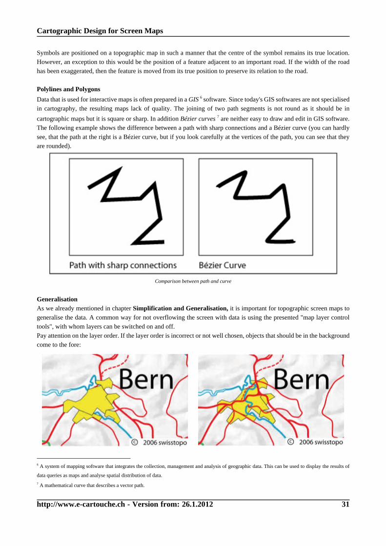
Data that is used for interactive maps is often prepared in a GIS 6 software. Since today's GIS softwares are not specialised
in cartography, the resulting maps lack of quality. The joining of two path segments is not round as it should be in
cartographic maps but it is square or sharp. In addition Bézier curves 7 are neither easy to draw and edit in GIS software.
The following example shows the difference between a path with sharp connections and a Bézier curve (you can hardly
see, that the path at the right is a Bézier curve, but if you look carefully at the vertices of the path, you can see that they
are rounded).
Comparison between path and curve
GeneralisationAs we already mentioned in chapter Simplification and Generalisation, it is important for topographic screen maps to
generalise the data. A common way for not overflowing the screen with data is using the presented "map layer control
tools", with whom layers can be switched on and off.
Pay attention on the layer order. If the layer order is incorrect or not well chosen, objects that should be in the background
come to the fore:
6 A system of mapping software that integrates the collection, management and analysis of geographic data. This can be used to display the results of
data queries as maps and analyse spatial distribution of data.
7 A mathematical curve that describes a vector path.

Cartographic Design for Screen Maps
http://www.e-cartouche.ch - Version from: 26.1.2012 32
Settlement layer is in the front (wrong) (© swisstopo) Settlement layer is in the background (right) (© swisstopo)
1.3.3. Colours
Topographic maps represent the earth surface including man made and physical features, for example highways, railroads,
gravel pits, buildings, etc. Ideally, all these features should appear on a map in their true colour. Rivers for example should
be held in a blue tone, forests in a green tone, etc.
The following list shows the colours that - in Switzerland - are reserved for their corresponding features:
• Black: Man-made or cultural features as roads, buildings, names, boundaries, and transmission lines.
• Blue: Water or hydrographic features as lakes, rivers, canals, glaciers, and swamps.
• Brown: Contour lines which show relief, but also terrain variations.
• Green / White: Landscape cover.
• Red: Important roads.
• Yellow: Secondary roads.
Green for forests and trees (© swisstopo) Blue for hydrographic features (© swisstopo)
Brown for contour lines (© swisstopo) Black for man-made or cultural features (© swisstopo)
Have a look at the two examples below. The first one did not choose the feature colours according to their nature colours.
Since for example the settlement areas are coloured in green they seem to be forest areas and so on. The second example
did choose the right colours for each feature and it therefore became readable.

Cartographic Design for Screen Maps
http://www.e-cartouche.ch - Version from: 26.1.2012 33

Cartographic Design for Screen Maps
http://www.e-cartouche.ch - Version from: 26.1.2012 34
1.3.4. Label Placement
As we mentioned in a previous chapter, the names of the objects and landscapes that are represented in a map belong to
the content of a topographic map. The placement of these names is not that easy as it seems to. Some placement rules
have to be followed.
There exist three label types:
• Point Labels
The placement is basically horizontal. In maps with small
scales, the names can be placed along the parallels.
Point Labels (Räber 2005)
• Line Labels
The placement is parallel to the line, high bends should
be avoided. Long lines should be named more than once.
Line Labels (Räber 2005)
• Area Labels
If possible, the names must be placed into the area. If the
area name cannot be placed horizontally, the name must
be bended.
Area Labels (Räber 2005)
The labels of point symbols should be placed at the same position in the entire map. Because it is not always possible to
place the names in the same position there exist an order of priority for the label placement. The priorities are numbered
from 1 to 8.
Order of priority (Räber 2005)
Depending on the scale factor of a map, the label type may change as it is shown in the next image:

Cartographic Design for Screen Maps
http://www.e-cartouche.ch - Version from: 26.1.2012 35
Label Type is dependent on the scale factor (Räber 2005)
One important point in the field of label placements is that labels must not be headfirst as it was done in the following
example!
Some labels are headfirst (Bundesamt für Gewässerkunde)
If you want to read more about label placements have a look at the GITTA lesson "Theory of Lettering Maps".
1.3.5. Interactivity
We now present you some functions that may be implemented into an interactive topographic map. The tools do not
necessarily have to be implemented in a topographic map, but they are nice to have.
Have a look at the following example which contains a lot of possible interactive functions that can be implemented in
an interactive map. Check out all the functions.

Cartographic Design for Screen Maps
http://www.e-cartouche.ch - Version from: 26.1.2012 36
Interactive Topographic Map of Tuerlersee (Neumann 2002)
Did you really check all the functions? The following tools you should have been checked
• Zooming functions
• Map layer control
• Select data to show on mouse-over
• Set hillshade parameters
• Show routes
• Locate places
• Draw an arbitrary profil
Since we already discussed the navigation and the map layer control tools in previous chapters, we will say no more about
these points. But we want to say a few words about some of the other functions.
In general, the following functions extract only the information that the user is already able to see in the topographic map.
But the information is visualised in a more pleasing way.
ProfileWith this tool you are able to draw the profile of an arbitrary polyline.

Cartographic Design for Screen Maps
http://www.e-cartouche.ch - Version from: 26.1.2012 37
It is nice to have this function for interactive topographic maps since the
topic of a topographic map is the topography. Of course the contour lines
contain already all the information but it is nevertheless comfortable to get
the difference in elevation at a glance. Especially for bikers or hikers this
information can be of particular importance.
Be aware that for being able to produce a profile you need the DTM
(Digital Terrain Model - see Basic Cartographic Modelling of 3D Space)
that belongs to the segment of the map that is visualised.
Profile (Neumann 2002)
Read out information and display itThe functions "select data to show on mouse-over" and "locate places" read information out of the map and displays it
in two different ways:
• The attribute data (e.g. length of rivers, object-class of landcover, etc.) is displayed as text when moving the mouse
over the corresponding objects.
• The places (villages and mountains) first have to be selected in a selection list and then the map is directly zoomed
to the right position.
Displaying attribute values (Neumann 2002)
Locate places (Neumann 2002)
The function that gives information with on mouse-over effects are limited for topographic maps. You can only extract the
information that is already visualised in the map (e.g. landcover types are distinguished with different colours, etc.). Of
course it is not comfortable to extract the length of a river out of a screen map, but it is possible if you would have to do it.
You will see that in the subject of interactive thematic maps it is also possible to visualise attribute values that are not
and never will be visualised directly in the map.
1.3.6. Self Assessment
We found the following topographic map in the Internet on a website which advertises Railpasses for Europe. The map
breaks some of the representation rules that we presented you in this and the first chapter. What would you change in this
map and how do your suggestions for improvements look like? Put 5 improvements on the discussion board "Topographic
Map" and comment on 5 entries of your colleagues with whom you do not agree.

Cartographic Design for Screen Maps
http://www.e-cartouche.ch - Version from: 26.1.2012 38
Map found in the Internet (europeonrail.com)
1.3.7. Summary
ContentThe content of topographic maps consists of the following objects:
• The earth's surface
• Water
• Vegetation
• Settlement
• Transportation
• Administrative Borders
• Names
Graphical ImprovementsIdeally, all the features of a topographic map should appear in their true proportion, position, shape, and colour. Since
this is not feasible for all objects, some symbols have to be created to represent the man-made and natural features. These
symbols should look as closely as possible to the real features themselves. If this is not possible, a new symbol is created
that logically implies the features it portrays.
It is important to prepare the data in a way that the features look naturally. Therefore, polylines or polygons should not
have sharp edges except for the real objects really feature them.
Pay attention when defining the order of the available layers of a map. The map is not of a good quality if the objects
of the background come to the fore.
ColoursAll the features of a topographic map should appear in their true colour. Rivers for example should be held in a blue tone,
forests in a green tone, etc.
Label PlacementThree label types are distinguished: Point, Line and Area Labels.
The labels of point symbols should be placed at the same position in the entire map. Because it is not always possible to
place the names in the same position there exists an order of priority for the label placement.

Cartographic Design for Screen Maps
http://www.e-cartouche.ch - Version from: 26.1.2012 39
Depending on the scale factor of a map, the label type may change.
InteractivityPossible interactive tools for topographic maps are:
• Creation of a profile
• Read out the map's information and display it in the application
• Setting hillshade parameters

Cartographic Design for Screen Maps
http://www.e-cartouche.ch - Version from: 26.1.2012 40
1.4. Cartographic Representation Rules for Thematic Maps
Learning Objectives
You will be able...
• ...to explain the differences between qualitative and quantitative thematic maps.
• ...to list the three representation methods that can be used for thematic attributes.
• ...to give three reasons for the question "Why can it be useful to classify data?".
• ...to list at least three classification methods.
• ...to say how many colour classes are recommended for thematic maps.
• ...to list the five generalisation methods of diagram maps.
• ...to name four interactive functions that can be implemented in a thematic map.
Introduction
At the beginning of this unit we repeat the theory of thematic cartography in general. Take into account that it is only a
repetition of knowledge that we assume is already known. You will find some links that lead to further theory, in case
you want to get more information about this topic .
Within the topic of interactive thematic maps you generally have the same possibilities for interactivity as for topographic
maps. But there are some more possibilities that have to be considered and may be realised within an interactive thematic
map.
In this unit we will introduce some of these possibilities. But before talking about the interactive thematic maps, we will
introduce the basic theory of thematic cartography in general.

Cartographic Design for Screen Maps
http://www.e-cartouche.ch - Version from: 26.1.2012 41
Example of Thematic Map
(Source: Schweizer Weltatlas 1993, p.27, modified)
BellinzonaLocarno
Lugano
Mendrisio
Chiasso
Type of Service
Trading
Gastronomy
Banks, Finance, Insurances Education services
Health and Veterinary services, Health buildings, Welfare Works
Administration
Summarised remaining services
Total number of employees per Community 1985
20 000
10 000
3000 1000 250
1.4.1. Content
Thematic MapsThematic maps represent the distribution of a particular geographical feature, or of a structural relationship between
several features. Like topographic maps, thematic maps show spatial information. But this information serves merely as
a locational framework or skeleton upon which the distribution or relationship is hung. (Asche et al. 2002)
Density of Protestants and Resident population, 2004 (Atlas der Schweiz 2.0)
Cartographic Design for Screen Maps
http://www.e-cartouche.ch - Version from: 26.1.2012 42
It is often difficult to draw a clear-cut distinction between thematic and topographic map because topographic maps
incorporate thematic components such as infrastructure, and thematic representations display locational features including
rivers, terrain and political boundaries as a spatial background to the actual theme. (Asche et al. 2002)
Thematic maps can be either qualitative or quantitative.
Qualitative Thematic MapsA qualitative thematic map represents merely the properties or attributes of geographical features and their distribution
or location (e.g. land use) (Asche et al. 2002).
Deposits of ores and minerals, 2004 (Atlas der Schweiz 2.0)
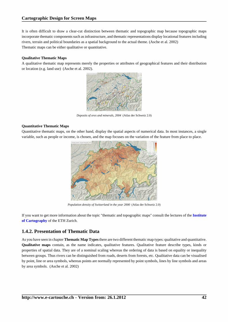
Quantitative Thematic MapsQuantitative thematic maps, on the other hand, display the spatial aspects of numerical data. In most instances, a single
variable, such as people or income, is chosen, and the map focuses on the variation of the feature from place to place.
Population density of Switzerland in the year 2000 (Atlas der Schweiz 2.0)
If you want to get more information about the topic "thematic and topographic maps" consult the lectures of the Instituteof Cartography of the ETH Zurich.
1.4.2. Presentation of Thematic Data
As you have seen in chapter Thematic Map Types there are two different thematic map types: qualitative and quantitative.
Qualitative maps contain, as the name indicates, qualitative features. Qualitative feature describe types, kinds or
properties of spatial data. They are of a nominal scaling whereas the ordering of data is based on equality or inequality
between groups. Thus rivers can be distinguished from roads, deserts from forests, etc. Qualitative data can be visualised
by point, line or area symbols, whereas points are normally represented by point symbols, lines by line symbols and areas
by area symbols. (Asche et al. 2002)

Cartographic Design for Screen Maps
http://www.e-cartouche.ch - Version from: 26.1.2012 43
Symbolisation for qualitative maps (Asche et al. 2002)
Quantitative maps contain quantitative attributes which relate to the values, magnitudes or intensities of numerical data
which are expressed in a numerical form e.g. the number of inhabitants of individual settlements (Asche et al. 2002).
Quantitative data can either be absolute (e.g. inhabitants of a commune) or relative (e.g. population density of a commune).
The decision on how to visualise quantitative data, depends on several aspects as you can see in the following illustration:
From data to a thematic map (Hurni et al. 2005)
First of all we have to decide whether to visualise one attribute, such as inhabitants of a commune, or several attributes,
such as inhabitants of a commune subdivided into male and female. If we visualise only one attribute we have to find out
whether the attribute is relative or absolute.
The following paragraphs explain in a few words the representation types that may be used to visualise the data.
Continuous Representation of Data Amounts
Criteria for this representation type: • Representation of integer, positive and negative
numbers, including zero
• Representation of decimal numbers
Maps with continuous representation of data amounts portray correct data relations, because each measured value is
visualised.

Cartographic Design for Screen Maps
http://www.e-cartouche.ch - Version from: 26.1.2012 44
There exist several methods to visualise a continuous representation of data amounts. Three of them are presented next:
Method Example
Choropleth MapThe exact object values are visualised (e.g. colored or shaded) directly in
the map. Even little value differences are visible.
Advantages:
• The exact value can be read out of the map
• Exact placing to its correct location
Disadvantages:
• Difficulty to compare the values with the naked eye
• Impossible to design value overlapping
Exact values are visualised in the map (Allen et al. 2001)
Proportional SymbolA symbol is defined whose area size is directly proportional to the value
dimension.
Advantages:
• Slower growing of the symbol dimension by increasing value.
• Exact placing to its correct location
Disadvantages:
• Poor accuracy of value estimation
• Difficulty to design symbol overlapping
One symbol is defined whose size is variable (Allen et
al. 2001)
Repeated SymbolOne unit is defined with whom all other values can be represented. The
repetition of the unit makes the dimension of the values visible.
Advantages:
• Quick and easy overview
• Countability of the represented values
Disadvantages:
• Difficult to show a wide value range
• The impression of over-simplification
One unit is defined to visualise all values (Institut für
Länderkunde 2000)
As you can see in the presented maps, there may occur a few problems using the continuous representation of data amounts
in screen maps because this representation type needs a lot of space.
Representation with Intervals
Criteria for this representation type: • Representation of integer, positive and negative
numbers, including zero
• Representation of decimal numbers
• Classification of data values (building intervals)
Classification of data leads to a loss of detail because the exact numercial data relations are not visible anymore. (The
theory of how to classify data is explained in the next chapter.)
The representation with intervals can be used for relative and absolute attributes:

Cartographic Design for Screen Maps
http://www.e-cartouche.ch - Version from: 26.1.2012 45
Attribute Type Representation Type Example
Relative Choropleth MapAdvantages:
• Phenomenon is spread
evenly and continuously
over the area
• Density change occurs at
boundaries
Disadvantages:
• Boundaries may suggest
that densities change
abruptly at the lines
• Densities are not uniform
throughout any statistical
unit
Interactive choropleth map (Schnabel 2008)
Absolute Graduated range of geometric /pictorial symbols or charactersAdvantages:
• Avoids overcrowding
• Number of symbols can be
adjusted to cover a certain
value range
• Small symbols can mark
large values
Disadvantages:
• Symbols do not express
exact values
Representation with geometric symbols, reproduced with
the permission of swisstopo (JD072706)
Representation with pictorial symbols, reproduced with
the permission of swisstopo (JD072706)

Cartographic Design for Screen Maps
http://www.e-cartouche.ch - Version from: 26.1.2012 46
Representation with characters, reproduced with the
permission of swisstopo (JD072706)
Absolute Flow Chart (for directionaltopics)Advantages:
• Show movements and
transportations and their
direction
• Start and end point of the
movements are important
and not their location
Disadvantages:
• Need quite a lof of space
Flow Chart (Allen et al. 2001)
Representation with DiagramsThere is a huge amount of diagram types than can be used for the visualisation of thematic data. We will only introduce
the most popular ones. If you want to get familiar with other diagram types have a look at the pdf file "Diagram Types"(in german).
The most important diagrams within the field of cartography are the following:
Diagram Type Example Advantages/Disadvantages
(Divided) Wing Chart Advantages:
• absolute totals depicted by wing area
• null sets can be represented easily
Disadvantages:
• estimation and measuring is generally less
accurate

Cartographic Design for Screen Maps
http://www.e-cartouche.ch - Version from: 26.1.2012 47
(Divided) Bar Chart Advantages:
• quick and easy overview of the represented
value percentages
• null sets can be represented easily
Disadvantages:
• estimation and measuring is generally less
accurate
Area Chart Advantages:
• space-saving and great centring
• absolute totals depicted by quadrat area
• representation of individual component values
by quadrat segments
Disadvantages:
• takes up a lot of space when showing large
values
Pie Chart Advantages:
• space-saving and great centring
• absolute totals depicted by circle area
• representation of individual component values
by circle segments
• representation of component percentages by
segment angles
Disadvantages:
• takes up a lot of space when showing large
values
If you are interested in more information about methods that are used to represent thematic data, have a look at the
following e-learning lesson: Thematic Cartography.
1.4.3. Classification
How classification is done?The classification operation behaves pretty much like a group of stacked sieves. Each sieve acts as a class boundary, and
only values of certain sizes are allowed to pass into one of several classes. (Dent 1999)
Discover interactively the sieve analogy: Click on "Classify Data" to start classification
Only pictures can be viewed in this version! For Flash, animations, movies etc. see online version. Onlyscreenshots of animations will be displayed. [link]

Cartographic Design for Screen Maps
http://www.e-cartouche.ch - Version from: 26.1.2012 48
What is a classified map?A classified map represents data that has been grouped into different classes. On the map, the different classes can be
distinguished e.g. by their colour (hue, brightness, or saturation).
Why can it be useful to classify data before creating a map?Data is classified for three reasons:
• To reduce a large number of individuals (objects) to a smaller number of groups in order to facilitate description
and illustration (Dent 1999).
• To define phenomena - classes about which general statements can be made (Dent 1999).
• The human eye only has a limited ability to discriminate a large number of different areal symbol shades (concerns
maps with proportional symbols) (Slocum 1999).
Although classification may lead to a loss of detail, it usually makes meaningful interpretation possible. (Dent 1999)
There are several methods to classify data. The major
ones are presented in the following table. An example that
deals with population density data of Europe is used to
demonstrate the differences between the methods. See the
figure to the left to watch a data-set of the population
density.
Take into account that the best classification method
depends on the data set that is classified. Therefore, the
following results refer only to the data set that is shown on
the right!
Data distribution graph (Institute of Cartography)
Method Example Dispersion Graph
Equal Intervals
(Institute of Cartography)(Institute of Cartography)
Mean-Standard Deviation
(Institute of Cartography)(Institute of Cartography)
Quantiles
(Institute of Cartography) (Institute of Cartography)

Cartographic Design for Screen Maps
http://www.e-cartouche.ch - Version from: 26.1.2012 49
Maximum Breaks
(Institute of Cartography) (Institute of Cartography)
Natural Breaks
(Institute of Cartography) (Institute of Cartography)
The pdf file Classification of data introduces all major classification methods with their advantages and disadvantages.
The decision on which method of classification should be used depends on the data. According to (1999) the following
criteria can assist in selecting a classification method:
• Whether the method considers how data are distributed along the number line,
• Ease of understanding the method,
• Ease of computation,
• Ease of understanding the legend,
• Whether the method is acceptable for ordinal data, and
• Whether the method can assist in selecting an appropriate number of classes.
In cartography the number of classes should be between 3 and 7. Do not use more than seven classes because the
human eye cannot distinguish more than seven classes.
1.4.4. Generalisation
Like topographic data, thematic data can be generalised as well. Especially in the field of screen maps it is often inescapable
to generalise the thematic data. The following interaction part introduces some methods for the generalisation of diagram
maps.
Only pictures can be viewed in this version! For Flash, animations, movies etc. see online version. Onlyscreenshots of animations will be displayed. [link]
1.4.5. Graphical Improvements
In chapter 1.4.2 Thematic Data we listed some of the most important representation types for thematic data. For each
representation type we presented an example. Already these examples demonstrate that it is not easy to visualise thematic
data in a pleasing way. Depending on the data set that is to be visualised and the chosen representation type, there may

Cartographic Design for Screen Maps
http://www.e-cartouche.ch - Version from: 26.1.2012 50
occur presentation problems. Imagine to visualise the number of inhabitants for each commune around Zurich (divided
into two main groups: men and women which are subdivided into three subgroups: 0-14 years, 15-64 years and >64 years).
Consider that Zurich has about 300'000 inhabitants in contrast to the surrounding communes which have only 10'000
inhabitants or even less.
If we want to visualise these values in a map using diagrams we could choose between different diagrams. But not
all diagram types are suitable to get a quality thematic map. The following examples show first some bad results and
afterwards some good examples.
(Divided) Bar ChartThe first example shows the visualisation of the values with divided bars. There are two main bars: men and women which
are subdivided into the different age categories. Since there are small (below Winterthur) and huge (Zurich) values, it is
not recommended to represent the values with this representation type. When you look at the bars of Zurich you can see
that not even the first bar fragmentations find entirely place in the map. It would neither be possible to visualise these bars
on the entire screen, which is a multiple bigger than the presented map, because of the incredible height of these bars.
In contrast to these huge values, there exist some small values whose bar fragmentations are hardly recognisable (look
at bar between Wetzikon and Winterthur). Take into account that we did not even visualise all values in this map. The
visualisation of only few values already causes presentation problems.
Histogram, reproduced with the permission of swisstopo (JD072706)
The same problems as above occur when using a histogram as representation type. The values of Zurich are huge and not
visualisable anymore. Small values as well are neither visualisable because we cannot recognise them anymore. Since this
sort of diagram needs a lot of space (each diagram consists of six bars), it is even more complicated to find an appropriate
visualisation. The histograms cannot be placed inside their commune borders, because of their size. As a consequence,
the affiliation of the diagrams is not clear anymore what confuses the users. Additionally, if you want to visualise the
values of each commune, it is not possible to avoid their ovelapping. We conclude that this diagram is not suitable for
the given values, because the result is not satisfaying.

Cartographic Design for Screen Maps
http://www.e-cartouche.ch - Version from: 26.1.2012 51
Divided Bar Chart, reproduced eith the permission of swisstopo (JD072706)
Neither the representation with bar sequences leads to a good map result as you can see in the map below. The huge value
differences lead to the same visualisation problems described above. Huge values need a lot of space while small values
are not recognisable anymore.

Cartographic Design for Screen Maps
http://www.e-cartouche.ch - Version from: 26.1.2012 52
Bar Sequence, reproduced eith the permission of swisstopo (JD072706)
Divided Wing ChartThe given values are best visualised with divided wings, since within this method, the sector areas are compared and not,
as in the examples above, the bar heights. As you can see in the example below, we are able to visualise all values of each
commune. The values of Zurich and Winterthur, of course, are still the largest ones. Therefore, the areas of those sectors
are the largest ones and we still cannot avoid an overlapping with other diagrams.

Cartographic Design for Screen Maps
http://www.e-cartouche.ch - Version from: 26.1.2012 53
Divided Wing Chart, reproduced eith the permission of swisstopo (JD072706)
As you can see, the diagrams of Zurich and Winterthur cover a big part of the basic map so that e.g. the commune borders
are not recognisable anymore. Therefore, we advice to either give these huge diagrams a transparency factor or to design
them totally transparent and give them a coloured, expanded stroke. Have a look at the following examples to get an
impression of these possibilities.
Divided Wing Chart with transparency factor,
reproduced eith the permission of swisstopo (JD072706)
Divided Wing Chart with coloured and expanded stroke,
reproduced eith the permission of swisstopo (JD072706)

Cartographic Design for Screen Maps
http://www.e-cartouche.ch - Version from: 26.1.2012 54
Conclusion
Depending on the values that are to be visualised and the chosen representation type, there may occur some
visualisation problems. Always try to find the best representation type by taking into account that you want to
produce a quality thematic map, that follows the cartographic principles.
The aspects we presented above are for both paper and screen maps. So far, we only treated static screen maps. In chapter
1.4.7. Interactivity in Thematic Maps you will get to know a few interactivities that can be implemented into thematic
screen maps. Implementing such interactivities into a thematic screen map can reduce some of the presented visualisation
problems.
1.4.6. Colours
Colours of Basic MapThematic maps show both topographic and thematic information. Since the spatial information serves merely as a
locational framework or skeleton upon which the thematic distribution or relationship is hung, the spatial information
should be held in unobtrusive colours.
In the following interaction part you can change the opacity of the basic map. Try to find the ideal opacity value by
changing the position of the slider. When clicking the "Check Answer" button, there appears a green bar that shows the
optimal values.

Cartographic Design for Screen Maps
http://www.e-cartouche.ch - Version from: 26.1.2012 55
Colour RangesIn chapter 1.1.5 Colours we introduced some problems that may occur with colours on different platforms and different
browsers.
In the field of thematic maps, there exists another problem with colours, since colour ranges play an important role.
(2003) recommends the following:
Clearly differentiate colours for thematic mapping, i.e. use larger colour contrasts for screen maps than for paper
maps. Two close colours might appear very distinctive on a certain screen, but might be hardly discernible on
another. To better differentiate succeeding thematic classes with grades of colour, you may also reduce their number
(at the most 5-7 classes are recommended).

Cartographic Design for Screen Maps
http://www.e-cartouche.ch - Version from: 26.1.2012 56
ExamplesThe following maps did not clearly differentiate the used colours. The map on the left used too many classes so that
10 different colours had to be defined. Therefore, the colours are too close and the human eye is not able anymore to
discriminate the different colours. The map on the right used colours that are too close. As well as in the first map, the
colours cannot be distinguished anymore.
Map with too many colour classes (Atlas der Schweiz 2.0)
Colours are too similar (Atlas der Schweiz 2.0)
The next two maps use clearly differentiated colours. The user can therefore discriminate the different colours with the
naked eye.
Map with clearly differentiated colours (Atlas der Schweiz 2.0)Map with clearly differentiated colours (Atlas der Schweiz 2.0)
Finding the right colours and number of classes
There exists a web tool for selecting colour schemes for
thematic maps, most usually for choropleth maps. The tool
allows to select the number of classes you want to visualise
and to choose predefined colour spectra that will be applied
to the given map. A few icons suggest contexts (laptop,
video projector, screen, etc.) in which the particular colour
scheme should work.
Explore the "Color Brewer"-tool and try to find a schema
that can be used for all suggested contexts. Tip: Vary the
number of classes within the same colour scheme and look
what happens.Colour Brewer (Brewer 2005)

Cartographic Design for Screen Maps
http://www.e-cartouche.ch - Version from: 26.1.2012 57
1.4.7. Interactivity in Thematic Maps
When producing a static thematic map you have to choose the data visualisation type right at the beginning of the
production process. That means that you have to choose a representation type and eventually a classification type and
visualise the data, according to your choice, in the map. Even if there exist several possibilities to visualise the data in an
appropriate way in a map, you have to choose one of them and apply it to the data.
Within the field of interactive thematic maps we have the possibility to leave the choice for an appropriate data
representation to the user. Of course, you have to choose the representation types that visualise best the given data. But if
there are several ideal methods (choropleth map, diagrams, etc.) for the best visualisation, you are able to leave the final
choice to the user. You can even leave the choice of which data should be visualised to the user.
To get an idea of some of the mentioned possibilities, explore the following interactive map.
Example of an interactive thematic map (Schnabel 2008)
Can you name three functions that allow to change the visualisation parameters of the presented map?
• Choosing the variables that will be
visualised (sex, year)
• Changing the number of classes
• Changing the colors
Settings of the interactive map (Schnabel 2008)
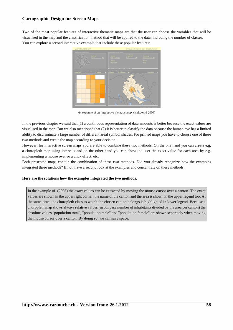
Cartographic Design for Screen Maps
http://www.e-cartouche.ch - Version from: 26.1.2012 58
Two of the most popular features of interactive thematic maps are that the user can choose the variables that will be
visualised in the map and the classification method that will be applied to the data, including the number of classes.
You can explore a second interactive example that include these popular features:
An example of an interactive thematic map (Isakowski 2004)
In the previous chapter we said that (1) a continuous representation of data amounts is better because the exact values are
visualised in the map. But we also mentioned that (2) it is better to classify the data because the human eye has a limited
ability to discriminate a large number of different areal symbol shades. For printed maps you have to choose one of these
two methods and create the map according to your decision.
However, for interactive screen maps you are able to combine these two methods. On the one hand you can create e.g.
a choropleth map using intervals and on the other hand you can show the user the exact value for each area by e.g.
implementing a mouse over or a click effect, etc.
Both presented maps contain the combination of these two methods. Did you already recognize how the examples
integrated these methods? If not, have a second look at the examples and concentrate on these methods.
Here are the solutions how the examples integrated the two methods.
In the example of (2008) the exact values can be extracted by moving the mouse cursor over a canton. The exact
values are shown in the upper right corner, the name of the canton and the area is shown in the upper legend too. At
the same time, the choropleth class to which the chosen canton belongs is highlighted in lower legend. Because a
choropleth map shows always relative values (in our case number of inhabitants divided by the area per canton) the
absolute values "population total", "population male" and "population female" are shown separately when moving
the mouse cursor over a canton. By doing so, we can save space.

Cartographic Design for Screen Maps
http://www.e-cartouche.ch - Version from: 26.1.2012 59
In the example of (2004) the exact values can be extracted by moving the mouse cursor over a district of the map.
At the same time, the interval to which the chosen district belongs to is highlighted.
Think about further possibilities!
For example in a third example made by (2005), the values will be additionally visualised in a histogram
which compares all values. When moving the mouse cursor over a district, the corresponding histogram value
is highlighted. At the same time, the interval to which the chosen district belongs to is highlighted. Look at the
screenshots to understand how it works.
(Stopper 2005)
We will not go into further details of interactivity
for thematic maps because there is a large number
of functions that can be implemented into a thematic
map. We only want you to explore the example on
the right, which is very rich of interactive tools for
thematic maps, to get an idea what interactivities may
be implemented in a thematic map.
The application allows you to load your own dataset,
choose a diagram type and create a map out of your
defined settings.
Application rich of interactivities (Schnabel 2006)

Cartographic Design for Screen Maps
http://www.e-cartouche.ch - Version from: 26.1.2012 60
If you are interested in examples that show possibilities of the interaction between the content of a thematic map and its
legend, have a look at the Homepage of Ellsiepen. There you find several examples that deal with interactive legends
in thematic maps.
ExerciseWe only presented you a few possible interaction parts that could be implemented into an interactive thematic map. There
are a lot more possibilities how to design a thematic map interactively.
There exist a lot of interactive thematic maps in the Internet. We now want you to search the Internet for one of them.
Write a short (about 1/2 A4 page) essay about the interactive parts of your chosen maps. How is the thematic cartography
aspect realised? Do you miss some interactivities or are there some interactivities which could be realised in a better way?
Hand in your essay to your tutor.
1.4.8. Self Assessment
Below, we listed various topics that have to be visualised in a thematic interactive map. Choose one of those topics and
find the best representation type for it. Consider that there may occur some visualisation problems with your chosen
representation type, depending on the data set (e.g. overlapping of Wing Charts, etc.). The data is referring to Switzerland
but depending on the topic of your choice you also have to define the exact referring features (commune, district, canton
or entire country).
You best have a look at the scheme that we presented in chapter 1.4.2. Presentation of thematic data. This scheme helps
you to find the right representation type.
After the definition of the representation type, think about some possible interactivities that may be implemented in the
map. The interactive parts can also have an influence on the choice of the representation type. An Example: The number
of tourists in Switzerland can be represented with relative attributes (as a percentage: number of tourists per inhabitants
of a commune) or with absolute attributes (number of tourists for each commune). You now can say that you want to
visualise the relative attributes in the map, but the user shall have the possibility to extract the absolute values with an
interactive tool such as "click" or "on mouse over" effects.
Write a short essay about your results. Name the topic of your choice and describe the representation type, the visualisation
problems that may occur and all the interactive tools you want to implement. You may sketch some of your ideas.
Hand in your essay to the tutor.
Topics
• Population: Census Density
• Religion divided in:
• Christian
• Non-Christian
• No religious affiliations
• Average number of years in education for:
• Women 30 - 39
• Women 40 - 49
• Women 50 - 59
• Women 60 - 69
• Men 30 - 39
• Men 40 - 49
• Men 50 - 59
• Men 60 - 69

Cartographic Design for Screen Maps
http://www.e-cartouche.ch - Version from: 26.1.2012 61
• Health: Addictive substances divided in
• Tobacco consumption
• Alcohol consumption
• Cannabis consumption
• Medicament consumption
• National languages of Switzerland
• German
• French
• Italian
• Romansh
• Annual water temperature for rivers and streams (measured in degrees)
• Annual temperature (measured in degrees)
• Annual lightning frequency (measured in lightning strikes/km2)
• Frequency of fog in winter (measured in days)
Examples of possible maps of Switzerland (Communes, Districts)
Map of Switzerland with all communes, reproduced with the permission
of swisstopo (JD072706) (Swisstopo)
Map of Switzerland with all districts, reproduced with the permission of
swisstopo (JD072706) (Swisstopo)
1.4.9. Summary
Thematic data representation and classificationWe distinguish between qualitative and quantitative maps. Quantitative maps can be visualised with various
representation types:
• Continuous Representation of data amounts
• Representation with value intervals
• Representation with diagrams
A representation with intervals leads to a loss of detail because the exact numerical data relations are not visible anymore.
But there are also reasons why a representation with intervals is preferred:
"Unclassed mapped data present a geographical pattern that is not particularly revealing and has little interpretive power.
As the data are grouped into similar classes having identical numerical characteristics, there is an increase in their ability
to convey information about which generalizations can be made." (Dent 1999)

Cartographic Design for Screen Maps
http://www.e-cartouche.ch - Version from: 26.1.2012 62
GeneralisationLike topographic data thematic data can be generalised. We differentiate between five methods:
• Generalisation of the reference areas
• Merging diagrams
• Using signatures of too small diagrams
• Merging thematic subfields
• Redistribution of too small partial quantities
ColoursChoose the colours for a thematic map carefully! 5-7 colour classes are recommended
InteractivityWithin the topic of interactive thematic maps we are able to combine several of the represenation methods that we listed
above. The next example contains some of these functions:
Example of an interactive thematic map (Neumann 2003)

Cartographic Design for Screen Maps
http://www.e-cartouche.ch - Version from: 26.1.2012 63
1.5. Summary
In the field of cartography we
distinguish between topographic and
thematic maps. Topographic maps
show the terrain with its situation
and its names. Whereas thematic
maps represent the distribution of a
particular geographical feature, or of a
structural relationship between several
features. Map 1 (© 2006 swisstopo)Map 2 (Atlas der Schweiz 2.0)
Screen maps should be designed interactively. In doing so, the quality of the map increases. The most popular interactivities
are:
• Map layer control tools
• Navigation (zoom in/out, pan, original view, et.)
• Adaptive Zooming
• Mouse Over Effects
• Click Effects
• Interactive Legend
If possible, an adaptive zooming should be implemented. That way, the quality of the map is always high and the
cartographic principles are conformed.
Interactive thematic maps contain the same interactive parts as topographic maps and even more. The following example
contains a couple of these possible interaction tools:
Example of an interactive thematic map
There are a few rules that have to be respected when producing a screen map - independent of the map type (topographic
or thematic) and independent of the interactivity of the map (static or interactive):
• Adaptation of the information density for a screen map
• Minimum distances between two surfaces
• Minimum aerial dimensions of point signatures
• Font (must be legible)
• Colours (must be distinguishable)

Cartographic Design for Screen Maps
http://www.e-cartouche.ch - Version from: 26.1.2012 64
• Scale Indication (Cartesian grid or scale bar)

Cartographic Design for Screen Maps
http://www.e-cartouche.ch - Version from: 26.1.2012 65
1.6. GlossaryAdaptive Zooming:
A zooming is called adaptive when the representation of a screen map is adapted to the zoom level. Therefore for
each zoom level, the quality of the map is always high and the cartographic principles are conformed. Hence, adaptive
zooming describes the adjustment of a map, its contents and the symbolization to target scale in consequence of a
zooming operation (=scale change). (Brühlmeier 2000)
Bézier Curve:A mathematical curve that describes a vector path.
Feature Class:A feature class is used to define a class of geographic items having the same basic set of characteristics. All features
have a topology type of Polygon, Line or Point. Some examples of feature class are Bridge, Road, Lake. A "feature"
differs from a "feature class" in that the feature is an instance of feature class. For example "Lake" is a feature class.
The feature class "Lake" (and associated data) describes the standards to which all lakes are captured.
Gamma:Gamma is the curve that describes how the middle tones of images appear on a computer. Changing the value of the
gamma affects the mid-tones while leaving the whites and blacks unaltered. (Apple Computer Inc. 2001)
GIS (Geographic Information System):"A system of mapping software that integrates the collection, management and analysis of geographic data. This can
be used to display the results of data queries as maps and analyse spatial distribution of data." (Quartix)
Level of Detail (LoD):LOD or Level of Detail means that in maps with adaptive zooming the objects are available at different scale levels.
Thus, the details of a map are decreased when you zoom out and increased when you zoom in.
SVG:"Scalable Vector Graphics (SVG) is an XML markup language for describing two-dimensional vector graphics, both
static and animated." (Wikipedia)

Cartographic Design for Screen Maps
http://www.e-cartouche.ch - Version from: 26.1.2012 66
1.7. Bibliography
• Allen, S., Buckley, A.R., Meacham, J.E., 2001. Atlas of Oregon. Second Edition. United States of America:
University of Oregon.
• Apple Computer Inc., 2001. Final Cut Pro 2 User's Manual.
• Asche, H., Herrmann, C., 2002. Thematic Cartography. In: Anson, R.W. and Ormeling, F.J., ed. Basic
Cartography for students and technicians - Volume 2. Great Britain: Butterworth-Heinemann, 123-150.
• Atlas de France. Atlas de France [online]. Available from: http://www.mgm.fr/PUB/ATFSom10.html [Accessed
28.03.2006].
• Atlas der Schweiz 2.0. [CD-ROM]. 2.0. Swisstopo.
• Brewer, C. (2005). Color Brewer [online]. Available from: http://www.personal.psu.edu/cab38/ColorBrewer/
ColorBrewer.html [Accessed 30.03.2006].
• Brühlmeier, T., 2000. Interaktive Karten - adaptives Zoomen mit Scalable Vector Graphics. ETH Zurich.
Download: http://www.ika.ethz.ch/teaching/Diplomarbeit-Bruehlmeier.pdf
• Bundesamt für Gewässerkunde. Digitaler Hydrologischer Atlas von Deutschland [online]. Available from:
http://had.bafg.de:8080/ [Accessed 28.03.2006].
Download: http://had.bafg.de:8080/had080/dighad_32.htm
• Bundesamt für Statistik. Institutionelle Raumgliederungen der Schweiz, 1970-2000 [online]. Available
from: http://www.media-stat.admin.ch/maps/mapresso/call/ch_mf/ch-mf-abg7000nom-insti_de.php [Accessed
28.03.2006].
• Bundesamt für Statistik (BfS) (2006). Available from: http://www.bfs.admin.ch [Accessed 16.03.2006].
• Bundesamt für Umwelt (BAFU). Epizentren von Schadenbeben in der Schweiz Jahr 250-2000 [online]. Available
from: http://e-geo.camptocamp.com/erdbeben/index.html [Accessed 12.04.2006].
• Cecconi, A., Galanda, M., 2002. Adaptive Zooming in Web Cartography. In: SVG Open, Zurich. Zurich.
Download: http://www.svgopen.org/2002/papers/cecconi_galanda__adaptive_zooming/
• Davos Klosters Mountains. Panoramakarten [online]. Available from: http://www.parsenn.ch/ [Accessed
28.03.2006].
Download: http://www.parsenn.ch/data/modul/panoramakarte/sued.jpg
• Dent, B.D., 1999. Cartography - Thematic Map Design. Fifth Edition. United States of America: The McGraw-
Hill Companies.
• europeonrail.com. Available from: http://www.europeonrail.com/ [Accessed 28.04.2006].
Download: http://www.europeonrail.com/pics/maps/Switzerland.gif
• Galanda, M., Cecconi, A.. Webmapping and Cartographic Generalization Prototype 0.3a [online]. Available
from: http://www.geo.uzh.ch/oldgis/research/webmap/proto/proto.html [Accessed 30.03.2006].
• GIS-Zentrum Kanton Zürich. GIS-Browser [online]. Available from: http://www.giszh.zh.ch [Accessed
12.04.2006].
Download: http://www.gis.zh.ch/gb4/bluevari/gb.asp
• Google Earth. Google Earth.
Download: http://earth.google.com
• Hallwag Kümmerly + Frey. Schweiz, 1:303000. Kümmerly + Frey.
• Hurni, L., Schnabel, O., Werner, M., 2005. Umsetzung statistischer Daten in thematische Karten. ETH Zurich.
• Institute of Cartography, ETH Zurich. Dealing with Natural Hazards and Risks [online]. Available from: http://
www.nahris.ch/ [Accessed 24.03.2006].
• Institut für Länderkunde, 2000. Nationalatlas Bundesrepublik Deutschland - Gesellschaft und Staat. Heidelberg,
Berlin: Spektrum Akademischer Verlag GmbH.
• Isakowski, Y. (2004). Zürich zieht um - Umzugsdynamik der Stadt Zürich [online]. ETH Zurich. Available from:
http://www.carto.net/papers/svg/zuerich_migration/index.svgz [Accessed 27.03.2006].

Cartographic Design for Screen Maps
http://www.e-cartouche.ch - Version from: 26.1.2012 67
• Kanton Aargau. Aargauisches Geographisches Informationssystem [online]. Available from: http://www.ag.ch/
agis/ [Accessed 28.03.2006].
• Lonely Planet. Available from: http://www.lonelyplanet.com/worldguide/destinations/europe/switzerland
[Accessed 27.07.2007].
• MapQuest. Mapquest (MapQuest and the MapQuest logo are registered trademarks of MapQuest, Inc. Map
content(c) 2007 by MapQuest, Inc and NavTeq. Used with permission) [online]. Available from: http://
www.mapquest.com/ [Accessed 16.03.2006].
• Ministry of Forests. Spatial Dictionary Tables [online]. Available from: http://www.for.gov.bc.ca/pScripts/isb/
idd/datadict.asp [Accessed 31.03.2006].
• National Atlas U.S.. National Atlas of the United States [online]. Available from: http://www.nationalatlas.gov
[Accessed 29.03.2006].
Download: http://www.nationalatlas.gov/printable/reference.html#list
• Neumann, A. (2002). Interactive Topographic Map of Tuerlersee [online]. Available from: http://www.carto.net/
papers/svg/tuerlersee/ [Accessed 16.03.2006].
• Neumann, A. (2003). US States Population 2000 [online]. Available from: http://www.carto.net/papers/svg/
us_population/index.html [Accessed 30.03.2006].
• Quartix. Glossary of terms related to GPS and vehicle tracking [online]. Available from: http://www.quartix.net/
content/htm/glossary.asp [Accessed 05.12.2005].
• Räber, St., 2005. Kartenbeschriftung. Zurich.
Download: http://www.karto.ethz.ch/education/teaching_courses/carto_basics/scripts/kartenbeschriftung.pdf
• Räber, St., Jenny, B., 2003. Karten im Netz - ein Plädoyer für mediengerechte Kartengrafik. In: Asche/Herrmann, ed. Web.Mapping 2. Heidelberg: Wichmann Verlag, 57-76.
• Schnabel, O. (2008). Population Density of Switzerland [online]. Available from: http://www.carto.net/schnabel/
pop_dens/ [Accessed 02.07.2008].
• Schnabel, O. (2006). Map Symbol Brewer [online]. ETH Zurich. Available from: http://www.carto.net/schnabel/
mapsymbolbrewer/ [Accessed 30.03.2006].
• Slocum, T.A., 1999. Thematic Cartography and Visualization. New Jersey: Prentice Hall.
• Spiess, E., 1996. Digitale Technologie und graphische Qualität von Karten und Plänen. Geomatik Schweiz, 9, 467.
• Stadt Jena. Stadtkarte von Jena [online]. Available from: http://www.jena.de/stplan/ [Accessed 12.04.2006].
• Stopper,R. (2005). Herkunft der Studierenden der ETH Zürich [online].
• Swissgeo. Swissgeo [online]. Available from: http://www.swissgeo.ch/ [Accessed 20.03.2006].
• Swisstopo. Übersichtskarten der Schweiz [online]. Available from: http://www.swisstopo.ch [Accessed
30.03.2006].
Download: http://www.swisstopo.ch/de/download/testdata/maps/overview
• Wikipedia. Scalable Vector Graphics [online]. Available from: http://en.wikipedia.org/wiki/SVG [Accessed
05.12.2005].
• Wikipedia. Schweiz [online]. Available from: http://de.wikipedia.org/wiki/Hauptseite [Accessed 16.03.2006].
Download: http://de.wikipedia.org/wiki/Schweiz
• Williams, J. (2005). Yosemite National Park Hiking Map [online]. ETH Zurich. Available from: http://
www.carto.net/williams/yosemite/ [Accessed 28.04.2006].