Embed Size (px)
Citation preview
1
Rhetoric versus Reality: The Best and Worst of
Aid Agency Practices
William Easterly & Claudia R. Williamson*
JEL: O1; F5
* William Easterly ([email protected]) NYU and NBER, and Claudia Williamson ([email protected]) Development Research Institute, New York University, 19 W. 4th St, New York, New York 10012.

2
Acknowledgements: We thank Polina Minkovski and Nobuyuki Kanazawa for valuable research
assistance.
3
Abstract
Foreign aid critics, supporters, recipients and donors have produced eloquent rhetoric on
the need for better aid practices – has this translated into reality? This paper attempts to
monitor the best and worst of aid practices among bilateral, multilateral, and UN
agencies. We create aid practice measures based on aid transparency, specialization,
selectivity, ineffective aid channels and overhead costs. We rate donor agencies from
best to worst on aid practices. We find that the UK does well among bilateral agencies,
the US is below average, and Scandinavian donors do surprisingly poorly. The biggest
difference is between the UN agencies, who mostly rank in the bottom half of donors,
and everyone else. Average performance of all agencies on transparency, fragmentation,
and selectivity is still very poor. The paper also assesses trends in best practices over time
– we find modest improvement in transparency and more in moving away from
ineffective channels. However, we find no evidence of improvements (and partial
evidence of worsening) in specialization, fragmentation, and selectivity, despite
escalating rhetoric to the contrary.
Keywords: Foreign Aid, Best Practices, Transparency, Bureaucracy, Incentives
4
1. INTRODUCTION
“We, Ministers of developed and developing countries responsible for promoting
development and Heads of multilateral and bilateral development institutions…resolve to
take far-reaching and monitorable actions to reform the ways we deliver and manage
aid…we recognize that while the volumes of aid and other development resources must
increase to achieve these goals, aid effectiveness must increase significantly as well to
support partner country efforts to strengthen governance and improve development
performance.”
Paris Declaration on Aid Effectiveness (2005, p.1)
Despite the transfer of over $4.6 trillion (measured in constant 2007 dollars) in gross
official development assistance (ODA) to developing countries from 1960 through 2008,
a substantial amount of the world remains in extreme poverty and stagnant growth1
([Bauer, 2000], [Easterly, 2001, 2006] and [Moyo, 2009]).2 The aid community now
emphasizes improved quality of the delivery and allocation of official aid as a necessary
means to achieve positive outcomes (for example, see the [Paris Declaration on Aid
Effectiveness, 2005], which was followed up by the [Accra Agenda for Action, 2008]).
Unfortunately, there is no disaggregated data available on the impact of aid on the
beneficiaries, which would be the most desirable measure of quality of aid. Like others in
this literature, we follow a more indirect approach. We focus on five dimensions of
agency ‘best practices’ derived from what practices the donors themselves, outside aid
monitors, and the academic literature suggest agencies should follow. We use the Paris
and Accra process as another reference point among many on what the consensus on best
5
practices is. However, as explained below, we choose not to directly monitor compliance
with Paris and Accra agreements, as these agreements are a negotiated political process
rather than an academic monitoring exercise.
The five best practice dimensions are based on Easterly and Pfutze’s (2008) best
practices, which are agency transparency, minimal overhead costs, fragmentation of aid,
delivery to more effective channels, and allocation to less corrupt, more democratically
free, poor countries. Transparency is based on the ability to gather information such as
employment numbers, budgetary data, and overhead costs. Specialization captures the
extent to which aid is divided among many donors, many countries, and many sectors.
Selectivity refers to aid delivery to the poorest countries while avoiding corrupt dictators.
Ineffective channels measures the share of aid that is tied, given as food aid or as
technical assistance. Overhead cost utilizes the data collected during the transparency
stage and refers to an agencies’ costs relative to aid disbursements. These concepts reflect
standards identified over a number of years of research on the need to reform the
allocation and management of foreign aid ([Rome Declaration, 2003], [Roodman, 2006,
2009], [Center for Global Development, 2007], [Knack and Rahman, 2007],
[Commission for Africa, 2005], [IMF and World Bank, 2005, 2006], [Paris Declaration,
2005], [United Nations Development Program, 2005], [United Nation Millennium
Project, 2005], [Easterly, 2007], [Accra Agenda, 2008], [Easterly and Pfutze, 2008],
[Birdsall, Kharas, Mahgoub, and Perakis, 2010] and [Knack, Rogers, and Eubank 2010]).
We will provide more detailed justification and references in the section on each concept
below.
6
We acknowledge that there is no direct evidence that our indirect measures
necessarily map into improved impact of aid on the intended beneficiaries. We will also
point out specific occasions where the relationship between our measures and desirable
outcomes could be non-monotonic or ambiguous. We primarily emphasize outliers that
are less ambiguous. We focus on best practice as one constructive input into the aid
system as a whole working well. So for example, we think aid is unlikely to be a healthy
system if donors refuse to disclose information on their activities, if even the smallest aid
agencies fragment their assistance into dozens of different country and sector programs,
if most aid money is given to corrupt dictators, if most of aid is tied to purchases of goods
or consultants from the donor, and if overhead costs take up much of aid disbursements.
This focus addresses two general questions in the wider aid debate: 1) do agencies
perform the way they say they should and 2) are agencies moving towards 1) over time?
The analysis attempts to sort out agency rhetoric from reality by contrasting what
agencies are saying with what they are actually doing. We do so by monitoring
individual bilateral and multilateral aid agencies, including the UN agencies, compared to
the best practices outlined above. From these measures, we remark on the improvement,
or lack thereof, of agency practices among individual donors over the past five years and
for the international aid effort as a whole dating back to 1960 (when possible). We simply
take the best practice measures as stated from the aid community and the aid literature as
given and focus the analysis on ranking individual aid agencies compared to these
practices.
The paper has several main results. As emphasized in previous aid studies, “the
data on aid agency spending are inexcusably poor” (Easterly and Pfutze, 2008, p. 3).

7
Unfortunately, the current state of aid data remains appallingly inconsistent making it
difficult to compare best practices across donors and overtime. This finding makes the
recent attempt by AidData to collect consistent and comprehensive data on development
finance all the more valuable (Tierney et al., 2011).3 Most of our data on donor
allocation of aid is taken from the OECD Development Assistance Committee (DAC) but
reporting is voluntary and a number of agencies do not participate. In addition, less than
half of the agencies directly contacted for this study actually responded. This general
finding lends support to the conclusion that agencies are not nearly as transparent as they
need to be, making consistent and accurate monitoring all the more difficult. When
possible, we compare changes in donor transparency and do find a slight trend toward an
increase in agency transparency.
The data that is available suggests that the overall international aid community
continues to suffer from many of the problems previously identified. Aid is fragmented
among many donors, large and small, and donors do not specialize, splintering aid
allocation among many countries and many sectors. Donors continue to allocate aid to
corrupt and unfree countries, even taking into account the worthy aim of directing aid to
poor countries. In short, aid community criticizes these practices but continues them
anyway.
Based these measures of best practices, we create an overall aid agency ranking.
Who are the best and worst performers on aid practices? The Global Fund is the best
multilateral and the United Kingdom is the best among the bilateral agencies, ranking
second overall. Greece ranks last overall.

8
We look for patterns relative to well known priors among aid observers – do the
Scandinavian countries deserve their good reputation among bilaterals? Does the
different governance structure of the UN agencies (such as more diluted governance
based on equal voting rights in the General Assembly) result in differential performance
relative to other multilaterals? (The answers turn out to be (1) no, and (2) yes.). We will
also pay special attention to the US as a donor, because the politics of aid in the US are
fairly well known.
The paper also assesses trends in best practices over time, updating the work of
Easterly (2007) where data permits. Our results are that there has been substantial
improvement in discontinuing ineffective channels of aid delivery, and a little
improvement in transparency. However, aid fragmentation and selectivity favoring non-
corrupt democratic donors continue to show no improvement over very poor
performance, despite the escalation of rhetoric and Paris Declaration (2005)
commitments (frequently reiterated every year, such as Accra [2008])
2. LITERATURE REVIEW
There has been a welcome surge in the literature on monitoring, evaluating, and
rating aid agencies’ performance. Before explaining how our study adds value relative to
other studies, we first note that this literature is still at an early stage and is still
undersupplying the public good of independent commentary on aid agencies’
performance. As pointed out by many authors, aid agencies lack the normal feedback
loops available to democratic or market actors, who can observe dissatisfaction of voters
or customers. Aid beneficiaries have no vote and no purchase decisions by which they

9
could communicate dissatisfaction to aid agencies. This makes a variety of independent
academic checks on aid agencies useful to fill the void. So we first welcome the recent
collection of recent papers using apparently similar methods to achieve apparently similar
objectives, yet still offering important differences in both methods and objectives to this
paper.
We organize our discussion of the literature and our paper’s marginal contribution
around several important issues. The first issue is how closely to track the aid donors’
Paris Declaration (2005) and Accra Agenda (2008) process on improving aid
effectiveness. Knack, Rogers, and Eubank (2010) closely follow the content and main
indicators outlined in the Paris Declaration when selecting which components to include
in the analysis. A second study by Birdsall, Kharas, Mahgoub, and Perakis (2010)
parallels Knack, Roger, and Eubank (2010) also using the Paris Monitoring Indicators to
motivate their dimensions of focus. These studies are very useful to answer the question
if donors are keeping their commitments under the Paris Declaration, the current major
international effort for reform in aid practices. Nonetheless, our paper chooses not to
follow the Paris Declaration so closely. While the Paris Declaration itself is important
evidence on the donor consensus on best practices (to which we also appeal like other
studies), the Declaration also introduced its own methods and indicators for monitoring
these practices. Since the Paris Declaration process itself is an institutional and political
process and not an academic exercise, we believe it is also valuable for us to provide an
aid monitoring exercise based on our own choices on the best methods for monitoring on
academic grounds alone.

10
A second related issue is how broad to make the monitoring exercise, or in other
words, how broad to make the concept being monitored. Most of the other papers in this
literature choose broader concepts than we do. Birdsall et al. (2010) and Knack et al.
(2010) use Aid Quality as their desired concept, while the high profile exercise described
in Roodman (2006, 2009) uses Commitment to Development. There is a tradeoff between
a broader concept that provides a more comprehensive picture, on one hand, and the lack
of clarity of the precise definition or measurement of a broad concept, on the other. We
choose to focus on the more precise and measurable concept of Aid Best Practices.
A third issue is whether to monitor donors’ absolute or conditional performance.
A priori, conditional performance measures have a strong appeal as controlling for
factors beyond the donors’ control. This is usually done with regression methods
controlling for such factors. For example, Dollar and Levin (2006) rank agencies based
on a policy selectivity index that captures whether donors consider a recipient county’s
institutional and policy environment before allocating aid, controlling for policies and
population. The most ambitious and persuasive effort along these lines is Knack, Rogers,
and Eubank (2010), which controls for factors like an agency’s geographic range when
monitoring their behavior.
These studies provide valuable information, but we believe that measuring
absolute performance (as our paper will do) is also important and insightful. Once the
Pandora’s box of conditioning factors is opened, it is very hard to decide where to begin
or where to stop. For example, Knack et al. (2010) follows Dollar and Levin in
measuring donors’ sensitivity to income controlling for policy and population. It is
arguable whether population should be a control, since it winds up reflecting the small
11
country bias of most aid donors, and one wonders whether small country bias should be a
valid excuse for not having better poverty or democracy selectivity. The conditioning
process is also sensitive to errors in variables. For example, the World Bank’s Country
Policy and Institutional Assessment (CPIA) is used by both Dollar and Levin and Knack
et al., yet is arguably biased in favor of countries with which the Bank wants or needs to
maintain a long run relationship for other reasons. Finally, Knack et al. control for
aspects of the aid agency’s mission or geographic reach. Ex-post, this is obviously
beyond the aid agency’s control. However, we may want to comment on what kinds of
agency mission statements or geographic restrictions lead to better or worse performance.
For all of these reasons, we believe the absolute performance measures that we
use are a valuable alternative methodology. We will still be able to discuss the factors
beyond agency control that affect the absolute performance of individual agencies as we
describe the outcomes.
Yet another dimension in this literature is whether to emphasize snapshots at one
moment in time, or to analyze trends in aid performance. The only other paper to include
systematic trends is the Commitment to Development Index, which can now compare the
2010 edition to the first edition in 2003. Because of our narrower focus, in addition to
current snapshots, we can also offer trends going back into the 1960s or 1970s, which
allows us to address important issues such as whether aid practices changed in the wake
of major international changes like the end of the Cold War and the beginning of the War
on Terror, or major changes in aid rhetoric, such as that concerning democracy and
corruption in the mid-1990s. We have been using, learning, and cleaning the same
datasets for a long while now (see [Easterly and Pfutze, 2008] and [Easterly, 2007]), and
12
we believe this continuity contributes to the value of this exercise, while at the same time
we present new results. We present several examples below how the “snapshot” view can
reflect one-time flukes, hence the importance of multi-year monitoring.
For all of these reasons, there is surprisingly limited overlap between our studies
and others, which at first blush appear similar. For Birdsall et al. (2010), only seven of
their thirty indicators overlap with ours. For Knack et al. (2010), it is five out of their
eighteen. For the Commitment to Development Index, we overlap on selectivity and aid
tying, but aid practice is only a part of the CDI aid component, which in turn is only one
out of seven components of the CDI. The overlapping indicators also play a small role in
our exercise. And even for the overlapping indicators, our methodology is different in the
ways described above.
In summary, we suggest this paper offers significant valued added relative to the
other papers in the literature. We also acknowledge the significant contributions made by
these other papers, and believe we are still in the “let a thousand flowers bloom” phase of
the aid agency monitoring literature.
Again we cannot emphasize enough that all of the studies in this literature,
including ours, leave out any direct measurement of the impact of aid dollars on the
intended beneficiaries. This would be highly desirable to monitor but there are simply no
reliable impact measures available across agencies (or for aid in general at any detailed
level in most cases). For the same reason, all of the studies (including ours) cannot
demonstrate evidence that our measures of aid quality or aid practices are directly related
to aid impact, since again we have no measure of the latter. All studies in this literature
13
have to appeal instead to a common sense consensus that very bad performance on the
indicators would make a strong positive aid impact less likely.
3. AGENCY BEST AND WORST PRACTICES
Why focus on best practices? As discussed above, and in more detail below, best
practices are measurable indicators that could allow observers to monitor donors, as one
small contribution to overcoming the problem of missing feedback and accountability, a
problem that is well-documented in the literature ([IMF and World Bank, 2005],
[Martens, Mummert, Murrell, and Seabright, 2002] and [Easterly 2006]). We follow the
established methodology on how to measure best practices taking into consideration
some recent criticisms (for example, see BenYishay and Wiebe, 2009).4
The names of bilateral donors are obviously just the country names, we combine
agencies when there is more than one per country. In the end, the analysis included 31
bilateral agencies from 23 donor countries. The paper does not include donors from non-
DAC countries such as China, Poland, or Turkey, which have extremely limited data.
Table 1 lists the multilateral agencies in the analysis along with a brief
description. There are 10 non-UN multilateral agencies and 10 UN agencies. The
multilaterals range from international development banks such as the World Bank (IBRD
& IDA), to more focused agencies such as the United Nation’s World Food Program
(WFP).
TABLE 1 INSERTED HERE
The general methodology in each area is to measure several different indices of
performance on practices. We will then take a weighted average of the measures if they

14
are measuring commensurate concepts, such as Herfindhals (the weights are usually
equal, with the exceptions noted below).
If the sub-indicators are not commensurate, then we convert each sub-indicator
into a percentile ranking on that sub-indicator, and do the average over the percentile
ranks to get an overall ranking for each indicator. We will follow the same methodology
to get an overall composite index – i.e. the average of five percentile rankings will give
an aggregate score for all agencies.5
(a) Transparency
The first component, and possibly the most important, is agency transparency.
This entails the ability for those outside the organization to obtain access to information
about the operations of the agency. Examples include the number of employees and staff,
a breakdown of overall agency expenditures, including aid disbursements, administrative
costs, and expenditures on salaries and benefits. Without transparency, independent
commentators cannot monitor aid agencies. Aid recipients have no mechanism to hold
agencies responsible and taxpayers in donor countries cannot monitor aid practices, as it
is virtually impossible to track where the money goes.
The absence of feedback from aid recipients is widely regarded as one of the
fundamental problems with aid effectiveness. The international aid community now calls
for greater transparency to remedy the lack of feedback and to improve incentives for
effective aid allocation. In fact, transparency is the latest buzzword among the aid
community. According to the Paris Declaration on Aid Effectiveness (2005, p.1), donors
commit to “(e)nhancing donors’ and partner countries’ respective accountability to their
citizens and parliaments for their development policies, strategies and performance…(A)
15
lack of transparency, which erode public support, impede(s) effective resource
mobilisation and allocation and divert(s) resources away from activities that are vital for
poverty reduction and sustainable economic development.”
In order to measure transparency, we follow the methodology established by
Easterly and Pfutze (2008) (EP), explained in detail below. Due to very limited data on
agency transparency, the only possible way to monitor changes in agency transparency
over time is to compare our rankings to EP’s transparency rankings. Although this is not
an ideal test, this is a first attempt to try and measure changes in agency transparency
over time. We discuss this further in section 4.1 below.
To monitor agencies based on transparency, we create two different indices from
two main sources. To construct the first index, we utilize data from the International
Development Statistics provided by the OECD reporting system. Reporting to the OECD
system is a first step towards greater agency transparency as it provides the public with
information on the allocation of aid expenditures. If an agency reports to one of five
OECD tables for bilateral agencies and to one of three OECD tables for multilaterals, it
receives one point for each table.6 The average across all tables is taken to construct an
overall OECD reporting transparency index ranging from zero to one, with one implying
full reporting.
In addition to OECD reporting, we undertake our own inquiries contacting the
agencies directly regarding overhead costs. We attempt to collect data on permanent
international staff, administrative expenses, salaries and benefits, and total development
assistance disbursed. In an ideal world, it would be possible to gather more detailed
information regarding overhead costs such as the number of consultants and local staff,
16
but as discovered by Easterly and Pfutze (2008) these detailed inquiries are often
unfruitful. We follow the same lowered ambitions of the earlier study. Therefore, we
have chosen to collect data on four broad areas of overhead costs in hopes of obtaining
the most consistent data.7
These inquiries are taken in multiple stages. The first stage involves consulting
each agencies website to find the four numbers, including going through the latest annual
reports available. If data are available directly from an agency’s website, it receives one
point for that particular category, otherwise it receives a zero.
The second stage follows an interactive approach introduced by Easterly and
Pfutze (2008). It entails emailing all the agencies individually requesting data on all four
components of operating expenses. For consistency purposes, we used the contact email
address listed on each agency’s website as the initial point of communication.8 The
agencies were informed that they had three weeks to respond. At the end of the three
weeks, a second round of emails were sent out as a reminder. They had an additional
three weeks to respond with the requested information, for a total of six weeks. If an
agency had any part of the information available online but did not respond to the email
requests, their scores are not affected (they still receive a one in that category); however,
if the information is not online but an agency replied with the requested data, they receive
half a point instead of a zero in that category. Although this interactive approach is
certainly not free of pitfalls, it introduces a novel direct measurement of agency
responsiveness to outside observers.
Out of the 53 agencies emailed, 21 responded, 13 of the 31 bilateral agencies and
8 out of the 22 multilateral agencies. This number includes all automated responses, and
17
responses with full, partial or no information. Out of the 21 responses, 13 agencies
responded before the end of the first round while 8 responded by the end of the second
deadline. To create the transparency overhead costs index, the average across all four
categories is calculated. Since these inquiries are done at the individual agency level, the
scores are aggregated using a weighted average based on ODA disbursements to create a
score by country.9 We recognize that the data may not be perfectly comparable across all
agencies, but take the standard benchmark that at minimum the information should be
available after inquiry; therefore, an average score below 0.5 indicates a severe lack of
transparency.
TABLE 2 INSERTED HERE
Table 2 above summarizes the average transparency score across the different
agencies. The raw data for the transparency indices is provided in Appendix 1. The first
transparency index is based on 2008 OECD reporting as described above. All bilateral
agencies fully report to all five OECD tables. Most multilaterals do some reporting but
with much more variance. Eight agencies, listed above, fully report, two report 67% of
the times. Only one UN agency (IFAD) fully reports (and it will also score a 1 overall on
transparency). According to the OECD reporting index averages, the bilateral agencies
fare better than the multilateral agencies and both are more transparent than the UN
agencies.
The second index, overhead costs, gives a somewhat of a different perspective on
transparency. Of the 31 bilateral agencies, 17 have permanent international employment

18
data publicly available online, 21 report administrative costs, only 12 agencies report
salaries and benefits, and 22 publicly report the amount of development assistance
disbursements. Three agencies responded to our emails with the information regarding
employment, salaries and benefits and official development assistance, while two replied
regarding administrative costs. The number of agencies not reporting any data or
responding to our persistent emails ranges from 6 (regarding ODA disbursements) to 16
(regarding salaries and benefits). Overall, two agencies (MOFA Japan and France’s
DgCiD) fail to report any data whatsoever – a rather surprising result for government
agencies in democratic polities that have agreed to the international aid transparency
process. Three other agencies fall below the 0.5 transparency benchmark: all surprisingly
Scandinavian: Finland, Norway, and Sweden is also poor. Seven donor agencies barely
met these criteria with an average right at 0.5, and only 4 bilateral donors fully report
across all four components. Despite the rhetoric cited above, most bilaterals are
surprisingly negligent reporting elementary data on their operations.
The multilateral agencies perform better than the bilateral agencies on making
non-OECD DAC data publicly available. Only 1 agency fails to report any data (GEF)
and only one other is at 0.5 or below. The UN agencies again perform the worst. UNDP
is the most remarkable example of zero reporting, given its high profile as the UN’s
primary development agency.
The average index is comprised of the average across the overhead costs index
and the OECD reporting index for an overall transparency score. Finally, an overall rank
is applied to each agency based on their average score. Five bilaterals get a perfect score
on transparency, including the UK and US ,10, four multilaterals, and one UN agency.

19
FAO, UNDP, UNTA, and UNIFEM, all UN agencies, perform the poorest falling below
the (weak) transparency benchmark.
In sum, transparency is still shockingly poor in most aid agencies. Comparing
across bilateral aid agencies, the Scandinavian agencies do surprisingly poorly on this
dimension. Comparing across multilateral agencies, many of the UN agencies have an
extremely bad record on transparency, confirming the prior that the UN agencies are
among the least accountable aid agencies.
(b) Overhead Costs
Most agencies agree that extreme overhead costs should be avoided (for example,
see IMF and World Bank 2005, p. 171). Although there is not an established benchmark
as to how much aid could be spent on overhead, spending a large percent of the budget on
overhead could be interpreted as diversion of aid funds to sustain bureaucracy rather than
deliver funds to the intended recipients. However, the optimal overhead ratio is not zero
either, as a well-managed aid effort requires funding of management activities such as
fiduciary oversight, monitoring and evaluation, and project design and implementation.
Also, agencies vary widely in purpose and mission, and some missions may require
higher administrative budgets than others.
A few of these differences we can address in our measure. For example,
development banks combine aid with non-concessional loans as part of their mission. To
partly account for these differences, we consider costs ratios relative to official
development financing (i.e. including non-concessional loans) for multilaterals (and the
UN agencies). We still use official development assistance for the bilateral donors. 11
20
Also, in more recent years multilaterals have a greater role in managing things for
other agencies (including joint efforts). For example, the World Bank is responsible for
managing a large number of trust funds and is also responsible for accounting and
fiduciary oversight at some financial intermediary funds, such as the Global Fund.12 In
light of these considerations, we are cautious in interpreting our findings. We will
primarily be looking for extreme outliers.
As noted in the previous section, transparency on overhead costs is dismal.
Therefore, in order to calculate overhead costs for individual agencies, we utilize the
information gathered from the transparency overhead calculations above to create three
different categories of overhead cost indicators: ratio of administrative costs to official
development assistance (or official development financing (ODF) for multilaterals that
also do significant non-ODA activities), ratio of salaries and benefits to ODA (bilaterals)
or ODF (multilaterals that include non-ODA activities), and total ODA or ODF
disbursements per employee. Because missing data is such a problem, we use the old data
from Easterly and Pftuze (2008) to record entries when no new data is available for the
current period (indicated in bold in Appendix 2 where the underlying data is reported).13
We believe this is a good rule for all monitors of overhead costs to follow, because
otherwise there would be an incentive for poorly performing agencies in one round of
monitoring to stop reporting data in the next round.
This information gathering process has resulted in numbers that are likely not
standardized across agencies because different agencies have different notions of what
defines ‘administrative costs’ and number of ‘permanent international employees.’
21
TABLE 3 INSERTED HERE
Table 3 above presents the averages of the three overhead costs indicators for the
averages of the all three indicators for bilateral agencies at the country level, multilateral
agencies, and UN agencies.14 Bilaterals have lower overhead costs than multilaterals,
who in turn have lower cost ratios than UN agencies. The most extreme among the latter
are UNDP and UNFPA, who actually spend more on administrative costs than aid
disbursements (129% and 125%, respectively). UNDP also ranks last across all agencies
recording the highest salary/aid ratio at 100 percent. The United States has the highest
administrative costs of the bilaterals, plausibly reflecting the much-noted phenomenon
that Congress has imposed many earmarks and other multiple and conflicting mandates
on USAID.
Our third measure is ODA disbursed divided by numbers of employees. The
overall average is roughly $6 million dollars disbursed per every aid employee. Bilateral
agencies disburse more per employee than multilaterals, who in turn disburse more than
UN agencies. The remarkably low outliers are a pitiful $30,000 per employee for the
World Food Program, $40,000 per employee at UNHCR, $100,000 per employee at
UNICEF, and $190,000 per employee at UNDP.
The overall ranking shows (reported in Appendix 2 that out of the top ten
agencies nine are bilateral agencies (Norway ranks first) with the bottom 6 out of ten
being UN agencies (World Food Program is last).
In sum, the main result on overhead costs is that the extreme poor performers are
UN agencies, with very high costs driven by salaries. A secondary result is that
22
multilateral agencies have higher salaries and other overhead costs relative to lending
than do bilaterals.
We suggest two plausible explanations for these patterns. The first is the structure
of ownership: ownership of multilaterals is diffuse, typically with ownership shares
proportional to the donor’s GDP. Ownership is even more diffuse with UN agencies
where every country has one vote at the UN. Diffuse ownership means that there is less
effective control over salaries and other costs. For example, when the overall budget of a
UN agency with N owners increases by $1, and N is large, each country only sees a small
$1/N increase in its spending on the agency. (Our results could also confirm common
perceptions of UN agencies being partly used as patronage vehicles for UN member
governments.) An interesting special case is the EC, which is technically a bilateral but
obviously has diffuse ownership and indeed has a remarkably high overhead cost ratio.
The rival explanation is that, as mentioned above, multilaterals have more
complex tasks and additional responsibilities that bilaterals do not have, and hence the
larger budgets are NOT necessarily a sign of “bloat.” We cannot definitively resolve to
what degree each of these hypotheses explains our findings, but we hope these findings
will stimulate further research in this area.
(c) Specialization/Fragmentation
The effectiveness of aid is reduced when there are too many duplicating initiatives,
especially at country and sector levels.
Accra Agenda for Action (2008, page 17).

23
One of the biggest complaints in aid effectiveness is the lack of donor
specialization. A main tenet to make aid more effective, as outlined in the Paris
Declaration (2005), encourages donors to coordinate activities as a way to minimize
transaction costs. A big part of the problem is duplication of efforts, which leads to
multiple reporting requirements for overstretched aid recipients. Most agree that there
have been too many donors in too many countries, stretched across too many sectors or
projects ([World Bank, 1998, p. 25], [Commission for Africa,2005, pp. 62, 320], [IMF
and World Bank, 2005, p. 171], [IMF and World Bank, 2006, p. 62], [Knack and
Rahman, 2007], [Easterly, 2007] and [Frot and Santiso, 2009]). In rich countries,
government bureaucracies tend to specialize more as a way of minimizing coordination
problems (although these can still be severe in some cases), lowering overhead and
transactions costs, and to improve incentives and accountability to the intended
beneficiaries.15
The caveat is that complete specialization by country or sector is not necessarily
optimal either, so this measure may be ambiguous around relatively high levels of
specialization across donors. In practice, however, most of our observations are at a high
level of fragmentation that plausibly corresponds to suboptimal behavior.
Indeed, the overall picture of aid is one that is remarkably fragmented along many
dimensions, forfeiting the gains from specialization and possibly creating confusion
between both donor and recipient countries. Figure 1 illustrates how the 2008
international aid budget of $175 billion is first split amongst many donors. There are 24
agencies that each account for less than 1 percent of the total budget (and then we will
see below that these agencies are internally fragmented). Of course, it’s a little tricky
24
dealing with the existential problem of whether any particular small agency should
renounce its existence in order improve system-wide fragmentation.
INSERT FIGURE 1 HERE
Each agency splits its budget among a large number of recipients and sectors. We
measure fragmentation with Herfindahl coefficients that are used in industrial
organization as a measure of market concentration (1 implies maximum concentration, 0
implies maximum fragmentation).16 Appendix 3 presents the 2008 country and sector
Herfindahls for bilateral and multilateral agencies with an overall rank based on the
average percent rank of the two indices. Table 4 below presents the summary of this
data.
The World Bank and IMF’s Global Monitoring Report (2010, p. 131) states:
Reducing fragmentation and strengthening aid coordination is essential to
enhancing aid effectiveness. When aid comes in too many small slices from too
many donors, transaction costs go up and recipient countries have difficulty
managing their own development agenda. In 2006, 38 recipient countries each
received assistance from 25 or more DAC and multilateral donors. In 24 of these
countries, 15 or more donors collectively provided less than 10 percent of that
country’s total aid. The number of aid agencies has also grown enormously, with
about 225 bilateral and 242 multilateral agencies funding more than 35,000
activities each year. A recent OECD survey revealed that in 2007 there were
15,229 donor missions to 54 countries—more than 800 to Vietnam alone.
25
Unfortunately, the IMF (0.14) and the World Bank (0.04) themselves continue to
fragment aid among many countries despite this statement.
TABLE 4 INSERTED HERE
The overall average Herfindahl by country is 0.08 and 0.20 by sector. UNRWA
is at the top of specialization by country (0.43) while the rest of the UN agencies rank at
the bottom. Specialization for UNRWA is a special case as it has a very specific mission
(Palestinian refugees) that is concentrated regionally (see Table 1 above). Regional
development banks have somewhat higher country Herfindahls, which also follows
naturally from the restriction of their mission to a particular set of countries rather than
the whole developing world.
Similarly, some agencies are specialized by design by sector. UNFPA has 100
percent concentration in population/reproductive health, WFP has 75 percent of its aid
categorized as food aid, while the Global Fund and UNAIDS are both above 50 percent.
Among other multilaterals, the Nordic Development Fund is also specialized (giving
grants for climate change) and shows a high sector Herfindahl.
For the bilateral agencies, which do not have a specialized mission, fragmentation
is rampant, with very low Herfindahls for both country and sector.17
To explain the fragmentation patterns, we consider two alternative hypotheses.
The first is based on the idea that each new sector and each new country that a donor
enters has some overhead costs regardless of scale. Therefore, we would expect smaller
agencies to specialize more, while larger agencies can afford to specialize less. The

26
alternative hypothesis is based on political economy: all agencies regardless of scale are
subject to sector and country lobbies, and so all agencies would try to placate these
lobbies with allocations to a large number of countries and sectors. Agencies also like to
maximize visibility of their efforts to their political sponsors, with each additional
country and sector making agency efforts more visible.
Figures 2 and 3 show the scatter between country (sector) Herfindahls and the log
of aid given by each agency. Most of the variation is explained by the above mentioned
outliers that are based on agency mission definition or on unusual one-time flukes
(Austria and Italy—see footnote 16).
INSERT FIGURE 2 HERE
INSERT FIGURE 3 HERE
These well-explained outliers aside, there is little sign of any association between
total ODA disbursements (log) and specialization by country or sector. (Because of the

27
small sample and the outliers, we do not regard any formal regressions as very
informative – in any case we found no robust and significant associations between scale
and specialization). For example, Belgium, Ireland, Switzerland, New Zealand, and
Luxembourg are small aid givers, yet are still very fragmented by country and by sector.
Luxembourg has the same country fragmentation as the US, and slightly more sector
fragmentation, even though the US aid budget is 70 times larger.
If fixed startup costs by country and sector are important at all, then a lot of small
donors may be having much or all of their aid eaten up by these fixed costs. These do not
correspond to the overhead costs we discussed above, as this kind of startup cost is aid
spending within the country or sector.
However, we would still expect overhead to be higher with fragmentation,
especially in small agencies. We tested this by regressing for all agencies the overhead
cost percentile ranking score (as described above) on fragmentation indices, controlling
for log of ODA by agency. We did not find country fragmentation to be significant, but
sector fragmentation did show a significant relationship in the predicted direction
(controlling for scale of aid). The magnitude was economically meaningful – a move
from complete sector fragmentation to complete specialization would raise the ranking on
(having the lowest) overhead costs by 43 percentile points.18 This is some indication that
fragmentation is costly for the efficient delivery of aid, although subject to the usual
caveats about causality and the small sample size.
So there are many indications that donors are very far from efficient behavior on
specialization. We are left with the alternative hypothesis that donors are responding to
political economy incentives in fragmenting aid, a hypothesis that has long been popular

28
among aid observers. As the World Bank’s landmark Assessing Aid (1998, p. 26) put it:
donors like to “plant their flags” on as many countries, sectors, and projects as possible.
Sadly, recent reform efforts have made no progress in reversing this behavior.
(d) Selectivity
Effective and efficient use of development financing requires both donors and
partner countries to do their utmost to fight corruption.
Accra Agenda for Action (2008, page 20).
Another best practice emphasized by the Paris Declaration (2005), IMF and
World Bank (2005, p. 171), and the High Level Forum (2008), is selectivity. These
statements posit that aid is more effective at reducing poverty when it goes (1) to those
countries in most need of it (the poorest countries) and (2) to countries with
democratically accountable governments, and (3) less corrupt governments. Of course,
the poorest countries are more likely to be authoritarian and corrupt, so agencies must
strike a balance between supporting the poorest countries and supporting those with the
best governance.
To measure overall selectivity by donor, we calculate the share of aid going to
low-income countries, free countries (based on democracy scores), and less corrupt
governments. We create an overall composite selectivity score where donors get positive
weight on aiding poor countries and negative weight on supporting corrupt or unfree
countries.19 Appendix 4 reports the 2008 shares of aid going to noncorrupt countries, free
29
countries, low-income countries, and the overall composite rank for each donor. Table 5
summarizes the results.
INSERT TABLE 5 HERE
We classify countries as free if they receive a democracy score equal to 8, 9, or 10
according to Polity IV’s 0 to 10 point democracy ranking, where 0 represents autocracy
and 10 fully democratic. Polity IV creates an institutionalized democracy ranking (coded
as DEMOC in Polity IV’s data) based on three components. This includes the
competitiveness of political participation, the openness and competitiveness of executive
recruitment, and the constraints placed on the chief executive. Therefore, this variable
captures the extent in which citizens feel secure to express their political preferences and
actively participate in the political process, as well as measures the formal rules in place
to constrain executive power. Polity IV is one of the most commonly used datasets to
measure democracy in the academic literature (for example, see [Marshall and Jaggers,
2004], [Persson and Tabellini, 2006] and [Acemoglu, Johnson, Robinson, and Yared
2008]).
There are of course other democracy measures. Freedom House ranks countries
based on political freedom by administering an annual survey to individuals in order to
access their ability to freely participate in the political process. There are pluses and
minuses with this measure – it is perceived by many as ideologically biased, but it seems
to capture a broader definition of democratic “freedom” than Polity. Because of concerns
30
about the bias, we chose to use Polity, but in any case our results turn out to be broadly
similar for the Freedom House measure.
Corruption shares are based on International Country Risk Guide’s political risk
index, which has a corruption component dating back to 1984. We define corruption as a
score of less than two on a zero to six-point scale. The low-income share is the sum of
aid flowing to least developed countries plus other low income countries, as defined by
OECD. We should note that neither Polity IV nor ICRG rank every aid receiving
country, particularly lacking data for most Caribbean countries. In order to not bias the
results for the Caribbean Development Bank, we supplement aid shares for Caribank with
two additional data sources.20
Figure 4 plots the shares of aid to free and clean countries and to low income
countries as a way to illustrate which donors are actually more selective. The top right
quadrant is the most desirable as indicating successful selectivity both on poverty and on
governance. The World Bank (IDA), Asian Development Bank (AsDF), and Global
Fund are in this quadrant. The World Bank receives the top score on selectivity, mainly
reflecting its success at directing aid to “non-corrupt” poor countries.
The off-diagonal quadrants indicate success at one dimension at the expense of
the other. UNDP and UNICEF, for example, focus mainly on income as a selection
criterion and do poorly on governance. At the other extreme, those donors in the bottom
right quadrant – Japan and CarDB, for example -- allocate aid to well-governed countries
without much consideration of income. The bottom left quadrant is the worse, indicating
that poor selectivity on one dimension is NOT explained by strong selectivity on the

31
other – these donors do badly on BOTH. These are the donors that have low scores on
selectivity in our methodology.
INSERT FIGURE 4 HERE
The UN agencies do not do as badly on selectivity overall as on some other
criteria. Rather they tend to emphasize poverty selectivity more than governance
selectivity.
In contrast, the worst performers (in the lower left hand quadrant) include two
major Scandinavian donors – Sweden and Norway-- that have a strikingly high tolerance
for non-democratic recipients, perhaps reflecting the tradition of Scandinavian aid going
to more ideologically socialist regimes that perform badly on democracy measures. The
USA is the largest donor in this unsavory quadrant, perhaps reflecting the primacy of
foreign policy objectives rather than aid selectivity in a superpower.21
Regional restrictions for development banks also matter -- the EBRD is stuck with
relatively well off but corrupt and authoritarian clients in its region, CarDB and IDB have
relatively democratic middle income countries as clients, while AfDB has poor, corrupt,
undemocratic countries.
The analysis in Figure 4 is relative. The horizontal axis in Figure 4 on governance
is so truncated that a large share of aid is going to badly governed countries from ALL
agencies.
On average, twenty-four percent of aid flowed to free countries in 2008, and forty
percent to non-corrupt countries without much variation across bilateral, multilateral or
32
UN donors. For all agencies, the average share of aid flowing to low-income countries is
45 percent; here, bilaterals had a lower average share of low income countries than
multilaterals and UN agencies. This may reflect greater success of the “poverty agenda”
in international organizations than in bilaterals, who often have traditional ties to certain
countries for historical reasons.
(e) Ineffective Channels
Untying aid generally increases aid effectiveness by reducing transaction costs for
partner countries and improving country ownership and alignment.
Paris Declaration on Aid Effectiveness (2005, p.5)
The last measure of best practices calculates the share of aid being allocated
through ineffective channels, as described by the agencies themselves and by the
academic literature (see citations in Easterly, 2007). This includes share of aid that is
tied, food aid, and aid allocated as technical assistance. Tied aid is when specifies that a
certain percentage of the aid that must be spent on the donor country’s goods or services.
Most agencies agree that allocating aid in this manner does not promote the interests in
the recipient country; instead, it is used as a means to increase the donor country’s
exports ([IMF and World Bank, 2005, p. 172], [United Nations Development Program,
2005, p. 102] and [Commission for Africa, 2005, p. 92]).
Food aid is another form of aid that is recognized as an inefficient way to provide
assistance.22 It is viewed as a way for higher income countries to shed their excess
agricultural products without any concern for the local agricultural markets in the
receiving country ([IMF and World Bank, 2006, pp. 7, 83] and [United Nations
33
Millennium Project, 2005, p. 197]), food aid is often tied, and in kind transfers are worse
than cash transfers.
Technical assistance is also seen as a way for rich countries to promote their own
interests by allocating aid that must be used to hire consultants from the donor country.
Not only are benefits flowing back to the donor country, but consultants hired under these
circumstances often have poor incentives to respect recipients’ priorities and lack
essential local knowledge ([United Nations Millennium Project, 2005, pp. 196–7] and
[IMF and World Bank, 2006, p. 7]). The knowledge that these three areas are less
effective ways of allocating aid is not a recent development: complaints about these
shortcomings go back many years.
Of course, these assumptions do not universally hold. Technical assistance can be
well-done and productive in some cases. One could also envision useful food aid, or even
tied aid under some circumstances. Again, we are taking the donors’ own
recommendations to themselves at face value – that these three channels tend to be
ineffective on average.
Appendix 5 reports the share of aid that is tied, food aid or in the form of
technical assistance as of 2008 and ranks agencies based on an average of the percentage
ranks from all three categories. Most data is only available for bilateral agencies and
only bilateral agencies do aid tying; however, one multilateral agency (IDB) reports on
technical assistance and several UN agencies report either technical assistance or food
aid. Therefore, these donors are included in the analysis, but we refrain from providing a
summary table given the small sample of donors. Data on technical assistance from
34
multilaterals, including the UN, is often unreliable. As with the case of overhead costs,
we principally focus on the worst outliers.
Despite decades of criticism, the largest bilateral, the United States, still ties a
quarter of its aid. Note that this is much more informative than the Easterly and Pfutze
2008 analysis of US aid tying, because as they noted the US had stopped reporting on aid
tying since 1996. They mysteriously resumed reporting in 2006 on aid tying and the
number here is current (2008).23
The largest donors of food aid, are not surprisingly, agricultural powerhouses: the
EC, US, and Australia. These three donors are also relatively large givers of humanitarian
disaster relief, and this is significantly correlated with food aid across donors (even after
excluding the extreme observation of the WFP). However, we will see below that the
overall long-run trend is to move away from food aid even as disaster relief keeps
growing, so disaster relief is no longer a very good “excuse” for food aid. What is even
more troublesome is that food aid for the US is still tied to purchases from US farmers,
which causes long delays and harms local food producers during food emergencies. It
would be much better to use cash to buy food from local or nearby producers to avoid
these problems; however the US agricultural lobby has so far resisted change.
Italy also ties over 20 percent of their aid. Greece and Portugal tie an even larger
portion of their aid (62% and 71%, respectively) and both provide approximately 25
percent of aid as technical assistance. Canada and Australia also give over 30 percent in
technical assistance.
Two UN agencies perform poorly on this measure by the very nature of their
mission. UNTA reports donating 100 percent of its aid as technical assistance and WFP
35
gives 84 percent of aid as food. Neither of these statistics should be surprising given the
mission of each agency, however one may still question whether agencies with such
mission statements are helpful to the overall cause of effective aid.
(f) Examining correlation among components
As a final attempt to better understand agency practices, we show the pairwise
correlations and their significance level for all five best practice rankings in Table 6
below for all agencies. Only one of the correlations is statistically significant, suggesting
that we are capturing largely independent measures of performance in our exercise.
The significant correlation is between transparency and low overhead. A possible
explanation for this finding is that agencies with high overheads would like to conceal
them. Of course, correlation does not imply causality and there are other possible
explanations. Transparency and overheads may reflect some third factor driving both –
for example, the UN governance structure may have particular impact on these two
dimensions, as suggested by the UN agencies being the worst performers on these two
dimensions, as discussed above.
INSERT TABLE 6 HERE
In contrast to Knack et al. 2010, we do not interpret correlations among components as
an indication of coherence of the overall measure. This is because we do not conceive of
our exercise as measuring one general concept of “aid quality.” We believe that different
agencies are subject to different political economy constraints, mission statements, and
governance structures that skew performance in some areas more than others, as we

36
discuss throughout this paper. So we are not surprised that different agencies will be
better or worse at different things.
Also, the interesting relationships between these dimensions may require
controlling for some other factor – such as our example above about how specialization
was correlated with lower overhead once we control for the scale of aid.
4. THE BEST AND THE WORST TRENDS
In addition, to comparing agencies among themselves, we analyze agency
performance (and overall aid performance) over time to check for any sign of
improvement or deterioration in performance. This is possible by utilizing original data
from Easterly and Pfutze’s analysis conducted in 2005-2006, as well as longer time series
on some variables to establish trends.24 The Paris Declaration (2005), created by the
agencies themselves to emphasize (among other things) the practices we measure here,
reflected a rhetorical agreement to improve. Therefore, agencies have had several years to
incorporate the criticisms and suggestions not only from the academic literature, but also
from the international aid community.
(a) Transparency
Are agencies becoming more transparent as they say they should? Comparing the
overall averages (0.62 in EP to 0.76 in current analysis) suggests that there are signs of
improvements. For example, all bilateral agencies fully report to OECD whereas before
only 15 fully reported. Also, the multilateral agencies have substantially increased
reporting to OECD. Both overhead costs reporting and the average transparency index
receive overall improvements. Based on the average index, 7 individual agencies that
previously fell below the transparency benchmark now clear the 0.5 hurdle, 3 of which

37
are multilaterals and 3 UN agencies (Luxembourg, EBRD, UNFPA, UNHCR, UNAIDS,
IFC, and GEF). One of the biggest improvements came from the international
development bank, EBRD, now fully reporting to OECD and making all overhead costs
information publicly available.25 Although they were already transparent in the original
analysis, both the Netherlands (improving overhead costs) and IFAD (improving on both
indices) significantly improved their transparency, now receiving perfect scores.
UNDP went in reverse, currently falling below the transparency benchmark. It
does not provide any data on overhead costs and only partially reports to OECD. One
speculative explanation is that previous analysis suggested poor UNDP performance and
UNDP may now want to restrict the available information on its performance.
Overall improvement still leaves average performance of aid agencies as
inexcusably poor on disclosure of elementary data necessary to monitor the agencies. It
will be interesting to see if current international initiatives such as the International Aid
Transparency Initiative,26 Publish What You Fund,27 and AidData28 will improve matters.
(b) Overhead costs
Given that the dataset is still in its infancy and is likely to be very noisy, our main
priority was to check the correlation between the results in Easterly and Pfutze (2008)
and those here. The correlations are reassuringly high for every component of overhead
costs (0.56 for log of ODA per staff, 0.84 on salaries ratio to ODA, and 0.71 for overhead
ratio to ODA) and for the overall composite ranking on overhead costs (correlation
=0.74). We decided not to attempt to interpret the outliers to these high correlations
38
because we feel that we do not have enough confidence yet in the measures to assign
much significance to changes.
(c) Specialization
To track specialization trends overtime and among individual agencies, we create
three different Herfindahl indices based on 3 different types of shares: the shares of all
gross official development assistance given by different donors, the shares of aid
allocated to different recipients, and the shares of aid allocated to different sectors.29
These can be interpreted respectively as the probability that two randomly selected aid
dollars will be from the same donor, to the same country (from any donor), and to the
same sector (from any donor). For fragmentation of aid by recipient and by sector, we
show the median for all donors as well as the aggregates for all ODA.30
Figure 5 below illustrates the decline in specialization since 1967. Aid has
become more fragmented among many donors as new donors have emerged and there
was a shift away from the traditionally largest donors (US and World Bank) towards the
rest.
The sharp long run decline towards greater aid fragmentation by sector is
plausibly explained by the rise of the international NGOs, many of whom specialized in
particular sectors and thus became potent lobbies for “their” sectors. The NGOs also
campaigned for an expansion in the social sectors (health, education, clean water, etc.),
which came at the expense of some traditional large sectors such as transport
infrastructure and agriculture. The shift to the social sectors had already begun in the
1970s (most famously associated with World Bank President Robert McNamara) from a
“growth” focus to a “poverty” focus (Easterly, 2007). There was also the effect of new

39
mandates taken on by donors, as after the fall of the Berlin Wall they began in the 1990s
to emphasize more democracy and corruption and to intervene more aggressively in post-
conflict reconstruction and “fixing failed states.” Combined with new or much more
emphasized issues like the environment and gender, there was a perfect storm that led
sector fragmentation since the mid-1990s to be at historically unprecedented levels.
As far as aid recipient Herfindahls, the trend is also negative but not as dramatic
as with sectors. The recipient fragmentation grew as aid has spread to cover virtually all
regions of the world, including new ones after the fall of the Berlin Wall. There has also
been an increasing emphasis on aid to Africa, which is inevitably more fragmented
because of the continent’s many small countries.
INSERT FIGURE 5 HERE
The Herfindhals of the typical (median) donor by sector and by recipient also trend
downward. For example, in 1999 New Zealand concentrated 32 percent of its aid to post-
secondary education; however, over the past nine years, New Zealand has fragmented its
aid among more sectors with no sector receiving more than 12 percent in 2008, and most
much less.
In the last fifteen years or so, Herfindahls have stabilized (aside from a temporary
blip in 2005 due to debt relief). This may reflect simply that Herfindahls could not
mathematically fall much further. Interpreted another way, they have failed to rise despite
increasingly heated criticism and reform efforts (including the Paris Declaration process)

40
to reduce fragmentation. This is one of the most conspicuous failures in aid practices,
both in levels and in trends.
(d) Selectivity
We analyze here the trends in total aid shares going to low income countries,
corrupt governments, unfree countries, and unfree + part free countries.31 Easterly (2007)
and Easterly and Pfutze (2008) both noted the lack of evidence for the conventional
wisdom that donors became more sensitive to corruption and democracy after the end of
the Cold War and the new emphasis on governance began in the 1990s. Easterly and
Pfutze pointed out that the share of aid going to corrupt countries has actually
INCREASED since the early 1990s.
INSERT FIGURE 6 HERE
This paper once again confirms and updates that finding: the share of aid flowing
to corrupt countries increased from the mid-1990s through 2002 (Figure 6) and then has
fluctuated around the new higher level since then. Ironically, the period of increase is the
same period over which donors began to openly condemn corruption, with the rhetoric
implying that aid should increasingly shift from more corrupt to less corrupt countries.
We found no evidence for either a positive shift or a perverse negative shift. Instead we
confirmed also the finding of Easterly and Pfutze that the increased share of aid going to
corrupt countries is driven almost entirely by the increased corruption of the same aid
recipients rather than by a shift from less corrupt to more corrupt countries.
41
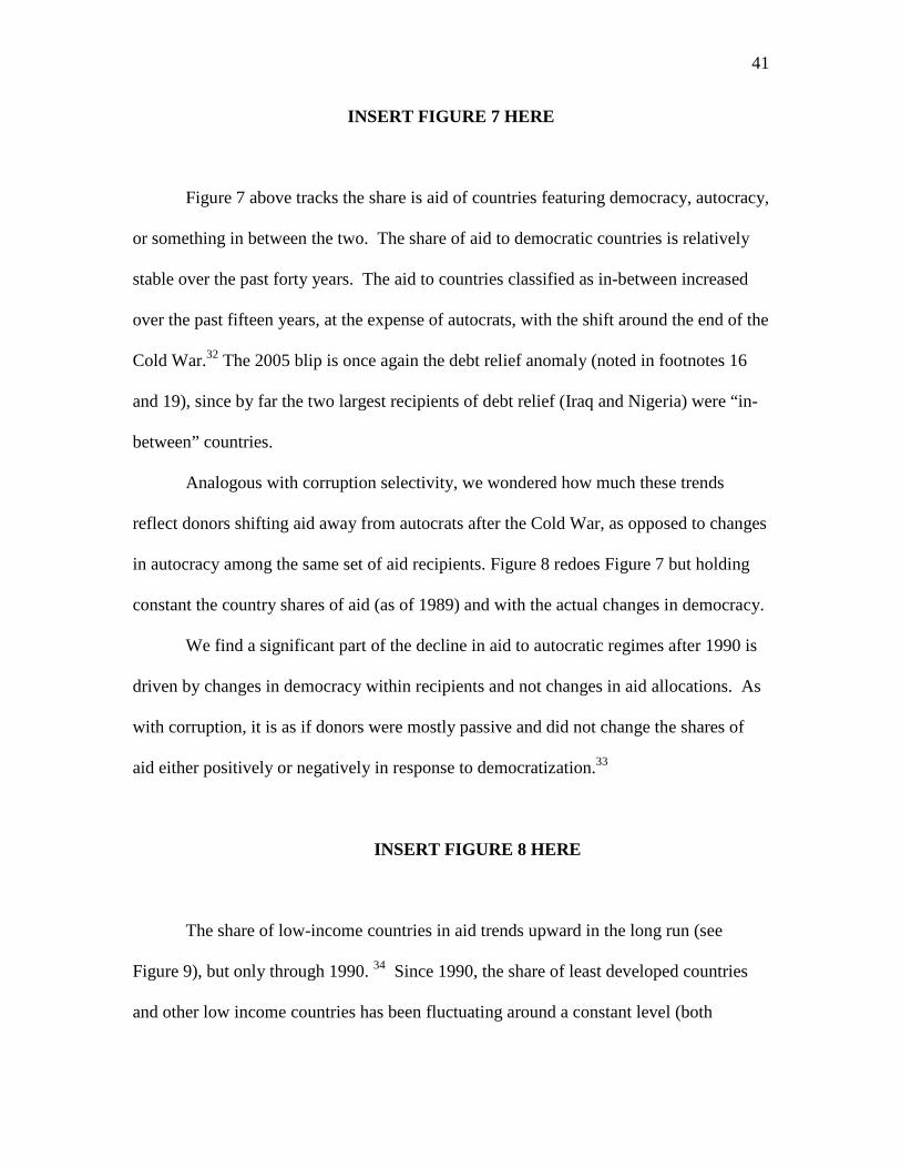
INSERT FIGURE 7 HERE
Figure 7 above tracks the share is aid of countries featuring democracy, autocracy,
or something in between the two. The share of aid to democratic countries is relatively
stable over the past forty years. The aid to countries classified as in-between increased
over the past fifteen years, at the expense of autocrats, with the shift around the end of the
Cold War.32 The 2005 blip is once again the debt relief anomaly (noted in footnotes 16
and 19), since by far the two largest recipients of debt relief (Iraq and Nigeria) were “in-
between” countries.
Analogous with corruption selectivity, we wondered how much these trends
reflect donors shifting aid away from autocrats after the Cold War, as opposed to changes
in autocracy among the same set of aid recipients. Figure 8 redoes Figure 7 but holding
constant the country shares of aid (as of 1989) and with the actual changes in democracy.
We find a significant part of the decline in aid to autocratic regimes after 1990 is
driven by changes in democracy within recipients and not changes in aid allocations. As
with corruption, it is as if donors were mostly passive and did not change the shares of
aid either positively or negatively in response to democratization.33
INSERT FIGURE 8 HERE
The share of low-income countries in aid trends upward in the long run (see
Figure 9), but only through 1990. 34 Since 1990, the share of least developed countries
and other low income countries has been fluctuating around a constant level (both
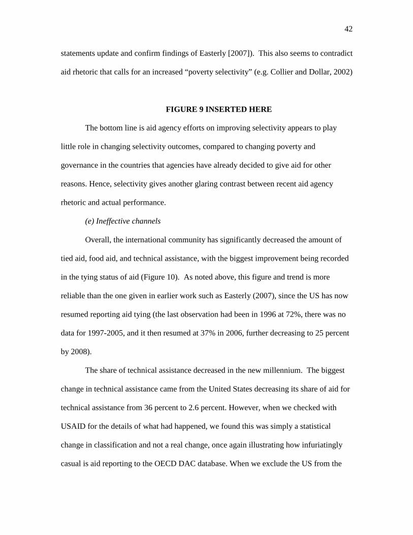
42
statements update and confirm findings of Easterly [2007]). This also seems to contradict
aid rhetoric that calls for an increased “poverty selectivity” (e.g. Collier and Dollar, 2002)
FIGURE 9 INSERTED HERE
The bottom line is aid agency efforts on improving selectivity appears to play
little role in changing selectivity outcomes, compared to changing poverty and
governance in the countries that agencies have already decided to give aid for other
reasons. Hence, selectivity gives another glaring contrast between recent aid agency
rhetoric and actual performance.
(e) Ineffective channels
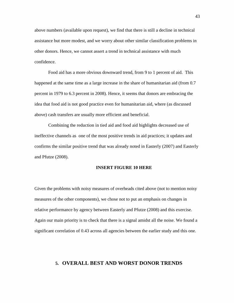
Overall, the international community has significantly decreased the amount of
tied aid, food aid, and technical assistance, with the biggest improvement being recorded
in the tying status of aid (Figure 10). As noted above, this figure and trend is more
reliable than the one given in earlier work such as Easterly (2007), since the US has now
resumed reporting aid tying (the last observation had been in 1996 at 72%, there was no
data for 1997-2005, and it then resumed at 37% in 2006, further decreasing to 25 percent
by 2008).
The share of technical assistance decreased in the new millennium. The biggest
change in technical assistance came from the United States decreasing its share of aid for
technical assistance from 36 percent to 2.6 percent. However, when we checked with
USAID for the details of what had happened, we found this was simply a statistical
change in classification and not a real change, once again illustrating how infuriatingly
casual is aid reporting to the OECD DAC database. When we exclude the US from the
43
above numbers (available upon request), we find that there is still a decline in technical
assistance but more modest, and we worry about other similar classification problems in
other donors. Hence, we cannot assert a trend in technical assistance with much
confidence.
Food aid has a more obvious downward trend, from 9 to 1 percent of aid. This
happened at the same time as a large increase in the share of humanitarian aid (from 0.7
percent in 1979 to 6.3 percent in 2008). Hence, it seems that donors are embracing the
idea that food aid is not good practice even for humanitarian aid, where (as discussed
above) cash transfers are usually more efficient and beneficial.
Combining the reduction in tied aid and food aid highlights decreased use of
ineffective channels as one of the most positive trends in aid practices; it updates and
confirms the similar positive trend that was already noted in Easterly (2007) and Easterly
and Pfutze (2008).
INSERT FIGURE 10 HERE
Given the problems with noisy measures of overheads cited above (not to mention noisy
measures of the other components), we chose not to put an emphasis on changes in
relative performance by agency between Easterly and Pfutze (2008) and this exercise.
Again our main priority is to check that there is a signal amidst all the noise. We found a
significant correlation of 0.43 across all agencies between the earlier study and this one.
5. OVERALL BEST AND WORST DONOR TRENDS
44
Based on the five best practice measures, we give an overall ranking to all donors
calculated by averaging across the percentile rankings of each individual category. When
data is missing, the calculation is performed over those categories with data. In addition
to separating donors into bilateral, multilateral, and UN agencies, we also separate out
donors that are classified as regional banks, non-aid disbursing donors, and donors with
insufficient data as an attempt to compare agencies with the similar missions and
activities. Appendix 7 reports our ‘main’ list of donors (including bilateral, multilateral,
and UN agencies) and also ranks those agencies classified as other donors, agencies
defined as regional banks, donors involved with non-aid disbursements, or agencies with
insufficient data.
(a) Best and Worst Donors
Table 7 below summarizes our best and worst agencies based on our standard
categories, for which we also report average scores.
For the overall scores, we confirm earlier patterns: the UN agencies on average
are worse than the other multilateral agencies and the bilateral agencies, and the
differences are statistically significant. In addition to the usual equality of averages test,
we also conduct a simple binomial test of how likely each category is to be in the bottom
half of the rankings. The test confirms that the UN is below the median at the 2%
significance level; other multilaterals just fail to reach significance for being above the
median of the whole sample at the 5.4% significance level (8 out of 10 were in the top
half); bilaterals are evenly split. The UN agencies’ overall score reflects their extremely
poor performance on overhead and transparency (both significantly worse than average
using the binomial test). The multilaterals’ better performance reflects consistent

45
(although not significant) performance slightly above average on all indicators. The
bilaterals are not significantly different overall on the binomial test, although
interestingly enough they are significantly worse on specialization.
These patterns are roughly in accord in common perceptions – that (1) the UN is
relatively spendthrift and unaccountable, partly predicted by its very diffuse ownership,
(2) the bilaterals’ differential failing is their “plant the flag” syndrome that causes
excessive aid fragmentation, and (3) the multilaterals’ less diffuse ownership than the UN
agencies correctly predicts better performance than the latter.
To pick up on another theme, the Scandinavian donors appear to be average to
mediocre on the overall ranking. All four are below average on specialization and
transparency. Apparently, the reputation of Scandinavia as altruistic is based on the
volume of its aid, and not on following best practices in aid giving.
Finally, we look at extremes. A top rated agency among multilaterals (as well as
among all categories) is the Global Fund. (We will not have much to say about the even
more highly rated Nordic Development Fund, a marginal and even more specialized
agency -- grant financing for climate change projects.) Global Fund scores high on
transparency listing all basic information on staffing and its budget on its website. It
disperses over $5 million aid dollars per employee supporting lower overhead costs.
Global Fund’s aid is highly specialized by sector (by design), dispersing almost 40
percent for basic health and 60 percent to population programs. It is one of the most
selective donors by choosing low income, less corrupt recipients.
We emphasize again that our measure only covers aid practices and NOT aid
effectiveness. For example, the Global Fund could be doing a poor job achieving the best

46
results possible for its aid disbursements and this would NOT be reflected in our
rankings.
The top bilateral donor is the United Kingdom. According to our transparency
criteria, DFID is one of ten agencies fully reporting aid flows to OECD and listing basic
information such as number of staff, administrative costs, salaries and benefits and ODA
budget on its website. DFID also has relatively low overhead costs, dispersing $4.4
million aid dollars per employee and maintaining low administrative costs and salaries
and benefits relative to aid disbursements (2.6% and 1.6% respectively). DFID relies on
more effective channels of aid disbursements, not tying any of its aid and dispersing
relatively little food aid (1.3%). Japan, New Zealand, and Germany also compare
favorably completing the top five best agencies.
The worst bilateral agency is Hellenic Aid ran by Greece’s Development
Cooperation Agency. Greece is not nearly as transparent as the other agencies. It does
not report on the number of staff or its salaries and benefits, even after several rounds of
emails requesting this information. Hellenic Aid scores poorly on selectivity dispersing
87 percent to corrupt countries and less than 12 percent to low income countries. Greece
also disburses a large portion of aid through ineffective channels, tying 62 percent and
allocating 27 percent of aid to technical assistance. Greece is not the only bilateral
agency performing poorly. The bottom eight agencies among our main list of donors are
all bilateral donors: the United States, Portugal, Sweden, Switzerland, Spain, Belgium,
Finland and Greece. Remember that this poor performance relative to the average is all
the more striking since the average behavior is itself unsatisfactory by minimum
standards.

47
The US does badly because of poor performance on selectivity and ineffective
channels – the foreign policy needs of the US superpower and the lobbies for particular
aid channels seem to dominate the politics of American aid.
INSERT TABLE 7 HERE
(b) Overall best and worst trends
The best trend overall is in ineffective channels, where the aid community has
decreased disbursing aid through food aid, tied aid, and (possibly) technical assistance.
Transparency gets a weak honorable mention as showing some signs of
improvement, although we have less confidence that our measures are comparable over
time. When this is combined with our extremely low standards for transparency and with
the emphasis that is placed on transparency from the international aid community, it is
hard to find that much to celebrate on transparency.
Overhead cost data is too spotty and unreliable to make any judgment on overall
improvement or worsening. The other two “best practices” are actually getting worse. .
Since the late 1960s, splintering of aid among recipients, even for the smallest aid
agencies, has gotten progressively worse and seems to have bottomed out only because of
a mathematical lower bound. Since 1980, aid has continued to become more fragmented
and allocated across an increasing number of sectors. Despite all the rhetoric about
reducing fragmentation and improving coordination, there is no sign whatsoever in the
data about any reversal of these counterproductive practices.
A good candidate for worst trend in aid is selectivity, most specifically aid to
corrupt countries (see Figure 6 above). We showed that any changes in aid shares to
corrupt countries are mainly due to changes in country classification, not to any responses

48
from the donors, yet the donors had the option to switch to less corrupt countries and
failed to do so. The corruption outcome reflects the sharpest contradiction between (a
large amount of) rhetoric and symbolic actions (more anti-corruption units in recipient
governments!), on one hand, and actual outcomes, on the other hand.
6. CONCLUSION
This study attempts to measure if donors follow best practices, as outlined in the
Paris Declaration, aid agency documents, and the academic literature, and if agency
behavior is improving. The general answer is no and no, with the exceptions noted above.
Above all, we recognize that the disappointing outcomes on transparency imply
that much better data is needed to gain a more accurate description of the state of aid and
aid agencies. This study repeats the paradoxical complaint of Easterly and Pfutze (2008):
the aid data is of extremely poor quality and coverage, and what data is available shows
very poor practices. Both are signs of a fundamental lack of accountability of the official
aid system to any kind of independent monitoring.
We hope this is the last paper we have to do with the unsatisfactory OECD DAC
database, and that the new Aid Data exercise now becoming available will make possible
a deeper understanding of aid agency behavior. However, there will still likely be an
important role for the OECD DAC as an official enforcer and standardized data collector
for OECD members and multilaterals that have already supposedly agreed to its
requirements and standards. However, the OECD DAC in this paper shows poor
enforcement and low quality standards, and so would itself need major reform.
At the same time, we are not naïve that these efforts alone will bring transparency
and accountability. The political climate must pressure the aid agencies to produce
49
comparable and accurate data on their operations. And it should put even more of a
burden on the aid agencies is to match the reality of aid practices to their rhetoric.

50
1 Official Development Assistance is defined as those flows to recipients on the DAC recipient list and
multilateral development institutions from official agencies granting aid to promote economic welfare and
is concessional in nature with at least a 25% grant element; therefore this excludes private flows.
2For empirical studies supporting the ineffectiveness of foreign aid in achieving development, see ([Boone,
1996], [Svensson, 1999, 2000], [Knack, 2001], [Brumm, 2003], [Ovaska, 2003], [Brautigam and Knack,
2004], [Easterly et al., 2004], [Djankov, Montalvo, and Reynal-Querol, 2006, 2008], [Hartford and Klein,
2005], [Heckelman and Knack, 2008] and [Williamson, 2008]).
3 AidData attempts to gather data on development financing and foreign aid at the project level providing
comprehensive descriptive information across donors and time. We choose to rely on OECD DAC as our
main source of data but do not suspect that our results would be significantly different if we were to use
AidData (Tierney et al., 2011).
4 The main database for official development assistance, OECD DAC, is substantially improved and
updated since Easterly and Pfutze (2008); therefore, the results from this study are not directly comparable.
5 An alternative methodology is to do numeric ranks instead of percentile ranks. These two methodologies
will give different rankings when there are ties and differing sample sizes across indicators or sub-
indicators. We did a sensitivity check of our analysis with numeric ranks and found very similar results
(available on request).
6 From the Creditor Reporting System (CRS), we use information based on All Commitments—All details
and All Disbursements—All details. From the OECD DAC database, I use table “Total Official Flows” and
for bilateral agencies only I look at table 1 (Official and Private Flows, main aggregates) and table 7b
(Tying Status of Bilateral Official Development Assistance).
7 Some recent criticisms of Easterly and Pfutze (2008) (for example,[ BenYishay and Wiebe, 2009]) argue
that by including several measures of employment unfairly weights the index in favor of employment data
51
versus the other subcomponents; therefore, we only include one broad employment measure in the
transparency index.
8 Often agencies would respond with a specific person to contact, in which case we would resend the initial
email to that person. This is the same methodology followed by Easterly and Pfutze (2008).
9 If no disbursement data is available, a simple average is used.
10 The United States had a slightly less than perfect score of 0.99 (the MCC received a 0.5 for ODA data
availability) but is included because it is so close to perfect.
11 We use official development financing defined as the sum of ODA plus nonconcessional loans for the
multilaterals agencies because the development banks tend to support other purposes besides granting aid;
therefore, to gain a more accurate description of overhead costs ODF is substituted in this analysis only.
12 We are grateful to one of the referees for reminding us of the Global Fund example.
13 This includes Norway, Finland, UNDP, Australia admin, Portugal staff, Italy salaries/benefts and admin,
Sweden salaries/benefits, Switzerland salaries/benefits, AsDB salaries/benefits and admin, Denmark staff,
UNRWA salaries/benefits, CARDB salaries/benefits.
14 If an agency is missing data in a category, the average percent rank is calculated by averaging the
categories where data is available.
15 The gain from specialization under a division of labor as a means of social cooperation is one of the
oldest principles in economics (Smith, 1776).
16 This is done by calculating the aid shares and then sum the squares of these values.
17 Two bilateral donors stand out for being much less fragmented than the others by both country and
sector: Austria and Italy (see Appendix Table 4). These two countries had not been standouts in Easterly
and Pfutze (2008) on fragmentation, and in fact their fragmentation outlier in our data turns out to be a
fluke. They both gave a large share of their aid as debt relief to Iraq (a one-time event) in 2008, which
made for high concentration both by sector (debt relief) and by country (Iraq). This episode shows the
importance of monitoring performance over several years as well as carefully checking outliers.
52
18 Results available on request.
19 The composite score is calculated as: 0.25 X percentile rank(share not going to corrupt countries) + 0.25
X percentile rank(shares going to free countries) + 0.50 X percentile rank(shares going to low income
countries).
20 For CariBank shares, we also use data on democracy rankings from Przeworski et al. (1997, 2000)
(updated in Cheibub et al., 2010), which is a dichotomous rankings, and data on corruption rankings from
Transparency International's CPI (2008). Countries receiving scores less than 3 are considered corrupt. We
do so in order to not bias the rankings on CariBank due to significant missing data for most Caribbean
countries.
21 Other outcomes reflect quirks previously pointed out (footnote 16) – Italy and Austria do badly because
of their one-time large debt relief transfer to Iraq -- a corrupt, middle income country.
22 We recognize that food aid is often given for humanitarian purposes as opposed to development
purposes; however, it is still viewed as an inefficient and donor driven means of providing assistance (see
below).
23 We have investigated the changes in USAID in reporting and non-reporting. Although we have had
trouble getting a straight answer from USAID on this, one factor appears to have been a change in
measurement and reporting systems within USAID after 1996, and again after 2005, so the motivation for
non-reporting was not automatically political.
24 To match our current methodology, we recalculate EP’s overhead costs index from the original,
averaging only across permanent international employment, administrative costs, salaries and benefits, and
ODA disbursements.
25 Easterly and Pfutze (2008) heavily criticized EBRD in their original analysis.
26 http://www.aidtransparency.net/
27 http://www.publishwhatyoufund.org/
53
28 http://www.aiddata.org/home/index
29 The 36 sectoral classifications are defined by OECD and are: I.1.a. Education, Level Unspecified; I.1.b.
Basic Education; I.1.c. Secondary Education; I.1.d. Post-Secondary Education; I.2.a. Health, General; I.2.b.
Basic Health; I.3. Population Pol./Progr. & Reproductive Health; I.4. Water Supply & Sanitation; I.5.a.
Government & Civil Society-general; I.5.b. Conflict, Peace & Security; I.6. Other Social Infrastructure &
Services; II.1. Transport & Storage; II.2. Communications; II.3. Energy; II.4. Banking & Financial
Services; II.5. Business & Other Services; III.1.a. Agriculture; III.1.b. Forestry; III.1.c. Fishing; III.2.a.
Industry; III.2.b. Mineral Resources & Mining; III.2.c. Construction; III.3.a. Trade Policies & Regulations;
III.3.b. Tourism; IV.1. General Environment Protection; IV.2. Other Multisector; VI.1. General Budget
Support; VI.2. Dev. Food Aid/Food Security Ass.; VI.3. Other Commodity Ass.; VII. Action Relating to
Debt; VIII.1. Emergency Response; VIII.2. Reconstruction Relief & Rehabilitation; VIII.3. Disaster
Prevention & Preparedness; IX. Administrative Costs of Donors; X. Support to NGOs; XI. Refugees in
Donor Countries.
30 The median Herfindahl is calculated across all donors for which full data is available from 1967-2008.
31 We include the median values as well as the shares of aid for all donors.
32 In an earlier version of the paper, we used Freedom House classifications of “free,” “unfree” and “partly
free.” The results on democracies/free countries were similar. Polity IV shows more of a shift from
autocracies to in-between after the end of the Cold War than does Freedom House.
33 Of course, the donors’ commitment to democracy would get more support if the donors get credit for
inducing countries to shift away from autocracy (or other improvements in governance). We cannot address
that very large issue in this paper, but the results from the literature on donors’ effect on democracy do not
support a positive donor role. Knack (2004) finds no association between aid and the change in democracy.
Djankov, Montalvo and Reynal-Querol (2006, 2008) found a causal negative relationship from aid to the
change in democracy. Of course, if donors got credit for an improvement in democracy, then should they
also get (dis)credit for the worsening of corruption?
34 These results are similar to those found in Easterly (2007) and Easterly and Pfutze (2008).
54
REFERENCES
Acemoglu, D., Johnson, S., Robinson, J.A., & Yared, P. (2008). Income and Democracy,
American Economic Review, 98(3), 808-842.
AidData Database. (2010). http://www.aiddata.org
Bauer, P.T. (2000). From Subsistence to Exchange. Princeton: Princeton University
Press.
BenYishey, A. & Wiebe, F.S. (2009). Can Aid Agencies Follow Best Practices? An
Assessment of the Millennium Challenge Corporation’s Aid Practices Based on Easterly
& Pfutze (2008). Millennium Challenge Corporation Working Paper.
Birdsall, N., Kharas, H., & Mahgoub, A. (2010). A Quality of Development Assistance
Index. Center for Global Development and the Wolfensohn Center for Development at
the Brookings Institution.
Boone, P. (1996). Politics and the Effectiveness of Foreign Aid. European Economic
Review, 40 (2), 289-329.
Brautigam, D. & Knack, S. (2004). Foreign Aid, Institutions and Governance in Sub-
Saharan Africa. Economic Development and Cultural Change 52 (2), 255–86.
Brumm, H.J. (2003). Aid, policies and growth: Bauer was right. Cato Journal, 23 (2),
167-74.
Center for Global Development. (2007). Measuring the Quality of Development
Assistance: Discussion Draft. Washington, DC: Center for Global Development.
Cheibub, J. A., Gandhi, J., & Vreeland, J. R. (2010). Democracy and Dictatorship
Revisited. Public Choice, 143 (1-2), 67-101.

55
Collier, P. & Dollar, D. (2002). Aid Allocation and Poverty Reduction. European
Economic Review, 46 (8), 1475-1500.
Commission for Africa. (2005). Our Common Interest: Report of the Commission for
Africa. London, UK.
Djankov, S., Montalvo, J. G., & Reynal-Querol, M. (2006). Does Foreign Aid Help?
Cato Journal, 26 (1), 1-28.
Djankov, S., Montalvo, J.G. & Reynal-Querol, M. (2008). The curse of aid. Journal of
Economic Growth, 13 (3), 169-194.
Dollar, D. & Levin, V. (2006). The Increasing Selectivity of Foreign Aid, 1984 – 2003.
World Development, 34 (12), 2034-46.
Easterly, W. (2001). The Elusive Quest for Growth: Economists’ Adventures and
Misadventures in the Tropics. Cambridge, MA: MIT Press.
-----. (2006). The White Man’s Burden: Why the West’s Efforts to Aid the Rest Have
Done So Much Ill and So Little Good. New York, NY: Penguin Press.
-----. (2007). “Are Aid Agencies Improving?” Economic Policy 22(52): 633-678.
Easterly, W., Levine, R. & Roodman, D. (2004). New Data, New Doubts: A
Comment on Burnside and Dollar’s ‘Aid, Policies, and Growth. American
Economic Review, 94 (3), 774-780.
Easterly, W. & Pfutze, T. (2008). Where Does the Money Go? Best and
Worst Practices in Foreign Aid. Journal of Economic Perspectives, 22 (2), 29-52.
Frot, E. & Santiso, J. (2009). Development Aid and Portfolio Funds: Trends, Volatility
and Fragmentation. OECD Development Centre Working Papers #275.

56
Hartford, T. & Klein, M. (2005). Aid and the Resource Curse. The World Bank Group
No. 291.
Heckelman, J. & Knack, S. (2008). Foreign Aid and Market-Liberalizing
Reform. Economica, 75 (299), 542-548.
IMF, and World Bank. (2005). Global Monitoring Report 2005: Millennium
Development Goals: From Consensus to Momentum. Washington, DC: World Bank.
IMF, and World Bank. (2006). Global Monitoring Report 2006: Strengthening Mutual
Accountability— Aid, Trade, and Governance. Washington, DC: World Bank.
IMF, and World Bank. (2010). Global Monitoring Report 2010: The MDGs after the
Crisis. Washington, DC: World Bank.
International Aid Transparency Initiative. (http://www.aidtransparency.net)
International Country Risk Guide. (2008). Corruption Index. The PRS Group, Syracuse,
NY.
Knack, S. (2001). Aid Dependence and the Quality of Governance: Cross-Country
Empirical Tests. Southern Economic Journal, 68(2), 310–29.
Knack, S. (2004). Does Foreign Aid Promote Democracy? International Studies
Quarterly, 48 (1), 251–266
Knack, S. & Rahman, A. (2007). Donor Fragmentation and Bureaucratic Quality in Aid
Recipients. Journal of Development Economics, 83 (1), 176-197.
Knack, S., Rogers, F.H., & Eubank, N. (2010). Aid Quality and Donor Rankings. World
Bank Policy Research Working Paper No. 5290.
Marshall, M. G., & Jaggers, K. (2004). Polity IV Project: political regime characteristics
and transitions, 1800–2004 dataset users manual manuscript, Center for Global Policy
57
School of Public Policy, George Mason University, Arlington, VA. Dataset available at:
http://www.cidcm.umd.edu/polity.
Martens, B., Mummert, U., Murrell, P., & Seabright, P. (2002). The Institutional
Economics of Foreign Aid. Cambridge University Press.
Moyo, D. (2009). Dead Aid: Why Aid is Not Working and How There is a Better Way for
Africa. NY, NY: Farrar, Straus and Giroux.
Ovaska, T. (2003). The Failure of Development Aid. Cato Journal, 23 (2), 175-88.
Persson, T. & Tabellini, G. (2006). Democracy and development: the devil in the details.
American Economic Review Papers and Proceedings, 99 (2), 319–324.
Przeworski, A. & Limongi, F. (1997). Modernization: Theory and Facts. World Politics
49 (2), 155-183.
Przeworski, A., Alvarez, M., Cheibub, J.A., & Limongi, F. (2000). Democracy and
Development: Political Institutions and Material Well-being in the World, 1950-1990.
New York, NY: Cambridge University Press.
Publish What You Fund (2010). Aid Transparency Assessment 2010. London, Publish
What You Fund.
OECD (2008). 2008 Survey on Monitoring the Paris Declaration: Effective Aid by
2010? Paris, OECD
(www.oecd.org/dac/hlfsurvey <http://www.oecd.org/dac/hlfsurvey>).
OECD. (2003). 2003 Rome Declaration on Harmonization. Rome, OECD.
OECD. (2005). 2005 Paris Declaration on Aid Effectiveness. Paris, OECD.
OECD. (2008). 2008 Accra High Level Forum on Aid Effectiveness. Accra, OECD.

58
OECD DAC Database.
(http://www.oecd.org/document/33/0,2340,en_2649_34447_36661793_1_1_1_1,00.html
#dac)
Roodman, D. (2006 and 2009). An Index of Donor Performance. Center for Global
Development Working Paper Number 67. Data set updated 2009.
Smith, A. (1991, [1776]). The Wealth of Nations. New York, NY: Alfred A. Knopf,
Everyman’s Library.
Svensson, J. (1999). Aid and Growth: Does Democracy Matter? Economics & Politics,
11(3), 275-297.
Svensson, J. (2000). Foreign Aid and Rent-Seeking. Journal of International Economics
51:437-461.
Tierney, M.J., Nielson, D., Hawkins, D. G., Roberts, J.T., Findley, M.G., Powers, R.M.,
Parks, B. Wilson, S., & Hicks, R.L. (2011). More Dollars than Sense? Addressing
Knowledge Scarcity in Development Finance. World Development Journal, Special
Issue.
Transparency International. (2008). Corruption Perception Index 2008. Berlin, Germany:
Transparency International.
United Nations Development Program. (2005). Human Development Report 2005:
International Co- operation at a Crossroads: Aid, Trade, and Security in an Unequal
World. New York, NY: United Nations Development Program.
United Nations Millennium Project. (2005). Investing in Development: A Practical Plan
to Achieve the Millennium Development Goals (Main Report). United Nations: New
York.
59
Williamson, C. R. (2008). Foreign Aid and Human Development: The Impact of
Foreign Aid to the Health Sector. Southern Economic Journal, 75(1): 188-207.
World Bank. (1998). Assessing Aid. Washington D.C.: World Bank.
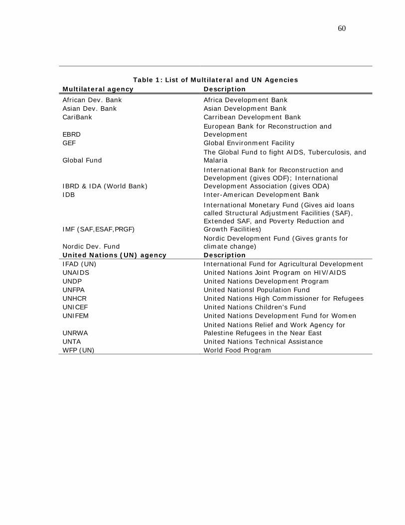
60
Table 1: List of Multilateral and UN Agencies
Multilateral agency Description African Dev. Bank Africa Development Bank Asian Dev. Bank Asian Development Bank CariBank Carribean Development Bank
EBRD European Bank for Reconstruction and Development
GEF Global Environment Facility
Global Fund The Global Fund to fight AIDS, Tuberculosis, and Malaria
IBRD & IDA (World Bank)
International Bank for Reconstruction and Development (gives ODF); International Development Association (gives ODA)
IDB Inter-American Development Bank
IMF (SAF,ESAF,PRGF)
International Monetary Fund (Gives aid loans called Structural Adjustment Facilities (SAF), Extended SAF, and Poverty Reduction and Growth Facilities)
Nordic Dev. Fund Nordic Development Fund (Gives grants for climate change)
United Nations (UN) agency Description IFAD (UN) International Fund for Agricultural Development UNAIDS United Nations Joint Program on HIV/AIDS UNDP United Nations Development Program UNFPA United Nationsl Population Fund UNHCR United Nations High Commissioner for Refugees UNICEF United Nations Children's Fund UNIFEM United Nations Development Fund for Women
UNRWA United Nations Relief and Work Agency for Palestine Refugees in the Near East
UNTA United Nations Technical Assistance WFP (UN) World Food Program
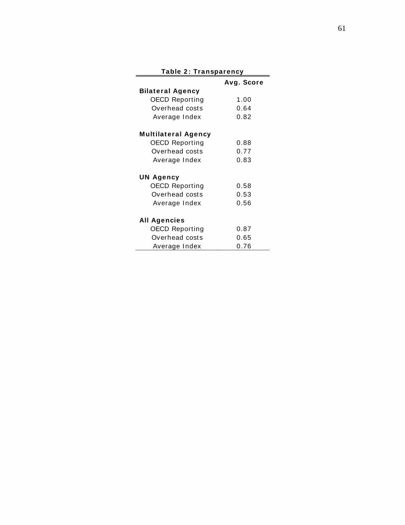
61
Table 2: Transparency Avg. Score Bilateral Agency
OECD Reporting 1.00 Overhead costs 0.64 Average Index 0.82
Multilateral Agency
OECD Reporting 0.88 Overhead costs 0.77 Average Index 0.83
UN Agency
OECD Reporting 0.58 Overhead costs 0.53 Average Index 0.56
All Agencies
OECD Reporting 0.87 Overhead costs 0.65 Average Index 0.76
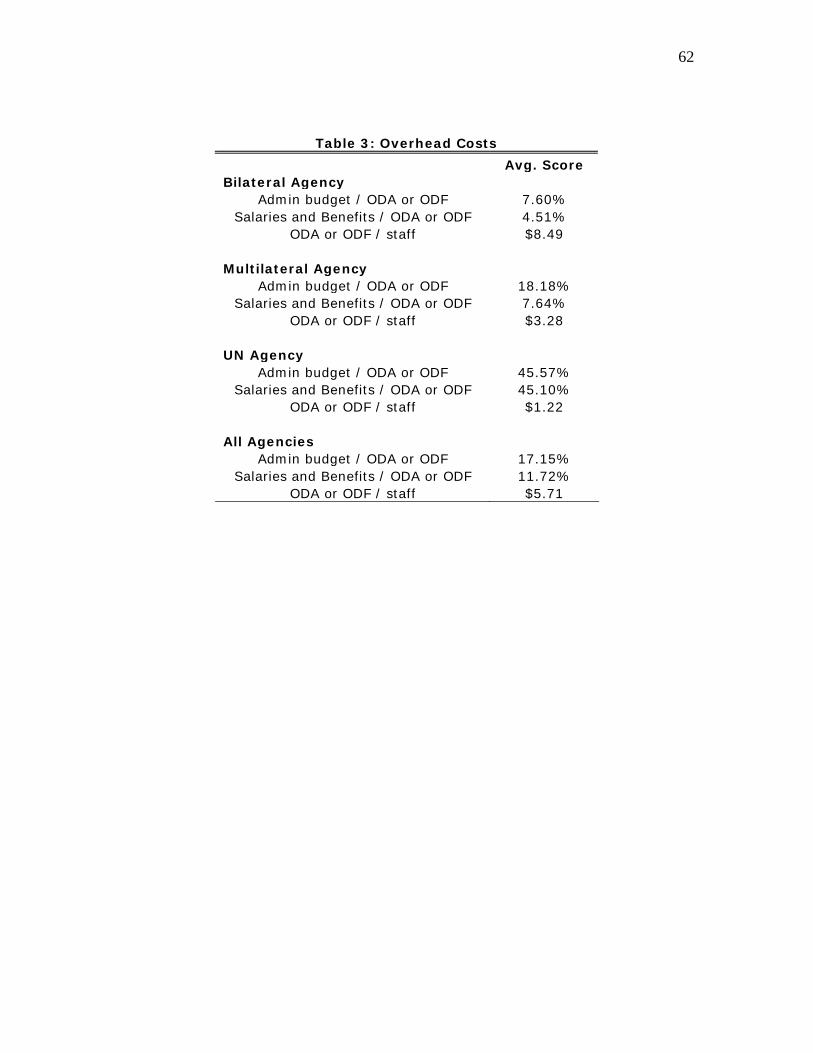
62
Table 3: Overhead Costs Avg. Score Bilateral Agency
Admin budget / ODA or ODF 7.60% Salaries and Benefits / ODA or ODF 4.51%
ODA or ODF / staff $8.49
Multilateral Agency Admin budget / ODA or ODF 18.18%
Salaries and Benefits / ODA or ODF 7.64% ODA or ODF / staff $3.28
UN Agency
Admin budget / ODA or ODF 45.57% Salaries and Benefits / ODA or ODF 45.10%
ODA or ODF / staff $1.22 All Agencies
Admin budget / ODA or ODF 17.15% Salaries and Benefits / ODA or ODF 11.72%
ODA or ODF / staff $5.71

63
Figure 1: Share of Gross ODA by Donor 2008
Note: Data from OECD DAC.
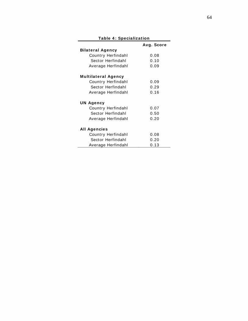
64
Table 4: Specialization
Avg. Score Bilateral Agency
Country Herfindahl 0.08 Sector Herfindahl 0.10
Average Herfindahl 0.09
Multilateral Agency Country Herfindahl 0.09 Sector Herfindahl 0.29
Average Herfindahl 0.16
UN Agency Country Herfindahl 0.07 Sector Herfindahl 0.50
Average Herfindahl 0.20 All Agencies
Country Herfindahl 0.08 Sector Herfindahl 0.20
Average Herfindahl 0.13
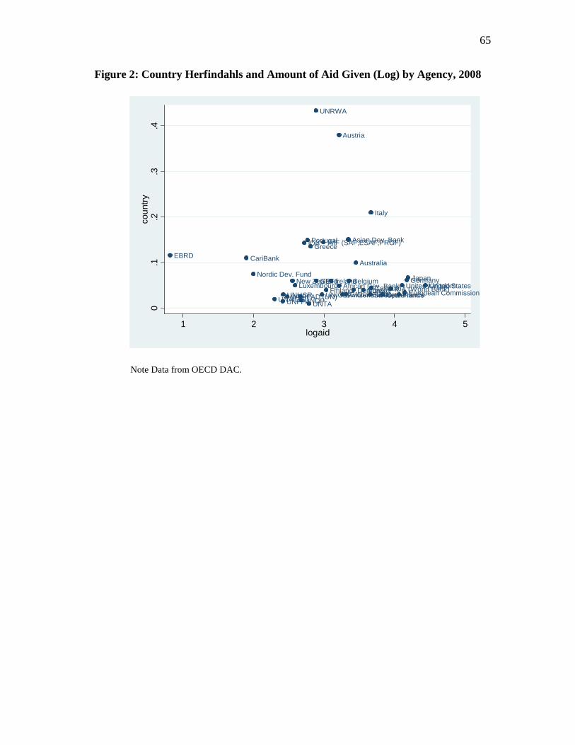
65
Figure 2: Country Herfindahls and Amount of Aid Given (Log) by Agency, 2008
African Dev. Bank
Asian Dev. Bank
Australia
Austria
BelgiumCanada
CariBank
Denmark
EBRD
European CommissionFinlandFrance
GEF Germany
Global Fund
Greece
IDA (World Bank)
IDB
IFAD (UN)
IMF (SAF,ESAF,PRGF)
Ireland
Italy
JapanLuxembourg
Netherlands
New ZealandNordic Dev. Fund
Norway
Portugal
SpainSwedenSwitzerlandUNAIDSUNDPUNFPAUNHCR UNICEF
United KingdomUnited States
UNRWA
UNTAWFP
0.1
.2.3
.4co
untry
1 2 3 4 5logaid
Note Data from OECD DAC.
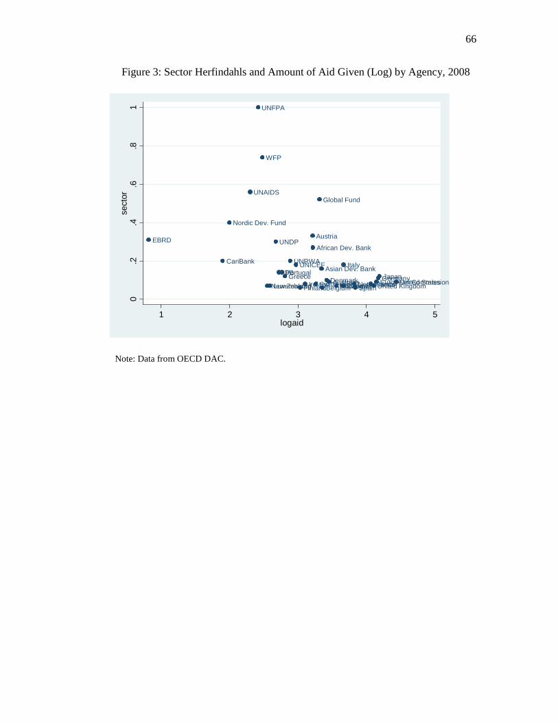
66
Figure 3: Sector Herfindahls and Amount of Aid Given (Log) by Agency, 2008
African Dev. Bank
Asian Dev. Bank
Australia
Austria
BelgiumCanada
CariBank
Denmark
EBRD
European CommissionFinland France
Germany
Global Fund
GreeceIDB
Ireland
Italy
JapanLuxembourg NetherlandsNew Zealand
Nordic Dev. Fund
Norway
Portugal
SpainSwedenSwitzerland
UNAIDS
UNDP
UNFPA
UNICEF
United KingdomUnited States
UNRWA
WFP
0.2
.4.6
.81
sect
or
1 2 3 4 5logaid
Note: Data from OECD DAC.

67
Table 5: Selectivity Avg. Score Bilateral Agency
Share to Noncorrupt 39.13% Share to Free 23.32% Share to Poor 38.43%
Multilateral Agency
Share to Noncorrupt 41.85% Share to Free 25.89% Share to Poor 56.57%
UN Agency
Share to Noncorrupt 35.53% Share to Free 21.11% Share to Poor 50.18%
All Agencies
Share to Noncorrupt 39.01% Share to Free 23.46% Share to Poor 45.15%
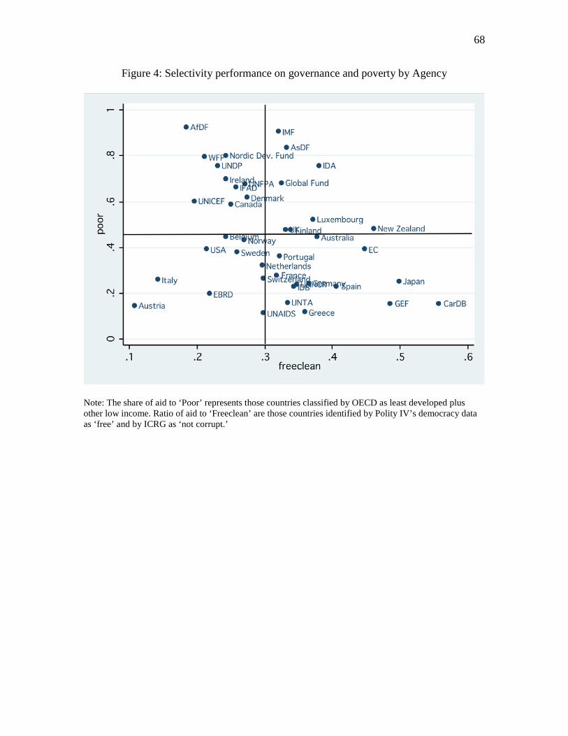
68
Figure 4: Selectivity performance on governance and poverty by Agency
Note: The share of aid to ‘Poor’ represents those countries classified by OECD as least developed plus other low income. Ratio of aid to ‘Freeclean’ are those countries identified by Polity IV’s democracy data as ‘free’ and by ICRG as ‘not corrupt.’
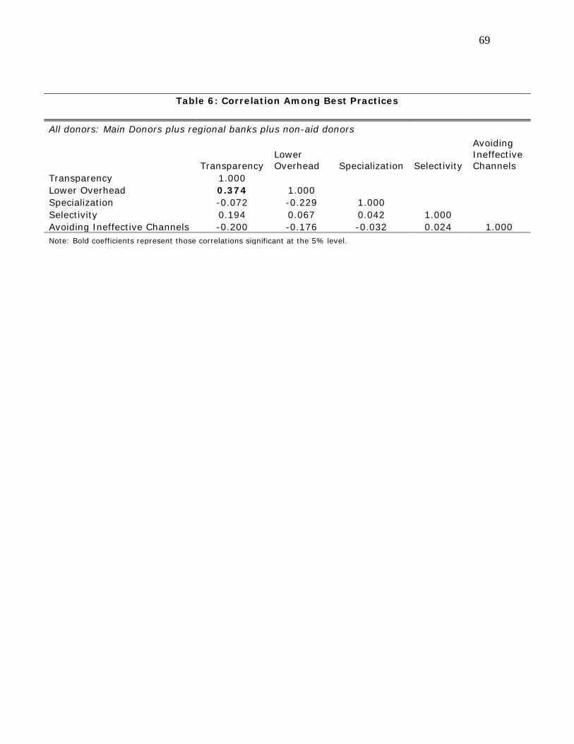
69
Table 6: Correlation Among Best Practices All donors: Main Donors plus regional banks plus non-aid donors
Transparency Lower Overhead Specialization Selectivity
Avoiding Ineffective Channels
Transparency 1.000 Lower Overhead 0.374 1.000 Specialization -0.072 -0.229 1.000 Selectivity 0.194 0.067 0.042 1.000 Avoiding Ineffective Channels -0.200 -0.176 -0.032 0.024 1.000 Note: Bold coefficients represent those correlations significant at the 5% level.
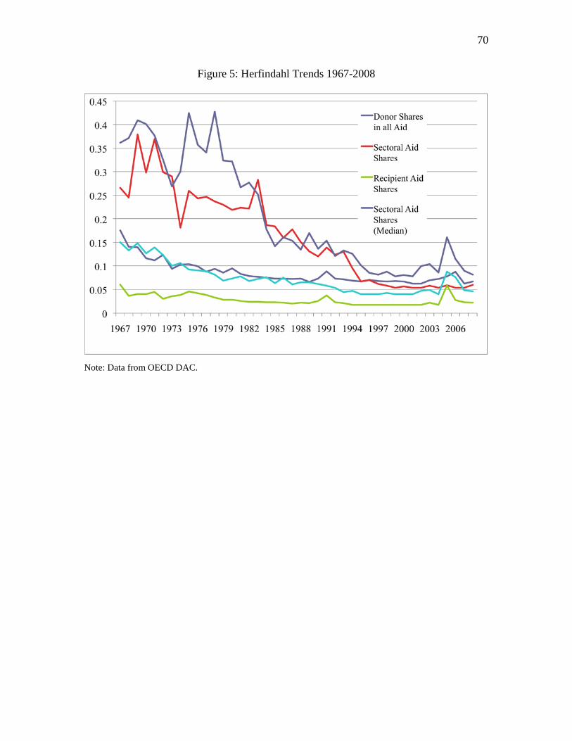
70
Figure 5: Herfindahl Trends 1967-2008
Note: Data from OECD DAC.
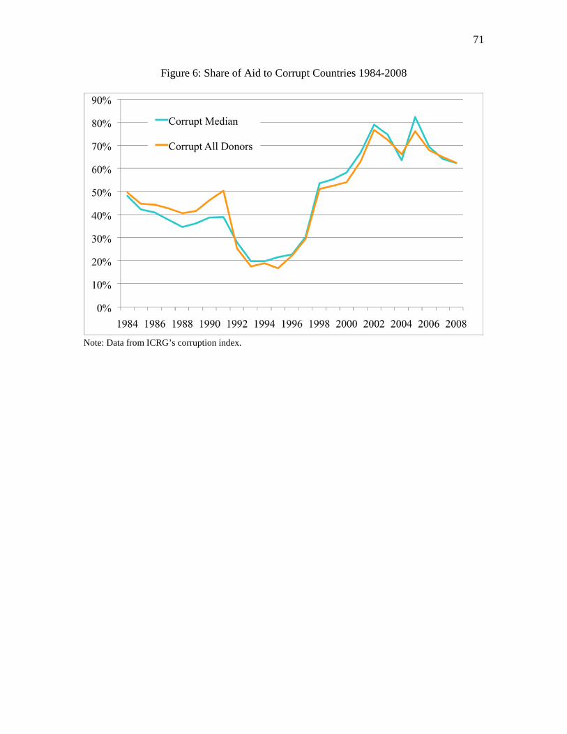
71
Figure 6: Share of Aid to Corrupt Countries 1984-2008
Note: Data from ICRG’s corruption index.
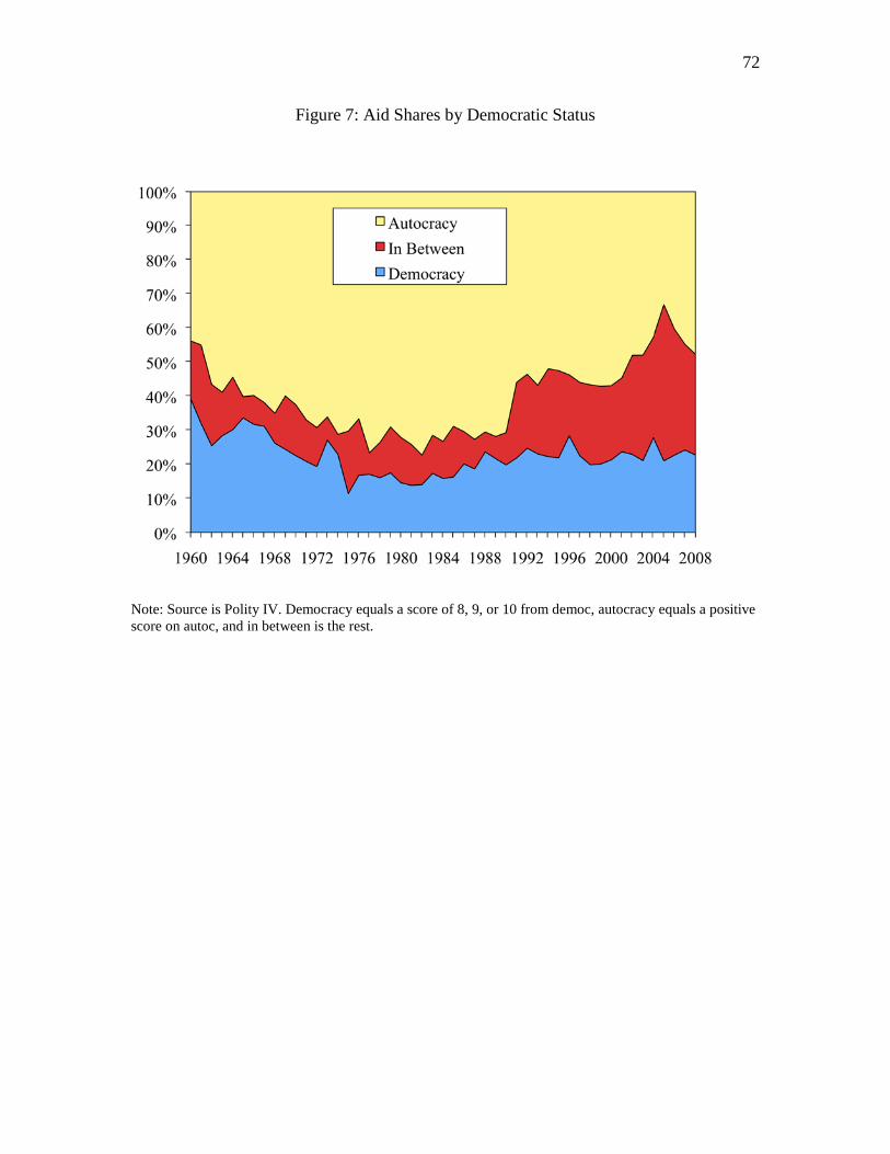
72
Figure 7: Aid Shares by Democratic Status
Note: Source is Polity IV. Democracy equals a score of 8, 9, or 10 from democ, autocracy equals a positive score on autoc, and in between is the rest.

73
Figure 8: Aid Shares by Democratic Status if Recipient Country Shares were Unchanged from 1990
Note: Source is Polity IV. Democracy equals a score of 8, 9, or 10 from democ, autocracy equals a positive score on autoc, and in between is the rest.
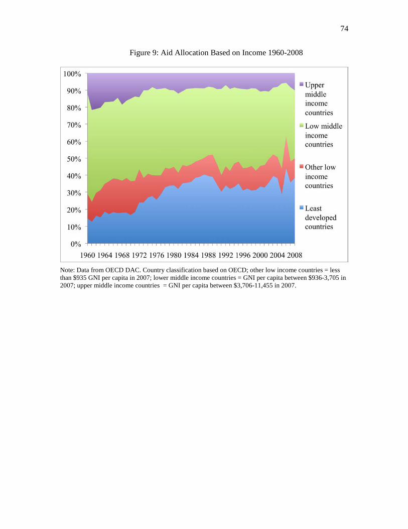
74
Figure 9: Aid Allocation Based on Income 1960-2008
Note: Data from OECD DAC. Country classification based on OECD; other low income countries = less than $935 GNI per capita in 2007; lower middle income countries = GNI per capita between $936-3,705 in 2007; upper middle income countries = GNI per capita between $3,706-11,455 in 2007.

75
Figure 10: Share of Aid to Ineffective Channels 1979-2008
Note: Data from OECD DAC.

76
Table 7: Ranking of Donor Agencies 2008 Average Percentile Ranking (higher rank means better practice)
Donor
Rank of Overall Percent
Rank Specia- lization
Selec-tivity
Ineffective Channels
Over- head
Trans- parency
Avg. of Percent Ranks
Bilateral Agency United Kingdom 5 34% 80% 70% 83% 82% 70% Japan 6 54% 71% 41% 95% 57% 63% New Zealand 8 41% 95% 63% 44% 66% 62% Germany 9 51% 44% 59% 98% 57% 62% Ireland 11 44% 61% 85% 78% 36% 61% Australia 12 56% 78% 4% 90% 66% 59% Netherlands 13 17% 32% 67% 93% 82% 58% Luxembourg 14 37% 85% 81% 17% 61% 56% Norway 15 24% 37% 89% 100% 20% 54% European Commission 16 39% 83% 22% 59% 66% 54% Denmark 19 44% 66% 74% 39% 36% 52% Italy 22 80% 2% 56% 73% 36% 50% Canada 23 27% 51% 7% 76% 82% 49% Austria 24 95% 0% 48% 32% 66% 48% France 26 17% 41% 44% 46% 82% 46% United States 28 44% 12% 37% 54% 80% 45% Portugal 29 68% 34% 0% 85% 36% 45% Sweden 30 12% 20% 93% 61% 27% 42% Switzerland 32 17% 22% 78% 49% 36% 40% Spain 34 10% 49% 19% 80% 36% 39% Finland 36 12% 68% 15% 71% 20% 37% Belgium 37 29% 27% 33% 41% 55% 37% Greece 39 61% 7% 11% 27% 36% 28%
Average 21 40% 46% 48% 65% 53% 50%
Multilateral Agency Nordic Dev. Fund 1 85% 76% 88% 66% 79% Global Fund 2 88% 88% 68% 64% 77% Asian Dev. Bank 3 73% 90% 51% 82% 74% African Dev. Bank 4 78% 59% 66% 82% 71% IDA (World Bank) 10 7% 100% 56% 82% 61% IDB 18 63% 15% 52% 63% 66% 52% IMF (SAF,ESAF,PRGF) 20 66% 93% 12% 30% 50% EBRD 21 83% 10% 24% 82% 50% CariBank 31 71% 39% 22% 36% 42% GEF 40 29% 46% 5% 9% 22% Average 15 64% 61% 52% 46% 60% 58%
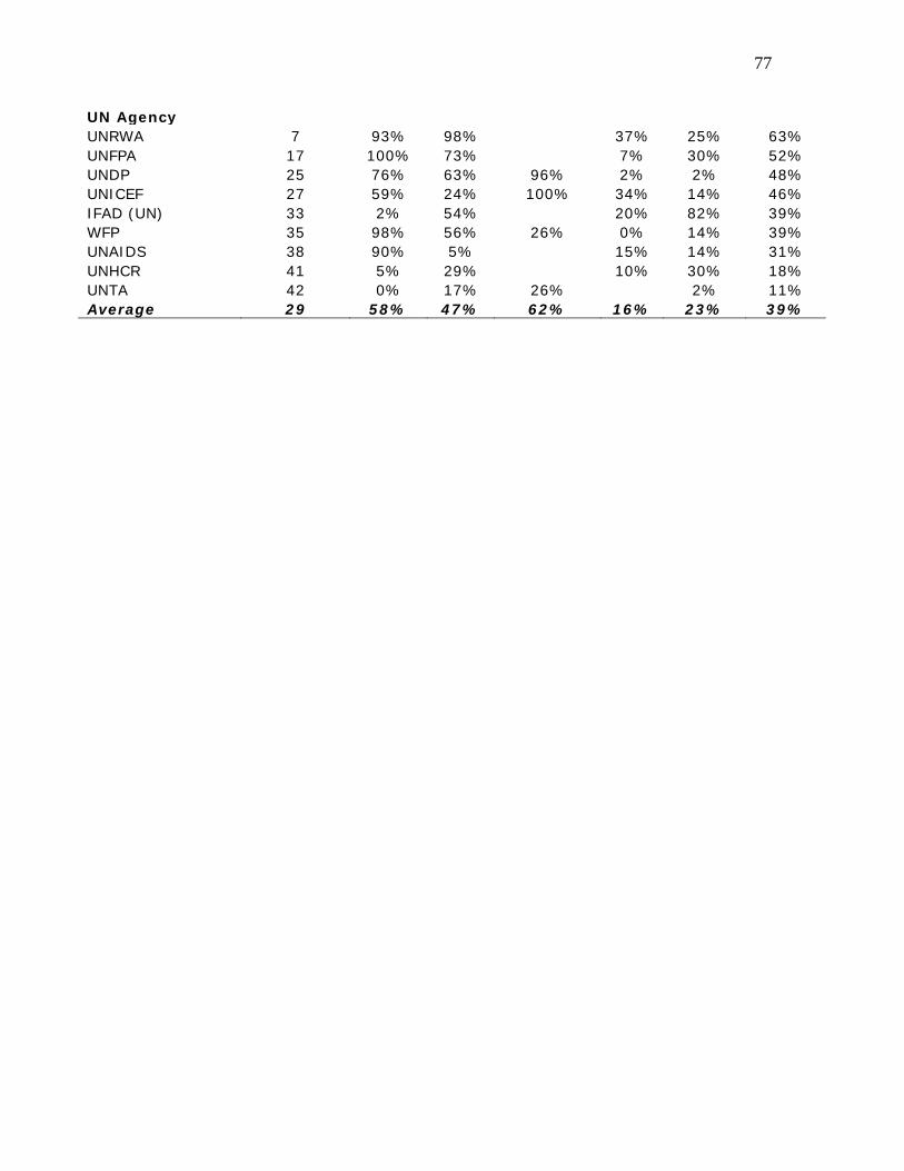
77
UN Agency UNRWA 7 93% 98% 37% 25% 63% UNFPA 17 100% 73% 7% 30% 52% UNDP 25 76% 63% 96% 2% 2% 48% UNICEF 27 59% 24% 100% 34% 14% 46% IFAD (UN) 33 2% 54% 20% 82% 39% WFP 35 98% 56% 26% 0% 14% 39% UNAIDS 38 90% 5% 15% 14% 31% UNHCR 41 5% 29% 10% 30% 18% UNTA 42 0% 17% 26% 2% 11% Average 29 58% 47% 62% 16% 23% 39%

78