Embed Size (px)
Citation preview
Making Sense of Statistics in Clinical Trial Reports
Stuart J. Pocock, PhD*, John JV McMurray, MD† and Tim J. Collier, MSc*
* Department of Medical Statistics, London School of Hygiene & Tropical Medicine† Institute of Cardiovascular and Medical Sciences, University of Glasgow
Corresponding Author: Stuart Pocock, Department of Medical Statistics, London
School of Hygiene & Tropical Medicine, Keppel Street, London, WC1E 7HT, UK.
email: [email protected].
Declarations: There are no disclosures for any authors - this is an educational
article.
AbstractThis article is a practical guide to the essentials for statistical analysis and reporting
of randomised clinical trials (RCTs). It is the first in a series of four educational
articles on statistical issues for RCTs, the others being on statistical controversies in
RCT reporting and interpretation, the fundamentals of design for RCTs, and
statistical challenges in the design and monitoring of RCTs. Here we concentrate on
displaying results in Tables and Figures, estimating treatment effects, expressing
uncertainty using confidence intervals and using P-values wisely to assess the
strength of evidence for a treatment difference. The various methods and their
interpretation are illustrated by recent, topical cardiology trial results.
Word Count: 6552
1

AbbreviationsRCT: Randomised Clinical Trial; CI: Confidence Interval; CABG: Coronary Artery
Bypass Grafting; PCI: Percutaneous Coronary Intervention; ANCOVA: Analysis of
Covariance; SBP: Systolic Blood Pressure.
2

Introduction
Statistical methods are an essential part of virtually all published medical research.
Yet a sound understanding of statistical principles is often lacking amongst
researchers and journal readers, with cardiologists no exception to this limitation. In
this series of four articles in consecutive issues of JACC, our aim is to illuminate
readers on statistical matters, our focus being on the design and reporting of
randomised controlled trials (RCTs).
After these first two articles on statistical analysis and reporting of clinical trials,
two subsequent articles will focus on statistical design of randomised trials and
also data monitoring. The principles are brought to life by real topical examples,
and besides laying out the fundamentals we also tackle some common
misperceptions and some ongoing controversies that affect the quality of research
and its valid interpretation.
Constructive critical appraisal is an art continually exercised by journal editors,
reviewers and readers, and is also an integral part of good statistical science which
we hope to encourage via our choice of examples. Throughout this series we
concentrate on concepts rather than providing formulae or calculation techniques,
therefore ensuring that readers without a mathematical or technical background can
grasp the essential messages we wish to convey.
The Essentials of Statistical Analysis
The four main steps in data analysis are:
1) displaying results in Tables and Figures
2) quantifying any associations (eg. estimates of treatment differences in patient
outcomes)
3) expressing the uncertainty in those associations by use of confidence
intervals
4) assessing the strength of evidence that the association is “real”, ie. more than
could be expected by chance, by using P-values (statistical tests of
significance).
3
The next few sections take us through these essentials, illustrated by examples from
randomised trials. The same principles broadly apply to observational studies, with
one major proviso: in non-randomised studies one cannot readily infer that any
association not due to chance indicates a causal relationship.
Also next week we discuss some of the more challenging issues when reporting
clinical trials.
Displaying Results in Tables and Figures
Table of Baseline Data
The first Table in any clinical trial report shows patients’ baseline characteristic by
treatment group. Which characteristics to present will vary by trial but will almost
always include key demographic variables, related medical history and other
variables that might be strongly related to the trial endpoints. See Table 1 as an
example from the PARADIGM-HF trial (1). Note categorical variables are shown as
number (%) by group. For quantitative variables there are two common options:
means (and standard deviations) or median (and inter-quartile range). For variables
with a skew distribution the latter is often preferable, geometric means being another
option. In addition some such variables may be formed into categories eg. age
groups, specific (abnormal) cut-offs for biochemical variables. This (and indeed any
other Table) should include the total number of patients per group at the top. In order
to limit the size of Table 1, a third column showing results for all groups combined
may be unnecessary. Also for some binary variables eg. gender, disease history only
one category eg. male, diabetic, need be shown. Unnecessary precision in reporting
means or percentages should be avoided with one decimal place usually being
sufficient. The use of P values in baseline tables should also be avoided since in the
setting of a well conducted randomised controlled trial any differences at baseline
must have arisen by chance.
4
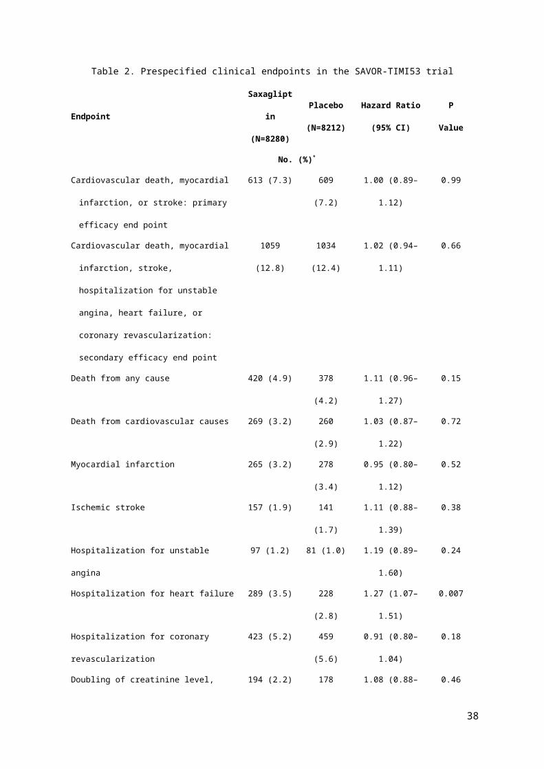
Table of Main Outcome Events
The key Table for any clinical trial displays the main outcomes by treatment group.
For trials concentrating on clinical events during follow-up the numbers (%) by group
experiencing each type of event should be shown. See Table 2 as an example from
the SAVOR-TIMI53 trial (2).
For any composite event (eg. death, myocardial infarction, stroke) the numbers
experiencing any of them (ie. the composite) plus the numbers in each component
should all be shown. Since some patients can have more than one type of event, eg.
non-fatal myocardial infarction followed by death, the numbers in each component
usually add up to slightly more than the numbers with a composite events.
The focus is often on time to first event, so any subsequent (repeat) events, eg. a
second or third myocardial infarction, do not get included in the main analyses. This
is not a problem when the frequency of repeat events is low. But for certain chronic
disease outcomes, eg. hospitalisation for heart failure, repeat events are more
common. For instance, in the CORONA trial (3) of rosuvastatin versus placebo in
chronic heart failure, there were a total of 2408 heart failure hospitalisations in 1291
out of 5011 randomised patients. Conventional analyses of time to first
hospitalisation was inconclusive, but analyses using all hospitalisations (including
repeats) gave strong evidence of a treatment benefit in that secondary outcome (4).
In trials of chronic diseases, eg. chronic heart failure, in which the incidence rates
over time are fairly steady it may be useful to replace % by the incidence rate per
100 patient years (say) of follow-up in each group: to calculate the incidence rate
one divides the number of patients with the relevant event by the total follow-up time
in years of all patients (excluding any follow-up after an event occurs). Such a Table
will usually add in estimates of treatment effect, confidence intervals and P-values,
as dealt with in the next three sections, and already shown in Table 2. Another
important Table concerns adverse events by treatment group.
Kaplan Meier Plot
5
The most common type of Figure in major trial reports is a Kaplan Meier plot of time-
to-event outcomes. Figure 1 shows this for the primary outcome (death, MI or stroke)
of the PLATO trial (5). The Figures displays clearly the steadily accumulating
difference in incidence rates between ticagrelor and clopidogrel. There are several
features that make for a good quality Kaplan Meier plot (6). The numbers at risk in
each group should be shown at regular time intervals of follow-up. In this case, we
see that nearly all patients had 6 months follow-up but only around half of patients
had been followed for 1 year. In connection with this we recommend that the time
axis should not be extended too far, perhaps not beyond the time when less than
10% of patients is still under follow-up.
One good practice that is sadly rarely done is to convey the extent of statistical
uncertainty in the estimates over time, by plotting standard error bars at regular time
points. In this case, the standard errors would be much tighter at 6 months compared
to 1 year, reflecting the substantial proportion of patients not followed out to 1 year.
Sometimes, Kaplan Meier plots are inverted thereby showing the declining
percentage over time who are event free. This can be particularly misleading if there
is a break in the vertical axis (which readers may not spot). In general, we feel it is
more informative to have the curves going up (not down), thereby focusing on
cumulative incidence, with a sensible range (up to 12% in this case) rather than a full
vertical axis up to 100%, so that relevant details, especially regarding treatment
differences can be clearly seen. The choice of vertical scale is an important
ingredient in interpreting these plots; not so wide (0 to 100%) as to cramp the visual
impact but not so tight as to exaggerate any small differences that may occur.
Repeated Measures over Time
For quantitative or symptom-related outcomes, repeated measures over time are
usually obtained at planned visits. Consequent treatment comparisons of means (or
% with symptoms) are usually best presented in a Figure. See Figure 2 for mean
systolic blood pressure in the PARADIGM-HF trial (1) both in the build-up to
randomisation and over the subsequent 3 years. Each mean by treatment group
should have standard error bars around it. In this case, the large numbers of patients
make the tiny standard errors hard to see. With such precise estimation it is obvious
6
without formal testing that mean systolic blood pressure is consistently around 2.5
mmHg lower on LCZ696 compared to enalapril, but this secondary finding was
peripheral to the trial’s main aims concerning clinical events.
Trial Profile
As part of the CONSORT Guidelines for clinical trial reports (7) it is recommended
that every trial publication should have a Trial Profile which shows the flow of
patients through the trial from the pre-randomisation build-up to the post-
randomisation follow-up. Figure 3 is an example from the HEAT PPCI trial(8). It
nicely shows the high proportion of eligible patients who were randomised, the small
number not getting their randomised treatment (but still included in intention to treat
analysis), the controversial delayed consent and the consequent small numbers
removed from analysis or lost to follow-up. The use of delayed consent meant 17
patients died before consent could be obtained and for a further 17 surviving patients
no consent was obtained. Figure 3 shows how 2499 patients were identified, 1829
were randomized and 1812 were included in the analysis, with all steps along the
way documented, each with patient numbers. Note with a more conventional patient
consent prior to randomisation, the trial profile would become somewhat simplified.
The next most common Figure is the Forest plot for subgroup analyses, but more on
that in next week’s article.
Estimates of Treatment Effect and their Confidence Intervals
Now we get down to the serious business of estimating the magnitude of the
difference between treatments on patient outcomes. First, we wish to obtain a point estimate ie. what was the actual difference observed. Then we need to express the
degree of uncertainty present in the data, ie. the bigger the trial the more precise the
point estimate will be. Such uncertainty is usually expressed as a 95% confidence interval.
7
Exactly what type of estimate is required, depends on the nature of the patient
outcome of interest. There are three main types of outcome data:
1) a binary (yes/no) response eg. success or failure, dead or alive, or in the trial
we pursue below the composite of death, myocardial infarction, ischaemia
driven revascularisation or stent thrombosis ie. did any of these occur within
48 hours of randomisation in PCI patients, yes or no?
2) a time to event outcome, eg. time to death, time to symptom relief, or in the
trial we pursue below the time to first hospitalisation for heart failure or
cardiovascular death, whichever (if either) happens first.
3) a quantitative outcome, eg. change in systolic blood pressure from
randomisation to six months later.
What follows are the standard estimation methods for these three types of data. In
the process, we also explain what a confidence interval actually means.
Estimates based on Percentages
In acute disease the comparative efficacy of two treatments is often assessed by
“success or failure” in terms of “absence or presence” of a serious clinical event. For
instance, in the CHAMPION-PHOENIX trial (9) the primary outcome was the
composite of death, myocardial infarction, ischemia driven revascularisation or stent
thrombosis within 48 hours of randomisation. Patients undergoing PCI were
randomized to cangrelor or clopidogrel (N=5470, 5469 respectively) and the
numbers (%s) experiencing the primary composite outcome were 257 (4.7%) and
322 (5.9%) respectively. The various estimates of comparative treatment efficacy,
based on these two percentages are displayed in Table 3 with each estimate
accompanied by its 95% confidence interval.
Relative risk is the ratio of two percentages, here 0.798, and can be converted to
the relative risk reduction, which on a percentage scale is 20.2%. A common
alternative to relative risk is relative odds, here 0.788. This is less readily
understandable since except for those who gamble on horses the concept of odds is
8
harder to grasp. However as explained later relative odds are linked to logistic
regression which permits adjustment for baseline variables. Relative risk and relative
odds are sometimes called risk ratio and odds ratio instead. If event rates are small
then the two give quite similar estimates, with the odds ratio always slightly further
away from 1.
The absolute difference in percentages, here 1.19% is another important statistic.
It is sometimes called the absolute risk reduction. In trial reports it is useful to
present both the absolute and relative risk reduction. The former express the
estimated absolute benefit across all randomised patients in avoiding the primary
endpoint by giving cangrelor instead of clopidogrel. The latter express in relative
terms what estimated percentages of primary events on clopidogrel would have been
prevented by using cangrelor instead.
The difference in percentages can be converted into the Number Needed to Treat (NNT), here 84.0. This means that in order to prevent one primary event by using
cangrelor instead of clopidogrel we need to treat an estimated 84 patients. For NNT
it is important to note the relevant time frame: here it is 48 hours post randomisation.
Expressing Uncertainty using Confidence Intervals
All the estimates based on percentages, such as in Table 3 (and indeed other types
of estimate to follow in the next two sections) are not to be trusted at face value. Any
estimate has a built-in imprecision because of the finite sample of patients studied,
and indeed the smaller the study the less precise the estimate will be. The extent of
such statistical uncertainty is best captured by use of a 95% confidence interval
(95% CI) around any estimate (10,11).
For instance, the observed relative risk reduction 20.2% has a 95% CI from 6.4% to
32.0%. What does this mean? In simple terms we are 95% sure that the true
reduction with cangrelor versus clopidogrel lies between 6.4% and 32.0%. However,
the frequentist principles of statistical inference, which underpin all use of confidence
intervals and P-values, give a more precise meaning as follows. If we were to repeat
the whole clinical trial many, many times using an identical protocol we would get a
9
slightly different confidence interval each time. 95% of those confidence intervals
would contain the true underlying relative risk reduction. But whenever we calculate
a 95% CI there is a 2.5% chance that the true effect lies below and a 2.5% that the
true effect lies above the interval.
What matters here is that the whole 95% CI indicates a clear relative risk reduction.
This is reinforced by 95% CI for the difference in %s which is from -0.35% to -2.03%,
see Table 3. These relatively tight confidence intervals, each wholly in a direction
substantially favouring cangrelor indicates strong evidence that cangrelor reduces
the risk of the primary endpoint compared to clopidogrel. Later, we achieve the same
message by use of a P-value. Note Table 3 also gives a 95% CI for the number
needed to treat (NNT). Some trials report the NNT but not its 95% CI, a practice to
be avoided since readers are led astray by thinking that the NNT is precisely known.
An important obvious principle is that larger studies (more patients and hence more
events) produce more precise estimation and tighter confidence intervals.
Specifically, to halve the width of a confidence interval one needs four times as many
patients. This logic feeds into statistical power calculations when designing a clinical
trial (see future article).
Another issue is why choose 95% confidence: why not 90% or 99%? Well there is no
universal wisdom that says 95% is the right thing to do. It is just a convenient fashion
that for consistency’s sake virtually all articles follow. It also has a link to P<0.05, as
discussed below. It is worth noting that “confidence” is not evenly distributed over a
95% CI. For instance, there is around a 70% chance that the true treatment effect
lies in the inner half of the 95% CI. Also, one and a half times the 95% CI width gives
a 99.9% CI.
Estimates for Time-to-Event Outcomes
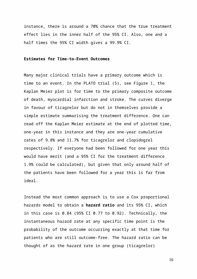
Many major clinical trials have a primary outcome which is time to an event. In the
PLATO trial (5), see Figure 1, the Kaplan Meier plot is for time to the primary
composite outcome of death, myocardial infarction and stroke. The curves diverge in
10
favour of ticagrelor but do not in themselves provide a simple estimate summarising
the treatment difference. One can read off the Kaplan Meier estimate at the end of
plotted time, one-year in this instance and they are one-year cumulative rates of
9.8% and 11.7% for ticagrelor and clopidogrel respectively. If everyone had been
followed for one year this would have merit (and a 95% CI for the treatment
difference 1.9% could be calculated), but given that only around half of the patients
have been followed for a year this is far from ideal.
Instead the most common approach is to use a Cox proportional hazards model to
obtain a hazard ratio and its 95% CI, which in this case is 0.84 (95% CI 0.77 to
0.92). Technically, the instantaneous hazard rate at any specific time point is the
probability of the outcome occurring exactly at that time for patients who are still
outcome-free. The hazard ratio can be thought of as the hazard rate in one group
(ticagrelor) divided by the hazard rate in the other group (clopidogrel) averaged over
the whole follow-up period. Conceptually, it is similar to the relative risk (risk ratio),
except that follow-up time is taken into account (12).
In this example, the hazard ratio and its 95% CI are all substantially below 1
indicating strong evidence of fewer primary outcomes on ticagrelor compared to
clopidogrel. For those who like a more straightforward statistical life, we note the
numbers of patients having the primary outcome are 864 and 1014 in the ticagrelor
and clopidogrel groups respectively. The simple ratio 864÷1014=0.852 is very similar
to the hazard ratio, as will usually be the case for trials with equal randomisation and
relatively low event rates.
The hazard ratio is best suited to data where the Kaplan Meier plot shows a steady
divergence between treatment groups. But in some trials, especially with surgical
intervention, one might anticipate an early excess risk followed by a subsequent gain
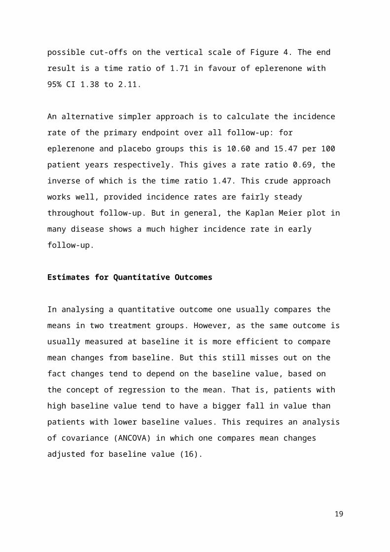
in efficacy as time goes by. For instance, the FREEDOM trial (13) of coronary artery
bypass grafting (CABG) versus percutaneous coronary intervention (PCI) has
primary composite endpoint death, myocardial infarction or stroke (Figure 4). An
early excess event rate on CABG (mainly due to stroke) is followed by a lower event
rate after the first 6 months. The Kaplan Meier curves cross at around 1 year. Here a
hazard ratio would be a peculiar average of early bad news followed by later good
11
news for CABG, and so is not particularly useful. The focus on five year composite
event rate (18.7% on CABG, 26.6% on PCI) is informative but suffers from the fact
that only around one-third of patients have so far been followed for 5 years. More
complete 5-year follow-up is required to clarify this.
Another problem with hazard ratios is that they focus on a “vertical interpretation” of
the Kaplan Meier plot. But in chronic diseases a more “horizontal interpretation”
focussing on event-free time gained may be more appropriate. The accelerated failure time model (14) is unfortunately rarely used, but it can nicely capture this
concept. In a nutshell it estimates a time ratio whereby if a new treatment helps to
delay the occurrence of events, the time ratio will be greater than 1. For instance, a
time ratio of 1.5 means that on average it takes 50% longer for an event to occur on
the new treatment compared to control.
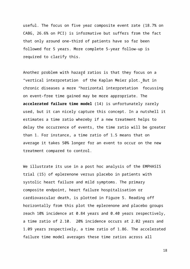
We illustrate its use in a post hoc analysis of the EMPHASIS trial (15) of eplerenone
versus placebo in patients with systolic heart failure and mild symptoms. The primary
composite endpoint, heart failure hospitalisation or cardiovascular death, is plotted in
Figure 5. Reading off horizontally from this plot the eplerenone and placebo groups
reach 10% incidence at 0.84 years and 0.40 years respectively, a time ratio of 2.10.
20% incidence occurs at 2.02 years and 1.09 years respectively, a time ratio of 1.86.
The accelerated failure time model averages these time ratios across all possible
cut-offs on the vertical scale of Figure 4. The end result is a time ratio of 1.71 in
favour of eplerenone with 95% CI 1.38 to 2.11.
An alternative simpler approach is to calculate the incidence rate of the primary
endpoint over all follow-up: for eplerenone and placebo groups this is 10.60 and
15.47 per 100 patient years respectively. This gives a rate ratio 0.69, the inverse of
which is the time ratio 1.47. This crude approach works well, provided incidence
rates are fairly steady throughout follow-up. But in general, the Kaplan Meier plot in
many disease shows a much higher incidence rate in early follow-up.
Estimates for Quantitative Outcomes
12
In analysing a quantitative outcome one usually compares the means in two
treatment groups. However, as the same outcome is usually measured at baseline it
is more efficient to compare mean changes from baseline. But this still misses out on
the fact changes tend to depend on the baseline value, based on the concept of
regression to the mean. That is, patients with high baseline value tend to have a
bigger fall in value than patients with lower baseline values. This requires an analysis
of covariance (ANCOVA) in which one compares mean changes adjusted for
baseline value (16).
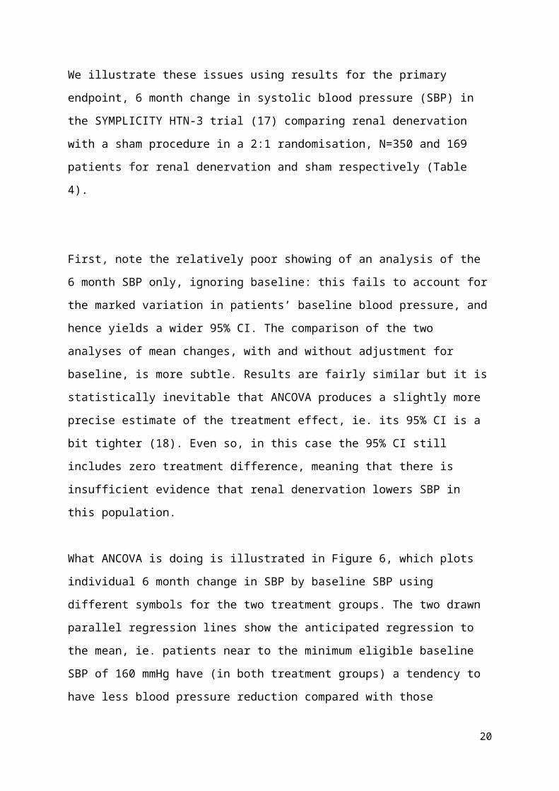
We illustrate these issues using results for the primary endpoint, 6 month change in
systolic blood pressure (SBP) in the SYMPLICITY HTN-3 trial (17) comparing renal
denervation with a sham procedure in a 2:1 randomisation, N=350 and 169 patients
for renal denervation and sham respectively (Table 4).
First, note the relatively poor showing of an analysis of the 6 month SBP only,
ignoring baseline: this fails to account for the marked variation in patients’ baseline
blood pressure, and hence yields a wider 95% CI. The comparison of the two
analyses of mean changes, with and without adjustment for baseline, is more subtle.
Results are fairly similar but it is statistically inevitable that ANCOVA produces a
slightly more precise estimate of the treatment effect, ie. its 95% CI is a bit tighter
(18). Even so, in this case the 95% CI still includes zero treatment difference,
meaning that there is insufficient evidence that renal denervation lowers SBP in this
population.
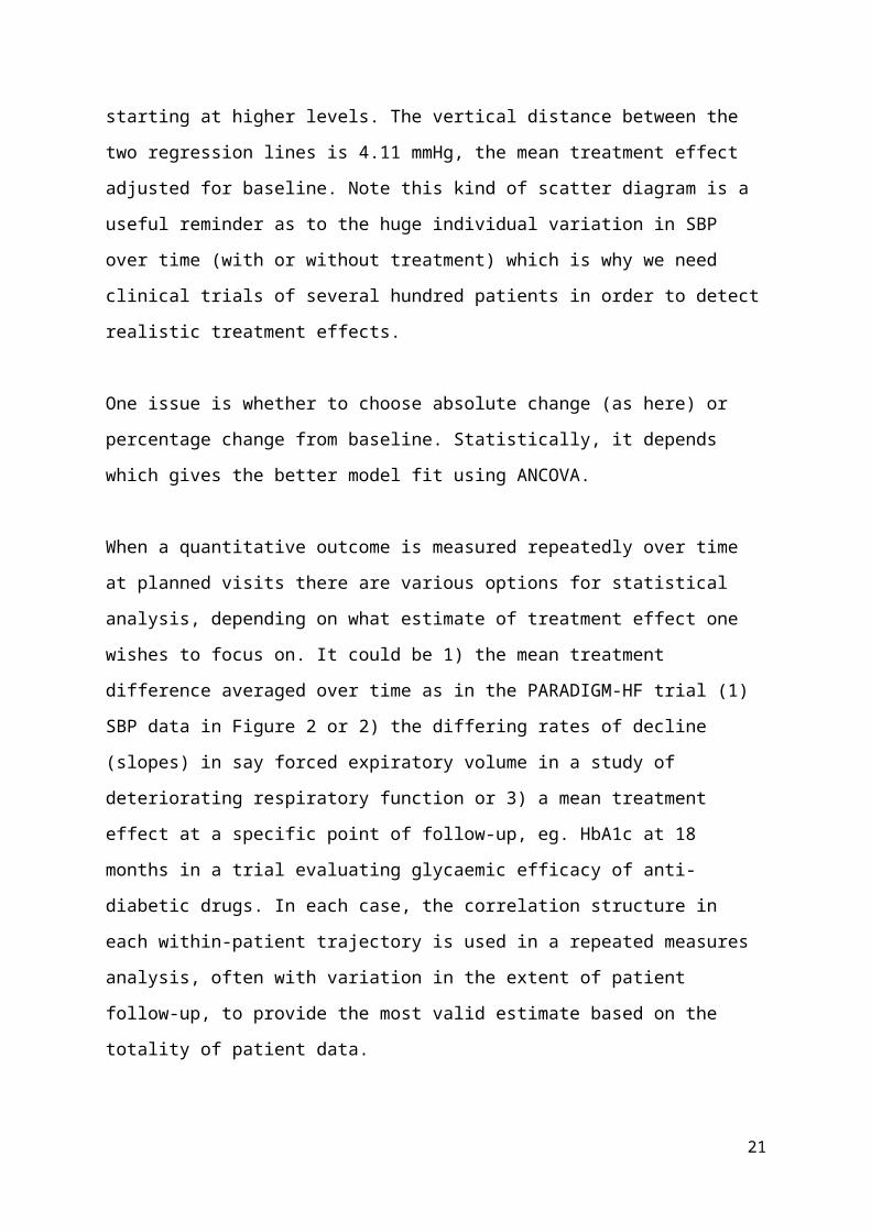
What ANCOVA is doing is illustrated in Figure 6, which plots individual 6 month
change in SBP by baseline SBP using different symbols for the two treatment
groups. The two drawn parallel regression lines show the anticipated regression to
the mean, ie. patients near to the minimum eligible baseline SBP of 160 mmHg have
(in both treatment groups) a tendency to have less blood pressure reduction
compared with those starting at higher levels. The vertical distance between the two
regression lines is 4.11 mmHg, the mean treatment effect adjusted for baseline. Note
this kind of scatter diagram is a useful reminder as to the huge individual variation in
13

SBP over time (with or without treatment) which is why we need clinical trials of
several hundred patients in order to detect realistic treatment effects.
One issue is whether to choose absolute change (as here) or percentage change
from baseline. Statistically, it depends which gives the better model fit using
ANCOVA.
When a quantitative outcome is measured repeatedly over time at planned visits
there are various options for statistical analysis, depending on what estimate of
treatment effect one wishes to focus on. It could be 1) the mean treatment difference
averaged over time as in the PARADIGM-HF trial (1) SBP data in Figure 2 or 2) the
differing rates of decline (slopes) in say forced expiratory volume in a study of
deteriorating respiratory function or 3) a mean treatment effect at a specific point of
follow-up, eg. HbA1c at 18 months in a trial evaluating glycaemic efficacy of anti-
diabetic drugs. In each case, the correlation structure in each within-patient trajectory
is used in a repeated measures analysis, often with variation in the extent of patient
follow-up, to provide the most valid estimate based on the totality of patient data.
Sometimes a quantitative outcome has a highly skew distribution so that a
conventional analysis of means becomes unstable because of its dependence on a
few extreme values. Options then are 1) to use a suitable transformation, eg. natural
logarithm leading to comparison of geometric means 2) to use non-parametric
analyses often focussing on a comparison of medians or 3) to focus on a particular
cut-off value(s), eg. the upper limit of normal in liver function tests, with a
consequent comparison of percentages.
P-values and their interpretation
We have deliberately delayed explaining P-values until after covering descriptive
statistics, estimation and confidence intervals. This is in order to counter the
obsessive tendency for people to classify a clinical trial into “positive” or “negative”
depending on whether the primary endpoint achieves P<0.05 or not. This
oversimplification is an abuse of the P-value, which can be valuable statistical tool
when interpreted appropriately.
14
Alongside an estimate of treatment difference and its 95% CI, the corresponding P-
value is the most succinct direct route to expressing the extent to which it looks
plausibly like a real treatment effect, or rather could readily have arisen by chance.
At the heart of any significance test is the null hypothesis that the two treatments are
identical in their effect on the outcome of interest. The p-value is the probability of
obtaining a treatment difference at least as great (in either direction) as that actually
observed if the null hypothesis were true. The smaller the P-value the stronger is the
evidence against the null hypothesis, ie. the more convincing is the evidence that a
genuine treatment difference exists.
Let’s consider some recent trials to elucidate the range of their P-values for the
primary endpoint. In doing so, our aim is to translate statistical evidence into plain
English (19). The PARADIGM-HF trial (1) compared a new drug LCZ696 with
enalapril in patients with chronic heart failure. For the primary endpoint, heart failure
hospitalisation or cardiovascular death over a median 27 months follow-up the
hazard ratio was 0.80 with 95% CI 0.73 to 0.87, P=0.0000004. Such a small P-value
means that if LCZ696 were truly no better than enalapril, the chances of getting this
magnitude of treatment difference (or greater) is less than one in a million.
Such a small P-value provides overwhelming evidence of a treatment difference.
Such proof beyond reasonable doubt means one can confidently assert that LCZ696
is superior to enalapril with regards the incidence of the primary endpoint.
The CHAMPION PHOENIX trial (9) of cangrelor vs clopidogrel had an odds ratio of
0.788 with 95% CI 0.666 to 0.932 for its primary endpoint (Table 3). Here P=0.005
meaning there is a 1 in 200 chance of such a difference (or greater) arising by
chance: not as thoroughly convincing as the PARADIGM-HF trial but still strong
evidence of a treatment benefit, ie. cangrelor appears to be superior to clopidogrel.
Note the trial report (9) gave an adjusted odds ratio etc.: we discuss covariate
adjustment in next week’s article.
The IMPROVE-IT trial (20) compared ezetimibe with placebo in 18,144 post-ACS
patients receiving simvastatin 40 mg. The primary composite endpoint over a mean
5.4 years was CV death, MI, stroke, unstable angina and coronary revascularization
15
with hazard ratio 0.936 (95% CI 0.888 to 0.988). Here P=0.016 meaning less than a
1 in 50 chance of such a difference (or greater) arising by chance. This provides
some evidence of a treatment benefit: it reaches the oft-used guideline of P<0.05, ie.
statistically significant at the 5% level. There is a 6.4% relative risk reduction and an
absolute treatment difference of 2.0%, both with wide confidence intervals. This
suggests a modest treatment benefit which is imprecisely estimated.
In the SYMPLICITY HTN-3 trial (17) (Figure 5) the mean difference between renal
denervation and sham procedure in 6 month change in systolic blood pressure
adjusted for baseline was -4.11 mmHg with 95% CI -8.44 to +0.22 mmHg. Here
P=0.064. Under the null hypothesis that renal denervation is ineffective this observed
magnitude of treatment difference has more than a 1 in 20 chance of occurring.
Since P>0.05 ie. 5% significance is not achieved, it is customary to declare that there
is insufficient evidence that renal denervation reduces systolic blood pressure. This
should not be interpreted dogmatically that renal denervation has no effect (i.e. the
null hypothesis is not necessarily true). Rather, we should declare there is
insufficient evidence that renal denervation lowers systolic blood pressure compared
to a sham procedure. It may be that renal denervation has a modest effect OR it may
have no effect: the data are inconclusive.
Now to a more clearly neutral finding. The ASTRONAUT trial (21) randomised 1639
patients with hospitalised heart failure to aliskiren or placebo with a median 11.3
months follow-up. The primary endpoint, re-hospitalisation for heart failure or
cardiovascular death, had hazard ratio 0.92 (95% CI 0.76 to 1.12) with P=0.41. With
such a clearly non-significant P-value, there is no evidence that aliskiren has an
effect on the primary endpoint. However, we still cannot assert definitively that
aliskiren has no effect: the hazard ratio is in the direction of slightly fewer primary
events on aliskiren and the wide confidence interval extends out to a substantial
distance from neutrality (hazard ratio =1) in both directions.
Thus, we may think of P-values not as a “black and white” significant/non-significant
dichotomy but more in terms of “shades of grey” (22). This analogy to a recent movie
is not to make statistics sexy, nor to suggest that statisticians are sadists, but more
in the spirit of the expression’s original meaning. The smaller the value of P the
16

stronger the evidence to contradict the null hypothesis of no true treatment
difference. We can think of P<0.000001 as “pure white” and P=0.99 as “pure black”
with a trend of increasingly darkening greyness in-between those extreme. Table 5
summarises a useful vocabulary that might be applied to interpreting P-values.
A brief history of the P-value and its variety of interpretations is provided in the
appendix.
“A P-value is no Substitute for a Brain”
The above quote (23) is to remind us all that interpretation of a seemingly “positive”
trial rests on more than just a significant P-value: 1) it is good practice to give the
actual P-value ie. P=0.042 rather than P<0.05 or crudely “significant” or P=0.061
rather than “not significant”.
2) it is useful to recognise the link between the P-value and the 95% CI for the
treatment difference. If the latter includes no difference (ie. 0 on an absolute scale
eg. % or mean difference, 1 on a ratio scale eg. relative risk or hazard ratio) then we
know P is greater than 0.05. Conversely, if the 95% CI is wholly one side of the null
value, then we know P<0.05.
3) it is best if we always use two-sided P-values. That is, under the null hypothesis
P is the probability of getting a difference in either direction as big as (or bigger)
than that observed. Occasionally, people will argue that they are only interested in
one direction of treatment effect (new treatment superior) and hence should be
allowed to halve the P-value in a one-sided test. For instance, the Corevalve trial
(24) claimed one-sided P=0.04 for lower mortality on transcatheter aortic valve
replacement versus surgery, rather than the conventional two-sided P=0.08. This
practice is to be avoided since it produces an inconsistency across trial reports and
makes it a bit too easy to achieve P<0.05.
4) A small P-value clarifies that an observed treatment difference appears greater
than could be attributed to chance, but this does not automatically mean that a real
17
treatment effect is occurring. There may be biases in the study design and conduct, eg. randomisation could be absent or flawed, lack of appropriate blinding,
incomplete follow-up, which contribute wholly or in part, to the apparent treatment
difference. These issues contribute to why regulators often require two trials be
conducted to demonstrate a reassuring consistency of findings in two different
settings.
5) There is an important distinction between statistical significance and clinical
relevance of a treatment effect. Here the magnitude of treatment difference and its
CI are a guide as to whether the benefit of a new treatment is sufficiently great to
merit its use in clinical practice.
6) For a small trial to reach a statistical significant treatment effect the magnitude of
treatment difference needs to be very large. For instance, a trial of acetylcysteine vs
placebo to prevent contrast-induced nephropathy (25) reported 1 out of 41 and 9 out
of 42 acute reductions in renal failure, P=0.01. This finding has a risk ratio =0.11 with
a very wide 95% CI 0.015 to 0.859. The observed result is “too good to be true”. A
comparable small trial with a non-significant finding would doubtless not have been
published in a major journal. Thus, publication bias, ie. the tendency for published
trials to exaggerate treatment effects, is accentuated when trials are small.
7) In this article, we concentrate on interpreting P-values (and confidence intervals)
for trials whose purpose is to determine if one treatment is superior to another. For
non-inferiority trials, with the goal of seeing if a new treatment is as good as control,
interpretation is somewhat different, as explained in the last article in this series.
The Simplest Statistical Test
This article does not provide the statistical calculations or programs required to
obtain P values. Suffice it to say that for the three types of outcome data, binary,
time-to-event and quantitative, the most common tests used are chi-squared, logrank
and two-sample t-test or ANCOVA respectively. But for trials with 1:1 randomisation
and a binary or time-to-event outcome there does exist a quick alternative (26) which
18
can be used by the inquisitive reader who is “dying to know” if a result is statistically
significant. The test is so simple that most statisticians do not know about it!
All you need to use is the number of patients in each treatment group who have the
primary endpoint. Then the difference divided by the square root of the sum is
approximately a standardised normal deviate which can readily be converted into a
P-value. See Table 6 for how it works for four of the trials we have already
discussed. In each case this simple test agrees well with the more complex
calculations used in the trial publication.
Concluding remarks
We have covered the essentials of statistical analysis and reporting in this article,
and the key aspects are summarised in the Central Illustration. Next week we tackle
a variety of more complex statistical challenges that are often faced in the reporting
of clinical trials. These include multiplicity of data, covariate adjustment, subgroup
analysis, assessing individual benefits and risk, analysis by intention to treat and
alternatives, the interpretation of surprises (both good and bad) and enhancing the
overall quality of clinical trial reports.
19
Appendix
A Brief History of the P-value
The first extensive documentation of P-values was by Karl Pearson in 1914 with his
Tables for Statisticians. These were very detailed tables of P-values with no focus on
any particular cut-off values. R A Fisher realized the need for more compact tables
which were easier to use and in 1925 his text “Statistical Methods for Research
Workers”(27) focussed on specific selected values of P e.g. P=0.1, 0.05, 0.02, 0.01
and 0.001. It has been suggested that “Fisher produced these tables of significance
levels to save space and to avoid copyright problems with Pearson, whom he
disliked”. The cut-off P=0.05 received no particular emphasis in the tables.
However, Fisher’s writings on how to interpret P-values did put more emphasis on
P<0.05 than on any other cut-off. For instance he wrote “The value for which P=0.05
or 1 in 20 is convenient to take as a limit in judging whether a deviation ought to be
significant or not”. He recognised though that one specific cut-off should not
dominate: “If one in 20 does not seem high enough odds, we may if we prefer it,
draw the line at 1 in 50 or 1 in 100. I prefer to set a low standard of significance at
5% and ignore entirely all results that fail to reach this level”. His interpretation is
somewhat inclined towards P-values as decision tools, but he was wary, and slightly
self-contradictory on this point. This next quote nicely tones down any emphasis on a
cut-off: “When P is between 0.02 and 0.05 the result must be judged significant but
barely so. The data do not demonstrate this point beyond reasonable doubt”.
In 1933 Jerzy Neyman and Egon Pearson (son of Karl Pearson) produced a more
decision-oriented approach to P-values. Their hypothesis testing formulation
declared that P<0.05 meant reject the null hypothesis of no treatment difference.
P>0.05 meant accept the null hypothesis. Part of their reasoning was to introduce a
pre-declared alternative hypothesis regarding a specific magnitude of treatment
difference. This led to the need to control two types of errors: falsely rejecting the null
hypothesis (Type I error) and falsely accepting the null hypothesis (Type 2 error).
The consequent power calculations have been the basis for determining the size of
clinical trials and other studies (see next week).
20
Unfortunately, it has had undesirable consequences for generating an unduly
dogmatic interpretation of P-values, which has bedevilled clinical trials and much
other quantitative research ever since. Fisher insightfully and robustly countered
their alternative to his “strength of evidence” interpretation as follows: “the calculation
is absurdly academic, for no scientific worker has a fixed level of significance at
which he rejects hypotheses”. We wish to endorse Fisher’s arguments since year-in
year-out we devote teaching time to undoing the damage people have encountered
in their previous statistics teaching which has misguidedly emphasized this
accept/reject philosophy of significance testing.
A key early text in expanding the appropriate use of significance tests and other
statistical techniques was G W Snedecor’s “Statistical Methods” (28) first published
in 1940. Snedecor’s proselytizing of Fisher’s ideas achieved much, his book being
the most cited scientific text in the 1970s. Over several decades P-values took hold
as the main method for comparing treatments in all kinds of experimental studies,
especially in agriculture initially but increasingly in medical research as randomized
clinical trials became the gold standard for evaluating new therapeutic interventions.
Irwin Bross in 1971 gave a valuable perspective on how the use of P-values seemed
to be heading in some inappropriate directions and saw a “need for curtailing
language games” (29). Bross did see merit in P<0.05 as a point of reference: “if
there were no 5% level firmly established some would stretch the level to 6% or 7%.
Soon others would be stretching to 10% or 15%. Furthermore “the 5% level is a
feasible level at which to do research work, i.e. to set up a study which will have a
fair chance of picking up effects of scientific interest”. He appeared to adopt a more
critical stance when stating “we continue to use P values nearly as absolute cut-offs,
but with an eye to rethinking our position for values close to 0.05”. He was also
wisely aware of the push for researchers to claim significance: “researchers tend to
worry about P values slightly greater than 0.05 and why they deserve attention
nonetheless. I cannot recall published research downplaying P values less than
0.05”. How true!
21
References
1. McMurray JJV, Packer M, Desai AS, et al. Angiotensin–Neprilysin Inhibition versus Enalapril in Heart Failure. New England Journal of Medicine 2014;371:993-1004.
2. Scirica BM, Bhatt DL, Braunwald E, et al. Saxagliptin and Cardiovascular Outcomes in Patients with Type 2 Diabetes Mellitus. New England Journal of Medicine 2013;369:1317-1326.
3. Kjekshus J, Apetrei E, Barrios V, et al. Rosuvastatin in Older Patients with Systolic Heart Failure. New England Journal of Medicine 2007;357:2248-2261.
4. Rogers JK, Jhund PS, Perez A-C, et al. Effect of Rosuvastatin on Repeat Heart Failure HospitalizationsThe CORONA Trial (Controlled Rosuvastatin Multinational Trial in Heart Failure). JACC: Heart Failure 2014;2:289-297.
5. Wallentin L, Becker RC, Budaj A, et al. Ticagrelor versus Clopidogrel in Patients with Acute Coronary Syndromes. New England Journal of Medicine 2009;361:1045-1057.
6. Pocock SJ, Clayton TC, Altman DG. Survival plots of time-to-event outcomes in clinical trials: good practice and pitfalls. The Lancet 2002;359:1686-1689.
7. Moher D, Hopewell S, Schulz KF, et al. CONSORT 2010 explanation and elaboration: updated guidelines for reporting parallel group randomised trials. BMJ 2010;340:c869.
8. Shahzad A, Kemp I, Mars C, et al. Unfractionated heparin versus bivalirudin in primary percutaneous coronary intervention (HEAT-PPCI): an open-label, single centre, randomised controlled trial. The Lancet;384:1849-1858.
9. Bhatt DL, Stone GW, Mahaffey KW, et al. Effect of Platelet Inhibition with Cangrelor during PCI on Ischemic Events. New England Journal of Medicine 2013;368:1303-1313.
10. Bulpitt CJ. Confidence Intervals. The Lancet 1987;329:494-497.11. Altman D, Machin D, Bryant T, Gardner M. Statistics with confidence: confidence intervals
and statistical guidelines: John Wiley & Sons, 2013.12. Clark T, Bradburn M, Love S, Altman D. Survival analysis part I: basic concepts and first
analyses. British journal of cancer 2003;89:232.13. Farkouh ME, Domanski M, Sleeper LA, et al. Strategies for Multivessel Revascularization in
Patients with Diabetes. New England Journal of Medicine 2012;367:2375-2384.14. Wei L. The accelerated failure time model: a useful alternative to the Cox regression model
in survival analysis. Statistics in medicine 1992;11:1871-1879.15. Zannad F, McMurray JJV, Krum H, et al. Eplerenone in Patients with Systolic Heart Failure
and Mild Symptoms. New England Journal of Medicine 2011;364:11-21.16. Vickers AJ, Altman DG. Analysing controlled trials with baseline and follow up
measurements. BMJ 2001;323:1123-1124.17. Bhatt DL, Kandzari DE, O'Neill WW, et al. A Controlled Trial of Renal Denervation for
Resistant Hypertension. New England Journal of Medicine 2014;370:1393-1401.18. Senn S. Change from baseline and analysis of covariance revisited. Statistics in Medicine
2006;25:4334-4344.19. Pocock SJ, Ware JH. Translating statistical findings into plain English. The Lancet;373:1926-
1928.20. Cannon CP, Blazing MA, Giugliano RP, et al. Ezetimibe Added to Statin Therapy after Acute
Coronary Syndromes. New England Journal of Medicine 2015;372:2387-2397.21. Gheorghiade M, Böhm M, Greene SJ, et al. Effect of aliskiren on postdischarge mortality and
heart failure readmissions among patients hospitalized for heart failure: The astronaut randomized trial. JAMA 2013;309:1125-1135.
22. Sterne JA, Davey Smith G. Sifting the evidence-what's wrong with significance tests? BMJ 2001;322:226-31.
23. Stone GW, Pocock SJ. Randomized Trials, Statistics, and Clinical Inference. Journal of the American College of Cardiology 2010;55:428-431.
22
24. Adams DH, Popma JJ, Reardon MJ, et al. Transcatheter Aortic-Valve Replacement with a Self-Expanding Prosthesis. New England Journal of Medicine 2014;370:1790-1798.
25. Tepel M, van der Giet M, Schwarzfeld C, Laufer U, Liermann D, Zidek W. Prevention of Radiographic-Contrast-Agent–Induced Reductions in Renal Function by Acetylcysteine. New England Journal of Medicine 2000;343:180-184.
26. Pocock SJ. The simplest statistical test: how to check for a difference between treatments. BMJ 2006;332:1256-8.
27. Fisher RA. Statistical Methods For Research Workers: Cosmo Publications, 1925.28. Snedecor GW. Statistical Methods, 1962.29. Bross I. Critical levels, statistical language, and scientific inference. Toronto, Canada: Holt,
Rinehart and Winston, 1971.
23
Table 1. Characteristics of the patients at baseline in the PARADIGM-HF trial*
Characteristic LCZ696 Enalapril
Age — yr 63.8±11.5 63.8±11.3
Female sex — no. (%) 879 (21.0) 953 (22.6)
Race or ethnic group — no. (%)
White 2763 (66.0) 2781 (66.0)
Black 213 (5.1) 215 (5.1)
Asian 759 (18.1) 750 (17.8)
Other 452 (10.8) 466 (11.1)
Region — no. (%)
North America 310 (7.4) 292 (6.9)
Latin America 713 (17.0) 720 (17.1)
Western Europe and other 1026 (24.5) 1025 (24.3)
Central Europe 1393 (33.3) 1433 (34.0)
Asia–Pacific 745 (17.8) 742 (17.6)
Systolic blood pressure — mm Hg 122±15 121±15
Heart rate — beats/min 72±12 73±12
Body-mass index 28.1±5.5 28.2±5.5
Serum creatinine — mg/dl 1.13±0.3 1.12±0.3
Clinical features of heart failure
Ischemic cardiomyopathy — no. (%) 2506 (59.9) 2530 (60.1)
Left ventricular ejection fraction — % 29.6±6.1 29.4±6.3
Median B-type natriuretic peptide (IQR) — pg/ml 255 (155–474) 251 (153–465)
Median N-terminal pro–B-type natriuretic peptide (IQR) — pg/ml 1631 (885–3154) 1594 (886–3305)
NYHA functional class — no. (%)
I 180 (4.3) 209 (5.0)
II 2998 (71.6) 2921 (69.3)
III 969 (23.1) 1049 (24.9)
IV 33 (0.8) 27 (0.6)
Missing data 7 (0.2) 6 (0.1)
Medical history — no. (%)
Hypertension 2969 (70.9) 2971 (70.5)
Diabetes 1451 (34.7) 1456 (34.6)
Atrial fibrillation 1517 (36.2) 1574 (37.4)
Hospitalization for heart failure 2607 (62.3) 2667 (63.3)
Myocardial infarction 1818 (43.4) 1816 (43.1)
Stroke 355 (8.5) 370 (8.8)
Pretrial use of ACE inhibitor 3266 (78.0) 3266 (77.5)
Pretrial use of ARB 929 (22.2) 963 (22.9)
24
Treatments at randomization — no. (%)
Diuretic 3363 (80.3) 3375 (80.1)
Digitalis 1223 (29.2) 1316 (31.2)
Beta-blocker 3899 (93.1) 3912 (92.9)
Mineralocorticoid antagonist 2271 (54.2) 2400 (57.0)
Implantable cardioverter–defibrillator 623 (14.9) 620 (14.7)
Cardiac resynchronization therapy 292 (7.0) 282 (6.7)
* Plus–minus values are means ±SD. IQR denotes interquartile range.Source: McMurray JJV, Packer M, Desai AS, et al. Angiotensin–Neprilysin Inhibition versus Enalapril in Heart Failure. New England Journal of Medicine 2014;371:993-1004
Table 1 Caption: Table summarising the characteristics at the baseline visit for patients in the PARADIGM-HF trial by treatment allocation.
25

Table 2. Prespecified clinical endpoints in the SAVOR-TIMI53 trial
EndpointSaxagliptin
(N=8280)
Placebo
(N=8212)
Hazard Ratio
(95% CI)P Value
No. (%)*
Cardiovascular death, myocardial infarction,
or stroke: primary efficacy end point
613 (7.3) 609 (7.2) 1.00 (0.89–1.12) 0.99
Cardiovascular death, myocardial infarction,
stroke, hospitalization for unstable angina,
heart failure, or coronary revascularization:
secondary efficacy end point
1059 (12.8) 1034 (12.4) 1.02 (0.94–1.11) 0.66
Death from any cause 420 (4.9) 378 (4.2) 1.11 (0.96–1.27) 0.15
Death from cardiovascular causes 269 (3.2) 260 (2.9) 1.03 (0.87–1.22) 0.72
Myocardial infarction 265 (3.2) 278 (3.4) 0.95 (0.80–1.12) 0.52
Ischemic stroke 157 (1.9) 141 (1.7) 1.11 (0.88–1.39) 0.38
Hospitalization for unstable angina 97 (1.2) 81 (1.0) 1.19 (0.89–1.60) 0.24
Hospitalization for heart failure 289 (3.5) 228 (2.8) 1.27 (1.07–1.51) 0.007
Hospitalization for coronary revascularization 423 (5.2) 459 (5.6) 0.91 (0.80–1.04) 0.18
Doubling of creatinine level, initiation of
dialysis, renal transplantation, or creatinine
>6.0 mg/dl (530 μmol/liter)
194 (2.2) 178 (2.0) 1.08 (0.88–1.32) 0.46
Hospitalization for hypoglycemia 53 (0.6) 43 (0.5) 1.22 (0.82–1.83) 0.33
* Percentages are 2-year Kaplan-Meier estimates. Source: Scirica BM, Bhatt DL, Braunwald E, et al. Saxagliptin and Cardiovascular Outcomes in Patients with Type 2 Diabetes Mellitus. New England Journal of Medicine 2013;369:1317-1326.
Table 2 Caption: 2-year Kaplan-Meier estimates and hazard ratios (95% CIs) for prespecified clinical endpoints in the SAVOR-TIMI53 trial.
26
Table 3. Estimates based on the comparison of two percentages, illustrated by the primary outcome*
of the CHAMPION-PHOENIX trial
*primary composite outcome is death, myocardial infarction, ischaemia driven revascularisation or
stent thrombosis within 48 hours of randomisation; † in the middle of all numerical calculations, any
values (eg. percentages) should be precise, eg. to 3 or more decimal place. Only at the final step
should values be rounded for convenience of expression
Table 3 Caption: Number and percentage of patients with a primary outcome (death, myocardial
infarction, ischaemia driven revascularisation or stent thrombosis within 48 hours of randomisation) in
CHAMPION-PHOENIX trial along with various estimates of treatment effect.
27
cangrelor clopidogrel
no. of randomised patients 5470 5469
no. (%) with primary outcome 257 (4.698%)† 322 (5.888%)†
relative risk (95% CI)
4.698
5.888= 0.798 (0.680, 0.936)
relative risk reduction (95% CI)
(1-0.798)x100 = 20.2% (6.4%, 32.0%)
relative odds (95% CI)
4.698÷(100-4.698)
5.888÷(100-5.888)= 0.788 (0.666, 0.932)
difference in percentages (95% CI)
4.698-5.888 = -1.19% (-0.35%, -2.03%)
number needed to treat (95% CI)
100
1.19= 84.0 (49.3, 285.7)
Table 4: Six month results from the SYMPLICITY HTN-3 trial
Mean Treatment Difference (95% CI), mmHg
SBP at 6 months -4.20 (-9.17, +0.77)
6 month change in SBP -4.07 (-8.63, +0.49)
6 month change in SBP adjusted for
baseline SBP using ANCOVA*
-4.11 (-8.44, +0.22)
* ANCOVA: analysis of covariance
Table 4 Caption: Three different methods of analysing six month systolic blood pressure results from the SYMPLICITY HTN-3 Trial of renal denervation versus a sham procedure.
28
Table 5. A Useful Language for Interpreting P-values
P<0.001 overwhelming evidence
0.001≤P<0.01 strong evidence
0.01≤P<0.05 some evidence
0.05≤P<0.10 insufficient evidence
0.10≤P no evidence
Table 5 Caption: A useful language for interpreting p-values
29

Table 6. The Simplest Statistical Test*
a, b are the numbers having an outcome event in the two treatment groups
a−b√a+b
is approximately a standardised normal deviate, z
The larger is z, the smaller is P. Here are some useful values:
Z P
1.64 0.1
1.96 0.05
2.58 0.01
2.81 0.005
3.29 0.001
3.48 0.0005
3.89 0.0001
Four Examples:
Trial no. of patients with event
Z P interpretation
control
(a)
new treatment
(b)
a−b√a+b
PARADIGM-HF 1117 914 4.50 P<0.00001 overwhelming evidence
CHAMPION-
PHOENIX
322 257 2.70 P=0.007 strong evidence
IMPROVE-IT 2742 2572 2.33 P=0.02 some evidence
ASTRONAUT 214 201 0.64 P=0.52 no evidence
*Only suitable for trials with 1:1 randomisation. Most reliable when proportions having events are
small. Should be confirmed by the more complex test, eg. logrank
30
31

Figure1. Kaplan-Meier Estimates of the Cumulative Incidence over Time of the First Adjudicated
Occurrence of the Primary Efficacy End Point in the PLATO trial
Source: Wallentin L, Becker RC, Budaj A, et al. Ticagrelor versus Clopidogrel in Patients with Acute
Coronary Syndromes. New England Journal of Medicine 2009;361:1045-1057.
Figure 1 Caption: Cumulative incidence of the primary end point – a composite of death from vascular
causes, myocardial infarction, or stroke – was significantly lower in the ticagrelor group than in the
clopidogrel group (9.8% vs 11.7% at 12 months; hazard ratio, 0.84; 95% confidence interval, 0.77 to
0.92; P<0.001).
32

Figure 2. Systolic blood pressure during run-in and after randomisation in the PARADIGM-HF trial
Figure 2 Caption: Mean systolic blood pressure by visit and treatment group and overall mean
difference (95% CI) in the PARADIGM-HF trial.
33
Figure 3. Trial Profile of the HEAT-PPCI trial
Source: Shahzad A, Kemp I, Mars C, et al. Unfractionated heparin versus bivalirudin in primary percutaneous coronary intervention (HEAT-PPCI): an open-label, single centre, randomised controlled trial. The Lancet; 384:1849-1858.
Figure 3 Caption: Trial profile for HEAT-PPCI summarising the flow of patients through the trial from the pre-randomisation recruitment period to the post-randomisation follow-up and analysis.
34
Figure 4 Kaplan-Meier Estimates of the Cumulative Incidence over Time of the Primary Efficacy Endpoint in the FREEDOM trial
Source: Tepel M, van der Giet M, Schwarzfeld C, Laufer U, Liermann D, Zidek W. Prevention of Radiographic-Contrast-Agent–Induced Reductions in Renal Function by Acetylcysteine. New England Journal of Medicine 2000;343:180-184.
Figure 4 caption: Kaplan-Meier estimates of the cumulative incidence of the primary efficacy endpoint (death, myocardial infarction or stroke) by treatment group in the FREEDOM trial.
35
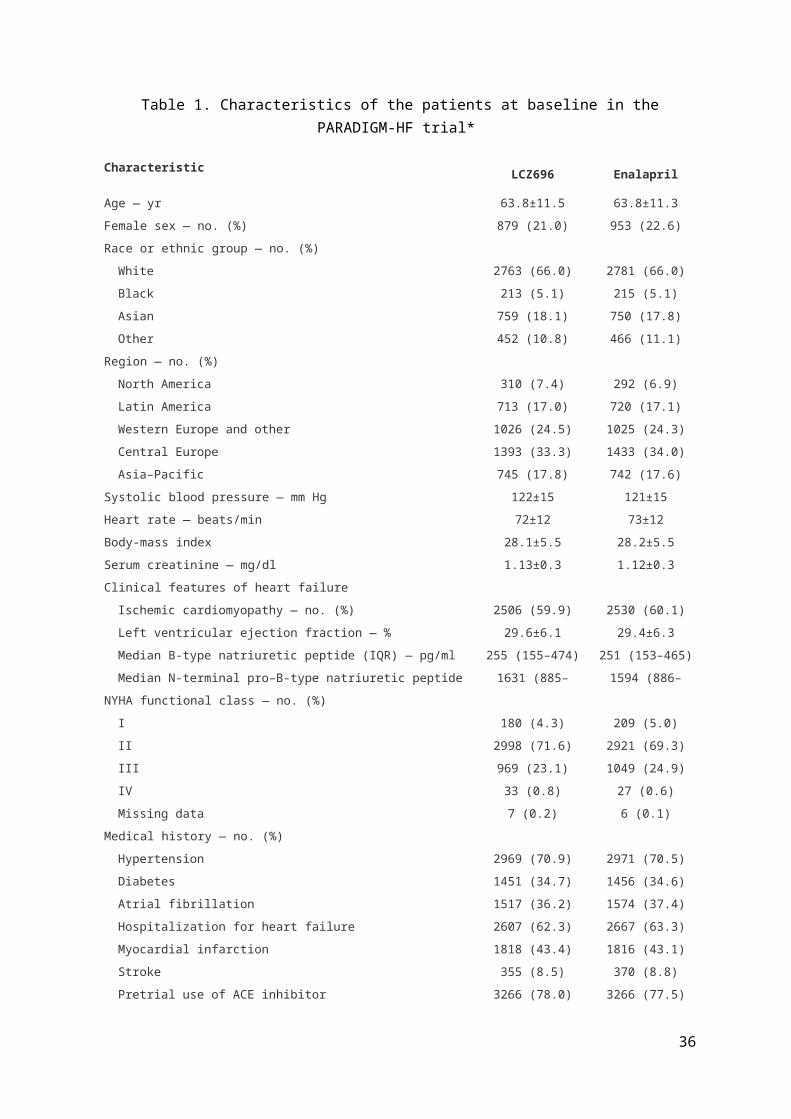
Figure 5. Time to Primary Event in the EMPHASIS-HF trial
Figure 5 Caption: Kaplan-Meier cumulative incidence of cardiovascular (CV) death or hospitalisation
for heart failure (HF) in the EMPHASIS-HF trial. The eplerenone and placebo groups reach 10%
incidence at 0.84 years and 0.40 years respectively, a time ratio of 2.10. 20% incidence occurs at
2.02 years and 1.09 years respectively, a time ratio of 1.86.
36
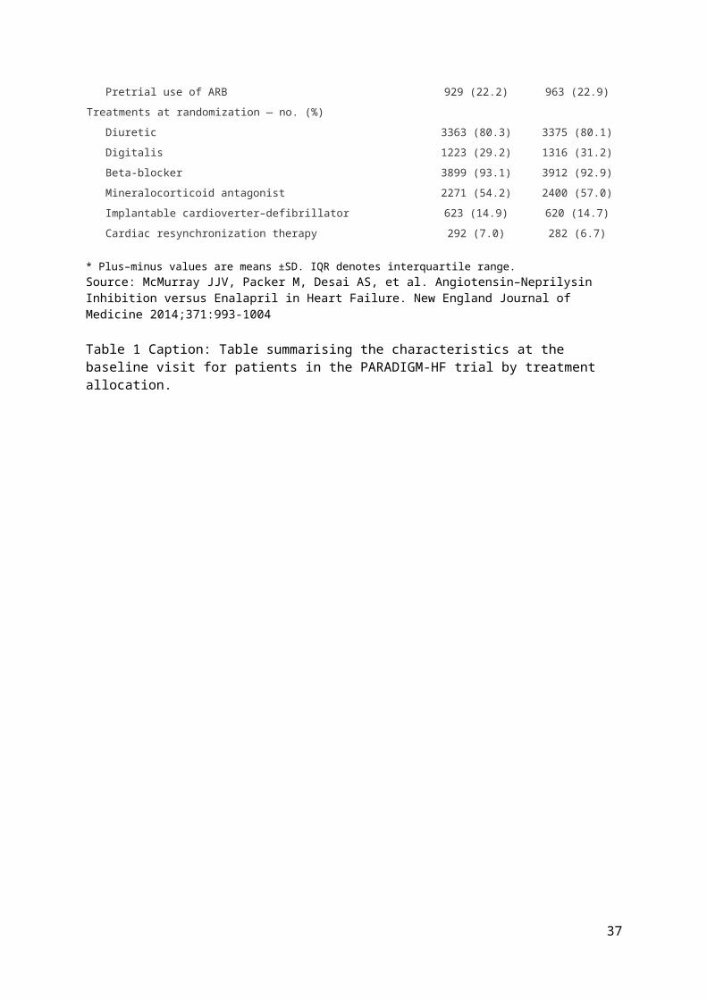
Figure 6. Analysis of Covariance for Change in SBP in the SYMPLICITY 3 trial
Figure 6 Caption: Individual 6 month change in systolic blood pressure (SBP) by baseline SBP by
treatment group from the SYMPLICITY 3 trial. The two drawn parallel regression lines show the
anticipated regression to the mean, ie. patients with a higher baseline SBP (in both treatment groups)
tend to have a greater blood pressure reduction compared with those nearer the minimum inclusion
criteria of 160 mmHg. The vertical distance between the two regression lines is 4.11 mmHg, the mean
treatment effect adjusted for baseline.
37
Central Illustration of Topics Covered
Displaying Results in Tables and Figures main types of Tables and Figures
guidance on what to include
Kaplan-Meier plots
trial profile
Estimates of Treatment Effect relative risk and relative odds
difference in percentages
number needed to treat
hazard ratio for time-to-event data
ANCOVA for quantitative data
Confidence Intervals their value in expressing uncertainty
convention of the two-sided 95% confidence
interval (CI)
connection between CIs and P-values
larger trials produce tighter CIs
Interpreting P-values their role in assessing strength of evidence
misguided reliance on P<0.05
a vocabulary for interpreting P-values
the simplest statistical test
38