Embed Size (px)
Citation preview
Solar PV Installation Price Dispersion in the U.S.
Kathryne Cleary, Josh Constanti, Franz Hochstrasser, Kelly Kneeland, Matthew Moroney
A final paper for FES 800: Energy Economics and Policy Analysis Professor Kenneth Gillingham
Yale University School of Forestry and Environmental Management Spring 2017
1
Table of Contents Executive Summary………………………………………………………….2 Introduction………………………………………………………………...….3 Methodology…………………………………...……………………………….4 Results…………………………………………………………………………...5 National Analysis………………………………………………………...5 Competition………………………………………………………………..6
Third Party Ownership………………………………………………….9
Findings on TPO and Market Competition…………………..11 Connecticut Case Study…………………………………………………...17 Connecticut Regression Analysis……………………………………..19
Connecticut Implications for Policy………………………………….20 Conclusions and Future Work……………………..………………...….24
2
Executive Summary The cost reduction of residential photovoltaic solar (PV) in the U.S. over the past
decade has been well documented. However, these cost reductions have not occurred equally across all states. In this paper, we investigate potential factors causing this dispersion of cost reductions across a variety of states using 2015 data from the Open PV Project led by the National Renewable Energy Laboratory (NREL) and the Lawrence Berkeley National Laboratory (LBNL). Our research focused on examining whether competition, third party ownership, top installers, or price components predict the largest variation in installed cost per watt.
In analyzing these questions, we begin by predicting PV price with non-cost variables: insolation rate, the Herfindahl-Hirschman Index (HHI), third-party system ownership, and a top ten national installer variable. While we find that each of these variables is significant (p < 0.05) in explaining the cost per watt, the results only explain a relatively small portion of the price per watt (R2 = 0.142). We also found no strong correlations in national residential solar trends between HHI and mean insolation, between mean cost per watt and mean insolation, or between mean cost per watt and HHI for 88 counties in 2015.
Our national HHI model shows no apparent trend, so we ran state-specific regressions. Some states show a negative correlation with HHI, meaning that those states have lowered PV costs in counties with less competition. However, most show a slightly positive correlation or a non-significant trend (within 95% confidence intervals). Our state-level third party-owned (TPO) model shows that states with TPO-financing tend to have flatter installation costs per watt with increasing system sizes, than do non-TPO financed states. We also generally see temporary small upticks in cost per watt for states after TPO financing is made available, but lower overall cost per watt in states with TPO thereafter. We also combined our analysis of HHI and TPO on the county level, and we found that counties with the highest HHIs (the most concentrated markets) also tend to be those with the highest percentage of TPO systems.
Finally, we conducted a case study on Connecticut to analyze its cost component-specific trends over time. All of the cost components in our Connecticut regression are significant predictors of cost per watt and explain close to 90% of the variation of the data. We also found that the coefficient for balance of system (BOS) costs per watt increased from a significant value of 0.782 to a larger value of 1.029 from 2012 to 2015, implying that BOS price per watt had more influence in 2015 on the cost per watt than in 2012. We found the same conclusion for rebates and grants. We also noticed relatively high permitting costs per watt, which could be alleviated for further price per watt decreases if Connecticut State legislature would pass a statewide policy that established uniform solar permitting fees.
We also are compelled to bring attention to some shortcomings of the dataset and suggest opportunities for improvement. Overall, despite data gaps, we conclude that localized analysis is crucial for understanding PV cost dispersion and that no single factor can explain the regional differences.
3
Introduction
Over the course of the last decade, much research has been done looking into the various factors contributing to the declining costs of residential photovoltaic solar (PV) throughout the United States. The environmental benefits associated with renewable energy, along with avoiding risk associated with volatile fuel prices, have incentivized both private and public investments in the solar PV industry.1 Additionally, there are proven benefits of PV solar associated with improving domestic energy security, as well as reducing the load on the grid through residential solar installations.2 As such, solar installation costs have been declining throughout the United States since 1998.2 Overall installation numbers have also increased, with average annual growth of residential and commercial PV systems exceeding 40 percent over the last decade.3 Both state and federal policies have significantly contributed to both of these trends, including up-front cash rebates, production-based incentives, purchase requirements on electricity suppliers, and tax benefits. One of the most prominent federal policies is the U.S. Department of Energy’s SunShot Initiative, aiming to make solar energy cost-competitive with other forms of electricity by 2020, with an initial goal of $1/watt.
Past research on factors driving down residential cost-per-watt for solar include economies of scale, new construction sites, greater installer density, and increasing installer experience.2 Additionally, the Tracking the Sun (TTS) Report found that reductions in inverter and racking equipment costs make up about 20 percent of the drop in non-module costs for residential systems, with the remainder of factors falling into the category of “soft” costs unrelated to the technical PV system.2 Finally, the prevalence of cash incentive programs, such as rebates and performance-based incentives, has decreased over the last decade. Despite this drop, there has still been a continued fall in overall PV installed prices.3 Thus, although policies directed toward solar price reduction may be weakening as solar approaches price parity with fossil fuel-based electricity generation, there are still significant drivers of $/watt declines over the last few years.
Based on this previous research, we wanted to consider a few different factors that may have contributed to residential solar PV installation price declines by examining the dispersion of prices around the country in 2015. As Gillingham, et al. explained, a large portion of price variation still remains unexplained. This can likely be attributed to measurement error in the reported prices, or installation-specific factors such as the suitability of the roof or consumer willingness to shop around for lower costs.2 Thus, with Open PV data on 2015, the most recent year of residential installs across the U.S., we sought to dive deeper into some of the cost components making up total installation price.
Furthermore, Gillingham, et al. found that greater market competition within the PV market is actually associated with slightly lower prices. We sought to look into the effect of competition on 2015 residential PV prices. Although Chung, et. al.’s findings on evidence of economies of scale driving down solar prices were significant, this only represented the effect of the size of the solar systems themselves, rather than the effect of the size of the actual business.4 With a lack of literature associated with business size impacts on system
1 Shrimali, G., and S. Jenner (2013). "The Impact of State Policy on Deployment and Cost of Solar Photovoltaic Technology in the U.S.: A Sector-specific Empirical Analysis." Renewable Energy 60(1): 679-690. 2 Gillingham, K., Deng, H., Wiser, R., Darghouth, N., Barbose, G., & Berkeley, L. (2014). Deconstructing Solar Photovoltaic Pricing : The Role of Market Structure , Technology , and Policy - Fact Sheet, 2011, 1998–2005. 3 Barbose, G., & Darghouth, N. (2016). Tracking the Sun IX Primary authors with contributions from Tracking the Sun IX. LBNL Report, (August). 4 Chung, D., Davidson, C., Fu, R., Ardani, K., & Margolis, R. (2015). U.S. Photovoltaic Prices and Cost Breakdowns : Q1 2015 Benchmarks for Residential , Commercial , and Utility-Scale Systems. National Renewable Energy Laboratory, (September), 42. http://doi.org/NREL/TP-6A20-64746
4
price, we sought to examine the impacts of top installers on price, compared to the overall installer impact on PV system price. Finally, since Gillingham, et al. and others have suggested a more targeted analysis of the drivers to third party ownership and customer pricing for valuable future findings, we sought to analyze the effect of third-party ownership on residential PV prices. Our research questions are as follows:
1) What predicts US residential solar PV prices? a) Which cost components are the biggest determinants of price? b) How does market competitiveness affect price? c) How do big installers compare? d) What effect does third party ownership have?
2) What policy recommendations do we have for the future? Methodology
We used the Open PV Project dataset to better understand our research questions. The dataset is made up of public-contributions and maintained through a collaboration of the National Renewable Energy Laboratory (NREL) and Lawrence Berkeley National Laboratory (LBNL). There are two publicly available versions of this data: the raw data and a version cleaned by LBNL for their annual TTS Report.5 The latter is the dataset we based our analysis on. It contains 806,745 solar panel installation records with 61 variables. There are many missing values: 45% of the cells are missing in the dataset.
Our analysis filtered the TTS data to examine residential installations. We created a cost per watt ($/watt) variable for all price components and imputed the national monthly median price for any missing values, except for rebates and grants where the state median for that month was imputed. We also added a binary variable to indicate whether or not the installer was a top installer (SolarCity, Vivint Sunpower, Verengo, Sungevity, Rec Solar, PetersenDean, RGS/Real Goods). We also calculated a measure of competitiveness, the Herfindahl-Hirschman Index (HHI). To calculate the HHI, we calculated the market share of each installer by dividing the number of installations completed by that installer over the total installations. After calculating the installer fraction of market share, we multiplied market share each by 100 and squared the value, and then summed all those values to calculate the HHI. This gave us a number between 1 and 10,000, where 10,000 represents the least competitive market (I.e. a monopoly) and 1 representing the most competitive market.
To exclude any miscoded data with erroneous values, the data was filtered to only contain installations with system sizes less than 20 kilowatts and a cost per watt between $0.10 and $20. The final dataset in this analysis contained 485,932 installations over the all dates and 169,385 installs in 2015.
We iteratively ran seven sets of linear regression models to evaluate which of the chosen variables explain the variation in solar prices. The set of predictors in each model were selected to evaluate different scenarios: cost options (e.g. cost per watt), non-cost options (e.g. solar insolation rate), and policy options (e.g. third party ownership). We evaluated four different versions of each model: with and without interactions, and with and without interactions after scaling the continuous variables from 0 to 1. This made for a total of 28 model permutations. The first 6 models used the national dataset for 2015. The 7th model used the dataset after sub-setting only for Connecticut in two different years, 2012 and 2015. The following models were evaluated:
5 TTS_LBNL_OpenPV_public_file_06-Jan-2017.csv
5
1. Cost / watt = Third Party Owned + Top Installer + Insolation Rate 2. Total Price = System Size + Balance of Systems / W + Module Price / W + Rebates /
W 3. Total Price = System Size + Third Party Owned + Insolation Rate 4. Cost / W = Balance of Systems / W + Module Price / W + Rebates / W 5. Cost / W = Rebates / W + Competitiveness (HHI) + Third Party Ownership 6. Total Price = Rebates + Third Party Ownership + Competitiveness + System Size 7. CT Cost / W = Module / W + Balance of Systems / W + Rebates & Grants / W +
Permitting / W + Labor / W In addition to our linear regressions, we also used the multivariate statistical
techniques of principal component analysis (PCA) and hierarchical clustering to evaluate our dataset. PCA creates new, uncorrelated variables called principal components that are linear re-combinations of the original variables to reduce the dimensionality (number of variables) in the original data. The components are numbered so that component one explains the maximum amount of variability and the sequential components explain decreasing amounts of variability. A hierarchal cluster analysis calculates the distance between each column value to produce agglomerations, or clusters, that can be displayed in a graph called a dendrogram. The groupings of the clusters indicate more closely related observations. We used the Euclidian distance method and the complete agglomeration method to generate clusters for 5 states (AZ, CA, CT,MA,NV). National Analysis
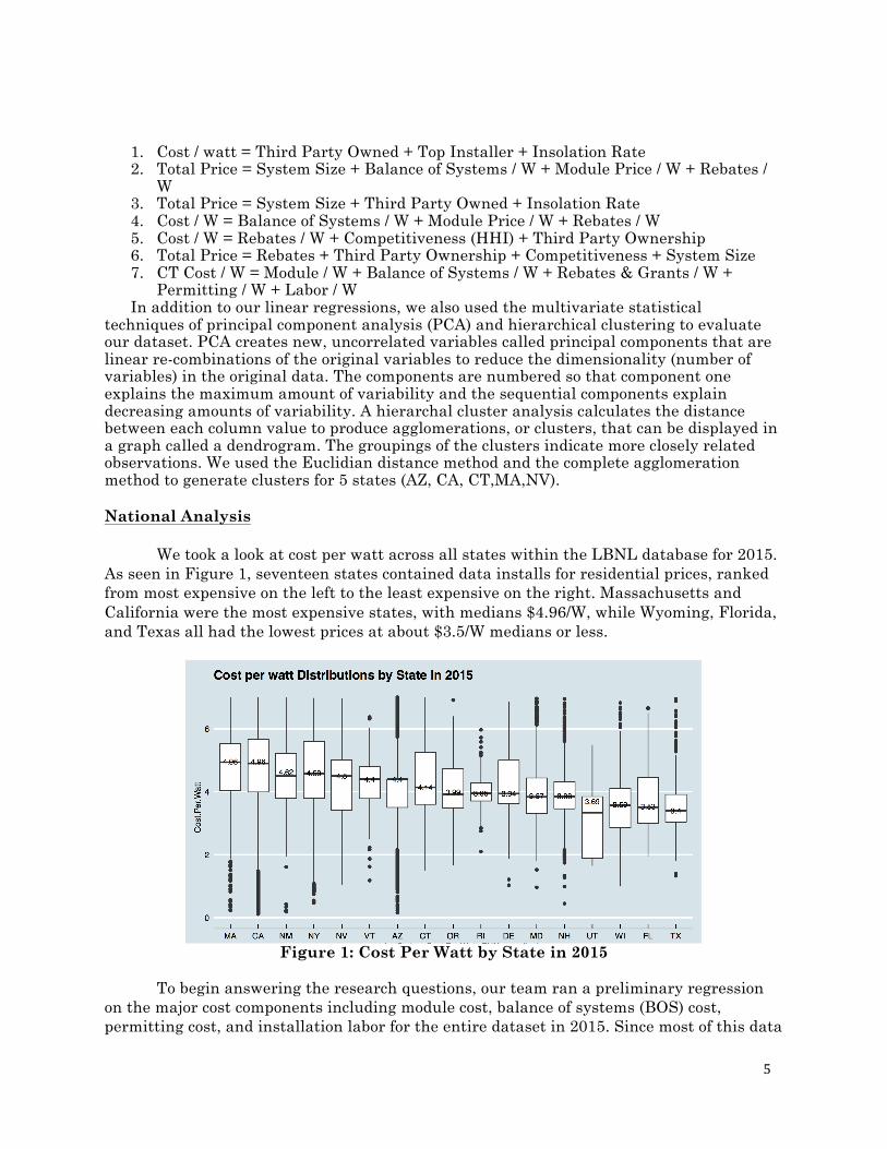
We took a look at cost per watt across all states within the LBNL database for 2015. As seen in Figure 1, seventeen states contained data installs for residential prices, ranked from most expensive on the left to the least expensive on the right. Massachusetts and California were the most expensive states, with medians $4.96/W, while Wyoming, Florida, and Texas all had the lowest prices at about $3.5/W medians or less.
Figure 1: Cost Per Watt by State in 2015
To begin answering the research questions, our team ran a preliminary regression
on the major cost components including module cost, balance of systems (BOS) cost, permitting cost, and installation labor for the entire dataset in 2015. Since most of this data
6
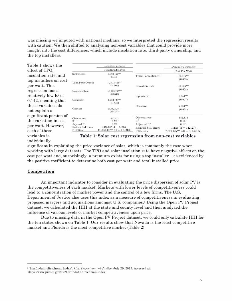
was missing we imputed with national medians, so we interpreted the regression results with caution. We then shifted to analyzing non-cost variables that could provide more insight into the cost differences, which include insolation rate, third-party ownership, and the top installers.
Table 1 shows the effect of TPO, insolation rate, and top installers on cost per watt. This regression has a relatively low R2 of 0.142, meaning that these variables do not explain a significant portion of the variation in cost per watt. However, each of these variables is individually significant in explaining the price variance of solar, which is commonly the case when working with large datasets. The TPO and solar insolation rate have negative effects on the cost per watt and, surprisingly, a premium exists for using a top installer – as evidenced by the positive coefficient to determine both cost per watt and total installed price. Competition
An important indicator to consider in evaluating the price dispersion of solar PV is the competitiveness of each market. Markets with lower levels of competitiveness could lead to a concentration of market power and the control of a few firms. The U.S. Department of Justice also uses this index as a measure of competitiveness in evaluating proposed mergers and acquisitions amongst U.S. companies.6 Using the Open PV Project dataset, we calculated the HHI at the state and county level and then analyzed the influence of various levels of market competitiveness upon price.
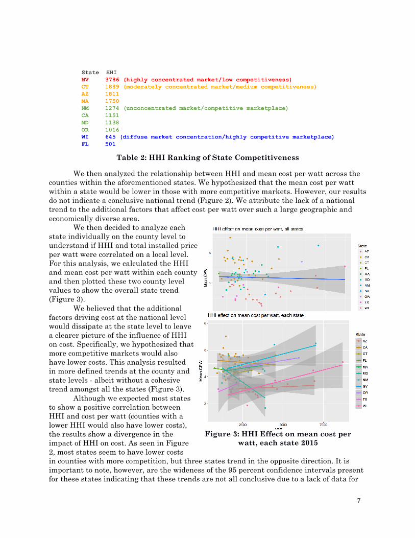
Due to missing data in the Open PV Project dataset, we could only calculate HHI for the ten states shown on Table 1. Our results show that Nevada is the least competitive market and Florida is the most competitive market (Table 2).
6 “Herfindahl-Hirschman Index”. U.S. Department of Justice. July 29, 2015. Accessed at: https://www.justice.gov/atr/herfindahl-hirschman-index
Table 1: Solar cost regression from non-cost variables
7
Table 2: HHI Ranking of State Competitiveness
We then analyzed the relationship between HHI and mean cost per watt across the counties within the aforementioned states. We hypothesized that the mean cost per watt within a state would be lower in those with more competitive markets. However, our results do not indicate a conclusive national trend (Figure 2). We attribute the lack of a national trend to the additional factors that affect cost per watt over such a large geographic and economically diverse area. We then decided to analyze each state individually on the county level to understand if HHI and total installed price per watt were correlated on a local level. For this analysis, we calculated the HHI and mean cost per watt within each county and then plotted these two county level values to show the overall state trend (Figure 3). We believed that the additional factors driving cost at the national level would dissipate at the state level to leave a clearer picture of the influence of HHI on cost. Specifically, we hypothesized that more competitive markets would also have lower costs. This analysis resulted in more defined trends at the county and state levels - albeit without a cohesive trend amongst all the states (Figure 3).
Although we expected most states to show a positive correlation between HHI and cost per watt (counties with a lower HHI would also have lower costs), the results show a divergence in the impact of HHI on cost. As seen in Figure 2, most states seem to have lower costs in counties with more competition, but three states trend in the opposite direction. It is important to note, however, are the wideness of the 95 percent confidence intervals present for these states indicating that these trends are not all conclusive due to a lack of data for
Figure 2: HHI Effect on mean cost per watt, all states 2015
Figure 3: HHI Effect on mean cost per watt, each state 2015
8
certain counties. Maryland in particular has lower costs in less competitive counties than in their more competitive neighborhoods. However, Maryland notably has only 772 installations performed by 54 installers, which is a relatively small amount of data compared to Connecticut (6,220 and 53, respectively) and California (91,149 and 1,890, respectively). This revelation is still surprising since we expected that states would always show lower costs in counties with more competition, but the result could be due to lack of substantial data in these states.
Researchers have analyzed other competitive markets to understand the impact competition has on price. Borenstein (1985) found that brand loyalty can lead to pricing power of firms within a competitive market.7 Pless, et al. (2017) found that market structure, competition, and price are influenced by one another simultaneously; making it challenging to parse out the effect one variable has on the others.8 However, the authors concluded that firms can charge higher prices in competitive markets. They theorize that firms in less competitive markets may be lowering price below their competitors’ marginal cost, driving them out of business and detracting would-be new entrants from entering the nascent solar industry. In addition, multiple dominant firms may engage in price wars in competitive markets, driving down the price.8 This research may help to explain why states like Maryland seem to become more expensive in more competitive markets.
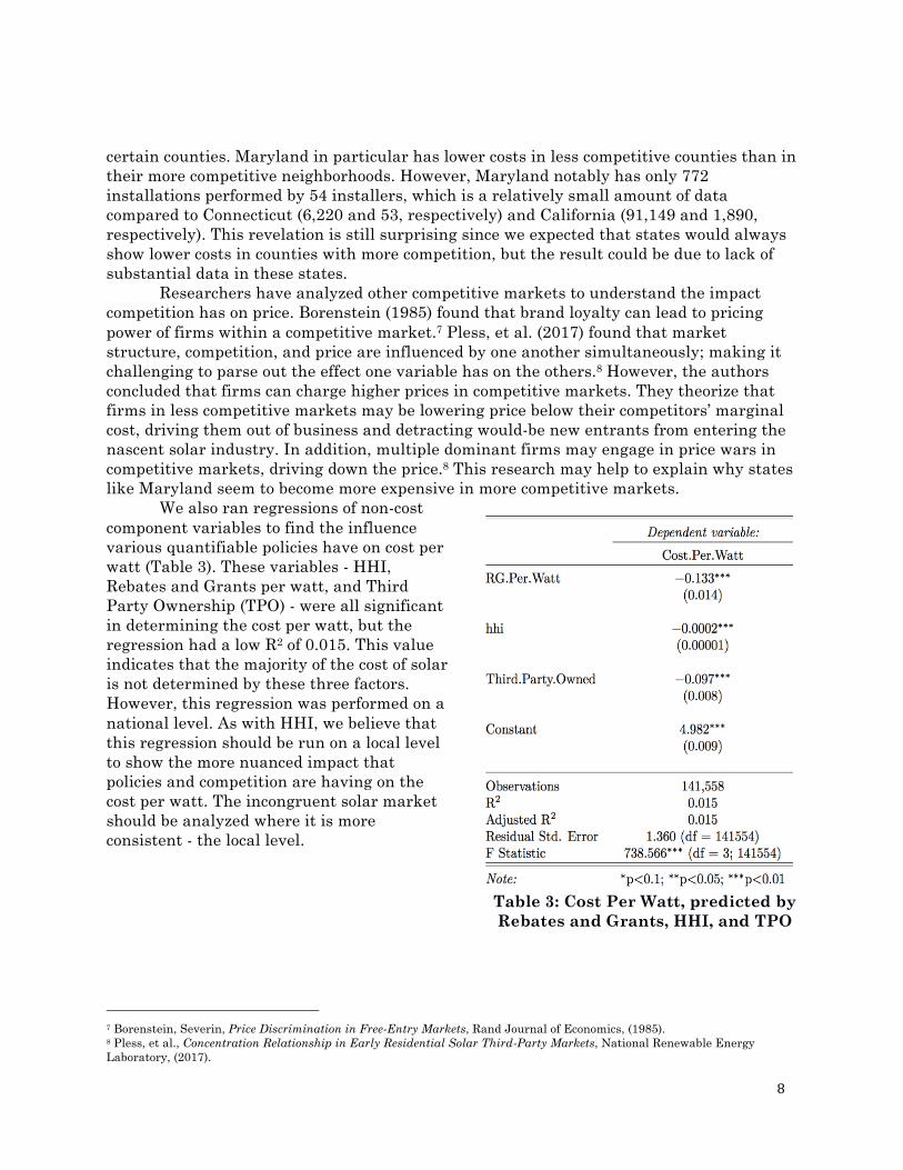
We also ran regressions of non-cost component variables to find the influence various quantifiable policies have on cost per watt (Table 3). These variables - HHI, Rebates and Grants per watt, and Third Party Ownership (TPO) - were all significant in determining the cost per watt, but the regression had a low R2 of 0.015. This value indicates that the majority of the cost of solar is not determined by these three factors. However, this regression was performed on a national level. As with HHI, we believe that this regression should be run on a local level to show the more nuanced impact that policies and competition are having on the cost per watt. The incongruent solar market should be analyzed where it is more consistent - the local level.
7 Borenstein, Severin, Price Discrimination in Free-Entry Markets, Rand Journal of Economics, (1985). 8 Pless, et al., Concentration Relationship in Early Residential Solar Third-Party Markets, National Renewable Energy Laboratory, (2017).
Table 3: Cost Per Watt, predicted by Rebates and Grants, HHI, and TPO
9
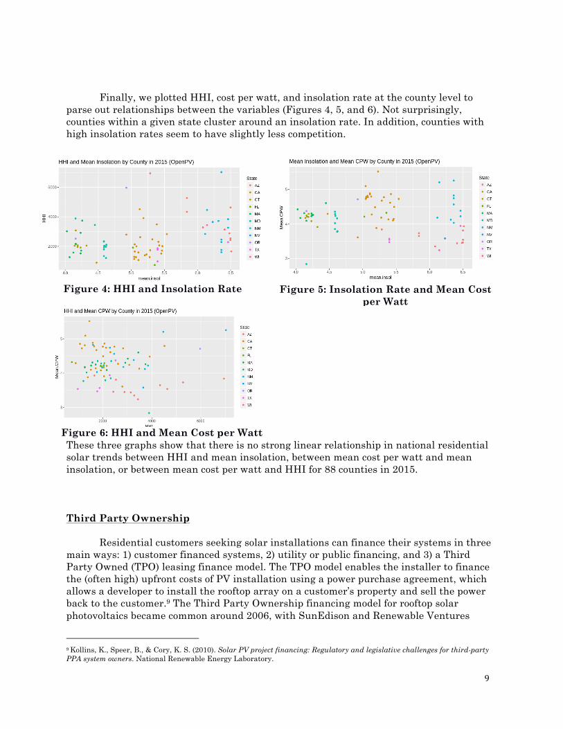
Finally, we plotted HHI, cost per watt, and insolation rate at the county level to parse out relationships between the variables (Figures 4, 5, and 6). Not surprisingly, counties within a given state cluster around an insolation rate. In addition, counties with high insolation rates seem to have slightly less competition.
These three graphs show that there is no strong linear relationship in national residential solar trends between HHI and mean insolation, between mean cost per watt and mean insolation, or between mean cost per watt and HHI for 88 counties in 2015. Third Party Ownership
Residential customers seeking solar installations can finance their systems in three main ways: 1) customer financed systems, 2) utility or public financing, and 3) a Third Party Owned (TPO) leasing finance model. The TPO model enables the installer to finance the (often high) upfront costs of PV installation using a power purchase agreement, which allows a developer to install the rooftop array on a customer’s property and sell the power back to the customer.9 The Third Party Ownership financing model for rooftop solar photovoltaics became common around 2006, with SunEdison and Renewable Ventures
9 Kollins, K., Speer, B., & Cory, K. S. (2010). Solar PV project financing: Regulatory and legislative challenges for third-party PPA system owners. National Renewable Energy Laboratory.
Figure 4: HHI and Insolation Rate Figure 5: Insolation Rate and Mean Cost per Watt
Figure 6: HHI and Mean Cost per Watt
10
pioneering, and it rapidly overtook other financing models by 2008 despite legal and regulatory hurdles in some states.10 By 2011, TPO accounted for 42% of residential installs nation-wide.11 Despite TPO solar surging to a peak of 72.3% of ownership type in 2014, analysts at Green Tech Media (GTM) do not anticipate that level to sustain, as projections trail off, despite TPO still accounting for more than half of residential solar installs in 2015.12 EIA’s data differs from GTM’s in their most recent reporting as of December 2016, finding that TPO is only 30% of the solar market and 56% of distributed solar capacity in the residential sector. However, residential also accounts for 84% of third-party-owned solar capacity.13 GTM took issue with the EIA numbers, and our analysis of the data also suggests that EIA’s estimates were low, despite missing data.14 This data discrepancy also became clear in our analysis of the Open PV dataset where some states that allow TPO did not reflect any breakdown, and others that do reflect it still broadly lack completeness.
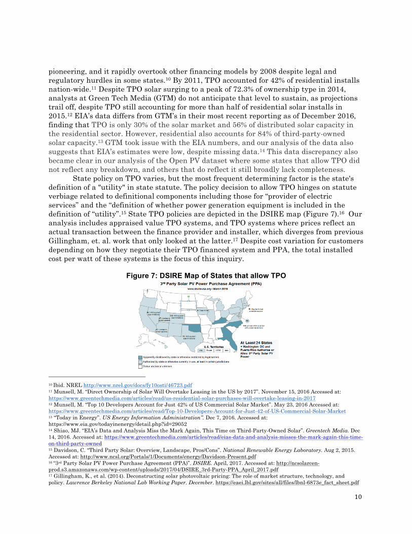
State policy on TPO varies, but the most frequent determining factor is the state's definition of a "utility" in state statute. The policy decision to allow TPO hinges on statute verbiage related to definitional components including those for “provider of electric services” and the “definition of whether power generation equipment is included in the definition of “utility”.15 State TPO policies are depicted in the DSIRE map (Figure 7).16 Our analysis includes appraised value TPO systems, and TPO systems where prices reflect an actual transaction between the finance provider and installer, which diverges from previous Gillingham, et. al. work that only looked at the latter.17 Despite cost variation for customers depending on how they negotiate their TPO financed system and PPA, the total installed cost per watt of these systems is the focus of this inquiry.
Figure 7: DSIRE Map of States that allow TPO
10 Ibid. NREL http://www.nrel.gov/docs/fy10osti/46723.pdf 11 Munsell, M. “Direct Ownership of Solar Will Overtake Leasing in the US by 2017”. November 15, 2016 Accessed at: https://www.greentechmedia.com/articles/read/us-residential-solar-purchases-will-overtake-leasing-in-2017 12 Munsell, M. “Top 10 Developers Account for Just 42% of US Commercial Solar Market”. May 23, 2016 Accessed at: https://www.greentechmedia.com/articles/read/Top-10-Developers-Account-for-Just-42-of-US-Commercial-Solar-Market 13 “Today in Energy”. US Energy Information Administration”. Dec 7, 2016. Accessed at: https://www.eia.gov/todayinenergy/detail.php?id=29052 14 Shiao, MJ. “EIA’s Data and Analysis Miss the Mark Again, This Time on Third-Party-Owned Solar”. Greentech Media. Dec 14, 2016. Accessed at: https://www.greentechmedia.com/articles/read/eias-data-and-analysis-misses-the-mark-again-this-time-on-third-party-owned 15 Davidson, C. “Third Party Solar: Overview, Landscape, Pros/Cons”. National Renewable Energy Laboratory. Aug 2, 2015. Accessed at: http://www.ncsl.org/Portals/1/Documents/energy/Davidson-Present.pdf 16 “3rd Party Solar PV Power Purchase Agreement (PPA)”. DSIRE. April, 2017. Accessed at: http://ncsolarcen-prod.s3.amazonaws.com/wp-content/uploads/2017/04/DSIRE_3rd-Party-PPA_April_2017.pdf 17 Gillingham, K., et al. (2014). Deconstructing solar photovoltaic pricing: The role of market structure, technology, and policy. Lawrence Berkeley National Lab Working Paper. December. https://eaei.lbl.gov/sites/all/files/lbnl-6873e_fact_sheet.pdf
11
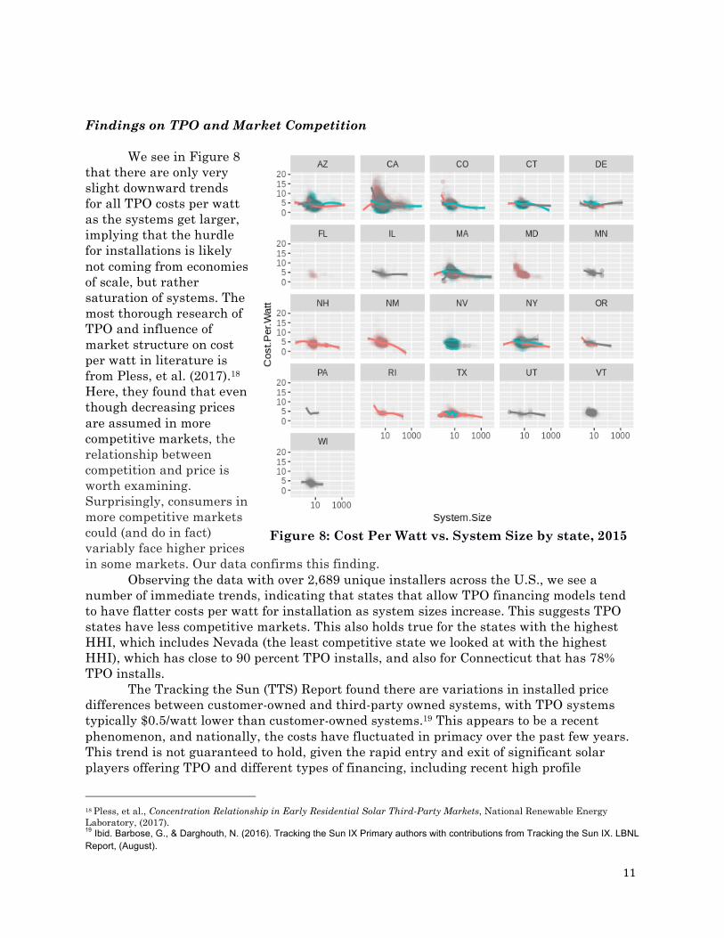
Findings on TPO and Market Competition We see in Figure 8
that there are only very slight downward trends for all TPO costs per watt as the systems get larger, implying that the hurdle for installations is likely not coming from economies of scale, but rather saturation of systems. The most thorough research of TPO and influence of market structure on cost per watt in literature is from Pless, et al. (2017).18 Here, they found that even though decreasing prices are assumed in more competitive markets, the relationship between competition and price is worth examining. Surprisingly, consumers in more competitive markets could (and do in fact) variably face higher prices in some markets. Our data confirms this finding.
Observing the data with over 2,689 unique installers across the U.S., we see a number of immediate trends, indicating that states that allow TPO financing models tend to have flatter costs per watt for installation as system sizes increase. This suggests TPO states have less competitive markets. This also holds true for the states with the highest HHI, which includes Nevada (the least competitive state we looked at with the highest HHI), which has close to 90 percent TPO installs, and also for Connecticut that has 78% TPO installs.
The Tracking the Sun (TTS) Report found there are variations in installed price differences between customer-owned and third-party owned systems, with TPO systems typically $0.5/watt lower than customer-owned systems.19 This appears to be a recent phenomenon, and nationally, the costs have fluctuated in primacy over the past few years. This trend is not guaranteed to hold, given the rapid entry and exit of significant solar players offering TPO and different types of financing, including recent high profile
18 Pless, et al., Concentration Relationship in Early Residential Solar Third-Party Markets, National Renewable Energy Laboratory, (2017). 19 Ibid. Barbose, G., & Darghouth, N. (2016). Tracking the Sun IX Primary authors with contributions from Tracking the Sun IX. LBNL Report, (August).
Figure 8: Cost Per Watt vs. System Size by state, 2015
12
bankruptcies of Sungevity and SunEdison. While our regression in Table 1 has a lower R2
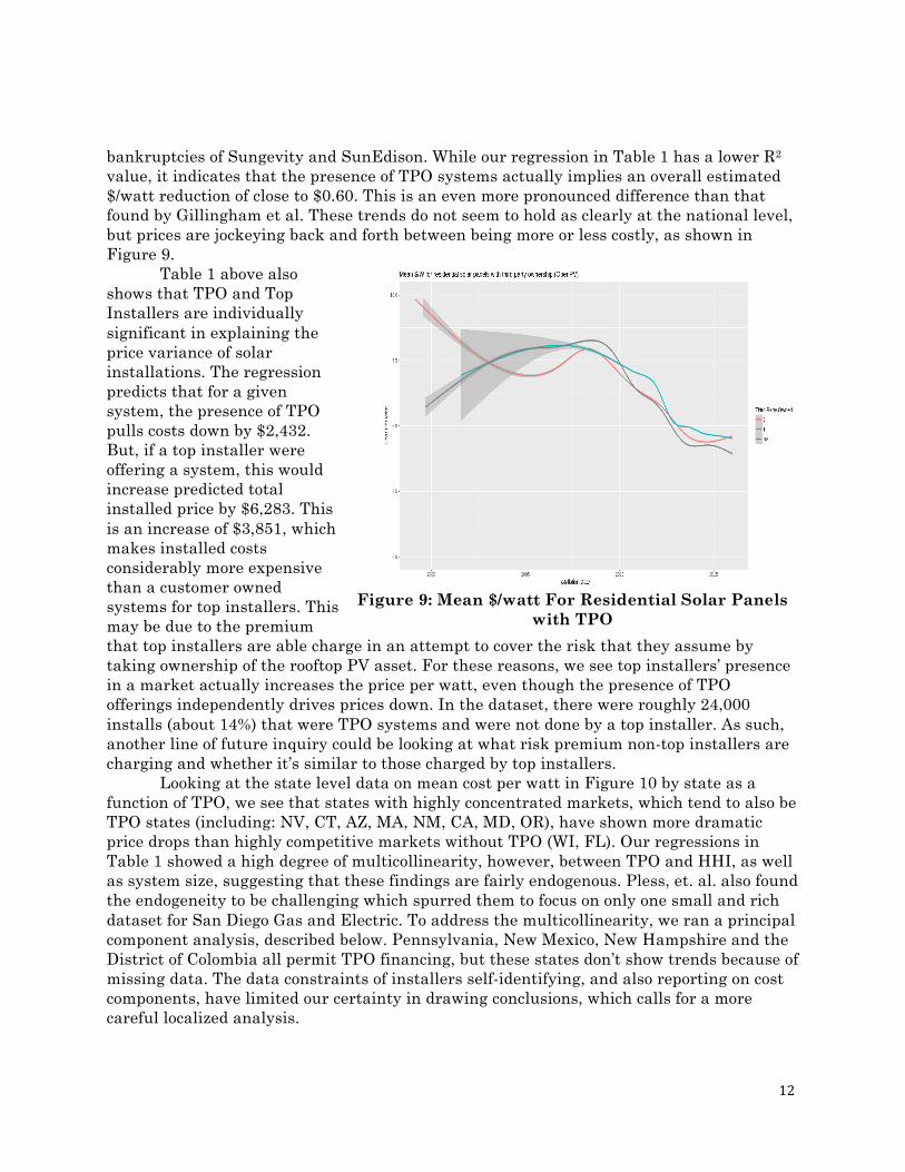
value, it indicates that the presence of TPO systems actually implies an overall estimated $/watt reduction of close to $0.60. This is an even more pronounced difference than that found by Gillingham et al. These trends do not seem to hold as clearly at the national level, but prices are jockeying back and forth between being more or less costly, as shown in Figure 9.
Table 1 above also shows that TPO and Top Installers are individually significant in explaining the price variance of solar installations. The regression predicts that for a given system, the presence of TPO pulls costs down by $2,432. But, if a top installer were offering a system, this would increase predicted total installed price by $6,283. This is an increase of $3,851, which makes installed costs considerably more expensive than a customer owned systems for top installers. This may be due to the premium that top installers are able charge in an attempt to cover the risk that they assume by taking ownership of the rooftop PV asset. For these reasons, we see top installers’ presence in a market actually increases the price per watt, even though the presence of TPO offerings independently drives prices down. In the dataset, there were roughly 24,000 installs (about 14%) that were TPO systems and were not done by a top installer. As such, another line of future inquiry could be looking at what risk premium non-top installers are charging and whether it’s similar to those charged by top installers.
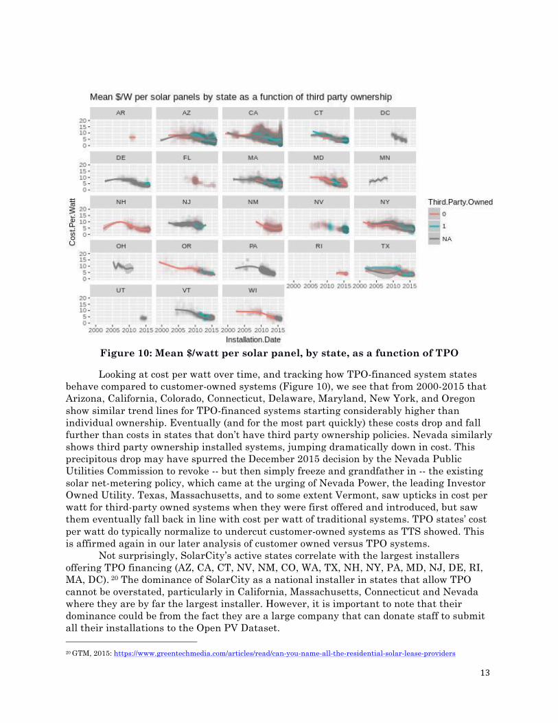
Looking at the state level data on mean cost per watt in Figure 10 by state as a function of TPO, we see that states with highly concentrated markets, which tend to also be TPO states (including: NV, CT, AZ, MA, NM, CA, MD, OR), have shown more dramatic price drops than highly competitive markets without TPO (WI, FL). Our regressions in Table 1 showed a high degree of multicollinearity, however, between TPO and HHI, as well as system size, suggesting that these findings are fairly endogenous. Pless, et. al. also found the endogeneity to be challenging which spurred them to focus on only one small and rich dataset for San Diego Gas and Electric. To address the multicollinearity, we ran a principal component analysis, described below. Pennsylvania, New Mexico, New Hampshire and the District of Colombia all permit TPO financing, but these states don’t show trends because of missing data. The data constraints of installers self-identifying, and also reporting on cost components, have limited our certainty in drawing conclusions, which calls for a more careful localized analysis.
Figure 9: Mean $/watt For Residential Solar Panels with TPO
13
Figure 10: Mean $/watt per solar panel, by state, as a function of TPO
Looking at cost per watt over time, and tracking how TPO-financed system states behave compared to customer-owned systems (Figure 10), we see that from 2000-2015 that Arizona, California, Colorado, Connecticut, Delaware, Maryland, New York, and Oregon show similar trend lines for TPO-financed systems starting considerably higher than individual ownership. Eventually (and for the most part quickly) these costs drop and fall further than costs in states that don’t have third party ownership policies. Nevada similarly shows third party ownership installed systems, jumping dramatically down in cost. This precipitous drop may have spurred the December 2015 decision by the Nevada Public Utilities Commission to revoke -- but then simply freeze and grandfather in -- the existing solar net-metering policy, which came at the urging of Nevada Power, the leading Investor Owned Utility. Texas, Massachusetts, and to some extent Vermont, saw upticks in cost per watt for third-party owned systems when they were first offered and introduced, but saw them eventually fall back in line with cost per watt of traditional systems. TPO states’ cost per watt do typically normalize to undercut customer-owned systems as TTS showed. This is affirmed again in our later analysis of customer owned versus TPO systems.
Not surprisingly, SolarCity’s active states correlate with the largest installers offering TPO financing (AZ, CA, CT, NV, NM, CO, WA, TX, NH, NY, PA, MD, NJ, DE, RI, MA, DC). 20 The dominance of SolarCity as a national installer in states that allow TPO cannot be overstated, particularly in California, Massachusetts, Connecticut and Nevada where they are by far the largest installer. However, it is important to note that their dominance could be from the fact they are a large company that can donate staff to submit all their installations to the Open PV Dataset. 20 GTM, 2015: https://www.greentechmedia.com/articles/read/can-you-name-all-the-residential-solar-lease-providers
14
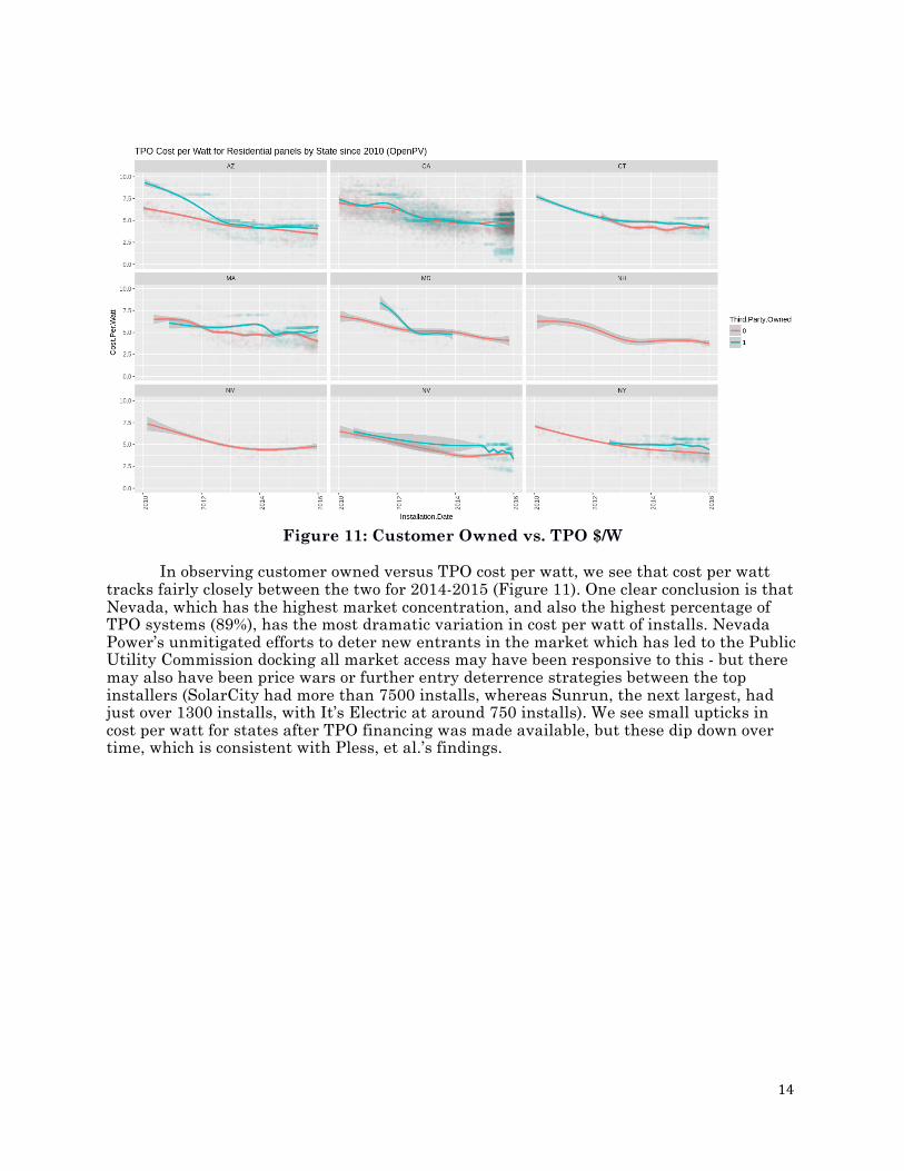
Figure 11: Customer Owned vs. TPO $/W
In observing customer owned versus TPO cost per watt, we see that cost per watt tracks fairly closely between the two for 2014-2015 (Figure 11). One clear conclusion is that Nevada, which has the highest market concentration, and also the highest percentage of TPO systems (89%), has the most dramatic variation in cost per watt of installs. Nevada Power’s unmitigated efforts to deter new entrants in the market which has led to the Public Utility Commission docking all market access may have been responsive to this - but there may also have been price wars or further entry deterrence strategies between the top installers (SolarCity had more than 7500 installs, whereas Sunrun, the next largest, had just over 1300 installs, with It’s Electric at around 750 installs). We see small upticks in cost per watt for states after TPO financing was made available, but these dip down over time, which is consistent with Pless, et al.’s findings.
15
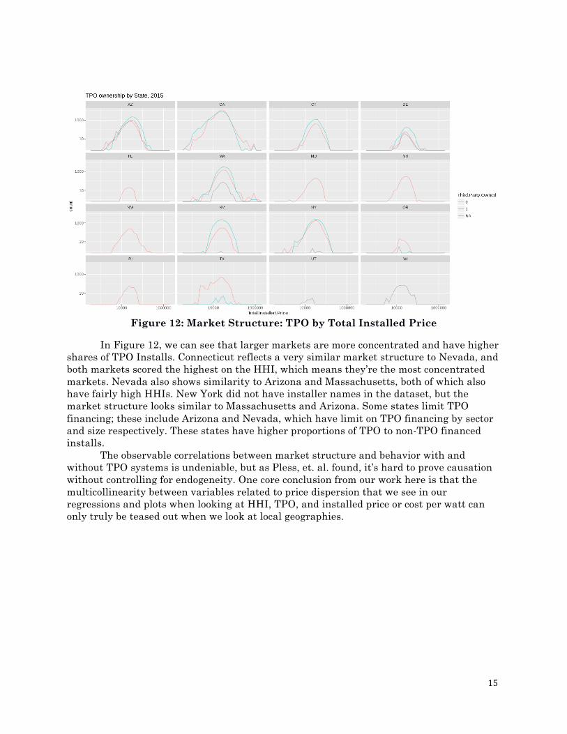
Figure 12: Market Structure: TPO by Total Installed Price
In Figure 12, we can see that larger markets are more concentrated and have higher shares of TPO Installs. Connecticut reflects a very similar market structure to Nevada, and both markets scored the highest on the HHI, which means they’re the most concentrated markets. Nevada also shows similarity to Arizona and Massachusetts, both of which also have fairly high HHIs. New York did not have installer names in the dataset, but the market structure looks similar to Massachusetts and Arizona. Some states limit TPO financing; these include Arizona and Nevada, which have limit on TPO financing by sector and size respectively. These states have higher proportions of TPO to non-TPO financed installs.
The observable correlations between market structure and behavior with and without TPO systems is undeniable, but as Pless, et. al. found, it’s hard to prove causation without controlling for endogeneity. One core conclusion from our work here is that the multicollinearity between variables related to price dispersion that we see in our regressions and plots when looking at HHI, TPO, and installed price or cost per watt can only truly be teased out when we look at local geographies.
16
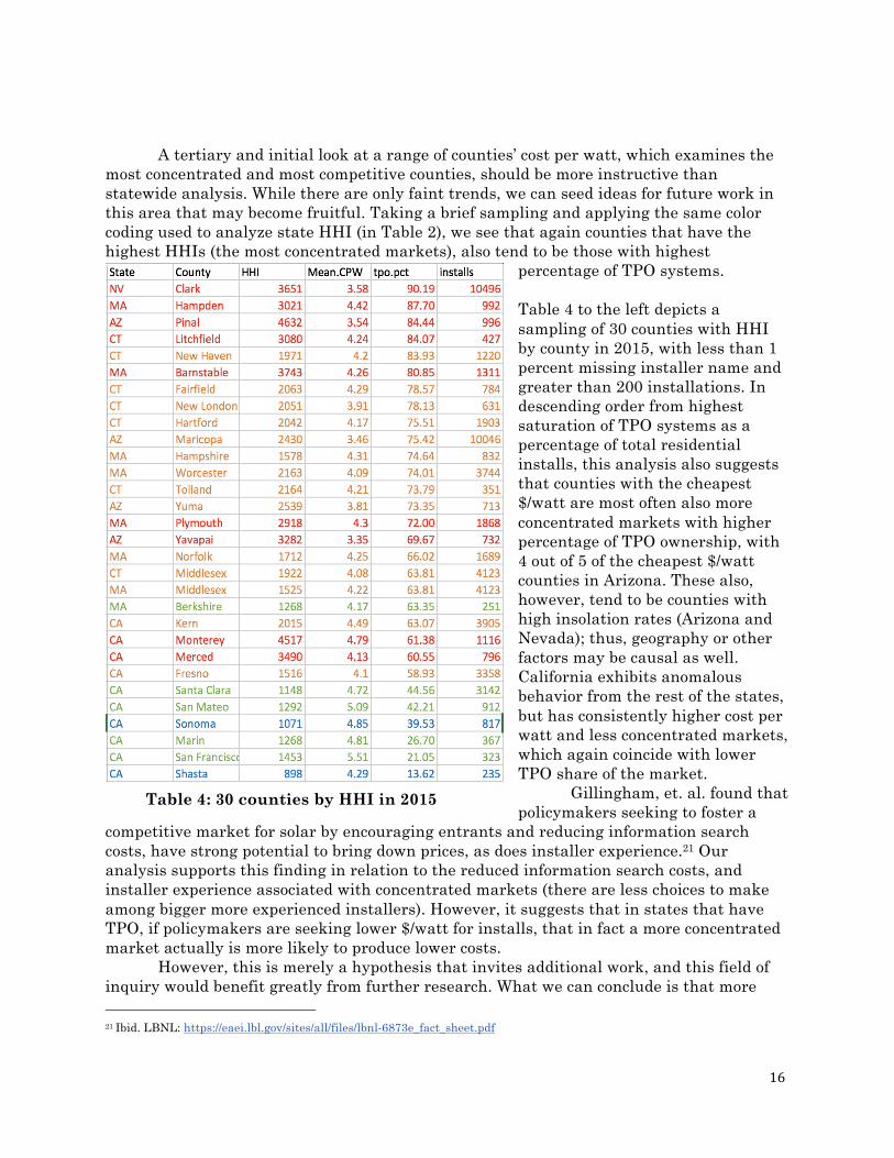
A tertiary and initial look at a range of counties’ cost per watt, which examines the most concentrated and most competitive counties, should be more instructive than statewide analysis. While there are only faint trends, we can seed ideas for future work in this area that may become fruitful. Taking a brief sampling and applying the same color coding used to analyze state HHI (in Table 2), we see that again counties that have the highest HHIs (the most concentrated markets), also tend to be those with highest
percentage of TPO systems. Table 4 to the left depicts a sampling of 30 counties with HHI by county in 2015, with less than 1 percent missing installer name and greater than 200 installations. In descending order from highest saturation of TPO systems as a percentage of total residential installs, this analysis also suggests that counties with the cheapest $/watt are most often also more concentrated markets with higher percentage of TPO ownership, with 4 out of 5 of the cheapest $/watt counties in Arizona. These also, however, tend to be counties with high insolation rates (Arizona and Nevada); thus, geography or other factors may be causal as well. California exhibits anomalous behavior from the rest of the states, but has consistently higher cost per watt and less concentrated markets, which again coincide with lower TPO share of the market.
Gillingham, et. al. found that policymakers seeking to foster a
competitive market for solar by encouraging entrants and reducing information search costs, have strong potential to bring down prices, as does installer experience.21 Our analysis supports this finding in relation to the reduced information search costs, and installer experience associated with concentrated markets (there are less choices to make among bigger more experienced installers). However, it suggests that in states that have TPO, if policymakers are seeking lower $/watt for installs, that in fact a more concentrated market actually is more likely to produce lower costs.
However, this is merely a hypothesis that invites additional work, and this field of inquiry would benefit greatly from further research. What we can conclude is that more 21 Ibid. LBNL: https://eaei.lbl.gov/sites/all/files/lbnl-6873e_fact_sheet.pdf
Table 4: 30 counties by HHI in 2015
17
localized targeting of policy interventions would likely have a higher degree of efficacy than focusing on the statewide level. Whether or not we accept the notion that the utility death spiral is going to gradually pull traditional Investor Owned Utilities apart, the definition of ‘utility’ is changing drastically in the industry, so it is hard to see why TPO systems won’t continue to grow if installation prices continue falling. This growth would in turn enable more solar installs, especially for lower income or risk-averse customers that still want to go solar but can’t afford the upfront capital of a customer-owned system. This is the logic that likely led GTM to project a peak of TPO system penetration in 2016, but an eventual decline of TPO market share. The EIA data indicated that TPO systems account for 44% of residential solar PV systems in 2016, suggesting that the growth of TPO nationally has flagged already compared to projections.
With the merger of SolarCity and Tesla ostensibly due to shaky financials in the former, and the faltering of NRG’s solar installation program, Sungevity, SunEdison and other installers offering TPO, we’re seeing highly variable and dynamic shifts in the installer market that differ widely across states and counties, and which may continue to disrupt these trends. It is also hard for policymakers to argue for greater concentration in markets, as it is counterintuitive to traditional economics, even if it is more likely to produce conditions for lower $/watt for installs. State and local policies, and specifically their treatment of TPO offerings, as well as the market behavior of large installers offering TPO, therefore become all the more important in determining installation costs for residential solar PV. Connecticut Case Study State Profile
The state of Connecticut has a vibrant solar market with over 13,146 total installations according to the LBNL dataset. In 2015 alone, Connecticut installed 6,220 residential rooftop solar installations all across the state at an average cost of 4.35 $/watt.
Connecticut ranks sixth in residential solar installations per state with 13,146 total rooftop installations. Given Connecticut’s small population compared to leading states California, New York, and Arizona, Connecticut’s rooftop installations are actually quite high for a state of its geographic size and population density.
As part of our analysis on the drivers of installation costs, we attempted to look at a national plot of rooftop solar cost components over time, including balance of systems, labor, modules, and permitting. When we attempted to display the data over time in terms of these components, however, the majority of states were missing one or more of the sub-cost components, and the majority of the data points that remained were almost exclusively from Connecticut.
Thus, in order to include this vital cost analysis, we narrowed the scope to focus on Connecticut alone, as shown in the figure below:
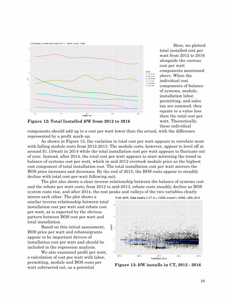
18
Here, we plotted
total installed cost per watt from 2012 to 2016 alongside the various cost per watt components mentioned above. When the individual cost components of balance of systems, module, installation labor, permitting, and sales tax are summed, they equate to a value less than the total cost per watt. Theoretically, these individual
components should add up to a cost per watt lower than the actual, with the difference represented by a profit mark-up.
As shown in Figure 12, the variation in total cost per watt appears to correlate most with falling module costs from 2012-2013. The module costs, however, appear to level off at around $1.15/watt in 2014 while the total installation cost per watt appears to fluctuate out of sync. Instead, after 2014, the total cost per watt appears to start mirroring the trend in balance-of-systems cost per watt, which in mid 2012 overtook module price as the highest cost component of total installation cost. The total installation cost per watt mirrors the BOS price increases and decreases. By the end of 2015, the BOS costs appear to steadily decline with total cost-per-watt following suit.
The plot also shows a clear inverse relationship between the balance of systems cost and the rebate per watt costs; from 2012 to mid-2013, rebate costs steadily decline as BOS system costs rise, and after 2014, the cost peaks and valleys of the two variables clearly mirror each other. The plot shows a similar inverse relationship between total installation cost per watt and rebate cost per watt, as is expected by the obvious pattern between BOS cost per watt and total installation.
Based on this initial assessment, BOS price per watt and rebates/grants appear to be important drivers of installation cost per watt and should be included in the regression analysis.
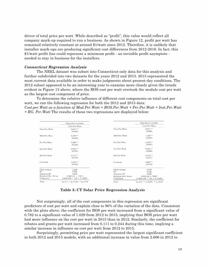
We also examined profit per watt, a calculation of cost per watt with labor, permitting, module and BOS costs per watt subtracted out, as a potential
Figure 12: Total Installed $/W from 2012 to 2016
Figure 13: $/W installs in CT, 2012 - 2016
19
driver of total price per watt. While described as “profit”, this value would reflect all company mark-up required to run a business. As shown in Figure 12, profit per watt has remained relatively constant at around $1/watt since 2012. Therefore, it is unlikely that installer mark-ups are producing significant cost differences from 2012-2016. In fact, this $1/watt profit line could represent a minimum profit - an invisible profit asymptote - needed to stay in business for the installers. Connecticut Regression Analysis
The NREL dataset was subset into Connecticut-only data for this analysis and further subdivided into two datasets for the years 2012 and 2015. 2015 represented the most current data available in order to make judgments about present-day conditions. The 2012 subset appeared to be an interesting year to examine more closely given the trends evident in Figure 13 above, where the BOS cost per watt overtook the module cost per watt as the largest cost component of price.
To determine the relative influence of different cost components on total cost per watt, we ran the following regression for both the 2012 and 2015 data: Cost.per.Watt as a function of Mod.Per.Watt + BOS.Per.Watt + Per.Per.Watt + Inst.Per.Watt + RG. Per.Watt The results of these two regressions are displayed below:
Not surprisingly, all of the cost components in this regression are significant predictors of cost per watt and explain close to 90% of the variation of the data. Consistent with the plots above, the coefficient for BOS per watt increased from a significant value of 0.782 to a significant value of 1.029 from 2012 to 2015, implying that BOS price per watt had more influence on the cost per watt in 2015 than in 2012. Similarly, the coefficient for rebates and grants per watt increased from 0.111 to 0.244 during this time, implying a similar increase in influence on cost per watt from 2012 to 2015.
Surprisingly, permitting price per watt represented the largest significant coefficient in both 2012 and 2015 models, with an additional increase in value from 2.606 in 2012 to
Table 5: CT Solar Price Regression Analysis
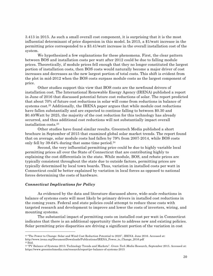
20
3.413 in 2015. As such a small overall cost component, it is surprising that it is the most influential determinant of price dispersion in this model. In 2015, a $1/watt increase in the permitting price corresponded to a $3.41/watt increase in the overall installation cost of the system.
We hypothesized a few explanations for these phenomena. First, the clear pattern between BOS and installation costs per watt after 2012 could be due to falling module prices. Theoretically, if module prices fell enough that they no longer constituted the largest portion of installation costs, then BOS costs would naturally become a major driver of cost increases and decreases as the new largest portion of total costs. This shift is evident from the plot in mid-2012 when the BOS costs surpass module costs as the largest component of price.
Other studies support this view that BOS costs are the newfound drivers of installation cost. The International Renewable Energy Agency (IRENA) published a report in June of 2016 that discussed potential future cost reductions of solar. The report predicted that about 70% of future cost reductions in solar will come from reductions in balance of systems cost.22 Additionally, the IRENA paper argues that while module cost reductions have fallen substantially and are expected to continue falling to between $0.30 and $0.40/Watt by 2025, the majority of the cost reduction for this technology has already occurred, and thus additional cost reductions will not substantially impact overall installation costs.23
Other studies have found similar results. Greentech Media published a short brochure in September of 2015 that examined global solar market trends. The report found that on average, solar module costs had fallen by 79% from 2007-2014, while BOS costs only fell by 39-64% during that same time period.24
Second, the very influential permitting price could be due to highly variable local permitting prices all over the State of Connecticut that are contributing highly to explaining the cost differentials in the state. While module, BOS, and rebate prices are typically consistent throughout the state due to outside factors, permitting prices are typically determined by local town boards. Thus, variation in installed costs per watt in Connecticut could be better explained by variation in local forces as opposed to national forces determining the costs of hardware. Connecticut Implications for Policy
As evidenced by the data and literature discussed above, wide-scale reductions in balance of systems costs will most likely be primary drivers in installed cost reductions in the coming years. Federal and state policies could attempt to reduce these costs with targeted research and development to improve and lower the costs of inverters, wiring, and mounting systems.
The substantial impact of permitting costs on installed cost per watt in Connecticut indicates that there is an additional opportunity there to address new and existing policies. Solar permitting price disparities are driving a significant portion of the variation in cost 22 “The Power to Change: Solar and Wind Cost Reduction Potential to 2025”, IRENA. June 2016. Accessed at: http://www.irena.org/DocumentDownloads/Publications/IRENA_Power_to_Change_2016.pdf 23 Ibid. 24 “PV Balance of Systems 2015: Technology Trends and Markets”. Green Tech Media Research, September 2015. Accessed at: https://www.greentechmedia.com/research/report/pv-balance-of-systems-2015
21
per watt of Connecticut’s data in both 2012 and 2015. As of 2014, Connecticut did not have statewide policy on permitting solar systems and town boards varied widely in their policies. Some towns, like Bridgeport and Manchester, waived the permit fee altogether, while other towns used methods that increased the permit fee depending on the size of the system.25 If the Connecticut State legislature would pass a statewide policy that established low, uniform solar permitting fees, this could have dramatic implications for cost reductions within the state.
While the results of this analysis are relevant for Connecticut, other state markets may behave vastly different due to different state-level policies and general market behavior and therefore the results of this case study should be taken with caution when used for application to other markets. A similar in-depth cost component analysis would need to be done for other markets to reach useful policy conclusions. The implications for BOS trends, however, may be relevant for state solar markets nationwide as hardware costs are typically more similar on a national level than more localized soft costs.
25 “Connecticut Rooftop Solar PV Permitting Guide”. Energize Connecticut. May 1, 2014. Accessed at: https://www.energizect.com/sites/default/files/uploads/CGB/18-CT-Rooftop-Solar-PV-Permitting-Guide.pdf
22
Multivariate Analysis
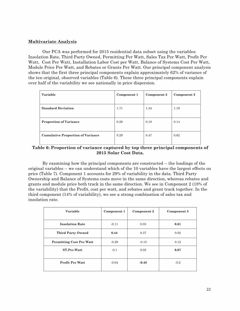
Our PCA was performed for 2015 residential data subset using the variables: Insolation Rate, Third Party Owned, Permitting Per Watt, Sales Tax Per Watt, Profit Per Watt, Cost Per Watt, Installation Labor Cost per Watt, Balance of Systems Cost Per Watt, Module Price Per Watt, and Rebates or Grants Per Watt. Our principal component analysis shows that the first three principal components explain approximately 62% of variance of the ten original, observed variables (Table 6). These three principal components explain over half of the variability we see nationally in price dispersion.
Variable Component 1 Component 2 Component 3
Standard Deviation 1.71 1.34 1.19
Proportion of Variance 0.29 0.18 0.14
Cumulative Proportion of Variance 0.29 0.47 0.62
Table 6: Proportion of variance captured by top three principal components of 2015 Solar Cost Data.
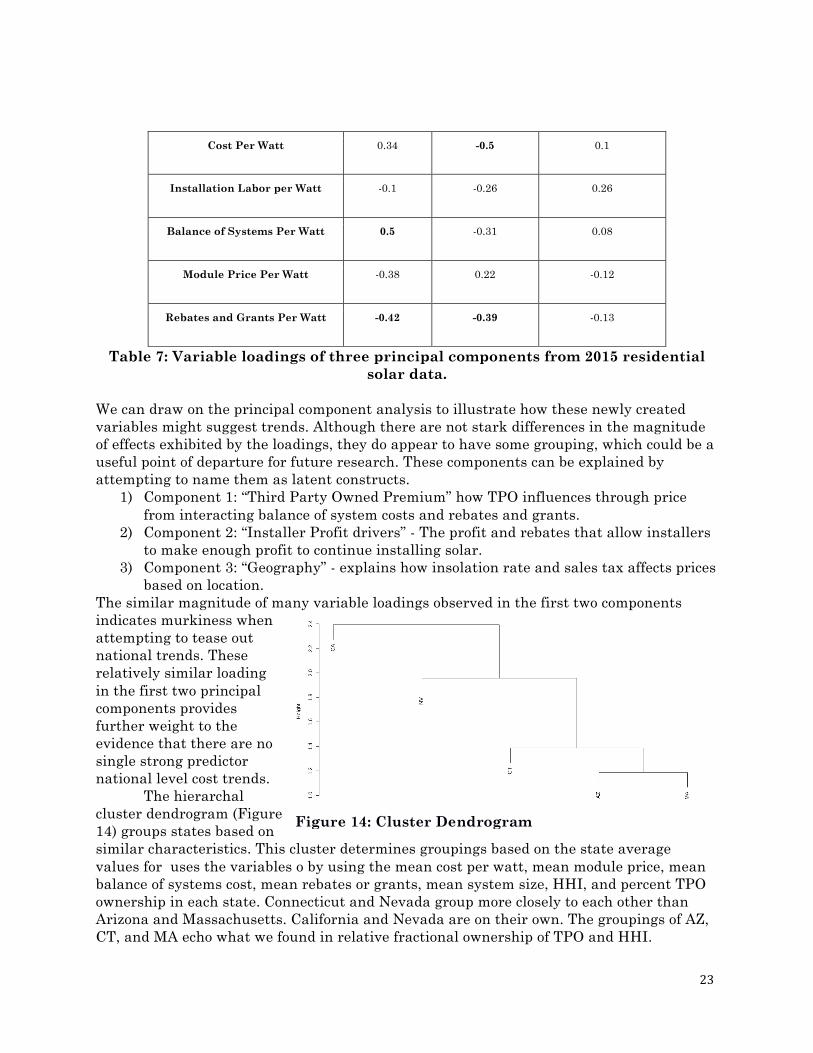
By examining how the principal components are constructed -- the loadings of the
original variables -- we can understand which of the 10 variables have the largest effects on price (Table 7). Component 1 accounts for 29% of variability in the data. Third Party Ownership and Balance of Systems costs move in the same direction, whereas rebates and grants and module price both track in the same direction. We see in Component 2 (18% of the variability) that the Profit, cost per watt, and rebates and grant track together. In the third component (14% of variability), we see a strong combination of sales tax and insolation rate.
Variable Component 1 Component 2 Component 3
Insolation Rate -0.11 0.03 0.61
Third Party Owned 0.44 0.37 0.02
Permitting Cost Per Watt -0.29 -0.15 0.12
ST.Per.Watt -0.1 0.02 0.67
Profit Per Watt -0.04 -0.48 -0.2
23
Cost Per Watt 0.34 -0.5 0.1
Installation Labor per Watt -0.1 -0.26 0.26
Balance of Systems Per Watt 0.5 -0.31 0.08
Module Price Per Watt -0.38 0.22 -0.12
Rebates and Grants Per Watt -0.42 -0.39 -0.13
Table 7: Variable loadings of three principal components from 2015 residential solar data.
We can draw on the principal component analysis to illustrate how these newly created variables might suggest trends. Although there are not stark differences in the magnitude of effects exhibited by the loadings, they do appear to have some grouping, which could be a useful point of departure for future research. These components can be explained by attempting to name them as latent constructs.
1) Component 1: “Third Party Owned Premium” how TPO influences through price from interacting balance of system costs and rebates and grants.
2) Component 2: “Installer Profit drivers” - The profit and rebates that allow installers to make enough profit to continue installing solar.
3) Component 3: “Geography” - explains how insolation rate and sales tax affects prices based on location.
The similar magnitude of many variable loadings observed in the first two components indicates murkiness when attempting to tease out national trends. These relatively similar loading in the first two principal components provides further weight to the evidence that there are no single strong predictor national level cost trends.
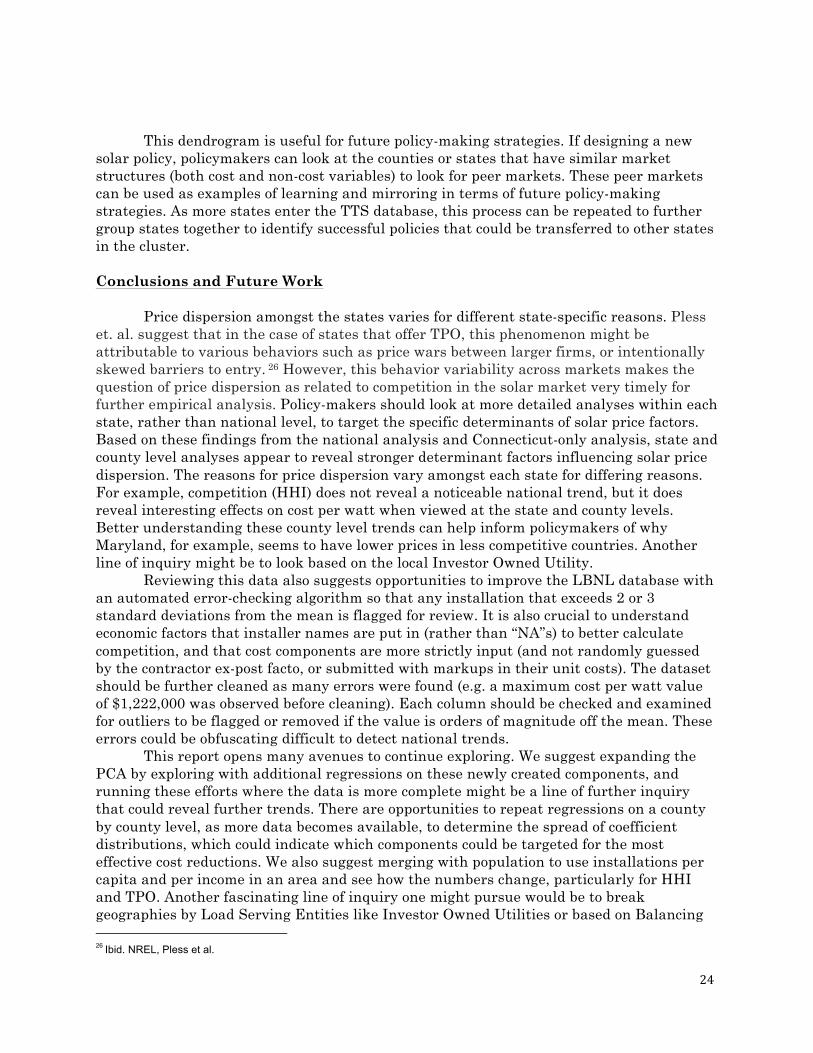
The hierarchal cluster dendrogram (Figure 14) groups states based on similar characteristics. This cluster determines groupings based on the state average values for uses the variables o by using the mean cost per watt, mean module price, mean balance of systems cost, mean rebates or grants, mean system size, HHI, and percent TPO ownership in each state. Connecticut and Nevada group more closely to each other than Arizona and Massachusetts. California and Nevada are on their own. The groupings of AZ, CT, and MA echo what we found in relative fractional ownership of TPO and HHI.
Figure 14: Cluster Dendrogram
24
This dendrogram is useful for future policy-making strategies. If designing a new solar policy, policymakers can look at the counties or states that have similar market structures (both cost and non-cost variables) to look for peer markets. These peer markets can be used as examples of learning and mirroring in terms of future policy-making strategies. As more states enter the TTS database, this process can be repeated to further group states together to identify successful policies that could be transferred to other states in the cluster.
Conclusions and Future Work
Price dispersion amongst the states varies for different state-specific reasons. Pless
et. al. suggest that in the case of states that offer TPO, this phenomenon might be attributable to various behaviors such as price wars between larger firms, or intentionally skewed barriers to entry. 26 However, this behavior variability across markets makes the question of price dispersion as related to competition in the solar market very timely for further empirical analysis. Policy-makers should look at more detailed analyses within each state, rather than national level, to target the specific determinants of solar price factors. Based on these findings from the national analysis and Connecticut-only analysis, state and county level analyses appear to reveal stronger determinant factors influencing solar price dispersion. The reasons for price dispersion vary amongst each state for differing reasons. For example, competition (HHI) does not reveal a noticeable national trend, but it does reveal interesting effects on cost per watt when viewed at the state and county levels. Better understanding these county level trends can help inform policymakers of why Maryland, for example, seems to have lower prices in less competitive countries. Another line of inquiry might be to look based on the local Investor Owned Utility.
Reviewing this data also suggests opportunities to improve the LBNL database with an automated error-checking algorithm so that any installation that exceeds 2 or 3 standard deviations from the mean is flagged for review. It is also crucial to understand economic factors that installer names are put in (rather than “NA”s) to better calculate competition, and that cost components are more strictly input (and not randomly guessed by the contractor ex-post facto, or submitted with markups in their unit costs). The dataset should be further cleaned as many errors were found (e.g. a maximum cost per watt value of $1,222,000 was observed before cleaning). Each column should be checked and examined for outliers to be flagged or removed if the value is orders of magnitude off the mean. These errors could be obfuscating difficult to detect national trends.
This report opens many avenues to continue exploring. We suggest expanding the PCA by exploring with additional regressions on these newly created components, and running these efforts where the data is more complete might be a line of further inquiry that could reveal further trends. There are opportunities to repeat regressions on a county by county level, as more data becomes available, to determine the spread of coefficient distributions, which could indicate which components could be targeted for the most effective cost reductions. We also suggest merging with population to use installations per capita and per income in an area and see how the numbers change, particularly for HHI and TPO. Another fascinating line of inquiry one might pursue would be to break geographies by Load Serving Entities like Investor Owned Utilities or based on Balancing 26 Ibid. NREL, Pless et al.
25
Authority and measuring between them running regressions on HHI and TPO and controlling for Insolation and Cost Per Watt. Additionally, there are more opportunities to explore the relationship between HHI, Insolation, and Cost Per Watt. We suggest taking all the cities in the bottom and top deciles of Insolation and HHI and performing t-tests to begin to see if there are significant differences in cost per watt.
Accurately targeting these determinants can help drive solar PV prices farther down. While the U.S. does have a national investment tax credit for solar energy installations, there is not a unified federal policy on renewable portfolio standards, net-metering policies, permitting processes, or financing options for solar PV. Without unified federal policy, policy needs to tailor to county or even city level. We did not find the national policies to be the most significant in driving solar prices; rather, prices are more individual to county and state levels. The causes of $/watt decreases and the reasons for price dispersion vary by locale. Hence, the key takeaway is that for solar, the law of one price does not hold. Classical economic assumptions might predict that greater competitiveness across many variables and many states would serve to drive down the price of a marketable good like solar installation. We found rather that cost per watt is not a bathtub on a national level27 (perhaps due to its lack of fungibility between geographies). It could perhaps best be thought of in the old adage: that like all politics, all solar PV residential installation pricing dispersion is local.
27 Nordhaus, W. D. (2009, June). The economics of an integrated world oil market. In International Energy Workshop (pp. 17-19).