Embed Size (px)
Citation preview
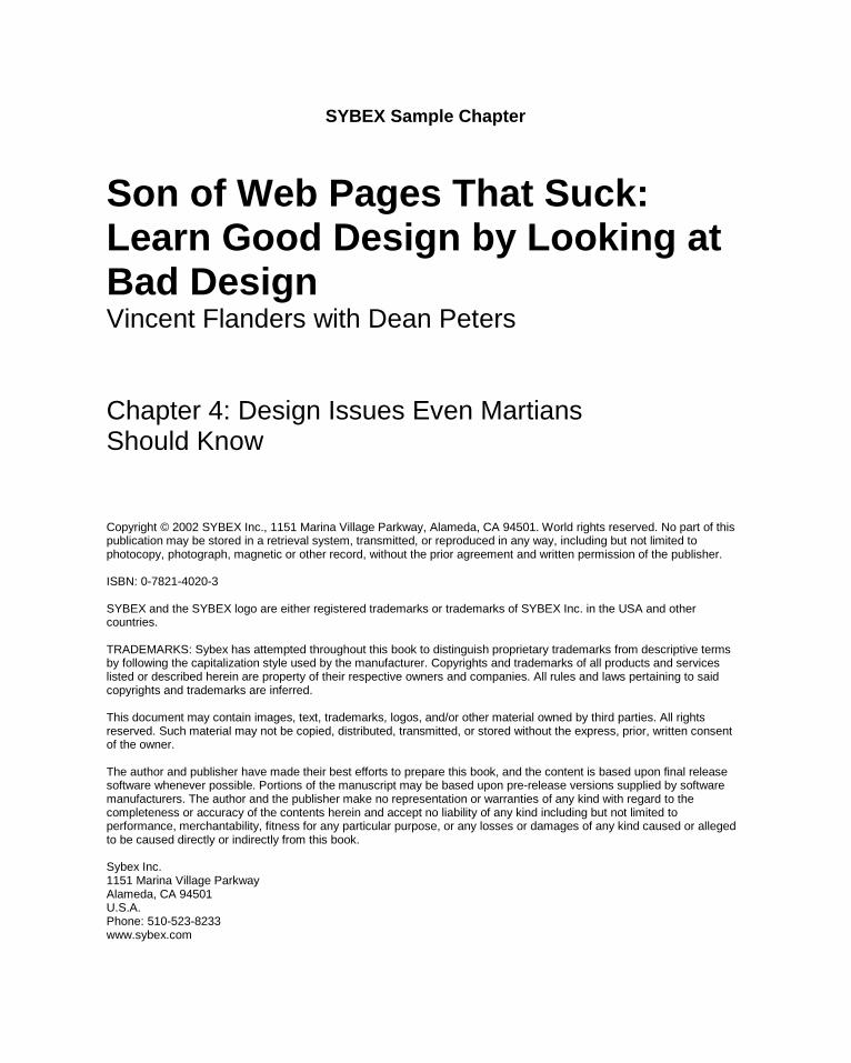
SYBEX Sample Chapter
Son of Web Pages That Suck:Learn Good Design by Looking atBad DesignVincent Flanders with Dean Peters
Chapter 4: Design Issues Even MartiansShould Know
Copyright © 2002 SYBEX Inc., 1151 Marina Village Parkway, Alameda, CA 94501. World rights reserved. No part of thispublication may be stored in a retrieval system, transmitted, or reproduced in any way, including but not limited tophotocopy, photograph, magnetic or other record, without the prior agreement and written permission of the publisher.
ISBN: 0-7821-4020-3
SYBEX and the SYBEX logo are either registered trademarks or trademarks of SYBEX Inc. in the USA and othercountries.
TRADEMARKS: Sybex has attempted throughout this book to distinguish proprietary trademarks from descriptive termsby following the capitalization style used by the manufacturer. Copyrights and trademarks of all products and serviceslisted or described herein are property of their respective owners and companies. All rules and laws pertaining to saidcopyrights and trademarks are inferred.
This document may contain images, text, trademarks, logos, and/or other material owned by third parties. All rightsreserved. Such material may not be copied, distributed, transmitted, or stored without the express, prior, written consentof the owner.
The author and publisher have made their best efforts to prepare this book, and the content is based upon final releasesoftware whenever possible. Portions of the manuscript may be based upon pre-release versions supplied by softwaremanufacturers. The author and the publisher make no representation or warranties of any kind with regard to thecompleteness or accuracy of the contents herein and accept no liability of any kind including but not limited toperformance, merchantability, fitness for any particular purpose, or any losses or damages of any kind caused or allegedto be caused directly or indirectly from this book.
Sybex Inc.1151 Marina Village ParkwayAlameda, CA 94501U.S.A.Phone: 510-523-8233www.sybex.com
Design Issues Even Martians Should Know
Chapter 4
chapter_4_p3 3/20/2002 2:50 PM Page 55
DESIGN ISSUES EVEN CHAPTER 4 MARTIANS SHOULD KNOW56
BIG PICTURE ISSUE #1—WEB DESIGN ISN’T SEXI’ve tried many ways to convey a simple message andsometimes I feel the message is not getting through.Maybe a sexual analogy will work.
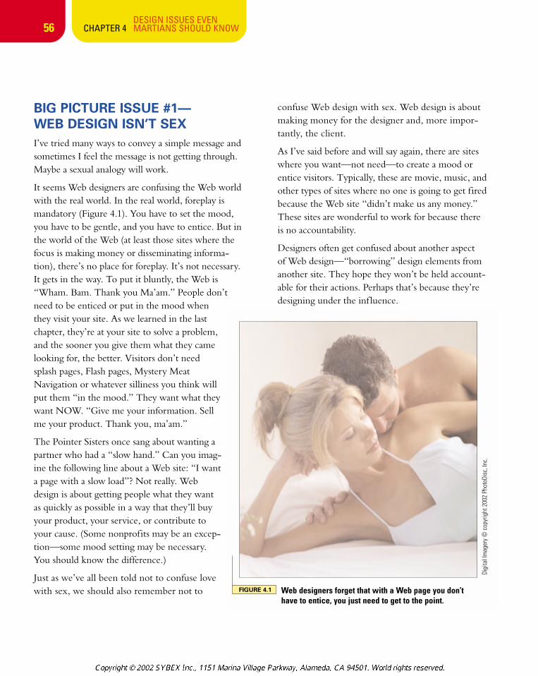
It seems Web designers are confusing the Web worldwith the real world. In the real world, foreplay ismandatory (Figure 4.1). You have to set the mood,you have to be gentle, and you have to entice. But inthe world of the Web (at least those sites where thefocus is making money or disseminating informa-tion), there’s no place for foreplay. It’s not necessary.It gets in the way. To put it bluntly, the Web is“Wham. Bam. Thank you Ma’am.” People don’tneed to be enticed or put in the mood whenthey visit your site. As we learned in the lastchapter, they’re at your site to solve a problem,and the sooner you give them what they camelooking for, the better. Visitors don’t needsplash pages, Flash pages, Mystery MeatNavigation or whatever silliness you think willput them “in the mood.” They want what theywant NOW. “Give me your information. Sellme your product. Thank you, ma’am.”
The Pointer Sisters once sang about wanting apartner who had a “slow hand.” Can you imag-ine the following line about a Web site: “I wanta page with a slow load”? Not really. Webdesign is about getting people what they wantas quickly as possible in a way that they’ll buyyour product, your service, or contribute toyour cause. (Some nonprofits may be an excep-tion—some mood setting may be necessary.You should know the difference.)
Just as we’ve all been told not to confuse lovewith sex, we should also remember not to
confuse Web design with sex. Web design is aboutmaking money for the designer and, more impor-tantly, the client.
As I’ve said before and will say again, there are siteswhere you want—not need—to create a mood orentice visitors. Typically, these are movie, music, andother types of sites where no one is going to get firedbecause the Web site “didn’t make us any money.”These sites are wonderful to work for because thereis no accountability.
Designers often get confused about another aspect of Web design—“borrowing” design elements fromanother site. They hope they won’t be held account-able for their actions. Perhaps that’s because they’redesigning under the inf luence.
FIGURE 4.1 Web designers forget that with a Web page you don’thave to entice, you just need to get to the point.
Digi
tal I
mag
ery
© c
opyr
ight
200
2 Ph
otoD
isc,
Inc.
chapter_4_p3 3/20/2002 2:50 PM Page 56
57
YOU KNOW THEDESIGN OF YOUR WEBSITE IS A SUCCESSWHEN PEOPLE CALL OR E-MAIL YOU TO COMPLAIN:1. It’s too easy to find what
I’m looking for on your site.
2. Your site loads too quickly.
3. Your site is too easyto navigate.
4. Your site is too informative.
This is so important we have to say it again. Your goal is to design your site so visitorscan complain about these four issues.
fâv~á aÉà
BIG PICTURE ISSUE #2—DESIGNING UNDER THE INFLUENCE (DUI)Part of the charm of the World Wide Web is that you are just a few clicksaway from tens of thousands of creative individuals whose work you can seeand read and draw inspiration from. Web designers are also just a few clicksaway from grabbing someone’s creativity and passing it off as their own.There’s a thin line between being inf luenced by what you see and designingunder someone’s inf luence.
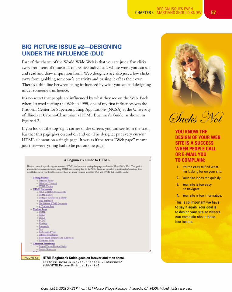
It’s no secret that people are inf luenced by what they see on the Web. Backwhen I started surfing the Web in 1995, one of my first inf luences was theNational Center for Supercomputing Applications (NCSA) at the Universityof Illinois at Urbana-Champaign’s HTML Beginner’s Guide, as shown inFigure 4.2.
If you look at the top-right corner of the screen, you can see from the scrollbar that this page goes on and on and on. The designer put every currentHTML element on a single page. It was as if the term “Web page” meantjust that—everything had to be put on one page.
DESIGN ISSUES EVEN CHAPTER 4 MARTIANS SHOULD KNOW
FIGURE 4.2 HTML Beginner’s Guide goes on forever and then some.archive.ncsa.uiuc.edu/General/Internet/
WWW/HTMLPrimerPrintable.html
chapter_4_p3 3/20/2002 2:50 PM Page 57
DESIGN ISSUES EVEN CHAPTER 4 MARTIANS SHOULD KNOW
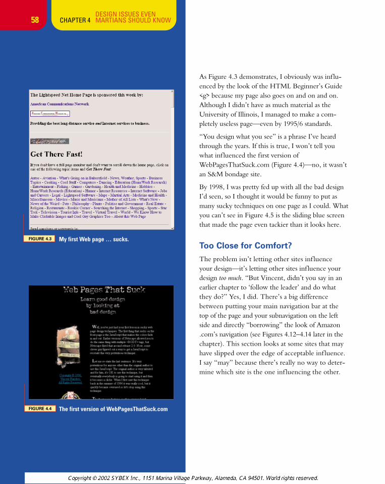
FIGURE 4.3 My first Web page … sucks.
58
As Figure 4.3 demonstrates, I obviously was inf lu-enced by the look of the HTML Beginner’s Guide<g> because my page also goes on and on and on.Although I didn’t have as much material as theUniversity of Illinois, I managed to make a com-pletely useless page—even by 1995/6 standards.
“You design what you see” is a phrase I’ve heardthrough the years. If this is true, I won’t tell youwhat inf luenced the first version ofWebPagesThatSuck.com (Figure 4.4)—no, it wasn’tan S&M bondage site.
By 1998, I was pretty fed up with all the bad designI’d seen, so I thought it would be funny to put asmany sucky techniques on one page as I could. Whatyou can’t see in Figure 4.5 is the sliding blue screenthat made the page even tackier than it looks here.
Too Close for Comfort?
The problem isn’t letting other sites inf luence your design—it’s letting other sites inf luence yourdesign too much. “But Vincent, didn’t you say in anearlier chapter to ‘follow the leader’ and do whatthey do?” Yes, I did. There’s a big differencebetween putting your main navigation bar at thetop of the page and your subnavigation on the leftside and directly “borrowing” the look of Amazon.com’s navigation (see Figures 4.12–4.14 later in thechapter). This section looks at some sites that mayhave slipped over the edge of acceptable inf luence.I say “may” because there’s really no way to deter-mine which site is the one inf luencing the other.
FIGURE 4.4 The first version of WebPagesThatSuck.com
chapter_4_p3 3/20/2002 2:50 PM Page 58
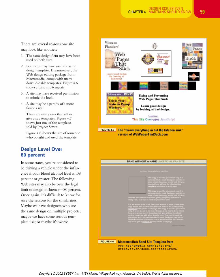
FIGURE 4.5 The “throw everything in but the kitchen sink” version of WebPagesThatSuck.com
59
There are several reasons one sitemay look like another:
1. The same design firm may have beenused on both sites.
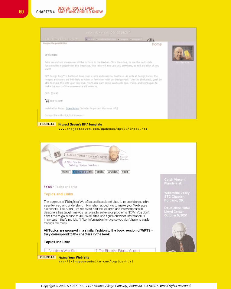
2. Both sites may have used the samedesign template. Dreamweaver, theWeb design editing package fromMacromedia, comes with manydownloadable templates. Figure 4.6shows a band site template.
3. A site may have received permissionto mimic the look.
4. A site may be a parody of a morefamous site.
There are many sites that sell or give away templates. Figure 4.7 shows just one of the templates sold by Project Seven.
Figure 4.8 shows the site of someonewho bought and used the template.
Design Level Over 80 percent
In some states, you’re considered tobe driving a vehicle under the inf lu-ence if your blood alcohol level is .08percent or greater. The followingWeb sites may also be over the legallimit of design inf luence—80 percent.Once again, it’s difficult to know forsure the reasons for the similarities.Maybe we have designers who usethe same design on multiple projects;maybe we have some serious tem-plate use; or maybe it’s worse.
DESIGN ISSUES EVEN CHAPTER 4 MARTIANS SHOULD KNOW
FIGURE 4.6 Macromedia’s Band Site Template fromwww.macromedia.com/software/
dreamweaver/download/templates/
chapter_4_p3 3/20/2002 2:50 PM Page 59
60DESIGN ISSUES EVEN
CHAPTER 4 MARTIANS SHOULD KNOW
FIGURE 4.7 Project Seven’s DP7 Template www.projectseven.com/dpdemos/dpvii/index.htm
FIGURE 4.8 Fixing Your Web Site www.fixingyourwebsite.com/topics.html
chapter_4_p3 3/20/2002 3:05 PM Page 60
61DESIGN ISSUES EVEN
CHAPTER 4 MARTIANS SHOULD KNOW
AMAZON.COM VARIANTS
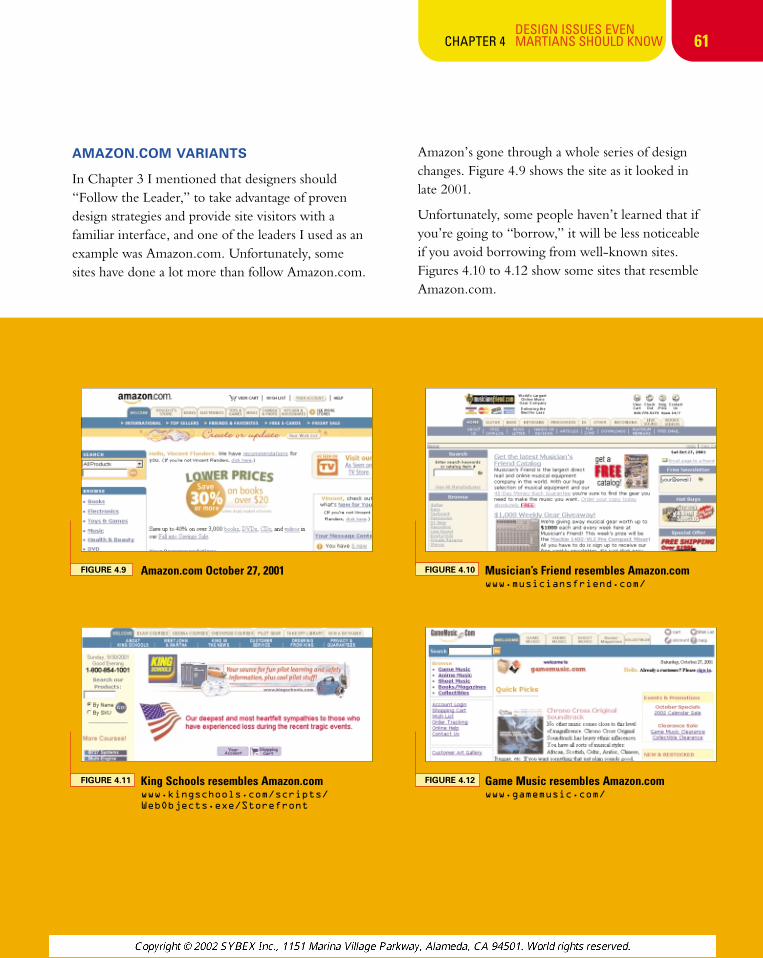
In Chapter 3 I mentioned that designers should“Follow the Leader,” to take advantage of provendesign strategies and provide site visitors with afamiliar interface, and one of the leaders I used as anexample was Amazon.com. Unfortunately, somesites have done a lot more than follow Amazon.com.
Amazon’s gone through a whole series of designchanges. Figure 4.9 shows the site as it looked in late 2001.
Unfortunately, some people haven’t learned that ifyou’re going to “borrow,” it will be less noticeable if you avoid borrowing from well-known sites.Figures 4.10 to 4.12 show some sites that resembleAmazon.com.
FIGURE 4.9 Amazon.com October 27, 2001 FIGURE 4.10 Musician’s Friend resembles Amazon.comwww.musiciansfriend.com/
FIGURE 4.11 King Schools resembles Amazon.com www.kingschools.com/scripts/
WebObjects.exe/Storefront
FIGURE 4.12 Game Music resembles Amazon.comwww.gamemusic.com/
chapter_4_p3 3/20/2002 2:50 PM Page 61
62DESIGN ISSUES EVEN
CHAPTER 4 MARTIANS SHOULD KNOW
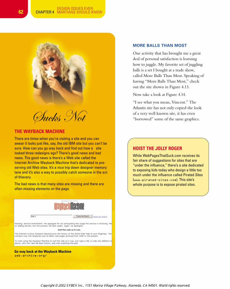
fâv~á aÉàTHE WAYBACK MACHINEThere are times when you’re visiting a site and you canswear it looks just like, say, the old IBM site but you can’t besure. How can you go way back and find out how a sitelooked three redesigns ago? There’s good news and badnews. The good news is there’s a Web site called theInternet Archive Wayback Machine that’s dedicated to pre-serving old Web sites. It’s a nice trip down designer memorylane and it’s also a way to possibly catch someone in the actof thievery.
The bad news is that many sites are missing and there areoften missing elements on the page.
Go way back at the Wayback Machine web.archive.org/
MORE BALLS THAN MOST
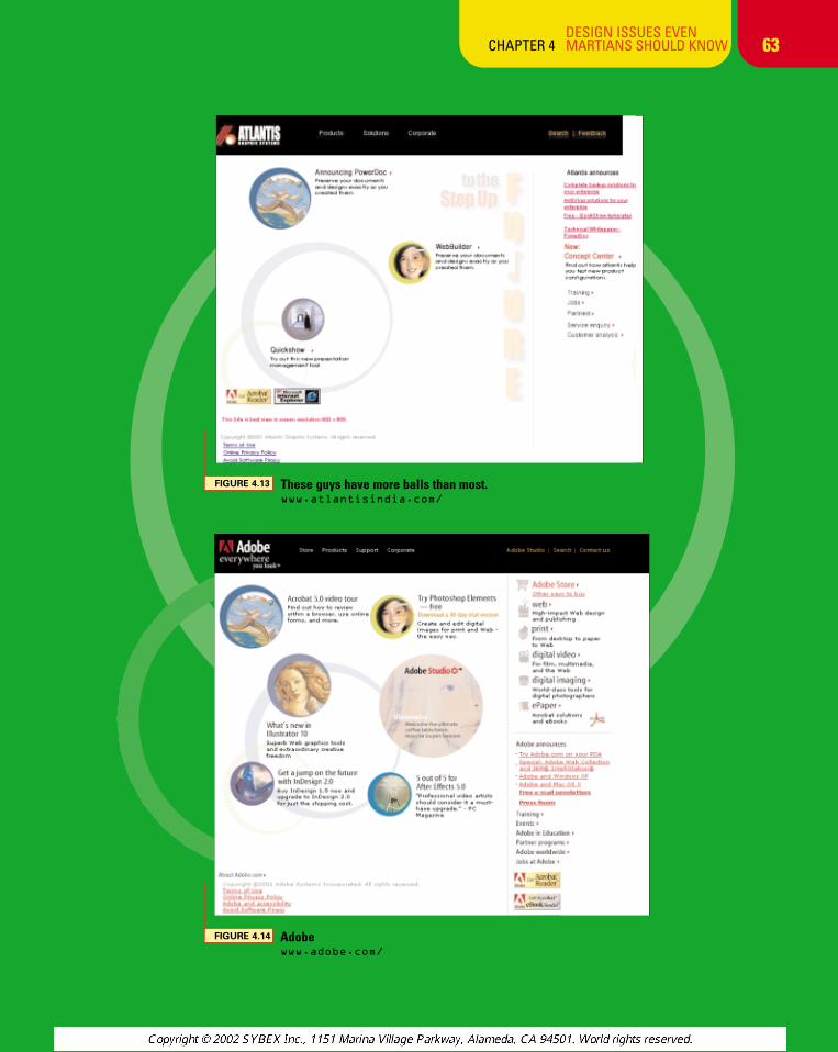
One activity that has brought me a greatdeal of personal satisfaction is learninghow to juggle. My favorite set of jugglingballs is a set I bought at a trade show,called More Balls Than Most. Speaking ofhaving “More Balls Than Most,” checkout the site shown in Figure 4.13.
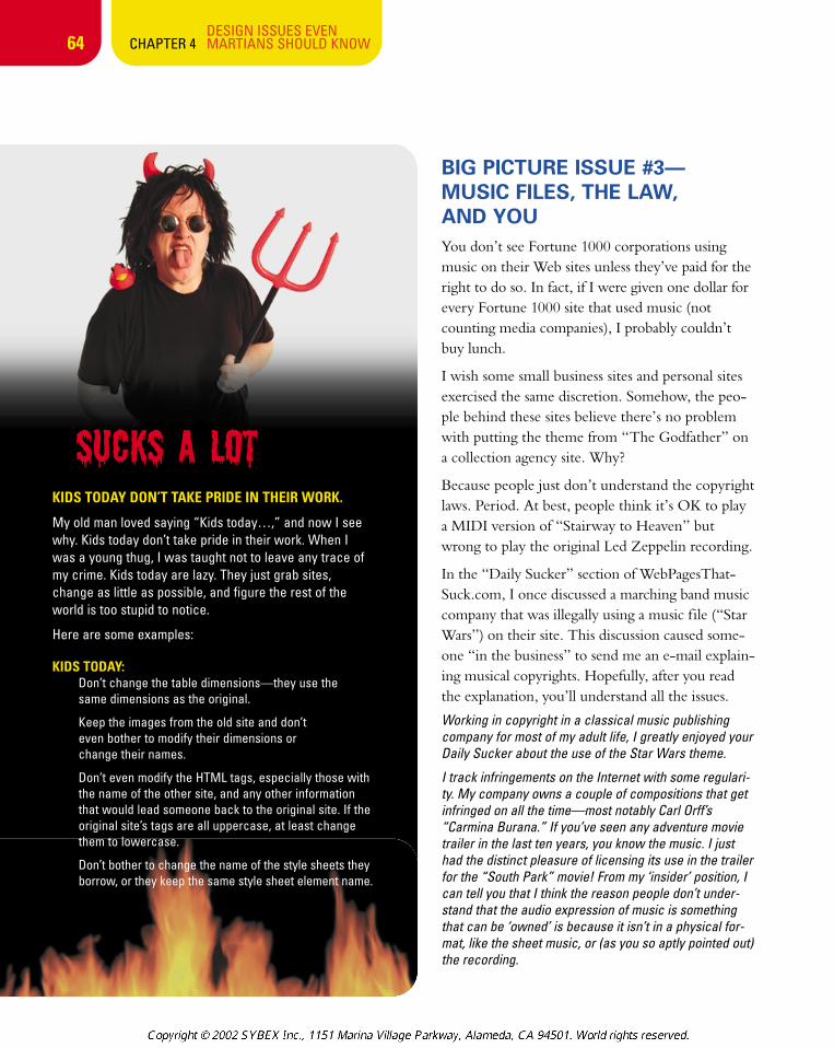
Now take a look at Figure 4.14.
“I see what you mean, Vincent.” TheAtlantis site has not only copied the lookof a very well known site, it has even“borrowed” some of the same graphics.
HOIST THE JOLLY ROGERWhile WebPagesThatSuck.com receives itsfair share of suggestions for sites that are“under the influence,” there’s a site dedicatedto exposing kids today who design a little toomuch under the influence called Pirated Sites(www.pirated-sites.com). This site’swhole purpose is to expose pirated sites.
chapter_4_p3 3/20/2002 2:50 PM Page 62
63DESIGN ISSUES EVEN
CHAPTER 4 MARTIANS SHOULD KNOW
FIGURE 4.13 These guys have more balls than most.www.atlantisindia.com/
FIGURE 4.14 Adobe www.adobe.com/
chapter_4_p3 3/20/2002 2:50 PM Page 63
Sucks a Lot
64DESIGN ISSUES EVEN
CHAPTER 4 MARTIANS SHOULD KNOW
KIDS TODAY DON’T TAKE PRIDE IN THEIR WORK.
My old man loved saying “Kids today…,” and now I seewhy. Kids today don’t take pride in their work. When Iwas a young thug, I was taught not to leave any trace ofmy crime. Kids today are lazy. They just grab sites,change as little as possible, and figure the rest of theworld is too stupid to notice.
Here are some examples:
KIDS TODAY:Don’t change the table dimensions—they use the same dimensions as the original.
Keep the images from the old site and don’t even bother to modify their dimensions or change their names.
Don’t even modify the HTML tags, especially those withthe name of the other site, and any other informationthat would lead someone back to the original site. If theoriginal site’s tags are all uppercase, at least changethem to lowercase.
Don’t bother to change the name of the style sheets theyborrow, or they keep the same style sheet element name.
BIG PICTURE ISSUE #3—MUSIC FILES, THE LAW, AND YOUYou don’t see Fortune 1000 corporations usingmusic on their Web sites unless they’ve paid for theright to do so. In fact, if I were given one dollar forevery Fortune 1000 site that used music (notcounting media companies), I probably couldn’tbuy lunch.
I wish some small business sites and personal sitesexercised the same discretion. Somehow, the peo-ple behind these sites believe there’s no problemwith putting the theme from “The Godfather” ona collection agency site. Why?
Because people just don’t understand the copyrightlaws. Period. At best, people think it’s OK to playa MIDI version of “Stairway to Heaven” butwrong to play the original Led Zeppelin recording.
In the “Daily Sucker” section of WebPagesThat-Suck.com, I once discussed a marching band musiccompany that was illegally using a music file (“StarWars”) on their site. This discussion caused some-one “in the business” to send me an e-mail explain-ing musical copyrights. Hopefully, after you readthe explanation, you’ll understand all the issues.
Working in copyright in a classical music publishingcompany for most of my adult life, I greatly enjoyed yourDaily Sucker about the use of the Star Wars theme.
I track infringements on the Internet with some regulari-ty. My company owns a couple of compositions that getinfringed on all the time—most notably Carl Orff’s“Carmina Burana.” If you’ve seen any adventure movietrailer in the last ten years, you know the music. I justhad the distinct pleasure of licensing its use in the trailerfor the “South Park” movie! From my ‘insider’ position, Ican tell you that I think the reason people don’t under-stand that the audio expression of music is somethingthat can be ‘owned’ is because it isn’t in a physical for-mat, like the sheet music, or (as you so aptly pointed out)the recording.
chapter_4_p3 3/20/2002 2:50 PM Page 64
65
MUSIC ON YOUR WEB SITE No topic is “touchier” than music on a Web site. Here are a couple ofimportant links that explain the ins and outs of what you can and can’tlegally do with music. Of course, none of this information should be putinto practice without consulting an attorney. The rules on copyrightvary from country to country.
“The Use of Music on a Multimedia Web Site” (www.ivanhoffman.com/music.html): A very educational article phrased in terms thatmost people can easily understand. Full disclosure: I’ve used its authoron a couple of contracts.
“Web Site FAQ” (www.bmi.com/licensing/webcaster/webfaq.asp): BMI is one of the leading licensors of music in theworld, so it’s their business to know what you can and can’t do. Myfavorite quote about what’s covered is their definition of a music page.“A music page is a web page with any links to audio, or multimediafiles, that contain music. It can also be a page that has music playingupon the loading of the page.”
“Copyright Basics” (www.loc.gov/copyright/circs/circ1.html): I just briefly touched on “borrowing” images but I haven’t even touchedon the issue of “borrowing” text from another site. Actually, that issue ismuch more complex because of the doctrine of “Fair Use.” When youstart to get involved in copyright issues, well, it’s time for a lawyer.
fâv~á aÉà
DESIGN ISSUES EVEN CHAPTER 4 MARTIANS SHOULD KNOW
“Reporting copyright infringements”—a link you won’t see on most Web sites. www.harvard.edu/
My favorite way of explaining the concept ofintellectual property to the illiterate tribes-men I encounter daily is “Okay, imagine thatall the sheet music in the world burned up ina huge bonfire, and then imagine that theythrew on all the CDs. You can still hum themusic, right? The music still exists, right?Well, that thing you can’t touch, or buy, orbreak...that is what we own.”
The simple way to look at the issue ofusing music on your site is this: If youdidn’t write it, you don’t own it andcan’t put it on your site. In fact, even ifyou wrote a song, you may still not ownit. John Fogerty was sued by his formerrecord company for writing songs thatsound like the Creedence ClearwaterRevival songs he wrote years earlier,which the company owns. Hmm. And I thought the book business was tough.
Will some music copyright owner comeafter you if you use a sound file youshouldn’t be using? Who knows? Whytake the chance? The entertainmentindustry in general and the music indus-try in particular are very diligent aboutprotecting their copyrights.
Finally, forget for a moment about thelegalities of putting music on your Website and just consider whether it’s aneffective strategy or a distraction.Nothing says “I’m an amateur, pleasemake fun of me behind my back!” fasterthan using background music on yoursite. As always, there are exceptions: on aband site or a movie site, you’re expectedto put your songs on the site—but itwould be most considerate of you if youdidn’t put them as background music.
chapter_4_p3 3/20/2002 2:50 PM Page 65
66DESIGN ISSUES EVEN
CHAPTER 4 MARTIANS SHOULD KNOW
Contracts
Get a lawyer. Anything else I’ve said earlier andnow say and will say in the future about legal mat-ters is not authoritative and shouldn’t be believed.Here are some links to articles on the topic, butthey don’t take the place of a lawyer.
“Contracts and the Digital Warrior—Beware the Form Agreement,” by Scott J. Fine.www.finehummel.com/library/intellect/
contractsandthedigitalwarrior.htm
“Contracts for Every Occasion”builder.cnet.com/webbuilding/0-3885-8-
4500031-1.html Of course, the first article aboverecommends that you don’t use form contracts likethese, and the fine print on this site says “you shouldnot use this sample, or any part, without the adviceof competent legal counsel.” Still, it’s worth reading.
“Internet Library” www.phillipsnizer.com/internetlib.htm Summaries of actual court cases.Not quite legalese, but tending in that direction.
“The Internet Law Journal” www.tilj.com/Another fairly complex site, but it has lots of depth.
BIG PICTURE ISSUE #4—TECHNICAL CONCERNSBesides legal issues, there are technical issues thataffect your Web site. You may think it’s easy forvisitors to view your Web site—they just get onthe Internet, type some characters, hit the Enterkey, and they’re at your site. The process is actual-ly a lot more complicated than you might imaginebecause there are so many technical issues involved.Some of these issues include the quality of theserver where you host your site, the number ofother domains hosted on that server, the softwareand utilities your host provides, and the size and number of the Internet connections of yourhosting service.
fâv~á aÉàTHE LINK THAT’S WORTH THE PRICE OF THE BOOK?As you’ve seen, there are complicated legal issues revolv-ing around one issue—copyright. You just know thesearen’t the only legal issues facing Web site designers andowners.
There are a whole host of legal issues that you have to gothrough to make sure you don’t get your rear end sued off.This is especially true when you’re dealing with the artistswho create your graphics. If you don’t have the outsidedesign firm sign the right kind of contract, you may not ownyour own material. The best place to learn about theseissues is Ivan Hoffman’s Web Site Audit Check List, atwww.ivanhoffman.com/audit.html.
Some of the topics covered are
• The Need for a Written Web Design Agreement
• Who Owns the Copyright in Your Web Site?
• The Use of Protected Materials on Multimedia Web Sites
• Work Made for Hire Agreements
• Domain Names and Trademarks
• Disclaimers
chapter_4_p3 3/20/2002 2:50 PM Page 66
67DESIGN ISSUES EVEN
CHAPTER 4 MARTIANS SHOULD KNOW
On the visitor’s end, factors affecting the view-ing experience include the browser used, theresolution of the monitor, and the speed of theconnection to the Internet.
This isn’t a book for techies (not that there’s any-thing wrong with techies), so I won’t attempt topresent detailed solutions to the issues outlinedhere. (For that kind of information, see AnnNavarro’s Effective Web Design; Sybex, 2nd edi-tion 2001.) But these issues directly affect theWeb design process, so anyone reading this bookneeds to be familiar with them.
Upgrade Your Browser or We’ll Shoot This Monitor
Check the appearance of your site using differentbrowsers on different systems.
I really can’t put it any simpler than that.
You would think that Web pages would lookthe same in each and every browser on each and every system. Well, they don’t. Why?Because the Internet Explorer and Netscape(Communicator) browsers interpret HTMLstatements differently—and that’s for statementsthey both support. Back in the days whenMicrosoft and Netscape were engaged in a life-and-death browser war, each vendor also createdtheir own proprietary tags which, of course,were not supported by the other vendor.
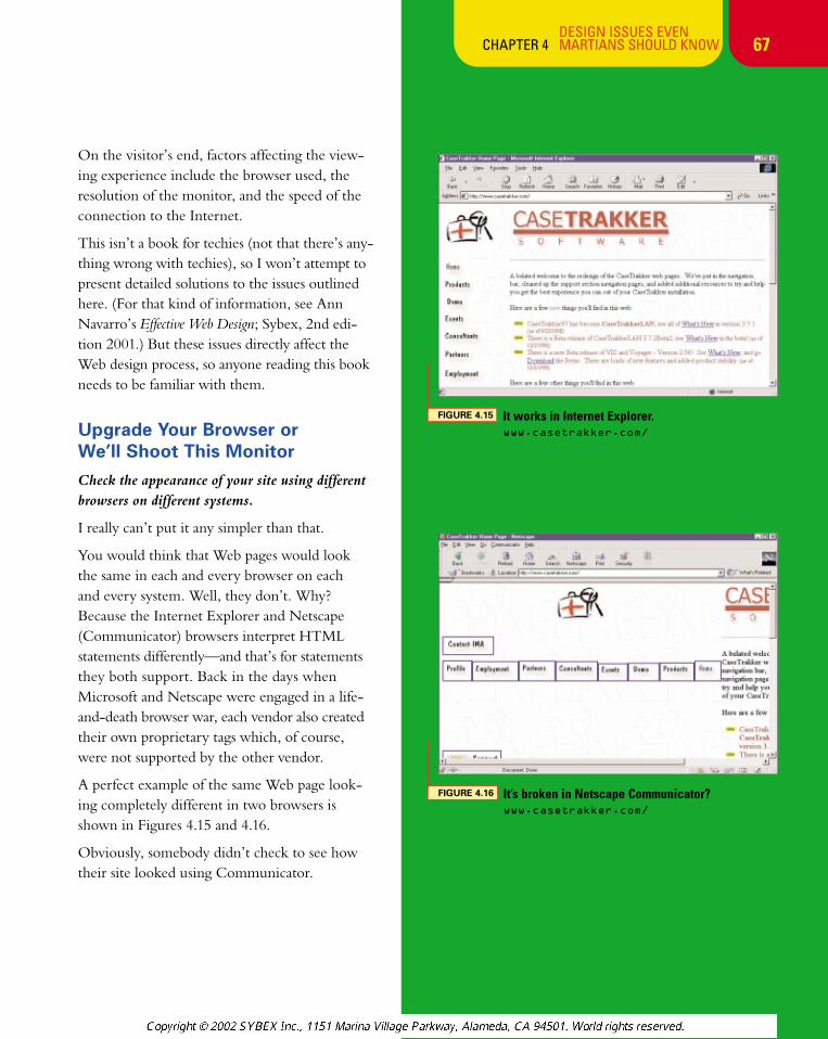
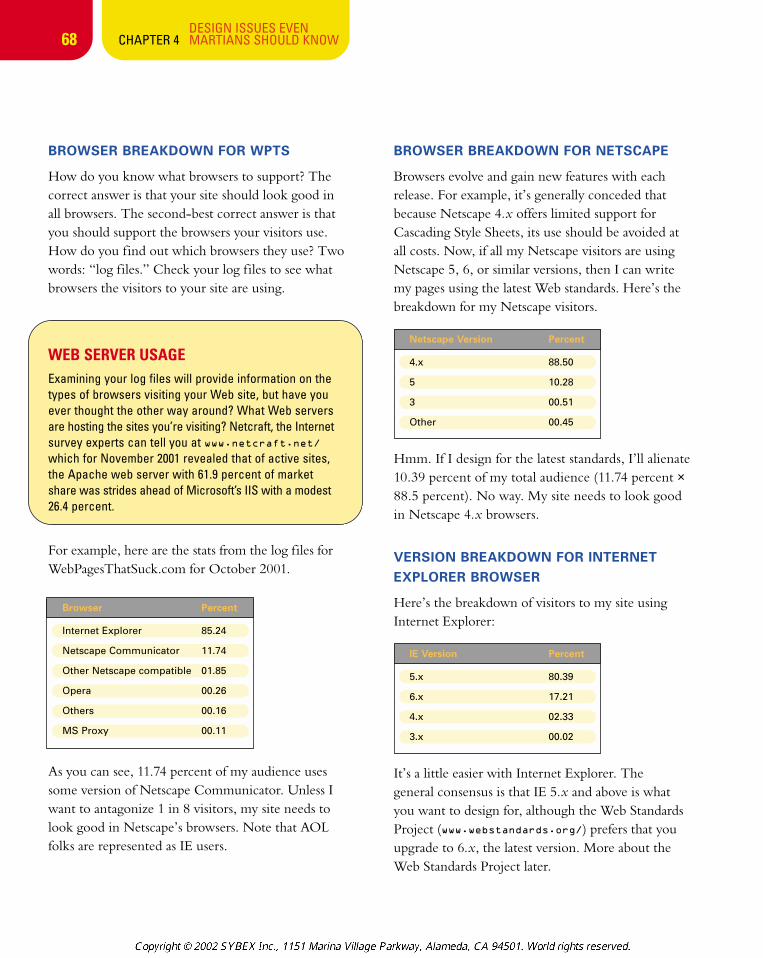
A perfect example of the same Web page look-ing completely different in two browsers isshown in Figures 4.15 and 4.16.
Obviously, somebody didn’t check to see howtheir site looked using Communicator.
FIGURE 4.15 It works in Internet Explorer. www.casetrakker.com/
FIGURE 4.16 It’s broken in Netscape Communicator? www.casetrakker.com/
chapter_4_p3 3/20/2002 2:50 PM Page 67
68DESIGN ISSUES EVEN
CHAPTER 4 MARTIANS SHOULD KNOW
BROWSER BREAKDOWN FOR WPTS
How do you know what browsers to support? Thecorrect answer is that your site should look good inall browsers. The second-best correct answer is thatyou should support the browsers your visitors use.How do you find out which browsers they use? Twowords: “log files.” Check your log files to see whatbrowsers the visitors to your site are using.
WEB SERVER USAGEExamining your log files will provide information on thetypes of browsers visiting your Web site, but have youever thought the other way around? What Web serversare hosting the sites you’re visiting? Netcraft, the Internetsurvey experts can tell you at www.netcraft.net/which for November 2001 revealed that of active sites,the Apache web server with 61.9 percent of market share was strides ahead of Microsoft’s IIS with a modest26.4 percent.
For example, here are the stats from the log files forWebPagesThatSuck.com for October 2001.
As you can see, 11.74 percent of my audience usessome version of Netscape Communicator. Unless Iwant to antagonize 1 in 8 visitors, my site needs tolook good in Netscape’s browsers. Note that AOLfolks are represented as IE users.
BROWSER BREAKDOWN FOR NETSCAPE
Browsers evolve and gain new features with eachrelease. For example, it’s generally conceded thatbecause Netscape 4.x offers limited support forCascading Style Sheets, its use should be avoided atall costs. Now, if all my Netscape visitors are usingNetscape 5, 6, or similar versions, then I can writemy pages using the latest Web standards. Here’s thebreakdown for my Netscape visitors.
Hmm. If I design for the latest standards, I’ll alienate10.39 percent of my total audience (11.74 percent ×88.5 percent). No way. My site needs to look goodin Netscape 4.x browsers.
VERSION BREAKDOWN FOR INTERNETEXPLORER BROWSER
Here’s the breakdown of visitors to my site usingInternet Explorer:
It’s a little easier with Internet Explorer. The general consensus is that IE 5.x and above is what you want to design for, although the Web StandardsProject (www.webstandards.org/) prefers that youupgrade to 6.x, the latest version. More about theWeb Standards Project later.
Browser Percent
Internet Explorer 85.24
Netscape Communicator 11.74
Other Netscape compatible 01.85
Opera 00.26
Others 00.16
MS Proxy 00.11
Netscape Version Percent
4.x 88.50
5 10.28
3 00.51
Other 00.45
IE Version Percent
5.x 80.39
6.x 17.21
4.x 02.33
3.x 00.02
chapter_4_p3 3/20/2002 2:50 PM Page 68
69
fâv~á aÉà
DESIGN ISSUES EVEN CHAPTER 4 MARTIANS SHOULD KNOW
WHAT FEATURES DO THEDIFFERENT BROWSERSSUPPORT?Before you use Web designtechniques on your site, makesure your audience can seethem. WebReview.com has compiled some fairly complex—and very useful—lists of whatbrowser supports which feature.
Browser Compatibility Chart:webreview.com/browsers/
browsersshtml
Style Sheet Compatibility Chart:webreview.com/style/css1/
charts/mastergrid.shtml
PLATFORM BREAKDOWN
Another issue you’ll see mentioned is designing your site for a particularcomputer platform. Among other platform differences, graphics lookbrighter on a Macintosh than on a Windows machine, and there are differ-ences between the Macintosh and Windows versions of Internet Explorer.Fonts may also be different between Macintosh and Windows platforms.
Here are the stats for my site (this chart was gathered before Windows XPwas released).
Visitors using the Windows platform compose 87.47 percent of my audience. The Macintosh audience is around 8 percent—not a trivial percentage to alienate.
LET’S ADD AOL TO THE MIX
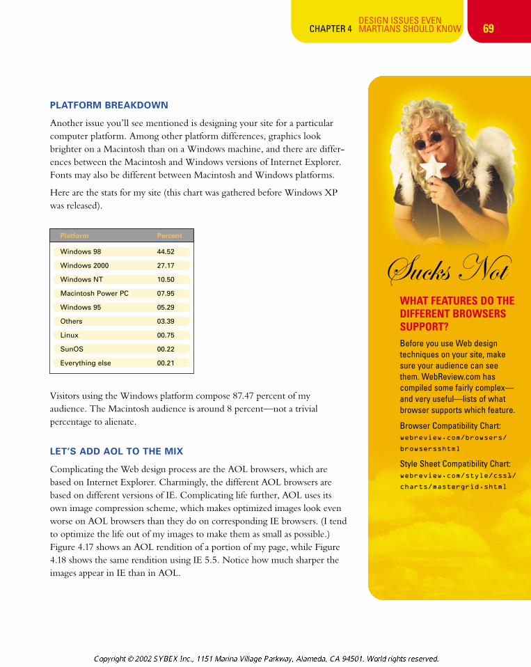
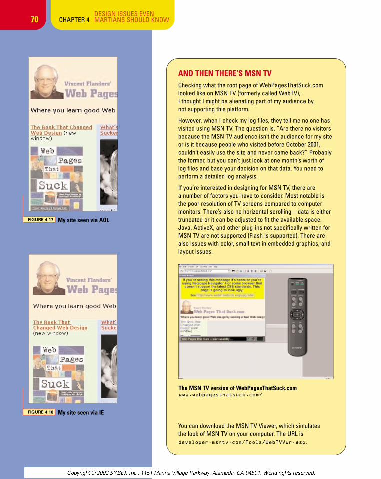
Complicating the Web design process are the AOL browsers, which arebased on Internet Explorer. Charmingly, the different AOL browsers arebased on different versions of IE. Complicating life further, AOL uses itsown image compression scheme, which makes optimized images look evenworse on AOL browsers than they do on corresponding IE browsers. (I tendto optimize the life out of my images to make them as small as possible.)Figure 4.17 shows an AOL rendition of a portion of my page, while Figure4.18 shows the same rendition using IE 5.5. Notice how much sharper theimages appear in IE than in AOL.
Platform Percent
Windows 98 44.52
Windows 2000 27.17
Windows NT 10.50
Macintosh Power PC 07.95
Windows 95 05.29
Others 03.39
Linux 00.75
SunOS 00.22
Everything else 00.21
chapter_4_p3 3/20/2002 2:50 PM Page 69
70DESIGN ISSUES EVEN
CHAPTER 4 MARTIANS SHOULD KNOW
AND THEN THERE’S MSN TVChecking what the root page of WebPagesThatSuck.comlooked like on MSN TV (formerly called WebTV), I thought I might be alienating part of my audience by not supporting this platform.
However, when I check my log files, they tell me no one hasvisited using MSN TV. The question is, “Are there no visitorsbecause the MSN TV audience isn’t the audience for my siteor is it because people who visited before October 2001,couldn’t easily use the site and never came back?” Probablythe former, but you can’t just look at one month’s worth oflog files and base your decision on that data. You need toperform a detailed log analysis.
If you’re interested in designing for MSN TV, there are a number of factors you have to consider. Most notable isthe poor resolution of TV screens compared to computermonitors. There’s also no horizontal scrolling—data is eithertruncated or it can be adjusted to fit the available space.Java, ActiveX, and other plug-ins not specifically written forMSN TV are not supported (Flash is supported). There arealso issues with color, small text in embedded graphics, andlayout issues.
You can download the MSN TV Viewer, which simulates the look of MSN TV on your computer. The URL is developer.msntv.com/Tools/WebTVVwr.asp.
The MSN TV version of WebPagesThatSuck.com www.webpagesthatsuck.com/
FIGURE 4.17 My site seen via AOL
FIGURE 4.18 My site seen via IE
chapter_4_p3 3/20/2002 2:50 PM Page 70
71DESIGN ISSUES EVEN
CHAPTER 4 MARTIANS SHOULD KNOW
LIQUID VS. FIXED-WIDTH DESIGN
HTML can be as f lexible or almost as rigid as youwant to make it. Another of the arguments you seeon the Web is whether it’s better to design a site so it fits in almost any computer window (a so-called“liquid” design) or to try (emphasis on “try”) tocontrol how the page looks to the viewer (a so-called“fixed-width” design). Fixed-width design is verysimple. You specify the width of the page in your<TABLE> tag or in your style sheet as I did on a ver-sion of WebPagesThatSuck.com by specifying thewidth in my ID selector:
#frame {
width:650px;
margin-right:auto;
margin-left:auto;
margin-top:10px;
padding:0px;
text-align:left;
}
I specified that I want the width of my frame to be 650 pixels.
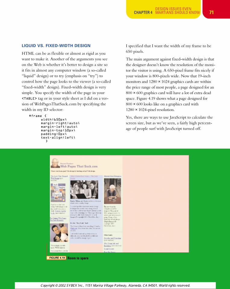
The main argument against fixed-width design is thatthe designer doesn’t know the resolution of the moni-tor the visitor is using. A 650-pixel frame fits nicely ifyour window is 800-pixels wide. Now that 19-inchmonitors and 1280 × 1024 graphics cards are withinthe price range of most people, a page designed for an800 × 600 graphics card will have a lot of extra deadspace. Figure 4.19 shows what a page designed for 800 × 600 looks like on a graphics card with 1280 × 1024-pixel resolution.
Yes, there are ways to use JavaScript to calculate thescreen size, but as we’ve seen, a fairly high percent-age of people surf with JavaScript turned off.
FIGURE 4.19 Room to spare
chapter_4_p3 3/20/2002 2:50 PM Page 71
72DESIGN ISSUES EVEN
CHAPTER 4 MARTIANS SHOULD KNOW
DETECTING BROWSER AND WINDOW SIZEWhen, as a Web site author, you have an interest incontent layout with respect to the size of your visitor’sbrowser view, there are a couple of things worthknowing. One is the browser’s window size, and theother is the size of the whole screen.
Detecting the size of a browser’s window is a little trickyunless the browser is Communicator 4.x or above. Forthose lucky visitors, you can determine the window sizewith a bit of JavaScript, using the properties window
.innerWidth and window.innerHeight, butthere’s little else that works on other browsers, apartfrom creating new, right-sized windows yourself withthe window.open() method.
Detecting the size of the whole screen proves easieracross many browsers with JavaScript’s screenobject, which has various properties describing thescreen size in pixels. For example, width andheight indicate the size of the whole screen, andavailWidth and availHeight indicate the sizeof the area potentially available to the browser.
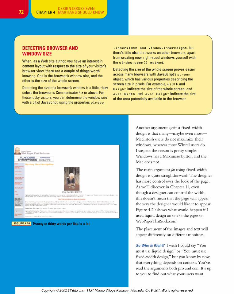
FIGURE 4.20 Twenty to thirty words per line is a lot.
Another argument against fixed-widthdesign is that many—maybe even most—Macintosh users do not maximize theirwindows, whereas most Wintel users do. I suspect the reason is pretty simple:Windows has a Maximize button and theMac does not.
The main argument for using fixed-widthdesign is quite straightforward: The designerhas more control over the look of the page.As we’ll discover in Chapter 11, eventhough a designer can control the width,this doesn’t mean that the page will appearthe way the designer would like it to appear.Figure 4.20 shows what would happen if Iused liquid design on one of the pages onWebPagesThatSuck.com.
The placement of the images and text willappear differently on different monitors.
So Who Is Right? I wish I could say “Youmust use liquid design” or “You must usefixed-width design,” but you know by nowthat everything depends on context. You’veread the arguments both pro and con. It’s upto you to find out what your users want.
chapter_4_p3 3/20/2002 2:50 PM Page 72
73DESIGN ISSUES EVEN
CHAPTER 4 MARTIANS SHOULD KNOW
WINDOW SIZE
You need to check how your site looks with differentwindow sizes. This is especially important if you’reusing the fixed-width method of design. If you don’ttake window size into consideration, your’ visitors maybe forced to scroll horizontally or they may end uplooking at lots of white space as you saw in Figure 4.19.
I ran some calculations on a Windows system usingBrowserMaster to generate the window size andScreen Calipers to measure the internal space(minus the “chrome”—the buttons, scrollbar, andother material that belongs to the browser). Theseestimates were “eyeballed” and may be 1 or 2 pixelsoff. It’s important to note for the calculations thatWindows users have the option of setting thetaskbar and Microsoft office bars to be “always ontop,” deducting from the available browser space.
On Communicator 4, the maximum space was calcu-lated with the Navigation and Address toolbars on thebrowser and the taskbar and office bar turned off on
the Windows system, and the minimum space has all of those elements turned on.
On Communicator 6.1, the maximum space was calculated with the personal toolbar and status barand My Sidebar turned off, and the minimum spacehas all of those elements turned on.
On IE 5.01, the maximum space was calculated with the standard buttons and address bar turned on and the taskbar and office bar turned off on theWindows system. The minimum space was calculatedwith the Standard buttons, address bar, links andradio on. The taskbar was horizontal and the officebar was vertical.
Finally, note that some browsers give users theoption of pressing the F11 key to banish all thechrome and devote the entire screen to your site’scontent. Of course, you can’t assume your site visi-tors will choose that option.
As you can see, the minimum available sizes for eachwindow are smaller than you might imagine—another reason why liquid design makes sense.
Browser Resolution Minimum Space Maximum Space
Netscape 4.x 640 x 480 523 x 274 620 x 355
Netscape 6.1 640 x 480 530 x 336 624 x 394
Internet Explorer 5.x 640 x 480 524 x 244 620 x 343
Netscape 4.x 800 x 600 681 x 394 780 x 475
Netscape 6.1 800 x 600 689 x 456 784 x 514
Internet Explorer 5.x 800 x 600 685 x 382 780 x 465
Netscape 4.x 1024 x 768 907 x 562 1005 x 643
Netscape 6.1 1024 x 768 914 x 624 1010 x 682
Internet Explorer 5.x 1024 x 768 908 x 550 1006 x 633
All 640 x 480 523 x 244 624 x 394
All 800 x 600 681 x 382 780 x 514
All 1024 x 768 907 x 550 1010 x 682
chapter_4_p3 3/20/2002 2:50 PM Page 73
SOFTWARE THAT SUCKS NOTI own two iMacs, but I’ve been aWindows person since 1984. I love niftylittle utilities, and here are severalWindows programs that apply to meas-uring screen sizes. The first two pro-grams can be found on the CD-ROM thataccompanies this book.
BrowserSizer: Lets Web designers changetheir window sizes so they can see whatusers see. Takes into account the WindowsTask bar and Microsoft Office shortcut barwhen making calculations. Free. The moreadvanced version, BrowserMaster, is avail-able for $20; demo versions of both are onthe CD-ROM.
Screen Ruler: This program uses a yardstickor tape measure metaphor for measuringscreen space. Free. There’s a moreadvanced version available for $15.
Screen Calipers: An interesting programthat uses the metaphor of measuringcalipers to measure screen areas. Thedemo is free to use for an unlimited time!Fully featured version is available for $15(www.iconico.com/caliper/).
fâv~á aÉà
74DESIGN ISSUES EVEN
CHAPTER 4 MARTIANS SHOULD KNOW
STANDARDS
Another topic generating controversy in the Web design communityconcerns designing sites for Web standards. What’s controversial is thatthe standards being proposed would, in effect, make many sites difficultto view with the current crop of browsers.
The issue of design standards will be covered more fully in Chapter 14,“The Bleeding Edge Is Where You Bleed,” but here is a little background.
The Web Standards Project (WaSP) (www.webstandards.org/upgrade/)wants to encourage “developers to use W3C standards even if theresulting sites fail (or look less than optimal) in old, non-standards-compliant web browsers.” The press release for the movement(www.webstandards.org/upgrade/pr.html) states:
Faced with the irreconcilable design goals of standards compliance and backward compatibility, Web builders currently deliver sites that are neitherstandards-compliant nor fully backward-compatible: a lose-lose proposition.The WaSP hopes to change that by educating developers and hastening thetypically slow rate at which users upgrade their browsers.
The goal is quite simple: “to separate style from content,” making it easier and cheaper to design Web sites. Unfortunately, it won’t be an easy task. Millions of Web surfers don’t understand how to upgrade their browsers to the latest versions. Most upgrades occur when a newsystem is purchased, but the economy plays a factor in computer pur-chases. Designing sites to force consumers to upgrade their browser is a radical concept, as one member of WaSP noted:
This is radical…and not every site can participate. Yahoo and Amazon, forinstance, can’t afford to risk alienating a single visitor. We recognize that manysites are in that position. Our hope is that if enough sites are willing to take theplunge, the typical 18-month user upgrade cycle will be drastically shortened,and a Web that works for all will no longer be something we just talk about: itwill be every web user’s experience.
It’s a concept that’s even too radical for me. I once received some private statistics about paying customers—not visitors, paying customers—from an online vendor who sold generic products. I was stunned todiscover that 2.4 percent of his significant online sales were to peoplewho used WebTV (now called MSN TV). This is proof that you reallyhave to know your audience and design for their needs. When itcomes to the “browser most likely not to be worried about whendesigning Web pages,” WebTV is the winner.
chapter_4_p3 3/20/2002 2:50 PM Page 74
75DESIGN ISSUES EVEN
CHAPTER 4 MARTIANS SHOULD KNOW
As was noted, most sites can’t afford to alienate a sin-gle visitor. For the moment, an easy-to-design-forWeb is hanging out with other similar concepts like“world peace,” “an end to hunger and poverty,” and“food without calories.”
How Do I Check My Site?
Even if world peace and standards-compliant Websites and browsers existed, you’d still have to checkyour sites. We’ll discuss the more technical methodsin Chapter 12, “Tweak, Tweak,” but there are somevisual tools that are easy to use.
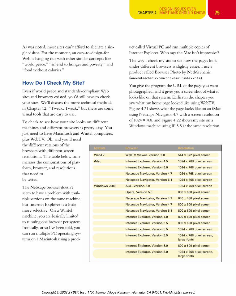
To check to see how your site looks on differentmachines and different browsers is pretty easy. Youjust need to have Macintosh and Wintel computers,plus WebTV. Oh, and you’ll needthe different versions of thebrowsers with different screenresolutions. The table below sum-marizes the combinations of plat-form, browser, and resolutionsthat need to be tested.
The Netscape browser doesn’tseem to have a problem with mul-tiple versions on the same machine,but Internet Explorer is a littlemore selective. On a Wintelmachine, you are basically limitedto running one browser per system.Ironically, or so I’ve been told, youcan run multiple PC operating sys-tems on a Macintosh using a prod-
uct called Virtual PC and run multiple copies ofInternet Explorer. Who says the Mac isn’t impressive?
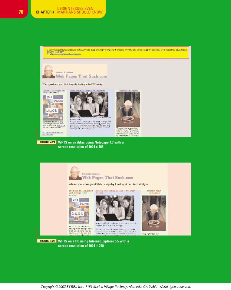
The way I check my site to see how the pages lookunder different browsers is slightly easier. I use aproduct called Browser Photo by NetMechanic(www.netmechanic.com/browser-index.htm).
You give the program the URL of the page you wantphotographed, and it gives you a screenshot of what itlooks like on that system. Earlier in the chapter yousaw what my home page looked like using WebTV.Figure 4.21 shows what the page looks like on an iMacusing Netscape Navigator 4.7 with a screen resolutionof 1024 × 768, and Figure 4.22 shows my site on aWindows machine using IE 5.5 at the same resolution.
System Browser Resolution
WebTV WebTV Viewer, Version 2.0 544 x 372 pixel screen
iMac Internet Explorer, Version 4.5 1024 x 768 pixel screen
Internet Explorer, Version 5.0 1024 x 768 pixel screen
Netscape Navigator, Version 4.7 1024 x 768 pixel screen
Netscape Navigator, Version 6.1 1024 x 768 pixel screen
Windows 2000 AOL, Version 6.0 1024 x 768 pixel screen
Opera, Version 5.0 800 x 600 pixel screen
Netscape Navigator, Version 4.7 640 x 480 pixel screen
Netscape Navigator, Version 4.7 800 x 600 pixel screen
Netscape Navigator, Version 6.1 800 x 600 pixel screen
Internet Explorer, Version 4.0 800 x 600 pixel screen
Internet Explorer, Version 5.5 800 x 600 pixel screen
Internet Explorer, Version 5.5 1024 x 768 pixel screen
Internet Explorer, Version 5.5 1024 x 768 pixel screen, large fonts
Internet Explorer, Version 6.0 800 x 600 pixel screen
Internet Explorer, Version 6.0 1024 x 768 pixel screen, large fonts
chapter_4_p3 3/20/2002 2:50 PM Page 75
76DESIGN ISSUES EVEN
CHAPTER 4 MARTIANS SHOULD KNOW
FIGURE 4.22 WPTS on a PC using Internet Explorer 5.5 with ascreen resolution of 1024 × 768
FIGURE 4.21 WPTS on an iMac using Netscape 4.7 with a screen resolution of 1024 x 768
chapter_4_p3 3/20/2002 2:50 PM Page 76
77DESIGN ISSUES EVEN
CHAPTER 4 MARTIANS SHOULD KNOW
Internet Connection Speed—If the BitsDon’t Flow, People Will Go
As you’ll discover in Chapter 10 “Grrraphics,” manysites don’t optimize their graphics to make the pagesload faster. Optimizing the file size of your graphicsis probably the most important thing you can do tohelp your page load faster. Why is that important?Zona Research estimates that fat Web pages—anypages that take longer than 8 seconds to download at56K—cost businesses a lot of money: $362 millionin 2000 (www.zdnet.com/zdnn/stories/news/0,4586,2640862,00.html).
If you’re looking for more articles than you everimagined existed on the topic of testing your Website for speed and responsiveness, go to www.keynote.com/solutions/html/resource_product_research_
libr.html.
With apologies to Johnny Cochran, I like to say, “If thebits don’t f low, people will go.” Quickly loading Websites are important because:
• As we learned last chapter, visitors want theirproblems solved now!
• Most people are not connecting to the Internetwith high-speed modems.
• More and more international users are accessing the Web, and many don’t have high-speed connections.
• Just as the thin, athletic guy steals the girl from thefat guy, sites that load quickly will steal customersaway from their bloated competitors.
• Sites that load quickly and conform to standardsare easier to maintain and change, and they eat upless bandwidth—saving your company money.
Too many of us forget that when we design a site andthen load it into our browser, it’s coming directlyfrom our hard disk. We also forget that even whenwe test a live site, we probably are connecting to theInternet via a T1, cable modem, or DSL, which isn’tthe best measure of real-world speed. How can weget an accurate representation of what people will seewhen they dial up using real-world equipment?
The obvious solution is to get a dial-up connection.But if you can’t justify the time and expense, there’san easier way. Macromedia’s Dreamweaver tool—orjust about any decent Web editor—will tell you theweight of the page. For example, when I see this dis-play at the bottom of my screen:
it means Dreamweaver is telling me that the page is236KB in size and will take 34 seconds to load at56Kbs (the setting I chose). What’s nice aboutDreamweaver is that you can set the speed of theconnection to 14.4, 28.8, 33.6, 56, 65, 128, and1500 kilobits per second—or you can type in anotherspeed and see how long the page will take to load. Ifind the only problem is that this information residesdown at the status bar, where it is easy to ignore.
For some users, however, it’s not enough to see areport of how long it will take the page to load; thesepeople won’t be convinced there’s a problem untilthey “feel” how long the page takes to load.
chapter_4_p3 3/20/2002 2:50 PM Page 77
78DESIGN ISSUES EVEN
CHAPTER 4 MARTIANS SHOULD KNOW
THE MORONIC CLIENT/BOSS/DESIGNER/CO-WORKER
I don’t have to tell you there are some people whowill look at our status line and won’t appreciate howslow the page takes to load. They can see it’s goingto take 34 seconds to load, and they know that’sexcessive, but they can’t feel how excessive it is unlessthey experience the delay. There is an interestingWindows (of course) product that lets you feel howlong it takes for the page to load. The program iscalled WebSpeed Simulator, and a demo version ison the CD-ROM that comes with the book. As theWeb site (www.xat.com) states:
WebSpeed Simulator helps you design more efficient Webpages by previewing your web page at the speed of realworld dial-up connections. You can avoid designing pagesthat look great on your LAN but are too slow for the realInternet. If you use Flash or Java, you can preview how itwill load in conjunction with the rest of your site. Errors thatmight not be visible during design are readily identified.This saves you design time because you can preview off-line and simulate any connection speed more efficiently.
When your moronic boss/client/whatever can’t com-prehend why the 234K spinning logo is a bad idea,you can show him (or her; not all idiotic bosses aremen) why it’s a bad idea. It’s a very cool product.
BANDWIDTH SPEED TESTIt’s one thing to talk about your connection speed tothe Internet and another to actually measure thespeed. Here are five sites that will let you measureyour connection speed:
1. The Mother of All Lists—Bandwidth SpeedsTests Broadband Internet Connections:home.cfl.rr.com/eaa/Bandwidth.htm.Test your high-speed connection to 105 locations.
2. Bandwidth Place:www.bandwidthplace.com/speedtest/
3. DSL Reports: www.dslreports.com/stest
4. Bandwidth Meter: www.2wire.com/services/bwm.html
chapter_4_p3 3/20/2002 2:50 PM Page 78
79DESIGN ISSUES EVEN
CHAPTER 4 MARTIANS SHOULD KNOW
TWO-MINUTE OFFENSE
2:00www.capeevansville.org/, Continued
www.capeevansville.org/
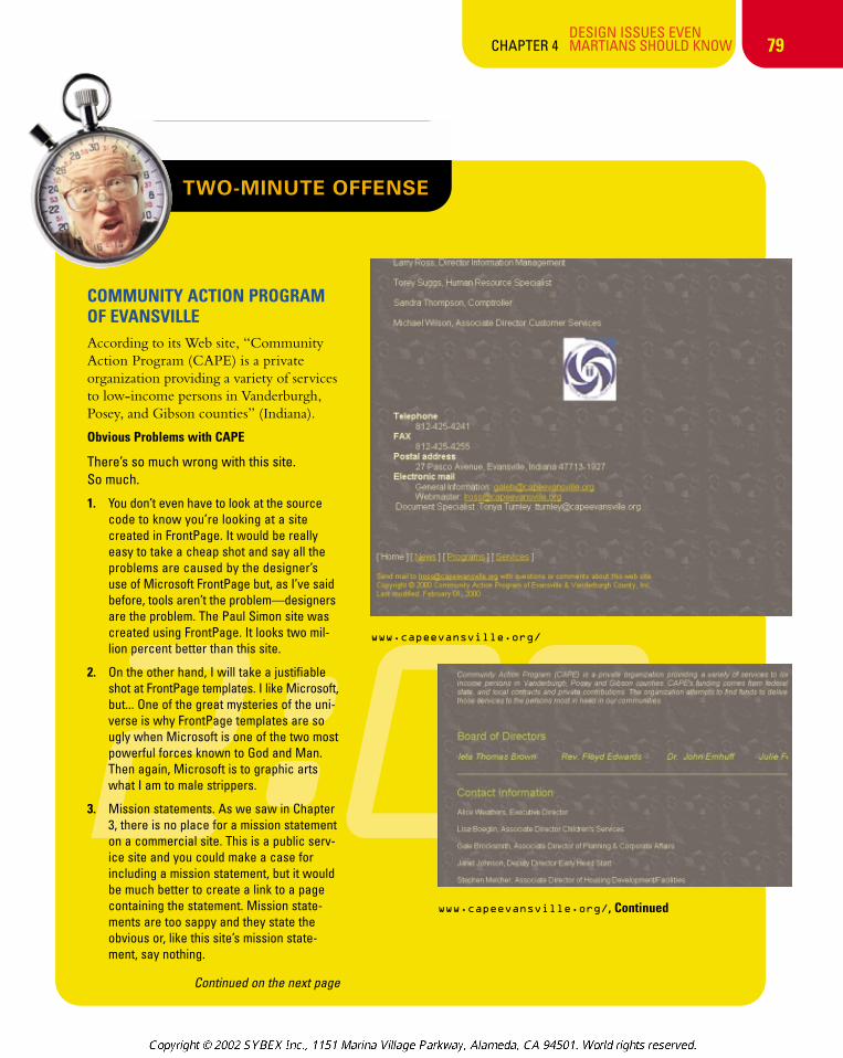
COMMUNITY ACTION PROGRAM OF EVANSVILLEAccording to its Web site, “CommunityAction Program (CAPE) is a privateorganization providing a variety of servicesto low-income persons in Vanderburgh,Posey, and Gibson counties” (Indiana).
Obvious Problems with CAPE
There’s so much wrong with this site. So much.
1. You don’t even have to look at the sourcecode to know you’re looking at a site created in FrontPage. It would be reallyeasy to take a cheap shot and say all theproblems are caused by the designer’s use of Microsoft FrontPage but, as I’ve saidbefore, tools aren’t the problem—designersare the problem. The Paul Simon site wascreated using FrontPage. It looks two mil-lion percent better than this site.
2. On the other hand, I will take a justifiableshot at FrontPage templates. I like Microsoft,but... One of the great mysteries of the uni-verse is why FrontPage templates are sougly when Microsoft is one of the two mostpowerful forces known to God and Man.Then again, Microsoft is to graphic artswhat I am to male strippers.
3. Mission statements. As we saw in Chapter3, there is no place for a mission statementon a commercial site. This is a public serv-ice site and you could make a case forincluding a mission statement, but it wouldbe much better to create a link to a pagecontaining the statement. Mission state-ments are too sappy and they state theobvious or, like this site’s mission state-ment, say nothing.
Continued on the next page
chapter_4_p3 3/20/2002 2:58 PM Page 79
80
TWO-MINUTE OFFENSE
DESIGN ISSUES EVEN CHAPTER 4 MARTIANS SHOULD KNOW
2:00
Continued from previous page
As I’ve said since the last century, “missionstatements basically say ‘All babies must eat.’”(Credit goes to Chris Rock for that line.) If youabsolutely must have a mission statement, thengo to www.unitedmedia.com/comics/dilbert/career/bin/ms2.cgi and useCatbert’s Anti-Career Center Mission StatementGenerator. You’ll save a lot of time, and it will bejust as stupid as anything your own marketingpeople might come up with.
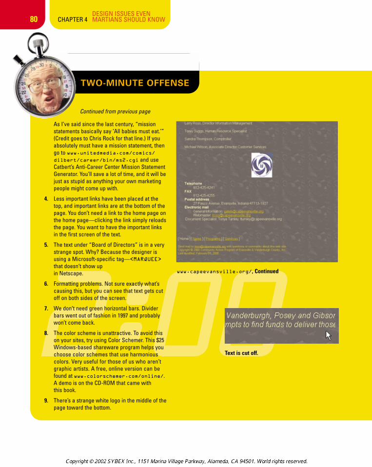
4. Less important links have been placed at thetop, and important links are at the bottom of thepage. You don’t need a link to the home page onthe home page—clicking the link simply reloadsthe page. You want to have the important linksin the first screen of the text.
5. The text under “Board of Directors” is in a verystrange spot. Why? Because the designer isusing a Microsoft-specific tag—<MARQUEE>
that doesn’t show up in Netscape.
6. Formatting problems. Not sure exactly what’scausing this, but you can see that text gets cutoff on both sides of the screen.
7. We don’t need green horizontal bars. Dividerbars went out of fashion in 1997 and probablywon’t come back.
8. The color scheme is unattractive. To avoid thison your sites, try using Color Schemer. This $25Windows-based shareware program helps youchoose color schemes that use harmonious colors. Very useful for those of us who aren’tgraphic artists. A free, online version can befound at www.colorschemer.com/online/.A demo is on the CD-ROM that came with this book.
9. There’s a strange white logo in the middle of thepage toward the bottom.
Text is cut off.
www.capeevansville.org/, Continued
chapter_4_p3 3/20/2002 2:58 PM Page 80
81DESIGN ISSUES EVEN
CHAPTER 4 MARTIANS SHOULD KNOW
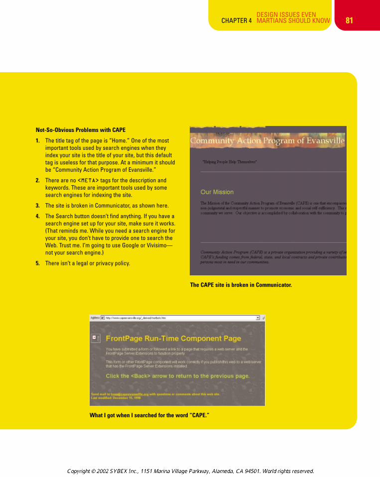
Not-So-Obvious Problems with CAPE
1. The title tag of the page is “Home.” One of the mostimportant tools used by search engines when theyindex your site is the title of your site, but this defaulttag is useless for that purpose. At a minimum it shouldbe “Community Action Program of Evansville.”
2. There are no <META> tags for the description andkeywords. These are important tools used by somesearch engines for indexing the site.
3. The site is broken in Communicator, as shown here.
4. The Search button doesn’t find anything. If you have asearch engine set up for your site, make sure it works.(That reminds me. While you need a search engine foryour site, you don’t have to provide one to search theWeb. Trust me. I’m going to use Google or Vivisimo—not your search engine.)
5. There isn’t a legal or privacy policy.
The CAPE site is broken in Communicator.
What I got when I searched for the word “CAPE.”
chapter_4_p3 3/20/2002 2:58 PM Page 81
What Did We Learn in This Chapter?1. Web design isn’t sex. With sex,
there’s foreplay. There is no foreplayon the Web (certain types of sitessuch as game, music, and moviebeing exceptions). On the Web youget right to the point.
2. Your goal is to get the following “complaints”:
a. It’s too easy to find what I’m lookingfor on your site.
b. Your site loads too quickly.
c. Your site is too easy to navigate.
d. Your site is too informative.
3. It’s OK to let other sites influence your design efforts. Just don’t borrow directly.
4. Sometimes it’s difficult to tell if a sitehas directly borrowed the design.
a. The same design firm could havedesigned both sites.
b. The same design template mayhave been used.
c. The site could have received permission to borrow the design.
d. The site could be a parody.
5. Some sites borrow too heavily.They’re “Under the Influence.”
6. Don’t borrow images from another site.
7. The Wayback Machine(web.archive.org/) has captured many sites from the past.Unfortunately, many of the graphicsare missing.
8. Unless you’re a music, movie, ormedia company, there is no excusefor using music files on your site.
9. Unless you’re paying ASCAP, BMI, orsome other entity, or you wrote themusic yourself, you probably have nolegal right to use music on your site.
10. Contracts are very important for Website owners. Get a lawyer.
11. Many technical issues can affect howvisitors view your sites: the quality ofthe server where you host your site,the number of other domains hostedon the machine where your site ishosted, the software and utilities yourhost provides, and the size and num-ber of the Internet connections ofyour hosting service.
12. On the visitor’s end, factors affectingthe viewing experience include thebrowser used, the resolution of themonitor, and the speed of the connec-tion to the Internet.
82DESIGN ISSUES EVEN
CHAPTER 4 MARTIANS SHOULD KNOW
chapter_4_p3 3/20/2002 2:58 PM Page 82
83DESIGN ISSUES EVEN
CHAPTER 4 MARTIANS SHOULD KNOW
13. Unfortunately, sites don’t look thesame to all visitors, because of thevariations in browsers, computer sys-tems, graphics cards, and monitors.
14. A page that looks good in InternetExplorer may look terrible whenviewed with Netscape and vice versa.
15. Check your Web logs to see whatbrowsers and compute systems peo-ple are using to visit your site.
16. There are two types of design—fixed-width and liquid. With fixed-widthdesign, you set limits on the width(and possibly the height) of the page.With liquid design, the page flows intothe available screen space.
17. Should you use fixed-width or liquiddesign? As with everything, itdepends. You need to see what yourusers want.
18. Many in the Web design communitywant Web sites to conform to Webstandards such as those proposed bythe W3C. It’s a wonderful idea, butunfortunately too many sites would“break down”—especially those sitesusing Netscape 4.X.
19. There are software and online toolsyou can use to check the appearanceof your site and to help you displayyour Web page at real-time speeds.
20. Remember, Internet connection speedis important. Your site should loadquickly. “If the bits don’t flow, peoplewill go.”
21. FrontPage templates are an affront togood taste. Heck, let’s be honest.They’re even insulting to bad taste.Yes, you can create nice lookingpages with FrontPage—but not if youuse the templates that come with theprogram.
22. Mission Statements are “full of soundand fury, signifying nothing.”
23. The important links go at the top ofthe page. The less important links goon the left-hand vertical navigationbar or on the bottom of the page. TheCAPE site has the important links atthe bottom and the less importantlinks at the top.
24. The Microsoft-specific tag <MARQUEE>produces unpredictable results in aNetscape browser. Unless you knowthat 100 percent of your visitors useMicrosoft, I’d try to be more generic.
25. Green divider bars went out of fashionin 1997. Divider bars are out of fashionand probably won’t come back.
26. To avoid ugly color schemes, try usinga shareware program like ColorSchemer, included on the CD-ROMwith this book.
27. Don’t use images with white back-grounds on pages with dark back-grounds. Make the backgrounds ofthe images transparent. Any decentgraphics program can do this.
28. The <TITLE> tag of your page isextremely important because almostall search engines use this in catego-rizing your site.
29. If you have a search engine set up foryour site, make sure it works.
30. If you are a public service site, besure to include a legal or privacy policy link.
chapter_4_p3 3/20/2002 2:58 PM Page 83