Embed Size (px)
Citation preview
STUDY RESOURCES
Sources for the study of marketing
in the V&A Archive
The Public Affairs division is responsible for the ways in which the V&A promotes and markets
itself. It has produced a factfile that provides information on its current marketing strategy,
campaigns and press coverage. The factfile is available on the Marketing the V&A page.
This subject guide outlines the resources available in the V&A Archive for studying the history of
marketing and publicity at the V&A, particularly the V&A’s corporate identity/brand and its
graphic language. These include posters and other printed literature: advertisements for
exhibitions, displays and events, office stationery, concert programmes and some information
on the V&A logo and signage. They may be viewed by appointment in the Blythe House Reading
Room.
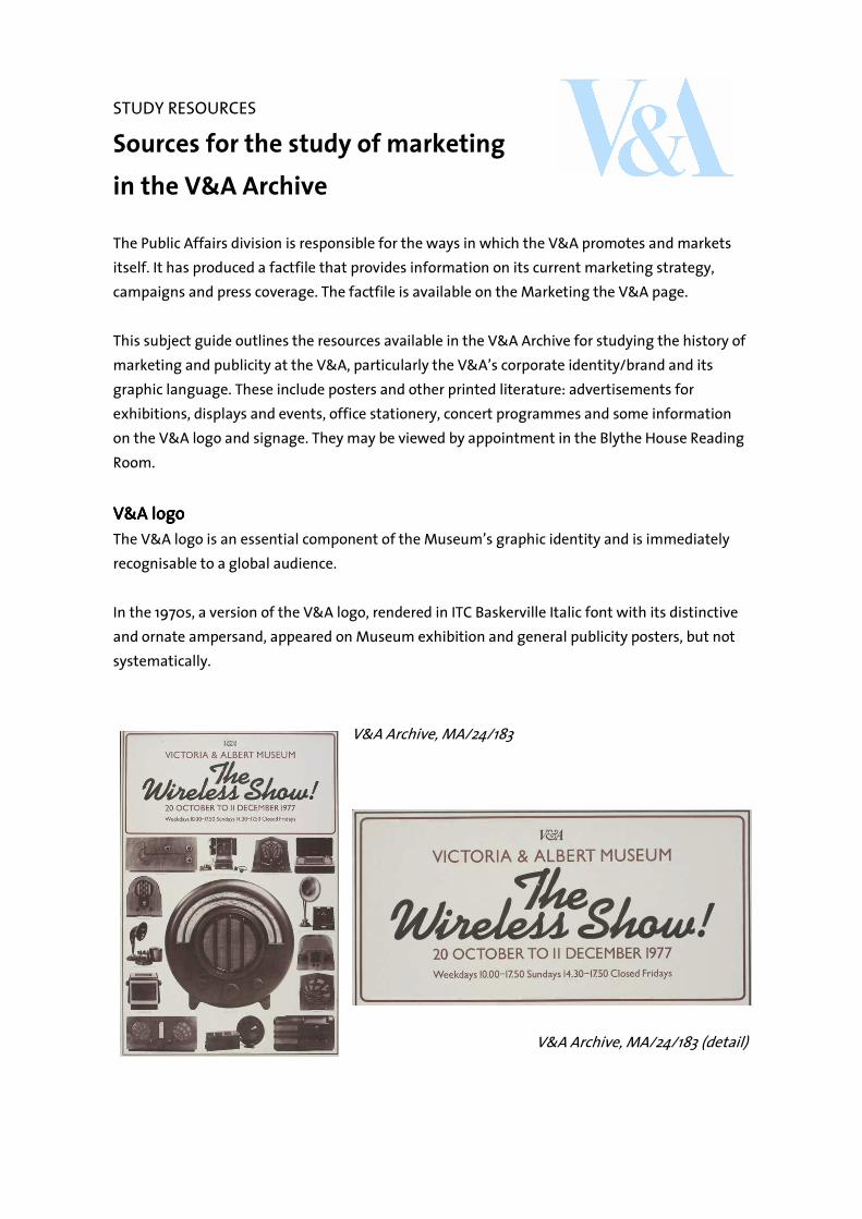
V&A logoV&A logoV&A logoV&A logo
The V&A logo is an essential component of the Museum’s graphic identity and is immediately
recognisable to a global audience.
In the 1970s, a version of the V&A logo, rendered in ITC Baskerville Italic font with its distinctive
and ornate ampersand, appeared on Museum exhibition and general publicity posters, but not
systematically.
V&A Archive, MA/24/183
V&A Archive, MA/24/183 (detail)
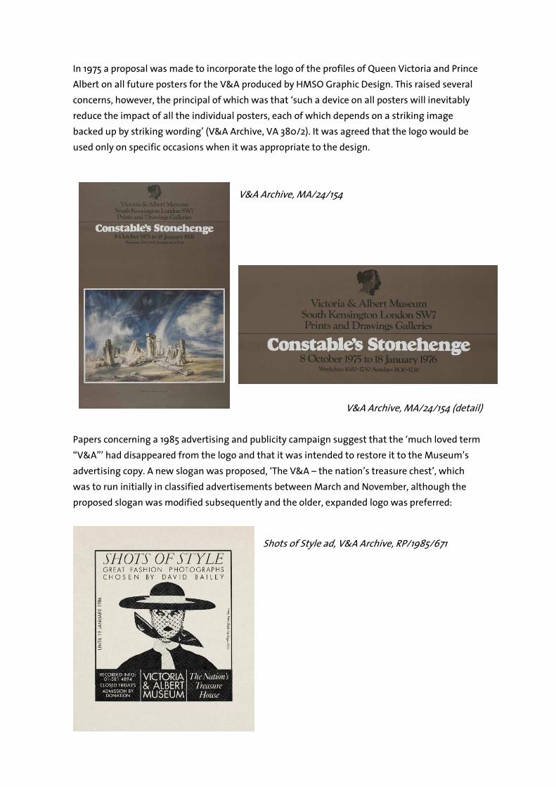
In 1975 a proposal was made to incorporate the logo of the profiles of Queen Victoria and Prince
Albert on all future posters for the V&A produced by HMSO Graphic Design. This raised several
concerns, however, the principal of which was that ‘such a device on all posters will inevitably
reduce the impact of all the individual posters, each of which depends on a striking image
backed up by striking wording’ (V&A Archive, VA 380/2). It was agreed that the logo would be
used only on specific occasions when it was appropriate to the design.
V&A Archive, MA/24/154
V&A Archive, MA/24/154 (detail)
Papers concerning a 1985 advertising and publicity campaign suggest that the ‘much loved term
“V&A”’ had disappeared from the logo and that it was intended to restore it to the Museum’s
advertising copy. A new slogan was proposed, ‘The V&A – the nation’s treasure chest’, which
was to run initially in classified advertisements between March and November, although the
proposed slogan was modified subsequently and the older, expanded logo was preferred:
Shots of Style ad, V&A Archive, RP/1985/671
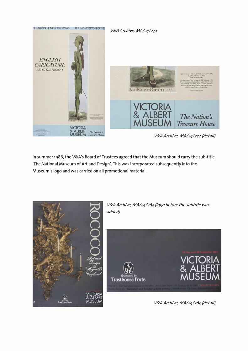
V&A Archive, MA/24/274
V&A Archive, MA/24/274 (detail)
In summer 1986, the V&A’s Board of Trustees agreed that the Museum should carry the sub-title
‘The National Museum of Art and Design’. This was incorporated subsequently into the
Museum’s logo and was carried on all promotional material.
V&A Archive, MA/24/263 (logo before the subtitle was
added)
V&A Archive, MA/24/263 (detail)
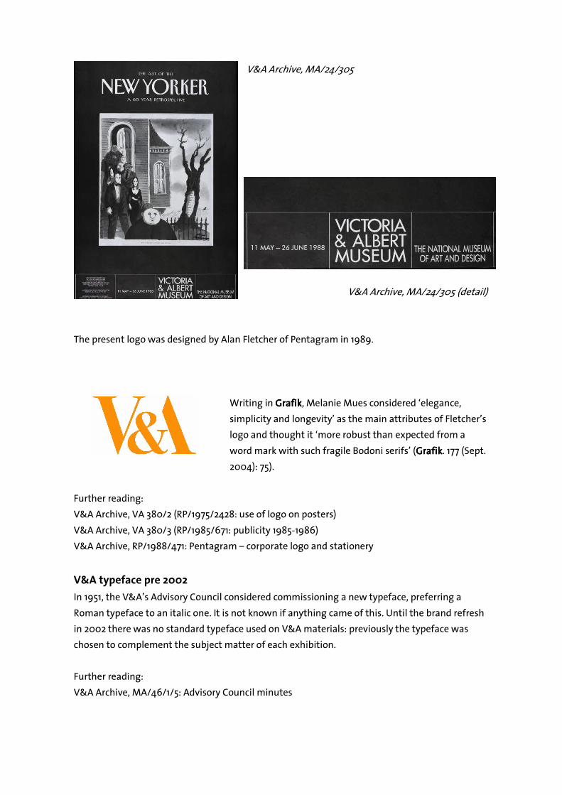
V&A Archive, MA/24/305
V&A Archive, MA/24/305 (detail)
The present logo was designed by Alan Fletcher of Pentagram in 1989.
Writing in GrafikGrafikGrafikGrafik, Melanie Mues considered ‘elegance,
simplicity and longevity’ as the main attributes of Fletcher’s
logo and thought it ‘more robust than expected from a
word mark with such fragile Bodoni serifs’ (GrafikGrafikGrafikGrafik. 177 (Sept.
2004): 75).
Further reading:
V&A Archive, VA 380/2 (RP/1975/2428: use of logo on posters)
V&A Archive, VA 380/3 (RP/1985/671: publicity 1985-1986)
V&A Archive, RP/1988/471: Pentagram – corporate logo and stationery
V&A typeface pre 2002
In 1951, the V&A’s Advisory Council considered commissioning a new typeface, preferring a
Roman typeface to an italic one. It is not known if anything came of this. Until the brand refresh
in 2002 there was no standard typeface used on V&A materials: previously the typeface was
chosen to complement the subject matter of each exhibition.
Further reading:
V&A Archive, MA/46/1/5: Advisory Council minutes

V&A Archive, MA/24/29
V&A Archive, MA/24/376
V&A Archive, MA/24/397
V&A brand refresh 2002
In 2002 Wolff Olins, a leading brand consultancy firm, was appointed to refresh the V&A’s brand
and graphic identity and to provide guidelines for its future use in print work. The V&A logo was
retained, but it was to be used in a more dramatic and confident way. Colours would play a
much greater role in the identity (the only instruction was ‘no black’). To bring all
communications together, a new typeface was developed specifically for the V&A, the ‘V&A
Sans’ (adapted from TheSans font, which had been designed by Luc(as) de Groot in 1994). As a
result ‘The Museum is now able to communicate with visitors in more direct, elegant, and

The V&A blueprint
what we dowhat we dowhat we dowhat we dowe run the world’s greatest museum of art and design
what we focus onwhat we focus onwhat we focus onwhat we focus oninternational/nationalcreative industriesaccess & audiencesefficiency & effectiveness
why we do itwhy we do itwhy we do itwhy we do itto inspire creativity
through our knowledge
how we do ithow we do ithow we do ithow we do itwe use our unique collection to
bring the past to life, explore the contemporary and
inspire the designers of the future
what we valuewhat we valuewhat we valuewhat we valuegenerosity
accessible, welcoming, respectful, sharing
imaginationinventive, original, progressive, risky
coherenceclear, consistent, engaging, direct
rigourdemanding, challenging, authoritative
persuasive manner’ (V&A End of year report, April 2002 V&A End of year report, April 2002 V&A End of year report, April 2002 V&A End of year report, April 2002 –––– March 2003 March 2003 March 2003 March 2003). At this point the
strapline ‘The National Museum of Art and Design’ was also dropped.
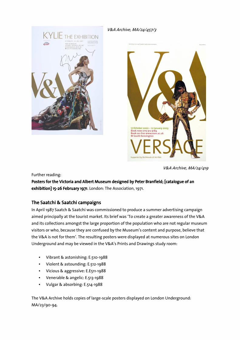
The refined visual identity was launched with the Versace exhibition marketing campaign in
October 2002. It was subsequently rolled-out on to all other external and internal materials,
including the V&A’s website, staff newsletters and signage.
The following documents relating to the brand refresh can be made available:
• Creative brief: V&A identity repair and enhancement
• Wolff Olins: tender/outline concept for V&A brand / corporate identity refresh (‘Doing
More With Less’)
• V&A design toolkit
• V&A style guidelines
• Example of the Versace poster and Discover the V&A leaflet
Further reading:
Clayton, Richard. ‘V&A appoints Wolff Olins to overhaul its identity.’ Design WeekDesign WeekDesign WeekDesign Week (23 May 2002).
Jones, Robert. ‘Museums need to be rebranded if they want to show how much they’ve
changed.’ Museums JournalMuseums JournalMuseums JournalMuseums Journal 108, no. 8 (Aug. 2008): 16.
Wolff Olins, ‘V&A: Renewed’:
http://www.wolffolins.com/media/case_studies/VA_case_study.pdf
V&A End of year report, April 2002 V&A End of year report, April 2002 V&A End of year report, April 2002 V&A End of year report, April 2002 –––– March 2003March 2003March 2003March 2003
Further work on the V&A’s brand
The visual identity refresh was followed by more extensive work to define the V&A’s brand, both
internally and externally, in partnership with branding consultant Jane Wentworth. This lead to
the creation of The V&A Blueprint – a summary of the V&A’s mission, strategy and values, the
setting up CulturePlan, a brand engagement programme for staff, and various other
manifestations of the brand for staff in particular, such as a new staff handbook.
Further reading:
Welcome to the V&AWelcome to the V&AWelcome to the V&AWelcome to the V&A staff handbookstaff handbookstaff handbookstaff handbook
V&A style guidelines
When in 2002 the V&A refreshed its brand, it also introduced new formats and guidelines
designed to present the Museum in an ‘elegant, unified and consistent way’ (V&A Style V&A Style V&A Style V&A Style
GuidelinesGuidelinesGuidelinesGuidelines, 2). In order to bring internal documents in line with these new standards, a simple
style guide was produced for all Word and PowerPoint documents, and text guidelines for
curatorial and non-curatorial text were developed to ensure consistency of tone of voice. These
guidelines were used for the production of all-in house generated literature and communication
materials.
Further reading:
V&A Archive, RP/1994/2027: V&A style guide
V&A Archive, RP/1995/677: Text house style (Education dept.)
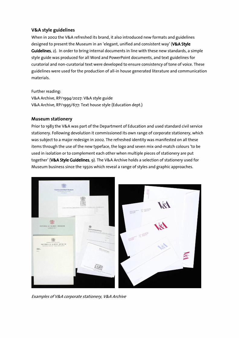
Museum stationery
Prior to 1983 the V&A was part of the Department of Education and used standard civil service
stationery. Following devolution it commissioned its own range of corporate stationery, which
was subject to a major redesign in 2002. The refreshed identity was manifested on all these
items through the use of the new typeface, the logo and seven mix-and-match colours ‘to be
used in isolation or to complement each other when multiple pieces of stationery are put
together’ (V&A Style GuidelinesV&A Style GuidelinesV&A Style GuidelinesV&A Style Guidelines, 9). The V&A Archive holds a selection of stationery used for
Museum business since the 1950s which reveal a range of styles and graphic approaches.
Examples of V&A corporate stationery, V&A Archive
Further reading:
V&A Archive, A0052: Specimens of stationery (writing paper, postcards and envelopes), 1950s to
1980s
V&A Archive, A0415: Specimens of stationery (letter heads, envelopes, compliment slips etc.),
c.2000 and c.2004
V&A Archive, A0422: Specimens of stationery and forms used by the Museum and the Prints,
Drawings & Paintings Department, 1980s to 1990s
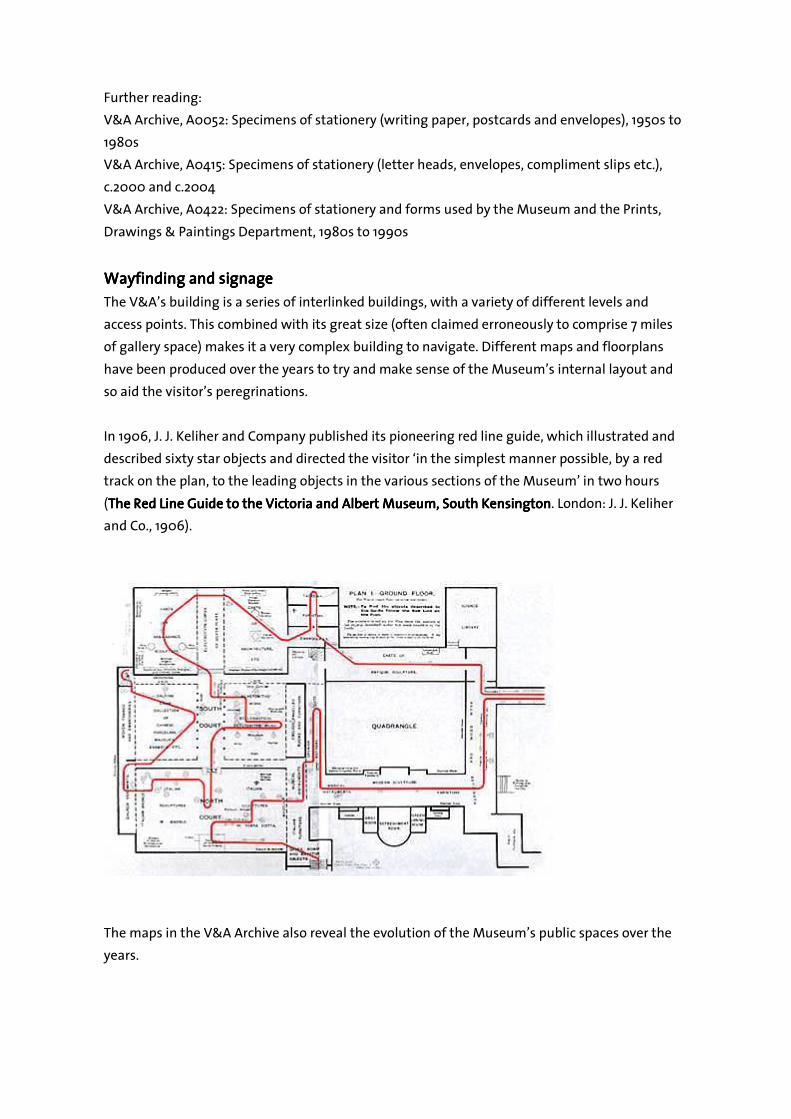
Wayfinding and sWayfinding and sWayfinding and sWayfinding and signageignageignageignage
The V&A’s building is a series of interlinked buildings, with a variety of different levels and
access points. This combined with its great size (often claimed erroneously to comprise 7 miles
of gallery space) makes it a very complex building to navigate. Different maps and floorplans
have been produced over the years to try and make sense of the Museum’s internal layout and
so aid the visitor’s peregrinations.
In 1906, J. J. Keliher and Company published its pioneering red line guide, which illustrated and
described sixty star objects and directed the visitor ‘in the simplest manner possible, by a red
track on the plan, to the leading objects in the various sections of the Museum’ in two hours
(The The The The Red Line Guide to the Victoria and Albert Museum, South KensingtonRed Line Guide to the Victoria and Albert Museum, South KensingtonRed Line Guide to the Victoria and Albert Museum, South KensingtonRed Line Guide to the Victoria and Albert Museum, South Kensington. London: J. J. Keliher
and Co., 1906).
The maps in the V&A Archive also reveal the evolution of the Museum’s public spaces over the
years.
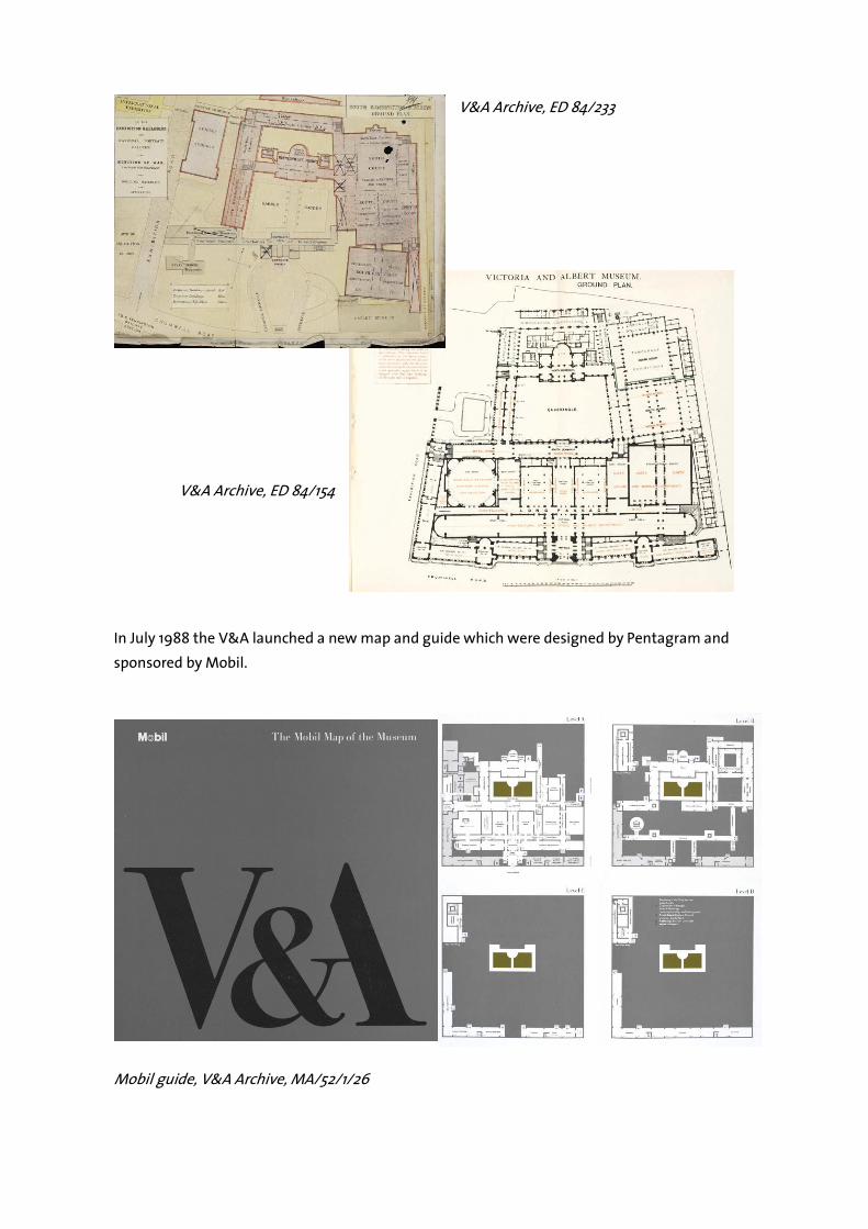
V&A Archive, ED 84/233
V&A Archive, ED 84/154
In July 1988 the V&A launched a new map and guide which were designed by Pentagram and
sponsored by Mobil.
Mobil guide, V&A Archive, MA/52/1/26
The map was intended ‘to bring simplicity and clarity to a complex institution and building’
while the guide would provide the first-time visitor with ‘basic information about the role of the
V&A, highlights of the collections and the services available’. A new signage system, based on
banners hanging between galleries, was introduced in September beginning with the first floor
and the rest of the building following in 1989.
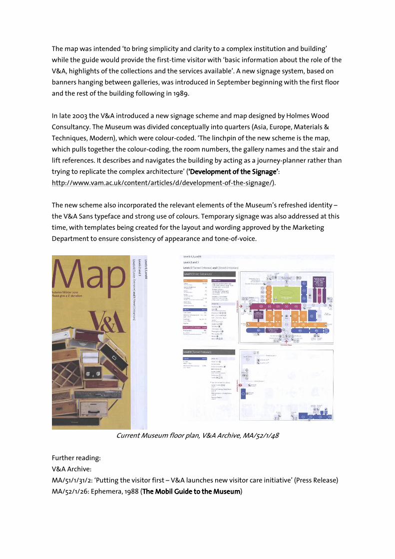
In late 2003 the V&A introduced a new signage scheme and map designed by Holmes Wood
Consultancy. The Museum was divided conceptually into quarters (Asia, Europe, Materials &
Techniques, Modern), which were colour-coded. ‘The linchpin of the new scheme is the map,
which pulls together the colour-coding, the room numbers, the gallery names and the stair and
lift references. It describes and navigates the building by acting as a journey-planner rather than
trying to replicate the complex architecture’ (‘‘‘‘Development of the Development of the Development of the Development of the Signage’Signage’Signage’Signage’:
http://www.vam.ac.uk/content/articles/d/development-of-the-signage/).
The new scheme also incorporated the relevant elements of the Museum’s refreshed identity –
the V&A Sans typeface and strong use of colours. Temporary signage was also addressed at this
time, with templates being created for the layout and wording approved by the Marketing
Department to ensure consistency of appearance and tone-of-voice.
Current Museum floor plan, V&A Archive, MA/52/1/48
Further reading:
V&A Archive:
MA/51/1/31/2: ‘Putting the visitor first – V&A launches new visitor care initiative’ (Press Release)
MA/52/1/26: Ephemera, 1988 (The MobilThe MobilThe MobilThe Mobil Guide to the Museum Guide to the Museum Guide to the Museum Guide to the Museum)
A0328: annotated draft text and sample covers for Red Line Souvenir of the Victoria and Albert Red Line Souvenir of the Victoria and Albert Red Line Souvenir of the Victoria and Albert Red Line Souvenir of the Victoria and Albert
MuseumMuseumMuseumMuseum, and advertising poster
Rees, Elizabeth. Preliminary study and recommendations for a new approach to signing at the Preliminary study and recommendations for a new approach to signing at the Preliminary study and recommendations for a new approach to signing at the Preliminary study and recommendations for a new approach to signing at the
Victoria and Albert MuseumVictoria and Albert MuseumVictoria and Albert MuseumVictoria and Albert Museum (1987)
Minutes of the meeting of the Board of Trustees, 16 January 2003, item 4
A formative evaluation of plans for a sign scheme and map prepared for the Victoria & Albert A formative evaluation of plans for a sign scheme and map prepared for the Victoria & Albert A formative evaluation of plans for a sign scheme and map prepared for the Victoria & Albert A formative evaluation of plans for a sign scheme and map prepared for the Victoria & Albert
MuseumMuseumMuseumMuseum by the Holmes Wood Consultancyby the Holmes Wood Consultancyby the Holmes Wood Consultancyby the Holmes Wood Consultancy … prepared by Dr Paulette M. McManus, Museum & … prepared by Dr Paulette M. McManus, Museum & … prepared by Dr Paulette M. McManus, Museum & … prepared by Dr Paulette M. McManus, Museum &
Heritage ConsultantHeritage ConsultantHeritage ConsultantHeritage Consultant, May 2003, May 2003, May 2003, May 2003
Holmes Wood Consultancy:
http://www.holmeswood.com/Work/wayfindingAndSigns/details.asp?iuid=16459909>
Holmes Wood Consultancy. ‘V&A Sign Report’ (27 March 2003)
‘‘‘‘V&A V&A V&A V&A wayfinding scheme and onsite signwayfinding scheme and onsite signwayfinding scheme and onsite signwayfinding scheme and onsite signage principlesage principlesage principlesage principles’’’’ ((((23 January 200823 January 200823 January 200823 January 2008))))
‘‘‘‘Development of the Development of the Development of the Development of the SignageSignageSignageSignage’’’’: http://www.vam.ac.uk/content/articles/d/development-of-the-
signage/
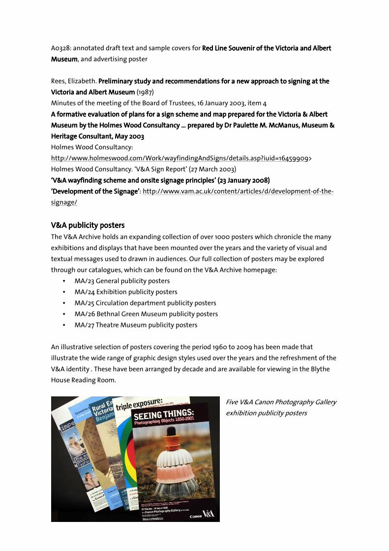
V&A V&A V&A V&A ppppublicitublicitublicitublicity postersy postersy postersy posters
The V&A Archive holds an expanding collection of over 1000 posters which chronicle the many
exhibitions and displays that have been mounted over the years and the variety of visual and
textual messages used to drawn in audiences. Our full collection of posters may be explored
through our catalogues, which can be found on the V&A Archive homepage:
• MA/23 General publicity posters
• MA/24 Exhibition publicity posters
• MA/25 Circulation department publicity posters
• MA/26 Bethnal Green Museum publicity posters
• MA/27 Theatre Museum publicity posters
An illustrative selection of posters covering the period 1960 to 2009 has been made that
illustrate the wide range of graphic design styles used over the years and the refreshment of the
V&A identity . These have been arranged by decade and are available for viewing in the Blythe
House Reading Room.
Five V&A Canon Photography Gallery
exhibition publicity posters
V&A Archive, MA/24/457/3
V&A Archive, MA/24/419
Further reading:
Posters for the Victoria and Albert Museum designed by Peter Branfield; [catalogue of an Posters for the Victoria and Albert Museum designed by Peter Branfield; [catalogue of an Posters for the Victoria and Albert Museum designed by Peter Branfield; [catalogue of an Posters for the Victoria and Albert Museum designed by Peter Branfield; [catalogue of an
exhibition] 15exhibition] 15exhibition] 15exhibition] 15----26 February 197126 February 197126 February 197126 February 1971. London: The Association, 1971.
The Saatchi & The Saatchi & The Saatchi & The Saatchi & Saatchi campaignSaatchi campaignSaatchi campaignSaatchi campaignssss
In April 1987 Saatch & Saatchi was commissioned to produce a summer advertising campaign
aimed principally at the tourist market. Its brief was ‘To create a greater awareness of the V&A
and its collections amongst the large proportion of the population who are not regular museum
visitors or who, because they are confused by the Museum’s content and purpose, believe that
the V&A is not for them’. The resulting posters were displayed at numerous sites on London
Underground and may be viewed in the V&A’s Prints and Drawings study room:
• Vibrant & astonishing: E.510-1988
• Violent & astounding: E.512-1988
• Vicious & aggressive: E.E511-1988
• Venerable & angelic: E.513-1988
• Vulgar & absorbing: E.514-1988
The V&A Archive holds copies of large-scale posters displayed on London Underground:
MA/23/90-94.
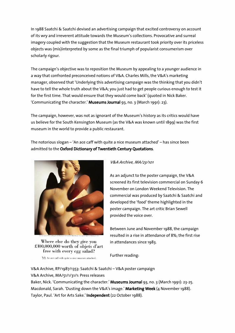
In 1988 Saatchi & Saatchi devised an advertising campaign that excited controversy on account
of its wry and irreverent attitude towards the Museum’s collections. Provocative and surreal
imagery coupled with the suggestion that the Museum restaurant took priority over its priceless
objects was (mis)interpreted by some as the final triumph of popularist consumerism over
scholarly rigour.
The campaign’s objective was to reposition the Museum by appealing to a younger audience in
a way that confronted preconceived notions of V&A. Charles Mills, the V&A’s marketing
manager, observed that ‘Underlying this advertising campaign was the thinking that you didn’t
have to tell the whole truth about the V&A; you just had to get people curious enough to test it
for the first time. That would ensure that they would come back’ (quoted in Nick Baker.
‘Communicating the character.’ Museums JournalMuseums JournalMuseums JournalMuseums Journal 93, no. 3 (March 1991): 23).
The campaign, however, was not as ignorant of the Museum’s history as its critics would have
us believe for the South Kensington Museum (as the V&A was known until 1899) was the first
museum in the world to provide a public restaurant.
The notorious slogan – ‘An ace caff with quite a nice museum attached’ – has since been
admitted to the Oxford Dictionary of Oxford Dictionary of Oxford Dictionary of Oxford Dictionary of Twentieth CenturyTwentieth CenturyTwentieth CenturyTwentieth Century QuotationsQuotationsQuotationsQuotations.
V&A Archive, MA/23/101
As an adjunct to the poster campaign, the V&A
screened its first television commercial on Sunday 6
November on London Weekend Television. The
commercial was produced by Saatchi & Saatchi and
developed the ‘food’ theme highlighted in the
poster campaign. The art critic Brian Sewell
provided the voice over.
Between June and November 1988, the campaign
resulted in a rise in attendance of 8%; the first rise
in attendances since 1983.
Further reading:
V&A Archive, RP/1987/1353: Saatchi & Saatchi – V&A poster campaign
V&A Archive, MA/51/1/31/1: Press releases
Baker, Nick. ‘Communicating the character.’ Museums JournalMuseums JournalMuseums JournalMuseums Journal 93, no. 3 (March 1991): 23-25.
Macdonald, Sarah. ‘Dusting down the V&A’s image.’ Marketing WeekMarketing WeekMarketing WeekMarketing Week (4 November 1988).
Taylor, Paul. ‘Art for Arts Sake.’ IndependentIndependentIndependentIndependent (22 October 1988).
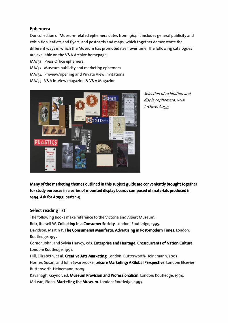
EphemeraEphemeraEphemeraEphemera
Our collection of Museum-related ephemera dates from 1964. It includes general publicity and
exhibition leaflets and flyers, and postcards and maps, which together demonstrate the
different ways in which the Museum has promoted itself over time. The following catalogues
are available on the V&A Archive homepage:
MA/51 Press Office ephemera
MA/52 Museum publicity and marketing ephemera
MA/54 Preview/opening and Private View invitations
MA/55 V&A In-View magazine & V&A Magazine
Selection of exhibition and
display ephemera, V&A
Archive, A0535
Many of the marketing themes outlined in this subject guide are conveniently brought together Many of the marketing themes outlined in this subject guide are conveniently brought together Many of the marketing themes outlined in this subject guide are conveniently brought together Many of the marketing themes outlined in this subject guide are conveniently brought together
for study purposes ifor study purposes ifor study purposes ifor study purposes in a series of mounted display boarn a series of mounted display boarn a series of mounted display boarn a series of mounted display boards composed of materials produced inds composed of materials produced inds composed of materials produced inds composed of materials produced in
1994. 1994. 1994. 1994. Ask for A0535, parts 1Ask for A0535, parts 1Ask for A0535, parts 1Ask for A0535, parts 1----3.3.3.3.
Select reading list Select reading list Select reading list Select reading list
The following books make reference to the Victoria and Albert Museum:
Belk, Russell W. Collecting in a Consumer SocietyCollecting in a Consumer SocietyCollecting in a Consumer SocietyCollecting in a Consumer Society. London: Routledge, 1995.
Davidson, Martin P. The Consumerist Manifesto: Advertising in PostThe Consumerist Manifesto: Advertising in PostThe Consumerist Manifesto: Advertising in PostThe Consumerist Manifesto: Advertising in Post----modern Timesmodern Timesmodern Timesmodern Times. London:
Routledge, 1992.
Corner, John, and Sylvia Harvey, eds. Enterprise and Heritage: Crosscurrents of Nation CultureEnterprise and Heritage: Crosscurrents of Nation CultureEnterprise and Heritage: Crosscurrents of Nation CultureEnterprise and Heritage: Crosscurrents of Nation Culture.
London: Routledge, 1991.
Hill, Elizabeth, et al. Creative Arts MarketingCreative Arts MarketingCreative Arts MarketingCreative Arts Marketing. London: Butterworth-Heinemann, 2003.
Horner, Susan, and John Swarbrooke. Leisure Marketing: A Global PerspectiveLeisure Marketing: A Global PerspectiveLeisure Marketing: A Global PerspectiveLeisure Marketing: A Global Perspective. London: Elsevier
Butterworth-Heinemann, 2005.
Kavanagh, Gaynor, ed. Museum Provision and ProfessionalismMuseum Provision and ProfessionalismMuseum Provision and ProfessionalismMuseum Provision and Professionalism. London: Routledge, 1994.
McLean, Fiona. Marketing the MuseumMarketing the MuseumMarketing the MuseumMarketing the Museum. London: Routledge, 1997.