Embed Size (px)
DESCRIPTION
Statistical Techniques in Business and Economics 12e Chapter 02
Citation preview

2- 1
Chapter
Two
McGraw-Hill/Irwin
© 2005 The McGraw-Hill Companies, Inc., All Rights Reserved.

2- 2
Chapter TwoDescribing Data: Frequency Distributions Describing Data: Frequency Distributions
and Graphic Presentationand Graphic PresentationGOALSWhen you have completed this chapter, you will be able to:
ONE Organize data into a frequency distribution.
TWO Portray a frequency distribution in a histogram, frequency polygon, and cumulative frequency polygon.
THREEPresent data using such graphic techniques as line charts, bar charts, and pie charts.
Goals

2- 3
Frequency Distribution
A Frequency DistributionFrequency Distribution is a grouping of data into mutually exclusive
categories showing the number of observations in each class.
2- 4
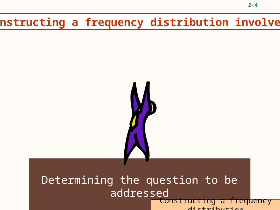
Determining the question to be addressed
Constructing a frequency distribution involves:
Constructing a frequency distribution

2- 5
Determining the question to be addressed
Constructing a frequency distribution involves:
Collecting raw data
Constructing a frequency distribution

2- 6
Determining the question to be addressed
Constructing a frequency distribution involves:
Collecting raw data
Organizing data (frequency distribution)
Constructing a frequency distribution

2- 7
Determining the question to be addressed
Constructing a frequency distribution involves:
Collecting raw data
Organizing data (frequency distribution)
Presenting data (graph)
Constructing a frequency distribution

2- 8
Determining the question to be addressed
Constructing a frequency distribution involves:
Collecting raw data
Organizing data (frequency distribution)
Presenting data (graph)
Drawing conclusions
Constructing a frequency distribution
2- 9
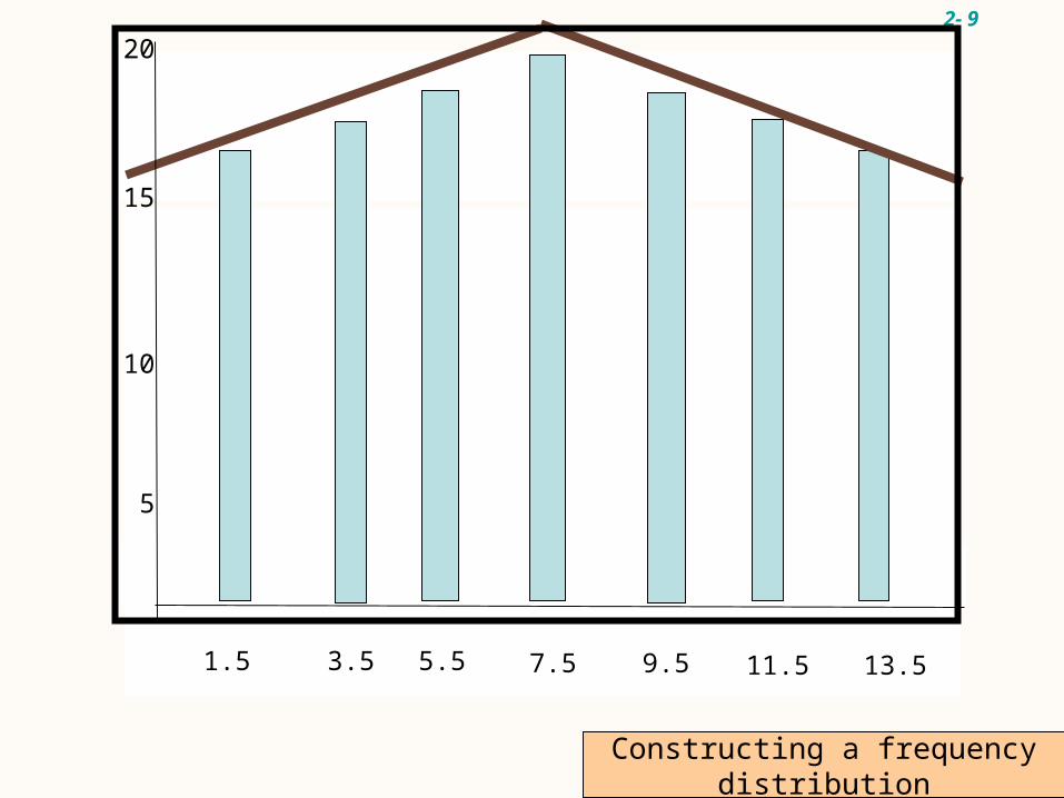
Collecting raw data
Organizing data (frequency distribution)
Presenting data (graph)
Drawing conclusions
1.5 3.5 5.5 7.5 9.5 11.5 13.5
5
10
15
20
Constructing a frequency distribution
2- 10
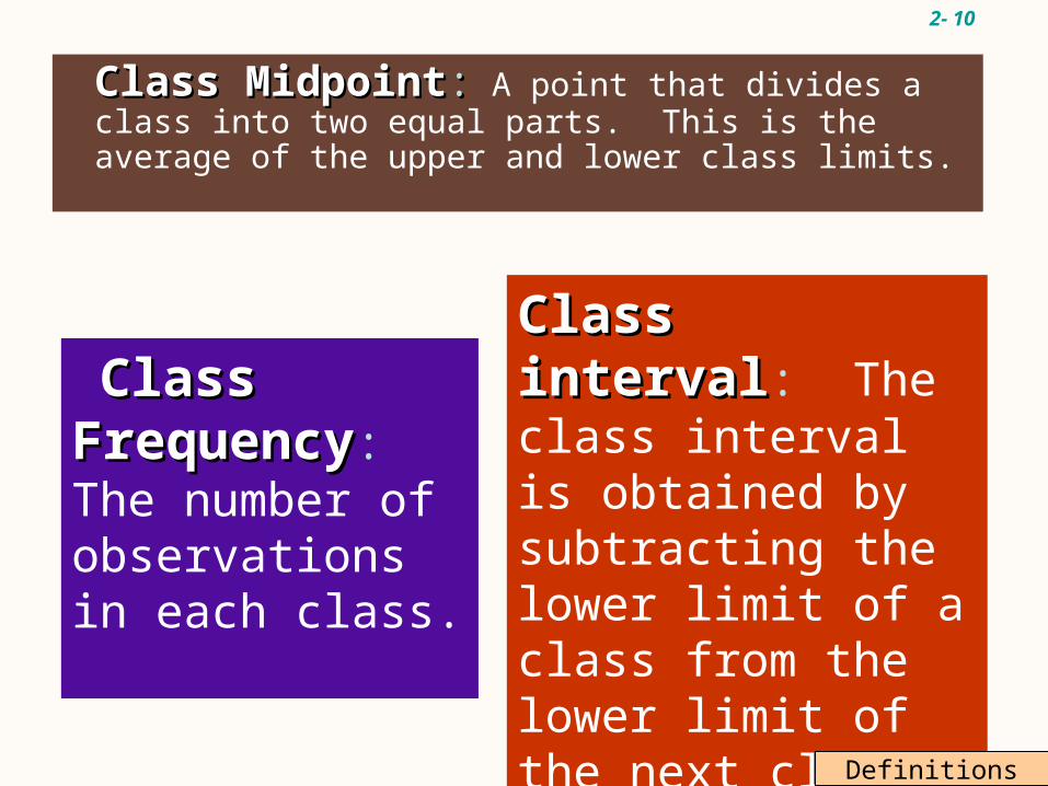
Class MidpointClass Midpoint:: A point that divides a class into two equal parts. This is the average of the upper and lower class limits.
Class FrequencyClass Frequency: The number of observations in each class.
Class intervalClass interval: The class interval is obtained by subtracting the lower limit of a class from the lower limit of the next class. The class intervals should be equal.
Definitions

2- 11
EXAMPLE 1
15.0, 23.7, 19.7, 15.4, 18.3, 23.0, 14.2, 20.8, 13.5, 20.7, 17.4, 18.6, 12.9, 20.3, 13.7, 21.4, 18.3, 29.8, 17.1, 18.9, 10.3, 26.1, 15.7, 14.0, 17.8, 33.8, 23.2, 12.9, 27.1, 16.6.
Organize the data into a frequency distribution.
Dr. Tillman is Dean of the School of Business Socastee University. He wishes prepare to a report showing the number of hours per week students spend studying. He selects a random sample of 30 students and determines the number of hours each student studied last week.

2- 12
Example 1 continued
Step OneStep One:: Decide on the number of classes using the formula
22kk > n > nwhere k=number of classes n=number of observations
oThere are 30 observations so n=30.
oTwo raised to the fifth power is 32.
oTherefore, we should have at least 5 classes, i.e., k=5.

2- 13
where H=highest value, L=lowest value
33.8 – 10.3 5
= 4.7
Step TwoStep Two: Determine the class interval or width using the formula
H – LH – L kk
i > =
Round up for an interval of 5 hours.
Set the lower limit of the first class at 7.5 hours, giving a total of 6 classes.
Example 1 continued

2- 14
EXAMPLE 1 continued
Hours studying Frequency, f
7.5 up to 12.5 1
12.5 up to 17.5 12
17.5 up to 22.5 10
22.5 up to 27.5 5
27.5 up to 32.5 1
32.5 up to 37.5 1
Step ThreeStep Three: Set the individual class limits andSteps Four and FiveSteps Four and Five: Tally and count the number of items in each class.

2- 15
Class MidpointClass Midpoint: find the midpoint of each interval, use the following formula: Upper limit + lower limit
2Hours
studying Midpoint f
7.5 up to 12.5 (12.5+7.5)/2 =10.0 1
12.5 up to 17.5 (17.5+12.5)/2=15.0 12
17.5 up to 22.5 (22.5+17.5)/2=20.0 10
22.5 up to 27.5 (27.5+22.5)/2=25.0 5
27.5 up to 32.5 (32.5+27.5)/2=30.0 1
32.5 up to 37.5 (37.5+32.5)/2=35.0 1
Example 1 continued

2- 16
Hours f Relative Frequency
7.5 up to 12.5 1 1/30=.0333
12.5 up to 17.5 12 12/30=.400
17.5 up to 22.5 10 10/30=.333
22.5 up to 27.5 5 5/30=.1667
27.5 up to 32.5 1 1/30=.0333
32.5 up to 37.5 1 1/30=.0333 TOTAL 30 30/30=1
Example 1 continued
A Relative Frequency DistributionRelative Frequency Distribution shows the percent of observations in each class.

2- 17
Graphic Presentation of a Frequency Distribution
A Histogram is a graph in which the class midpoints or limits are marked on the horizontal axis and the class frequencies on the vertical axis.
The class frequencies are represented by the heights of the bars and the bars are drawn adjacent to each other.
The three commonly used graphic forms are Histograms, Frequency PolygonsHistograms, Frequency Polygons, and a
Cumulative FrequencyCumulative Frequency distribution.

2- 18
Histogram for Hours Spent Studying
0
2
4
6
8
10
12
14
10 15 20 25 30 35
Hours spent studying
Fre
qu
ency
midpoint

2- 19
Graphic Presentation of a Frequency Graphic Presentation of a Frequency DistributionDistribution
Graphic Presentation of a Frequency Distribution
A Frequency PolygonFrequency Polygon consists of line segments connecting the points formed by the class midpoint and the class frequency.

2- 20
Frequency PolygonFrequency Polygon for Hours for Hours Spent StudyingSpent Studying
0
2
4
6
8
10
12
14
10 15 20 25 30 35
Hours spent studying
Fre
qu
en
cy
Frequency Polygon for Hours Spent Studying

2- 21
A Cumulative Cumulative Frequency Frequency DistributionDistribution is used to determine how many or what proportion of the data values are below or above a certain value.
Cumulative Frequency DistributionCumulative Frequency Distribution
To create a cumulative frequency polygon, scale the upper limit of each class along the X-axis and the corresponding cumulative frequencies along the Y-axis.
Cumulative Frequency distribution

2- 22
Cumulative Frequency Table for Hours Spent Cumulative Frequency Table for Hours Spent StudyingStudying
Hours Studying
Upper Limit
f Cumulative Frequency
7.5 up to 12.5 12.5 1 1
12.5 up to 17.5 17.5 12 13 (1+12)
17.5 up to 22.5 22.5 10 23 (13+10)
22.5 up to 27.5 27.5 5 28 (23+5)
27.5 up to 32.5 32.5 1 29 (28+1)
32.5 up to 37.5 37.5 1 30 (29+1)
Cumulative frequency table

2- 23
Cumulative Frequency Distribution Cumulative Frequency Distribution For Hours StudyingFor Hours Studying
0
5
10
15
20
25
30
35
10 15 20 25 30 35
Hours Spent Studying
Frequency
Cumulative frequency distribution

2- 24
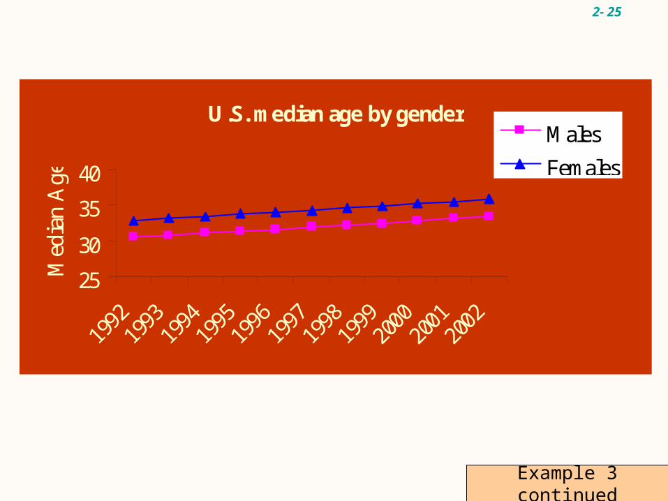
Line graphs are typically used to show the change or trend in a variable over time.
Year Males Females1992 30.5 32.91993 30.8 33.21994 31.1 33.51995 31.4 33.81996 31.6 34.01997 31.9 34.31998 32.2 34.61999 32.5 34.92000 32.8 35.22001 33.2 35.52002 33.5 35.8
Line Graphs
2- 25
U.S. median age by gender
25
30
35
40
Med
ian
Age
Males
Females
Example 3 continued
2- 26
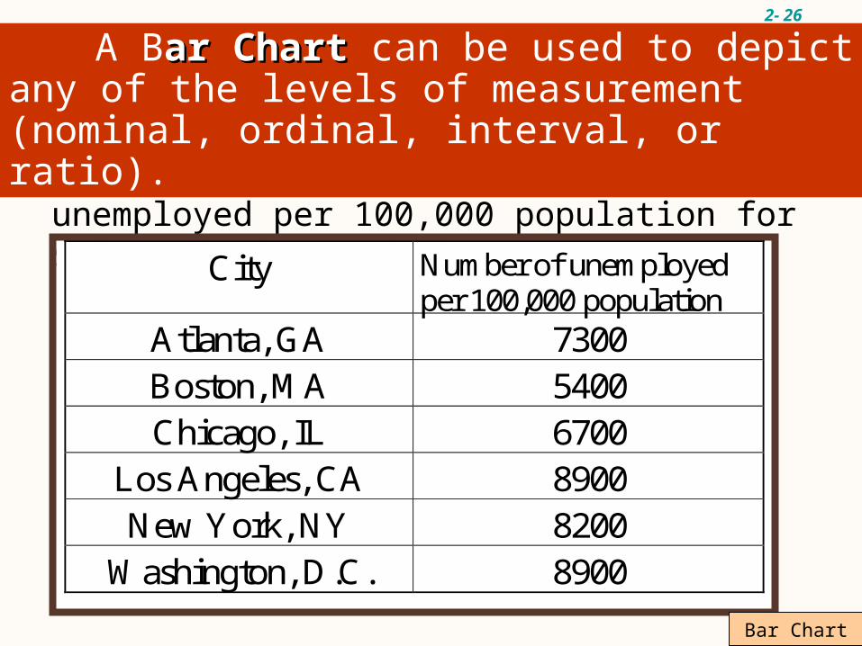
Construct a bar chart for the number of unemployed per 100,000 population for selected cities during 2001
City Number of unemployed per 100,000 population
Atlanta, GA 7300 Boston, MA 5400 Chicago, IL 6700
Los Angeles, CA 8900 New York, NY 8200
Washington, D.C. 8900
A Bar Chartar Chart can be used to depict any of the levels of measurement (nominal, ordinal, interval, or ratio).
Bar Chart

2- 27
Bar Chart for the Unemployment Data
7300
5400
6700
89008200
8900
0
1000
2000
3000
4000
5000
6000
7000
8000
9000
10000
1 2 3 4 5 6
Cities
# u
nem
plo
yed
/100
,000
Atlanta
Boston
Chicago
Los Angeles
New York
Washington
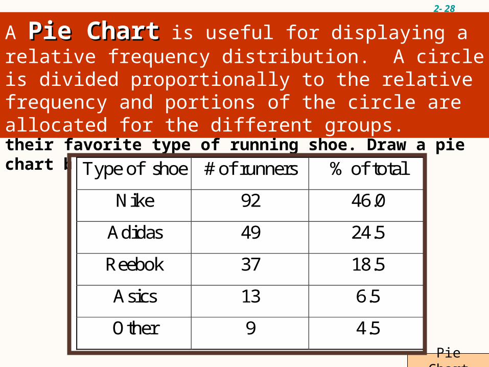
2- 28
Pie Chart
A sample of 200 runners were asked to indicate their favorite type of running shoe. Draw a pie chart based on the following information.
Type of shoe # of runners % of total
Nike 92 46.0
Adidas 49 24.5
Reebok 37 18.5
Asics 13 6.5
Other 9 4.5
A Pie ChartPie Chart is useful for displaying a relative frequency distribution. A circle is divided proportionally to the relative frequency and portions of the circle are allocated for the different groups.

2- 29
Pie Chart for Running Shoes
46%
24.50%
18.50%6.50%
4.50%
Nike
Adidas
ReebokAsics
Other
Pie Chart for Running Shoes