Embed Size (px)
Citation preview
1
Statistics and Data Analysis
ÿ A five-day unit plan by: Erin Olsenÿ For grade level Nineÿ Five 45 minute lessonsÿ Materials: View Screen, TI-83+, Computer,
Motion detector, and Cbl
2
Table of Contents
Objectives and Standards…...……………………………………………………….3
Resources………………….……………………………………………………………5
Overview of Unit……………………………………………………………………….6
Materials and Equipment……………………………………………………………..7
Day One: Defining Measures of Central Tendency……………………………...8
Day Two: Stem-and-Leaf Plots..……………………………………………...……15
Day Three: Bar Graphs and Histograms…………………………………………21
Day Four: Scatter Plots, Correlation, and Linear Regression ……………….30
Day Five: Box and Whisker Plots……………………………………………….…37
3
Objectives and Standards
Students will be able to:¸ Describe relations between measures of central tendency or
measures of spread.¸ Select and use appropriate statistical methods to analyze data.¸ Use statistics to describe data sets or compare/contrast data sets.¸ Select, create and use appropriate graphical representations of
data, including histograms, box plots, scatter plots, and stem andleaf plots.
¸ Develop recognition and understanding of data representations.¸ Discuss and understand the correspondence between data sets
and their graphical representations.¸ Develop and evaluate inferences and predictions that are based on
data and their graphical representations.Standards:
NCTM• Algebra
- Draw reasonable conclusions about a situation beingmodeled.
- Approximate and interpret rates of change from graphicaland numerical data.
• Measurement- Make decisions about units and scales that are appropriate
for problem situations involving measurement.• Data Analysis & Probability
- Understand the differences among various kinds of studiesand which types of inferences can legitimately be drawnfrom each.
- Understand histograms, parallel box plots, and scatterplotsand use them to display data.
- For univariate measurement data, be able to display thedistribution, describe its shape, and select and calculatesummary statistics.
- For bivariate measurement data, be able to display ascatterplot, describe its shape, and determine regressioncoefficients, regression equations, and correlationcoefficients using technological tools.
- Identify trends in bivariate data that find functions that modelthe data or transform the data so that they can be modeled.
• Communication- Communicate their mathematical thinking coherently and
clearly to peers, teachers, and others.- Analyze and evaluate the mathematical thinking and
strategies of others.
4
- Use the language of mathematics to express mathematicalideas precisely.
• Connections- Recognize and use connections among mathematical ideas.- Understand how mathematical ideas interconnect and build
on one another to produce a coherent whole.• Representation
- Create and use representations to organize, record, andcommunicate mathematical ideas.
- Select, apply, and translate among mathematicalrepresentations to solve problems.
- Use representations to model and interpret physical, social,and mathematical phenomena.
NYS• Modeling/Multiple Representations
- 4E: Systems of linear equations.• Measurement
- 5D: Collecting and organizing data, measures of centraltendency, and quartiles and percentiles.
- 5G: Equation of a line.• Uncertainty
- 6C: Probability distribution.• Patterns/Functions
- 7D: Determine and model real-life situations with appropriatefunctions.
5
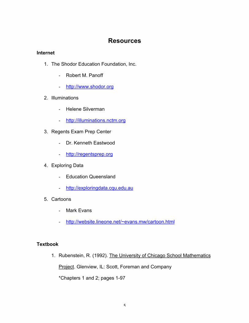
Resources
Internet
1. The Shodor Education Foundation, Inc.
- Robert M. Panoff
- http://www.shodor.org
2. Illuminations
- Helene Silverman
- http://illuminations.nctm.org
3. Regents Exam Prep Center
- Dr. Kenneth Eastwood
- http://regentsprep.org
4. Exploring Data
- Education Queensland
- http://exploringdata.cqu.edu.au
5. Cartoons
- Mark Evans
- http://website.lineone.net/~evans.mw/cartoon.html
Textbook
1. Rubenstein, R. (1992). The University of Chicago School Mathematics
Project. Glenview, IL: Scott, Foreman and Company
*Chapters 1 and 2; pages 1-97
6
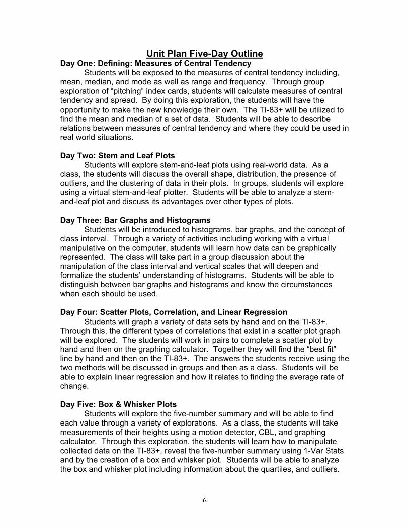
Unit Plan Five-Day OutlineDay One: Defining: Measures of Central Tendency
Students will be exposed to the measures of central tendency including,mean, median, and mode as well as range and frequency. Through groupexploration of “pitching” index cards, students will calculate measures of centraltendency and spread. By doing this exploration, the students will have theopportunity to make the new knowledge their own. The TI-83+ will be utilized tofind the mean and median of a set of data. Students will be able to describerelations between measures of central tendency and where they could be used inreal world situations.
Day Two: Stem and Leaf PlotsStudents will explore stem-and-leaf plots using real-world data. As a
class, the students will discuss the overall shape, distribution, the presence ofoutliers, and the clustering of data in their plots. In groups, students will exploreusing a virtual stem-and-leaf plotter. Students will be able to analyze a stem-and-leaf plot and discuss its advantages over other types of plots.
Day Three: Bar Graphs and HistogramsStudents will be introduced to histograms, bar graphs, and the concept of
class interval. Through a variety of activities including working with a virtualmanipulative on the computer, students will learn how data can be graphicallyrepresented. The class will take part in a group discussion about themanipulation of the class interval and vertical scales that will deepen andformalize the students’ understanding of histograms. Students will be able todistinguish between bar graphs and histograms and know the circumstanceswhen each should be used.
Day Four: Scatter Plots, Correlation, and Linear RegressionStudents will graph a variety of data sets by hand and on the TI-83+.
Through this, the different types of correlations that exist in a scatter plot graphwill be explored. The students will work in pairs to complete a scatter plot byhand and then on the graphing calculator. Together they will find the “best fit”line by hand and then on the TI-83+. The answers the students receive using thetwo methods will be discussed in groups and then as a class. Students will beable to explain linear regression and how it relates to finding the average rate ofchange.
Day Five: Box & Whisker PlotsStudents will explore the five-number summary and will be able to find
each value through a variety of explorations. As a class, the students will takemeasurements of their heights using a motion detector, CBL, and graphingcalculator. Through this exploration, the students will learn how to manipulatecollected data on the TI-83+, reveal the five-number summary using 1-Var Statsand by the creation of a box and whisker plot. Students will be able to analyzethe box and whisker plot including information about the quartiles, and outliers.
7
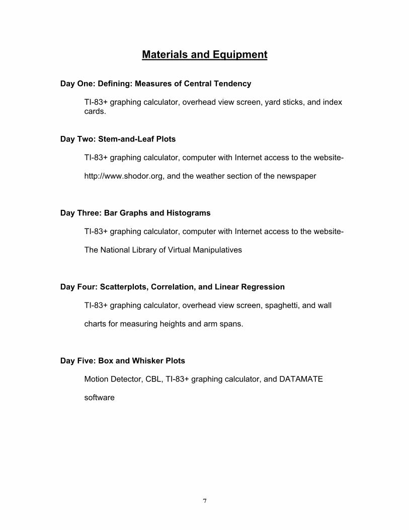
Materials and Equipment
Day One: Defining: Measures of Central Tendency
TI-83+ graphing calculator, overhead view screen, yard sticks, and indexcards.
Day Two: Stem-and-Leaf Plots
TI-83+ graphing calculator, computer with Internet access to the website-
http://www.shodor.org, and the weather section of the newspaper
Day Three: Bar Graphs and Histograms
TI-83+ graphing calculator, computer with Internet access to the website-
The National Library of Virtual Manipulatives
Day Four: Scatterplots, Correlation, and Linear Regression
TI-83+ graphing calculator, overhead view screen, spaghetti, and wall
charts for measuring heights and arm spans.
Day Five: Box and Whisker Plots
Motion Detector, CBL, TI-83+ graphing calculator, and DATAMATE
software
8
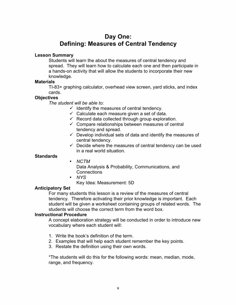
Day One:Defining: Measures of Central Tendency
Lesson SummaryStudents will learn the about the measures of central tendency andspread. They will learn how to calculate each one and then participate ina hands-on activity that will allow the students to incorporate their newknowledge.
MaterialsTI-83+ graphing calculator, overhead view screen, yard sticks, and indexcards.
ObjectivesThe student will be able to:
¸ Identify the measures of central tendency.¸ Calculate each measure given a set of data.¸ Record data collected through group exploration.¸ Compare relationships between measures of central
tendency and spread.¸ Develop individual sets of data and identify the measures of
central tendency.¸ Decide where the measures of central tendency can be used
in a real world situation.Standards
• NCTMData Analysis & Probability, Communications, andConnections
• NYSKey Idea: Measurement: 5D
Anticipatory SetFor many students this lesson is a review of the measures of centraltendency. Therefore activating their prior knowledge is important. Eachstudent will be given a worksheet containing groups of related words. Thestudents will choose the correct term from the word box.
Instructional ProcedureA concept elaboration strategy will be conducted in order to introduce newvocabulary where each student will:
1. Write the book’s definition of the term.2. Examples that will help each student remember the key points.3. Restate the definition using their own words.
*The students will do this for the following words: mean, median, mode,range, and frequency.
9
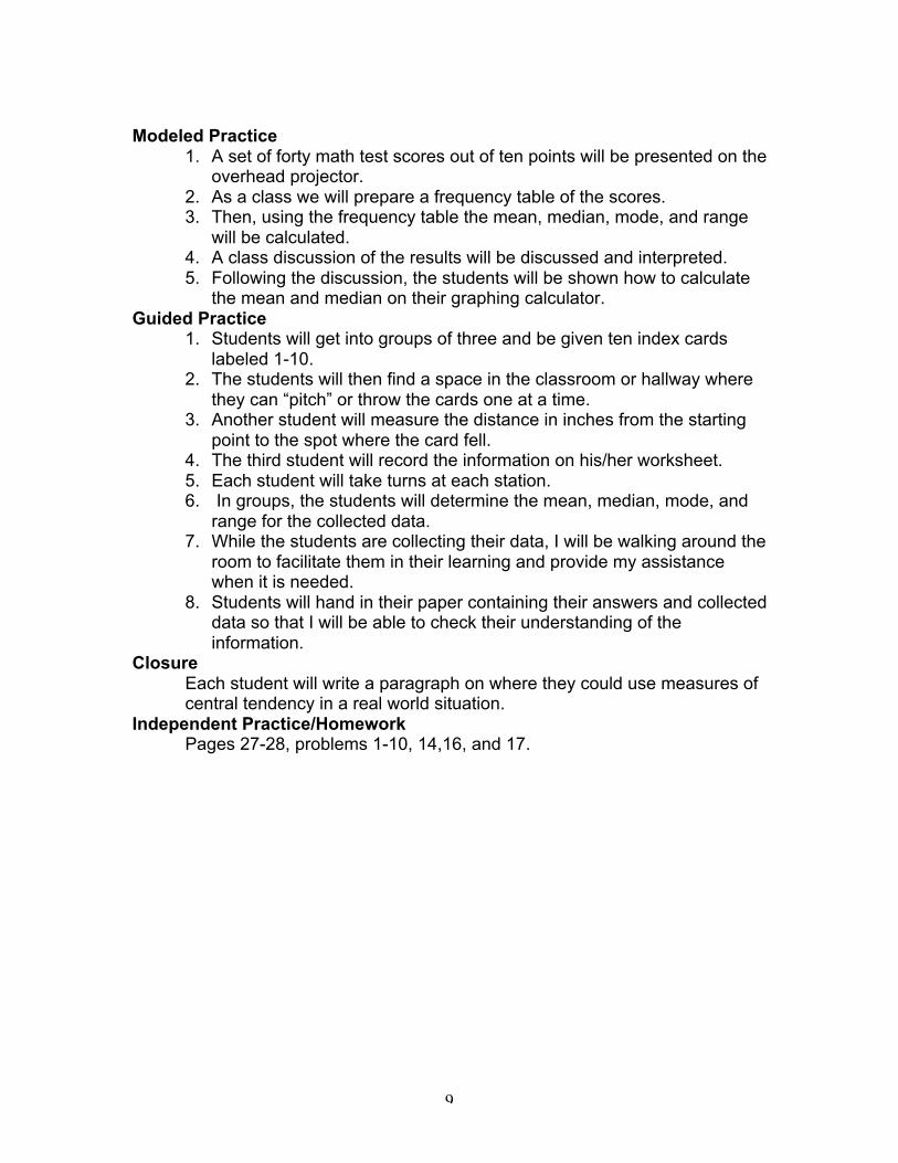
Modeled Practice1. A set of forty math test scores out of ten points will be presented on the
overhead projector.2. As a class we will prepare a frequency table of the scores.3. Then, using the frequency table the mean, median, mode, and range
will be calculated.4. A class discussion of the results will be discussed and interpreted.5. Following the discussion, the students will be shown how to calculate
the mean and median on their graphing calculator.Guided Practice
1. Students will get into groups of three and be given ten index cardslabeled 1-10.
2. The students will then find a space in the classroom or hallway wherethey can “pitch” or throw the cards one at a time.
3. Another student will measure the distance in inches from the startingpoint to the spot where the card fell.
4. The third student will record the information on his/her worksheet.5. Each student will take turns at each station.6. In groups, the students will determine the mean, median, mode, and
range for the collected data.7. While the students are collecting their data, I will be walking around the
room to facilitate them in their learning and provide my assistancewhen it is needed.
8. Students will hand in their paper containing their answers and collecteddata so that I will be able to check their understanding of theinformation.
ClosureEach student will write a paragraph on where they could use measures ofcentral tendency in a real world situation.
Independent Practice/HomeworkPages 27-28, problems 1-10, 14,16, and 17.
10
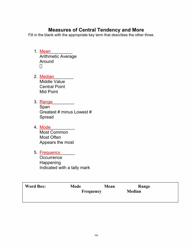
Measures of Central Tendency and MoreFill in the blank with the appropriate key term that describes the other three.
1. Mean_________Arithmetic AverageAroundS
2. Median________Middle ValueCentral PointMid Point
3. Range_________SpanGreatest # minus Lowest #Spread
4. Mode__________Most CommonMost OftenAppears the most
5. Frequency______OccurrenceHappeningIndicated with a tally mark
Word Box: Mode Mean RangeFrequency Median
11
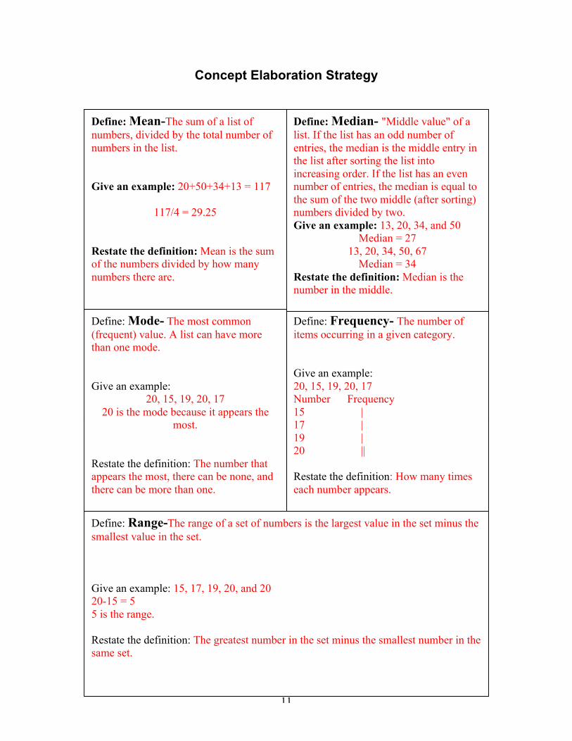
Concept Elaboration Strategy
Define: Mean-The sum of a list ofnumbers, divided by the total number ofnumbers in the list.
Give an example: 20+50+34+13 = 117
117/4 = 29.25
Restate the definition: Mean is the sumof the numbers divided by how manynumbers there are.
Define: Frequency- The number ofitems occurring in a given category.
Give an example:20, 15, 19, 20, 17Number Frequency15 |17 |19 |20 ||
Restate the definition: How many timeseach number appears.
Define: Mode- The most common(frequent) value. A list can have morethan one mode.
Give an example:20, 15, 19, 20, 17
20 is the mode because it appears themost.
Restate the definition: The number thatappears the most, there can be none, andthere can be more than one.
Define: Median- "Middle value" of alist. If the list has an odd number ofentries, the median is the middle entry inthe list after sorting the list intoincreasing order. If the list has an evennumber of entries, the median is equal tothe sum of the two middle (after sorting)numbers divided by two.Give an example: 13, 20, 34, and 50
Median = 2713, 20, 34, 50, 67
Median = 34Restate the definition: Median is thenumber in the middle.
Define: Range-The range of a set of numbers is the largest value in the set minus thesmallest value in the set.
Give an example: 15, 17, 19, 20, and 2020-15 = 55 is the range.
Restate the definition: The greatest number in the set minus the smallest number in thesame set.
12
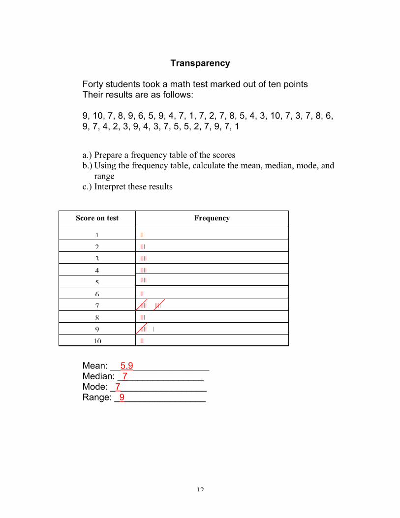
Transparency
Forty students took a math test marked out of ten pointsTheir results are as follows:
9, 10, 7, 8, 9, 6, 5, 9, 4, 7, 1, 7, 2, 7, 8, 5, 4, 3, 10, 7, 3, 7, 8, 6,9, 7, 4, 2, 3, 9, 4, 3, 7, 5, 5, 2, 7, 9, 7, 1
a.) Prepare a frequency table of the scoresb.) Using the frequency table, calculate the mean, median, mode, and
rangec.) Interpret these results
11
Mean: __5.9_______________Median: _7_______________Mode: _7_________________Range: _9________________
Score on test Frequency
1
5
4
3
2
10
9
8
7
6
||
|||
||||
||||||||
||
|||| ||||
|||
|||| |
||
13
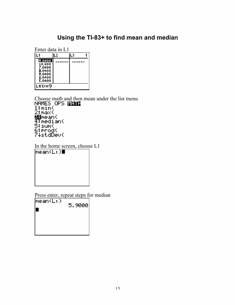
Using the TI-83+ to find mean and median
Enter data in L1
Choose math and then mean under the list menu
In the home screen, choose L1
Press enter, repeat steps for median
14
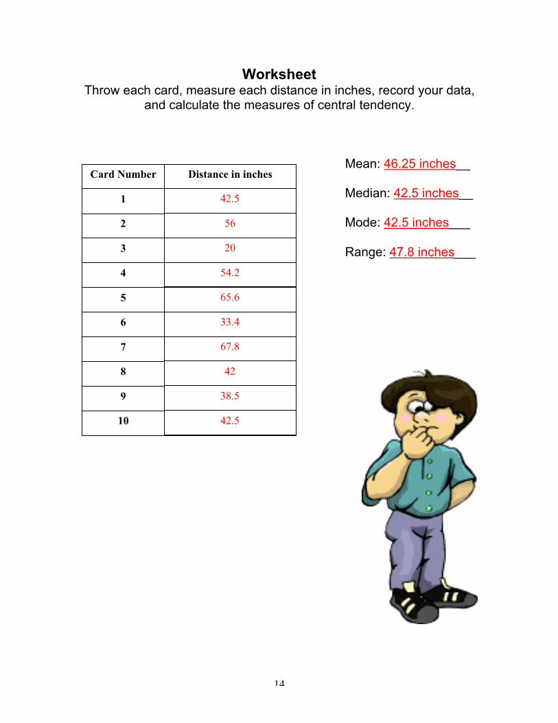
WorksheetThrow each card, measure each distance in inches, record your data,
and calculate the measures of central tendency.
Mean: 46.25 inches__
Median: 42.5 inches__
Mode: 42.5 inches___
Range: 47.8 inches___
Card Number Distance in inches
1
2
3
4
5
6
7
8
9
10
42.5
56
54.2
20
65.6
33.4
67.8
42
38.5
42.5
15
Day TwoStem and Leaf Plots
Lesson SummaryStudents will explore stem-and-leaf plots using real-world data. As aclass, the students will discuss the overall shape, distribution, thepresence of outliers, and the clustering of data in their plots. In groups,students will explore using a virtual stem-and-leaf plotter.
MaterialsTI-83+ graphing calculator, computer with Internet access to the Websitewww.shodor.org, and the weather section of the newspaper.
ObjectivesThe student will be able to:
¸ Show how the stem and leaf plot works.¸ Construct a stem and leaf plot given a set of data and
calculate the measures of central tendency.¸ Use a virtual stem-and-leaf plotter to plot a set of chosen
data and calculate the measures of central tendency.¸ Examine the graph and identify specific outliers and peaks.¸ Determine the general shape of the distribution using their
collected data.¸ Judge whether the use of the stem and leaf plot is
advantageous over other types of plots.Standards
• NCTMAlgebra, Data Analysis & Probability, Communications, andRepresentations
• NYSKey Idea 5: Measurement: 5D
Homework CheckThe answers to last night’s homework will be placed on the overhead.Students will be allowed five minutes to check their answers and discusswith their neighbor any problems they had. The teacher will be walkingaround the room to see if each student made a conscious effort tocomplete the assignment.
Anticipatory SetThe students will be asked to list as many ways data can be organized.The student with the longest list will be rewarded. Hopefully he/she willmention a stem-and-leaf plot and then be able to explain what a stem-and-leaf plot is to the class. If not, I will prompt the students to look in theirbooks to see what plot they missed on their list.
Instructional Procedure1. Explain that a stem-and-leaf plot is another way a set of data can be
organized and displayed.2. This type of plot shows the shape and distribution of the data.3. Each data value is split into a “stem” and “leaf”.
16
4. The “leaf” is the last digit of the number and the other digits form the“stem”.
Modeled Practice1. Each student will be given a copy of the weather section from the
newspaper.2. Pick ten cities; record the city and the high temperature for that
corresponding city.3. Creating a stem-and-leaf plot will be demonstrated on the overhead4. Each student will follow along and create a stem-and-leaf plot that
incorporates the temperatures of their chosen cities.5. Each student will then calculate the mean, median, and mode for their
set of data.6. The students will then pair up and describe their stem-and-leaf plot
with their partner discussing the location, overall shape, outliers, andclustering of each.
Guided Practice1. In a room with computers that have Internet access, students work in
groups of two.2. Using a virtual stem-and leaf-plotter located at www.shodor.org the
students will create a plot using any numbers and as many numbers asthe want.
3. After exploring the virtual plotter, the students will chose 20 numbersand calculate the mean, median, and mode.
4. The students will record their data as well as their answers and handtheir papers in before they leave.
ClosureAs an exit slip write one reason why you would use a stem-and-leaf plotover another type of plot.
Independent Practice/HomeworkComplete the stem-and-leaf plot worksheet
17
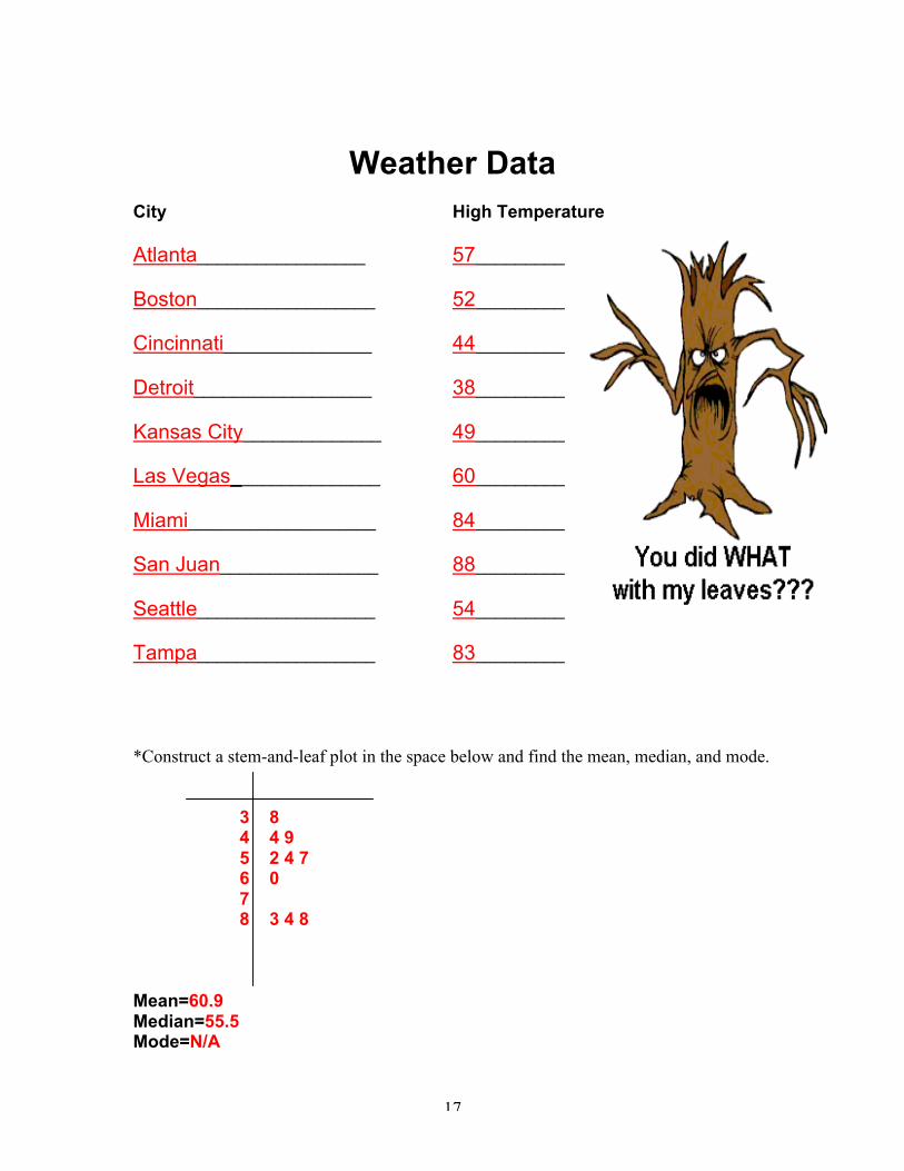
Weather DataCity High Temperature
Atlanta_________________ 57_________
Boston__________________ 52_________
Cincinnati_______________ 44_________
Detroit__________________ 38_________
Kansas City______________ 49_________
Las Vegas_______________ 60_________
Miami___________________ 84_________
San Juan________________ 88_________
Seattle__________________ 54_________
Tampa__________________ 83_________
*Construct a stem-and-leaf plot in the space below and find the mean, median, and mode.
3 84 4 95 2 4 76 07 8 3 4 8
Mean=60.9Median=55.5Mode=N/A
18
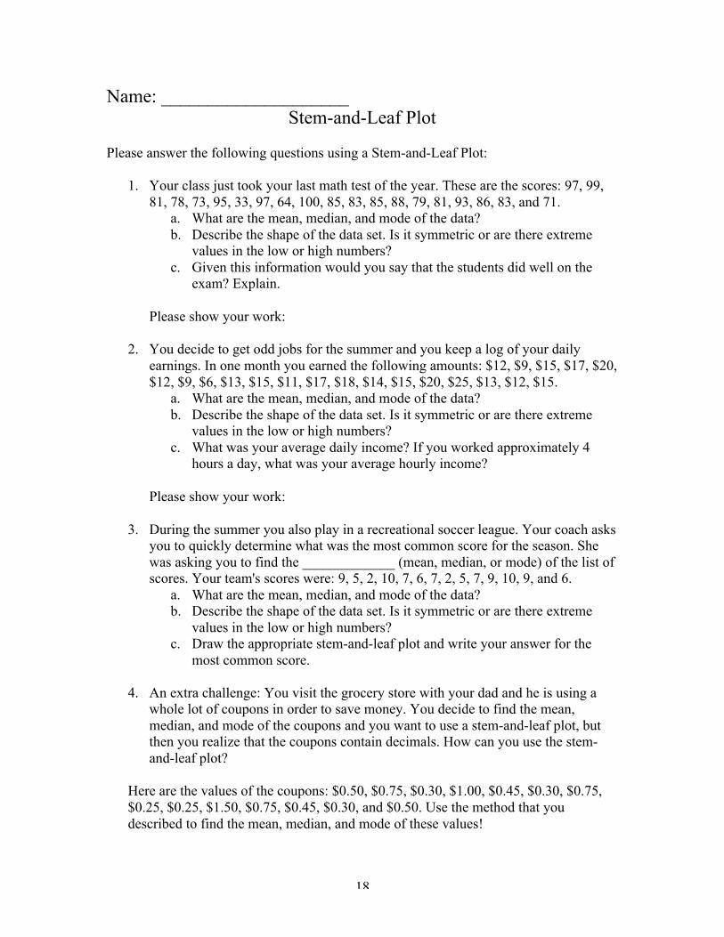
Name: ____________________Stem-and-Leaf Plot
Please answer the following questions using a Stem-and-Leaf Plot:
1. Your class just took your last math test of the year. These are the scores: 97, 99,81, 78, 73, 95, 33, 97, 64, 100, 85, 83, 85, 88, 79, 81, 93, 86, 83, and 71.
a. What are the mean, median, and mode of the data?b. Describe the shape of the data set. Is it symmetric or are there extreme
values in the low or high numbers?c. Given this information would you say that the students did well on the
exam? Explain.
Please show your work:
2. You decide to get odd jobs for the summer and you keep a log of your dailyearnings. In one month you earned the following amounts: $12, $9, $15, $17, $20,$12, $9, $6, $13, $15, $11, $17, $18, $14, $15, $20, $25, $13, $12, $15.
a. What are the mean, median, and mode of the data?b. Describe the shape of the data set. Is it symmetric or are there extreme
values in the low or high numbers?c. What was your average daily income? If you worked approximately 4
hours a day, what was your average hourly income?
Please show your work:
3. During the summer you also play in a recreational soccer league. Your coach asksyou to quickly determine what was the most common score for the season. Shewas asking you to find the _____________ (mean, median, or mode) of the list ofscores. Your team's scores were: 9, 5, 2, 10, 7, 6, 7, 2, 5, 7, 9, 10, 9, and 6.
a. What are the mean, median, and mode of the data?b. Describe the shape of the data set. Is it symmetric or are there extreme
values in the low or high numbers?c. Draw the appropriate stem-and-leaf plot and write your answer for the
most common score.
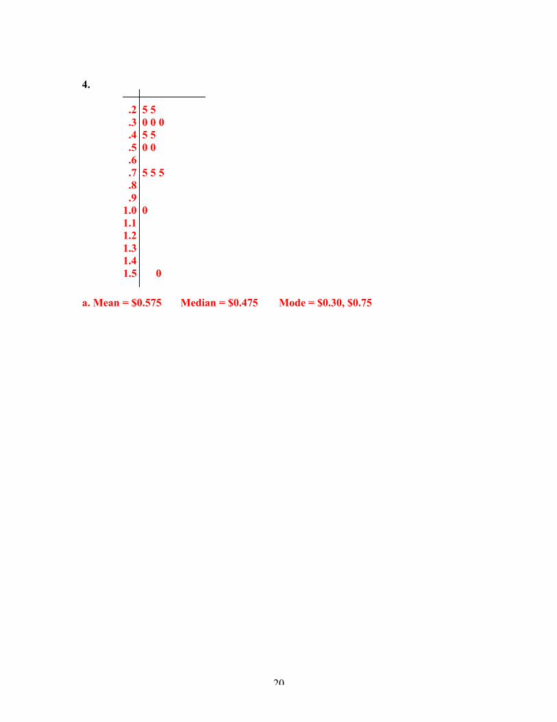
4. An extra challenge: You visit the grocery store with your dad and he is using awhole lot of coupons in order to save money. You decide to find the mean,median, and mode of the coupons and you want to use a stem-and-leaf plot, butthen you realize that the coupons contain decimals. How can you use the stem-and-leaf plot?
Here are the values of the coupons: $0.50, $0.75, $0.30, $1.00, $0.45, $0.30, $0.75,$0.25, $0.25, $1.50, $0.75, $0.45, $0.30, and $0.50. Use the method that youdescribed to find the mean, median, and mode of these values!
19
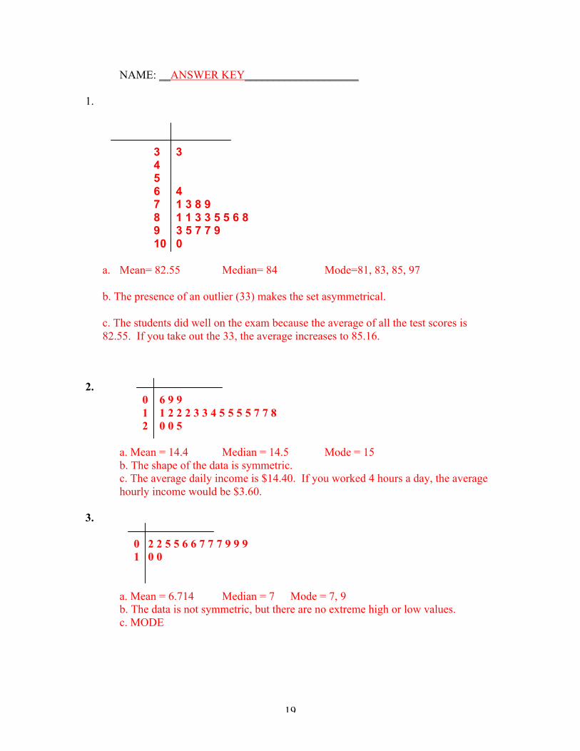
NAME: __ANSWER KEY____________________
1.
3 3456 47 1 3 8 98 1 1 3 3 5 5 6 89 3 5 7 7 910 0
a. Mean= 82.55 Median= 84 Mode=81, 83, 85, 97
b. The presence of an outlier (33) makes the set asymmetrical.
c. The students did well on the exam because the average of all the test scores is82.55. If you take out the 33, the average increases to 85.16.
2. 0 6 9 9
1 1 2 2 2 3 3 4 5 5 5 5 7 7 8 2 0 0 5
a. Mean = 14.4 Median = 14.5 Mode = 15b. The shape of the data is symmetric.c. The average daily income is $14.40. If you worked 4 hours a day, the averagehourly income would be $3.60.
3.
0 2 2 5 5 6 6 7 7 7 9 9 9 1 0 0
a. Mean = 6.714 Median = 7 Mode = 7, 9b. The data is not symmetric, but there are no extreme high or low values.c. MODE
20
4.
.2 5 5 .3 0 0 0 .4 5 5 .5 0 0
.6 .7 5 5 5
.8 .9 1.0 0 1.1 1.2 1.3 1.4
1.5 0
a. Mean = $0.575 Median = $0.475 Mode = $0.30, $0.75
21
Day ThreeBar Graphs and Histograms
Lesson SummaryThe goal of this lesson is to introduce the students to histograms and theconcept of class interval. Through a variety of activities including using avirtual manipulative, the students will learn how data can be graphicallyrepresented. Students will be able to distinguish between bar graphs andhistograms and determine the context in which each should be used.
MaterialsTI-83+ graphing calculator, computer with Internet access to the website-The National Library of Virtual Manipulatives
ObjectivesThe student will be able to:
¸ Identify the differences between bar graphs and histograms.¸ Construct a histogram given a set of data.¸ Read and understand the overall shape of the data,
symmetry, location, spread, and the existence of outliers.¸ Interpret information in a histogram and match it to its
associated summary statistics.¸ Deduce the most accurate histogram through exploration of
different intervals and scales.¸ Determine when advantages and disadvantages exist of
using the histogram over other types of plots.Standards
• NCTMAlgebra, Measurement, Data Analysis & Probability,Communication, Connections, and Representations
• NYSKey Idea 5: Measurement: 5DKey Idea 6: Uncertainty: 6C
Homework CheckStudents will be allowed five minutes to discuss their homework in groupsof four. The teacher will be walking around the room to check to see if thestudents made a conscious effort to complete the assignment. Also theteacher will answer questions if the students are having trouble.
Anticipatory SetStudents should already be familiar with the bar graph because it isfrequently used in other content areas such as social studies and scienceto represent a set of data. Also, bar graphs are frequently used inmagazines and newspapers. A variety of articles fromnewspapers/magazines that utilize the bar graph to represent data will bepresented to the class. Students will brainstorm how and what types ofinformation is presented in a bar graph.
Instructional Procedure1. The concept of the histogram will be introduced to the class.
22
2. Students will be shown how their stem-and-leaf plot from the previousday resembles a histogram when it is rotated onto its side.
3. The differences between the bar graph and histogram will be explainedand in what situations you use each one.
4. A concept elaboration strategy will be conducted in which each studentwill:ÿ Write the book’s definition of the termÿ Examples that will help each student remember the key pointsÿ Restate the definition using their own words.
*The students will do this for the following words: bar graph, histogram,and class interval.
Modeled Practice1. As a class, we will create a histogram for a set of test scores by hand.2. We will explore the histogram using different vertical scales.3. We will explore the histogram using different class intervals.4. We will discuss which graph represents the data the best.5. The measures of central tendency will be calculated.6. Exploration using the TI-83+ graphing calculator to manipulate the
intervals of a histogram will be discussed.Guided Practice
1. In the computer lab, the students will be able to use a virtualmanipulative to explore histograms.
2. The source of the manipulative is The National Library of VirtualManipulatives-Histograms
3. Students will complete the Analysis of Histogram worksheet thatcorresponds to the computer activity.
ClosureDiscuss and review as a class what the differences are between ahistogram and bar graph. Write a paragraph in response to if you thinkthe histogram has advantages/disadvantages over the other graphicalrepresentations we have learned about. Why or why not?
Independent Practice/HomeworkPages 41-43, Problems 1-10, and 12 in addition to completing thematching histograms and summary statistics worksheet.
23
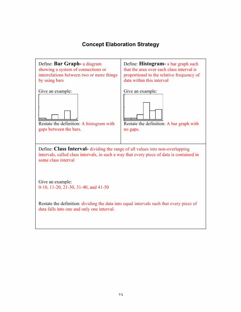
Concept Elaboration Strategy
Define: Bar Graph- a diagramshowing a system of connections orinterrelations between two or more thingsby using bars
Give an example:
Restate the definition: A histogram withgaps between the bars.
Define: Class Interval- dividing the range of all values into non-overlappingintervals, called class intervals, in such a way that every piece of data is contained insome class interval
Give an example:0-10, 11-20, 21-30, 31-40, and 41-50
Restate the definition: dividing the data into equal intervals such that every piece ofdata falls into one and only one interval.
Define: Histogram- a bar graph suchthat the area over each class interval isproportional to the relative frequency ofdata within this interval
Give an example:
Restate the definition: A bar graph withno gaps.
24
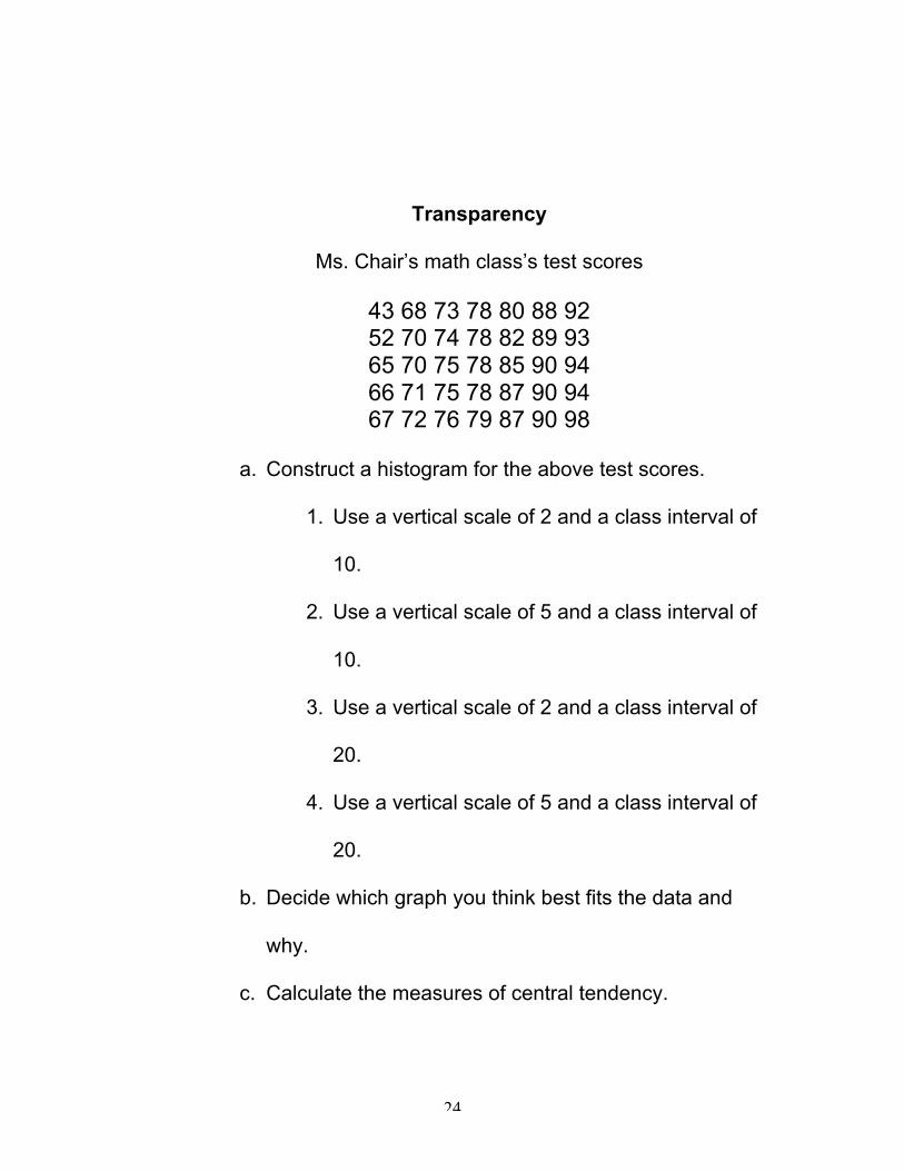
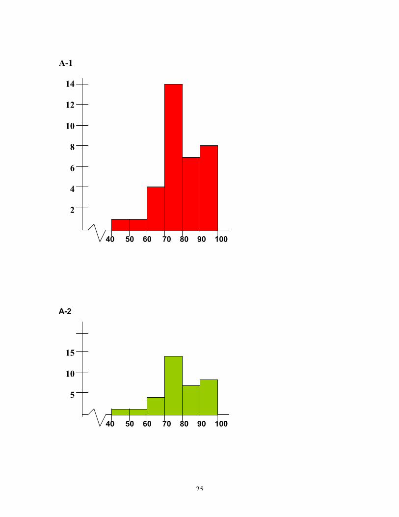
Transparency
Ms. Chair’s math class’s test scores
43 68 73 78 80 88 9252 70 74 78 82 89 9365 70 75 78 85 90 9466 71 75 78 87 90 9467 72 76 79 87 90 98
a. Construct a histogram for the above test scores.
1. Use a vertical scale of 2 and a class interval of
10.
2. Use a vertical scale of 5 and a class interval of
10.
3. Use a vertical scale of 2 and a class interval of
20.
4. Use a vertical scale of 5 and a class interval of
20.
b. Decide which graph you think best fits the data and
why.
c. Calculate the measures of central tendency.
25
A-1
14
12
10
8
6
4
2
40 50 60 70 80 90 100
A-2
15
10
5
40 50 60 70 80 90 100
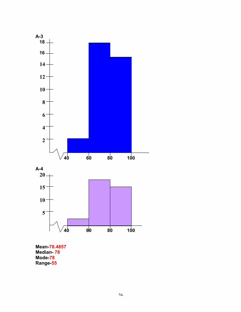
26
A-3 18
16
14
12
10
8
6
4
2
40 60 80 100
A-4 20
15
10
5
40 60 80 100
Mean-78.4857Median- 78Mode-78Range-55
27
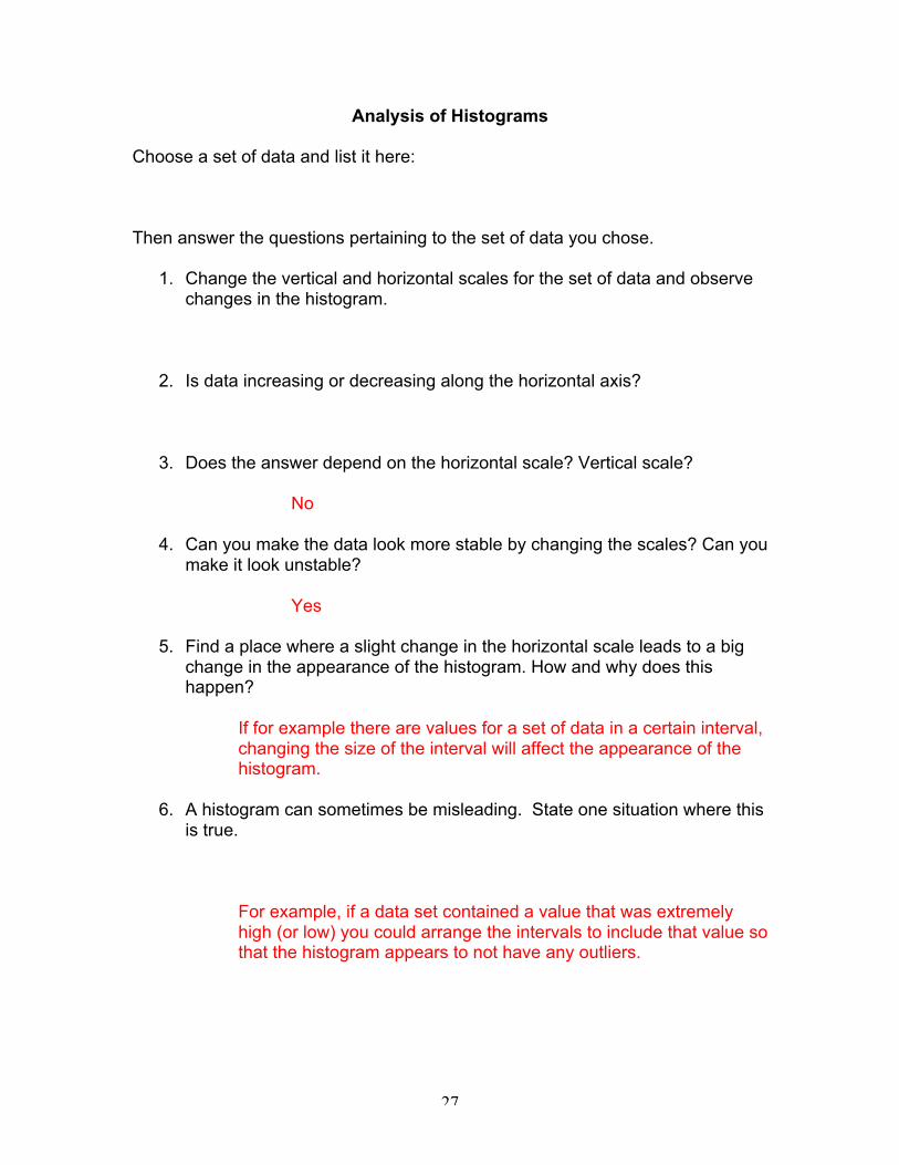
Analysis of Histograms
Choose a set of data and list it here:
Then answer the questions pertaining to the set of data you chose.
1. Change the vertical and horizontal scales for the set of data and observechanges in the histogram.
2. Is data increasing or decreasing along the horizontal axis?
3. Does the answer depend on the horizontal scale? Vertical scale?
No
4. Can you make the data look more stable by changing the scales? Can youmake it look unstable?
Yes
5. Find a place where a slight change in the horizontal scale leads to a bigchange in the appearance of the histogram. How and why does thishappen?
If for example there are values for a set of data in a certain interval,changing the size of the interval will affect the appearance of thehistogram.
6. A histogram can sometimes be misleading. State one situation where thisis true.
For example, if a data set contained a value that was extremelyhigh (or low) you could arrange the intervals to include that value sothat the histogram appears to not have any outliers.
28
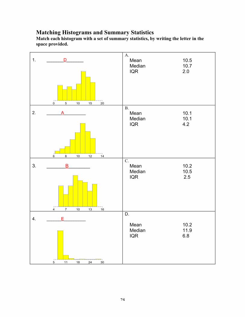
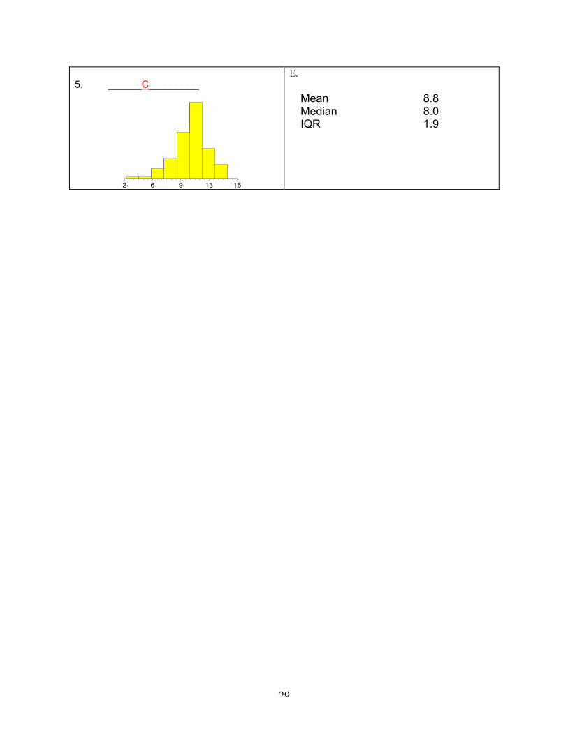
Matching Histograms and Summary StatisticsMatch each histogram with a set of summary statistics, by writing the letter in thespace provided.
1. _______D_______
0 5 10 15 20
A.Mean 10.5Median 10.7IQR 2.0
2. ______A_________
6 8 10 12 14
B.Mean 10.1Median 10.1IQR 4.2
3. _______B________
4 7 10 13 16
C.Mean 10.2Median 10.5IQR 2.5
4. ______E_________
5 11 18 24 30
D.
Mean 10.2Median 11.9IQR 6.8
29
5. ______C_________
2 6 9 13 16
E.
Mean 8.8Median 8.0IQR 1.9
30
Day FourScatter Plots, Correlation, and Linear Regression
Lesson SummaryStudents will learn how to make a scatter plot and find a “best fit” line.Students will work in pairs to gather two sets of data and record them on aclass chart. The whole class will work to design a scatter plot of the data.Class discussion will focus on interpreting the meaning of individualcoordinates, the overall graph, and the “best fit” line.
MaterialsTI-83+ graphing calculator, overhead view screen, spaghetti, and wallcharts for measuring heights and arm spans.
ObjectivesThe student will be able to:
¸ Plot points on a given set of coordinates.¸ Construct scatter plots of two variable data and interpret
individual data points.¸ Classify certain data points as outliers and examine the
measures of central tendency.¸ Construct a “best fit” line by hand and with the TI-83+
graphing calculator.¸ Determine the equation of the “best fit” line and draw
conclusions about the trends in data.Standards
• NCTMAlgebra, Data Analysis & Probability, Problem Solving,Communication, and Representations
• NYSKey Idea 4: Modeling/Multiple Representation: 4EKey Idea 5: Measurement: 5D, 5GKey Idea 7: Patterns/Functions: 7D
Homework CheckThe answers to last night’s homework will be placed on the overhead.Students will be allowed five minutes to check their answers and discusswith their neighbor any problems they had. The teacher will be walkingaround the room to see if each student made a conscious effort tocomplete the assignment.
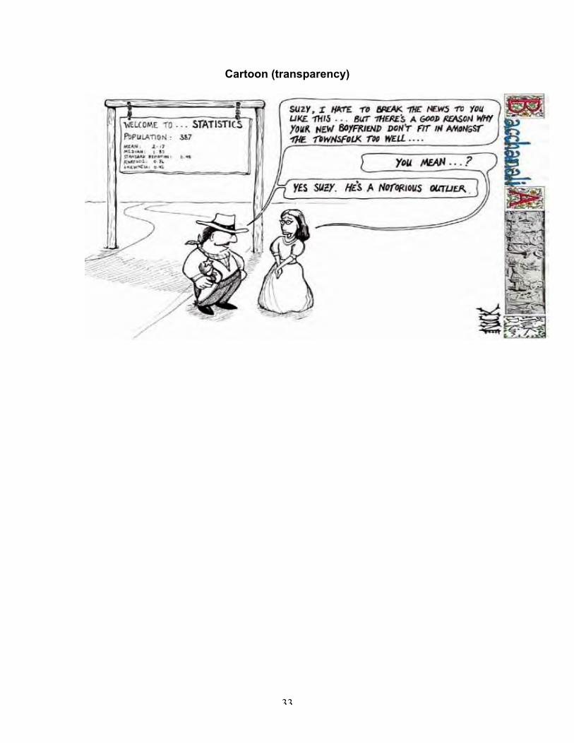
Anticipatory SetThe students will be presented with a mathematical cartoon aboutstatistics and outliers. The cartoon is intended for the students to activatetheir prior knowledge about statistics including mean, median, andoutliers. The students will be asked for their interpretations of the cartoon.This discussion will lead into the introduction of scatter plots and howoutliers are identified.
31
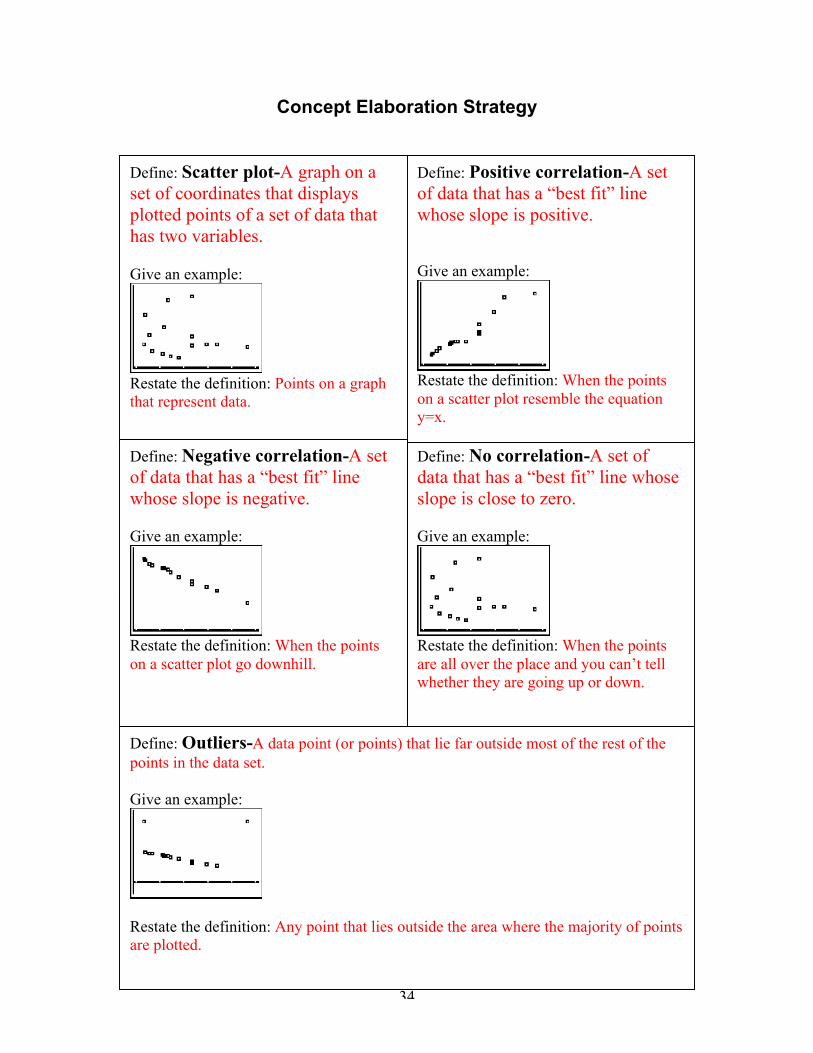
Instructional Procedure2. A concept elaboration strategy will be conducted in which each student
will:ÿ Write the book’s definition of the termÿ Examples that will help each student remember the key pointsÿ Restate the definition using their own words.
*The students will do this for the following words: Scatter plot, correlation(positive, negative, and none), and outliers
Modeled Practice1. A set of data will be presented on the overhead projector relating the
cost of engine repairs per year and the number of oil changes per year.2. As a class, the points will be plotted on a coordinate graph.3. Discussion about the points and their correlation will take place.4. The teacher will pass out spaghetti to each student and they will be
asked if they can visualize a “best fit” line that would represent thesummary of the data
5. The student will be instructed to lay their piece of spaghetti on thatimaginary line.
6. The teacher will then demonstrate on the overhead view screen how toaccurately find the “best fit” line by doing linear regression.ÿ Enter data in L1 and L2.ÿ Choose the scatter plot option under STAT PLOT.ÿ Graph the plot and explain to the students that this should look
like the work that they just did by hand.ÿ Press the STAT button, scroll over to the CALC menu, choose
LinReg(ax+b).ÿ This should paste LinReg(ax+b) in the home screen.ÿ Next, paste L1, L2, such that your screen looks like
LinReg(ax+b) L1,L2,ÿ Next press the VARS button, scroll over to Y-Vars, choose
function, and then choose Y1. This step pastes the equation ofthe line into Y1.
ÿ Press ENTER to complete the calculation.ÿ Finally press GRAPH to see how your “best fit” line looks on
your scatter plot.7. Conduct a class discussion to see how close the students were to
finding the “best fit” line with their spaghetti.Guided Practice
1. The class will conduct an experiment to determine if there exists arelationship between a person’s height and their arm span.
2. Students will work in pairs to collect the data of their height and armspan.
3. After each student has their data, they will then record it on a classchart.
32
4. Each student pair will work together to plot the points in order toconstruct a scatter plot on the TI-83+ calculator.
5. Then they will determine the “best fit” line and be able to perform linearregression.
ClosureIndividually, each student will write a paragraph discussing theappearance and interpretation of the scatter plot and its “best fit” line.They will also be asked to include the measurement of a person’s armspan that is 7 foot tall according to their “best fit” line.
Independent Practice/HomeworkPage 22, problem 14Page 97, problem 10
33
Cartoon (transparency)
34
Concept Elaboration Strategy
Define: Scatter plot-A graph on aset of coordinates that displaysplotted points of a set of data thathas two variables.
Give an example:
Restate the definition: Points on a graphthat represent data.
Define: No correlation-A set ofdata that has a “best fit” line whoseslope is close to zero.
Give an example:
Restate the definition: When the pointsare all over the place and you can’t tellwhether they are going up or down.
Define: Negative correlation-A setof data that has a “best fit” linewhose slope is negative.
Give an example:
Restate the definition: When the pointson a scatter plot go downhill.
Define: Positive correlation-A setof data that has a “best fit” linewhose slope is positive.
Give an example:
Restate the definition: When the pointson a scatter plot resemble the equationy=x.
Define: Outliers-A data point (or points) that lie far outside most of the rest of thepoints in the data set.
Give an example:
Restate the definition: Any point that lies outside the area where the majority of pointsare plotted.
35
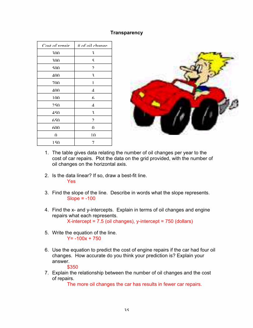
Transparency
1. The table gives data relating the number of oil changes per year to thecost of car repairs. Plot the data on the grid provided, with the number ofoil changes on the horizontal axis.
2. Is the data linear? If so, draw a best-fit line.Yes
3. Find the slope of the line. Describe in words what the slope represents.Slope = -100
4. Find the x- and y-intercepts. Explain in terms of oil changes and enginerepairs what each represents.
X-intercept = 7.5 (oil changes), y-intercept = 750 (dollars)
5. Write the equation of the line.Y= -100x + 750
6. Use the equation to predict the cost of engine repairs if the car had four oilchanges. How accurate do you think your prediction is? Explain youranswer.
$3507. Explain the relationship between the number of oil changes and the cost
of repairs.The more oil changes the car has results in fewer car repairs.
Cost of repair
450 3
650 2
600 0
100
150 7
100 6
250 4
400 4
700 1
400 3
5
500 2
# of oil change
3300
300
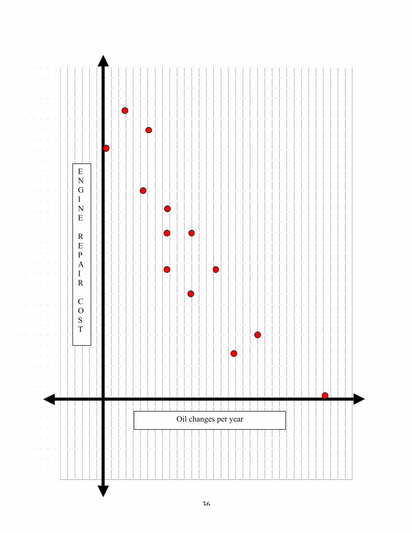
36
Oil changes per year
ENGINE
REPAIR
COST
37
Day FiveBox & Whisker Plots
Lesson SummaryThe goal of this lesson is for the students to explore the five-numbersummary as well as the concept of outliers. Through discussion and twoactivities students will learn how to create a box and whisker plot by handand by using the TI-83+. Students will be able to determine theadvantages and disadvantages of using a box and whisker plot and areable to compare it to a histogram.
MaterialsTI-83+ graphing calculator, CBL, motion detector, DATAMATE software,pencils, worksheets, overhead, overhead view screen, strips of numberpaper.
ObjectivesThe student will be able to:
¸ Name the key concepts in the five-number summary¸ Construct a box and whisker plot using the TI-83+ calculator
and identify the five-number summary given a set of data.¸ Make use of a motion detector, CBL, and TI-83+ to collect
data.¸ Analyze the data collected using statistical concepts.¸ Construct a variety of plots on the TI-83+ using the collected
data.¸ Determine the advantages and disadvantages of using the
box and whisker plot to describe the collected data.¸ Interpret information given in a box and whiskers plot and
match the distribution to that of its associated histogram.Standards
• NCTMAlgebra, Data Analysis & Probability, Communication,Connections, and Representations
• NYSKey Idea 5: Measurement: 5DKey Idea 6: Uncertainty: 6C
Homework CheckThe teacher will choose students to present one of their answers on theboard from last night’s homework so that every problem is displayed onthe board. Students will check their answers while each student ispresenting his or her answer. Homework will be collected and checked.
Anticipatory SetThe students will be presented with a problem that relates to a basketballgame and the score at the end of each quarter. It is easy to find the scoreafter each period, but what if you had a set of data and you wanted to findthe number that lies at the 25th percentile, 50th percentile, and the 75th
percentile. The students will already know how to find the number at the
38
50th percentile because it is the median. The students will use their priorknowledge to brainstorm how to find the lower quartile as well as theupper quartile.
Instructional ProcedureA concept elaboration strategy will be conducted in which each studentwill:1. Write the book’s definition of the term2. Examples that will help each student remember the key points3. Restate the definition using their own words.
*The students will do this for the following words: box & whisker plot, lowerquartile, upper quartile, maximum, and minimum.
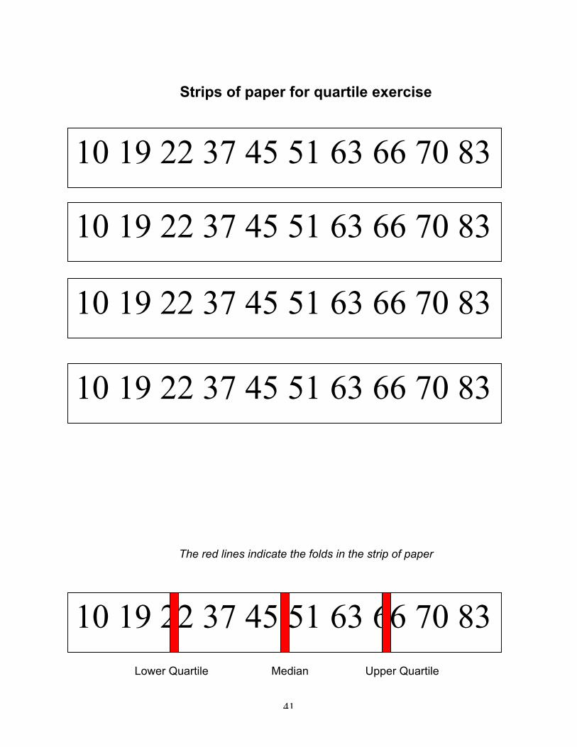
Modeled Practice
1. Students will be given rectangular strips of paper containing a set ofdata that is equally spaced in ascending order.
2. The student will be instructed to fold the paper into four equal partsand then unfold the strip.
3. Once the paper is unfolded, the class will discuss what each foldmeans, if the fold does not pass directly through a data value, discusshow you would find this value.
4. After discussion, show students how to create a box and whisker plotand also a modified one containing outliers.
5. Have students enter the data from the strip into the TI-83+, choose thebox and whisker plot option and graph the plot.
6. Have students find the values of the numbers in the five-numbersummary, compare their drawing with the calculator and discuss if theymatch the folds in the strips of paper.
Guided Practice1. Measure the heights of students using the CBL and motion detector.
ß Position the motion detector about 2.5 meters from the floor,making sure there are no obstructions beneath the detector.
ß Plug the motion detector into the CBL and the CBL into the TI-83+.
ß Turn the TI-83+ on and start the DATAMATE software.ß The screen will show the distance to the floor in meters.ß Have the motion detector record the distance to the head of
each student and not record the distance to the floor in betweenthe student measurements; set up DATAMATE to record onlyselected events.ÿ Select SETUP from the main screen.ÿ Press up to move to the mode selection.ÿ Press ENTER to move to the SELECT MODE menu.ÿ Select SELECTED EVENTS from the SELECT MODE
menu.ÿ Select OK to return to the main screen.
39
ÿ Select START.ß Have the first student stand directly under the motion detector.
Press ENTER to make a measurement.ß Repeat for all students.ß When finished, press the STORE button to end data collection.ß Press ENTER to see a plot of distance readings. These need to
be converted into heights.ÿ Press ENTER to return to the graph selection screen.ÿ Select MAIN SCREEN to return to the main screen.ÿ Select QUIT to leave DATAMATE.ÿ Follow directions on calculator screen to return to the
home screen.ÿ Then enter the distance to the floor in meters and
subtract the list that contains the heights and then storethe expression to the same list.
ÿ For example, 2.5 – L1 STO_ L1.ÿ Press ENTER to complete the operation.
ß To calculate a number of statistics all at once, use the 1-Var Statsfunction.
ß Press STAT and scroll over to open the CALC menu. PressENTER to paste the 1-Var Stats function to the home screen.
ß Press 2nd [L1]ß Press ENTER to complete the calculation.ß Scroll down to reveal the values of the mean, minimum, median
and maximum as well as the lower quartile and upper quartile.
2. Have students create a box & whisker plot to view the graph of thedata distribution of their collected data.
ClosureComplete the Data Collection and Analysis worksheet with a partner. Thisactivity will allow the students to think critically and assess their knowledgeof what was learned though the exploration.
Independent Practice/HomeworkPages 35-36, Problems 1-10, 12, and 13 in addition to the matching boxplots and histogram worksheet.
40
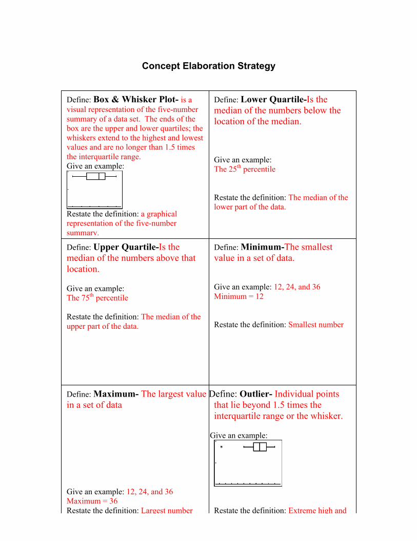
Concept Elaboration Strategy
Define: Box & Whisker Plot- is avisual representation of the five-numbersummary of a data set. The ends of thebox are the upper and lower quartiles; thewhiskers extend to the highest and lowestvalues and are no longer than 1.5 timesthe interquartile range.Give an example:
Restate the definition: a graphicalrepresentation of the five-numbersummary.
Define: Minimum-The smallestvalue in a set of data.
Give an example: 12, 24, and 36Minimum = 12
Restate the definition: Smallest number
Define: Upper Quartile-Is themedian of the numbers above thatlocation.
Give an example:The 75th percentile
Restate the definition: The median of theupper part of the data.
Define: Lower Quartile-Is themedian of the numbers below thelocation of the median.
Give an example:The 25th percentile
Restate the definition: The median of thelower part of the data.
Define: Maximum- The largest value Define: Outlier- Individual pointsin a set of data that lie beyond 1.5 times the
interquartile range or the whisker.
Give an example:
Give an example: 12, 24, and 36Maximum = 36Restate the definition: Largest number Restate the definition: Extreme high and
low points.
41
Strips of paper for quartile exercise
22223333
The red lines indicate the folds in the strip of paper
Lower Quartile Median Upper Quartile
10 19 22 37 45 51 63 66 70 83
10 19 22 37 45 51 63 66 70 83
10 19 22 37 45 51 63 66 70 83
10 19 22 37 45 51 63 66 70 83
10 19 22 37 45 51 63 66 70 83
42
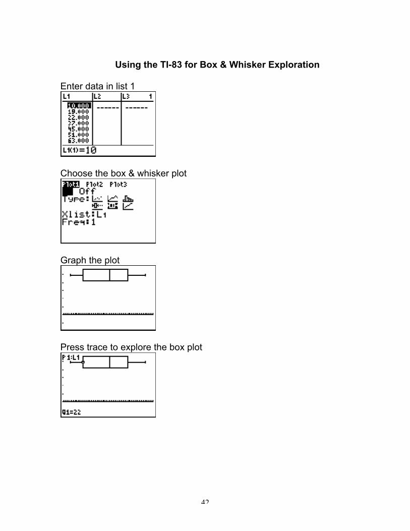
Using the TI-83 for Box & Whisker Exploration
Enter data in list 1
Choose the box & whisker plot
Graph the plot
Press trace to explore the box plot
43
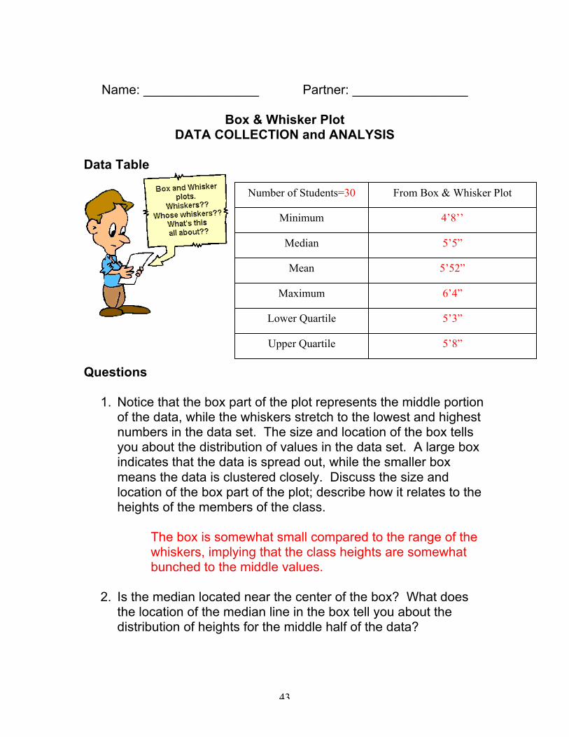
Name: ________________ Partner: ________________
Box & Whisker PlotDATA COLLECTION and ANALYSIS
Data Table
Questions
1. Notice that the box part of the plot represents the middle portionof the data, while the whiskers stretch to the lowest and highestnumbers in the data set. The size and location of the box tellsyou about the distribution of values in the data set. A large boxindicates that the data is spread out, while the smaller boxmeans the data is clustered closely. Discuss the size andlocation of the box part of the plot; describe how it relates to theheights of the members of the class.
The box is somewhat small compared to the range of thewhiskers, implying that the class heights are somewhatbunched to the middle values.
2. Is the median located near the center of the box? What doesthe location of the median line in the box tell you about thedistribution of heights for the middle half of the data?
Number of Students=30
Median
Mean
Minimum
Maximum
Upper Quartile
Lower Quartile
From Box & Whisker Plot
4’8’’
5’5”
5’52”
6’4”
5’3”
5’8”
44
The median is 5’5”, which is to the left of center in thebox. This means that there is a smaller differencebetween the minimum and median then there is betweenthe median and maximum.
3. The length of the whiskers on the box plot gives a hint as to thedistribution of the data. If one whisker is significantly longerthan the other, we say the data is skewed in the direction of theshorter whisker. This usually means that the values arebunched together near the shorter whisker. Describe thewhiskers on the plot. What do the whisker lengths tell youabout the heights for the class?
The whiskers are about the same lengths on the plot,which tells you that the shortest person is about as muchshorter than average as the tallest person is taller thanaverage.
4. The presence of an outlier might cause you to think that thedata is skewed in one direction or another when it really is not.Can you identify any outliers in the data set?
There are no clear outliers, so the answer to the previousquestion does not change.
5. Describe how the box plot would be affected if one of themembers of your class were exceptionally tall at 7’5”.
The right-hand whisker would extend considerably, theupper quartile value would increase slightly, but the othervalues would remain the same.
6. Suppose that the values for the tallest and shortest members ofthe class were removed from the data set. How would themedian, lower quartile, and upper quartile values change, if atall?
45
The median value would not change, while the lowerquartile value would increase slightly. The upper quartilevalue would decrease slightly.
7. Determine the advantages and disadvantages of using the boxand whisker plot over other types of plots including histogramsand stem and leaf plots.
The advantages of the box plot is that this plot shows thelower quartile, median, and upper quartile where in thehistogram and stem-leaf plot these measures are noteasily seen. The disadvantage of the box plot is that itdoes not display the frequency of each number, nor doesit show each individual number as does the stem-leaf plotdoes.
46
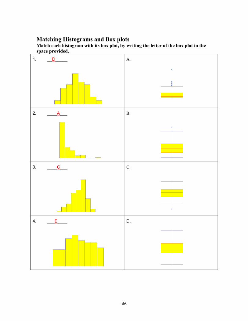
Matching Histograms and Box plotsMatch each histogram with its box plot, by writing the letter of the box plot in thespace provided.
1. __D_____ A.
2. ____A___ B.
3. ____C___ C.
4. ___E____ D.
47
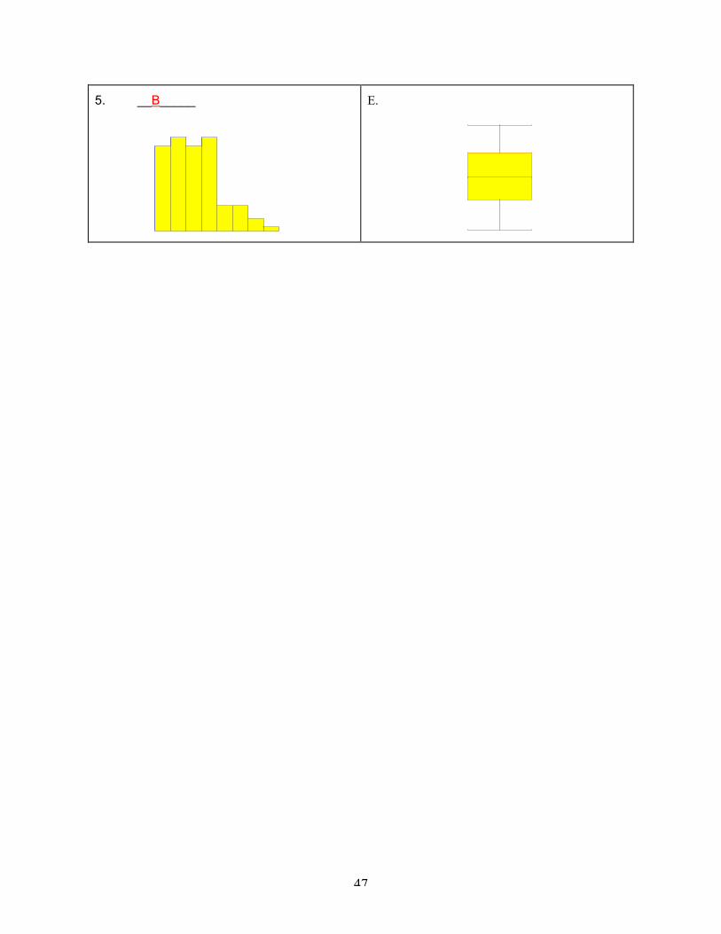
5. __B_____ E.