Embed Size (px)
Citation preview

S TYLE GUIDE & GRAPHIC STANDARDS MANUAL
CHAPTER AND ALUMNI CLUB
- 2 -
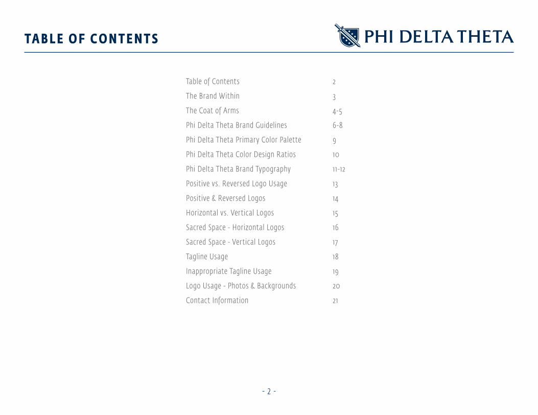
TA B L E O F C O N T E N T S
Table of Contents 2
The Brand Within 3
The Coat of Arms 4-5
Phi Delta Theta Brand Guidelines 6-8
Phi Delta Theta Primar y Color Palette 9
Phi Delta Theta Color Design Ratios 10
Phi Delta Theta Brand Typography 11-12
Positive vs. Reversed Logo Usage 13
Positive & Reversed Logos 14
Horizontal vs. Vertical Logos 15
Sacred Space - Horizontal Logos 16
Sacred Space - Vertical Logos 17
Tagline Usage 18
Inappropriate Tagline Usage 19
Logo Usage - Photos & Backgrounds 20
Contact Information 21

- 3 -
T H E B R A N D W I T H I N
Founded in 1848 on the values of fr iendship, sound learning and rectitude, Phi Delta Theta seeks men of outstanding character who wish to
exceed their personal expectations. Helping ever y individual to meet the true potential inside them is the bedrock of Phi Delta Theta Fraternity.
Phi Delta Theta logos and trademarks symbolize more than just the heritage and values of our fraternity. They are the visible sign of what is inside –
the most central beliefs – of the thousands of men who are proud to call themselves “Phi Delts”.
Our visual identity is the most important external sign of how our brand is communicated graphically – from logos and trademarks to color and
typeface. It reinforces all the thoughts and feelings people associate with Phi Delta Theta, from our alumni to our Brothers to our newest pledge.
It is important that all the elements of our visual identity ref lect the consistent strength of character of Phi Delta Theta and its members in ever y
internal and external communication.
To hold ourselves true to the power of Phi Delta Theta’s brand, it is important that ever yone who is given the right to use these important graphic
elements does so correctly.
The guidelines that follow set the graphic standards that we adhere to as Phi Delts, as much as we adhere to the values of the organization.
By following these graphic standards, you uphold the legacy and the promise of the Phi Delta Theta brand. By our consistent graphic external presence,
we build upon the understanding of the Phi Delta Theta brand inside each of us.

- 4 -
T H E C OAT O F A R M S
The Phi Delta Theta Coat of Arms was adopted in 1898 and is our most time-honored symbol. The Coat of Arms may be used as the primar y logo for the
purposes of internal, member-to-member communication, member apparel or specif ic chapter and individual recognition awards.
The Coat-of-Arms. The coat-of-arms of the Fraternity is emblazoned as follows:
- Escutcheon: Azure, on a bend argent, between six mullets of the second, a sword proper point downward.
- Helmet: Proper, af frontee, visor closed, mantling of the f irst and second.
- Crest: A dexter arm embowed vambraced hurling a javelin all proper.
- Motto:
George A Long III, Indiana Alpha 1413
George A Long, Indiana Beta 10/19/1208 #332
Granville Moody Jr. Illinois Eta, 3/7/1914 #232
George A Long Jr., Illinois Eta, 6/6/1939 #586
Edward C. Loy, Indiana Theta, 4/5/1934 #504
Herbert Strawbridge, Indiana Theta, 4/19/1936 #531
Robert Strawbridge, Indiana Theta, 3/18/1937 #539
Russe
ll Stra
wbrid
ge, In
diana
Theta
, 4/27
/1947
#749
Dallas Ryan Long, Florida Gamma, 4/22/2007 #1663

- 5 -
T H E C OAT O F A R M S
The assignments of colors in our Coat-of-Arms are derived from the “Blazon” of Phi Delta Theta originally described in 1898.
a dex ter ( t he r ig ht s ide of t he sword holder) a r m embraced ( bent)
va mbraced ( a r mored ) of t he t h i rd ( color ment ioned )
ha nd ca r nat ion ( f lesh ) hu rl i ng a javel i n
of t he t h i rd ( color ment ioned )
bet ween s i x mu l let s of t he second
( color ment ioned )
“On a bend a rgent” ( f rom wh ite to s i lver)
Esc utc heon: A z u re ( blue)
a sword or ( gold ) poi nt dow nwa rd
Crest : a rea above t he “torse” ( ba nded c lot h )
ma nt l i ng of t he f i rst a nd second ( colors ment ioned )
George A
Long III, Indiana Alpha 1413
George A Long, Indiana Beta 10/19/1208 #332
Granville Moody Jr. Illinois Eta, 3/7/1914 #232
George A Long Jr., Illinois Eta, 6/6/1939 #586
Edward C. Loy, Indiana Theta, 4/5/1934 #504
Herbert Strawbridge, Indiana Theta, 4/19/1936 #531
Robert Strawbridge, Indiana Theta, 3/18/1937 #539
Russ
ell S
traw
brid
ge, I
ndia
na T
heta
, 4/2
7/19
47 #
749
Dallas Ryan Long, Florida Gamma, 4/22/2007 #1663
Pa ntone 430 C Pa ntone 7540 C Pa ntone 4705 C Pa ntone 466 C Pa ntone 539 C Pa ntone 3005 C
C 5M 0Y 0K 45
R 148G 156B 161
C 0M 0Y 0K 72
R 105G 106B 109
C 0M 62Y 71K 49
R 144G 73B 45
C 12M 22Y 43K 0
R 224G 194B 152
C 100M 49Y 0K 70
R 0G 43B 84
C 100M 34Y 0K 2
R 0G 129B 198

- 6 -
P H I D E LTA T H E TA B R A N D G U I D E L I N E S
The logo of Phi Delta Theta is a simple graphic representation of the heart of the Coat of Arms: The Shield, The Sword and the Six Stars. It is the mark
that we use on business cards, letterhead, advertising and promotion and all of f icial brand communications. This is the only of f icially approved logo of
Phi Delta Theta. On the pages that follow, you will see how to properly use the Phi Delta Theta brand identity.
- 7 -
P H I D E LTA T H E TA B R A N D G U I D E L I N E S
• The Phi Delta Theta logo is the primar y logo of the Phi Delta Theta Fraternity.
• It is the contemporar y graphic expression of our Coat of Arms and is meant for all graphic communications.
• The diagonal sword on the shield represents honor and braver y.
• The six stars represent the Immortal Six.
• The dark blue tone represents our time-honored values and the white represents our sincerity in our actions of ser vice. Azure and argent
(heraldic terms for blue and white) were chosen in 187 1.
• The Phi Delta Theta logo can be on its own in Phi Delta Theta communication or in conjunction with any other element of the overall Phi Delta Theta
brand identity.
• The Phi Delta Theta Foundation logo is always the primar y logo, with other Chapter, Organizational and Alumni organizational logos
being secondar y.

- 8 -
P H I D E LTA T H E TA B R A N D G U I D E L I N E S
TONE AND MANNER OF PHI DELTA THETA:
The tone and manner of the Phi Delta Theta communications should assert our dedication to friendship, sound learning and rectitude. It should
also feel approachable, social and fun. Ever y Phi Delta Theta communication should capture the driving spirit of Phi Delta Theta, that achieving and
exceeding your potential through friendship, sound learning and rectitude can be a path to greatness your whole life long. And that becoming the
greatest version of yourself is the ultimate goal of all great men.
PHI DELTA BR AND POSITION:
Phi Delta Theta is the pinnacle fraternal and professional society, centered around the potential of each brother, the unquenchable thirst for personal
development and the lifelong values of fr iendship, sound learning and rectitude.
PHI DELTA THETA BR AND AT TITUDE:
Trustworthy. Brave. Independent. Successful. Approachable. Social. Loyal.

- 9 -
P H I D E LTA T H E TA P R I M A RY C O LO R PA L E TT E
Pa ntone 3005 CPa ntone 539 C Pa ntone 428 C
C 100M 34Y 0K 2
R 0 G 129 B 198
C 100M 49Y 0K 70
R 0G 43B 84
C 0M 0Y 0K 60
R 123G 121B 121

- 1 0 -
P H I D E LTA T H E TA C O LO R D E S I G N R AT I O S

- 1 1 -
FEDRA SANS CONDENSED STD BOLD
OPTI TRIPLETT LIGHT
ELLINGTION MT ITALIC
ELLINGTION MT ROMAN
ELLINGTION MT LIGHT
FEDRA SANS CONDENSED STD LIGHT
DUNT AT AUT DUIS NUM VEL DOLORE FEUGIAT UT DOLESTRUD TAT ECTEM.
PHI DELTA THETA
Become the greatest version of yourself
Gunt at aut duis num vel feugiat ut dolesd tat ectem Am nonulla facipit aliquis aut.
Gunt at aut duis num vel dolore dolore feugiat ut dolesd tat ectem Am nonulla facipit aliquis aut.
Gunt at aut duis num vel dolore dolore feugiat ut dolesd tat ectem Am nonulla facipit aliquis aut.
ADVERTISING/DESIGN HEADLINESAll advertising or promotional mailer headlines appear in all caps.
BODY COPYUpper and lower case, used exclusively as body copy in ads, catalogues and promotional
items. This typeface has multiple fonts that can be applied depending on the situation and
the artist’s discretion.
ALT BODY COPY OPTIONUpper and lower case, used exclusively as body copy in ads, catalogues and promotional items.
P H I D E LTA T H E TA B R A N D T Y P O G R A P H Y

- 1 2 -
P H I D E LTA T H E TA B R A N D T Y P O G R A P H Y
ACCEPTABLE IDENTIT Y SYSTEM FONT SUBSTITUTIONS:
ARIAL BOLD
DUNT AT AUT DUIS NUM VEL DOLORE DOLORE FEUGIAT UT DOLESTRUD TAT ECTEM.
BOOK ANTIQUA BOLD ITALIC
Dunt at aut duis num vel dolore dolor feugiat ut dolestrud tat ectem.
SUB HEADLINEIf Ellington MT is not available and a typeface is needed for sub headlines use Book Antiqua Bold Italic, with upper and lower case.
BODY COPYArial Regular can be substituted if one of the three primary typefaces are not available. It should be typeset using upper and lower case.
ARIAL REGULAR
Gunt at aut duis num vel dolore dolore feugiat
ut dolesd tat ectem Am nonulla facipit aliquis aut.
HEADLINEIf Fedra is not available, Arial Bold in all caps should be used for headlines in communcation pieces.

- 1 3 -
P O S I T I V E V S . R E V E R S E D LO G O U S A G E
The logos of Phi Delta Theta in the identity system are f irst broken into two segments: positive and reversed. The positive logos are to be used on
white or light colored backgrounds or substrates (white, light grey, etc.). The reversed logos are to be used on dark colored backgrounds or substrates
(black, navy, dark green, etc.). The reversed logos can be identif ied with the designation .REV in the f ile name. They also can be identif ied by the
thin white outline around the shield. (see below). In addition, it is recommended to use the reversed logos on patterns, stripes, and over 4-color
photography - but this is left up to the users best judgement. For instance, there is an example that appears later in this guide that has black, royal
blue and white stripes (like a golf shir t) - it was determined the positive logo was the best choice due to legibility issues with the white stripes.
Finally, there are some colors that fall into a “mid-value range” (red, and royal blue). For these colors or substrates, it is acceptable to use either the
positive or reversed versions of the logo.
POSIT IVE LOGO EXAMPLE: REVERSED LOGO EXAMPLE:
thin white outline around the shield indicates this is a reversed logo

- 1 4 -
P O S I T I V E & R E V E R S E D LO G O S
POSIT IVE LOGOS: REVERSED LOGOS:

- 1 5 -
H O R I Z O N TA L V S . V E RT I C A L LO G O S
There are two architectural forms of the Phi Delta Theta logo. Vertical and horizontal. When deciding which logo form will work best, look at the space
it is being used in. Horizontal spaces require the horizontal logo. Vertical or square (or squarish) spaces require the vertical logo.
HORIZONTAL LOGOS: VERTICAL LOGOS:
- 1 6 -
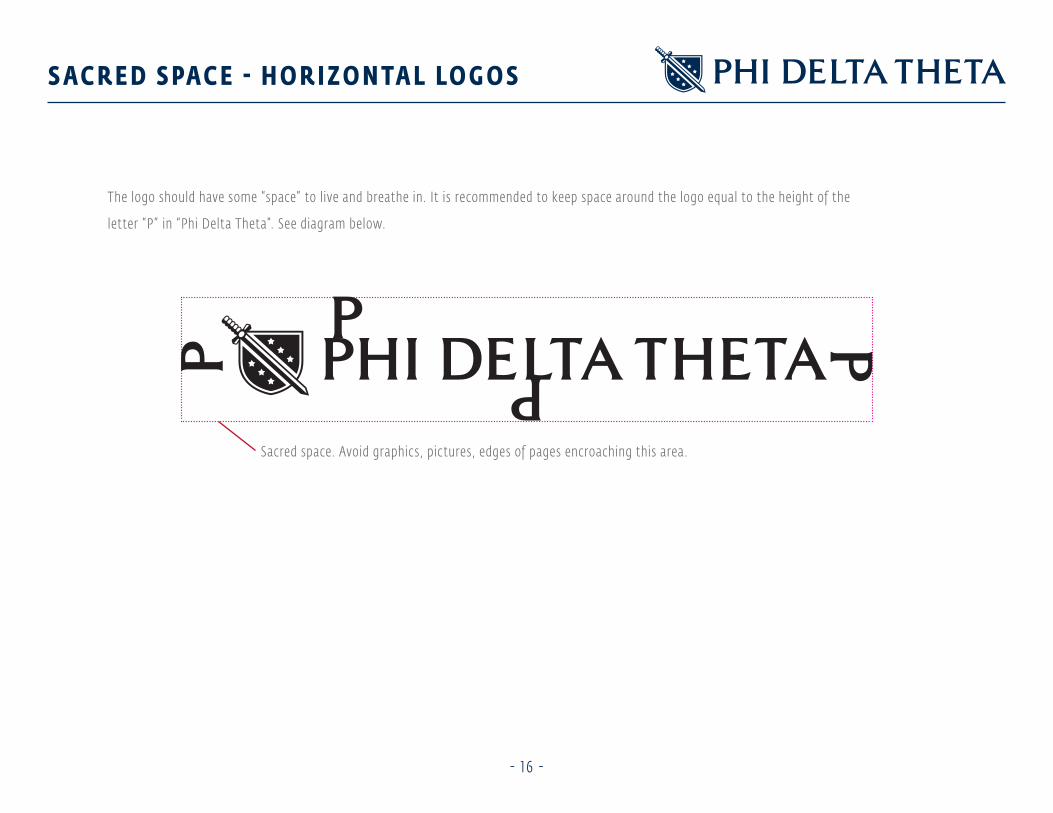
S A C R E D S PA C E - H O R I Z O N TA L LO G O S
The logo should have some “space” to live and breathe in. It is recommended to keep space around the logo equal to the height of the
letter “P” in “Phi Delta Theta”. See diagram below.
Sacred space. Avoid graphics, pictures, edges of pages encroaching this area.

- 1 7 -
S A C R E D S PA C E - V E RT I C A L LO G O S
The logo should have some “space” to live and breathe in. It is recommended to keep space around the logo equal to the height of the
letter “P” in “Phi Delta Theta”. See diagram below.
Sacred space. Avoid graphics, pictures, edges of pages encroaching this area.

- 1 8 -
TA G L I N E U S A G E
The logos for Phi Delta Theta can be used with and without the tagline, “Become the greatest version of yourself ”. If the tagline is used, it should be
used exactly as it appears in the vertical and horizontal logo formations. See correct usage below.

- 1 9 -
I N A P P R O P R I AT E TA G L I N E U S A G E
Always use the tagline within the vector or j-peg f ile. See below for inappropriate tagline usage.
Do not subst it ute fonts for t he tagl i ne. Do not st retc h t he tagl i ne ver t ica l ly or hor i zonta l ly.
Do not i nc rease t he si ze of t he tagl i ne. Do not c ha nge t he color of t he tagl i ne.
BECOME THE GREATEST VERSION OF YOURSELFBECOME THE GREATEST VERSION OF YOURSELF

- 2 0 -
LO G O U S A G E - P H OTO S & B A C K G R O U N D S
The Phi Delta Theta logos can be used on white, or with colored backgrounds or substrates. The logo can also be used over photography. When using
the logo over backgrounds or photography, always tr y to use simple or relatively clean backgrounds. Also, when used over photography, always use the
reversed option of the logo. With a colored or tinted solid background, if the tone is less than 50% density, use the positive logos - if over 50% density,
use the reversed logos.
TINTED BACKGROUNDS: PHOTOGRAPHY:
Less t ha n 50% densit y - posit ive logo. Less t ha n 50% densit y i n t he a rea beh i nd t he logo - posit ive logo.
More t ha n 50% densit y - reversed logo. More t ha n 50% densit y i n t he a rea beh i nd t he logo - reversed logo.

If you have any questions regarding the Phi Delta Theta Style Guide & Graphic Standards Manual,
please email [email protected], visit phideltatheta.org, or call the Phi Delta Theta General Headquarters at 513.523.6345.
PHI DELTA THETA INTERNATIONAL FRATERNITY
General Headquarters | 2 South Campus Avenue | Oxford, OH 45056