Embed Size (px)
Citation preview

NBER WORKING PAPER SERIES
SUPERSTAR CITIES
Joseph GyourkoChristopher Mayer
Todd Sinai
Working Paper 12355http://www.nber.org/papers/w12355
NATIONAL BUREAU OF ECONOMIC RESEARCH1050 Massachusetts Avenue
Cambridge, MA 02138July 2006
Dimo Pramaratov and Dan Simundza provided outstanding research assistance. We appreciate the commentsand suggestions of Dennis Yao, Joel Waldfogel, Will Strange, Nick Souleles, Emmanuel Saez, Albert Saiz,Matt Rhodes-Kropf, Susan Guthrie, Raj Chetty, Karl Case, Markus Brunnermeier and seminar participantsat Columbia University, the Econometric Society, the Federal Reserve Bank of Philadelphia, HarvardUniversity, the London School of Economics, the NBER Summer Institute, UC Berkeley, University ofMaryland, University of South Carolina, University of Southern California, and the Wharton School. We alsobenefitted greatly from conversations with other friends and colleagues in the early stages of this project.Gyourko and Sinai received financial support from the Research Scholars program of the Zell-Lurie RealEstate Center at Wharton. Mayer was funded by the Milstein Center for Real Estate at Columbia BusinessSchool. Full addresses: Gyourko – 1480 Steinberg Hall-Dietrich Hall, 3620 Locust Walk, Philadelphia, PA19104-6302 / (215)-898-3003 / [email protected]. Mayer – 3022 Broadway, Uris Hall #808, NewYork, NY 10025 / (212) 854-4221 /[email protected]. Sinai – 1465 Steinberg Hall-Dietrich Hall, 3620Locust Walk, Philadelphia, PA 19104-6302 / (215) 898-5390 / [email protected]. The viewsexpressed herein are those of the author(s) and do not necessarily reflect the views of the National Bureauof Economic Research.
©2006 by Joseph Gyourko, Christopher Mayer and Todd Sinai. All rights reserved. Short sections of text,not to exceed two paragraphs, may be quoted without explicit permission provided that full credit, including© notice, is given to the source.

Superstar CitiesJoseph Gyourko, Christopher Mayer and Todd SinaiNBER Working Paper No. 12355July 2006JEL No. R0, J0, D4, N9
ABSTRACT
Differences in house price and income growth rates between 1950 and 2000 across metropolitanareas have led to an ever-widening gap in housing values and incomes between the typical andhighest-priced locations. We show that the growing spatial skewness in house prices and incomesare related and can be explained, at least in part, by inelastic supply of land in some attractivelocations combined with an increasing number of high-income households nationally. Scarce landleads to a bidding-up of land prices and a sorting of high-income families relatively more into thosedesirable, unique, low housing construction markets, which we label “superstar cities.” Continuedgrowth in the number of high-income families in the U.S. provides support for ever-largerdifferences in house prices across inelastically supplied locations and income-based spatial sorting.Our empirical work confirms a number of equilibrium relationships implied by the superstar citiesframework and shows that it occurs both at the metropolitan area level and at the sub-MSA level,controlling for MSA characteristics.
Joseph GyuorkoThe Wharton SchoolUniversity of Pennsylvania1480 Steinberg-Dietrich Hall3620 Locust WalkPhiladelphia, PA 19104-6302and [email protected]
Christopher MayerGraduate School of BusinessColumbia University3022 Broadway, Uris Hall #808New York, NY 10025and [email protected]
Todd SinaiThe Wharton SchoolUniversity of Pennsylvania1465 Steinberg-Dietrich Hall3620 Locust WalkPhiladelphia, PA 19104-6302and [email protected]

1
Over the last 50 years, the number of families in U.S. metropolitan areas doubled, with
the number making more than $140,000 in real ($2000) terms increasing more than eight-fold
according to the U.S. Census. Gains in income growth have been concentrated in those high-
income families. Piketty and Saez (2004) estimate that the fraction of income attributable to the
top one percent of U.S. households rose from 11.4 percent in 1950 to 16.9 percent in 2000.
Concurrently, two other patterns arose. First, there has been a large dispersion in real
house price appreciation rates across metropolitan areas and towns, with some appreciating at
very high rates. For example, real house price growth in the San Francisco primary metropolitan
statistical area (PMSA) averaged about 3.5 percent per year between 1950 and 2000, more than 2
percentage points higher than the national average. These differences in long-run rates of
appreciation led to an ever-widening gap in the price of housing between the most expensive
metropolitan areas or communities and the average ones. Indeed, the gap in prices between the
most expensive metropolitan area (San Francisco) and the average across all areas doubled
between 1970 and 2000. San Francisco in 2000 had an average house price of almost $550,000,
more than three times higher than the average. Second, real income growth rates between 1950
and 2000 and changes in the income distribution also varied widely across locations. For
example, in the San Francisco PMSA the share of families earning over $110,000 (in constant
2000 dollars) grew by 21 percentage points between 1970 and 2000 versus 9 percentage points
across all metropolitan areas.
In this paper, we provide evidence that these patterns of spatial dispersion in house price
and income growth are related: they are the inevitable result of increasing scarcity of land in
certain metropolitan areas and towns, combined with a growing number of high income families
nationally. In places that are desirable but have low rates of new housing construction, families

2
with high incomes or strong preferences for that location outbid lower willingness-to-pay
families for scarce housing, driving up the price of the underlying land. As the number of high
income families grows nationally, existing residents are outbid by even higher-income families,
raising the price of land yet further. By contrast, in municipalities where construction is easier,
any family who wishes to live there – rich or poor – can buy in at the cost of constructing a new
house and, instead of growth in house prices, the area exhibits growth in the quantity of houses.
Land prices act as a clearing mechanism, so lower-income households are disproportionately
excluded from cities that have limited supply, leaving behind concentrations of higher-income
households. In this sense, living in a superstar city is like owning a scarce luxury good.
Over time, the gap in house prices between cities can keep increasing. Even if each
family individually is willing to pay only a fixed premium for a location, when the absolute
number of rich families in the country increases and their incomes rise, there are more families
who will pay a higher premium for the same perceived difference between cities. Thus, a
changing composition of residents in supply-constrained cities toward higher income families
supports the growth in land prices.
This process can continue as long as the growth in the income-weighted demand for a
location exceeds the addition in supply, either in the original location or in a close substitute.
Indeed, the inelastically supplied city need not be more desirable on average than any other city,
nor do workers in the city need to enjoy increased productivity by moving there. As long as the
city appeals to a large enough clientele of families, a growing price gap and a shifting of the
local income distribution to the right will occur. We label metropolitan areas and towns where
demand exceeds supply and supply growth is limited, “superstars.” These superstar cities and
towns are ones in which residents are willing to pay a premium to live and into which high-

3
income superstar-earners disproportionately sort. These markets do not allow for increasing
density through construction, cannot infinitely expand their borders, and have few close
substitute locations. Our results emphasize that even seemingly generic MSAs, for some portion
of the population, are not perfectly substitutable.
This correlated skewness in house prices and the income distribution is a modern
development at least at the metropolitan area level, because even the densest coastal markets had
plenty of land available for development throughout much of the twentieth century. Once these
MSAs “filled up”, in the sense that adding units to the housing stock became difficult, both
because of geographical limitations and local restrictions on increases in density, growth in
house prices accelerated.
We begin the analysis by documenting the long-run trends in house price and income
growth and the spatial skewness that has arisen since 1950. Next, we outline a simple two
location model that shows how inelastic land supply can link these stylized patterns. This model
is similar in spirit to Epple and Platt (1998), but allows for differences in the elasticity of supply
across locations, and generates a set of empirically testable predictions. Systematic patterns in
the data are consistent with the equilibrium predictions of this superstar cities model.
First, the income-sorting predictions of the model are borne out in the data. Income
distributions in superstar cities are skewed to the right, and skew relatively more when the
national number of high-income families rises. Recent movers into superstar cities tend to be
higher-income, on average, than recent movers into other cities, and recent movers out of
superstar cities are drawn disproportionately from the bottom tail of the city’s income
distribution.
4
Second, not only do superstar cities enjoy higher long-run house price growth, but prices
in those markets are a higher multiple of current rents, suggesting that homebuyers there
anticipate more rapid long-run rent and price growth. In addition, when the total number of
high-income families living in the U.S. grows more rapidly, the gap in house prices between
superstar cities and other housing markets widens the most.
These patterns are repeated when we compare superstar towns to other towns within their
metropolitan areas. “Superstar suburbs” typically have more high-income households and fewer
poor ones, and experience a greater rightward shift in their income distributions and more rapid
growth in their house prices when the number of high-income households in their MSAs rises.
They, too, have higher price-to-rent ratios. That we find similar evidence of ‘superstar suburbs’
is an important differentiator from models of urban agglomerations because labor productivity is
unlikely to vary geographically based on where workers live within a given labor market area.
Consistent with the model’s predictions, once an elastically supplied city or town “fills
up” and future supply growth becomes limited, price-to-rent ratios increase, and income sorting
and house price dispersion accelerates. A number of jurisdictions in our sample undergo this
transition into superstar status. For example, Los Angeles and San Francisco are the first major
metropolitan areas to become supply-limited, and that happened between 1960 and 1980. The
areas around Boston and New York followed between 1970 and 1990.
The implications of the superstar cities framework are fundamentally different from those
of existing urban models. For example, standard compensating differential models attribute
differences in prices across markets to variation in amenities and other local traits. [Roback
(1982), Blomquist et al (1988), Gyourko and Tracy (1991)] By contrast, the superstar cities
view implies that limited land supply results in a rightward shift in the income distribution and

5
rising land prices that are neither due to changes in the innate attractiveness of living there nor in
local productivity, but follow from an increasing number of high willingness-to-pay families in
the population. Second, the superstar cities intuition reverses the causality of typical
agglomeration models in which moving to a location enhances a worker’s productivity. [Glaeser
et al (1992, 1995), Henderson et al (1995), Rauch (1993), Moretti (2004a,b,c), Rosenthal and
Strange (2001, 2003)] Instead, high human capital (high income) workers concentrate in
superstar cities because they can outbid less productive workers. We do not claim that
alternative explanations involving the potential impacts of human capital spillovers, production
agglomeration effects, or preference externalities on housing markets are not valid, but we do
show empirically that they cannot completely account for the patterns observed in the data.
1. Skewness and dispersion in house prices, incomes, and their long-run growth rates
We begin by detailing the remarkable dispersion – and even skewness – across MSAs in
house price and income growth over the 1950 to 2000 period. Figure 1A plots the kernel density
of average annual real house price growth between 1950 and 2000 for the 280 metropolitan areas
with populations over 50,000 in 1950.1 The tail of growth rates above 2.6 percent is especially
thick and the distribution is right-skewed. Table 1, which lists the average real annual house
price growth rate between 1950 and 2000 for the ten fastest and ten slowest appreciating
metropolitan areas out of the 50 MSAs with populations of at least 500,000 in 1950, documents
that the dispersion seen in this figure is not an artifact of a few areas that were small initially and
then experienced abnormally rapid price growth.
These annual differences compound to very large price gaps over time even within the
top few markets. For example, San Francisco’s 3.5 percent annual house price appreciation
1 The Census data that underlies these calculations is described in Section 3.

6
implies a 458 percent increase in real house prices between 1950 and 2000, more than twice as
large as seventh-ranked Boston at 212 percent, which itself still grew 50 percent more than the
sample average of 132 percent for the 50 most populous metropolitan areas.2 Figure 2A, which
plots a kernel density estimate of the 280 metropolitan area average house values in 1950 and
2000, shows that skewness has increased over the last 50 years, with a relative handful of
markets ending up commanding enormous price premiums. Figure 2B normalizes the means and
standard deviations of the 1950 and 2000 house value distributions so they are equal and plots
them against each other. In 2000, the right tail of the MSA house value distribution extends to
four times the mean, more than twice the highest MSA from the right tail of the 1950 Census.
The left tail ends at about half the mean in both years, although it is slightly more skewed in the
2000 Census.
There is also long-run persistence in the markets which exhibit above-average price
growth. Across the two 30-year periods from 1940-1970 and 1970-2000, average annual
percentage house price growth has a positive correlation of about 0.3. Moreover, of the MSAs in
the top quartile of annual house price growth between 1940 and 1970, half were still in the top
quartile and nearly two-thirds remained ranked in the top half between 1970 and 2000.3
Income growth rates, as well, demonstrate wide dispersion across MSAs over the long-
run. Figure 1B plots the kernel density of average annual real income growth over the 1950 to
2000 period. Growth rates range from 0.8 percent per year to 3.1 percent, and the distribution
also evinces some right-skew.
2 It is worth emphasizing that the extremely high appreciation seen in the Bay Area, southern California, and Seattle markets is not restricted to the past couple of decades. The top five markets in terms of annual real appreciation rates between 1950-1980 are as follows: (1) San Francisco, 3.65 percent; (2) San Diego, 3.49 percent; (3) Los Angeles, 3.20 percent; (4) Oakland, 2.99 percent; and (5) Seattle, 2.88 percent. 3 Over short horizons, such as a decade, MSAs can experience large price swings. The correlation in house price growth rates across contiguous decades often is significantly negative.

7
2. Superstar Cities
We turn to a simple model to show that the stylized facts in the previous section may be
linked through the elasticity of supply of land. In our model, households vary by their incomes
and tastes for two locations which differ by whether they have available land. Epple and Platt
(1998, henceforth known as EP) present a more formal and extensive treatment of a similar
model, but assume that land supply is perfectly inelastic in all jurisdictions. By limiting the
model to two cities and allowing for elastic supply in one, we emphasize the testable empirical
implications of differences in the elasticity of supply. In addition, our results do not depend
upon the reasons for location preferences or inelasticity of supply, so we neither attempt to
discern why some families prefer certain cities nor address the causes of limited supply.
A. A Simple Model of Superstar Cities
There are two cities: a red city (R) and a green city (G). The red city does not allow new
development and has a fixed size of K units of housing. The green city has a perfectly elastic
supply of new housing units.4
There are N workers in the economy, with a continuum of worker skills. Wages are
increasing in skill, but are independent of a worker’s location, so worker productivity is
unrelated to the number or concentration of high-skilled workers in R or G. Define n(W) as the
distribution of workers who earn wage W. Thus 0
( ) .w
n W dW N∞
=
=∫
4 While we realize that land is not perfectly elastically supplied anywhere, the ease with which builders construct new units clearly differs across the country, as shown by Gyourko and Glaeser (2003), Glaeser, Gyourko, and Saks (2005b), and Saks (2005).

8
Each worker has an intensity of preference, c, uniformly distributed between 0 and 1, to
live in the red versus green city.5 The higher is c, the more that a worker prefers to live in G.
The preference to live in R or G is independent of income.
Workers choose two items in their consumption bundle: a city to live in (R or G), and a
quantity of the composite good, A. The price of A is normalized to 1. The rental cost of
agricultural land is l. By assumption, land is perfectly elastically supplied in G so that residents
can always acquire an additional lot at rent l in the green city. If more than K households prefer
the red city, residents of R must pay a per-period rent r+l with the rent premium r>0 determined
based on bidding as described below.
We assume that a worker gets utility from consumption of A, as follows:
UR ≡ (1-c)f(A) and A=w-r if worker resides in city R U =
UG ≡ cf(A) and A=w if worker resides in city G.
For simplicity, we normalize w= W-l. This specification assumes that a worker obtains higher
utility from consumption when its preference for its current location is stronger. However, all of
our results presented below still hold if consumption benefits from location and all other goods
were separable.
B. Solution:
A worker will choose to live in R and pay rent premium r if and only if UR > UG, or
(1−c)f(w−r) > cf(w). If N/2<=K, r=0 since the red city still has open land and residents sort into
R and G solely based on whether c is less than or greater than 1/2. We will restrict our attention
to the case of N/2>K, so that the expected rent premium in the red city will be strictly positive.
5 Reasonable alternatives to a uniform distribution of tastes exacerbate the income sorting predictions. Suppose the Red city is preferred to the Green city by all workers. Then, only high-wage workers end-up in R because they are the only workers that can afford to live there. Of course, as Epple and Platt (1998) point out, a single preference model cannot literally be true, otherwise we would observe pure income sorting. Intermediate cases in which higher income workers have a moderate preference for R versus G would not change our qualitative predictions.

9
The market-clearing rent premium, r*, equates the number of workers desiring to live in R
with the number of lots available by solving:
(0.1) ∫∞
=
≤0
* )()(w
Kdwwnwc .
The function c*(w) is the maximum c such that a worker with wage w will choose to live in R and
pay rent premium r*. When w ≤ r*, then c*(w) = 0; that is, workers cannot afford to live in R
unless their wage is greater than the rent required to live in R. When w > r*, c*(w) represents the
preference of a worker of a given wage who is just indifferent between living in R or G. So
workers with wage w and preference c< c*(w) will choose to live in R.
C. Simulation Results:
To demonstrate the effect of inelastic supply of land on land prices and income sorting,
we perform a simple simulation. The simulated economy has 100,000 workers, but only 30,000
spaces in city R, and a truncated normal wage distribution with discrete $1,000 increments, a
mean wage of $40,000, a standard deviation of $40,000, the lowest wage truncated at 0, and the
highest wage truncated at $150,000. As above, wages are defined as compensation earned in
excess of the agricultural rent, l. The location preference c is uniformly distributed between 0
and 1, and f(A)=A. Solving for the market-clearing rent premium yields r*= $19,257, or almost
40 percent of the average wage.6
Prediction 1: Rents, the average wage, and the share of high income workers are higher in R
than in G.
Explanation for Prediction 1:
6 The average wage in the economy is actually $51,246 given that the lower truncation wage of $0 removes more of the low wage workers relative to the upper truncation wage of $150,000.

10
Figure 3 graphs the wage distributions in the red and green cities, with the number of
residents in G equal to the difference between the two solid lines. A disproportionate share of
higher income workers, and no one at all earning below $19,257, lives in the red city.
This result is purely due to the scarcity of locations in R. At zero rent premium, any
worker with c<0.5 would prefer to live in the red city. Since more workers prefer R than there
are spots, the clearing rent premium is strictly positive, and each worker trades off its intensity of
preference for the red city with the rent premium. For example, any worker with income less
than r* is better off in the free green city, no matter what its value of c. A low-wage worker with
w just above r* will choose R only if c is close to zero, and a high-income worker with w well
above r* will choose R as long as c is at least slightly below 0.5. Thus the income distribution in
R is skewed to the right.7
Note that this sorting occurs even though a given worker is equally productive in R and G
and worker preferences are independent of income.8 Indeed, with a uniform distribution of c,
more than half of the high wage workers live in the green city. This is because half of the
workers actually prefer the green city and those on the cusp choose to live in the green city
versus paying a rent premium r* to live in the red city. High-income residents comprise a
smaller share of the green city since it is larger than R, with well more than half of the low-
income workers living there.
Prediction 2: Population growth leads to a higher rent premium, higher prices, and more skewed
wages in R relative to G. 7 Epple and Platt (1998) obtain a similar partial sorting by income. In EP, sorting arises because families have preferences over a bundle of public goods and tax rates which are provided in different amounts across inelastically supplied locations. In our illustrative model, we allow for differences in the elasticity of land supply but do not specify why a household might prefer one location over another. 8 Because we do not incorporate peer effects or increasing returns to skill, [Moretti (2004b,c)] there is no countervailing pecuniary incentive for high wage workers with a preference for G to live in R anyway. Given that the density of high wage workers is higher in R but the absolute number of high wage workers is higher in G, it is unclear where such effects would be greater.

11
Explanation for Prediction 2:
Suppose that population doubles from 100,000 to 200,000 but the number of spots in R is
unchanged. The equilibrium rent premium increases from $19,257 to $41,263 as the number of
households with c<0.5 doubles.9 Figure 4 illustrates that the wage distribution in the red city
also shifts to the right. Thus, population growth leads to an even more skewed distribution of
wages for workers living in R relative to G. Some families who previously had a strong
preference to live in R will no longer have the income necessary to cover the r*, and others will
no longer prefer it at the higher rent. Families with the lowest incomes are disproportionately
priced out of R as the national population grows.
Assuming house prices equal the present discounted value of rents, markets with higher
rent levels will also have higher house prices. Rent and price premiums are due to the
underlying scarcity of land, not the cost of housing structures, which is similar across markets.10
Prediction 3: A thicker right tail in the aggregate wage distribution leads to higher rents
and wages in R relative to G.
Explanation for Prediction 3:
Even without population growth, an increase in income inequality raises the average
income and thus the willingness-to-pay of the marginal worker who prefers R. Thus the rent
premium rises in R, but less so than in the case of population growth because the number of
families who prefer R does not increase. Higher rent, in turn, displaces relatively more low-wage
workers in favor of high wage workers. This process is illustrated in Figure 5, where the
standard deviation of the truncated wage distribution is raised to $80,000.
9 The specific percentage change in rent is dependent on the parameter values. Eventually the cutoff rent must grow more slowly than the population because the upper support of the truncated normal distribution does not change. 10 Gyourko and Saiz (forthcoming) show that the cost of construction has been declining in real terms, while real house prices have risen almost everywhere in the U.S.

12
Prediction 4: When aggregate population growth and/or a spreading to the right of the overall
income distribution is anticipated, R will have a higher price/rent ratio than G.
Explanation for Prediction 4:
The comparative statics in predictions 2 and 3 demonstrate that population growth or a
right-skewing of the income distribution lead to higher rents in R (r*>0). This prediction
assumes that expected long-run risk-adjusted returns to investing in housing in the two cities are
equated by the market, where rent is analogous to the dividend paid by a house. If workers
anticipate that rents in R will grow faster than agricultural rents, they will bid up house prices so
that the overall return for a house in R is equal to the return on a house in G. If R has a faster
growth rate of rents than G, that market will also have the same faster stationary growth rate in
prices.
Priced fairly, a house in R earns a lower current yield (lower rent/price ratio), but a higher
future capital gain due to the faster rent and price growth than in G. Thus, when the number of
high-income families is growing, the price/rent ratio should be higher in R than G. In fact, house
price levels are higher in R for two reasons: both land rents and the price-to-rent ratio are higher
in R than in G.
Prediction 5: An unexpected increase in the relative growth rate of rents in R implies a higher
steady state growth rate in prices in R and an increase in the price-to-rent ratio.
Explanation for Prediction 5:
With stationary growth in rents, the price/rent ratios will be fixed. If there is an
unanticipated shock to the growth rate of rents, the price/rent ratio and the growth rate of prices
can deviate from its steady-state trend. If a city runs out of developable land, thereby
transitioning from a city like G to a superstar city like R, the growth rate of rents (and prices) will

13
rise accordingly. In the short-term, house prices will grow more quickly than rents as the
price/rent ratio rises to reflect the new higher growth rate of rents. Owners in the newly-created
superstar city will earn a one-time capital gain.
3. Data description
We use data from the U.S. decennial census, aggregated to three different levels: the
metropolitan area, which corresponds to the local labor market, the Census-designated place,
which is a political entity such as a city or town, and the household. At the metro area and the
census-designated place levels we obtain information on the distribution of house values, family
incomes, population, and the number of housing units.11 For the analysis across metropolitan
areas, we use a sample of 280 such areas that had populations of at least 50,000 in 1950 and are
in the continental United States.12
11 Census house price data are imperfect in that they are self-reported and not quality adjusted. We use them because the length of the panel available allows us to observe the evolution of superstar markets over time. While correlations between constant quality and unadjusted series can be weak at annual frequencies, the correlation over the decadal periods, which are the unit of analysis here, is quite high. For example, from 1980-1990 and 1990-2000, the sole time periods for which both Census and constant quality data from the Office of Federal Housing Enterprise Oversight are available, the correlation in appreciation rates for a set of consistently defined MSAs is 0.94 in the 1980s and 0.87 in the 1990s. 12 Thirty-six areas with populations under 50,000 in 1950 were excluded from our analysis because of concerns about abnormal house quality changes in markets with so few units at the start of our period of analysis. Those MSAs are: Auburn-Opelika, Barnstable, Bismarck, Boulder, Brazoria, Bryan, Casper, Cheyenne, Columbia, Corvallis, Dover, Flagstaff, Fort Collins, Fort Myers, Fort Pierce, Fort Walton Beach, Grand Junction, Iowa City, Jacksonville, Las Cruces, Lawrence, Melbourne, Missoula, Naples, Ocala, Olympia, Panama City, Pocatello, Punta Gorda, Rapid City, Redding, Rochester, Santa Fe, Victoria, Yolo, and Yuma. That said, none of our key results are materially affected by this paring of the sample. Similar concerns account for our not using data from the first Census of Housing in 1940 in the regression results reported below. (All individual housing trait data from the 1940 census were lost, so we cannot track any trait changes over time from that year.) However, we did repeat our MSA-level analysis over the 1940-2000 time period. While the point estimates naturally differ from those reported below, the magnitudes, signs, and statistical significance are essentially unchanged. Finally, the New York PMSA is missing crucial house price data for 1960, and is excluded from the analysis reported below. The census did not report house value data for that year because it did not believe it could accurately assess value for cooperative units, the preponderant unit type in Manhattan at that time.

14
Since the definitions of metro areas change over time, we use one based on 1990 county
boundaries to project consistent metro area boundaries forward and backward through time.13
Data were collected at the county level and aggregated to the metropolitan statistical area (MSA)
or primary metropolitan statistical area (PMSA) level in the case of consolidated metropolitan
statistical areas.14 Data for the 1970-2000 period are obtained from GeoLytics, which compiles
long-form data from the decennial Censuses of Housing and Population. We hand-collected
1950 and 1960 data from hard copy volumes of the Census of Population and Housing. Both
sources are based on 100 percent population counts. For the analysis within MSAs, we extract
place-level data for 1970-2000 from the GeoLytics CD-ROMs.15 All dollar values are converted
into constant 2000 dollars.
Household-level data comes from the Integrated Public Use Micro Samples (IPUMs),
which provide a set of matched variables using common definitions across decades. We use
family income and the MSA of residence five years prior in an analysis of recent movers
reported below. If the resident lived in a different MSA than the current one five years ago, that
individual is an in-migrant to the current MSA and an out-migrant from the host MSA five years
previously. We restrict the household sample to 1980 and 1990 because the ‘MSA-five-years-
ago’ variable did not exist prior to 1980 (except for a few MSAs in 1940), and in 2000 the
number of MSAs identified in the IPUMs was drastically reduced.
13 We use definitions provided by the Office of Management and Budget, available at http://www.census.gov/population/estimates/metro-city/90mfips.txt. 14 All our conclusions are robust to aggregating to the CMSA level for those few areas with that designation. 15While states differ in the extent to which local jurisdictions control new construction or even whether they can change their boundaries, census-designated places provide a useful comparable sample. The 1970 data include only 6,963 out of 20,768 places. (Conversations with the Census Bureau suggest that the micro data on the remaining places has been lost or is not readily available.) Fortunately, these places account for more than 95 percent of U.S. population in 1970. In 2000, 161 million people lived in these 6,963 places, 206 million people in all places, and 281 million people in the entire U.S. We further limit the sample to places within a MSA.

15
In each data set, we divide the distribution of real family incomes into five categories that
are consistent over time. The income categories in the original Census data change in each
decade. We set the category boundaries equal to 25, 50, 75, and 100 percent of the 1980 family
income topcode, and populate the resulting five bins using a weighted average of the actual
categories in $2000, assuming a uniform distribution of families within the bins. Since 1980 had
amongst the lowest topcode in real terms, using it as an upper bound reduces miscategorization
of families into income bins. We call a family “poor” if its income is less than $39,179 in $2000.
“Middle-poor” are those families with incomes between $39,179 and $78,358, “middle” income
families have incomes between $78,359 and $117,537, “middle-rich” families lie between
$117,538 and $156,716, and “rich” families have incomes in excess of the 1980 real topcode of
$156,716.
4. A case study of San Francisco and Las Vegas
A case study of two cities illustrates how the superstar city dynamic plays out in practice.
Over the last 50 years the U.S. has experienced growth in the absolute number, population share,
and income share of high-income households. [Autor et al (2006), Piketty and Saez (2003), Saez
(2004)] The left panel of Figure 6 shows that the aggregate distribution of family income across
all MSAs in the U.S. has been shifting to the right in real dollars as the right tail of the income
distribution has grown much faster than the mean. The right panel of Figure 6 displays the
evolution of the number of families, rather than the share, in each of the income bins. Most of
the growth in the number of families was among those earning more than the $78,358 median
value for our sample.

16
These changes in the national high-income share were accompanied by very disparate
patterns at the metropolitan area level. San Francisco, a canonical superstar city, experienced
low levels of new construction and high house price growth. Between 1950 and 1960, the San
Francisco primary metropolitan statistical area (PMSA) expanded its population by about 48,000
families. Over the subsequent four decades, San Francisco grew by only 44,000 families, with
two-thirds of that growth taking place between 1960 and 1970. Real house prices (in constant
$2000 dollars) spiked in San Francisco after 1970, growing between 3 and 4 percent per year
between 1970 and 1990, about 1.5 percentage points above the average across all MSAs, and 1.4
percent per year between 1990 and 2000, almost one percentage point above the all-MSA
average.
By contrast, over the same time period, Las Vegas was a canonical high-demand,
elastically supplied non-superstar city. Las Vegas saw explosive population growth, growing
from fewer than 50,000 families in 1960 to the size of San Francisco by 2000. Yet it
experienced modest real house price growth that was well below the national average.
Consistent with the income distribution predictions of the superstar cities model, as the
number of high-income families in the country increased, San Francisco’s share high-income
grew disproportionately. San Francisco (Figure 7), which always had relatively more rich
families and fewer poor families than Las Vegas (Figure 8), became even more skewed toward
high income families between 1960 and 2000. Since the number of families in the San Francisco
MSA did not grow by much, the MSA actually experienced an increase in the number of rich
families and a reduction in the number of lower income ones. In fact, only the richest groups,
with incomes of $78,358 and above, increased their share of the number of families in the San
Francisco MSA.

17
By contrast, the overall income distribution in Las Vegas did not keep up with the nation
(left panel of Figure 8), leaving Las Vegas progressively more poor relative to both San
Francisco and the U.S. metropolitan area aggregate. The large numbers of new families in Las
Vegas were both rich and poor, leading to pro rata growth in the number of families across Las
Vegas’ income distribution. Relative to the national income distribution, which shifted right, the
growth in Las Vegas was skewed towards poorer families.
In the remainder of this paper, we show empirically that these patterns and the
equilibrium predictions of the model generalize to all MSAs and towns.
5. How do we determine if a city is a superstar?
Following the model in Section 2, superstars must be in high demand, relative to supply,
with demand manifested more in price growth than in housing unit growth because of binding
restrictions on the development of new sites. We neither observe the true state of demand nor
the elasticity of supply, so we define a superstar city using housing market outcomes. Growth in
mean real prices and housing units at the MSA level is measured over 20-year periods. This
window size gives us growth rates defined over four time periods: 1950-70, 1960-80, 1970-90,
and 1980-2000. We match each growth rate to the characteristics of the market at the end of the
window so, for example, the 1950-70 growth rates are matched to 1970 data.16
A MSA is categorized as a superstar if it exhibits high demand, defined as whether its
sum of price and quantity growth over the prior two decades is above the sample median, and it
16 We chose this algorithm because the model suggests that the predicted income segregation and house price effects occur after the superstar market has ‘filled up’. The use of lagged data helps guard against us misclassifying an area as a superstar too early. Also, we wish to classify superstar status of metro areas in the most recent census year, 2000. That said, this choice is not critical to our results. For example, we could match 1950-1970 growth rates to metro areas as of 1960. That methodology generates superstar classifications from 1960-1990, rather than from 1970-2000. Our findings are robust to such changes.

18
has a low elasticity of supply, indicated by a high ratio of price growth to quantity growth. We
allow the high-demand cutoff to vary over time to account for changes in the aggregate
economy. By contrast, the cutoff for having a low elasticity of supply should not vary over time
since aggregate changes in demand should not affect the ratio of price growth to unit growth.
Hence, we use the 90th percentile of the distribution of price growth to quantity growth for all
metropolitan areas over the entire period, which is about 1.7.
Superstar markets as of 2000, determined using 1980-2000 growth rates, lay in the region
marked A in Figure 9, which plots average real annual house price growth between 1980 and
2000 against housing unit growth. Thus high-demand cities are far from the origin and
inelastically supplied markets are close to the y-axis. Region A is both above the downward-
sloping boundary determining high growth status and above the leftmost upwards-sloping line
marking significant inelasticity of supply. The cities in A include many coastal markets such as
San Francisco, New York, and Boston.
A metro area has a high elasticity of supply if it builds sufficient new housing to satisfy
demand so that real price growth is low and housing unit production is relatively high, placing it
close to the x-axis in Figure 9. We label these cities with high demand but with a ratio of price
growth to quantity growth being less than 1/1.7 (about 0.59) as ‘Non-superstars’. Non-superstars
are in the C range, below the less-steeply upwards-sloped line and above the downward-sloped
demand cutoff. They include markets such as Las Vegas and Phoenix. The remaining high
demand markets, in-between the superstars and non-superstars, lay in the B range. They have
experienced relatively high demand, and have built at least a modest amount of new units and
experienced a moderate amount of real house price appreciation. The final category consists of

19
metropolitan areas that are in low demand, defined as the sum of price and quantity growth
below the sample median, and lies in the D region below the negatively-sloped line.17
We chose to use a discrete method of identifying superstar cities to ease the interpretation
of the empirical results. As will be discussed in the results section, our findings are not affected
by this decision.
At the Census place level, we use a parallel methodology to determine which places are
superstars. A place is considered to be high-demand if its sum of price and housing unit growth
exceeds that period’s median across all places in all MSAs. It is a superstar place if it is both
high-demand and inelastically supplied, defined as the ratio of price growth to unit growth
exceeding the 75th percentile, or 4.06. Some places experience high price growth but declines in
the number of housing units. To keep the ratio greater than zero, in such places we set the ratio
equal to the sample maximum ratio. Similarly, non-superstar places have high demand and
elastic supply, with a ratio below the inverse of the 75th percentile. If housing unit growth is
positive but prices have fallen, we set the ratio of price growth to unit growth equal to the lowest
positive sample value. Since place data is available only for 1970 to 2000, we assign superstar
or non-superstar categories to places in 1990 and 2000.
In the face of geographic constraints and politically-imposed restrictions on development,
it seems natural that high-demand metropolitan areas could become more inelastically supplied
over time as they grow and begin to “fill up”. This process would appear as a market moving
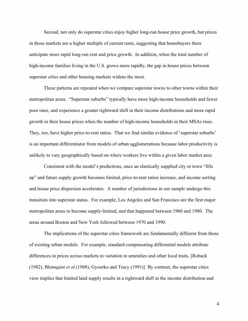
over time from area C to B to A. Comparing Figures 9 and 10, we observe such an evolution. In
1980, only San Francisco and Los Angeles clearly qualified as superstars, as can be seen in
17 We do not distinguish between low-demand areas on the basis of inelasticity of supply. As Glaeser and Gyourko (2005) note, the existence of durable housing makes most cities appear to be inelastically supplied when demand falls. Thus inelastic supply in a low-demand city does not necessarily reflect constraints on new development.

20
Figure 10 which plots the price growth-to-unit growth relationship over the 1960-1980 period.18
Between 1980 and 2000, twenty more MSAs filled up, becoming superstars.
6. Implications of superstar cities: income distributions and house prices
An important set of predictions of our framework is that a superstar city’s household
income should be skewed to the right of the U.S. income distribution, and should become more
skewed as the right tail of the national income distribution becomes thicker and as the MSA fills
up.
A. Income distributions across MSAs
To see if this pattern holds across all MSAs, we estimate the following regression for
MSA i in year t:
itt εδγγββ
ββ
++++++
+=
)Demand Low()Demand Low()superstar-Non()Superstar(
)superstar-Non()Superstar(Households of #
Bin Incomein #
it1i1it4it3
i2i1yit
yit
This regression relates the share of a MSA’s families that are in each income bin to its superstar
status, and controls for total demand. The model implies that superstar cities should have
relatively larger shares of rich or middle-rich families (highest and second-highest income bins,
respectively) and lower shares of those in the lowest income bins.19
The first column of the top panel of table 2 is based on a pooled cross section of 1,116
MSA × year observations.20 This regression treats superstar status as a (non-exclusive) fixed
MSA characteristic, including indicator variables for whether the MSA ever was a superstar over
the 1970-2000 period, whether it is ever in the non-superstar range, whether the MSA ever
18 Enid, OK, barely makes it into ‘superstar’ territory in this time period. This appears to be the result of an extraordinary, but temporary, oil industry-related shock, as this area is not a superstar later. 19 See Appendix Table 1 for summary statistics on all variables used in these regressions. 20 This represents 279 MSAs in each census year from 1970-on.

21
moved inside the low-demand area, and time dummies. The intermediate, high demand MSAs
from region B are the excluded category in all the metro area regressions.21
The difference in income distribution between superstars and all other MSAs is
pronounced. MSAs that ever were superstars have a 2.5 percentage point greater share of their
families that are in the rich category relative to the excluded high-demand cities (row 1, column
1). This effect is largest at the high end of the income distribution and declines in magnitude as
incomes fall. For example, as reported in square brackets in row 1, the high income share of
superstar MSAs is about 83 percent more than the 3 percent share rich for the average MSA that
is not a superstar. The share of the next-highest income category is 69 percent greater in
superstars relative to the average of other MSAs, and 34 percent higher in the middle category.
Markets that have ever been superstars also have a nearly 9 percentage point lower share of poor
families (row 1, column 5), almost 21 percent less than the other MSAs.
Non-superstar cities appear similar to the in-between group (row 2). Those coefficients
are relatively small and do not exhibit a clear pattern. Low-demand MSAs are less high-income
and poorer relative to all of the high demand categories of MSAs, although the magnitudes are
modest (row 3).
The superstar cities model suggests that superstar cities should become richer and less
poor when they transition into the superstar region. The second panel of Table 2 addresses this
hypothesis by adding time-varying superstar, non-superstar, and low demand indicator variables
to the previous specifications. Prior to becoming superstars, MSAs that eventually will become a
21 Our qualitative results and statistical significance in this table and those below are robust to changing the cutoffs between the regions, including continuous measures of the degree of superstardom, or removing from the superstar (or non-superstar) ranks any city that failed to qualify as such in at least two consecutive periods. For example, we have tried including the ratio of price growth to quantity growth, the sum of price and quantity growth, and the interaction of the two, as superstar fundamentals. We have also tried including price growth and quantity growth separately. These specifications lead to the same conclusions, though they are more difficult to describe concisely. The results are available from the authors.

22
superstar are richer on average, with a 1.3 percentage point greater share rich and a 7.1
percentage point lower share poor (row 1 of panel 2). When these areas are actually in the
superstar region, their share rich goes up by an additional 2.8 percentage points and their share
poor declines by a further 4.1 percentage points (row 4 of panel 2). Thus superstar cities, as a
baseline, have a 43 percent higher share rich, declining monotonically to 17 percent lower share
poor, than other MSAs. After their transition to superstar status, these MSAs have an additional
80 to 90 percent greater share of the top two income groups and an 8 to 10 percent lower share of
the bottom two income categories. As before, this pattern of results is robust to adding a host of
controls for potential unobservables, such as MSA fixed effects, differential time trends for
superstars vs. not, or separate year dummies for superstars/non-superstars/low-demand MSAs.
The data do not indicate nearly as much income skewing among non-superstars or low
demand MSAs relative to the omitted group. For example, when MSAs transition into being
non-superstars or low demand MSAs, they appear to lose a small share of rich relative to poor,
although not all of these coefficients are statistically different from zero at conventional levels.
B. Income distributions across places within MSAs
Next, we turn to analogous regressions for superstar places within MSAs. Examining
changes in house prices and income distributions at the census-designated place level has several
clear advantages over the MSA level. The most important is that by using sub-MSA variation,
we can control for MSA-level factors, such as agglomeration or other production externalities
that affect the common labor market. By including MSA × year fixed effects, we compare
places within an MSA in a given year. Another advantage is that places exhibit much more
variation in changes in the overall income distribution than do MSAs. On the downside, the
place-level data is noisier than the MSA data, and covers a shorter time period.

23
When we regress the share of households in an income category on the time-invariant
measure of place superstar status, using the full 1970 to 2000 sample and controlling for MSA ×
year effects, places that were ever a superstar have a higher fraction of their families in the richer
categories and a lower percentage in the poorer categories. The estimates are reported in the first
row of the first panel of Table 3. Superstar places have a 5.2 percentage point higher share rich
than do places in the same MSA and year that are in the in-between omitted category, an increase
of nearly 150 percent from the sample mean. These places have a 28 percent greater share in the
middle-rich category, and anywhere from a 3 to 11 percent lower share in the three poorest
categories. The non-superstar and low-demand places show the opposite pattern, except in the
poorest category, with generally a lower share of high-income, and a higher share of low-
income, families. Both of these patterns are statistically different from zero at conventional
levels.
In the second panel of Table 3, we add the time-varying superstar variables. Even when
they are not yet superstars, superstar places are relatively more high-income and relatively less
poor. In the years that a place is a superstar, it has an even larger share of its families in the
highest income category. For example, relative to the omitted in-between group, a place that will
eventually be a superstar has a 3.7 percentage point, or more than 80 percent, greater share in the
rich category. When that place is a superstar, the share in the rich category increases by 4.2
percentage points, or 85 percent of the mean. Once again, we observe the reverse pattern for the
non-superstar places. The patterns are somewhat less distinct because we are limited to the small
sample of 7,584 observations over 1990 to 2000, but one can see that the same general pattern
holds at both the MSA and place levels, and using the time-varying or time-invariant definitions

24
of superstar status. Finally, the bottom panel shows that we obtain similar cross-section results
whether we use the full sample or the smaller 1990-2000 places sample.
C. What happens to local house prices and the share rich when the aggregate number of rich rises?
Another implication of the superstar cities model is that when the number of rich families
in the country increases, land prices should rise fastest in superstar MSAs since the clearing price
goes up to equilibrate the limited supply of houses with the increased demand. Similarly, the
income distributions in the superstar cities should shift to the right more than in other cities when
there are more rich families at the national level—as long as some of the added rich families
have a preference for the inelastic markets. The superstar cities model also predicts analogous
patterns at the place level, with the number of rich families at the MSA level positively
correlated with the growth of prices and the rich share of the families in the superstar places.
First, we examine whether house values in superstar MSAs are linked to the number of
rich families at the national level. We regress a proxy for the entry price of a house – the 10th
percentile house value – on the time invariant city status variable (superstar, non superstar, and
low demand) interacted with the national number rich, plus year and MSA fixed effects, for the
1970-2000 sample period, with the results reported in Table 4. Note that the MSA fixed effects
subsume the non-interacted superstar indicator variables and the year dummies subsume the non-
interacted national number rich, so our estimates are identified from MSA × year variation.
The results in column 1 show that entry level houses in superstar cities are even more
expensive relative to other cities when the U.S. has more rich families. Indeed, when the
national number of rich families is 10 percent higher, the gap in the 10th percentile house value
between the MSAs that are ever superstars and the in-between MSAs is 1.1 percent greater.22
22 We find similar results using the average house value rather than the 10th percentile.

25
However, one should note that our true variation is limited since we observe only four changes in
the number of rich families for the metropolitan U.S. as a whole and are merely observing that
something is happening disproportionately to superstar MSAs at those times.
This is not the case at the place level, where each of the 279 “parent” MSAs has its own
pattern of growth in the number of rich families over four decades. Once again, the 10th
percentile house price for each place is regressed on the interaction of place superstar status and
the number of rich families in the MSA. We include place fixed effects, and MSA × year effects
to control for MSA-level dynamics. We use all four census years and the time-invariant
definition of superstar places.
The places results in column 2 of Table 4 show that the entry house price is 0.98 percent
higher in superstar places relative to the in-between places in the same MSA in the years when
an MSA’s number rich is 10 percent greater. The in-between places have 10th percentile prices
that are 1.81 percent higher relative to the non-superstar places when the MSAs’ number rich is
10 percent higher. We obtain very similar results when we restrict the sample to those places
that appear in our data in all four decades (column 3) and when we exclude places with fewer
than an average of 500 families (not shown).
In the right-hand panel of Table 4, we repeat the exercise with the share of the families in
the MSA (or place) that are in the “rich” category as our dependent variable. Again, the income
distribution in superstars shifts to the right the most when the number of rich families is the
largest. Column 4 shows that, at the MSA level, a 10 percent rise in the national number rich is
correlated with a 0.31 percentage point greater rise in the share rich for superstar cities relative to
in-between cities in the same year. At the place level, a 10 percent rise in a MSA’s number rich
is correlated with a 0.22 percentage point greater rise in the share rich for its superstar places

26
relative to its in-between places. Again, the place results are robust to including only those
places that are in our sample for 1970-2000 (column 6) or excluding places with fewer than an
average of 500 families.
D. Mobility and superstar cities
The superstar cities model suggests that rising incomes in a city are due to a changing
composition of families within superstar cities from an influx of highly productive high-income
workers, rather than through gains in existing residents’ productivity. Ideally, one could
distinguish between these alternatives by comparing workers’ wages before and after
exogenously moving to a superstar city. If the superstar city had a positive influence on wages
over and above what the worker earned prior to moving, that would provide evidence in support
of agglomeration benefits. But, if the type of worker who moved to the city was already high-
income so that his arrival changed the income distribution of the destination city, the pattern
would be more consistent with superstar cities. Unfortunately, in our data we do not observe
preexisting wages (or exogenous moves), so we compare the distributions of recent in-migrants
and out-migrants in superstar cities and non-superstars to identify whether the share of in-
migrants who are currently high-income is greater in superstar cities.
The top panel of Table 5 shows that the income distribution of recent movers into
superstar cities is shifted toward relatively more “rich” families. Each column corresponds to the
regression of the share of the MSA’s recent movers (in-migrants in the top panel, out-migrants in
the bottom panel) in a particular income bin on the MSA’s superstar/non-superstar status, a year
dummy, and an indicator for low demand status. The out-migrant regressions also include the
share of the MSA’s families in the income category as a control for the at-risk-of-moving
population. The sample contains 231 MSAs with migration data in 1980 and 1990. Relative to

27
recent in-migrants in the omitted intermediate B category or in non-superstars, superstar MSAs
have fewer low-income in-migrants and more middle-to-upper income ones. This difference in
income distribution is more than twice as thick as the average density of long-time residents on
the rich end and half as thick at the low-income end (see the numbers in square brackets). The
difference in the income distributions of in-migrants between superstar and non-superstar MSAs
is statistically significant in all but the “middle-poor” income category.
There is not such a strong pattern for out-migrants. Superstar MSAs typically do have a
lower fraction of rich out-migrants and a higher fraction of poor out-migrants. However, these
effects are statistically distinguishable from the in-between MSAs in only three of the five
columns and from the non-superstar MSAs in only one case at the 95 percent confidence level
(and two more cases at the 90 percent level).
However, the difference in the income distributions of in-migrants and out-migrants
varies considerably between superstar cities and non-superstars. In superstar MSAs, in-migrants
are more often rich and less often poor than out-migrants, while in non-superstars there is little
difference between in-migrants and out-migrants. This difference in net in-migration is
statistically significant in four out of five cases, as reported in the bottom row of the table. This
comparison is especially useful as it differences out MSA-level characteristics that affect the
income distribution of in-migrants and out-migrants equally.
7. Implications of superstar cities: higher price-to-rent ratios
Another implication of the superstar cities framework is that the price-to-rent ratio should
be higher in superstar cities. If home buyers correctly anticipate that superstar cities have higher
than average rent growth, they should be willing to pay a greater multiple of current rents to

28
obtain a house. This is analogous to the price/earnings ratio being higher for stocks with higher
expected growth in earnings.23
Table 6 reports results from regressing the log of the ratio of average house value to
average annual rent on our indicators for superstar status and year dummies. At the MSA level,
we find that metropolitan areas that became superstars at any time from 1970-2000 have higher
price/rent ratios, consistent with the implication that superstar cities should experience higher
expected rent growth. Relative to the intermediate B markets, the price/rent ratio is 22 percent
(with a standard error of 1.4 percent) higher for MSAs that ever were superstars (first row), and
13 percent (1.2) lower for low demand MSAs (third row). There is no statistically or
economically meaningful difference between price-to-rent ratios for non-superstar metros
(second row) and the omitted group.
To show that the higher price/rent ratios are not a spurious characteristic of MSAs that
happen to become superstars, in column two of Table 6 we add time-varying indicators for
whether an MSA is classified as a superstar, a non-superstar, or low demand in each census year.
The results confirm that MSAs’ price-to-rent ratios rise when they become superstars.
Specifically, MSAs that will become superstars have 10 percent higher price-to-rent ratios than
the excluded group before they are superstars, but their price-to-rent ratios rise by another 23
percent (row 4) during their actual superstar period(s). Non-superstars have similar price-to-rent
ratios to the in-between group of MSAs when they are not in the non-superstar category, but they
have a 12 percent lower price-to-rent ratio in those years when their supply is most elastic (row
5). Finally, low demand MSAs exhibit their lowest price-to-rent ratios when they are in a low
demand period (row 6). This pattern is robust to many specifications, including adding MSA
23 In previous research, Sinai and Souleles (2005) show that a higher price/rent ratio is associated with a higher expected growth rate of rents, measured as the average rent growth over the first nine of the prior 10 years, holding constant other important factors including differences in risk (volatility of rents) across metro areas.

29
fixed effects, different linear time trends for each type of MSA superstars, non-superstars, and
low demand, and different year dummies for each of the four categories of MSAs.
At the place level, we find a parallel result to the MSA-based analysis: the price-to-rent
ratio is higher in superstar suburbs. We begin by regressing the log price-to-rent ratio on
whether a place ever is considered a superstar, non-superstar, or low-demand, in column 3. We
include indicators for MSA × year to control for unobserved dynamics taking place at the
metropolitan area level, so in essence we are comparing price-to-rent ratios of superstar and non-
superstar places within the same MSA and same year. Because of the short time series at the
place level, we extrapolate superstar status in 1990 or 2000 back to 1970 and 1980. Relative to
the omitted, intermediate high demand category, price-to-rent ratios are 14 percent higher for
superstar (row 1) and 5 percent lower for non-superstar places (row 2). Price-to-rent ratios in
low demand places are nearly 16 percent lower than the high-demand, in-between places (row 3).
All of these results are highly statistically significant.
In column 4, we examine whether the places that transition in or out of superstar/non-
superstar status experience a change in their price-to-rent ratio. Because we use lagged data to
determine contemporaneous superstar status, we restrict the sample to the places for which we
have data over the 1970 to 2000 period and use only 1990 and 2000 in the regression. These
restrictions result in a drop from 30,539 to 7,584 observations. As with the MSAs, the census
year in which a city achieves superstar status is associated with an increase in the price-to-rent
ratio, although the coefficient is small and the standard error is relatively high. Including place
fixed effects, in results that we do not report here, reduces that standard error sufficiently that the
positive effect is statistically significant. Exiting non-superstar status raises the price-to-rent
ratio by 10.3 percent (with a 3.7 percent standard error).

30
These time-varying place results do not appear to be an artifact of the restricted sample.
As a consistency check, in column 5 we repeat the estimation strategy from column 3 using the
smaller sample. We find qualitatively similar, and still statistically significant, results.24
8. Distinguishing superstar cities from alternative explanations
Taken in concert, the empirical evidence above indicates that the superstar cities
phenomenon must be at least partially responsible for the skewness in growth rates in house
prices and income sorting that we observe. While alternative theories of urban growth and
agglomeration are consistent with some of the facts we have identified, none except for superstar
cities matches the entire set. Of course, we do not claim that other potential hypotheses are not
also valid; rather they cannot be the only explanations.
Unlike superstar cities, which contends that house price growth and changes in the
income distribution at the MSA or place level is merely due to exogenous changes in the income
distribution and sorting, typical urban theories postulate that there are locational differences in
underlying value, either as consumption or through production. In the urban compensating
differential literature discussed above, high-amenity locations should have permanently higher
land prices. However, this literature does not typically address house price growth and there is
no reason to believe that local amenities happen to improve the most when the number of high
income people rises. Moreover, it is difficult to imagine that underlying amenities have
24 Analogously, our MSA results are qualitatively unchanged if we rerun the regressions over the entire 1950-2000 time period using an indicator of supertar status that is extrapolated to the first two decades.

31
improved nearly enough to account for the dramatic increase in house price dispersion
experienced across U.S. markets.25
Another way to generate persistent differences in house price appreciation is for some
cities to have faster productivity growth. If a worker must live in a city to become more
productive and land supply there is limited, workers will bid up the price of land, firms will have
to pay higher wages, and land prices ultimately will capitalize the productivity-induced wage
premium. If the productivity in the location increases over time, so will the willingness-to-pay to
live there.
While we believe that differential agglomeration effects exist across urban areas, there
are two main reasons why they cannot be the sole explanation for the variation seen in the data.
First, the fact that we find similar patterns across places within a MSA strongly suggests that
superstar cities effects exist independently of agglomeration effects. The effect of productivity
growth on house prices should occur throughout the labor market area, even when agglomeration
benefits accrue in the workplace, since MSAs are constructed according to how families
commute to work. Income sorting and skewness in house price growth rates at the sub-MSA
level must be due to some reason other than productivity growth. Second, there is no reason why
the income benefits to productivity growth should accrue disproportionately to recent in-
migrants, as in Table 6.26
Some related strands of research, in combination with the superstar cities concept,
suggest that the broad theory articulated here may be a better fit of the data than the empirical
25 While changes in amenities cannot explain differential growth rates, amenities such as good weather or other people with similar preferences (Waldfogel 2003) may be characteristics that make some families prefer one city to another. That, plus growth in the right tail of the income distribution, is the mechanism for superstar cities. 26 Combining these alternatives, Shapiro (2005) reports results consistent with other changes occurring with respect to the local quality life that could help retain high human capital workers who well could be essential to the agglomerated firms, thereby reducing their mobility.

32
results indicate. For example, if production requires a mix of high and low-skill workers, low-
skill workers in superstar cities would earn a premium to enable them to afford living there. This
theory could partially explain why superstar cities have a lower apparent poor household share,
although superstar cities would still have to be the driving force as to why high-skill workers sort
there in the first place. Consistent with this possibility, Lee (2005) shows that nurses earn large
premiums to work in large cities, while doctors actually earn small discounts in the same cities.
Ortalo-Magne and Rady (2006) develop a theory that helps explain why we observe some poor
households remaining in the superstar cities. If a poor family owns its house, its wealth grows at
the same rate as land prices in a superstar city and thus it can always afford to live in the city,
even though its wage income alone would not support it.27
9. Conclusion
The dispersion in house price and income growth rates across locations and the skewness
in house prices, especially the strong growth in the right tail, can be explained in part by inelastic
land supply in some places combined with growth in the high-income population. The view that
some cities and towns have turned into scarce luxury goods, which we label superstar cities, is
supported by a number of consistent empirical facts. First, superstar cities and towns have
higher mean incomes and income distributions that are skewed to the right, consistent with high
land prices discouraging low-income households from living there. Income distributions at the
MSA (or place) level shift right the most when the absolute number of high-income families rise
at the national (or MSA) level. This pattern also kicks in more when a location fills up and
transitions into superstar status. Second, superstar cities trade at higher price-to-rent ratios and
27 Ortalo-Magne and Rady also note that their theory is consistent with in-migrants having higher incomes than existing residents.

33
that ratio expands further when those cities fill up. Third, superstar MSAs (towns) enjoy
disproportionately high house price growth when the number of high-income families increases
at the national (MSA) level. Lastly, recent movers into superstar MSAs are more likely to be rich
and less likely to be poor than recent movers into other cities.
In this framework, house prices do not rise in superstar cities because there is increasing
value from amenities or productivity benefits. Instead, the composition of families living in
superstar cities shifts to those who are willing to pay more as high-income families become more
numerous.
This analysis naturally raises a host of questions. Can the growth in the house price
premiums for living in superstar cities and towns persist? On the demand side, the increasing
house price gap for superstar cities is dependent on the thickness and length of the right tail of
the income distribution, so that any reduction in the absolute number of high-income families or
thinning of the right tail of the wage distribution will put downward pressure on this dispersion
across cities. According to Piketty and Saez (2004), since 1940 there has never been a sustained
drop in either the aggregate income or the average income earned by the top percentile of the
U.S. income distribution (although the share of income held by that percentile has fallen).
Further, U.S. cities may be ever-more dependent on the income distribution internationally, with
superstar residents drawn from the highest income families worldwide.
What about the supply of superstar cities? Our model is predicated upon cities being
imperfectly substitutable, so that each has a clientele of potential residents that prefer it to others.
However, as cities “enter” the market in response to population growth, they may locate close in
product space to existing cities, siphoning off some of a city’s clientele. The net effect will
depend on the rate of growth of close substitutes, the growth in the high-income population, and

34
the distribution of intensity of tastes. Second, most existing superstar cities could expand supply
by increasing density, but choose not to. The political economy behind that decision is only just
beginning to be studied. [Glaeser, Gyourko, and Saks (2005a), Ortalo-Magne and Prat (2006)]
In addition, this dynamic has profound implications for the evolution of urban areas
because it implies that even large metropolitan areas might evolve into communities that are
affordable only by the rich, just as exclusive resort areas have done. Is such an MSA sustainable,
or does it lose the vibrancy that makes it unique? Should public policy ensure that living in a
particular city is available to all families or, since superstar cities and towns are like luxury
goods, is it reasonable that low income workers can no longer afford to buy homes in superstar
cities?

35
Selected References
Autor, David, Lawrence Katz, and Melissa Kearney (2006). “The Polarization of the U.S. Labor Market”, American Economic Review, 96: 189-194.
Blomquist, Glenn, Mark Berger, and John Hoehn (1988). “New Estimates of the Quality of Life
in Urban Areas”, American Economic Review, 78(1): 89-107. Epple, Dennis and Glenn J. Platt. (1998). “Equilibrium and Local Redistribution in an Urban Economy when Households Differ in both Preferences and Incomes”, Journal of
Urban Economics, 43: 23-51. Glaeser, Edward and Joseph Gyourko (2003). “The Impact of Zoning on Housing
Affordability”, Economic Policy Review, 9(2): 21-39. Glaeser, Edward and Joseph Gyourko (2005). “Urban Decline and Durable Housing”, Journal of
Political Economy, 113(2): 345-375. Glaeser, Edward, Joseph Gyourko, and Raven Saks (2005a). “Why Have House Prices Gone
Up?, American Economic Review, 95(2): 329-333. Glaeser, Edward, Joseph Gyourko, and Raven Saks (2005b) “Why Is Manhattan So
Expensive? Regulation and the Rise in House Prices”, Journal of Law and Economics, 48(2): 331-370.
Glaeser, Edward, Hedi Kallal, Jose Scheinkman, and Andrei Shleifer (1992). “Growth in
Cities”, Journal of Political Economy, 100(6): 1126-1152. Glaeser, Edward, Jose Scheinkman, and Andrei Shleifer (1995). “Economic Growth in a
Cross-Section of Cities”, Journal of Monetary Economics, 36: 117-143. Gyourko, Joseph and Joseph Tracy (1991). “The Structure of Local Public Finance and
the Quality of Life”, Journal of Political Economy, 99(4): 774-806. Gyourko, Joseph and Albert Saiz (forthcoming). “Construction Costs and the Supply of Housing Structure”, Journal of Regional Science. Henderson, J. Vernon, A. Kuncoro, and M. Turner (1995). “Industrial Development in Cities”,
Journal of Political Economy, 106(4): 667-705. Lee, Sanghoon Conan (2005). “Ability Sorting and Consumer City,” University of British
Columbia working paper, October 28. Moretti, Enrico (2004a). “Estimating the External Return to Higher Education: Evidence
from Cross-Sectional and Longitudinal Data”, Journal of Econometrics, Vol. 121.

36
______ (2004b). “Human Capital Externalities in Cities” in J.V. Henderson and J- F. Thisse (eds.) Handbook of Urban and Regional Economics, Volume 4.
______ (2004c). “Workers’ Education, Spillovers, and Productivity: Evidence
from Plant-Level Production Functions”, American Economic Review, 94(3), 656-90.
Ortalo-Magne, Francois, and Andrea Prat (2006). “The Political Economy of Housing Supply”,
University of Wisconsin working paper, March 31. Ortalo-Magne, Francois and Sven Rady (2006). “Heterogeneity within Communities: A
Stochastic Model with Tenure Choice”, University of Wisconsin working paper, February.
Piketty, Thomas and Emmanuel Saez (2003). “Income Inequality in the United States, 1913-
1998”, Quarterly Journal of Economics 118(1), 1-39. __________ (2004). “Income Inequality in the United States, 1913-2002,” UC Berkeley
Working Paper. Rauch, Jonathan (1993). “Productivity Gains from Geographic Concentration of Human
Capital: Evidence from the Cities”, Journal of Urban Economics, 34: 380-400. Roback, Jennifer (1982). “Wages, Rents, and the Quality of Life”, Journal of Political
Economy, 90(2): 1257-78. Rosenthal, Stuart and William Strange (2001). “The Determinants of Agglomeration”,
Journal of Urban Economics, 50: 191-229. ______ (2003). “Geography, Industrial Organization, and
Agglomeration”, Review of Economics and Statistics, 85(2): 377-393. Saks, Raven (2005). “Job Creation and Housing Construction: Constraints on Metropolitan Area
Growth”, Finance and Economics Discussion Series 2005-49. Washington: Board of Governors of the Federal Reserve System.
Shapiro, Jesse (2005). “Smart Cities: Quality of Life, Productivity, and the Growth Effects of
Human Capital”, Review of Economics and Statistics, forthcoming. Sinai, Todd and Nicholas Souleles (2005). “Owner Occupied Housing as a Hedge
Against Rent Risk,” Quarterly Journal of Economics, May 2005.
Waldfogel, Joel (2003). “Preference Externalities: An Empirical Study of Who Benefits Whom in Differentiated Product Markets” RAND Journal of Economics.

37
Table 1: Real annualized house price growth, 1950-2000, Top and Bottom 10 MSAs with 1950 population>500,000
Top 10 MSAs by Price Growth Annualized growth rate, 1950-2000
Bottom 10 MSAs by Price Growth Annualized Growth Rate, 1950-2000
San Francisco 3.53 San Antonio 1.13
Oakland 2.82 Milwaukee 1.06
Seattle 2.74 Pittsburgh 1.02
San Diego 2.61 Dayton 0.99
Los Angeles 2.46 Albany (NY) 0.97
Portland (OR) 2.36 Cleveland 0.91
Boston 2.30 Rochester (NY) 0.89
Bergen-Passaic (NJ) 2.19 Youngstown-Warren 0.81
Charlotte 2.18 Syracuse 0.67
New Haven 2.12 Buffalo 0.54
Population-weighted average of the 50 MSAs in this sample: 1.70

38
Table 2: The income distribution in superstar MSAs
Left-hand-side variable: Share of MSA’s families in income bin: Rich Middle-rich Middle Middle-poor Poor
Cross-section: 0.025 0.022 0.042 -0.004 -0.086
(0.001) (0.001) (0.003) (0.004) (0.007) Superstari [Relative to mean share] [0.833] [0.688] [0.339] [-0.010] [-0.208]
0.005 0.003 0.002 -0.023 0.013 Non-superstari (0.001) (0.001) (0.002) (0.003) (0.006) -0.008 -0.007 -0.010 0.007 0.017 Low Demandi (0.001) (0.001) (0.003) (0.004) (0.007)
Adj. R2 0.442 0.621 0.377 0.178 0.214
Time-varying superstar/non-superstar status 0.013 0.011 0.035 0.013 -0.071
(0.002) (0.002) (0.004) (0.005) (0.009) Superstari [Relative to mean share] [0.433] [0.344] [0.282] [0.0325] [-0.171]
0.005 0.005 0.002 -0.022 0.010 Non-superstari (0.001) (0.001) (0.003) (0.004) (0.007) -0.006 -0.006 -0.009 0.000 0.021 Low Demandi (0.001) (0.001) (0.003) (0.004) (0.007) 0.028 0.027 0.017 -0.030 -0.041
(0.003) (0.002) (0.006) (0.008) (0.015) Superstarit [Relative to mean share] [0.903] [0.818] [0.135] [-0.075] [-0.100]
-0.003 -0.006 -0.004 0.010 0.003 Non-superstarit (0.002) (0.001) (0.004) (0.005) (0.009)
-0.003 -0.003 -0.003 0.015 -0.006 Low Demandit (0.001) (0.001) (0.003) (0.004) (0.007)
Adj. R2 0.504 0.669 0.383 0.207 0.219 Mean of LHS: Superstari=0 [Superstarit=0]
0.030 [0.031]
0.032 [0.033]
0.124 [0.126]
0.400 [0.402]
0.414 [0.409]
Notes: Number of observations is 1,116, for four decades (1970-2000) and 279 MSAs. Standard errors are in parentheses. All specifications include year dummies. Superstarit is equal to 1 when an MSA’s ratio of real annual price growth over the previous two decades to its annual housing unit growth over the same period exceeds 1.7 (the 90th percentile) and the sum of price and unit growth over that period exceeds the median. Superstari is equal to 1 for an MSA if superstarit is ever equal to 1. Non-superstarit is equal to 1 when the price growth/unit growth ratio is below 1/1.7, and non-superstari is an indicator whether non-superstarit is ever 1. To control for MSA-demand, the top panel includes an indicator variable for whether the MSA’s sum of annual price growth and unit growth over any 20-year period fell below the median in that period. The bottom panel includes that variable plus a time-varying variable for whether the sum of the growth rates over the preceding 20 years was below the median.

39
Table 3 - Panel 1: The income distribution in superstar places
Left-hand-side variable: Share of place’s families in income bin:
Rich Middle-rich Middle Middle-poor Poor
Cross-section: 0.052 0.011 -0.004 -0.044 -0.014
(0.002) (0.001) (0.001) (0.002) (0.003) Superstari [Relative to mean share] [1.486] [0.282] [-0.029] [-0.107] [-0.037]
-0.017 0.005 0.030 0.040 -0.057 Non-superstari (0.002) (0.001) (0.001) (0.002) (0.003) -0.032 -0.014 -0.020 0.009 0.056 Low Demandi (0.001) (0.001) (0.001) (0.001) (0.002)
Adj. R2 0.130 0.098 0.041 0.036 0.064 Mean of LHS: Superstari=0 0.035 0.039 0.136 0.412 0.377
Notes: Number of observations is 31,200 over four decades (1970-2000). This is not a rectangular panel. Standard errors are in parentheses. All specifications include MSA x year dummies. Superstari is equal to 1 if a place’s ratio of real annual price growth over the previous two decades to its annual housing unit growth over the same period ever exceeds 2.06 (the 75th percentile) and the sum of price and unit growth over that period exceeds the median. Non-superstari is equal to 1 if the price growth/unit growth ratio is ever below 1/2.06 and the sum of price and unit growth over that period exceeds the median. Low demandi is an indicator variable for whether the place’s sum of annual price growth and unit growth over any 20-year period fell below the median in that period.

40
Table 3 - Panel 2: The income distribution in superstar places, 1990-2000
Left-hand-side variable: Share of place’s families in income bin:
Rich Middle-rich Middle Middle-poor Poor
Time-varying superstar/non-superstar status 0.037 0.008 -0.001 -0.024 -0.020
(0.005) (0.002) (0.003) (0.004) (0.007) Superstari [Relative to mean share] [0.804] [0.140] [-0.006] [-0.062] [-0.057]
-0.033 -0.001 0.023 0.038 -0.026 Non-superstari (0.005) (0.002) (0.003) (0.004) (0.007) -0.055 -0.021 -0.016 0.039 0.052 Low Demandi (0.003) (0.002) (0.002) (0.003) (0.005) 0.042 -0.001 -0.022 -0.027 0.008
(0.005) (0.002) (0.004) (0.005) (0.008) Superstarit [Relative to mean share] [0.857] [-0.017] [-0.137] [-0.070] [0.023]
-0.014 -0.004 -0.001 0.009 0.010 Non-superstarit (0.006) (0.003) (0.004) (0.005) (0.008)
-0.012 -0.015 -0.029 -0.008 0.063 Low Demandit (0.003) (0.002) (0.002) (0.003) (0.005)
Adj. R2 0.242 0.240 0.116 0.124 0.188
Cross-section: 0.066 0.010 -0.012 -0.041 -0.023
(0.003) (0.001) (0.002) (0.003) (0.005) Superstari [Relative to mean share] [1.435] [0.175] [-0.075] [-0.106] [-0.066]
-0.042 -0.001 0.027 0.045 -0.028 Non-superstari (0.003) (0.001) (0.002) (0.003) (0.004) -0.065 -0.031 -0.034 0.035 0.096 Low Demandi (0.002) (0.001) (0.002) (0.002) (0.003)
Adj. R2 0.233 0.229 0.093 0.119 0.172 Mean of LHS: Superstari=0 [Superstarit=0]
0.046 [0.049]
0.057 [0.059]
0.160 [0.161]
0.386 [0.384]
0.351 [0.347]
Notes: Number of observations is 7,584 over two decades (1990-2000), 3,792 places per decade. Standard errors are in parentheses. All specifications include MSA x year dummies. Superstarit is equal to 1 when a place’s ratio of real annual price growth over the previous two decades to its annual housing unit growth over the same period exceeds 2.06 (the 75th percentile) and the sum of price and unit growth over that period exceeds the median. Superstari is equal to 1 for a place if superstarit is ever equal to 1. Non-superstarit is equal to 1 when the price growth/unit growth ratio is below 1/2.06, and non-superstari is an indicator whether non-superstarit is ever 1. Low demand it is an indicator variable for whether the MSA’s sum of annual price growth and unit growth over the prior 20-year period fell below the median in that period. Low demand i is equal to 1 if low demand it ever equals 1.

41
Table 4: How Changes in the Number of the Nation’s or MSA’s Rich Differentially Affect House Prices and the Fraction Rich in Superstar and Non-Superstar Cities or Places
Left-hand-side variable: Log of the 10th Percentile House Value Share of families that are in the “rich” category
Unit of observation MSA × year Place × year Place × year MSA × year Place × year Place × year
0.140 0.098 0.119 0.031 0.022 0.027 Superstari × log(Number Richkt) (0.044) (0.010) (0.011) (0.002) (0.001) (0.001)
-0.003 -0.181 -0.121 0.004 -0.009 -0.016 Non-Superstari × log(Number Richkt) (0.036) (0.009) (0.011) (0.001) (0.001) (0.001)
-0.176 -0.155 -0.123 -0.013 -0.025 -0.033 Low Demandi × log(Number Richkt) (0.040) (0.007) (0.008) (0.001) (0.001) (0.001)
Fixed effects: MSA, year Place, MSA × Year
Place, MSA × Year MSA, year Place,
MSA × Year Place,
MSA × Year
N 1,116 31,190 15,170 1,116 31,200 15,170 Rectangular sample? Yes No Yes Yes No Yes
Adj. R2 0.259 0.093 0.203 0.233 0.127 0.162 Notes: The sample period is 1970-2000. At the MSA level, it covers 279 MSAs over four decades. At the place level, the rectangular sample uses the 3,792 Census-designated Places for which we have data over the entire period. The larger sample also uses places that enter the data set post-1970. Standard errors are in parentheses. Superstari is equal to 1 for an MSA [place] if ever an MSA’s [place’s] ratio of real annual price growth over the previous two decades to its annual housing unit growth over the same period exceeds 1.7 [2.06] (the 90th percentile) and the sum of price and unit growth over that period exceeds the median. Non-superstari is equal to 1 if ever the price growth/unit growth ratio is below 1/1.7 [1/2.06] and the sum of price and unit growth over that period exceeds the median. To control for demand, low demandi is an indicator variable for whether the MSA’s [place’s] sum of annual price growth and unit growth over any 20-year period fell below the median in that period. Each of these variables is interacted with the either the national number of families in the “rich” category (in the MSA specifications) or the MSA number “rich” (in the place-level specifications). The uninteracted variables are subsumed by the fixed effects.

42
Table 5: The difference among superstar MSAs in the income distribution of movers Income Bins
Rich Middle-rich Middle Middle-
poor Poor
In-migrants:
(i) Superstarit [Relative to mean share in income category]
0.034 (0.013) [1.22]
0.048 (0.009) [1.45]
0.078 (0.020) [0.65]
0.002 (0.030) [0.005]
-0.162 (0.037) [-0.39]
(ii) Non-superstarit [Relative to mean share in income category]
-0.002 (0.008) [-0.07]
-0.006 (0.006) [-0.18]
-0.006 (0.012) [-0.05]
-0.009 (0.018) [-0.02]
0.023 (0.023) [0.06]
Adj. R2 0.0632 0.1112 0.1354 0.0587 0.0657 (A) With what confidence level is (i) – (ii) ≠ 0?
99% 99% 99% 27% 99%
Out-migrants:
(iii) Superstarit [Relative to mean share in income category]
-0.012 (0.017) [-0.42]
-0.029 (0.010) [-0.88]
-0.054 (0.023) [-0.45]
-0.019 (0.029) [-0.05]
0.056 (0.029) [0.14]
(iv) Non-superstarit [Relative to mean share in income category]
-0.010 (0.010) [-0.38]
-0.012 (0.006) [-0.35]
0.016 (0.014) [0.14]
0.012 (0.018) [0.03]
0.002 (0.017) [0.01]
Adj. R2 0.1358 0.3005 0.2699 0.1468 0.2226 (B) With what confidence level is (iii) – (iv) ≠ 0?
5% 90% 99% 70% 93%
With what confidence level is (A) – (B) ≠ 0?
91% 99% 99% 58% 99%
Notes: The left-hand-side variable is the share of the MSA’s number of in-migrants (or out-migrants) that are in the income category. The sample is restricted to 1980 and 1990 and the 231 MSAs per year for which we have migration data. Standard errors are in parentheses. All specifications include a year dummy and a control for low demand MSAs. Standard errors in parentheses. Superstarit is equal to 1 when an MSA’s ratio of real annual price growth over the previous two decades to its annual housing unit growth over the same period exceeds 1.7 (the 90th percentile) and the sum of price and unit growth over that period exceeds the median. Non-superstarit is equal to 1 when the price growth/unit growth ratio is below 1/1.7. To control for MSA-demand, the regressions include an indicator variable for whether the sum of the growth rates over the preceding 20 years was below the median. The out-migrant regressions also include the share of the MSA’s families in the income category as a control.

43
Table 6: Price-to-rent ratios and superstars
Left-hand-side variable: Log average house value/average rent
Unit of observation: MSA × year Place × year
Definition of superstar:
Fixed MSA characteristic
Time-varying
Fixed place characteristic
Time-varying
Fixed place characteristic
Superstari 0.219
(0.014) 0.100
(0.016) 0.135
(0.011) 0.159
(0.031) 0.212
(0.021)
-0.004 -0.012 -0.045 -0.121 -0.165 Non-superstari (0.011) (0.012) (0.010) (0.031) (0.021)
-0.131 -0.100 -0.155 -0.128 -0.241 Low Demandi (0.012) (0.013) (0.007) (0.022) (0.016)
0.227 0.048 Superstarit (0.025) (0.034)
-0.119 -0.103 Non-superstarit (0.015) (0.037)
-0.093 -0.163 Low Demandit (0.012) (0.022)
Fixed effects Year Year MSA × year MSA × year MSA × year
N 1,116 1,116 30,539 7,584 7,584
Sample period 1970-2000 1970-2000 1970-2000 1990-2000 1990-2000
Adj. R2 0.450 0.548 0.065 0.153 0.135 Notes: Standard errors are in parentheses. Superstarit is equal to 1 when an MSA’s [place’s] ratio of real annual price growth over the previous two decades to its annual housing unit growth over the same period exceeds 1.7 [2.06] (the 90th percentile) and the sum of price and unit growth over that period exceeds the median. Superstari is equal to 1 for an MSA if superstarit is ever equal to 1. Non-superstarit is equal to 1 when the price growth/unit growth ratio is below 1/1.7 [1/2.06], and non-superstari is an indicator whether non-superstarit is ever 1. Low demandi is an indicator variable for whether the sum of annual price growth and unit growth over any 20-year period fell below the median in that period. Low demandit is a time-varying variable for whether the sum of the growth rates over the preceding 20 years was below the median.

44
Appendix Table A1: MSA Summary Statistics Variable Mean Standard deviation
MSA time-invariant characteristics: Average Annual Real House Price Growth, 1950-2000 (N=279) 1.57 0.56
Average Annual Housing Unit Growth, 1950-2000 (N=279) 2.10 0.98
Average Annual Real Income Growth, 1950-2000 (N=279) 1.82 0.35
Ever a “superstar” 0.165 [46] 0.372 Ever a “non-superstar” 0.337 [94] 0.474 Ever “low demand” 0.821 [229] 0.384
MSA time-varying characteristics: Average 20-year Real House Price Growth 1.50 1.04 Average 20-year Housing Unit Growth 2.10 1.20 Average 20-year house price growth + housing unit growth 3.60 1.86
Average ratio of 20-year price growth to 20-year unit growth 0.936 0.642
Real house value 111,329 54,889 Average price/average annual rent 17.00 3.99 Year # “superstars” # “non-superstars”
1970 3 55 1980 3 34 1990 30 43 2000 21 36
Income Distribution Mean Standard deviation Share of an MSA’s population that is “rich” 0.033 0.021 Share “middle-rich” 0.035 0.024 Share “middle” 0.129 0.043 Share “middle-poor” 0.400 0.050 Share “poor” 0.402 0.095 National number “rich”
1970 1,571,136 1980 1,312,103 1990 2,611,178 2000 4,098,324

45
Appendix Table A2: Place Summary Statistics (Full sample: N=31,200)
Variable Mean Standard deviation Place time-invariant characteristics:
Average Real House Price Growth 0.013 0.015 Average Housing Unit Growth, 0.015 0.023 Average Real Income Growth 0.028 0.029 Ever a “superstar” 0.113 0.316 Ever a “non-superstar” 0.113 0.316 Ever “low demand” 0.556 0.497
Place time-varying characteristics: Average 20-year Real House Price Growth 0.013 0.016 Average 20-year Housing Unit Growth 0.016 0.023 Average 20-year house price growth + housing unit growth 0.029 0.030
Mean real house value 123,600 101,081 10th Percentile house value 68,758 64,139 Average price/average annual rent 16.21 7.45 Year # “superstars” # “non-superstars”
1990 387 272 2000 837 870
Income Distribution Mean Standard deviation Share of an place’s population that is “rich” 0.045 0.084 Share “middle-rich” 0.043 0.046 Share “middle” 0.141 0.079 Share “middle-poor” 0.405 0.101 Share “poor” 0.365 0.167 MSA number “rich”
1970 16,216 1980 10,072 1990 19,963 2000 30,499

46
Appendix Table A2: Place Summary Statistics (Rectangular sample: N=3,792 per decade)
Variable Mean Standard deviation Place time-invariant characteristics:
Avg. Real House Price Growth (1970-2000) 0.015 0.011 Avg. Housing Unit Growth (1970-2000) 0.017 0.019 Avg. Real Income Growth (1970-2000) 0.007 0.007 Ever a “superstar” 0.154 0.361 Ever a “non-superstar” 0.124 0.330 Ever “low demand” 0.618 0.486
Place time-varying characteristics: (1970-2000) Average 20-year Real House Price Growth 0.015 0.017 Average 20-year Housing Unit Growth 0.016 0.021 Average 20-year house price growth + housing unit growth 0.031 0.028
Mean real house value 156,634 125,393 10th Percentile house value 90,703 79,105 Average price/average annual rent 17.75 7.60 Year # “superstars” # “non-superstars”
1990 381 272 2000 446 327
Income Distribution (1970-2000) Mean Standard deviation Share of an place’s population that is “rich” 0.062 0.092 Share “middle-rich” 0.065 0.048 Share “middle” 0.166 0.070 Share “middle-poor” 0.375 0.082 Share “poor” 0.332 0.154 MSA number “rich”
1970 16,214 1980 13,358 1990 26,765 2000 39,549

47
Figure 1A: Density of 1950-2000 Annualized Real House Price Growth RatesAcross MSAs with 1950 population > 50,000
0.0%
1.0%
2.0%
3.0%
4.0%
5.0%
6.0%
7.0%
0.2% 0.5% 0.8% 1.1% 1.4% 1.7% 2.0% 2.3% 2.6% 2.9% 3.2% 3.5% 3.8%
House price growth rate
Den
sity
(per
cent
)
Figure 1B: Density of 1950-2000 Annualized Real Income Growth RatesAcross MSAs with 1950 population > 50,000
0.0%
1.0%
2.0%
3.0%
4.0%
5.0%
6.0%
0.8% 1.0% 1.2% 1.3% 1.5% 1.7% 1.9% 2.1% 2.3% 2.5% 2.7% 2.9% 3.1%
Income growth rate
Den
sity
(per
cent
)

48
Figure 2A Density of Mean House Values Across MSA's
1950 versus 2000
0.00E+00
5.00E-06
1.00E-05
1.50E-05
2.00E-05
2.50E-05
3.00E-05
3.50E-05
0 100000 200000 300000 400000 500000 600000
1950 Density
2000 Density
Figure 2BSkewness in Mean House Values Across MSA's
1950 versus 2000
0
0.5
1
1.5
2
2.5
0 0.5 1 1.5 2 2.5 3 3.5 4 4.5
1950 Density
2000 Density

49
Figure 3Wage Distribution in Red and Green Cities
0
200
400
600
800
1000
1200
1400
$0 $15,000 $30,000 $45,000 $60,000 $75,000 $90,000 $105,000 $120,000 $135,000 $150,00
Live in Red City
Live in Green City
30,000 workers
Note : 10 0 , 0 0 0 worke rs; trunc a te d norma l d istribu tion ; me a n= 4 0 , 0 0 0 ; std . = 4 0 , 0 0 0 , w L = $ 0 , w U = $ 15 0 , 0 0 0
Figure 4Wages and Rents in Red City, Alternate Populations
0
100
200
300
400
500
600
$0 $15,000 $30,000 $45,000 $60,000 $75,000 $90,000 $105,000 $120,000 $135,000 $150,00
Wage Distribution(N=100,000)
Note: truncated normal distribution; mean=40,000; std.=40,000, wL=$0, wU =$150,000
rent=$19,257
rent=$41,263
Wage Distribution(N=200,000)
Figure 5Wages and Rents in Red City, Fatter Tails
0
100
200
300
400
500
$0 $15,000 $30,000 $45,000 $60,000 $75,000 $90,000 $105,000 $120,000 $135,000 $150,00
Note: 100,000 workers; truncated normal distribution; mean=40,000; wL=$0, wU =$150,000
Wage Distribution(std.=$40,000)
rent=$19,257
rent=$23,994
Wage Distribution(std.=$80,000)

50
0
2040
6080
100
Per
cent
of F
amili
es in
Inco
me
Cat
egor
y ($
2000
)
1950 1960 1970 1980 1990 2000
All MSAs (pop1950>50,000)Income Distribution of Families
<36,384 36,384-72,769
72,769-109,153 109,153-145,538
>145,538
050
100
Num
ber o
f Fam
ilies
in In
com
e C
ateg
ory
($20
00)
mill
ions
1950 1960 1970 1980 1990 2000
All MSAs (pop1950>50,000)Number of Families by Income Category
<36,384 36,384-72,769
72,769-109,153 109,153-145,538
>145,538
Figure 6: The Evolution of the National Income Distribution
020
4060
8010
0P
erce
nt o
f Fam
ilies
in In
com
e C
ateg
ory
($20
00)
1950 1960 1970 1980 1990 2000
San Francisco: Income Distribution of Families
<36,384 36,384-72,769
72,769-109,153 109,153-145,538
>145,538
010
0000
2000
0030
0000
4000
00N
umbe
r of F
amili
es in
Inco
me
Cat
egor
y ($
2000
)
1950 1960 1970 1980 1990 2000
San Francisco: Number of Families by Income Category
<36,384 36,384-72,769
72,769-109,153 109,153-145,538
>145,538
Figure 7: San Francisco (big price growth)gains rich, loses poor

51
020
4060
8010
0P
erce
nt o
f Fam
ilies
in In
com
e C
ateg
ory
($20
00)
1950 1960 1970 1980 1990 2000
Las Vegas: Income Distribution of Families
<36,384 36,384-72,769
72,769-109,153 109,153-145,538
>145,538
010
0000
2000
0030
0000
4000
00N
umbe
r of F
amilie
s in
Inco
me
Cat
egor
y ($
2000
)
1950 1960 1970 1980 1990 2000
Las Vegas: Number of Families by Income Category
<36,384 36,384-72,769
72,769-109,153 109,153-145,538
>145,538
Figure 8: Las Vegas (big unit growth)gains rich and poor, shares stay constant
Figure 9: Real annual house price growth versus unit growth, 1980-2000
Steubenville-WeirtonWheelingDecatur
Duluth
Enid
JohnstownElmira
Waterloo-Cedar Falls
Peoria-Pekin
St. Joseph
Pine Bluff
Davenport
SharonTerre Haute
Grand Forks
Youngstown-WarrenPittsburgh
Altoona
Jamestown
Mansfield
Benton Harbor
CumberlandMuncie
Newark
Scranton
AlexandriaBuffalo
Kankakee
Sioux City
Utica-Rome
Jersey City
Beaumont
Lima
Bergen-Passic
Great Falls
ClevelandToledoErie
BinghamtonCharleston
Williamsport
HuntingtonWichita Falls
CantonGary
San Francisco
Saginaw
Vineland-Millville-Bridgeton
DetroitPittsfield
ParkersburgNew Orleans
Dayton
Flint
Dubuque
Jackson
Kokomo
Nassau-Suffolk County
Lawton
Syracuse
Springfield
Topeka
Los Angeles
Philadelphia
Gadsden
Shreveport-Bossier
Chicago
Rochester
New Haven
MonroeSpringfield
AkronSouth Bend
ProvidenceKalamazooAlbany
Evansville
St. LouisYakima
MilwaukeeJanesville
Trenton
Racine
Roanoke
LewistonDanvillePueblo
Champaign
Anniston
Boston
Hartford
Louisville
Owensboro
Lansing
Texarkana
Dutchess County
San Jose
Santa Cruz
Shermon-Denison
New London
Longview
Sheboygan
Harrisburg
Columbus
Fort Wayne
Cincinnati
Cedar Rapids
Santa Barbara-Santa Maria
Rockford
Allentown
Lake CharlesLubbock
Hagerstown
Eugene
Abilene
BangorEau Claire
Reading
Albany
Birmingham
Amarillo
Kenosha
Glens Falls
Omaha
Wausau
Chattanooga
Atlantic CitySpokane
Salinas
Florence
Billings
Tulsa
MiamiYuba
Oakland
Kansas City
Waco
Richland
Joplin
Des MoinesLa Crosse
Baltimore
Lafayette
HoumaCorpus ChristiWichita
Johnson City
Odessa
Bloomington
Florence
Oklahoma City
Rocky MountJacksonYork
Portland
Memphis
San Angelo
State CollegeOrange County
Jackson
ElkhartBiloxi
GalvestonVisalia-Tulare-Porterville
Hattiesburg
Indianapolis
Goldsboro
Fort Smith
Lynchburg
DothanMontgomeryMacon
Monmouth-OceanWilmington
Salem
Lincoln
Baton RougeLafayette
Merced
Grand Rapids
Ventura
Appleton
Ann Arbor
Little Rock
Columbus
Fargo
StocktonLancaster
Burlington
Decatur
ChicoTyler
Hamilton
Savannah
HickoryBloomington
Sumter
Asheville
Minneapolis-St. Paul
Houston
Newburgh
TuscaloosaMiddlesex-Somerset-Hunterdon
St. Cloud
Greeley
Fresno
MadisonRichmond-PetersburghNorfolkSan Diego
Sioux FallsGreen BayMobileMedfordKnoxville
Jonesboro
Portland
Fayetteville
Lexington-FayetteWashington
Greensboro-Winston-Salem
Modesto
Vallejo
Santa RosaGreenvilleTacomaDenverAugustaSalt Lake City
Bakersfield
Seattle
Tampa-St. Petersburgh
Charlottesville
Killeen
Springfield
El Paso
Albuquerque
Fort Lauderdale
Columbia
San Luis Obispo
Charleston
Sacramento
Bellingham
San Antonio
Clarksville
Nashville-DavidsonPensacola
Athens
Gainesville
Bremerton
Jacksonville
Sarasota
Dallas
Tallahassee
Reno
Provo-Orem
TucsonLakeland
Huntsville
Boise City
Charlotte
Fort Worth
Colorado Springs
Greenville
Riverside-San Bernardino
Brownsville
Daytona Beach
FayettevilleWest Palm Beach-Boca Raton
AtlantaRaleigh-Durham-Chapel Hill
Laredo
Wilmington
PhoenixOrlando
Austin
McAllen
Myrtle Beach
Las Vegas
-.02
0.0
2.0
4A
vera
ge A
nnua
l Rea
l Gro
wth
in H
ouse
Val
ue, 1
980-
2000
0 .02 .04 .06Average Annual Growth in Housing Units, 1980-2000
A B
D C
52
Figure 10: Real annual house price growth versus unit growth, 1960-1980
Jersey City
Wheeling
Terre Haute
Sioux City
Buffalo
Jamestown
St. Joseph
Utica-Rome
Duluth
Johnstown
Elmira
Pittsburgh
Altoona
PittsfieldSharon
Steubenville-Weirton
ScrantonNewarkCumberlandCharleston
South Bend
Bergen-Passic
Cleveland
Wichita Falls
SpringfieldBenton HarborBinghamton
Joplin
Youngstown-Warren
San Francisco
WichitaProvidence
Lewiston
WilliamsportAbilene
Detroit
Glens FallsMilwaukee
Albany
ReadingWaco
DecaturSt. LouisErieLimaPhiladelphiaPine Bluff
Yakima
Mansfield
GadsdenChicagoBostonToledo
Sheboygan
AkronCincinnati
Los Angeles
Evansville
Great FallsVineland-Millville-Bridgeton
Portland
BangorWaterloo-Cedar Falls
MuncieGary
Syracuse
Jackson
Huntington
Beaumont
Corpus Christi
Enid
Savannah
Kalamazoo
DanvilleCanton
New Haven
Texarkana
AllentownPeoria-PekinLake CharlesKansas CityTopekaDes MoinesTrenton
Shreveport-BossierKenosha
Rochester
SpokanePueblo
Rockford
DavenportRacine
Birmingham
Odessa
Dayton
DubuqueParkersburg
Atlantic City
SaginawFlint
Kokomo
NewburghKankakeeFort Wayne
La CrosseSpringfieldNew LondonHartford
Janesville
Hagerstown
Columbus
Harrisburg
Grand Rapids
Nassau-Suffolk County
Indianapolis
Baltimore
Cedar RapidsAlexandria
Owensboro
AmarilloLouisville
San Angelo
Rocky MountGrand ForksLafayette
Omaha
SumterJacksonLincolnYorkEau Claire
Shermon-Denison
MobileAnniston
Wausau
Appleton
LancasterChattanooga
Elkhart
AshevilleMemphis
JonesboroBrownsville
Wilmington
FlorenceRoanoke
Longview
HamiltonMontgomery
Dutchess County
Macon
Bakersfield
Sioux FallsGoldsboro
Visalia-Tulare-Porterville
Minneapolis-St. Paul
Oakland
Columbus
Laredo
New OrleansLawton
Galveston
Champaign
Johnson City
Lubbock
Middlesex-Somerset-HunterdonBloomington
Lansing
Fresno
Knoxville
BillingsMonroeLynchburgFargoClarksvilleHattiesburg
Tulsa
Stockton
LafayetteSeattle
GreenvilleGreensboro-Winston-SalemTuscaloosaAlbany
SpringfieldSt. CloudRichmond-Petersburgh
Burlington
El Paso
Fort Smith
Florence
Portland
Augusta
Charlotte
Jacksonville
DecaturGreen Bay
Merced
Bellingham
Oklahoma CityNashville-Davidson
San Antonio
Tacoma
Norfolk
Tyler
Greenville
Yuba
PensacolaAnn ArborState College
Salinas
Little Rock
Bremerton
DothanJacksonLexington-Fayette
HoumaMcAllen
Madison
Salt Lake CityHickory
Fort Worth
Miami
Greeley
Monmouth-Ocean
CharlestonChico
Salem
BiloxiCharlottesville
Vallejo
Santa Cruz
Modesto
Raleigh-Durham-Chapel HillBoise City
Huntsville
MedfordSanta Barbara-Santa Maria
Bloomington
WashingtonDenver
Baton Rouge
Dallas
Santa Rosa
WilmingtonSacramento
Lakeland
Columbia
San Diego
Richland
AthensAtlanta
Eugene
Killeen
Riverside-San Bernardino
Albuquerque
Provo-Orem
Fayetteville
Fayetteville
Myrtle Beach
San Luis ObispoSan Jose
TallahasseeTampa-St. PetersburghOrlandoDaytona Beach
Colorado Springs
AustinHouston
Tucson
Gainesville
Phoenix
Reno
Ventura
Sarasota
Orange County
West Palm Beach-Boca RatonFort LauderdaleLas Vegas
0.0
1.0
2.0
3.0
4.0
5A
vera
ge A
nnua
l Rea
l Gro
wth
in H
ouse
Val
ue, 1
980-
1980
0 .02 .04 .06 .08Average Annual Growth in Housing Units, 1980-1980
A B
C
D