Embed Size (px)
Citation preview
NBER WORKING PAPER SERIES
SUPPLY-CHAIN TRADE:A PORTRAIT OF GLOBAL PATTERNS AND SEVERAL TESTABLE HYPOTHESES
Richard BaldwinJavier Lopez-Gonzalez
Working Paper 18957http://www.nber.org/papers/w18957
NATIONAL BUREAU OF ECONOMIC RESEARCH1050 Massachusetts Avenue
Cambridge, MA 02138April 2013
We wish to thank Marcel Timmer, Sebastien Miroudot, Rob Johnson, Peter Schott, and Andy Bernardfor excellent comments and suggestions, and Yuan Zi for excellent research assistance. We thank theparticipants in conferences at the WTO (September 2012), Oxford (October 2012), and HitotsubashiUniversity (December 2012). The views expressed herein are those of the authors and do not necessarilyreflect the views of the National Bureau of Economic Research.
NBER working papers are circulated for discussion and comment purposes. They have not been peer-reviewed or been subject to the review by the NBER Board of Directors that accompanies officialNBER publications.
© 2013 by Richard Baldwin and Javier Lopez-Gonzalez. All rights reserved. Short sections of text,not to exceed two paragraphs, may be quoted without explicit permission provided that full credit,including © notice, is given to the source.
Supply-Chain Trade: A Portrait of Global Patterns and Several Testable HypothesesRichard Baldwin and Javier Lopez-GonzalezNBER Working Paper No. 18957April 2013JEL No. F1,F2,F21
ABSTRACT
The trade linked to international production networks – supply-chain trade for short – is associatedwith momentous global economic changes. This paper presents a portrait of the global pattern of supply-chaintrade and how it has evolved since 1995. The paper draws on a variety of data sources but most heavilyon the recent World Input-Output Database. China’s supply-chain trade receives special attention.
Richard BaldwinCigale 21010 LausanneSWITZERLANDand CEPRand also [email protected]
Javier Lopez-GonzalezUniversity of Sussex Sussex HouseBrighton, BN1 9RHUnited [email protected]
2
1. INTRODUCTION
Internationalisation of production has given rise to complex cross-border flows of goods, know-how, investment, services and people – call it ‘supply-chain trade’ for short.2 Supply chain trade is transformative according to policymakers (Lamy 2010). Among economists, however, it is typically viewed as trade in goods that happens to be concentrated in parts and components (Grossman and Rossi-Hansberg 2008).
This paper argues that the facts are on the side of the policymakers. Flourishing supply-chain trade has revolutionised global economic relations and the revolution is still in full swing. We start with its timing.
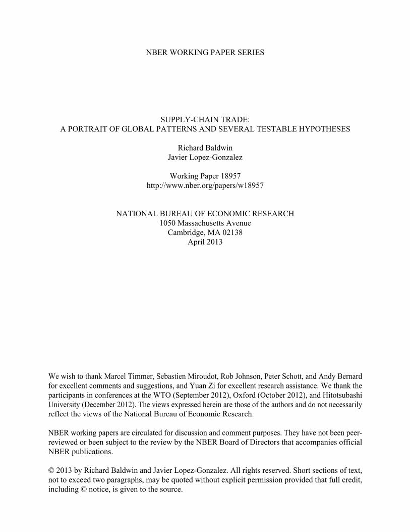
1.1. Timing the revolution Supply-chain trade has been important among rich nations for decades. The US and Canada, for instance, signed the 1965 Auto Pact to underpin supply chain trade. But North-North production networks were not revolutionary. The revolution started when supply chain trade gained importance between high-tech and low-wage nations between 1985 and 1995. Figure 1 illustrates the timing with two proxies for supply-chain trade – a ‘vertical specialisation’ index and partner-wise intra-industry trade indices.3 These changes have been widely noted.4
Figure 1: Indirect measures of supply-chain trade from 1960s. Source and notes: left: shows Amador and Cabral (2009) proxy for supply-chain trade as share of global manufacturing imports; right: shows Brülhart (2009) bilateral IIT index.
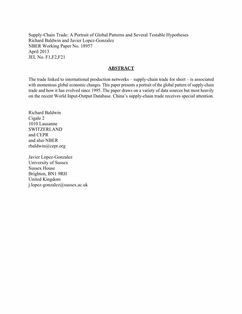
The momentous changes are even easier to spot. Up to the end of the 1980s, globalisation was associated with rising G7 shares of world trade and income. Afterwards, globalisation
2 It is often also referred to as Global Value Chain (GVC) trade 3 The Amador and Cabral (2009) index uses detailed trade data to find situations where a nation has a high export share and a high import share of a related intermediate goods (identified with a detailed IO table) relative to the world. This combination of IO information and trade data allows a longer data coverage with more nations than related measures by of Hummels et al. (2001). 4 The mid1980s structural break has been shown by many (Dallas Fed 2002, Feenstra and Hanson 1996, Ando and Kimura 2005, and Fukao, Ishito, and Ito 2003) and the trade changes by many others (Hummels, Ishii, and Yi 2001, Yi 2003, Bems, Johnson, and Yi 2010, Koopman, Powers, Wang, and Wei 2011, and Johnson and Noguera 2012a,b).
Eur & NorAm
Asia
1990
Latin America
Africa0%
1%
2%
3%
4%
5%
1967
1971
1975
1979
1983
1987
1991
1995
1999
2003
2007
Source: Amador and Cabral (2009)
US-EU25
1986
Intra-Asean
Japan-Asean
US-China
0%
10%
20%
30%
40%
50%
60%19
6219
6719
7219
7719
8219
8719
9219
9720
0220
0720
12
Index of intra-industry trade
3
worked very differently (Figure 2).
When North-South production sharing took off, G7 world shares of income and exports plummeted.
By 2010, the G7 world income share was back to its 1900 level. It took only one decade to return the G7’s world trade share to its 1948 level and by 2010 it was half the post-war figure. Plainly, globalisation is working differently since North-South production sharing blossomed.
Figure 2: G7 share of world income, trade and manufacturing. Sources: WTO, World Bank and Maddison, UNstats.
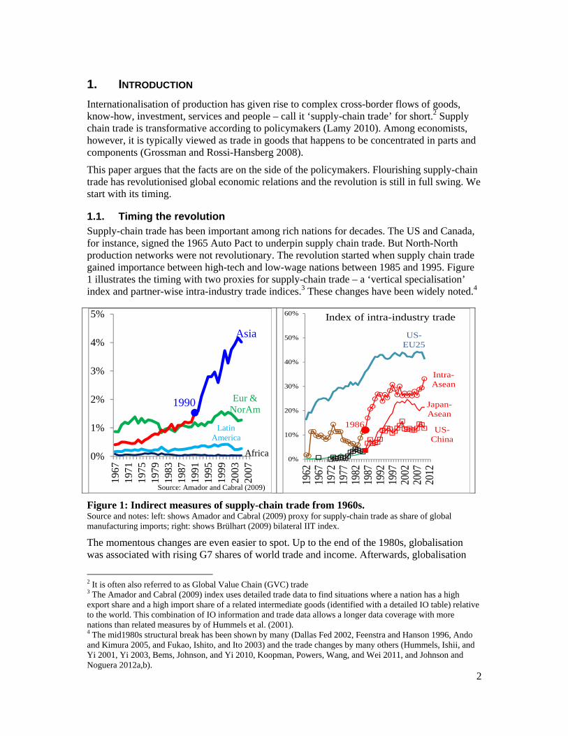
At about the same time, the politics of trade liberalisation flipped.
Developing nations that had eschewed trade liberalisation for decades, suddenly embraced openness that facilitated international production sharing.
As Figure 3 shows, they slashed tariffs unilaterally (especially on intermediates), signed Bilateral Investment Treaties (BITs, which are mostly unilateral concessions to rich-nation firms seeking to invest), and signed Regional Trade Agreements (RTAs) with ‘deep’ provisions that are pro-supply-chain (e.g. assurances for intellectual property, capital movements, competition policy, etc.).
Figure 3: Take-off in BITs, FDI, unilateralism, and deep RTAs. Sources: Tariffs from World databank, deep RTA provisions from WTO, BITs from ICSID.
1991, 52%
20%
30%
40%
50%
60%
1948
1953
1958
1963
1968
1973
1978
1983
1988
1993
1998
2003
2008
Source: WTO database
G7 world export share 1989, 67%
20%
30%
40%
50%
60%
70%
1820
1830
1840
1850
1860
1870
1880
1890
1900
1910
1920
1930
1940
1950
1960
1970
1980
1990
2000
2010
Source: World Databank from 1960; Maddison pre-1960
G7 world GDP share
South Asia
Sub-Sahara
n Africa
Middle East & North Africa
East Asia & Pacific
0
5
10
15
20
25
30
35
40
45
50
1988
1990
1992
1994
1996
1998
2000
2002
2004
2006
2008
Applied tariffs, simple mean, all goods (%)
New BITs
signed
1988
FDI
0
500
1000
1500
2000
2500
0
50
100
150
200
250
1959
1964
1969
1974
1979
1984
1989
1994
1999
2004
1986
0
5
10
15
20
25
30
35
40
45
1958
1962
1966
1970
1974
1978
1982
1986
1990
1994
1998
2002
2006
2010
Number of deep provisions in new RTAs
4
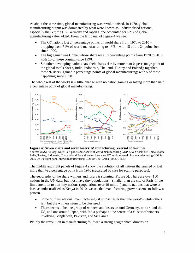
At about the same time, global manufacturing was revolutionised. In 1970, global manufacturing output was dominated by what were known as ‘industrialised nations’, especially the G7; the US, Germany and Japan alone accounted for 52% of global manufacturing value added. From the left panel of Figure 4 we see:
The G7 nations lost 24 percentage points of world share from 1970 to 2010 – dropping from 71% of world manufacturing to 46% – with 18 of the 24 points lost since 1990.
The big gainer was China, whose share rose 18 percentage points from 1970 to 2010 with 16 of these coming since 1990.
Six other developing nations saw their shares rise by more than ½ percentage point of the global total (Korea, India, Indonesia, Thailand, Turkey and Poland); together, these ‘6 risers’ gained 7 percentage points of global manufacturing; with 5 of these happening since 1990.
The whole rest of the world saw little change with no nation gaining or losing more than half a percentage point of global manufacturing.
Figure 4: Seven risers and seven losers: Manufacturing reversal of fortunes. Source: UNSTAT.org; Note: Left panel show share of world manufacturing GDP, seven risers are China, Korea, India, Turkey, Indonesia, Thailand and Poland; seven losers are G7; middle panel plots manufacturing GDP in 2005 USDs; right panel shows manufacturing GDP of G&+China (2005 USDs).
The middle and right panels of Figure 4 show the evolution of all nations that gained or lost more than ½ a percentage point from 1970 (separated by size for scaling purposes).
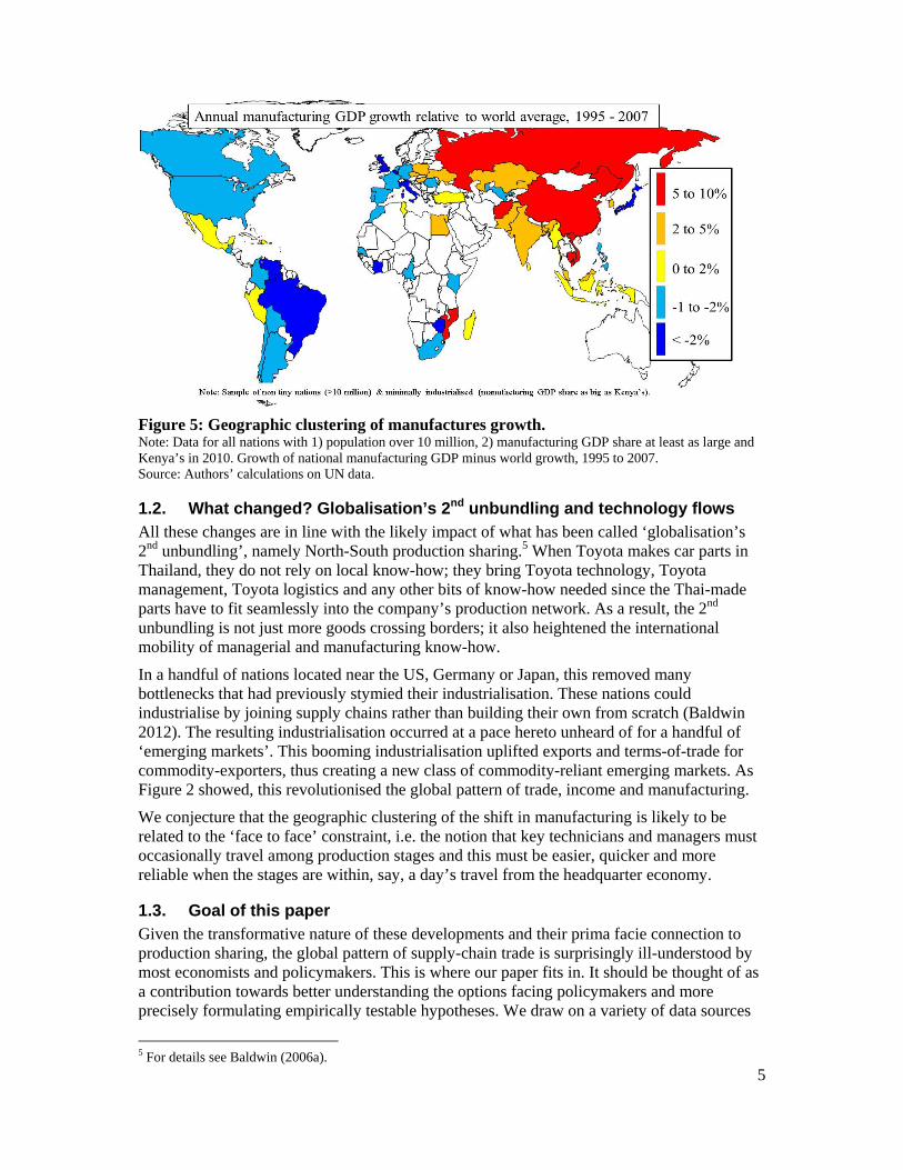
The geography of the share winners and losers is stunning (Figure 5). There are over 150 nations in the UN data, but most have tiny populations – smaller than the city of Paris. If we limit attention to non-tiny nations (populations over 10 million) and to nations that were at least as industrialised as Kenya in 2010, we see that manufacturing growth seems to follow a pattern.
Some of these nations’ manufacturing GDP rose faster than the world’s while others fell, but the winners seem to be clustered.
There seems to be one group of winners and losers around Germany, one around the US, and one around Japan; with India perhaps at the centre of a cluster of winners involving Bangladesh, Pakistan, and Sri Lanka.
Plainly the revolution in manufacturing followed a strong geographical dimension.
India
Spain
Canada
Turkey
Indonesia
NL
Australia
Poland
Thailand
CH
0%
1%
1%
2%
2%
3%
3%
1970
1975
1980
1985
1990
1995
2000
2005
2010
Wor
ld m
anuf
actu
ring
sha
re
Source: unstats.un.org
US
China
Japan
Germany
Korea
Italy
UK
France
0%
5%
10%
15%
20%
25%
30%
1970
1975
1980
1985
1990
1995
2000
2005
2010
Wor
ld m
anuf
actu
ring
sha
re
Source: unstats.un.org
1990, 65%
G7, 47%
3%
China, 19%
5%
6 Risers, 9%
RoW
0%
10%
20%
30%
40%
50%
60%
70%
80%
1970
1975
1980
1985
1990
1995
2000
2005
2010
Wor
ld m
anuf
actu
ring
sha
re
Source: unstats.un.org; 6 risers = Korea, India, Indonesia, Thailand, Turkey, Poland
5
Figure 5: Geographic clustering of manufactures growth. Note: Data for all nations with 1) population over 10 million, 2) manufacturing GDP share at least as large and Kenya’s in 2010. Growth of national manufacturing GDP minus world growth, 1995 to 2007. Source: Authors’ calculations on UN data.
1.2. What changed? Globalisation’s 2nd unbundling and technology flows All these changes are in line with the likely impact of what has been called ‘globalisation’s 2nd unbundling’, namely North-South production sharing.5 When Toyota makes car parts in Thailand, they do not rely on local know-how; they bring Toyota technology, Toyota management, Toyota logistics and any other bits of know-how needed since the Thai-made parts have to fit seamlessly into the company’s production network. As a result, the 2nd unbundling is not just more goods crossing borders; it also heightened the international mobility of managerial and manufacturing know-how.
In a handful of nations located near the US, Germany or Japan, this removed many bottlenecks that had previously stymied their industrialisation. These nations could industrialise by joining supply chains rather than building their own from scratch (Baldwin 2012). The resulting industrialisation occurred at a pace hereto unheard of for a handful of ‘emerging markets’. This booming industrialisation uplifted exports and terms-of-trade for commodity-exporters, thus creating a new class of commodity-reliant emerging markets. As Figure 2 showed, this revolutionised the global pattern of trade, income and manufacturing.
We conjecture that the geographic clustering of the shift in manufacturing is likely to be related to the ‘face to face’ constraint, i.e. the notion that key technicians and managers must occasionally travel among production stages and this must be easier, quicker and more reliable when the stages are within, say, a day’s travel from the headquarter economy.
1.3. Goal of this paper Given the transformative nature of these developments and their prima facie connection to production sharing, the global pattern of supply-chain trade is surprisingly ill-understood by most economists and policymakers. This is where our paper fits in. It should be thought of as a contribution towards better understanding the options facing policymakers and more precisely formulating empirically testable hypotheses. We draw on a variety of data sources
5 For details see Baldwin (2006a).
6
but most heavily on internationally linked input-output tables and indicators of the types discussed in the seminal work by Hummels Ishii and Yi (2001) which motivated the recent literature on ‘value added’ trade notably Johnson and Noguera (2012a,b), Koopman et al. (2011), Timmer et al (2011), and Daudin, Rifflart and Schweisguth (2011).
The first section after the introduction presents basic concepts and conditioning facts. The subsequent section, Section 3, looks at the global pattern of the broadest definition of supply-chain trade, namely imports of intermediates. Section 4 shows the global pattern of a narrower definition - imports used to export. Section 5 covers an even narrower form of supply-chain trade – reimporting and reexporting, while Section 6 looks at a very new dataset that shows ‘value added’ trade. The final section provides a summary and lists a number of testable hypotheses.
2. BASIC CONCEPTS AND CONDITIONING FACTS
The importance of trade in intermediates has long been recognized in empirical work (e.g. and Grubel and Lloyd 1975) and theoretical work (Batra and Casas 1973, Woodland 1977). Its importance has been ‘re-discovered’ every decade since – each time providing a fresh set of terminology: in the 1980s (Ethier 1982, Dixit and Grossman 1982, Sanyal and Jones 1982, Helpman 1984, Deardorff 1989a, b); in the 1990s (Jones and Kierzkowski 1990, Francois 1990, Yi 1998, Venables 1999); in the 2000s (Hummels, Ishii and Yi, 2001, Kohler 2004, Markusen 2006, Grossman and Rossi-Hansberg 2008, Antràs et al. 2006), and in the 2010s (Johnson and Noguera 2012, Koopmans, Wei and Zhang 2011). To fix ideas, this section introduces basic concepts and key conditioning facts.
As supply-chain trade concerns goods that will be inputs into production processes in other nations, the missing information on the final-or-intermediate usage is the central problem to be solved when it comes to data. It is also why the facts on the global pattern of supply chain are not widely appreciated – you cannot just download the data. There are three ways to solve the central problem.
Before 2011, many authors addressed the ‘usage’ problem by turning to the customs classifications (Yeats 1998, Kimura and Ando 2004, Athukorala and Yamashita 2006, Athukorala, Yamashita and Nobuaki, 2006). For example, many HS codes include descriptors like ‘parts’ or ‘components’. However this is not fully satisfactory. Some parts – say spare tires for autos – can be intermediates (inputs into new cars) or final goods (replacement parts for old cars), and many intermediates cannot be clearly identified from the HS labels.6
A second approach is to turn to input-output tables that keep track of usage explicitly – although this tactic always comes at the cost of less disaggregation in product categories. This method has recently been adopted by many authors (Hummels, Ishii, and Yi 2001, Yi 2003, Bems, Johnson, and Yi 2010, Koopman, Powers, Wang, and Wei 2011, Johnson and Noguera 2012a,b). For some nations, we have a third solution since there is data from special customs regimes for ‘processing trade’. This is where tariffs on imported intermediates are suspended if all the intermediates are used to make goods that are subsequently exported. In such cases, customs keeps track of which imports are used as intermediates (Koopman, Wang, and Wei 2008).
6 This is especially a problem in electronics as the 1997 Information Technology Agreement’s elimination of tariffs on 90% of world trade removed custom authorities’ incentive to be precise about the nature of such imports.
7
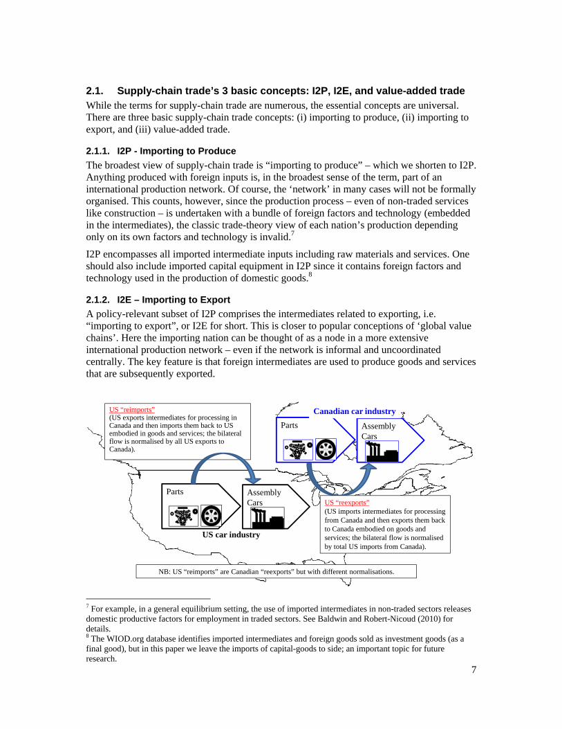
2.1. Supply-chain trade’s 3 basic concepts: I2P, I2E, and value-added trade While the terms for supply-chain trade are numerous, the essential concepts are universal. There are three basic supply-chain trade concepts: (i) importing to produce, (ii) importing to export, and (iii) value-added trade.
2.1.1. I2P - Importing to Produce
The broadest view of supply-chain trade is “importing to produce” – which we shorten to I2P. Anything produced with foreign inputs is, in the broadest sense of the term, part of an international production network. Of course, the ‘network’ in many cases will not be formally organised. This counts, however, since the production process – even of non-traded services like construction – is undertaken with a bundle of foreign factors and technology (embedded in the intermediates), the classic trade-theory view of each nation’s production depending only on its own factors and technology is invalid.7
I2P encompasses all imported intermediate inputs including raw materials and services. One should also include imported capital equipment in I2P since it contains foreign factors and technology used in the production of domestic goods.8
2.1.2. I2E – Importing to Export
A policy-relevant subset of I2P comprises the intermediates related to exporting, i.e. “importing to export”, or I2E for short. This is closer to popular conceptions of ‘global value chains’. Here the importing nation can be thought of as a node in a more extensive international production network – even if the network is informal and uncoordinated centrally. The key feature is that foreign intermediates are used to produce goods and services that are subsequently exported.
7 For example, in a general equilibrium setting, the use of imported intermediates in non-traded sectors releases domestic productive factors for employment in traded sectors. See Baldwin and Robert-Nicoud (2010) for details. 8 The WIOD.org database identifies imported intermediates and foreign goods sold as investment goods (as a final good), but in this paper we leave the imports of capital-goods to side; an important topic for future research.
Parts AssemblyCars
US “reimports”(US exports intermediates for processing in Canada and then imports them back to US embodied in goods and services; the bilateral flow is normalised by all US exports to Canada).
Parts AssemblyCars
US “reexports” (US imports intermediates for processing from Canada and then exports them back to Canada embodied on goods and services; the bilateral flow is normalised by total US imports from Canada).
US car industry
Canadian car industry
NB: US “reimports” are Canadian “reexports” but with different normalisations.
8
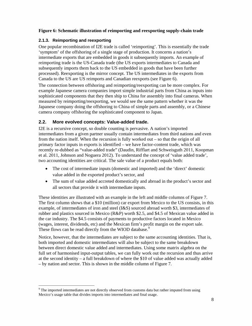
Figure 6: Schematic illustration of reimporting and reexporting supply-chain trade
2.1.3. Reimporting and reexporting
One popular recombination of I2E trade is called ‘reimporting’. This is essentially the trade ‘symptom’ of the offshoring of a single stage of production. It concerns a nation’s intermediate exports that are embedded in goods it subsequently imports. An example of reimporting trade is the US-Canada trade (the US exports intermediates to Canada and subsequently imports them back to the US embedded in goods that have been further processed). Reexporting is the mirror concept. The US intermediates in the exports from Canada to the US are US reimports and Canadian reexports (see Figure 6).
The connection between offshoring and reimporting/reexporting can be more complex. For example Japanese camera companies import simple industrial parts from China as inputs into sophisticated components that they then ship to China for assembly into final cameras. When measured by reimporting/reexporting, we would see the same pattern whether it was the Japanese company doing the offshoring to China of simple parts and assembly, or a Chinese camera company offshoring the sophisticated component to Japan.
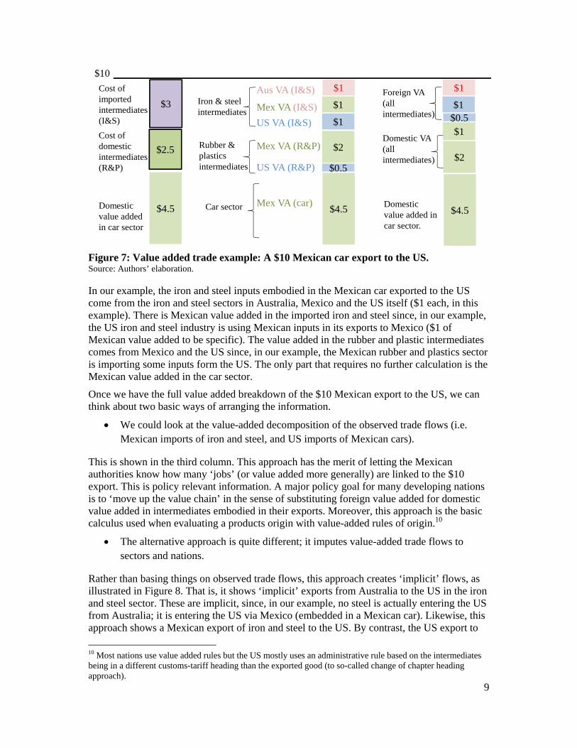
2.2. More evolved concepts: Value-added trade. I2E is a recursive concept, so double counting is pervasive. A nation’s imported intermediates from a given partner usually contain intermediates from third nations and even from the nation itself. When the recursion is fully worked out – so that the origin of all primary factor inputs in exports is identified – we have factor-content trade, which was recently re-dubbed as “value-added trade” (Daudin, Rifflart and Schweisguth 2011, Koopman et al. 2011, Johnson and Noguera 2012). To understand the concept of ‘value added trade’, two accounting identities are critical. The sale value of a product equals both:
The cost of intermediate inputs (domestic and imported) and the ‘direct’ domestic value added in the exported product’s sector, and
The sum of value added accreted domestically and abroad in the product’s sector and all sectors that provide it with intermediate inputs.
These identities are illustrated with an example in the left and middle columns of Figure 7. The first column shows that a $10 (million) car export from Mexico to the US consists, in this example, of intermediates of iron and steel (I&S) sourced abroad worth $3, intermediates of rubber and plastics sourced in Mexico (R&P) worth $2.5, and $4.5 of Mexican value added in the car industry. The $4.5 consists of payments to productive factors located in Mexico (wages, interest, dividends, etc) and the Mexican firm’s profit margin on the export sale. These flows can be read directly from the WIOD database.9
Notice, however, that the intermediates are subject to the same accounting identities. That is, both imported and domestic intermediates will also be subject to the same breakdown between direct domestic value added and intermediates. Using some matrix algebra on the full set of harmonised input-output tables, we can fully work out the recursion and thus arrive at the second identity – a full breakdown of where the $10 of value added was actually added – by nation and sector. This is shown in the middle column of Figure 7.
9 The imported intermediates are not directly observed from customs data but rather imputed from using Mexico’s usage table that divides imports into intermediates and final usage.
9
Figure 7: Value added trade example: A $10 Mexican car export to the US. Source: Authors’ elaboration.
In our example, the iron and steel inputs embodied in the Mexican car exported to the US come from the iron and steel sectors in Australia, Mexico and the US itself ($1 each, in this example). There is Mexican value added in the imported iron and steel since, in our example, the US iron and steel industry is using Mexican inputs in its exports to Mexico ($1 of Mexican value added to be specific). The value added in the rubber and plastic intermediates comes from Mexico and the US since, in our example, the Mexican rubber and plastics sector is importing some inputs form the US. The only part that requires no further calculation is the Mexican value added in the car sector.
Once we have the full value added breakdown of the $10 Mexican export to the US, we can think about two basic ways of arranging the information.
We could look at the value-added decomposition of the observed trade flows (i.e. Mexican imports of iron and steel, and US imports of Mexican cars).
This is shown in the third column. This approach has the merit of letting the Mexican authorities know how many ‘jobs’ (or value added more generally) are linked to the $10 export. This is policy relevant information. A major policy goal for many developing nations is to ‘move up the value chain’ in the sense of substituting foreign value added for domestic value added in intermediates embodied in their exports. Moreover, this approach is the basic calculus used when evaluating a products origin with value-added rules of origin.10
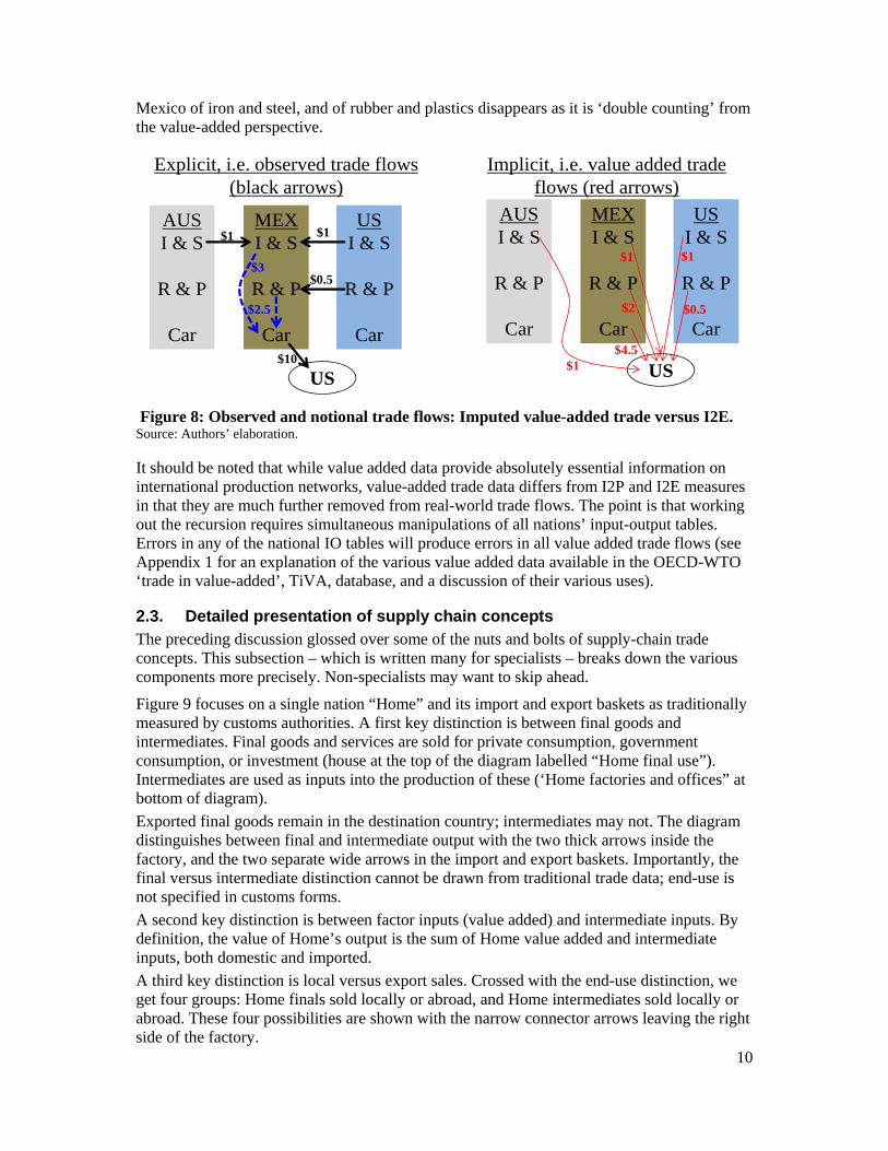
The alternative approach is quite different; it imputes value-added trade flows to sectors and nations.
Rather than basing things on observed trade flows, this approach creates ‘implicit’ flows, as illustrated in Figure 8. That is, it shows ‘implicit’ exports from Australia to the US in the iron and steel sector. These are implicit, since, in our example, no steel is actually entering the US from Australia; it is entering the US via Mexico (embedded in a Mexican car). Likewise, this approach shows a Mexican export of iron and steel to the US. By contrast, the US export to
10 Most nations use value added rules but the US mostly uses an administrative rule based on the intermediates being in a different customs-tariff heading than the exported good (to so-called change of chapter heading approach).
Cost of imported intermediates (I&S)
$3
$4.5
Cost of domestic intermediates (R&P)
Domestic value added in car sector
Rubber & plastics intermediates
Iron & steel intermediates
Car sector
US VA (R&P)
Mex VA (R&P)
Aus VA (I&S)
US VA (I&S)
Mex VA (I&S)
Mex VA (car)
$1
$1
$1
$4.5
$2
$0.5
$2.5
$10
$1
$2
Foreign VA (all intermediates)
Domestic VA (all intermediates)
Domestic value added in car sector.
$1
$1
$4.5
$0.5
10
Mexico of iron and steel, and of rubber and plastics disappears as it is ‘double counting’ from the value-added perspective.
Figure 8: Observed and notional trade flows: Imputed value-added trade versus I2E. Source: Authors’ elaboration.
It should be noted that while value added data provide absolutely essential information on international production networks, value-added trade data differs from I2P and I2E measures in that they are much further removed from real-world trade flows. The point is that working out the recursion requires simultaneous manipulations of all nations’ input-output tables. Errors in any of the national IO tables will produce errors in all value added trade flows (see Appendix 1 for an explanation of the various value added data available in the OECD-WTO ‘trade in value-added’, TiVA, database, and a discussion of their various uses).
2.3. Detailed presentation of supply chain concepts The preceding discussion glossed over some of the nuts and bolts of supply-chain trade concepts. This subsection – which is written many for specialists – breaks down the various components more precisely. Non-specialists may want to skip ahead.
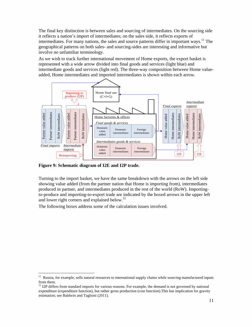
Figure 9 focuses on a single nation “Home” and its import and export baskets as traditionally measured by customs authorities. A first key distinction is between final goods and intermediates. Final goods and services are sold for private consumption, government consumption, or investment (house at the top of the diagram labelled “Home final use”). Intermediates are used as inputs into the production of these (‘Home factories and offices” at bottom of diagram).
Exported final goods remain in the destination country; intermediates may not. The diagram distinguishes between final and intermediate output with the two thick arrows inside the factory, and the two separate wide arrows in the import and export baskets. Importantly, the final versus intermediate distinction cannot be drawn from traditional trade data; end-use is not specified in customs forms.
A second key distinction is between factor inputs (value added) and intermediate inputs. By definition, the value of Home’s output is the sum of Home value added and intermediate inputs, both domestic and imported.
A third key distinction is local versus export sales. Crossed with the end-use distinction, we get four groups: Home finals sold locally or abroad, and Home intermediates sold locally or abroad. These four possibilities are shown with the narrow connector arrows leaving the right side of the factory.
$1AUSI & S
R & P
Car
MEXI & S
R & P
Car
USI & S
R & P
Car
$3
$10
US
Explicit, i.e. observed trade flows (black arrows)
$2.5
$0.5
$1AUSI & S
R & P
Car
MEXI & S
R & P
Car
USI & S
R & P
Car
$1
$1
US
$0.5$2
$4.5
$1
Implicit, i.e. value added trade flows (red arrows)
11
The final key distinction is between sales and sourcing of intermediates. On the sourcing side it reflects a nation’s import of intermediates; on the sales side, it reflects exports of intermediates. For many nations, the sales and source patterns differ in important ways.11 The geographical patterns on both sales- and sourcing-sides are interesting and informative but involve no unfamiliar terminology.
As we wish to track further international movement of Home exports, the export basket is represented with a wide arrow divided into final goods and services (light blue) and intermediate goods and services (light red). The three-way composition between Home value-added, Home intermediates and imported intermediates is shown within each arrow.
Figure 9: Schematic diagram of I2E and I2P trade.
Turning to the import basket, we have the same breakdown with the arrows on the left side showing value added (from the partner nation that Home is importing from), intermediates produced in partner, and intermediates produced in the rest of the world (RoW). Importing-to-produce and importing-to-export trade are indicated by the boxed arrows in the upper left and lower right corners and explained below.12
The following boxes address some of the calculation issues involved.
11 Russia, for example, sells natural resources to international supply chains while sourcing manufactured inputs from them. 12 I2P differs from standard imports for various reasons. For example, the demand is not governed by national expenditure (expenditure function), but rather gross production (cost function).This has implication for gravity estimation; see Baldwin and Taglioni (2011).
Home final use (C+I+G)
Home factories & offices
Final goods & services
Foreign intermediates
Domestic value added
Domestic intermediates
Foreign intermediates
Domestic value added
Domestic intermediates
Intermediates goods & services
Importing to produce (I2P)
Reimporting I2EI2E
Intermediate imports
Final imports
Part
ner
valu
e ad
ded
RoW
inte
rmed
iate
s
Part
ner
inte
rmed
iate
s
Part
ner
valu
e ad
ded
RoW
inte
rmed
iate
s
Part
ner
inte
rmed
iate
s
Hom
e va
lue
adde
d
RoW
inte
rmed
iate
s
Hom
e in
term
edia
tes
Hom
e va
lue
adde
d
RoW
inte
rmed
iate
s
Hom
e in
term
edia
tes
Intermediate exportsFinal exports
12
2.4. Conditioning facts Before studying the global pattern of supply-chain trade, we show a set of facts that condition the analysis. These are based on two sources. First, a recent joint effort by a consortium of 11 research institutions led by the University of Groningen and funded by the European Commission that produced the so-called the World Input-Output Database (WIOD); see Timmer et al (2012).13 The WIOD shows where each sector in each nation obtains its inputs and sells its output – being careful to distinguish purchases of the goods for intermediate usage and final usage (www.WIOD.org). Second, a dataset that was launched after the first draft of our paper in September 2012, namely the OECD-WTO TiVA data base (OECD-
13 Other sources that have commonly been used in the literature include: the Asian Input-Output Table (IDE-JETRO); the GTAP database; and the OECD inter-country IO Database.
Box 3: Trade-offs in harmonising IO tables In the WIOD database, and other exercises (e.g. Johnson and Noguera 2012b), one faces a trade-off between precision and balance. Creating internationally linked IO tables is largely an exercise in balancing. Since the WIOD is created using single country Supply-Use tables which generally differentiate between globally imported and domestic components, the bilateral balancing exercise can be problematic. Creating the bilateral intermediate use tables requires the use of some restrictive assumptions (proportionality in the use of intermediates from different origins and by different industries). To balance the tables, one has to calibrate some of the underlying technological coefficients and it can be important empirical. Preliminary work we have undertaken suggests, for example, that using the WIOD tables with and without the RoW grouping leads to fairly different I2E measures. This suggests that the balancing has significantly altered the technology coefficients in the WIOD table.
Box 2: Calculating reimports and reexports from IO tables and trade data Differences between I2P and I2E trade arise from differences in the domestic output vector and the export vector. In the same way, the difference between reimporting and I2E on the sourcing side is all down to differences in the composition of a nation’s global imports versus its bilateral imports from the concerned partner. An example may help illustrate why this is important. The US’ total export vector is likely to be quite full, including such things as natural resources. Its bilateral exports to Mexico, however, focus more on manufacturing products. The measures of re-exports and re-imports will capture differences in the composition of bilateral trade in the calculation of the indicator and hence if the US only exports manufacturing products to Mexico and these have a higher degree of Mexican value added in them then its re-export vector is likely to be larger with Mexico than with the world. See Lopez-Gonzalez (2012) for technical issues and assumption necessary to complete the calculations using IO tables and bilateral trade data.
Box 1: Calculation of I2E trade flows Because I2E trade is computed from the same coefficients that determine an individual country’s I2P trade, it is best explained by underlining how these measures relate. If total output and exports were to have the exact same composition, or in other words, if all the products that Mexico sells domestically were also to be sold as exports, then I2P and I2E trade would be perfectly proportional. However, as Mexico’s domestic sales include non-tradable services like government services and construction, domestic output and output destined for exports differs. It is this difference that drives the distinction between I2P and I2E. More concretely, because the import content of exports tends to be higher for manufactured products and manufactured products occupy a larger share of the export vector (see Tables 1 and 3), then I2E values will tend to be larger than those of I2P.
I2E trade is a ‘computed’ measure requiring the use of assumptions which see the technologies used for the production of total output as the same of those used in producing exports. It is easy to think of counterexamples (e.g. electronics sold to the domestic market are markedly less sophisticated than exported electronics), but given the lack of country and sector specific data, the ‘proportionality’ assumption, adopted by all scholars in this field (e.g. it is used in the calculation of I2E trade), is the best we can do. What it means is that these measures are to be interpreted with some degree of caution.
13
WTO 2012; oe.cd/tiva).
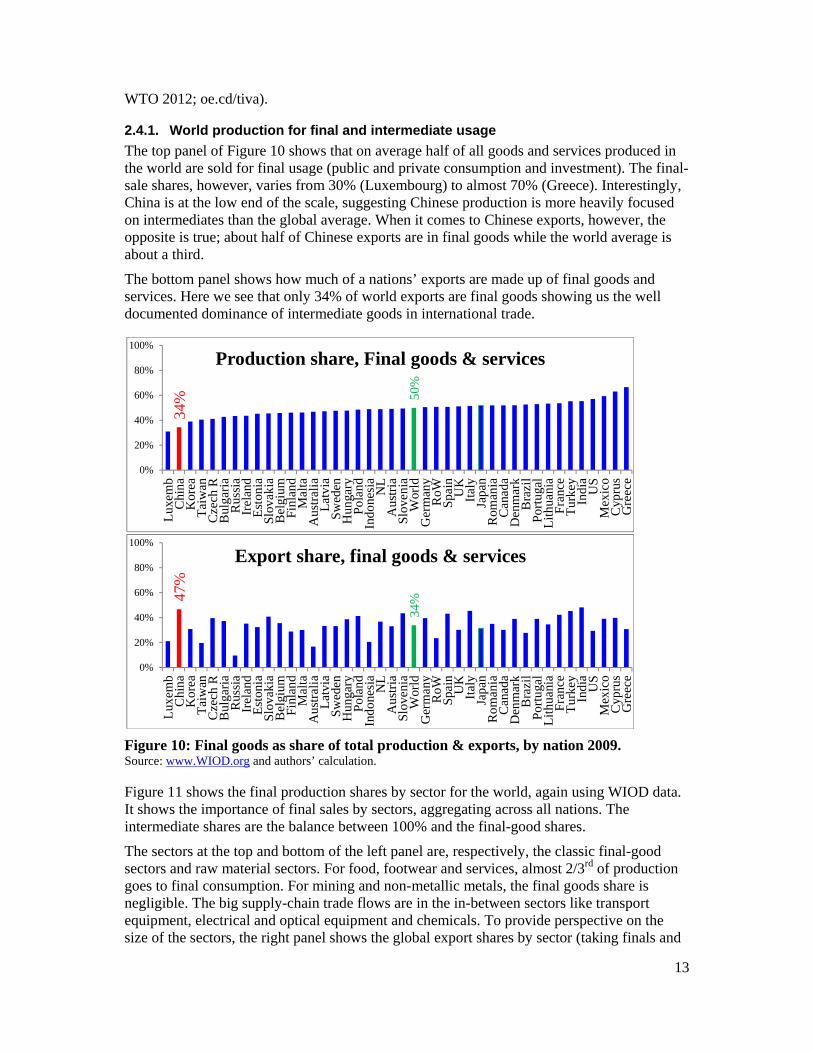
2.4.1. World production for final and intermediate usage
The top panel of Figure 10 shows that on average half of all goods and services produced in the world are sold for final usage (public and private consumption and investment). The final-sale shares, however, varies from 30% (Luxembourg) to almost 70% (Greece). Interestingly, China is at the low end of the scale, suggesting Chinese production is more heavily focused on intermediates than the global average. When it comes to Chinese exports, however, the opposite is true; about half of Chinese exports are in final goods while the world average is about a third.
The bottom panel shows how much of a nations’ exports are made up of final goods and services. Here we see that only 34% of world exports are final goods showing us the well documented dominance of intermediate goods in international trade.
Figure 10: Final goods as share of total production & exports, by nation 2009. Source: www.WIOD.org and authors’ calculation.
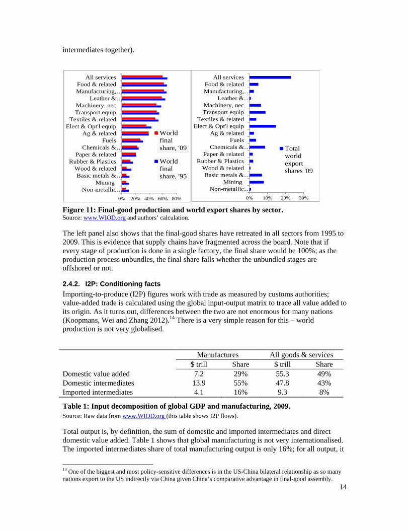
Figure 11 shows the final production shares by sector for the world, again using WIOD data. It shows the importance of final sales by sectors, aggregating across all nations. The intermediate shares are the balance between 100% and the final-good shares.
The sectors at the top and bottom of the left panel are, respectively, the classic final-good sectors and raw material sectors. For food, footwear and services, almost 2/3rd of production goes to final consumption. For mining and non-metallic metals, the final goods share is negligible. The big supply-chain trade flows are in the in-between sectors like transport equipment, electrical and optical equipment and chemicals. To provide perspective on the size of the sectors, the right panel shows the global export shares by sector (taking finals and
34% 50
%
0%
20%
40%
60%
80%
100%
Lux
emb
Chi
naK
orea
Tai
wan
Cze
ch R
Bul
gari
aR
ussi
aIr
elan
dE
ston
iaSl
ovak
iaB
elgi
umF
inla
ndM
alta
Aus
tral
iaL
atvi
aS
wed
enH
unga
ryPo
land
Indo
nesi
aN
LA
ustr
iaSl
oven
iaW
orld
Ger
man
yR
oWS
pain
UK
Ital
yJa
pan
Rom
ania
Can
ada
Den
mar
kB
razi
lP
ortu
gal
Lit
huan
iaF
ranc
eT
urke
yIn
dia
US
Mex
ico
Cyp
rus
Gre
ece
Production share, Final goods & services
47%
34%
0%
20%
40%
60%
80%
100%
Lux
emb
Chi
naK
orea
Tai
wan
Cze
ch R
Bul
gari
aR
ussi
aIr
elan
dE
ston
iaS
lova
kia
Bel
gium
Finl
and
Mal
taA
ustr
alia
Lat
via
Sw
eden
Hun
gary
Pol
and
Indo
nesi
aN
LA
ustr
iaS
love
nia
Wor
ldG
erm
any
RoW
Spa
inU
KIt
aly
Japa
nR
oman
iaC
anad
aD
enm
ark
Bra
zil
Por
tuga
lL
ithu
ania
Fra
nce
Tur
key
Indi
aU
SM
exic
oC
ypru
sG
reec
e
Export share, final goods & services
14
intermediates together).
Figure 11: Final-good production and world export shares by sector. Source: www.WIOD.org and authors’ calculation.
The left panel also shows that the final-good shares have retreated in all sectors from 1995 to 2009. This is evidence that supply chains have fragmented across the board. Note that if every stage of production is done in a single factory, the final share would be 100%; as the production process unbundles, the final share falls whether the unbundled stages are offshored or not.
2.4.2. I2P: Conditioning facts
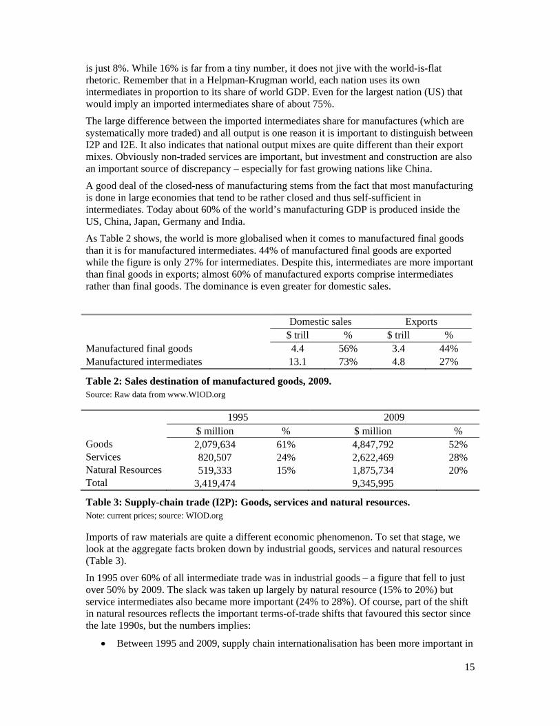
Importing-to-produce (I2P) figures work with trade as measured by customs authorities; value-added trade is calculated using the global input-output matrix to trace all value added to its origin. As it turns out, differences between the two are not enormous for many nations (Koopmans, Wei and Zhang 2012).14 There is a very simple reason for this – world production is not very globalised.
Manufactures All goods & services $ trill Share $ trill Share Domestic value added 7.2 29% 55.3 49% Domestic intermediates 13.9 55% 47.8 43% Imported intermediates 4.1 16% 9.3 8%
Table 1: Input decomposition of global GDP and manufacturing, 2009. Source: Raw data from www.WIOD.org (this table shows I2P flows).
Total output is, by definition, the sum of domestic and imported intermediates and direct domestic value added. Table 1 shows that global manufacturing is not very internationalised. The imported intermediates share of total manufacturing output is only 16%; for all output, it
14 One of the biggest and most policy-sensitive differences is in the US-China bilateral relationship as so many nations export to the US indirectly via China given China’s comparative advantage in final-good assembly.
0% 10% 20% 30%
Non-metallic…Mining
Basic metals &…Wood & related
Rubber & PlasticsPaper & related
Chemicals &…Fuels
Ag & relatedElect & Opt'l equip
Textiles & relatedTransport equipMachinery, nec
Leather &…Manufacturing,…Food & related
All services
Totalworldexportshares '09
0% 20% 40% 60% 80%
Non-metallic…Mining
Basic metals &…Wood & related
Rubber & PlasticsPaper & related
Chemicals &…Fuels
Ag & relatedElect & Opt'l equip
Textiles & relatedTransport equipMachinery, nec
Leather &…Manufacturing,…Food & related
All services
Worldfinalshare, '09
Worldfinalshare, '95
15
is just 8%. While 16% is far from a tiny number, it does not jive with the world-is-flat rhetoric. Remember that in a Helpman-Krugman world, each nation uses its own intermediates in proportion to its share of world GDP. Even for the largest nation (US) that would imply an imported intermediates share of about 75%.
The large difference between the imported intermediates share for manufactures (which are systematically more traded) and all output is one reason it is important to distinguish between I2P and I2E. It also indicates that national output mixes are quite different than their export mixes. Obviously non-traded services are important, but investment and construction are also an important source of discrepancy – especially for fast growing nations like China.
A good deal of the closed-ness of manufacturing stems from the fact that most manufacturing is done in large economies that tend to be rather closed and thus self-sufficient in intermediates. Today about 60% of the world’s manufacturing GDP is produced inside the US, China, Japan, Germany and India.
As Table 2 shows, the world is more globalised when it comes to manufactured final goods than it is for manufactured intermediates. 44% of manufactured final goods are exported while the figure is only 27% for intermediates. Despite this, intermediates are more important than final goods in exports; almost 60% of manufactured exports comprise intermediates rather than final goods. The dominance is even greater for domestic sales.
Domestic sales Exports $ trill % $ trill % Manufactured final goods 4.4 56% 3.4 44% Manufactured intermediates 13.1 73% 4.8 27%
Table 2: Sales destination of manufactured goods, 2009. Source: Raw data from www.WIOD.org
1995 2009 $ million % $ million % Goods 2,079,634 61% 4,847,792 52% Services 820,507 24% 2,622,469 28% Natural Resources 519,333 15% 1,875,734 20% Total 3,419,474 9,345,995
Table 3: Supply-chain trade (I2P): Goods, services and natural resources. Note: current prices; source: WIOD.org
Imports of raw materials are quite a different economic phenomenon. To set that stage, we look at the aggregate facts broken down by industrial goods, services and natural resources (Table 3).
In 1995 over 60% of all intermediate trade was in industrial goods – a figure that fell to just over 50% by 2009. The slack was taken up largely by natural resource (15% to 20%) but service intermediates also became more important (24% to 28%). Of course, part of the shift in natural resources reflects the important terms-of-trade shifts that favoured this sector since the late 1990s, but the numbers implies:
Between 1995 and 2009, supply chain internationalisation has been more important in
16
services and natural resources than it has been in industrial goods.
The second set of facts concerns the level and change in self-reliance for inputs (Table 4). As mentioned above, the world production is still not very globalised:
Supply-chain trade is on average only a small part of global production; goods are more globalised than natural resources and these are more globalised than services.
As expected, all the own-sourcing shares fell, but even in 2009 the figure for own sourcing of intermediate services trade is about 90% – a fact that shows just how far services trade has to go before it becomes as globalised as goods trade. This casts doubts on the idea, popularised by Alan Blinder (2006), that offshoring of services is about to transform the employment landscape in high-wage nations.
1995 2009 Goods 77% 73% Services 94% 91% Nat.Res 85% 80%
Table 4: Share of intermediates sourced domestically, 1995 and 2009, goods, services and natural resources. Note: current prices; source: WIOD.org
2.4.3. Value added: Conditioning facts
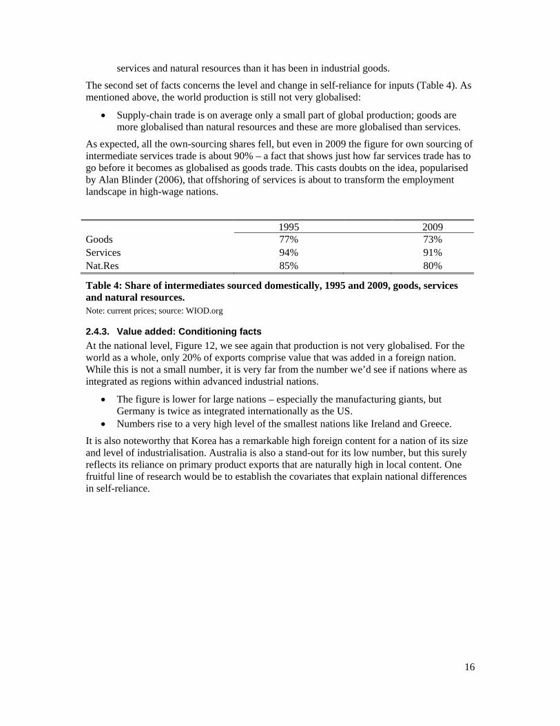
At the national level, Figure 12, we see again that production is not very globalised. For the world as a whole, only 20% of exports comprise value that was added in a foreign nation. While this is not a small number, it is very far from the number we’d see if nations where as integrated as regions within advanced industrial nations.
The figure is lower for large nations – especially the manufacturing giants, but Germany is twice as integrated internationally as the US.
Numbers rise to a very high level of the smallest nations like Ireland and Greece.
It is also noteworthy that Korea has a remarkable high foreign content for a nation of its size and level of industrialisation. Australia is also a stand-out for its low number, but this surely reflects its reliance on primary product exports that are naturally high in local content. One fruitful line of research would be to establish the covariates that explain national differences in self-reliance.
17
Figure 12: Foreign value added in nations’ total exports, 2009. Source: TiVA database.
3. THE WORLD PATTERN OF IMPORTING-TO-PRODUCE (I2P) TRADE
This section highlights the key facts concerning the imports of intermediate goods used in the production of all goods and services, i.e. I2P trade.
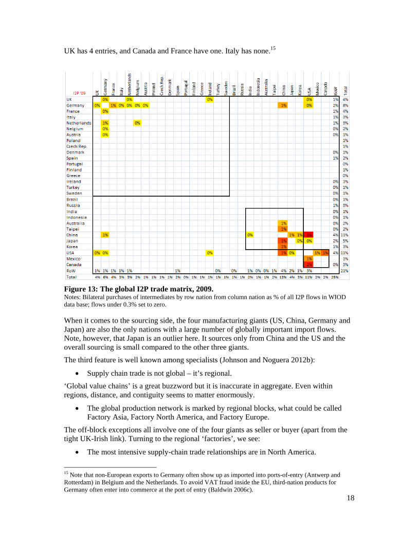
3.1. World I2P matrix diagram To illustrate global pattern, we employ a matrix that shows the flow of supply-chain trade among the nations for which the WIOD has harmonised IO tables. Each element of the matrix shows the column-nation’s imports of intermediates from the row-nation. To focus on the big picture, we zero-out any bilateral flow that is less than 3 tenths of 1% of all the trade among the listed nations. We also hide the rows and columns for several tiny nations in the sample (Cyprus, Malta, Lithuania, Estonia, etc.). The rows and columns are arranged to reflect regions. Europe is at the top, North America at the bottom and Asia and other nations are in between.
Focusing on 2009, the most recent year, Figure 13 shows the global I2P pattern. The most salient features are:
The matrix is very sparse; very few bilateral flows are significant on a global scale.
The US, China, Germany, and Japan dominate global supply chain trade.
These are the only nations who supply a globally significant amount of intermediates to a large number of partners.
Germany is by far the most significant in terms of number of partners with globally significant flows. This, however, surely reflects the WIOD’s bias towards European nations (27 of the 40 nations). From other sources, we know that supply-chain trade among Japan, Korea, China and other large East Asian nations (Philippines, Malaysia, Thailand, Singapore, Vietnam, and Taiwan) is very important (see Figure 32). Among the other G7 nations, the
0%10%20%30%40%50%60%70%80%90%
100%
Russia
Brazil
United
States
Australia
Norw
ayIndonesia
Japan
South Africa
United
Kingdom
Italy
Chile
Spain
New
Zealand
Canada
Turkey
Greece
India
Austria
Germany
France
Poland
China
Den
mark
Switzerland
Slovenia
Mexico
Portugal
Israel
Belgium
Rest of the World
Swed
enFinland
Iceland
Netherlands
Estonia
Czech Rep
ublic
Korea
Ireland
Hungary
Slovak Rep
ublic
Luxembourg
Foreign Value added in gross exports
18
UK has 4 entries, and Canada and France have one. Italy has none.15
Figure 13: The global I2P trade matrix, 2009. Notes: Bilateral purchases of intermediates by row nation from column nation as % of all I2P flows in WIOD data base; flows under 0.3% set to zero.
When it comes to the sourcing side, the four manufacturing giants (US, China, Germany and Japan) are also the only nations with a large number of globally important import flows. Note, however, that Japan is an outlier here. It sources only from China and the US and the overall sourcing is small compared to the other three giants.
The third feature is well known among specialists (Johnson and Noguera 2012b):
Supply chain trade is not global – it’s regional.
‘Global value chains’ is a great buzzword but it is inaccurate in aggregate. Even within regions, distance, and contiguity seems to matter enormously.
The global production network is marked by regional blocks, what could be called Factory Asia, Factory North America, and Factory Europe.
The off-block exceptions all involve one of the four giants as seller or buyer (apart from the tight UK-Irish link). Turning to the regional ‘factories’, we see:
The most intensive supply-chain trade relationships are in North America.
15 Note that non-European exports to Germany often show up as imported into ports-of-entry (Antwerp and Rotterdam) in Belgium and the Netherlands. To avoid VAT fraud inside the EU, third-nation products for Germany often enter into commerce at the port of entry (Baldwin 2006c).
19
US I2P trade with Mexico and Canada are both over 1% of the world total. US imports from China and Canada are the two largest I2P flows globally (2% each).
The I2P trade in Northeast Asia is almost as intense as North America’s.
The notion of an Asia-Pacific region also emerges from the matrix. The trade between US and Japan and China easily passes the 0.3% threshold.
As we can see for the row sums:
The biggest suppliers of intermediates are China and the US – each with about 11% of global intermediate exports; Germany is third with 8%; Japan’s share is surprisingly modest at 5%.
From the column sums we see:
China is the biggest buyer of intermediates with 13%, the US second with 11% and Germany third with 6%; again Japan is far less important as a buyer with only 2%.
Another fact that is well established among specialists (Johnson and Noguera 2012a) is:
I2P trade is marked by a hub-and-spoke pattern around the four manufacturing giants.
This can be most easily seen in North America where the sales and sourcing flows with the US are all large, but those between Mexico and Canada are small. The same holds for Germany (its row and column are rather full especially in Europe). Japan is again an outlier in that it sells large amounts of intermediates only to China, Korea and the US and, as mentioned above, Japan only sources large amounts only form China and the US.
A key distinction that is less well appreciated—and one that we return to repeatedly below – is the technological asymmetry in the international production network whereby there are ‘headquarter economies’ and ‘factory economies’.16 Oversimplifying, we can say that firms in the headquarter economies (mostly the US, Japan and Germany) arrange the production networks; factory economies provide the labour.
The nations not in the sample (RoW) are important taken as a whole. Particularly important on the sales-side are the world’s energy and food producers (OPEC nations, Argentina, etc.). On the sourcing-side, noticeable omissions include the large ASEANs (Malaysia, Thailand, and the Philippines). They account for 25% of global I2P flows on the sourcing side (i.e. as buyers) and 21% on the sales side (i.e. as suppliers).
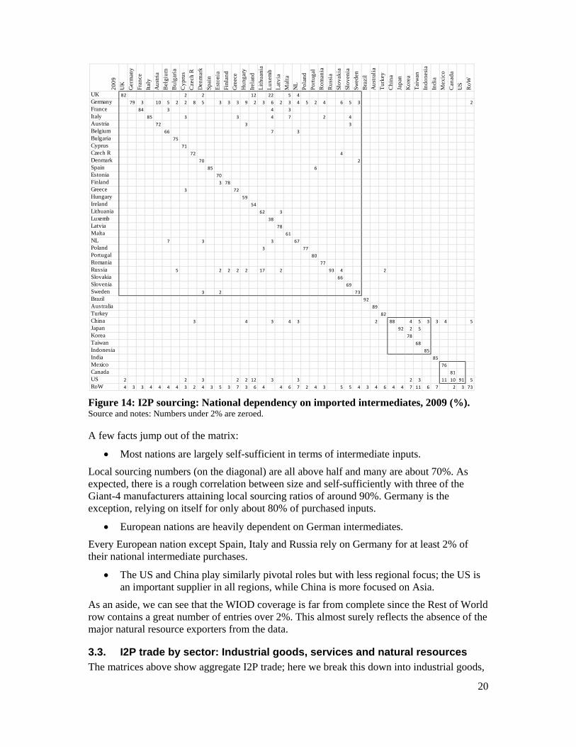
3.2. Supply-chain interdependency The matrices presented above take the global perspective – looking only at flows that are significant at the global level. Here we look at the national level, focusing on where each nation sources its intermediate inputs. In a sense, this reveals each nation’s dependency on international supply networks.
The numbers for 2009 are shown in Figure 14. Each column adds up to 100% and thus shows each column nation’s purchasing pattern (numbers under 2 percent are zeroed to reduce clutter).
16 See Baldwin (2006b) for a fuller analysis of the distinction.
20
Figure 14: I2P sourcing: National dependency on imported intermediates, 2009 (%). Source and notes: Numbers under 2% are zeroed.
A few facts jump out of the matrix:
Most nations are largely self-sufficient in terms of intermediate inputs.
Local sourcing numbers (on the diagonal) are all above half and many are about 70%. As expected, there is a rough correlation between size and self-sufficiently with three of the Giant-4 manufacturers attaining local sourcing ratios of around 90%. Germany is the exception, relying on itself for only about 80% of purchased inputs.
European nations are heavily dependent on German intermediates.
Every European nation except Spain, Italy and Russia rely on Germany for at least 2% of their national intermediate purchases.
The US and China play similarly pivotal roles but with less regional focus; the US is an important supplier in all regions, while China is more focused on Asia.
As an aside, we can see that the WIOD coverage is far from complete since the Rest of World row contains a great number of entries over 2%. This almost surely reflects the absence of the major natural resource exporters from the data.
3.3. I2P trade by sector: Industrial goods, services and natural resources The matrices above show aggregate I2P trade; here we break this down into industrial goods,
2009
UK
Ger
man
y
Fran
ce
Ital
y
Aus
tria
Bel
gium
Bul
gari
a
Cyp
rus
Cze
ch R
Den
mar
k
Spai
n
Est
onia
Finl
and
Gre
ece
Hun
gary
Irel
and
Lit
huan
ia
Lux
emb
Lat
via
Mal
ta
NL
Pola
nd
Port
ugal
Rom
ania
Rus
sia
Slov
akia
Slov
enia
Swed
en
Bra
zil
Aus
tral
ia
Tur
key
Chi
na
Japa
n
Kor
ea
Tai
wan
Indo
nesi
a
Indi
a
Mex
ico
Can
ada
US
RoW
UK 82 2 1 1 1 2 1 2 1 2 1 1 1 1 1 12 1 22 1 5 4 1 1 1 0 1 1 2 0 0 0 0 0 0 0 0 0 0 1 0 1
Germany 2 79 3 2 10 5 2 2 8 5 2 3 3 3 9 2 3 6 2 3 4 5 2 4 1 6 5 3 1 0 2 1 0 1 1 1 0 1 1 0 2
France 1 1 84 1 1 3 1 1 1 1 2 1 1 1 2 2 0 4 1 3 1 1 1 1 0 1 1 1 0 0 1 0 0 0 0 0 0 0 0 0 1
Italy 1 1 1 85 1 1 1 3 1 1 1 1 1 3 1 1 1 4 1 7 1 1 1 2 0 1 4 1 0 0 1 0 0 0 0 0 0 0 0 0 1
Austria 0 1 0 0 72 0 1 0 1 0 0 0 0 0 3 0 0 1 0 1 0 1 0 1 0 1 3 0 0 0 0 0 0 0 0 0 0 0 0 0 0
Belgium 1 1 1 0 0 66 0 2 1 1 0 0 1 1 1 1 1 7 0 1 3 1 1 1 0 1 1 1 0 0 0 0 0 0 0 0 0 0 0 0 0
Bulgaria 0 0 0 0 0 0 75 0 0 0 0 0 0 1 0 0 0 0 0 0 0 0 0 1 0 0 0 0 0 0 0 0 0 0 0 0 0 0 0 0 0
Cyprus 0 0 0 0 0 0 0 71 0 0 0 0 0 0 0 0 0 0 0 0 0 0 0 0 0 0 0 0 0 0 0 0 0 0 0 0 0 0 0 0 0
Czech R 0 1 0 0 1 0 1 1 72 0 0 0 0 0 1 0 0 0 0 0 0 1 0 0 0 4 1 0 0 0 0 0 0 0 0 0 0 0 0 0 0
Denmark 0 0 0 0 0 0 0 0 0 70 0 0 1 0 0 0 1 0 0 0 0 0 0 0 0 0 0 2 0 0 0 0 0 0 0 0 0 0 0 0 0
Spain 1 1 1 1 0 1 0 1 1 1 85 1 0 1 1 1 0 1 0 2 1 1 6 1 0 0 1 1 0 0 0 0 0 0 0 0 0 0 0 0 1
Estonia 0 0 0 0 0 0 0 0 0 0 0 70 0 0 0 0 1 0 1 0 0 0 0 0 0 0 0 0 0 0 0 0 0 0 0 0 0 0 0 0 0
Finland 0 0 0 0 0 0 0 0 0 1 0 3 78 0 0 0 1 0 1 1 0 0 0 0 0 0 0 1 0 0 0 0 0 0 0 0 0 0 0 0 0
Greece 0 0 0 0 0 0 1 3 0 0 0 0 0 72 0 0 0 0 0 0 0 0 0 0 0 0 0 0 0 0 0 0 0 0 0 0 0 0 0 0 0
Hungary 0 0 0 0 1 0 0 0 1 0 0 0 0 0 59 0 0 0 0 0 0 0 0 1 0 2 1 0 0 0 0 0 0 0 0 0 0 0 0 0 0
Ireland 1 0 0 0 0 1 0 0 0 0 0 0 1 0 0 54 0 1 0 0 0 0 0 0 0 0 0 0 0 0 0 0 0 0 1 0 0 0 0 0 0
Lithuania 0 0 0 0 0 0 0 0 0 0 0 2 0 0 0 0 62 0 3 0 0 0 0 0 0 0 0 0 0 0 0 0 0 0 0 0 0 0 0 0 0
Luxemb 0 0 0 0 0 0 0 0 0 0 0 0 0 0 0 0 0 38 0 0 0 0 0 0 0 0 0 0 0 0 0 0 0 0 0 0 0 0 0 0 0
Latvia 0 0 0 0 0 0 0 0 0 0 0 1 0 0 0 0 1 0 78 0 0 0 0 0 0 0 0 0 0 0 0 0 0 0 0 0 0 0 0 0 0
Malta 0 0 0 0 0 0 0 0 0 0 0 0 0 0 0 0 0 0 0 61 0 0 0 0 0 0 0 0 0 0 0 0 0 0 0 0 0 0 0 0 0
NL 1 2 1 1 1 7 0 2 1 3 1 1 1 1 2 2 1 3 1 1 67 1 1 1 0 1 1 1 0 0 0 0 0 0 0 0 0 0 0 0 0
Poland 0 1 0 0 1 1 1 0 2 1 0 1 0 0 1 1 3 0 2 0 0 77 0 1 0 1 1 1 0 0 0 0 0 0 0 0 0 0 0 0 0
Portugal 0 0 0 0 0 0 0 0 0 0 0 0 0 0 0 0 0 0 0 0 0 0 80 0 0 0 0 0 0 0 0 0 0 0 0 0 0 0 0 0 0
Romania 0 0 0 0 0 0 1 1 0 0 0 0 0 0 1 0 0 0 0 0 0 0 0 77 0 0 0 0 0 0 0 0 0 0 0 0 0 0 0 0 0
Russia 0 1 1 1 1 0 5 0 1 0 0 2 2 2 2 0 17 0 2 0 1 2 0 1 93 4 1 1 0 0 2 0 0 0 0 0 0 0 0 0 1
Slovakia 0 0 0 0 1 0 0 0 2 0 0 0 0 0 2 0 0 0 0 0 0 1 0 0 0 66 1 0 0 0 0 0 0 0 0 0 0 0 0 0 0
Slovenia 0 0 0 0 0 0 0 0 0 0 0 0 0 0 0 0 0 0 0 0 0 0 0 0 0 0 69 0 0 0 0 0 0 0 0 0 0 0 0 0 0
Sweden 0 0 0 0 0 0 0 0 0 3 0 2 2 0 0 0 1 1 1 0 0 0 0 0 0 0 0 73 0 0 0 0 0 0 0 0 0 0 0 0 1
Brazil 0 0 0 0 0 0 0 0 0 0 0 0 0 0 0 0 0 0 0 0 1 0 1 0 0 0 0 1 92 0 0 0 0 0 0 0 0 0 0 0 0
Australia 0 0 0 0 0 0 0 0 0 0 0 0 0 0 0 0 0 0 0 0 0 0 0 0 0 0 0 0 0 89 0 1 1 1 1 1 1 0 0 0 0
Turkey 0 0 0 0 0 0 2 0 0 0 0 0 0 1 0 0 0 0 0 0 0 0 0 1 0 0 0 0 0 0 82 0 0 0 0 0 0 0 0 0 0
China 1 2 1 1 1 1 1 2 3 2 1 2 2 1 4 2 1 3 0 4 3 2 1 1 1 2 1 2 1 2 1 88 1 4 5 3 3 4 2 2 5
Japan 0 0 0 0 0 1 0 0 1 0 0 0 0 0 1 0 0 0 0 0 0 0 0 0 0 0 0 0 0 0 0 1 92 2 5 1 0 1 1 0 2
Korea 0 0 0 0 0 0 0 0 0 0 0 0 0 0 1 0 0 0 0 0 0 0 0 0 0 2 0 0 0 0 0 1 0 78 2 1 0 1 0 0 1
Taiwan 0 0 0 0 0 0 0 0 0 0 0 0 0 0 0 0 0 0 0 0 0 0 0 0 0 0 0 0 0 0 0 1 0 0 68 0 0 0 0 0 0
Indonesia 0 0 0 0 0 0 0 0 0 0 0 0 0 0 0 0 0 0 0 0 0 0 0 0 0 0 0 0 0 0 0 0 0 1 1 85 0 0 0 0 0
India 0 0 0 0 0 0 0 0 0 0 0 0 0 0 0 0 0 0 0 0 0 0 0 0 0 0 0 0 0 0 0 0 0 0 0 0 85 0 0 0 0
Mexico 0 0 0 0 0 0 0 0 0 0 0 0 0 0 0 0 0 0 0 0 0 0 0 0 0 0 0 0 0 0 0 0 0 0 0 0 0 76 0 1 0
Canada 1 0 0 0 0 0 0 0 0 0 0 0 0 0 0 1 0 1 0 1 0 0 0 0 0 0 0 0 0 0 0 0 0 0 0 0 0 1 81 1 0
US 2 1 1 1 1 2 0 2 1 3 1 1 1 2 2 12 0 3 1 1 3 1 0 0 0 1 1 2 1 1 1 1 1 2 3 1 1 11 10 91 5
RoW 4 3 3 4 4 4 4 3 2 4 3 5 3 7 3 6 4 2 4 6 7 2 4 3 1 5 5 4 3 4 6 4 4 7 11 6 7 2 2 3 73
21
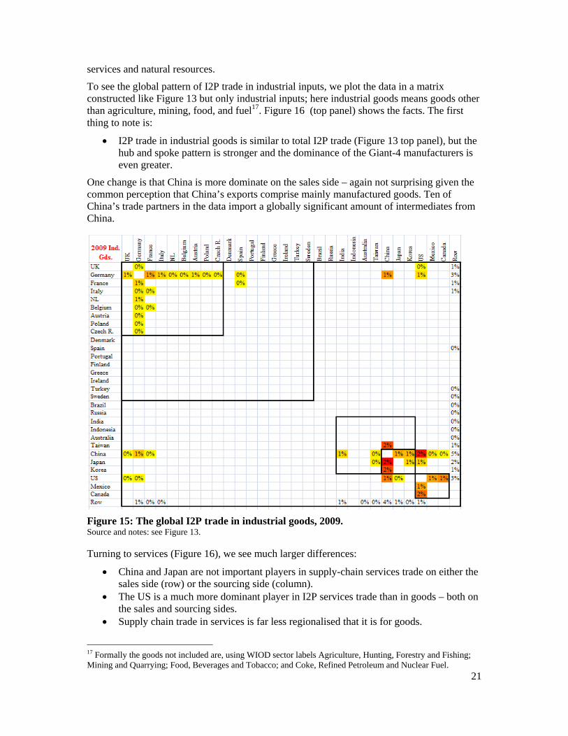
services and natural resources.
To see the global pattern of I2P trade in industrial inputs, we plot the data in a matrix constructed like Figure 13 but only industrial inputs; here industrial goods means goods other than agriculture, mining, food, and fuel17. Figure 16 (top panel) shows the facts. The first thing to note is:
I2P trade in industrial goods is similar to total I2P trade (Figure 13 top panel), but the hub and spoke pattern is stronger and the dominance of the Giant-4 manufacturers is even greater.
One change is that China is more dominate on the sales side – again not surprising given the common perception that China’s exports comprise mainly manufactured goods. Ten of China’s trade partners in the data import a globally significant amount of intermediates from China.
Figure 15: The global I2P trade in industrial goods, 2009. Source and notes: see Figure 13.
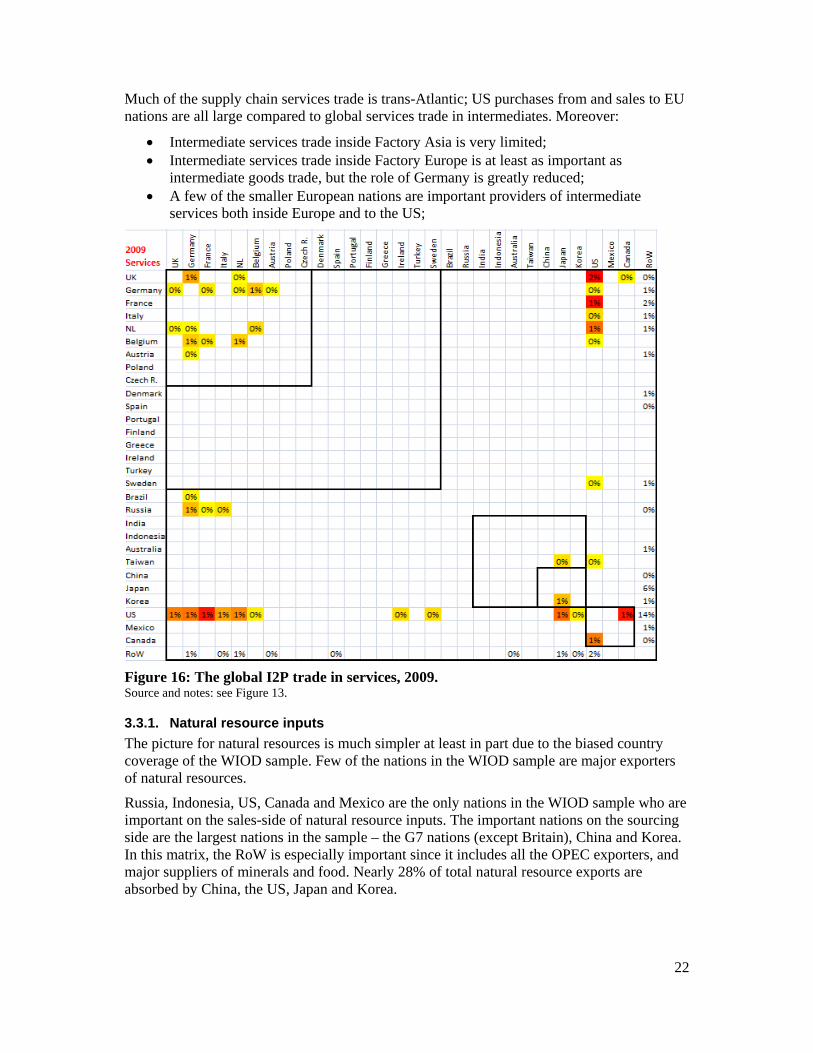
Turning to services (Figure 16), we see much larger differences:
China and Japan are not important players in supply-chain services trade on either the sales side (row) or the sourcing side (column).
The US is a much more dominant player in I2P services trade than in goods – both on the sales and sourcing sides.
Supply chain trade in services is far less regionalised that it is for goods.
17 Formally the goods not included are, using WIOD sector labels Agriculture, Hunting, Forestry and Fishing; Mining and Quarrying; Food, Beverages and Tobacco; and Coke, Refined Petroleum and Nuclear Fuel.
22
Much of the supply chain services trade is trans-Atlantic; US purchases from and sales to EU nations are all large compared to global services trade in intermediates. Moreover:
Intermediate services trade inside Factory Asia is very limited; Intermediate services trade inside Factory Europe is at least as important as
intermediate goods trade, but the role of Germany is greatly reduced; A few of the smaller European nations are important providers of intermediate
services both inside Europe and to the US;
Figure 16: The global I2P trade in services, 2009. Source and notes: see Figure 13.
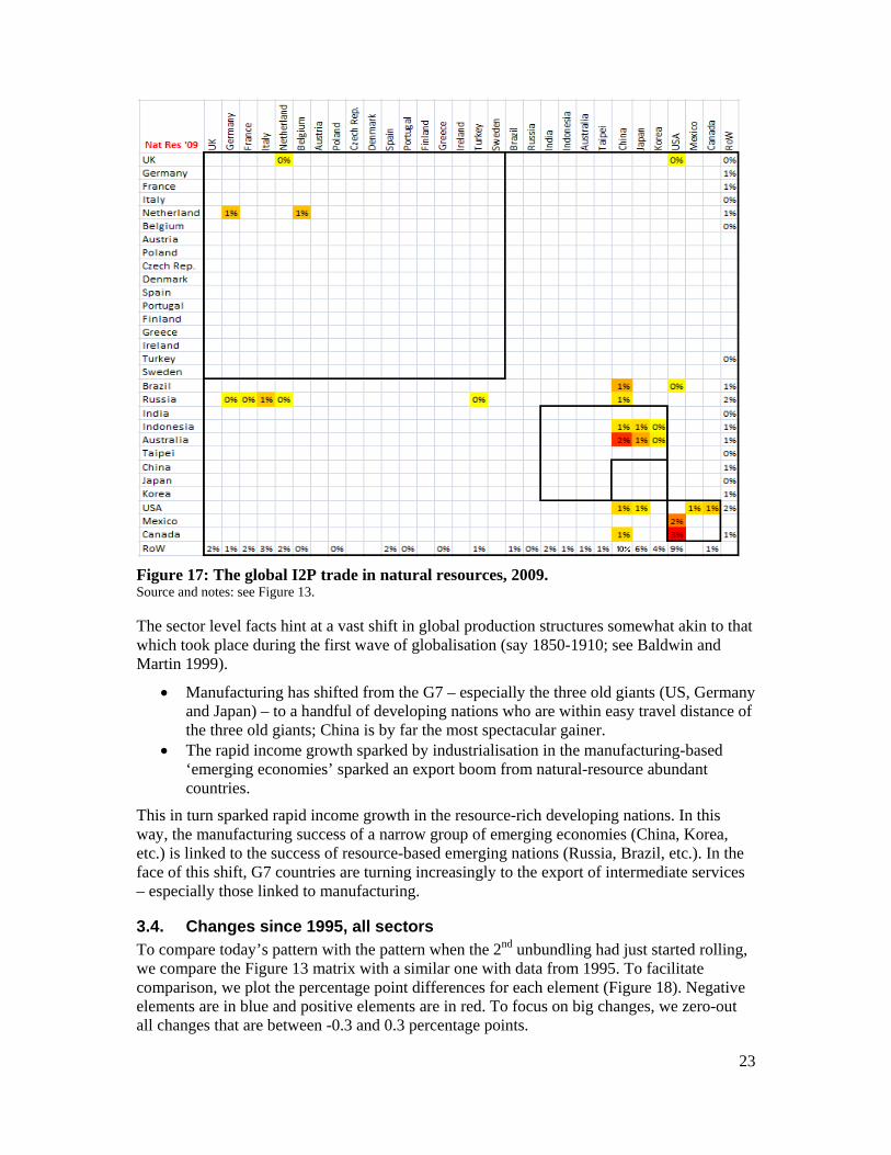
3.3.1. Natural resource inputs
The picture for natural resources is much simpler at least in part due to the biased country coverage of the WIOD sample. Few of the nations in the WIOD sample are major exporters of natural resources.
Russia, Indonesia, US, Canada and Mexico are the only nations in the WIOD sample who are important on the sales-side of natural resource inputs. The important nations on the sourcing side are the largest nations in the sample – the G7 nations (except Britain), China and Korea. In this matrix, the RoW is especially important since it includes all the OPEC exporters, and major suppliers of minerals and food. Nearly 28% of total natural resource exports are absorbed by China, the US, Japan and Korea.
23
Figure 17: The global I2P trade in natural resources, 2009. Source and notes: see Figure 13.
The sector level facts hint at a vast shift in global production structures somewhat akin to that which took place during the first wave of globalisation (say 1850-1910; see Baldwin and Martin 1999).
Manufacturing has shifted from the G7 – especially the three old giants (US, Germany and Japan) – to a handful of developing nations who are within easy travel distance of the three old giants; China is by far the most spectacular gainer.
The rapid income growth sparked by industrialisation in the manufacturing-based ‘emerging economies’ sparked an export boom from natural-resource abundant countries.
This in turn sparked rapid income growth in the resource-rich developing nations. In this way, the manufacturing success of a narrow group of emerging economies (China, Korea, etc.) is linked to the success of resource-based emerging nations (Russia, Brazil, etc.). In the face of this shift, G7 countries are turning increasingly to the export of intermediate services – especially those linked to manufacturing.
3.4. Changes since 1995, all sectors To compare today’s pattern with the pattern when the 2nd unbundling had just started rolling, we compare the Figure 13 matrix with a similar one with data from 1995. To facilitate comparison, we plot the percentage point differences for each element (Figure 18). Negative elements are in blue and positive elements are in red. To focus on big changes, we zero-out all changes that are between -0.3 and 0.3 percentage points.
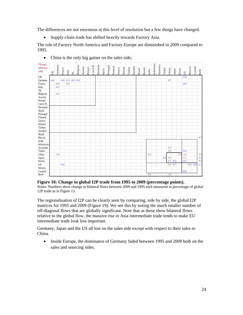
24
The differences are not enormous at this level of resolution but a few things have changed.
Supply-chain trade has shifted heavily towards Factory Asia.
The role of Factory North America and Factory Europe are diminished in 2009 compared to 1995.
China is the only big gainer on the sales side;
Figure 18: Change in global I2P trade from 1995 to 2009 (percentage points). Notes: Numbers show change in bilateral flows between 2009 and 1995 each measured in percentage of global 12P trade as in Figure 13.
The regionalisation of I2P can be clearly seen by comparing, side by side, the global I2P matrices for 1995 and 2009 (Figure 19). We see this by noting the much smaller number of off-diagonal flows that are globally significant. Note that as these show bilateral flows relative to the global flow, the massive rise in Asia intermediate trade tends to make EU intermediate trade look less important.
Germany, Japan and the US all lost on the sales side except with respect to their sales to China.
Inside Europe, the dominance of Germany faded between 1995 and 2009 both on the sales and sourcing sides.
Change, 2009 less 1995
UK
Ger
man
y
Fran
ce
Ital
y
NL
Bel
gium
Aus
tria
Pola
nd
Cze
ch R
Den
mar
k
Spai
n
Port
ugal
Finl
and
Gre
ece
Irel
and
Tur
key
Swed
en
Bra
zil
Rus
sia
Indi
a
Indo
nesi
a
Aus
tral
ia
Tai
pei
Chi
na
Japa
n
Kor
ea
US
Mex
ico
Can
ada
RoW
UK -0.4
Germany -0.4 -0.4 -0.3 -0.3 -0.3 0.7
France -0.4 -0.3 -0.4
Italy -0.3
NLBelgium -0.3
AustriaPolandCzech RDenmarkSpainPortugalFinlandGreeceIrelandTurkeySwedenBrazilRussia 0.7
IndiaIndonesiaAustralia 0.5
Taipei 0.6 -0.3
China 0.4 0.3 0.4 1.4 3.5
Japan -0.3 0.8 -1.1 -2.1
Korea 0.7 -0.3 -0.3 0.3
US -0.4 0.9 -0.7 -0.3 -0.8 -1.7
MexicoCanada -0.8
RoW 0.6 3.6
25
Figure 19: Global I2E matrices, 1995 and 2009, side by side. Soure: WIOD.org
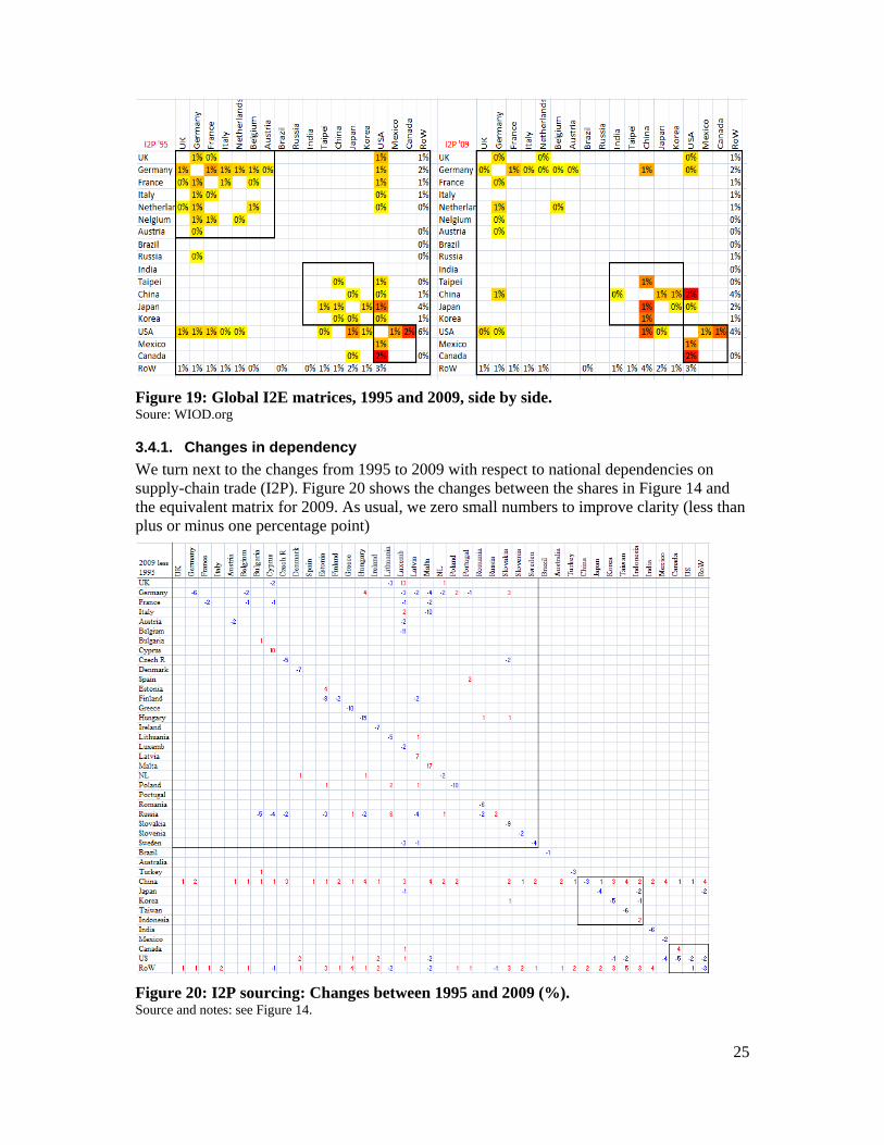
3.4.1. Changes in dependency
We turn next to the changes from 1995 to 2009 with respect to national dependencies on supply-chain trade (I2P). Figure 20 shows the changes between the shares in Figure 14 and the equivalent matrix for 2009. As usual, we zero small numbers to improve clarity (less than plus or minus one percentage point)
Figure 20: I2P sourcing: Changes between 1995 and 2009 (%). Source and notes: see Figure 14.
26
The most striking fact is the almost universal reduction in local sourcing (diagonal elements mostly negative).
This is nothing more than an enumeration of the 2nd unbundling; more stages of production are been broken off from the home factory or industrial district and shipped abroad. The exceptions are Russia, Canada, Indonesia and some very small nations (many of them former communist economies).
China’s rise as a global supplier of intermediates can be seen in the many positive numbers in its row; this has not been accompanied by a rise as a purchaser (few positive number on its column).
The decline of Russia as a supplier of intermediates is almost as impressive as China’s rise, given the large number of negative numbers on Russia’s row.18
Germany has mostly seen its role decline while the US’s experience is more mixed with number falling in North America but rising in Asia.
Note also that the rest of the world (bottom row) has predominantly positive numbers. This surely reflects the increased exports of commodities from omitted nations; it may also reflect industrial exports of omitted Asia nations like Thailand and the Philippines.
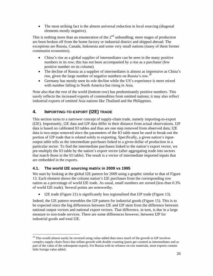
4. IMPORTING-TO-EXPORT (I2E) TRADE
This section turns to a narrower concept of supply-chain trade, namely importing-to-export (I2E). Importantly, I2E data and I2P data differ in their distance from actual observations. I2P data is based on calibrated IO tables and thus are one step removed from observed data; I2E data is two-steps removed since the parameters of the IO table must be used to break-out the portion of I2P trade that is related solely to exporting. Specifically, a given nation’s input-output table tells us the intermediate purchases linked to a given dollar of production in a particular sector. To find the intermediate purchases linked to the nation’s export vector, we pre-multiply the IO table by the nation’s export vector (after aggregating trade into sectors that match those in the IO table). The result is a vector of intermediate imported inputs that are embedded in the exports.
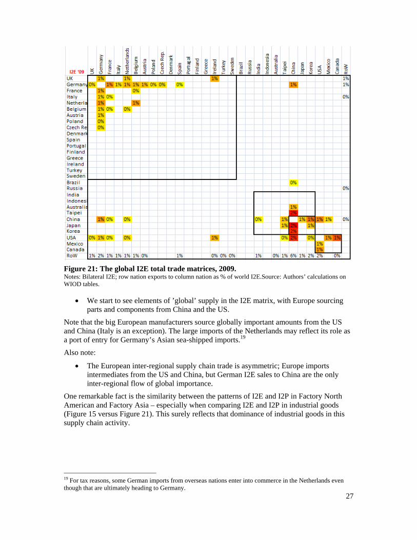
4.1. The world I2E sourcing matrix in 2009 vs 1995 We start by looking at the global I2E pattern for 2009 using a graphic similar to that of Figure 13. Each element shows the column nation’s I2E purchases from the corresponding row nation as a percentage of world I2E trade. As usual, small numbers are zeroed (less than 0.3% of world I2E trade). Several points are noteworthy.
I2E trade (Figure 21) is significantly less regionalised that I2P trade (Figure 13).
Indeed, the I2E pattern resembles the I2P pattern for industrial goods (Figure 15). This is to be expected since the big differences between I2E and I2P stem from the difference between national output vectors and national export vectors. That difference, in turn, is due in a large measure to non-trade services. There are some differences however, between I2P for industrial goods and total I2E.
18 This would almost surely be reversed using value-added data since much of the growth in I2P involves complex supply-chain flows that inflate growth with double counting (parts get counted as intermediates and as part of the value of the subsequent export). For Russia with its reliance on raw materials, most exports contain little foreign value added.
27
Figure 21: The global I2E total trade matrices, 2009. Notes: Bilateral I2E; row nation exports to column nation as % of world I2E.Source: Authors’ calculations on WIOD tables.
We start to see elements of ’global’ supply in the I2E matrix, with Europe sourcing parts and components from China and the US.
Note that the big European manufacturers source globally important amounts from the US and China (Italy is an exception). The large imports of the Netherlands may reflect its role as a port of entry for Germany’s Asian sea-shipped imports.19
Also note:
The European inter-regional supply chain trade is asymmetric; Europe imports intermediates from the US and China, but German I2E sales to China are the only inter-regional flow of global importance.
One remarkable fact is the similarity between the patterns of I2E and I2P in Factory North American and Factory Asia – especially when comparing I2E and I2P in industrial goods (Figure 15 versus Figure 21). This surely reflects that dominance of industrial goods in this supply chain activity.
19 For tax reasons, some German imports from overseas nations enter into commerce in the Netherlands even though that are ultimately heading to Germany.
28
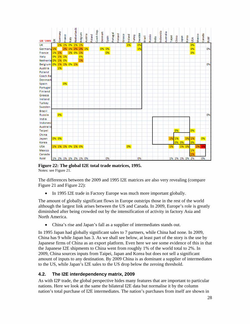
Figure 22: The global I2E total trade matrices, 1995. Notes: see Figure 21.
The differences between the 2009 and 1995 I2E matrices are also very revealing (compare Figure 21 and Figure 22):
In 1995 I2E trade in Factory Europe was much more important globally.
The amount of globally significant flows in Europe outstrips those in the rest of the world although the largest link arises between the US and Canada. In 2009, Europe’s role is greatly diminished after being crowded out by the intensification of activity in factory Asia and North America.
China’s rise and Japan’s fall as a supplier of intermediates stands out.
In 1995 Japan had globally significant sales to 7 partners, while China had none. In 2009, China has 9 while Japan has 3. As we shall see below, at least part of the story is the use by Japanese firms of China as an export platform. Even here we see some evidence of this in that the Japanese I2E shipments to China went from roughly 1% of the world total to 2%. In 2009, China sources inputs from Taipei, Japan and Korea but does not sell a significant amount of inputs to any destination. By 2009 China is as dominant a supplier of intermediates to the US, while Japan’s I2E sales to the US drop below the zeroing threshold.
4.2. The I2E interdependency matrix, 2009 As with I2P trade, the global perspective hides many features that are important to particular nations. Here we look at the same the bilateral I2E data but normalise it by the column nation’s total purchase of I2E intermediates. The nation’s purchases from itself are shown in
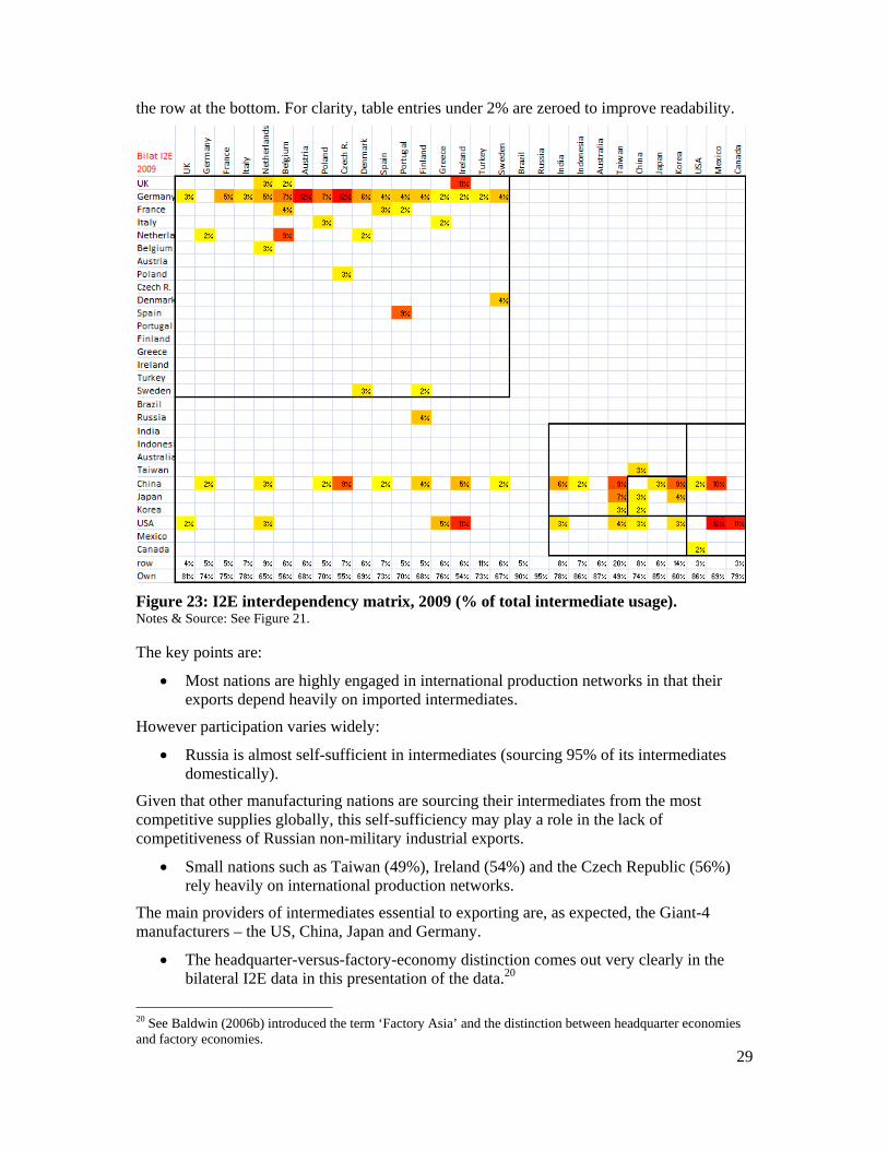
29
the row at the bottom. For clarity, table entries under 2% are zeroed to improve readability.
Figure 23: I2E interdependency matrix, 2009 (% of total intermediate usage). Notes & Source: See Figure 21.
The key points are:
Most nations are highly engaged in international production networks in that their exports depend heavily on imported intermediates.
However participation varies widely:
Russia is almost self-sufficient in intermediates (sourcing 95% of its intermediates domestically).
Given that other manufacturing nations are sourcing their intermediates from the most competitive supplies globally, this self-sufficiency may play a role in the lack of competitiveness of Russian non-military industrial exports.
Small nations such as Taiwan (49%), Ireland (54%) and the Czech Republic (56%) rely heavily on international production networks.
The main providers of intermediates essential to exporting are, as expected, the Giant-4 manufacturers – the US, China, Japan and Germany.
The headquarter-versus-factory-economy distinction comes out very clearly in the bilateral I2E data in this presentation of the data.20
20 See Baldwin (2006b) introduced the term ‘Factory Asia’ and the distinction between headquarter economies and factory economies.
30
The rows of HQ economies are very full as they are key suppliers to many partners, but their columns are very empty. Nations with advanced technology and high-wages (the headquarter economies, especially Japan, Germany and the US) have tended to offshore certain stages of production to nearby low-wage nations (the factory economies). This has created regional supply chains sometimes called Factory Asia, Factory North America and Factory Europe.
China does not fit neatly into this two-way categorisation; evidence presented in Section 6 suggests that China is exporting low-tech industrial intermediates while importing high-tech intermediates.
Looking at the regions:
Most European nations are heavily reliant on German intermediates.
The role of China is impressive – it is globally dominant as a supplier of industrial inputs;
China’s intermediate export pattern is the most globalised of all the Giant-4 manufacturers.
For example, 8 of the 16 European nations get more than 2% of their total I2E from China; its dominant role in Asia and North America has already been noted.
Germany and the US are almost as dominate as China but their sales patterns are more regional.
Japan is a key supplier of intermediates used in exports, but only for other nearby Asian countries.
4.2.1. Evolution of I2E sourcing patterns: 1995 versus 2009
Changes from 1995 can be seen by comparing Figure 21 with the same matrix for 1995 (Figure 22). The differences are stunning:
The 1995 matrix is sparser than the 2009 matrix.
This means that most nations relied less on I2E in 1995 than in 2009 – another indication of the impact of the 2nd unbundling on global flows – especially the rapid growth in North-South I2E trade shown in our intra-industry trade index charts (Figure 1).
Two national changes are particular salient:
The decrease in Mexico’s role in US supply chains.
Mexico shifted its sourcing of I2E from the US to China. More generally:
The rise of China as a source for I2E trade is stunning – but not unexpected given China’s spectacular rise in global manufacturing league tables.
In 1995, which was before China’s determined effort to join supply chains (as a means of building their own), only Korea sourced more than 2% of its export-inputs from China; Japan and the US were the main suppliers of intermediates in Asia. In the intervening 14 years, China’s fantastic manufacturing growth meant that is now an important supplier of industrial inputs to most nations in the world. On its purchasing side, it sources significant amount from Japan, Korea and the US in 2009. In a sense, China has become the Saudi Arabia of industrial inputs.
In 1995 few entries outside of the regional boxes were significant and almost all of those involved the US.
The rise of trans-Pacific I2E is one of the biggest global changes in I2E since 1995.
31
In 1995, the only globally important flows across the Pacific involved Japanese intermediates supplied to the US and Canada (mostly auto parts). In 2009, all three North American nations are sourcing heavily from China, Japan and Korea.
4.3. Sales and sourcing of I2E trade by nation Additional insights come from looking at sales and sourcing patterns for I2E by nation normalising these by the nation’s own exports rather than global totals. This allows us to see where a nation sources the intermediates it uses to export and where it sells the intermediates that are used in its partners’ exports. We start with the four giant manufacturing nations (Figure 24 and Figure 25).
The left chart in each panel shows the nation’s I2E sourcing pattern – i.e. the share of its exports made up of imported intermediates from the lists partners. For each partner, the shares are shown for 1995 and 2009 to illustrate the evolution of sourcing patterns. Note that the purchase shares are all positive, but they have been plotted as negative numbers to facilitate comparison between sourcing and sales patterns. The right chart in each panel shows the nation’s bilateral exports of I2E trade as a share of its total exports. As usual, tiny partners have been removed to improve readability.
The US figures are in the left panel of Figure 24. The key facts are:
The US’s buys significant amounts of I2E inputs from handful of suppliers (Mexico, Canada, China and Japan especially).
On the sales side (right side), Canada, China, Mexico and the RoW are the big destinations; Mexico and Canada’s role is falling as China’s is rising.
The share of US I2E exports to China has increased dramatically reaching almost 3% of US exports. Canada’s role, initially bigger than China’s, has declined steadily. While the US sells some intermediates into supply chains in the other G7 nations, these are all fairly small and declining mildly (except for Ireland which is important in the supply chains of US electronic and software companies).
On the purchasing side, Mexico and Canada continue to play a large role and both have seen their importance to the US increase over the period. China’s role has soared and is now bigger than that of Mexico and Canada. In addition, Japan and Korea’s role as suppliers of intermediates has fallen considerably
The numbers for Germany come next (right panel of Figure 24).
Germany is far more broadly involved in international supply chains than either the US or Japan; it buys and sells a significant amount of intermediates to a larger number of nations (mostly in Europe but also the US).
In 2009, almost 25% of German exports were made up of I2E trade. On the purchasing side, Germany also sources broadly, but again mostly from Europe, although both the US and China are important.
The numbers for Japan are shown in the left panel of Figure 25. Japan’s overall pattern is quite different from that of the US.
On the sales side (right bar chart), Japan has a much narrower range of ‘customers’ for its intermediate exports.
The supply chains of China, Korea, Taiwan and the US are the main purchasers of Japanese intermediates.
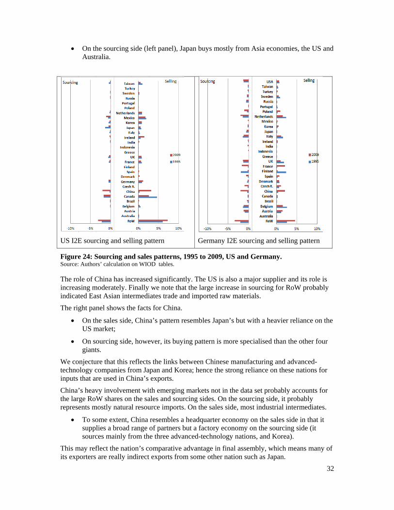
32
On the sourcing side (left panel), Japan buys mostly from Asia economies, the US and Australia.
US I2E sourcing and selling pattern
Germany I2E sourcing and selling pattern
Figure 24: Sourcing and sales patterns, 1995 to 2009, US and Germany. Source: Authors’ calculation on WIOD tables.
The role of China has increased significantly. The US is also a major supplier and its role is increasing moderately. Finally we note that the large increase in sourcing for RoW probably indicated East Asian intermediates trade and imported raw materials.
The right panel shows the facts for China.
On the sales side, China’s pattern resembles Japan’s but with a heavier reliance on the US market;
On sourcing side, however, its buying pattern is more specialised than the other four giants.
We conjecture that this reflects the links between Chinese manufacturing and advanced-technology companies from Japan and Korea; hence the strong reliance on these nations for inputs that are used in China’s exports.
China’s heavy involvement with emerging markets not in the data set probably accounts for the large RoW shares on the sales and sourcing sides. On the sourcing side, it probably represents mostly natural resource imports. On the sales side, most industrial intermediates.
To some extent, China resembles a headquarter economy on the sales side in that it supplies a broad range of partners but a factory economy on the sourcing side (it sources mainly from the three advanced-technology nations, and Korea).
This may reflect the nation’s comparative advantage in final assembly, which means many of its exporters are really indirect exports from some other nation such as Japan.
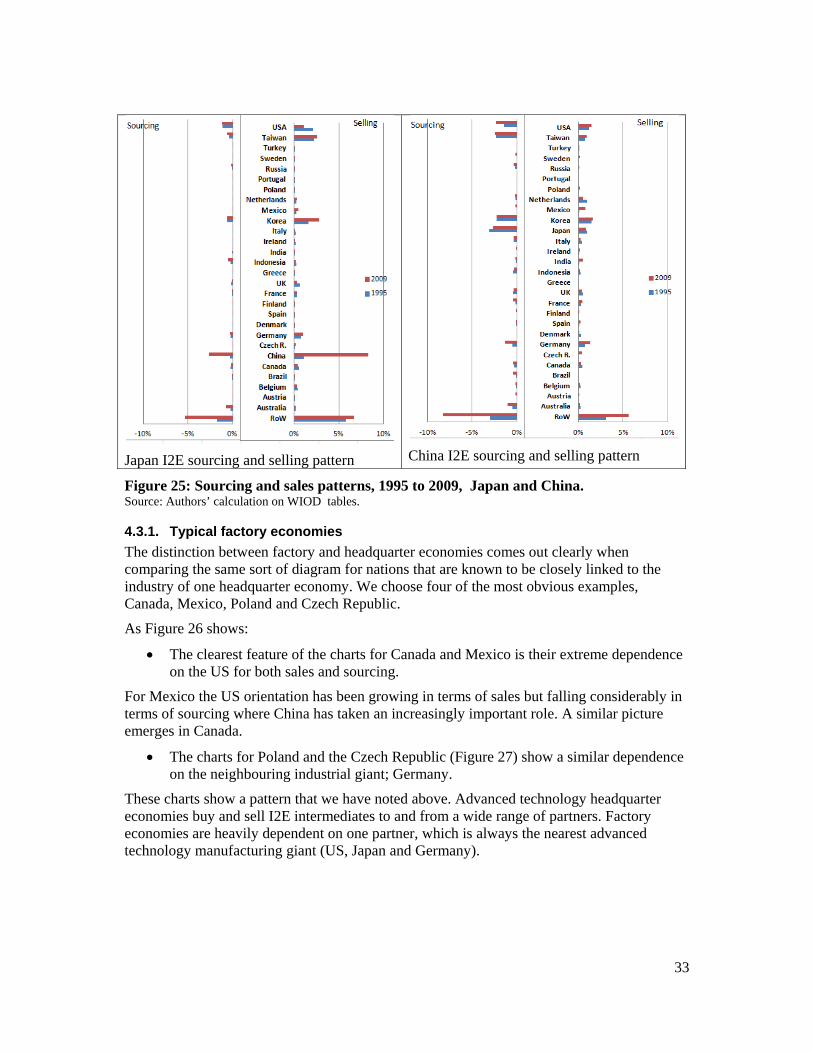
33
Japan I2E sourcing and selling pattern China I2E sourcing and selling pattern
Figure 25: Sourcing and sales patterns, 1995 to 2009, Japan and China. Source: Authors’ calculation on WIOD tables.
4.3.1. Typical factory economies
The distinction between factory and headquarter economies comes out clearly when comparing the same sort of diagram for nations that are known to be closely linked to the industry of one headquarter economy. We choose four of the most obvious examples, Canada, Mexico, Poland and Czech Republic.
As Figure 26 shows:
The clearest feature of the charts for Canada and Mexico is their extreme dependence on the US for both sales and sourcing.
For Mexico the US orientation has been growing in terms of sales but falling considerably in terms of sourcing where China has taken an increasingly important role. A similar picture emerges in Canada.
The charts for Poland and the Czech Republic (Figure 27) show a similar dependence on the neighbouring industrial giant; Germany.
These charts show a pattern that we have noted above. Advanced technology headquarter economies buy and sell I2E intermediates to and from a wide range of partners. Factory economies are heavily dependent on one partner, which is always the nearest advanced technology manufacturing giant (US, Japan and Germany).
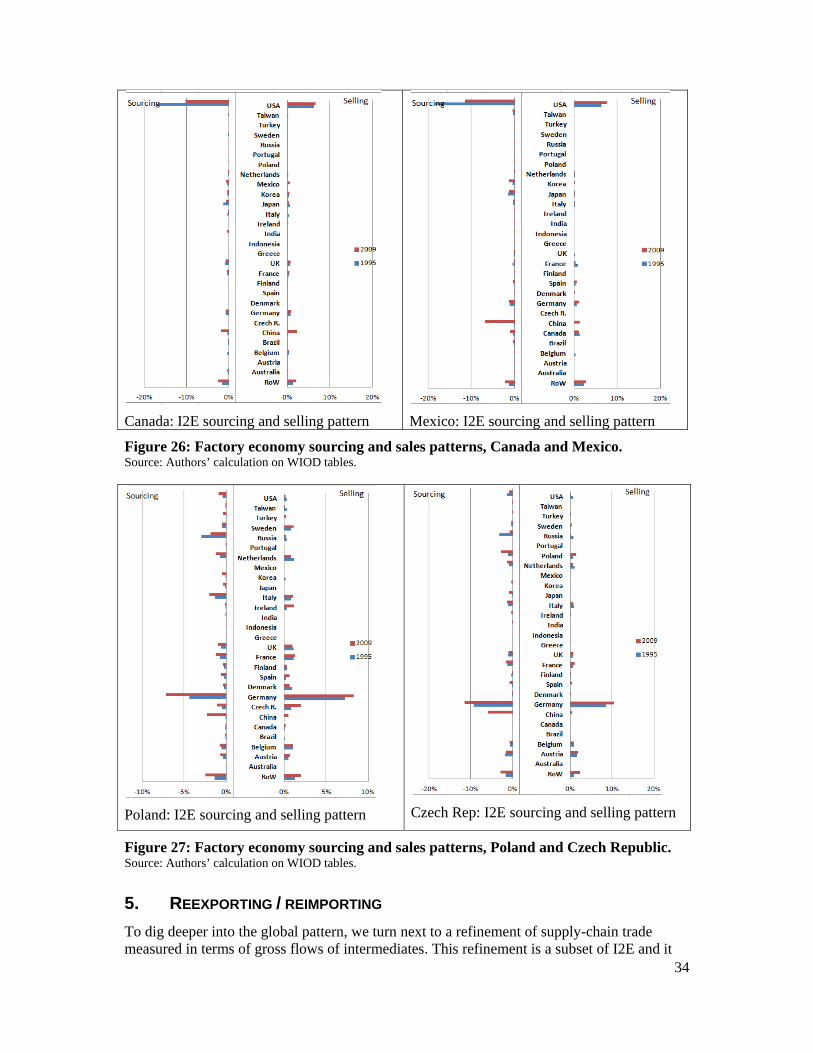
34
Canada: I2E sourcing and selling pattern
Mexico: I2E sourcing and selling pattern
Figure 26: Factory economy sourcing and sales patterns, Canada and Mexico. Source: Authors’ calculation on WIOD tables.
Poland: I2E sourcing and selling pattern
Czech Rep: I2E sourcing and selling pattern
Figure 27: Factory economy sourcing and sales patterns, Poland and Czech Republic. Source: Authors’ calculation on WIOD tables.
5. REEXPORTING / REIMPORTING
To dig deeper into the global pattern, we turn next to a refinement of supply-chain trade measured in terms of gross flows of intermediates. This refinement is a subset of I2E and it
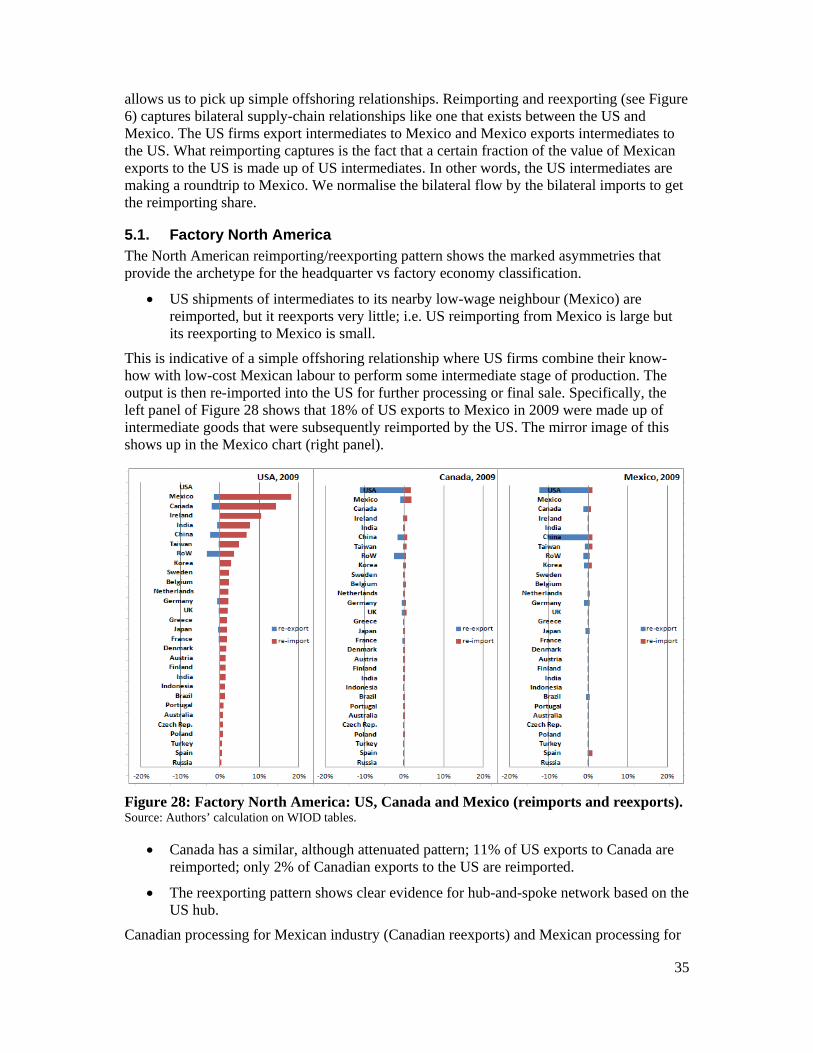
35
allows us to pick up simple offshoring relationships. Reimporting and reexporting (see Figure 6) captures bilateral supply-chain relationships like one that exists between the US and Mexico. The US firms export intermediates to Mexico and Mexico exports intermediates to the US. What reimporting captures is the fact that a certain fraction of the value of Mexican exports to the US is made up of US intermediates. In other words, the US intermediates are making a roundtrip to Mexico. We normalise the bilateral flow by the bilateral imports to get the reimporting share.
5.1. Factory North America The North American reimporting/reexporting pattern shows the marked asymmetries that provide the archetype for the headquarter vs factory economy classification.
US shipments of intermediates to its nearby low-wage neighbour (Mexico) are reimported, but it reexports very little; i.e. US reimporting from Mexico is large but its reexporting to Mexico is small.
This is indicative of a simple offshoring relationship where US firms combine their know-how with low-cost Mexican labour to perform some intermediate stage of production. The output is then re-imported into the US for further processing or final sale. Specifically, the left panel of Figure 28 shows that 18% of US exports to Mexico in 2009 were made up of intermediate goods that were subsequently reimported by the US. The mirror image of this shows up in the Mexico chart (right panel).
Figure 28: Factory North America: US, Canada and Mexico (reimports and reexports). Source: Authors’ calculation on WIOD tables.
Canada has a similar, although attenuated pattern; 11% of US exports to Canada are reimported; only 2% of Canadian exports to the US are reimported.
The reexporting pattern shows clear evidence for hub-and-spoke network based on the US hub.
Canadian processing for Mexican industry (Canadian reexports) and Mexican processing for
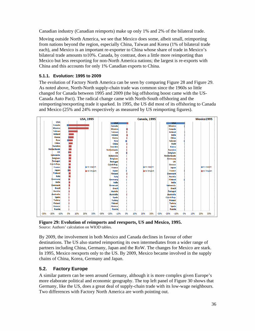
36
Canadian industry (Canadian reimports) make up only 1% and 2% of the bilateral trade.
Moving outside North America, we see that Mexico does some, albeit small, reimporting from nations beyond the region, especially China, Taiwan and Korea (1% of bilateral trade each), and Mexico is an important re-exporter to China whose share of trade in Mexico’s bilateral trade amounts to10%. Canada, by contrast, does a little more reimporting than Mexico but less reexporting for non-North America nations; the largest is re-exports with China and this accounts for only 1% Canadian exports to China.
5.1.1. Evolution: 1995 to 2009
The evolution of Factory North America can be seen by comparing Figure 28 and Figure 29. As noted above, North-North supply-chain trade was common since the 1960s so little changed for Canada between 1995 and 2009 (the big offshoring boost came with the US-Canada Auto Pact). The radical change came with North-South offshoring and the reimporting/reexporting trade it sparked. In 1995, the US did most of its offshoring to Canada and Mexico (25% and 24% respectively as measured by US reimporting figures).
Figure 29: Evolution of reimports and reexports, US and Mexico, 1995. Source: Authors’ calculation on WIOD tables.
By 2009, the involvement in both Mexico and Canada declines in favour of other destinations. The US also started reimporting its own intermediates from a wider range of partners including China, Germany, Japan and the RoW. The changes for Mexico are stark. In 1995, Mexico reexports only to the US. By 2009, Mexico became involved in the supply chains of China, Korea, Germany and Japan.
5.2. Factory Europe A similar pattern can be seen around Germany, although it is more complex given Europe’s more elaborate political and economic geography. The top left panel of Figure 30 shows that Germany, like the US, does a great deal of supply-chain trade with its low-wage neighbours. Two differences with Factory North America are worth pointing out.
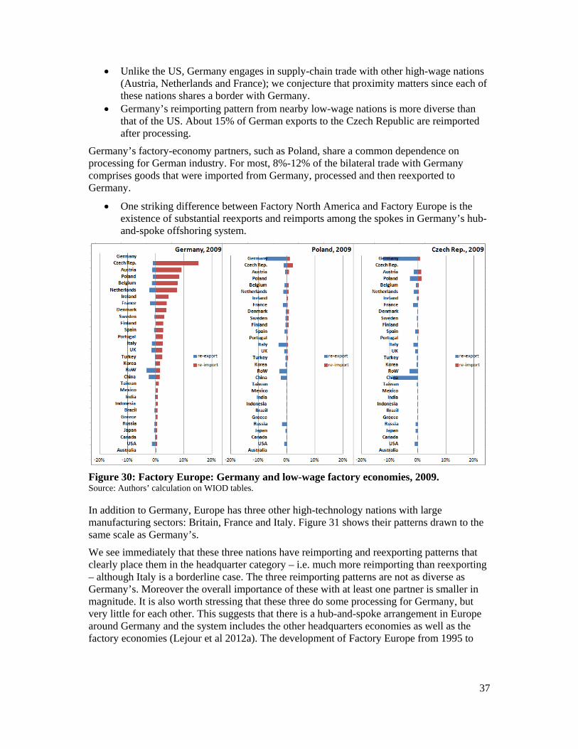
37
Unlike the US, Germany engages in supply-chain trade with other high-wage nations (Austria, Netherlands and France); we conjecture that proximity matters since each of these nations shares a border with Germany.
Germany’s reimporting pattern from nearby low-wage nations is more diverse than that of the US. About 15% of German exports to the Czech Republic are reimported after processing.
Germany’s factory-economy partners, such as Poland, share a common dependence on processing for German industry. For most, 8%-12% of the bilateral trade with Germany comprises goods that were imported from Germany, processed and then reexported to Germany.
One striking difference between Factory North America and Factory Europe is the existence of substantial reexports and reimports among the spokes in Germany’s hub-and-spoke offshoring system.
Figure 30: Factory Europe: Germany and low-wage factory economies, 2009. Source: Authors’ calculation on WIOD tables.
In addition to Germany, Europe has three other high-technology nations with large manufacturing sectors: Britain, France and Italy. Figure 31 shows their patterns drawn to the same scale as Germany’s.
We see immediately that these three nations have reimporting and reexporting patterns that clearly place them in the headquarter category – i.e. much more reimporting than reexporting – although Italy is a borderline case. The three reimporting patterns are not as diverse as Germany’s. Moreover the overall importance of these with at least one partner is smaller in magnitude. It is also worth stressing that these three do some processing for Germany, but very little for each other. This suggests that there is a hub-and-spoke arrangement in Europe around Germany and the system includes the other headquarters economies as well as the factory economies (Lejour et al 2012a). The development of Factory Europe from 1995 to
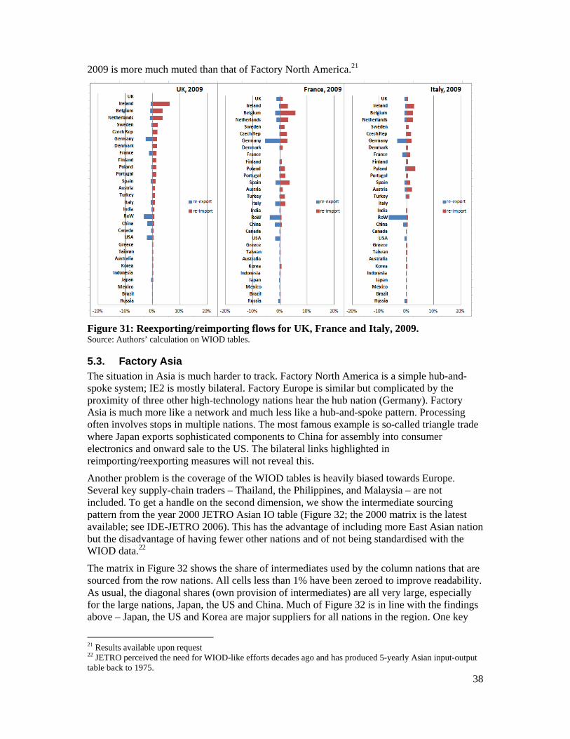
38
2009 is more much muted than that of Factory North America.21
Figure 31: Reexporting/reimporting flows for UK, France and Italy, 2009. Source: Authors’ calculation on WIOD tables.
5.3. Factory Asia The situation in Asia is much harder to track. Factory North America is a simple hub-and-spoke system; IE2 is mostly bilateral. Factory Europe is similar but complicated by the proximity of three other high-technology nations hear the hub nation (Germany). Factory Asia is much more like a network and much less like a hub-and-spoke pattern. Processing often involves stops in multiple nations. The most famous example is so-called triangle trade where Japan exports sophisticated components to China for assembly into consumer electronics and onward sale to the US. The bilateral links highlighted in reimporting/reexporting measures will not reveal this.
Another problem is the coverage of the WIOD tables is heavily biased towards Europe. Several key supply-chain traders – Thailand, the Philippines, and Malaysia – are not included. To get a handle on the second dimension, we show the intermediate sourcing pattern from the year 2000 JETRO Asian IO table (Figure 32; the 2000 matrix is the latest available; see IDE-JETRO 2006). This has the advantage of including more East Asian nation but the disadvantage of having fewer other nations and of not being standardised with the WIOD data.22
The matrix in Figure 32 shows the share of intermediates used by the column nations that are sourced from the row nations. All cells less than 1% have been zeroed to improve readability. As usual, the diagonal shares (own provision of intermediates) are all very large, especially for the large nations, Japan, the US and China. Much of Figure 32 is in line with the findings above – Japan, the US and Korea are major suppliers for all nations in the region. One key
21 Results available upon request 22 JETRO perceived the need for WIOD-like efforts decades ago and has produced 5-yearly Asian input-output table back to 1975.
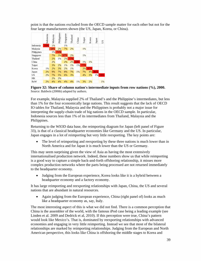
39
point is that the nations excluded from the OECD sample matter for each other but not for the four large manufacturers shown (the US, Japan, Korea, or China).
Figure 32: Share of column nation's intermediate inputs from row nations (%), 2000. Source: Baldwin (2006b) adapted by authors.
For example, Malaysia supplied 2% of Thailand’s and the Philippine’s intermediates, but less than 1% for the four economically large nations. This result suggests that the lack of OECD IO tables for Thailand, Malaysia and the Philippines is probably not a major issue for interpreting the supply-chain trade of big nations in the OECD sample. In particular, Indonesia sources less than 1% of its intermediates from Thailand, Malaysia and the Philippines.
Returning to the WIOD data base, the reimporting diagram for Japan (left panel of Figure 33), is that of a classical headquarter economies like Germany and the US. In particular, Japan engages in a lot of reimporting but very little reexporting. The key points are:
The level of reimporting and reexporting by these three nations is much lower than in North America and for Japan it is much lower than the US or Germany.
This may seem surprising given the view of Asia as having the most extensively internationalised production network. Indeed, these numbers show us that while reimporting is a good way to capture a simple back-and-forth offshoring relationship, it misses more complex production networks where the parts being processed are not returned immediately to the headquarter economy.
Judging from the European experience, Korea looks like it is a hybrid between a headquarter economy and a factory economy.
It has large reimporting and reexporting relationships with Japan, China, the US and several nations that are abundant in natural resources.
Again judging from the European experience, China (right panel of) looks as much like a headquarter economy as, say, Italy.
The most interesting aspect of this is what we did not find. There is a common perception that China is the assembler of the world, with the famous iPod case being a leading example (see Linden et al. 2009 and Dedrick et al, 2010). If this perception were true, China’s pattern would look like Mexico’s. That is, dominated by reexporting relationships with advanced economies and engaging in very little reimporting. Instead we see that most of the bilateral relationships are marked by reimporting relationships. Judging from the European and North American perspective, this looks like China is offshoring the middle stages to Korea and
Indo
nesi
a
Mal
aysi
a
Phi
lippi
nes
Sin
gapo
re
Tha
iland
Chi
na
Tai
pei
Kor
ea
Japa
n
US
Indonesia 90% 1% 1%Malaysia 58% 2% 7% 2% 1%Philippines 1% 71%Singapore 7% 3% 67% 2% 1%Thailand 2% 1% 2% 77%China 2% 2% 2% 93% 1% 1%Taipei 3% 2% 1% 1% 1% 77%Korea 1% 2% 3% 2% 1% 2% 87%Japan 2% 9% 7% 8% 7% 1% 7% 4% 96%US 2% 7% 5% 6% 3% 4% 3% 1% 96%HK 2% 2%RoW 2% 4% 4% 4% 4% 1% 3% 2% 1%
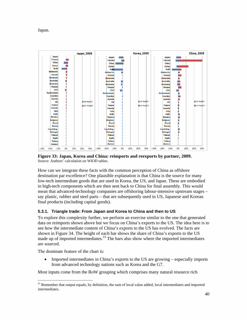
40
Japan.
Figure 33: Japan, Korea and China: reimports and reexports by partner, 2009. Source: Authors’ calculation on WIOD tables.
How can we integrate these facts with the common perception of China as offshore destination par excellence? One plausible explanation is that China is the source for many low-tech intermediate goods that are used in Korea, the US, and Japan. These are embodied in high-tech components which are then sent back to China for final assembly. This would mean that advanced-technology companies are offshoring labour-intensive upstream stages – say plastic, rubber and steel parts – that are subsequently used in US, Japanese and Korean final products (including capital goods).
5.3.1. Triangle trade: From Japan and Korea to China and then to US
To explore this complexity further, we perform an exercise similar to the one that generated data on reimports shown above but we focus on China’s exports to the US. The idea here is to see how the intermediate content of China’s exports to the US has evolved. The facts are shown in Figure 34. The height of each bar shows the share of China’s exports to the US made up of imported intermediates.23 The bars also show where the imported intermediates are sourced.
The dominate feature of the chart is:
Imported intermediates in China’s exports to the US are growing – especially imports from advanced technology nations such as Korea and the G7.
Most inputs come from the RoW grouping which comprises many natural resource rich
23 Remember that output equals, by definition, the sum of local value added, local intermediates and imported intermediates.
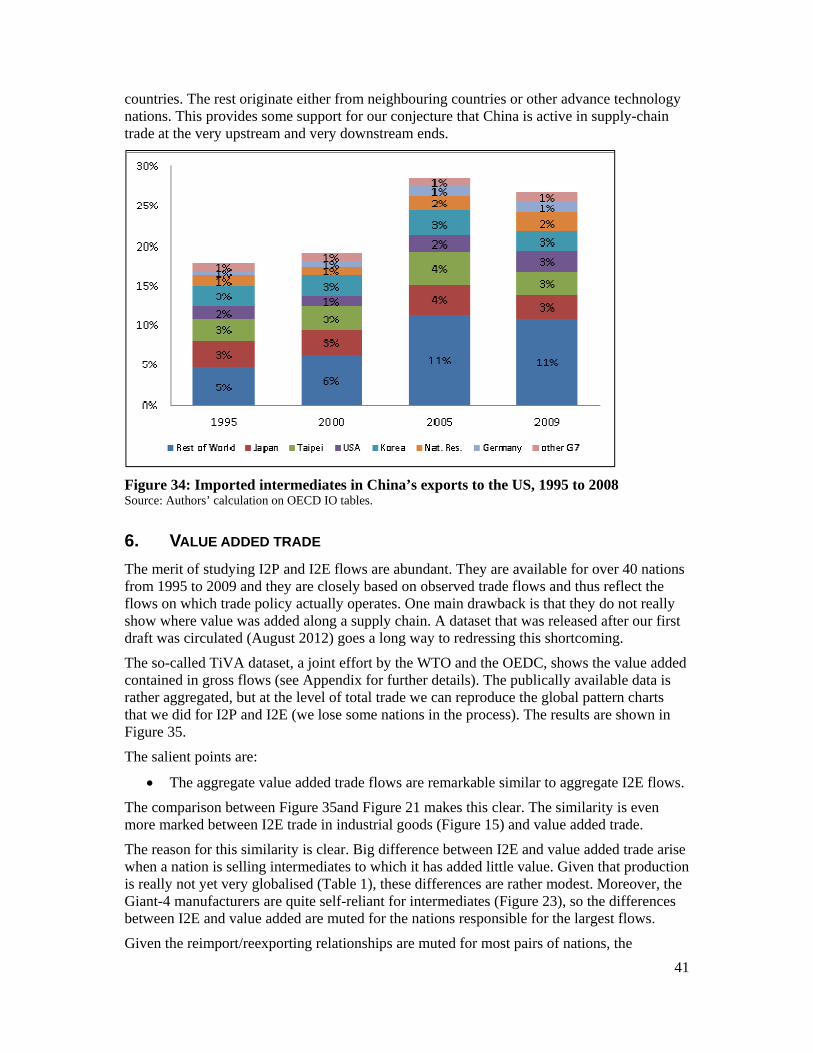
41
countries. The rest originate either from neighbouring countries or other advance technology nations. This provides some support for our conjecture that China is active in supply-chain trade at the very upstream and very downstream ends.
Figure 34: Imported intermediates in China’s exports to the US, 1995 to 2008 Source: Authors’ calculation on OECD IO tables.
6. VALUE ADDED TRADE
The merit of studying I2P and I2E flows are abundant. They are available for over 40 nations from 1995 to 2009 and they are closely based on observed trade flows and thus reflect the flows on which trade policy actually operates. One main drawback is that they do not really show where value was added along a supply chain. A dataset that was released after our first draft was circulated (August 2012) goes a long way to redressing this shortcoming.
The so-called TiVA dataset, a joint effort by the WTO and the OEDC, shows the value added contained in gross flows (see Appendix for further details). The publically available data is rather aggregated, but at the level of total trade we can reproduce the global pattern charts that we did for I2P and I2E (we lose some nations in the process). The results are shown in Figure 35.
The salient points are:
The aggregate value added trade flows are remarkable similar to aggregate I2E flows.
The comparison between Figure 35and Figure 21 makes this clear. The similarity is even more marked between I2E trade in industrial goods (Figure 15) and value added trade.
The reason for this similarity is clear. Big difference between I2E and value added trade arise when a nation is selling intermediates to which it has added little value. Given that production is really not yet very globalised (Table 1), these differences are rather modest. Moreover, the Giant-4 manufacturers are quite self-reliant for intermediates (Figure 23), so the differences between I2E and value added are muted for the nations responsible for the largest flows.
Given the reimport/reexporting relationships are muted for most pairs of nations, the
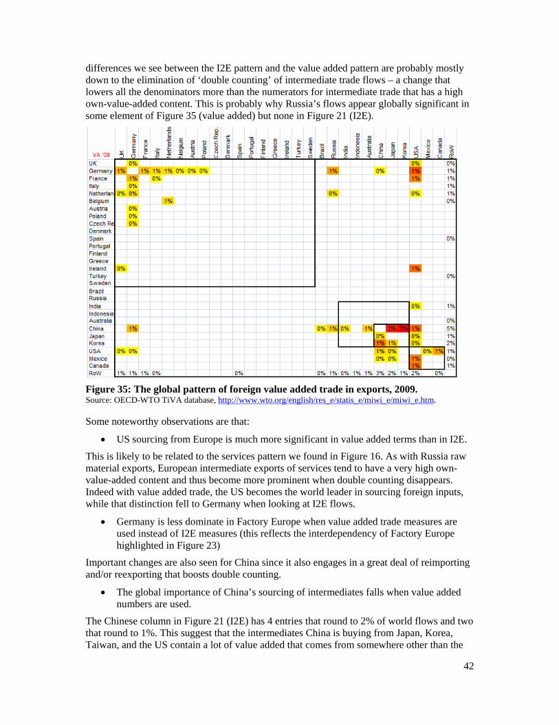
42
differences we see between the I2E pattern and the value added pattern are probably mostly down to the elimination of ‘double counting’ of intermediate trade flows – a change that lowers all the denominators more than the numerators for intermediate trade that has a high own-value-added content. This is probably why Russia’s flows appear globally significant in some element of Figure 35 (value added) but none in Figure 21 (I2E).
Figure 35: The global pattern of foreign value added trade in exports, 2009. Source: OECD-WTO TiVA database, http://www.wto.org/english/res_e/statis_e/miwi_e/miwi_e.htm.
Some noteworthy observations are that:
US sourcing from Europe is much more significant in value added terms than in I2E.
This is likely to be related to the services pattern we found in Figure 16. As with Russia raw material exports, European intermediate exports of services tend to have a very high own-value-added content and thus become more prominent when double counting disappears. Indeed with value added trade, the US becomes the world leader in sourcing foreign inputs, while that distinction fell to Germany when looking at I2E flows.
Germany is less dominate in Factory Europe when value added trade measures are used instead of I2E measures (this reflects the interdependency of Factory Europe highlighted in Figure 23)
Important changes are also seen for China since it also engages in a great deal of reimporting and/or reexporting that boosts double counting.
The global importance of China’s sourcing of intermediates falls when value added numbers are used.
The Chinese column in Figure 21 (I2E) has 4 entries that round to 2% of world flows and two that round to 1%. This suggest that the intermediates China is buying from Japan, Korea, Taiwan, and the US contain a lot of value added that comes from somewhere other than the
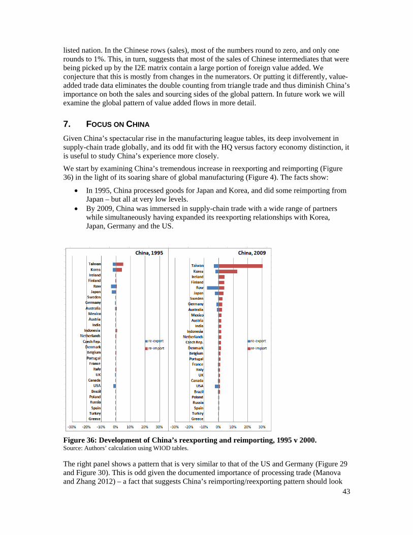
43
listed nation. In the Chinese rows (sales), most of the numbers round to zero, and only one rounds to 1%. This, in turn, suggests that most of the sales of Chinese intermediates that were being picked up by the I2E matrix contain a large portion of foreign value added. We conjecture that this is mostly from changes in the numerators. Or putting it differently, value-added trade data eliminates the double counting from triangle trade and thus diminish China’s importance on both the sales and sourcing sides of the global pattern. In future work we will examine the global pattern of value added flows in more detail.
7. FOCUS ON CHINA
Given China’s spectacular rise in the manufacturing league tables, its deep involvement in supply-chain trade globally, and its odd fit with the HQ versus factory economy distinction, it is useful to study China’s experience more closely.
We start by examining China’s tremendous increase in reexporting and reimporting (Figure 36) in the light of its soaring share of global manufacturing (Figure 4). The facts show:
In 1995, China processed goods for Japan and Korea, and did some reimporting from Japan – but all at very low levels.
By 2009, China was immersed in supply-chain trade with a wide range of partners while simultaneously having expanded its reexporting relationships with Korea, Japan, Germany and the US.
Figure 36: Development of China’s reexporting and reimporting, 1995 v 2000. Source: Authors’ calculation using WIOD tables.
The right panel shows a pattern that is very similar to that of the US and Germany (Figure 29 and Figure 30). This is odd given the documented importance of processing trade (Manova and Zhang 2012) – a fact that suggests China’s reimporting/reexporting pattern should look
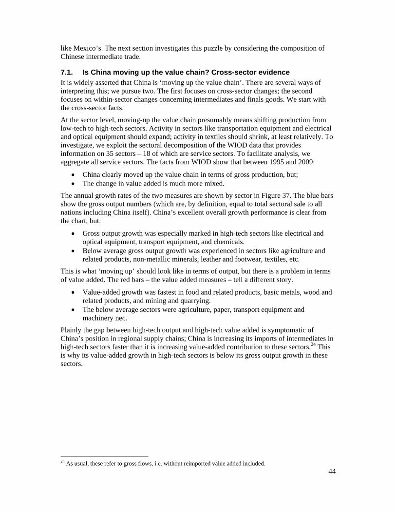
44
like Mexico’s. The next section investigates this puzzle by considering the composition of Chinese intermediate trade.
7.1. Is China moving up the value chain? Cross-sector evidence It is widely asserted that China is ‘moving up the value chain’. There are several ways of interpreting this; we pursue two. The first focuses on cross-sector changes; the second focuses on within-sector changes concerning intermediates and finals goods. We start with the cross-sector facts.
At the sector level, moving-up the value chain presumably means shifting production from low-tech to high-tech sectors. Activity in sectors like transportation equipment and electrical and optical equipment should expand; activity in textiles should shrink, at least relatively. To investigate, we exploit the sectoral decomposition of the WIOD data that provides information on 35 sectors – 18 of which are service sectors. To facilitate analysis, we aggregate all service sectors. The facts from WIOD show that between 1995 and 2009:
China clearly moved up the value chain in terms of gross production, but; The change in value added is much more mixed.
The annual growth rates of the two measures are shown by sector in Figure 37. The blue bars show the gross output numbers (which are, by definition, equal to total sectoral sale to all nations including China itself). China’s excellent overall growth performance is clear from the chart, but:
Gross output growth was especially marked in high-tech sectors like electrical and optical equipment, transport equipment, and chemicals.
Below average gross output growth was experienced in sectors like agriculture and related products, non-metallic minerals, leather and footwear, textiles, etc.
This is what ‘moving up’ should look like in terms of output, but there is a problem in terms of value added. The red bars – the value added measures – tell a different story.
Value-added growth was fastest in food and related products, basic metals, wood and related products, and mining and quarrying.
The below average sectors were agriculture, paper, transport equipment and machinery nec.
Plainly the gap between high-tech output and high-tech value added is symptomatic of China’s position in regional supply chains; China is increasing its imports of intermediates in high-tech sectors faster than it is increasing value-added contribution to these sectors.24 This is why its value-added growth in high-tech sectors is below its gross output growth in these sectors.
24 As usual, these refer to gross flows, i.e. without reimported value added included.
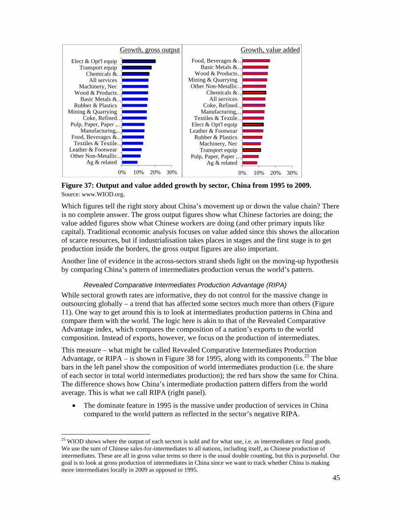
45
Figure 37: Output and value added growth by sector, China from 1995 to 2009. Source: www.WIOD.org.
Which figures tell the right story about China’s movement up or down the value chain? There is no complete answer. The gross output figures show what Chinese factories are doing; the value added figures show what Chinese workers are doing (and other primary inputs like capital). Traditional economic analysis focuses on value added since this shows the allocation of scarce resources, but if industrialisation takes places in stages and the first stage is to get production inside the borders, the gross output figures are also important.
Another line of evidence in the across-sectors strand sheds light on the moving-up hypothesis by comparing China’s pattern of intermediates production versus the world’s pattern.
Revealed Comparative Intermediates Production Advantage (RIPA)
While sectoral growth rates are informative, they do not control for the massive change in outsourcing globally – a trend that has affected some sectors much more than others (Figure 11). One way to get around this is to look at intermediates production patterns in China and compare them with the world. The logic here is akin to that of the Revealed Comparative Advantage index, which compares the composition of a nation’s exports to the world composition. Instead of exports, however, we focus on the production of intermediates.
This measure – what might be called Revealed Comparative Intermediates Production Advantage, or RIPA – is shown in Figure 38 for 1995, along with its components.25 The blue bars in the left panel show the composition of world intermediates production (i.e. the share of each sector in total world intermediates production); the red bars show the same for China. The difference shows how China’s intermediate production pattern differs from the world average. This is what we call RIPA (right panel).
The dominate feature in 1995 is the massive under production of services in China compared to the world pattern as reflected in the sector’s negative RIPA.
25 WIOD shows where the output of each sectors is sold and for what use, i.e. as intermediates or final goods. We use the sum of Chinese sales-for-intermediates to all nations, including itself, as Chinese production of intermediates. These are all in gross value terms so there is the usual double counting, but this is purposeful. Our goal is to look at gross production of intermediates in China since we want to track whether China is making more intermediates locally in 2009 as opposed to 1995.
0% 10% 20% 30%
Ag & relatedOther Non-Metallic…Leather & Footwear
Textiles & Textile…Food, Beverages &…
Manufacturing,…Pulp, Paper, Paper ,…
Coke, Refined…Mining & Quarrying
Rubber & PlasticsBasic Metals &…
Wood & Products…Machinery, Nec
All servicesChemicals &…
Transport equipElect & Opt'l equip
Growth, gross output
0% 10% 20% 30%
Ag & relatedPulp, Paper, Paper ,…
Transport equipMachinery, Nec
Rubber & PlasticsLeather & FootwearElect & Opt'l equipTextiles & Textile…
Manufacturing,…Coke, Refined…
All servicesChemicals &…
Other Non-Metallic…Mining & Quarrying
Wood & Products…Basic Metals &…
Food, Beverages &…
Growth, value added
46
China’s RIPA for most goods sectors are positive but vary in size. The goods sectors are ordered roughly according to sophistication, ranging from electrical and optimal equipment (this includes electronics) to raw materials like coke, petroleum & nuclear fuel.
Figure 38: Revealed Intermediates Production Advantage (RIPA), 1995 Source: www.WIOD.org
Figure 39: Revealed Intermediates Production Advantage (RIPA), 2009 Source: www.WIOD.org
To gauge the evolution of intermediates production across sector in China versus the world, Figure 39 displays the same numbers for 2009. The left panel shows the two production profiles as before (but for 2009) and the right panel shows RIPA for 1995 (red bars) and 2009 (black bars). The dominant shift between 1995 and 2009 is:
China’s gap in intermediate services disappears.
In 1995, only 27% of Chinese intermediates were in services, while the global figure was
0% 10% 20% 30% 40% 50% 60%
Other Non-Metal MineralCoke, Petro & Nuclear Fuel
Mining & QuarryingAg & related
Food & relatedTextiles & related
Leather & FootwearPaper & related
Rubber & PlasticsWood & related
Manufact, necMachinery, nec
Basic & Fabricated MetalChemicals & related
Transport equipElect & Opt'l equip
All Services
China '95
World '95
-30%-20%-10% 0% 10%
RIPA'95
0% 25% 50% 75%
Other Non-Metal MineralCoke, Petro & Nuclear…
Mining & QuarryingAg & related
Food & relatedTextiles & related
Leather & FootwearPaper & related
Rubber & PlasticsWood & related
Manufact, necMachinery, nec
Basic & Fabricated MetalChemicals & related
Transport equipElect & Opt'l equip
All Services
China '09
World '09
-30% -20% -10% 0% 10%
RIPA '95
RIPA '09

47
52%; by 2009, the Chinese figure was 63% while the global figure was 64%. Whether this reflects reality or changes in Chinese statistical practices is impossible to say.26
Returning to the up-the-value-chain question, we see in 2009:
China had a revealed intermediates production advantage (RIPA is positive) in some primary sectors and some light manufacturing sectors.
The former include agriculture and related goods, fuels, and mining; the latter include textiles and related, leather and related, rubber and plastic goods, and manufacturing not elsewhere classified, nec). China also has a RIPA edge in chemicals, and basic and fabricated metals. To summarise:
China has a revealed intermediates production dis-advantage (RIPA is negative) in high-tech sectors; and
A revealed intermediates production advantage (RIPA is positive) in low-tech sectors.
In short, China’s growth in the production of intermediates in high-tech sectors has not kept pace with global growth. For example, the numbers for transport equipment, and electrical and optical equipment are negative while they are positive for agriculture and related products, leather and related products and manufacturing not elsewhere classified. Table 5 shows the numbers explicitly.27
RIPA '09 RIPA '95
RIPA '09 minus '95
Other Non-Metallic Mineral 3% 4% -1% Coke, Refined Petroleum and Nuclear Fuel -1% 1% -2% Mining and Quarrying -3% 1% -4% Agriculture, Hunting, Forestry and Fishing 3% 6% -4% Food, Beverages and Tobacco 0% 1% -1% Textiles and Textile Products -1% 4% -5% Leather, Leather and Footwear 3% 1% 2% Pulp, Paper, Paper , Printing and Publishing -1% -1% 0% Rubber and Plastics 0% 1% -1% Wood and Products of Wood and Cork -1% 0% -1% Manufacturing, nec; Recycling 4% 0% 4% Machinery, Nec -2% 2% -4% Basic Metals and Fabricated Metal 0% 5% -4% Chemicals and Chemical Products 1% 2% -1% Transport Equipment -3% -1% -1% Electrical and Optical Equipment -1% 0% -1% All Services -1% -25% 24%
Table 5: China’s RIPA in 1995, 2009 and swings by sector. Source: www.WIOD.org
The interpretation of these numbers, however, is not straightforward since a low-tech sector
26 Communist planners tended to be dismissive of service sector output. In the USSR, for example, products were routinely valued according to weight as prices did not necessary reflect value. In such procedures, services were ‘under-weighted’. 27 This conclusion can be moderated when we consider only goods. The reason for doing so is that the dominate swing in services between 1995 and 2009 is so massively positive that it tends to make all other changes negative. That is, given the way the index is formulated, the distribution of swings in goods must be on average negative by 24 percentage points. The big winners among the goods sectors – i.e. where China’s RIPA rose the most – were in manufacturing nec (4 percentage points), and leather and related (2 percentage points). The rest saw China losing ground with the heaviest losses in low-tech industries such as metals, and textiles.
48
like agriculture can use very high-tech intermediates, and some intermediates in high-tech sectors are themselves very low tech. Nevertheless, this finding cast doubts on the notion that China is shifting its intermediates production in a way that makes it more self-sufficient in high-tech sectors. Of course the level of aggregation could be hiding many important developments, but RIPA does not provide any clear evidence of an upward shift in China’s value chain.
7.1.1. Within sector evidence: Substituting local for imported intermediates
Next we turn to intermediate usage. We are looking for evidence that China is replacing imported intermediates with domestically produced ones, especially in high-tech sectors. We start with the composition of China’s intermediate usage for all production rather than simply those used for exporting (i.e. I2P rather than I2E).
Evidence from the imported intermediates ratio (IIR) To investigate local versus foreign sourcing of intermediates, we look at China’s imported intermediate ratio. This is just the value of imported intermediates over the sum of imported and locally sourced intermediates. As Figure 37 shows, in 1995 China sourced less than 20% of its intermediates from abroad in most of the sectors, although for electrical and optical equipment the figure was over 30% (blue bars). Note that this is for all production, not just export-oriented production.
Figure 40: Imported Intermediates Ratio (IIR): China 1995 & 2009. Source: www.WIOD.org; note: IIR = Chinese imports of intermediates over Chinese usage of intermediates (sourced locally and abroad).
To look for switches from imported to local sources, we also plot the imported-intermediates ratio (IIR) for 2009 (red bars). The notable facts are:
China saw a very large switch towards foreign sourcing in services, and natural resource sectors (mining and quarrying);
Large switches away from foreign sourcing are in ‘light manufactures’ (textiles and clothing, leather and footwear, and Wood and related products).
China’s dependence on imported intermediates did not abate in the higher-tech sectors such as electrical and optical equipment, transport equipment or chemicals.
0% 10% 20% 30% 40%
Other Non-Metal MineralFood & related
Ag & relatedRubber & Plastics
Coke, Petro & Nuclear FuelBasic & Fabricated Metal
Transport equipPaper & related
Mining & QuarryingWood & related
Chemicals & relatedTextiles & related
Leather & FootwearElect & Opt'l equip
All Services
IIR '09
IIR '95
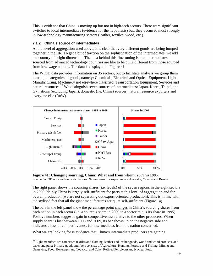
49
This is evidence that China is moving up but not in high-tech sectors. There were significant switches to local intermediates (evidence for the hypothesis) but, they occurred most strongly in low-technology manufacturing sectors (leather, textiles, wood, etc.).
7.1.2. China’s source of intermediates
At the level of aggregation used above, it is clear that very different goods are being lumped together in the IIR. To get a bit of traction on the sophistication of the intermediates, we add the country of origin dimension. The idea behind this fine-tuning is that intermediates sourced from advanced technology countries are like to be quite different from those sourced from low-wage nations. The data is displayed in Figure 41.
The WIOD data provides information on 35 sectors, but to facilitate analysis we group them into eight categories of goods, namely: Chemicals, Electrical and Optical Equipment, Light Manufacturing, Machinery not elsewhere classified, Transportation Equipment, Services and natural resources.28 We distinguish seven sources of intermediates: Japan, Korea, Taipei, the G7 nations (excluding Japan), domestic (i.e. China) sources, natural resource exporters and everyone else (RoW).
Figure 41: Changing sourcing, China: What and from whom, 2009 vs 1995. Source: WIOD with authors’ calculations. Natural resource exporters are Australia, Canada and Russia.
The right panel shows the sourcing shares (i.e. levels) of the seven regions in the eight sectors in 2009.Plainly China is largely self-sufficient for parts at this level of aggregation and for overall production (we are not separating out export-oriented production). This is in line with the stylised fact that all the giant manufactures are quite self-sufficient (Figure 14).
The bars in the left panel show the percentage point changes in China’s sourcing shares from each nation in each sector (i.e. a source’s share in 2009 in a sector minus its share in 1995). Positive numbers suggest a gain in competitiveness relative to the other producers. When supply share is lost between 1995 and 2009, its bar shows up on the negative side and indicates a loss of competitiveness for intermediates from the nation concerned.
What we are looking for is evidence that China’s intermediate producers are gaining
28 Light manufactures comprises textiles and clothing, leather and leather goods, wood and wood products, and paper and pulp; Primary goods and fuels consists of Agriculture, Hunting, Forestry and Fishing, Mining and Quarrying, Food, Beverages and Tobacco, and Coke, Refined Petroleum and Nuclear Fuel.
-20% -10% 0% 10% 20%
Chemicals
Elec&Opt'l Equip
Light manuf
Machinery, nec
Primary gds & fuel
Services
Transp Equip
Change in intermediate source shares, 1995 to 2009
Japan
Korea
Taipei
G7 ex Japan
China
Nat'l Res
RoW
0% 50% 100%
Shares in 2009
50
competitiveness in high-tech sectors. The most striking feature in Figure 41 is:
There has been a large substitution away from domestic sources and towards imported sources for intermediates in Primary goods & fuels, and Machinery nec.
No surprise here; this reflects China’s massive appetite for imported raw materials. The gaining foreign sources are mostly RoW for primary goods, and RoW and the G7 for Machinery nec. While it is difficult to evaluate the change in Machinery nec, the switch in primary intermediates is perfectly in line with common perceptions that China is drawing in raw materials at a mighty pace (raw materials count as intermediates in WIOD).
The light manufacturing sector is where China’s edged has increased the most.
In this sector, China’s gain came mostly at the expense of Japan, Korea, Taipei, and other G7 nations.
A big shift among foreign suppliers occurred in electrical and optical equipment.
Intermediate inputs from Japan and other G7 nations fell being replaced by imports from Korea, Taipei and RoW (which includes all of ASEAN). We cannot tell whether this was due to a shift of sources, or an offshoring by G7 firms to Korea, Taipei and RoW. The only other notable shift was in services.
Services from advanced-technology nations have substituted for those from China.
Recall that these are services that are inputs into the production of other goods and services, not final services sold to consumers or government bodies.
To get some perspective on these facts for China, we present that same numbers for Japan and Korea. Moreover, apart from primary goods, the big share shifts in Figure 41 involve Korea and Japan.
Changes for Japan and Korea To shed more light on China’s role in Factory Asia, we show the Figure 41 calculations for Japan and Korea (Figure 42). Japan’s numbers are displayed in the top panel; Korea’s in the bottom panel.
Japan’s development is one of across the board internationalisation. In every sector except services, sourcing from domestic sources is swapped for greater foreign sourcing. The biggest change is in electrical and optical equipment where China is the biggest gainer. Indeed in most of the sectors, more than half the foreign increase in shares is attributed to China except primary goods and fuels (in transport equipment it is almost half). This is a picture of the famous ‘hollowing out’ of the Japanese economy. Notice that the 2009 shares of self-sufficiency in intermediates (right panel) are quite similar between Japan and China.
Shifts in Korea’s sourcing pattern are more mixed than Japan’s and more indicative of ‘moving up the value chain’ than China’s. The big changes are a massive loss of competitiveness in primary goods (a trend shared with Japan and China), and significant increases in competitiveness in transport equipment and machinery nec – as measured by the switch from foreign to domestic sources for intermediates. The latter two sectors are typically considered high-tech so the substitution of Korean intermediates for imported intermediates suggests a move up the value chain in these sectors – at least within the very aggregate level of analysis that is possible with WIOD data.
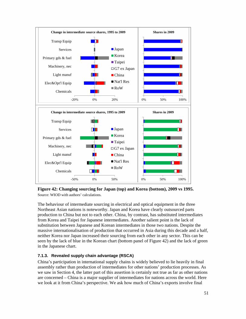
51
Figure 42: Changing sourcing for Japan (top) and Korea (bottom), 2009 vs 1995. Source: WIOD with authors’ calculations.
The behaviour of intermediate sourcing in electrical and optical equipment in the three Northeast Asian nations is noteworthy. Japan and Korea have clearly outsourced parts production to China but not to each other. China, by contrast, has substituted intermediates from Korea and Taipei for Japanese intermediates. Another salient point is the lack of substitution between Japanese and Korean intermediates in those two nations. Despite the massive internationalisation of production that occurred in Asia during this decade and a half, neither Korea nor Japan increased their sourcing from each other in any sector. This can be seen by the lack of blue in the Korean chart (bottom panel of Figure 42) and the lack of green in the Japanese chart.
7.1.3. Revealed supply chain advantage (RSCA)
China’s participation in international supply chains is widely believed to lie heavily in final assembly rather than production of intermediates for other nations’ production processes. As we saw in Section 4, the latter part of this assertion is certainly not true as far as other nations are concerned – China is a major supplier of intermediates for nations across the world. Here we look at it from China’s perspective. We ask how much of China’s exports involve final
-20% 0% 20%
Chemicals
Elec&Opt'l Equip
Light manuf
Machinery, nec
Primary gds & fuel
Services
Transp Equip
Change in intermediate source shares, 1995 to 2009
Japan
Korea
Taipei
G7 ex Japan
China
Nat'l Res
RoW
0% 50% 100%
Shares in 2009
-50% 0% 50%
Chemicals
Elec&Opt'l Equip
Light manuf
Machinery, nec
Primary gds & fuel
Services
Transp Equip
Change in intermediate source shares, 1995 to 2009
Japan
Korea
Taipei
G7 ex Japan
China
Nat'l Res
RoW
0% 50% 100%
Shares in 2009
52
goods versus intermediate goods.
Our measure – what might be called revealed supply-chain advantage, or RSCA for short – looks at the sector-by-sector share of Chinese exports made up on intermediates and compares this to the world share. The idea behind this (inspired by the traditional revealed comparative advantage index) is that the world intermediates export share provides a benchmark against which to gauge the orientation of China’s industry towards intermediates versus final-good exports. The RSCA can be thought of as the export equivalent of the production measures in RIPA.
The components of RSCA are show in the left panel of Figure 43. The red bars show the share of Chinese exports in each sector made up of intermediates. For example, Chinese exports in the mining and quarry sector are almost all intermediates, while its exports of food and related products are almost all final goods. The same figures for the world as a whole are shown with the blue bars. China’s RSCA index is the difference between the two, with a negative RSCA indicating that China has a disadvantage in the sector when it comes to exporting intermediates versus final goods. To get a perspective on how important the sectors are, the right panel shows China’s and the world’s export shares for each of the sectors in 2009. The key point is:
In 2009, China has a comparative disadvantage in intermediates – and thus a comparative advantage in final goods – in almost all sectors.29
This, of course, reflects China’s well-known strength as an assembler of final goods. The middle panel of Figure 43 shows the same numbers for 1995. The key point in comparing 1995 and 2009 is:
China’s comparative advantage as an assembler versus intermediates producer has changed little since 1995 but the magnitudes have fallen (notice the scale in the middle panel starts at -50%).
In other words:
China’s export participation in global supply chains has shifted away from final goods and towards intermediates (all relative to what happened in the world as a whole).
For comparison’s sake, we show the RSCA for Factory North America, and a pair of nations in Factory Europe in Figure 44. To reduce the clutter and focus on big sectors, we only show the sectors where world exports in the sector are more than 5% of world exports overall.
For Factory North America the RSCAs are shown in the left panel. By definition, a positive RSCA indicates a relative advantage in intermediates and, necessarily, a relative disadvantage in final goods. Thus we can conclude that assembly tends to take place in nations with negative RSCAs and parts production tends to take place in nations with positive RSCAs. The RSCAs for North America shows the familiar pattern in the transportation equipment sector. In transport equipment, the US has a comparative supply-chain advantages in intermediates (and thus an dis-advantage in final autos) while Mexico and Canada have comparative supply-chain dis-advantage in intermediates. This reflects the fact that assembly tends to take place in the in Mexico and Canada while parts production tends to take place in the US. In reality, assembly and parts production take place in all three nations, but the RSCA picks up averages.
29 Fuels, chemicals and transport equipment are the exceptions.
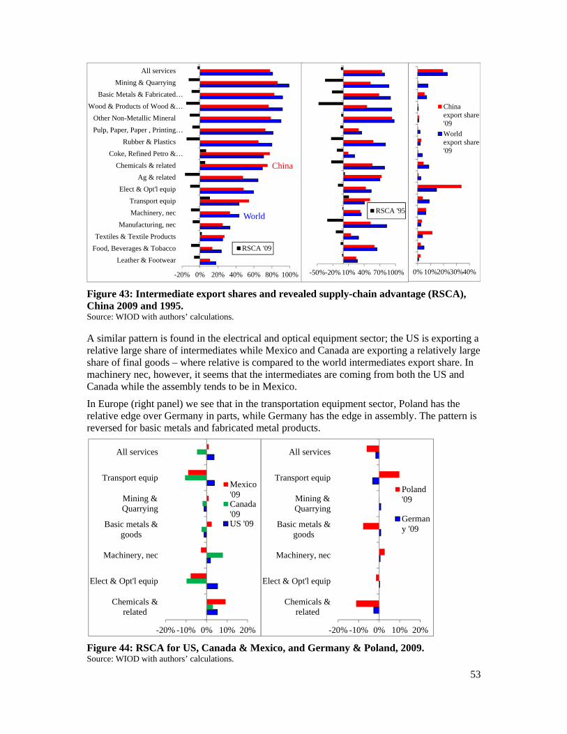
53
Figure 43: Intermediate export shares and revealed supply-chain advantage (RSCA), China 2009 and 1995. Source: WIOD with authors’ calculations.
A similar pattern is found in the electrical and optical equipment sector; the US is exporting a relative large share of intermediates while Mexico and Canada are exporting a relatively large share of final goods – where relative is compared to the world intermediates export share. In machinery nec, however, it seems that the intermediates are coming from both the US and Canada while the assembly tends to be in Mexico.
In Europe (right panel) we see that in the transportation equipment sector, Poland has the relative edge over Germany in parts, while Germany has the edge in assembly. The pattern is reversed for basic metals and fabricated metal products.
Figure 44: RSCA for US, Canada & Mexico, and Germany & Poland, 2009. Source: WIOD with authors’ calculations.
World
China
-20% 0% 20% 40% 60% 80% 100%
Leather & Footwear
Food, Beverages & Tobacco
Textiles & Textile Products
Manufacturing, nec
Machinery, nec
Transport equip
Elect & Opt'l equip
Ag & related
Chemicals & related
Coke, Refined Petro &…
Rubber & Plastics
Pulp, Paper, Paper , Printing…
Other Non-Metallic Mineral
Wood & Products of Wood &…
Basic Metals & Fabricated…
Mining & Quarrying
All services
RSCA '09
-50%-20% 10% 40% 70%100%
RSCA '95
0% 10%20%30%40%
Chinaexport share'09
Worldexport share'09
-20% -10% 0% 10% 20%
Chemicals &related
Elect & Opt'l equip
Machinery, nec
Basic metals &goods
Mining &Quarrying
Transport equip
All services
Mexico'09Canada'09US '09
-20% -10% 0% 10% 20%
Chemicals &related
Elect & Opt'l equip
Machinery, nec
Basic metals &goods
Mining &Quarrying
Transport equip
All services
Poland'09
Germany '09
54
8. SUMMARY AND TESTABLE HYPOTHESES
This paper paints a portrait of the global supply-chain trade and its evolution between 1995 and 2009. In a world where a picture is worth a thousand words, summarising a paper with 44 figures is an impossible task. We shall instead point out some things that struck us as somewhat underappreciated and highlight a few testable hypotheses.
8.1. Conceptual points
The nature and impact of globalisation changed radically sometime between 1985 and 1995; the internationalisation of production is a likely cause.
This is a testable hypothesis that has not been tested on a global data set, although the symptomatic changes in trade patterns have been established for a number of nations.30
We conjecture that the vector of change is not the goods trade itself, but by the North-South international movement of managerial, technical and marketing know-how necessitated by international production.
To ensure goods processed in low-wage nations slotted perfectly into advance nations’ production, sales and after-sales systems, firms from advanced-technology nations ‘lent’ their technology to firms in low-nation nations. This is not ‘knowledge transfer’ in the 1960s sense – indeed firms strenuously seek to avoid ‘transfer’ – but by providing all the missing pieces, this international movement of know-how allowed low-wage nations to industrialise at a pace that is completely out of proportion with earlier historical experiences. China went from producing 3% of world manufacturing to 19% in two decades – by following a process that had very little to do with the way the US, Germany, Japan, or Korea industrialised. Chinese industrialisation happened by combining Chinese labour with know-how from advanced-nation firms.
This conjecture argues for studying the ‘nexus’ of cross-border flows of goods, services, investment, know-how and people; the global data, unfortunately, are not available. As a second best, we focus on the flow in intermediate goods which is a key symptom of the underlying phenomenon.
A key lesson we learned is that one should take a broader view of international production than suggested by the evocative examples that so widely discussed – the iPod, Barbie Dolls, etc. To this end, we distinguish between:
Importing-to-produce (I2P), i.e. the use of foreign intermediates (goods and services) in a nation’s production of goods and services.
I2P includes intermediate imports used in all sectors, including non-traded sectors like construction. A key subset of I2P is:
Importing-to-export (I2E), i.e. use of imported inputs into exported goods and services.
These measures of supply chain trade are based on observed trade flows (i.e. gross trade) with manipulations done by the World Input-Output Database. An important refinement of the I2E concept is available for a restricted number of sectors, countries and years in the TiVA. This shows value-added trade that eliminates the double counting of intermediate 30 Dallas Fed 2002, Feenstra and Hanson 1996, Ando and Kimura 2005, and Fukao, Ishito, and Ito 2003..
55
trade flows.
One hypothesis that should be tested is whether the value-added trade pattern fits the Heckscher-Ohlin-Vanek predictions better than observed trade flows. Theory says it should.
For I2P, I2E and value added, an important distinction is between:
The ‘sales side’ (i.e. selling into international supply chains); and The ’sourcing side’ (i.e. buying from international supply chains).
As Lopez-Gonzalez (2012) shows:
The share of nations’ exports sold to international production networks (i.e. the share of intermediates in exports) is hump-shaped in per capita income.
Likewise,
The share of nations’ reliance on imported intermediates in its exports is hump-shaped in per capita income.
Thus there appears to be an interesting, and unexplored, mechanism linking supply-chain trade and stages of development. These two hypotheses have not been tested empirically although the data is readily available to do so.
8.2. Conditioning facts The second set of facts concerns the realities that condition the I2P, I2E and value-added trade flows:
About half of the world’s output of goods and services are sold as intermediate inputs.
An important misconception, stoked by a few examples of truly globalised production, concerns the relative openness of final and intermediate markets.
The world is still more globalised for final goods than it is for intermediates; the domestic-sales-to-export split is about 60-40 for final manufactures while it is about 70-30 for intermediates (i.e. 70% sold locally and 30% exported).
Overall, world production is not yet very internationalised:
The imported intermediates share of total world manufacturing is only 16%; for the production of all goods and services, it is just 8%.
In other words, the world is not flat and distance has not died – especially when it comes to international production networks. At the level of aggregation available today, most nations are largely self-sufficient in terms of intermediate inputs. From our inspection of the data, we conjecture that:
The degree of industrial-input self-reliance increases with economic size and distance from the 3 major supply networks – Factory Asia, Factory North America, and Factory Europe.
This hypotheses is easily testable but has not been tested. Establishing the baseline relationship would be useful in judging nations’ deviations from ‘normal’ supply chain involvement.
A fact that is widely underappreciated is the importance of services trade.
Intermediate services taken together account for 28% of world supply-chain trade flows (i.e. all intermediates) as measured by I2P.
56
We note that the WIOD data has embedded in it, a global trade in services data for disaggregated into 18 sectors. No one, to our knowledge, has used this data to test hypotheses related to trade agreements, the role of size and distance (gravity equations), or the shift in value added from fabrication to pre- and post-fabrication services.
8.3. Manufacturing’s global distribution A third set of condition facts concerns manufacturing since this sector still dominates our measures of global supply-chain trade (I2P, I2E and value added). The primary fact on manufacturing is that it is astoundingly concentrated.
Four nations – the Giant-4 manufacturers – account for about 60% of all manufacturing GDP (the US, China, Germany and Japan).
This is perfectly in line with Home Market Hypothesis (Krugman 1980), but for our purposes the crucial point is that it means that the Giant-4 naturally dominated supply-chain trade on both the sales and sourcing sides.
8.4. Global patterns Turning to the pattern of supply-chain trade, there is a widespread perception that supply chains are global – the term ‘global value chains’ has conditioned many people’s thinking on the subject. This is false.
International supply chains are mostly regional, not global.
Most supply chain trade happens within what have been called Factory Asia, Factory Europe, and Factory North America. Moreover, there are clear structures within the regions:
The US, Germany and China are the hubs in their respective regions; Japan’s supply-trade pattern is far more regionalised than the US, German and Chinese patterns, but Japan is not a hub in Factory Asia.
These hypotheses could be but have not been tested; establishing them empirically would be important for anchoring policy analysis that has hereto been rather negligent of the central role played by geography.
At the world level, China is the leader in terms of the export and import of intermediates (when flows are measured by I2P and I2E).
China is the biggest buyer and seller of intermediates measured as gross exports (i.e. as reported by customs and thus inclusive of double counting issues).
Although it is a fluke, it is curious that one has to move only a single letter to transform ‘supply chain’ into ‘supply China’.
There are important differences in the global patterns of intermediate industrial goods, raw materials and services.
The global pattern for intermediate industrial goods is more regionalised that the pattern for intermediate services.
The global pattern for raw materials is even less regionalised. These hypotheses is readily testable but have not been tested. Establishing them would be important for the policy choices faced by nations that are far from the high-tech manufacturing giants.
Looking at evolutions of the patterns between 1995 and 2009, we note:
57
Supply-chain trade has shifted heavily towards Factory Asia and away from Factory North America and Factory Europe.
China’s role increased enormously on the sales and source sides; Inside Europe, the dominance of Germany faded between 1995 and 2009 both on the
sales and sourcing sides while the centrality of China in Asia has increased.
While most discussion has concerned linkages between imports and exports, the facts above were established for all production, i.e. using the broader I2P concept instead of the I2E concept.
Another noteworthy set of facts concerns the role of international sourcing in exports versus overall production. Using the data available, all the differences are down to the fact that national output vectors are quite different than their export vectors. A few key facts are:
The world pattern of I2E and value added trade is more regionalised and more hub-and-spoke than aggregate trade.
8.5. HQ and Factory economies A distinction that we found useful in interpreting the data is the distinction between headquarter (HQ) and factory economies
HQ economies tend to be diverse in terms of partners on both the sourcing and sales side; factory economies tend to be heavily reliant on the closest high-technology manufacturing giant – the US, Germany and Japan.
While the US and Germany are clearly HQ economies, the pattern is more nuance for China, Korea and Japan.
The paper also presents some facts on China’s role in global supply chain trade and its evolution – especially on the question of whether China is ‘moving up the value chain’. We identified a number of interesting facts, but the full picture is not sufficiently clear to specify testable hypotheses. More work is needed.
8.6. Concluding remarks The rise of supply chain trade was coincident with some of the most radical changes that the global economy has ever experienced. This paper focuses on portraying the global picture of the most visible aspect of international production networks – namely, cross border flows of intermediate goods and services. The effort is based on two data sets that have been recently released but woefully underutilised – the World Input-Output Database (released in 2011 on WIOD.org) and the TiVA Database (released in January 2013 on oe.cd\tiva).
Our goal is to stimulate further empirical and theoretical work on how the internationalisation of production has altered the nature and impact of globalisation. Now we have two rich datasets on the most visible aspects of the underlying phenomenon. It’s time to get to work.
58
REFERENCES
Amador, João and Sónia Cabral. 2009. "Vertical Specialization across the World: A Relative Measure." The North American Journal of Economics and Finance, 20(3), 267-80.
Ando, Mitsuyo and Fukunari Kimura. 2005. "The Formation of International Production and Distribution Networks in East Asia," International Trade in East Asia, NBER-East Asia Seminar on Economics, Volume 14. University of Chicago Press, 177-216.
Antràs, Pol; Davin Chor; Thibault Fally and Russell Hillberry. 2012. "Measuring the Upstreamness of Production and Trade Flows." American Economic Review, 102(3), 412-16.
Antràs, Pol; Luis Garicano and Esteban Rossi-Hansberg. 2006. "Offshoring in a Knowledge Economy." The Quarterly Journal of Economics, 31-77.
Athukorala, Prema-chandra and Nobuaki Yamashita. 2006. "Production Fragmentation and Trade Integration: East Asia in a Global Context." The North American Journal of Economics and Finance, 17(3), 233-56.
Baldwin, Richard and Philippe Martin. 1999. "Two Waves of Globalisation: Superficial Similarities, Fundamental Differences." National Bureau of Economic Research Working Paper Series, No. 6904.
Baldwin, Richard 2012. “Trade and Industrialisation after Globalisation’s Second Unbundling: How Building and Joining a Supply Chain are Different and Why it Matters,” in Globalization in an Age of Crisis: Multilateral Economic Cooperation in the Twenty-First Century, Robert Feenstra and Alan Taylor (eds), University of Chicago Press.
Baldwin, Richard and Anthony Venables. 2012. "Relocating the Value Chain: Offshoring and Agglomeration in the Global Economy." NBER WP updated 2012; forthcoming Journal of International Economics 2013
Baldwin, Richard and Daria Taglioni. 2011. "Gravity Chains: Estimating Bilateral Trade Flows When Parts and Components Trade Is Important." National Bureau of Economic Research Working Paper Series, No. 16672.
Baldwin, Richard and Frederic Robert-Nicoud (2010). ”Trade-in-Goods and Trade-in-Tasks: An Integrating Framework”, NBER, Working Paper No. 15882, April.
Baldwin, Richard. 2006a. "Globalisation: The Great Unbundling (S)." Economic Council of Finland, 20.
Baldwin, Richard. 2006b. "The Euro's Trade Effects." ECB Working Paper Series, No. 594.
Baldwin, Richard. 2006c. "Multilateralising Regionalism: Spaghetti Bowls as Building Blocs on the Path to Global Free Trade." The World Economy, 29(11), 1451-518.
Batra, Raveendra N and Francisco R Casas. 1973. "Intermediate Products and the Pure Theory of International Trade: A Neo-Hecksher-Ohlin Framework." The American Economic Review, 63(3), 297-311.
Bems, Rudolfs; Robert C Johnson and Kei-Mu Yi. 2010. "Demand Spillovers and the Collapse of Trade in the Global Recession." IMF Economic Review, 58(2), 295-326.
Blinder, Alan S. 2006. "Offshoring: The Next Industrial Revolution." Foreign Affairs, 85, 113.
59
Brülhart, Marius. 2009. "An Account of Global Intra‐Industry Trade, 1962–2006." The World Economy, 32(3), 401-59.
Cañas, Jesus and Roberto Coronado. 2002. "Maquiladora Industry: Past, Present and Future." El Paso Business Frontier, Federal Reserve Bank of Dallas, El Paso Branch, (2), 1-6.
Daudin, Guillaume; Christine Rifflart and Danielle Schweisguth. 2011. "Who Produces for Whom in the World Economy?" Canadian Journal of Economics/Revue canadienne d'économique, 44(4), 1403-37.
Deardorff, Alan V. 2001. "Fragmentation in Simple Trade Models." The North American Journal of Economics and Finance, 12(2), 121-37.
Deardorff, AV. 1998. "Fragmentation across Cones." Michigan-Center for Research on Economic & Social Theory Papers.
Dedrick, Jason; Kenneth L Kraemer and Greg Linden. 2010. "Who Profits from Innovation in Global Value Chains?: A Study of the Ipod and Notebook Pcs." Industrial and Corporate Change, 19(1), 81-116.
Dixit, Avinash K and Gene M Grossman. 1982. "Trade and Protection with Multistage Production." The Review of Economic Studies, 49(4), 583-94.
Ethier, Wilfred J. 1982. "National and International Returns to Scale in the Modern Theory of International Trade." The American Economic Review, 389-405.
Feenstra, Robert C and Gordon H Hanson. 1996. "Globalization, Outsourcing, and Wage Inequality." The American Economic Review, 86(2), 240-45.
Francois, Joseph F. 1990. "Trade in Nontradables: Proximity Requirements and the Pattern of Trade in Services." Journal of International Economic Integration, 31-46.
Fukao, Kyoji; Hikari Ishido and Keiko Ito. 2003. "Vertical Intra-Industry Trade and Foreign Direct Investment in East Asia." Journal of the Japanese and International Economies, 17(4), 468-506.
Grossman, Gene M and Esteban Rossi-Hansberg. 2008. "Trading Tasks: A Simple Theory of Offshoring." American Economic Review, 98(5), 1978-97.
Grubel, Herbert G and PJ Lloyd. 1975. "Intra-Industry Trade: The Theory and Measurement of International Trade in Differentiated Products," Wiley (New York),
Helpman, Elhanan. 1984. "A Simple Theory of International Trade with Multinational Corporations." The Journal of Political Economy, 451-71.
Hummels, David; Dana Rapoport and Kei-Mu Yi. 1998. "Vertical Specialization and the Changing Nature of World Trade." Economic Policy Review, 4(2).
Hummels, David; Jun Ishii and Kei-Mu Yi. 2001. "The Nature and Growth of Vertical Specialization in World Trade." Journal of international Economics, 54(1), 75-96.
Johnson, Robert C and Guillermo Noguera. 2012a. "Fragmentation and Trade in Value Added over Four Decades," National Bureau of Economic Research,
Johnson, Robert C and Guillermo Noguera. 2012b. "Proximity and Production Fragmentation." The American Economic Review, 102(3), 407-11.
Jones, Ronald Winthrop and Henryk Kierzkowski. 1988. "The Role of Services in Production and International Trade: A Theoretical Framework." RCER Working Papers.
60
Kimura, Fukunari and Mitsuyo Ando. 2005. "Two-Dimensional Fragmentation in East Asia: Conceptual Framework and Empirics." International Review of Economics & Finance, 14(3), 317-48.
Kohler, Wilhelm. 2004. "Aspects of International Fragmentation." Review of International Economics, 12(5), 793-816.
Koopman, Robert; William Powers; Zhi Wang and Shang-Jin Wei. 2010. "Give Credit Where Credit Is Due: Tracing Value Added in Global Production Chains." National Bureau of Economic Research Working Paper Series, No. 16426.
Koopman, Robert; Zhi Wang and Shang-Jin Wei. 2008. "How Much of Chinese Exports Is Really Made in China? Assessing Domestic Value-Added When Processing Trade Is Pervasive." National Bureau of Economic Research Working Paper Series, No. 14109.
Krugman, Paul. 1980. "Scale Economies, Product Differentiation, and the Pattern of Trade." The American Economic Review, 950-59.
Linden, Greg; Kenneth L Kraemer and Jason Dedrick. 2009. "Who Captures Value in a Global Innovation Network?: The Case of Apple's Ipod." Communications of the ACM, 52(3), 140-44.
López González, Javier 2012. "Vertical Specialisation and New Regionalism," University of Sussex
Markusen, Ann. 2006. "Urban Development and the Politics of a Creative Class: Evidence from a Study of Artists." Environment and Planning A, 38(10), 1921.
Richard, E Baldwin. 2008. "Managing the Noodle Bowl: The Fragility of East Asian Regionalism." The Singapore Economic Review, 53(03), 449-78.
Sanyal, Kalyan K and Ronald W Jones. 1982. "The Theory of Trade in Middle Products." The American Economic Review, 16-31.
Timmer, Marcel. 2012. "The World Input-Output Database (WIOD): Contents, Sources and Methods." WIOD Background document available at www. wiod. org.
Venables, Anthony J. 1999. "Fragmentation and Multinational Production." European Economic Review, 43(4), 935-45.
Woodland, Alan D. 1977. "Joint Outputs, Intermediate Inputs and International Trade Theory." International Economic Review, 517-33.
Yeats, Alexander. 1998. "Just How Big Is Global Production Sharing?" World Bank Policy Research Working Paper, (1871).
Yi, Kei‐Mu. 2003. "Can Vertical Specialization Explain the Growth of World Trade?" Journal of political Economy, 111(1), 52-102.
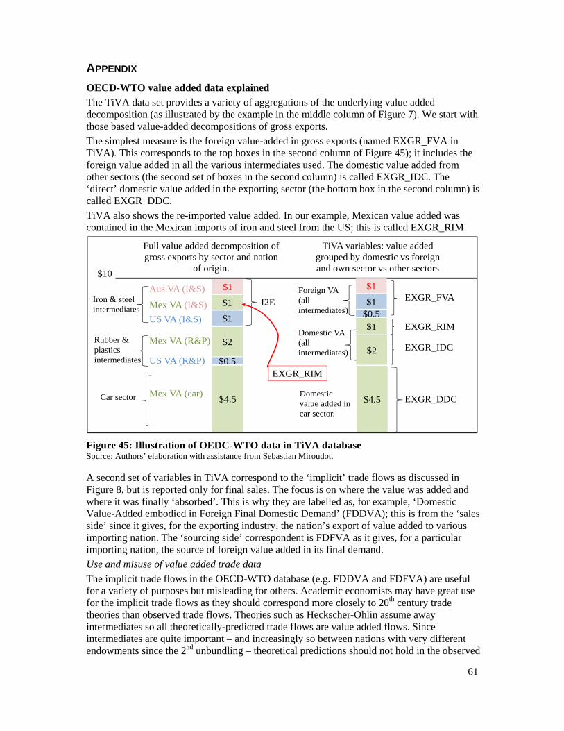
61
APPENDIX
OECD-WTO value added data explained
The TiVA data set provides a variety of aggregations of the underlying value added decomposition (as illustrated by the example in the middle column of Figure 7). We start with those based value-added decompositions of gross exports.
The simplest measure is the foreign value-added in gross exports (named EXGR_FVA in TiVA). This corresponds to the top boxes in the second column of Figure 45); it includes the foreign value added in all the various intermediates used. The domestic value added from other sectors (the second set of boxes in the second column) is called EXGR_IDC. The ‘direct’ domestic value added in the exporting sector (the bottom box in the second column) is called EXGR_DDC.
TiVA also shows the re-imported value added. In our example, Mexican value added was contained in the Mexican imports of iron and steel from the US; this is called EXGR_RIM.
Figure 45: Illustration of OEDC-WTO data in TiVA database Source: Authors’ elaboration with assistance from Sebastian Miroudot.
A second set of variables in TiVA correspond to the ‘implicit’ trade flows as discussed in Figure 8, but is reported only for final sales. The focus is on where the value was added and where it was finally ‘absorbed’. This is why they are labelled as, for example, ‘Domestic Value-Added embodied in Foreign Final Domestic Demand’ (FDDVA); this is from the ‘sales side’ since it gives, for the exporting industry, the nation’s export of value added to various importing nation. The ‘sourcing side’ correspondent is FDFVA as it gives, for a particular importing nation, the source of foreign value added in its final demand.
Use and misuse of value added trade data
The implicit trade flows in the OECD-WTO database (e.g. FDDVA and FDFVA) are useful for a variety of purposes but misleading for others. Academic economists may have great use for the implicit trade flows as they should correspond more closely to 20th century trade theories than observed trade flows. Theories such as Heckscher-Ohlin assume away intermediates so all theoretically-predicted trade flows are value added flows. Since intermediates are quite important – and increasingly so between nations with very different endowments since the 2nd unbundling – theoretical predictions should not hold in the observed
$10
$1
$2
Foreign VA (all intermediates)
Domestic VA (all intermediates)
Domestic value added in car sector.
$1
$1
$4.5
$0.5
Rubber & plastics intermediates
Iron & steel intermediates
Car sector
US VA (R&P)
Mex VA (R&P)
Aus VA (I&S)
US VA (I&S)
Mex VA (I&S)
Mex VA (car)
$1
$1
$1
$4.5
$2
$0.5
EXGR_FVAI2E
EXGR_DDC
TiVA variables: value added grouped by domestic vs foreign and own sector vs other sectors
Full value added decomposition of gross exports by sector and nation
of origin.
EXGR_RIM
EXGR_IDC
EXGR_RIM
62
trade flows. As the OECD-WTO statisticians have stripped out intermediate flows, the match between the implicit, value-added flows and the old theories should be much better. Someone should run the old Heckscher-Ohlin-Vaneck tests on the new value-added data.
The OECD-WTO data is also useful for thinking about ‘true’ bilateral trade imbalances. For example, one of the biggest shifts in I2E trade was the drop in exports from Japan to the US and an increase in exports from Japan to China and China to the US (see Section 4.1). This, ‘triangle trade’ as it is known in Asia, reduced the US-Japan imbalance but boosted the US-China imbalance. The value-added OECD-WTO data allows us to see that the shift was not really so much in value added but rather something more similar to a transhipment of Japanese components to the US via China (with useful assembly happening on the way).
The OECD-WTO data is useful for seeing the true importance of sectors in global trade. For example, using observed, gross trade flows, service sectors make up about 20% of world trade; using value-added data the figure is more like 40%. The difference stems from stripping out all the double counting of manufactured goods crossing borders multiple times (e.g. a hard drive crosses once as a component and once embedded in a laptop). This form of the data is also useful for working out the underlying bilateral exchanges, i.e. those that include all direct and indirect exports. Johnson and Noguera (2012) suggest that the trade balance between the EU and the US is 30% lower when one considers US value added returning back through triangle trade.
The implicit value added data, however, is misleading for several other uses. The most important is trade policy. Border measures like tariffs and regulations affect gross trade flows, not value-added trade flows. The standard points about effective versus nominal rates-of-protection are valid exactly because tariffs hit gross flows, not value-added flows. Working out effective rates of protection requires knowledge of value-added decompositions of observed trade flows, not implicit value-added flows. Here indicators like EXGR_FVA are more suitable. These could and should be used to estimate the impact of RTAs and the like.
Governments that are trying to move up the value chain by replacing imported intermediates with local intermediates will be interested in the value-added decomposition method. The test will be how much of the export sales in, say autos, comprises domestic value added. The OECD-WTO method eliminates the link between auto sales and domestic value added in steel, so changes in upstream domestic value added cannot be tracked (embodied steel is counted as if it was exported directly). Here the sum of EXGR_IDC and EXGR_DDC will be useful. In particular, the effectiveness of local content restrictions will be much easier to evaluate using these.
Related problems arise from using the implicit data flows for measuring the competitiveness impact of bilateral exchange rates. As is well known, the impact will depend strongly on the source of intermediate inputs since devaluation makes exports cheaper but imported intermediates more expensive. In the Figure 7 example, appreciation of the Australian dollar against the US dollar would harm the competitiveness of Mexican car makers even if the dollar-peso rate were unchanged. To work this out, we would have to use the first method (value added decomposition of observed trade flows).
There are also possible misunderstandings when looking at the implicit flows to gauge comparative advantage. One of the key insights of supply-chain analysis is that a nation’s exports are made up of other nation’s inputs, so national competitiveness is no longer a national concept but rather a regional concept – at least in a world where trade is not costless and production is clustered regionally. Being located near a big producer of intermediates will affect a nation’s comparative advantage.