Embed Size (px)
Citation preview

Table manners
GAP Toolkit 5 Training in basic drug abuse data management and analysis
Training session 10
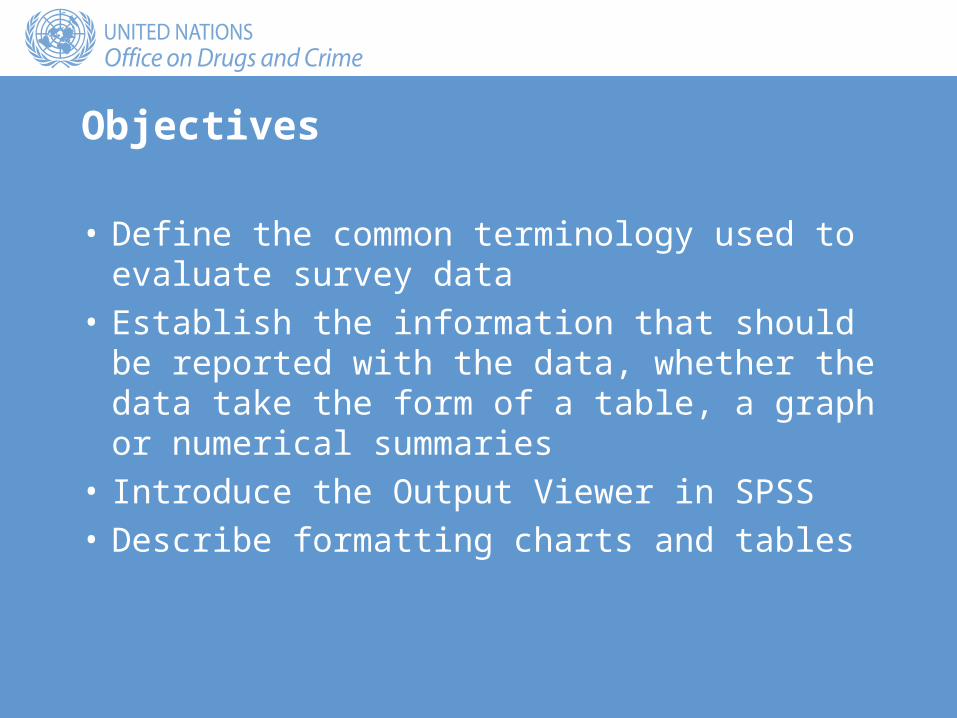
Objectives
• Define the common terminology used to evaluate survey data
• Establish the information that should be reported with the data, whether the data take the form of a table, a graph or numerical summaries
• Introduce the Output Viewer in SPSS• Describe formatting charts and tables

Conflicting aims
• A table has two purposes:– To put across a point– To allow the reader to verify our claims with reference to the
data• “These aims are not always the same and getting the
balance right is as much an art as a science.”(C. Marsh, Exploring Data: An Introduction to Data Analysis for
Social Scientists (Cambridge, Polity Press, 1988)).

Survey terminology
• Reliability• Validity:
– Internal– External

Reliability
• A tool of measurement displays reliability if it records the same result in repeated applications under identical conditions
• For example:– I weigh myself on my bathroom scales on Monday and weigh
100 kg – I weigh myself on my bathroom scales on Tuesday and weigh
72 kg– This would be nice, but is unlikely: the scales are probably
unreliable
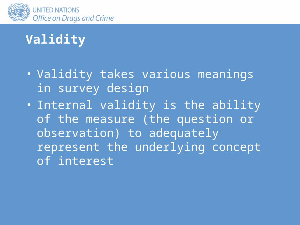
Validity
• Validity takes various meanings in survey design• Internal validity is the ability of the measure (the
question or observation) to adequately represent the underlying concept of interest
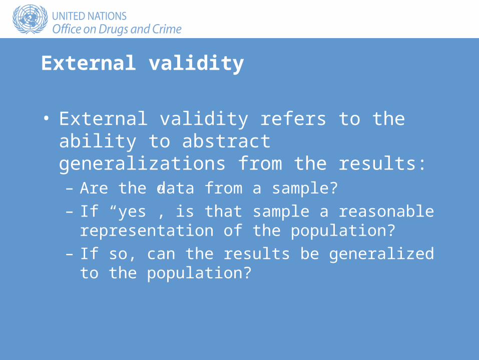
External validity
• External validity refers to the ability to abstract generalizations from the results:– Are the data from a sample? – If “yes”, is that sample a reasonable representation of the
population? – If so, can the results be generalized to the population?

Table design
• Clarity:– Structure– Message
• Completeness
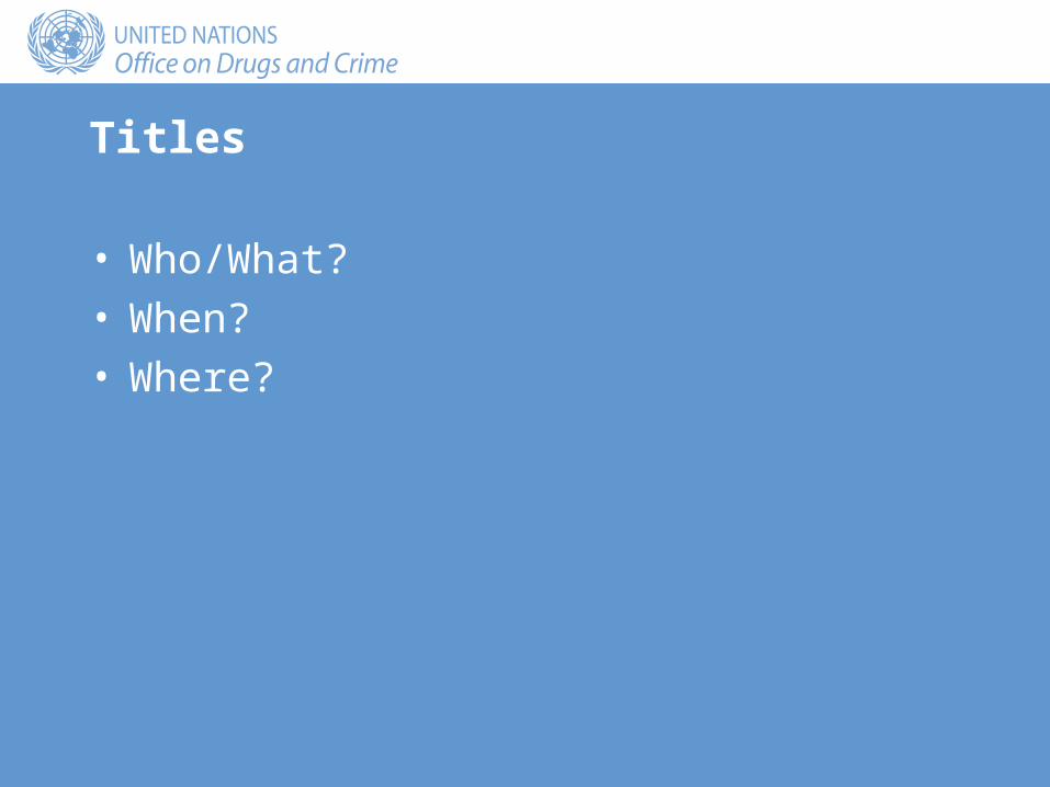
Titles
• Who/What?• When?• Where?

Source
• It is essential that the source of the data is presented regardless of what form the statistics take
• The source of the data helps establish the authority of the data

Variables
• Definitions• Units
Percentages
• If a variable is measured in percentages, be certain it is clear what it is a percentage of:– Rows– Columns– Totals
• Ensure that the original numbers can be calculated by reporting the sample size (the size of the denominator in the calculation of the percentage)

Method
• Sample statistics are frequently used to make general statements about the population
• If the statistics are drawn from a sample, state the method of sampling
• The method determines the external validity of the results

Missing data
• Always report the number of missing observations in your data set
• A large amount of missing data brings into question the external validity of a survey:– Those who agreed to answer and those who refused may
well have different characteristics

Precision
• Avoid reporting data to unjustifiable levels of precision• Round results to the level of precision of the original
data

Output Viewer
• The third main window in SPSS• Used to edit and format the results of any statistical
analysis• Generates output files with the suffix .spo

Exercise: Session 8: Output
• Retrieve the output file “Session 8 freq.spo” saved in session 8

Table of contents
Output

Left-hand panel
• Use the left-hand panel to manage the output• Clicking on a heading selects that part of the output • Clicking on the – sign to the left of a heading hides or
collapses the output• Clicking on the + to the left of a heading displays or
expands the output

Right-hand panel
• Select a single piece of output by pointing and clicking once
• Select multiple pieces of output by holding down the Ctrl key while clicking more than once
• Format output by pointing and double-clicking

Copying tables to Word
• Select the output in the left-hand panel or in the Viewer• Edit/Copy• Move to Word• Edit/Paste Special:
– Formatted Text– Unformatted Text– Picture


Copying charts to Word
• Select the output in the left-hand panel or in the Viewer• Edit/Copy• Move to Word• Edit/Paste
Exercise: copying to Word
• Copy the frequency table for Education to a Word document as: – Formatted text– Unformatted text– Picture
• Copy the bar chart of Education to the same Word document as a picture
Formatting tables
• Double click to enter formatting mode• A new border appears around the output with short
diagonal lines at a 45-degree angle• The menu bar now contains formatting options

Editing the table
• Edit any component of the table by double-clicking that particular part of the table
• A box will appear in which the table can be edited

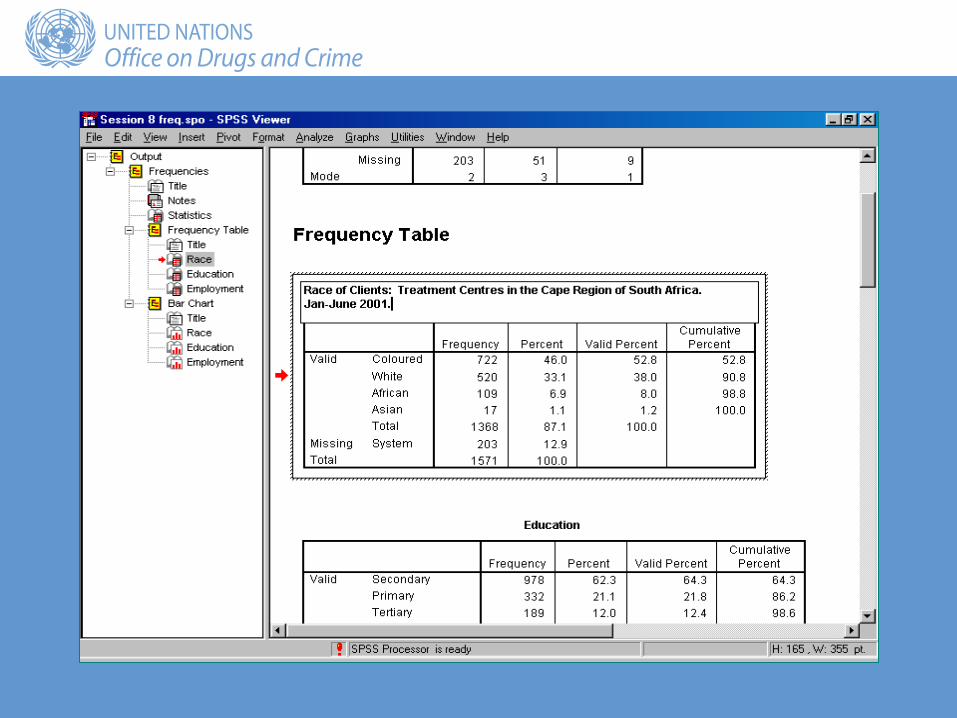

Frequency Percent Valid Percent Cumulative Percent
Valid Coloured 722 46.0 52.8 52.8
White 520 33.1 38.0 90.8
African 109 6.9 8.0 98.8
Asian 17 1.1 1.2 100.0
Total 1368 87.1 100.0
Missing System 203 12.9
Total 1571 100.0
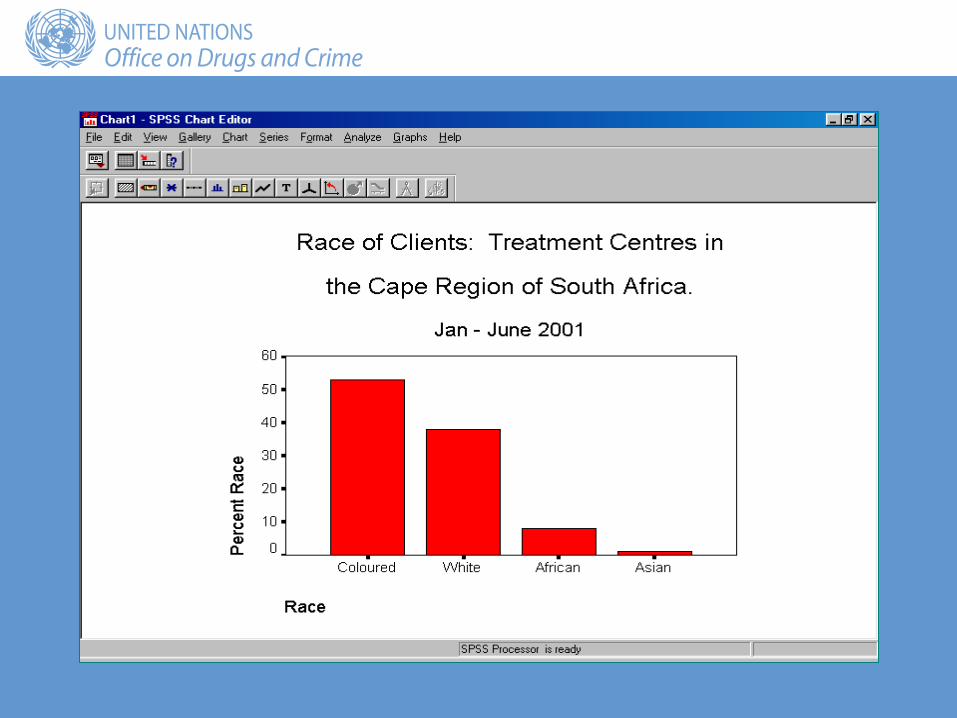
Race of clients: treatment centres in the Cape region of South Africa
January-June 2001
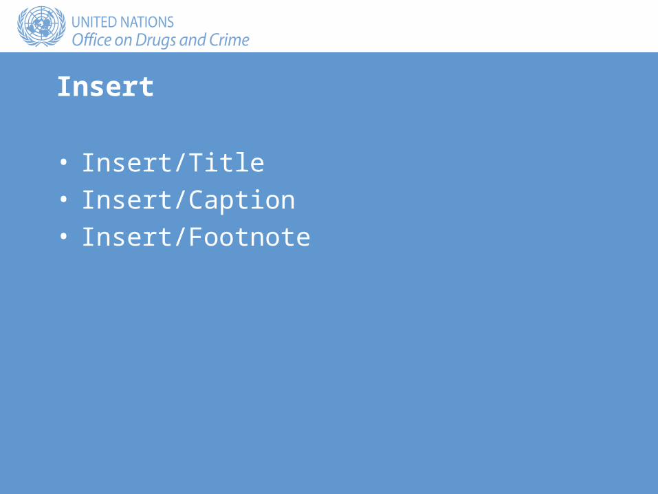
Insert
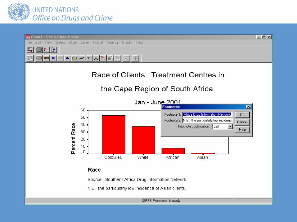
• Insert/Title• Insert/Caption• Insert/Footnote


Caption text box

Type required caption here

Frequency Percent Valid Percent Cumulative Percent
Valid Coloured 722 46.0 52.8 52.8
White 520 33.1 38.0 90.8
African 109 6.9 8.0 98.8
Asian 17 1.1 1.2 100.0
Total 1368 87.1 100.0
Missing System 203 12.9
Total 1571 100.0
Race of clients: treatment centres in the Cape region of South Africa
January-June 2001
Source: The data were collected from the treatment centres as part of the South African Drug Information System.
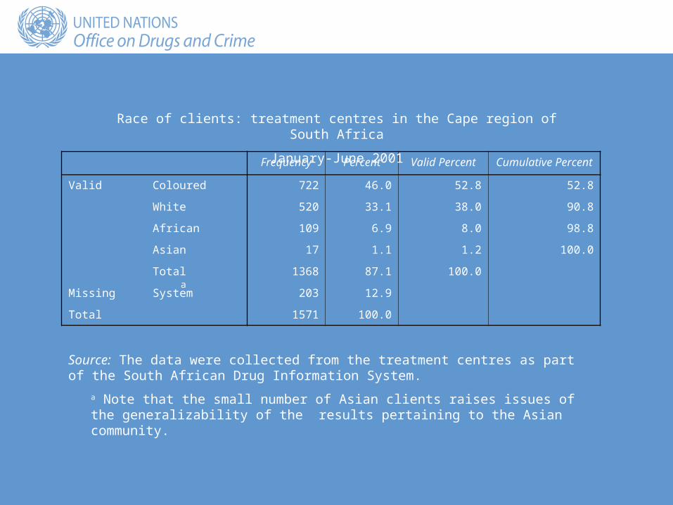
a Note that the small number of Asian clients raises issues of the generalizability of the results pertaining to the Asian community.
a

Format
• Format/Table Properties• Format/TableLooks

TableLooks

Frequency Percent Valid Percent Cumulative Percent
Valid Coloured 722 46.0 52.8 52.8
White 520 33.1 38.0 90.8
African 109 6.9 8.0 98.8
Asiana 17 1.1 1.2 100.0
Total 1368 87.1 100.0
Missing System 203 12.9
Total 1571 100.0
Race of clients: treatment centres in the Cape region of South Africa
January-June 2001
Source: The data were collected from the treatment centres as part of the South African Drug Information System.
a Note that the small number of Asian clients raises issues of the generalizability of the results pertaining to the Asian community.

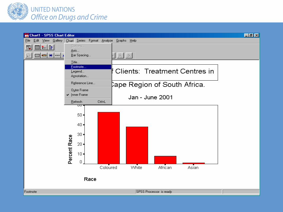
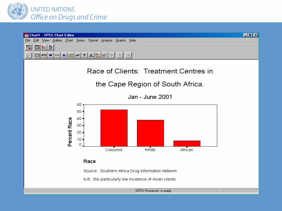
Formatting charts
• Double-click a chart in the Output Viewer to open the chart in the Chart Editor
• To edit or format the chart:– Point at the part to be edited and double-click
OR– Use the menu bar options


Exercise
• Using the file ‘Session 8 freq.spo’, edit the frequency table and the bar chart for the variable Education to reflect the principles discussed here
• Copy the edited frequency table and bar chart to a Word document
Summary
• Principles:– Subject of the data
(who/what?)– Time period (when?)– Area covered (where?)– Variables:
• Definitions• Units of measurement
– Method
• Saving Output:– To file– To a word-processor
• Tables• Charts