Embed Size (px)
Citation preview
TECHNICAL REPORT
Geographic Visualization of the 1993 Midwest FloodWater Balance
by
W. Scott WhiteDepartment of Geosciences
Fort Lewis CollegeDurango, Colorado
Merrill K. RiddDepartment of Geography
University of UtahSalt Lake City, Utah
and
Pawel J. Mizgalewicz3DI TerraLogic, Inc.Columbia, Maryland
David R. MaidmentCenter for Research in Water Resources
University of Texas at AustinAustin, Texas
The research for this report was financed by the United States Geological Survey througha grant administered by the Texas Water Resources Institute.
The contract number used by the University of Utah to manage this grant is14–08–0001–22048–UU–95–1.
Technical Report No. 209Texas Water Resources Institute
The Texas A&M University SystemCollege Station, Texas 77843-2118
ii
February 2003
Table of Contents Page Number
1. Introduction 12. Geographic Visualization 3
2.1. Visualization and Map Representation 32.2. Visualization Tools and Techniques 62.3. Visualization of Surficial Hydrologic Processes 7
3. Animation Methodology and Descriptions of Visualization Projects 83.1. Approach to Geographic Visualization 83.2. Visualization 1: Area-based Animation of the 1993
UMRB Water Storage 93.2.1. Cartographic Design 93.2.2. Animation of the Maps 123.2.3. Description of Visualization 1 13
6. Visualization 2: Point-based Animation of the 1993UMRB Water Storage 16
6. Cartographic Design 16a. Animation of the Maps 216. Description of Visualization 2 26
6. Visualization 3: Line-based Animation of the 1993UMRB Streamflow 26
6. Cartographic Design 266. Animation of the Maps 326. Description of Visualization 3 34
1. Summary and Conclusions 366. Areas of Future Research 38
5.1. Visualization Project 1 385.2. Visualization Project 2 395.3. Visualization Project 3 39
6. References 41
Appendix
Description of Computer Files and Contents of the CD-ROM 46
iii
Figures Page Number1.1. The Upper Mississippi River Basin (UMRB) study area 2
2.1. (CARTOGRAPHY)3 – A representation of 3-D map use space 4
2.2. The four goals of map use as positioned within the map use cube 5
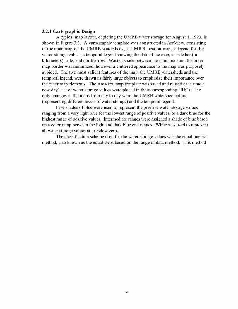
3.1. HUCs in the Upper Mississippi River Basin study area 10
3.2. Map layout used in the construction of the individual waterstorage maps for visualization project 1 11
3.3. Still frames from water balance animation 14
3.4. The reaches of rivers in the UMRB study area that experiencednew record floods and those that experienced nonrecord, butstill significant, flooding in 1993 17
3.5. The ArcView (v.3.1) Legend Editor with the Dot legend typechosen 18
3.6. HUCs in the Upper Mississippi River Basin study area 19
3.7. Map layout used in the construction of the individual waterstorage maps for visualization project 2 22
3.8. Introductory map layout frames used in visualization project 2 23-25
3.9. The Mississippi River drainage basin. 27
3.10. Classification of flow line maps 29
3.11. Introductory map layout frame used in visualizationdischarge maps for visualization project 3 30-31
3.12. Map layout used in the construction of individual flooddischarge maps for visualization project 3 33

iv
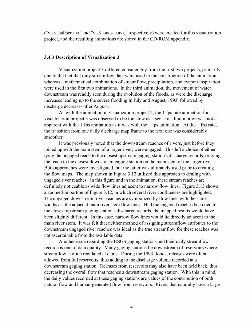
3.13. Close-up of Figure 3.12 highlighting problems with ungageddownstream river reaches 35
1
1. Introduction
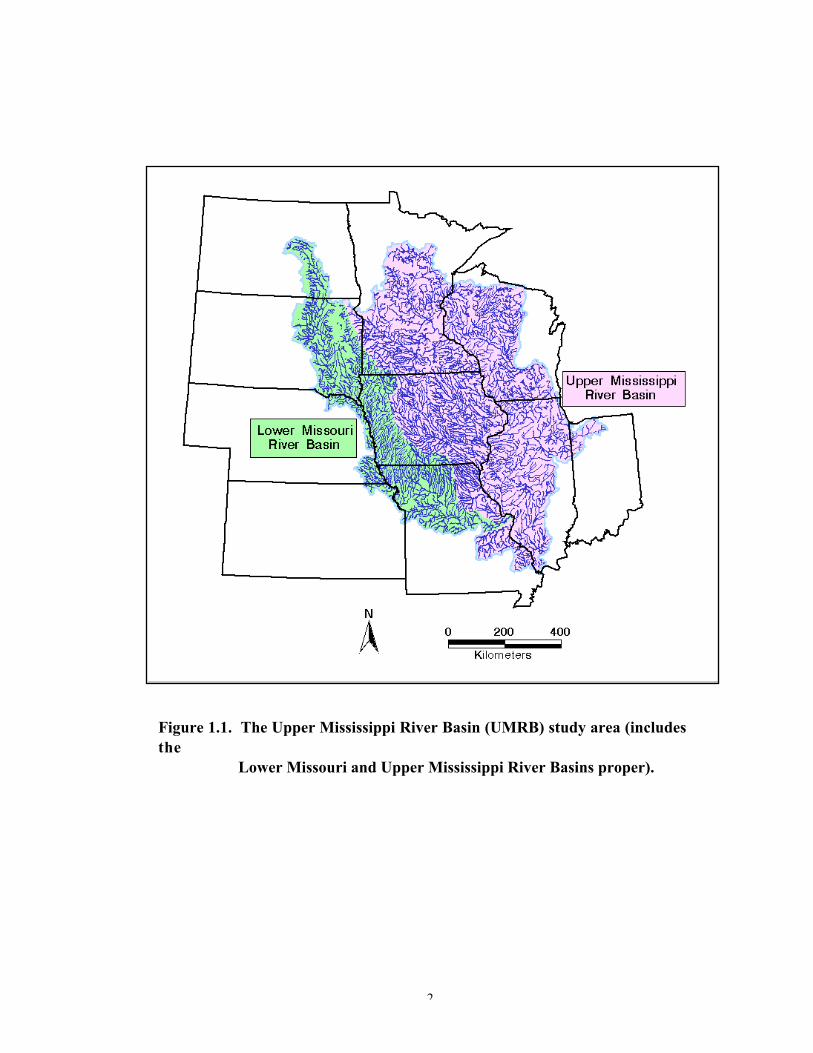
This report documents the construction of three visualization projects based onhydrologic modeling of the 1993 Midwest flood. The modeling procedures and resultshave been described in “Water Balance of the 1993 Midwest Flood,” by Mizgalewicz andMaidment (1998). In their report, a water balance was calculated for the UpperMississippi River basin for all of 1993 using streamflow, precipitation, andevapotranspiration data sets. In both this study, and Mizgalewicz’ and Maidment’sstudy, the Upper Mississippi River basin (UMRB) includes the Mississippi River basinfrom the river’s headwaters in Minnesota to Cairo, Illinois, and the Lower Missouri Riverbasin below Gavins Point dam, South Dakota, to St. Louis, Missouri (Figure 1.1). Usinga digital elevation model of the study area, the daily flow into and out of the basin wascalculated, and a series of 365 maps of basin water storage were created. The basin wassubdivided into watershed boundaries as delineated in ArcInfo using a digital elevationmodel and a coverage of U.S. Geological Survey (USGS) stream gaging stations. Thewater storage values within these watershed boundaries were then spatially averaged intothe standard USGS 8-digit hydrologic unit code (HUC) boundaries, and these maps anddata sets were used in the construction of several hydrologic visualization projects.
As a follow-up to Mizgalewicz’ and Maidment’s study, the water balance datasets and maps were used to create several map-based, computer-generated scenes thatdepict the catastrophic flooding that occurred in 1983 in the Upper Mississippi/LowerMissouri River basins. Three primary geographic visualization products have beengenerated during the course of this research: (1) an area-based map animation of the 1993basin water storage, (2) a point-based map animation of the 1993 water storage, and (3) aline-based map animation of 1993 basin streamflow.
2
Figure 1.1. The Upper Mississippi River Basin (UMRB) study area (includesthe Lower Missouri and Upper Mississippi River Basins proper).
3
2. Geographic Visualization
Until very recently, the output from a GIS-based analysis was often a series ofstatic map products. Even time-dependent data sets investigated using GIS technologywere prone to a reduction in utility and understanding when final products werepresented because of the limitations of the GIS software in handling such data. Thesestatements are still somewhat true today, and there has been much discussion amongst thegeoscientific community as to how the results of a GIS analysis can be made moreunderstandable to a wider range of users. To this end, geoscientists have beeninvestigating for the last ten years or so, the field of visualization in scientific computing(or scientific visualization) as a means of creating more meaningful and useful GISproducts. The following paragraphs briefly summarize the field of scientific visualizationas it relates to cartography and GIS, and provide some background on the various uses ofvisualization tools and methodologies in the geosciences.
2.1 Visualization and Map Representation
Visualization in scientific computing (ViSC) was first formalized in a NationalScience Foundation report by McCormick and others (1987; known informally as the"McCormick Report") as both a computing method that transforms symbolicrepresentation into geometric representation, and as a tool for interpreting image data andcreating new images from multidimensional data sets. Their definition also discusses ViSCin terms of human perception, use, and communication of the visual information.
Visualization has been a part of cartography since the inception of mapmaking.By definition, maps represent a way of visualizing or constructing a mental image of somearea. The purpose is to provide humans with spatial information that not only can beuseful and instructional, but also can promote interactivity with the human user.Cartographic communication models stress the construction of a mental map in the mindof the map user through the visual language of the cartographer (Robinson and Petchenik,1976). With the release of the McCormick Report in 1987, geographers andcartographers started to realize the scientific visualization methodologies and softwareused in computer science and other related fields could be applied to the construction ofmaps that facilitated human visual thinking and cognition.
The word "visualization" was used in a cartographic context by DiBiase (1990),who described the development of a graphic model of map-based scientific visualization.His model of geographic visualization portrays a sequence of map uses from private
4
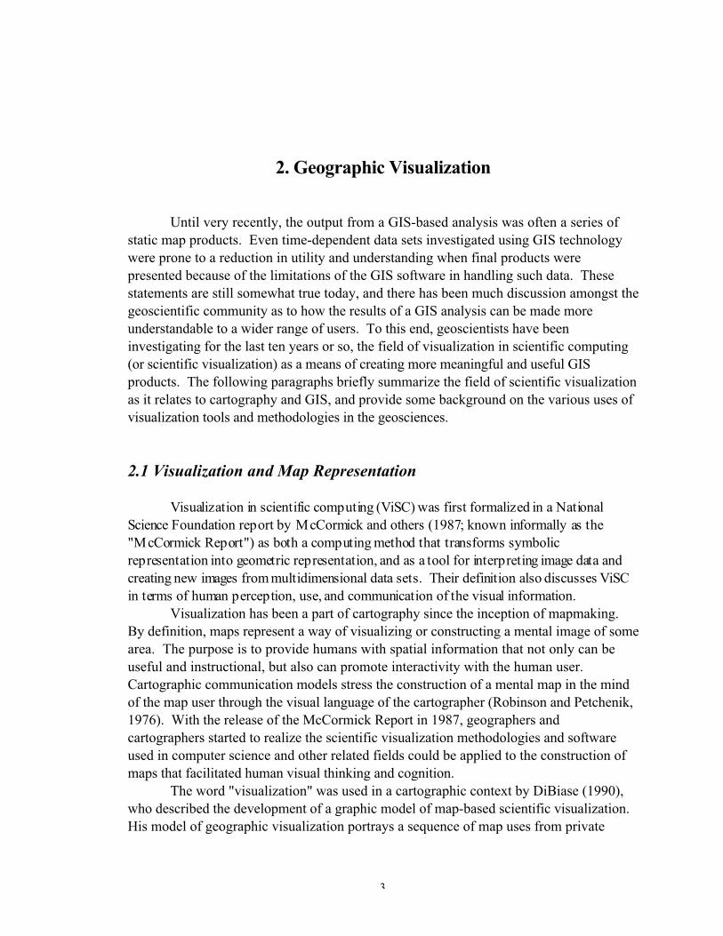
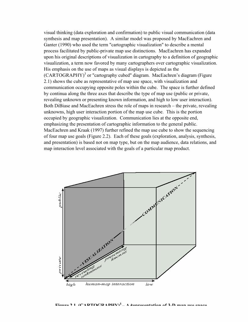
visual thinking (data exploration and confirmation) to public visual communication (datasynthesis and map presentation). A similar model was proposed by MacEachren andGanter (1990) who used the term "cartographic visualization" to describe a mentalprocess facilitated by public-private map use distinctions. MacEachren has expandedupon his original descriptions of visualization in cartography to a definition of geographicvisualization, a term now favored by many cartographers over cartographic visualization.His emphasis on the use of maps as visual displays is depicted as the(CARTOGRAPHY)3 or "cartography cubed" diagram. MacEachren’s diagram (Figure2.1) shows the cube as representative of map use space, with visualization andcommunication occupying opposite poles within the cube. The space is further definedby continua along the three axes that describe the type of map use (public or private,revealing unknown or presenting known information, and high to low user interaction).Both DiBiase and MacEachren stress the role of maps in research – the private, revealingunknowns, high user interaction portion of the map use cube. This is the portionoccupied by geographic visualization. Communication lies at the opposite end,emphasizing the presentation of cartographic information to the general public.MacEachren and Kraak (1997) further refined the map use cube to show the sequencingof four map use goals (Figure 2.2). Each of these goals (exploration, analysis, synthesis,and presentation) is based not on map type, but on the map audience, data relations, andmap interaction level associated with the goals of a particular map product.
Figure 2 1 (CARTOGRAPHY)3 – A representation of 3-D map use space
5
Figure 2.2. The four goals of map use as positioned within the map use cube(modified from MacEachren and Kraak, 1997).
6
2.2 Visualization Tools and Techniques
The tools of visualization are directly related to the four primary goals of map useas described by MacEachren and Kraak (1997). Whether the results of a geographicvisualization procedure are designed for private, exploratory, high user-interaction map use,or whether they are presented to the public with low user interaction, visualizationsoftware tools are important to the process. MacEachren (1995: p. 359) defines three tasksthat visualization tools may be used to address (listed in order of increasing complexity):
(1) Feature Identification: recognition of known features or discovery of unknownfeatures
(2) Feature Comparison: identification of features and the relationships betweenthem
(3) Space-Time Feature Analysis: feature identification and feature comparisonwithin a spatiotemporal domain
Kraak (1998) and Blok and Köbben (1998) list several tools needed forexploratory visualization. Among these tools are computer display, navigation/orientation, database querying, generalization, data transformation ("re-expression"),hyperlinked views, animation, and World Wide Web/Internet search and retrieval engines.Many of these tools exist today, either as commercial software packages (publicavailability), or as shareware or freeware computer programs (public or privateavailability). Indeed, several popular GIS programs, such as ArcInfo and ArcView,incorporate most of these tools in various degrees of sophistication and usability.
Animation, a relatively recent addition to commercial GIS software, has been usedby cartographers since the late 1950s (Peterson, 1994). Thrower (1961) described thepotential of cartographic animation through motion pictures. Cornwell and Robinson(1966) advocated using computers to create individual frames in a cartographic motionpicture. However, due to the time-intensive nature of working with computers in the1960s and 1970s, few examples were described in the literature. Peterson lists Tobler'scity growth animated maps (1970), and Moellering's animated maps of traffic accidents(1972, 1973a, 1973b) as notable exceptions. Today, animation is a common geographicvisualization tool, primarily because of the widespread availability of powerful computerworkstations and PCs. Peterson (1994: p. 623) defines cartographic animation as "the
7
depiction of change through the presentation of maps in quick succession." Hesubdivides cartographic animation into temporal animations (depicting change throughtime) and nontemporal animations (depicting change caused by factors other than time).In non-temporal animation, the viewer's perspective may change with time, but theactions of the main subject matter remain stationary over time. Tasks performed throughnon-temporal animation include generalization, classification, identification of spatialtrends, and 3-D movements through space. These latter animations include "fly-bys" or"fly-throughs,” and commonly depict movement over a 3-D representation of terrain as ifthe viewer was flying over a fixed land surface in some form of aircraft.
2.3 Visualization of Surficial Hydrologic Processes
The U.S. Geological Survey, U.S. Army Corps of Engineers, and U.S. Army(military branch) have led the way in the United States with several publications andcomputer programs related to surficial hydrologic visualization. Traub (1994) used ascientific visualization program (AVS – Advanced Visual Systems, Inc., ApplicationVisualization System) to study how a highway bridge at Chester, Illinois, affected velocityvectors and channel scour at the highway crossing during the 1993 floods. Other USGSefforts towards hydrologic modeling and visualization include Hay and Knapp's (1993)paper on early efforts by the USGS to model the sensitivity of the Gunnison River basinin Colorado to climate change. This study utilized a three-component system consistingof an orographic precipitation model (RHEA-CSU), a GIS (ArcInfo), and a scientificvisualization system (IBM Visualization Data Explorer). The GIS stored the basindatabase and provided input to the RHEA-CSU model. Output from the model wasanalyzed by the GIS, and subsequently fed into the visualization program to animatesequences of images over space and time. Hay and Knapp note that, despite the limitedanalytic capabilities of the visualization system, the use of Data Explorer filled a gap inGIS visualization capabilities, and they stressed the need for a more integrated GISvisualization system.
The U.S. Army Corps of Engineers (USACE) has developed several hydrologicvisualization tools over the last several years. The GRASS GIS program has severalvector and raster visualization capabilities including 3-D image generation and time seriesanimation. Brigham Young University, in conjunction with the USACE WaterwaysExperiment Station, has developed the Watershed Modeling System (WMS), whichprovides tools for the delineation of watersheds and flood plains, using GIS, DEMs, andTINs as input data. WMS also interfaces with industry standard hydrologic models suchas HEC-1 and TR-20. The Surface Water Modeling System (SMS) was also developedby BYU and the USACE as a comprehensive graphical user environment for 2-Dnumerical modeling. SMS includes tools for mesh and grid generation, interfacing withfive popular hydrologic models, and visualization using 2-D contour plots of meshes andvectors and animations of water flow and sediment transport over time.
8
The Mississippi Basin Modeling System (MBMS), developed by the USACEHydrologic Engineering Center, is a real-time unsteady flow forecasting system that wasdesigned as a response to the Midwest flood of 1993. MBMS' primary objective is toforecast flood events, but it is also capable of analyzing low-volume flows so that routinedaily forecasting needs of the USACE and other users can be met (U.S. Army Corps ofEngineers, 1998).
The U.S. Army Construction Engineering Research Laboratories (USACERL)Environmental Modeling & Visualization Group and researchers at the University ofIllinois Geographic Modeling Systems Laboratory have utilized the GRASS GIS programto construct several different landscape process simulations including surface, rainfallrunoff, and soil geomorphology models, along with multidimensional interpolation andvisualization for the Chesapeake Bay environmental monitoring program. They have alsoexperimented with conversion of the GRASS results to the VRML format for interactiveuse on the Web (Mitas and others, 1997).
3. Animation Methodology and Descriptions of VisualizationProjects
The primary goal of this research was to develop methods of visualizing thestorage and movement of floodwaters through a large drainage basin over a specific periodof time. The large basin in this study is the Upper Mississippi River Basin (UMRB),and the flooding events occurred during the spring and summer months of 1993.Preliminary steps have occurred, as outlined below, in order to reach the point where thevisualization project could begin:
1) Collection of flood data (precipitation, potential evapotranspiration, and streamflow measurements)2) Acquistion of geospatial data (DEMs and GIS coverages)3) Evaluation of hardware and software needs; acquisition of computer equipment4) Construction of GIS-based flood database5) GIS-based modeling of the water balance during the 1993 floods
These steps are described in detail in Mizgalewicz and Maidment (1998). The resultingwater balance maps were used in the construction of the visualization projects describedin the following paragraphs.
3.1 Approach to Geographic Visualization
Geographic visualization techniques have been used in this study to develop a setof animation projects depicting the spatiotemporal dynamics of a catastrophic flood.Prior to the construction of these projects, data derived from the 1993 Midwest floods(streamflow, precipitation, and evapotranspiration) were used to define a water balance
9
for the year 1993. This data and the resulting series of maps have been used in theconstruction of several visualization scenes that show the dynamics of the flood waterbalance and the streamflow during the flood months.
The techniques developed in this research represent the first known use ofgeographic/scientific visualization theory in the development of models of thespatiotemporal change that occurs during a major flooding event. Geographicvisualization (GVis) is a term describing an approach to cartographic communication,which seeks to incorporate new computer technologies and display techniques to furtherthe cartographer’s goal of creating maps that are highly readable and understandable to awide audience. This type of map analysis often results in new map forms that deviatefrom the traditional, often static product of cartography – the paper map. Byincorporating computer technologies, GVis provides cartographers with the ability toanalyze spatial processes that occur over a specified time interval. Surficial hydrologicprocesses are ideally suited to representation in a GVis environment. This is particularlytrue of GIS-based studies of such phenomena, which are already in a database format thatcan easily integrate with GVis techniques.3.2 Visualization 1: Area-based Animation of the 1993 UMRB Water Storage
The objective of the initial visualization project was to create a HUC-basedanimation of the daily water storage amounts that were derived from Mizgalewicz’ andMaidment’s hydrologic modeling. Output from the modeling included a series of 365maps representing basin water storage values for the year 1993 (January 1 throughDecember 31), including the primary flooding months of April through September. Theintended purpose of this particular visualization experiment was to model the changes inwater storage as the flooding progressed through the summer months of 1993.
As shown in Figure 3.1, the spatial configuration of the HUCs exhibits a fairdegree of similarity, in terms of shape and area. The six largest rivers in the study area aredisplayed in this figure to aid in geographic reference. The UMRB watershed map wasexamined in ArcView, along with the daily values of water storage for each of the HUCs.Individual cumulative water storage values, spatially averaged across each HUC, rangedfrom –138.864517 to 253.566864 mm. Negative water storage values indicated a waterdeficit in a given watershed (more outflow and evapotranspiration from the watershedthan inflow and precipitation), while positive values indicated a water surplus. It shouldbe noted that these values have been spatially averaged across the watersheds and werederived from the water balance equation. Deficits and surpluses of precipitation andevapotranspiration were variable across any given watershed, and across the UMRB as awhole. These values were used to construct a series of water storage maps, which whensequenced together, provide a chronological picture of water storage during 1993 in theUMRB.
10
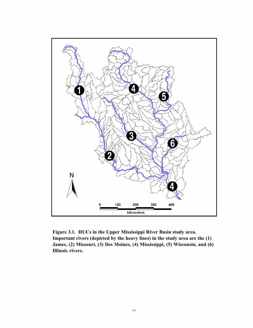
3.2.1 Cartographic DesignA typical map layout, depicting the UMRB water storage for August 1, 1993, is
shown in Figure 3.2. A cartographic template was constructed in ArcView, consistingof the main map of the UMRB watersheds , a UMRB location map, a legend for thewater storage values, a temporal legend showing the date of the map, a scale bar (inkilometers), title, and north arrow. Wasted space between the main map and the outermap border was minimized, however a cluttered appearance to the map was purposelyavoided. The two most salient features of the map, the UMRB watersheds and thetemporal legend, were drawn as fairly large objects to emphasize their importance overthe other map elements. The ArcView map template was saved and reused each time anew day's set of water storage values were placed in their corresponding HUCs. Theonly changes in the maps from day to day were the UMRB watershed colors(representing different levels of water storage) and the temporal legend.
Five shades of blue were used to represent the positive water storage valuesranging from a very light blue for the lowest range of positive values, to a dark blue for thehighest range of positive values. Intermediate ranges were assigned a shade of blue basedon a color ramp between the light and dark blue end ranges. White was used to representall water storage values at or below zero.
The classification scheme used for the water storage values was the equal intervalmethod, also known as the equal steps based on the range of data method. This method
11
Figure 3.1. HUCs in the Upper Mississippi River Basin study area.Important rivers (depicted by the heavy lines) in the study area are the (1)James, (2) Missouri, (3) Des Moines, (4) Mississippi, (5) Wisconsin, and (6)Illinois rivers.
12
•
Figure 3.2. Map layout used in the construction of the individual waterstorage maps for visualization project 1. This particular map shows waterstorage in the study area watersheds on August 1, 1993. Black dot in southcentral portion of the map marks the South Fabius watershed (HUC07110003) mentioned in the text.
13
divides the range between the high and low values by the desired number of classes (inthis case, five classes were desired for the positive water storage values) to obtain thecommon difference. The difference value is then successively added to the data valuesbeginning with the lowest value, to obtain the next higher class limit. This classificationscheme provided a simple method of categorizing the water storage values. As raw datawere used in the mapping, this visualization method provided a way of simply observingthe amount of water stored on an entire watershed during a given day of 1993.
The other important map element shown in Figure 3.2, and used in all of the maplayouts, is the temporal scale. This simple scale bar consists of two time identifiers – anabbreviation of the month and day ("AUG 01,” in Figure 3.2, for August 1st), and the firstletters of the months arranged below a colored bar. The bar was enlarged through eachmap layout using ArcView's "graphics size and position" feature, in which a selectedgraphic can be enlarged, decreased, or repositioned in the layout window. Through the365 days, the bar increases toward the right of the map layout as the days progress fromJanuary 1 (no bar) to December 31 (full bar).
One final point about the map in Figure 3.2 should be made with regards to aparticular HUC. The South Fabius watershed (HUC 07110003), marked by a black dotin Figure 3.2, lies just south of the confluence of the Des Moines and Mississippi Rivers.This watershed exhibited extremely low water storage values throughout all of 1993 withmost values less than zero. Upstream and downstream watersheds contained no suchabnormally low values, thus posing a problem with the South Fabius' water balance data.Both daily streamflow and precipitation values were not found to be significantlydifferent from daily values in upstream and downstream watersheds. Monthly potentialevapotranspiration values covered an area considerably larger than HUC 07110003 anddid not appear to be the cause of the problem. Further research is warranted to explainthe anomalous water balance values in HUC 07110003.
Each map was exported to a JPEG (Joint Photographic Experts Group) image at ascreen resolution of 72 dots per inch (dpi). The JPEG format was chosen primarily dueto file size limitations of the hardware and software. At 72 dpi, the resolution of theJPEG images was sufficient for their use in animation software. Another consideration isthat JPEG images are viewable using Internet browser applications such as MicrosoftCorp. Internet Explorer® and Netscape Communications Corp. Communicator® software.
3.2.2 Animation of the Maps
The exported map images were imported, sequenced, and animated using AdobeSystems Inc. Premiere® software (v. 4.2). Premiere is a (Microsoft) Windows®-baseddigital moviemaking program that allows the user to record, create, and play movies. Thesoftware has the ability to work with video files, as well as sound files, pre-existinganimation files, images, text, and other materials (Adobe, 1994).
Based on the layout page settings of the maps created in ArcView (9 inches x 6.5inches), each exported JPEG was 622 pixels long by 442 pixels wide (8.639 inches x
14
6.139 inches or 21.94 cm x 15.59 cm, where 72 pixels = 1 inch). A new Adobe Premierpresentation file was created, and the directory containing all 365 maps (as JPEG images)was imported into the presentation. Once the directory containing the images had beenimported into the presentation, the directory icon was placed in the Premiere constructionwindow. This window displays all of the images sequentially according to their filenames. Each image's file name corresponded to a date of water storage, thus the sequenceof images was displayed in chronological order from January 1 to December 31, 1993.From a pull-down menu in Premiere, the "Make Movie" command was used to create theanimation. After experimenting with various frame rates, the rate of 1 frame per second(fps) was used as it was found to be a good compromise between speed of the map framemovement with individual map frame dwell time. Hydrologic patterns and trendsemerged when viewing the animation at 1 fps, without sacrificing continuity betweenindividual map frames. The animation was subsequently saved in the Windows AVI(Audio Visual Interleaved) format. AVI files, along with pertinent GIS files and the JPEGimages are stored in the CD-ROM appendix to this report.
3.2.3 Description of Visualization 1
When viewed at a frame rate of 1 fps, the sequence of 365 images show thechanges in water storage amounts in the UMRB study area during the spring and summerflood months of 1993. The animation corresponds well with documented meteorologicalevents that happened in the basin. The descriptions below refer directly to the animationfiles located in the CD-ROM appendix to this report. Files "vis1_halfsec.avi" and"vis1_onesec.avi" contain the animations constructed at _ fps and 1 fps, respectively, inthis first visualization project. Selected still frames of the animation are shown in Figure3.3.
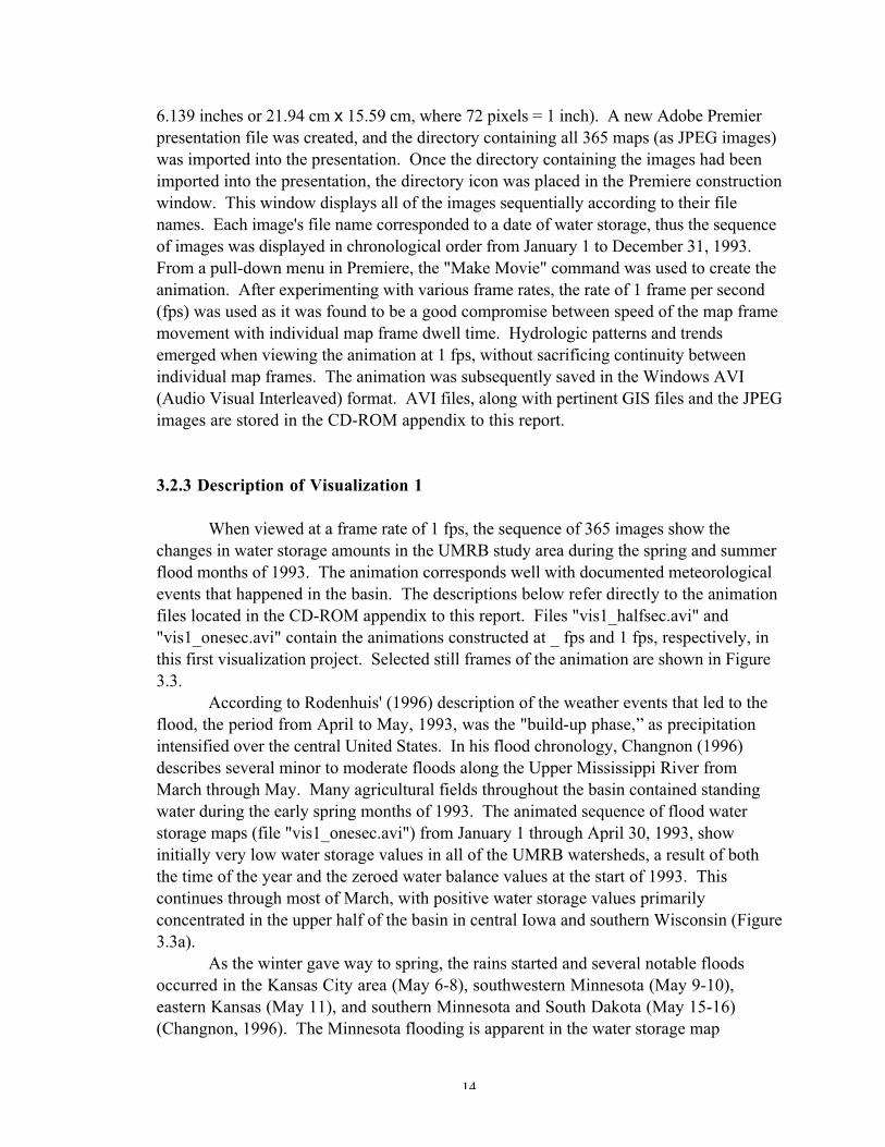
According to Rodenhuis' (1996) description of the weather events that led to theflood, the period from April to May, 1993, was the "build-up phase,” as precipitationintensified over the central United States. In his flood chronology, Changnon (1996)describes several minor to moderate floods along the Upper Mississippi River fromMarch through May. Many agricultural fields throughout the basin contained standingwater during the early spring months of 1993. The animated sequence of flood waterstorage maps (file "vis1_onesec.avi") from January 1 through April 30, 1993, showinitially very low water storage values in all of the UMRB watersheds, a result of boththe time of the year and the zeroed water balance values at the start of 1993. Thiscontinues through most of March, with positive water storage values primarilyconcentrated in the upper half of the basin in central Iowa and southern Wisconsin (Figure3.3a).
As the winter gave way to spring, the rains started and several notable floodsoccurred in the Kansas City area (May 6-8), southwestern Minnesota (May 9-10),eastern Kansas (May 11), and southern Minnesota and South Dakota (May 15-16)(Changnon, 1996). The Minnesota flooding is apparent in the water storage map

15
animation during much of May, 1993, although the eastern Kansas flooding does notappear to have as much of a signature on the animated maps (Figure 3.3b). This could bedue to decreased soil moisture in eastern Kansas watersheds during May as compared tosoil moisture values in southern Minnesota watersheds.
16
Figure 3.3. Still frames from water balance animation. 1993 UMRB waterstorage for March 15 (Figure 3.3a), May 15 (Figure 3.3b), June 25 (Figure 3.3c),and November 15 (Figure 3.3d) is shown.
(a)
(c) (d)
(b)
17
June, 1993, has been described by Rodenhuis (1996) as a period of transition inwhich a series of rapidly moving spring storms traveled across North America, resultingin even higher precipitation amounts throughout the central United States. Someimportant weather events that occurred during June included moderate to heavy rainfallevents in early to mid-June in South Dakota, Iowa, Minnesota, and Wisconsin. Also,flooding developed along the major tributaries of the Mississippi River in Iowa,Minnesota, and Wisconsin during mid-June, and along the Minnesota River near Mankato(south-central Minnesota) in mid- to late June. The June series of water storage mapsshow increasing amounts of water storage in the watersheds along the Des Moines River(Iowa) and the upper Mississippi (Minnesota and Wisconsin). Water storage in thecentral and northern parts of the UMRB dramatically increased during June, with notableprecipitation events and flooding occurring southwest of Minneapolis-St. Paul and justnorth of the confluence of the Mississippi and Wisconsin Rivers. The flooding in south-central Minnesota during mid- to late June can also be seen in the animation during thelast two weeks of the month (Figure 3.3c).
The sustained phase of precipitation started in late June, and continued in thecentral United States through July and extended into August. Flooding was widespreadduring this time resulting in peak flood crests in many locations along the Mississippi andMissouri Rivers and their tributaries. In the animation, the areas of greatest water storagewere along the Des Moines River in Iowa and the Mississippi River in southwesternWisconsin/northwestern Illinois during the first of July. As the month progressed, so didthe precipitation, flooding, and water storage. By the middle of July, large amounts ofwater were being stored in the southern part of the UMRB, particularly around the St.Louis area where the Mississippi and Missouri Rivers meet. Water was also being storedin larger than normal amounts along the Missouri River west of St. Louis. By the end ofthe month, the peak flooding was occurring along the lower reaches of the Missouri Riverand along the Mississippi River, particularly along the boundary formed by the riverbetween Illinois, Iowa, and Missouri. These high water storage amounts were sustainedthrough the end of July and into August in the southern part of the UMRB (Figure 3.2).
By August, the character of the precipitation and flooding changed. During thismonth, occasionally intense rainfall events occurred, rather than the more widespread andintense events that had occurred in July. These events are marked on the animation bythe decreasing values of water storage in the upper two-thirds of the basin. By the end ofAugust, water storage values were moderate in the middle and southern parts of the basin,and low nearly everywhere else.
Intermittent flooding continued into the fall months of 1993, but the precipitationevents were generally weaker than those that had occurred during the summer months.Changnon (1996) notes that there were several isolated flood events during September andNovember. Water storage values tend to decrease during September throughout most ofthe basin, but increase rapidly in the southern part of the basin on September 23 andremain high until October 3. During that time, heavy rains fell on saturated soils inKansas, Missouri, and Illinois, creating new flooding on the Missouri, Mississippi, andIllinois Rivers. Heavy rains and flooding also occurred during mid-November in Missouri
18
and Illinois, and this is shown by the rapid increase in water storage amounts in thesouthern part of the basin from mid- through late November (Figure 3.3d).
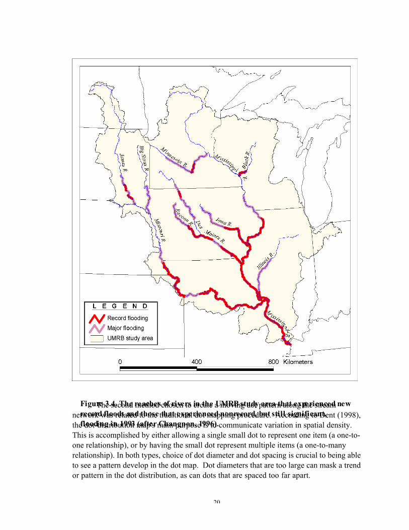
The animated series of water storage maps can also be favorably compared toFigure 3.4, which shows the reaches of rivers in the UMRB that experienced severeflooding during 1993. Record flood reaches in this diagram correspond well with thosewatersheds showing high water storage amounts in the animation. The correlationbetween the animation of water storage and the reported precipitation amounts is notsurprising as the same precipitation values that were recorded by meteorological stationswere used in the water storage calculations. Rapid increases after a major precipitationevent are visible, in most cases, on the animated series of maps. Gradual decreases inwater storage are not as striking on the animated series of maps, but are apparent as theanimation shows a gradual basinwide decrease after August, 1993.
3.3 Visualization 2: Point-based Animation of the 1993 UMRB WaterStorage
In the second visualization project, basin water storage depths were again used,but the symbology was considerably different than in the first visualization project.Whereas area-based symbols were used to indicate water storage depths in the firstproject, point-based symbols were used in the second project to indicate water storagevalues. As with the first project, the primary objective of the second visualizationproject was to model changes in basin water storage during the 1993 flood months. Thisparticular visualization project was undertaken to attempt to design a model ofdownstream flow that followed the UMRB river network. Each selected river segmentwould consist of a certain number of dots per segment, based on the daily water storagevalue for the HUC that the reach flowed through. Animation of the resulting maps wouldthen show a type of movement downstream as the flooding occurred.
3.3.1 Cartographic Design
The same output maps that were used in the first visualization project were usedin the second project, with some major changes. The primary change was in the depictionof a series of dots along a selected set of river reaches. River reaches were selected basedon their mean annual streamflow values and their location between HUC boundaries.The construction of a series of dots along the stream network presented some challengesdue to the limitations of the ArcView GIS software. Since ArcView does not contain anybuilt-in functionality that can convert a line feature to a series of points, the ESRIArcScripts web site (http://www.esri.com/arcscripts) was accessed and a search for anAvenue script designed to convert line features to points was initiated. Avenue is theobject-oriented scripting language that is used to customize ArcView. Users of ESRIsoftware, as well as ESRI software developers, regularly submit new scripts to the

19
ArcScripts web site that can be downloaded at no cost. A script (filename"divide1b.avx,” written by Steven Lead of ESRI Australia, June 16, 2000), contained in anArcView extension, was downloaded from this web site, and activated in ArcView. Thescript was designed to add a user-specified number of points spaced evenly along a line,and add points separated by a user-specified distance. Lines were converted to linear dotnetworks without any problem; however, there appeared to be no way to control thenumber of dots per stream reach based on the HUC water storage values. Although theresulting dotted lines contained uniform dot patterns and spacing, this method wasultimately abandoned.
20
The second method chosen to create a moving dot pattern along the streamnetwork was related to the traditional dot mapping procedure. According to Dent (1998),the dot-distribution map's main purpose is to communicate variation in spatial density.This is accomplished by either allowing a single small dot to represent one item (a one-to-one relationship), or by having the small dot represent multiple items (a one-to-manyrelationship). In both types, choice of dot diameter and dot spacing is crucial to being ableto see a pattern develop in the dot map. Dot diameters that are too large can mask a trendor pattern in the dot distribution, as can dots that are spaced too far apart.
Figure 3.4. The reaches of rivers in the UMRB study area that experienced newrecord floods and those that experienced nonrecord, but still significant,flooding in 1993 (after Changnon, 1996).
21
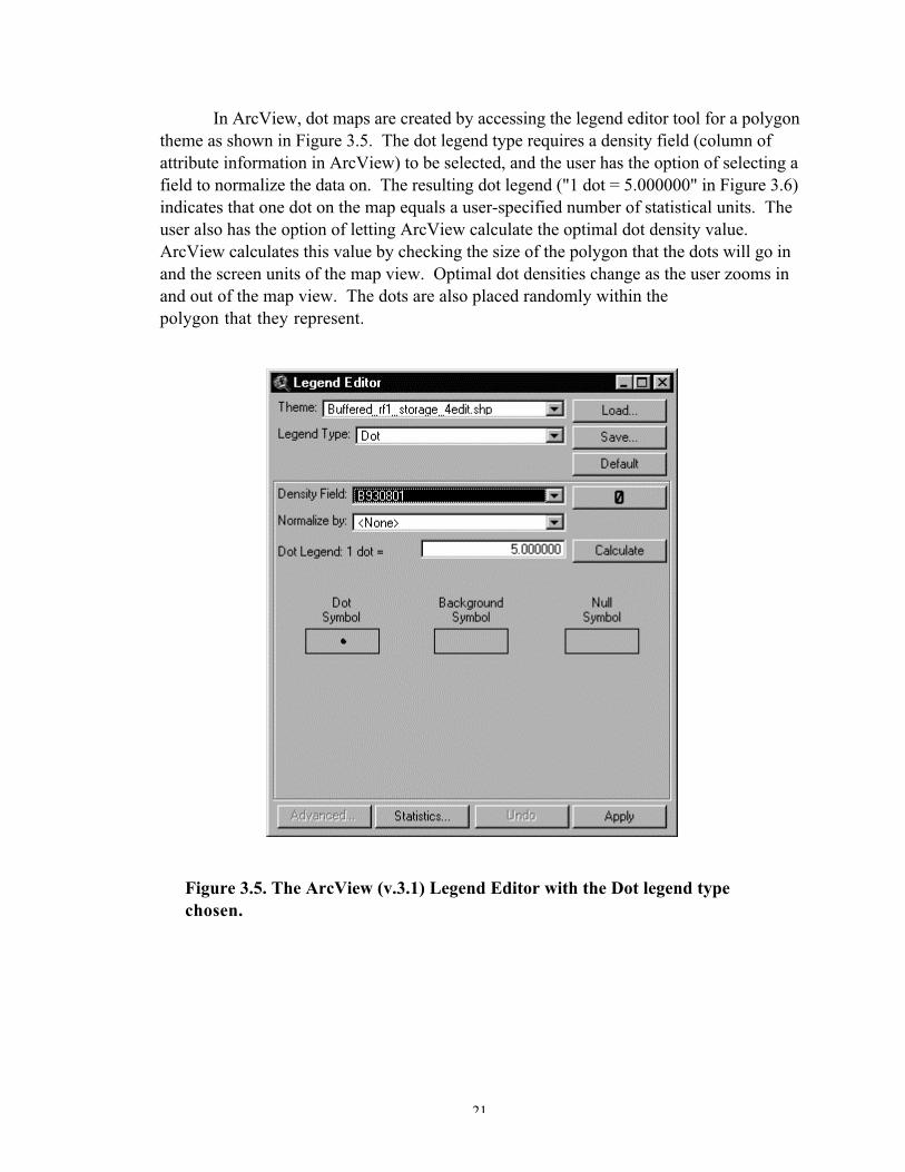
In ArcView, dot maps are created by accessing the legend editor tool for a polygontheme as shown in Figure 3.5. The dot legend type requires a density field (column ofattribute information in ArcView) to be selected, and the user has the option of selecting afield to normalize the data on. The resulting dot legend ("1 dot = 5.000000" in Figure 3.6)indicates that one dot on the map equals a user-specified number of statistical units. Theuser also has the option of letting ArcView calculate the optimal dot density value.ArcView calculates this value by checking the size of the polygon that the dots will go inand the screen units of the map view. Optimal dot densities change as the user zooms inand out of the map view. The dots are also placed randomly within thepolygon that they represent.
Figure 3.5. The ArcView (v.3.1) Legend Editor with the Dot legend typechosen.
22
For visualization project 2, the challenge was to use dot mapping procedures toindicate changes in water storage values along the stream network. Dot mapping is
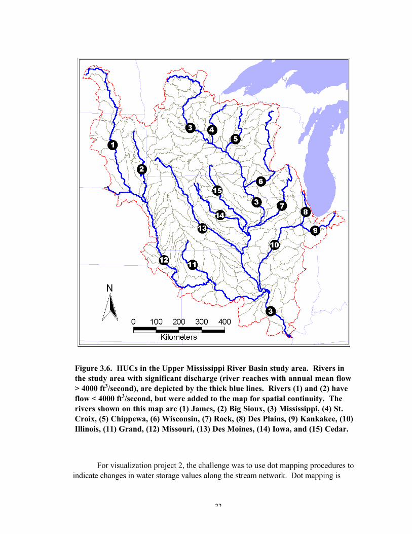
Figure 3.6. HUCs in the Upper Mississippi River Basin study area. Rivers inthe study area with significant discharge (river reaches with annual mean flow> 4000 ft3/second), are depicted by the thick blue lines. Rivers (1) and (2) haveflow < 4000 ft3/second, but were added to the map for spatial continuity. Therivers shown on this map are (1) James, (2) Big Sioux, (3) Mississippi, (4) St.Croix, (5) Chippewa, (6) Wisconsin, (7) Rock, (8) Des Plains, (9) Kankakee, (10)Illinois, (11) Grand, (12) Missouri, (13) Des Moines, (14) Iowa, and (15) Cedar.
23
typically performed using polygon-based features, and in ArcView, dot mapping is onlyavailable for polygon map themes. Thus, a method of assigning water storage values to apolygonal representation of the stream network had to be determined.
The data used in this visualization project included the RF1 (river reach file) linetheme for the UMRB study area, a point theme of USGS gaging stations, and the dailywater storage database tied to HUC polygons. The dense network of streams in the RF1theme dictated that only a selected number of streams should be used in the construction ofthis visualization project. In order to create a better spatial representation of the entirebasin, a denser stream network (as compared to the network used for visual purposes onlyin Figures 3.1 and 3.2) was determined. This network was based on the selection of thosestream reaches whose mean annual streamflow values was equal to or in excess of 4,000ft3/second (cfs). This rate was chosen as it allowed for a good spatial representation ofrivers in the basin study area. As depicted in Figure 3.6, 15 rivers were used in thisvisualization project. Two of the rivers, the James and Big Sioux Rivers in the northwestpart of the basin, did not contain mean flow values that were greater than 4,000 cfs, butthey were selected to provide spatial continuity in the stream network diagram.
The next task was to segment the stream network based on the configuration ofthe HUCs. The stream network was already segmented due to the manner in which theoriginal RF1 network was digitized. These segments did not correspond to HUCboundaries that crossed the stream network, so the features of the network weredissolved in ArcView. This resulted in a single, unattributed stream network theme. Thetheme was then spatially intersected with HUC boundaries to create a series of segmentedstreams containing daily water storage attributes from the HUC polygon theme.
Since ArcView can assign dots only to polygons, each stream segment wasbuffered by a 4-mile (6.4-km) wide polygon zone around the stream network lines.Several different widths were experimented with, but at the scale of the resulting maplayout, the 4-mile wide buffer seemed to allow for the best placement of dots. ArcView'sbasic buffer tool does not create buffers with the attributes of the original theme, thus theWizardBuffer.FINISH script (written by Thad Tilton of ESRI, March 22, 2000) wasdownloaded from the Arcscripts web site. Once the script was compiled and run,ArcView's "Create Buffers" tool was modified so that the user was prompted to choosean attribute to carry over from the original theme to the buffer polygons. The "HUC"attribute field was chosen as this contains the eight-digit HUC identifier, which was alsopresent in the stream segments theme. Since the stream segments theme also containedthe daily water storage values, the buffer polygon theme and the stream segments themewere joined based on the related attribute field, "HUC." The resulting theme was a set ofsegmented polygons that approximated the stream network and contained daily waterstorage values.
The dot map legend was created in ArcView by experimenting with several dotdiameters and spacings. At the scale of the resulting map layout, dot diameter played a bigrole in determining the look of the dotted stream network. Dots that were too largecoalesced too quickly in downstream ends of the stream network (large water storagevalues) and the map became too busy. Dots that were too small were difficult to see and
24
the overall stream network trend was not as apparent. After several experiments, a dotdiameter of 5 pixels (screen units of 72 pixels/inch) and a dot spacing of 1 dot/5 mm ofwater storage depth was chosen. This resulted in a good dot configuration for the streamnetwork, particularly during the flood months. As seen in Figure 3.7, the dots in thesouthern part of the basin are just starting to coalesce. This map represents data fromAugust 1, 1993, the day of maximum water storage in the downstream portion of the basin.
The map layout used for this visualization project was similar to the one used inthe first project. Figure 3.7 shows a typical layout depicting the water storage for August1, 1993. The temporal legend is retained from the first visualization project, but the staticmap legend differs. In this map, the dot legend "1 Dot = 5 mm of cumulative waterstorage per HUC" describes the density of dots on each daily map. ArcView's dotmapping tool places dots randomly within the chosen polygon boundaries, thus dotswere randomly placed at a density of 1 dot for every 5 mm of water storage within eachstream segment buffer polygon. Dot density changed, as did the random pattern of thedots within the buffer polygons, as water storage values changed during the days of 1993.
As with the first visualization project, each map in the second project wasexported to a 72 dpi JPEG file. The 365 JPEG images were subsequently imported intothe Adobe Premier animation software.
3.3.2 Animation of the Maps
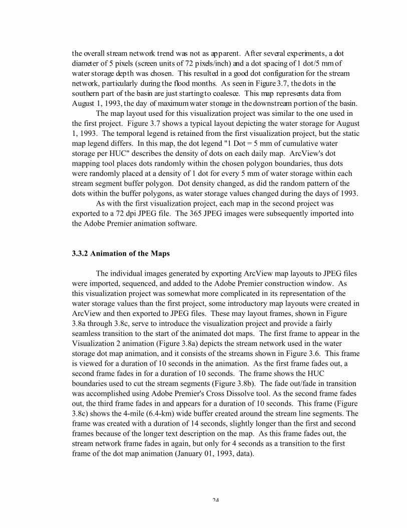
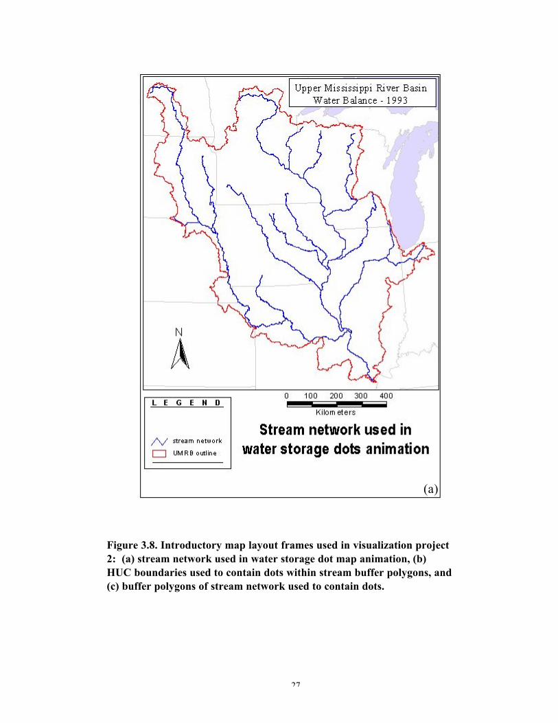
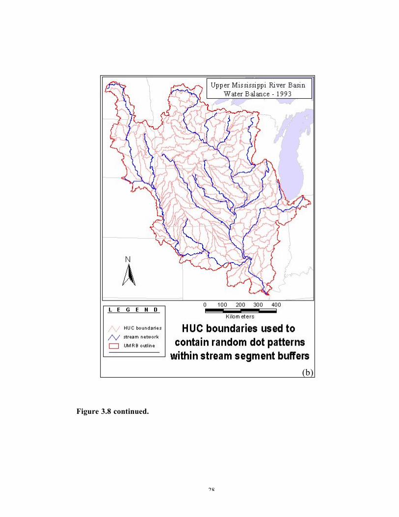
The individual images generated by exporting ArcView map layouts to JPEG fileswere imported, sequenced, and added to the Adobe Premier construction window. Asthis visualization project was somewhat more complicated in its representation of thewater storage values than the first project, some introductory map layouts were created inArcView and then exported to JPEG files. These may layout frames, shown in Figure3.8a through 3.8c, serve to introduce the visualization project and provide a fairlyseamless transition to the start of the animated dot maps. The first frame to appear in theVisualization 2 animation (Figure 3.8a) depicts the stream network used in the waterstorage dot map animation, and it consists of the streams shown in Figure 3.6. This frameis viewed for a duration of 10 seconds in the animation. As the first frame fades out, asecond frame fades in for a duration of 10 seconds. The frame shows the HUCboundaries used to cut the stream segments (Figure 3.8b). The fade out/fade in transitionwas accomplished using Adobe Premier's Cross Dissolve tool. As the second frame fadesout, the third frame fades in and appears for a duration of 10 seconds. This frame (Figure3.8c) shows the 4-mile (6.4-km) wide buffer created around the stream line segments. Theframe was created with a duration of 14 seconds, slightly longer than the first and secondframes because of the longer text description on the map. As this frame fades out, thestream network frame fades in again, but only for 4 seconds as a transition to the firstframe of the dot map animation (January 01, 1993, data).

25
Both half-second ("vis2_halfsecond.avi") and one-second ("vis2_onesecond.avi")frame rate animations were created for the second visualization project. The animationfiles are included in the CD-ROM appendix.

26
Figure 3.7. Map layout used in the construction of the individual water storagemaps for visualization project 2. This particular map shows water storage in thestudy area watersheds on August 1, 1993.
27
Figure 3.8. Introductory map layout frames used in visualization project2: (a) stream network used in water storage dot map animation, (b)HUC boundaries used to contain dots within stream buffer polygons, and(c) buffer polygons of stream network used to contain dots.
(a)
28
Figure 3.8 continued.
(b)
29
Figure 3.8 continued.
(c)
30
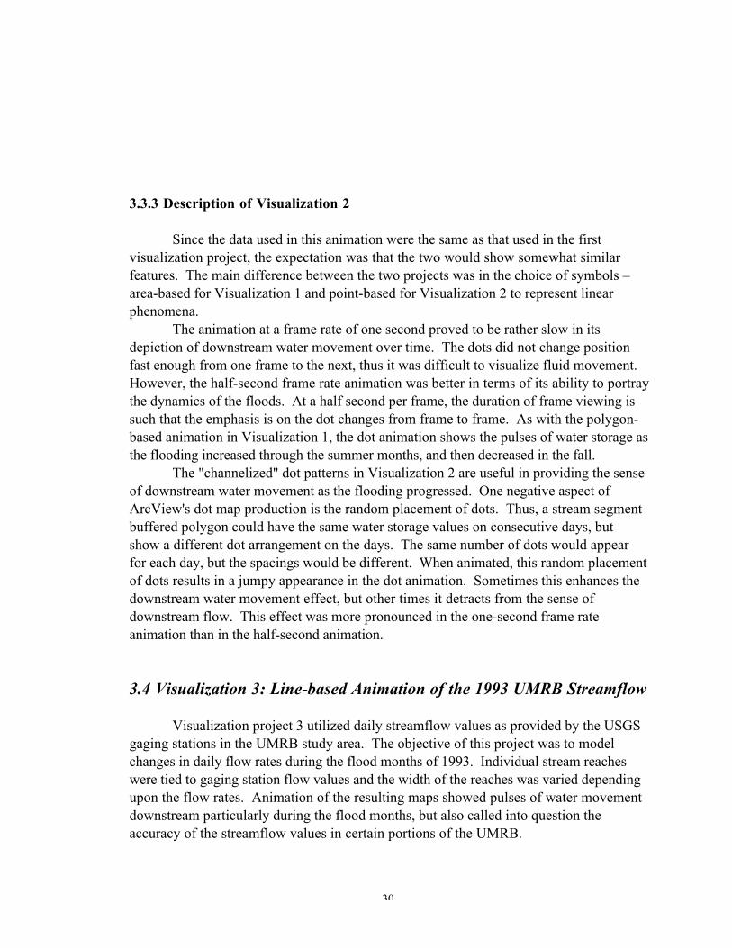
3.3.3 Description of Visualization 2
Since the data used in this animation were the same as that used in the firstvisualization project, the expectation was that the two would show somewhat similarfeatures. The main difference between the two projects was in the choice of symbols –area-based for Visualization 1 and point-based for Visualization 2 to represent linearphenomena.
The animation at a frame rate of one second proved to be rather slow in itsdepiction of downstream water movement over time. The dots did not change positionfast enough from one frame to the next, thus it was difficult to visualize fluid movement.However, the half-second frame rate animation was better in terms of its ability to portraythe dynamics of the floods. At a half second per frame, the duration of frame viewing issuch that the emphasis is on the dot changes from frame to frame. As with the polygon-based animation in Visualization 1, the dot animation shows the pulses of water storage asthe flooding increased through the summer months, and then decreased in the fall.
The "channelized" dot patterns in Visualization 2 are useful in providing the senseof downstream water movement as the flooding progressed. One negative aspect ofArcView's dot map production is the random placement of dots. Thus, a stream segmentbuffered polygon could have the same water storage values on consecutive days, butshow a different dot arrangement on the days. The same number of dots would appearfor each day, but the spacings would be different. When animated, this random placementof dots results in a jumpy appearance in the dot animation. Sometimes this enhances thedownstream water movement effect, but other times it detracts from the sense ofdownstream flow. This effect was more pronounced in the one-second frame rateanimation than in the half-second animation.
3.4 Visualization 3: Line-based Animation of the 1993 UMRB Streamflow
Visualization project 3 utilized daily streamflow values as provided by the USGSgaging stations in the UMRB study area. The objective of this project was to modelchanges in daily flow rates during the flood months of 1993. Individual stream reacheswere tied to gaging station flow values and the width of the reaches was varied dependingupon the flow rates. Animation of the resulting maps showed pulses of water movementdownstream particularly during the flood months, but also called into question theaccuracy of the streamflow values in certain portions of the UMRB.
31
3.4.1 Cartographic Design
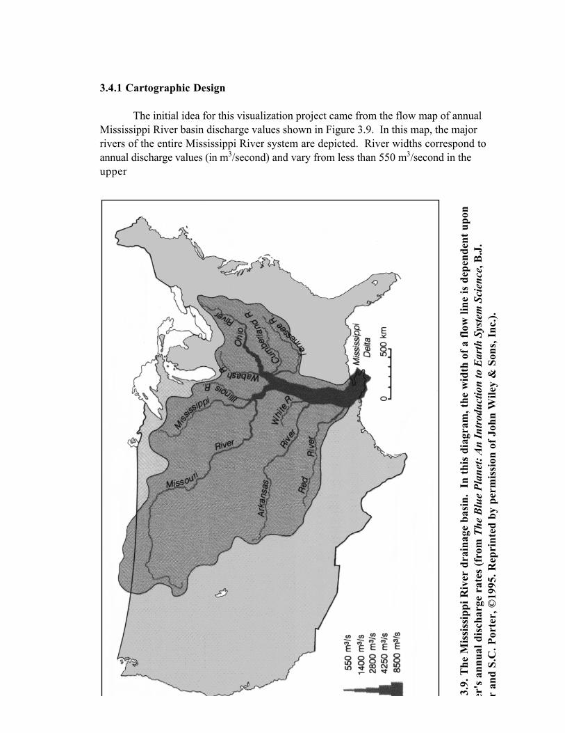
The initial idea for this visualization project came from the flow map of annualMississippi River basin discharge values shown in Figure 3.9. In this map, the majorrivers of the entire Mississippi River system are depicted. River widths correspond toannual discharge values (in m3/second) and vary from less than 550 m3/second in theupper
3.9.
The
Mis
siss
ippi
Riv
er d
rain
age
basi
n. I
n th
is d
iagr
am, t
he w
idth
of
a fl
ow li
ne is
dep
ende
nt u
pon
er's
ann
ual d
isch
arge
rat
es (
from
The
Blu
e P
lane
t: A
n In
trod
uctio
n to
Ear
th S
yste
m S
cien
ce, B
.J.
r an
d S.
C. P
orte
r, ©
1995
. Rep
rint
ed b
y pe
rmis
sion
of
John
Wile
y &
Son
s, I
nc.)
.
32
reaches of the rivers to 8,500 m3/second as the Mississippi River discharges into the Gulfof Mexico. This design was adapted to visualization project 3 with some modificationsto the map legend and the geographic extent of the basin.
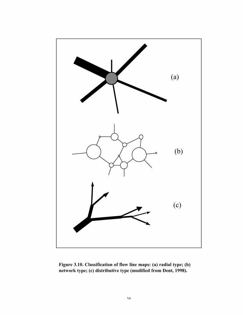
According to Dent (1998), the purpose of a quantitative flow map is to symbolizethe movement of some quantity between two locations. The widths of the flow linesconnecting the locations are drawn proportional to the quantity of movement that thelines represent. Based on a study by Parks (1987), Dent describes three different typesof flow line maps: radial, network, and distributive (Figure 3.10). Radial flow maps havetheir origin at a central node and branches radiate outwards in a spokelike fashion. Thistype of flow map is typified by the hub and spoke pattern in airline route maps.Network flow maps show the interconnectivity of locations, such as transportation andcommunication linkages. Distributive flow maps show the distribution of some value, orset of values, as they move between locations. Of the three, the distributive map is themost dynamic, and is often characterized by arrowheads pointing in the direction of flow.A reverse form of Parks’ distributive flow map idea (without arrowheads) can be seen inthe map in Figure 3.9, where the distribution of streamflow increases as one travelsdownstream towards the outlet of the Mississippi River.
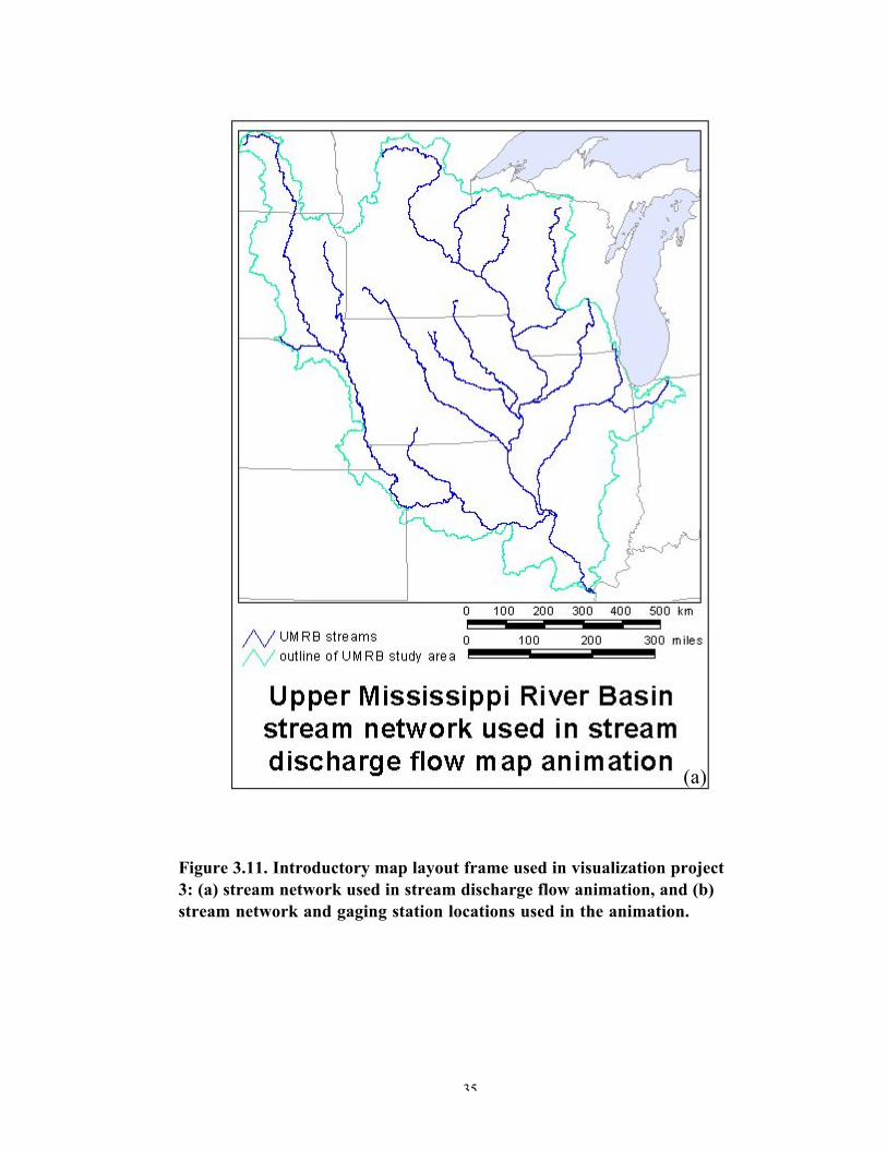
The base map for this visualization project consisted of the same fifteen majorrivers used in visualization project 2 and depicted in Figure 3.11a. These rivers, for themost part, contained reaches with annual streamflow greater than 4,000 cfs. Since thelocation of the river network itself was of interest in this study, and not the RF1 vectorfile attributes, the features of the network were dissolved in ArcView, resulting in a singleunattributed river network.
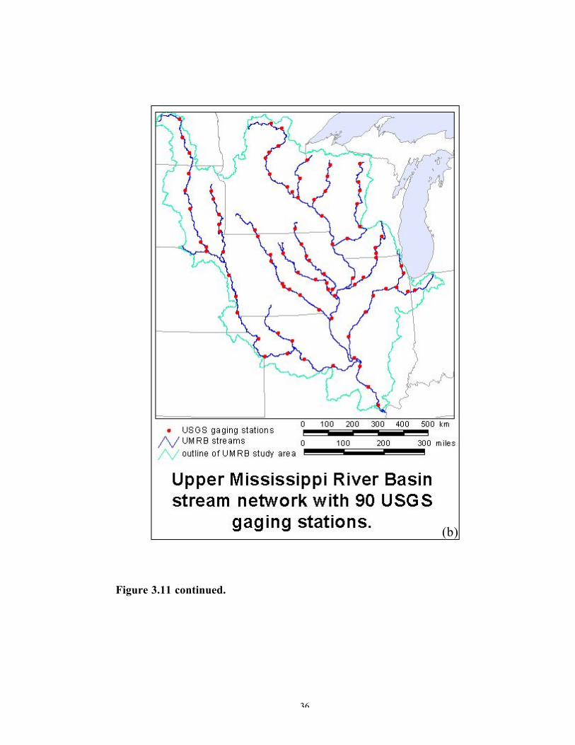
The next task was to assign USGS gaging stations to segments of the streams. InMizgalewicz’ and Maidment’s GIS modeling phase of this study, the discharge recordsfrom 261 gaging stations were initially used in the water balance calculations. This valuewas later reduced to account for discrepancies in the discharge and evapotranspiration data.For the purposes of Visualization 3, the spatial configuration afforded by the 261 gagingstations was important, so these data were used when constructing the maps for thisvisualization project.
Ninety stations lay along the river reaches. The locations of these stations wereused as guides to cutting the RF1 reach file to create 106 gaging-station definedriver segments. After zooming into the gaging station point and adjacent river reach,ArcView's "draw line to split feature" tool was used to split the line. This tool works by

33
digitizing a small line at the desired location to split the main river reach line. The extradigitized lines are then deleted and the result is a split line at the gaging station location.At the confluence of two or more rivers, the closest downstream gaging station was usedas the guide to splitting the river network. The segment of the Mississippi Riverdownstream of the station at Thebes, Illinois, was tied to the Thebes station data. Figure3.11b shows the river network and the 90 gaging stations used in this visualizationproject.
34
(a)
(b)
(c)
Figure 3.10. Classification of flow line maps: (a) radial type; (b)network type; (c) distributive type (modified from Dent, 1998).
35
Figure 3.11. Introductory map layout frame used in visualization project3: (a) stream network used in stream discharge flow animation, and (b)stream network and gaging station locations used in the animation.
(a)
36
Figure 3.11 continued.
(b)
37
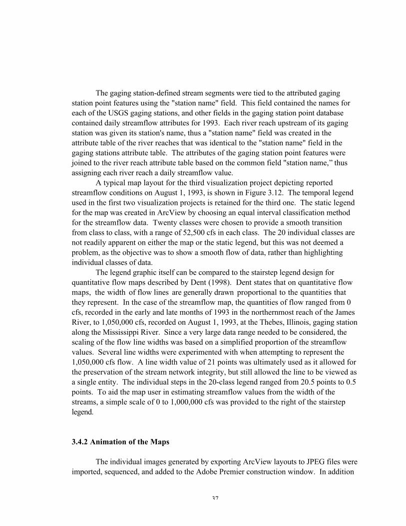
The gaging station-defined stream segments were tied to the attributed gagingstation point features using the "station name" field. This field contained the names foreach of the USGS gaging stations, and other fields in the gaging station point databasecontained daily streamflow attributes for 1993. Each river reach upstream of its gagingstation was given its station's name, thus a "station name" field was created in theattribute table of the river reaches that was identical to the "station name" field in thegaging stations attribute table. The attributes of the gaging station point features werejoined to the river reach attribute table based on the common field "station name,” thusassigning each river reach a daily streamflow value.
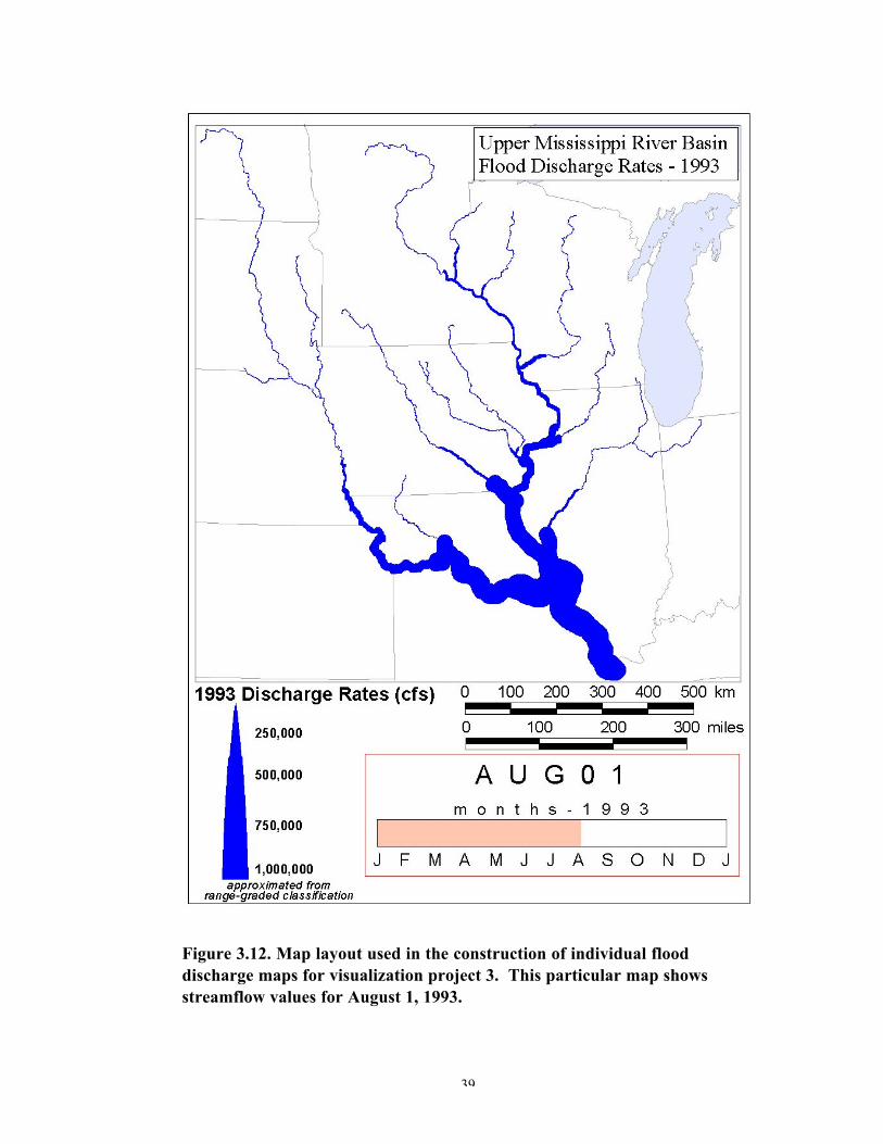
A typical map layout for the third visualization project depicting reportedstreamflow conditions on August 1, 1993, is shown in Figure 3.12. The temporal legendused in the first two visualization projects is retained for the third one. The static legendfor the map was created in ArcView by choosing an equal interval classification methodfor the streamflow data. Twenty classes were chosen to provide a smooth transitionfrom class to class, with a range of 52,500 cfs in each class. The 20 individual classes arenot readily apparent on either the map or the static legend, but this was not deemed aproblem, as the objective was to show a smooth flow of data, rather than highlightingindividual classes of data.
The legend graphic itself can be compared to the stairstep legend design forquantitative flow maps described by Dent (1998). Dent states that on quantitative flowmaps, the width of flow lines are generally drawn proportional to the quantities thatthey represent. In the case of the streamflow map, the quantities of flow ranged from 0cfs, recorded in the early and late months of 1993 in the northernmost reach of the JamesRiver, to 1,050,000 cfs, recorded on August 1, 1993, at the Thebes, Illinois, gaging stationalong the Mississippi River. Since a very large data range needed to be considered, thescaling of the flow line widths was based on a simplified proportion of the streamflowvalues. Several line widths were experimented with when attempting to represent the1,050,000 cfs flow. A line width value of 21 points was ultimately used as it allowed forthe preservation of the stream network integrity, but still allowed the line to be viewed asa single entity. The individual steps in the 20-class legend ranged from 20.5 points to 0.5points. To aid the map user in estimating streamflow values from the width of thestreams, a simple scale of 0 to 1,000,000 cfs was provided to the right of the stairsteplegend.
3.4.2 Animation of the Maps
The individual images generated by exporting ArcView layouts to JPEG files wereimported, sequenced, and added to the Adobe Premier construction window. In addition

38
to the 365 still frames, two introductory frames were added to the construction window.These frames, shown in Figure 3.11, are effective in introducing the mapped area to themap user. They are viewed for 10 seconds each with frame 1 (Figure 3.11a) fading intoframe 2 (Figure 3.11b), followed by frame 2 fading into the streamflow map for January1, 1993. Both half-second and one-second frame rate animations
39
Figure 3.12. Map layout used in the construction of individual flooddischarge maps for visualization project 3. This particular map showsstreamflow values for August 1, 1993.
40
("vis3_halfsec.avi" and "vis3_onesec.avi,” respectively) were created for this visualizationproject, and the resulting animations are stored in the CD-ROM appendix.
3.4.3 Description of Visualization 3
Visualization project 3 differed considerably from the first two projects, primarilydue to the fact that only streamflow data were used in the construction of the animation,whereas a mathematical combination of streamflow, precipitation, and evapotranspirationwere used in the first two animations. In the third animation, the movement of waterdownstream was readily seen during the evolution of the floods, as were the dischargeincreases leading up to the severe flooding in July and August, 1993, followed bydischarge decreases after August.
As with the animation in visualization project 2, the 1 fps rate animation forvisualization project 3 was observed to be too slow as a sense of fluid motion was not asapparent with the 1 fps animation as it was with the _ fps animation. At the _ fps rate,the transition from one daily discharge map frame to the next one was considerablysmoother.
It was previously noted that the downstream reaches of rivers, just before theyjoined up with the main stem of a larger river, were ungaged. This left a choice of eithertying the ungaged reach to the closest upstream gaging station's discharge records, or tyingthe reach to the closest downstream gaging station on the main stem of the larger river.Both approaches were investigated, but the latter was ultimately used prior to creatingthe flow maps. The map shown in Figure 3.12 utilized this approach to dealing withungaged river reaches. In this figure and in the animation, these stream reaches aredefinitely noticeable as wide flow lines adjacent to narrow flow lines. Figure 3.13 showsa zoomed-in portion of Figure 3.12, in which several river confluences are highlighted.The ungaged downstream river reaches are symbolized by flow lines with the samewidths as the adjacent main river stem flow lines. Had the ungaged reaches been tied tothe closest upstream gaging station's discharge records, the mapped results would havebeen slightly different. In this case, narrow flow lines would lie directly adjacent to themain river stem. It was felt that neither method of assigning streamflow attributes to thedownstream ungaged river reaches was ideal as the true streamflow for these reaches wasnot ascertainable from the available data.
Another issue regarding the USGS gaging stations and their daily streamflowrecords is one of data quality. Many gaging stations lie downstream of reservoirs wherestreamflow is often regulated at dams. During the 1993 floods, releases were oftenallowed from full reservoirs, thus adding to the discharge volume recorded at adownstream gaging station. Releases from reservoirs may also have been held back, thusdecreasing the overall flow that reaches a downstream gaging station. With this in mind,the daily values recorded at these gaging stations are values of the contribution of bothnatural flow and human-generated flow from reservoirs. Rivers that naturally have a large
41
volume of water flowing through them, such as the Mississippi and Missouri, are betterrepresented using flow line symbology than are low flow rivers.
Figure 3.13. Close-up of Figure 3.12 highlighting problems withungaged downstream river reaches.
42
4. Summary and Conclusions
The visualization projects described in this study represent a new approach to themapping of hydrologic data. Although the individual components of the research havebeen applied to hydrology before, namely raster-based GIS modeling and cartographicanimation, the mapped symbologies used to represent hydrologic processes are unique.These visualization projects provide a useful means of understanding the events that ledup to the 1993 Midwest floods.
Visualization project 1 examined the results of the GIS-based water balancestudies. The data sets utilized in this study included daily streamflow, precipitation, andevapotranspiration values (potential evapotranspiration depth measurements derivedfrom monthly values). Through the water balance equation, the output from the GISmodeling included a set of 365 grids of daily (1993) water storage values. These valueswere spatially averaged over USGS-defined watersheds (HUCs), and then brought intoArcView GIS for construction of the 365 maps that made up the visualization project.The value of this project lies in the dynamic presentation of the maps where variouspulses of water storage increases and decreases can be tracked along the network of majorrivers in the basin. Although the mapping is not precise enough to be able to calculateexactly when a large amount of upstream water storage will make it to the downstreamportion of the basin, one does get a sense of water movement through the HUCs, andthrough the basin as a whole, during the flood months of 1993.
Visualization 2 investigated the same data relations – flood water storage in theUMRB. The main difference between this visualization project and the first one was inthe use of dots to represent water storage in visualization project 2. Dot mapping is awell-documented technique in cartography of representing variation in spatial densitywithin some statistically bounded unit. Oftentimes, these units are polygons, but in thisstudy the dot mapping was ultimately applied to a linear network of rivers through asomewhat indirect use of polygonal boundaries. When animated, the blue dots indicate adefinite increase in downstream water storage as the flooding progressed through thesummer months of 1993. The dots do a good job of tracing out the stream network,particularly as they increase in number during the times of increasing flood water storagein the basin. Again, the temporal and physical scale of the mapping is such thatprediction of downstream high amounts of water storage is not possible from areas ofhigh amounts of upstream water storage.
Visualization 3 examined the streamflow records that were acquired by USGS gagingstations in the UMRB during 1993. These values played an important role in the
43
calculation of the basin water balance in the GIS-modeling phase of this study. They werealso effectively visualized through the animation of 365 maps of daily streamflow values.In most cases, values were tied to reaches of a river immediately upstream of a given gagingstation. The animation clearly shows the changes in the Mississippi and Missouri Riversduring 1993, including the early summer increases, followed by the late summer decreases inflooding. Part of the reason that these rivers are so well represented in the streamflowanimation is that the natural flow of these rivers increases markedly during the springmonths following snow melt. For the purposes of this study, the most important factorcontributing to the high discharge values at the gaging stations was the heavy amount ofprecipitation that was received at the stations during the spring and summer months. Thesmaller rivers adjoining the Mississippi and Missouri were not as well represented, exceptduring the peak flooding months of June through September, 1993. This was due primarilyto the scale that was chosen for the streamflow maps. The scale was adequate for the largerrivers' discharges to be mapped effectively, but was not sufficient for some of the smallerrivers. Still, the overall picture of water amounts greatly increasing over time is portrayedthrough the animation, and this was the primary objective of the third visualization project.Further studies could perhaps benefit from a comparison between 1993 discharge rates andthose from 1992. The difference between the two would yield a set of maps showingdeviations from 1992 values and would give the map user an idea of how extreme the 1993floods were compared to a more normal year such as 1992.
44
5. Areas of Future Research
The results of this study have shown that geographic visualization techniques canbe applied to GIS-based surface hydrologic models with varying degrees of success.Most of the visualization techniques described in this report have used commonlyavailable GIS and animation software to accomplish the goal of devising methods wherebydynamic maps that clearly depict the nature of the 1993 Midwest floods could be created.Future research areas could investigate other methods of geographic visualization, takingadvantage of the increasing availability of powerful graphics and animation software,better graphics cards in personal computers and workstations, and larger amounts ofRAM and storage space in computers.
5.1 Visualization Project 1
Visualization project 1 benefited from GIS output that was easily convertible intographics for map animation. When working with static and animated maps, thecartographer has to balance the needs and abilities of the map audience with theinformation content and design of the map. Too much information can lead to a clutteredappearance to the static map, and this clutter can be substantially increased when the mapis a part of an animation. This could lead to confusion on the part of the map audienceand loss of information content as the map audience is unable to fully comprehend themap animation results. The first visualization project was composed of individual 2-Dmaps. One avenue of future research regarding this particular visualization project wouldbe to create 3-D representations of the landscape and drape the HUC boundaries on topof the digital terrain model. The HUCs could be filled with semi-opaque shades of bluerepresenting the water storage amounts that would allow the map user to partially seethrough the colored HUC polygons to the terrain. Although this method would increasethe information content of the individual maps, it might provide too much information forthe map user to handle once the maps are sequenced into an animation.
Another idea would be to create a composite animation of the various ingredientsused to make up the water balance study: streamflow, precipitation, and
45
evapotranspiration. The animation could consist of four separate map animations, allrunning simultaneously at the same duration and rate of change, and showing the map userthe water storage visualization (blue animated HUCs), and animated maps of streamflow,precipitation, and evapotranspiration for the UMRB. This idea was based on theauthor's personal communication with Dr. David Maidment (Maidment, 2000). Althoughthe resulting composite animation would be extremely data rich, it would be difficult forthe map user to comprehend all of the information simultaneously. An advanced userinterface would need to be constructed as a frame to the composite animation that wouldallow the user to easily stop and start the animation at will, as well as zoom into one ormore of the individual animations for closer viewing and interpretation.
5.2 Visualization Project 2
Visualization project 2 was the most experimental of the three projects, andarguably the least successful. Software and hardware limitations prevented theconstruction of an animation that created dots that were dependent upon river velocity.Also, the dot mapping functionality in ArcView was only designed to be used inconjunction with static maps. Animation of the individual dot maps showed that therandom placement of dot distribution patterns was not conducive to the creation of theeffect of flow when the individual dot maps were sequenced into the animation.
Future research related to the animated dot mapping in the second visualizationproject should revolve around creating a direct relationship between the "flowing" dotpatterns and the velocity of the water along the stream reaches. Thus, each dot, orgrouping of dots, would represent a given parcel of water that would appear to changespeed as it moved downstream depending upon the changing velocity of water in therivers. While streamflow in ft3/second (cfs) is readily available for USGS gaging stations,velocity data is not (Maidment, personal communication), however, it could perhaps bederived from the streamflow data. A potential negative aspect of this type of dotmapping/visualization would be the creation of numerous independently flowing dotsthrough the UMRB river network. The dot flows might appear to be random to the mapuser, and information about overall basin flow dynamics might be lost as a result.
5.3 Visualization Project 3
Visualization project 3 did not utilize the GIS-based water balance results, butfocused on the raw streamflow data reported by the USGS gaging stations. Although theresults of this map animation were quite useful in terms of visualizing the pulses ofstreamflow during the flood months, some changes to the individual maps could besuggested. Future research should revolve around (1) dealing with the ungaged portions ofrivers, (2) investigating other data classification methods and stream width depictions, and(3) comparing 1993 streamflow data to average conditions.
46
As mentioned in the section of this report dealing with the third visualizationproject (Chapter 4), the river network consists of both gaged and ungaged stream reaches.These ungaged portions are found just upstream of the confluence of two or more rivers.The immediate downstream gage information was used to assign stream widths to theungaged reaches, resulting in quite wide stream widths (high streamflow) adjacent tonarrow (low streamflow) segments. Better results might be obtainable by estimating thestreamflow at these ungaged reaches, thus creating a smoother transition from high to lowstreamflow reaches.
The second area of future research related to Visualization 3 lies in the creation ofthe stream widths. The equal interval classification method was used to create the 20-class ranges used to symbolize the river network. Several other classification methodsexist, but were ultimately discarded in favor of the equal interval method, as this oneseemed most suitable to the data. Future work on streamflow animations should alsolook at the map scale and its effect on the resulting stream widths. Zooming into asmaller portion of the river basin (increasing the map scale) could provide a better pictureof the streamflow changes through the different classification scheme that would have tobe developed.
Finally, perhaps the best way to analyze the streamflow animation would be tocompare and contrast it with a similar animation of "normal" streamflow conditions.Unfortunately, the USGS does not publish average daily values for each gaging station, sothese values would have to be derived from the yearly reports. All daily values for aparticular gaging station could then be averaged over the history of the gaging station, andthe resulting data could be used to create an animated normal streamflow map. Individualdifference maps (1993 streamflow minus normal streamflow) could be created that wouldshow how 1993 streamflow deviated from normal streamflow. Animation of thedifference maps could be extremely beneficial in understanding the enormity of the floodand how it differed from normal flow conditions.
47
REFERENCES
Blok, C., and Köbben, B. 1998. A Web Cartography Forum: An Evaluation Site forVisualization Tools. Working Paper for the ICA Commission on VisualizationMeeting, Warsaw, Poland, May 1998.http://www.itc.nl/~carto/research/webcartoforum/paper.html .
Changnon, S.A. 1996. Defining the Flood: A Chronology of Key Events. In The Greatflood of 1993, ed. S.A. Changnon, pp. 3-28. Boulder, Colorado: Westview Press.
Cornwell, B., and Robinson, A. 1966. Possibilities for Computer Animated Film inCartography. Cartographic Journal 3:79-82.
Dent, B.D. 1998. Cartography Thematic Map Design. 5th ed. Boston: WCB/McGraw-Hill.
DiBiase, D. 1990. Visualization in the Earth Sciences. Earth and Mineral Sciences,Bulletin of the College of Earth and Mineral Sciences, Pennsylvania StateUniversity 59:13-18.
Hay, L. and Knapp, L. 1993. Visualization Techniques for Hydrologic Modeling. InProceedings of the Federal Interagency Workshop on Hydrologic ModelingDemands for the 90's. U.S. Geological Survey Water-Resources InvestigationsReport 93-4018, pp. 3-1 – 3.8. Denver: United States Government PrintingOffice.
48
Kraak, M.-J. 1998. Exploratory Cartography: Maps as Tools for Discovery. InauguralAddress. Enschede, Netherlands: International Institute for Aerospace Survey andEarth Sciences (ITC). http://www.itc.nl/~carto/division/kraak/index.html.
MacEachren, A.M. 1994. Visualization in Modern Cartography: Setting the Agenda. InVisualization in Modern Cartography, ed. A.M. MacEachren and D.R.F. Taylor,pp. 1-12. Oxford: Pergamon Press.
. 1995. How Maps Work: Representation, Visualization, and Design.New York: Guilford Press.
MacEachren, A.M., and Ganter, J.H. 1990. A Pattern Identification Approach toCartographic Visualization. Cartographica 27:64-81.
MacEachren, A.M., and Kraak, M.-J. 1997. Exploratory Cartographic Visualization.Computers & Geosciences 23:335-492. Special Issue.
Maidment, D.R. 2000. Personal communication.
McCormick, B.H., Defanti, T.A., and Brown, M.D. 1987. Visualization in ScientificComputing. ACM SIGGRAPH Computer Graphics 21(6). Special Issue.
Mitas, L., Brown, W.M., and Mitasova, H. 1997. Role of Dynamic Cartography inSimulations of Landscape Processes Based on Multivariate Fields. Computers &Geosciences 23:437-446.
Mizgalewicz, P.J., Maidment, D.R., White, W.S., and Ridd, M.K. 1998. Water Balance ofthe 1993 Midwest Flood. A report prepared for the Texas Water ResourcesInstitute and the U.S. Geological Survey. Unpublished.
Moellering, H. 1972. Traffic Crashes in Washtenaw County, Michigan, 1968-70.Highway Safety Research Institute, Ann Arbor, University of Michigan.
. 1973a. The Computer in Animated Film: A Dynamic Cartography. InProceedings, Association for Computing Machinery, pp. 64-69.
. 1973b. The Potential Uses of Computer Animated Film in the Analysisof Geographical Patterns of Traffic Crashes. Accident Analysis and Prevention 8:215-227.
Parks, M.J. 1987. American Flow Mapping: A Survey of the Flow Maps Found inTwentieth Century Geography Textbooks, Including a Classification of theVarious Flow Map Designs. M.S. thesis, Georgia State University.
49
Peterson, M.P. 1994. Spatial Visualization through Cartographic Animation: Theory andPractice. In Proceedings of GIS/LIS '94, pp. 619-628.
Robinson, A.H., and Petchenik, B.B. 1976. The Nature of Maps. Chicago: University ofChicago Press.
Rodenhuis, D.R. 1996. The Weather that Led to the Flood, In The Great flood of 1993,ed. S.A. Changnon, pp. 29-51. Boulder, Colorado: Westview Press.
Skinner, B.J., and Porter, S.C. 1995. The Blue Planet: An Introduction to Earth SystemScience. New York, John Wiley and Sons, Inc.
Thrower, N. 1961. Animated Cartography in the United States. International Yearbook ofCartography 1: 20-30.
Tobler, W. 1970. A Computer Movie Simulating Urban Growth in the Detroit Region.Economic Geography 46: 234-240.
Traub, L.M. 1994. Application of Scientific Visualization Techniques for Analysis of the1993 Flood on the Mississippi River [abstr.]. In U.S. Geological Survey ScientificVisualization Workshop, New Orleans, Louisiana, April 11-12, 1994: Programsand Abstracts. U.S. Geological Survey Open-File Report 94-1, p. 25. Reston,Virginia.
U.S. Army Corps of Engineers. 1998. Mississippi Basin Modeling System Developmentand Application. Davis, California: USACE, Hydrologic Engineering Center.
50
APPENDIX
Description of Computer Files and Contents of the CD-ROM
The CD-ROM appendix contains the GIS data sets used in this study, all of theJPEG images created in ArcView, and the animation files. The GIS data sets consist ofArcView shapefiles, associated files, and the legend files used in each visualizationproject. These data are located in the "gis_data" folder under each visualization projectname ("vis1,” "vis2,” and "vis3"). JPEG images at 72 dots per inch (dpi) resolution areincluded in the "jpegs" folders. The animation files, in Windows AVI format, are locatedin the "movies folders.” AVI files can be played in numerous software packages,including the freeware program Windows Media® Player, which is resident on allWindows-based PCs and is also available at Microsoft's web site. The AppleQuickTime® media player program also plays AVI files on both PCs and Macintoshcomputers.
The contents of the CD-ROM, as output from the freeware TreePrint program(Version 1.0 © 1999 Ziff-Davis, Inc.), are listed in a slightly modified form on the
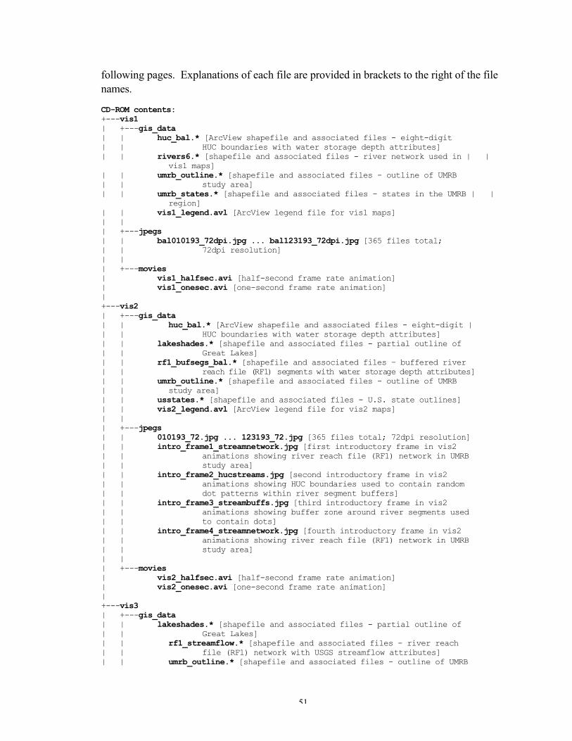
51
following pages. Explanations of each file are provided in brackets to the right of the filenames.
CD-ROM contents:+---vis1| +---gis_data| | huc_bal.* [ArcView shapefile and associated files - eight-digit| | HUC boundaries with water storage depth attributes]| | rivers6.* [shapefile and associated files - river network used in | |
vis1 maps]| | umrb_outline.* [shapefile and associated files - outline of UMRB| | study area]| | umrb_states.* [shapefile and associated files - states in the UMRB | |
region]| | vis1_legend.avl [ArcView legend file for vis1 maps]| || +---jpegs| | bal010193_72dpi.jpg ... bal123193_72dpi.jpg [365 files total; | | 72dpi resolution]| || +---movies| vis1_halfsec.avi [half-second frame rate animation]| vis1_onesec.avi [one-second frame rate animation]|+---vis2| +---gis_data| | huc_bal.* [ArcView shapefile and associated files - eight-digit || | HUC boundaries with water storage depth attributes]| | lakeshades.* [shapefile and associated files - partial outline of| | Great Lakes]| | rf1_bufsegs_bal.* [shapefile and associated files – buffered river| | reach file (RF1) segments with water storage depth attributes]| | umrb_outline.* [shapefile and associated files - outline of UMRB| | study area]| | usstates.* [shapefile and associated files - U.S. state outlines]| | vis2_legend.avl [ArcView legend file for vis2 maps]| || +---jpegs| | 010193_72.jpg ... 123193_72.jpg [365 files total; 72dpi resolution]| | intro_frame1_streamnetwork.jpg [first introductory frame in vis2| | animations showing river reach file (RF1) network in UMRB| | study area]| | intro_frame2_hucstreams.jpg [second introductory frame in vis2| | animations showing HUC boundaries used to contain random| | dot patterns within river segment buffers]| | intro_frame3_streambuffs.jpg [third introductory frame in vis2| | animations showing buffer zone around river segments used| | to contain dots]| | intro_frame4_streamnetwork.jpg [fourth introductory frame in vis2| | animations showing river reach file (RF1) network in UMRB| | study area]| || +---movies| vis2_halfsec.avi [half-second frame rate animation]| vis2_onesec.avi [one-second frame rate animation]|+---vis3| +---gis_data| | lakeshades.* [shapefile and associated files - partial outline of| | Great Lakes]| | rf1_streamflow.* [shapefile and associated files - river reach| | file (RF1) network with USGS streamflow attributes]| | umrb_outline.* [shapefile and associated files - outline of UMRB
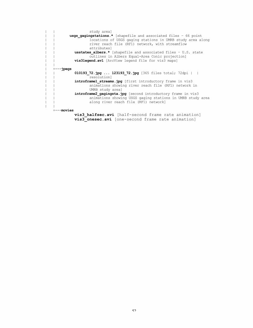
52
| | study area]| | usgs_gagingstations.* [shapefile and associated files – 66 point| | locations of USGS gaging stations in UMRB study area along| | river reach file (RF1) network, with streamflow| | attributes]| | usstates_albers.* [shapefile and associated files – U.S. state| | outlines in Albers Equal-Area Conic projection]| | vis3legend.avl [ArcView legend file for vis3 maps]| || +---jpegs| | 010193_72.jpg ... 123193_72.jpg [365 files total; 72dpi | || | resolution]| | introframe1_streams.jpg [first introductory frame in vis3| | animations showing river reach file (RF1) network in| | UMRB study area]| | introframe2_gagingsta.jpg [second introductory frame in vis3| | animations showing USGS gaging stations in UMRB study area| | along river reach file (RF1) network]| | +---movies vis3_halfsec.avi [half-second frame rate animation]
vis3_onesec.avi [one-second frame rate animation]