Embed Size (px)
Citation preview
13th AGILE International Conference on Geographic Information Science 2010 Page 1 of 10 Guimarães, Portugal
Three-dimensional Visualization, Interactive Analysis and Contextual Mapping of Space-time Cancer Data
Pierre Goovaerts (BioMedware, Inc)
INTRODUCTION
The increase in computational power and storage capacity of computers, combined with the growing availability of geocoded data, has increased dramatically the amount of information processed in health studies, making it difficult to understand, to explore, and to discover interesting patterns within the data. The major difficulty in the analysis of health outcomes is that the patterns observed reflect the influence of a complex constellation of demographic, social, economic, cultural and environmental factors that likely change through time and space, and interact with the different types and scales of places where people live. Thus, there is a large heterogeneity in the temporal and spatial scales of investigation, leading to the utilization of a wide range of statistical methods and visualization techniques in most studies of health outcomes.
Despite the significant work accomplished in health data visualization and analysis this last decade, spatial and temporal data are still displayed in separate views and so current software do not capitalize on the human visual processing engine to extract knowledge from the spatial interconnectedness of information over time and geography. In addition, common approaches to disease mapping too often focus on the display of disease rates for political or administrative units and lack information on the local context of cancer burden, which is critical to facilitate the interpretation of these maps by local communities and engage their participation to prevention and control activities. This paper reviews common approaches for the space-time visualization of health data and explores solutions for the 3D interactive visualization of health outcomes in a combined time and geography space and contextualization of disease maps through the incorporation of familiar markers, such as highways, rivers or topographic details.
VISUALIZATION OF SPACE-TIME DATA: COMMON SOLUTIONS
Most visualization techniques for analyzing health outcomes only display information along a single spatial or temporal dimension. For example, time-focused scheduling charts such as Lifelines (Plaisant et al., 1998) or Microsoft (MS) Project display attributes of events over the single dimension of time. Geographic Information System (GIS) products, such as GeoDA (Anselin et al., 2006) or ESRI ArcView, show events in the single dimension of space on a map. In each case, only a thin slice of a multidimensional picture is represented.
The following visualization techniques (Kapler and Wright, 2005), which are all available in TerraSeer’s Space-Information Intelligence System (STIS, Avruskin et al., 2004), are commonly used to overcome the limitations of one-dimensional displays:
1. Temporal animation: slideshow controlled by a time slider. Such dynamic representations are well suited to convey the general trend in health outcomes over time. However, this technique relies on limited human short term memory and quickly reaches its limit when longer time series have to be visualized: users simply cannot retain all changes in the visual representation and the animation takes too long for the user to remember its course. Even to achieve simple comparison of different time steps users would be compelled to browse through the animation over and over again (Tominski et al., 2005).
13th AGILE International Conference on Geographic Information Science 2010 Page 2 of 10 Guimarães, Portugal
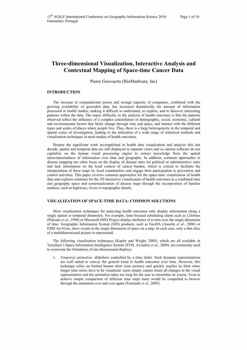
Figure 1: County-level maps of prostate cancer incidence rates per 100,000 person-years (advanced stage) estimated by Poisson kriging (Goovaerts, 2005) for nine different years. The same color scale is used for all the maps that were captured as screen shots of an animation generated by TerraSeer’s Space-Information Intelligence System and that included 25 slides (1981-2005). This time sequence
highlights how the incidence rates peaked in the early 1990s when PSA became widely available, followed by a decline caused by the advanced diagnosis of cancer cases.
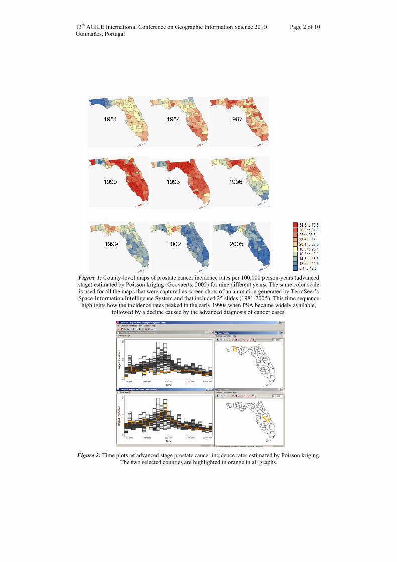
Figure 2: Time plots of advanced stage prostate cancer incidence rates estimated by Poisson kriging.
The two selected counties are highlighted in orange in all graphs.
13th AGILE International Conference on Geographic Information Science 2010 Page 3 of 10 Guimarães, Portugal
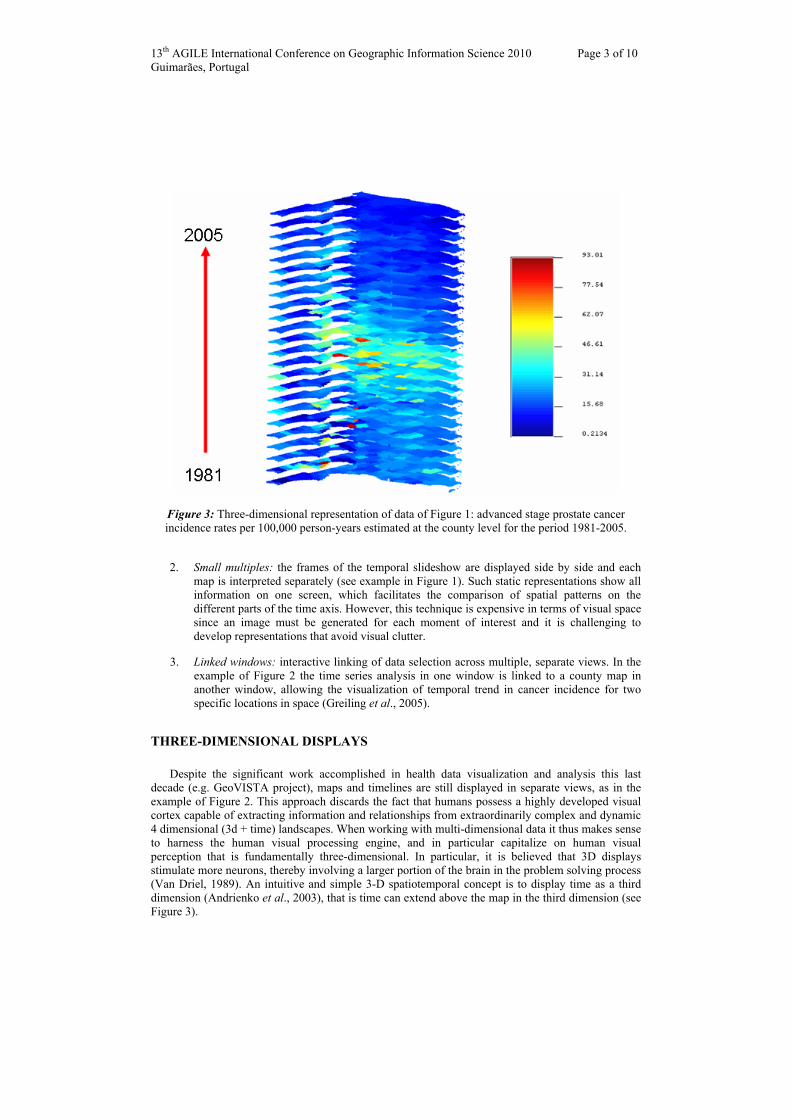
Figure 3: Three-dimensional representation of data of Figure 1: advanced stage prostate cancer incidence rates per 100,000 person-years estimated at the county level for the period 1981-2005.
2. Small multiples: the frames of the temporal slideshow are displayed side by side and each map is interpreted separately (see example in Figure 1). Such static representations show all information on one screen, which facilitates the comparison of spatial patterns on the different parts of the time axis. However, this technique is expensive in terms of visual space since an image must be generated for each moment of interest and it is challenging to develop representations that avoid visual clutter.
3. Linked windows: interactive linking of data selection across multiple, separate views. In the example of Figure 2 the time series analysis in one window is linked to a county map in another window, allowing the visualization of temporal trend in cancer incidence for two specific locations in space (Greiling et al., 2005).
THREE-DIMENSIONAL DISPLAYS
Despite the significant work accomplished in health data visualization and analysis this last decade (e.g. GeoVISTA project), maps and timelines are still displayed in separate views, as in the example of Figure 2. This approach discards the fact that humans possess a highly developed visual cortex capable of extracting information and relationships from extraordinarily complex and dynamic 4 dimensional (3d + time) landscapes. When working with multi-dimensional data it thus makes sense to harness the human visual processing engine, and in particular capitalize on human visual perception that is fundamentally three-dimensional. In particular, it is believed that 3D displays stimulate more neurons, thereby involving a larger portion of the brain in the problem solving process (Van Driel, 1989). An intuitive and simple 3-D spatiotemporal concept is to display time as a third dimension (Andrienko et al., 2003), that is time can extend above the map in the third dimension (see Figure 3).
13th AGILE International Conference on Geographic Information Science 2010 Page 4 of 10 Guimarães, Portugal
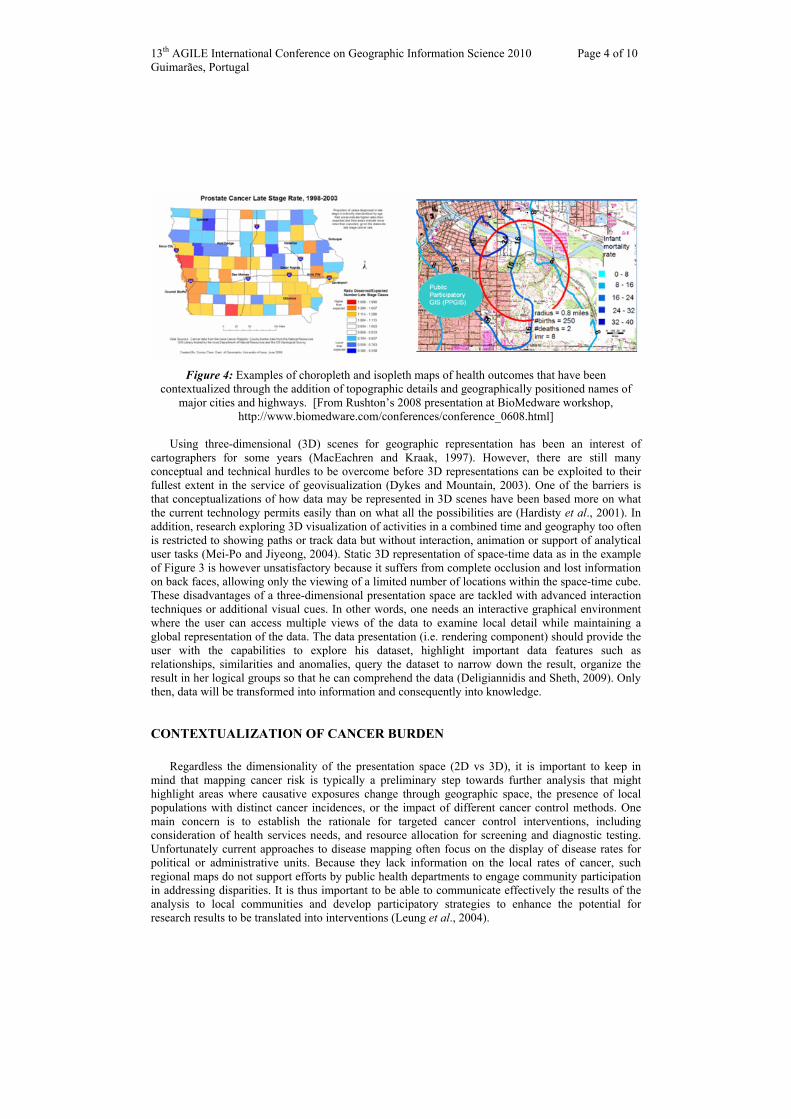
Figure 4: Examples of choropleth and isopleth maps of health outcomes that have been
contextualized through the addition of topographic details and geographically positioned names of major cities and highways. [From Rushton’s 2008 presentation at BioMedware workshop,
http://www.biomedware.com/conferences/conference_0608.html]
Using three-dimensional (3D) scenes for geographic representation has been an interest of cartographers for some years (MacEachren and Kraak, 1997). However, there are still many conceptual and technical hurdles to be overcome before 3D representations can be exploited to their fullest extent in the service of geovisualization (Dykes and Mountain, 2003). One of the barriers is that conceptualizations of how data may be represented in 3D scenes have been based more on what the current technology permits easily than on what all the possibilities are (Hardisty et al., 2001). In addition, research exploring 3D visualization of activities in a combined time and geography too often is restricted to showing paths or track data but without interaction, animation or support of analytical user tasks (Mei-Po and Jiyeong, 2004). Static 3D representation of space-time data as in the example of Figure 3 is however unsatisfactory because it suffers from complete occlusion and lost information on back faces, allowing only the viewing of a limited number of locations within the space-time cube. These disadvantages of a three-dimensional presentation space are tackled with advanced interaction techniques or additional visual cues. In other words, one needs an interactive graphical environment where the user can access multiple views of the data to examine local detail while maintaining a global representation of the data. The data presentation (i.e. rendering component) should provide the user with the capabilities to explore his dataset, highlight important data features such as relationships, similarities and anomalies, query the dataset to narrow down the result, organize the result in her logical groups so that he can comprehend the data (Deligiannidis and Sheth, 2009). Only then, data will be transformed into information and consequently into knowledge.
CONTEXTUALIZATION OF CANCER BURDEN
Regardless the dimensionality of the presentation space (2D vs 3D), it is important to keep in mind that mapping cancer risk is typically a preliminary step towards further analysis that might highlight areas where causative exposures change through geographic space, the presence of local populations with distinct cancer incidences, or the impact of different cancer control methods. One main concern is to establish the rationale for targeted cancer control interventions, including consideration of health services needs, and resource allocation for screening and diagnostic testing. Unfortunately current approaches to disease mapping often focus on the display of disease rates for political or administrative units. Because they lack information on the local rates of cancer, such regional maps do not support efforts by public health departments to engage community participation in addressing disparities. It is thus important to be able to communicate effectively the results of the analysis to local communities and develop participatory strategies to enhance the potential for research results to be translated into interventions (Leung et al., 2004).
13th AGILE International Conference on Geographic Information Science 2010 Page 5 of 10 Guimarães, Portugal
Figure 4 displays some of the results of the research conducted at the University of Iowa in collaboration with the Iowa Consortium for Comprehensive Cancer Control (Beyer and Rushton, 2009). Mapping health outcomes at a fine scale and contextualizing those maps through the incorporation of familiar markers, such as highways, rivers or topographic details, increase the relevance of the results to local communities. Making the information about cancer rates more meaningful to people who are familiar with the local area make them more likely to engage in addressing disparities in cancer outcomes. In other words, nowadays with the availability of advanced mapping resources, such as MapQuest or Google Earth, the typical choropleth maps displayed in Figure 1 and reported in Cancer Atlas are quickly looking obsolete and irrelevant to the public.
PROPOSED SOLUTIONS
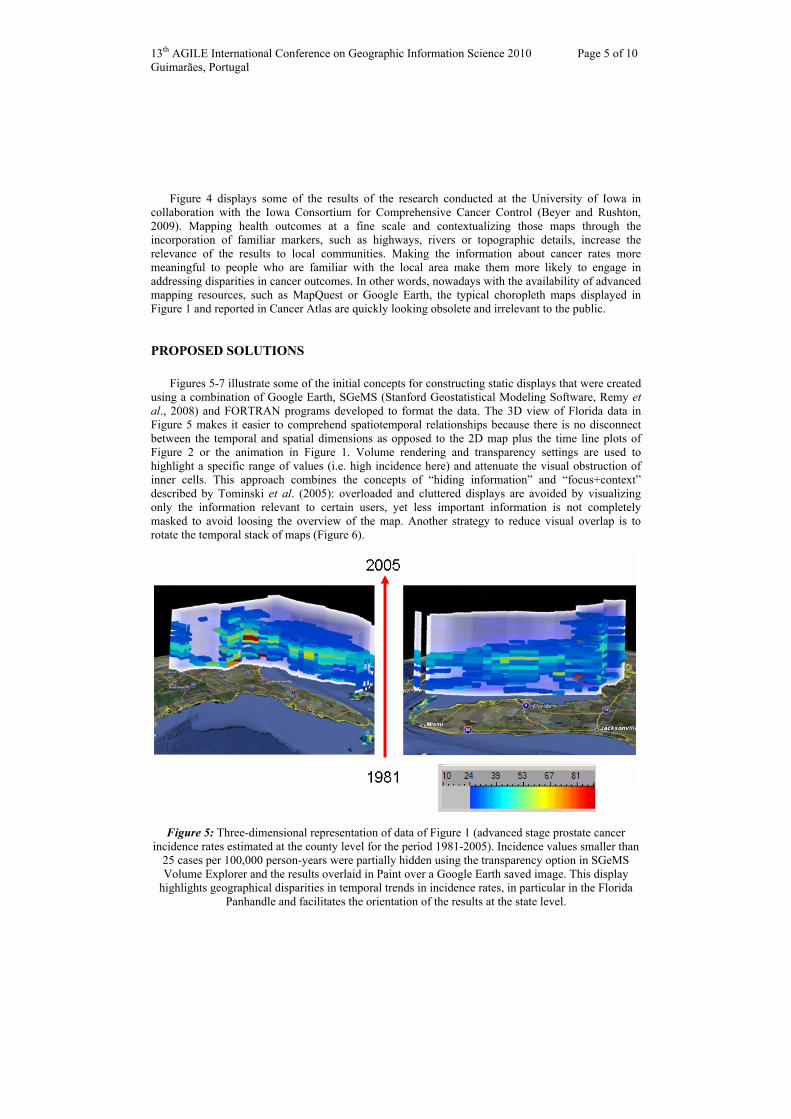
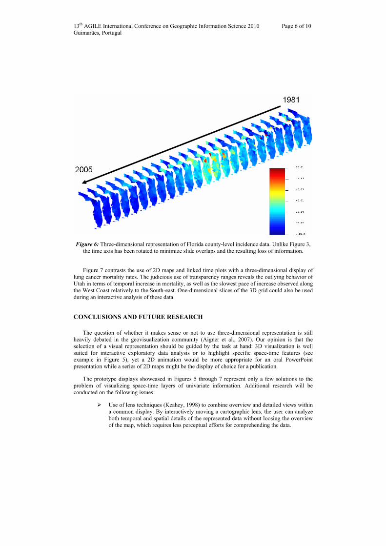
Figures 5-7 illustrate some of the initial concepts for constructing static displays that were created using a combination of Google Earth, SGeMS (Stanford Geostatistical Modeling Software, Remy et al., 2008) and FORTRAN programs developed to format the data. The 3D view of Florida data in Figure 5 makes it easier to comprehend spatiotemporal relationships because there is no disconnect between the temporal and spatial dimensions as opposed to the 2D map plus the time line plots of Figure 2 or the animation in Figure 1. Volume rendering and transparency settings are used to highlight a specific range of values (i.e. high incidence here) and attenuate the visual obstruction of inner cells. This approach combines the concepts of “hiding information” and “focus+context” described by Tominski et al. (2005): overloaded and cluttered displays are avoided by visualizing only the information relevant to certain users, yet less important information is not completely masked to avoid loosing the overview of the map. Another strategy to reduce visual overlap is to rotate the temporal stack of maps (Figure 6).
Figure 5: Three-dimensional representation of data of Figure 1 (advanced stage prostate cancer incidence rates estimated at the county level for the period 1981-2005). Incidence values smaller than
25 cases per 100,000 person-years were partially hidden using the transparency option in SGeMS Volume Explorer and the results overlaid in Paint over a Google Earth saved image. This display
highlights geographical disparities in temporal trends in incidence rates, in particular in the Florida Panhandle and facilitates the orientation of the results at the state level.
13th AGILE International Conference on Geographic Information Science 2010 Page 6 of 10 Guimarães, Portugal
Figure 6: Three-dimensional representation of Florida county-level incidence data. Unlike Figure 3, the time axis has been rotated to minimize slide overlaps and the resulting loss of information.
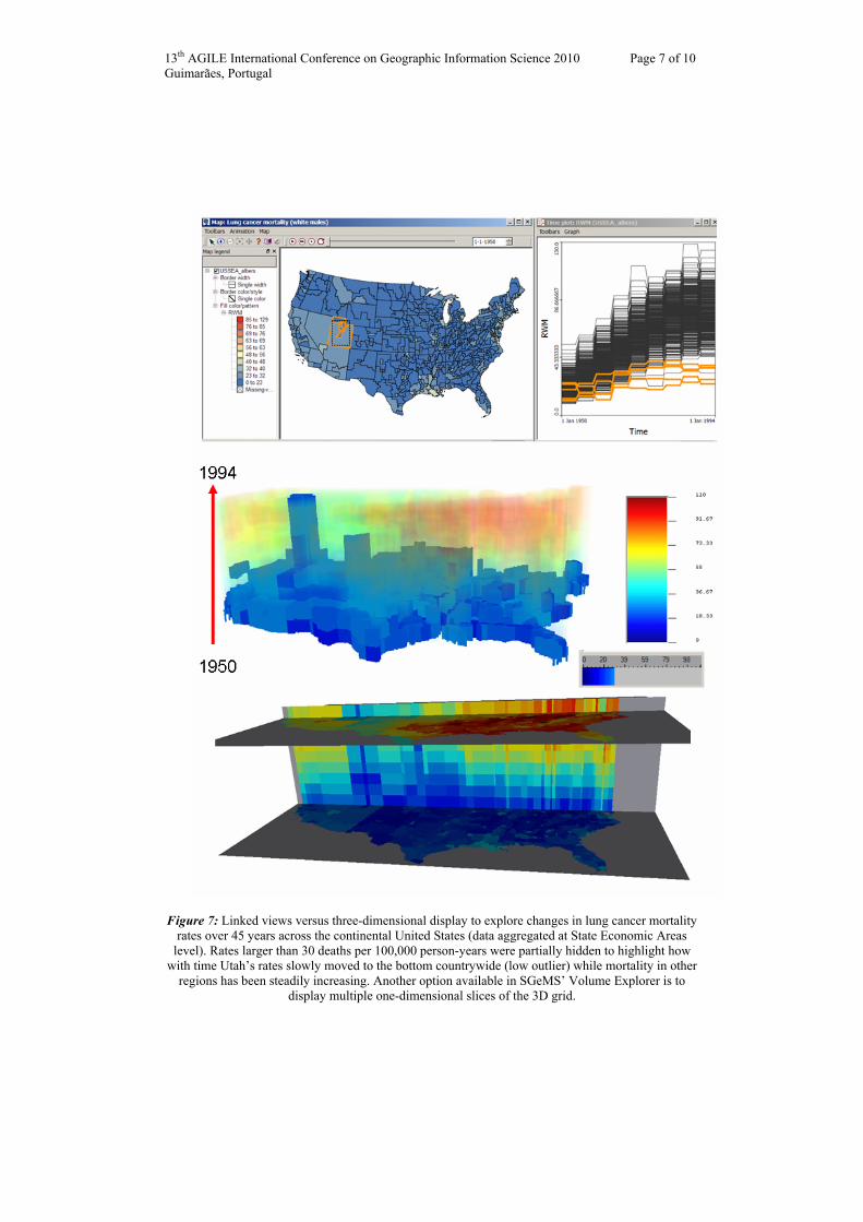
Figure 7 contrasts the use of 2D maps and linked time plots with a three-dimensional display of lung cancer mortality rates. The judicious use of transparency ranges reveals the outlying behavior of Utah in terms of temporal increase in mortality, as well as the slowest pace of increase observed along the West Coast relatively to the South-east. One-dimensional slices of the 3D grid could also be used during an interactive analysis of these data.
CONCLUSIONS AND FUTURE RESEARCH
The question of whether it makes sense or not to use three-dimensional representation is still heavily debated in the geovisualization community (Aigner et al., 2007). Our opinion is that the selection of a visual representation should be guided by the task at hand: 3D visualization is well suited for interactive exploratory data analysis or to highlight specific space-time features (see example in Figure 5), yet a 2D animation would be more appropriate for an oral PowerPoint presentation while a series of 2D maps might be the display of choice for a publication.
The prototype displays showcased in Figures 5 through 7 represent only a few solutions to the problem of visualizing space-time layers of univariate information. Additional research will be conducted on the following issues:
Use of lens techniques (Keahey, 1998) to combine overview and detailed views within a common display. By interactively moving a cartographic lens, the user can analyze both temporal and spatial details of the represented data without loosing the overview of the map, which requires less perceptual efforts for comprehending the data.
13th AGILE International Conference on Geographic Information Science 2010 Page 7 of 10 Guimarães, Portugal
Figure 7: Linked views versus three-dimensional display to explore changes in lung cancer mortality rates over 45 years across the continental United States (data aggregated at State Economic Areas
level). Rates larger than 30 deaths per 100,000 person-years were partially hidden to highlight how with time Utah’s rates slowly moved to the bottom countrywide (low outlier) while mortality in other
regions has been steadily increasing. Another option available in SGeMS’ Volume Explorer is to display multiple one-dimensional slices of the 3D grid.
13th AGILE International Conference on Geographic Information Science 2010 Page 8 of 10 Guimarães, Portugal
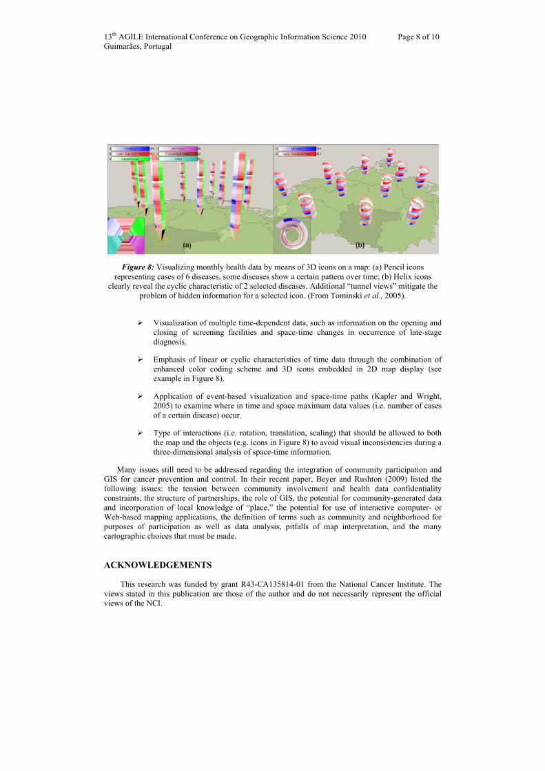
Figure 8: Visualizing monthly health data by means of 3D icons on a map: (a) Pencil icons representing cases of 6 diseases, some diseases show a certain pattern over time; (b) Helix icons
clearly reveal the cyclic characteristic of 2 selected diseases. Additional “tunnel views” mitigate the problem of hidden information for a selected icon. (From Tominski et al., 2005).
Visualization of multiple time-dependent data, such as information on the opening and closing of screening facilities and space-time changes in occurrence of late-stage diagnosis.
Emphasis of linear or cyclic characteristics of time data through the combination of enhanced color coding scheme and 3D icons embedded in 2D map display (see example in Figure 8).
Application of event-based visualization and space-time paths (Kapler and Wright, 2005) to examine where in time and space maximum data values (i.e. number of cases of a certain disease) occur.
Type of interactions (i.e. rotation, translation, scaling) that should be allowed to both the map and the objects (e.g. icons in Figure 8) to avoid visual inconsistencies during a three-dimensional analysis of space-time information.
Many issues still need to be addressed regarding the integration of community participation and GIS for cancer prevention and control. In their recent paper, Beyer and Rushton (2009) listed the following issues: the tension between community involvement and health data confidentiality constraints, the structure of partnerships, the role of GIS, the potential for community-generated data and incorporation of local knowledge of “place,” the potential for use of interactive computer- or Web-based mapping applications, the definition of terms such as community and neighborhood for purposes of participation as well as data analysis, pitfalls of map interpretation, and the many cartographic choices that must be made.
ACKNOWLEDGEMENTS
This research was funded by grant R43-CA135814-01 from the National Cancer Institute. The views stated in this publication are those of the author and do not necessarily represent the official views of the NCI.
13th AGILE International Conference on Geographic Information Science 2010 Page 9 of 10 Guimarães, Portugal
BIBLIOGRAPHY
Aigner W., Miksch S., Mueller W., Schumann H. and C. Tominski. 2007. Visualizing time-oriented data: A systematic view. Computers and Graphics, 31 (3): 401–409.
Andrienko N., Andrienko G. and P. Gatalsky. 2003. Exploratory spatio-temporal visualization: an analytical review. Journal of Visual Languages & Computing, 14: 503-541.
Anselin L., Syabri I. and Y. Kho. 2006. GeoDa: An Introduction to Spatial Data Analysis. Geographical Analysis 38: 5-22.
Avruskin G.A., Jacquez G.M., Meliker J.R., Slotnick M.J., Kaufmann A.M., and J.O. Nriagu. 2004. Visualization and exploratory analysis of epidemiologic data using a novel space time information system. International Journal of Health Geographics, 3: 26.
Beyer, K.M.M. and G. Rushton. 2009. Mapping cancer for community engagement. Preventing Chronic Disease, 6 (1). Accessible: http://www.cdc.gov/pcd/issues/2009/jan/08_0029.htm
Deligiannidis L. and A. Sheth. 2009. Visualization of Two Parameters in a Three Dimensional Environment. In Z.S. Hippe and J.L. Kulikowski (Eds.). Human-Computer Systems Interaction. Backgrounds and Applications. Springer-Verlag.
Dykes J.A. and D.M. Mountain. 2003. Seeking structure in records of spatio-temporal behaviour: visualization issues, efforts and applications. Computational Statistics and Data Analysis 43: 581-603.
Goovaerts P. 2005. Geostatistical analysis of disease data: estimation of cancer mortality risk from empirical frequencies using Poisson kriging. International Journal of Health Geographics, 4: 31.
Greiling D.A., Jacquez G.M., Kaufmann A.M. and R.G. Rommel. 2005. Space-time visualization and analysis in the Cancer Atlas Viewer. Journal of Geographical Systems, 7: 67-84.
Hardisty F., MacEachren A.M. and M. Takatsuka. 2001. Cartographic Animation in Three Dimensions: Experimenting with the Scene Graph. 20th International Cartographic Conference, Beijing, China, August 6-10, 2001.
Kapler T. and W. Wright. 2005. GeoTime information visualization. Information Visualization, 4(2): 136-146.
Keahey T.A. 1998. The generalized detail-in-context problem. Proceedings of IEEE Symposium on Information Visualization (InfoVis'98), Durham, October, 19-20, 1998, pp. 44-51.
Leung M.W., Yen I.H., and M. Minkler. 2004. Community based participatory research: a promising approach for increasing epidemiology’s relevance in the 21st century. Int J Epidemiol, 33(3): 499-506.
MacEachren A. and M. Kraak. 1997. Exploratory cartographic visualization: advancing the agenda. Computers and Geosciences, 23: 335–344.
Mei-Po K. and L. Jiyeong. 2004. Geovisualization of human activity patterns using 3D GIS: a time-geographic approach. In: Goodchild M, Janelle D (Eds). Spatially Integrated Social Science. Oxford University Press: New York, page 48–66.
Plaisant C., Mushlin R., Snyder A., Li J., Heller D. and B. Shneiderman. 1998. LifeLines: Using Visualization to Enhance Navigation and Analysis of Patient Records. Revised version in 1998 American Medical Informatic Association Annual Fall Symposium (Orlando, Nov. 9-11, 1998), p. 76-80, AMIA, Bethesda MD.

13th AGILE International Conference on Geographic Information Science 2010 Page 10 of 10 Guimarães, Portugal
Remy N., Boucher A. and J. Wu. 2008. Applied Geostatistics with SGeMS: A User's Guide. Cambridge University Press.
Tominski C., Schulze-Wollgast P. and H. Schumann. 2005. 3D information visualization for time dependent data on maps. Proceedings of the Ninth International Conference on Information Visualisation (IV’05).
Van Driel J.N. 1989. Three dimensional display of geologic data. In: J. Raper (ed.) Three dimensional applications in Geological Information System. Taylor & Francis: London, page 1-9.


![20100818 agile2010 report [DRAFT]](https://img.pdfslide.net/doc/110x75/545398a0af79591d308b5700/20100818-agile2010-report-draft.jpg)