Embed Size (px)
Citation preview
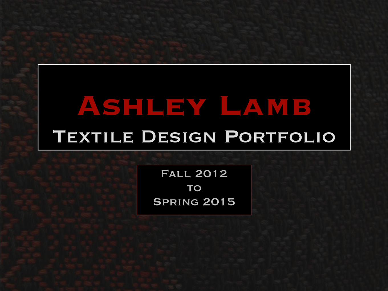
Ashley LambTextile Design Portfolio
Fall 2012to
Spring 2015
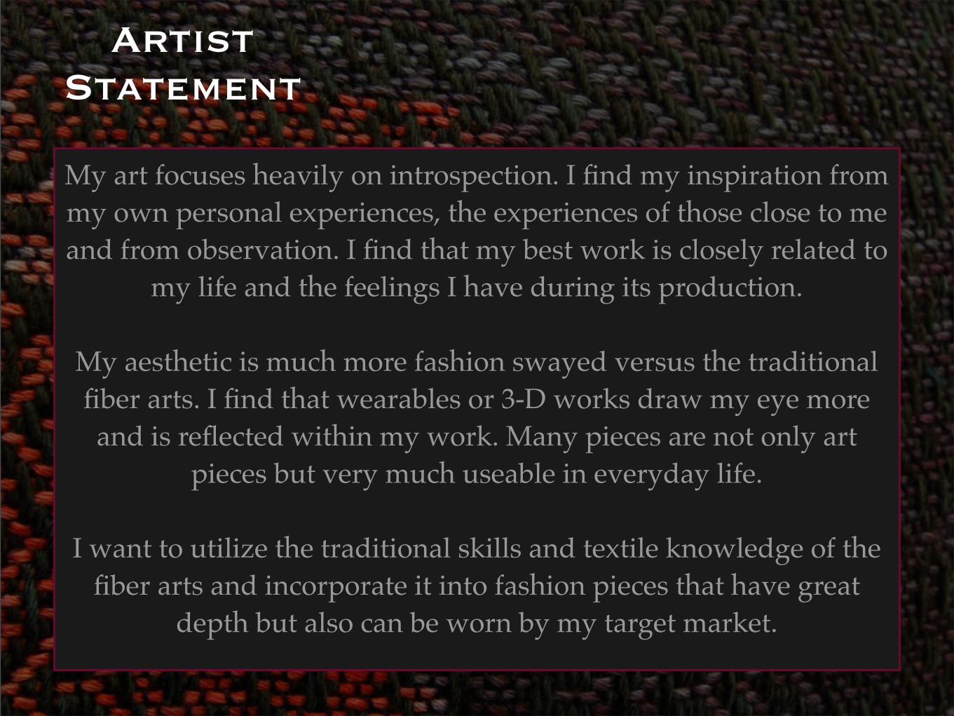
Artist Statement
My art focuses heavily on introspection. I find my inspiration from my own personal experiences, the experiences of those close to me and from observation. I find that my best work is closely related to
my life and the feelings I have during its production.
My aesthetic is much more fashion swayed versus the traditional fiber arts. I find that wearables or 3-D works draw my eye more and is reflected within my work. Many pieces are not only art
pieces but very much useable in everyday life.
I want to utilize the traditional skills and textile knowledge of the fiber arts and incorporate it into fashion pieces that have great
depth but also can be worn by my target market.
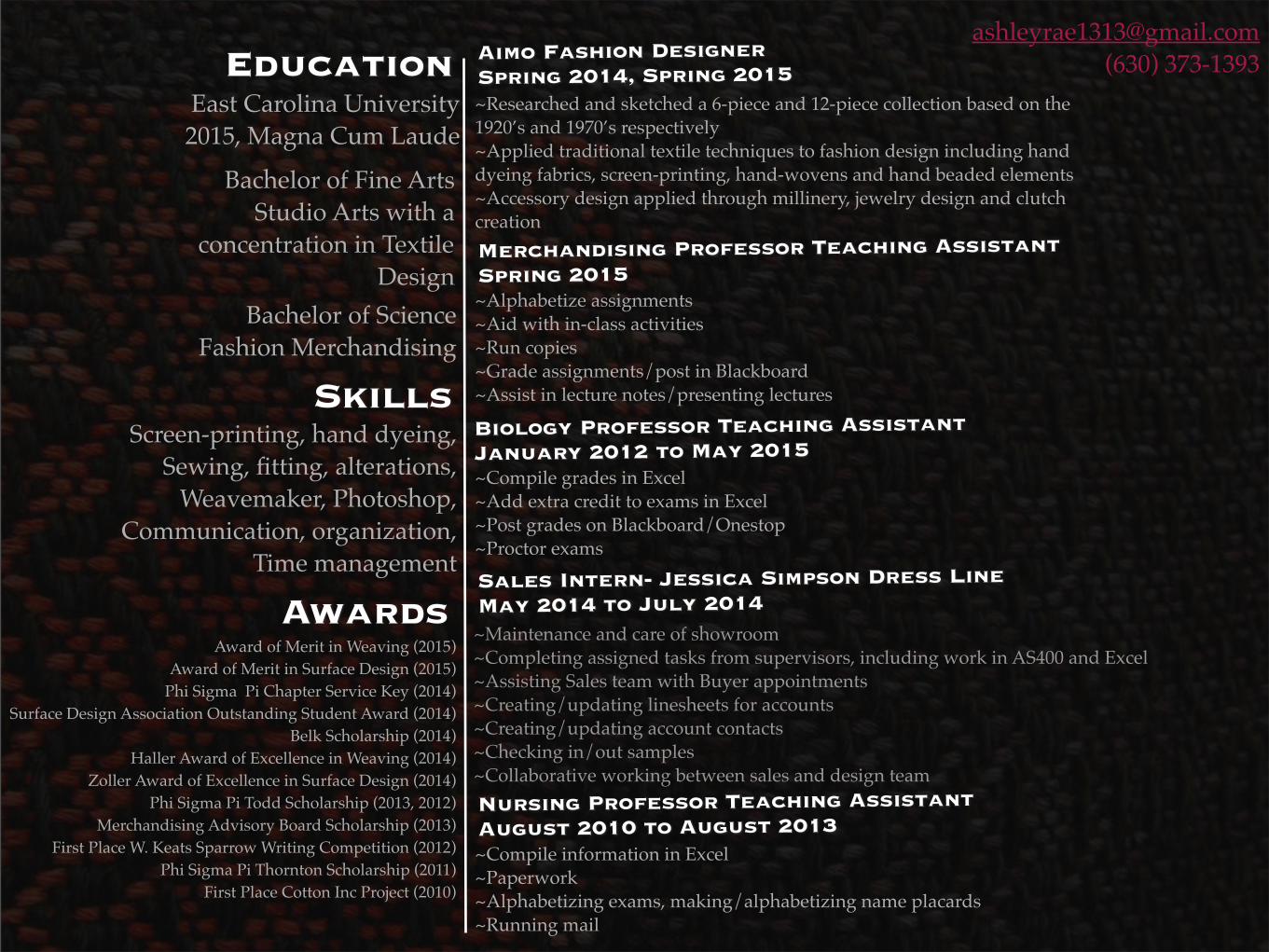
(630) 373-1393East Carolina University2015, Magna Cum Laude
Bachelor of Fine ArtsStudio Arts with a
concentration in Textile Design
Bachelor of ScienceFashion Merchandising
SkillsScreen-printing, hand dyeing,
Sewing, fitting, alterations,Weavemaker, Photoshop,
Communication, organization,Time management
AwardsAward of Merit in Weaving (2015)
Award of Merit in Surface Design (2015)Phi Sigma Pi Chapter Service Key (2014)
Surface Design Association Outstanding Student Award (2014)Belk Scholarship (2014)
Haller Award of Excellence in Weaving (2014)Zoller Award of Excellence in Surface Design (2014)
Phi Sigma Pi Todd Scholarship (2013, 2012)Merchandising Advisory Board Scholarship (2013)
First Place W. Keats Sparrow Writing Competition (2012)Phi Sigma Pi Thornton Scholarship (2011)
First Place Cotton Inc Project (2010)
Aimo Fashion DesignerSpring 2014, Spring 2015~Researched and sketched a 6-piece and 12-piece collection based on the 1920’s and 1970’s respectively~Applied traditional textile techniques to fashion design including hand dyeing fabrics, screen-printing, hand-wovens and hand beaded elements~Accessory design applied through millinery, jewelry design and clutch creationMerchandising Professor Teaching AssistantSpring 2015~Alphabetize assignments~Aid with in-class activities~Run copies~Grade assignments/post in Blackboard~Assist in lecture notes/presenting lectures
Biology Professor Teaching AssistantJanuary 2012 to May 2015~Compile grades in Excel ~Add extra credit to exams in Excel ~Post grades on Blackboard/Onestop~Proctor exams
Sales Intern- Jessica Simpson Dress LineMay 2014 to July 2014~Maintenance and care of showroom~Completing assigned tasks from supervisors, including work in AS400 and Excel~Assisting Sales team with Buyer appointments~Creating/updating linesheets for accounts~Creating/updating account contacts~Checking in/out samples~Collaborative working between sales and design teamNursing Professor Teaching AssistantAugust 2010 to August 2013~Compile information in Excel ~Paperwork ~Alphabetizing exams, making/alphabetizing name placards~Running mail
Surface Design
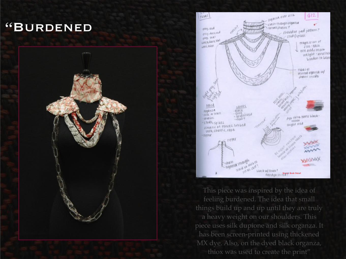
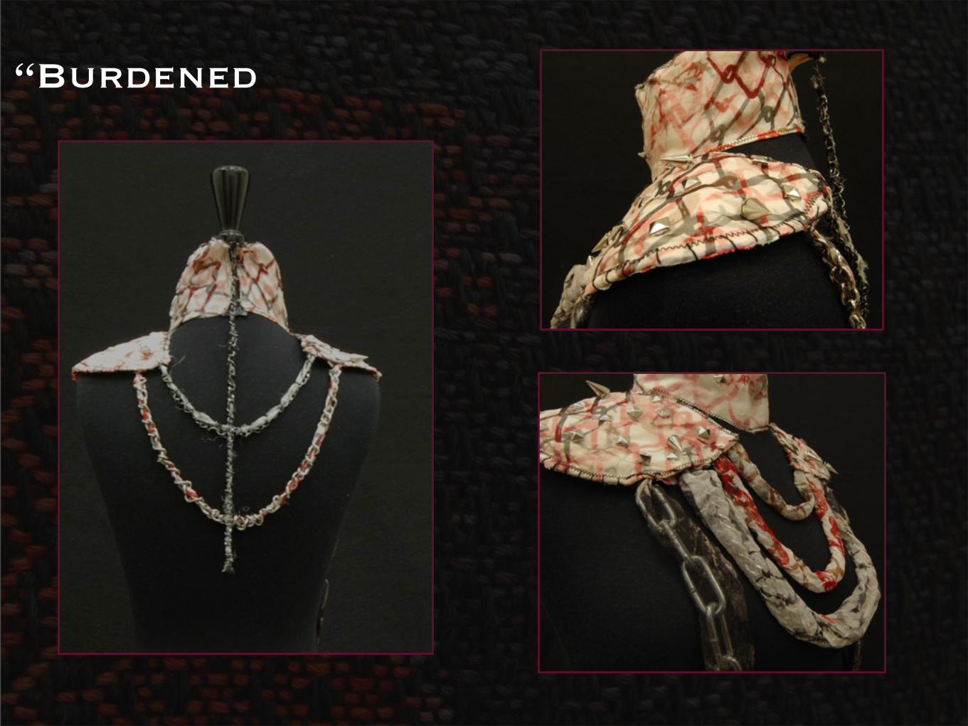
“Burdened
This piece was inspired by the idea of feeling burdened. The idea that small
things build up and up until they are truly a heavy weight on our shoulders. This
piece uses silk dupione and silk organza. It has been screen-printed using thickened
MX dye. Also, on the dyed black organza, thiox was used to create the print”
Sketch Book Detail
“Burdened
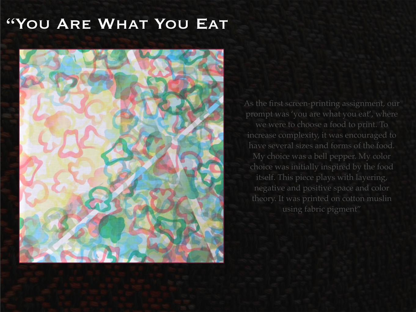
“You Are What You Eat
As the first screen-printing assignment, our prompt was ‘you are what you eat’, where
we were to choose a food to print. To increase complexity, it was encouraged to have several sizes and forms of the food. My choice was a bell pepper. My color
choice was initially inspired by the food itself. This piece plays with layering, negative and positive space and color
theory. It was printed on cotton muslin using fabric pigment”
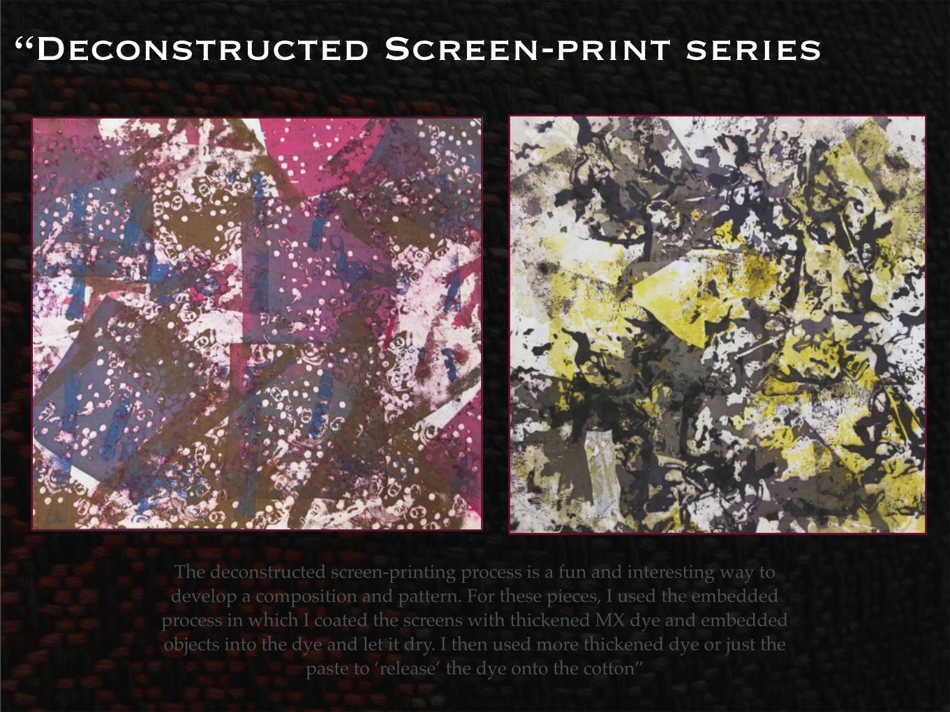
“Deconstructed Screen-print series
The deconstructed screen-printing process is a fun and interesting way to develop a composition and pattern. For these pieces, I used the embedded
process in which I coated the screens with thickened MX dye and embedded objects into the dye and let it dry. I then used more thickened dye or just the
paste to ‘release’ the dye onto the cotton”
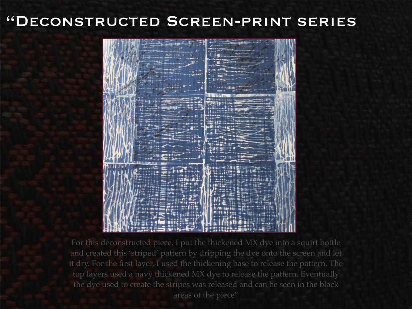
“Deconstructed Screen-print series
For this deconstructed piece, I put the thickened MX dye into a squirt bottle and created this ‘striped’ pattern by dripping the dye onto the screen and let it dry. For the first layer, I used the thickening base to release the pattern. The top layers used a navy thickened MX dye to release the pattern. Eventually the dye used to create the stripes was released and can be seen in the black
areas of the piece”
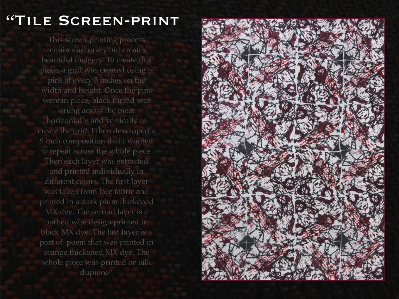
“Tile Screen-printThis screen-printing process requires accuracy but creates
beautiful imagery. To create this piece, a grid was created using t-
pins at every 3 inches on the width and height. Once the pins were in place, black thread was
strung across the piece horizontally and vertically to
create the grid. I then developed a 9 inch composition that I wanted to repeat across the whole piece. Then each layer was extracted
and printed individually in different colors. The first layer was taken from lace fabric and
printed in a dark plum thickened MX dye. The second layer is a barbed wire design printed in
black MX dye. The last layer is a part of poem that was printed in
orange thickened MX dye. The whole piece was printed on silk
dupione”
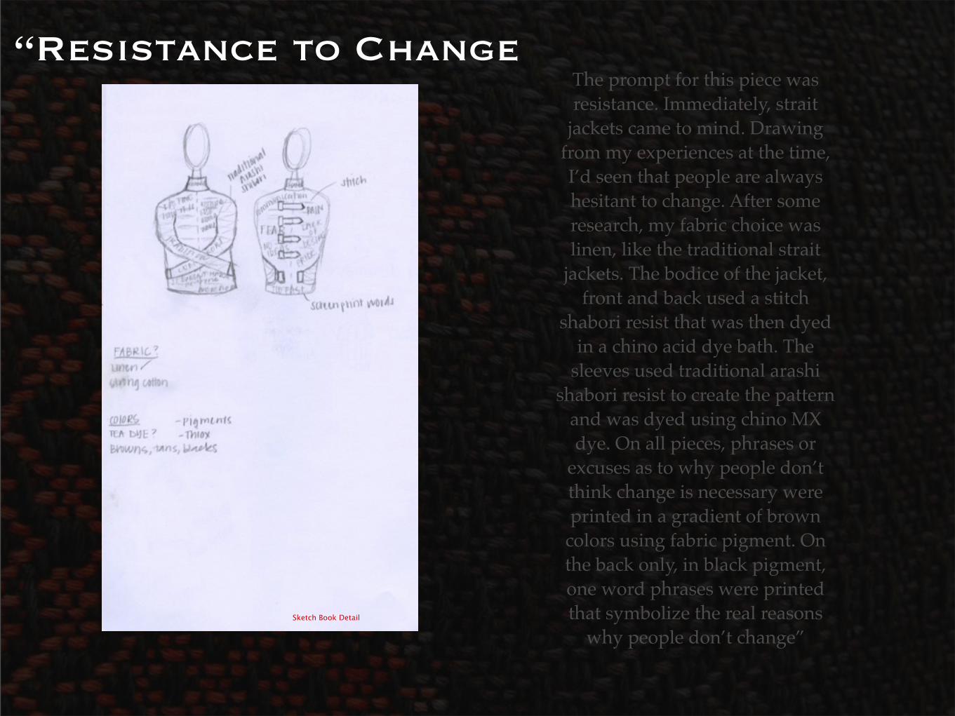
“Resistance to ChangeThe prompt for this piece was resistance. Immediately, strait
jackets came to mind. Drawing from my experiences at the time, I’d seen that people are always hesitant to change. After some research, my fabric choice was linen, like the traditional strait
jackets. The bodice of the jacket, front and back used a stitch
shabori resist that was then dyed in a chino acid dye bath. The
sleeves used traditional arashi shabori resist to create the pattern
and was dyed using chino MX dye. On all pieces, phrases or
excuses as to why people don’t think change is necessary were printed in a gradient of brown
colors using fabric pigment. On the back only, in black pigment, one word phrases were printed that symbolize the real reasons
why people don’t change”Sketch Book Detail
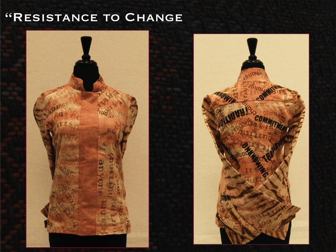
“Resistance to Change
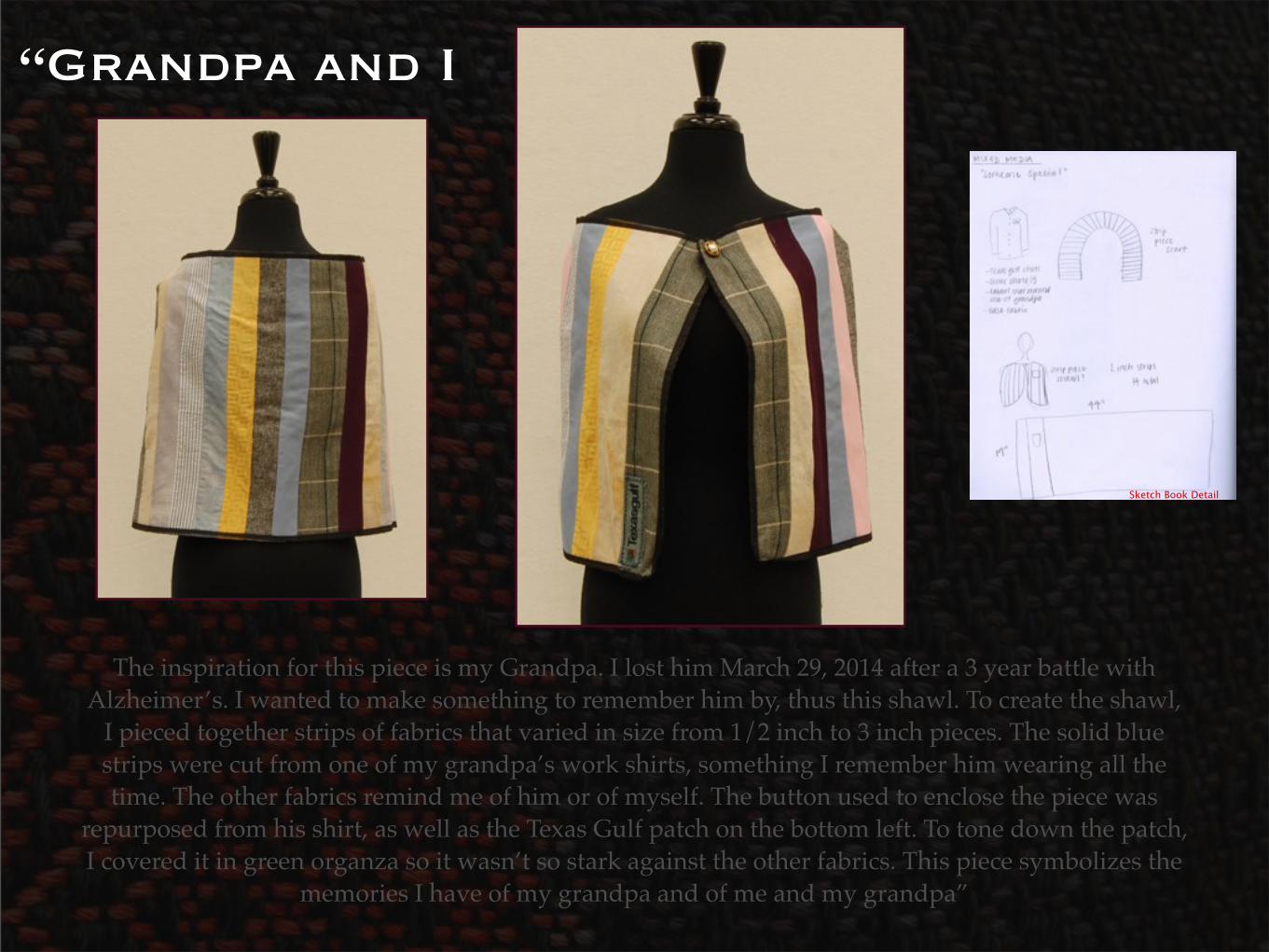
“Grandpa and I
The inspiration for this piece is my Grandpa. I lost him March 29, 2014 after a 3 year battle with Alzheimer’s. I wanted to make something to remember him by, thus this shawl. To create the shawl,
I pieced together strips of fabrics that varied in size from 1/2 inch to 3 inch pieces. The solid blue strips were cut from one of my grandpa’s work shirts, something I remember him wearing all the time. The other fabrics remind me of him or of myself. The button used to enclose the piece was
repurposed from his shirt, as well as the Texas Gulf patch on the bottom left. To tone down the patch, I covered it in green organza so it wasn’t so stark against the other fabrics. This piece symbolizes the
memories I have of my grandpa and of me and my grandpa”
Sketch Book Detail
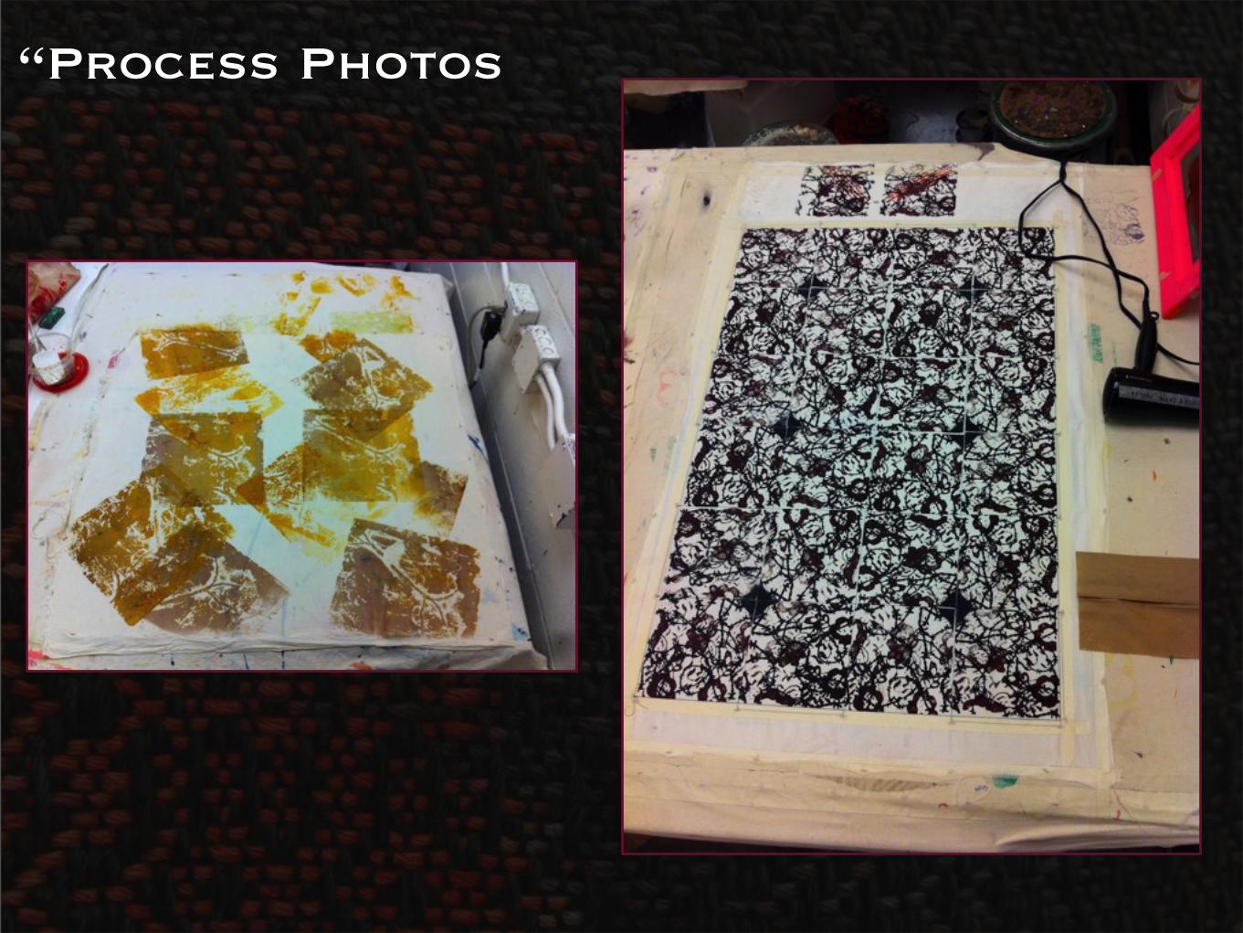
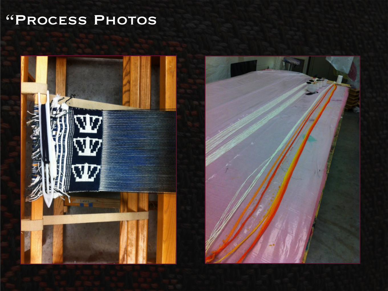
“Process Photos
Weaving
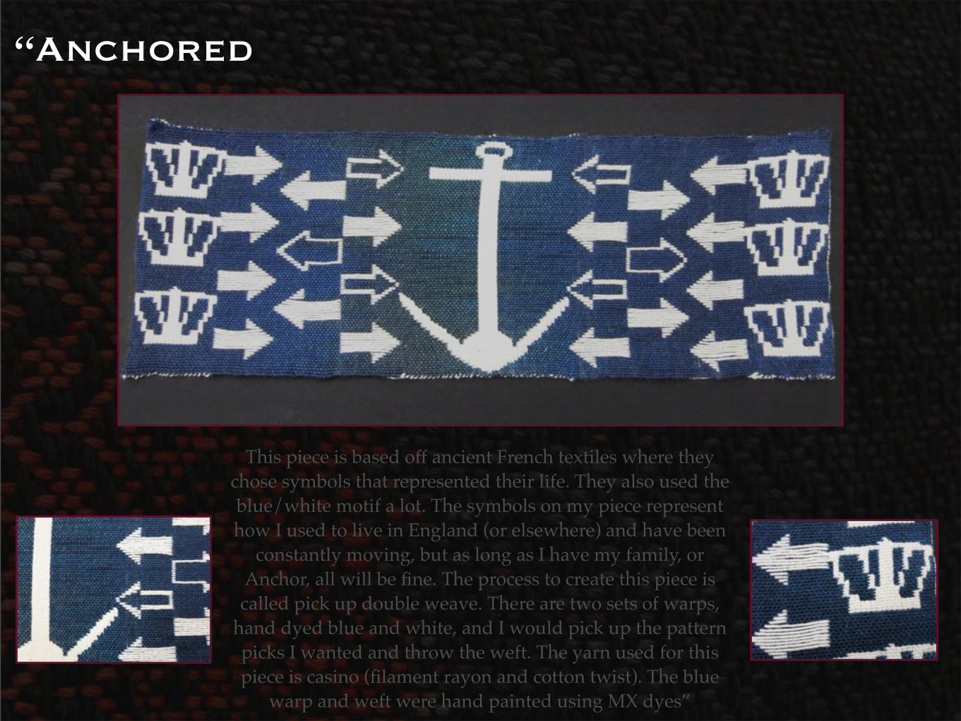
“Anchored
This piece is based off ancient French textiles where they chose symbols that represented their life. They also used the blue/white motif a lot. The symbols on my piece represent how I used to live in England (or elsewhere) and have been
constantly moving, but as long as I have my family, or Anchor, all will be fine. The process to create this piece is called pick up double weave. There are two sets of warps,
hand dyed blue and white, and I would pick up the pattern picks I wanted and throw the weft. The yarn used for this piece is casino (filament rayon and cotton twist). The blue
warp and weft were hand painted using MX dyes”
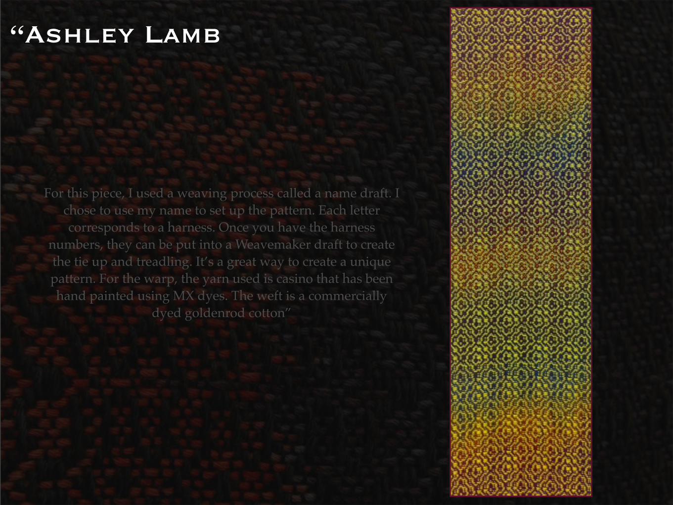
“Ashley Lamb
For this piece, I used a weaving process called a name draft. I chose to use my name to set up the pattern. Each letter corresponds to a harness. Once you have the harness
numbers, they can be put into a Weavemaker draft to create the tie up and treadling. It’s a great way to create a unique pattern. For the warp, the yarn used is casino that has been hand painted using MX dyes. The weft is a commercially
dyed goldenrod cotton”
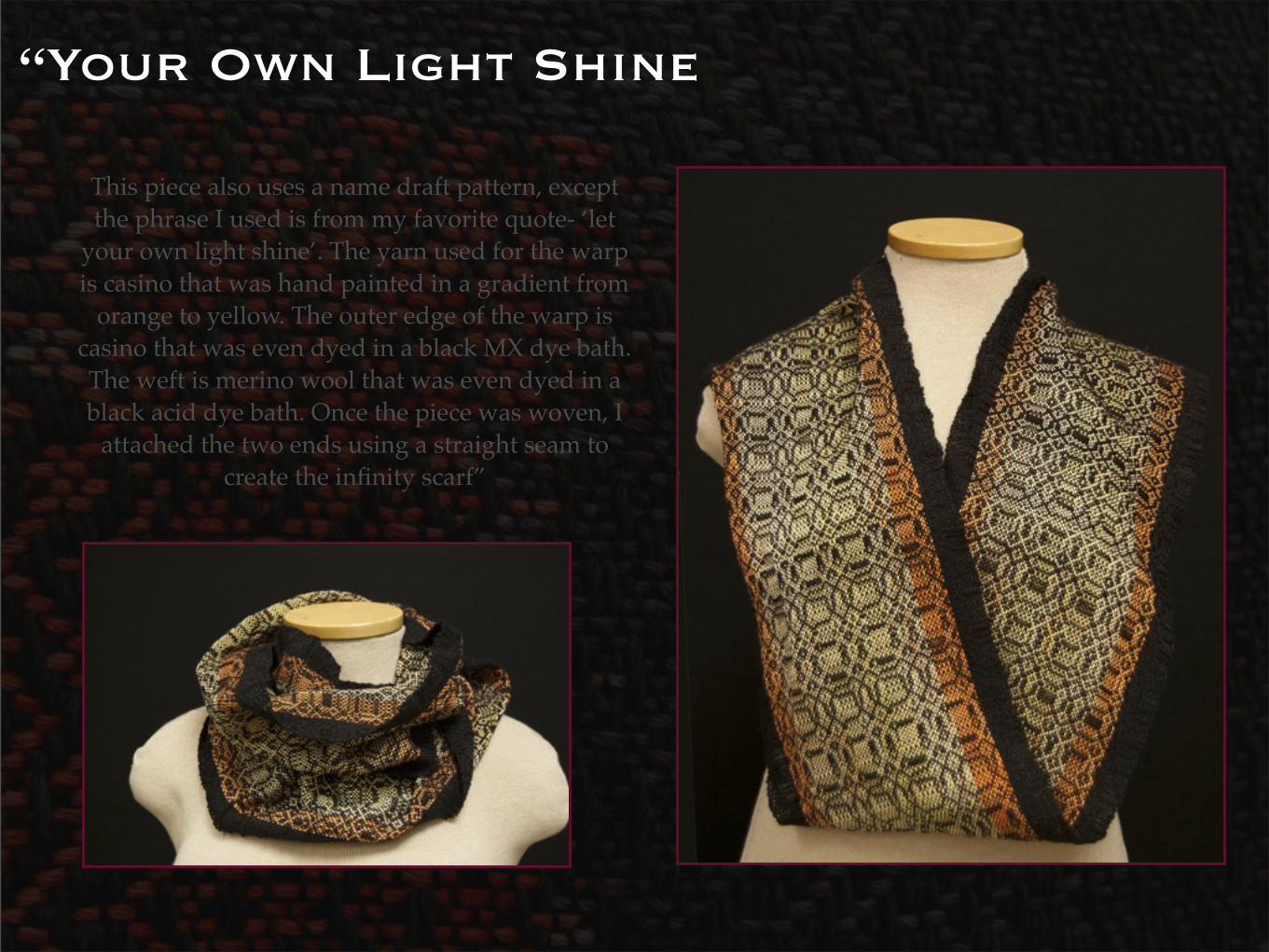
“Your Own Light Shine
This piece also uses a name draft pattern, except the phrase I used is from my favorite quote- ‘let
your own light shine’. The yarn used for the warp is casino that was hand painted in a gradient from
orange to yellow. The outer edge of the warp is casino that was even dyed in a black MX dye bath. The weft is merino wool that was even dyed in a black acid dye bath. Once the piece was woven, I
attached the two ends using a straight seam to create the infinity scarf”
“Your Own Light Shine
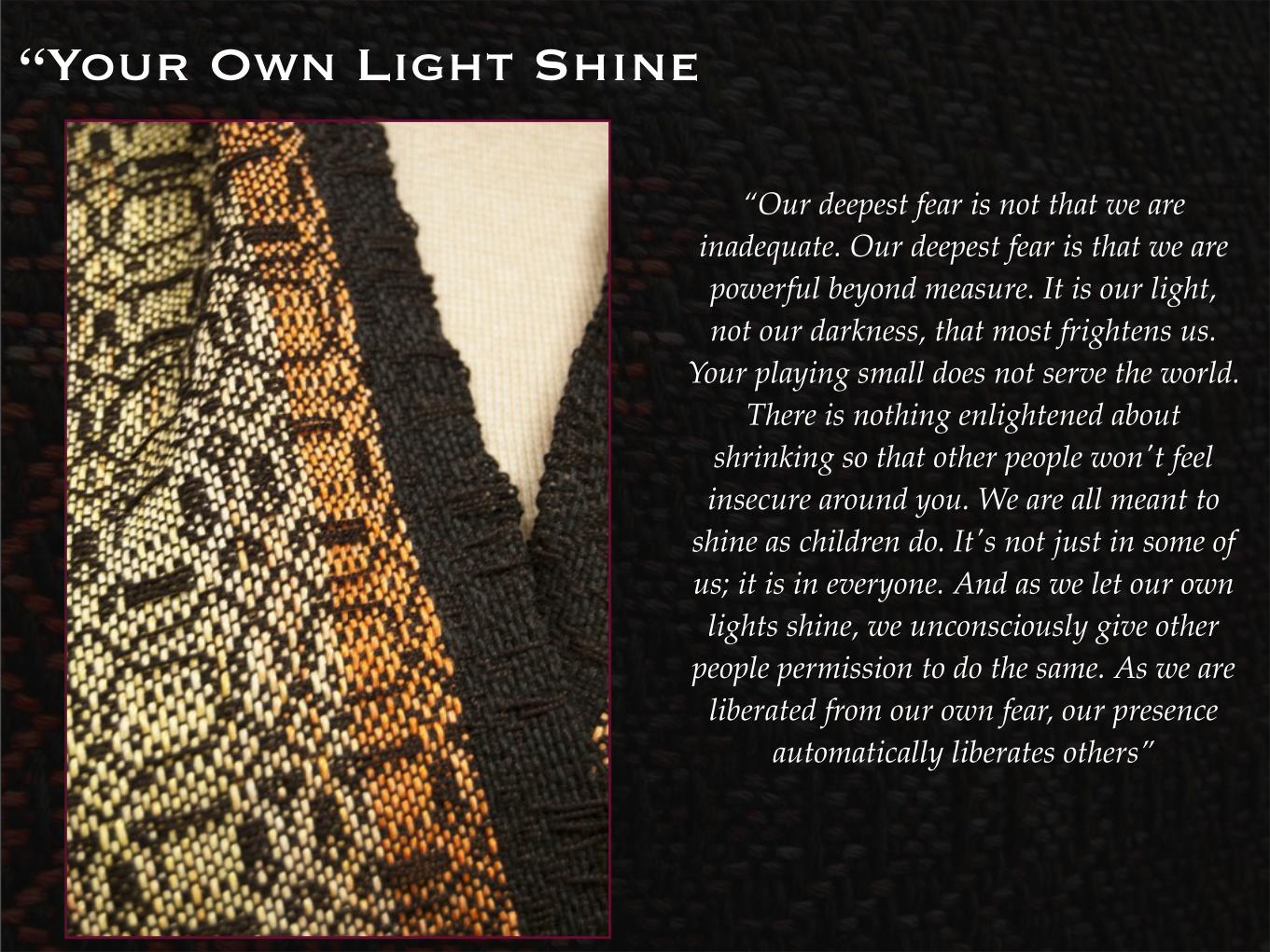
“Our deepest fear is not that we are inadequate. Our deepest fear is that we are powerful beyond measure. It is our light, not our darkness, that most frightens us.
Your playing small does not serve the world. There is nothing enlightened about
shrinking so that other people won't feel insecure around you. We are all meant to
shine as children do. It's not just in some of us; it is in everyone. And as we let our own lights shine, we unconsciously give other
people permission to do the same. As we are liberated from our own fear, our presence
automatically liberates others”
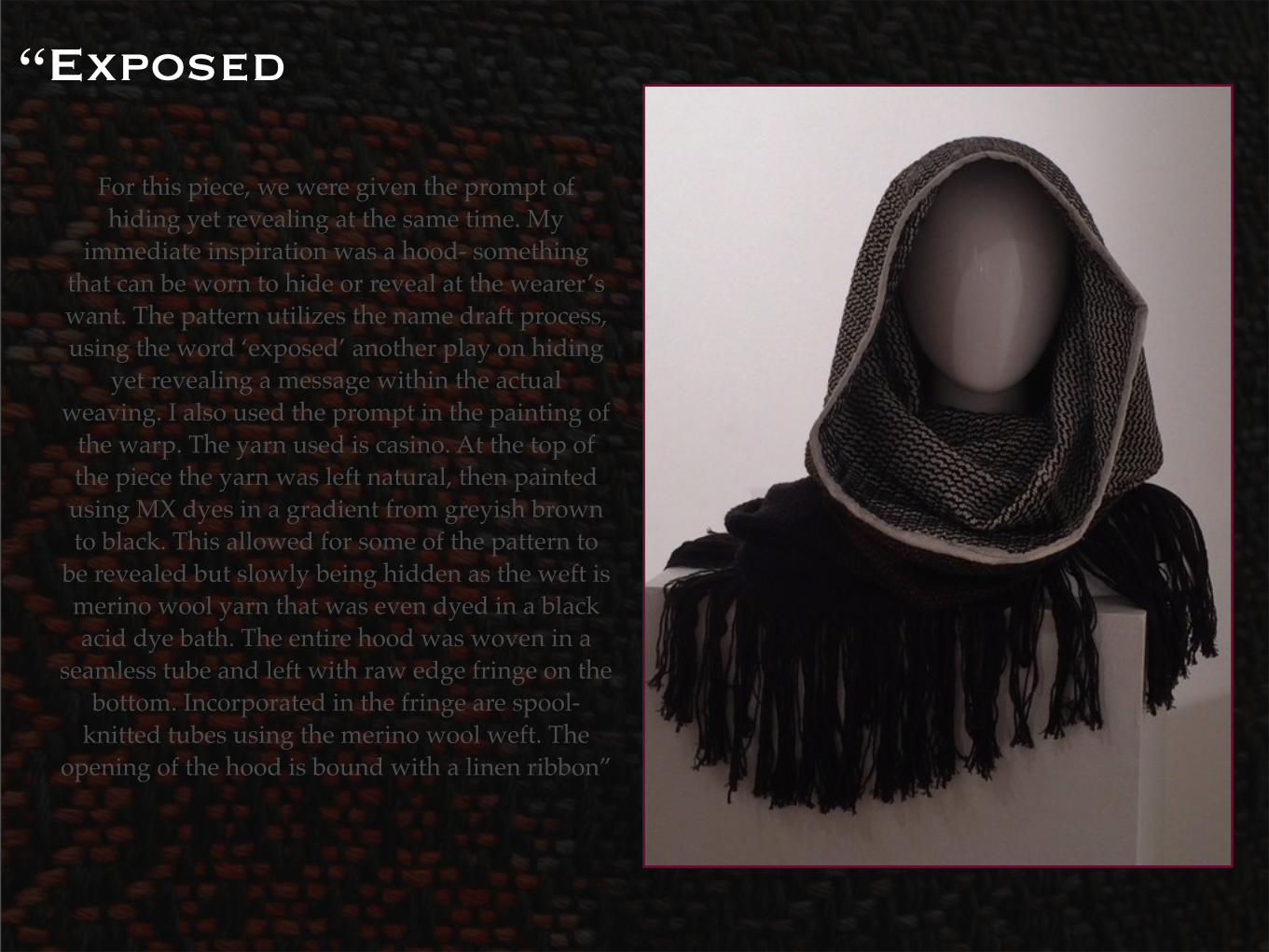
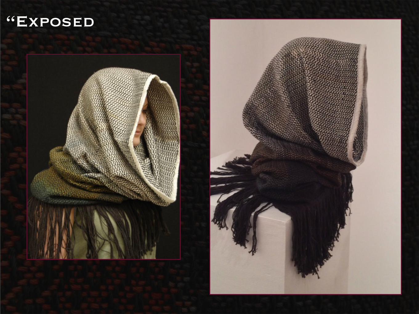
“Exposed
For this piece, we were given the prompt of hiding yet revealing at the same time. My
immediate inspiration was a hood- something that can be worn to hide or reveal at the wearer’s want. The pattern utilizes the name draft process, using the word ‘exposed’ another play on hiding
yet revealing a message within the actual weaving. I also used the prompt in the painting of
the warp. The yarn used is casino. At the top of the piece the yarn was left natural, then painted using MX dyes in a gradient from greyish brown to black. This allowed for some of the pattern to
be revealed but slowly being hidden as the weft is merino wool yarn that was even dyed in a black acid dye bath. The entire hood was woven in a
seamless tube and left with raw edge fringe on the bottom. Incorporated in the fringe are spool-
knitted tubes using the merino wool weft. The opening of the hood is bound with a linen ribbon”
“Exposed
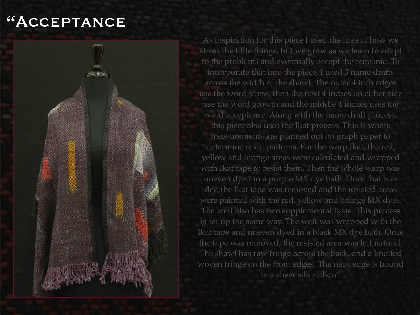
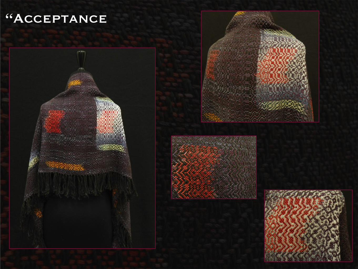
“AcceptanceAs inspiration for this piece I used the idea of how we
stress the little things, but we grow as we learn to adapt to the problems and eventually accept the outcome. To
incorporate that into the piece, I used 3 name drafts across the width of the shawl. The outer 4 inch edges
use the word stress, then the next 4 inches on either side use the word growth and the middle 4 inches uses the word acceptance. Along with the name draft process,
this piece also uses the Ikat process. This is where measurements are planned out on graph paper to
determine resist patterns. For the warp Ikat, the red, yellow and orange areas were calculated and wrapped with Ikat tape to resist them. Then the whole warp was uneven dyed in a purple MX dye bath. Once that was dry, the Ikat tape was removed and the resisted areas
were painted with the red, yellow and orange MX dyes. The weft also has two supplemental Ikats. This process is set up the same way. The weft was wrapped with the
Ikat tape and uneven dyed in a black MX dye bath. Once the tape was removed, the resisted area was left natural. The shawl has raw fringe across the back, and a knotted woven fringe on the front edges. The neck edge is bound
in a sheer silk ribbon”
“Acceptance
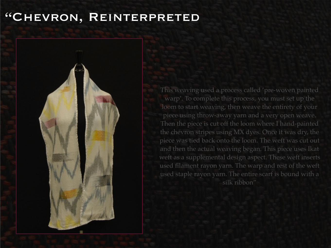
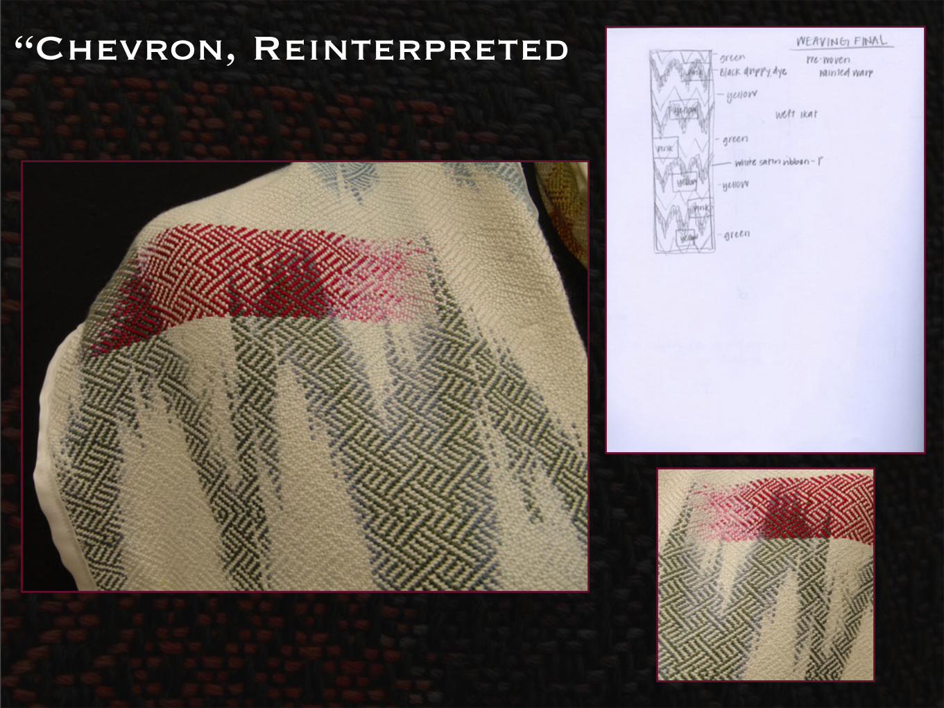
“Chevron, Reinterpreted
This weaving used a process called ‘pre-woven painted warp’. To complete this process, you must set up the
loom to start weaving, then weave the entirety of your piece using throw-away yarn and a very open weave.
Then the piece is cut off the loom where I hand-painted the chevron stripes using MX dyes. Once it was dry, the piece was tied back onto the loom. The weft was cut out and then the actual weaving began. This piece uses Ikat weft as a supplemental design aspect. These weft inserts used filament rayon yarn. The warp and rest of the weft used staple rayon yarn. The entire scarf is bound with a
silk ribbon”
“Chevron, Reinterpreted
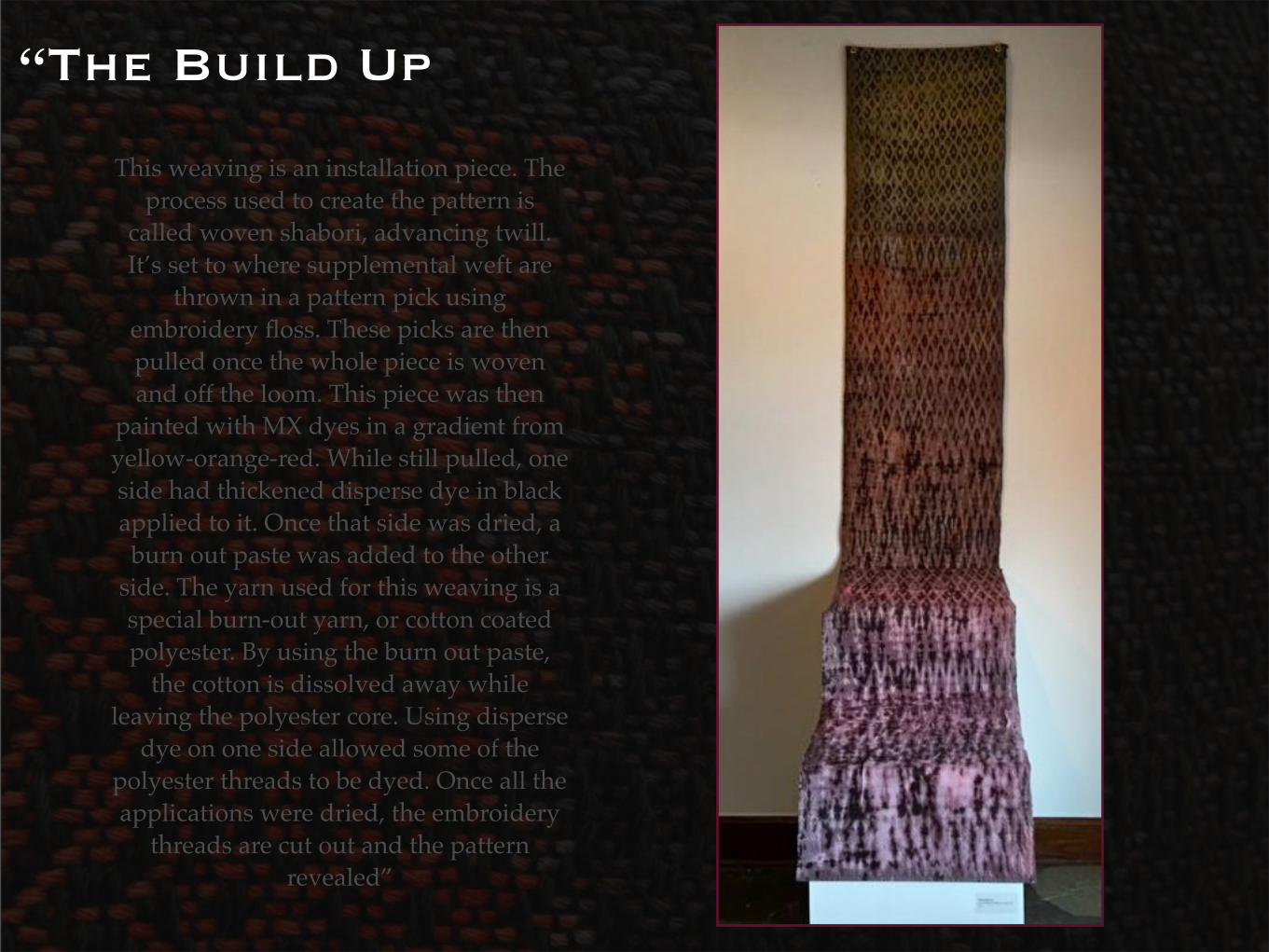
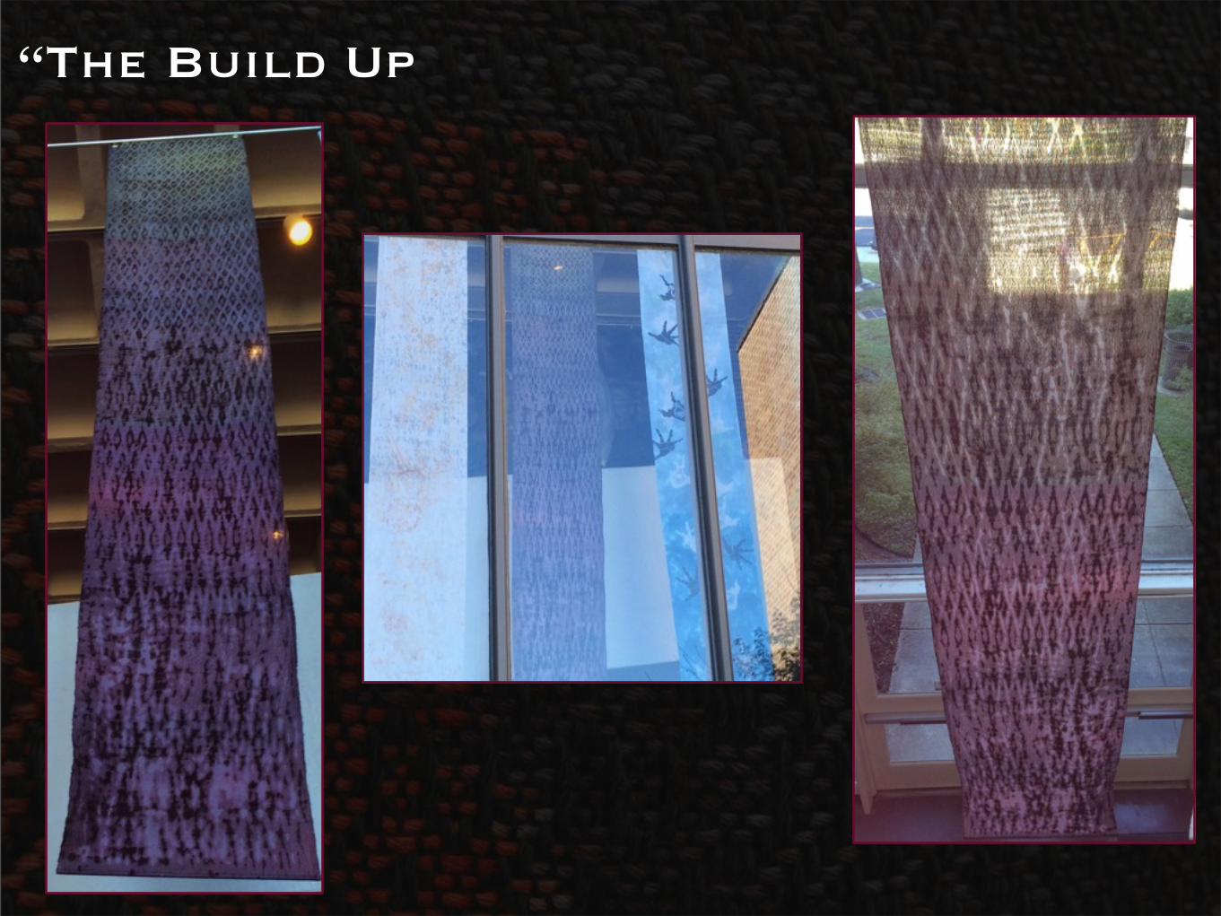
“The Build Up
This weaving is an installation piece. The process used to create the pattern is
called woven shabori, advancing twill. It’s set to where supplemental weft are
thrown in a pattern pick using embroidery floss. These picks are then pulled once the whole piece is woven and off the loom. This piece was then
painted with MX dyes in a gradient from yellow-orange-red. While still pulled, one side had thickened disperse dye in black applied to it. Once that side was dried, a burn out paste was added to the other
side. The yarn used for this weaving is a special burn-out yarn, or cotton coated polyester. By using the burn out paste,
the cotton is dissolved away while leaving the polyester core. Using disperse
dye on one side allowed some of the polyester threads to be dyed. Once all the applications were dried, the embroidery
threads are cut out and the pattern revealed”
“The Build Up
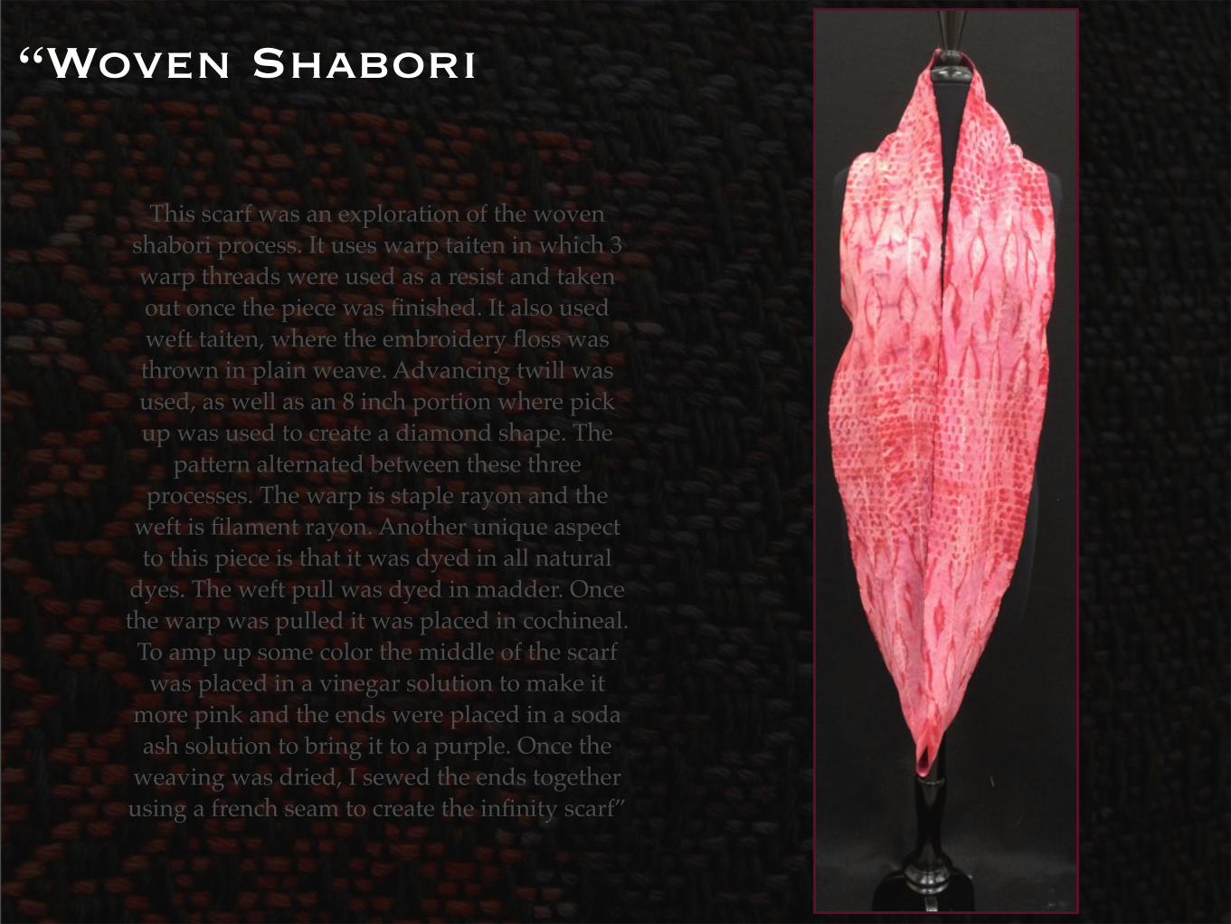
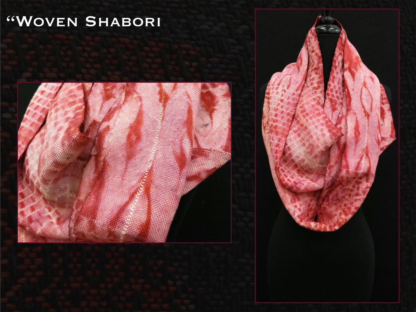
“Woven Shabori
This scarf was an exploration of the woven shabori process. It uses warp taiten in which 3 warp threads were used as a resist and taken out once the piece was finished. It also used weft taiten, where the embroidery floss was thrown in plain weave. Advancing twill was used, as well as an 8 inch portion where pick up was used to create a diamond shape. The
pattern alternated between these three processes. The warp is staple rayon and the
weft is filament rayon. Another unique aspect to this piece is that it was dyed in all natural
dyes. The weft pull was dyed in madder. Once the warp was pulled it was placed in cochineal. To amp up some color the middle of the scarf
was placed in a vinegar solution to make it more pink and the ends were placed in a soda ash solution to bring it to a purple. Once the
weaving was dried, I sewed the ends together using a french seam to create the infinity scarf”
“Woven Shabori
“Process Photos
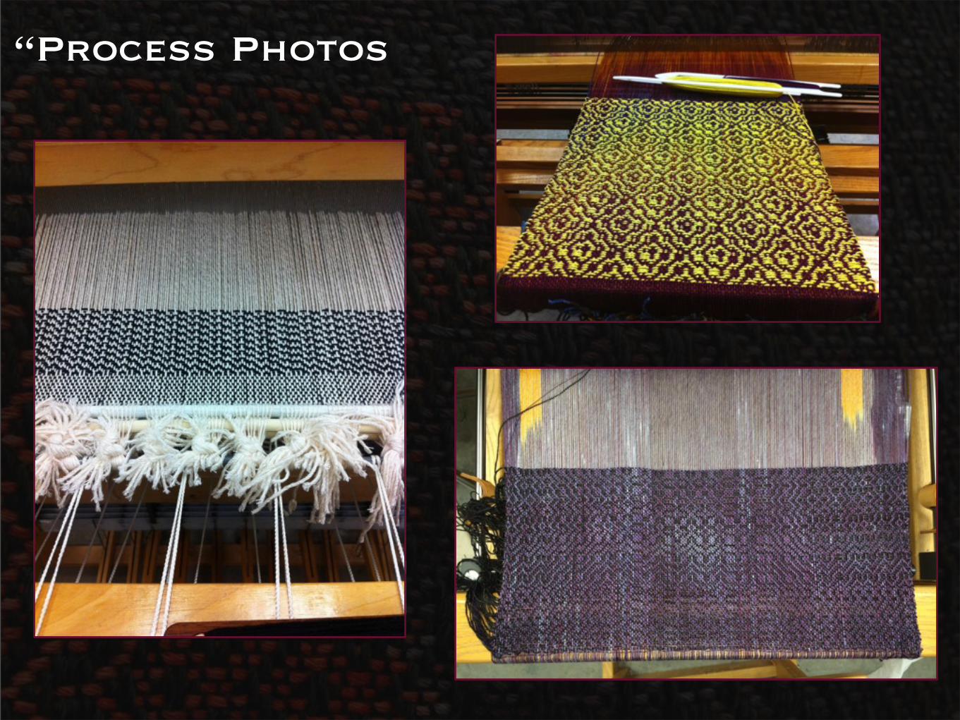
“Process Photos