Embed Size (px)
Citation preview
Shaping the Display of the Future: The Effects of Display Size and Curvature on User
Performance and Insights Lauren Shupp, Christopher Andrews, Margaret Kurdziolek, Beth Yost,
and Chris North
Center for Human-Computer Interaction, and Department of Computer Science
Virginia Polytechnic Institute and State University
RUNNING HEAD: Curving Large High-Resolution Displays
Corresponding Author’s Contact Information: Chris North and Christopher Andrews [email protected], [email protected] Department of Computer Science, Virginia Tech 2202 Kraft Dr., Blacksburg, VA 24061 540-231-2458
Alternative Authors’ Contact Information: Lauren Shupp [email protected] Margaret Kurdziolek [email protected] Beth Yost [email protected] Christopher Andrews [email protected] Chris North [email protected]
Brief Authors’ Biographies:
Lauren Shupp received her MS degree in Computer Science at Virginia Tech in December 2006, and is currently a user experience engineer at IBM. Margaret Kurdziolek is a PhD student in Computer Science at Virginia Tech. Beth Yost received her PhD in Computer Science at Virginia Tech in May 2007, and is currently with the MITRE Corporation. Christopher Andrews is a PhD student in Computer Science at Virginia Tech. Chris North is an Associate Professor of Computer Science at Virginia Tech, and director of the GigaPixel Display Laboratory, with research interests in Information Visualization and Human Computer Interaction.
- 1 -
ABSTRACT
As display technology continues to improve, there will be an increasing diversity in the available display form factors and scales. Empirical evaluation of how display attributes affect user perceptions and performance can help designers understand the strengths and weaknesses of different display forms, provide guidance for effectively designing multiple display environments, and offer initial evidence for developing theories of ubiquitous display. While previous research has shown user performance benefits when tiling multiple monitors to increase the number of pixels, little research has analyzed the performance and behavioral impacts of the form factors of much larger, high-resolution displays. This paper presents two experiments in which user performance was evaluated on a high-resolution (96 DPI), high pixel-count (approximately 32 million pixels) display for single-user scenarios in both flat and curved forms. We show that for geospatial visual analytics tasks there is a benefit to larger displays, and a distinct advantage to curving the display to make all portions of the display more accessible to the user. In addition, we found that changing the form factor of the display does have an impact on user perceptions that will have to be considered as new display environments are developed.
- 2 -
1 INTRODUCTION
Given the rapid pace with which display technology continues to improve and change, it will soon be affordable to construct multi-display environments in which every surface is utilized as display space. While there are still many technical details that need to be resolved to make such environments possible, the vision is plausible enough that the question is no longer ‘can it be done’, but ‘what advantages would such an environment offer’. What might a multi-display workspace look like? What kind of effect would this environment have on the way people work and what they can accomplish?
The real fundamental difference between how users currently engage with computers and how they will in a multi-display environment is the change in the role of space. Currently, computer monitors act as a kind of porthole into the working environment – taking up only a fraction of the available field of view. Despite the enormous quantities of information that computers can make available, users are forced to manage with what can be displayed in at most a couple of square feet. In a ubiquitous multi-display environment, users will physically inhabit their working environment. Rather than interacting with their information at a distance through the relatively tiny views provided by current displays and creating external representations with paper and other unmanaged artifacts, the user will be able to work with information in an environment where data can be displayed anywhere and all of it is available to the computer for management and manipulation. There will be real spatial distances and relationships between pieces of data. The location of displayed information within the environment and with respect to the user will affect how users interpret and interact with it. Beyond simply scaling up the available display space, we must consider how these environments will change user perceptions and affect how they work.
There are two primary ways in which spatial concerns will drive the research exploration of display-rich environments. First, the context of use [1, 2] must be considered. What does the space indicate about how a display could or would be used? For example, we would expect a very different usage scenario for a large, wall sized display in a communal area with no chairs than we would for a small, table-mounted display in a private office. The second consideration is: how do different form factors and scales affect human performance? This entails not just concerns about human factors and perceptual issues, but also how cognitive abilities are affected and perceptions are changed. The focus of this paper is on these latter issues – the effects of display scale and form factor on human performance and perceptions.
1.1 Large, High-Resolution Displays
It is relatively easy to create a wall-sized display – it merely requires a blank wall and a projector. While this creates a physically larger viewing area, there is no corresponding increase in the amount of information that can be displayed. Regardless, there are clear benefits to the use of large displays for collaboration due to the increased visibility and working area. In addition, large displays may have benefits due to an increased level of immersion [3] as well as having some potential ergonomic benefits [4].
- 3 -
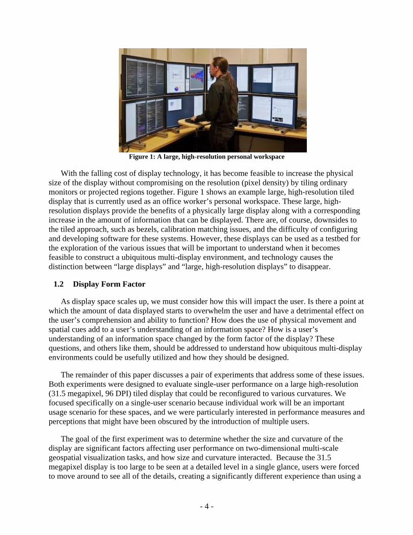
Figure 1: A large, high-resolution personal workspace
With the falling cost of display technology, it has become feasible to increase the physical size of the display without compromising on the resolution (pixel density) by tiling ordinary monitors or projected regions together. Figure 1 shows an example large, high-resolution tiled display that is currently used as an office worker’s personal workspace. These large, high-resolution displays provide the benefits of a physically large display along with a corresponding increase in the amount of information that can be displayed. There are, of course, downsides to the tiled approach, such as bezels, calibration matching issues, and the difficulty of configuring and developing software for these systems. However, these displays can be used as a testbed for the exploration of the various issues that will be important to understand when it becomes feasible to construct a ubiquitous multi-display environment, and technology causes the distinction between “large displays” and “large, high-resolution displays” to disappear.
1.2 Display Form Factor
As display space scales up, we must consider how this will impact the user. Is there a point at which the amount of data displayed starts to overwhelm the user and have a detrimental effect on the user’s comprehension and ability to function? How does the use of physical movement and spatial cues add to a user’s understanding of an information space? How is a user’s understanding of an information space changed by the form factor of the display? These questions, and others like them, should be addressed to understand how ubiquitous multi-display environments could be usefully utilized and how they should be designed.
The remainder of this paper discusses a pair of experiments that address some of these issues. Both experiments were designed to evaluate single-user performance on a large high-resolution (31.5 megapixel, 96 DPI) tiled display that could be reconfigured to various curvatures. We focused specifically on a single-user scenario because individual work will be an important usage scenario for these spaces, and we were particularly interested in performance measures and perceptions that might have been obscured by the introduction of multiple users.
The goal of the first experiment was to determine whether the size and curvature of the display are significant factors affecting user performance on two-dimensional multi-scale geospatial visualization tasks, and how size and curvature interacted. Because the 31.5 megapixel display is too large to be seen at a detailed level in a single glance, users were forced to move around to see all of the details, creating a significantly different experience than using a
- 4 -
small or low-resolution display. By creating the need for the user to utilize physical navigation (e.g. eye, head, and body movement) rather than virtual navigation (e.g., traditional zoom and pan techniques for navigating large data spaces), we could examine how these different techniques affected the user’s performance. Display curvature was introduced in an attempt to minimize physical navigation without reducing the amount of data that could be displayed (and thus keeping the required amount of virtual navigation constant).
The results of the first experiment showed distinct performance benefits due to the larger display and further benefits when the display was curved. Hence, the second experiment was designed to further explore the impact of the display curvature for static two-dimensional geospatial visualization tasks. The experiment explored three questions about the effect of display curvature on users’ visualization abilities: • How does curvature affect finding data in different locations on the display? • How does curvature affect comparing data at varying distances? • How does curvature affect users’ abilities to reason about visualized data?
The first two questions are fairly low-level issues that deal specifically with how the display form factor affects certain types of spatial relationship tasks. The third question approaches the issue from a more conceptual level. Perhaps the primary reason to change how data is displayed and interacted with is to change our understanding of the data. As such, the third question moves away from pure performance based measures like speed and accuracy, and employed an insight-based evaluation method [5] which seeks to make qualitative measurements of the type and depth of insights and observations made by the user. More specifically, we were interested in discovering if the curvature of the display actually affected the types of insights that users gained about the visualized data, and if so, how they were affected.
The rest of this paper examines these experiments in more detail and then discusses how this should impact future research and some possible new avenues of exploration.
2 LITERATURE REVIEW
2.1 Large, High-Resolution Displays
The majority of research related to large high-resolution displays has been about the physical construction of the display (e.g., [6-10]), the software and algorithms available for distributing the graphics (e.g., [11, 12]), or interaction techniques for working with the displays (e.g., [13-19]). Less research has been done assessing the benefits and impacts of these displays.
Much of the research relating to large displays has focused on their use in supporting collaboration rather than on their use for single-user applications (e.g., [20-22]). While the larger viewing area seems a natural fit to collaborative activities, we believe that individual activities will continue to dominate workplace behavior and that these displays have unexplored benefits for the single-user scenario.
One exception is the work done by Ball and North, which examined the role of physical navigation while performing single-user visual analytic tasks [23, 24]. They found that in large display environments, there was a strong user preference towards physical navigation with
- 5 -
corresponding benefits in performance. Physical navigation in large high-resolution displays can result in better performance than panning and zooming on smaller displays [25, 26].
Tan, et al. also examined the effects of large low-resolution displays on single-user performance [27]. While the large displays were not high resolution and physical navigation was not encouraged, they still found that the larger display changed how the user related to the display and that there were noticeable benefits for users performing spatial tasks. They also found that larger displays improve performance even when the total visual angle is maintained [28], and that using larger displays narrows the gender gap on spatial performance [29]. In addition, Focus+Context screens are an attempt to take advantage of lower resolutions for context, and a small high-resolution area for details [30]. This technique emphasizes virtual panning rather than physically moving.
On a smaller scale, there has been research exploring the single-user use of multi-monitor desktops. There are two paradigms for multiple monitor users, either the idea of partitioned spaces used as different rooms, or used as one large space [31]. People tend to use monitors to the left or right as separate rooms and monitors that are tiled vertically as single spaces [32]. There are many open issues with interaction, notification, and window management across multiple monitor desktops [33-36].
2.2 Reconfigurable Displays
One question that arises is whether or not there is a point of diminishing returns. For example, is there a point at which a wider field of view no longer improves user performance? Additionally, at what point are there so many pixels in a display that performance no longer improves? One method of decreasing the access cost is to curve the display so when users turn their heads the display is still at an equal distance away.
Creating a curved display can be challenging. Dsharp is a display that uses multiple projectors in creating a curved display by carefully aligning the images [37, 38]. NASA's hyperwall allows monitors in a 7×7 tiled array to be tilted and rotated [39]. Also available are rear-projected blocks that can be stacked [40]. While there have been several studies examining how different display configurations (in particular, tabletop displays) affect user comprehension and behavior [41-44], there is very little empirical comparison of user performance between flat and curved displays.
2.3 Information Separation
It is becoming more common in work place environments for single users to have more than one display. In work done by Tan and Czerwinski, they evaluated the effect of separating information with wider viewing angles, and the effect of discontinuities of the displays themselves. In their experiment they used two types of displays at different distances and two visual angles. They found there was a detrimental effect on user performance when the information was separated by a larger visual angle and a larger distance [45]. While they did not find an effect for simply placing the information on the outside edges of two separate monitors, we feel that if they had increased the visual angle even farther they would have found a significant effect. For example, on our 32 megapixel display, information can be separated by up
- 6 -
to nine feet. We theorize that by placing data at the edges of this display will make it harder for the user to effectively compare the information.
2.4 Insight Based Evaluation
Traditionally, visualization methods and tools are evaluated by running controlled experiments, usability tests, metrics, heuristics, and models. The importance of running these studies is uncontested. However, it was argued by Saraiya et al. that it is also important to evaluate the types of insights users glean from using a visualization. They defined insight to mean an individual observation about the data, or a unit of discovery. In their evaluation of bioinformatics visualization tools, they recorded what facts the users pointed out, as well as the “domain value,” which indicated the importance of the insights the participants had. The researchers conclude that a visualization tool influences the interpretation of the data and insight gained by users, and that this difference can be measured [5].
The increase in screen real estate offered by large, high-resolution displays is very appealing to researchers in the field of information visualization. With more space and pixel density, there is a potential for displaying more data with greater context. When evaluating these displays it is important to use similar methods to those used in evaluating visualization tools, such as usability testing and controlled experiments. Nevertheless, it is also important to evaluate the insights users glean from data displayed on these large displays, because insight – the knowledge gained from visualization – may also differ depending on the form factor of the display space.
2.5 Summary
In summary, this work builds on and extends previous research by considering single user performance on geospatial tasks using a large high-resolution display, and examines benefits and impacts of reconfiguring the display by uniformly curving it around the user.
3 DISPLAY HARDWARE
The display used in these experiments was made up of twenty-four seventeen-inch LCD flat panels and twelve GNU/Linux computers. The monitors were paired, two to a computer, and set to their highest resolution of 1280×1024. Color, brightness and contrast were tuned to achieve close, though not perfect, matches between the monitors. The plastic casing around each monitor was removed to reduce the bezel gap between adjacent monitors to 2cm. For ergonomic reasons the setup was designed to be no more than three monitors high [46]. Each column was mounted on a freestanding wooden support, allowing the columns to be moved independently. The twenty-four monitors created an 8×3 matrix approximately 9 feet wide and 3 feet tall, with a total resolution of 10,240×3072 = 31,457,280 pixels.
- 7 -
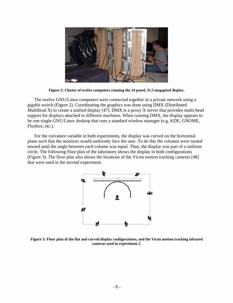
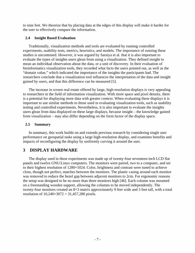
Figure 2: Cluster of twelve computers running the 24 panel, 31.5 megapixel display.
The twelve GNU/Linux computers were connected together in a private network using a gigabit switch (Figure 2). Coordinating the graphics was done using DMX (Distributed Multihead X) to create a unified display [47]. DMX is a proxy X server that provides multi-head support for displays attached to different machines. When running DMX, the display appears to be one single GNU/Linux desktop that runs a standard window manager (e.g. KDE, GNOME, Fluxbox, etc.).
For the curvature variable in both experiments, the display was curved on the horizontal plane such that the monitors would uniformly face the user. To do this the columns were turned inward until the angle between each column was equal. Thus, the display was part of a uniform circle. The following floor plan of the laboratory shows the display in both configurations (Figure 3). The floor plan also shows the locations of the Vicon motion tracking cameras [48] that were used in the second experiment.
Figure 3: Floor plan of the flat and curved display configurations, and the Vicon motion tracking infrared cameras used in experiment 2.
- 8 -
4 EXPERIMENT 1: DISPLAY SIZE AND CURVATURE
The goal of the first experiment was to explore how changes in size and curvature of a display affect user performance. As the details of this experiment have been published elsewhere [49], what follows is a summary of the experiment and the more interesting results that impact the second experiment.
4.1 Motivation
The motivation behind the experiment is twofold. First we wished to quantify the user performance benefits of increasingly larger displays (greater pixel-count) and curved displays for geospatial tasks (Figure 4). We first hypothesized that user performance would improve with larger displays because users would have more data and more context visible at once, and because such displays afford efficiently navigating the information physically using eye, head, and body movement. However, counter arguments are that such a large amount of visual information will overwhelm users, and that physical navigation will be too slow when compared to virtual navigation techniques such as pan and zoom. One could also argue that expanding the total screen size beyond the visual acuity of the eye wastes pixels.
x x (a) (b)
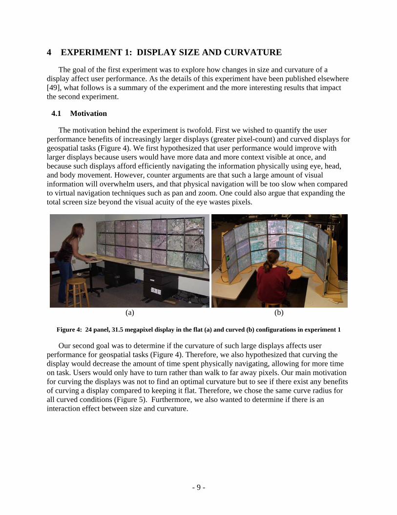
Figure 4: 24 panel, 31.5 megapixel display in the flat (a) and curved (b) configurations in experiment 1
Our second goal was to determine if the curvature of such large displays affects user performance for geospatial tasks (Figure 4). Therefore, we also hypothesized that curving the display would decrease the amount of time spent physically navigating, allowing for more time on task. Users would only have to turn rather than walk to far away pixels. Our main motivation for curving the displays was not to find an optimal curvature but to see if there exist any benefits of curving a display compared to keeping it flat. Therefore, we chose the same curve radius for all curved conditions (Figure 5). Furthermore, we also wanted to determine if there is an interaction effect between size and curvature.
- 9 -
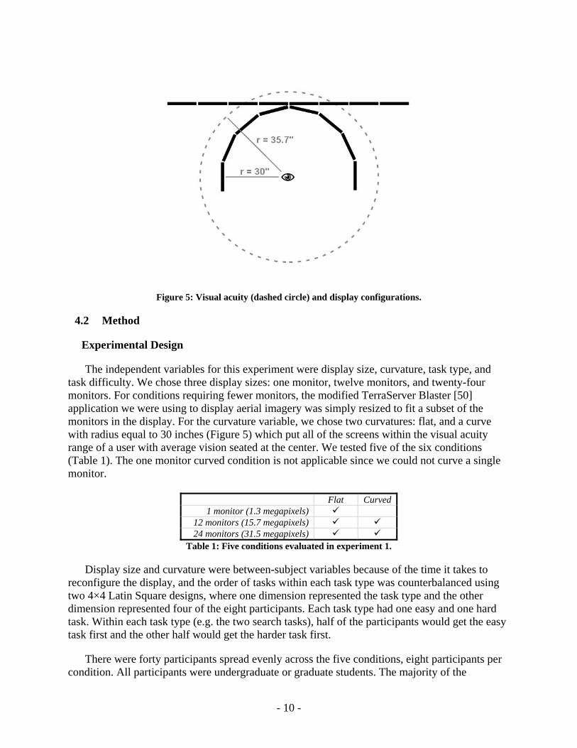
Figure 5: Visual acuity (dashed circle) and display configurations.
4.2 Method
Experimental Design
The independent variables for this experiment were display size, curvature, task type, and task difficulty. We chose three display sizes: one monitor, twelve monitors, and twenty-four monitors. For conditions requiring fewer monitors, the modified TerraServer Blaster [50] application we were using to display aerial imagery was simply resized to fit a subset of the monitors in the display. For the curvature variable, we chose two curvatures: flat, and a curve with radius equal to 30 inches (Figure 5) which put all of the screens within the visual acuity range of a user with average vision seated at the center. We tested five of the six conditions (Table 1). The one monitor curved condition is not applicable since we could not curve a single monitor.
Flat Curved 1 monitor (1.3 megapixels)
12 monitors (15.7 megapixels) 24 monitors (31.5 megapixels)
Table 1: Five conditions evaluated in experiment 1.
Display size and curvature were between-subject variables because of the time it takes to reconfigure the display, and the order of tasks within each task type was counterbalanced using two 4×4 Latin Square designs, where one dimension represented the task type and the other dimension represented four of the eight participants. Each task type had one easy and one hard task. Within each task type (e.g. the two search tasks), half of the participants would get the easy task first and the other half would get the harder task first.
There were forty participants spread evenly across the five conditions, eight participants per condition. All participants were undergraduate or graduate students. The majority of the
- 10 -
participants were computer science majors. The average age of the participants was twenty-five with a range between twenty-one and thirty-one years old. Twenty-seven of the participants were male and thirteen were female. All participants had normal or corrected-normal (e.g. glasses) vision and reported having daily use with computers. Users were not expected to have a background in geography and the tutorial covered the background necessary to complete the tasks.
Tasks
Users were asked to perform a series of typical analytic geospatial tasks using satellite imagery from the TerraServer database. Geospatial data is ideal for this experiment because it is naturally a high-resolution, multi-scale, and dense data set that is also comprehensible to non-experts.
Based on consultation with expert geographers and intelligence analysts as well as previous research utilizing geospatial data on larger displays [26], we chose three basic types of tasks: searching, route tracing, and comparing. These tasks were chosen because they are common visual analytic tasks and they require the user to utilize the display in different ways. Search requires the user to develop methods to visit the entire set of data in some efficient manner. Route tracing, on the other hand, requires the user to traverse a limited and specific portion of the data without losing context. Finally, image comparison tasks are a complex combination of these first two, requiring a user to maintain a shared context across two images that potentially offer few registration points to indicate how the images correspond. However, for the comparison task, only accuracy was measured, and no significant results were found; so we will not present that task here. Participants performed two of each task type, an easy and a hard task, for a total of six tasks per condition.
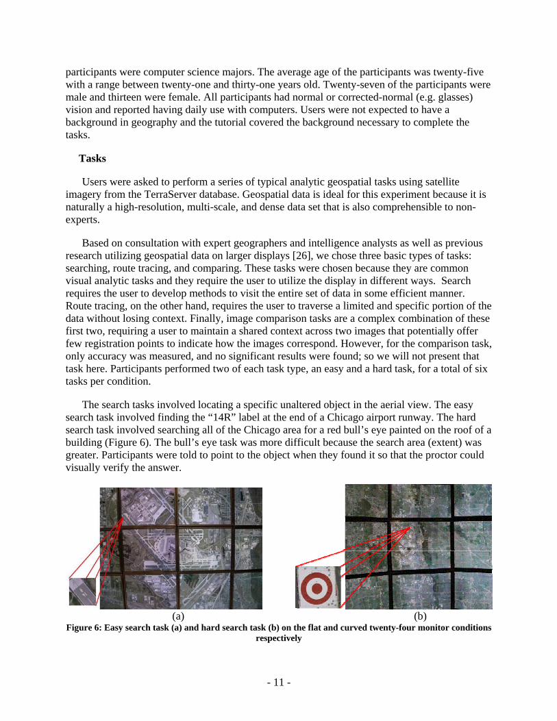
The search tasks involved locating a specific unaltered object in the aerial view. The easy search task involved finding the “14R” label at the end of a Chicago airport runway. The hard search task involved searching all of the Chicago area for a red bull’s eye painted on the roof of a building (Figure 6). The bull’s eye task was more difficult because the search area (extent) was greater. Participants were told to point to the object when they found it so that the proctor could visually verify the answer.
(a) (b) Figure 6: Easy search task (a) and hard search task (b) on the flat and curved twenty-four monitor conditions
respectively
- 11 -
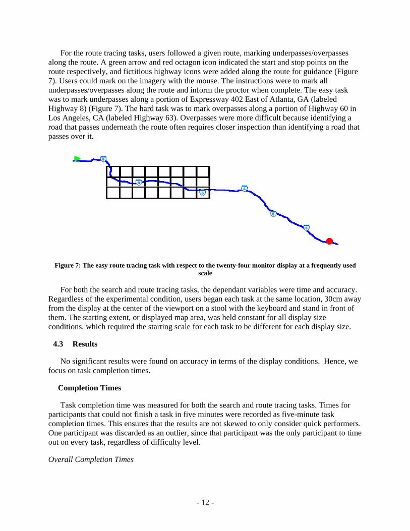
For the route tracing tasks, users followed a given route, marking underpasses/overpasses along the route. A green arrow and red octagon icon indicated the start and stop points on the route respectively, and fictitious highway icons were added along the route for guidance (Figure 7). Users could mark on the imagery with the mouse. The instructions were to mark all underpasses/overpasses along the route and inform the proctor when complete. The easy task was to mark underpasses along a portion of Expressway 402 East of Atlanta, GA (labeled Highway 8) (Figure 7). The hard task was to mark overpasses along a portion of Highway 60 in Los Angeles, CA (labeled Highway 63). Overpasses were more difficult because identifying a road that passes underneath the route often requires closer inspection than identifying a road that passes over it.
Figure 7: The easy route tracing task with respect to the twenty-four monitor display at a frequently used scale
For both the search and route tracing tasks, the dependant variables were time and accuracy. Regardless of the experimental condition, users began each task at the same location, 30cm away from the display at the center of the viewport on a stool with the keyboard and stand in front of them. The starting extent, or displayed map area, was held constant for all display size conditions, which required the starting scale for each task to be different for each display size.
4.3 Results
No significant results were found on accuracy in terms of the display conditions. Hence, we focus on task completion times.
Completion Times
Task completion time was measured for both the search and route tracing tasks. Times for participants that could not finish a task in five minutes were recorded as five-minute task completion times. This ensures that the results are not skewed to only consider quick performers. One participant was discarded as an outlier, since that participant was the only participant to time out on every task, regardless of difficulty level.
Overall Completion Times
- 12 -
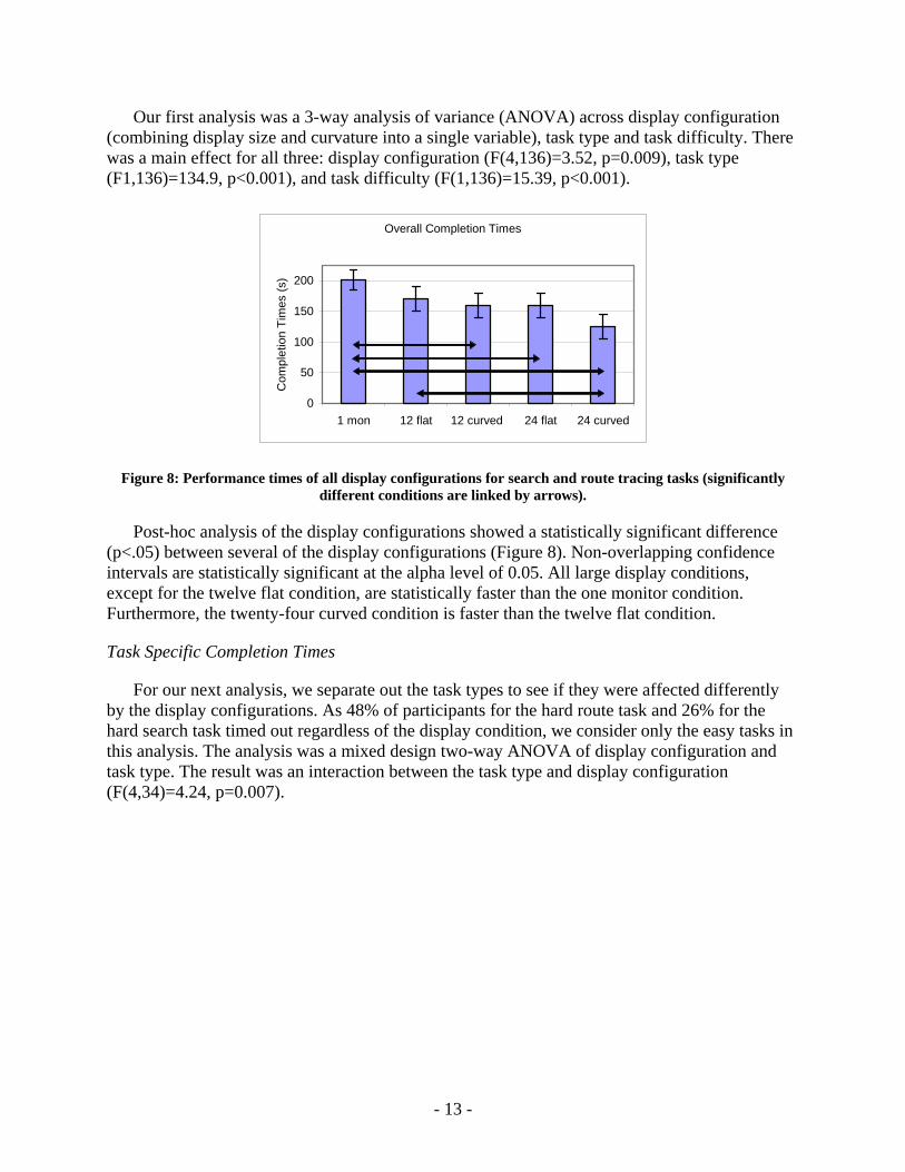
Our first analysis was a 3-way analysis of variance (ANOVA) across display configuration (combining display size and curvature into a single variable), task type and task difficulty. There was a main effect for all three: display configuration (F(4,136)=3.52, p=0.009), task type (F1,136)=134.9, p<0.001), and task difficulty (F(1,136)=15.39, p<0.001).
Overall Completion Times
0
50
100
150
200
1 mon 12 flat 12 curved 24 flat 24 curved
Com
plet
ion
Tim
es (s
)
Figure 8: Performance times of all display configurations for search and route tracing tasks (significantly different conditions are linked by arrows).
Post-hoc analysis of the display configurations showed a statistically significant difference (p<.05) between several of the display configurations (Figure 8). Non-overlapping confidence intervals are statistically significant at the alpha level of 0.05. All large display conditions, except for the twelve flat condition, are statistically faster than the one monitor condition. Furthermore, the twenty-four curved condition is faster than the twelve flat condition.
Task Specific Completion Times
For our next analysis, we separate out the task types to see if they were affected differently by the display configurations. As 48% of participants for the hard route task and 26% for the hard search task timed out regardless of the display condition, we consider only the easy tasks in this analysis. The analysis was a mixed design two-way ANOVA of display configuration and task type. The result was an interaction between the task type and display configuration (F(4,34)=4.24, p=0.007).
- 13 -
Easy Search Task
020406080
100120140
1 mon 12 flat 12curved
24 flat 24curved
Com
plet
ion
Tim
e (s
)
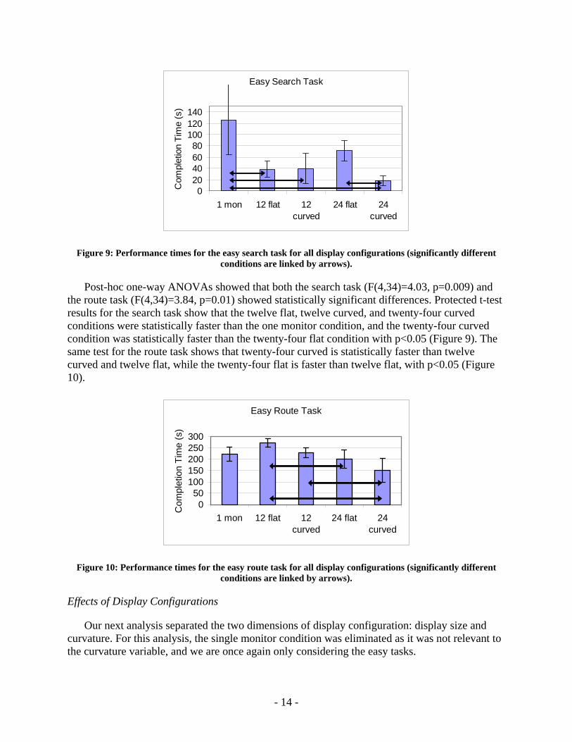
Figure 9: Performance times for the easy search task for all display configurations (significantly different conditions are linked by arrows).
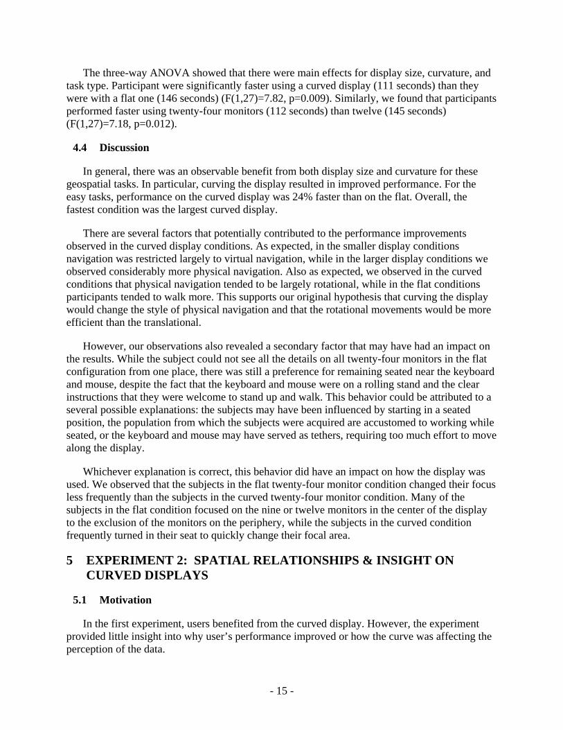
Post-hoc one-way ANOVAs showed that both the search task (F(4,34)=4.03, p=0.009) and the route task (F(4,34)=3.84, p=0.01) showed statistically significant differences. Protected t-test results for the search task show that the twelve flat, twelve curved, and twenty-four curved conditions were statistically faster than the one monitor condition, and the twenty-four curved condition was statistically faster than the twenty-four flat condition with p<0.05 (Figure 9). The same test for the route task shows that twenty-four curved is statistically faster than twelve curved and twelve flat, while the twenty-four flat is faster than twelve flat, with p<0.05 (Figure 10).
Easy Route Task
050
100150200250300
1 mon 12 flat 12curved
24 flat 24curved
Com
plet
ion
Tim
e (s
)
Figure 10: Performance times for the easy route task for all display configurations (significantly different conditions are linked by arrows).
Effects of Display Configurations
Our next analysis separated the two dimensions of display configuration: display size and curvature. For this analysis, the single monitor condition was eliminated as it was not relevant to the curvature variable, and we are once again only considering the easy tasks.
- 14 -
The three-way ANOVA showed that there were main effects for display size, curvature, and task type. Participant were significantly faster using a curved display (111 seconds) than they were with a flat one (146 seconds) (F(1,27)=7.82, p=0.009). Similarly, we found that participants performed faster using twenty-four monitors (112 seconds) than twelve (145 seconds) (F(1,27)=7.18, p=0.012).
4.4 Discussion
In general, there was an observable benefit from both display size and curvature for these geospatial tasks. In particular, curving the display resulted in improved performance. For the easy tasks, performance on the curved display was 24% faster than on the flat. Overall, the fastest condition was the largest curved display.
There are several factors that potentially contributed to the performance improvements observed in the curved display conditions. As expected, in the smaller display conditions navigation was restricted largely to virtual navigation, while in the larger display conditions we observed considerably more physical navigation. Also as expected, we observed in the curved conditions that physical navigation tended to be largely rotational, while in the flat conditions participants tended to walk more. This supports our original hypothesis that curving the display would change the style of physical navigation and that the rotational movements would be more efficient than the translational.
However, our observations also revealed a secondary factor that may have had an impact on the results. While the subject could not see all the details on all twenty-four monitors in the flat configuration from one place, there was still a preference for remaining seated near the keyboard and mouse, despite the fact that the keyboard and mouse were on a rolling stand and the clear instructions that they were welcome to stand up and walk. This behavior could be attributed to a several possible explanations: the subjects may have been influenced by starting in a seated position, the population from which the subjects were acquired are accustomed to working while seated, or the keyboard and mouse may have served as tethers, requiring too much effort to move along the display.
Whichever explanation is correct, this behavior did have an impact on how the display was used. We observed that the subjects in the flat twenty-four monitor condition changed their focus less frequently than the subjects in the curved twenty-four monitor condition. Many of the subjects in the flat condition focused on the nine or twelve monitors in the center of the display to the exclusion of the monitors on the periphery, while the subjects in the curved condition frequently turned in their seat to quickly change their focal area.
5 EXPERIMENT 2: SPATIAL RELATIONSHIPS & INSIGHT ON CURVED DISPLAYS
5.1 Motivation
In the first experiment, users benefited from the curved display. However, the experiment provided little insight into why user’s performance improved or how the curve was affecting the perception of the data.
- 15 -
(a) (b)
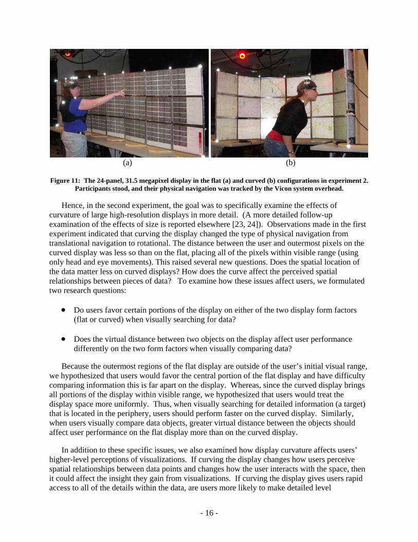
Figure 11: The 24-panel, 31.5 megapixel display in the flat (a) and curved (b) configurations in experiment 2.
Participants stood, and their physical navigation was tracked by the Vicon system overhead.
Hence, in the second experiment, the goal was to specifically examine the effects of curvature of large high-resolution displays in more detail. (A more detailed follow-up examination of the effects of size is reported elsewhere [23, 24]). Observations made in the first experiment indicated that curving the display changed the type of physical navigation from translational navigation to rotational. The distance between the user and outermost pixels on the curved display was less so than on the flat, placing all of the pixels within visible range (using only head and eye movements). This raised several new questions. Does the spatial location of the data matter less on curved displays? How does the curve affect the perceived spatial relationships between pieces of data? To examine how these issues affect users, we formulated two research questions:
• Do users favor certain portions of the display on either of the two display form factors (flat or curved) when visually searching for data?
• Does the virtual distance between two objects on the display affect user performance differently on the two form factors when visually comparing data?
Because the outermost regions of the flat display are outside of the user’s initial visual range, we hypothesized that users would favor the central portion of the flat display and have difficulty comparing information this is far apart on the display. Whereas, since the curved display brings all portions of the display within visible range, we hypothesized that users would treat the display space more uniformly. Thus, when visually searching for detailed information (a target) that is located in the periphery, users should perform faster on the curved display. Similarly, when users visually compare data objects, greater virtual distance between the objects should affect user performance on the flat display more than on the curved display.
In addition to these specific issues, we also examined how display curvature affects users’ higher-level perceptions of visualizations. If curving the display changes how users perceive spatial relationships between data points and changes how the user interacts with the space, then it could affect the insight they gain from visualizations. If curving the display gives users rapid access to all of the details within the data, are users more likely to make detailed level
- 16 -
observations? Does display curvature result in reduced opportunities to gain overview-level perspective, since users are less likely to step back (physically zoom out) and there is no position from which users can see the entire display without perspective distortion? To address these issues, we formulated a third research question that specifically examines the types of insights users gained based on the display conditions:
• Do users of curved displays make observations (insights) in visualizations at a different level on the overview-to-detail spectrum than users of flat displays?
We hypothesized that users on the curved display will gain more localized detail-level insights, because details of localized regions can be readily accessed with only head and eye movements. Whereas, users on the flat display will gain more overview-level insights because increased physical navigation will naturally afford a broad integrative view by stepping back from the display. We noticed this tendency in our own usage of the displays, and sought to examine the issue experimentally.
Thus, the motivation for the second experiment is threefold:
• Determine how much the spatial position of data on the display affects user performance on the two form factors (flat and curved).
• Determine how much the distance between two data objects on the display affects user performance on the two form factors.
• Determine the overview-to-detail level of insights users gain from visualizations on the two form factors.
5.2 Method
Equipment Setup
To reduce the tethering effects from the first experiment, no seat or input devices were provided – all tasks dealt with static imagery only. In addition, the display was raised to better accommodate standing. The bottom of the display was about three feet (36.5 inches) from the floor, and the top of the display was about six feet (71 inches) from the floor.
During the experiment, all subjects wore a vest and hat that were instrumented with reflective markers for tracking by the Vicon motion tracking system. The Vicon system allowed us to track the subject’s position and orientation. For both the subjects’ torso and head, full 6 degree-of-freedom positions (3D translation and 3D rotation) were continuously recorded. This data was used to measure the Euclidean distances traveled in 3D space and the amount of turning done by the subjects.
Experimental Design
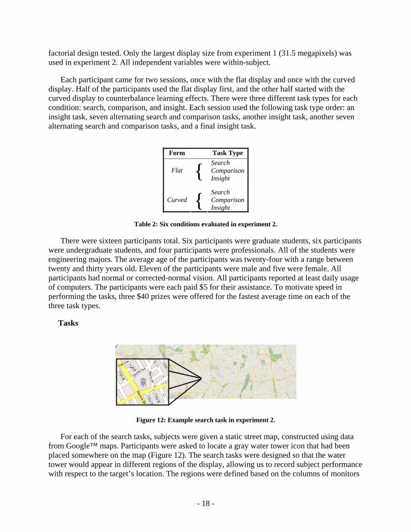
The experiment design examined two factors: form and task type. Form is a two-level factor including flat and curved (Figure 3), and task type is a three-level factor. Table 2 shows the full
- 17 -
factorial design tested. Only the largest display size from experiment 1 (31.5 megapixels) was used in experiment 2. All independent variables were within-subject.
Each participant came for two sessions, once with the flat display and once with the curved display. Half of the participants used the flat display first, and the other half started with the curved display to counterbalance learning effects. There were three different task types for each condition: search, comparison, and insight. Each session used the following task type order: an insight task, seven alternating search and comparison tasks, another insight task, another seven alternating search and comparison tasks, and a final insight task.
Form Task Type
Search ComparisonFlat { Insight
Search ComparisonCurved { Insight
Table 2: Six conditions evaluated in experiment 2.
There were sixteen participants total. Six participants were graduate students, six participants were undergraduate students, and four participants were professionals. All of the students were engineering majors. The average age of the participants was twenty-four with a range between twenty and thirty years old. Eleven of the participants were male and five were female. All participants had normal or corrected-normal vision. All participants reported at least daily usage of computers. The participants were each paid $5 for their assistance. To motivate speed in performing the tasks, three $40 prizes were offered for the fastest average time on each of the three task types.
Tasks
Figure 12: Example search task in experiment 2.
For each of the search tasks, subjects were given a static street map, constructed using data from Google™ maps. Participants were asked to locate a gray water tower icon that had been placed somewhere on the map (Figure 12). The search tasks were designed so that the water tower would appear in different regions of the display, allowing us to record subject performance with respect to the target’s location. The regions were defined based on the columns of monitors
- 18 -
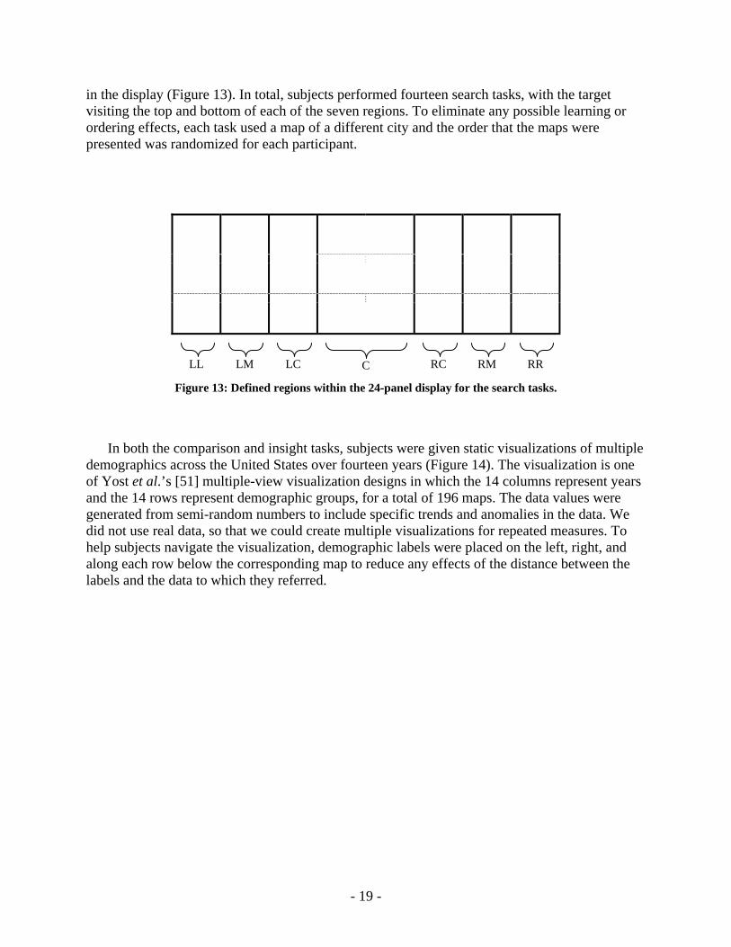
in the display (Figure 13). In total, subjects performed fourteen search tasks, with the target visiting the top and bottom of each of the seven regions. To eliminate any possible learning or ordering effects, each task used a map of a different city and the order that the maps were presented was randomized for each participant.
C RC RM
RR LM LC LL
Figure 13: Defined regions within the 24-panel display for the search tasks.
In both the comparison and insight tasks, subjects were given static visualizations of multiple demographics across the United States over fourteen years (Figure 14). The visualization is one of Yost et al.’s [51] multiple-view visualization designs in which the 14 columns represent years and the 14 rows represent demographic groups, for a total of 196 maps. The data values were generated from semi-random numbers to include specific trends and anomalies in the data. We did not use real data, so that we could create multiple visualizations for repeated measures. To help subjects navigate the visualization, demographic labels were placed on the left, right, and along each row below the corresponding map to reduce any effects of the distance between the labels and the data to which they referred.
- 19 -

Figure 14: Visualization for comparison and insight tasks in experiment 2.
For each comparison task, subjects were asked a specific question that required a direct comparison of two values within the visualization. For example, “Which year had the most ‘College Graduates’ in Kansas? 1982 or 1983?” The questions were designed to evaluate the effects of different horizontal virtual distances; so they all had the same form, requiring subjects to compare a particular demographic in a particular state across two different years. The distance conditions were broken up based on the number of display columns that separated the two values – the closest being a single column of separation (about 14”) and the farthest being seven columns of separation (about 98”). In total, subjects were asked to perform 28 comparisons – four for each distance measure. The comparisons were broken up across the two sessions so that each participant performed two comparisons at each distance with both the flat and the curved display. All comparisons were done using the same visualization, but the order of questions was randomized.
For each insight task, subjects were asked to state three observations that they found meaningful about any of the data presented to them in the visualization and to show the evidence supporting the observation to the experimenters. This was an open-ended task protocol with no additional instructions, similar to the insight-based evaluation method developed by Saraiya et al. [5]. The prize for fastest average time encouraged the subjects to tell us their initial observations rather than over-thinking and rejecting observations that they felt were not meaningful enough. This was done to reduce any bias that subjects might have toward a particular level of detail (e.g., a belief that broader observations that include more of the data set are more meaningful). Each subject performed three insight tasks per session, for a total of nine observations per subject for each display condition. There were six different data sets used for the insight tasks. Subjects only saw each data set once and the order in which the data sets were presented was randomized across the sessions for each subject.
Procedure
Each session took about one hour to complete. Before beginning the first session, participants were asked to fill out a demographic questionnaire and to inform the proctor of any physical conditions such as color-blindness or claustrophobia. Participants then had a training session for
- 20 -
each task type, to learn how to recognize the search target, how to interpret the demographic visualization, and to gain some experience performing the tasks before beginning the experiment. Participants were told to start each task by standing at a marked ‘X’ on the floor (30 inches from the center of the display) and to look straight ahead. They were told that they could move from their starting position once the task began. Written instructions for each comparison task were given to the participant when he or she began the task. After each task, participants were asked to verbally rate their frustration level on an unlabeled Likert scale from one to seven, seven being the greatest frustration level.
5.3 Results
Quantitative results for each task type were analyzed separately because we are not concerned with the performance difference between task types. For all tasks, the dependant variables were time to completion, frustration level, and physical movement. Comparison tasks also included accuracy as a dependant variable, and insight tasks included insight level of detail. One participant’s physical movement results were thrown out due to an incomplete recording. There were no significant correlations found between the dependant variables and the demographics collected, gender and age.
Search Tasks
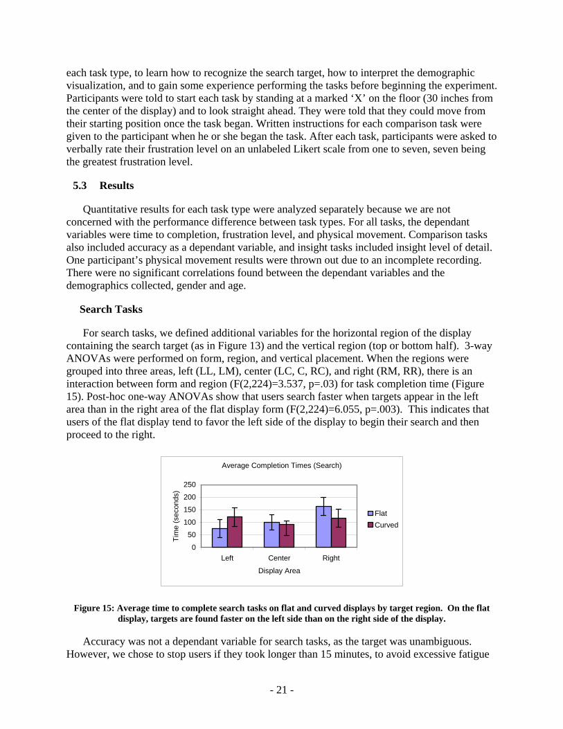
For search tasks, we defined additional variables for the horizontal region of the display containing the search target (as in Figure 13) and the vertical region (top or bottom half). 3-way ANOVAs were performed on form, region, and vertical placement. When the regions were grouped into three areas, left (LL, LM), center (LC, C, RC), and right (RM, RR), there is an interaction between form and region (F(2,224)=3.537, p=.03) for task completion time (Figure 15). Post-hoc one-way ANOVAs show that users search faster when targets appear in the left area than in the right area of the flat display form (F(2,224)=6.055, p=.003). This indicates that users of the flat display tend to favor the left side of the display to begin their search and then proceed to the right.
Average Completion Times (Search)
0
50
100
150
200
250
Left Center Right
Display Area
Tim
e (s
econ
ds)
FlatCurved
Figure 15: Average time to complete search tasks on flat and curved displays by target region. On the flat display, targets are found faster on the left side than on the right side of the display.
Accuracy was not a dependant variable for search tasks, as the target was unambiguous. However, we chose to stop users if they took longer than 15 minutes, to avoid excessive fatigue
- 21 -
and stress. This only occurred once each for three out of the sixteen participants (two on the curved display and 1 on the flat) and their times were recorded as 15 minutes.
For frustration level, there was a significant main effect for form (F(1,224)=6.747, p=.01) where participants found the curved form less frustrating than the flat form (Figure 16).
Average Frustration Level (Search)
1234567
Flat Curved
Form
Frus
tratio
n Le
vel
Figure 16: Average frustration level (7 = greatest frustration) on the two display forms for search tasks. The curved display was less frustrating.
For physical movement, there was a significant main effect of form (F(1,210)=18.542, p<.001) where participants traveled less total distance (translation of head position) when using the curved form (Figure 17). There was also an interaction between form and region for moving the position of their body (F(6,210)=2.172, p=.045). Post-hoc one-way ANOVAs show that participants moved the position of their body less while using the curved form (F(1,210)=14.352, p<.001) (Figure 17).
Average Total Movement (Search)
02000400060008000
100001200014000
Head Body
Dis
tanc
e Tr
avel
led
(mm
)
FlatCurved
Figure 17: Average total head and body translational movement on the two forms for search tasks. Participants moved less with the curved display.
Comparison Tasks
For the comparison tasks, a 2-way ANOVA was performed on form and virtual distance between targets. For time to completion, there was a statistically significant main effect for virtual distance (F(6,64)=7.073, p<.001). This is not surprising, since the difficulty of comparing more distant objects is already understood. There was no significant main effect observed for
- 22 -
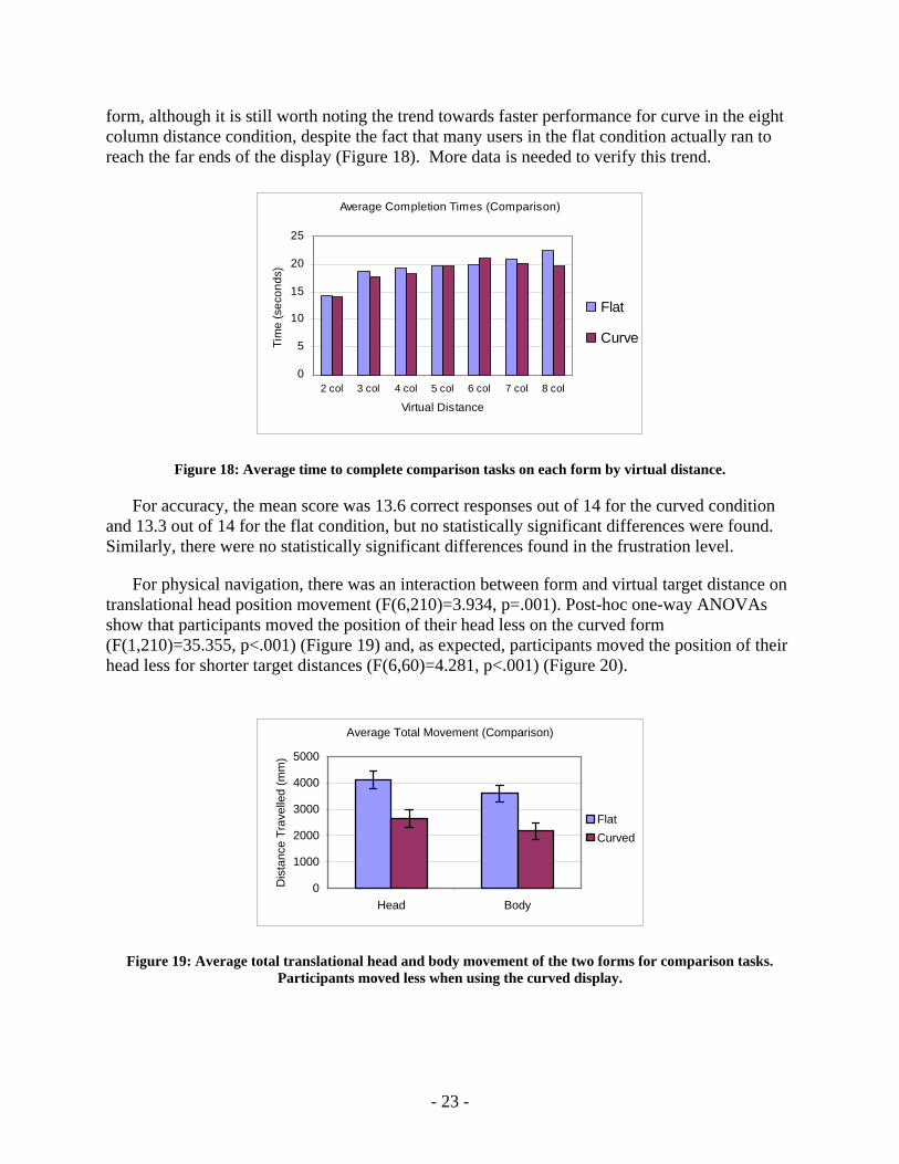
form, although it is still worth noting the trend towards faster performance for curve in the eight column distance condition, despite the fact that many users in the flat condition actually ran to reach the far ends of the display (Figure 18). More data is needed to verify this trend.
Average Completion Times (Comparison)
0
5
10
15
20
25
2 col 3 col 4 col 5 col 6 col 7 col 8 col
Virtual Distance
Tim
e (s
econ
ds)
Flat
Curve
Figure 18: Average time to complete comparison tasks on each form by virtual distance.
For accuracy, the mean score was 13.6 correct responses out of 14 for the curved condition and 13.3 out of 14 for the flat condition, but no statistically significant differences were found. Similarly, there were no statistically significant differences found in the frustration level.
For physical navigation, there was an interaction between form and virtual target distance on translational head position movement (F(6,210)=3.934, p=.001). Post-hoc one-way ANOVAs show that participants moved the position of their head less on the curved form (F(1,210)=35.355, p<.001) (Figure 19) and, as expected, participants moved the position of their head less for shorter target distances (F(6,60)=4.281, p<.001) (Figure 20).
Average Total Movement (Comparison)
0
1000
2000
3000
4000
5000
Head Body
Dis
tanc
e Tr
avel
led
(mm
)
FlatCurved
Figure 19: Average total translational head and body movement of the two forms for comparison tasks. Participants moved less when using the curved display.
- 23 -

Similarly, there was also an interaction between form and virtual target distance on translational body position movement (F(6,210)=4.432, p<.001). Post-hoc one-way ANOVAs show that participants moved the position of their body less on the curved form (F(1,210)=38.272, p<.001) (Figure 19) and less for shorter target distances (F(6,60)=5.147, p<.001) (Figure 20).
Average Total Movement (Comparison)
010002000300040005000
2 col 3 col 4 col 5 col 6 col 7 col 8 col
Virtual Distance
Dis
tanc
e Tr
avel
led
(mm
)
HeadBody
Figure 20: Average total head and body movement on the seven virtual target distances in the comparison
task reflects expected patterns.
Conversely, there was a main effect of form on rotational body movement (F(1,210)=14.919, p<.001) showing that participants rotated (turned to the left and right) significantly more on the curved display (Figure 21) than the flat display. These results clearly demonstrate the physical navigation tradeoff between translational movement on the flat display and rotational movement on curved displays.
Average Total Horizontal Body Turns (Compare)
0
5
10
15
20
25
30
Flat Curved
Tota
l Rad
ians
Tur
ned
FlatCurved
Figure 21: Average total side-to-side body rotation during comparison tasks using the two display forms. Participants turned to the side more when using the curved display.
Insight Tasks
Our intent in using the insight-based approach was to get more subjective perceptions of the data from the subjects. While the subjects were required to show the evidence supporting their
- 24 -

observations to demonstrate that they had made a good faith effort to base their observations on the visualization, no measurement was made of the accuracy of the insights. The insights that are generated by this open-ended protocol are very difficult to score in a meaningful way [52]. Rather than trying to quantify the quality of the insights, we examined the types of insights the subjects generated.
Each observation made by the subjects was coded for its level on a detail-to-overview spectrum on a Likert-scale. Level 1 indicates insights that are very localized to a specific detail in a small portion of the visualization. Level seven indicates insights that involve global overview trends covering the entire visualization. Table 3 shows the scale used to rate the level of detail for each insight reported by the participants.
Rating Rule: Description of Observation 1 Observation regarding one population in one state in one year 2 Observation regarding one population in one state over two or more years 3 Observation regarding one population in one state over all years 4 Observation regarding one population over two or more states over all years 5 Observation regarding one population over all states over all years 6 Observation regarding two or more populations over all states over all years 7 Observation regarding all populations over all states over all years
Table 3: Rules for rating the level of detail of each insight reported by the participants.
For insight degree of detail, there was a near significant main effect for form (F(1,144)=3.718, p<.055) with more detailed insights on the curve form and more overview insights on the flat (Figure 22).
Average Degree of Detail
1234567
Flat Curved
Form
Insi
ght R
atin
g
Figure 22: Average insight level of detail on the two forms. The flat display prompted more overview oriented observations.
For physical navigation, there was a statistically significant main effect of form (F(1,130)=47.188, p<.001) showing that participants’ head position moved less with the curved form while deriving insights. There was also a main effect for form (F(1,130)=33.763, p<.001)
- 25 -
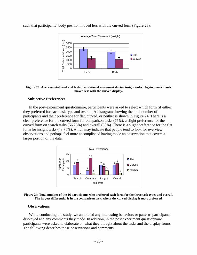
such that participants’ body position moved less with the curved form (Figure 23).
Average Total Movement (Insight)
0500
10001500200025003000
Head BodyTota
l Dis
tanc
e M
oved
(mm
)
FlatCurved
Figure 23: Average total head and body translational movement during insight tasks. Again, participants moved less with the curved display.
Subjective Preferences
In the post-experiment questionnaire, participants were asked to select which form (if either) they preferred for each task type and overall. A histogram showing the total number of participants and their preference for flat, curved, or neither is shown in Figure 24. There is a clear preference for the curved form for comparison tasks (75%), a slight preference for the curved form on search tasks (56.25%) and overall (50%). There is a slight preference for the flat form for insight tasks (43.75%), which may indicate that people tend to look for overview observations and perhaps feel more accomplished having made an observation that covers a larger portion of the data.
Total Preference
377 7
96
8
12
3
0 1 10
5
10
15
Search Compare Insight Overall
Task Type
Num
ber o
f P
artic
ipan
ts Flat
Curved
Neither
Figure 24: Total number of the 16 participants who preferred each form for the three task types and overall. The largest differential is in the comparison task, where the curved display is most preferred.
Observations
While conducting the study, we annotated any interesting behaviors or patterns participants displayed and any comments they made. In addition, in the post experiment questionnaire participants were asked to elaborate on what they thought about the tasks and the display forms. The following describes those observations and comments.
- 26 -
For the search tasks, there was a broad range of strategies employed by participants. The most common searching strategy was to scan the monitors left to right and top to bottom. Thus, when the water tower target was on the left side of the screen, participants found it faster than when it was on the right side. This is illustrated in Figure 15. Other strategies included scanning the monitors by row (top to bottom), scanning the middle columns first then moving outwards, and quickly scanning the whole display hoping that the water tower would “pop out.”
All of the participants who preferred the curved display for the search tasks said they did not have to move as much to see the screens and it made it easier to scan the screens quickly. Of the seven participants that preferred the flat display, three of them said they liked to back up and move around while searching for the water tower. One of the participants commented that the flat display seemed more “normal” to them, and two of the participants said the flat display helped them search in a grid pattern.
For the comparison tasks, many participants said they would visualize where the data would be located on the screen in their minds before beginning the task. They said this helped them to make more efficient use of their time once the task began. Also, when asked to compare data that was eight columns apart on the flat display, some participants ran back and forth to see both data points. Another observation was that more participants used their arms and hands to mark the data locations on the curved display than on the flat display. This is probably because participants could touch any point on the curved display from a position in the middle, whereas, participants could only span across part of the flat display.
The participants who preferred the curved form for the comparison tasks wrote on the questionnaire that it was because they could easily see all the points on the screen. Four of those participants elaborated further and said that they liked being able to touch the screen and see the data points without having to move. All three of the participants who preferred the flat display on this task said that it was because it felt more “normal” and it was easier to see the row-column alignment of the data points.
The six participants who preferred the curved form for the insight task said that this was because it was easier for them to see trends in certain populations. All seven of the participants who expressed a preference for the flat form said it was because it was easier to step back and see all of the data points.
Since all of the participants experienced both form factors of the display, several of them had initial opinions of the two display forms. One participant, who started with the curved form and returned to finish the experiment on the flat display, said of the flat form: “Wow, this is going to be so much harder.” When asked why, the participant said that it looked like so much more to take in at once. Two participants who started on the flat form first said that they wished the display was curved around them. They said it would be easier to see details if the display was closer to them.
On the post-experiment questionnaire, eight of the participants preferred the curved form overall and seven preferred the flat form. All of the participants who preferred the curved display said that it was because they could see all the data without having to move much. One participant went on to say that the curved display was more “immersive” and helped him to focus on the
- 27 -
tasks. Of the participants who preferred the flat condition, three said it was because it felt more “normal” and another three said it was because they could step back and see all the information at once.
5.4 Discussion
For all three tasks (search, comparison, and insight) users physically navigated approximately twice as far, in terms of total translational movement, when using the flat display. During comparison tasks, users made significantly more rotational movement when using the curved form than with the flat. This change in physical navigation is the most likely cause of the improved user performance times on some search tasks, the preference for curved form on comparison tasks, and the more detail oriented insights. Rotational physical navigation appears to be more efficient than translational physical navigation, but may also have deeper cognitive effects.
When looking for a target on the display, users favored the left side of the flat display over the right side. This particular bias for the left side is likely cultural. While we did not collect demographic data specifically targeting this question, the subjects were predominately from left-to-right reading cultures. However, on the curved display there was no significant preference displayed, which seems to indicate that curving the display removed any bias users had towards the left side of the display. Furthermore, users were less frustrated searching on the curved display. This may be because the average time to find the object was less dependent on its location due to the lack of bias. Given the greatly reduced physical translational movement, it is perhaps surprising that more subjects did not prefer the curved display for this task. Based on user comments, it appears that those who preferred the flat display did so because of familiarity with that form and its natural support for searching by grids.
While there is no statistically significant difference in performance time between the flat and curved conditions for the comparison tasks, we believe this is primarily because many users compensated for the extra physical navigation needed on the flat display by running. Given the incentive to perform well, this is unsurprising. However, in longitudinal use with more complex comparisons, it seems likely that users would not continue to run while performing comparisons and the curved display might result in an overall faster performance. In addition, it is possible that the tasks were too simple and did not require enough cognitive effort to show an effect as was found in experiment 1. In any case, it is clear that users strongly preferred the curved form for comparison tasks, probably because they could accomplish the task with less physical effort.
The experiment also demonstrated evidence that the form factor of the display has an impact on users’ insights gained from visualization. On a flat display as large as this one, users’ initial insights were more at the overview level. This means users tend to make large-scale observations about the data, such as global trends and patterns. This is apparently because users can step back from the display and visually aggregate all the data in a single view when the display is flat. Whereas, on this curved display, initial insights were more at the local detail level, such as observations about anomalies or sub-groups of the data. This may be because users cannot see all of the data points at once. For this task, there was a slight preference for the flat display, perhaps because users perceive overview insights as more valuable, and their instinct was to find (more meaningful) high-level observations. However, an insight’s level of overview or detail
- 28 -
does not dictate the importance of that observation. Depending on the scenario, either type of insight could be critical. As such, this finding is not an argument for one display over another, but rather evidence that the choice of form factor is an important design consideration that must be matched to the users’ tasks. It could also indicate the need for a new type of flexible-form display that users can rapidly reconfigure according to their current task.
6 CONCLUSIONS
6.1 Summary
The results of these experiments identify the important effects of scale and form factor in ubiquitous multi-display environments of the future. As the pixel-count is increased (up to 31.5 million pixels) on a high-resolution (96 DPI) display, users will perform faster on some tasks, with more physical navigation and less frustration. Furthermore, curving large high-resolution displays, bringing all the pixels into visual range, produces the following impacts:
• Changes the amount and type of physical navigation, from translational to rotational, decreasing translational by about half and doubling rotational movement.
• Further improves user performance time for some tasks, up to 24% faster.
• Eliminates users’ significant region bias towards the left side of large flat displays.
• Changes the type of insights users gain from large-scale visualizations, to less overview insights and more localized detail insights.
• Reduces users’ frustration levels on search tasks, and substantially increases user preference on comparison tasks.
In information visualization, it is well recognized that interaction plays a critical role in how people understand information (e.g. [5]). Related research argues for the important role of physical navigation in enabling people to better interact with and explore visual information [23, 24], lending greater credence towards theories of embodied interaction and cognition and their application to information visualization. The results presented in this paper may serve to further strengthen that argument by also showing that the type of physical navigation, translational versus rotational, plays a distinctive role in how people perceive information, and demonstrating the deeper link between physical interaction and cognition.
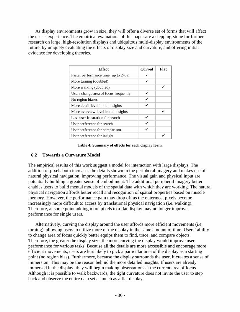
These results highlight the value of rapidly reconfigurable or alternative displays. As the summarization of results in Table 4 shows, there are several advantages of curved displays for 2D visualization tasks. However, the impact that form factor has on insights argues for enabling the user to easily change the display shape to match their tasks. A quickly reconfigurable or flexible-form display could allow users to start their task with a flat display for an overview perspective of their data, and then pull the sides of the display inward into a curved form so that they can better observe details. An additional benefit of such a capability would be to quickly switch between the curved form for a single-user workspace and the flat form for collaborative multi-user usage.
- 29 -
As display environments grow in size, they will offer a diverse set of forms that will affect the user’s experience. The empirical evaluations of this paper are a stepping-stone for further research on large, high-resolution displays and ubiquitous multi-display environments of the future, by uniquely evaluating the effects of display size and curvature, and offering initial evidence for developing theories.
Effect Curved Flat
Faster performance time (up to 24%) More turning (doubled) More walking (doubled) Users change area of focus frequently No region biases More detail-level initial insights More overview-level initial insights Less user frustration for search User preference for search User preference for comparison User preference for insight
Table 4: Summary of effects for each display form.
6.2 Towards a Curvature Model
The empirical results of this work suggest a model for interaction with large displays. The addition of pixels both increases the details shown in the peripheral imagery and makes use of natural physical navigation, improving performance. The visual gain and physical input are potentially building a greater sense of embodiment. The additional peripheral imagery better enables users to build mental models of the spatial data with which they are working. The natural physical navigation affords better recall and recognition of spatial properties based on muscle memory. However, the performance gain may drop off as the outermost pixels become increasingly more difficult to access by translational physical navigation (i.e. walking). Therefore, at some point adding more pixels to a flat display may no longer improve performance for single users.
Alternatively, curving the display around the user affords more efficient movements (i.e. turning), allowing users to utilize more of the display in the same amount of time. Users’ ability to change area of focus quickly better equips them to find, trace, and compare objects. Therefore, the greater the display size, the more curving the display would improve user performance for various tasks. Because all the details are more accessible and encourage more efficient movements, users are less likely to pick a particular area of the display as a starting point (no region bias). Furthermore, because the display surrounds the user, it creates a sense of immersion. This may be the reason behind the more detailed insights. If users are already immersed in the display, they will begin making observations at the current area of focus. Although it is possible to walk backwards, the tight curvature does not invite the user to step back and observe the entire data set as much as a flat display.
- 30 -
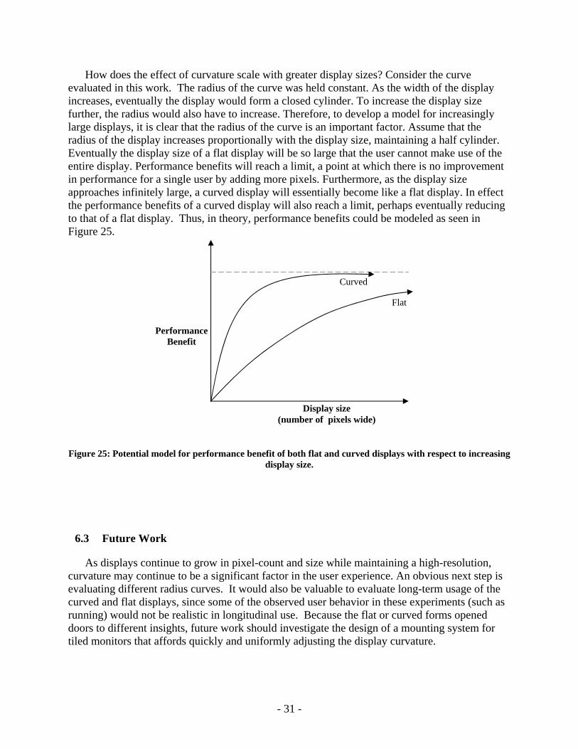
How does the effect of curvature scale with greater display sizes? Consider the curve evaluated in this work. The radius of the curve was held constant. As the width of the display increases, eventually the display would form a closed cylinder. To increase the display size further, the radius would also have to increase. Therefore, to develop a model for increasingly large displays, it is clear that the radius of the curve is an important factor. Assume that the radius of the display increases proportionally with the display size, maintaining a half cylinder. Eventually the display size of a flat display will be so large that the user cannot make use of the entire display. Performance benefits will reach a limit, a point at which there is no improvement in performance for a single user by adding more pixels. Furthermore, as the display size approaches infinitely large, a curved display will essentially become like a flat display. In effect the performance benefits of a curved display will also reach a limit, perhaps eventually reducing to that of a flat display. Thus, in theory, performance benefits could be modeled as seen in Figure 25.
Curved
Flat
Display size (number of pixels wide)
Performance Benefit
Figure 25: Potential model for performance benefit of both flat and curved displays with respect to increasing display size.
6.3 Future Work
As displays continue to grow in pixel-count and size while maintaining a high-resolution, curvature may continue to be a significant factor in the user experience. An obvious next step is evaluating different radius curves. It would also be valuable to evaluate long-term usage of the curved and flat displays, since some of the observed user behavior in these experiments (such as running) would not be realistic in longitudinal use. Because the flat or curved forms opened doors to different insights, future work should investigate the design of a mounting system for tiled monitors that affords quickly and uniformly adjusting the display curvature.
- 31 -
In terms of visualization, all tasks evaluated in this work involved static two-dimensional geospatial visualizations. None of the tasks required users to understand the geometric relationships between distant objects. Future work is necessary to understand potential disadvantages curving may have on users’ perception of the distorted imagery. Can users mentally transform the imagery into a flat scene? Also, how does curvature impact the visual perception of various graphical encodings in visualization? How does curvature impact 3D visualization? How does curvature impact the visualization of dynamic data and the perception of changes?
It would also be very useful to understand how curvature affects the partitioned space paradigm. Because users tend to work with multiple windows, switching their attention often, it would be beneficial to understand how curvature might affect common office productivity tasks. Based on the comparison tasks of the second experiment, such scenarios might be a strength of curved displays. Because the greater virtual distances affect performance negatively, a study using the partitioned space paradigm (using different regions of the display for different windows) should provide guidance for interface designs. In particular, likely design improvements are for desktop organization, window placement, and interaction techniques. Evaluating the partitioned space paradigm should also improve the design of future ubiquitous multi-display environments, because each display will typically be separated by edges in the physical environment in which they are embedded.
A noticeable attribute of the displays used in these experiments is the bezels between tiled LCD panels that create physical divisions. The physical discontinuities created by the bezels segment the display into equal parts, provide landmarks, and create potential registration errors across the gaps. While other research suggests that discontinuities are only a problem when combined with an offset in depth [53], it is possible that our results depend on the visible cues they provide to the user. The landmarks they create may help users identify the visual angle of the data and overcome perspective problems that might exist without the bezels. It would be beneficial to study whether the bezels are a factor.
Large display sizes suggest possibilities for collaborative work. How does curving the display affect this? With a curve radius as small as the one used in these experiments, there is little room for more than one user inside the space. The curve radius could be increased to permit more users to participate, but how does this affect performance? Is there still some benefit to the curve? For example, curvature might help to see what other users are working on. Collaborative work is another argument for the case of reconfigurable displays.
There is also much current research on designing input devices for large displays. What is the impact of display curvature on input device design? For example, tiled touch-screen monitors may be sufficient for curved displays that are closer to the user, but cumbersome when the display is flat. Conversely, a six-degree-of-freedom hand-held mouse may be best suited for a flat display, but less accurate when the user is close to a curved display.
Moving beyond the question of curved or flat large displays, this work should be viewed as part of a larger effort to understand how working in a ubiquitous display environment will affect the way people work. When displays can be stretched across walls like wallpaper, embedded in desktops, attached to the arms of chairs and carried around like sheets of paper it will be
- 32 -

important to understand how the various form factors support different activities. Our experiments have demonstrated that a relatively simple change (curving the display to bring more pixels “within reach”) doesn’t just affect performance, but also changes the user’s comprehension of the data being displayed. There is much more that could be done to examine the effects of form, scale, and physical spatial relationships on how information can be processed, manipulated and understood. What is learned from these studies will shape how ubiquitous multi-monitor environments of the future will be designed and used.
- 33 -

Acknowledgments. This research is partially supported by National Science Foundation grants #CNS-0423611 and #IIS-0617975. This study was also supported and monitored by the Advanced Research and Development Activity (ARDA) and the National Geospatial-Intelligence Agency (NGA) under Contract Number HM1582-05-1-2001. The views, opinions, and findings contained in this report are those of the authors and should not be construed as an official US Department of Defense position, policy, or decision, unless so designated by other official documentation.
Authors’ Present Addresses. Chris North, 2202 Kraft Dr., Blacksburg, VA 24061
HCI Editorial Record. (supplied by Editor)
- 34 -
REFERENCES
1. Dourish, P., What We Talk About When We Talk About Context. Personal and Ubiquitous Computing, 2004. 8(1): p. 19-30.
2. Harrison, S. and P. Dourish. Re-place-ing space: the roles of place and space in collaborative systems. in CSCW '96: Proceedings of the 1996 ACM conference on Computer supported cooperative work. 1996. New York, NY, USA: ACM Press.
3. Bowman, D. and D. Raja, A Method for Quantifying the Benefits of Immersion Using the Cave. Presence-Connect, 2004. 4(2).
4. Bishop, G. and G. Welch, Working in the Office of "Real Soon Now". IEEE Computer Graphics and Applications, 2000. 20(4): p. 76-78.
5. Saraiya, P., C. North, and K. Duca, An Insight-based Methodology for Evaluating Bioinformatics Visualizations. IEEE Transactions Visualization and Computer Graphics, 2005. 11(4): p. 443-456.
6. Dietz, P. and D. Leigh, DiamondTouch: A Multi-user Touch Technology, in User Interface Software and Technology (UIST). 2001, ACM: Orlando, FL, USA. p. 219-226.
7. Hereld, M., I.R. Judson, and R.L. Stevens, Tutorial: Introduction to Building Project-based Tiled Display Systems. IEEE Computer Graphics and Applications, 2000. 20(4): p. 22-28.
8. Li, K., et al., Building and Using a Scalable Display Wall System. IEEE Computer Graphics and Applications, 2000. 20(4): p. 29-37.
9. Masuishi, T., D. Small, and R.L. MacNeil, 6000x2000 Display Prototype, in High-Resolution Displays and Projection Systems. 1992, SPIE: San Jose, CA, USA. p. 202-209.
10. Sandstrom, T.A., C. Henze, and C. Levit, The Hyperwall, in Coordinated and Multiple Views in Exploratory Visualization (CMV). 2003, IEEE: London, England. p. 124-133.
11. Humphreys, G., et al., Chromium: A Stream-Processing Framework for Interactive Rendering on Clusters. ACM Transactions on Graphics (TOG), 2002. 21(3): p. 693-702.
12. Staadt, O.G., et al., A Survey and Performance Analysis of Software Platforms for Interactive Cluster-Based Multi-Screen Rendering, in Workshop on Virtual Environemtns. 2003, ACM: Zurich, Switzerland.
13. Collomb, M., et al. Improving drag-and-drop on wall-size displays. in GI '05: Proceedings of the 2005 conference on Graphics interface. 2005. School of Computer Science, University of Waterloo, Waterloo, Ontario, Canada: Canadian Human-Computer Communications Society.
- 35 -
14. Forlines, C., et al. Multi-user, multi-display interaction with a single-user, single-display geospatial application. in UIST '06: Proceedings of the 19th annual ACM symposium on User interface software and technology. 2006. New York, NY, USA: ACM.
15. Forlines, C., D. Vogel, and R. Balakrishnan. HybridPointing: fluid switching between absolute and relative pointing with a direct input device. in UIST '06: Proceedings of the 19th annual ACM symposium on User interface software and technology. 2006. New York, NY, USA: ACM.
16. Khan, A., et al. Spotlight: directing users' attention on large displays. in CHI '05: Proceedings of the SIGCHI conference on Human factors in computing systems. 2005. New York, NY, USA: ACM Press.
17. Nacenta, M.A., et al. A comparison of techniques for multi-display reaching. in CHI '05: Proceedings of the SIGCHI conference on Human factors in computing systems. 2005. New York, NY, USA: ACM Press.
18. Parker, J.K., R.L. Mandryk, and K.M. Inkpen. TractorBeam: seamless integration of local and remote pointing for tabletop displays. in GI '05: Proceedings of the 2005 conference on Graphics interface. 2005. School of Computer Science, University of Waterloo, Waterloo, Ontario, Canada: Canadian Human-Computer Communications Society.
19. Vogel, D. and R. Balakrishnan, Distant freehand pointing and clicking on very large, high resolution displays, in Proceedings of the 18th annual ACM symposium on User interface software and technology. 2005, ACM: Seattle, WA, USA.
20. Elrod, S., et al., Liveboard: A Large Interactive Display Supporting Group Meetings, Presentations, and Remote Collaboration, in Human Factors in Computing Systems (CHI). 1992, ACM: Monterey, CA, USA. p. 599-607.
21. Johanson, B., A. Fox, and T. Winograd, The Interactive Workspaces Project: Experiences with Ubiquitous Computing Rooms. IEEE Pervasive Computing, 2002. 1(2): p. 67-74.
22. Streitz, N.A., et al., i-LAND: An Interactive Landscape for Creativity and Innovation, in Human Factors in Computing Systems (CHI). 1999, ACM: Pittsburgh, PA, USA. p. 120-127.
23. Ball, R. and C. North, Realizing embodied interaction for visual analytics through large displays. Computers & Graphics, 2007. 31(3): p. 380-400.
24. Ball, R., C. North, and D.A. Bowman. Move to improve: promoting physical navigation to increase user performance with large displays. in CHI '07: Proceedings of the SIGCHI conference on Human factors in computing systems. 2007. New York, NY, USA: ACM Press.
25. Ball, R. and C. North. Effects of Tiled High-Resolution Display on Basic Visualization and Navigation Tasks. in Extended Abstracts of Human Factors in Computing Systems (CHI '05). 2005. Portland, OR, USA: ACM.
- 36 -
26. Ball, R., et al. Evaluating the Benefits of Tiled Displays for Navigating Maps. in International Conference on Human-Computer Interaction (IASTED-HCI '05). 2005. Phoenix, AZ, USA: ACTA Press.
27. Tan, D.S., et al., Physically large displays improve performance on spatial tasks. ACM Trans. Comput.-Hum. Interact., 2006. 13(1): p. 71--99.
28. Tan, D., et al. With Similar Visual Angles, Larger Display Improve Spatial Performance. in Human Factors in Computing Systems (CHI '03). 2003. Ft. Lauderdale, FL, USA: ACM.
29. Czerwinski, M., D. Tan, and G. Robertson. Women Take a Wider View. in Human Factors in Computing Systems (CHI '02). 2002. Minneapolis, MN, USA: ACM.
30. Baudisch, P., et al. Keeping Things in Context: A Comparative Evaluation of Focus Plus Context Screens, Overviews, and Zooming. in Human Factors in Computing Systems (CHI '02). 2002. Minneapolis, MN, USA: ACM.
31. Grudin, J. Partitioning Digital Worlds: Focal and Peripheral Awareness in Multiple Monitor Use. in Human Factors in Computing Systems (CHI '01). 2001. Seattle, WA, USA: ACM.
32. Ball, R. and C. North. An Analysis of User Behavior on High-Resolution Tiled Displays. in IFIP TC13 International Conference on Human-Computer Interaction (INTERACT '05). 2005. Rome, Italy: Springer.
33. Ashdown, M., K. Oka, and Y. Sato. Combining Head Tracking and Mouse Input for a GUI on Multiple Monitors. in Extended Abstracts on Human Factors in Computing Systems (CHI '05). 2005. Portland, OR, USA: ACM.
34. Hutchings, D.R. and J. Stasko. Understanding Current Practice to Inform Next-Generation Design. in Graphics Interface (GI '04). 2004. London, Ontario, CAN: ACM.
35. Hutchings, D.R. and J. Stasko. Mudibo: Multiple Dialog Boxes for Multiple Monitors. in Extended Abstracts of Human Factors in Computing Systems (CHI '05). 2005. Portland, OR, USA: ACM.
36. Guimbretiere, F., M. Stone, and T. Winograd. Fluid Interaction with High-Resolution Wall-Size Displays. in User Interface Software Technology (UIST '01). 2001. Orlando, FL, USA: ACM.
37. Starkweather, G.K., DSHARP-A Wide-Screen Multi-Projector Display. Journal of Optics: Pure and Applied Optics, 2003. 5(5): p. S136-S139.
38. Czerwinski, M., et al. Toward characterizing the productivity benefits of very large displays. in Interact. 2003: IFIP.
39. Sandstrom, T.A., C. Henze, and C. Levit. The Hyperwall. in Coordinated and Multiple Views in Exploratory Visualization (CMV '03). 2003. London, England: IEEE.
- 37 -
40. Schmidt, R., E. Penner, and S. Carpendale, Reconfigurable Displays, in Workshop on Ubiquitous Display Environments. 2004: Nottingham, England.
41. Forlines, C., et al. Exploring the effects of group size and display configuration on visual search. in CSCW '06: Proceedings of the 2006 20th anniversary conference on Computer supported cooperative work. 2006. New York, NY, USA: ACM.
42. Kruger, R., et al. How people use orientation on tables: comprehension, coordination and communication. in GROUP '03: Proceedings of the 2003 international ACM SIGGROUP conference on Supporting group work. 2003. New York, NY, USA: ACM.
43. Wigdor, D. and R. Balakrishnan. Empirical investigation into the effect of orientation on text readability in tabletop displays. in ECSCW'05: Proceedings of the ninth conference on European Conference on Computer Supported Cooperative Work. 2005. New York, NY, USA: Springer-Verlag New York, Inc.
44. Wigdor, D., et al. Perception of elementary graphical elements in tabletop and multi-surface environments. in CHI '07: Proceedings of the SIGCHI conference on Human factors in computing systems. 2007. New York, NY, USA: ACM.
45. Tan, D.S. and M. Czerwinski, Effects of Visual Separation and Physical Discontinuities When Distributing Information Across Multiple Displays, in Computer-Human Interaction Special Interest Group of the Ergonomics Society of Australia (OZCHI). 2003: Brisbane, Australia. p. 184-191.
46. Ball, R. and C. North, An Analysis of User Behavior on High-Resolution Tiled Displays, in IFIP TC13 International Conference on Human-Computer Interaction (INTERACT). 2005, Springer: Rome, Italy. p. 350-363.
47. Distributed. Multihead X (DMX) Project. [Home Page] [cited 2005; Available from: http://dmx.sourceforge.net.
48. Motion. Capture Systems from Vicon Peak. [Home Page] [cited 2006; Available from: http://www.vicon.com.
49. Shupp, L., et al. Evaluation of Viewport Size and Curvature of Large, High-Resolution Displays. in Graphics Interface 2006. 2006. Québec City, Canada.
50. Rajlich, P. TerraServer Blaster. 2003 [cited 2008; Available from: http://brighton.ncsa.uiuc.edu/prajlich/wall/tsb.html.
51. Yost, B. and C. North, The Perceptual Scalability of Visualization. IEEE Transactions on Visualization and Computer Graphics (Proceedings Visualization/Information Visualization 2006), 2006. 12(5).
52. North, C., Visualization Viewpoints:Toward Measuring Visualization Insight. IEEE Computer Graphics & Applications, 2006. 26(3): p. 6-9.
- 38 -

53. Tan, D.S. and M. Czerwinski. Effects of Visual Separation and Physical Discontinuities When Distributing Information Across Multiple Displays. in Computer-Human Interaction Special Interest Group of the Ergonomics Society of Australia (OZCHI '03). 2003. Brisbane, Australia.
- 39 -