Embed Size (px)
Citation preview

E D U C A T I O N P O L I C Y P R O G R A M
RE S E AR C H RE P O R T
The Road to School How Far Students Travel to School in the Choice-Rich Cities of
Denver, Detroit, New Orleans, New York City, and Washington, DC
Urban Institute Student Transportation Working Group
March 2018
AB O U T T H E U R BA N I N S T I T U TE
The nonprofit Urban Institute is a leading research organization dedicated to developing evidence-based insights
that improve people’s lives and strengthen communities. For 50 years, Urban has been the trusted source for
rigorous analysis of complex social and economic issues; strategic advice to policymakers, philanthropists, and
practitioners; and new, promising ideas that expand opportunities for all. Our work inspires effective decisions that
advance fairness and enhance the well-being of people and places.
Copyright © March 2018. Urban Institute. Permission is granted for reproduction of this file, with attribution to the
Urban Institute. Cover photo by Lydia Thompson/Urban Institute. Skyler Clay, a ninth-grader at School Without
Walls in the Foggy Bottom neighborhood of Washington, DC, walks to class after her 30-minute commute on the
public bus.

Contents Acknowledgments iv
Executive Summary v
The Road to School 1
Why Student Travel Matters 2
The Landscape of Education in Cities with School Choice 3
Measuring Student Travel Times to School 12
Student Transportation in Five Cities 13
Transportation Policies Vary across City 13
Relative Efficiency of Public Transit 15
Car Ownership in Low- and High-Poverty Neighborhoods 16
Assessing Travel Times to School 20
Race and Ethnicity 22
Income 23
School Type 25
Student Travel Patterns 27
Some Students Are Farther from High-Quality Schools 27
Geographic and Choice Contexts Matter 30
Limitations 33
Conclusions 34
Appendix A. Data Tables and Charts 36
Appendix B. City Maps 42
Appendix C. City Methodologies 45
Notes 50
References 51
Statement of Independence 53

I V A C K N O W L E D G M E N T S
Acknowledgments This report was funded by the Walton Family Foundation. We are grateful to them and to all our
funders, who make it possible for Urban to advance its mission.
The views expressed are those of the authors and should not be attributed to the Urban Institute,
its trustees, or its funders. Funders do not determine research findings or the insights and
recommendations of Urban experts. Further information on the Urban Institute’s funding principles is
available at urban.org/fundingprinciples.
We thank Denver Public Schools, the Michigan Department of Education, the Center for
Educational Performance and Information, the Louisiana Recovery School District, the New York City
Department of Education, and the District of Columbia Public Schools, the Washington, DC, Public
Charter School Board for sharing data used in this study. We thank John White (Louisiana state
superintendent) and Jill Zimmerman (executive director of planning of the Recovery School District
Portfolio of Schools) for their feedback on this study. We thank Brian Eschbacher (executive director of
planning and enrollment for Denver Public Schools) for his feedback on this study.
The authors thank Luigi Caloi, Missy Cosby, Rebecca Ivester, Victoria Rosenboom, and Danielle
Sanderson for excellent research assistance and support.
The Urban Institute Student Transportation Working Group members are as follows:
Kristin Blagg, Urban Institute
Matthew M. Chingos, Urban Institute
Sean P. Corcoran, New York University
Sarah A. Cordes, Temple University
Joshua Cowen, Michigan State University
Patrick Denice, Washington University in St. Louis
Betheny Gross, Center on Reinventing Public Education
Jane Arnold Lincove, University of Maryland, Baltimore County
Carolyn Sattin-Bajaj, Seton Hall University
Amy Ellen Schwartz, Syracuse University
Jon Valant, The Brookings Institution
E X E C U T I V E S U M M A R Y V
Executive Summary How to get to school is an important issue for families who want to send their children
to schools outside their neighborhood and for education policymakers seeking to
implement school choice policies that mitigate rather than exacerbate educational
inequality.
We analyze travel times between the homes and schools of nearly 190,000 students across five
large US cities that offer a significant amount of educational choice: Denver, Detroit, New Orleans,
New York City, and Washington, DC.
Key findings, which both confirm and question conventional wisdom, include the following:
Most students in our cities do not live farther than about a 20-minute drive from home to
school, but travel patterns vary across age and demographic groups.
The distance that students travel (as measured in driving time) appears to vary more by grade
than by city, despite wide variation across cities in student transportation policy, public transit
availability, geography, and school choice policies. Older students travel farther to school than
younger students, and black students travel farther than white or Hispanic students. However,
the small proportion of students who are not low income tend to travel slightly farther than
their more numerous low-income peers.
Although many perceive enrollment in a charter school as opting into a school farther from
home, this is not universally true. Particularly among older students, those enrolled in
traditional public schools tend to travel as far, or in some cases farther, than those attending
charter schools. These differences across demographics and school types may reflect
differences in family preferences for nonneighborhood schools, as well as differences in school
siting decisions and transportation policies for different types of schools.
Access to “high quality” high schools varies across cities, race and ethnicity, and on the quality
measure used. However, ninth-grade students, on average, tend to live about a 10-minute drive
from a “high quality” high school.
Access to a car can significantly increase the number of schools available to a family. Typical
travel times to school by public transit are significantly greater than by car, especially in cities
with less efficient transit networks. As a result, a student whose parents can drive her 15
V I E X E C U T I V E S U M M A R Y
minutes to school has more schools to choose from than a student considering the same
commute on public transit. According to US Census data, disadvantaged households are less
likely to have access to a car, although this varies widely by city.
Where students live relative to the schools they attend is only one important consideration in a
well-functioning school choice system. Other factors that affect equitable access could include how
families are informed of their school choice options, policies such as centralized lotteries that allocate
students to schools, and the capacity of high-performing schools to expand to meet demand. No single
factor is decisive on its own, but ensuring that students can reliably travel to a school is a critical factor
in making a choice in theory a choice in reality.

The Road to School Families in many cities now have a great deal of choice about where to send their children to school, at
least on paper. Although a neighborhood school is still usually an option, families can increasingly opt
into a traditional public school in a different neighborhood, a charter school, a magnet school, or even a
private school. In 2012, 37 percent of all parents indicated that they had a choice of public school
options, and 49 percent of those in cities reported having public school choice.1
But for these other school options to be feasible choices for families, parents must be able to get
their children to the school. For a parent with a car and flexible schedule, this may not be an issue. But
for many working parents or for those who do not have access to a reliable form of transportation, it
could be a challenge to consistently get students to school on time.
Cities vary widely in the assistance they provide to parents who send their children to
nonneighborhood schools. For example, New Orleans requires nearly all schools to provide bus service
to students who live at least a mile away. Washington, DC, provides free public transit to all students
but does not provide school buses for regular-education students. Denver has a school bus system,
where charter school students have access to district buses in designated neighborhoods, and other
charter schools contract with the system for bus access (students who are not served receive transit
passes instead).
How choice-rich urban education systems confront the trade-offs between the costs and benefits
of different student transportation policies may have implications for whether their policies provide
more equitable access to education by increasing the choices available to students. But there is little
research that looks at the distance between where children live and where they go to school, and
existing research tends to focus on individual cities (Denice and Gross 2016).
In this report, we examine the relationship between where students live, where they go to school,
and the availability of other school options in five cities with a high degree of school choice: Denver,
Detroit, New Orleans, New York City, and Washington, DC. We examine how far different students
travel to get to school, how long it would take them to make the trip by car or public transit, and how
travel patterns vary across cities, grade levels, and demographic groups.
Our report reveals new information about the pattern of student travel in these cities. This analysis
provides policymakers and advocates with the opportunity to understand which students in their
communities are traveling the farthest to attend school, and how resources such as family income,

2 T H E R O A D T O S C H O O L
availability of nearby schools, and school district and city transportation policy may affect how far
students travel.
Why Student Travel Matters
A student’s trip to school can affect more than whether they can access a desired school. The time that
the trip takes and the quality of the trip could also impact a student’s academic outcomes and
engagement. A long commute to school might affect a student’s ability to get to school on time, her
number of absences, and her availability to participate in before- or after-school activities (Blackmon
and Cain 2015; Canfield et al. 2016; Grossman, Walker, and Raley 2001; Teasley 2004).
Families generally value a school that is convenient, all else equal. A study of school lottery choices
in Washington, DC, found that a typical middle school parent would be willing to send their child to a
school with lower test scores if it were closer (Glazerman and Dotter 2017). In a recent survey of 8
cities, 60–72 percent of parents reported that an adult in the household was responsible for getting
their child to school (Jochim et al. 2014).
The use of school-provided transportation (typically yellow bus service) is often the easiest option
for families but may bring logistical challenges for schools and districts. For example, school-provided
transportation could limit available school starting times because of the constraints of bus availability
and route length. School start times have been shown to have an impact on student achievement, and
older students, who are often assigned the earliest start times, tend to benefit the most from a later
start (Carrell, Maghakian, and West 2011; Wolfson et al. 2007). Changing district bus schedules to give
older students a later start time is one relatively low-cost solution (Wahistrom 2002). But
transportation changes, particularly to bus schedules, may be accompanied by an increase in costs and
pushback from families (Edwards 2012; Jacob and Rockoff 2011).2
Patterns of school quality, distance to school, and transportation availability also vary by race,
ethnicity, and income. An analysis of students entering high school in Chicago showed that students
from affluent neighborhoods were more likely to attend school close to home, but students from low-
income neighborhoods were more likely to travel farther and were 35 percent more likely to be the only
student from their neighborhood at a given school (Burdick-Will 2015). In Denver, black families were
more likely to apply to a distant, “high quality” school than Hispanic or white families (Denice and Gross
2016).

T H E R O A D T O S C H O O L 3
The Landscape of Education in Cities with School Choice
All five cities in our study have substantially increased the choices available to their students. Students
in these cities can enroll in nonneighborhood schools (traditional, magnet, and charter), and may also
have access to outside options through private-school scholarship programs and interdistrict choice.
We document how choice-oriented education policies have evolved in each city over the last few
decades and how the number of public schools available to students often varies more across cities than
across demographic groups within a given city.
Increased School Options and School Choice
Since the 1990s or earlier, policymakers have acted to expand school choice in our study cities. Inter-
and intradistrict choice, charter schools, and scholarships for private schools provide new school
options to families (figure 1). Many of these policies, such as interdistrict choice or school voucher
policies, are implemented at the state level. In some cases, school choice policies are implemented at the
state level but mediated through local districts. For example, interdistrict choice programs typically rely
on the capacity of neighboring receiving districts.

4 T H E R O A D T O S C H O O L
FIGURE 1
School Choice Policy Timelines
1990–2018
URBAN INSTITUTE
Source: Analysis of school choice legislation.
Notes: In Washington, DC, interdistrict choice options predate the 1990 start date of this timeline. In addition, intradistrict choice has been an option in at least some New York City
Community School Districts, such as East Harlem’s District 4, since the 1970s. EAA = Emergency Achievement Authority; RSD = Recovery School District.

T H E R O A D T O S C H O O L 5
Most of our cities have adopted interdistrict choice, where city students may attend schools in
nearby school districts, as policy since the mid-1990s or earlier. Interdistrict choice typically makes
participation voluntary for receiving districts. In Washington, DC, interdistrict choice to schools in
Maryland and Virginia is an option, but only if the sending student’s family pays tuition to the receiving
school district.
Intradistrict choice, sometimes called open enrollment, allows students to attend district schools
outside their zoned neighborhood school. This kind of choice among public schools is available to at
least some degree in all our study cities, with implementation years ranging from as early as 1994 (in
Denver) to as late as 2009 (in Detroit).
All the cities in our study also have charter schools within their district boundaries. Our cities were
affected by state-level charter authorization laws that were first enacted in the 1990s, between 1993
(Denver and Detroit) and 1998 (New York City). School districts have different levels of control over
the operation of charter schools within their boundaries. For example, in Denver, charter schools have a
contract with Denver Public Schools, and the Denver Public School Board decides on the opening and
closing of schools. In Detroit, the district may authorize charter schools, but schools may also be
authorized by public higher education institutions and intermediate (county-level) school districts.3
Over nearly three decades, shifts and changes in school district policies have led to an increase in
the overall number of new schools in each district. However, the patterns of enrollment in these choices
over time have varied by city. For example, when we look at the opening of new schools, we find public
school enrollment trends that are influenced both by policy changes and by larger economic and
demographic changes (figure 2). Although enrollment levels do not always capture the level of growth
of a sector (for example, a city could see a sudden increase in the number of new schools, but these
schools steadily increase to their full enrollment share over the years as they add grades), examining
these levels offers a baseline understanding of the shifts in school enrollment over time.

6 T H E R O A D T O S C H O O L
FIGURE 2
Enrollment in New Schools over Time
Fall 1986 to fall 2014
Denver Detroit New Orleans
New York City Washington, DC Year school opened
URBAN INSTITUTE
Source: Analysis of NCES Common Core of Data from fall 1986, 1990, 1994, 1998, 2002, 2006, 2010, and 2014.
Notes: Analysis is of student membership in city public schools that were operational during the school year. We identify new schools as those that have a new National Center for
Education Statistics identification number.
0
20,000
40,000
60,000
80,000
100,000
1986 1990 1994 1998 2002 2006 2010 2014
0
50,000
100,000
150,000
200,000
1986 1990 1994 1998 2002 2006 2010 20140
10,000
20,000
30,000
40,000
50,000
60,000
70,000
80,000
90,000
1986 1990 1994 1998 2002 2006 2010 2014
0
200,000
400,000
600,000
800,000
1,000,000
1,200,000
1986 1990 1994 1998 2002 2006 2010 2014
0
10,000
20,000
30,000
40,000
50,000
60,000
70,000
80,000
90,000
1986 1990 1994 1998 2002 2006 2010 2014

T H E R O A D T O S C H O O L 7
The largest enrollment change occurs in New Orleans, where enrollment dropped sharply after
Hurricane Katrina, as measured in the fall of 2006. Since the storm, the city has slowly recovered more
than half of its previous public school enrollment. Most of the recovery has been in the form of
enrollment in new public (typically charter) schools, many of which were founded after the storm. In
Detroit, the decline in student population echoes declines in the city’s overall population in the early
2000s. However, even as enrollment has fallen, Detroit has opened a substantial number of new
schools; more than half of Detroit public school students are enrolled in schools that were opened after
the fall of 1987.
Shifts in enrollment in new public schools are less dramatic in Denver, New York City, and
Washington, DC, but patterns still emerge. For example, among schools founded since 1987, schools
that were opened from fall 1999 forward tend to enroll a larger share of students than schools founded
before this period. Part of the reason for this trend is the increase in the number of new schools during
this time. For example, roughly 230 new schools opened in New York City in the 12 years between fall
1987 and fall 1998, but about 710 new schools opened in the 12 years between fall of 1999 and fall
2010. Many of these schools may be small schools that are located within former large comprehensive
high schools, particularly in New York City, where the movement was prevalent (Bloom and Unterman
2014; Schwartz, Stiefel, and Wiswall 2013). The evolution of these new school options, whether in new
buildings or colocated on previous school sites, changes the set of school choices available to families.
All five cities have seen large enrollment increases in new schools, but enrollment growth in new
charter schools varies more widely across cities. For example, New York City and Denver have
experienced relatively slow charter growth, at least as a percentage of total enrollment, while the vast
majority of New Orleans students are now enrolled in charters (figure 3). Detroit has seen substantial
growth in enrollment in its charter sector, with a large share enrolled in schools that were founded
before the fall of 2002. Washington, DC, has similarly experienced a large increase in charter school
enrollment, with the largest share of new charter students enrolled in schools that were founded
between fall of 2007 and fall of 2010.

8 T H E R O A D T O S C H O O L
FIGURE 3
Enrollment in Charter Schools over Time
Fall 1986 to fall 2014
Denver Detroit New Orleans
New York City Washington, DC Year school opened
URBAN INSTITUTE
Source: Analysis of NCES Common Core of Data from Fall 1986, 1990, 1994, 1998, 2002, 2006, 2010, and 2014,
Notes: Analysis is of student membership in city public schools that were operational during the school year. In some cases, schools that did not report as charters in previous years
of data later reported as charters under the same NCES school ID. Those schools are counted in the first year that they identify as a charter school.
0
20,000
40,000
60,000
80,000
100,000
1986 1990 1994 1998 2002 2006 2010 2014
0
50,000
100,000
150,000
200,000
1986 1990 1994 1998 2002 2006 2010 20140
10,000
20,000
30,000
40,000
50,000
60,000
70,000
80,000
90,000
1986 1990 1994 1998 2002 2006 2010 2014
0
200,000
400,000
600,000
800,000
1,000,000
1,200,000
1986 1990 1994 1998 2002 2006 2010 20140
10,000
20,000
30,000
40,000
50,000
60,000
70,000
80,000
90,000
1986 1990 1994 1998 2002 2006 2010 2014
T H E R O A D T O S C H O O L 9
Differences in School and Student Location
How far students travel to school may depend, in part, on the number and location of choices available
to them. For example, we might expect students who live near an abundance of schools to be less likely
to travel far than a student who has fewer choices nearby. Further, we may expect these patterns to
vary by city and by family characteristics.
We use publicly available data from the American Community Survey to measure the location of
students relative to public schools by school-age group: elementary (ages 5 through 9), middle (10
through 14), and high school (15 through 17). Although proximity to schools varies by poverty status as
well as race and ethnicity within our cities, we find that proximity to schools generally varies more
across our five cities than between student demographics within them (appendix tables A.1a–c).
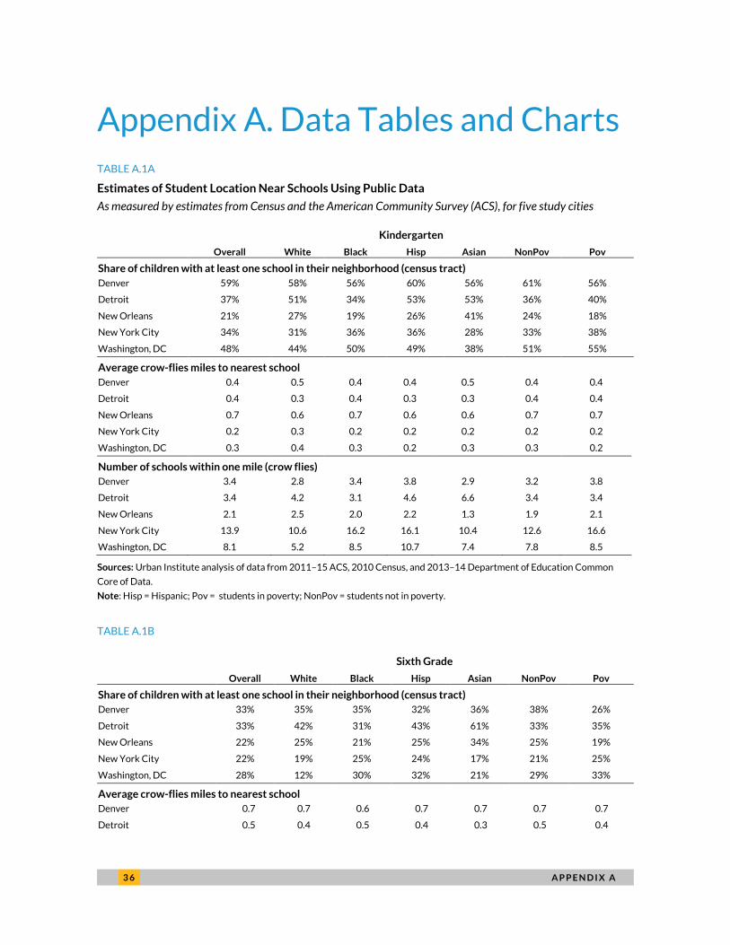
When we look at the share of school-age students who have at least one public school (traditional
or charter) in their home neighborhood (defined as the census tract), we find substantial differences
across cities (figure 4). For example, though nearly 60 percent of elementary-age children in Denver
have at least one public elementary school in their neighborhood, 21 percent of elementary-age
students in New Orleans have a school in their neighborhood. Some of this variation may be because of
differences in the average number of students in each census tract across cities. For example, New
Orleans and Detroit experienced population declines in the past several decades, a trend that may
affect the distribution of students relative to schools.
The likelihood of having a nearby public school generally declines as students grow older, though
the steepness of this decline also varies by city. For example, students in Denver and Washington, DC,
generally see a much steeper decline in the availability of middle schools relative to elementary schools
in their neighborhood (in large part because they are much more likely to have an elementary school in
their neighborhood). In Detroit and New Orleans, the steeper drop-off in neighborhood school
availability is between the middle school and high school years. In New York City, there is a steadier
drop-off in the availability of elementary, middle, and high schools.
These differences across cities could reflect historic school siting policies (e.g., an effort to have
small elementary schools that serve individual neighborhoods or an effort to locate high schools in the
urban center or near transportation hubs), but these differences could also reflect the preferences of
families. For example, families who prefer that their children walk or bike to school may opt to move to
a neighborhood with a local elementary and middle school. Families may also choose to live closer to
schools if the nearby available housing stock is more amenable for families (e.g., multiple bedrooms).

1 0 T H E R O A D T O S C H O O L
FIGURE 4
School-Age Children with at Least One Public School in Their Neighborhood
URBAN INSTITUTE
Sources: Analysis of NCES Common Core of Data from Fall 2014 and ACS tract-level data from 2011–15.
Notes: Analysis is of traditional and charter public schools that were operational during the school year. Schools that offer
kindergarten are classified as elementary, sixth grade as middle, and ninth grade as high school. Schools that offer multiple grades
are included in both of the relevant analyses (e.g., kindergarten and sixth grade are included in both elementary and middle
school). A neighborhood is defined as a census tract.
The cities in our report differ not only in the availability of at least one neighborhood option, but
also in the total number of nearby school options. The average New York City elementary-age child has
13.9 schools within a one-mile radius, and the average New Orleans child has just 2.1 schools within the
same distance. We would expect to see some differences across our cities based on differences in
population density and urban form. However, across all cities, children from families in poverty have, on
average, an equal or greater number of nearby schools compared with children who do not come from
families in poverty (table 1).
There are several possible explanations for the fact that low-income families tend to live near a
greater number of schools than other families. In cities with stronger private school traditions (such as
New Orleans, New York City, or Washington, DC), new public schools may be less likely to be sited near
students who have the means to attend a private option. Students from low-income households may be
more likely to live in areas with a high population density, which might require a higher number of
59%
37%
21%
34%
48%
33% 33%
22% 22%
28%
22%
14%
10%13%
23%
Denver Detroit New Orleans New York City Washington, DC
Elementary school Middle school High school
Share of students with school located in their neighborhood

T H E R O A D T O S C H O O L 1 1
schools to serve students in the areas. Further, school reforms aimed at improving the achievement of
low-income students may have the effect of adding additional choices for these students. For example,
charter schools may locate in areas near low-income students, and new public options may be added
through other reforms, such as the division of previously large traditional schools, or the founding of
new traditional public schools.
TABLE 1
Average Number of Schools within a One-Mile Radius for School-Age Children
Household poverty status Elementary school Middle school High school
Denver Poverty 3.8 2.1 1.9
Nonpoverty 3.2 1.8 1.4
Detroit Poverty 3.4 3.2 1.9
Nonpoverty 3.4 3.0 1.7
New Orleans Poverty 2.1 1.9 1.0 Nonpoverty 1.9 1.9 1.0
New York City Poverty 16.6 13.1 11.2 Nonpoverty 12.6 9.2 8.1
Washington, DC
Poverty 8.5 4.2 3.2 Nonpoverty 7.8 4.3 3.0
Sources: Analysis of NCES Common Core of Data from Fall 2014 and ACS tract-level data from 2011–15.
Notes: Analysis is of traditional and charter public schools that were operational during the school year. Schools that offer
kindergarten are classified as elementary, sixth grade as middle, and ninth grade as high school. Poverty is measured as being
below the poverty threshold for the given family size.
When assessing the number of school choices within one mile by race and ethnicity, the patterns
within cities are less clear (appendix tables A.1a–c). For example, Hispanic and black students in
Denver, New York City, and Washington, DC, consistently have more nearby options than white
students for elementary, middle, and high school. However, in Detroit and New Orleans, variations
among the most common racial and ethnic groups are less pronounced, and, in some cases, white
students appear to live closer to more schools than students of color.

1 2 T H E R O A D T O S C H O O L
Measuring Student Travel Times to School
Though data on straight-line distance to schools are valuable, it is perhaps even more important to
understand how long these journeys would take by different transportation modes, both to students’
actual schools and to other schools their families might choose. Using individual-level data on where
students live and the schools they attend, we calculate estimates of travel time to school, both by car
and public transportation, in our five cities. We estimate travel times for kindergarteners in New
Orleans, New York City, and Washington, DC; for sixth-graders in Denver, Detroit, and Washington DC;
and for ninth-graders in all five cities.
We calculate the travel time for each student to her own school, as well as to all other schools that
serve her grade. We report our results in terms of travel time by car or transit (e.g., bus, subway, ferry),
rather than in distance traveled, both because time matters more than distance for families and to
ensure consistency across cities (e.g., traveling a mile takes longer in some places than others).
We use estimated driving times and travel times by public transit from the Google Distance Matrix
application programming interface (API). To simplify calculations, student addresses were matched to
census blocks, and distance calculations were made from the population-weighted centroid of each
census block.4 Travel times were computed assuming the usual traffic for a departure time that is 30
minutes before the estimated start time for schools in the city. In cases where a school is less than one
half-mile as the crow flies from the student’s residence, the walking time was also calculated, and the
estimated walking time replaced the estimated transit time if it was shorter.
Individual-level data for the study is from the 2013–14 or 2014–15 school years, but the Google
API does not permit the calculation of travel times in the past. This study uses the estimate of driving
and transit time as calculated for Wednesday, September 13, 2017. Although our cities have made small
changes to their transportation system in the intervening three years (for example, Denver opened two
new commuter rail lines, and Washington, DC, implements quarterly adjustments to its Metrobus
routes), we believe that these changes are not substantial enough to bias our estimates. Moreover,
there have not been significant enough changes in the residential patterns of students in these cities
over the last four years to suggest gaps would look different with contemporaneous data.
T H E R O A D T O S C H O O L 1 3
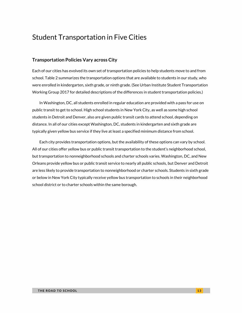
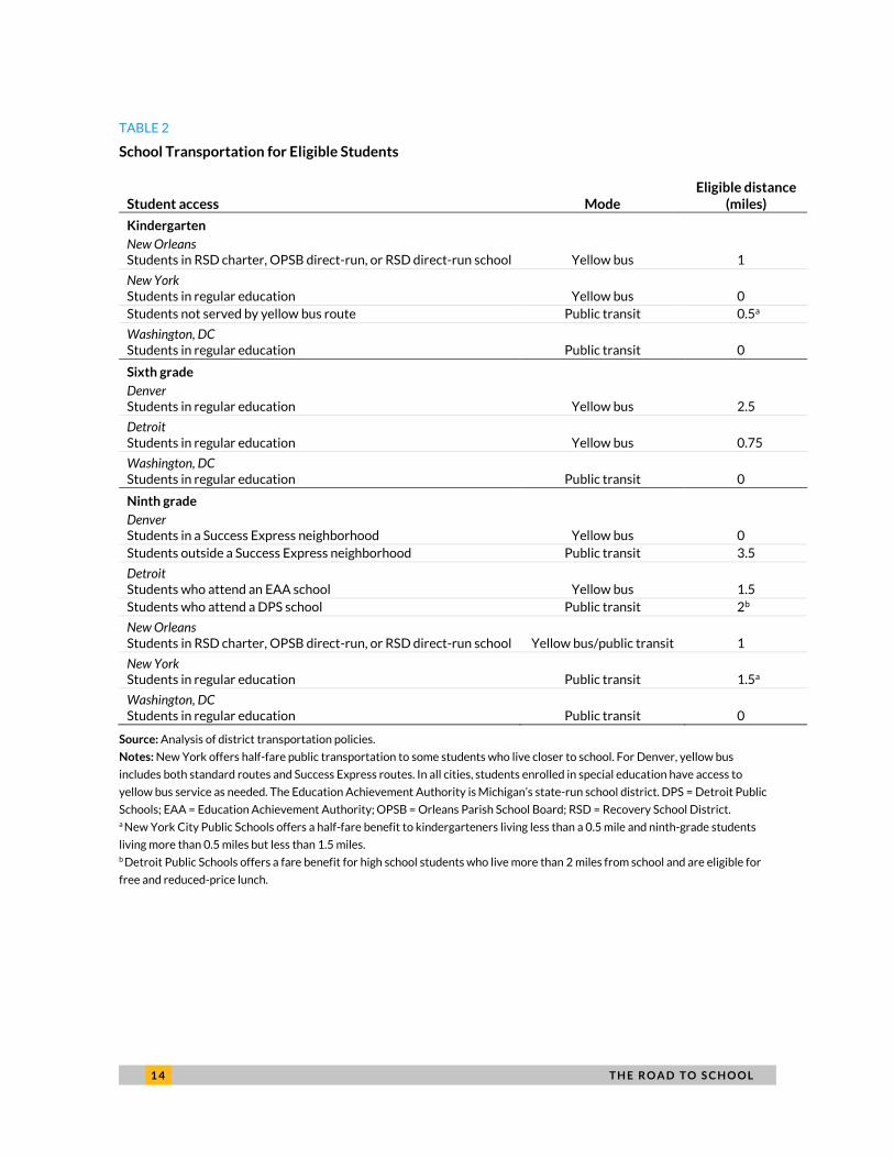
Student Transportation in Five Cities
Transportation Policies Vary across City
Each of our cities has evolved its own set of transportation policies to help students move to and from
school. Table 2 summarizes the transportation options that are available to students in our study, who
were enrolled in kindergarten, sixth grade, or ninth grade. (See Urban Institute Student Transportation
Working Group 2017 for detailed descriptions of the differences in student transportation policies.)
In Washington, DC, all students enrolled in regular education are provided with a pass for use on
public transit to get to school. High school students in New York City, as well as some high school
students in Detroit and Denver, also are given public transit cards to attend school, depending on
distance. In all of our cities except Washington, DC, students in kindergarten and sixth grade are
typically given yellow bus service if they live at least a specified minimum distance from school.
Each city provides transportation options, but the availability of these options can vary by school.
All of our cities offer yellow bus or public transit transportation to the student’s neighborhood school,
but transportation to nonneighborhood schools and charter schools varies. Washington, DC, and New
Orleans provide yellow bus or public transit service to nearly all public schools, but Denver and Detroit
are less likely to provide transportation to nonneighborhood or charter schools. Students in sixth grade
or below in New York City typically receive yellow bus transportation to schools in their neighborhood
school district or to charter schools within the same borough.
1 4 T H E R O A D T O S C H O O L
TABLE 2
School Transportation for Eligible Students
Student access Mode Eligible distance
(miles)
Kindergarten
New Orleans
Students in RSD charter, OPSB direct-run, or RSD direct-run school Yellow bus 1
New York
Students in regular education Yellow bus 0
Students not served by yellow bus route Public transit 0.5a
Washington, DC
Students in regular education Public transit 0
Sixth grade
Denver
Students in regular education Yellow bus 2.5
Detroit
Students in regular education Yellow bus 0.75
Washington, DC
Students in regular education Public transit 0
Ninth grade
Denver
Students in a Success Express neighborhood Yellow bus 0
Students outside a Success Express neighborhood Public transit 3.5
Detroit
Students who attend an EAA school Yellow bus 1.5
Students who attend a DPS school Public transit 2b
New Orleans
Students in RSD charter, OPSB direct-run, or RSD direct-run school Yellow bus/public transit 1
New York
Students in regular education Public transit 1.5a
Washington, DC
Students in regular education Public transit 0
Source: Analysis of district transportation policies.
Notes: New York offers half-fare public transportation to some students who live closer to school. For Denver, yellow bus
includes both standard routes and Success Express routes. In all cities, students enrolled in special education have access to
yellow bus service as needed. The Education Achievement Authority is Michigan’s state-run school district. DPS = Detroit Public
Schools; EAA = Education Achievement Authority; OPSB = Orleans Parish School Board; RSD = Recovery School District. a New York City Public Schools offers a half-fare benefit to kindergarteners living less than a 0.5 mile and ninth-grade students
living more than 0.5 miles but less than 1.5 miles. b Detroit Public Schools offers a fare benefit for high school students who live more than 2 miles from school and are eligible for
free and reduced-price lunch.

T H E R O A D T O S C H O O L 1 5
TABLE 3
Likelihood of Public Student Transportation Assistance by School Attended
Traditional neighborhood
school
Traditional nonneighborhood
school Charter school
Private school
Other districts
Denver All Few Some None None
Detroit All Few Some None Some
New Orleans NAa All Most None None
New York City All Some Most Some None
Washington, DC All All All Most None
Source: Analysis of district transportation policy.
Notes: Transportation for charter schools in Denver and Detroit is provided at discretion of the school, except for charter
students in Denver’s Success Express regions, who are eligible for transportation through that service. Transportation for other
district schools neighboring Detroit is provided at the discretion of the district. This table excludes assistance for students with
special needs. a New Orleans no longer has assigned neighborhood schools.
Relative Efficiency of Public Transit
Of our five study cities, New York City and Washington, DC, rely most heavily on public transportation
to help students travel to school. Using our data on the driving and transportation time from each
student block to each school they are eligible to attend, we can compare the relative efficiency of public
transportation to driving in each city.
Figure 5 shows the average public transit time for all trips that take a given number of minutes
driving. The black dotted line represents a scenario where public transit takes the same amount of time
as driving (in traffic) would. As might be expected, traveling by public transportation takes longer than
the same trip by car. However, both New York City and DC are closer to parity between driving and
public transportation. On average, a 10-minute car ride to a school is equivalent to a roughly 23-minute
public transportation trip in these cities. In Detroit, Denver, and New Orleans, a 10-minute drive is
more likely to take 32 to 34 minutes by public transportation. As drive time increases, average
transportation time grows at a slower rate in New York City and Washington, DC, while transit time
generally increases more linearly in other cities.

1 6 T H E R O A D T O S C H O O L
FIGURE 5
Comparison of Driving Time (in Traffic) and Public Transportation Time from Students’
Homes to Schools
URBAN INSTITUTE
Sources: Analysis of student-level data from Denver Public Schools, the Michigan Department of Education, the Center for
Educational Performance and Information, the Louisiana Recovery School District, the New York City Department of Education,
and the District of Columbia Public Schools, the Washington, DC, Public Charter School Board.
Notes: Figure reflects comparison of average transit time to school at each drive time interval, for every school a student would
be able to attend. The black dotted line indicates a scenario where travel time by public transit time is equal to travel time by car,
in traffic.
These results show that the policies enacted by our five cities are largely in line with the efficiency
of the local transportation system. Cities that can more quickly deliver students to school tend to rely
more on public transportation to transport students. In cities with less-efficient transportation,
students are more likely to be offered yellow bus service. However, high school students in Denver and
Detroit may still rely on public transportation for school, which means that a school that is a 15-minute
car ride away could easily be a 50-minute journey by public transit.
Car Ownership in Low- and High-Poverty Neighborhoods
Access to a car is associated with an increased likelihood of employment among low-income
households, as well as an increased likelihood of moving to neighborhoods with higher levels of school
0
5
10
15
20
25
30
35
0 10 20 30 40 50 60 70 80 90 100
Drive time
Public transit time
DenverDetroitNew OrleansNew York CityWashington DC
T H E R O A D T O S C H O O L 1 7
performance (Gurley and Bruce 2005; Ong 2002; Pendall et al. 2014). When we look at car ownership in
our five cities by census tract, we find that the likelihood of owning a car decreases as the share of
families in poverty increases (figure 6). However, the overall levels of car ownership tend to differ
across our five cities.
Car ownership is more prevalent in cities with less-efficient transportation systems. Even in census
tracts with the highest share of families in poverty, a household is more likely to have access to a car
than not in these cities. In the highest-poverty quartile of census tracts in Denver, for example, just 15
percent of households do not own a car (relative to 4 percent in the lowest-poverty quartile). In New
Orleans, 30 percent of households in the highest-poverty quartile of tracts do not own a car (relative to
6 percent). In the highest-poverty census tracts in Detroit, 28 percent of households do not have a car
(relative to 17 percent).
Cities with more robust transportation systems have comparatively lower car ownership levels.
Fifty-one percent of households in the highest-poverty tracts do not have a car in Washington, DC,
(relative to 21 percent for low-poverty tracts), and 71 percent of high-poverty tracts in New York City
do not have a car (relative to 37 percent in low-poverty tracts).

1 8 T H E R O A D T O S C H O O L
FIGURE 6
Poverty Rate for Families with School-Age Children and Share of Households without a Car by Census Tract
Denver Detroit New Orleans
New York City Washington, DC
URBAN INSTITUTE
Source: Analysis of ACS tract-level data from 2011–15.
Note: Stippled line indicates line of best fit for data.
0%
20%
40%
60%
80%
100%
0% 20% 40% 60% 80% 100%Families in poverty
Share of households without a car
0%
20%
40%
60%
80%
100%
0% 20% 40% 60% 80% 100%
0%
20%
40%
60%
80%
100%
0% 20% 40% 60% 80% 100%
0%
20%
40%
60%
80%
100%
0% 20% 40% 60% 80% 100%
0%
20%
40%
60%
80%
100%
0% 20% 40% 60% 80% 100%

T H E R O A D T O S C H O O L 1 9
Surveys of public school families in four of our five cities show that car travel is the most frequent
mode of transportation (figure 7). Car transportation is highest in Denver (67 percent reporting that
they usually drive their students to school) and Detroit (65 percent), where publicly provided
transportation to a given school tends to be less certain. Car transportation is lower in New Orleans (46
percent), with yellow bus transportation functioning as the second-most common option (40 percent).
In Washington, DC, 43 percent of students drive or are driven to school, and 23 percent take public
transit. Although parent survey data is unavailable for New York City, about 27 percent of adults in the
city commute to work by car (compared with 39 percent in Washington, DC) and 57 percent commute
via public transportation (compared with 38 percent in Washington, DC) (Urban Institute Student
Transportation Working Group 2017).
FIGURE 7
Typical Mode of Transportation to School
For students in four of our five study cities
URBAN INSTITUTE
Source: Center on Reinventing Public Education.
Note: Survey responses include parents of children enrolled in any public traditional or charter school in the city.
Despite city-level differences in school transportation mode, we can compare the share of parents
who report that transporting students to school is difficult across the four surveyed cities (appendix
13%
8% 9%
23%
14%
20%
40%
11%
67%65%
46%43%
1% 0% 0% 1%4%
6%4%
22%
2% 0% 1% 0%
Denver Detroit New Orleans Washington, DC
Walk Yellow bus Car Bike Public transit RefusedShare of students

2 0 T H E R O A D T O S C H O O L
figure A.2). Transportation to school is a concern for roughly a quarter of parents across our cities; at
the low end, 23 percent of public school parents report transportation concerns in Washington, DC,
and, at the high end, 30 percent of parents report concerns in New Orleans.
Assessing Travel Times to School
Grade Level
Travel times to school vary more by grade within a city than they do across cities. Even when students
have access to school choices, younger students tend not to travel as far as older students (figure 8).
Among the three cities for which we measured travel by kindergartners, the estimated median travel
time ranges from 3 to 9 minutes from home (driving with usual traffic). Among sixth-graders, the median
travel ranges from 6 to 9 minutes, and among ninth-graders, the range increases to 10 to 15 minutes
from home.
These typical travel times mask some variation across students, but the variation is not substantial.
For example, 75 percent of New York kindergarteners attend a school that is no more than 5 minutes
away from their home by car (90 percent are less than 20 minutes away). In New Orleans and
Washington, DC, 75 percent of kindergarten students attend school within 15 minutes of home (90
percent are within 18 to 21 minutes). These numbers are only modestly higher for older students in
these cities, with 75 percent of ninth-graders attending school no more than 24 minutes from home
across all five cities (and 90 percent no more than 40 minutes from home).

T H E R O A D T O S C H O O L 2 1
FIGURE 8
Distribution of Estimated Travel Time to School
URBAN INSTITUTE
Sources: Analysis of student-level data from Denver Public Schools, the Michigan Department of Education, the Center for Educational Performance and Information,
the Louisiana Recovery School District, the New York City Department of Education, and the District of Columbia Public Schools, the Washington, DC, Public Charter
School Board.
1
32
32
34 4
5 54
2
5
3
53
57 7
9 97
3
9
68
6
910 10
15
13 13
5
14 14
1210
18
15 15
24
17
21
10
18
24
18
16
29
23
20
36
21
33
New York City New Orleans Washington,DC
Denver Detroit Washington,DC
Denver Detroit New York City New Orleans Washington,DC
Kindergarteners Sixth-graders Ninth-graders
Minutes of drive time, in traffic 10th percentile 25th percentile 50th percentile 75th percentile 90th percentile

2 2 T H E R O A D T O S C H O O L
These data also indicate that cities that make it easier for students to attend schools farther away
do not have a substantially larger share of students traveling great distances. Though New Orleans
mandates yellow bus service for nearly all students who live more than a mile from their school and DC
only provides transit passes, kindergarteners do not travel much farther to school in New Orleans than
in DC. The same is true for ninth-graders in these cities. Of course, there are differences between cities
that may account for differences in travel patterns, but these results suggest that there are other
factors limiting the degree to which students attend school far from home.
Few students live more than 25 minutes by car from their school, but commuting time increases at
least twofold if they travel by public transportation (appendix figure A.2). For kindergarteners, the
median time by walking or public transportation ranges from 7 minutes (New York City) to 28 minutes
(New Orleans). For sixth-graders, the median time is 20 minutes for students in Detroit and
Washington, DC, and 26 minutes in Denver. For high schoolers, the median public transit travel time
ranges from 27 minutes (Washington, DC) to 45 minutes (New Orleans).
The larger differences in travel times by public transit across cities likely reflect the differences in
the efficiency of the transit systems (relative to driving) documented above. We might not expect all
groups of students to have the same travel patterns from home to school. The ability to travel to a
school may depend on the resources families can devote to transportation, the enrollment capacity of
nearby and distant schools, and many other factors. Given these differences, we also examine travel
times by race and ethnicity, income, and school type, to see which students are traveling farthest to
school, on average.
Race and Ethnicity
In four of our five cities, black high school students attend schools that are 2 to 5 minutes farther away
by car, on average, compared with their white peers (figure 9). Hispanic high school students do not
travel as far as black students, and, in Denver and Washington, DC, Hispanic students also have shorter
driving-time commutes than their white counterparts.
The pattern we observe for high school students holds for students in the lower grades as well. In
nearly every grade we observe, black students travel an average of 1 to 5 minutes farther than white
students. This difference is not the influence of a few outlier students. Black students at the 25th,
median, and 75th percentiles all travel farther relative to their white counterparts at the same
percentiles.

T H E R O A D T O S C H O O L 2 3
FIGURE 9
Average Driving Time to School for Ninth-Graders by Race and Ethnicity
URBAN INSTITUTE
Sources: Analysis of student-level data from Denver Public Schools, the Michigan Department of Education, the Center for
Educational Performance and Information, the Louisiana Recovery School District, the New York City Department of Education,
and the District of Columbia Public Schools, the Washington, DC, Public Charter School Board.
Notes: New Orleans data come from an imputation of race and ethnicity based on student’s home location. See appendix C for
more details.
Income
When we look at travel time by family income (as measured by receipt of a free or reduced-price lunch),
we find that students from low-income families typically do not travel farther than their comparatively
advantaged peers. In fact, in nearly every city-grade pair, low-income students face relatively lower
travel times (figure 10). Differences by family income between the two groups are generally not as large
as the difference between black and white students, but they exist across all five of our cities.
12
8
16 16
14
17
12
13
20
16
11
8
17
11
Denver Detroit New Orleans New York City Washington, DC
White Black HispanicMinutes to school, in traffic

2 4 T H E R O A D T O S C H O O L
FIGURE 10
Average Driving Time to School by Income Status
URBAN INSTITUTE
Sources: Analysis of student-level data from Denver Public Schools, the Michigan Department of Education, the Center for
Educational Performance and Information, the Louisiana Recovery School District, the New York City Department of Education,
and the District of Columbia Public Schools, the Washington, DC, Public Charter School Board.
Notes: Low-income status is defined differently for different cities based on available data; consult the appendix C for further
information. New Orleans data come from an imputation of low-income status based on student’s home location.
Because black students in these five cities also tend to be students identified as low-income, these
results may seem surprising. However, these results reflect the high proportion of students who are
classified as low-income in our data (ranging from 75 percent in Denver to 92 percent in New Orleans).
Among the minority of students who are not low income, we often observe a reversed pattern by race:
black students who are not low income tend to attend distant schools, and white students who are not
low income tend to attend schools that are closer. Data from Washington, DC, tabulated by both race
and income illustrates this pattern (table 4).
10
13
9
1212
16
5
19
8
14
20
9
12
7
11
10
12
5
18
10
13
15
6 9 6 9 K 9 K 9 K 6 9
Denver Detroit New Orleans New York City Washington, DC
Not low income Low incomeMinutes to school, in traffic

T H E R O A D T O S C H O O L 2 5
TABLE 4
Average Travel Times for Black and White Sixth-Grade Students in Washington, DC
Not low income Low income All
Black 20.8 mins 12.6 mins
13.2 mins n = 251 n = 3,354
White 9.6 mins 12.5 mins
11.2 mins n = 306 n = 350
All 14.5 mins 12.6 mins
Sources: Analysis of student-level data from the District of Columbia Public Schools, the Washington, DC, Public Charter School
Board.
School Type
It is possible that charter school students will travel farther to school than their counterparts in
traditional public schools because charters typically admit students without regard to where they live.
Additionally, parents may be willing to tolerate a longer commute in exchange for perceived higher
academic quality or a diverse student body (Glazerman and Dotter 2017). Demand for charter schools,
as measured by student waitlists, is also high in our study cities, particularly in New York City and
Washington, DC, so capacity constraints at nearby charter schools could push students to more-distant
charter options.
But this may not be true universally. Charter schools are often located in neighborhoods with a
large share of students of color and in neighborhoods where traditional public options may be perceived
as less desirable by parents (Burdick-Will, Keels, and Schuble 2013; Glomm, Harris, and Lo 2005; Jacobs
2013). Given parental preferences for schools that are nearby (Glazerman and Dotter 2017), we might
expect charter schools to draw students from roughly similar distances as traditional public schools.
Additionally, traditional public schools may also draw students from outside their attendance zones
under intradistrict choice policies.
When we look at travel times by type of school attended, we see diverging patterns by grade level
and city. The younger students attending charter schools (those in kindergarten) tend to travel
significantly farther from home, compared with their peers in traditional public schools. Students who
attend charter school in New York City travel nearly twice as far by car than students who attend
traditional public school (10 versus 4 minutes), and the difference in Washington, DC, is also substantial
(13 versus 8 minutes). The difference in New Orleans, where there are very few traditional public
schools (and no neighborhood-zoned schools), is smaller.

2 6 T H E R O A D T O S C H O O L
A similar pattern holds for sixth-graders in two of the three cities for which data are available
(Detroit and DC, with Denver as the exception). But among ninth-graders, the pattern is reversed: those
attending traditional public schools tend to travel as far or farther than those in charter schools (figure
11). The difference is largest in Denver; in the other cities, average travel times are roughly similar
between sectors.
In sum, younger students in Detroit, New York City, and Washington, DC, travel farther, on
average, to charter schools than traditional public schools, and students in Denver tend to travel farther
to traditional public schools. The differences across grade levels may stem, in part, from the great ability
and willingness of older students to travel further to school (regardless of sector) and that high schools
are often seen as citywide resources that offer specialized programs or vocational training.
FIGURE 11
Average Driving Time to School by School Type
URBAN INSTITUTE
Sources: Analysis of student-level data from Denver Public Schools, the Michigan Department of Education, the Center for
Educational Performance and Information, the Louisiana Recovery School District, the New York City Department of Education,
and the District of Columbia Public Schools, the Washington, DC, Public Charter School Board.
10
13
6
11 11
4
18
8
12
16
9 9 9
1110 10
17
13
1515
6 9 6 9 K K 9 K 6 9
Denver Detroit NewOrleans
New York City Washington, DC
Traditional public school Charter schoolMinutes to school, in traffic

T H E R O A D T O S C H O O L 2 7
Student Travel Patterns
In every city, black students travel farther to school than white or Hispanic students. However, the
small proportion of students who are not low income tend to travel slightly farther than their more
numerous low-income peers. These differences may be indicative of differences in both preferences
and residential location relative to desired schools. We might expect that charter school students travel
farther than those who attend traditional public schools, but this is not always the case. This may reflect
school siting decisions by charter schools and may also reflect increased student enrollment in
nonneighborhood district schools.
When we look at maps of student travel in our five cities (appendix B and interactive maps available
at www.urban.org/research/publication/road-school), we find that transportation times tend to be
unevenly distributed across student populations in neighborhoods across each city. In general, students
who are nearer to the edges of our school districts tend to have longer average travel times to school.
Students in areas that are separated by natural barriers (such as rivers or public parks) tend to travel
farther. Students in the Algiers and New Orleans East neighborhoods in New Orleans are isolated from
the main part of the city by the Mississippi River and navigation canals. Students in Wards 7 and 8 in
Washington, DC, have to travel across the Anacostia River to get to schools in the central downtown
area. In addition, political boundaries, such as district boundaries, can also play a role. For example,
students in the Far Northeast neighborhood of Denver are isolated from the rest of the district because
of the way district boundaries are drawn.
Some Students Are Farther from High-Quality Schools
Defining High-Quality High Schools
In all of our cities, the students who travel the farthest to school are those who travel to high schools.
Average travel time ranges from 11 minutes of driving in traffic in Detroit to 18 minutes in New York
City. This higher travel time may be a function of high schools having larger enrollments (and therefore
fewer locations) as well as the fact that some high schools are designed for specific student interests
(such as performance arts or vocational education).
Because of the longer distances that these students must travel, we examined how far ninth-grade
students must travel to get to a “high quality” school in each of our five cities. The definition of “high
quality” may vary by family and by individual student needs. We thus use several measures of high

2 8 T H E R O A D T O S C H O O L
school resources5 and student outcomes. The first measure assesses how far a student would have to
travel to get to a school that has a high (i.e., is in the top quartile) proportion of veteran teachers
(teachers who have more than two years of experience). The second measure estimates how far an
average student would have to travel to access a city school that offers calculus, an important course
for postgraduate success in STEM fields (Tyson et al. 2007). The final measure assesses how far a
student would have to travel to reach a school with a high (top quartile) graduation rate.
This analysis is only done for students who have already opted into the public school system (e.g.,
are not enrolled in private school). Further, these numbers do not account for capacity constraints at
schools or other barriers, such as a high school application process or lottery-based enrollment that
would keep a student from enrolling in their nearest “quality” school.
Distance to High-Quality High Schools
The data show that average distance to our variously defined high-quality high schools differs
substantially across cities and across student demographics (figure 12). For example, in Washington,
DC, black ninth-grade students would have to travel an average of 4 minutes farther by car than white
or Hispanic student to access a school in the top quartile of veteran teachers. In other cities, such as
Denver and Detroit, it is white students who live slightly farther, in terms of driving distance in traffic,
from high-quality schools than students of color.
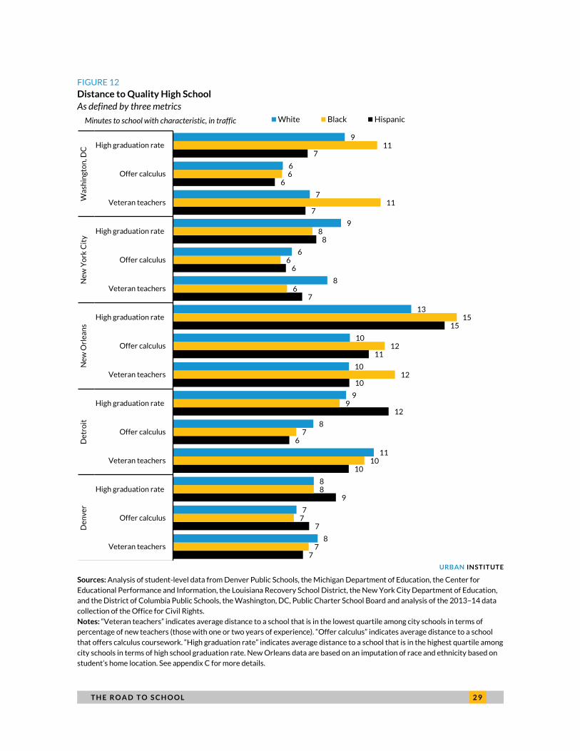
T H E R O A D T O S C H O O L 2 9
FIGURE 12
Distance to Quality High School
As defined by three metrics
URBAN INSTITUTE
Sources: Analysis of student-level data from Denver Public Schools, the Michigan Department of Education, the Center for
Educational Performance and Information, the Louisiana Recovery School District, the New York City Department of Education,
and the District of Columbia Public Schools, the Washington, DC, Public Charter School Board and analysis of the 2013–14 data
collection of the Office for Civil Rights.
Notes: “Veteran teachers” indicates average distance to a school that is in the lowest quartile among city schools in terms of
percentage of new teachers (those with one or two years of experience). “Offer calculus” indicates average distance to a school
that offers calculus coursework. “High graduation rate” indicates average distance to a school that is in the highest quartile among
city schools in terms of high school graduation rate. New Orleans data are based on an imputation of race and ethnicity based on
student’s home location. See appendix C for more details.
7
7
9
10
6
12
10
11
15
7
6
8
7
6
7
7
7
8
10
7
9
12
12
15
6
6
8
11
6
11
8
7
8
11
8
9
10
10
13
8
6
9
7
6
9
Veteran teachers
Offer calculus
High graduation rate
Veteran teachers
Offer calculus
High graduation rate
Veteran teachers
Offer calculus
High graduation rate
Veteran teachers
Offer calculus
High graduation rate
Veteran teachers
Offer calculus
High graduation rate
De
nv
er
De
tro
itN
ew
Orl
ea
ns
Ne
w Y
ork
Cit
yW
ash
ing
ton
, DC
White Black HispanicMinutes to school with characteristic, in traffic
3 0 T H E R O A D T O S C H O O L
Our estimates indicate that most ninth-grade students are, on average, about a 10-minute drive
from their nearest high-quality school along these measures. Although black students tend to travel
farther to school than white students in every city in our analysis, we do not see a similar universal
pattern when looking at distance to a high-quality school.
When we count the average number of options available to ninth-grade students within a 10-
minute drive, we see large variations by city and some variations by race (appendix table A.4). For
example, students in New Orleans have an average of 4 high schools within 10 minutes’ drive, students
in Washington, DC, and Denver have an average of 6, and those in Detroit and New York City have an
average of 12. Black and Hispanic high school students tend to have more nearby school choices, on
average, than their white counterparts. For example, black and Hispanic students in Washington, DC,
have an average of 8 high schools within 10 minutes’ drive in traffic (compared with 5 for white
students). In New York City, black students have an average of 14 choices and Hispanic students have
an average of 13, relative to 6 for white students.
Geographic and Choice Contexts Matter
Choosing to Drive or Take Transit
How far students travel to school reflects both the options that are available to a family and the choices
the families make. Most students in our study live less than 15 minutes from their school if they were to
drive. We showed, however, that households in neighborhoods with a higher proportion of families in
poverty were less likely to own cars.
When we look at access to schools within a 15-minute radius, we find that a 15-minute drive
garners far more choice than a 15-minute transit ride. In nearly every grade, students have access to 10
or more schools when traveling by car for 15 minutes or less, but typically have access to fewer than 10
schools when traveling for the same amount of time on public transit (figure 13). For example, the
average kindergartener in Washington, DC, lives within a 15-minute drive of 31 elementary schools but
can only get to 7 schools in that time on public transit.

T H E R O A D T O S C H O O L 3 1
FIGURE 13
Number of Schools Available, by Mode of Travel
URBAN INSTITUTE
Sources: Analysis of student-level data from Denver Public Schools, the Michigan Department of Education, the Center for
Educational Performance and Information, the Louisiana Recovery School District, the New York City Department of Education,
and the District of Columbia Public Schools, the Washington, DC, Public Charter School Board
These differences in school choice by mode could have implications for equity. If students do not
have access to yellow bus service or a family member who can drive them to school, their school choices
could be much more restricted. Although students from low-income families tend to have more schools
located near their homes, it is unlikely that proximity of schools could completely close the gap in choice
for students who do not have reliable access to a car.
Students Often Bypass Their Nearest School
Another way to assess student travel to school is to look at whether students are attending their
nearest school (as measured by driving time) or whether they are traveling to more-distant schools. In
figure 14, we show the share of students who attend their nearest school, who “pass” by one other
option, two other options, and so on.
17
13
48
35
24
9
47
30 31
18
11
1 12 2 2
1
11
7 7
42
6 9 6 9 K 9 K 9 K 6 9
Denver Detroit New Orleans New York City Washington, DC
Driving with traffic Public transitNumber of schools within 15 minutes

3 2 T H E R O A D T O S C H O O L
FIGURE 14
Share of Students Attending Nearest School
As measured by driving time in traffic
URBAN INSTITUTE
Sources: Analysis of student-level data from Denver Public Schools, the Michigan Department of Education, the Center for
Educational Performance and Information, the Louisiana Recovery School District, the New York City Department of Education,
and the District of Columbia Public Schools, and the Washington, DC, Public Charter School Board.
The results of this analysis show large differences in the likelihood of attending a nearby school by
city and grade. Forty-three percent of kindergarteners in New York City attend their nearest
elementary school, but just 17 percent of those in New Orleans and 26 percent of those in Washington,
DC, do.
13%
21%
26%
9%
43%
13%
17%
11%
25%
19%
17%
22%
21%
21%
13%
30%
23%
22%
18%
25%
27%
27%
14%
10%
7%
8%
7%
15%
13%
11%
11%
16%
18%
9%
6%
5%
5%
4%
14%
7%
8%
6%
10%
9%
43%
43%
41%
65%
16%
34%
40%
52%
32%
28%
30%
0% 10% 20% 30% 40% 50% 60% 70% 80% 90% 100%
9
6
K
9
K
9
K
9
6
9
6
Wa
shin
gto
n, D
CN
ew
Yo
rk C
ity
Ne
w O
rle
an
sD
etr
oit
De
nv
er
Closest school 2nd–4th closest 5th–7th closest 8th–10th closest Farther than nearest 10
Percentage of students attending
T H E R O A D T O S C H O O L 3 3
In high school, this pattern is reversed; just 35 percent of students in New York City attend one of
their 10-nearest school options. A much larger share of high school students in our other cities (from 48
percent in Detroit to 72 percent in Denver) attend one of their 10-nearest schools. Very few high school
students attend their nearest high school in any city. Denver has the highest proportion of students
attending their nearest school (19 percent), and New York City has the lowest proportion (9 percent).
Though the number of school options within a 15-minute public transit ride is low across our cities,
the majority of students in our cities, particularly high school students, attend a school that is not their
closest school. In many cases, students travel farther than their 10-nearest school options.
Given that household car ownership is correlated with family poverty in our cities, we also looked at
the number of options that are close to students from low-income backgrounds. Similar to our
estimates from census data, we find that students from low-income families tend to have the same
number, or slightly more, nearby options than students from nonpoor backgrounds. However, we do
not see a distinct pattern in selection of nearby schools by income status across our cities (appendix
tables A.2–A.4).
Limitations
Our analysis is subject to some limitations. First, we only examine one year of data for typical entry
grades in elementary, middle, and high school. As a result, our analysis may miss changing patterns that
could result from students switching schools over the course of a year or as they continue into other
grades. For example, students may initially attend a school of choice and then return to their
neighborhood school. Further, our data only capture students who are attending public schools in the
city. Students who attend private schools, or schools outside the city’s district boundaries, are excluded
from the data, so our report does not reflect the travel patterns of or options available to these
students.
Second, we do not directly observe the mode of transportation students select. We know roughly
how long it would take them to travel to school by car or public transit, but we do not know the mode
they use in practice. For cities that offer school buses, we do not know how long these trips take
because of the intermediate stops made between the student’s home and school.
Third, we must also consider that students are subject to some level of travel time uncertainty
because of heavy traffic, weather, or other factors. If a route is unreliable, our travel time estimates

3 4 T H E R O A D T O S C H O O L
serve as a lower bound. Because students are expected to arrive at school on time (e.g., the first bell of
homeroom), families may also shift toward earlier departures to decrease the probability of arriving late
(Noland and Small 1995).
These limitations mean that our analysis is not a precise description of how long it takes students to
get to school in each city, but a broad overview of where students attend school relative to where they
live and how long it would take them to travel via different modes.
Conclusions
This study is the first to focus on the issue of transportation from home to school across multiple cities
offering substantial school choice. Our analysis identifies similarities in student travel patterns across
all five cities, even as their underlying school choice structures, transportation systems, and student
population densities differ. This descriptive analysis opens several avenues for future research.
Although we find that student travel times are relatively reasonable on average (lower than 20
minutes driving time in traffic), some students travel long distances to attend public school in their city.
It is critical to understand why students travel this far, and if they are selecting schools that provide
academic advantages or services above what they could access closer to home. It is unclear how long
commutes could potentially affect student outcomes in a given city with school choice. Travel to a high-
quality option could yield substantial benefits for the student, but the student could also be at risk for
increased lateness or absences because of her commute. If a student feels disconnected from her school
community because of distance (e.g., unable to attend after-school activities), she could suffer
academically and nonacademically.
An additional subject for further investigation is the set of transportation modes that students are
using to get to and from school. Because of data limitations, we do not know whether the students in
our sample actually use the transportation options available to them or whether they rely on other
methods, such as walking, biking, or being driven by a parent. Understanding how students use different
modes to get to school (and how often they rely on a secondary transportation mode, such as using a
taxi or ride-share service with their parents if they miss their bus) would illuminate issues of safety and
reliability in student transportation. In particular, the issue of transportation mode may be important
for students who live relatively close to school, and who may therefore benefit from having a safe
walking or bicycling route to school.

T H E R O A D T O S C H O O L 3 5
Finally, this report reveals some of the hidden trade-offs inherent in embracing school choice in a
city. Just as there are inequalities and differences in students’ academic performance across these
cities, we see parallel inequalities and differences in the distances that students travel and in the
availability of nearby school options. Experiments in targeted policy interventions, such as
implementing transportation vouchers for low-income parents of very young students, using yellow
buses on circulating routes (similar to Denver’s Success Express), or changing the way that school siting
decisions are made, might yield pragmatic solutions that further level the playing field for a city’s most
disadvantaged students.
3 6 A P P E N D I X A
Appendix A. Data Tables and Charts TABLE A.1A
Estimates of Student Location Near Schools Using Public Data
As measured by estimates from Census and the American Community Survey (ACS), for five study cities
Kindergarten
Overall White Black Hisp Asian NonPov Pov
Share of children with at least one school in their neighborhood (census tract)
Denver 59% 58% 56% 60% 56% 61% 56%
Detroit 37% 51% 34% 53% 53% 36% 40%
New Orleans 21% 27% 19% 26% 41% 24% 18%
New York City 34% 31% 36% 36% 28% 33% 38%
Washington, DC 48% 44% 50% 49% 38% 51% 55%
Average crow-flies miles to nearest school
Denver 0.4 0.5 0.4 0.4 0.5 0.4 0.4
Detroit 0.4 0.3 0.4 0.3 0.3 0.4 0.4
New Orleans 0.7 0.6 0.7 0.6 0.6 0.7 0.7
New York City 0.2 0.3 0.2 0.2 0.2 0.2 0.2
Washington, DC 0.3 0.4 0.3 0.2 0.3 0.3 0.2
Number of schools within one mile (crow flies)
Denver 3.4 2.8 3.4 3.8 2.9 3.2 3.8
Detroit 3.4 4.2 3.1 4.6 6.6 3.4 3.4
New Orleans 2.1 2.5 2.0 2.2 1.3 1.9 2.1
New York City 13.9 10.6 16.2 16.1 10.4 12.6 16.6
Washington, DC 8.1 5.2 8.5 10.7 7.4 7.8 8.5
Sources: Urban Institute analysis of data from 2011–15 ACS, 2010 Census, and 2013–14 Department of Education Common
Core of Data.
Note: Hisp = Hispanic; Pov = students in poverty; NonPov = students not in poverty.
TABLE A.1B
Sixth Grade
Overall White Black Hisp Asian NonPov Pov
Share of children with at least one school in their neighborhood (census tract)
Denver 33% 35% 35% 32% 36% 38% 26%
Detroit 33% 42% 31% 43% 61% 33% 35%
New Orleans 22% 25% 21% 25% 34% 25% 19%
New York City 22% 19% 25% 24% 17% 21% 25%
Washington, DC 28% 12% 30% 32% 21% 29% 33%
Average crow-flies miles to nearest school
Denver 0.7 0.7 0.6 0.7 0.7 0.7 0.7
Detroit 0.5 0.4 0.5 0.4 0.3 0.5 0.4

A P P E N D I X A 3 7
Sixth Grade
Overall White Black Hisp Asian NonPov Pov
New Orleans 0.6 0.7 0.6 0.6 0.6 0.6 0.6
New York City 0.3 0.4 0.3 0.3 0.4 0.4 0.3
Washington, DC 0.5 0.9 0.4 0.4 0.6 0.5 0.4
Number of schools within one mile (crow flies)
Denver 1.9 1.5 2.1 2.0 1.9 1.8 2.1
Detroit 3.0 3.5 2.9 3.6 7.1 3.0 3.2
New Orleans 1.9 2.1 1.9 2.1 1.2 1.9 1.9
New York City 10.4 6.4 13.2 12.7 6.1 9.2 13.1
Washington, DC 4.4 1.9 4.7 6.5 3.7 4.3 4.2
Sources: Urban Institute analysis of data from 2011–15 ACS, 2010 Census, and 2013–14 Department of Education Common
Core of Data.
Note: Hisp = Hispanic; Pov = students in poverty; NonPov = students not in poverty.
TABLE A.1C
Ninth Grade
Overall White Black Hisp Asian NonPov Pov
Share of children with at least one school in their neighborhood (census tract)
Denver 22% 16% 26% 24% 22% 23% 23%
Detroit 14% 23% 13% 29% 4% 15% 15%
New Orleans 10% 12% 9% 10% 16% 11% 10%
New York City 13% 9% 16% 15% 10% 13% 14%
Washington, DC 23% 10% 25% 21% 16% 20% 24%
Average crow-flies miles to nearest school
Denver 0.9 1.1 0.8 0.9 1.0 1.0 0.9
Detroit 0.8 0.6 0.8 0.5 0.5 0.7 0.7
New Orleans 1.0 1.1 0.9 1.0 0.8 1.0 0.9
New York City 0.5 0.6 0.4 0.4 0.5 0.5 0.4
Washington, DC 0.6 1.0 0.5 0.5 0.7 0.6 0.5
Number of schools within one mile (crow flies)
Denver 1.6 1.0 1.8 1.8 1.4 1.4 1.9
Detroit 1.7 2.1 1.5 3.0 2.6 1.7 1.9
New Orleans 1.0 1.2 1.0 1.1 0.8 1.0 1.0
New York City 9.0 5.2 10.8 11.2 5.6 8.1 11.2
Washington, DC 3.2 1.2 3.3 5.0 3.0 3.0 3.2
Sources: Urban Institute analysis of data from 2011–15 ACS, 2010 Census, and 2013–14 Department of Education Common
Core of Data.
Note: Hisp = Hispanic; Pov = students in poverty; NonPov = students not in poverty.
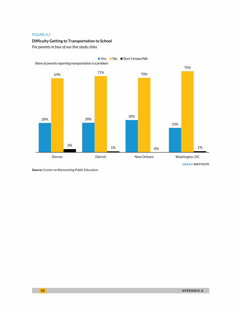
3 8 A P P E N D I X A
FIGURE A.1
Difficulty Getting to Transportation to School
For parents in four of our five study cities
URBAN INSTITUTE
Source: Center on Reinventing Public Education.
28% 28%30%
23%
69%71%
70%
76%
3%1% 0% 1%
Denver Detroit New Orleans Washington, DC
Yes No Don't know/NA
Share of parents reporting transportation is a problem

A P P E N D I X A 3 9
FIGURE A.2
Distribution of Estimated Travel Time to School
URBAN INSTITUTE
Sources: Analysis of student-level data from Denver Public Schools, the Michigan Department of Education, the Center for Educational Performance and Information, the Louisiana
Recovery School District, the New York City Department of Education, and the District of Columbia Public Schools, and the Washington, DC, Public Charter School Board.
3
85
1113
7
1315
11
16
10
4
15
8
17
12
19 2018
28
15
7
28
14
26
20 20
3032
29
45
27
12
48
30
38
3337
4348
42
64
45
21
68
5052 54 55
6260
55
82
58
New York City New Orleans Washington,DC
Denver Detroit Washington,DC
Denver Detroit New York City New Orleans Washington,DC
Kindergarteners Sixth-graders Ninth-graders
Minutes of public transit time 10th percentile 25th percentile 50th percentile 75th percentile 90th percentile

4 0 A P P E N D I X A
TABLE A.2
Descriptive Data for Kindergarteners
For three of our five study cities
Overall White Black Hisp Asian NonLow LowInc TPS Charter
Sample size
New Orleans 2,592 161 2409 † † 139 1538 103 2489
New York City 70,708 11,811 17,446 28,501 11,276 19,359 51,349 62,653 8,055
Washington, DC 7,478 1,548 5,194 363 121 1,069 6,409 4,750 2,728
Average driving duration (minutes, in traffic)
New Orleans 9.9 8.9 9.9 † † 11.2 9.1 9.0 9.4
New York City 5.0 4.7 5.9 4.5 4.2 5.3 4.7 4.2 10.0
Washington, DC 10.1 6.7 11.1 11.2 7.1 7.9 10.4 8.1 13.4
Share of students attending nearest school
New Orleans 17% 22% 17% † † 11% 16% 19% 17%
New York City 43% 52% 33% 42% 54% 46% 42% 48% 7%
Washington, DC 26% 43% 21% 6% 45% 54% 21% 36% 8%
Average number of schools within 10 minutes of driving in traffic
New Orleans 9 10 9 † † 8 10 10 9
New York City 11 13 25 22 15 16 22
Washington, DC 11 17 19 24 14 13 20 18 20
Sources: Analysis of student-level data from Denver Public Schools, the Michigan Department of Education, the Center for
Educational Performance and Information, the Louisiana Recovery School District, the New York City Department of Education,
and the District of Columbia Public Schools, and the Washington, DC, Public Charter School Board.
Notes: Hisp=Hispanic; LowInc = students from low-income families; NonLow = students not from low-income families. Low-
income status is defined differently for different cities based on available data. New Orleans data come from an imputation of
race and ethnicity based on student’s home location. See appendix C for more details.
† = Sample does not meet reporting standards.
TABLE A.3
Descriptive Data for Sixth-Grade Students
For three of our five study cities
Overall White Black Hisp Asian NonLow LowInc TPS Charter
Sample size
Denver 4,462 1,001 577 2,564 † 1,161 3,301 2,616 1,846
Detroit 7,252 237 6,111 763 84 812 6,440 4,360 2,892
Washington, DC 4,658 641 3,506 309 80 619 4,039 2,830 1,828
Average driving duration (minutes, in traffic)
Denver 9 10.1 10.8 8.7 † 10 9.1 9.8 8.6
Detroit 7 5 7.6 6.9 6 8.7 7.3 6.4 9.0
Washington, DC 13 11.2 13.2 10.3 11.6 14.1 12.5 11.5 14.6
Share of students attending nearest school
Denver 17% 16% 12% 18% † 17% 17% 20% 13%
Detroit 25% 43% 25% 16% 57% 20% 26% 29% 19%
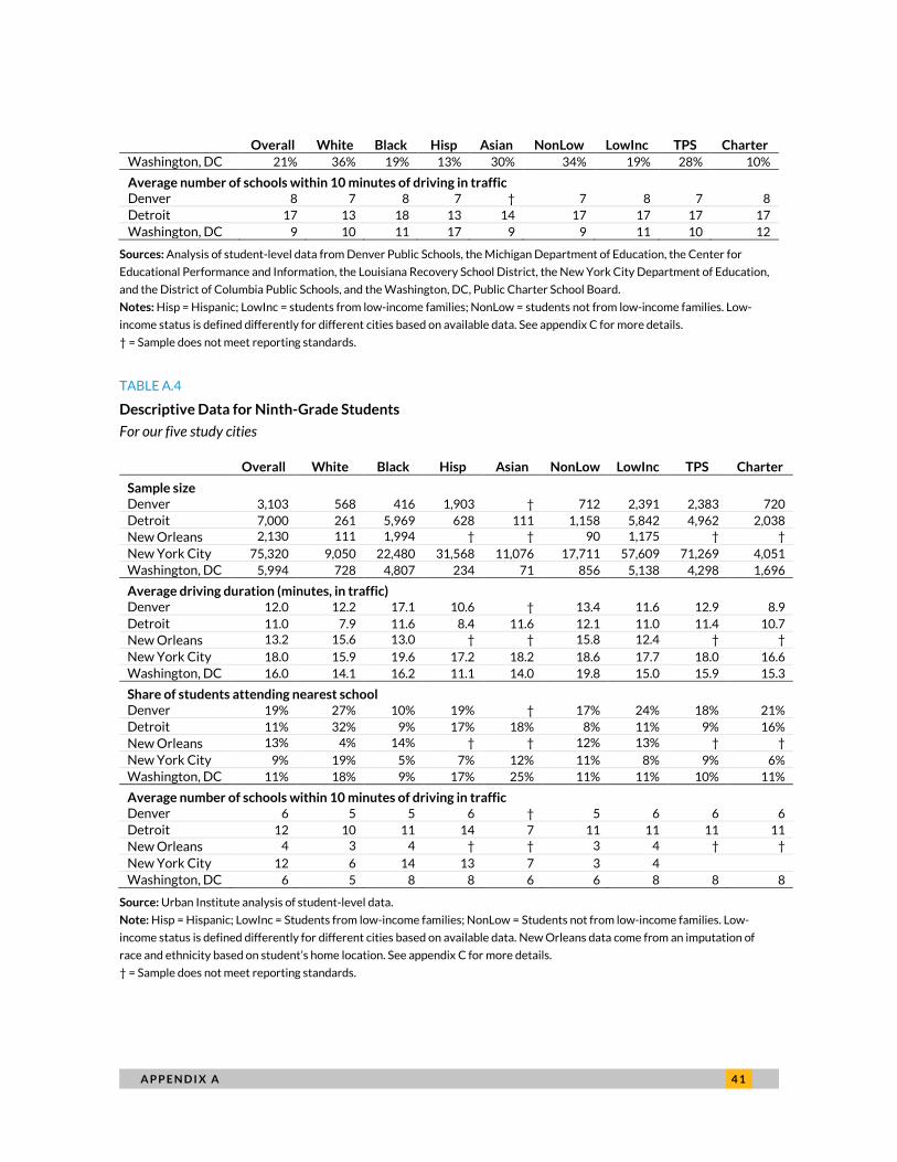
A P P E N D I X A 4 1
Overall White Black Hisp Asian NonLow LowInc TPS Charter
Washington, DC 21% 36% 19% 13% 30% 34% 19% 28% 10%
Average number of schools within 10 minutes of driving in traffic
Denver 8 7 8 7 † 7 8 7 8
Detroit 17 13 18 13 14 17 17 17 17
Washington, DC 9 10 11 17 9 9 11 10 12
Sources: Analysis of student-level data from Denver Public Schools, the Michigan Department of Education, the Center for
Educational Performance and Information, the Louisiana Recovery School District, the New York City Department of Education,
and the District of Columbia Public Schools, and the Washington, DC, Public Charter School Board.
Notes: Hisp = Hispanic; LowInc = students from low-income families; NonLow = students not from low-income families. Low-
income status is defined differently for different cities based on available data. See appendix C for more details.
† = Sample does not meet reporting standards.
TABLE A.4
Descriptive Data for Ninth-Grade Students
For our five study cities
Overall White Black Hisp Asian NonLow LowInc TPS Charter
Sample size
Denver 3,103 568 416 1,903 † 712 2,391 2,383 720
Detroit 7,000 261 5,969 628 111 1,158 5,842 4,962 2,038
New Orleans 2,130 111 1,994 † † 90 1,175 † †
New York City 75,320 9,050 22,480 31,568 11,076 17,711 57,609 71,269 4,051
Washington, DC 5,994 728 4,807 234 71 856 5,138 4,298 1,696
Average driving duration (minutes, in traffic)
Denver 12.0 12.2 17.1 10.6 † 13.4 11.6 12.9 8.9
Detroit 11.0 7.9 11.6 8.4 11.6 12.1 11.0 11.4 10.7
New Orleans 13.2 15.6 13.0 † † 15.8 12.4 † †
New York City 18.0 15.9 19.6 17.2 18.2 18.6 17.7 18.0 16.6
Washington, DC 16.0 14.1 16.2 11.1 14.0 19.8 15.0 15.9 15.3
Share of students attending nearest school
Denver 19% 27% 10% 19% † 17% 24% 18% 21%
Detroit 11% 32% 9% 17% 18% 8% 11% 9% 16%
New Orleans 13% 4% 14% † † 12% 13% † †
New York City 9% 19% 5% 7% 12% 11% 8% 9% 6%
Washington, DC 11% 18% 9% 17% 25% 11% 11% 10% 11%
Average number of schools within 10 minutes of driving in traffic
Denver 6 5 5 6 † 5 6 6 6
Detroit 12 10 11 14 7 11 11 11 11
New Orleans 4 3 4 † † 3 4 † †
New York City 12 6 14 13 7 3 4
Washington, DC 6 5 8 8 6 6 8 8 8
Source: Urban Institute analysis of student-level data.
Note: Hisp = Hispanic; LowInc = Students from low-income families; NonLow = Students not from low-income families. Low-
income status is defined differently for different cities based on available data. New Orleans data come from an imputation of
race and ethnicity based on student’s home location. See appendix C for more details.
† = Sample does not meet reporting standards.

4 2 A P P E N D I X B
Appendix B. City Maps FIGURE B.1
Denver’s Average Driving Times for Ninth-Grade Students
FIGURE B.2
Detroit’s Average Driving Times for Ninth-Grade Students

A P P E N D I X B 4 3
FIGURE B.3
New Orleans’s Average Driving Times for Ninth-Grade Students
FIGURE B.4
New York City’s Average Driving Times for Ninth-Grade Students
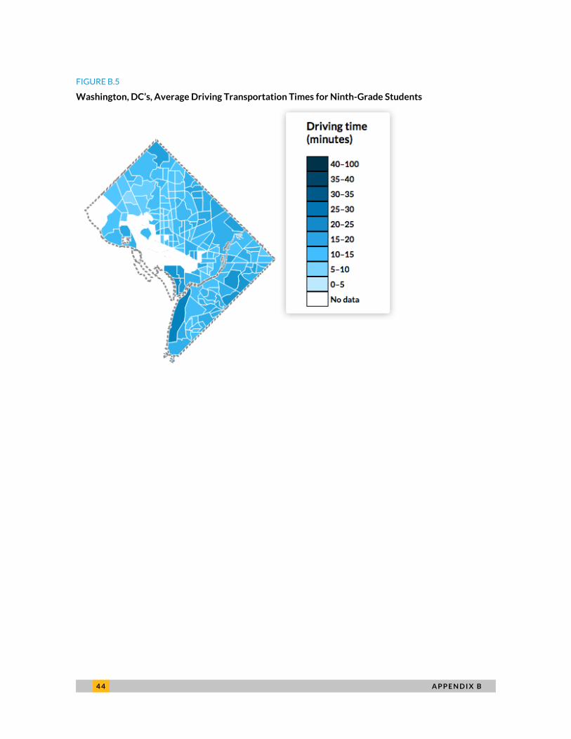
4 4 A P P E N D I X B
FIGURE B.5
Washington, DC’s, Average Driving Transportation Times for Ninth-Grade Students
A P P E N D I X C 4 5
Appendix C. City Methodologies
Denver
We link administrative data from Denver Public Schools (DPS) with information about the region’s
public transit system. The data from DPS include a record for every student whose parent submitted a
school choice application in the spring of 2014 for entrance into the sixth or ninth grade and whose
application contains a valid (nonmissing) home address. These data include information about students’
race and ethnicity, family income (i.e., free or reduced-price lunch status), special education and English
language learner status, and gender, as well as the school they currently attend and the schools ranked
by their family on their school choice applications.
School-level data come from a variety of sources: (1) geographic and programmatic (e.g., whether a
school is a charter school) information comes from the US Department of Education’s Common Core of
data; (2) four-year graduation rates for the 2013–14 school year from the CO Department of
Education. In total, our data consisted of residential and demographic information for roughly 8,000
students. We geocoded students’ residential addresses to 2010 Census blocks. We matched these
students to every public school in the district that was open in the 2014–15 school year, contained the
student’s next grade level, and made no obvious restrictions to their student body (for example, boys
were not matched to an all-girls school). Our final dataset contained about 460,000 student-school
records.
Detroit
Our sample of sixth and ninth-grade students is from the 2013–14 school years and is sourced from the
Michigan Department of Education (MDE) and the Center for Educational Performance and
Information (CEPI). We restrict the sample to students who live within the boundary of Detroit Public
Schools (DPS) and attended a traditional public school or a charter school within the district boundaries
of DPS. If student appears multiple times in the dataset in one year because of multiple home addresses
or schools attended, we use first observation in the dataset. We did not have information on which
school the student attended first.
4 6 A P P E N D I X C
For distances within a 2-mile radius (as the “crow flies”), drive time was calculated from the center
of each students’ home census block to the center of each school census block. For distances further
than 2 miles, distance was calculated from the center of each students’ home census tract to the center
school census tract.
Disclaimer
This research result used data collected and maintained by MDE and/or CEPI. Results, information and
opinions solely represent the analysis, information, and opinions of the author(s) and are not endorsed
by, or reflect the views or positions of, grantors, MDE and CEPI or any employee thereof.
New Orleans
Data for student-level New Orleans analyses come from the Recovery School District (RSD) and
Louisiana Department of Education (LDOE). We report data for kindergarteners and ninth-grade
students, the transition grades for most New Orleans schools, who applied for schools through the city’s
unified enrollment system, the OneApp, for the 2013–14 school year. Students are assumed to have
enrolled at the school they were assigned to in the final round of OneApp assignment.
State administrators report that 79 percent of New Orleans public schools were available in the
OneApp for the 2013–14 year (EnrollNOLA 2016). All OneApp schools in 2013–14 offered open
enrollment to students across the city, with no selective admissions. Notably, several of the city’s
highest-performing, highest-demand public schools (both with and without admissions requirements)
were not available in the OneApp at that time. Private schools that participated in the state voucher
program, the Louisiana Scholarship Program (LSP), also appeared in the OneApp. The students who
applied for private schools through the OneApp are included in these analyses (e.g., in identifying where
students live in the city). The private schools are not included in these analyses (e.g., in identifying
where schools operate in the city). The OneApp was the primary access point for public schools, so the
OneApp data used for this report contain observations for the vast majority of students who enrolled in
public schools. Students who enrolled in an LSP-participating private school without receiving a
voucher themselves might not have participated in the OneApp and therefore might not appear in these
data.

A P P E N D I X C 4 7
Our OneApp data do not include information about students’ race, ethnicity, or family income. For
the subgroup analyses in this report, the New Orleans data are disaggregated based on the
characteristics of the census block groups in which students live. Census block group information comes
from the five-year estimates of the 2011–15 American Community Survey (ACS). For race and
ethnicity, we disaggregate by whether the plurality of a census block’s population is black (non-
Hispanic/Latino), white (non-Hispanic/Latino), Asian (non-Hispanic/Latino), or Hispanic/Latino. For
family income, we calculated the percentage of each census block group’s population that had received
benefits from the Supplemental Nutrition Assistance Program (SNAP, also known as food stamps) in the
past 12 months. We then divided all Louisiana census block groups into quartiles. We disaggregate
results by these quartiles based on where students lived. For some students, characteristics of their
block group (e.g., the plurality race and ethnicity) likely does not match the student’s characteristics
(e.g., the student race and ethnicity).
In the analyses that disaggregate by charter and traditional school, we classify Orleans Parish
School Board (OPSB) direct-run schools (n = 6) and RSD direct-run schools (n = 2) as traditional. OPSB
direct-run schools were managed by the local school board. RSD schools were managed, temporarily, by
the RSD (a state agency). Both OPSB and RSD direct-run schools were schools of choice (i.e., they did
not have neighborhood attendance zones or selective admission) but generally had less school-level
autonomy than the city’s charter schools.
New York City
This analysis draws on several administrative data sources from the NYC Department of Education
(NYCDOE): (1) residential census blocks, demographics, and programmatic information for
kindergarten and ninth-grade students enrolled in NYC public schools; and (2) addresses, census blocks,
descriptive characteristics, and performance measures for all NYC public schools. All data are from the
2013–14 school year.
Residential census blocks were identified using Geosupport Desktop Edition software from the
NYC Department of City Planning. This software is the official geocoder of the city government and is
generally better at parsing unusual NYC addresses than other available packages. Students in these
analyses include charter school students but exclude students enrolled in alternative schools or schools
that exclusively serve students with disabilities (District 79 and 75 schools, respectively). We use
ArcGIS and census block boundary files to assign geocoded addresses to 2010 Census block IDs. The

4 8 A P P E N D I X C
162,625 unique students across both grades were located in 23,804 unique census blocks (19,845 for
kindergarten and 19,863 for ninth grade, not mutually exclusive).
Enrollment data from the NYCDOE Demographic Snapshot are used to identify schools offering
either kindergarten or ninth grade. Schools in these analyses again exclude alternative and special
education schools. School addresses from March 2014 are obtained from the NYCDOE Location Code
Generation Management System (LCGMS). Using an online geocoding tool, we obtain spatial
coordinates (latitude and longitude) and 2010 Census block IDs for the 1,406 unique schools serving
kindergarten or ninth grade. These schools are located in 1,056 unique census blocks (821 for
kindergarten and 306 for ninth grade, not mutually exclusive).
Calculating travel time between all unique home and school block combinations would be
computationally intensive and expensive. (There are roughly 25 million unique block pairs for the two
grades combined.) To reduce the scope of this analysis, we first eliminate kindergarten block pairs in
different boroughs. This decision is justified given that most kindergarten students (97.8 percent) in
NYC attend their residentially zoned school in the same borough. Eliminating pairs in different
boroughs significantly reduces the total number of block pairs from 25.1 to 9.7 million. We do not make
this restriction for ninth-graders since many attend a school outside of their borough of residence.
To reduce the number of combinations further, we calculate the straight-line distance between
centroids of each student and school block. If the straight-line distance is more than 5 miles (for
kindergarten pairs) or more than 10 miles (for ninth-grade pairs), the block pair is eliminated, under the
assumption that students in these grades would not travel that far to school. (The 95th percentile of
straight-line distance between home and current school for ninth-graders is 9 miles. For kindergarten, it
is 2.2 miles. Thus, trips this far are very rare in the data.) This further reduced the total number of block
pairs from 9.7 to 5.7 million.
For the remaining block pairs, we calculate travel time between student and school using block
centroids when the straight-line distance was less than 1 mile. When the straight-line distance is 1 mile
or more, we calculate travel time between student and school blocks using tract centroids. Because
tracts encompass a larger land area than blocks, this markedly reduces the number of required
calculations. For a random sample of 500 block pairs, we compare the travel time calculated using block
and tract centroids. For driving time, the correlation was 0.987. For public transit time, the correlation
was 0.981.

A P P E N D I X C 4 9
Washington, DC
Data for student-level Washington, DC, analyses come from the District of Columbia Public Schools
(DCPS) and from the District of Columbia Public Charter School Board (PCSB). We report data for all
kindergarteners, sixth-graders, and ninth-graders who were enrolled in either traditional or charter
schools in DC in the 2013–14 school year.
In cases where students are enrolled in more than one school over the course of the school year, we
record the first enrollment, by entry date, as the enrollment for which we calculate travel distance and
times. We exclude students who are recorded as attending schools outside the district or who report
non-DC addresses. A very small number of students (fewer than 10) were recorded as enrolled in a
school that does not offer the grade that they are enrolled in; these students were also excluded from
the analysis.
A student’s low-income status is recorded as receiving free or reduced-price lunch in the 2013–
2014 enrollment year. A student is recorded as a charter school student if their first recorded
enrollment is a charter school.
5 0 N O T E S
Notes 1. Digest of Education Statistics 2015, table 206.40.
2. Max Larkin, “After BPS Reschedules School Start Times by Computer, Parents Push Back,” WBUR December
10, 2017, http://www.wbur.org/edify/2017/12/09/bps-reschedules-start-times-parents-push-back.
3. Although not a focus of our study (we only have access to data on enrollment in public schools), two of our
cities also have publicly funded private-school choice. Since 2004, low-income students living in Washington,
DC, have been able to access private schools through vouchers provided by the federally funded DC
Opportunity Scholarship Program. Through state programs, low-income New Orleans students may have
access to private schools through vouchers provided through the Louisiana Scholarship program (created in
2008) and via donated scholarships through the Louisiana Tuition Donation Rebate Program (starting in
2012). In addition, all families in Louisiana are able to claim tax deductions for private school expenses under
the Elementary and Secondary School Tuition Deduction program (enacted in 2008).
4. In Detroit and New York City, distant schools were measured using tract-to-tract centroids, to reduce the
number of calculations required. See appendix for more details on each city.
5. High school resources are as reported from the US Department of Education’s Office for Civil Rights Data
Collection from 2013–14.
R E F E R E N C E S 5 1
References Blackmon, Bret J., and Daphne S. Cain. 2015. “Case Manager Perspectives on the Effectiveness of an Elementary
School Truancy Intervention.” School Social Work Journal 40 (1): 1–22.
Bloom, Howard S., and Rebecca Unterman. 2014. “Can Small High Schools of Choice Improve Educational
Prospects for Disadvantaged Students?” Journal of Policy Analysis and Management 33 (2): 290–319.
Burdick-Will, Julia, Micere Keels, and Todd Schuble. 2013. “Closing and Opening Schools: The Association between
Neighborhood Characteristics and the Location of New Educational Opportunities in a Large Urban District.”
Journal of Urban Affairs 35 (1): 59–80.
Burdick-Will, Julia. 2015. “School Choice, Neighborhood Income, and Educational Heterogeneity.” Presented at
American Sociological Association Annual Meeting, Chicago, IL, August 24.
Canfield, James P., Joseph Nolan, Dana Harley, Ashley Hardy, and Willie Elliott. 2016. “Using a Person-Centered
Approach to Examine the Impact of Homelessness on School Absences.” Child and Adolescent Social Work
Journal 33 (3): 199–205.
Carrell, Scott E., Teny Maghakian, and James E. West. 2011. “A’s from Zzzz’s? The Causal Effect of School Start
Time on the Academic Achievement of Adolescents.” American Economic Journal: Economic Policy 3 (3): 62–81.
Denice, Patrick, and Betheny Gross. 2016. “Choice, Preferences, and Constraints: Evidence from Public School
Applications in Denver.” Sociology of Education 89 (4): 300–20.
Edwards, Finley. 2012. “Early to Rise? The Effect of Daily Start Times on Academic Performance.” Economics of
Education Review 31 (6): 970–83.
EnrollNOLA. 2016. EnrollNOLA Annual Report. New Orleans: EnrollNOLA.
Glazerman, Steven, and Dallas Dotter. 2017. “Market Signals: Evidence on the Determinants and Consequences of
School Choice from a Citywide Lottery.” Educational Evaluation and Policy Analysis 39 (4): 593–619.
Glomm, Gerhard, Douglas Harris, and Te-Fen Lo. 2005. “Charter School Location.” Economics of Education Review 24
(4): 451–57.
Grossman, Jean Baldwin, Karen Walker, and Rebecca Raley. 2001. “Challenges and Opportunities in After-School
Programs: Lessons for Policymakers and Funders.” Philadelphia: Public/Private Ventures.
Gurley, Tami, and Donald Bruce. 2005. “The Effects of Car Access on Employment Outcomes for Welfare
Recipients.” Journal of Urban Economics 58 (2): 250–72.
Jacob, Brian A., and Jonah E. Rockoff. 2011. “Organizing Schools to Improve Student Achievement: Start Times,
Grade Configurations, and Teacher Assignments.” Washington, DC: Brookings Institution.
Jacobs, Nicholas, 2013. “Understanding School Choice: Location as a Determinant of Charter School Racial,
Economic, and Linguistic Segregation.” Education and Urban Society 45 (4): 459–82.
Jochim, Ashley, Michael DeArmond, Betheny Gross, and Robin Lake. 2014. How Parents Experience Public School
Choice. Seattle: Center on Reinventing Public Education.
Noland, Robert B., and Kenneth A. Small. 1996.Travel-Time Uncertainty, Departure Time Choice, and the Cost of the
Morning Commute. Institute of Transportation Studies, University of California, Irvine.
Ong, Paul M., 2002. “Car Ownership and Welfare‐to‐Work.” Journal of Policy Analysis and Management 21 (2): 239–
52.
Pendall, Rolf, Christopher Hayes, Arthur (Taz) George, Zach McDade, Casey Dawkins, Jae Sik Jeon, Eli Knapp,
Evelyn Blumenberg, Gregory Pierce, and Michael Smart. 2014. Driving to Opportunity: Understanding the Links

5 2 R E F E R E N C E S
among Transportation Access, Residential Outcomes, and Economic Opportunity for Housing Voucher Recipients.
Washington DC: Urban Institute.
Schwartz, Amy Ellen, Leanna Stiefel, and Matthew Wiswall. 2013. “Do Small Schools Improve Performance in Large,
Urban Districts? Causal Evidence from New York City.” Journal of Urban Economics 77:27–40.
Teasley, Martell L. 2004. “Absenteeism and Truancy: Risk, Protection, and Best Practice Implications for School
Social Workers.” Children & Schools 26 (2): 117–28.
Tyson, Will, Reginald Lee, Kathryn M. Borman, and Mary Ann Hanson. 2007. “Science, Technology, Engineering, and
Mathematics (STEM) Pathways: High School Science and Math Coursework and Postsecondary Degree
Attainment.” Journal of Education for Students Placed at Risk 12 (3): 243–70.
Wahistrom, Kyla. 2002. “Changing Times: Findings from the First Longitudinal Study of Later High School Start
Times.” NASSP Bulletin 86 (633): 3–21.
Wolfson, Amy R., Noah L. Spaulding, Craig Dandrow, and Elizabeth M. Baroni. 2007. “Middle School Start Times:
The Importance of a Good Night’s Sleep for Young Adolescents.” Behavioral Sleep Medicine 5 (3): 194–209.
Urban Institute Student Transportation Working Group. 2017. Student Transportation and Educational Access: How
Students Get to School in Denver, Detroit, New Orleans, New York City, and Washington, DC. Washington, DC:
Urban Institute.

ST A T E M E N T O F I N D E P E N D E N C E
The Urban Institute strives to meet the highest standards of integrity and quality in its research and analyses and in
the evidence-based policy recommendations offered by its researchers and experts. We believe that operating
consistent with the values of independence, rigor, and transparency is essential to maintaining those standards. As
an organization, the Urban Institute does not take positions on issues, but it does empower and support its experts
in sharing their own evidence-based views and policy recommendations that have been shaped by scholarship.
Funders do not determine our research findings or the insights and recommendations of our experts. Urban
scholars and experts are expected to be objective and follow the evidence wherever it may lead.
2100 M Street NW
Washington, DC 20037
www.urban.org