Embed Size (px)
Citation preview
THE WHY AND HOW OF CREATING DATA DISPLAYS

2
PURPOSES OF TRAINING
Discuss why data displays are useful in responding to Indicator 14 of the SPP/APR
Provide examples of making effective and useful data displays for Indicator 14
Provide a tool for data managers to use with transition specialists for:
Understanding how to create clear & accurate data displays
Developing data displays for other audiences
Encouraging a deeper understanding of PSO data for program improvement by various audiences

3
WHY USE DATA DISPLAYS?
To convey data and information clearly and accurately
Many individuals learn better through pictures than words
To motivate an audience to access data
To provide both descriptive data & analyses of data

4
WHY USE DATA DISPLAYS?(cont’d)
To show patterns in data
To facilitate accurate & efficient interpretations of data while minimizing the likelihood of misrepresenting the data

5
HOW IS THE RIGHT DATA DISPLAY CHOSEN?
What is the question(s)?• Work with your transition program specialist
to identify the question(s) to be answered and the message to convey
• Know how your display will answer the question(s) and inform the reader
• Consider the amount of data needed to answer the question
• Decide which question(s) need to be answered for APR/SPP Indicator 14 & program improvement
6
WHAT IS BEING COMPARED?
Data displays must answer the question: Compared to what?
What are the most meaningful types of measures to use in data displays?
Conclusions depend on the comparisons made among your data
Using data over time for policy making Using district and school data to drill down

7
WHAT IS BEING COMPARED?(cont’d)
What is being compared in data displays used for SPP/APR Indicator 14?
What measures should be used to make the data collected for SPP/APR Indicator 14 meaningful?
What types of conclusions for future policy making can be drawn from the comparisons presented to respond to SPP/APR Indicator 14?

8
WHAT IS BEING COMPARED? (cont’d)
Notes:aThese percentages are based on the 2,500 respondents to the Postsecondary Experiences of Students with Disabilities Survey.bCompetitive employment is defined by Sections 7(11) and 12(c) of the Rehabilitation Act 29 U.S.C. 705(11) and 709(cc).cPostsecondary schools included 4-year universities and colleges; community colleges; and business, trade, and technical training.
Postsecondaryc school only15%
Both employed and in school35%
Competitivelyb employed only30%
None20%
Figure 1. Percentagea of (State) Students with Disabilities by Type of Postsecondary Experience One Year After Leaving High School
FFY 2008

9
WHAT IS BEING COMPARED? (cont’d)
2007(n=2,000)
2008(n=2,500)
0%
25%
50%
75%
100%
40%47%
35% 37%
Figure 2. Percentage of Respondents with Disabilities by Gender Who Were Engaged One Year After Leaving High School
FFY 2007 and 2008
Females Males
FFY
Pe
rce
nta
ge
of
Re
sp
on
de
nts

10
WHAT IS BEING COMPARED? (cont’d)
Notes:aThese percentages are based on the number of students competitively employed, enrolled in postsecondary school, or both divided by the total number of respondents to the (State) Postsecondary Survey on Engagement One Year After Leaving Secondary School.The number of respondents was 525 in 2006 and 602 in 2007.bCompetitive employment is defined by Sections 7(11) and 12(c) of the Rehabilitation Act 29 U.S.C. 705(11) and 709(cc).cPostsecondary schools included 4-year universities and colleges; community colleges; and business, trade, and technical training.
2006 2007 2008 2009 20100
50
100
Figure 3. Percentagea of (State) Students with Disabilities Competi-tively Employed,b Enrolled in Postsecondary Schoolc or Both One
Year After Leaving High School and Targets for Future YearsFFY 2006-2010
Actual data Target
FFY
Pe
rce
nta
ge
co
mp
eti
tiv
ely
em
plo
ye
d, e
nro
lled
inp
os
tse
co
nd
ary
sc
ho
ol o
r b
oth
11
WHO IS THE AUDIENCE?
Policymakers Other audiences
– Parents
– Advocates
– Service providers and administrators
– Media
Implications of the audience for the use of different types of data displays for SPP/APR Indicator 14 data

12
WHAT DATA ARE AVAILABLE?
Data needed to respond to SPP/APR Indicator 14
Cross tabulations of data Data over time Data on regions, districts, etc. Counts, proportions, per capita counts

13
WHAT ARE THE MOST COMMON TYPES OF DATA DISPLAYS?
Pie Charts Bar Charts Trend Lines

14
WHAT ARE THE MOST COMMON TYPES OF DATA DISPLAYS? (cont’d)
Notes:aThese percentages are based on the 1,000 minority respondents to the Postsecondary Experiences of Students with Disabilities Survey.bCompetitve employment is defined by Sections 7(11) and 12(c) of the Rehabilitation Act 29 U.S.C. 705(11) and 709(cc).cPostsecondary schools included 4-year universities and colleges; community colleges; and business, trade, and technical training.
Postsecondaryc school only30%
Neither25%
Competitivelyb employed20%
Both employed and in school15%
Other10%
Figure 4. Percentagea of Rural Respondents with Disabilities Who Were Engaged One Year After Leaving High School by Type of
EngagementFederal Fiscal Year 2008

15
WHAT ARE THE MOST COMMON TYPES OF DATA DISPLAYS? (cont’d)
Notes:aThese percentages are based on the 2,500 respondents to the Postsecondary Experiences of Students with Disabilities Survey.bPostsecondary schools include 4-year universities and colleges; community colleges; and business, trade, and technical training.
Grant Adams Monroe Jefferson Lincoln Roosevelt0%
50%
100%
40%35%
25% 24%20%
10%
Figure 5. Percentagea of Aspen School District Students with Disabilities in Postsecondary Schoolb One Year After Leaving
High School by SchoolFFY 2008
School
Pe
rce
nta
ge
in p
os
tse
co
nd
ary
sc
ho
ol

16
WHAT ARE THE MOST COMMON TYPES OF DATA DISPLAYS? (CONT’D)
Notes:aThese percentages are based on the 500 respondents to the (State) Postsecondary Experiences of Students with DisabilitiesSurvey in 2006 and 678 respondents in 2007.bThese percentages are based on the 2,500 respondents to the 2006 Postsecondary Experiences of Students with Disabilities Survey, and 2,657 respondents in 2007.
2006 2007 2008 2009 20100
50
100
Aspen district (State) State target
FFY
Pe
rce
nta
ge
en
ga
ge
d
Figure 6. Comparison of the Percentagea Aspen School District's Students withDisabilities Who Are Engaged One Year After Leaving High School to the Same
Percentage for (State)b and the State Target for Active EngagementFFY 2006-2010

17
WHAT ARE THE PROs AND CONs OF DIFFERENT TYPES OF DATA
DISPLAYS?
Pie Chart Bar Chart Trend Line
18
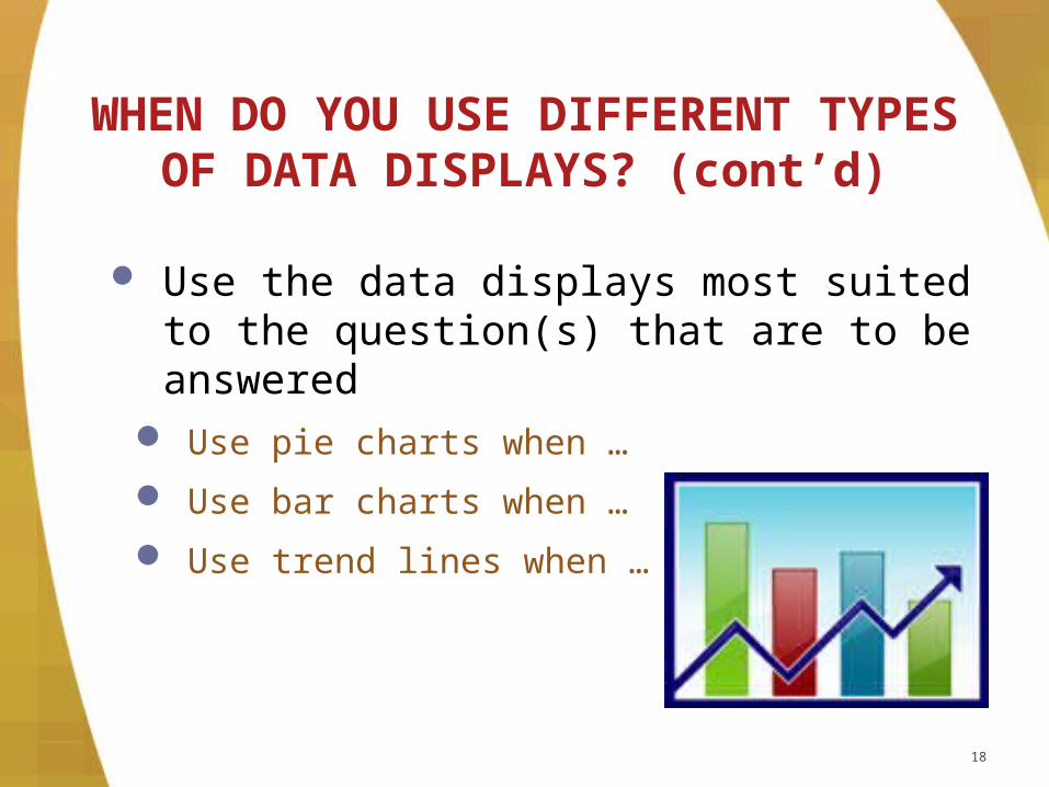
WHEN DO YOU USE DIFFERENT TYPES OF DATA DISPLAYS?
(cont’d)
Use the data displays most suited to the question(s) that are to be answered
Use pie charts when …
Use bar charts when …
Use trend lines when …

19
WHAT MAKES A GOOD DATA DISPLAY?
Self explanatory Clearly represents data Provides accurate data Defines acronyms & technical terms Uses descriptive titles Uses clear & appropriate labels
20
WHAT MAKES A GOOD DATA DISPLAY? (cont’d)
Ensures readability Uses notes to explain calculations Uses color sparingly Complies with Section 508 of the
Rehabilitation Act Avoids using a three-dimensional display
with one-dimensional data Are checked by someone knowledgeable
about the principles of good data displays

21
WHAT MAKES A GOOD DATA DISPLAY? (cont’d)
Notes:aThese percentages are based on the 376 respondents to the Postsecondary Experiences of Students with Disabilities Survey.bCompetitive employment is defined by Sections 7(11) and 12(c) of the Rehabilitation Act 29 U.S.C. 705(11) and 709(cc).cPostsecondary schools included 4-year universities and colleges; community colleges; and business, trade, and technical training.
Neither40%
Both employed and in school25%
Postsecondaryc school only20%
Competitivelyb employed only10%
Other 5%
Figure 7. Percentagea of (State) Students with Emotional Disturbance Who Were Engaged One Year After Leaving High School
FFY 2007

22
WHAT MAKES A GOOD DATA DISPLAY? (cont’d)
Notes:aPercentages are based on the 2,500 respondents to the Postsecondary Experiences of Students with Disabilities Survey.bCompetitive employment is defined by Sections 7(11) and 12(c) of the Rehabilitation Act 29 U.S.C. 705(11) and 709(cc).cPostsecondary schools included 4-year universities and colleges; community colleges; and business, trade, and technical training.
Aged out
Certificate
Dropped out
Modified diploma
High school diploma
0% 20% 40% 60% 80% 100%
20
30
30
50
85
80
25
10
30
10
45
60
20
5
Figure 8. Percentagea of (State) Students with Disabilities One Year Af-ter Leaving High School by Type of School Exit and Status
FFY 2007
Engaged Neither Other
Percentage of students with disabilities
Ty
pe
of
sc
ho
ol e
xit

Quotes from State Administrators
“I’m just not accustomed to reading graphs horizontally.”
“…I don’t relate too well to horizontal ones, so when I look at it, I have to turn it to the side, 90 degrees, so I
can see it up and down….I find it difficult to just quickly pick up on the data…it is just not comfortable for me
visually.”
23
24
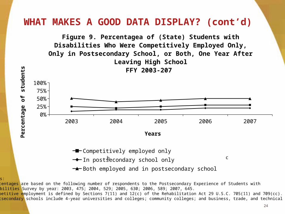
WHAT MAKES A GOOD DATA DISPLAY? (cont’d)
Notes:aPercentages are based on the following number of respondents to the Postsecondary Experience of Students with Disabilities Survey by year: 2003, 475; 2004, 529; 2005, 630; 2006, 589; 2007, 645.bCompetitive employment is defined by Sections 7(11) and 12(c) of the Rehabilitation Act 29 U.S.C. 705(11) and 709(cc).cPostsecondary schools include 4-year universities and colleges; community colleges; and business, trade, and technical training.
2003 2004 2005 2006 20070%
25%
50%
75%
100%
Figure 9. Percentagea of (State) Students with Disabilities Who Were Competitively Employed Only, Only in Postsecondary School, or
Both, One Year After Leaving High SchoolFFY 2003-207
Competitively employed only In postsecondary school onlyBoth employed and in postsecondary school
Years
Pe
rce
nta
ge
of
stu
de
nts
b c

25
APPENDIX A. CHECKLIST FOR SEA PERSONNEL ON THE CREATION OF
DATA DISPLAYS1. Remember when creating data displays you want to
facilitate accurate & efficient interpretation of data while minimizing misinterpretation of data.
2. Specifying the question you want to answer is key to developing an effective data display.
3. Make sure you have identified the message you want to convey.
4. Identify the data you will need to answer your question.
5. Remember that data displays must compare data.

26
APPENDIX A. CHECKLIST FOR SEA PERSONNEL ON THE CREATION OF
DATA DISPLAYS (cont’d)6. Specify your audience(s) & consider how best to
display data for each audience or multiple audiences.
7. Pick the type of data display you will used based on the question you want to answer, the message you want to convey, the audience(s) you are trying to reach, and the pros and cons of different types of data displays.
8. Answer the following questions to assess whether you have created a data display that meets checklist item #1:

27
APPENDIX A. CHECKLIST FOR SEA PERSONNEL ON THE CREATION OF
DATA DISPLAYS (cont’d)
Is the display self explanatory?
Does it clearly represent the data?
Does it provide accurate data?
Does it define acronyms, technical terms, and any calculations used?
Are the titles descriptive of the data presented?
Are the labels clear and descriptive of the data used?
Does the display ensure readability?

28
APPENDIX A. CHECKLIST FOR SEA PERSONNEL ON THE CREATION OF
DATA DISPLAYS (cont’d)
Does it comply with Section 508 of the Rehabilitation Act?
Does it avoid using 3-dimensional displays?
Was the display checked by someone who knows the principles of good data display?

29
APPENDIX B. REFERENCESHenry, G.T. (1993). Using graphical displays for evaluation data.
Evaluation Review, 17(60), 60-78.
Henry, G.T. (1995). Graphing data: Techniques for display and analysis. Thousand Oaks, CA: Sage.
Henry, G.T. (Ed.). (1997). Creating effective graphs: Solutions for a variety of evaluation data (Vol. 73). San Francisco, CA: Jossey-Bass Publishers.
Schmid, C.F. (1983). Statistical graphics: Design principles and practices. New York, NY: John Wiley & Son, Inc.
Tufte, E.R. (2001). Visual display of quantitative information (2nd ed.). Cheshire, CT: Graphics Press.
Wainer, H. (1984). How to display data badly. The American Statistician, 38(2), 137-147.
Wainer, H. (1997c). Visual revelations: Graphical tales of fate and deception from Napoleon Bonaparte to Ross Perot. New York: Copernicus.

Contact InformationMarsha L. Brauen, Ph.D.
Vice President, Westat 301-738-3668
www.westat.com/
30
Charlotte Y. Alverson, Ph.D. NPSO Center
541-346-1390
www.psocenter.org/