Embed Size (px)
Citation preview
Typography Day 2015 1
Experimental Typography http://www.typoday.in
Typography design in Newspaper Comparative study of typography in Hindi Newspaper vs. English Newspaper.
Navneet Kamal, PDPM Indian Institute of Information Technology Design and Manufacturing, Jabalpur, India, [email protected] Sujeet Kumar, PDPM Indian Institute of Information Technology Design and Manufacturing, Jabalpur, India, [email protected]
Abstract: Newspaper is a way of managing information which is very complex that circulate in
present time. Typographical representation is increasingly used. Typography helps and adds
meaning to information presented in newspaper, through an efficient communication design. The
typographical culture itself, driven by technological evolution had been redefining form of
communication. So that contemporary way of communication represents major impact on society.
The research presents the comparative analysis of two respective publication of newspaper.
Focusing on formal aspects of newspaper and space they dedicated to various typographical
informational elements. Newspaper named “The Hindu” and one Hindi newspaper “Dainik Jagran”
selected for this purpose. The study focuses on that how newspaper shows similarity in the use of
typographic solution. That supports a visual trend in communication design. The research will also
reveal that why English newspaper is more meticulous with typographic consistency and how Hindi
newspapers are emerging as better comprehensive than ever earlier. The study intended to
contribute to improving knowledge of the newspaper and communication design through
typographic solution.
Key words: Journalism, vision Cone , Typography, Information design, Testing, Experiment.
1. Introduction
Large amount of information of every type has access by society every day. Including
sociopolitical in different formats with evincive typography weather Times new roman in
Typography Day 2015 2
The Hindu news paper or Krutidev in Dainik Jagran News paper. The Newspaper can be
without the visual but it can’t be without the typography. Because the typographic
information provide a greater capacity to observe details, idea and social tendencies to
analyze the situation behind the story. Reader determines the content they consume; new
medium & strategies have come into view, new business models and way of capturing
reader attention and facilitation the understanding of information content.
The aim of this study is to analyze the typographic trends in “The Hindu” and “Dainik
Jagran” Indian newspaper publication. We attempt to evaluate experimental typography
design in newspaper by analyzing the use of different ways of typography representation.
It is the study that has the main objective is to investigate the parameters that support
the printed newspaper, Study of different type of typographic element which the
publication uses. In short the main challenge is to initiate an attempt to map the elements
and resources in the use of experimental typography printed in news paper.
The typographic communication of printed and digital media together brings several
typographic elements that are outcome of the typographic culture that predominated in
society by synthesizing the journalistic information. The typographic information offers
the reader evident element of its authenticity and also presents a great power of
persuasion through its visibility, readability and legibility altogether. The following
objectives were defined: use of typographic language to determine to what extent.
Typography is used in English newspaper identify the specificities of newspaper as well as
the influence they put forth in the information understanding.
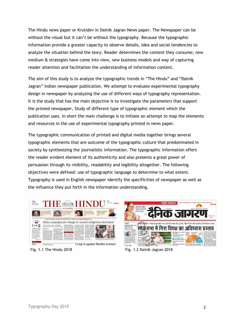
Fig. 1.1 The Hindu 2018 Fig. 1.2 Dainik Jagran 2018
Typography Day 2015 3
2. Method
We have used Quantitative analysis in this paper that is further explained in this section.
a. Characterization of the sample: After selecting of publications to be included in this
study. The period of analysis was defined between January and March 2019. A period of
time in which 50 additions of each of the aforementioned news paper were published.
Making a total of 50-60 publications. Assuming the category not change on daily basis.
b. Criteria: The analysis took into account several quantitative aspect of each of
typographic element present in the publications in order to obtain an objective and
systematic description. Thus each publication was divided into each of its constituent
typographic elements which are typeface, hierarchy, contrast, consistency, alignment,
white space, and color, allowing measuring the relationship between them and to be able
to establish a comparative basis in each news paper.
Test of function of different part of visual system (how human eye work while reading
Vision cone study of senior citizens, young and children while reading newspaper.
Influence of typographic experiment in newspaper.
Testing of visual acuity while reading newspaper without moving head.
Human psychology is from left to right and top to bottom.
Typographic experiments for information representation.
3. Result
Total 2500 pages were analyzed, with a great variability in the number of pages per
addition of each publication. In all typographic formats essential visual ergonomic element
has been studied that is the Visibility, legibility and readability in all typographic
elements: typeface, hierarchy, contrast, consistency, alignment, and color and the number
of words per line per column used by each page were taken in to consideration.
3.1 Typeface
In The Hindu newspaper maximum typeface used are 3 included serif and sans- serif.
Times New Roman is highly used typeface for information representation. Krutidev and
Nirmala UI are used by Dainik Jagran.
Typography Day 2015 4
3.2 Test of function of different part of visual system
How human eye work while reading. Eye movement while information recognition at first
we studied no. of words per line and hierarchy of information to identify the category of
information.
No. of letters per line
News paper Avg. of columns Per
page
Avg. of letters per
line
Avg. Number of
sections per page
The Hindu 15 8 9
Dainik Jagran 17 8 12
Table 3: analysis of words per line in both newspaper
With the evolution of technology, publications have used different strategies to capture
attention and facilitate the understanding of information content by its readers. Thus,
graphic elements were gradually introduced in the production of news content.
Distributed spatially in the pages, with the aim of making the content more
contextualized, these elements capture the attention and improve the reader's
understanding of the news. That is why it is essential to study the use of these graphic
resources.
In this study, it was verified that the avg. no. of words per line in English, and avg. no. of
words per line in Hindi newspaper is 8. There is a balance between English and Hindi in
this indicator.
3.3 Study of vision cone: Impact of pixel digital vs. print
In this study we studied Impact of pixels – Dead pixel and white pixels. : There is impact
on Pupil on digital medium (laptop, Kindle) reading - eye get tired easily on digital
medium, 25% less efficiency in screen reading. But it is reverse print media. We have an
attention span of 0.8 seconds. This disables the reading culture among youth but more in
old sets.
Typography Day 2015 5
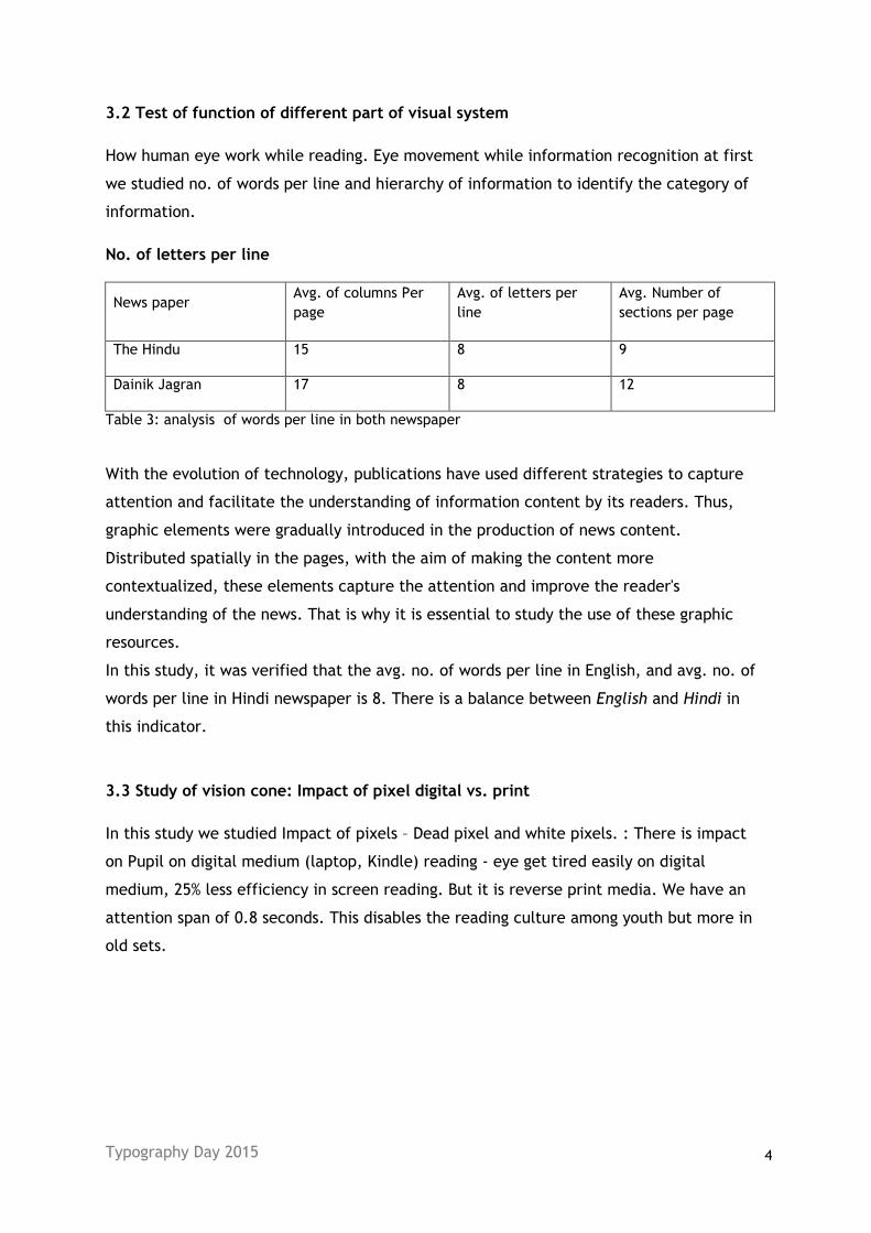
Fig. 2: The better south 2015
Probabilistic random sample stratified by newspaper. Each of the defined typologies by
each of typographic element and then the total printed area and the relative weight
occupied in the whole of the publication were evaluated. Thus it was possible to obtain
real evaluation of the space occupied by each type of publication.
Conflicting element: Ads are the biggest element in newspaper. The percentage of
conflicting element is higher in English newspaper by (10 %).
Supporting element: Chart and graphs help to retain the information.
In the newspaper sample analyzed there is variability in number of conflicting element per
page of each publication. Overall this number of conflicting element per page of each
publication. Overall this number ranges from 4-6 element s as its basis although it varies
its number in some section with avg. number of 5.9 conflicting element per page on the
other hand Hindi publication.
There was relationship between the numbers of conflicting element per page and number
of supportive element per page. The English news paper has the highest number of
supportive element per page. It is found that shorter and shorter news accounts for more
than half in each publication.
In English newspaper, the content that is offered to the reader is very concise and very
ordered, which can be presented by the editorial and graph, chart to which the reader is
habituated, in the same sections occupying the same places every day, in order to make
easy the navigation through the news.
The newspaper Dainik Jagran has compact structure throughout the publication.
Typography Day 2015 6
The various that elements are distributed on a page contribute to the integrity to
its user, balance and identity of a publication. Most of the pages present an
experiment in typography structure that facilitates the insertion of content across the
pages and ensures the continuity of the overall design of the publication; the layouts are
designed to assure the variety in the number of solutions, allowing breaking the
monotony.
3.4 Influence of experimental typography In the specific case of the use of experimental typography in the press, it is for a long time
only a support or a complement of the textual content. Nowadays, with the tendency
towards the visual, the photography with their strong ability to attract attention, coupled
with the power of the attraction of color and the size they occupy on the page, have come
to gain a prominent place in publications. In this study, this case was verified. Through the
research we have found that experiment in Hindi newspaper is more than the English
newspaper. Whereas English newspaper is more meticulous in grid, layout & consistency.
3.5 Human psychology is from left to right and top to bottom
People interested in reading from left to right but if letters are more in one line than
people loses their concentration while reading but in this case both newspaper uses
average number of letter 8 per column that tested to be good in general.
Typography Day 2015 7
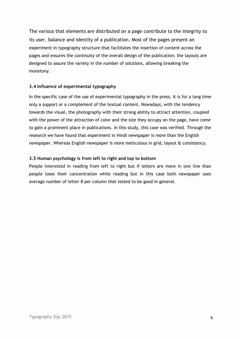
3.6 Typographic experiments for information representation
Fig. 3.1: Dainik Jagran, experiment in color and shape of font and experiment in fist letter of word
Fig. 3.2: Dainik Jagran, experiment in original shape of font
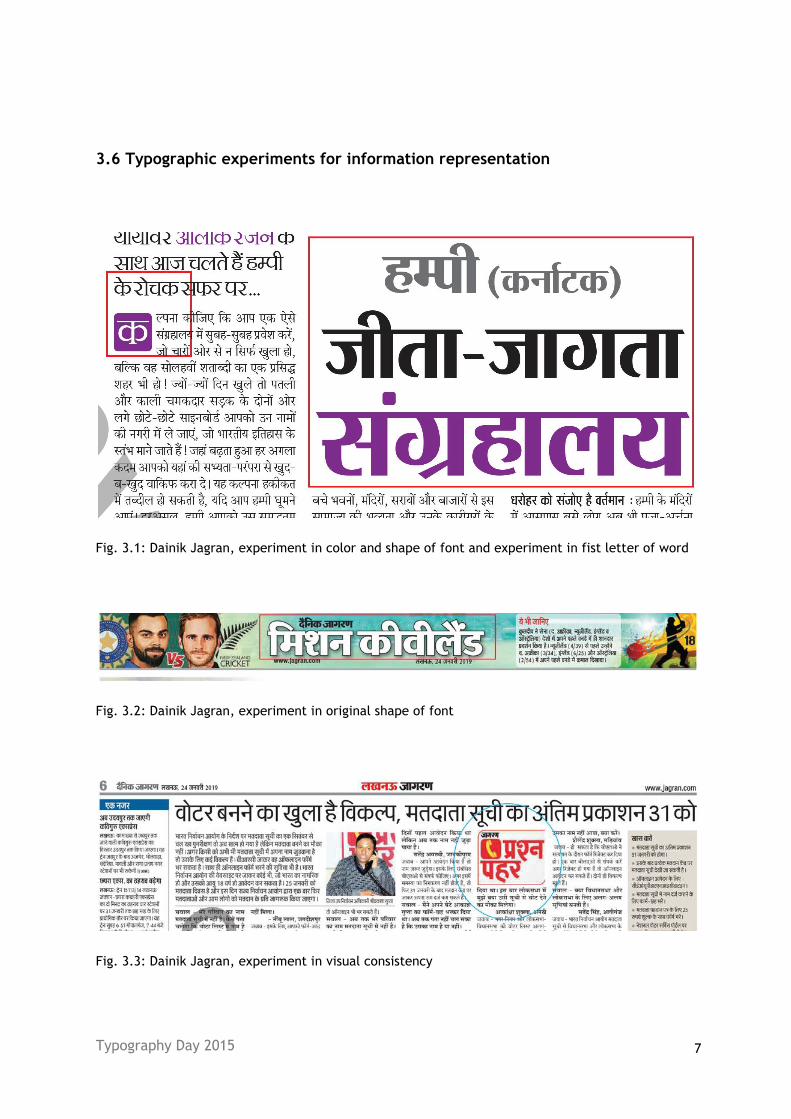
Fig. 3.3: Dainik Jagran, experiment in visual consistency
Typography Day 2015 8
Fig. 3.4: Dainik Jagran, experiment in visual consistency
Typography Day 2015 9
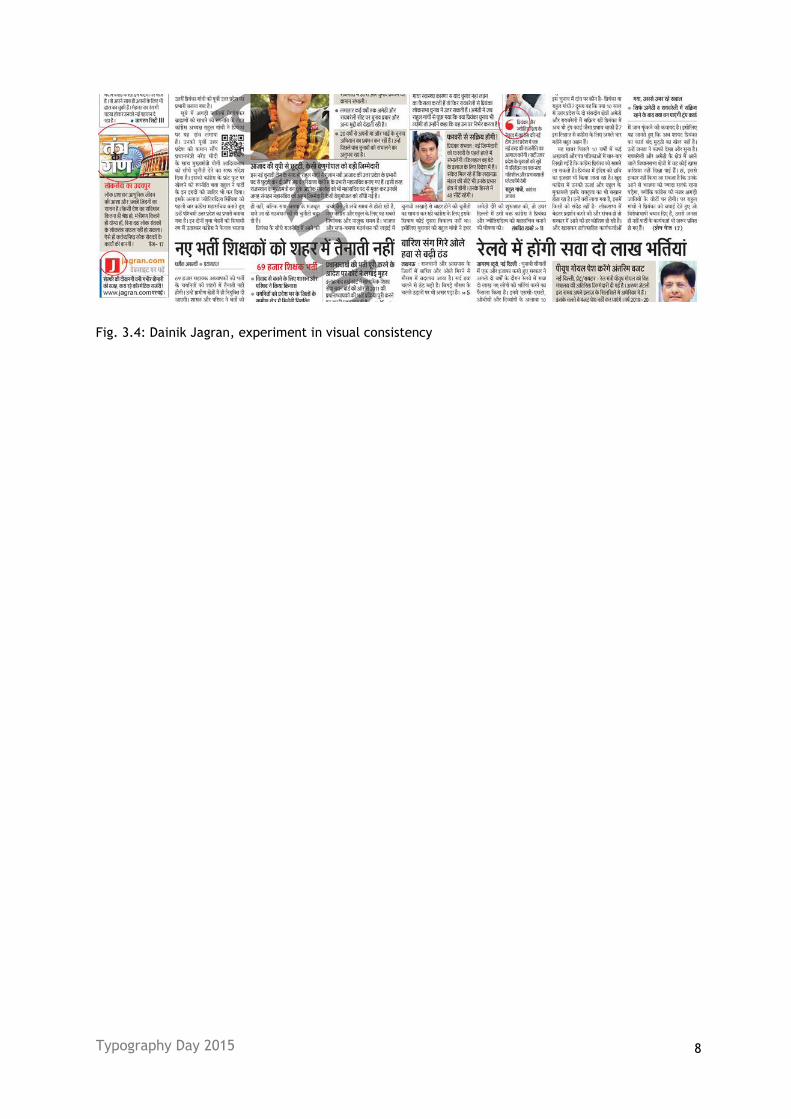
Fig. 3.4: The Hindu, More towards consistency
Fig. 3.5: The Hindu, Experiment with numeral size
Fig. 3.6: The Hindu, Experiment with alphabet size
After study of both newspaper we concluded that The Hindu news paper if more organize
by its layout to provide consistency to readers but in case of Dainik Jagran we found that
publication is more forward toward experiment with type size, color, typesetting and
experiment with typeface shape.
Typography Day 2015 10
References
https://www.dailynewspapers.in/2018/09/the-hindu-e-paper-news-september-2018_1.html
[Accessed 15 October 2018]
http://www.bettersouth.org/2013/05/man-reading-newspaper-bamberg-s-c/
[Accessed 15 October 2018]
https://www.dailynewspapers.in/2018/07/dainik-jagran-epaper-news-21-july-2018.html
[[Accessed 15 October 2018]
https://medium.com/gravitdesigner/typography-elements-everyone-needs-to-understand-
5fdea82f470d
[Accessed 10 Feb 2019]
Jeffrey Anshel, (1998) Visual Ergonomics in the Workplace
https://epaper.jagran.com/epaper/edition-today-11-lucknow.html
[Accessed 10 January-15 February 2019]
https://epaper.thehindu.com
[Accessed 10 January-30 Jan 2019]