Embed Size (px)
Citation preview
Running Head: USABILITY FACTORS IN WEBSITE DESIGN 1
Usability Factors in Website Design: A Case Study in Developing a New Literary Journal
Antoni Grgurovic
University of Minnesota
IRB Exempt STUDY00002625
Usability Factors in Website Design 2
Abstract
The field of usability is a fertile one for technical communicators looking to expand their
skill sets and expertise. In this study, a literature review of usability factors was conducted to
learn more about current best practices in usable website design. The usability factors identified
from this review were then applied in developing a website prototype for a new literary journal.
A usability test was conducted and the results analyzed to confirm the effectiveness of these best
practices and to identify additional usability factors. Recommendations for technical
communicators were then discussed regarding how best to incorporate usable design when
developing content using the website as the primary medium.
Keywords: usability factors, usability testing, website design, literary journal
Usability Factors in Website Design 3
Introduction
The literary journal (or magazine) is a relatively new form of artistic expression. The first
iteration of the genre in the United States was in 1815 with the publication of the North
American Review (Kurowski, 2008). Since then, volumes of original literary work have been
published in journals both short-lived and enduring. These artifacts of artistic thought serve as a
reflection of contemporary society and a barometer for societal priorities and tastes. Moreover,
literary journals continue to provide a medium in which marginalized and experimental voices
gain exposure and momentum (Kuebler, n.d.).
Since the 1995 publication of the first online issue by the Mississippi Review (Kurowski,
2008), scores of literary content has been made available online. The 21st century has seen
literary journals shifting, if not entirely transitioned, to online access. Readers who lament the
loss of the printed volume may find encouragement in knowing that the less overhead required to
publish affords greater flexibility in publishing experimental content (Pound, 1930). Online
publications thus enjoy greater freedom in publishing and distributing literature from writers who
would otherwise not have an audience due to the reduced production costs.
In order to continue the literary tradition and encourage talented writers to submit their
work and avid readers to experience the literature in an online setting, literary journals must
make their websites accessible for both writers and readers. I have yet to locate any research that
analyzes literary journal websites in terms of usability best practices. As such, it is not clear if
the same usability best practices used in other types of websites are also used in online literary
journals. Furthermore, it is not clear what distinguishes one online literary journal as better than
another save for the usability of the website and the content. I will leave the analysis of the
Usability Factors in Website Design 4
content to the literary critics and focus instead on the usability factors that make up a successful
literary journal website.
Literature Review
The focus of my literature review was twofold. I first needed to understand the history of
the literary journal and its cultural relevance. The resources I gathered were the result of
searching for the “history of the literary [journal/magazine]” in both the University of Minnesota
(UMN) library database as well as in Google’s search engine. Information collected from this
first round of research highlighted the important development of the online literary journal, and a
secondary search was conducted for the “history of the online literary journal” using the same
databases. These articles thus helped formulate my introduction and clarify my research problem.
The second purpose of my literature review was to research the usability factors that
contribute to a successful website design. This included both effective design principles and
methods for conducting and evaluating usability testing on user interfaces. I exclusively used the
UMN library database for this research, locating relevant articles through keywords such as
“usability factors,” “usability research,” “usability testing,” “information design,” “website
design,” “visual design,” and “cognitive ergonomics.” The following review summarizes how
this research guided me through the process of developing and evaluating my own online literary
journal.
Reducing the “Symmetry of Ignorance”
Usability studies, at its most fundamental level, seeks to bridge the gap between the
users’ knowledge and human factors engineers’ design knowledge to create “a shared
understanding of the overall design problem” (Pai & Allendoerfer, 2006, p. 24). Shantanu Pai
and Kenneth Allendoerfer write that “the intended users of a system understand their goals and
Usability Factors in Website Design 5
tasks, the good and bad aspects of the current system or process, and their working environment.
Designers understand general approaches for solving design problems and know principles and
best practices” (Pai & Allendoerfer, 2006, p. 24). Thus, in order to meet the user needs in a
system, both the users and the designers must work together in reducing the “symmetry of
ignorance” by sharing their knowledge and perspective of the overall design problem. The
method used to facilitate this type of information sharing between the two groups is through a
prototype, or what Pai and Allendoerfer refer to as a “boundary object.”
Boundary objects such as an interface prototype create a shared problem-solving context
where both users and designers can offer their expertise on how to improve a prototype design,
thereby making their tacit knowledge explicit (Pai & Allendoerfer, 2006). By using the boundary
object as the focus of collaboration, users and designers can educate one another on various
concepts to create the most optimal design specifications. To put this into perspective, writers
and readers both have different demands when it comes to the website of an online literary
journal. In order for a journal to meet these demands, a website prototype should be developed to
gather feedback on whether the users’ needs are being met and what aspects of the design need
improvement.
Finding the Right Participants and the User Viewer Gap
The success of early prototype testing depends on having an accurate representation of
the intended user group (Falk, 2006). In her frequently cited book, Letting Go of the Words,
Ginny Redish recommends bringing the user group to life through the use of personas (Redish,
2012). A persona is an amalgam of various characteristics that is representative of a group of real
people. As such, personas help clarify and support design decisions that often affect entire
populations of users and can be used to identify participants that mirror the intended user
Usability Factors in Website Design 6
population. Different participants, however, “might experience the same problem but might not
experience the same impact” due to different experience levels and knowledge, even after they
have been screened to fit a certain criteria (Lewis, 1994, p. 371). It is therefore important to
understand the user’s mental model to avoid the user viewer gap.
Within the user interface, or visualization, two distinct mental models can be found. The
first is the design model created by the designer(s) and their vision for how the interface is
intended to work. The second is the user model, which is the user’s interpretation of the
graphical elements in the interface (Raschke, Blascheck, & Ertl, 2014). A user viewer gap
emerges when the design model and user model diverge from one another, leading to a
misunderstanding of the visualized information. Designers can remedy this gap by paying
attention to the requirements of the task and the skills of the user, thereby creating a visualization
with the necessary affordances to allow the user to complete the task with the skills they already
have (Raschke et al., 2014).
Conceptual Design and User Requirements
Developing an effective visualization requires planning of a conceptual design that
explores the design problem before attempting to solve it. Specifically, designers should seek to
understand and be capable of defining the overall design problem, the content or data that needs
to be communicated to solve the problem, and the audience whose problem it is. Of these, the
audience is the most complex as a variety of factors need to be taken into account such as “levels
of visual literacy, education, needs, behaviors, and familiarity with [the] content” in order to
arrive at an appropriate solution (Pontis & Babwahsingh, 2016, p. 256).
The conceptual design process is also fundamental in identifying user needs and user
requirements. User needs refer to “factors or conditions necessary for a user to achieve desired
Usability Factors in Website Design 7
results,” whereas user requirements are the “statements that provide the basis for design and
evaluation of interactive systems to meet some or all of the identified user needs” (Spath,
Hermann, Peissner, & Sproll, 2012, p. 1313). This process is necessarily iterative as designers go
through information cycles beginning with their implicit knowledge (e.g., past experiences,
principles, strategies, and theories), and then move to explicit knowledge such as user feedback
and research of the problem domain (Pontis & Babwahsingh, 2016). The conceptual design is
thus constantly evolving over the product cycle as new information is made available through
usability testing.
Design Principles and Visual Hierarchy
Effective design principles complete the transition from planning a design to producing
the final product. Published in 1994, Jakob Nielsen’s heuristics on user interface design continue
to be cited in usability design research (Wang & Caldwell, 2002). These heuristics include: (1)
visibility of system status, (2) match between system and the real world, (3) user control and
freedom, (4) consistency and standards, (5) error prevention, (6) recognition rather than recall,
(7) flexibility and efficiency of use, (8) aesthetic and minimalist design, (9) help users recognize,
diagnose, and recover from errors, and (10) help and documentation (Nielsen, 1994b).
More recent studies have also looked at the visual hierarchy of interfaces, specifically the
different visual path models of users. In her article on “Visual Hierarchy and Mind Motion in
Advertising Design,” Doaa Eldesouky (2013) offers guidance on where to place certain content
on a webpage. One visual path model, the Gutenberg diagram, suggests that because of “natural
reading gravity,” the strong (far right) and weak (far left) fallow areas will receive the least
attention from viewers “unless emphasized visually in some way.” The z-pattern layout, another
visual path model, is essentially the same as the Gutenberg diagram with the exception that the z-
Usability Factors in Website Design 8
pattern layout encourages viewers to pass through the two fallow areas rather than skip over
them as in the Gutenberg diagram. The last model discussed is the f-pattern layout, which begins
in the top left corner and moves horizontally, but with each subsequent line of content the
horizontal movement diminishes until the viewer is mostly skimming only the left edge of the
visual. This type of layout is most commonly seen in online web-browsing. Regardless of the
visual path model the viewer chooses to follow—different viewers will have different
preferences based on the type of content—the designer can still override any of these patterns by
carefully implementing a visual hierarchy into the interface design.
Methods
This study used both qualitative and quantitative data to assess the usability of literary
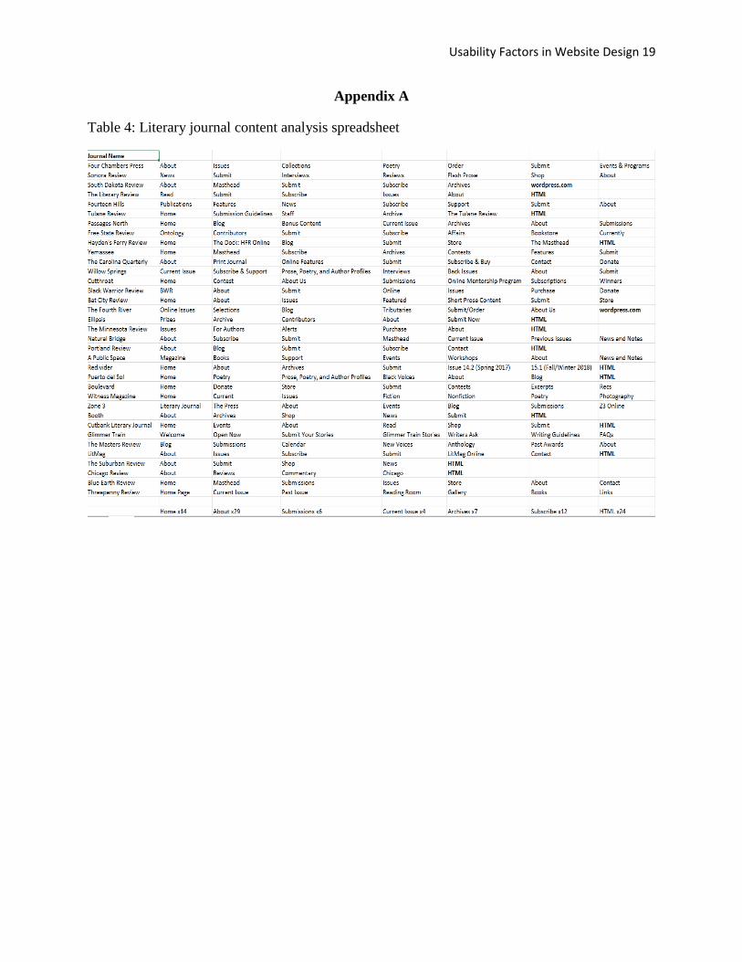
journal websites. Before developing any prototype, I first conducted a content analysis of the
websites of 35 current literary journals to survey the designs currently in use (see Appendix A). I
looked specifically at the menu design and location, the terminology used for site pages, the
method used to create or host the site, as well as the overall layout of the content on each page. I
then coded this data to identify patterns in the menu design and the most common terminology
used for the various sections of the websites.
From this preliminary research I was able to build my website prototype using
WordPress, an open source blog hosting software commonly used by literary journals to host
their websites.

Usability Factors in Website Design 9
Figure 1: Screenshot of prototype homepage
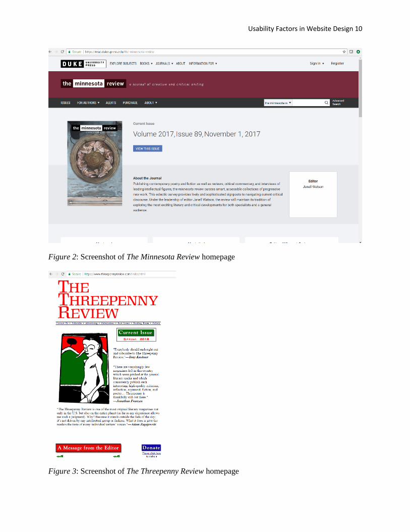
I then selected two other literary journals to compare my prototype against for usability testing:
The Minnesota Review and The Threepenny Review. These journals were selected based on both
their long tenure as prominent literary journals and their different approaches to website design.
The Threepenny Review website uses a minimalist design whereas The Minnesota Review offers
a more stylized and collaborative design. Both journals, however, offer similar amounts of
content on their websites despite their design differences.
Usability Factors in Website Design 10
Figure 2: Screenshot of The Minnesota Review homepage
Figure 3: Screenshot of The Threepenny Review homepage
Usability Factors in Website Design 11
With the prototype developed and the journals selected, I then conducted two rounds of
in-person usability testing using two specific user groups: writers looking to submit their work,
and readers looking to find a particular story to read. Note that these user groups are not mutually
exclusive. Some writers are also readers of the journals they submit their work to, though the
needs of writers and readers are still different enough to warrant a bifurcation.
In the first usability test there were four participants: two prospective writers and two
prospective readers. Each group was assigned a task to complete using the journal websites. For
the writers the task was the same throughout, namely, to submit their work to the journal using
the instructions provided on the website. The readers, on the other hand, were tasked with
locating a particular story or poem buried in the archives of previous issues. A copy of the
written instructions is provided below.
Table 1: List of instructions given to participants in each user group
Writer User Group 1. Please submit your short story to the
(Minnesota / Threepenny / Arrowhead)
Review using the instructions provided on the
website.
Reader User Group 1. Please locate the poem “Ode to Home”
written by Kimiko Hahn and published in The
Minnesota Review.
2. Please locate the short story “Child’s Play”
written by Medardo Fraile and published in
The Threepenny Review.
Usability Factors in Website Design 12
Both user groups were evaluated on time on task, success rate, and error rate. At the end of the
quantitative usability test, I also conducted a qualitative debriefing interview with each
participant. The interviews were semi-structured and brief, lasting no more than ten minutes. I
asked participants to evaluate the ease of use of each site, pain points they experienced, and any
suggestions they have to improve the user experience.
After this first round of usability testing, I revised my prototype based on the user
feedback I received. I then repeated the same usability test and debriefing interview with two
new participants, one for each user group. In total six users were tested with equal distribution
between the two user groups.
Results and Discussion
The results of the content analysis and usability testing identified three major human
factors issues with the design of current online literary journals. The first is that users are asked
to recall from past experience how to navigate a journal’s website rather than recognizing
appropriate signifiers that help facilitate the navigation without needing to memorize pathways.
The second issue is that the cognitive load of the users is frequently exceeded due to the
organization and presentation of content on the website. Lastly, there is a lack of flexibility and
efficiency of use when users attempt to locate a particular piece of work from the archives of a
journal.
Recognition Rather Than Recall
The content analysis revealed first that there is substantial variation between the designs
of different literary journals. While some websites used a minimal design with as little as four
menu items, other journals had as many as 14 menu items. The average among all 35 journals
Usability Factors in Website Design 13
was 6.88 menu items. Furthermore, there is a lack of consistency in the naming conventions used
for the various content pages across the different journals. To learn about a journal most websites
had a designated “About” or “About Us” page. However, other websites referred to this page as
the “Masthead,” and in one instance both words were used to designate two separate content
pages. As a result, users were denied a consistent terminology which could allow for quicker and
more accurate navigation of a literary journal’s website. Feedback from my debriefing interviews
with participants also confirmed that the lack of consistent terminology made it more time-
consuming to recognize which menu tab to select in order to complete the designated task.
Although the participants were able to recall likely patterns of where to locate content based on
their experience with other literary journals not included in the usability test, the lack of easy
recognition poses an issue for new users who do not have sufficient experience with these types
of journals, and is an area currently in need of design improvement.
Cognitive Load
From the perspective of the writer user group, the primary issue affecting their task
completion and workflow was the high cognitive load, i.e., the amount of mental effort devoted
to working memory. The instructions for how to submit a piece of writing totaled 716 words on
The Minnesota Review submit page. Similarly, The Threepenny Review used 687 words to
explain its submission process. The Arrowhead Review website prototype, one the other hand,
used only 62 words to explain the submission process. The results below show a more than two
minute average decrease in the time on task for The Arrowhead Review when compared to both
The Minnesota Review and The Threepenny Review.
Usability Factors in Website Design 14
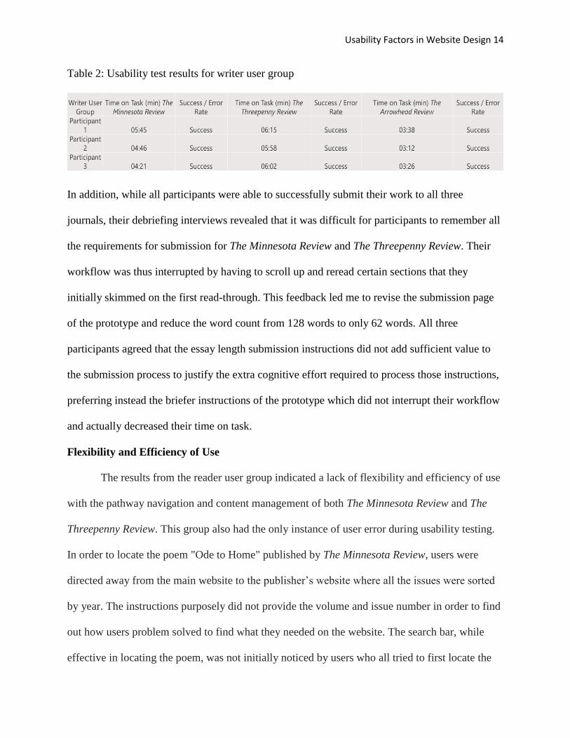
Table 2: Usability test results for writer user group
In addition, while all participants were able to successfully submit their work to all three
journals, their debriefing interviews revealed that it was difficult for participants to remember all
the requirements for submission for The Minnesota Review and The Threepenny Review. Their
workflow was thus interrupted by having to scroll up and reread certain sections that they
initially skimmed on the first read-through. This feedback led me to revise the submission page
of the prototype and reduce the word count from 128 words to only 62 words. All three
participants agreed that the essay length submission instructions did not add sufficient value to
the submission process to justify the extra cognitive effort required to process those instructions,
preferring instead the briefer instructions of the prototype which did not interrupt their workflow
and actually decreased their time on task.
Flexibility and Efficiency of Use
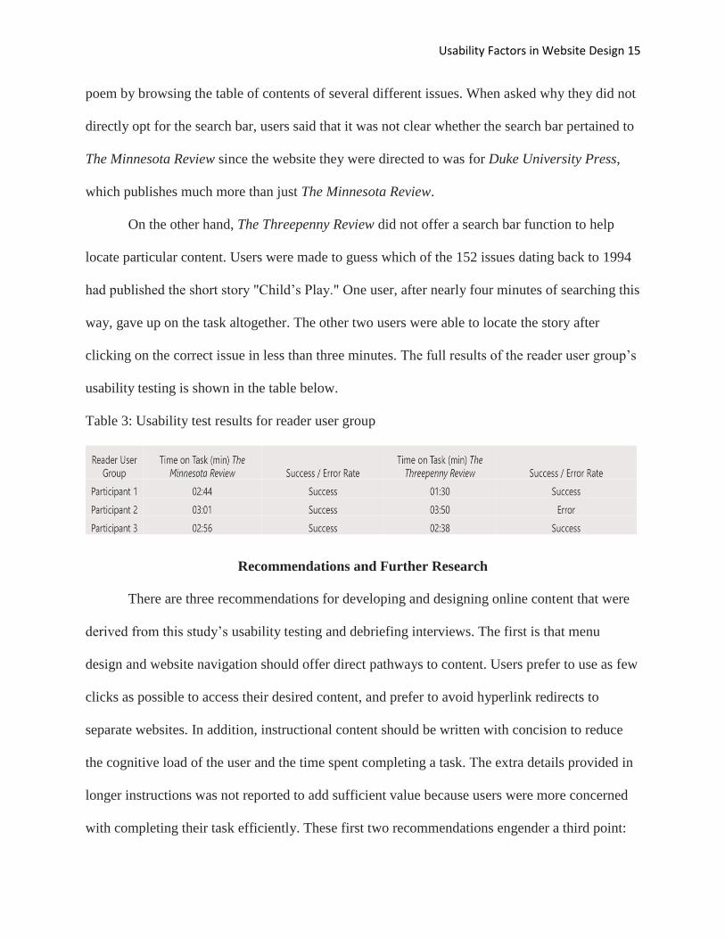
The results from the reader user group indicated a lack of flexibility and efficiency of use
with the pathway navigation and content management of both The Minnesota Review and The
Threepenny Review. This group also had the only instance of user error during usability testing.
In order to locate the poem "Ode to Home" published by The Minnesota Review, users were
directed away from the main website to the publisher’s website where all the issues were sorted
by year. The instructions purposely did not provide the volume and issue number in order to find
out how users problem solved to find what they needed on the website. The search bar, while
effective in locating the poem, was not initially noticed by users who all tried to first locate the
Usability Factors in Website Design 15
poem by browsing the table of contents of several different issues. When asked why they did not
directly opt for the search bar, users said that it was not clear whether the search bar pertained to
The Minnesota Review since the website they were directed to was for Duke University Press,
which publishes much more than just The Minnesota Review.
On the other hand, The Threepenny Review did not offer a search bar function to help
locate particular content. Users were made to guess which of the 152 issues dating back to 1994
had published the short story "Child’s Play." One user, after nearly four minutes of searching this
way, gave up on the task altogether. The other two users were able to locate the story after
clicking on the correct issue in less than three minutes. The full results of the reader user group’s
usability testing is shown in the table below.
Table 3: Usability test results for reader user group
Recommendations and Further Research
There are three recommendations for developing and designing online content that were
derived from this study’s usability testing and debriefing interviews. The first is that menu
design and website navigation should offer direct pathways to content. Users prefer to use as few
clicks as possible to access their desired content, and prefer to avoid hyperlink redirects to
separate websites. In addition, instructional content should be written with concision to reduce
the cognitive load of the user and the time spent completing a task. The extra details provided in
longer instructions was not reported to add sufficient value because users were more concerned
with completing their task efficiently. These first two recommendations engender a third point:
Usability Factors in Website Design 16
that the perceived ease-of-use of a website has a direct correlation with the perceived usability of
that website. Thus, online literary journals can directly and quickly improve the user experience
of their websites by implementing the above recommendations.
Further research on usability factors in website design should explore some of the
limitations of this study. There was a limited and selective sample size of users which may not be
representative of online users in general. In order to develop a consistent terminology across
menu designs to help facilitate quicker navigation, users with little to no exposure with literary
journals ought to be tested. Furthermore, there is a vital user group that was not researched for
this study, namely, the editors of literary journals. This user group is directly responsible for any
changes that get implemented to the online literary journal experience. A qualitative study
researching the methods that editors are using, or plan to use, to attract new readers and writers
to their journals will help ensure that this literary tradition continues to thrive as a source of
cultural and intellectual expression.
Usability Factors in Website Design 17
References
Eldesouky, D. (2013). Visual hierarchy and mind motion in advertising design. Journal of Arts
and Humanities, 2(2), 148-162. Retrieved from
https://doaj.org/article/c6a57205653c4d5abbb81db7188bbeb5
Falk D. (2006). Getting the right participants for a usability test. Human Factors International,
1-17. Retrieved from http://info.humanfactors.com/acton/attachment/4167/4167:f-
0049/1/%7B%7BEnv.MsgId%7D%7D/Bdc4167:f-
0049/%7B%7BEnv.SrcId%7D%7D/%7B%7BEnv.RecId%7D%7D/
Kuebler, C. (n.d.) Literary magazines in context: A historical perspective. Retrieved from
Community of Literary Magazines and Presses Web site:
https://www.clmp.org/adoption/pdfs/Carolyn_Kuebler_essay.pdf
Kurowski, T. (2008). Some notes on the history of the literary magazine. Mississippi Review,
36(3), 231-243. Retrieved from http://www.jstor.org/stable/20132855
Lewis J.R. (1994). Sample sizes for usability studies: Additional considerations. Human Factors,
36(2), 368-378. Retrieved from
http://journals.sagepub.com.ezp1.lib.umn.edu/doi/abs/10.1177/001872089403600215
Nielsen, J. (1994b). 10 usability heuristics for user interface design. Nielsen Norman Group.
Retrieved from https://www.nngroup.com/articles/ten-usability-heuristics/
Pai, S., Allendoerfer, K.R. (2006). Reducing the “symmetry of ignorance” between human
factors engineers and users. Ergonomics in Design, 3, 24-29. Retrieved from
http://journals.sagepub.com.ezp2.lib.umn.edu/doi/abs/10.1177/106480460601400306
Usability Factors in Website Design 18
Pontis, S., & Babwahsingh, M. (2016). Improving information design practice: A closer look at
conceptual design methods. Information Design Journal, 22(3), 249-265. Retrieved from
http://www.jbe-platform.com/content/journals/10.1075/idj.22.3.06pon
Pound, E. (1930). Small magazines. The English Journal, 19(9), 689-704. Retrieved from
https://library.brown.edu/cds/mjp/pdf/smallmagazines.pdf
Raschke M., Blascheck T., Ertl T. (2014) Cognitive ergonomics in visualization. In: Ebert A.,
van der Veer G., Domik G., Gershon N., Scheler I. (eds) Building Bridges: HCI,
Visualization, and Non-formal Modeling. Lecture Notes in Computer Science, vol 8345,
80-94. Stuttgart, Germany: University of Stuttgart. Retrieved from https://link-springer-
com.ezp3.lib.umn.edu/book/10.1007%2F978-3-642-54894-9
Redish, J. G. (2012). Letting go of the words: Writing web content that works, second edition.
Waltham, MA: Elsevier, Inc.
Spath D., Hermann F., Peissner M., Sproll S. (2012). User requirements collection and analysis.
Handbook of Human Factors and Ergonomics, 1313-1322. Hoboken, NJ: John Wiley &
Sons, Inc.
Thomsett-Scott B. (2008). Web site usability with remote users. Journal of Library
Administration, 45(3-4), 517-547. Retrieved from https://www-tandfonline-
com.ezp3.lib.umn.edu/doi/abs/10.1300/J111v45n03_14
Wang P., Caldwell B. (2002). An empirical study of usability testing: Heuristic evaluation vs.
user testing. In Proceedings of the Human Factors and Ergonomics Society Annual
Meeting, 46, 774-778. Thousand Oaks, CA: SAGE Publications. Retrieved from
http://journals.sagepub.com/doi/abs/10.1177/154193120204600802
Usability Factors in Website Design 19
Appendix A
Table 4: Literary journal content analysis spreadsheet