Embed Size (px)
Citation preview
Visualizing Natural Language Resources
Kristina Kocijan
University of Zagreb, Faculty of Humanities and Social Sciences, Dept. of
Information and Communication Sciences
Ivana Lučića 3
Zagreb
Abstract
As we move through the era of Big Data, data visualization is increasingly
taking a leading role in the data presentation. Because of the disparity in the
amount of data and time we have to process it, it has become extremely
important to find the right way, i.e. the right picture that will convey a story
our data is holding. Although not falling within Big Data type of data, a
dictionary of nouns with a description of case paradigms still represents a
large amount of data that needs to be understood. In this paper, the
distribution of Croatian nouns and paradigms used for all singular cases
existing in the NooJ linguistic environment, as well as the relations among
the case endings and existing paradigms will be visually presented. Tableau
software is used for the first task and Cytoscape for the second. The structure
of presented data should help both those learning the language and those
learning about the language.
Keywords: language resources, Croatian, nouns, paradigms, morphologic
grammars, data visualization.
Introduction
Ever since we entered the era of Big Data, another term seems to be
following very closely and that word is visualization. Certainly, the data
visualization is not exclusively connected to Big Data since we have used it
before as well. But it seems as if we have finally realized its true power and
strength only after the emergence of Big Data.
The first thing that may come to one’s mind when you hear the word
visualization is, very likely, a beautiful picture. And one will not be at fault.
However, in order to be really beautiful, information visualization needs to
fulfill four criteria. It has to have a fresh, novel form of presentation that will
stimulate a new level of understanding, it has to be informative taking into
account the context for which it is used, efficient by giving the clear message
or a perspective and leaving out the unimportant information, and has to have
an esthetic aspect of graphical presentation with the main purpose of
presenting the information (Iliinsky, 2010). But it is not only the
visualization that can be beautiful. The data being visualized has its own
beauty as well. Norvig (2009) distinguishes two types of beautiful data:
Baudelaire’s and Thoreau’s beauty. While the first data is beautiful if it is the
result of reason and calculation, the second one is beautiful by its very
plainness.
When telling a story with visual tools, several questions need to be answered
before starting the visualization process. It is important to know what story
we want to tell the audience, but also who is the attended audience and in
what context we are telling the story. Different authors list different number
of phases needed for the visualization, ex. Fry (2008) lists 7 (acquire, parse,
filter, mine, represent, refine, interact), while only 3 can be found in Shapiro
(2010) (formulating question, collecting data, applying visual
representation) and Thorp (2010) (find data, convert them to useful
structure, visualize data). It is important to notice that although their methods
might look different on the surface, their purpose is the same: to get a visual
image of written data.
When large quantities of data need to be analyzed and explained, then
visualization is the best tool that can help you quickly tell a story that lies
behind the data being analyzed. The visualization’s true beauty, as well as its
strength, lies in the possibility to shed ‘light on unexpected and hidden
insights, which may lead to beneficial and profitable innovation” (Keim
et.al. 2010:6). Imagine how many numbers there are in the table for births
and deaths for each city in the Croatia in the past 10 years! And how about
an EU? This table could be printed on hundreds of pages and one would not
be able to quickly tell if the numbers are increasing or decreasing in some
region or the other. But, if placed on a map and represented with darker and
lighter versions of a color for each year for example, one may instantly see
the story behind all these pages with plain numbers (see for example Yau,
2011:Map of unemployment in the US).
It seems that everything is being visualized these days, i.e. everything that
the data exists for in a digital form: flight patterns (Koblin, Klump, 2010),
social networks (Krebs, 2010; Perer, 2010), social graph of US senate
(Odewahn, 2010), Wikipedia (Wattenberg, Viegas, 2010), from one day in
the life of NY Times (Young, Bilton, 2010) to 28 years of NY Times articles
(Thorp, 2010). And although it is the words that are being analyzed and
visualized in all these cases, I have not encountered any visualization of
language resources that serve as the foundation for all the other analysis1.
The aim of this paper is to present a visualization of language resources for
Croatian used in NooJ linguistic environment, namely Croatian nouns, in
order to tell the story about different types of nouns and the paradigms used
in building different cases in this word group. In the next section I will
briefly describe the nouns in Croatian language and provide some numbers
concerning their total number as well as some numbers for paradigms used
for inflecting the nouns in NooJ. In the subsequent section I will present
endings used for building singular cases of noun concentrating on the way
they are shared among different cases.
How to Present your Data
Regardless of the author or the tools used for the preparation of digital
language resources, the data on specific word category (in this paper on
nouns) can be presented in several ways.
1 Of course, this does not mean that linguistics does not use diagrammatic representations
at all (e.g. parse trees or sentence diagramming).
Slow Information Presentation
First, the longest way, would be to list all the nouns with their characteristic
properties including the type (common, proper, collective), gender (feminine,
masculine, neutral), some semantic categories (first name, last name, geo,
kinship etc.) and a name of a paradigm used for flection (taking the number
(plural, singular) and case (nominative, genitive, dative, accusative, vocative,
locative and instrumental) into consideration). Such a list would be 62 913
lines long, since there are 62 913 entries to the main dictionary of nouns in
NooJ.
If you are to consider the format of the text in this book, such data would
spread over a little bit more than 1 655 pages. Interested in reading this
report? First thing that probably comes to your mind is – boring – and you
would most certainly be in the majority. However, these 62 913 lines carry a
meaning that, although to maybe few, is valuable in understanding some
language concepts.
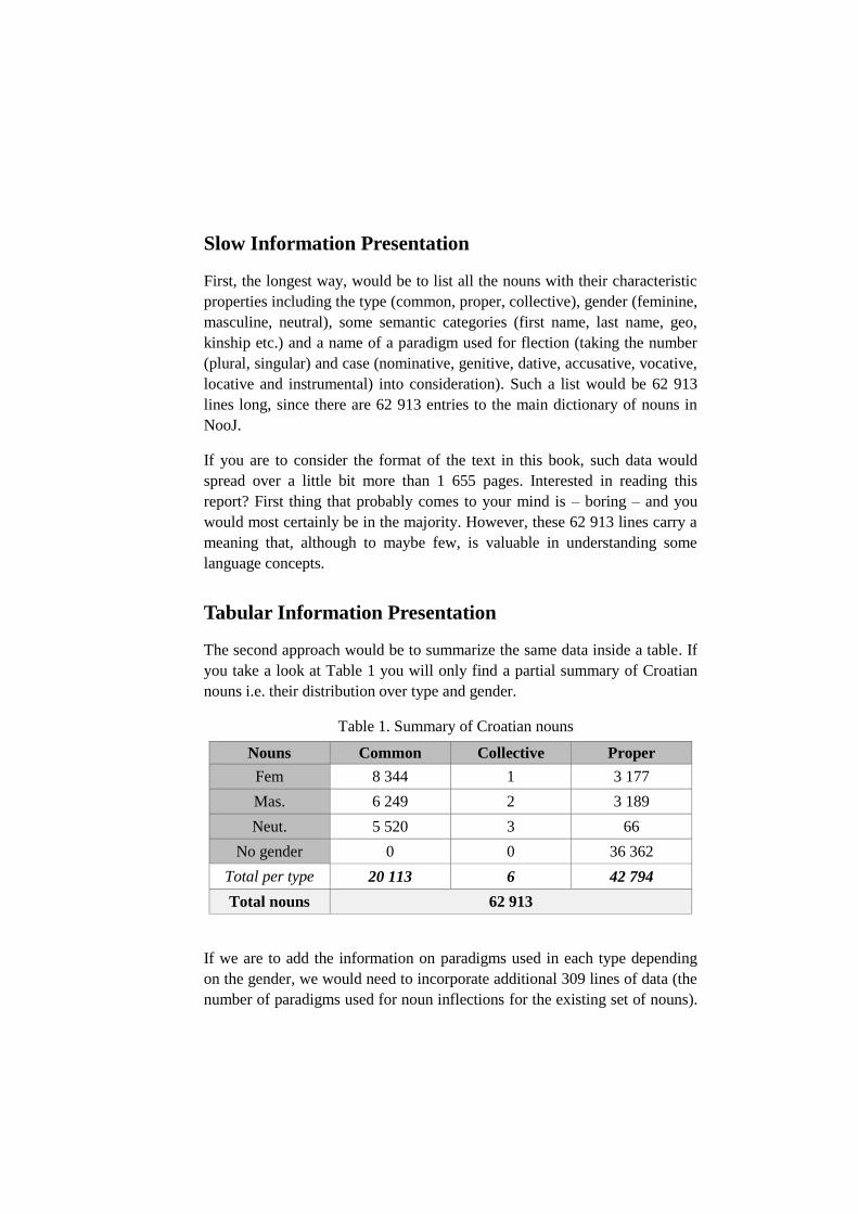
Tabular Information Presentation
The second approach would be to summarize the same data inside a table. If
you take a look at Table 1 you will only find a partial summary of Croatian
nouns i.e. their distribution over type and gender.
Table 1. Summary of Croatian nouns
Nouns Common Collective Proper
Fem 8 344 1 3 177
Mas. 6 249 2 3 189
Neut. 5 520 3 66
No gender 0 0 36 362
Total per type 20 113 6 42 794
Total nouns 62 913
If we are to add the information on paradigms used in each type depending
on the gender, we would need to incorporate additional 309 lines of data (the
number of paradigms used for noun inflections for the existing set of nouns).
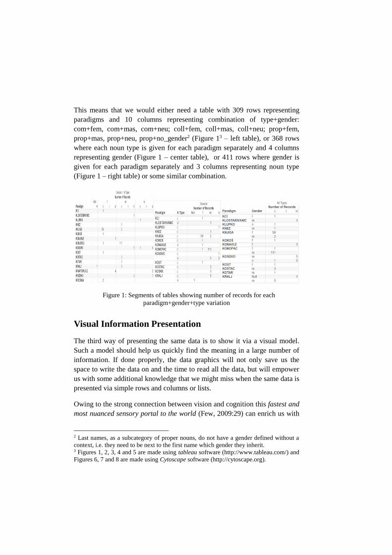
This means that we would either need a table with 309 rows representing
paradigms and 10 columns representing combination of type+gender:
com+fem, com+mas, com+neu; coll+fem, coll+mas, coll+neu; prop+fem,
prop+mas, prop+neu, prop+no_gender2 (Figure 13 – left table), or 368 rows
where each noun type is given for each paradigm separately and 4 columns
representing gender (Figure 1 – center table), or 411 rows where gender is
given for each paradigm separately and 3 columns representing noun type
(Figure 1 – right table) or some similar combination.
Figure 1: Segments of tables showing number of records for each
paradigm+gender+type variation
Visual Information Presentation
The third way of presenting the same data is to show it via a visual model.
Such a model should help us quickly find the meaning in a large number of
information. If done properly, the data graphics will not only save us the
space to write the data on and the time to read all the data, but will empower
us with some additional knowledge that we might miss when the same data is
presented via simple rows and columns or lists.
Owing to the strong connection between vision and cognition this fastest and
most nuanced sensory portal to the world (Few, 2009:29) can enrich us with
2 Last names, as a subcategory of proper nouns, do not have a gender defined without a
context, i.e. they need to be next to the first name which gender they inherit. 3 Figures 1, 2, 3, 4 and 5 are made using tableau software (http://www.tableau.com/) and
Figures 6, 7 and 8 are made using Cytoscape software (http://cytoscape.org).
new insights that used to be just a picture away. However, it should also be
used carefully since it can quite easily mislead us into wrong conclusions
resulting in some poor decisions.
In Search of a Story
When an information scientist is presented with a task of building language
resources, designing digital dictionaries and writing inflectional grammars, it
is inevitable that some non-linguistic questions might emerge: how many
suffixes are there, how many are shared among different cases, how can they
be reused in inflectional grammars etc. The quest for these answers created
the foundation for the story about Croatian nouns, presented here in
somewhat different fashion.
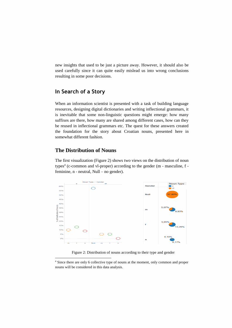
The Distribution of Nouns
The first visualization (Figure 2) shows two views on the distribution of noun
types4 (c-common and vl-proper) according to the gender (m - masculine, f -
feminine, n - neutral, Null – no gender).
Figure 2: Distribution of nouns according to their type and gender
4 Since there are only 6 collective type of nouns at the moment, only common and proper
nouns will be considered in this data analysis.
This data is shown in Table 1 using the absolute measures while the Figure 2
uses the percentage of each category. Both visualizations show the same data
but in different graph types (the left visualization is formed using circle
views, and the right one is formed using pie chart).
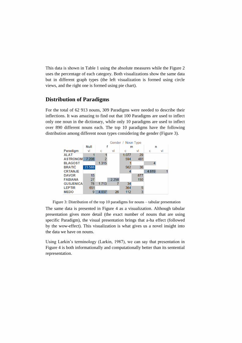
Distribution of Paradigms
For the total of 62 913 nouns, 309 Paradigms were needed to describe their
inflections. It was amazing to find out that 100 Paradigms are used to inflect
only one noun in the dictionary, while only 10 paradigms are used to inflect
over 890 different nouns each. The top 10 paradigms have the following
distribution among different noun types considering the gender (Figure 3).
Figure 3: Distribution of the top 10 paradigms for nouns – tabular presentation
The same data is presented in Figure 4 as a visualization. Although tabular
presentation gives more detail (the exact number of nouns that are using
specific Paradigm), the visual presentation brings that a-ha effect (followed
by the wow-effect). This visualization is what gives us a novel insight into
the data we have on nouns.
Using Larkin’s terminology (Larkin, 1987), we can say that presentation in
Figure 4 is both informationally and computationally better than its sentential
representation.
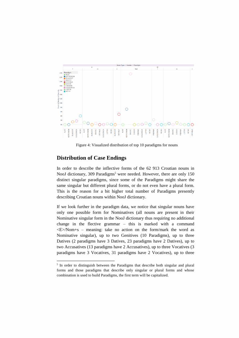
Figure 4: Visualized distribution of top 10 paradigms for nouns
Distribution of Case Endings
In order to describe the inflective forms of the 62 913 Croatian nouns in
NooJ dictionary, 309 Paradigms5 were needed. However, there are only 150
distinct singular paradigms, since some of the Paradigms might share the
same singular but different plural forms, or do not even have a plural form.
This is the reason for a bit higher total number of Paradigms presently
describing Croatian nouns within NooJ dictionary.
If we look further in the paradigm data, we notice that singular nouns have
only one possible form for Nominatives (all nouns are present in their
Nominative singular form in the NooJ dictionary thus requiring no additional
change in the flective grammar – this is marked with a command
<E>/Nom+s – meaning: take no action on the form/mark the word as
Nominative singular), up to two Genitives (10 Paradigms), up to three
Datives (2 paradigms have 3 Datives, 23 paradigms have 2 Datives), up to
two Accusatives (13 paradigms have 2 Accusatives), up to three Vocatives (3
paradigms have 3 Vocatives, 31 paradigms have 2 Vocatives), up to three
5 In order to distinguish between the Paradigms that describe both singular and plural
forms and those paradigms that describe only singular or plural forms and whose
combination is used to build Paradigms, the first term will be capitalized.
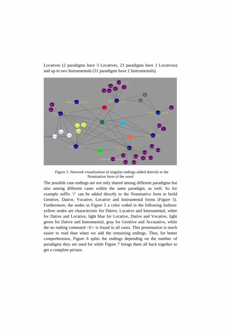
Locatives (2 paradigms have 3 Locatives, 23 paradigms have 2 Locatives)
and up to two Instrumentals (31 paradigms have 2 Instrumentals).
Figure 5: Network visualization of singular endings added directly to the
Nominative form of the word
The possible case endings are not only shared among different paradigms but
also among different cases within the same paradigm, as well. So for
example suffix ‘i’ can be added directly to the Nominative form to build
Genitive, Dative, Vocative, Locative and Instrumental forms (Figure 5).
Furthermore, the nodes in Figure 5 a color coded in the following fashion:
yellow nodes are characteristic for Dative, Locative and Instrumental, white
for Dative and Locative, light blue for Locative, Dative and Vocative, light
green for Dative and Instrumental, gray for Genitive and Accusative, while
the no ending command <E> is found in all cases. This presentation is much
easier to read than when we add the remaining endings. Thus, for better
comprehension, Figure 6 splits the endings depending on the number of
paradigms they are used for while Figure 7 brings them all back together to
get a complete picture.
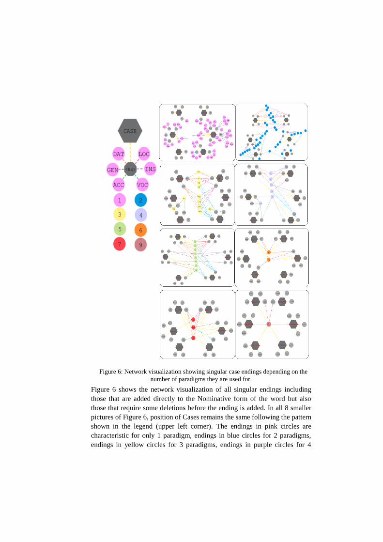
Figure 6: Network visualization showing singular case endings depending on the
number of paradigms they are used for.
Figure 6 shows the network visualization of all singular endings including
those that are added directly to the Nominative form of the word but also
those that require some deletions before the ending is added. In all 8 smaller
pictures of Figure 6, position of Cases remains the same following the pattern
shown in the legend (upper left corner). The endings in pink circles are
characteristic for only 1 paradigm, endings in blue circles for 2 paradigms,
endings in yellow circles for 3 paradigms, endings in purple circles for 4
paradigms, endings in green for 5 paradigms, endings in orange for 6
paradigms, endings in red for 7 paradigms and ending in brown for 9
paradigms. All the lines going directly from the main Case node are yellow,
while other lines are colored depending on the Case in the following manner:
orange for Dative, brown for Genitive, yellow for Accusative, blue for
Vocative, purple for Instrumental and pink for Locative. The same color
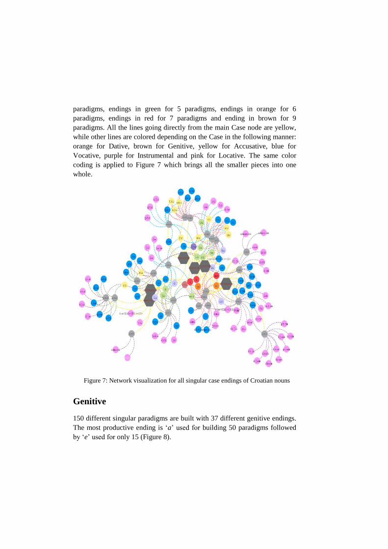
coding is applied to Figure 7 which brings all the smaller pieces into one
whole.
Figure 7: Network visualization for all singular case endings of Croatian nouns
Genitive
150 different singular paradigms are built with 37 different genitive endings.
The most productive ending is ‘a’ used for building 50 paradigms followed
by ‘e’ used for only 15 (Figure 8).
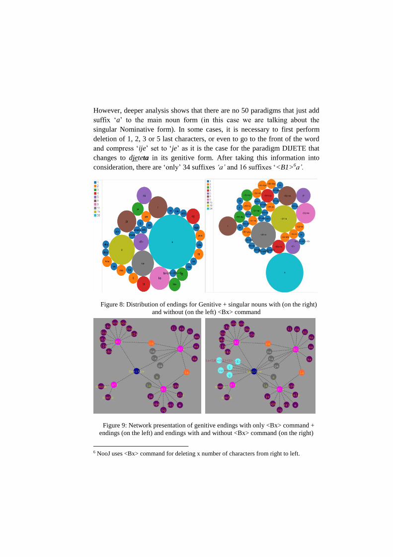
However, deeper analysis shows that there are no 50 paradigms that just add
suffix ‘a’ to the main noun form (in this case we are talking about the
singular Nominative form). In some cases, it is necessary to first perform
deletion of 1, 2, 3 or 5 last characters, or even to go to the front of the word
and compress ‘ije’ set to ‘je’ as it is the case for the paradigm DIJETE that
changes to djeteta in its genitive form. After taking this information into
consideration, there are ‘only’ 34 suffixes ‘a’ and 16 suffixes ‘<B1>6a’.
Figure 8: Distribution of endings for Genitive + singular nouns with (on the right)
and without (on the left) <Bx> command
Figure 9: Network presentation of genitive endings with only <Bx> command +
endings (on the left) and endings with and without <Bx> command (on the right)
6 NooJ uses <Bx> command for deleting x number of characters from right to left.
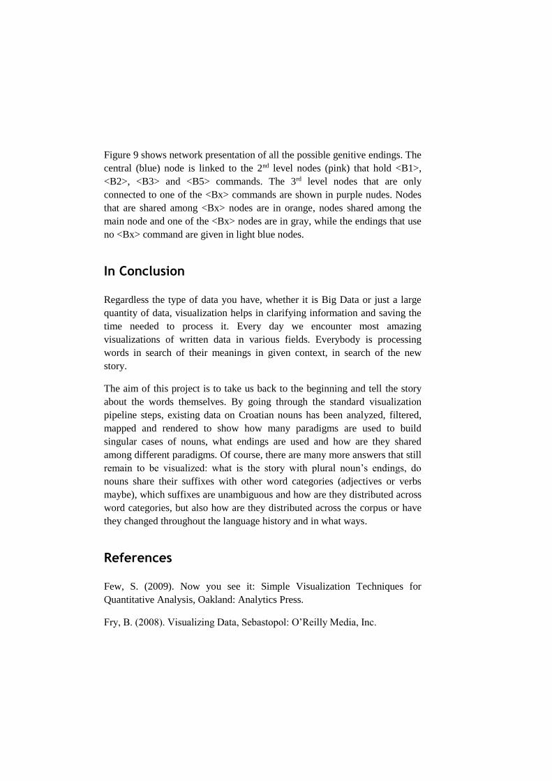
Figure 9 shows network presentation of all the possible genitive endings. The
central (blue) node is linked to the 2nd level nodes (pink) that hold <B1>,
<B2>, <B3> and <B5> commands. The 3rd level nodes that are only
connected to one of the <Bx> commands are shown in purple nudes. Nodes
that are shared among <Bx> nodes are in orange, nodes shared among the
main node and one of the <Bx> nodes are in gray, while the endings that use
no <Bx> command are given in light blue nodes.
In Conclusion
Regardless the type of data you have, whether it is Big Data or just a large
quantity of data, visualization helps in clarifying information and saving the
time needed to process it. Every day we encounter most amazing
visualizations of written data in various fields. Everybody is processing
words in search of their meanings in given context, in search of the new
story.
The aim of this project is to take us back to the beginning and tell the story
about the words themselves. By going through the standard visualization
pipeline steps, existing data on Croatian nouns has been analyzed, filtered,
mapped and rendered to show how many paradigms are used to build
singular cases of nouns, what endings are used and how are they shared
among different paradigms. Of course, there are many more answers that still
remain to be visualized: what is the story with plural noun’s endings, do
nouns share their suffixes with other word categories (adjectives or verbs
maybe), which suffixes are unambiguous and how are they distributed across
word categories, but also how are they distributed across the corpus or have
they changed throughout the language history and in what ways.
References
Few, S. (2009). Now you see it: Simple Visualization Techniques for
Quantitative Analysis, Oakland: Analytics Press.
Fry, B. (2008). Visualizing Data, Sebastopol: O’Reilly Media, Inc.
Iliinsky, N. (2010). On Beauty in Beautiful Visualization: Looking at Data
Through the Eyes of Experts, Sebastopol: O’Reilly Media, Inc., 1-14.
Keim, D.; Kohlhammer, J.; Ellis, G. and Mansmann F. (eds.) (2010).
Mastering the Information Age: Solving Problems with Visual Analytics,
Eurographics Association.
Koblin, A. and Klump, V. (2010). Flight Patterns: A Deep Dive in Beautiful
Visualization: Looking at Data Through the Eyes of Experts, Sebastopol:
O’Reilly Media, Inc., 91-102.
Krebs, V. (2010). Your Choices Reveal Who You Are: Mining and
Visualizing Social Patterns in Beautiful Visualization: Looking at Data
Through the Eyes of Experts, Sebastopol: O’Reilly Media, Inc., 103-122.
Larkin, J.H. and Simon, H.A. (1987). Why a Diagram is (Sometimes) Worth
Ten Thousand Words in Cognitive Science 11, 65-100.
Norvig, P. (2009). Natural Language Corpus Data in Beautiful Data: The
Stories Behind Elegant Data Solutions, Sebastopol: O’Reilly Media, Inc.
219-242.
Odewahn, A. (2010). Visualizing the U.S. Senate Social Graph (1991-2009)
in Beautiful Visualization: Looking at Data Through the Eyes of Experts,
Sebastopol: O’Reilly Media, Inc., 123-142.
Perer, A. (2010). Finding Beautiful Insights in the Chaos of Social Network
Visualizations in Beautiful Visualization: Looking at Data Through the Eyes
of Experts, Sebastopol: O’Reilly Media, Inc., 157-174.
Shapiro, M. (2010). Once Upon a Stacked Time Series in Beautiful
Visualization: Looking at Data Through the Eyes of Experts, Sebastopol:
O’Reilly Media, Inc.
Thorp, J. (2010). This Was 1994: Data Exploration with the NYTimes
Article Search API in Beautiful Visualization: Looking at Data Through the
Eyes of Experts, Sebastopol: O’Reilly Media, Inc., 255-270.
Wattenberg, M. and Viegas, F. (2010). Beautiful History: Visualizing
Wikipedia in Beautiful Visualization: Looking at Data Through the Eyes of
Experts, Sebastopol: O’Reilly Media, Inc., 175-192.

Yau, N. (2011). Visualize This: The FlowingData Guide to Design,
Visualization, and Statistics. Indianapolis: Wiley Publishing, Inc.
Young, M. and Bilton, N. (2010). A Day in the Life of the New Yourk Times
in Beautiful Visualization: Looking at Data Through the Eyes of Experts,
Sebastopol: O’Reilly Media, Inc., 271-290.