Embed Size (px)
Citation preview

VISUALIZING NATURE AND
SOCIETY
Michael Friendly and Gilles Palsky
In addition to their standard uses-wayfinding and picturing geographic features and political boundaries- maps and related graphic methods have long
played a significant role in scientific exploration, discovery, and explanation. In cartography, these latter uses are most well known under the rubric of"thematic cartography," but in fact, since the earliest such developments at the end of the seventeenth century, the histories of map-based and map-free information visualization have become increasingly intertwined. We thus construe our chapter title broadly to include various visual representations. We do not aim to give a comprehensive history of"first uses," but rather to explore the connections between image and scientific questioning through illustrative examples and their scientific context. In addition, we focus somewhat more
on the side of cartography than of statistical graphics. More comprehensive historical treatments of data visualization may be found in Friendly (2oo6) and Friendly and Denis ( 2006), and of nineteenth-century thematic cartography in
Palsky (1996, 2003).
VISUALIZING NATURE AND SOCIETY

The plan of this chapter is as follows: We first tell the story of two visual revelations that help us to understand how thematic maps and graphs can contribute to scientific explanation and discovery, and then try to identify some higher-level features shared by thematic maps and other data graphics in scientific inquiry and presentation. We then review the origin and develop· ment of thematic mapping, largely from a cartographic perspective. The fifth section illustrates some important developments in the history of statistical diagrams and graphs. Finally, we discuss the contributions of thematic maps
and diagrams to the development of the social sciences.
VISUAL !EXPLANATION AND DISCOVERY
Data and information visualization are fundamentally about showing quan· titative and qualitative information so that a viewer can see patterns, trends, or anomalies, constancy or variation, in ways that other forms-text and tables-do not allow. Today, weather maps, maps of election results (for example, the "red" and "blue" states depicted in maps of U.S. presidential races; see figs.
115-16), and maps of disease incidence or outbreak (perhaps related visually to potential causes) are commonplace. But this was not always so; it took several
small but significant conceptual leaps to move from showing purely geograph· ic features (rivers, towns, terrain) that could be seen directly, to other things that might be measured locally, but could not be seen or understood globally without the aid of a map-based visual representation.
Thematic maps, overlaying a visual rendering of a spatial distribution of some data on the familiar forms of base maps, did not arrive until late in the seventeenth century, with meteorological charts and maps of magnetic declination at sea by Edmund Halley. Once invented, thematic maps provided a
means for visual explanation and discovery that arguably could not have occurred otherwise.
In a parallel stream, the graphs and charts so widely used today had their origin in problems of physical, astronomical, and geodesic measurement also beginning in the seventeenth century. Throughout the eighteenth century, as new data-based problems were developing, graphic representation of scientific and economic data expanded to new domains and forms that were not primarily map based. To set the theme for this review, we briefly recount two stories
of visual discovery.
The founding of geological cartography
If one can say loosely that geography is about seeing and understanding the distribution ·of things above the ground, one can also say that geology is about seeing and understanding what is beneath the ground. Geography is immedi-
MICHAEL FRI E NDLY A ND G IL LES PALSKY
---~------ -----------_,__ ... _, .. _,_ ------... ~--,-- ......... - -____ ,.. _ ... _ ... __ - --~::=-----""-
- ---~-·-- ... ·-----"""" _ .. _, _____ _ __ .... __
c:: • ... --·-·--··~, .... ........ _,;_ ---
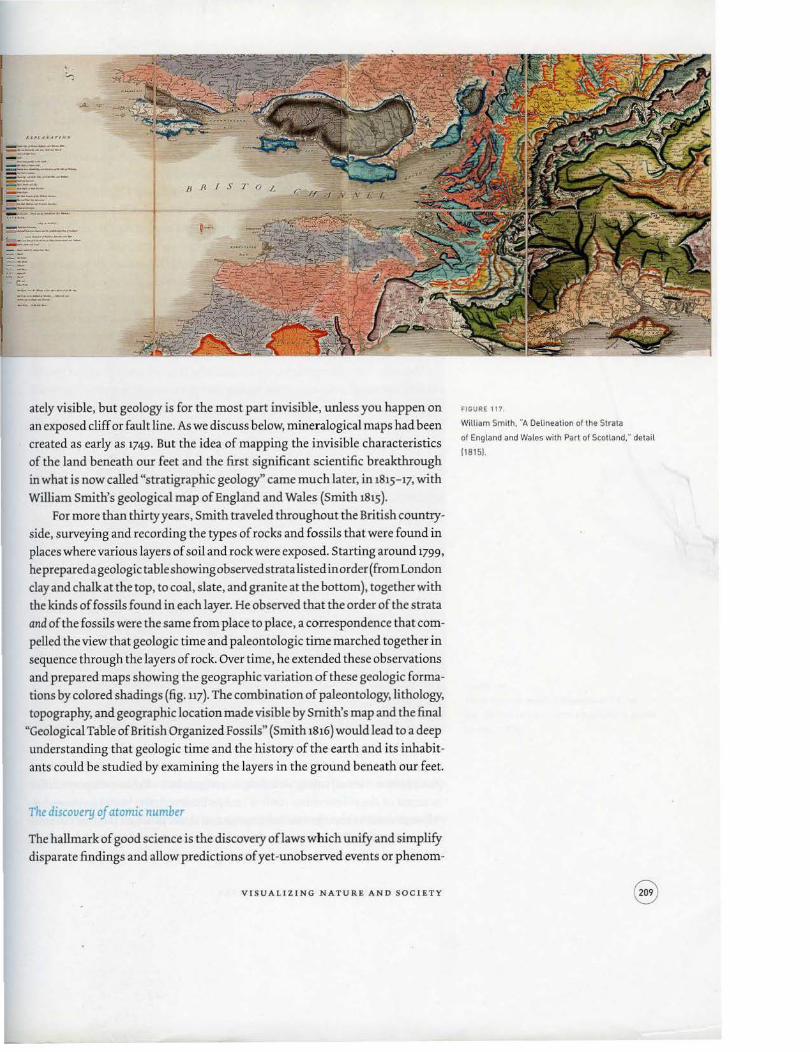
ately visible, but geology is for the most part invisible, unless you happen on
an exposed cliff or fault line. As we discuss below, mineralogical maps had been
created as early as 1749. But the idea of mapping the invisible characteristics
of the land beneath our feet and the first significant scientific breakthrough
in what is now called "stratigraphic geology" came much later, in 1815-17, with
William Smith's geological map of England and Wales (Smith 1815).
For more than thirty years, Smith traveled throughout the British country
side, surveying and recording the types of rocks and fossils that were found in
places where various layers of soil and rock were exposed. Starting around 1799,
he prepared a geologic table showing o bservedstra ta listed in order (from London
clay and chalk atthe top, to coal, slate, and granite at the bottom), together with
the kinds of fossils found in each layer. He observed that the order of the strata
and of the fossils were the same from place to place, a correspondence that com
pelled the view that geologic time and paleontologic time marched together in sequence through the layers of rock. Over time, he extended these observations
and prepared maps showing the geographic variation of these geologic forma
tions by colored shadings (fig. 117). The combination of paleontology, lithology,
topography, and geographic location made visible by Smith's map and the final
"Geological Table of British Organized Fossils" (Smith 1lh6) would lead to a deep
understanding that geologic time and the history of the earth and its inhabit
ants could be studied by examining the layers in the ground beneath our feet.
The discovery of atomic number
The hallmark of good science is the discovery oflaws which unify and simplify
disparate findings and allow predictions of yet-unobserved events or phenom-
VISUALIZING NATURE AND SOCIETY
FIGURE 11?
William Sm1th, "A Delineation of the Strata
of England and Wales with Part of Scotland: detail
1181 51.

ena. Mendeleev's periodic table, for example, allowed him to predict the physical and chemical characteristics of Gallium (Ga) and Germanium (Ge} before they were discovered decades later (Mendeleev 1889 ).
Mendeleev's table, however, arranged the elements only by a serial number, denoting an atom's position in a list arranged by increasing atomic mass. This changed in 1913-14, when Henry Moseley investigated the characteristic frequencies of X rays produced by bombarding samples of the elements from aluminum to gold with high-energy electrons, and measuring the wavelengths
(and hence frequencies) of two specific peaks or spikes (called K and L) in their spectra (Moseley 1913 ). He discovered that, if the serial numbers of the elements were plotted against the square root of frequencies in the X-ray spectra emitted by these elements, all the points neatly fell on a series of straight lines (see fig. u8). This must mean that the atomic number is more than a serial number; that it has some physical basis. Moseley proposed that the atomic number is the number of electrons in the atom of the specific element.
Moseley's graph represents an outstanding piece of numerical and graphical detective work. Had he plotted raw wavelength or frequency itself, he would not have observed this remarkable linearity. In effect, Moseley had also pre
dicted the existence of three new elements (without having observed them), corresponding to the gaps in the plot at atomic numbers 43 (Technetium}, 61
(Promethium), and 75 (Rhenium). He also noted slight departures from linearity which he could not explain; nor could he explain the multiple lines at the top and bottom of the figure. The explanation came later with the discovery of
the spin of the electron.
CO NTEN T , FORM, AND FUNCTION OF GRA PHIC DATA DISPLAY
Thematic cartography and data graphics share numerous visual features, general attitudes, and goals, but unfortunately do not share much in the way of a common language for analyzing the characteristics of each or explaining their historical development. However, both are ultimately concerned with the task of putting graphic marks on paper or some other medium to convey information to a viewer, and it may be of some use to consider them together from a wider perspective to discuss their development and contributions to
visualizing nature and society. In the abstract, maps and diagrams can be considered communication
devices for conveying information from a source (author or creator) to a target
(recipient ?r viewer) using visual signs and symbols. Various displays differ in terms of the information content (subject matter), the visual forms and attributes used to encode this information, and the function (task or communication goal) that the display is designed to serve. By analogy with language, ~sual form relates to the grammar and syntax of graphics (Wilkinson 2005),
MICHAE L F RIENDLY AND GILLE S PALSKY
lliglt-P?·equency Spect1·a of' the .hlnnents. 709
l'ig. 3 . • ~
79A. 78!\. 7n 760. 75 74 w 731;. 72
~b~ 69To 68£ 67 66 e~m
~~r" 62 61 60Nd 59P,. 58 57
gg~ .54 ~3' .S2T. .51 .so 49~ 48 47A 46 Pd 4SR 44 /} 4 3. 4 4 1NI. 40Zr I' 39Y 3~;;: 37 ~~· 3 4 33A 32 31 30Z• 29 28N
~lr. 25 24 23V' 22T, 21
14 16 18 20 2.2
OF FREQUENCY X 10·"
content corresponds to meaning and semantics, while function relates to the
pragmatic goals of communication.
At this level, both thematic cartography and data graphics are designed to
convey quantitative or categorical information to a reader. They can use any of
a wide range of visual attributes to map data items into graphic elements, and
VI S UA L IZING NATUR E AND SOCIETY
FIGURE 118.
Henry Moseley. graph of frequencies in X-ray
spectra of chemical elements on relation to atomic
number (19131.

can be about similar subjects and topics. They differ, of course, in that carto
graphic visualization is primarily concerned with representation constrained to a spat ial domain, but even spatially distributed data can be portrayed more or less usefully either in a map-based or graph-based form depending on the intended function or communication goal.
If we regard making maps and graphs from this perspective-as a form of communication, much like writing-we can distinguish at least three different
functional roles served by both thematic cartography and data graphics, each with different design principles:
EXPLO R ATION. Exploratory data maps and graphs are designed to help reveal the pattern or structure of quantitative or qualitative information, to show variation across space, time, or circumstances. Most thematic maps fall into
this category, as do data graphics used primarily to generate ideas and hypotheses. The use of dot or proportional symbol maps to show disease incidence (for example, Snow's dot map of cholera [fig. 140]) and of simple scatterplots to show relations between quantitative variables provide examples. ANALYSIS . Analytic maps and graphs are driven more by goals of explanation, and are intended to aid in synthesizing, generalizing, or testing patterns and relations observed or suspected. To serve this end, the map or graphic design should provide for direct visual comparison. Examples include arrang
ing several maps or diagrams side by side (figs. 126 and 133); overlaying additional information regarding potential risk factors for disease on a map; or overlaying the predicted relation under some model on a scatterplot, as shown in Moseley's graph (fig. u8). PRESENTATION. Maps and graphs designed for presentation intend to stimulate thought or to convey conclusions. Their design principles include those of aesthetics, rhetoric, and exposition. Minard's well-known depiction of the fate of Napoleon's Grand Army is one example (Minard 1869); Playfair's chart
of the national debt of England (fig. 130) is another.
THE MATIC MAPS
At first glance, the category of thematic maps, as distinct from general maps and even topographic maps, would seem both obvious and generally accepted. General maps attempt to show a variety of geographic features (waterways, roads, administrative boundaries, cities, and towns), while topographic maps
add another layer of information to display something about an additional dimension, typically of elevation. These spatial features are all more or less concrete, fixed, and durable phenomena existing on the earth's surface. In con
trast, the thematic map displays the occurrence, spatial pattern, or variation of one or a small number of phenomena in the physical, biological, social, or
MICHAEL F RI E NDLY AND GI LL ES PA LSKY

economic world, such as climate, natural resources, population characteristics, and commerce.
The term thematic was first used by the German geographer Nikolaus Creutzburg in 1952, entered common cartographic usage in the 196os, and merited a book-length historical treatment by Arthur Robinson in 1982 (Robinson 1982). Among theoreticians of cartography, there has been lively debate over precise definitions and attributes that distinguish thematic maps from other maps. To begin with, in terms of graphic form and content, there are
no simple criteria for distinguishing between a "topographic object" and a "thematic phenomenon." Besides, topography could be considered an entirely separate theme. On the other hand, some maps appear to belong neither wholly to the thematic nor to the topographic category; there is no clear boundary
between the two kinds, and mixed or intermediary forms exist. One rule of thumb that can serve to distinguish thematic maps from other
kinds of maps is their selective aspect. Thematic maps are designed to highlight the spatial distribution of a subject, an aspect, or a specific distribution, as opposed to the topographic map, a general map which represents various phenomena together. However, this characteristic is not enough, for some maps illustrate a theme emerging from topography such as administrative limits, roads, or hydrography. Thus, the difference between a topographic and a nontopographic object has to be specified. Thematic maps are also more ab
stract; because they attempt to show phenomena that are more or less invisible, they are more an intellectual construction than a straightforward depiction of land surface. For Elizabeth Clutton, "the thematic map presents a mental ordering of space, generalizing and arranging beyond the limitations of the original data to offer a visual image of more abstract truths" (1983, 42). Barbara Petchenik describes this as the difference between maps whose meaning relates to "being in place," compared with those whose meaning relates to "knowing about space" (1979). A more detailed discussion of the difference between the
two categories of maps can be found in Palsky (2003). Nevertheless, before becoming a recognizable, "nameable" category, the
matic maps evolved slowly, starting in the last half of the seventeenth century. Historically, forms of transition are observed that could be called "para-thematic" or "pre-thematic." In the seventeenth and eighteenth centuries, several cartographers proposed novel cartographic representations, either because they broke with the customary cartographic synthesis, or because they testify to new geographic curiosities and an enriched nomenclature of the world. We designate these two categories of maps as special-purpose and hybrid maps.
Speciid-purpose maps
Cartography in the early modern period progressed according to a principle of accumulation: it used symbols expressing an increasing number of places
VISUALIZING NATURE AND SOCI E TY

and seemed all the more useful when it expressed a large quantity of informa
tion. Even so, in the beginning of the seventeenth century some maps would
emphasize one element of the topographic inventory.
Road maps were among the first examples. Ogilby's renderings, assembled
inBritannia-a Geo9raphical and Historical description of the Principal Roads thereof (1675), portrayed the principal roads in England by vertical bands juxtaposed
on the same section, echoing the tradition of medieval itineraries (see the dis
cussion in chapter 1 of the present text, pp. 39, 42- 45 and fig.15 ). Moreover, true
maps of networks were conceived by the beginning of the seventeenth century.
Nicolas Sanson ( 1632) traced.royal roads and the location of stages on a general
map of France. The map, designed for travelers and traders, replaced the manu
script lists in use until then. In England, Ogilby' s work influenced John Adams
and George Willdey's ([ 1712]) maps of the road network (fig. 119 ).
The selective approach is also found in maps showing different admin
istrative and jurisdictional divisions, reflecting an extraordinary concern for
marking off sovereignties. Maps of the hydrographic network provide another
example of special-purpose cartography, though these were rarer. The first one
designed on the scale of France was Sanson's work (1634), republished in 1641 (fig. 120 ). Sanson showed only the outline of rivers, their toponyms, and their
channels. The big hydrographic basins were shown by watercolor.
How can this kind of cartography be interpreted? Its analytic principle
presented several advantages. First of all, the choice of one element of the in
ventory allowed a new precision. Thus, Sanson aimed his map of rivers at the
curious amateur, priding himself on providing more information. To this was
added a visual advantage: the map was less dense, and therefore more easily
readable. All the same, its superiority also lay in the level of understanding. In
1697, the Abbe de Dangeau underlined this irt his treatise of geography:
I realized by my own experience and those of others that all that prevents one
from benefiting as much as one would like from maps and books, which until
now were made to teach Geography, History and all that has a relation to it:
mainly the multitude of objects that one sees simultaneously, in the poor order
in which they are presented to the imagination. In order to improve this, I pre
sented my work so as to show in sections on several different maps of the same
country all that one sees in a single ordinary map. (Dangeau 1697, Ill)
The special-purpose map was in a way an echo of the Cartesian method
of knowledge, which first invited a consideration of absolute things, that is
to say singular, similar, equal, and independent, before going on to multiple
and compound things. Moreover, Descartes proposed a comparison between
his method of thought and the view, "for he who wishes to view several things
simultaneously at a sirtgle glance sees none distinctly"; and similarly, "he who
MICHAE L FRI E ND LY A ND GILLES PALSKY

is used to thinking of many things at the same time in one single act, is con
fused" (1996, 67-68).
Hybrid maps
It was not until150 years after Sanson's river map that another effort to map the hydrographic network of France appeared. It was drawn by the geographer-engineer Dupain-Triel ( 1781) and emerged in a very different context: the new interest after 1750 in the development of internal navigable waterways.
VISUALI2.ING NATURE AND SOCIETY
FIGURE 119
George Willdey. "The Roads of England according
to Mr. Ogtlby"s Survey- (17121 .

FIGURE 120
N1colas Sanson, ·carte des rivieres de La France·
(Map of the Rivers of France( (16341.
Selectivity remained rare in cartographic production in this period. Isolating an elementary geographic feature rather contradicted the natural tendency of cartographers, which was to add signs to complete the inventory.
At the beginning of the early modern period, many geographers drew attention to new objects, calling for their inclusion in maps. The Jesuit Antoine Lubin suggested, for instance, marking the outlines of big forests and distin
guishing the types of trees, or indicating forges or mines, because of"the passion that men have always had for riches" ( 1678, 222 ). Initially, this advice had little effect. Knowledge and no doubt graphic language too was insufficient to supply these details.
MICHAEL FRIENDLY AND GILLES PALSKY
The evolution was nonetheless irreversible: space was being differentiated,
the inventory completed, stemming as much from a more utilitarian vision
of nature as from the progress of natural sciences, especially during the eigh
teenth century. But if the map drew attention to new objects, it was often by
adding, and accumulating. Most of the special maps before 18oo were mixed
or "hybrid" maps, as Robinson noted: "Occasional thematic additions had been
entered on otherwise general maps, but the idea of making a map solely for the
· purpose of showing the geographical structure of one phenomenon seems not
to have occurred to anyone" (1982, 17).
Hybrid cartography was based principally on developments in the natural
sciences; thematic additions related to various fields, such as meteorological
phenomena, plant species, formations, land use, or natural catastrophes. Min
eralogical maps were typical examples. Before 1700, some maps were already
pioneers in localizing resources of precious metals, such as Olaus Magnus's
"Carta marina" (Mariner's Map; 1539). During the eighteenth century, these
maps multiplied. One of the most famous was Christopher Packe's "New Philo
sophico-Chorographical Chart of East Kent" (1743). Conceived to show the sys
tem of valleys in this part of England, it contains several mineralogical symbols
besides the usual information in a county map. In France, the naturalist J. E.
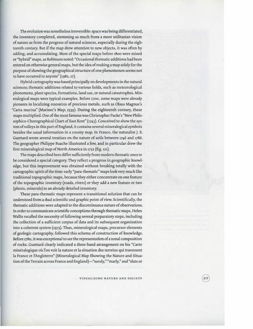
Guettard wrote several treatises on the nature of soils between 1746 and 1786.
The geographer Philippe Buache illustrated a few, and in particular drew the
first mineralogical map of North America in 1752 (fig. m). The maps described here differ sufficiently from modem thematic ones to
be considered a special category. They reflect a progress in geographic knowl
edge, but this improvement was obtained without breaking totally with the
cartographic spirit of the time: early "para-thematic" maps look very much like
traditional topographic maps, because they either concentrate on one feature
of the topographic inventory (roads, rivers) or they add a new feature or two
(plants, minerals) to an already detailed inventory.
These para-thematic maps represent a transitional solution that can be
understood from a dual scientific and graphic point of view. Scientifically, the
thematic additions were adapted to the discontinuous nature of observations.
In order to communicate scientific conceptions through thematic maps, Helen
Wallis recalled the necessity of following several preparatory steps, including
the collection of a sufficient corpus of data and its subsequent organization
into a coherent system (1973). Thus, mineralogical maps, precursor elements
of geologic cartography, followed this schema of construction of knowledge.
Before 1780, it was exceptional to see the representation of a zonal composition
of rocks. Guettard clearly indicated a three-band arrangement on his "Carte
mineralogique ou !'on voit Ia nature et Ia situation des terreins qui traversent
Ia France et l'Angleterre" (Mineralogical Map Showing the Nature and Situa
tion of the Terrain across France and England}-"sandy," "marly," and "slate or
VISUALIZING NATURE AND SOCIETY

FIGURE 121.
Phobppe Buache. ·carte moneralogique ou ron
voolla nature des terreons du Canada el de la
louisiane"IMineralogocal Map Showing the Nature
of the Terrain of Canada and Louisiana) 117521.
metallic" (1746)-but his idea found little resonance, and pointwise additions remained the most frequent medium for translating new phenomena.
From the graphic point of view, para-thematic cartography followed old, familiar habits of presentation. As Umberto Eco put it, "The iconic represen· tation produces real perception cramps and we are led to see things as they have long been presented to us by stereotyped iconic signs" (1972, 183). The situation is analogous to the usually slow pace of change in a society's art. Art
ists tend to paint the kinds of paintings their immediate predecessors painted, and people looking at paintings are troubled when they don't see the types of representations they are used to. The robust cartographic language that had developed since the Renaissance was ill suited to the depiction of new, invisible
MICHAEL FRI E ND LY AND GILLES PA LS KY

phenomena, and its very iconic familiarity delayed the introduction of a more
flexible, autonomous language of thematic cartography.
THEMATIC MAPS OF THE PHYSICAL WORLD
Thematic sea maps
There is no doubt that a real thematic cartography was born a little before 1700
in the realm of the sea chart, which linked the selective approach and the ex
pression of abstract phenomena. The development of navigation, due to commercial and colonial activities, permitted the multiplication of observations
on winds, sea currents, and terrestrial magnetism. Knowledge that earlier was
simply observational combined with scientific knowledge in this period. But
mariners' knowledge related to a portion of the surface of the globe that consti
tuted a blank page and was truly experimental, a place on which symbols could
be created without conflicting with topographic elements. In a space devoid of
visible objects, cartographers were forced to invent signs to show the invisible.
The idea of these maps once again preceded their material realization by
several decades. In France, for instance, J. Fran~ois invited cartographers as
early as 1652 to think of "the horizon with winds ... currents and other sea
movements ... , magnetic variations in several places in the sea and on earth"
(1652, 359 ). The idea was taken up some years later by Lubin: "It would then be
necessary to chart each of the winds on the sea map and register all the obser
vations I have just evoked"-that is to say, their direction, their "length," their
"breadth," their season. Nonetheless, these maps appeared very complicated to
produce. Thus, for the winds, Lubin underlined that "the enterprise would be
very new and difficult, but not impossible and (that) it would bring more glory
to those who could do it" (1678, 281).
The Englishman Edmund Halley imagined the first thematic maps at the
end of the seventeenth century. He drew a first map of oceanic winds (untitled;
it is known as "Halley's chart of the monsoons and trade winds" [1686]); then,
after a scientific journey on the Paramour, the first map indicating the mag
netic variations in the Atlantic Ocean: "A New and Correct Chart Shewing the
Variations of the Compass in the Western and Southern Ocean" (Halley 1701),
followed by a world map on the same subject (fig. 53). Halley used a method
borrowed from topography: isometric lines. He was convinced of the novelty
and effectiveness of the application of"curve lines," as he called them, toter
restrial magnetism.
Halley's maps were distributed on the Continent and quickly imitated. A
little after 1710, the map of magnetism was copied in France, probably by Guil
laume Delisle, under the title "Carte des variations de l'aiguille dans l'ocean
occidental et meridional suivant les observations faites en 1700 par Edmund
Hallei" (Map of the Variations of the Compass in the Western and Southern
VISUALIZING NATURE AND SO C IET Y

FIGURE 122.
Benjamin Fra nklin and Timothy Folger, -A Chart
of the Gulf Stream·· t1768). detail.
Ocean according to Observations Made in 1700 by Edmund Halley). Winds, cur
rents, and magnetism became the object of numerous representations during
the eighteenth century. Among them can be cited the "Chart of the Gulf Stream"
(fig. 122), drawn by Benjamin Franklin after Timothy Folger (Franklin 1768),
which seems to have adopted Fran<;ois' suggestion- showing a marine cur
rent as a river in the ocean. These maps sometimes combined several themes:
winds and currents, or winds and magnetism, as on J. N. Bellin's "Carte des
variations de la boussole et des vents generau.x'' (Map of the Variations of the
Compass and of the General Winds; Bellin 1765; fig.123).
A representational novelty oflimited distribution and constituting an end in itself, the thematic map thus evolved toward becoming a tool of comprehen
sion and management of territory, an instrumental map, "capable of shedding
light on complex features closely incorporated into natural and human space"
(Konvitz 1980, 304). At the same time, graphic language underwent its own par
ticular evolution. It was above all in the nineteenth century that it acquired its
autonomy in relation to the figurative or analogkal code of topography. With
M IC H A EL .FRIEN DLY A ND G ILLES PALS KY

the development of an autonomous language of thematic mapping, the prior
ity of representation was, in effect, reversed: topographic detail moved into the
background and special themes into the foreground.
The influence of Carl Ritter and Alexander von Humboldt
The end of the eighteenth century saw an increasing number of maps featuring
physical observations. Several colored maps recording the limits or extension of
bedrock were produced in the framework of geognosy by Lommer (1768), Glaser
VISUALIZING NATURE AND SOCIETY
FIGURE 123.
Jacques-Nicolas Bellin. ··carte des variations de
la boussote·· [Map of Compass Variations!. detail of
the Indian Ocean [1765] .
(1775), or Charpentier (1778). The first "zoographic" atlas, showing the distri
bution of animals on different continents with colored lines, appeared in 18oo
(Jauffret 18oo ). These works, only a few examples of which are mentioned here,
announced a flourishing cartography of physical phenomena in the nineteenili
century. Carl Ritter and Alexander von Humboldt, the founders of scientific ge
ography, played a fundamental role in the expansion of this cartographic field.
In 1806 Ritter published Sechs Karten von Europa (Six Maps of Europe), a
small atlas that showed the distribution of cultivated plants, trees and shrubs,
animals, and mountains, along with the limits of vegetation. The cartography
remained very elementary: the essential information was expressed by text on
the map and some colored highlights. However, the work enabled the correla
tion of natural data such as agricultural zones and climatic limits. It was the
starting point of a rational and comprehensive physical cartography, itself an
answer to Ritter's geographic project of a comparative knowledge of different
parts of the globe (Ritter 1806).
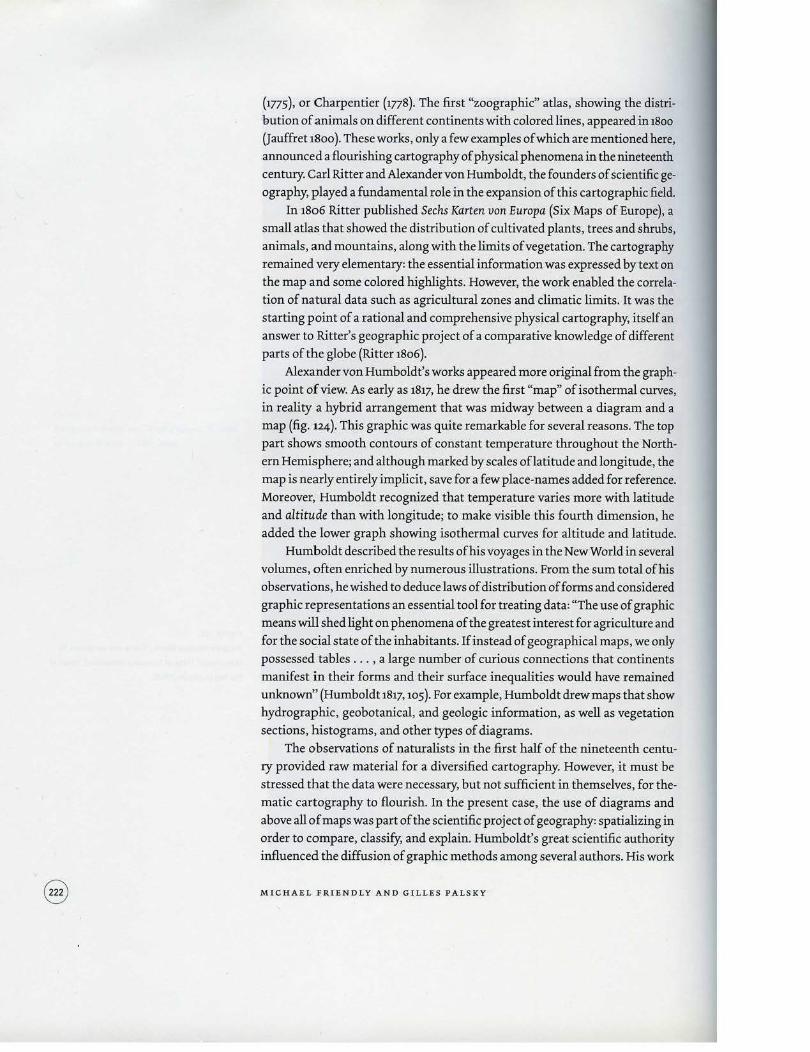
Alexander von Humboldt's works appeared more original from the graph
ic point of view. As early as 1817, he drew the first "map" of isothermal curves,
in reality a hybrid arrangement that was midway between a diagram and a
map (fig. 124). This graphic was quite remarkable for several reasons. The top
part shows smooth contours of constant temperature throughout the North
ern Hemisphere; and although marked by scales oflatitude and longitude, the
map is nearly entirely implicit, save for a few place-names added for reference.
Moreover, Humboldt recognized that temperature varies more with latitude
and altitude than with longitude; to make visible this fourth dimension, he
added the lower graph showing isothermal curves for altitude and latitude.
Humboldt described the results of his voyages in the New World in several
volumes, often enriched by numerous illustrations. From the sum total of his
observations, he wished to deduce laws of distribution of forms and considered
graphic representations an essential tool for treating data: "The use of graphic
means will shed light on phenomena of the greatest interest for agriculture and
for the social state of the inhabitants. If instead of geographical maps, we only
possessed tables . .. , a large number of curious connections that continents
manifest in their forms and their surface inequalities would have remained
unknown" (Humboldt 1817, 105 ). For example, Humboldt drew maps that show
hydrographic, geobotanical, and geologic information, as well as vegetation
sections, histograms, and other types of diagrams.
The observations of naturalists in the first half of the nineteenth centu
ry provided raw material for a diversified cartography. However, it must be
stressed that the data were necessary, but not sufficient in themselves, for the
matic carttography to flourish. In the present case, the use of diagrams and
above all of maps was part of the scientific project of geography: spatializing in order to compare, classify, and explain. Humboldt's great scientific authority
influenced the diffusion of graphic methods among several authors. His work
MICHAEL FR I ENDLY AND GILLES PALSKY

~ "'~ ... , ~--------4---11
f(f . .I .
·M-----+--=----------------·---------;-----------------------~------------r-~M
on isothermal lines thus served as a reference for a veritable German school of
cartographic treatment of meteorological data, marked by the works ofMahl
mann and Kaemtz, the latter imagining "isobaromet.ric" lines in 1832.
Nonetheless, the most important next step was Heinrich Berghaus's real
ization of the first big thematic atlas, the Physikalischer Atlas (Berghaus 1838- 48;
fig. 61). The work was undertaken on the suggestion of Humboldt, who saw it
as the graphic counterpart of his project describing the "Kosmos." Borrowing
from the best sources, it contained sixty maps, divided into six sections: Meteo
rology, Climatology, Hydrography, Geology, Magnetism, Phytogeography, and
Zoogeography. The work was quickly copied and even plagiarized in Germany.
It was also imitated abroad. In Scotland, A. K. johnston (1848 and later editions)
published the Physical Atlas, with plates (full-page illustrations) partly taken
from Berghaus and partly original, among them the splendid, Humboldt-in
spired planisphere of botanic geography decorated with vegetation profiles
or sections (fig. 125). The German cartographer Augustus Petermann collabo-
VISUALIZING NATUR E AND SOCIETY
FIGURE 124
Alexander von Humboldt. ·carte des Lignes lso
thermes-(Map of Isothermal Lines) 118171.

_.,... I I
I I
I I
I
.~
., .. ,. .... ....... ,w.av•>e.•'••-·• ---
FIGURE 125.
Ot'TI.l.'H:IS Ol"
B9UNIW. ~.Err. . ' .. " . 1'11f. OJ'iTMitlfTIO~ Of' 1'1.,\~
·~·,.._ ..... _",...., lll ... tw.. ..... tm.n.~·~~
-~~· ·f ........... _ .•. , .. ......................... _ ,,. .......... ,__e:;.. ··-
'l'lllt COUlC.IIM'IIk'..!ll.
DL3'!.ll:CW1T!O'i'l 07l'.I.W~'l'.:S ----01\'IT.tTol t>q .............. , .. 1,11).-... tc-'1 '1'.-u.,.,..,..,~ .,..,.,.,
.... &.. ............. <( ..
f\'1/u~,,..,. ..,.,...,... .... ,,,. ,...'-l~• ........
~-·ul_.,.. ... _,, . ..._.............,.,_
..__ ...... .. ___ ..... __ _
'· '
Alexander Keith Johnston, "The Geographical
Distr ibution of Plants"l1850l.
rated in this production and then published his own Atlas ofPhysical Geo9raphy ( 1850 ). In France, physical maps were included in later atlases, such as Hercule
Nicolet's Atlas de physique et de metiorolo9ie a9ricoles (Atlas of Agricultural Phys
ics and Meteorology; 1855), or J. A. Barral'sAtlas du Cosmos (1861).
Alongside these major works were more isolated ones. This was the case of
geologic maps produced at the beginning of the nineteenth century. Modern
MICHAEL FRIENDLY AND GILLES PALSKY
geologic science took shape between 18oo and 1830 around a certain number
of concepts that were new or had matured for a long time, including distin
guishing among sedimentary soils in chronolo9ical units, dated from the fossils
found there, rather than lithological units, identified by soil and rock types.
Stratigraphic paleontology replaced litho-stratigraphy. The first modern geo
logic maps were linked to these developments by color coding soils by age. A
pioneering work was the "Carte geognostique des environs de Paris" (Geologi
cal Map of the Environs of Paris) by Cuvier and Brongniart (18o8). Based on
Lamarck's research on fossils, the authors identified nine sedimentary forma
tions around Paris. The colors of their map, laid in flat tones, were reproduced
in an inset, vertically arranged in the very order of the deposits. The legend
and the sections joined to the map (including an "ideal cross section," or strati
graphic scale) thus provided structural information: they allowed the extrapo
lation of the rocky volume in three dimensions.
As we noted at the beginning of the chapter, the grand project of early
geologic mapping was accomplished by William Smith. Begun at the end of the
eighteenth century, it culminated with the publication of"ADelineation of the
Strata of England and Wales with Part of Scotland" (Smith 1815) on a scale of 5 miles (8 krn) to the inch (1:316,8oo) (.fig.117). The huge map, measuring nearly 6
feet by 9 feet (1.8 x 2.7 m), is a real masterpiece. Different strata are identified by
twenty-three colors, all applied by hand in this period before color lithography.
Simon Winchester (2001) makes a good case for the practical and theoretical
importance of Smith's map, calling it "the map that changed the world."
After 1820, maps based on stratigraphy multiplied. A second general map
of England was published by Greenough (1820), then completed and repub
lished in 1839. Leopold von Buch {1826) drew a geologic map of Germany and
neighboring countries, as did Heinrich von Dechen {1838). In France, the in
spector general of mines, Brochant de Villiers, was concerned about the ab
sence of a sufficiently precise geologic map enabling the development of the
mining industry. He elaborated a project in 1822, whose realization was
given to two polytechnicians and mine engineers, Dufn!noy and Elie de Beau
mont (1840 ). They stayed in England to learn the methods of work, and then
made their observations in France from 1825 to 1835. Their map was engraved
in 6 sheets at a scale of 1/5oo,ooo and presented to the Academy of Sciences
in 1841. Such small-scale maps served as a basis for the detailed renderings at larg
er scales that were undertaken in the following decades. Geologists' work also
extended to colonies and young republics of the New World, which were ideal
fields for the observations of naturalists. Thus, the geologically colored "Carte
generale de la republique de Bolivia" {General Map of the Republic of Bolivia)
testified to the results obtained by the Frenchman Alcide d'Orbigny during
his trip to South America from 1826 to 1834, at the request of the Museum of
Natural History in Paris (Orbigny 1842).
VISUALIZING NATURE AND SOCIET Y
DIAGRAMS AND STATISTICAL GRAPHS
The development of charts, diagrams, and graphs in many ways runs parallel to that of thematic maps, and arose from similar problems and similar desires to move from observations and evidence to understanding and explanation. Among the most important problems of the seventeenth century were those concerned With physical measurement-of time, distance, and space-for astronomy, surveying, mapmaking, navigation, and territorial expansion. This
century also saw great new growth in theory and the dawn of practical applica· tion of data to scientific problems: the rise of analytic geometry and coordinate systems (Descartes and Fermat), early theories of errors of measurement and estimation (J. Mayer and Gauss), the birth of probability theory (Pascal and Fermat), and the beginnings of demographic statistics and "political arithmetic" (Graunt). We use two early examples to illustrate these beginnings.
Scheiner's sunspots
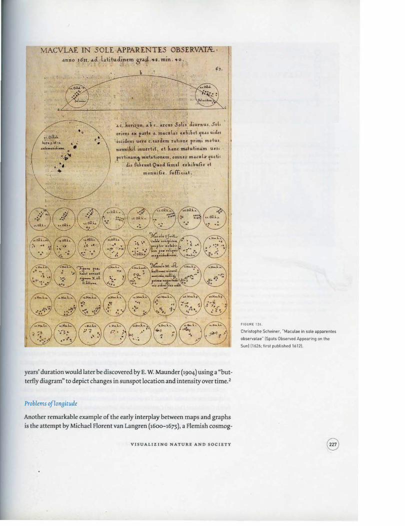
In late 1609, Galilee constructed one of the first astronomical telescopes and almost immediately made a series of important discoveries-craters on the moon, a huge number of new stars, observations on the moons of Jupiter, sun
spots-which he published in Sidereus nuncius (The Starry Messenger) in March 1610. News of Galilee's discoveries traveled quickly, and Christophe Scheiner (1573-1650), a Jesuit in Augsburg with talents in mathematics and instrument making, constructed a device to record the position and movement of sunspots over time. The substantive and philosophical issue was the Jesuit-assumed perfection of the sun (could sunspots be explained as shadows cast by moons?), but the evidentiary issue was how to display chan9es in configurations of sun
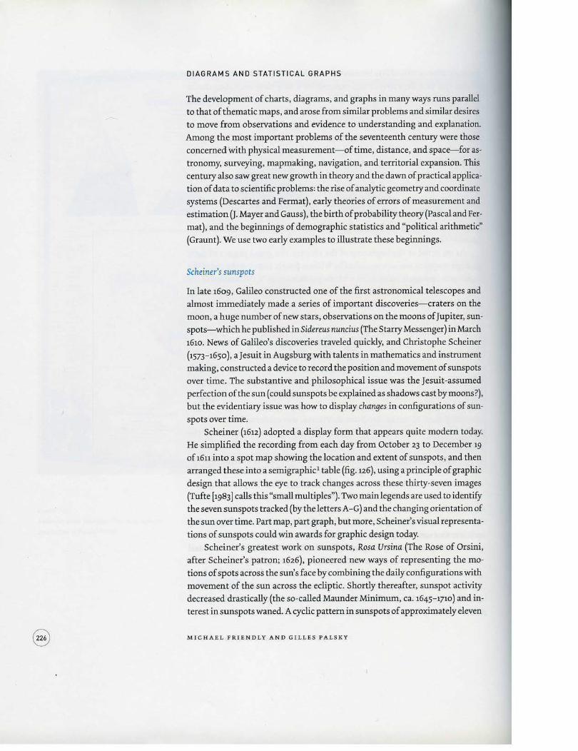
spots over time. Scheiner (16u) adopted a display form that appears quite modern today.
He simplified the recording from each day from October 23 to December 19
of 1611 into a spot map showing the location and extent of sunspots, and then arranged these into a sernigraphic1 table (fig. u6), using a principle of graphic design that allows the eye to track changes across these thirty-seven images (Tufte [ 1983] calls this "small multiples"). Two main legends are used to identify the seven sunspots tracked (by the letters A-G) and the changing orientation of the sun over time. Part map, part graph, but more, Scheiner's visual representa
tions of sunspots could win awards for graphic design today. Scheiner's greatest work on sunspots, Rosa Ursina (The Rose of Orsini,
after Scheiner's patron; 1626), pioneered new ways of representing the mo· tions of spots across the sun's face by combining the daily configurations with movement of the sun across the ecliptic. Shortly thereafter, sunspot activity decreased drastically (the so-called Maunder Minimum, ca. 1645-1710) and interest in sunspots waned. A cyclic pattern in sunspots of approximately eleven
MICHAEL FRIENDLY AND G ILL ES PALSKY
MACVLAE IN SOLE APPARENTIS OBS£RVA1ft. • o1nno 16n. o1d lo1titudintm ,~,r.1.~ . +a.min . •o . . . ,, .. . ...
.. . · • ,.
. ·:~'-A ~~ •
.. . r• •
\
.>.C. hori~n . ... b c , ... reus Solis. diurnus. Sol,
oricns ex p.a:rtc ..... m .. cul .. s u!.il..t ~'"'' uicfcs
·o<tidens ucrci c.e.asclcm r.1.tionc primi motus .
nonnil.i( inuntit .. et J. ... nc modutinim ucH
pe·din.l.m~ m<ri.>.bO'Ilc.m. ~·mnes· m.l.tUI.r 'luoti '
clic fu!.cu.nbQ~od fcmcl exhi!.ufst d
J monulGe. fuffici.l.t.
years' duration would later be discovered by E. W. Maunder (1904) using a "but
terfly diagram" to depict changes in sunspot location and intensity over time. 2
Problems oflonyitude
Another remarkable example of the early interplay between maps and graphs is the attempt by Michael Florent van Langren (1600-1675), a Flemish cosmog-
VISUALI ZING NATUR E AND SOCIETY
FIGURE 126.
Christophe Scheiner . .. Maculae in sole apparentes
observatae- ISpots Observed Appearing on the
Sun) [1626; first published 16121.

FIGURE 127.
Michael Florent van Langren, Variat ions in the
estimates of the difference in longitude between
Toledo and Rome 116441.
rap her to the court of Spain, to portray variations in the determination oflongitude (fig. 127), believed to be the first visual representation of statistical data (Tufte 1997, 15). At that time, lack of a reliable means to determine longitude at sea hindered navigation and exploration (Sobel1996).
This one-dimensional line graph (Langren 1644) shows all twelve known estimates of the difference in longitude between Toledo and Rome, and the name of the astronomer (Mercator, Tycho Brahe, Ptolemy, and so on) who provided each observation. What is notable is that van Langren could have presented this information more easily in various tables-ordered by author to show provenance, by date to show priority, or by longitude to show the range. However, only a graph shows simultaneously (1) the wide variation in the estimates (the range of values covers nearly half the length of the scale); (2) the central or estimated value (marked "ROMA''), along with (3) the names
and values attached to the individual determinations. 3 Van Langren's graph is also notable as the earliest-known exemplar of the principle of"effect ordering for data display'': "order information in graphs and tables according to what should be seen" (Friendly and Kwan 2003).
New 9raphic forms
With some rudiments of statistical theory, data of interest and importance, and the idea of graphic representation at least somewhat established, the eighteenth century witnessed the expansion of these aspects to new domains and new graphic forms. Abstract graphs and graphs of mathematical functions
became widespread, and as economic and political data began to be collected, some nov:el visual forms were invented to portray them so the data could more easily "speak to the eyes."
Interest in a wider range of phenomena called for new abstractions and adaptations of visual forms. For example, in 1770, Philippe Buache published (with Guillaume Delisle) Cartes et tables de Ia Gio9raphie physique, containing a chart and table of high and low water levels in the Seine over time, semiannu
ally from 1732 to 1766 (fig. 128). Buache, a physical geographer, was quite used
MICHAEL FRIENDLY AND GILLES PALSKY

to profile maps of terrain elevation over space. To show changes over rime, he
substituted time for space, and used two levels of sh ading to distinguish high
and low water levels (Buache 1770 ). A modest change visually, the substitution
of concrete space by a more ·abstract dimension of time anticipates time series
graphs and bar charts that would develop shortly.
As another example, geometric figures (squares or rectangles) and carto
grams to compare areas or demographic quantities were introduced by Charles
de Fourcroy (1782) and August F. W. Crome (1785). Figure 129 shows the English
version of a "map" of the "statistical relations of Europe," produced in 1819
by Crome and engraved by Aaron Arrowsmith, notable for the combination
of superimposed squares (showing area) and divided circles showing data on
population and finances. Time lines, or "cartes chronologiques," were devel
oped to portray people and events in history by Jacques Barbeu-Dubourg (on a
54-foot [ 16.2-m) scroll) and by Joseph Priestley (1765, 1769 ). Priestley's invention
would shortly serve as an inspiration for William Playfair, whose work can be
considered the origin of modern statistical graphics.
Playfair (1759- 1823) is widely considered the inventor of most of the graph
ic forms used today- fi.rst the line graph (to portray economic data over time)
VISUALIZING NATURE AND SOCIETY
FIGURE 128
Phillipe Buache. "Profits repn!sentants Ia crue et
Ia diminution des eaux de Ia Seine et des rivieres
qu'eUe re~oit dans le paYs-haul au dessus de Paris"'
(Profiles Showing the High and Low Waters of the
Seine and Its lnflowing Rivers in the High Lands
above Parisi (ca. 17701.

or TID. STA.TISTICAL bLA.TIORS or EUJIOR: ~ .. - p.w,. a..na. .c .. ,.': ~.c &.,.. !"'~~,..,-,/ _18n/;r,H /7 it. '.W.. '_L;C/}1'7/ rnl,.,!
FIGURE 129,
August F. W. Crome, "A Map of the Statistical
Relations of Europe· (18191.
...,.,.,..,..,_.,~ ~n,_(!)(lrUJ/1T.,grnb' •
and bar chart (1786), and later the pie chart and circle graph (1801). In the Commercial and Political Atlas, published in three editions in England (1786-1801)
and one in France (1789) and the Statistical Breviary (1801; French translation 1802), Playfair adapted and invented an astonishing number of graphic constructions to convey economic data to the eye. "His genius was to realize that nonspatial quantities such as expenditures and historical time could be represented by physical space and that such representations offered advantages denied to tabular presentations" (Wainer and Spence 2005, 30). Such graphs were indeed novel; he referred to the idea to represent quantities by lengths of
lines along a scale as "lineal arithmetic" and devoted several pages to description of how to read a graph.
Figure 130 shows his time series chart of the national debt of England. It is surprisingly modem in graphic design, with axis scales, major and minor grid lines, an aspect ratio (height to width) that enhances vertical differences, and text labels for significant historical events. Playfair's message is abundantly
MICHAEL FRIENDLY AND GILLES PA LSKY

clear: the national debt has risen dramatically, and each sharp upward tum
occurred in times of war.
Another chart (fig. 131) offers a creative combination of different visual
forms: circles (used to show the area of nations), a pie chart (to show the divi
sions of the Turkish Empire), and lines (to show both population and taxes). In
this figure the left axis and the left line on each circle shows population, while
the right axis and line shows taxes in millions of pounds. Playfair intended that
the slope of the line connecting the two would depict the rate of taxation, and
argued that the British were overtaxed compared with the other nations. The
graph is flawed, because the slope also depends on the diameter of the circle. It
would also be considered sinful today, because separate y scales allow percep
tions to be manipulated by rescaling one axis or the other. In Playfair's defense,
the idea of calculating and graphing rates or other indirect measurements was
still a half century away, and his main point is sustained because the line for
Britain slopes in the opposite direction to most of the others.
Beyinninys of modem statistical graphics
In the first half of the nineteenth century, all the modern forms of data display
were invented: bar and pie charts, histograms, line graphs and time series plots,
contour plots, scatterplots, and so forth. But another development- the wide
spread collection of population, economic, social, and medical data- spurred
explosive growth in applications of statistical representations by graphic displays at a rate that would not be equaled until modern times.
As the modern states of Europe developed, it was seen that statistics ( origi
nally meaning "numbers of the state") were crucial for national planning, so
cial legislation, and economic progress. Where should railroads and canals be
built? What was the distribution of imports and exports? What should be done
to control crime? Statistical bureaus that were established in many countries
created an "avalanche of numbers" (Hacking 1990 ), but graphic methods often
proved essential in deciphering them.
The use of diagrams and maps in understanding social or "moral" statis
tics will be detailed in the final section. Here we illustrate this period with a
novel1844 tableau.fiyuratif(fig. 132) by Charles Joseph Minard, engineer for the
Ecole Nationale des Ponts et Chaussees (national school of bridges and roads) in Paris. Minard is, of course, best known for his depiction of the fate of Na
poleon's Grand Army in what has been called the "best statistical graphic ever
drawn" (Tufte 1983).
This inventive graph is related to the modern bar chart and mosaic plot
(Friendly 1994, 2002), but Minard introduced two simultaneous innovations: the use of divided and proportional-width bars so that the area of each rectan
gle had a concrete visual interpretation. Through these variable-width, divided
bars, the graph shows the transportation of commercial goods along one canal
VI SUA L IZING NATUR E AND S O C I ETY
FIGURE 130.
William Playtair. "Chart of the National Debt of
England" [1801).

a.--~~ ;c.. __ ,~~....._., ~~....r-'~-~ ~-~ ~ ....... ,. ... ' ~-· ... <?:

route in France (Minard 1845b). The questions at hand were how to plan and
charge for transportation of various goods (coke, minerals, wood, and so forth)
along various portions of the route (differential rates for partial versus com
plete runs; effect of direction of shipment). In this display the width of each
vertical bar shows distance along this route; the divided bar segments have
height proportional to amount of goods of various types (shown by shading),
so the area of each rectangular segment is proportional to cost of transport.
Direction of each type of shipment is indicated by arrows. Minard used this
diagram to argue that differential rates should be set for various partial runs.
Whereas Playfair had tried to make data "speak to the eyes," Minard wished to
make them "calculer par !'ceil" (calculate by eye) as well (Minard 1861, 4).
The golden a9e of statistical graphics
By the rnid-18oos, the combination of abundant data of real importance, emerg
ing statistical theory, and technological advances in reproduction provided the
conditions for rapid growth-a "perfect storm" for advancements in data vi
sualization. What started as the "Age of Enthusiasm'' (Funkhouser 1937; Palsky
1996) for data graphics ended with what can be called a golden age, often with beauty difficult to find in modern graphics. So varied were these developments
that it is even difficult to be representative; some highly selective examples must suffice to illustrate a few themes.
One important theme was the desire to display more complex phenomena
and more than two variables simultaneously on a flat piece of paper. Earlier
developments ofisolines on thematic maps and contour diagrams of relatively
simple and error-free physical data (variations of temperature or barometric
pressure over time and space) were extended to three-dimensional surface
plots of population by age and time (for example, by Gustav Zeuner in Ger
many and Luigi Perozzo in Italy) and, most important, to situations where the
relations were statistical or only approximate, rather than functional ones or those measured with little error.
Among the scientific advances of this period that depended directly on in
sights gained from graphic analysis of statistical data in three or more dimen
sions, there are two that stand out, both due to Sir Francis Galton. The more
well known is Galton's discovery of the bivariate normal correlation surface
(Galton 1886), from data on the relation between heights of parents and their
offspring. Galton constructed a table of grouped frequencies of heights of par
ents and children and drew smoothed isofrequency contours. He noticed that
(1) the contours of equal frequency approximately formed a series of concentric
ellipses and (2) the loci of the mean of y given x and of x given y were approxi
mately the conjugate diameters of the ellipses. These relations would later form
the basis for the theory of correlation and regression (Pearson 1901).
VISUA L IZING NATUR E AN D SOCIETY
FIGURE 131.
(lacing. top) William Playfair. "Statistical Chart
Shewong the Extent. the Population and Revenues
of the Principal Nations of Europe·· (1 8011.
FIGURE 132
(facing. bottom) Charles Joseph Minard. ··Tableau
figuratil du mouvement commercoal du canal du
Centre en 1844- (Figurative Chart of Trade on the
Canal du Centre in 1844] (1845] .
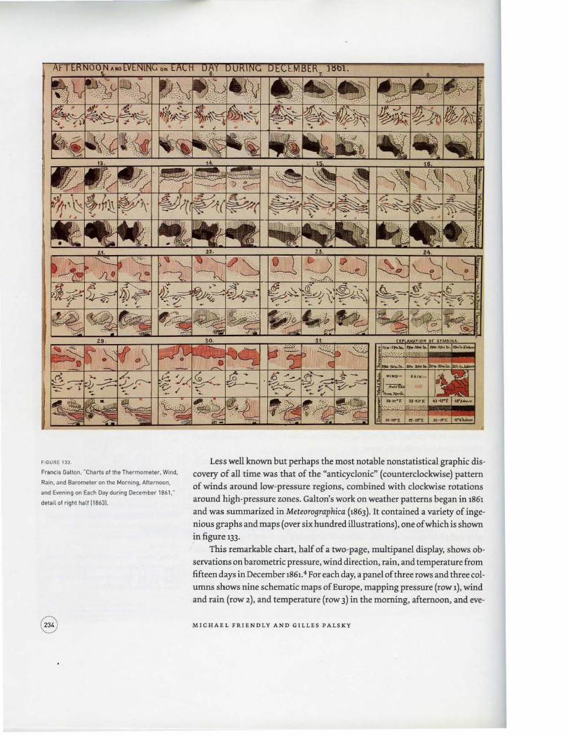
FIGURE 133.
Francis Gallon. "Charts of the Thermometer. Wind.
Rain. and Barometer on the Morning. Afternoon.
and Evening on Each Day during December 1861."
detail of right half 118631.
Less well known but perhaps the most notable nonstatistical graphic dis
covery of all time was that of the "anticyclonic" (counterclockwise) pattern
of winds around low-pressure regions, combined with clockwise rotations
around high-pressure zones. Galton's work on weather patterns began in 1861
and was summarized in Meteorographica (1863). It contained a variety of inge
nious graphs and maps (over six hundred illustrations), one of which is shown
in figure 133.
This remarkable chart, half of a two-page, multipanel display, shows ob
servations on barometric pressure, wind direction, rain, and temperature from
fifteen days in December 1861.4 For each day, a panel of three rows and three col
umns shows nine schematic maps of Europe, mapping pressure (row 1), wind
and rain (row 2), and temperature (row 3) in the morning, afternoon, and eve-
MICHAE L FRIENDLY AND GILL E S PALSKY
ning (columns). One can clearly see the series of black areas (low pressure) on the barometric charts for about the first half of the month, corresponding to the counterclockwise arrows in the wind charts, followed by a shift to red areas (high pressure) and more clockwise arrows. Howard Wainer remarks, "Galton did for the collectors of weather data what Kepler did for Tycho Brahe. This is
no small accomplishment" (2005, 56).
This chart was not the source of Galton's inspiration. Rather, it is the summary graphic he devised from ninety-three separate schematic maps of his data, each one using special iconic symbols he devised to show the weather measurements. As with Scheiner's graph of sunspots, the composition of many small figures into a single, "small-multiple" display permits visual comparisons of changes and patterns that could not be seen otherwise.
A second theme concerns transformations of data and maps to make relations simpler and enable their use for direct, visual calculation. Some examples
from this period are the sernilogarithmic graphs introduced by the economist WilliamS. Jevons (1863) to show percenta9e changes in commodity prices over time; log-log plots to show multiplicative relations (Lalanne 1846) as linear graphs; anamorphic maps by Emile Cheysson (reproduced in Palsky 1996 as figs. 63-64) using deformations of spatial size to show a quantitative variable (for example, the decrease in travel time from Paris to various places in France over two hundred years); and alignment diagrams or nomograms using sets of
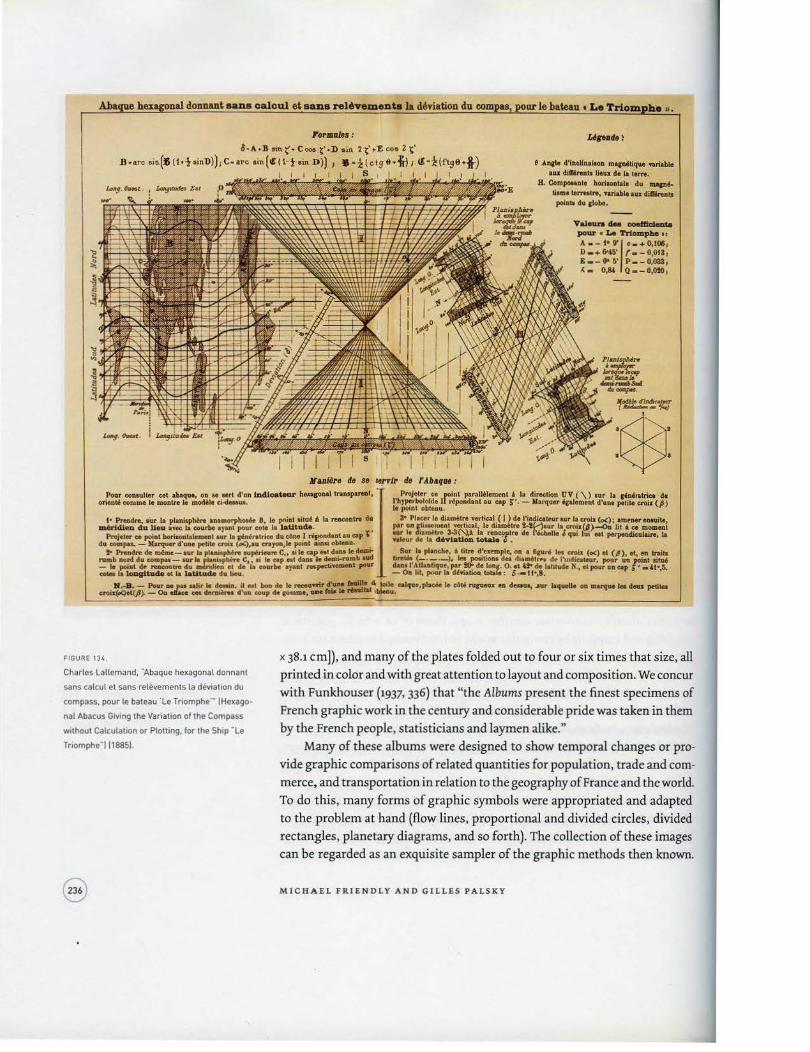
parallel axes ( Ocagne 1885, 1899) for calculating complex functions. We illustrate this slice of the golden age with figure 134, a tour-de-force
graphic by Charles Lallemand (1885) for determination of magnetic deviation of the compass at sea in relation to latitude and longitude without calculation. Lallemand was an engineer, best known as director general of the geodetic measurement of altitudes throughout France. This graphic combines many variables into a multifunction nomogram using three-dimensional figures, juxtaposition of anamorphic maps, parallel coordinates, and hexagonal grids. As with Galton's multivariate weather maps, those of us who do statistical
graphing and mapping by computer would be hard pressed to create such displays today.
A final theme for the golden age is the production of impressive statesponsored statistical atlases that began in the 1870s throughout many countries in Europe as well as the United States. This effort to present graphic views of population, trade and commerce, and social and political issues continued until the early part of the twentieth century, and was accompanied by international statistical congresses (begun in 1853 in Belgium) that attempted to develop standards for graphic presentation and were closely tied to the state statistical bureaus. The pinnacle of this period was undoubtedly the Albums de Statistique Graphique published annually by the French Ministry of Public Works between 1879 and 1899 under the direction of Emile Cheysson (see Dainville 1972). They were published as large-format books (about u x 15 inches [27.9
VISUALIZING NATURE A ND SO C I ET Y
nal dolllWlt aana oaloal et aaiUI relt.ementa Ia d6Tiation du compu, pour 1e bateau • Le Trtom he •.
l.oJOIHifa :
O•A·.B ""'t'· c- t"·D ein 2 t'+'E coo z t' B ·m sin(• U•t•in1>))1 C·arc am(Cil·tain D)) 1 • · z(ctg ti+~ J 11 ·-!(ftge•!)
s
JCaDIM'e de ae lel'Ta de r Abq11e :
& All(lo d'locllnalt<>D m.,.,.Uqae taNblo &Ill dUf4reoto U..U. do I& terre.
H. Com,_..to borl1011talo du ....... tiomo ..,_IN, ...nGta au clifirei.~J
poinoo du pbo.
Valftn .S. _....,._., poar • 1:.. YrtompM ••
A. -t•eo, ... o,toe1 0 • + 6-4$' f- - O,OtS1 1--0<5' P . -0,033, .__ o,84 o--o,otO,
Potar couulter eet 1baque, OD ae nrt d1un 1D41oat.ea.r h...,oalltranspa.reot, orien" conune t& monLte le modA:Ie ci-4euu.t.
Projeltr co point parall61emmt ' Ia direotioo UV ( \) our Ia pn,nlriee de l'ltrJ>!•·bololde II N!pondant u cop !;'. - Marquer 'colement d'une petita uo.iz (p) le potnt obtenu.
I• "'-''re. our Ia planiapMre onamorpbOIM 8, lo point oUtu6 i. Ia reACODIN do aMricUeo da. lieu avec: Ia courbe ayant pour cote Ia laUt.D.de. ,
3- Placer lo diam6tre 'fU!ieal ( I ) do l'iadicat.ur aur Ia croi• (oe) • • ..,..,... e-'1& per un tiiMmcnt ..-tical, le di.a.m~lr6 t.lt;j•ur Ia troia(l)-o.'ut l ce momai
Projel&r c. poi at boriaonl&lemet~l our Ia pn4ralrico du e4M I repoadaat au eop t du. compu. - Ka.rquer d•ODc pthte e:rotr (c.c),au ete)'OG,Ie point aiDa obteou. •
:r.~~ d~·~~~ ::..::.ev• ... do kbel~<~ & qoi lui ... porpeadieulaite 1a
to Prolldro de --••• Ia pluuophtro aup6rieuro c,,.; le cop.., daDSie~ . S..r Ia plandte, A btre d:~emple, on • &curt In uoi1 (o<) ot (,1), et,., lnilo namb nord. du. compu- tQJ" If, plani.pbtre c,," le cap etl dana le dem.-f'Wilb....,. ti,.. (-· ---)., '- poutioa del dliMlt,.... df' l'lr\dicateur, poor un _poiat lito6 - le poi•t 6t- reocootre do m"rtthtn et de Ia WOJ'be araat res~t ,_,. dan•I'Atlaat.ique, par 10- de loac-. 0. et 4!- de latilude N, et pour uo cap ; i •4t•,5. cola ta ~de ella Ia~ du II.u. - 0.. lot, pour Ia d4riatiota tolale: 6 •11•,8.
Jf.-8 . - l'oar ae pao aalir lo clooaia, n ool boa de lo ..-miT ohM~!:..'' irHio calqac,pi.U. le ebU rupeax 011 -.. ...,.. laqaollo oo ID ...... leo r1wz pttitao croi>EoQel(ft). - 0.. olaco - dorDiUot d'un eoup do comme, -lblo lo ,_ lblonu.
FIGURE 13,.
Charles La lle mand, "Abaque hexagona l donnanl
sans calcul et sans releve ments la deviation du
compass, pour le bateau 'Le Triomphe'" (Hexago
nal Abacus G1ving the Variation of the Compass
w1thout Calculation or Plotting. for the Ship "Le
Tnomphe"l (18851.
x 38.1 em]), and many of the plates folded out to four or six times that size, all printed in color and with great attention to layout and composition. We concur with Funkhouser (1937, 336) that "the Albums present the finest specimens of French graphic work in the century and considerable pride was taken in them by the French people, statisticians and laymen alike."
Many of these albums were designed to show temporal changes or pro
vide graphic comparisons of related quantities for population, trade and commerce, and transportation in relation to the geography of France and the world. To do this, many forms of graphic symbols were appropriated and adapted to the problem at hand (flow lines, proportional and divided circles, divided rectangles, planetary diagrams, and so forth). The collection of these images can be regarded as an exquisite sampler of the graphic methods then known.
MICHA EL FRI ENDLY AND GILLES P A LSKY

., ~ ,...CMICPMIOMTUitlr
~ ~
' . , . .,__,... __
f. \ M .\ '
Figure 135, for example, uses spiral symbols to show the population of each department (administrative district) over the five-year periods from 1801 to 1881. The radius of each circle corresponds to the population in 1841, and the area between this reference circle and the curve for actual population is shaded red or blue, respectively, according to whether the pop ulation was less than or
greater than that in 1841.
At about the same time, other statistical albums and atlases were pre
pared in Europe and the United States, and among these, those from the U.S. Census Office deserve special mention. The Statistical Atlas of the Ninth Census, produced in 1874 under the direction of Francis Walker, contains sixty plates, including several novel graphic forms (United States Census Office 1874).It had the ambitious goal of presenting a graphic portrait of the nation, and covered a
VISUALI ZING NATURE AND SOCIETY
FIGURE 135.
-Mouvement quinquennal de la population
par departement depuis 1801 jusqu·en 1881-
IOuinquennial Change of the Population by
Department from 1801 to 18811 118811.

~ •..---,.,.._-..;·-,.,.,.:._,.,.,_~ .__ ;.....,.,.,........ ........ / .... __ ..._.,........., _ __ _,..... .. ,.,..._....,. .. ~ .. ------...,., _...__,..,...,..._ _ _, ___ ~---.#......_ ...... ....., ... ~,.,--~-~.......,.., ,_...,...........,._, ...... .___. ,,_,,...._.....,_... -~--·----·-...... ·-------·---"'------j·- ----· ...,... .... ..,.- ":!"~- ... .,.,., . ..... ___ ,__,, .. -.-_.,__._ .. ___ ..... ____ ..,....,_ .... ....,.... -~·--......... ,.-..,.......,.~.·--~---~:: .!.w -:,.z:; :~!::..--..::..:::. --..----·"'---·----=:z:z:::.-;'!..,.~":;"~~.::;:. -.. ,.~-..,-~~ .... ,.,
FIGURE 136 .
Francis A. Walker, "Chart Showing the Principal
Constituent Elements of the Population of Each
S tate .. (18741.
I'IUSt'lr AL COli!I1TnJENT EIJ'.Ml:!CTS POPULATIONClF.EACH STATE,
u. ....... ,JC.Inlo'I~AJID ·dn'KWtn:", Ah ___ ...,...,_¥rf1lti)C'\' Tlltnctt:t/6 ........ ... ,....... ,_ .. ·d- e~,..,..w-..... J:....._ .. _ ,.j ..
~
ntA.~hC:A W.u«U.
---~·'--1 .... ~....,. ...... ... .,.,..,.,. .....,.,.~ .... -... _, ... """*" ......... ~ t-·
I
wide range of physical and human topics: geology, minerals, weather, popula
tion, wealth, literacy, rates of death and disease, and so forth. Figure 136, for
example, uses mosaiclike divided rectangles to show state populations classed
as foreign, native colored, and native white, and as born within or outside the
state of residence. Walker is also credited with the invention of"age pyramids"
(back-to-hack bilateral frequency histograms and polygons), which he used to
compare age distributions for two classes (male{female, married/single, and so
forth). (For more on Walker and the Statistical Atlas, see chapter 4 of the present
text, pp. 189- 92 and figs. 103-106). Following each subsequent decennial census for 188o to 1900, reports
and statistical atlases were produced with more numerous and varied graphic
illustrat ions. The 1898 volume from the census of 1890, under the direction
of Henry Gannett, contained over four hundred graphs, cartograms, and sta
tistical diagrams (United States Census Office 1898). Figure 137 is an example
M ICHAE L FRIENDLY AND GILLE S P ALSK Y

i. RAN~ OF STATES ANI) TERRITORIES I~ POPULATION AT EACH Cl:NSUS: 1190- 189Cl
...... -·--.. -----... ....... -------.. _. --· ------------_.., -··-·-----.... _ -... ----...... ....
-=- "'::"'
of a ranked-list, semi9raphic display of a form similar to what is now called
a parallel coordinate plot. The presentation goal was to show the ranking of populations of the states from all censuses from 1790 to 1890 and allow increase or decrease to be tracked by state. To achieve this, the symbol for each state was colored and shaded distinctively and connected across adjacent census
periods by lines.
MAPS AND DIAGRAMS IN SOCIAL SCIENCE
If the early modern period (before about 18oo) of thematic maps and graphs can be characterized as driven by concerns from the physical sciences, many innovations in the nineteenth century stemmed from a new concern with understanding human conditions and activities that would give rise to modern
VISU.ALIZING NAT U RE AND SOCIETY
··- ... =-
FIGURE 137.
-- --- -
Henry Gannett. "Rank of States and Territories in
Population at Each Census, 1790- 1890" (18981.

social science, including economics, sociology, and epidemiology. There were
several forces at play here, among which an explosive growth in data collection
on social and economic topics figured prominently, as we noted earlier. An·
other theme that arose was the possibility of formulating "laws" or relations of
the social order, akin to those that had been developed to understand relation
ships of the physical order. The principal methods of present-day quantitative
cartography were imagined in this context between 1826 and 1845; the graphic
methods invented by Playfair for economic data were extended, modified, and
appropriated to comprehend a wider range of social phenomena and their re
lations. 5 In this endeavor, the natural sciences offered a model to follow in the search for patterns of constancy and variation in social data, as can be
inferred from early statisticians' frequent references to Humboldt, Berghaus,
and others.
The rise of moral statistics
To express these new social phenomena, cartographers had to reform radically
the graphic language for the portrayal of statistical data in order to create new
relationships between graphic forms and numbers as well as establish a new
logic and a new syntax, much as Playfair had done with his "lineal arithmetic."
The first modern statistical map is credited to Baron Charles Dupin in France.
His "Carte figurative de !'instruction populaire de la France" (Figurative Map
of Popular Education in France) was the starting point of a graphic revolution,
whose consequences can still be felt in contemporary mapping. Trained as an
engineer at the Ecole Polytechnique starting in 1801, Dupin turned his attention
in the 182os to "statistics, an entirely new science [that] had never been usefully
applied. Mr. Charles Dupin resolved to make it serve to observe our country's
progress in the path of moral and material interests" (Hoefer 1858-78, val. 5, p.
320 ). Dupin presented some of his results in lectures at the Conservatoire Na·
tiona! des Arts et Metiers. In 1826, he submitted his map (fig. 138) in a paper on
the "effects of popular education on France's prosperity" (Dupin 1826). The map
was printed one year later in his major work: Forces productives et commerciales de Ia France (Productive and Commercial Power of France; Dupin 1827 ). It ill us·
trated primary education, considered a sign of general development. This topic
allowed him to represent a basic opposition between northern and southern
France through an original graphic method: "To render the most important of
these differences visible," he wrote, "I hit upon the idea of giving those depart·
ments that sent fewer pupils to schools the darker shades" (Dupin 1827, 249).
The method, now called the choropleth map, had no known antecedent.
However, a plausible hypothesis about its conception can be advanced. The
map became famous as the "map of enlightened and obscure France"6; Dupin
himself used the expression "enlightened France" when he presented it at the
Conservatoire.lt would be reasonable to conclude that a scale of moral values
MI CH A EL FRI E ND L Y AN D GIL L ES PALSK Y

directly inspired the gradual shadings of the map. The shading gave the impression of a light cast on the map, comparable to the light of knowledge. More
over, we will see that most of the maps that immediately succeeded Dupin's
were based on the same principle: the scale of shadings always transcribed a
scale of values, always with sense that darker meant worse.
Very quickly, Dupin's invention served a wider role in the origin of social
science as "moral" and social statistics became more widely available. In 1825,
the French Ministry of Justice instituted the first centralized, national system
of crime reporting, recording the details of every charge laid before the courts.
In 1829, Andre-Michel Guerry, a Parisian lawyer with a penchant for numbers,
V IS UALIZING NATURE AND SOCIETY
FIGURE 138.
Charles Dupin. -carte figurative de rinstruclion
popula~re de la France- IFigurat1ve Map of Popular
Education in Francel 118261.

joined with the Venetian geographer Adriano Balbi to produce the first comparative maps of crime and education, to examine the relation between these moral variables (Balbi and Guerry 1829 ). By 1833, Guerry produced the first comprehensive study of such social data, also including data on suicides, donations to the poor, illegitimate births, and so forth. Using shaded maps and graphic tables, he showed that rates of crime, suicide, and other variables remained remarkably stable over time, yet varied systematically from place to place. He said, "We are forced to conclude that the facts of the moral order are subject,
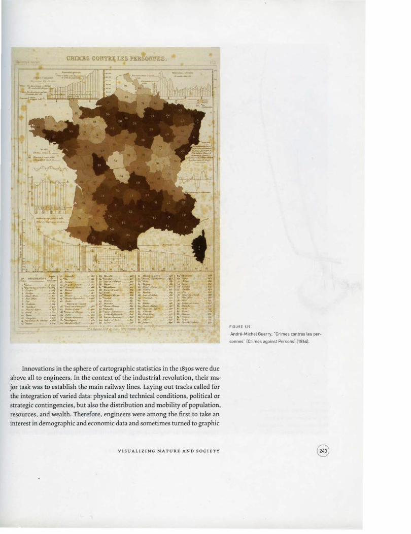
like those of the physical order, to invariable laws" (Guerry 1833, 14). This, along with the contemporaneous work of Adolphe Quetelet in Belgium (1831, 1835), may be regarded as the foundational study of criminology, sociology, and modern social science. Guerry's last work ( 1864) proposed a new form of analytical statistics presented visually with both maps and graphs, and comparing data from France and England over a thirty-year period. Figure 139 shows one of seventeen plates from that volume, here for crimes against persons in France. Recognizing that shading on the map is an overall summary, various graphs around the periphery were designed to dissect these by time or other factors or to highlight noteworthy patterns and trends.
Proportional symbols
Sometime after Dupin, A. Frere de Montizon, an officer who became a profes
sor of sciences after the fall of the First Empire, conceived a second graphic method employing dot symbols. He published several educational works on morals or history at the beginning of the century. Later, his "Carte philoso· phique figurant la population de la France" (Philosophical Map Showing the Population of France; Frere de Montizon 1830) represented population distribution in absolute values. The population was indicated by departments, using a number of dots proportional to the number of inhabitants, 1 dot to 1o,ooo persons. The map was "philosophical" because Frere de Montizon wished to relate the population to "the physical, intellectual and moral state of the country." He thus traced a line AB on his map, going from Saint-Nazaire to
Maubeuge-a "thermometric line" dividing the territory into two climatic zones of differing agricultural production. In his view, this fact explained the general distribution of population. The map was visually not very effective, for the procedure was difficult to master. The image presented was more of a uniform distribution, because the very small dots and the observation scale (by department) made the spatial contrasts less visible. Nonetheless, the "Carte philosophique" initiated an important method and revealed the new curios
ity toward demography. This was shown yet again a few years later by George P. Scrope's publication of a map of the world's population according to three bands of density (Scrope 1833).
MICHAEL FRIENDLY AND GILLES PALSKY
Innovations in the sphere of cartographic statistics in the 1830s were due above all to engineers. In the context of the industrial revolution, their major task was to establish the main railway lines. Laying out tracks called for the integration of varied data: physical and technical conditions, political or strategic contingencies, but also the distribution and mobility of population, resources, and wealth. Therefore, engineers were among the first to take an interest in demographic and economic data and sometimes turned to graphic
VI S UA LlltNG NATURE AN D SOCIETY
FIGURE 139.
Andre·Michel Guerry. "Crimes contres les per
sonnes" (Crimes against Persons] (18041.

fiGURE 140.
[facing! John Snow ... [Map] Showing
the Deaths from Cholera in Broad
Street. Golden Square. and the Neigh
bourhood .. [18551. detail.
language in order to better exploit them. The atlas presented by the railway
engineer Henry Harness to accompany a report of the Irish Railway Commis
sioners provides a first example (Harness 1838). It included six very original
maps on the distribution and circulation of goods and passengers: three of
them applied the system of proportional circles to urban populations, and the
other two were the first maps depicting the flow of passenger and freight road
traffic. The cartography of population and transport then became a tool for
objectively determining the main railway tracks.
Diffusion of procedures
The methods imagined by Dupin, Frere de Montizon, and Harness spread un
evenly. Statistical maps with dots (or other discrete symbols) remained rare
in the nineteenth century. The procedures reappeared in medicine, but quite
independently of Frere deMontizon's map, which remained little known; cases
or deaths linked to epidemics were localized on a large scale, often in an urban
context (Palsky 1995 ). A well-known example was Dr. John Snow's 1855 map (fig.
14Q), which showed the effects of cholera in a London neighborhood and the
link between the deaths and the probable source of infection from the public
water pump on Broad Street (Snow 1855). Snow's map figures prominently in
the history of epidemiology as a graphic argument linking cases of cholera to
a probable cause: the Broad street pump around which the majority of deaths
clustered (Koch 2005, 75-155). This was not the first map of disease seeking to understand causation
through its spatial distribution. In 1798, Valentine Seaman published two dot
maps to illustrate the distribution of yellow fever in New York (Seaman 1798).
After the first outbreak of Asiatic cholera in Great Britain, Dr. Robert Baker con
structed a map showing the distribution of the 1,8oo cholera cases in Leeds in
the particularly severe outbreak in 1832 (Baker 1833). But Seaman's and Baker's
graphic techniques, combined with their limited scientific understanding of
the causes of disease, were insufficient to lead to Snow's eureka experience. For
example, Baker simply used uniform hatching in red to denote "the districts
in Leeds in which cholera had prevailed." He could only note "how exceeding
the disease has prevailed in those parts of the town where there is a deficiency,
often an entire want of sewage, drainage and paving" (Baker, 1833, 10 ).
Maps with proportional symbols soon found other applications. Several
engineers drew flow maps after 1845 in France, Belgium, Austria-Hungary, and
Russia. Thus, the French engineer Minard transposed to cartography the idea
he had in 1844, when he drew diagrams of passenger and freight traffic (fig. 132
above). In March 1845, he presented his "Carte de la circulation des voyageurs
par voitures publiques sur les routes de la con tree oil sera place le chemin de
fer de Dijon a Mulhouse" (Map of the Circulation of Travelers by Public Con
veyances over the Region through Which the Dijon to Mulhouse Railroad Will
M ICHAEL FRIENDLY AND GILLES PALSKY
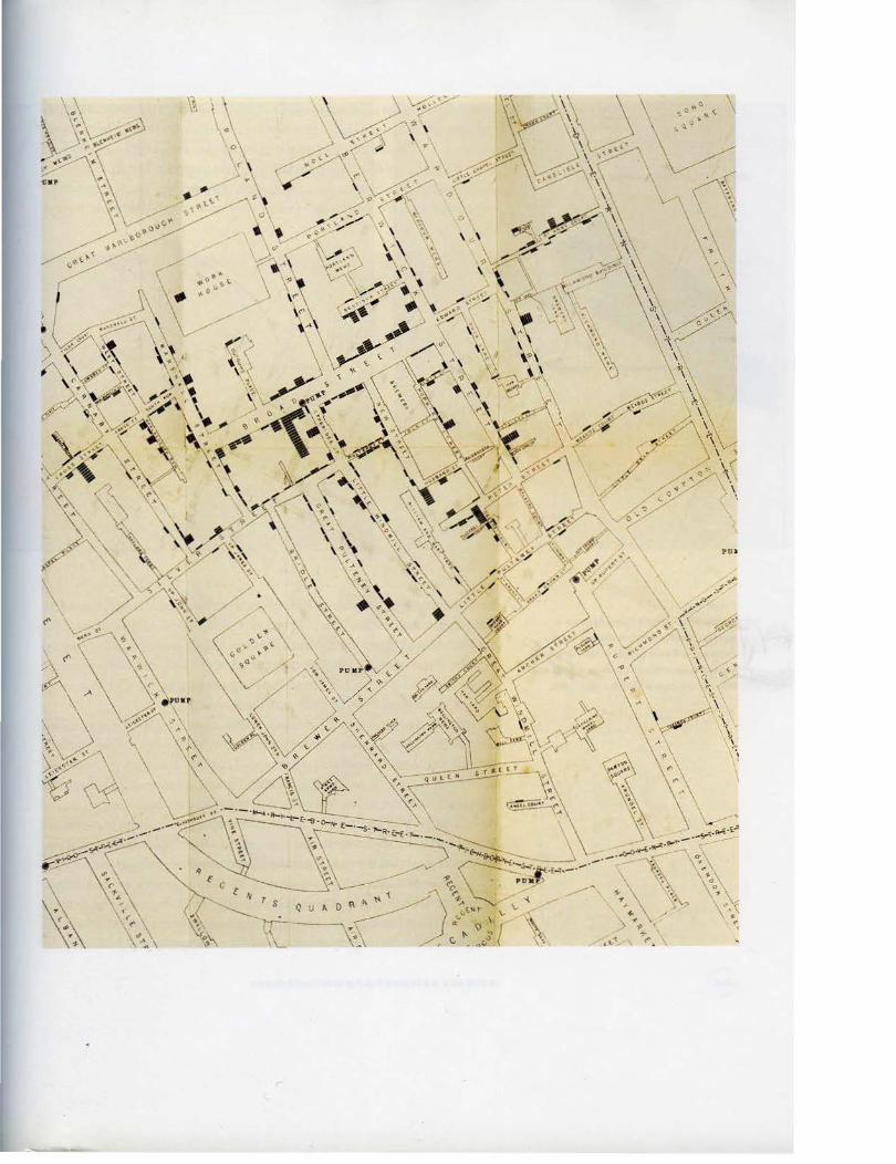

.\)1 f. Ill() I f. I}J' .\IIIW
\\1 1~ 111\ll •• 1)1
FIGURE U l.
Charles Joseph Minard. ·carte figurative et
approximative des quantites de coton en Iaine
importees en Europe en 1858 et 1862" [Figurative
and Approximate Map of Quanti ties of Raw Cotton
Impor ted to Europe in 1858 and 1862) [1863).
I \I rlt I til I . ll\
Run; Minard 1845a), in which he drew bands of thickness in proportion to the annual passenger traffic. This map was part of a running debate on two different routes for a railway line between Dijon and Mulhouse since 1841. It argued in favor of one of the routes (through Besancon and the Doubs valley), on the grounds of a clear distinction in the existing road traffic, which had more to do with visual evidence than with partisan interests.
Between 1845 and 1871, Minard drew several other "figurative rnaps,"which often backed analysis of political economy and sometimes testified eloquently to the irregularity of the traffic. His maps of imports of raw cotton to Europe before and during the American Civil War (fig. 141) were among the most striking visual demonstrations (Minard 1863). In particular, the visual message of the comparison is clear: before the war, most imports came from the southern United States; by 1862, substantial amounts had been replaced by Indian and Egyptian cotton, but the clothing makers in Europe were probably still wanting.
Further, Minard, perhaps inspired by Playfair, was one of the first to draw proportional circles divided in sectors on maps, for example in order to translate harbor circulation, or show both the total and proportions of kinds of meat shipped to Paris. These proportional symbols were equally popularized by the
MICHAEL FRIENDLY AND GILLES PALSKY

famous German cartographer Augustus Petermann, who toward midcentwy constructed several population maps according to this procedure (fig. J.42), but also, more surprisingly, a map showing the quantity of rainfall (around 1852).
In the realm of statistical graphics, Florence Nightingale (1857} introduced a polar-area chart, or "coxcomb diagram," showing mortality in the British
army in the Crimean War over time by angular sectors whose area was pro-
VISUALIZING NATURE AND SOCIETY
FIGURE 1'2.
Augustus Petermann, "Map of the British Isles.
Elucidating the Distribution of the Population"
118501.
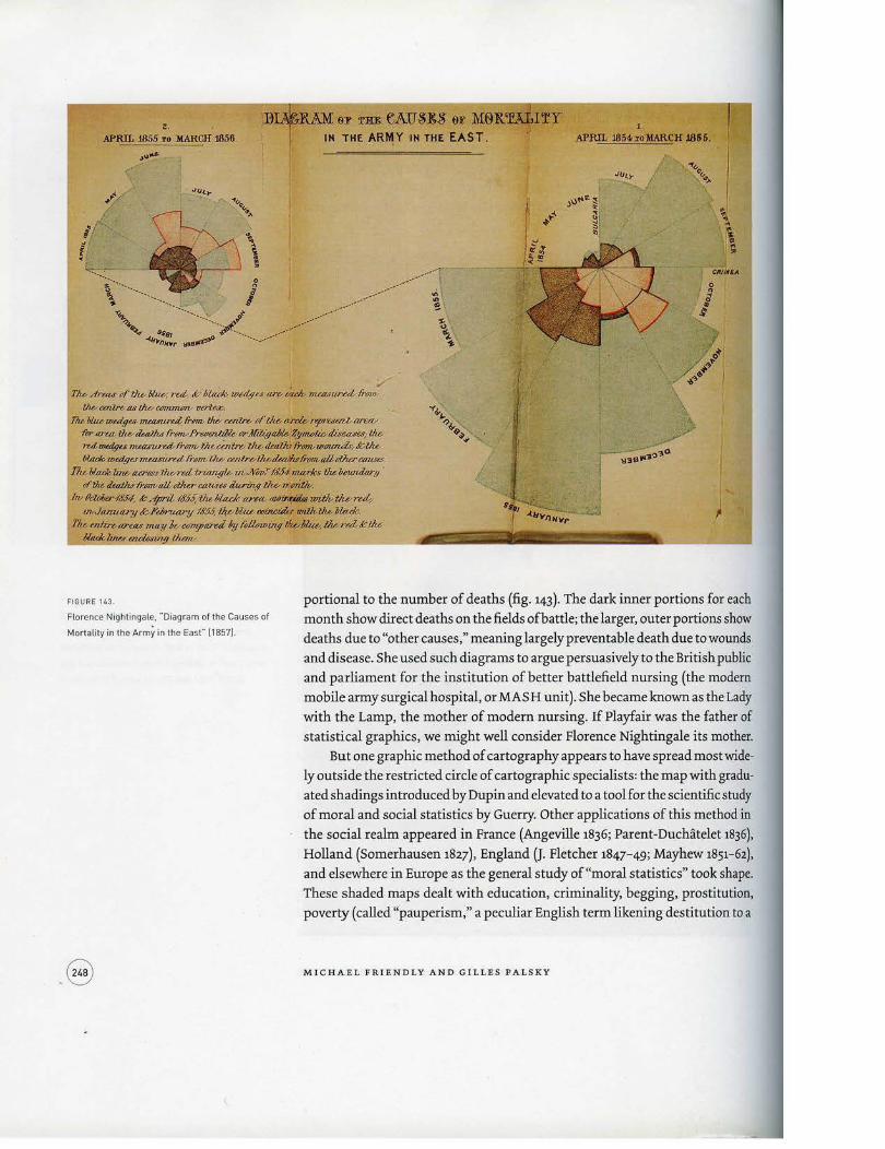
2. ...... ,..,, ...... n ... ,.., eJ> ru eAUS:&S e:r M6lt
APRIL .18SS ro liARCH J8.56 T HE AR~ Y IN THE EAST.
~ .,~,_,.
~.. ."Q I ......
i / \ ! (' ~- \ . ' "-:'::'.:... /,...,.
s '••,, g ,,o•''' oo ' 'o•'/ oA \ ··~....... I .. .. ·•·······.•. . __ .... / ; ~~ ··..... j ... -~-------...-·-~··· ~ " ~.. _...,. ~~-... -· \ ..c..,.,n,..,. _.,... ... - .... _ ... ,.... r
1M .dr~IU' of' thoN.wY, rul, &-bltu:k w~lge.• are-Uuh, measured• fro,; lhbcutlro- a.f (}u/cmnnum, um-
T/u. 'Wue-wu:tg .... f!U41Urd fi-pnv tJw COl.lro pf tilb ~ ~uur.J; aretv
'for llrtfL llwtUatlu /r(;fTV~tlrKittiJiZNe:Z;y~~W!hdis~ 1/te> mtflldl(fu nwuwedd7YI1'n- the-Wdre-lllbtkatiu /Nm,.UiutUUi:F: .t:-llu fllaek.wedgu~frtJmtlu-wdrvlltuleaH.di-dffMJ:fl.dliUCD.US<S.
!'lu,.b/ruk line- tu:1"atsllwrd iriang'U ui.KtJTJ." lh'.f4 niarks tJu.otTWUl.ar.IJ . «'tlte-tk«J}uf'l'(fi1Vtlikti{lw-aa~u durin.g tltb ,.w;lk.
lw #clol;oo-t&f4, &--fpril-IIJ'S:tlte bla.dc «re4..-~ untlv tho ru4 m-./«mttay hFebn.tm7Jib'.f.?, /hblilue ~( JDiJ},liJA- '/Jladt;.
1'/u. mtire-unu m<I1J k C'@7!/'«red Jy litl/Qwing IJu,.bka.l/v.--rulK lJu.. /;Uuk ZU,,; mcio~Ul;9 l:lunv.
1 .
APRIL 1854r %o li.ARCH J856.
FIGURE 1&3.
Florence Nightingale, "Diagram of the Causes of
Mortality in the Army in the East" (1857).
portional to the number of deaths (fig. 143). The dark inner portions for each month show direct deaths on the fields of battle; the larger, outer portions show
deaths due to "other causes," meaning largely preventable death due to wounds
and disease. She used such diagrams to argue persuasively to the British public
and parliament for the institution of better battlefield nursing (the modem
mobile army surgical hospital, or MASH unit). She became known as the Lady
with the Lamp, the mother of modern nursing. If Playfair was the father of
statistical graphics, we might well consider Florence Nightingale its mother.
.8
But one graphic method of cartography appears to have spread most wide
ly outside the restricted circle of cartographic specialists: the map with gradu·
a ted shadings introduced by Dupin and elevated to a tool for the scientific study
of moral and social statistics by Guerry. Other applications of this method in
the social realm appeared in France (Angeville 1836; Parent-Duchatelet 1836),
Holland (Somerhausen 1827), England (J. Fletcher 1847- 49; Mayhew 1851- 62),
and els.ewhere in Europe as the general study of"moral statistics" took shape.
These shaded maps dealt with education, criminality, begging, prostitution,
poverty (called "pauperism," a peculiar English term likening destitution to a
MICHAEL FRIEND L Y A N D GILLE S P ALS KY
disease), and other social topics. Like Nightingale's coxcomb diagrams but on
a much wider scale, maps, with their striking and persuasive aspect, figured
prominently as arguments in scientific or political debates. For example, Guer
ry (1833) argued from his maps that levels of crime are not related to the level of
instruction, as many in his time believed, and that crimes against persons and
against property show different relations to other variables.
Progressively, the connection between shadings and moral values seemed
to fade as the method was applied to other topics, now with dark representing
"more" and light representing "less. "7 However, the association between colors
and moral values remained, perhaps unconsciously; for a long time, as shown
by the maps on poverty that Charles Booth attached to his monumental social
inquiry of London (1889-91). Booth applied a color to each street that corre
sponded to a social category. He used dark and cold colors for the poor (black
for "the lowest, most vicious, semi-delinquent class"; dark blue for the "very
poor, occasional workers. Chronic misery," etc.) and hot colors like pink, red,
and orange for middle and higher categories (fig. 144). By combining the codi
fications of moral cartography from the beginning of the nineteenth century, Booth stigmatized the most ignorant, the most criminal, or the most miserable
parts of the urban territory by dark shades. Near the turn of the twentieth century, several social surveys were modeled
after Booth's study. Residents of Hull-House, a social settlement on Chicago's
West Side, published the results of their investigation of the neighborhood, a
poor immigrant district (Addams 1895 ). They created a series of detailed maps,
directly inspired by those of Booth, and retaining in particular his use of the
matic coloring. As with previous "moral" maps, the Hull-Houserenderings were
intended as graphic evidence of social problems, in order to promote reform.
CONCLUDING REMARKS
Over the last decades of the nineteenth century, state-sponsored statistical bu
reaus flourished throughout Europe and the United States, and the discipline of
social statistics became solidified in national and international organizations,
which began to consider the adoption of international standards for graphic
methods in both maps and diagrams. 8 Between 1869 and 1901, the congresses
held by the International Institute of Statistics in The Hague, Vienna, St. Pe
tersburg, and Budapest debated the variety of visual encodings used in maps
and diagrams in an attempt to define a universal grammar, with much of the
discussion concerning scales of values and coloring schemes for choropleth
maps. By 1914, a set of more general recommendations for statistical diagrams
was published by the American Statistical Association (Joint Committee on
Standards for Graphic Presentation 1914), and by this time graphic methods
VISUALIZING NATURE AND SOCI.ETY

. ._.... ... ...-.. -.-~ -~~""! ..... ~ ..... ,.........., .""' __ ....... .,........_ ... , ....... _.. ...... _~·-·-....-.r.~.,......... .~-~., .. o-~., ......... -_____ _
FIGURE 144
Charles Booth, "Descriptive Map of London
Poverty: northwestern sheet 11889).

became mainstream, entering textbooks, the curriculum, and standard use in
government, commerce, and social and natural science.
Paradoxically, the golden age of innovation, enthusiasm, and graphic ex
cellence in statistical graphics and thematic cartography had drawn to a close
in the early 1900s, being supplanted by the "modem dark ages" of visualization,
the rise of quantification and formal models in the social sciences (Friendly and
Denis 2000 ). Statistical models and parameter estimates were precise; graphs
and maps, on the other hand, were just pictures: pretty or evocative, perhaps,
but incapable of stating a "fact" to three or more decimal places. So it seemed
to many statisticians. The Zeitgeist for statistical mapping and graphics changed again begin
ning in the 1950s, with several significant developments. At this time, postwar
rebuilding and economic planning spurred huge developments in the appli
cation of thematic cartography, and the framework for a modem theoretical
appraisal of visual symbolism was laid by Arthur Robinson (1952). In France,
Jacques Bertin published the monumental Semioloyie Gra:phique (1967) that ap
peared to some to do for graphics what Mendeleev had done for the organiza
tion of the chemical elements. In the United States, John Tukey (1962) issued a
call for the recognition ofinformal, robust, and graphically based data analysis
distinct from mathematical statistics. Finally, initial steps in the computer pro
cessing of statistical data and computer-generated visual displays offered the
possibility to construct new graphic forms (or at least construct them more
quickly) and interactive graphic applications.
The present landscape for visualizing nature and society includes many
new specialties, including geographic information systems (GIS), an emerging
science of geovisualization (for example, Dykes, MacEachren, and Kraak 2005),
.volumetric brain and medical imaging, and visualization of high-dimensional
and massive data sets. But it also faces new and globally important challenges:
biotechnology, threat detection, global warming and environmental change,
and patterns of propagation of AIDS and influenza are just a few current topics
of application. Coupled with these forces, new technology now provides the
means for dynamic interaction with statistical data and graphs. As new graphic
methods are developed to help comprehend such phenomena, it is useful to un
derstand also the deep roots that these methods have in the history of thematic
cartography and statistical graphics. And although we think of these maps
and graphics as the products of science, their makers' desire to communicate
information effectively produced work that is often elegant and even beautiful.
Notes
This work was supported by Grant 8150 from the Natural Sciences and Enyineeriny Research Council of Canada toM. Friendly. We are grateful to the members ofLes Chevaliers
VIS U ALIZ I NG NATURE AND SOCIET Y

des Albums de Statistique Graphique for historical information, images, and helpful suggestions.
1. The term semigraphic was invented by John Tukey (1972) to refer to visual
displays that were a mix of graph, table, and numbers. In French, Charles
Joseph Minard and others referred to tableaux .figuratijs and cartes .figuratives to denote combined forms of tables, maps, and graphs.
2. Maunder plotted latitude of sunspot activity on the sun versus time and ob
served a cyclic pattern that resembled the wings of a butterfly (see http:/Jwww.
windows.ucar.eduJtourJlink=JsunJactivityJbutterfly.html). The explanation
for this recurrent migration is still unknown.
3. The estimates were all biased upward from the true distance (16" 30'), likely
due to underestimation of the earth's circumference (Tufte 1997).
4· In July 1861, Galton distributed a circular to meteorologists throughout Eu
rope, asking them to record these data synchronously, three times a day for
the entire month of December, 1861. About fifty weather stations supplied
the data; see Pearson (1914, 37- 39 ).
5. Not everyone concerned with statistical data and social problems was en
thusiastic about graphic methods. In France, the influential early statisti
cian Jacques Peuchet (t8os) considered Playfair's figures childish games, ir
relevant to science. In England, early statisticians ("statists," as they called
themselves) who formed the basis for the Royal Statistical Society were more
concerned with the presentation of statistical "facts'' in tables, leaving the
generalization to laws and theories to others.
6. It showed a relatively clear-cut separation between the north and south of
France along a line from Geneva to Saint-Malo in Brittany. This sharp cleav
age between "la France eclairee" (enlightened France) and "la France obscure"
would become reified as the "Saint-Malo-Geneva line" and generate much
debate about causes and circumstances through the end of the nineteenth
century.
7· The direction of the visual encoding of "more" and "less" is also crucial in
understanding the relations between different data shown on maps. Thus,
Guerry (1833) was careful to arrange the scales of data on crinte, instruction,
suicide, and so forth, so that darker always meant "worse" (more crime, less
education-or more illiteracy).
8. Initially, at the 1832 founding of the Statistical Section of the British Associa
tion for the Advancement of Science (later to become the Royal Statistical
Society), the view was expressed that its concerns were restricted "to facts
relating to communities of men which are capable of being expressed by
numbers, and which promise when sufficiently multiplied to indicate general laws." That might sound good, until it is realized that the "facts" were to
be expressed simply as numbers in tables, and the "general laws" were to be
inferred by others: "the sciences of morals and politics are far above the spec-
MIC H A EL FR IE ND LY AND GILLES PALSKY

ulations of our philosophy" {Mouat 185, 15). By 188s, at the Silver Jubilee of
the Royal Statistical Society, graphic methods and reasoning to conclusions
had become mainstream, as Alfred Marshall addressed the attendees on the
benefits of the graphic method, and Emile Levasseur presented a survey of
the wide variety of graphs and statistical maps then in use (see Marshall1885;
Levasseur 1885).
VISUALIZING NATURE AND SOCIETY