Embed Size (px)
Citation preview

Week 2 September 8-12
Five Mini-Lectures QMM 510Fall 2014

4-2
Describing Data Numerically ML 2.1
Chapter Contents
4.1 Numerical Description
4.2 Measures of Center
4.3 Measures of Variability
4.4 Standardized Data
4.5 Percentiles, Quartiles, and Box Plots
4.6 Correlation and Covariance
4.7 Grouped Data
4.8 Skewness and Kurtosis
Ch
apter 4
So many topics, so little time …

4-3
Ch
apter 4
Center, Variability, Shape
Three key characteristics of numerical data:

4-4
Ch
apter 4
Visual Description

4-5
• A familiar measure of center
• Excel function =AVERAGE(Data) where Data is an array of data values.
Population Mean Sample Mean
Mean
Ch
apter 4
Measures of Center

4-6
• The median (M) is the 50th percentile or midpoint of the sorted sample data.
• M separates the upper and lower halves of the sorted observations.• If n is odd, the median is the middle observation in the data array.• If n is even, the median is the average of the middle two observations in
the data array.
Median
Ch
apter 4
Measures of Center

4-7
• The most frequently occurring data value.
• Familiar and easy to understand.
• But - data may have multiple modes or no mode.
• Most useful for discrete or categorical data with only a few values.Rarely useful for continuous data or data with a wide range.
Mode
Ch
apter 4
Example: Revenue growth in 32 bio-tech companies last year.0.57 1.57 1.71 1.71 1.86 2.14 2.43 2.864.00 4.01 5.28 5.29 6.14 6.43 6.71 6.868.29 8.43 9.14 9.29 10.00 10.29 10.43 10.43
11.00 11.57 11.57 11.86 12.43 13.43 13.57 14.14
Caution: In decimal data, some data values may occur more than once, but this is likely due to chance (not central tendency). Excel’s =MODE(Data) returns only the first mode (1.71 in this example).
Measures of Center

4-8
• Compare mean and median or look at the histogram to determine degree of skewness.
• Figure 4.10 shows prototype population shapes showing varying degrees of skewness.
Ch
apter 4
Measures of Center

4-9
• The geometric mean (G) is a multiplicative average.
Geometric Mean
Ch
apter 4
Growth RatesA variation on the geometric mean used to find the average
growth rate for a time series.
In Excel =GEOMEAN(Data) or =(2*3*7*9*10*12)^(1/6)
Measures of Center

4-10
• For example, from 2006 to 2010, JetBlue Airlines revenues are:
Year Revenue (mil)
2006 2,361
2007 2,843
2008 3,392
2009 3,292
2010 3,779
Growth Rates
The average growth rate:
or 12.5 % per year.
Ch
apter 4
Measures of Center

4-11
• The midrange is the point halfway between the lowest and highest values of X.
• Easy to use but sensitive to extreme data values.
• Here, the midrange (126.5) is higher than the mean (114.70) or median (113).
Midrange
• For the J.D. Power quality data:
Ch
apter 4
Measures of Center

4-12
• To calculate the trimmed mean, first remove the highest and lowest k percent of the observations.
• For example, for the n = 33 P/E ratios, we want a 5 percent trimmed mean (i.e., k = .05).
• To determine how many observations to trim, multiply k by n, which is 0.05 x 33 = 1.65 or 2 observations.
• So, we would remove the two smallest and two largest observations before averaging the remaining values.
Trimmed Mean
Ch
apter 4
Measures of Center

4-13
• Here is a summary of all the measures of central tendency for the J.D. Power data, along with Excel functions.
• The trimmed mean mitigates the effects of very high values.
Mean: 114.70 =AVERAGE(Data)
Median: 113 =MEDIAN(Data)
Mode: 111 =MODE.SNGL(Data)
Geometric Mean: 113.35 =GEOMEAN(Data)
Midrange: 126.5 (MIN(Data)+MAX(Data))/2
5% Trim Mean: 113.94 =TRIMMEAN(Data, 0.1)
Trimmed Mean
Ch
apter 4
Measures of Center

4-14
Variability is the “spread” of data points about the center of the distribution in a sample.
Statistic Formula Excel Pro Con
Range xmax – xmin=MAX(Data) -
MIN(Data) Easy to calculateSensitive to extreme data values.
Sample Variance (s2)
=VAR.S(Data)Plays a key role in mathematical statistics.
Nonintuitive meaning.
Measures of Variability
Ch
apter 4
Measures of Variability

4-15
Statistic Formula Excel Pro Con
Sample standard deviation (s)
=STDEV.S(Data)
Most common measure. Uses same units as the raw data ($ , £, ¥, grams etc.).
Nonintuitive meaning.
Sample coef-ficient. ofvariation (CV)
=100*STDEV.S(Data)/
AVERAGE(Data)
Measures relative variation in percent so can compare data sets.
Requires non-negative data.
Ch
apter 4Population variance Population standard deviation
Measures of Variability

4-16
Statistic Formula Excel Pro Con
Mean absolute deviation (MAD)
=AVEDEV(Data)Easy to understand.
Lacks “nice” theoretical properties.
1
n
ii
x x
n
Ch
apter 4
Measures of Variability

4-17
• Useful for comparing variables measured in different units or with different means.
• A unit-free measure of dispersion.
• Expressed as a percent of the mean.
• Only appropriate for nonnegative data. It is undefined if the mean is zero or negative.
Coefficient of Variation
Ch
apter 4
Measures of Variability

4-18
Ch
apter 4
Example: Class scores on 16-point quiz on first day of class and after students had an opportunity to review the material.
Caution: Only appropriate for nonnegative data. CV is undefined if the mean is zero or negative (this could happen, for example, if stocks in a portfolio had negative rates of return).
Measures of Variability

4-19
Standardized Data ML 2.2C
hap
ter 4
Topics
• sorting, standardizing, z-scores
• normal distribution as a benchmark
• Empirical Rule (MegaStat)
• outliers and unusual observations
• Excel functions (Appendix J)
• examples: birth weight, voting
• using MegaStat and Minitab

4-20
• The Empirical Rule states that for data from a normal distribution, we expect the interval ± k to contain a known percentage of observed data:
• The normal distribution is symmetric and is also known as the bell-shaped curve.
k = 1 68.26% will lie within m + 1s
k = 2 95.44% will lie within m + 2sk = 3 99.73% will lie within m + 3s
Ch
apter 4
The Empirical Rule

4-21
Note: No upper bound is given.
Data values outside m + 3s are rare.
The Empirical Rule
Ch
apter 4
Standardized Data

4-22
• A standardized variable (Z) redefines each observation in terms of the number of standard deviations from the mean.
A negative zvalue means theobservation is to theleft of the mean.
Positive z means the observation is to the right of the mean.
Ch
apter 4
Standardization formula for a population:
Standardization formula for a sample (for n > 30):
Standardized Data

4-23
Ch
apter 4
Standardized Data

4-24
Ch
apter 4
Standardized DataExample: Birth Weights (n = 1429)
• 5 pound baby’s z-score: z = (80-116.14)/21.96 = -1.65• 8 pound baby’s z-score: z = (144-116.14)/21.96 = 1.27• 11 pound baby’s z-score: z = (176-116.14)/21.96 = 2.73
Resembles a normal except for the low tail (a few extremely tiny babies).
Source Birth records from the North Carolina State Center for Health and Environmental Statistics and the Institute for Research in Social Science at University of North Carolina at Chapel Hill.

4-25
Ch
apter 4
Standardized DataExample: Voting in 2004 Presidential Election)
Only two states stand out as unusual
State Voting% z-ScoreHawaii 46.2 -2.35California 49.1 -1.89Texas 50.3 -1.71Nevada 51.3 -1.55Georgia 52.6 -1.35… … …Oregon 70.6 1.45North Dakota 70.8 1.48Maine 72.0 1.67Wisconsin 73.0 1.82Minnesota 76.7 2.40
Note: Sorting the data values allows you to see the extremes. Values within μ ±1σ are not less interesting.
Use Excel’s function=STANDARDIZE(x, μ, σ)
Mean 61.29St Dev 6.43
n 50

4-26
Ch
apter 4
Excel
Voting%
Mean 61.286Standard Error 0.909788089Median 61.5Mode 59.7Standard Deviation 6.433173274Sample Variance 41.38571837Kurtosis 0.014949556Skewness 0.00241464Range 30.5Minimum 46.2Maximum 76.7Sum 3064.3Count 50
Voting percent in 50 states
Note: In Excel’s Descriptive Statistics, you can’t choose the statistics displayed.

4-27
Ch
apter 4
MegaStat
Note: You can choose the statistics displayed (e.g.,Empirical Rule).
Statistic Voting% empirical rulecount 50 mean - 1s 54.853 mean 61.286 mean + 1s 67.719 sample variance 41.386 percent in interval (68.26%) 68.00%sample standard deviation 6.433 mean - 2s 48.420 minimum 46.2 mean + 2s 74.152 maximum 76.7 percent in interval (95.44%) 96.00%range 30.5 mean - 3s 41.986
mean + 3s 80.586 1st quartile 57.450 percent in interval (99.73%) 100.00%median 61.500 3rd quartile 64.950 low outliers 0 interquartile range 7.500 high outliers 1 mode 59.700 high extremes 0
Voting percent in 50 states

4-28
Ch
apter 4
Appendix J: Excel Functions

4-29
Ch
apter 4
Appendix J: Excel Functions

4-30
Quantiles ML 2.3C
hap
ter 4
Topics
• percentiles, quartiles, boxplots
• fences, another view of outliers
• examples: birth weight. City MPG

4-31
• Percentiles are data that have been divided into 100 groups.
For example, you score in the 83rd percentile on a standardized test. That means that 83% of the test-takers scored below you.
• Deciles are data that have been divided into10 groups.
• Quintiles are data that have been divided into 5 groups.
• Quartiles are data that have been divided into 4 groups.
Percentiles
Ch
apter 4
Percentiles, Quartiles, and Box-Plots

4-32
• Percentiles may be used to establish benchmarks for comparison purposes (e.g. health care, manufacturing, and banking industries use 5th, 25th, 50th, 75th and 90th percentiles).
• Quartiles (25, 50, and 75 percent) are commonly used to assess financial performance and stock portfolios.
• Percentiles can be used in employee merit evaluation and salary benchmarking.
Percentiles
Ch
apter 4
Percentiles, Quartiles, and Box-Plots

4-33
• Quartiles are scale points that divide the sorted data into four groups of approximately equal size.
The three values that separate the four groups are called Q1, Q2, and Q3.
Q1 Q2 Q3
Lower 25% | Second 25% | Third 25% | Upper 25%
Quartiles
Ch
apter 4
Percentiles, Quartiles, and Box-Plots

4-34
• The second quartile Q2 is the median, a measure of central tendency.
Q2
Lower 50% | Upper 50%
Quartiles
Ch
apter 4
Percentiles, Quartiles, and Box-Plots

4-35
• For small data sets, find quartiles using method of medians:
Step 1: Sort the observations.
Step 2: Find the median Q2.
Step 3: Find the median of the data values that lie below Q2.
Step 4: Find the median of the data values that lie above Q2.
Method of Medians
Ch
apter 4
Percentiles, Quartiles, and Box-Plots

4-36
• The first quartile Q1 is the median of the data values below Q2
• The third quartile Q3 is the median of the data values above Q2.
Q1 Q2 Q3
Lower 25% | Second 25% | Third 25% | Upper 25%
For first half of data, 50% above, 50% below Q1.
For second half of data, 50% above, 50% below Q3.
Quartiles – The method of medians
Ch
apter 4
Percentiles, Quartiles, and Box-Plots

4-37
Method of Medians
Ch
apter 4
Example:
Percentiles, Quartiles, and Box-Plots
4-38
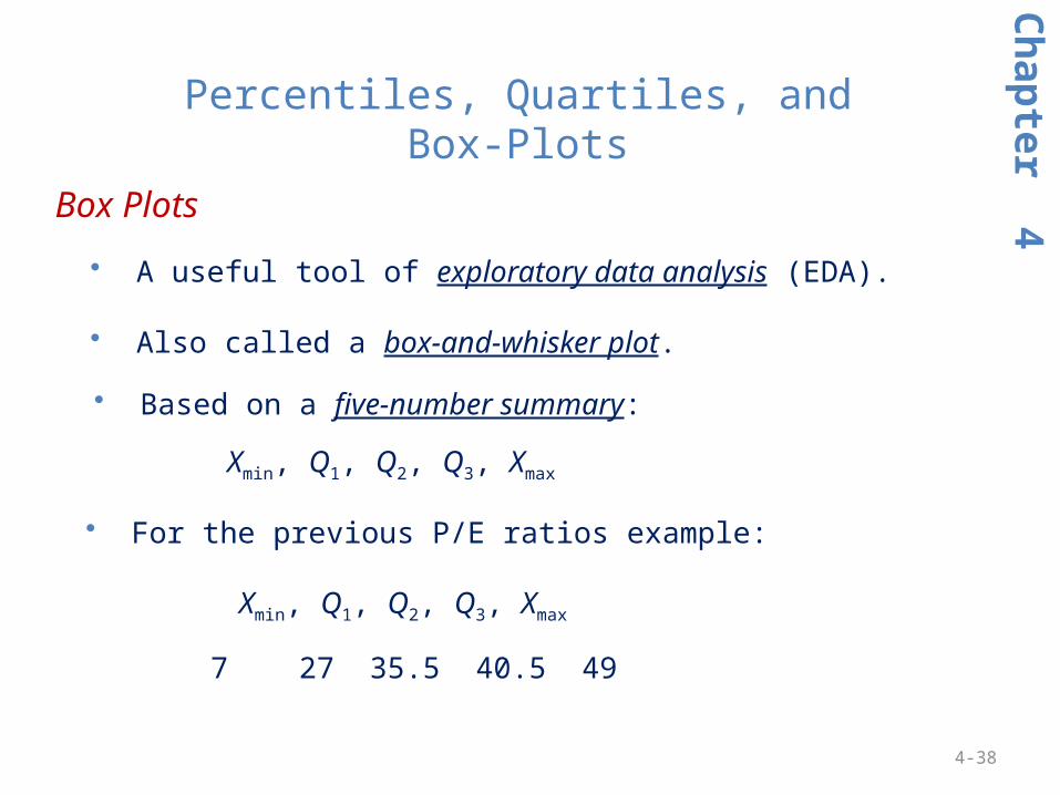
• A useful tool of exploratory data analysis (EDA).
• Also called a box-and-whisker plot.
• Based on a five-number summary:
Xmin, Q1, Q2, Q3, Xmax
• For the previous P/E ratios example:
7 27 35.5 40.5 49
Xmin, Q1, Q2, Q3, Xmax
Ch
apter 4
Box Plots
Percentiles, Quartiles, and Box-Plots

4-39
• The box plot is displayed visually, like this.
Ch
apter 4
Box Plots
Percentiles, Quartiles, and Box-Plots

4-40
Ch
apter 4
Box Plots
Percentiles, Quartiles, and Box-Plots

4-41
• The average of the first and third quartiles.
The name midhinge derives from the idea that, if the “box” were folded in half, it would resemble a “hinge”.
Box Plots: Midhinge
Ch
apter 4
Percentiles, Quartiles, and Box-Plots

4-42
• Use quartiles to detect unusual data points.
• These points are called fences and can be found using the following formulas:
Inner fences Outer fences:
Lower fence Q1 – 1.5 (Q3 – Q1) Q1 – 3.0 (Q3 – Q1)
Upper fence Q3 + 1.5 (Q3 – Q1) Q3 + 3.0 (Q3 – Q1)
• Values outside the inner fences are unusual while those outside the outer fences are outliers.
Box Plots: Fences and Unusual Data Values
Ch
apter 4
Percentiles, Quartiles, and Box-Plots

4-43
Ch
apter 4
Example: Birth Weights (n = 1429)
Box-Plots with Fences
Source Birth records from the North Carolina State Center for Health and Environmental Statistics and the Institute for Research in Social Science at University of North Carolina at Chapel Hill.
Note: The middle 50% of birth weights lie within a small range (105 to 130, or about 6.56 lb to 8.13 lbs). But there are extremes on the low end.

4-44
Fences Visualized:
Ch
apter 4
Fences Example:
Interpretation: There are three outliers (beyond the inner upper fence). One is on the border of the upper outer fence, so is almost an extreme outlier. Lower fences are not displayed since they are irrelevant for this sample.
Box-Plots with Fences

4-45
Interpretation: Based on the fences, there is only one outlier and no extreme outliers. Lower fences are not displayed since they are not needed for this sample.
Ch
apter 4
Example: Fences and Unusual Data Values
Outlier
Box-Plots with Fences

4-46
Correlation, Grouped Data, Shape ML 2.4C
hap
ter 4
Topics
• scatter plots
• correlation coefficient
• covariance – population, sample
• mean from grouped mean
• skewness, kurtosis (Excel)

4-47
The sample correlation coefficient is a statistic that describes the degree of linearity between paired observations on two quantitative variables X and Y.
Correlation Coefficient
Note: -1 ≤ r ≤ +1
Ch
apter 4
Correlation and Covariance
Perfect negative correlation
Perfect positivecorrelation

4-48
Illustration of Correlation Coefficients
Ch
apter 4
Correlation and Covariance

4-49
The sample correlation coefficient describes the degree of linearity between paired observations on two quantitative variables X and Y.
Correlation Coefficient: Examples Note: -1 ≤ r ≤ +1
Ch
apter 4
X = car weight (lbs), Y = city MPG X = gestation (months), Y = birth weight (oz)
Correlation and Covariance

4-50
The sample correlation coefficient describes the degree of linearity between paired observations on two quantitative variables X and Y.
Correlation Coefficient: Example Note: -1 ≤ r ≤ +1
Ch
apter 4
Correlation and Covariance

4-51
The covariance of two random variables X and Y (denoted σXY ) measures the degree to which the values of X and Y change together.
Covariance
Ch
apter 4
Correlation and Covariance
Caution: The covariance is not easy to interpret because its units depend on Y (e.g., dollars). That’s why we usually refer to the correlation coefficient (it is unit free).

4-52
Group Mean
Ch
apter 4
Grouped Data
Weighted Mean

4-53
Group Mean
Ch
apter 4
Grouped Data
Note: You will rarely need this. If you are given only grouped data. you will have to make your own tables in Excel (like this).

4-54
Skewness
Ch
apter 4
Skewness
To interpret Excel’s skewness coefficient, you need a table showing critical values for various sample sizes.
Note: You can assess skewness from the histogram or boxplot (usually revealed by outliers or a long tail). It’s usually not worth it to bother with the table.

4-55
To interpret Excel’s kurtosis coefficient, you need a table showing critical values for various sample sizes.
Ch
apter 4
Kurtosis
Caution: You cannot reliably assess kurtosis from the histogram, because its x-axis scale affects its appearance. Maybe best to let statisticians worry about this topic.

0-56
Assignments ML 2.5
• Connect C-2 (covers chapter 4)• You get three attempts• Feedback is given if requested• Printable if you wish• Deadline is midnight each Monday
• Project P-1 (data, tasks, questions)• Review instructions• Look at the data• Your task is to write a nice, readable report (not a spreadsheet)• Length is up to you

0-57
Projects: General Instructions
General Instructions
For each team project, submit a short (5-10 page) report (using Microsoft Word or equivalent) that answers the questions posed. Strive for effective writing (see textbook Appendix I). Creativity and initiative will be rewarded. Avoid careless spelling and grammar. Paste graphs and computer tables or output into your written report (it may be easier to format tables in Excel and then use Paste Special > Picture to avoid weird formatting and permit sizing within Word). Allocate tasks among team members as you see fit, but all should review and proofread the report (submit only one report).

0-58
Project P-1Random teams are assigned on Moodle (submit only one report). Data: Download Big Dataset 02 - Crime in Major Cities from Moodle. Your team is assigned one crime category (but you can change it if you wish). Copy the city names and the chosen crime data column to a new spreadsheet. Delete lines (if any) with missing data. Analysis: (a) Sort the observations (with city names). (b) List the top 10 and bottom 10 data values (with city names). (c) For the entire data set, calculate the mean and median. What do they tell you about center? Would the mode be helpful for this type of data? Explain. (d) Calculate the standard deviation. (e) Calculate the standardized z-value for each observation. (f) Are there outliers or unusual data values (see p. 137)? Discuss. (g) Use MegaStat (or Minitab or Excel) to make a histogram. Describe its shape. (h) Calculate the quartiles. Make a boxplot and describe it. (i) Make a scatter plot of your kind of crime versus a different type of crime. What does it show? (j) Ambitious students: Sort the database in random order (see bottom of page 36) using Excel’s function =RAND(). Copy and paste the first few sorted lines into your report to illustrate your sorting method. Comment on anything unusual (or interesting things that you might find on the web).
Watch the video walkthrough using Voting, North Carolina Births, and CEO compensation as examples (posted on Moodle)

0-59
Project P-1your 2010 data will look like this (2005 and 2000 are also available)
Crime Rates in U.S. Metropolitan Areas, 2010 (n = 365)
Metropolitan Statistical Area All Violent Murder Rape Robbery Assault All Property Burglary Larceny Car Theft DefinitionsAbilene, TX M.S.A. 423.0 3.1 48.9 72.7 298.3 3617.3 1009.0 2459.8 148.5 Violent crimeAkron, OH M.S.A. 304.7 3.7 40.9 105.1 155.0 3185.6 947.7 2074.5 163.3 Murder and nonnegligent manslaughterAlbany, GA M.S.A. 566.0 8.7 24.9 150.4 382.1 4512.6 1417.8 2803.4 291.4 Forcible rapeAlbany-Schenectady-Troy, NY M.S.A. 310.4 1.5 21.0 98.5 189.4 2693.6 512.1 2076.2 105.4 RobberyAlbuquerque, NM M.S.A. 670.4 5.8 44.8 124.3 495.6 3896.1 920.6 2586.2 389.4 Aggravated assaultAlexandria, LA M.S.A. 638.0 5.8 23.1 132.3 476.7 4592.9 1203.3 3176.3 213.3Allentown-Bethlehem-Easton, PA-NJ M.S.A. 228.2 3.5 20.3 93.6 110.9 2298.0 432.2 1758.1 107.7 Property crimeAltoona, PA M.S.A. 243.6 0.8 38.0 49.8 155.0 1811.7 425.4 1318.2 68.0 BurglaryAmarillo, TX M.S.A. 513.1 5.7 40.8 98.9 367.8 4812.7 1137.2 3390.5 285.0 Larceny-theftAmes, IA M.S.A. 299.5 1.1 41.7 12.4 244.4 2528.1 478.6 1966.1 83.3 Motor vehicle theftAnchorage, AK M.S.A. 812.9 4.2 85.9 148.5 574.4 3506.3 416.1 2813.4 276.8Anderson, IN M.S.A. 205.8 2.3 33.4 70.6 99.5 3353.8 848.1 2294.6 211.1Anderson, SC M.S.A. 586.0 5.3 36.4 75.9 468.4 4707.8 1297.6 3041.7 368.4Ann Arbor, MI M.S.A. 338.5 1.4 43.2 69.8 224.0 2713.7 659.7 1879.5 174.4Appleton, WI M.S.A. 155.8 0.0 21.4 13.8 120.5 2136.7 378.5 1708.2 50.0Asheville, NC M.S.A. 229.7 1.9 21.8 59.9 146.1 2454.9 749.6 1534.9 170.3Athens-Clarke County, GA M.S.A. 374.9 4.2 19.6 70.5 280.5 3843.7 1018.0 2588.1 237.5Atlanta-Sandy Springs-Marietta, GA M.S.A. 413.8 6.1 20.9 149.7 237.1 3462.6 957.0 2135.7 370.0Atlantic City-Hammonton, NJ M.S.A. 529.8 8.0 18.9 245.5 257.5 3550.3 741.5 2685.7 123.1Augusta-Richmond County, GA-SC M.S.A. 412.9 10.2 37.4 156.6 208.7 4815.3 1355.1 3037.7 422.5Austin-Round Rock-San Marcos, TX M.S.A. 327.9 3.4 24.7 84.0 215.8 3792.0 754.3 2866.9 170.8Bakersfield-Delano, CA M.S.A. 593.0 9.0 19.9 148.4 415.7 3713.1 1148.0 1931.6 633.6Baltimore-Towson, MD M.S.A. 685.3 10.3 23.6 214.4 437.0 3090.7 649.5 2135.5 305.7Bangor, ME M.S.A. 68.4 2.0 12.6 27.2 26.6 3098.2 573.3 2429.3 95.7Barnstable Town, MA M.S.A. 434.6 0.5 36.1 57.6 340.3 2972.8 1116.6 1764.7 91.5Battle Creek, MI M.S.A. 697.6 4.5 75.3 109.6 508.3 3703.5 1145.6 2411.1 146.8Bay City, MI M.S.A. 335.2 0.9 78.1 50.8 205.2 2472.4 610.1 1776.6 85.7Beaumont-Port Arthur, TX M.S.A. 498.3 5.6 37.7 157.9 297.0 3865.3 1156.9 2488.4 220.1Bellingham, WA M.S.A. 267.0 2.5 44.7 50.6 169.1 3197.8 694.2 2372.7 130.8Bend, OR M.S.A.2 304.9 4.3 29.0 30.9 240.7 2973.7 497.5 2360.2 116.0
Property Crimes Per 100,000Violent Crimes Per 100,000

0-60
Example: CEO Compensation
sorting is a good first step

0-61
Example: CEO Compensation
Highlight all data (including the headings) and use Custom Sort

0-62
Example: CEO Compensationnow you can clearly see the high and low data values (and comment on any weird data values)

0-63
Example: CEO Compensation
use MegaStat’s Descriptive Statistics to get your basic stats along with a nice boxplot

0-64
Example: CEO Compensation
use MegaStat’s Frequency Distributions to get a frequency table, histogram, etc
severely skewed
annotated by user
normal if logs used?

0-65
Example: CEO Compensationstandardize the sorted list by subtracting the mean from each x value and then dividing by the standard deviation (or use =STANDARDIZE function)

0-66
Example: CEO Compensationafter standardizing the sorted list, unusual z values can be seen

0-67
Example: CEO Compensation
to randomize the list, paste values of =RAND() beside data and custom sort on =RAND()