Embed Size (px)
Citation preview
SCHOOL OF DEVELOPMENT STUDIES RESEARCH REPORT No. 85
WHAT DO WE KNOW? PROFESSOR SERVAAS VAN DER BERG’S POVERTY ESTIMATES Charles Meth November 2010
SDS RESEARCH REPORT 85
What do we know? Professor Servaas van der Berg’s poverty estimates Charles Meth1 First published by the School of Development Studies in 2010 ISBN: 978-1-86840-697-5 Available from the website: www.sds.ukzn.ac.za/ Or The Librarian School of Development Studies University of KwaZulu-Natal Howard College Campus Durban 4041 SOUTH AFRICA Tel: +27 31 260-1031 The School of Development Studies is one of the world's leading centres for the study of the political economy of development. Its research and graduate teaching programmes in economic development, social policy and population studies, as well as the projects, public seminars and activism around issues of civil society and social justice, organised through its affiliated Centre for Civil Society place it among the most well-respected and innovative inter-disciplinary schools of its type in the world. We specialise in the following research areas: civil society; demographic research; globalisation, industry and urban development; macroeconomics, trade and finance; poverty and inequality; reproductive health; social aspects of HIV/AIDS; social policy; work and informal economy. School of Development Studies Research Reports are the responsibility of the individual authors and have not been through an internal peer-review process. The views expressed are those of the author(s) and are not necessarily shared by the School or the University.
1 Charles Meth is an Honorary Research Fellow in the School of Development Studies, University of KwaZulu-Natal, Durban, and in the Department of Sociological Studies in the University of Sheffield. He is a Research Affiliate in the Southern African Labour and Development Research Unit in the University of Cape Town.
2
SDS RESEARCH REPORT 85
Abstract Poverty studies in South Africa have long been handicapped by the inadequacies of data available from household surveys and censuses conducted by Statistics South Africa. In an attempt to fill in some of the gaps in knowledge about poverty and inequality trends since the transition, Professor Servaas van der Berg and his colleagues in the University of Stellenbosch have published a stream of papers on the topic since 2005, using data from the All Media and Products Surveys (AMPS) to bolster official data. In two of these papers, adjustments for survey under-reporting of income have been made – in the others, this adjustment has not been performed. Making only guarded references to the unsuitability of the AMPS income data for the task into which they dragoon them, the authors offer little guidance as to why they choose to present their results first in one form, then in another. Successive papers contain no discussion of the results of previous papers, even when there are vast differences between reported poverty levels. In essence, the present paper is an extended search through a handful of papers they have published (van der Berg et al, 2005; 2007a; 2007b; 2007c; 2008) for evidence of sins of omission. It is what the authors choose not to tell us, the side alleys they do not explore, the weaknesses they do not disclose, that are of interest. By failing to specify rigorously the criteria by which success in anti-poverty policy is to be judged, the authors open the way for the abuse of their results. So confusing is the manner in which the poverty estimates are presented, that their use by politicians (by accident or by design, we cannot say), to present the results of government’s anti-poverty policy in the most flattering possible light, is almost inevitable. The fact that the results from adjusted and non-adjusted AMPS survey data contradict each other is either lost on such users, or is ignored by them. A glance at the institutions that propagate research (commission, fund, publish, disseminate) reveals a surprising absence of evidence of the quality control to which each avows commitment. From the outset, cogent critiques of the van der Berg et al work have been available. Considering the delicate way in which in the later papers, the authors attempt to back-pedal away from some of the sillier implications of their findings, the failure of the propagators to be more demanding is inexplicable. The first working draft of the paper (June 2009) ended with a call for the editorial board of the South Africa Journal of Economics to bring about a meeting of minds aimed at eradicating the ‘disconnect’ (the unfortunate term now popular) between the perceptions of the progress of anti-poverty policy held respectively by officialdom, and the poor. Thereafter, an epilogue, summarising a discussion in Meth (2009b) of recent poverty estimates published by the Presidency, was added (November 2009). Based on (unpublished) papers by Bhorat and van der Westhuizen (2008), and Bhorat (2009) – they show rising inequality and falling poverty headcount ratios. Despite rapidly falling population growth, however, the poverty headcount rises by more than three million
3
SDS RESEARCH REPORT 85
between 1995 and 2008. The increase would probably have been even larger were it not for the HIV/AIDS epidemic. The analysis in Meth (2009b) is updated in a later paper (Meth, 2010) A postscript (extracted from Meth, 2010) reproduces and comments on yet another set of recent poverty and inequality figures – those by Leibbrandt et al (2010). Despite modest falls in the relevant poverty ratios, at the lower of the two poverty lines these authors use, the headcount rises by almost four million over the period 1993-2008.
4
SDS RESEARCH REPORT 85
Preface A World War II poster warned that: “Loose talk costs lives”. The policy advisor’s (or consultant’s) equivalent of loose talk is bad advice. One need look no further than the financial crisis currently ravaging the world to find examples where bad advice (e.g., Credit Default Swap markets should NOT be regulated) has had terrible consequences. Tracking down the folk responsible for propagating such self-serving (for a while, anyway) nonsense should not be too difficult.2 Would that it were possible to look into South Africa’s anti-poverty policy and say with certainty that the positive review, or pat on the back that constitutes implicit advice to do more of the same, offered by this one or that, has had these and these consequences. In particular, it would be satisfying to be able to show that the work behind the poverty estimates that have become the received wisdom, has resulted in damage to the poor (satisfying because it would strengthen the call made in the present paper for sensitivity in the handling of poverty statistics). Alas, even though the results created by the researchers in question, a team led by Professor Servaas van der Berg in the University of Stellenbosch, can be found being cited by the likes of ex-President Mbeki, and by senior officials in the Presidency, the evidence necessary to prove an allegation that the poor have been harmed by poor research is extremely difficult, if not impossible to obtain. Given the absence of evidence, one cannot determine whether or not the confusing estimates of poverty reviewed in the present paper have exacerbated the weaknesses of South African anti-poverty policy – it could be that even if far less sanguine claims had been advanced about policy successes, policymakers, unwilling to hear views that contradict their preconceptions, would have slogged on relentlessly in their chosen paths. Although it cannot be shown that the work of van der Berg et al has done any direct harm to the poor, it is possible to show that the information yielded by the poverty monitoring tool they produce is so coarse that it cannot be used to make anything other than the broadest of generalisations. That is not their fault – the survey data with which they work will permit little more. Where they are at fault is in not pointing out to readers the weakness of the results they have published. In what follows, a critique of the work of fellow economists is presented. The approach adopted is like that used by the Auditor-General’s office in carrying out its job of ensuring that one aspect of government business, its handling of public moneys, has been carried out responsibly. The object of the exercise is not to discover merit in the workmanship of the departments concerned – other bodies and institutions, in parliament and elsewhere, have a duty to examine the way in which government in all spheres discharges it mandates – the purpose of an audit is to discover whether or not there have been any deviations from an agreed code of practice. In similar vein, the goal of the present paper is to check whether one responsibility, that of handling extremely sensitive findings with due 2 An article by Julia Finch in the Guardian of 26 January 2009, headed “Twenty five people at the heart of the meltdown ….” does precisely that. First on the list is Alan Greenspan, former Federal Reserve chairman, who “backed sub-prime lending”.
5
SDS RESEARCH REPORT 85
care, has been discharged satisfactorily. Without doubt, there is some value in the papers considered below – the critical overviews of previous work on poverty, the literature review on the issue of scaling survey incomes, the beginnings of an exploration of the potential of a hitherto unused data set, the critique of Statistics South Africa – these are all useful activities. They are, however, of no relevance to the question the present paper seeks to address: in much the same way, for example, as the matric results are of no concern to the A-G when the Department of Education is being audited. Single-mindedness of this sort gives the paper a harsh appearance – so harsh that to some it will seem highly un-collegial, to say the least. If people choose to read the paper as a set of personal attacks, I shall be dismayed, for that is not my intention. The truth is that the subject matter, the question of whether or not poverty and inequality have declined in severity since the democratic transition, is so sensitive, that anyone (myself included) making assertions about the matter, one way or t’other, must be prepared to suffer the consequences of doing so, if consequences there be. When researchers set out, as van der Berg and his colleagues do, to see if government has succeeded in a particular endeavour, absolute clarity on what constitutes success (and why it does) is essential. Abuse or misuse of statistics by politicians is unfortunately so common that presenting one more example of their having done so, adds little to our understanding of the world. It does, however, add weight to the injunction that researchers and policy advisors need to err on the side of caution when reporting progress (prevention is better than cure). To call for caution is not to call for self-censorship – although there may not be an agreed code of practice for the publication of poverty estimates, there are certain rather obvious do’s and don’ts – possibly the most obvious being the need to bracket point estimates inside a highly visible confidence interval (in Day-Glo orange if necessary). In South Africa, that interval is large, very large; which makes it more than ordinarily difficult to say whether or not anti-poverty policy may be called a success.
6
SDS RESEARCH REPORT 85
Contents Abstract .............................................................................................. 3 Preface ................................................................................................ 5 Abbreviations ...................................................................................... 8 Introduction and structure of paper .................................................... 9 When in doubt, estimate frequently................................................... 10
The 2005 paper: Trends in poverty and inequality since the transition ...................................................................................... 12 The 2007a paper: Poverty estimates based on an alternative data source ........................................................................................... 15 The 2007b paper: National accounts-consistent estimates............. 18 The 2007c paper: ‘What we know’.................................................. 24 The 2008 paper: Post-transition poverty trends once more ........... 29
The march of the propagators............................................................ 39 Research funders/commissioners.................................................. 39 Learned journals ........................................................................... 43 The media ..................................................................................... 44
How politicians (and others) received and used the news................... 46 Conclusion........................................................................................ 48 Epilogue............................................................................................ 52 Postscript.......................................................................................... 54 References......................................................................................... 55 Appendix........................................................................................... 59
Tables Table 1 Poverty estimates by van der Berg et al (and the PCAS)............ 11 Table 2 Income bands in the Sept 2004 LFS & AMPS 2004 .................. 26 Table 3 Per capita consumption (R/month, in 2000 prices) in top household decile & bottom four household deciles, 2000-2007 ............. 36 Table 4 Expenditure on social grants ................................................... 60 Table 5 Data for estimating per capita expenditure levels ..................... 61
Figures Figure 1 Poverty count, 1993-2004 (poverty line = R3000) ................... 19
7
SDS RESEARCH REPORT 85
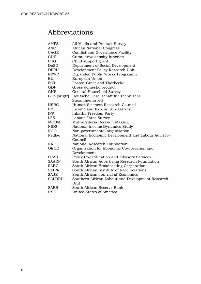
Abbreviations AMPS All Media and Product Survey ANC African National Congress CAGE Conflict and Governance Facility CDF Cumulative density function CSG Child support grant DoSD Department of Social Development DPRU Development Policy Research Unit EPWP Expanded Public Works Programme EU European Union FGT Foster, Greer and Thorbecke GDP Gross domestic product GHS General Household Survey GTZ (or gtz) Deutsche Gesellschaft für Technische
Zusammenarbeit HSRC Human Sciences Research Council IES Income and Expenditure Survey IFP Inkatha Freedom Party LFS Labour Force Survey MCDM Multi-Criteria Decision Making NIDS National Income Dynamics Study NGO Non-governmental organisation Nedlac National Economic Development and Labour Advisory
Council NRF National Research Foundation OECD Organisation for Economic Co-operation and
Development PCAS Policy Co-Ordination and Advisory Services SAARF South African Advertising Research Foundation SABC South African Broadcasting Corporation SAIRR South African Institute of Race Relations SAJE South African Journal of Economics SALDRU Southern African Labour and Development Research
Unit SARB South African Reserve Bank USA United States of America
8
SDS RESEARCH REPORT 85
“Using a constructed data series and another data series based on AMPS (the All Media and Products surveys), this paper explores trends in poverty and income distribution over the post-transition period.” (Abstract, van der Berg et al, 2005) “This paper analyses a previously unused source of data – the All Media and Product Survey (AMPS) – to arrive at alternative estimates of the post-transition poverty path.” (Abstract, van der Berg et al, 2007a) “This paper makes a unique contribution to the South African literature …” (van der Berg et al, 2007b, p.1) “This publication is a modest attempt to make available some of our research results to a wider public in a format that is both accessible and non-technical. In the words of Prof Jan Sadie, policy research starts with getting the numbers right.” (Preface, van der Berg et al, 2007c) “Those are my principles. If you don’t like them… well, I have others.” Groucho Marx
Introduction and structure of paper In the absence of reliable survey data on the basis of which credible estimates of poverty and inequality may be made, researchers are obliged, if they wish to look into the matter, to make use of what is available. The history of work in this field in South Africa is one of researchers making the best of a bad job. Not surprisingly, many of the conclusions drawn have proved to be contentious. The first concern of the present paper is to examine the headline results produced over time by the group of researchers responsible for publishing, if not the best, then certainly the most numerous estimates of poverty and inequality to appear in recent times – most of them extracted out of a non-official data set. The work in question is that produced by the group led by Professor van der Berg in the Economics Department of the University Stellenbosch. Like a currency debased by repeated revaluations and devaluations, the usefulness of their estimates is not readily established. The interest in this paper is not only in the quality of the estimates themselves, but also with the incidentals of their production and distribution. That said, however, it should be noted that textual analysis of the papers concerned takes up much of the space in the present paper. There are four specific areas of the production and dissemination process to explore – these are tackled after shooting the rapids of a flow of estimates that commenced in 2005. The topics are: • The quality control procedures of those who funded the research with
which this paper is concerned • The granting of an imprimatur by a peer-reviewed academic journal
9
SDS RESEARCH REPORT 85
• The role of the media in disseminating research findings • The political impact of the estimates These topics are aspects of a more general question, namely, that of the responsibilities of those who fund research, those who undertake it, those who distribute or disseminate the results, and those who make use of them. Although it is ultimately the quality (or lack thereof) of the poverty and inequality statistics made by the Stellenbosch team that drives the present paper, this concern steers it, willy-nilly, away from technical questions into a consideration of the actions of certain individuals and institutions. As the Preface above points out, this is tricky terrain – it will be easy to misunderstand the paper as an ad hominem attack on some of those involved – it is not. In general, although it poses blunt questions, the paper attempts to keep to an absolute minimum, speculation on the motives of the actors involved – for the most part, these must remain inscrutable. What it seeks to do is to place before readers a verifiable account of certain events – events of whose importance they are obviously free to form their own views. Occasional commentary, in the form of my judgement of the meaning or significance of events, although present, should be easy to detect (and discount, if desired) – it is easily distinguishable from the facts of the matter (the presence of adjectives usually points to authorial imposition).
When in doubt, estimate frequently Given that poverty is public enemy number one in South Africa, it is more than a little surprising that it has taken Statistics South Africa about 14 years to initiate a survey (the Living Conditions Survey) that may yield authoritative estimates of poverty (and inequality?), when its results are published in the last quarter of 2010. Some day, the story may be told of why that institution preferred instead to focus on meeting the requirements for the Special Data Dissemination Standard, or why so much money and attention has been lavished on the Labour Force Surveys, now appearing on a quarterly basis. Until that day, we can but speculate on possible reasons. Not having available to them, a set of dedicated survey results, researchers interested in poverty and inequality have made use of instruments designed for other purposes – the Labour Force Surveys; the General Household Surveys; the Income and Expenditure Surveys, and, of course, the Population Censuses. Since each of these instruments is deficient in one way or another (income under-reporting and zero, or missing income estimates being among the more common weaknesses), compensatory adjustments are required. Not surprisingly, disagreement about the adjustments, and the results the adjusted data sets yield, has been the order of the day. Poverty estimates touch on extreme sensitivities, especially among politicians. Consider, for a moment, the claim occasionally made, that for some fairly large number of people (and it is not formerly privileged whites the claimants have in mind), conditions under apartheid were better: it sets off a nuclear reaction among politicians, and for obvious reasons. Unlike many other official statistics, reliable, up-to-date reports of progress (or the lack thereof) in the fight against poverty are vital for policymakers – and unlike so many other areas of social and economic poverty, there are policy responses that can be made, and rapidly too, to reports of either worsening or improving conditions. Were it not for these
10
SDS RESEARCH REPORT 85
characteristics of poverty statistics, disagreements among researchers could be confined to the ivory tower where other scholastic matters are disputed, sometimes for centuries. In an attempt to break out of the impasse reached by the exhaustion of the potential of the data sources referred to above, the team of researchers group led by Professor van den Berg, has tapped into a source not previously used by poverty researchers, the data set generated by the South African Advertising Research Foundation (SAARF) in its annual All Media and Product Survey (AMPS). Ignoring minor variations, the Stellenbosch team has produced three sets of poverty estimates from the AMPS data, each of which differs significantly, one from the other. These results are presented in a series of papers, publication of which commenced in 2005. The primary results are presented in Table 1 below. Table 1 Poverty estimates by van der Berg et al (and the PCAS)
van der Berg and Louw, 2004, p.567 1993 1995
2000 Pessimistic
2000 Optimistic
Headcount ratio (%) 38.2 38.8 38.6 36.4 Headcount 15 269 709 16 033 948 17 239 710 16 261 294 van der Berg et al, 2005, p.17 1993 1995 2000 2004
Headcount ratio (%) 40.6 - 41.3 33.2 Headcount 16 200 000 - 18 500 000 15 400 000 van der Berg et al, 2006, p.21 1993 1995 2000 2004
Headcount ratio (%) 40.6 - 41.3 33.2 Headcount 16 200 000 - 18 500 000 15 400 000 van der Berg et al, 2007a, p.15 1993 1995 2000 2004
Headcount ratio (%) 50.1 51.7 50.8 46.9 Headcount 20 002 068 21 397 486 22 704 130 21 785 700 van der Berg et al, 2007b, p.19 1993 1995 2000 2004 Headcount ratio (%) 33.6 33.2 36.4 28.1 Headcount 13 426 144 13 724 926 16 287 231 13 063 241 van der Berg et al, 2007c, p.21 1993 1995 2000 2004 2006
Headcount ratio (%) 50.1 51.7 50.8 46.9 44.4 Headcount 20 002 068 21 397 486 22 704 130 21 785 700 20 990 916 van der Berg et al, 2008, p.69 1993 1995 2000 2004 2006
Headcount ratio (%) 50.1 51.7 50.8 46.9 44.4 Headcount 20 002 068 21 397 486 22 704 130 21 785 700 20 990 916 PCAS, 2007, p.25 1993 1995 2000 2004 2006 Headcount ratio (%) 50.1 51.7 50.8 46.9 43.2
11
SDS RESEARCH REPORT 85
To set the scene for what follows, the poverty headcounts and the poverty headcount ratios from a paper published in the South African Journal of Economics (van der Berg and Louw, 2004) are given in the first few rows of Table 1. These results had appeared in a working paper the previous year, before the group began working with the AMPS figures in earnest, (van der Berg and Louw, 2003). 3 In Table 1, the 2004 results are followed, in order of publication, by corresponding figures from the 2005, 2006, 2007 and 2008 papers (the latter from a paper also published in the South African Journal of Economics). Below the 2008 figures are a set of results published in the Development Indicators Mid-Term Review produced by the Policy Co-ordination and Advisory Services in the Presidency (PCAS, 2007). Before turning to the figures themselves, it is necessary to point out that there is nothing inherently wrong with revising one’s estimates of the magnitude of any socio-economic variable. This is especially true if one is experimenting with new data sets using contentious techniques. The criticisms of the van der Berg et al work offered in the present paper turn not on the fact that their figures have been revised, but rather:
a) on the fact that successive versions of their poverty estimates do not explain adequately, or at all, why the results differ, often substantially, from previously published estimates, and
b) on the fact that each version either states directly or implies in some way that the findings on poverty are robust.
In an area as sensitive as poverty research, where misuse and misunderstanding of the results, if not inevitable, is certainly highly likely, such conduct is inexcusable. We begin our journey by looking into their 2005 paper – containing as it does, the results of their first attempt to squeeze a set of poverty estimates out of the AMPS data (with some assistance from the national accounts).
The 2005 paper: Trends in poverty and inequality since the transition Past estimates of poverty made using either survey or census data in South Africa, as we noted above, are plagued by zero or missing income estimates, and are widely believed to under-report income (and expenditure). Critical of poverty and inequality estimates made using these far-from-perfect data sources (2005, pp.6-10), van der Berg and his colleagues set about trying to navigate their way round both by (i) using a data set that reportedly has no missing values or zeroes (the AMPS survey requires the enumerators to guess at incomes if respondents fail to supply the relevant information), and (ii) scaling incomes upward until the point where survey total income corresponds to the totals given by the national accounts. In essence, the latter process entails raising survey mean incomes (by race) to the levels estimated from the national accounts. Aware of the hazards of adjusting income estimates in this 3 Although the 2003 and 2004 papers do not make use of the AMPS data, they present an important part of the methodology that is later to be used by the team in extracting poverty estimates.
12
SDS RESEARCH REPORT 85
way, and aware as well, that national accounts themselves are none too reliable, the authors nevertheless state that:
“… we trust national accounts data for aggregate household income, while we trust survey data for the distribution of such income between households.” (2005, p.11)4
Venturing bravely into Assumptionland (as we all must, from time to time), the results they generate encourage them to declare that their research discloses “a strong and robust decline in poverty” (2005, p.2). This decline amounts, as we see in Table 1 above, to a fall in the poverty headcount of 3.1 million over the period 2000-2004, a drop which sees the headcount ratio go from 41.2 to 33.2 per cent (or from 0.412 to 0.332, if one prefers). Poverty gap ratios and poverty severity ratios (Foster, Greer and Thorbecke’s P1 and P2) fall as well (2005, Table 2, p.17). In the latter table we get the first whiff of the dominance that is the basis of their claim to having produced robust estimates. Their figures 19a and 19b (2005, p.40), which plot cumulative density functions (CDFs) for the four years 1993; 1995; 2000 and 2004, show that the CDF for 2004 lies below those for the other three years for most of its range up to R20 000 per annum. Although the early record is less clear, what the charts show is that for any plausible poverty line, there were fewer poor people in 2004 than there were in most preceding years.5 Harking back to their Table 2 (2005, p.17), we find two sets of results, one for the aforementioned poverty line of R3000 per capita per annum, and another for a line set at R3371 per capita per annum, or R281 per month (all in 2000 prices). The reasons why they do this do not concern us here – the feature of the results in their Table 2 that this choice of poverty lines forces upon our attention is the finding that a mere R31 per person per month was capable of changing the poverty headcount in 2004 from 18.0 million (at the R281 line) to 15.4 million (at the R250 line). The clustering of large numbers of individuals in the region demarcated as poor shows how sensitive the results of an analysis may be to the choice of poverty line and to assumptions about how to compensate for survey under-reporting of income.6 There is a hint in the 2005 paper of what will become more prominent in the 2007b paper, namely, a comparison of the poverty estimates made using AMPS data adjusted for under-reporting of income with those that
4 Three of their papers (2005; 2006 and 2007b) use this approach. Appendix 1 in their 2005 paper (pp.27-28) describes their methodology in some detail. Two of the papers (2007a and 2008) get around the problem of under-reporting of income by ignoring it. 5 See as well, their Figure 17 (p.39) and the discussion of it in the text (van der Berg et al, 2005, p.18). 6 The authors draw attention to this clustering and to some of its implications for changes in measured poverty (2005, p.18). They do not, however, refer to the fact that a small redistribution which shifts large numbers of people above some relatively arbitrary poverty line, leaves those moved in a situation of near-poverty. A glance at their Table 2 results (2005, p.17) shows that although they fall, the other two measures of poverty, the FGT poverty gap ratio P1 and poverty severity ratio (squared poverty gap) P2 are not all that much affected by an increase in the value of the poverty line from R3000 to R3371 per annum.
13
SDS RESEARCH REPORT 85
result from the use of raw AMPS data.7 This may be seen in Figure 16 (2005, p.38). The estimates for 2000 are fairly similar (±41-42 per cent), but the 2004 results differ substantially. Where the raw AMPS data suggests a rate of about 39 per cent, the adjusted van der Berg et al figures tell us that the rate was 33.2 per cent (see Table 1 above). As will become clear below, it is (mainly) the measurement of poverty with and without adjustment that accounts for the huge gaps between their various estimates of the seriousness of the problem. Confusion results from the failure to warn users of difference. Spurred on by the rash of publicity that greeted the van der Berg et al findings, and their frequent recitation by government and others,8 I began work on a paper, which when published, contained a set of poverty estimates for the year 2004, suggesting that at the poverty line they used (R250 per month per capita in 2000 prices), there were probably between 18-20 million poor people, down by possibly 1.5-2.0 million from 2000, the latter figure, as I acknowledged at the time, being little more than guesswork (Meth, 2006a, pp.72 and 75). My results attracted little comment when finally, they were published. Prior to publication, however, presentation of a draft version of the paper to a SALDRU (Southern African Labour and Development Research Unit) seminar, meant that the work did not go unnoticed in the academic community. This led, in February 2006, to the HSRC organising a seminar at which the van der Berg et al (2005) paper and a forerunner of my 2006a paper, were presented.9 Discussants assigned to each of us were critical of our respective efforts. After significant reworking, my 2006a paper was published by SALDRU – the van der Berg et al 2005 paper reappeared a little while later as a Development Policy Research Unit (DPRU) working paper (2006), apparently unchanged except where house style in the DPRU differed from that in Stellenbosch.10 Let us turn now to the three papers they published in 2007. The first of them (van der Berg et al, 2007a) was published as number 08/07 in the Stellenbosch Economic Working Papers series, while the 2007b paper is numbered 09/07. The precise dates of publication cannot be established – the .pdf files on the Stellenbosch website for both papers are dated 30 April 2007. The third of the papers (2007c), a version of the 2007a effort, is the ‘modest attempt to make the results accessible to a wider audience’ referred to in the epigraph to the present paper. It is dated August 2007. The reason the 2007a and 2007b dates may be significant becomes clear below.
7 The 2007b paper (pp.20-21) also presents adjusted and unadjusted estimates made using the 1995 and 2000 IESs. We comment below on the differences between the 2005 and 2007b unadjusted estimates. 8 Instances of this will be given below. 9 Officials from both the Presidency (Dr Vusi Gumede and Dr Alan Hirsch) and the National Treasury attended the seminar. 10 The only difference I can detect between their 2005 and 2006 papers is the substitution of upper-case first letters for lower-case for the racial categories, black, coloured and white. Their 2006 paper was packaged among those distributed at the DPRU Conference, held in Johannesburg in October 2006.
14
SDS RESEARCH REPORT 85
The 2007a paper: Poverty estimates based on an alternative data source Absent from the 2007a paper is any discussion of the scaling technique used to make the AMPS incomes compatible with the national accounts figures, and any application of the technique to the AMPS data. The 2007b paper, by contrast, takes the sparse commentary on the topic of scaling survey data with national accounts in the 2005 paper (two paragraphs on pp.10-11) and extends it to a two-page discussion (2007b, pp.9-11). A consequence of the use of non-scaled AMPS survey data in the 2007a paper is the leap in the poverty headcounts – using the same lower poverty threshold as that in the 2005 paper (R250 per capita per month in 2000 prices) the 2007a paper finds four million more poor people in the year 2000, and about 6.4 million more in the year 2004 than does it 2005 counterpart. No direct explanation is offered in the 2007a paper for the non-use of scaling – reference is made to the 2005 paper, where scaling is applied, but there is no discussion of the results obtained in the 2005 paper. Perhaps a clue to the group’s intentions may be gleaned from the respective titles of the 2007a and 2007b papers – the former is called “Post-Transition Poverty Trends Based on an Alternative Data Source”, while the latter bears the title “A Series of National Accounts-Consistent Estimates of Poverty and Inequality in South Africa”. In the 2007a paper, the authors go to considerable lengths to establish the credibility of the AMPS data as an alternative to official survey data, in particular, to the IESs (van der Berg et al, 2007a, pp.7-9). Having done that, they embark on a comparison between trends in income estimates obtained from the national accounts, and those that emerge from the unadjusted AMPS data. The comparison is preceded by this observation:
“Whatever misgivings one has about the accuracy of national accounts data, these series provide arguably the most consistent series of household income over time in South Africa, and are accordingly selected as the appropriate benchmark.”
The AMPS data ‘find’ roughly 60 per cent of the income reported in the national accounts. This relative constancy leads the authors to conclude that:
“On the whole … the AMPS’ capturing of aggregate household income as reflected in the national accounts is relatively consistent over time. It is also more stable than income capturing in the post-transition IESs and Censuses, and undercapturing of income is a less serious problem than in either of these Statistics South Africa data sources.” (van der Berg et al, 2007a, p.9)
Having found, both from a survey reliability point of view, and from the point of view of compatibility with national accounts income estimates, that the AMPS data are not wanting in quality, the group ignores the under-reporting of survey income (or over-estimation of national accounts income) implicit in ‘the roughly 60 per cent finding’, and proceeds to measure the extent of poverty. One possible explanation of how they find it possible to take no notice of this rather large elephant in the sitting room, is suggested by the word ‘trend’ in the title of the paper – instead of being concerned with the absolute number of poor people as measured by some arbitrary poverty line, they are interested instead in the way in which the headcount ratio, P0 (and, of course, the other FGT ratios P1 and
15
SDS RESEARCH REPORT 85
P2) have changed over time. Consider, for example, the following statement:
“It is argued here that trends in inequality derived from the AMPS Gini coefficients are likely to be more reliable than the estimated levels of inequality that they reflect. Attention focuses next on trends at the lower end of the income distribution. Post-transition poverty trends are of great interest and concern in policy debate, as their aggregate direction establishes whether the government has succeeded in a critical socio-economic objective. This paper therefore aims to establish with as much confidence as possible whether or not poverty has declined since 1994.” (van der Berg et al, 2007a, pp.12-13)
If it is true that trends in inequality they uncover are more reliable than the levels, then the same must hold for poverty rates and levels, yet nowhere in the paper is that simple acknowledgement made. One consequence, as we shall see below, was rampant confusion among senior politicians (ex-President Mbeki) and senior civil servants. The absence of (i) a clear statement of intent in the 2007a paper, and (ii) any reference either to the results that emerge when the AMPS figures are adjusted for under-reporting of income, both in the 2005 paper, and the 2007b paper (Working Paper 09/07), is odd, especially as the group could have been working on the 2007b paper at roughly the same time as they were writing the 2007a paper (Working Paper 08/07). In September 2006, in a working paper published by the School of Development Studies in the University of KwaZulu-Natal (Meth, 2006b), I returned to the question of the plausibility of the estimates in their 2005 paper. Troubled by the method they used to scale incomes, but without digging too deeply into the AMPS questionnaire, I argued that:
“…the adjustments to earned incomes down at the bottom end of the distribution necessary to replicate the van der Berg et al (2005) results are implausibly high … In effect, anyone who accepts the van der Berg et al results is telling survey respondents that their reported income or expenditure levels understate the ‘true’ figures by several hundred per cent.” (Meth, 2006b, p.8)
Ignoring this suggestion and all of the other criticisms made of their 2005 paper, the authors manage to draw comfort from my 2006b paper. It takes this form:
“Finally, additional support for a hypothesis of falling poverty is reflected in two recently released preliminary research papers. Meth (2006) analysed data from LFSs and found that poverty had fallen post-2000, although not to the same extent as reflected by AMPS. ” (van der Berg et al, 2007a, p.20)
Their 2005 paper put the poverty headcounts at 18.5 and 15.4 million respectively for 2000 and 2004. Corresponding figures for the 2007a paper are 22.7 and 21.8 million, i.e., a drop of about 900 000. My 2006b paper offered headcounts of about 19.5 million in 2001, and 18 million or so in 2004 (Meth, 2006b, p.3). The difference of almost three million between my 2006b estimates and their 2005 estimates of the headcount in 2004, I argued, was non-trivial. Identifying trends is all very well, but there are times when absolute levels are critical as well – poverty is a case
16
SDS RESEARCH REPORT 85
in point. What then, is one supposed to make of their 2007a results? If, as in the case of their Gini coefficients, the absolute levels of poverty are less reliable than the trends, why bother to reproduce unreliable headcounts? Doing so, reduces very considerably the impact of increases in social grants on poverty headcounts – the 2005 paper says it reduced the headcount by more than three million, while the 2007a paper has it raising less than one million out of poverty. There is a debate in the literature about how to describe a situation in which the poverty rate falls while the poverty headcount rises (usually because of population growth). When this happens, we face what Kanbur (2004, pp.6-7) describes as a “hard question”.11 Taking the poverty levels in the 2007a paper at face value (the authors do not state directly that one should not) places one in a situation where that hard question should be addressed. From Table 1 above we see that their estimates of the headcount for 1993; 1995; 2000 and 2004 respectively, were 20 002 068; 21 397 486; 22 704 130 and 21 785 700. Their commentary on the results is that:
“The story told by these numbers is one of increasing poverty around the mid 1990s, followed by a period of stability until the turn of the century, and then by a dramatic reduction in poverty after 2001. The initial increase in poverty is probably due to a combination of sluggish economic growth and poor labour market prospects in the second half of the 1990s. However, note that the progress made in fighting poverty since 2001 has been large enough to more than offset the preceding rise in poverty.” (2007a, p.15)
‘Dramatic’ can only apply to the fall in the headcount rate between 2000 (50.8 per cent) and 2004 (46.9 per cent) – there is nothing even remotely ‘dramatic’ about the changes in headcounts reported above. Raising 300 000 people each year some small distance above a low poverty line (such reductions in poverty as took place were almost certainly caused mainly by the rapid increase in the number of child support grants) is important for those who benefitted, but it is no ‘drama’.12 It is not clear what the last sentence in the paragraph cited above means – although the headcount was lower in 2004 than it was in the year 2000, the 2004 headcount was higher than the 1995 figure (see Table 1 above) If one is going to do justice to the 2007a results in one’s commentary, then in addition to celebrating the “dramatic reduction in poverty after 2001”, one should look at what has happened to the headcount over the period 1994-2004, the first decade of democracy. The paper does not give a headcount for 1994, but it is possible to hazard a reasonable guess at what it is likely to have been from other work that van der Berg et al have done – the figure should be in the region of 20.5 million.13 If we say that
11 Ignoring other measures of the severity of poverty, there is little doubt that under circumstances where both the poverty headcount rate and the headcount itself rise (or fall) that poverty has worsened (become less severe). Kanbur returned to this issue in a 2008 paper, at which we glance below. 12 Were estimation errors to be taken into account, it may be that there were no changes at all. 13 No estimates of poverty rates for 1994 are given in the 2007a paper (nor in the 2007c paper which reproduces them). There are three sources of the necessary information. One is Figure 5 on p.20 of the 2007b paper. Another is Figure 4 on p.70 of their 2008 paper. The Y-axis in the latter, with its range of 45-55 per cent, is much easier to read than the chart in
17
SDS RESEARCH REPORT 85
in order for poverty not to have worsened, that both the headcount rate and the headcount have to have fallen, then, if we trusted the results they offer (and if the reported changes were statistically significant) we would conclude that poverty was worse in 2004 than at the time of the transition. As we shall see below, although van der Berg et al do not raise the Kanbur ‘hard question’ when the results in the 2007a suggest that it does arise, they are at some pains to show in their 2007b paper that according to the estimates produced using adjusted AMPS data, the Kanbur ‘hard question’ does not arise. By the time they get around to reworking the 2007a paper for publication in the South African Journal of Economics (van der Berg et al, 2008) (as we shall also see below) they add a brief commentary on headcounts, but as in the 2007a paper, they ignore headcounts at the beginning and end of the first ten years of democracy.
The 2007b paper: National accounts-consistent estimates Far from acknowledging that their 2005 results present an overly optimistic assessment of the impact on the target population of government’s anti-poverty policies (chiefly, the expansion of the social grant system), the 2007b results, produced from adjusted (scaled) AMPS data, push the headcounts well below those reported in the 2005 paper. The 2000 headcount falls to 16.3 million, while the new figure for 2004 is 13.1 million. Unless AMPS revised their data, the differences between the 2005 and 2007b results must be explained by changes in the methodologies used to extract them from the raw data. The only reference I can find in the 2007b paper to methodological changes is the following:
“The methodology followed in this paper for scaling survey means with national accounts data is described more fully in Van der Berg et al. (2005). It has remained largely the same, with the exception of small improvements in the technique used to estimate the distribution of wage income.” (2007b, p.16)
The discussion on scaling, as noted above, extends to two pages in 2007b paper – it is preceded (on p.9 of that paper) by the following argument, culled from the literature, for adjusting survey means:
“The World Bank’s reason for not adjusting survey means with national accounts means is that the latter are plagued with measurement problems. Which is true. However, the choice of which estimate is finally chosen should be decided according to which method minimizes errors, especially errors in trends, because that is an important variable of interest. And it is likely that not adjusting
the 2007b, with its range of 0-60 per cent. The third source is the table on p.26 of PCAS (2007), which gives percentages for all years from 1993-2006, citing as origin, a 2006 paper by van der Berg et al. The values from that table match those that can be eyeballed in the second source. The poverty rate in 1994 was thus 50.5 per cent. Applying this to the implied 1994 population of 40.656 million in Table A1 in van der Berg et al (2007b), gives a 1994 headcount of approximately 20.5 million, comfortably below their 2004 figure of 21 785 700.
18
SDS RESEARCH REPORT 85
survey means introduces a larger error into the trends than adjusting the survey means by national accounts data.” (Bhalla, 2002, p.126)
Carrying out the scaling exercise on the AMPS data, however, yields poverty estimates that by their own admission, are too low. Reference to the differences between the adjusted and non-adjusted results occurs twice in the 2007b paper. The first is in the paper’s Abstract – here it is:
“Adjusted distributions yield lower levels of poverty and a stronger decline in poverty during the second half of the period than the figures obtained from the raw AMPS data. While the levels of poverty obtained using adjusted income distributions are artificially low, the derived downward trend is supported by a number of official data sources.” (van der Berg et al, Abstract, 2007b)
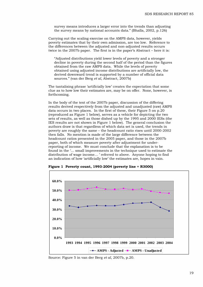
The tantalising phrase ‘artificially low’ creates the expectation that some clue as to how low their estimates are, may be on offer. None, however, is forthcoming. In the body of the text of the 2007b paper, discussion of the differing results derived respectively from the adjusted and unadjusted (raw) AMPS data occurs in two places. In the first of these, their Figure 5 on p.20 (reproduced as Figure 1 below), serves as a vehicle for depicting the two sets of results, as well as those dished up by the 1995 and 2000 IESs (the IES results are not shown in Figure 1 below). The general conclusion the authors draw is that regardless of which data set is used, the trends in poverty are roughly the same – the headcount ratio rises until 2000-2002 then falls. No mention is made of the large difference between the headcount ratios presented in the 2005 paper, and those in the 2007b paper, both of which measure poverty after adjustment for under-reporting of income. We must conclude that the explanation is to be found in the ‘… small improvements in the technique used to estimate the distribution of wage income… ’ referred to above. Anyone hoping to find an indication of how ‘artificially low’ the estimates are, hopes in vain. Figure 1 Poverty count, 1993-2004 (poverty line = R3000)
0.0%
10.0%
20.0%
30.0%
40.0%
50.0%
60.0%
1993 1994 1995 1996 1997 1998 1999 2000 2001 2002 2003 2004
AMPS - Adjusted AMPS - Unadjusted
Source: Figure 5 in van der Berg et al, 2007b, p.20.
19
SDS RESEARCH REPORT 85
The second examination of the differences between the two sets of results, is centred around their Figure 7, “Kernel density functions, AMPS adjusted and unadjusted” (2007b, pp.24-25). Functions for two years, 1995 and 2004 are plotted, using both adjusted and non-adjusted data – the adjustment obviously shifting the curves for both years bodily to the right. One can see, by inspection, that 2004 is an improvement on 1995. It is also clear that scaling does not affect the shapes of the distributions by much. Other than that, the exercise is singularly uninformative – as regards the ‘artificially low’ question, we are none the wiser as to where, if anywhere, plausible estimates of actual headcount ratios may lie. Although there is a reference in the 2007b paper to the results of their 2007a paper, it too is offered in such a way as to leave readers with no further guidance about how to make the 2007b figures less ‘artificially low’. Here is what they say:
“Interested readers are referred to Van der Berg et al. (2007) for a full set of comparable poverty and inequality measures estimated using the raw AMPS datasets.”14 (van der Berg et al, 2007b, p.24)
In the 2007a paper, the ‘interested reader’ is presented with a set of results that are probably artificially high because no allowance at all is made for possible under-reporting of income. One does not know whether to laugh or cry at the relief offered in the 2007b paper to those not best pleased by the ‘artificially low’ estimates. Rounding off a discussion on criticisms of their results, the members of the team have a Groucho Marx moment while addressing the objection that “using national accounts adjustments lowers poverty estimates”, when they assert, apparently without irony, in the very last sentences of the paper, that:
“The lower poverty estimates obtained when making adjustment of survey data to national accounts data are not seen as a real problem. Poverty lines are at the best of times subjective; in South Africa there has hitherto been no commonly accepted poverty line. If one believes that these estimates understate poverty, then the appropriate response is to use a higher poverty line for intertemporal and other comparisons.” (van der Berg et al, 2007b, p.26)
Who it is that does not see the low poverty estimates as a “real problem” is not clear. The authors presumably know as well as everybody else that poverty levels are a function of the selected poverty line, and the underlying distribution of income. The issue is thus not simply one of whether a higher poverty line would uncover more poor. As long as the condition for dominance is met, i.e., that the cumulative distribution functions (CDFs) for the years under consideration do not intersect, or if they do, do so outside of the range of any plausible poverty line, the researcher can conclude with confidence that raising the level of the poverty line will cause more people to be defined as poor. For the distributions they have concocted, their test for dominance (van der Berg et al, 2007b, pp23-24), as illustrated in Figure 6 (p.24), shows that the CDF for the year 2000 lies above that 2004 for all (real) per capita incomes up to R20 000 per annum. Under those conditions, the number
14 If, as seems likely, the 2007a and 2007b papers were published on the same day (the .pdf files for both papers were created on 30th April 2007), the failure to provide more guidance than this, really is quite strange.
20
SDS RESEARCH REPORT 85
of poor people in 2000 would be greater than the number in 2004 for any poverty line that can be plotted on their can chart. It follows from this that any poverty line higher than R250 per capita per month they use would disclose more poor people than are enumerated in their Table A1. That, however, is beside the point – the real question is whether a researcher, using the same poverty line as they do, but making different (defensible) adjustments on the different sets of survey data that are available to get near to national accounts total income estimates, would get anywhere near to replicating their results. My work (Meth, 2006b) suggests that this is not possible, because alternative data sets generate different distributions of income. Finding out why their AMPS-based 2007b results painted such a different picture from that sketched using Statistics South Africa survey data (after incomes had been suitably scaled), presented a challenge similar to that offered (and not taken up in any but the most cursory fashion) when their 2005 paper was published.15 The van der Berg et al 2007b results are, however, so preposterous, that instead of backing away from an engagement with the nitty-gritty of the AMPS data set, as I had done in my 2006a and 2006b papers (my primary concern in those papers was to show that official statistics could also yield credible estimates of poverty) an engagement with the AMPS data was unavoidable if I was going to understand why adjusted data from that source produced consistently lower poverty estimates than those that could be extracted from official surveys, such as the LFS or GHS. Some puzzles are well-nigh insoluble – mercifully, this one appears to have yielded with barely a whimper. Unless I have made some ghastly mistake, the explanation for the differences between the van der Berg et al 2005 and 2007b results, and my 2006b estimates, as I explain in Meth (2007), lies in the differences between the way that the AMPS and the LFSs (and GHSs) define income. The former does not distinguish in the
15 Although it is unnecessary to justify an interest in what, by any standards, must rank high in importance among social indicators in South Africa, it may be useful to point out that my concern with the reliability of the van der Berg et al poverty estimates grew out of repeated confrontations with unreliable official statistics, a passion dating back to the early 1980s. That gained me an appointment to the National Statistics Council created by the democratic government. One of the duties of council members was to bring to the attention of the relevant officials in Statistics South Africa, such deficiencies in official statistics as came to their attention. As chairperson of the council’s Economics and Social statistics sub-committee for the last couple of years that I served on council, I found myself devoting a great deal of critical attention to the major household surveys, especially the LFS and GHS. From that vantage point, I frequently voiced disquiet about the failure of Statistics South Africa to conduct a ‘proper’ poverty survey (especially when the 2005/2006 IES was in its planning stage), an activity that did not endear me to all the officials with whom I came in contact. After leaving council in 2005, I was appointed as a consultant to Statistics South Africa, with a loosely-specified brief that included looking critically at household surveys. My 2006a and 2006b papers both end with a string of recommendations aimed at improving the LFSs and GHSs. One goal was to allow the surveys to be used with greater confidence for the measurement of poverty and inequality. Few, if any, of these recommendations were implemented – what we have instead is the Living Conditions Survey, due to report, as noted above, at the end of 2010.
21
SDS RESEARCH REPORT 85
questionnaire between earned income and social grants (transfers), or at least it did not in the survey for the critical year of 2004, at which I looked. Here is the single question about income from the 2004 AMPS questionnaire:
“PD13. “Please give me the letter which best describes your PERSONAL TOTAL MONTHLY INCOME before tax and other deductions. Please include all sources of income i.e. salaries, pensions, income from investments, etc.”
The Statistics South Africa survey questionnaires, although a long way from perfect, allow grants to be distinguished from remuneration. Because neither grant-receiving nor workerless households can readily be identified in the AMPS data, adjustment (scaling) overstates income in workerless households. There is not a perfect fit between administrative data on social grants and the survey (LFS and GHS) results, but with some juggling and imputation, they can be made to converge. Since the values of the grants are known, the only adjustments that have to be made are those that apply to the income in households containing paid workers (or receiving remittances). Thus, when van der Berg et al point to the fact (not the likelihood) that their estimates of the poverty headcount are artificially low, the likely cause is the unsuitability of the AMPS data to bear the burden imposed upon them. Although the Stellenbosch team is to be congratulated for their enterprise in exploring the AMPS data as a possible route out the trap in which Statistics South Africa’s failure to conduct appropriate surveys has left poverty studies, it is time now to cease playing with that dangerous toy – poverty is too important a matter to allow estimates of its severity to degenerate into a game of ‘my guess is better than yours’. High on the list of pronouncements to be stopped, are those that offer possibly undeserved comfort to a government beset by thousands of protests by poor people. To be sure, progress in the struggle against poverty has been made. Using weak research findings to give an exaggerated account of this progress is, however, not a good idea. It was shown above that if the 2007a poverty headcounts were taken at face value, then Kanbur’s ‘hard question’ about whether poverty was less severe in 2004 than it had been in 1993 or 1995, would have had to have been faced. We have seen as well, that in the case of the 2007a results, the question was not raised. The 2007b results, by contrast, offer an opportunity for claiming that the question does not have to be addressed. Presenting results from Table 2 of their 2007b paper (p.19), van der Berg et al make the following observation:
“While population growth can sometimes offset reductions made in the headcount rate (through keeping the headcount number high), it is encouraging to see that despite population growth, the number of people living in poverty in 2004 is slightly lower than the comparator for the pre-transition year of 1993.” (2007b, p.20)
To find grounds for encouragement in such figures is to scrape the bottom of the barrel – the validity of the finding depending, as it does, on end-point selection. If the results in Table A1 in the Appendix of the van der Berg et al 2007b paper are to be believed, then the summary figures from that paper that find their way into their Table 2 enable an interpreter of the figures to avoid with ease, the problem of having to answer Kanbur’s ‘hard question’. There is, however, little reason why the pre-transition year of 1993 should claim pride of place as starting point
22
SDS RESEARCH REPORT 85
for a performance analysis of government’s anti-poverty policies – in what way is it superior to 1994? Turning to their Table A1, we observe that P0 in 1994 was said to have been 32.06 per cent, while the headcount was given as 13 034 375.16 By 2004, the headcount ratio had fallen to 28.11, the headcount, however, was fractionally higher at 13 063 241 than its 1994 counterpart. If the story told by their Table A1 figures were true, it could be used to justify the claim sometimes made that at least in terms of income poverty, the mass of people were worse off under democracy, than they had been under apartheid. Such a claim would, however, rest on an exceedingly shaky foundation – the trivial (statistically insignificant) differences between the end-point values would not allow any reliable conclusion to be drawn about the differences between them. Strictly speaking, therefore, what should have been said is that it is not possible to say whether or not the headcount was worse in 2004 than it had been at the transition (1993 or 1994). Were the figures in their Table A1 to be relied upon, we would be on a firmer footing if we claimed that they disclose the full extent of the failure of anti-poverty policy to start making serious inroads into the problem until 2003, some nine years after the advent of democracy. With the exception of 1997, the P0 for each succeeding year was higher than that for the previous year, right up until 2002. Because of population growth, headcounts rise every year between 1994 and 2002. In the latter year, the headcount peaks at 17 072 199, while P0 reaches 37.42 per cent (van der Berg et al, 2007b, Table A1). Even if the pre-2003 figures were plausible, the falls recorded after 2002 could not be. 17 In short, trying to tell a story about poverty, using figures that by their creator’s own admission are “artificially low”, is not only a waste of time, it is also likely to cause confusion. Far from being the “unique contribution” immodestly claimed by its authors in the opening line of the Abstract, their 2007b paper contains much that is misleading. On the last page, the authors, citing my 2006b paper, and a paper by Seekings (2006), assert that:
“Critics of an earlier version of this paper now acknowledge that the broad conclusions are probably correct …” (van der Berg et al, 2007b, p.26)
Seekings can speak for himself – both my 2006 papers found (and reported) that the massive expansion of the social grant system was likely to have reduced poverty. The disagreement between myself and van der Berg et al is not over whether poverty had fallen in the period 2000/2001 to 2004, but over the extent of the fall – where they claimed three million, I suggested the drop may have been in the region of 1.2-1.5 million (Meth, 2006a, p.31 and 2006b, p.3). Turning those estimates into the claim that I ‘now acknowledge’ that poverty probably fell because of the boost to poor people’s incomes provided by grants, implies that at some point I had
16 Levels of accuracy such as this are, of course, spurious – no measuring instrument could possibly be that precise. The same is true for FGT ratios given to three or four decimal places. 17 It takes more than a little willing suspension of disbelief to swallow the claim that the poverty rate could fall by more than nine percentage points in two years. The drop in poverty between 2002 and 2003 (P0 falls to 32.02 per cent and the headcount falls by 2.3 million) is also highly suspect.
23
SDS RESEARCH REPORT 85
denied that this had occurred. Not surprisingly, since it does not exist, no evidence is offered of any such denial on my part.18
The 2007c paper: ‘What we know’ It is time now to spend a while looking at aspects of their 2007c paper – the paper intended to make their results accessible to a wider public. Part of that wider public is the National Treasury. The chapter on social security in Budget Review 2008, needing evidence on the impact of the very large sum of money distributed as social grants, makes the following claim:
“Recent research has reconfirmed that the grants system is well targeted at the poorest households, and significantly reduces the extent and severity of income poverty.” (National Treasury, 2008, p.93)
Although it is likely that social grants are quite well targeted, the van der Berg et al 2007c paper does not offer much evidence of this – here is what the paper says about the matter:
“The grants are supposed to be targeted through the means test. Therefore, most of the additional R18 billion goes to poor households.” (van der Berg et al, 2007c, p.22, emphasis added)
Comment on the strange logic that can turn ‘supposed to be’ into ‘therefore’ is superfluous. The 2007c paper adds to the insubstantial claims about the extent of the reduction in the extent of poverty in the 2007a paper (a headcount falling from 22.7 to 21.8 million between 2000 and 2004), by tacking on a set of estimates for the year 2006. The 2006 headcount is 21 million, the poverty headcount rate (P1) falls from 46.9 per cent in 2004 to 44.4 per cent in 2006, while P2 falls (insignificantly?) from 0.2193 to 0.2114 and P3 falls (equally insignificantly?) from 0.1276 to 0.1265 over the same period (van der Berg et al, 2007c, p.21). If the figures in the table from which these results are extracted were to be believed, then the reduction in headcount from the year 2000, when the big push on social grants commenced, until 2006, would have been about 1.7 million. The 2006 headcount was higher, by roughly half-a-million, than the 1994 figure of about 20.5 million guesstimated above. Although the FGT ratios all fall, given the weakness of the AMPS data on which they rest, some generosity is required to interpret the performance as a ‘significant reduction’ in poverty.
18 In one of those efforts one wishes one had not allowed to be published, my 2004 paper with Rosa Dias reported an exuberant increase of 4.5 million in the number of poor between 1999 and 2002. The 2007b van der Berg et al paper also has poverty rising over that period, but by a more modest 1.6 million. The Meth and Dias paper does not refer to any of the van der Berg et al poverty papers in circulation at the time. Reference was made above to the seminar hosted by the HSRC in Pretoria on 17th February 2006. Apropos the question of whether or not social grants cause poverty to fall, the version of what was later to become my 2006a paper distributed at that seminar (it is numbered Version 4, and dated 14th February 2006), said on p.27 that: “Although the number of child grant recipients is large, the value of the grant is low. The grant’s effect on poverty, although noticeable, will be small.”
24
SDS RESEARCH REPORT 85
Apart from the addition of a few results for 2006 (total population only), the 2007c (Table 2) poverty figures do not differ from the 2007a (Table 4) figures – the 2007c paper does, however, contain an acknowledgement that the income data on which they base their conclusions leave a little to be desired. They do not go as far as I did in Meth (2007), but the mere fact that they admit that the form in which the income data in the AMPS is collected gives rise to problems, is a big concession. This is offered within the context of their observations about trends in inequality being more reliable than levels – here is the passage in question:
“The trends in inequality derived from the AMPS data are likely to be more reliable than the estimated levels,19 as the levels may be more affected by the nature of the data (household income estimates in income bands based on a single question). The Gini coefficients shown here are higher than those often reported. The reason for that is that many Gini calculations use the weighting for the household, without multiplying that by the household size, as should be done: Larger households have more members, and this should be considered in calculating inequality. The Gini coefficients here are thus the correct ones, and much higher than those reported by among others the World Bank, which are based on inappropriate weights.” (2007c, p.30)
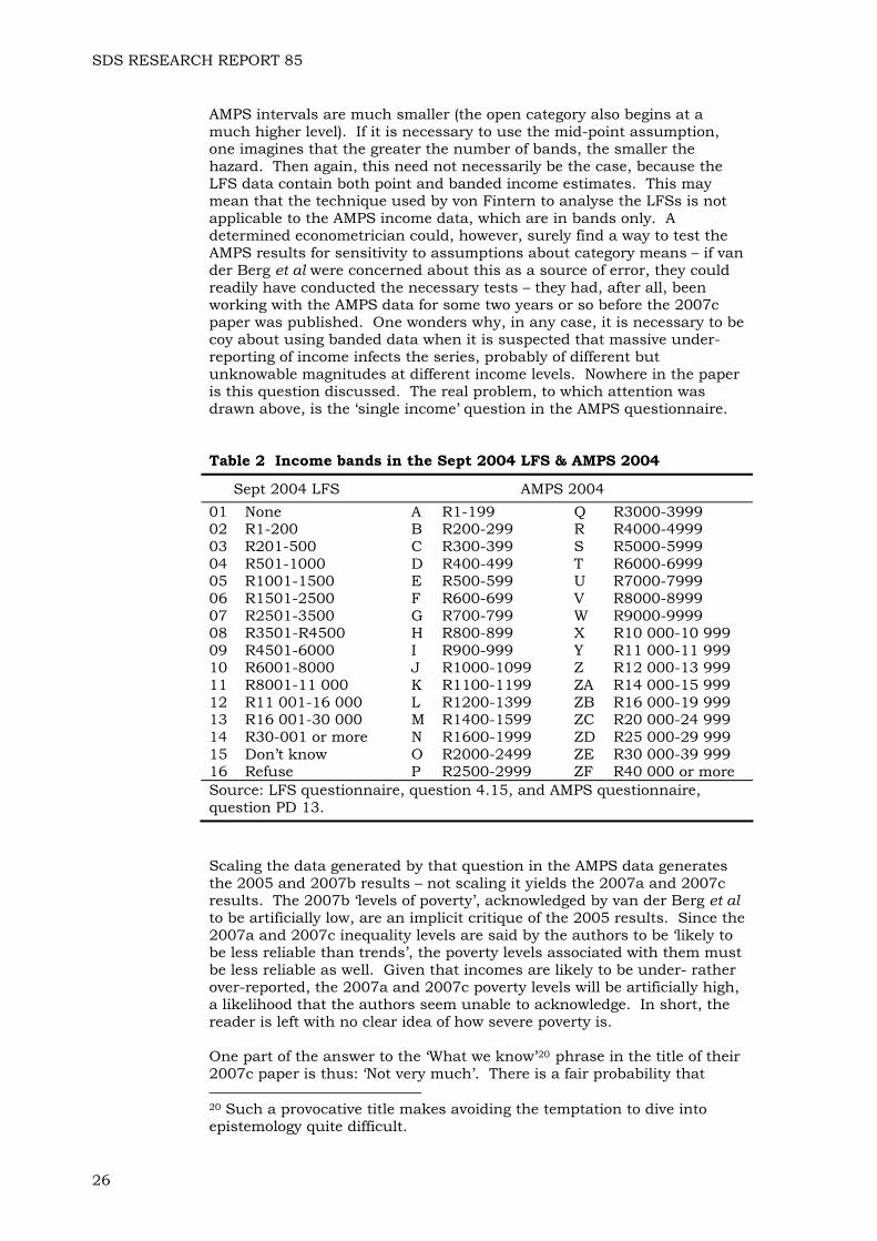
That last sentence is a bit odd – if the levels are less to be relied upon than the trends, then the ‘coefficients here’ can hardly be the ‘correct ones’ – surely they must be coefficients that have been estimated by the correct method, but using unadjusted and hence, suspect data? If the true extent of under-reporting of income were known, it would be possible to estimate ‘correct’ Gini coefficients – without knowing what those errors are it is inappropriate to talk about ‘correct’ coefficients. Making the statement above that “household income estimates in income bands based on a single question” are likely to affect the levels of the Gini coefficients, could be construed as an act of the most becoming modesty. Some of the shine is taken off this concession by the work of another Stellenbosch economist, work which would seem to encourage van der Berg et al to be less diffident about using banded income data. Shortly before their 2007c paper was published, a paper appeared which inquired into the issue of whether using income band mid-points for estimating earnings functions from Statistics South Africa survey data was “too rudimentary” (von Fintern, 2006). The conclusion was that given that the bracket structure had remained largely unchanged, doing so would not “introduce coefficient bias.” (p.ii). It is instructive to compare the intervals in the LFSs and the AMPS. These are given for the year 2004 in Table 2 below. There have been changes to the AMPS bands over time – van der Berg et al (2007c, p.16 ) note that in recent years, they increase from 28 to the 32 listed in the table. How that affects the quality of the poverty estimates is not known. One feature of the AMPS data that should make the use of banded or category survey results less problematic is the substantial difference between the numbers of bands in the latter, and those in the Statistics South Africa surveys. In the LFS there are effectively 13 bands, compared with the 32 in the AMPS. That means, as we see in the table, that the
19 This phrase is a slightly reworked restatement of the same claim (cited above) that they make in the 2007a paper (on p.13).
25
SDS RESEARCH REPORT 85
AMPS intervals are much smaller (the open category also begins at a much higher level). If it is necessary to use the mid-point assumption, one imagines that the greater the number of bands, the smaller the hazard. Then again, this need not necessarily be the case, because the LFS data contain both point and banded income estimates. This may mean that the technique used by von Fintern to analyse the LFSs is not applicable to the AMPS income data, which are in bands only. A determined econometrician could, however, surely find a way to test the AMPS results for sensitivity to assumptions about category means – if van der Berg et al were concerned about this as a source of error, they could readily have conducted the necessary tests – they had, after all, been working with the AMPS data for some two years or so before the 2007c paper was published. One wonders why, in any case, it is necessary to be coy about using banded data when it is suspected that massive under-reporting of income infects the series, probably of different but unknowable magnitudes at different income levels. Nowhere in the paper is this question discussed. The real problem, to which attention was drawn above, is the ‘single income’ question in the AMPS questionnaire. Table 2 Income bands in the Sept 2004 LFS & AMPS 2004
Sept 2004 LFS AMPS 2004 01 None A R1-199 Q R3000-3999 02 R1-200 B R200-299 R R4000-4999 03 R201-500 C R300-399 S R5000-5999 04 R501-1000 D R400-499 T R6000-6999 05 R1001-1500 E R500-599 U R7000-7999 06 R1501-2500 F R600-699 V R8000-8999 07 R2501-3500 G R700-799 W R9000-9999 08 R3501-R4500 H R800-899 X R10 000-10 999 09 R4501-6000 I R900-999 Y R11 000-11 999 10 R6001-8000 J R1000-1099 Z R12 000-13 999 11 R8001-11 000 K R1100-1199 ZA R14 000-15 999 12 R11 001-16 000 L R1200-1399 ZB R16 000-19 999 13 R16 001-30 000 M R1400-1599 ZC R20 000-24 999 14 R30-001 or more N R1600-1999 ZD R25 000-29 999 15 Don’t know O R2000-2499 ZE R30 000-39 999 16 Refuse P R2500-2999 ZF R40 000 or more Source: LFS questionnaire, question 4.15, and AMPS questionnaire, question PD 13. Scaling the data generated by that question in the AMPS data generates the 2005 and 2007b results – not scaling it yields the 2007a and 2007c results. The 2007b ‘levels of poverty’, acknowledged by van der Berg et al to be artificially low, are an implicit critique of the 2005 results. Since the 2007a and 2007c inequality levels are said by the authors to be ‘likely to be less reliable than trends’, the poverty levels associated with them must be less reliable as well. Given that incomes are likely to be under- rather over-reported, the 2007a and 2007c poverty levels will be artificially high, a likelihood that the authors seem unable to acknowledge. In short, the reader is left with no clear idea of how severe poverty is. One part of the answer to the ‘What we know’20 phrase in the title of their 2007c paper is thus: ‘Not very much’. There is a fair probability that 20 Such a provocative title makes avoiding the temptation to dive into epistemology quite difficult.
26

SDS RESEARCH REPORT 85
some time after 2000, social grants caused the poverty headcount rate to fall. It is also possible that after rising between 1993-1995 and 2000-2001, the headcount itself began to fall – by how much, it is impossible to say with any certainty.21 The two series plotted in Figure 1 above, reproduced, as noted, from Figure 5 in van der Berg et al, 2007b, probably constitute the upper and lower bounds within which lie most poverty estimates that have been made in recent times. My conclusion is that van der Berg et al would be hard-pressed to say, where, exactly, the line that measures the ‘true’ value of the poverty headcount ratio at R250 per capita per month lies. In short, after much calculating, all they have to tell their readers is that they are convinced that at some point after the year 2000, that line turned downwards.22 As far as poverty estimates made by others are concerned, van der Berg et al show that the unadjusted Income and Expenditure Survey (IES) estimates for 1995 and 2000 fall between the lines in Figure 1, while their adjusted IES estimates fall just below the lower line (2007b, p.20). My 2006b best guess at the 2004 poverty headcount ratio using a R250 per capita per month poverty line (in 2000 prices) was about 42.7 per cent, with a 2001 figure of 45.9 per cent (Meth, 2006b, Table 8, p.37). The Hoogeveen and Özler paper uses poverty lines of R174 and R322 per capita per month in 2000 prices. At the lower poverty line, the 1995 and 2000 poverty headcount ratios were 32 and 34 per cent. At the higher poverty line they were both 58 per cent. Eyeballing the cumulative distribution function plotted in Figure 1 of Hoogeveen and Özler (2004, Figure 1, p.34), it looks as though the ratios for 1995 and 2000 at the R250 per month line (in 2000 prices) would both have been in the vicinity of 45-48 per cent or so, values that lie within the region bounded by the two curves in Figure 1 above.
As researchers we need to recognise finally, that we are never going to be able to measure poverty during the period since the transition with any greater precision. No unexploited survey data exist, and the existing data sets have been beaten to death. If anyone wishes to point a finger, it should be in the direction of Statistics South Africa, for their failure to conduct surveys that would have enabled better estimates of poverty to be made.23
21 The extent of the decline may not be known with precision, but readers are reminded that the finding of a decline in poverty over the period is said to be robust (van der Berg et al, 2007c, p.22). 22 A comparison of the unadjusted AMPS poverty estimates they present in the 2005 paper (Figure 16, p.38) with those they offer in the 2007b paper (Figure 5, p.20), is instructive. In the latter, the poverty headcount ratio does not fall below 50 per cent until 2002. In the former, it hovers between 40-45 per cent until 2003 (both commence in 1993). As usual, no explanation for the differences is given. 23 A positive feature of the papers by van der Berg et al reviewed in the present paper is that each has a section, however short, devoted to the weaknesses of official statistics (2005, pp.9-10; 2006, p.11; 2007a, pp.6-7; 2007b, pp.12-13; 2007c, pp.14-15, and 2008 paper. pp.52-53).
27
SDS RESEARCH REPORT 85
Another question that is never going to be answered satisfactorily24 is that of the value to individuals of social spending, sometimes described as the ‘social wage’. Evidence about the impact of the ‘social wage’ is important part, along with laudatory income poverty reduction statistics, of government’s defence against critics who claim that poverty has worsened or that it has not been reduced quickly enough. In their summing up of ‘what we know’ about the ‘social wage’, van der Berg et al go well beyond damning government’s efforts with faint praise. Here is what they have to say:
an
“In the education sector resources were shifted to the poor, but outcomes, when measured in terms of quality, remained largely unchanged. Regarding health care, the services provided by the public health sector are not highly rated by the population – even the poor often opt for paying more to get higher quality private health care. Only in the case of social grants (where resources are shifted directly to the intended beneficiaries) and perhaps in the cases of housing, physical infrastructure and water provision (where provision of services often bring direct benefits) did the poor clearly gain from increased and more effectively targeted social expenditure.” (2007c, p.38)
Instead of citing this unpalatable finding in Budget Review 2008, Treasury presents a set of estimates of access to health and welfare services over the period 2002-2006 (Table 6.2, p.93). These bland figures show a small increase in the proportion of the population making use of public health services. Although the need to improve service delivery is acknowledged elsewhere in the Review (see, for example, pp.8 and 106),
24 Government’s response to claims that income poverty has increased or not been reduced fast enough, are invariably met with the observation that such claims ignore the contribution of the ‘social wage’ to the wellbeing of the poor. Unfortunately, the values to any individual, of several of the services procured by social spending are impossible to estimate with any reliability. The closest the conventional literature gets is the imputation of benefits from estimates of the costs of providing the goods and services that make up the social wage. Among those which cannot be valued, are education and health care. It so happens that these two are, by far, the largest components of the social wage. Using the dubious technique variously known as benefit incidence or cost apportionment, the HSRC put the value of the social wage for the poorest 40 per cent of households in 2003 at R719 per month per household, when distributed over all households – values of the individual items that went to make up the social wage were obviously higher in those households that actually received any or all of the components of the social wage. Similarly, grants added a further R236 per month per household, when distributed over all households. Some 13.5 per cent (R97 per household per month) was attributed to Electricity (R33), Water (R22), Sanitation (R6), Solid Waste Removal (R10) and Housing (R26). The other two components, accounting for R623 per month distributed over all households (86.5 per cent of the total social wage) were Education (R379) and Health Care (R244). The literature on the topic of valuing social spending topic is vast. In a paper commissioned by the HSRC, I have offered a suggestion for reducing the margin of ignorance about the impact of social spending on people’s lives (Meth, 2008b). The paper includes a review of the literature on the social wage, and a discussion of the reasons why it is so difficult to value social spending. It also contains a critical analysis of the silly Gini coefficients published in the Ten Year Review (PCAS, 2003).
28
SDS RESEARCH REPORT 85
nowhere is there an unmediated discussion of failure. The message is clear – the construction industry can be relied on to put physical resources into place, and the Department of Social Development can be relied upon to deliver grants (within tolerable limits of abuse of the system) – human resource-intensive activities, by contrast, have a very poor record. If, as I suspect, van der Berg et al have over-estimated the impact of expansion of the social grant system, then government is left with not very much to cling to, by way of reward for the expenditure of countless billion rands. Its weaknesses notwithstanding, the 2007c paper is more insightful than its fellows – if Kanbur’s ‘hard question’ had been addressed, we could almost begin to regard it as critical of government’s achievements in the income poverty reduction field.
The 2008 paper: Post-transition poverty trends once more Finally, we turn to the version of their paper published in the South African Journal of Economics (van der Berg et al, 2008). Like the 2007a and 2007c papers, this one presents the array of poverty and inequality estimates based on unadjusted AMPS data. The poverty estimates given in the 2008 paper are identical to those in the 2007a paper – Table 4 in the 2008 paper (p.69) reproduces exactly the results presented in Table 4 in the 2007a paper (p.15). Figure 4 in the 2008 paper (p.70) is the same as Figure 4 in the 2007a paper (p.14). By now, with exhaustion setting in, the unasked question of whether loosely-measured trends are satisfactory indicators of progress in the struggle against poverty, starts to cry out for an answer, or if it cannot be answered, at least to be aired. The levels versus trends argument crops up, as before, in relation to Gini coefficients (van der Berg et al, 2008, p.11). The poverty discussion commences with the following statement:
“Post-transition poverty trends are of great interest and concern in policy debate, as their aggregate direction establishes whether the government has succeeded in a critical socio-economic objective. This paper therefore aims to establish with as much confidence as possible whether or not poverty has declined since 1994.” 25 (van der Berg et al, 2008, p.68)
As has been noted above, there is a high probability that poverty has fallen over the period. As has also been noted above, the AMPS data cannot tell us, with any confidence, how large this fall is. Instead of saying this, and saying it bluntly, the authors, in their assessment of the contribution that the AMPS data can make the goal of informing policy debates, are guardedly critical of the toy they have played with so often – on the last page of the paper they say that:
“The AMPS data do not provide a perfect substitute for official data sources, which are generally designed with comprehensive measurement of person or household characteristics in mind.”
25 Each of the papers considered above contains all or part of this statement. It appears exactly in this form in van der Berg et al, 2007a, and in part in the 2005 paper (p.16), the 2007b paper (pp.18-19), and in the 2007c paper (p.19).
29
SDS RESEARCH REPORT 85
and a little further down the page that:
“Informed policymaking requires more frequent as well as accurate surveys that are released for analysis without undue delay. Although this paper has shown that unofficial data sources could offer some assistance, they can in no way substitute for good official surveys.” (van der Berg et al, 2008, p.75)
That, apparently, is as close as they come to saying that the AMPS figures cannot bear the weight imposed on them when attempts to measure poverty using either adjusted (or unadjusted) figures are made. As has been shown above, the way that the AMPS income question is asked, makes it inappropriate to apply the scaling technique they have developed. It is not possible to say why the paper came out containing estimates based on unadjusted AMPS figures, nor is it possible to know what would have happened had the authors presented poverty estimates based on adjusted figures to the editors of the SAJE. Notwithstanding their retreat to the ‘safer’ poverty estimates, the authors are still exposed. Once again, the only warning users get that the poverty headcounts in their Table 4 (2008, p.69) probably exaggerate the problem, comes in indirect form in the comments about the Gini coefficient. This is what they have to say:
“Trends in inequality derived from the AMPS Gini coefficients may have been more reliable than the estimated levels of inequality that they reflected, for instance if there were recurring patterns of misreporting of income.” (van der Berg et al, 2008, p.68. Emphasis in original)
In the discussion of their 2007a paper above, reference was made to the skimpy commentary on headcounts. Attention was drawn to the fact that a fall in headcount rates and headcounts (2001-2004) was celebrated, while a fall in the headcount rate accompanied by an increase in the headcount (1994-2004) was ignored. Since the 2007a and 2008 poverty results are identical, the same terrain has to be traversed in the later paper. This is how they deal with the issue:
“The story told by these numbers is one of increasing poverty around the mid 1990s, followed by a period of approximate stability in the poverty headcount rate until the turn of the century (although population growth did increase the number of poor), and then by a dramatic reduction in the poverty rate after 2001, with even the number of poor declining substantially despite population growth The initial increase in the poverty rate was probably due to a combination of sluggish economic growth and poor labour market prospects in the second half of the 1990s. However, note that the progress made in fighting poverty since 2001 was large enough to more than offset the preceding rise in the poverty rate.” (van der Berg et al, 2008, pp.69-70)
Although this is an improvement on their 2007a effort, there is still no reference to the other story told by their numbers, namely, that the headcount was ‘substantially’ (to use their adjective) higher in 2004 than it was in 1994.26 There are several ways to respond to this finding – one
26 Why, when 1994, the year of transition to democracy, is such an obvious starting point for analysis, they should choose to present figures
30
SDS RESEARCH REPORT 85
of them, their choice, is to ignore it. Another is to consider the likelihood of the reported decline in poverty after 2001 continuing into the future. Implicit in the optimistic passage above (‘the progress made in fighting poverty’) is the suggestion that further progress is to be expected. The likely cause of the poverty reduction (‘substantial’ they remind us) is a:
“… combination of factors, including faster economic growth, improving labour market prospects and swelling social grant spending.” (van der Berg et al, 2008, p.70)
This prompts two observations: (i) the available data are not robust enough to allow for credit to be apportioned among the causes, (ii) it is remains as true now as it ever was that pinning one’s hopes mainly on never-ending economic growth to rescue the poor is not sound policy. As far as the first of these is concerned, my suspicion is that social grants, in particular the child support grant (CSG), have been responsible for most of the poverty reduction (whatever its magnitude) that has taken place to date.27 As the authors point out, the number of such grants grew from about one million in 2001/2002 to 4.3 million in 2004/2005 (van der Berg et al, 2008, p.67). By April 2009, the number of Cbeneficiaries exceeded nine million (Treasury, 2009, p.90). Yet as van der Berg et al pointed out in their 2005 paper:
SG
“…. there are limits to the expansion of the grant system as a means of poverty alleviation, pointing to the importance of economic growth with job creation for sustaining the decline in poverty.” (van der Berg et al, 2005, p.2)
Those limits are being approached now – once the 15-17 year-olds have been incorporated, current government plans do not allow for many more extensions to the social grant system. That leaves the remainder of the job of alleviating poverty in the short- to medium-term, as well as that of eradicating it in the long-term, to economic growth. As a stopgap, government is offering Phase 2 of the EPWP. As I have argued elsewhere, despite the very large numbers now being kicked about, the intermittent ‘protection’ offered by this programme is no substitute for the security that social grants for the able-bodied working-age poor would provide (Meth, 2009b). While few would dispute the proposition that growth is necessary for eradicating poverty, many argue that it is not sufficient. Having railed for
for 1993 and 1995 is something of a mystery – as Figure 4 in the 2008 (and 2007a) paper demonstrates, they have the relevant figures to hand. 27 Social grants are said by van der Berg et al to have “… made a large contribution to the recently observed decline in poverty” (2005, p.23). The contrast between that proposition (hypothesis) and the conclusion produced by a simulation exercise (experiment) that they conduct to discover the likely benefactors of an hypothetical increase in employment could not be more extreme. Allocating one million jobs “… according to the likelihood of employment based on a probit model of current [2000] employment… ” sees 182 000 of those jobs going to those in the bottom income decile, and 135 000 to those in the income decile just above them (van der Berg et al, 2005, pp.21-22). Such a finding flies in the face of all common sense – those in the bottom two deciles are likely to be poorly equipped to compete for scarce jobs, by virtue of education, spatial location, and weakness of social networks.
31
SDS RESEARCH REPORT 85
years against the dangers of relying too heavily on growth, and the mistaken belief that maintaining high levels of it was going to be possible,28, it hardly feels like the wisdom of hindsight to point out that the recent collapse of growth, though worse than most of us anticipated, should have found a government fully prepared, having put in place the comprehensive social security system recommended by the Taylor Committee (DoSD, 2002) more than seven years ago. Only the poverty of South Africa’s poverty data is going to save government from finding out how heavy a price the poor will pay this time around for the absence of proper social protection. Social scientists need to maintain a critical distance from the subjects of their analysis – waxing excessively enthusiastic about government achievements is something best left to politicians. As we have seen above in the examination of their 2007a paper, the 2004 headcount was higher (by about 1.3 million) than the 1994 figure. If this figure were correct (and we assume that since the AMPS figures are under-reporting income, that it is not), would the now larger number of poor people think that ‘government has succeeded in a critical socio-economic objective’ because a poverty ratio had fallen? It is unlikely that those who take social policy seriously would be persuaded that the crass measure employed by van der Berg et al (a loosely-identified ‘trend’) has anything but propaganda value to government. The only use to which it could be put would be as a rabbit pulled out of a hat to tell the poor, through the media (or through ANC structures) that they were even better off than they imagined. In short, the significance of the van der Berg et al findings is mainly rhetorical – the results are so contentious that as guides to policy formation, or monitoring and evaluation, they are of little value. Let us pause for a while to think about rhetoric – there was a moment in the 1980s when it looked as though the discipline of economics would be deflected into a state of greater self-awareness about its objectives. Prompted by the publication of McCloskey’s book, The Rhetoric of Economics, a debate ensued, one that convinced at least some of us that our work almost always took the form of an attempt to persuade an audience of the truth of some proposition or other.29 The moment passed – for the most part, economics re-assumed its pseudo-scientific complacence, untroubled by the experience.30 In one sense, the stance
28 Most recently in an encounter with what I call ‘growth fundamentalists’ (Meth, 2008c). 29 In my case, it is obvious that I seek to persuade readers that handing politicians a statistical sledgehammer is not a good idea. The method used is to (a) identify the tool, and (b) to try to explain how it came into the hands of the politicians, and (c) to demonstrate the use made of it by those actors. 30 As an armchair sport, pricking the pretensions of conventional economics offers as much innocent entertainment as the best of them (it is almost as much fun as exposing the follies of mechanical Marxism). One needs to be a little cautious, however, because some economists whom one would want to dismiss as conservative (World Bank) hacks, occasionally display surprising sensitivity. A prime example is Deepak Lal. Discoursing on the difficulties of writing economic history (which has as its subject any and all economic events, including those that took place today) he and Myint (1996) argue that to do so, it is necessary to employ a methodology that is “essentially forensic”, drawing a parallel between writing economic history and the proceedings in a court of law. The “resulting answer”, they observe:
32
SDS RESEARCH REPORT 85
we adopt towards the episode does not greatly matter, for it is clear that even if we are not aware (self-conscious) of the devices we use in our attempts to persuade readers of the validity of our case, a critical reading of our work by other social scientists will quickly expose them. What of the rhetorical devices used by the Stellenbosch group? Aspects of their work remind me of national accounting statisticians, who, when pressed about the reliability of the figures they produce, assert that although absolute levels may not be all that accurate, they are reasonably sure that they are capturing trends. Given the relative paucity of critical analysis of national accounting statistics, repeated invocation of the mantra has probably disarmed critics. Something similar may be happening with the van der Berg et al research results. Another rhetorical device they use is the ‘big number’.31 Here it is in operation:
“The impact of the recent expansion of social grants on the poor was likely to have been major, considering that real transfers from government increased by some R22 billion in the last 2 years (in 2000 Rand value),32 an amount well in excess of R1000 per poor person. Bear in mind that poverty is defined in this paper as income of less than R3000 per capita per year. The grants were supposed to be targeted through the means test, thus most of the additional R18 billion flowed into poor households.33 Considering that the income of the poor was only R27 billion in 2000, an increase in social grants of this size would have made a great difference to the poor and may have lifted lift many of them out of poverty if grants were well targeted.”34 (van der Berg et al, 2008, p.70)
Offering more evidence in support of their claims about how the incomes of the poor had increased, they note that:
“From national accounts data, real remuneration rose by R53 billion in real terms between 2002 and 2004, representing an exceptionally large increase in terms of South African experience of 11.7% over the period. This effect, if accurately measured, must have had a strongly positive influence on the incomes of many of the poor, either through higher wages or through increased employment.” (van der Berg et al, 2008, p.71)
“… will not be infallible, but should still meet the requirement that the jury arrives at a conclusion that is ‘beyond reasonable doubt’. ” (1996, p.6). They go on to argue however, that: “… of course, there will always be debate about what is reasonable doubt, and in that sense it is unlikely that any important empirical issue in economics will ever finally be settled.” (Lal and Myint, 1996, p.7) In short, economic history is rhetoric. 31 The demonstration of robustness (dominance) in each of their papers (it occurs on pp.71-72 of the 2008 paper), may be viewed as yet another rhetorical device. The word ‘robust’ has reassuring connotations. 32 My estimate (in Table 4) of the increase between 2000-2004 is about R14 billion in 2000 prices. 33 This is as fine an example of a non sequitur as one could wish for. 34 The means test was (is) so slack that it is unlikely that all the grants would have gone to ‘the poor’ – capture of grants by those above the poverty line is likely to have been significant.
33
SDS RESEARCH REPORT 85
Let us probe a little, into these, and some other big numbers, to gain a more balanced picture of what may have happened in South Africa over the period 2000-2007, i.e., the period during which the social grant system underwent massive expansion. Table 3 below contains the results of a little simulation on data extracted from the national accounts and the 2005/2006 Income and Expenditure Survey conducted by Statistics South Africa. A full account of the way in which the figures are constructed is given in an appendix at the end of the present paper. For our purposes here, we need take note only of a few of the key assumptions used in the construction of Table 3 – these will be spelled out as we proceed. The table gives estimates of per capita consumption (expenditure) levels in the top decile of households, and in the bottom 40 per cent of households. Two indicators extracted from these estimates, the year-on-year change, and the ratios of consumption of the top decile to those of the bottom 40 per cent of households are given as well. The first of the steps required to prepare the estimates entailed the calculation of the total value of grants distributed from published information on the numbers of grants made, and their value in current prices. These values were then expressed as a percentage of total final consumption expenditure obtained from the Reserve Bank Quarterly Bulletins. The proportional distribution of expenditure by household decile in 2005/2006 was then estimated from the latest Income and Expenditure Survey. The cumulative total share of expenditure of the bottom 40 per cent of households in 2005/2006 was 7.45 per cent, while that of the top decile of households was 51.9 per cent. These values were taken as benchmarks for the year 2006. Because household size in both these groups was below the national average, the proportions of the population in each group (35.5 and 8.9 per cent respectively) were smaller than 40 and 10 per cent. Although it is known that mean household size fell over the period, it is assumed that these proportions hold across all years in question.35 This is tantamount to assuming that the decline was the same in each decile. It is then assumed (although we know it not to be the case) that all social grants went to the bottom 40 per cent of households. By subtracting from the share of total expenditure the group enjoyed, the proportion of expenditure in 2006 made possible by the receipt of social grants, it is possible to isolate that portion of expenditure made possible because income had been earned (or remittances received). In 2006, 5.1 per cent of expenditure was from social grants while 2.4 per cent came from earned income (and other income). It is then assumed that the latter figure holds for all years under consideration. By adding to this figure, the proportion of total expenditure accounted for by social grants, it is possible to estimate the total expenditure of the bottom four deciles. Dividing these totals by estimated populations yields annual estimates of mean per capita consumption. The sensitivity of the calculation to errors in the estimate of the share of total consumption in the 2005/2006 IES is tested by pushing the observed figure of 7.45 per cent up to 8.5 per cent. As may be seen in the table, the effect on per capita consumption estimates is substantial.
35 Figure 1 in the 2008 paper (p.65) shows the decline in mean household size detected by the AMPS surveys – it falls from about 4.8 in 1993 to about 4.45 in 2004. Similar movements have been picked up in the official statistics.
34
SDS RESEARCH REPORT 85
35
Mean per capita incomes in the top decile are much easier to estimate – we simply take the observed share (51.9 per cent) and convert into billions of Rand. Testing the sensitivity of the results to the assumption that this share holds in each year, is performed by assuming that it falls to 45 per cent. The effect may be seen in Table 3. Before proceeding, a word on the income means in the table – one cannot infer poverty levels from the figures – they are crude statements obtained by dividing a sum of money by a number of people. From the data used, we can gain no idea what the dispersion around these means was. Thus although we suspect (from other data sources) what van der Berg and his colleagues often mention, namely that the poor are densely clustered around a poverty line of R250 per capita per month (in 2000 prices), we cannot use that suspicion to guess at the impact of government’s anti-poverty measures (especially social grants). It may also be useful to be reminded that household size ensures that many in the 5th and 6th deciles are poor as well, in much the same way as it ensures that those in the smallest households in deciles 1-4 are not. Performing a bit of mental arithmetic produces immediate disquiet – between 2000 and 2007, per capita monthly expenditure at the bottom end could have increased by about R140,36 while at the top end, the increase was probably in the region of about R2000 – recall that these figures are in constant price (‘real’) terms. If we wish to find something less unpalatable to say, we could convert them to percentage increases and then say that consumption at the bottom end increased by 71-77 per cent (not forgetting to note that it was from a low base), while expenditure by the well-off only increased by one-third. We could also say that the ratio of expenditure by the well-off to that of the folk in the bottom 40 per cent of households fell from somewhere in the 30s to somewhere in the 20s. In addition, we could claim that growth was ‘pro-poor’, because while GDP and final consumption doubled over the period, social grants more than trebled, and so on. All of these things are possibly true, but if instead of looking at trends, we get back to the absolutes once more, we observe that up until 2003, the annual increment to the consumption of the well-off was a sizable fraction of the total consumption of those at the bottom. From 2004, the increment to the well-off comfortably exceeds the total consumption of the bottom 40 per cent, even if we assume that the share of the well-off was only 45 per cent of all consumption expenditure. The end-result is that after seven years of the big redistribution to which van der Berg et al repeatedly make reference, the increase in mean consumption of the well-off is about five or six times as large as mean total consumption of those in the bottom 40 per cent of households.
36 By my reckoning, the increase in monthly per capita expenditure between 2000-2004 of all those in the bottom 40 per cent of households, if all social grants had accrued to them (recall that this group is not ‘the poor’), would have been about R77-81. For what it is worth, this is close to the van der Berg et al figure of R1000 per annum. Grants would have accounted for about R68 of the increase in income available for consumption. Maintaining the assumption (the fiction) that all grants went to the bottom four deciles of the population, in 2000, 2.9 million grants would have been distributed among 15.6 million people, whereas in 2004, 7.9 million grants would have been distributed among 16.4 million people.
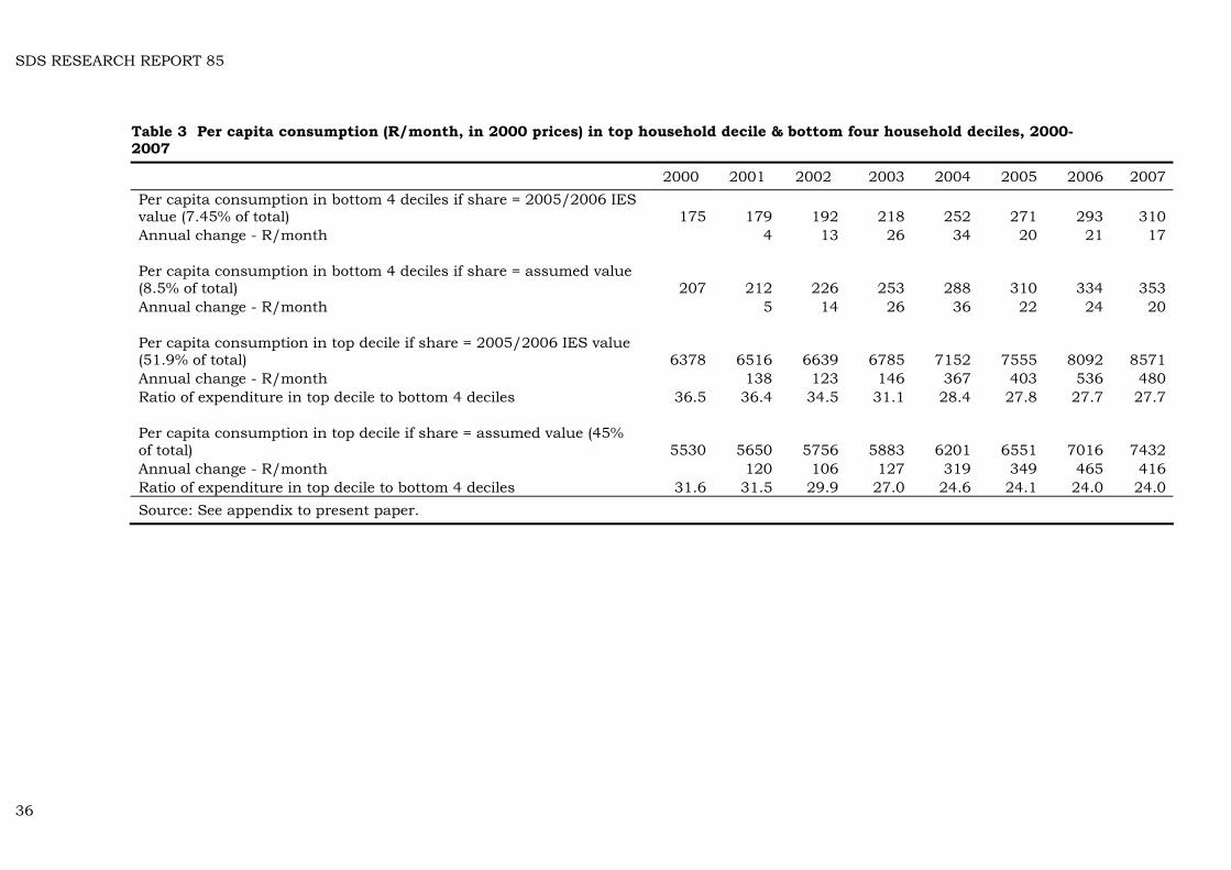
SDS RESEARCH RE
36
PORT 85
2000 2001 2002 2003 2004 2005 2006 2007 Per capita consumption in bottom 4 deciles if share = 2005/2006 IES value (7.45% of total) 175 179 192 218 252 271 293 310 Annual change - R/month 4 13 26 34 20 21 17 Per capita consumption in bottom 4 deciles if share = assumed value (8.5% of total) 207 212 226 253 288 310 334 353 Annual change - R/month 5 14 26 36 22 24 20 Per capita consumption in top decile if share = 2005/2006 IES value (51.9% of total) 6378 6516 6639 6785 7152 7555 8092 8571 Annual change - R/month 138 123 146 367 403 536 480 Ratio of expenditure in top decile to bottom 4 deciles 36.5 36.4 34.5 31.1 28.4 27.8 27.7 27.7 Per capita consumption in top decile if share = assumed value (45% of total) 5530 5650 5756 5883 6201 6551 7016 7432 Annual change - R/month 120 106 127 319 349 465 416 Ratio of expenditure in top decile to bottom 4 deciles 31.6 31.5 29.9 27.0 24.6 24.1 24.0 24.0 Source: See appendix to present paper.
Table 3 Per capita consumption (R/month, in 2000 prices) in top household decile & bottom four household deciles, 2000-2007
SDS RESEARCH REPORT 85
As we may see in Table 4 (in the appendix), the value of social grants in current prices increased from about R19 billion in 2000, to R62.7 billion in 2007.37 In constant 2000 price terms, this translates (assuming, as we noted, that all social grants went to bottom 40 per cent of households) into an increase in consumption of about R30 billion in constant 2000 prices for roughly 16-17 million people. Obviously, that largesse is unequally distributed among the poor, accruing as it does, only to households that are home to the appropriate grant recipients. At the top end, the total amount consumed by the roughly four million people (some of it, probably, by all of them) lucky enough to be so classified, grew by R120-140 billion (in constant 2000 prices).38 What we do not know is, what, if anything, participants from different walks of life do or would make of all of this? Probably the most visible sign, to the ordinary poor person, nearly all of whom will be African (Black), would be the emergence of a substantial number of people from their population group who have become well-off since the transition. Using an annual household income of R15 000 per month (in constant 2000 prices) van der Berg et al estimate the number of ‘middle and affluent class’ Africans at 935 000 in 1993, and 2.25 million in 2004 (2008, p.72). Desirable though such ‘progress’ undoubtedly is, it may also have less happy consequences. Much depends on the perceptions of people at the bottom of the social heap. One possible response is celebration of the success of their fellows, with the nouveau riche being viewed as role models. It is also possible that comparing the trivial increases in their command over consumption with the substantial progress made by some (visible in ostentatious display), could cause the poor to react with envy and dismay.39 We suspect that inequalities have important implications for social cohesion, but we are by no means sure what these are. Although there is a voluminous literature on the topic, we not sure whether (or when) absolute inequality is more important than relative inequality (and vice-versa). In view of this, the presentation of row upon row of inequality estimates to three decimal points (as van der Berg et al do in Table 3 on p.69), based on weak income data, does not inspire great confidence in conclusions such as this one:
37 It is not clear where van der Berg et al get the ‘R22 billion increase in the real value of transfers in the last 2 years (in 2000 Rand value)’ cited in the passage above. Table 4 in the appendix suggests that between 2000 and 2004, the value of grants in current prices rose by about R23.5 billion. 38 The 2007c paper presents an analysis of government spending since the transition which looks at the years 1995 and 2000 (van der Berg et al, 2007c, pp.31ff). They conclude that improved targeting caused reductions in real per capita spending among the top two deciles of the population, “… largely resulting from shifts in school spending …” (p.35). How much of the increase in expenditure was absorbed by increases in the costs of education to the well-off is an interesting question. For those near the lower end of the top decile, the effects could have been quite severe. Many at the top end are likely not to have been affected at all – their children will already have been attending private schools. 39 A recent attempt to understand the phenomenon concludes with this sentence: “… it remains to be seen whether the growth of the middle class in South Africa is ironically accompanied by the continued polarisation of society on class or racial lines.” (Modisha, 2007, p.221)
37
SDS RESEARCH REPORT 85
“The picture created [is] one of rising aggregate inequality during the 1990s, followed by stabilisation – and possibly even a small decline – from the turn of the century onwards. However, even after 2000 intra-racial inequality continued to rise for all groups, with the notable exception of blacks. This escalation was particularly rapid if one draws inference from the mean logarithmic deviation rather than the conventional Gini. The small but surprising decline in black inequality was consistent with a scenario in which the expansion of social grants and – to a lesser extent – recent improvements in job prospects had benefited poor individuals more than proportionately.”40 (van der Berg et al, 2008, p.68)
Why we would want to attach significance to a calculation that says the Gini coefficient for Africans falls from 0.609 in 2000 to 0.598 in 2004 (p.69), when we are aware that it is based on income estimates known to under-report income, is not obvious (and here, we are back at the questions McCloskey raised). Figures such as these cannot surely be expected to offer any insight into the question of the success of government policy? A comparison of the 2008 and 2007c papers is instructive. In some respects, treatment of inequality in the 2007c paper is more satisfying, even though it draws on the same data.41 In the lengthy quote from the 2007c paper that follows, they may be seen making predictions for the future about poverty, growth and inequality, that mix the optimistic with the pessimistic in almost equal measure:
“Economic growth is likely to continue at a fair pace. Therefore it seems quite realistic that the per capita income can grow by a full 40 per cent between now and 2019, a quarter century after the transition. Demographic projections indicate that fewer people will enter the labour market – the labour force growth will be less than 1 per cent per annum. At the same time the economic growth is likely to continue, creating more jobs. Access to jobs is likely to improve, thereby also improving wage and overall income distribution. A decomposition of inequality measures shows that 80 per cent of inequality between households results from inequality in access to wage income. Among the employed wage inequality will however remain high and might even grow. This is because economic growth will favour more employment for skilled and educated people, while the demand for unskilled workers will decline. As the skills base is expanding slowly, the skills-hungry economy will ensure that people who are better educated will experience most of the wage increases, further widening wage inequality. This will tend to keep the overall inequality high, thereby limiting the poverty reduction potential of economic growth. Given that most inequality derives from the labour market, the possibility that income distribution will improve as a result of the
40 A little earlier, talking of whites and Indians, they were to be found saying that: “The modestly accelerating economic growth rates experienced during the first post-transition decade and an improvement in the ability of the economy to generate jobs were likely to have benefited these groups in particular, given their relatively large stocks of human capital.” (van der Berg et al, 2008, p.66) 41 In the 2007c paper, the inequality estimates are pushed through to 2006. See van der Berg et al, 2007c, Table 4, p.29.
38
SDS RESEARCH REPORT 85
trends in other income sources or the further expansion of social grants is limited. This makes it likely that inequality will remain high. But poverty should continue to improve, due to economic growth, even though the high inequality will reduce this positive impact. (van der Berg et al, 2007c, p.39)
Although the 2008 paper is replete with references to (and calculations of) inequality, inequality does not rate a mention in the paper’s conclusion. One inference that may be drawn from this is that the academic audience at which the SAJE article is aimed can make their own predictions about the likely significance in the future of continuing high levels of inequality. The intended audience of the ‘What we know’ paper (2007c), by contrast, has its hand held as it is led to a set of quite mixed conclusions (the dismal comments, reproduced above, by van der Berg et al on the social wage being among them). A search for the words ‘protest’ and ‘unrest’ fails to disclose any sign of an awareness of the thousands of incidents of both in recent years, mostly by poor people very cross about service (non)delivery. There are only two references in the 2008 paper to service delivery. The first is a celebratory reference to the Bhorat et al (2006) paper purporting to show how asset poverty and inequality have declined. The second is to the likelihood that those “… suffering the greatest welfare deprivation were the poor in rural areas …”, not only because of service delivery backlogs, but also because of lack of “… information on and access to forms of social assistance.” (van der Berg et al, 2008, p.74). Although such bloodless treatment of one of the country’s worst social problems is not a requirement for acceptance by a learned journal in the field of economics, one is nonetheless far more likely to find the human aspects of such topics aired in the journals of the ‘soft sciences’ like sociology, politics and geography. The 2008 paper, like its forerunners, offers a useful survey of previous attempts to measure poverty and inequality in South Africa, as well as a reminder of the importance of Statistics South Africa’s failure to produce proper survey data for getting to grips adequately with the problems of poverty and inequality. For the rest, its treatment of the central issue with which it is concerned, poverty, renders its contentious results vulnerable to ‘capture’ by a government anxious, as nearly all governments are, for ‘good news’.
The march of the propagators In this section of the paper, we take a look at the contribution of three sets of actors, other than the researchers themselves, to the production and propagation of research results reviewed above. They are, in order of appearance: • Research funders/commissioners • Learned journals • Popular and financial media
Research funders/commissioners Research, as we all know, is usually an expensive business. The nature of much of what passes for economics is such, however, that it is possible
39
SDS RESEARCH REPORT 85
for dedicated amateurs in universities, often working alone, and using all the spare time not devoted to lecturing students, to keep up with those at the cutting edge. Mildly eccentric, such ‘pure’ activities are overshadowed, at least as far as those researchers interested in development are concerned, by research into policy-related areas, much of it driven by government (and NGO) demand for guidance in policy formation or assessment.42 Funding agencies and institutions now disburse vast sums of money to researchers to conduct research of the type reviewed in the present paper. A footnote to the 2003 van der Berg and Louw paper acknowledges that it was part of a larger project on inequality and mobility funded in part by the National Research Foundation (NRF). The 2005 van der Berg et al paper was commissioned, and, presumably, funded by the Deutsche Gesellschaft für Technische Zusammenarbeit (GTZ or gtz) GmbH. Each of the three 2007 papers was produced with financial assistance from the European Union, under the auspices of the Conflict and Governance Facility (referred to as the CAGE facility), a “partnership project under the auspices of the South African National Treasury, between the South African Government and The European Commission”.43 The 2007a and 2007b papers contain the weasel statement sometimes required by funders, distancing the institution from the research output. In those two papers, the following, quite strong, disclaimer appears:
“The contents of this document are the sole responsibility of the Department of Economics at the University of Stellenbosch and can under no circumstances be regarded as reflecting the position of the European Union.” (van der Berg et al, 2007a, p.2 and 2007b, p.2).
In addition to taking steps to create an appropriate space (arm’s length) between themselves and the researchers they fund, each of the institutions listed above makes a fuss, as one would expect them to, about quality. The NRF devotes a page of its glossy Vision document to an introduction to the ways in which it promotes research excellence. On its website one can find details of the criteria by which projects are judged. Most of the information appears, however, to refer to the process of grant application. Given that the organisation is dispensing taxpayer’s money, there is some sensitivity to the notion of accountability.44 Thus,
42 In countries like the USA, with large academic ‘markets’, ‘pure’ research into the most arcane reaches of economics proceeds unhindered by a need for policy, or indeed, any relevance. This generates both research eccentrics, and a huge self-perpetuating literature, whose primary purpose, it would appear, is advancement, by way of pure rather than applied mathematics, of the eccentrics up the promotion ladder. When it is necessary to descend into the empirical world, access to a vast array of databases, and the availability of highly sophisticated software, makes data mining cheap. For a discussion of the pointlessness of much of ‘economics’, see McCloskey, 1994, especially Chapter 10. 43 The CAGE facility made great play of transparency, disclosing on its website the recipients of the research grants it made, and the amounts given. In 2005, it made R335 000 available to the University of Stellenbosch Economics Department, for “Monitoring poverty, inequality and polarisation: Trends and prospects” (CAGE/AW02/CFP02/2005). In 2007 they received a further R100 000 for “Trends in Poverty and Inequality: What the evidence tells us” (CAGE/AW02/CFP03/2006). 44 There is a sort of customer’s charter in which the NRF promises to answer telephone calls and the like. See http://evaluation.nrf.ac.za/Content/About/EC_customer_care_ standards_29_May_2007.doc, downloaded on 26th December 2008.
40
SDS RESEARCH REPORT 85
on their website one finds this blurb in the Monitoring and Evaluation section:
“The NRF must continually demonstrate the relevance and value of its activities and the judicious use of the public funds entrusted to it. The organisation recognises the demands for greater accountability in the way it conducts its affairs for the sake of those who govern and fund it and for the sake of those it serves. The continuous and critical assessment of the performance of the NRF and of those supported by the organisation is a key competency. The responsibility for these two divergent assessment functions is vested in the Monitoring & Evaluation [section].”45
Specific reference to any peer-review process of outputs, I cannot find. There is a webpage giving details of evaluations of a number of institutions, but no reference that I could discover to publications produced by the programmes funded. Maybe the criteria for being considered to have discharged the terms of the contracts are specified in the individual contract documents.46 In any event, the NRF is a bit player in this saga – the two main players, for our purposes, are the gtz and the CAGE facility. Like the NRF, the gtz, as recipient of public money (in their case, taxes paid in the Federal Republic of Germany), expresses a clearly articulated recognition of the need to show that the money has been well spent. Their document on evaluation, which may be either self-evaluation, independent evaluation or external evaluation, informs us that:
“Evaluations examine the following questions: are we doing the right thing? (relevance), are we achieving the project and programme objectives? (effectiveness), are we contributing to the achievement of overarching development objectives and results? (impact), is our action cost-effective? (efficiency), and are the results durable? (sustainability).”47
If there had been some sort of publication review process (perhaps under the rubric of ‘are we achieving the project and programme objectives?’), the van der Berg et al 2005 paper could have been pitted against my 2006a paper, and possibly the 2006b paper as well. By themselves, my papers do not establish anything other than the fact that it is possible to mount a challenge to the results in their 2005 paper.48 That, in social scientific circles though, should be enough for questions to be asked. Since I can find no evidence that gtz has declared itself as an institution to be unsatisfied with the van der Berg et al 2005 paper, I must assume
45 Downloaded from, http://evaluation.nrf.ac.za/Content/About/about.htm#objectives, 26th December 2008. 46 To assist in this process, the NRF has been working for several years on Multi-Criteria Decision Making (MCDM) tool. It reached an advanced stage and was scheduled for introduction in 2007. A communiqué advising ‘customers’ that this was being postponed, was issued in February 2007. 47 Downloaded from http://www.gtz.de/en/unternehmen/6332.htm, 26th December 2008. 48 An ANC parliamentarian (who, regrettably, must remain nameless), informed me that my results had been ‘trashed’, either by the National Treasury or the Presidency, he was not sure which. I have not been able to lay hands on the critique, if indeed it exists.
41
SDS RESEARCH REPORT 85
that they have (a) reviewed the paper before my 2006a and 2006b critiques were published, or (b) examined and rejected the criticisms made in my two papers, or (c) that they have not reviewed the 2005 publication, being content that the reputation of the lead researcher is guarantee of quality. So much for the 2005 paper – the 2007 papers are a different kettle of fish, in that the CAGE facility documents appear to refer specifically to a publication review process. The wording is a little obscure – discussing the duties of the project steering committee, here is what it says:
[Amongst other things] “The Programme Steering Committee has the following mandate: o To review quality of final documentation submitted and give
directives on the way forward including organizing platforms for workshop, seminars, debates and dialogues.”49
Apart from two representatives from “civil society” (from the National Economic Development and Labour Advisory Council – Nedlac and the Foundation for Human Rights50), and the various observers from the EU delegation, including the Ambassador and Head of Delegation, at that time, Mr. Lodewijk Briët, the Steering Committee consisted of civil servants, one from the Department of Foreign Affairs, three from the National Treasury, including the Chairperson, and three from the Presidency including the Deputy-Chairperson, Dr Alan Hirsch.51 The CAGE facility website does not say what reviews, if any, were performed on the work of van der Berg et al – all we get is the warning sticker on their papers that under ‘no circumstances’ does it represent the position of the EU. Towards the end of the CAGE project, the experiences of participants, and a selection of “quality” papers that came out of the 57 projects supported by the initiative, were published in book form.52 In the first chapter, Estment assessed CAGE “… as an evolving model that facilitates productive dialogue in the arena of policy research.” Talking of ‘impact’, she asks:
“What more can be said about this particular dimension? Certainly the research grants have provided information and knowledge that might well lead to better informed decisions on conflict and governance issues. From this perspective, CAGE can point to extensive citations of its research. It is noted that ‘specific lessons about how policy areas are influenced by research are yet to be learned’ (Crewe and Young 2002: vii) and that this might be usefully
49 Downloaded from: http://cage.dcis.gov.za/, 16th December 2008 50 The Foundation for Human Rights was a grants-funding institution something like the CAGE facility, being a joint project of the EU and the South African government. Website http://www.fhr.org.za/ page.php?p_id=15&PHPSESSID=80ea8d0472fbfa3d97e7fb6cbce52435, consulted 26th December 2008. 51 See the CAGE facility website. These details were downloaded from: http://cage.dcis.gov.za/, 16th December 2008. Dr Hirsch, it may be recalled, was one of the representatives of the Presidency who attended the seminar organised by the HSRC in February 2006 to discuss my work (the forerunner of my 2006a paper) and the 2005 paper by van der Berg et al. 52 The van der Berg et al papers were not among them.
42
SDS RESEARCH REPORT 85
tested only if one is able to piece together a historical narrative of policy change which would involve the creation of a time line of key policy impacts along with important documents and events, and identifying key actors (Crewe and Young 2002). CAGE has attempted this in terms of tracking the policy dialogue that is coming out of its supported research. It is obviously limited by a small sample size and the ending of the project. However, it is notable, for example, that after 36 short months (‘short’ in research circles), CAGE-funded research undertaken by both the Development Policy Research Unit and the School of Economics at Stellenbosch University (Van der Bergh et al 2006)53 has enjoyed hearings at the Presidency and National Treasury (Bhorat et al 2006) …”54 (Estment, 2007, pp.25-26)
One wonders who enjoyed these hearings most, those bearing the good tidings, or those hearing them? Given the respective locations of the Chairperson and Deputy-Chairperson of the CAGE Steering Committee, it comes as little surprise to discover that van der Berg et al and Bhorat et al were able to secure hearings in the Presidency and the National Treasury. Although we do not know for sure what van der Berg et al presented at the hearings (it could have been any of the 2007 papers), we do know that all of them give the good news about poverty falling. The Bhorat et al work, whose methodology some have found to be problematic, finds statistically significant decreases in asset poverty over the period 1993-2004. Researchers talk, sometimes wistfully, of ‘mainstreaming’ their work – as long as those present at the hearings were sufficiently influential, these researchers could be certain that their findings would be injected straight into the policy artery. When we come to look at the response of the politicos, we see, in the case of the van der Berg et al results, a muddled, but recognisable regurgitation of said results.
Learned journals It is not obvious that the content of most academic journals, as opposed to the form, carries much weight, anywhere other than in academia itself. From the point of view of attracting funding, however, publication in the proper places is of great importance. Although the process is likely to be somewhat arbitrary, ranking journals from leading international to non-influential local is not too difficult. Research funders will look to this hierarchy when assessing applicants for research grants. What, if anything, funders do to exercise quality control over finished products that emerge from research they have commissioned and/or funded, is, as we saw above, less clear. One assumes that they would, however, regard publication in a leading domestic journal as evidence of money well spent.
53 Unfortunately, not only does Estment misspell van der Berg’s name, there is also no 2006 van der Berg et al paper in her list of references. There are, however, two 2007 papers with him as sole author that have the title “Employment, Poverty and Inequality: Trends and Scenarios” (Estment, 2007, p.32) 54 In 2007, the DPRU was awarded R338 572.80 to conduct “A comprehensive overview of welfare shifts in the post-apartheid SA: 1993-2005” (CAGE/AW03/CPF03/2006). The 2006 Bhorat et al paper to which Estment refers bears the title “Shifts in Non-Income Welfare in South Africa: 1993–2004”. The published version of that paper acknowledges funding from the CAGE facility, but does not include the weasel disclaimer.
43
SDS RESEARCH REPORT 85
In other words, journals, with their peer review hurdles matter. The publication of a version of the van der Berg et al 2007a paper in the March 2008 edition of the South African Journal of Economics (SAJE) was thus an event of some significance. The journal may not have the standing of the premier international journals, but for the most part, it appears now to be respected by the profession in South Africa. As a variant of the 2007a van der Berg et al production, the paper accepted for publication by the SAJE, presents one of the three sets of results they have published in recent times. It could be argued that to have in circulation three different sets of poverty estimates without giving users detailed instructions on how to use them, is to conduct one’s affairs somewhat strangely. If this argument is accepted, then the editorial board of the SAJE has some questions to answer. 55Why did the SAJE publish their work without at least asking for clarification about which set of results, if any, was to be regarded as authoritative (and why)? Why did the SAJE not ask the authors, once the hints about the weaknesses of the AMPS data has been made, how much discount should be allowed on poverty estimates whose trends, like those in inequality, were probably more reliable than reported levels? Why did the SAJE not ask the authors to explain why it was believed to be appropriate to publish poverty estimates based on unadjusted AMPS data, when it was known that such estimates overstate the severity of poverty?
The media There is an old saw that says ‘Last but by no means least’. In the case of the media’s role in the saga, it probably is the least significant. If the publicity accorded the van der Berg et al results has had any effect, I would speculate that it may have been most influential among economic conservatives who are opposed to further expansion of the ‘welfare state’. This may sound somewhat paradoxical in view of the fact that one of the central messages of their work is that thus far, it has been the extension of social grant system that has been most effective in reducing poverty. This notwithstanding, van der Berg et al regard the scope for expanding grant expenditure still further as limited – for them, the key to improved social outcomes is improved social delivery, to be achieved through efficiency gains (2007c, p.41). The other part of the van der Berg et al story, though, is that further poverty reduction must come from job-creating economic growth (2005, pp.22-23).56
55 Any economist could do what I have done above – essentially a prac crit of their work, such as one might do in an English Literature course. 56 By the time the 2007c paper comes to be written, they warn, as we saw above, of the dampening effect on poverty reduction that high inequality has, even when economic growth is quite rapid. Unlike what one may term ‘growth fundamentalists’, growth for them, although necessary, is not sufficient, as the following passage clearly shows: “The educational backlog, in terms of quantity as well as quality, means that the poor have a significant disadvantage in the labour market. More specifically, they cannot find jobs, or if they do, wages tend to be low. The backlog consequently reinforces inequality and poverty through the labour market. Labour market developments are not likely to favour unskilled labour, considering the skills intensive nature of global economic growth internationally. The situation is therefore likely to persist unless educational quality improves. Consequently, the long term reduction of poverty and inequality requires not so much changing
44
SDS RESEARCH REPORT 85
There are many references in the media to the van der Berg et al findings. One of them, a news article that I picked up from the SABC website, is typical of the kind of coverage their results have received. The website does not state whether or not the article was broadcast, but that is not of concern here – what is of interest is the way the argument is presented. The article, headed “Poverty’s sting eased by government grants” was written by Christina Scott.57 It is datelined November 15, 2005 at 08:30. Mindful, presumably, of the general audience it addresses, the article uses no numbers at all except the R22 billion by which grants increased after 2000, on top of a total income for the poor of R27 billion. Stress was laid in the article on how much effort had gone into the work that was able to show “conclusively” that poverty had declined in the past few years. The second paragraph reads as follows:
“Servaas van der Berg, an author and noted development economist, described the results as “a pat on the back for government” and said that criticism of the State for ignoring the needs of the poorest of the poor may be “misplaced.” ” Article downloaded from www.sabc.co.za, 22nd May 2006.
That last sentence is interesting – raising as it does a raft of questions about who it is that is criticising the state. Does it refer to academics? to trade unionists? NGO activists? the thousands who take part in protests (often violent)? or are they not the poorest of the poor? To rest such a contentious statement on a foundation as shaky as that provided by the AMPS data, says more about its author than it does about the poverty debate in South Africa. As far as getting the news to the people was concerned, the SABC was slow off the mark – Business Day had already run a more comprehensive piece on 1st November 2005. The article, by Hilary Joffe, appeared under the headline “Grants may boost war on poverty, but only jobs can beat it”. The group targeted by this newspaper is not the same as that aimed at the SABC, something that is immediately apparent in both the style and content of the two pieces. Joffe’s article goes some way into the complexities of the van der Berg et al 2005 paper, and captures as well the dimensions of the “hot controversy” into which the Stellenbosch findings were launched. Probably the most important effect of the article would be to confirm beliefs (prejudices?) about the limits of the contribution that social grants can make to poverty reduction. The article’s title says it all – and if that is not enough, readers are introduced to the speculation in the 2005 paper about the disproportionately large impact on the poor that the creation of one million jobs would have (van der Berg et al, 2005, p.21). Most of them would have no way of knowing how fragile the hypothetical exercise was (and would probably be not much concerned were they to become aware of this fragility).
government spending but rather an improvement in how public resources are managed. This will improve the conversion of public expenditure into social outcomes. This task is not beyond the capacity of the South African government, but it is one that requires immediate attention.” (van der Berg et al, 2007c, p.42) 57 Christina Scott also wrote a press release (1060 words) for my first published critique (Meth, 2006a) of the van der Berg et al 2005 paper. Issued by SALDRU on 18th June 2006, it was picked up by the Star which ran a 102-word article by Nalisha Kalideen under the sensational-sounding headline “20 million may be living in poverty” in the 19th June 2006 edition. Pretoria News ran the same article.
45
SDS RESEARCH REPORT 85
It is often claimed that the media, and especially newspapers, are influential in forming public opinion. This may be true with respect to new events, but in long-standing disputes it is likely that the media are best at confirming prior convictions or prejudices. If this is so, then it is unlikely that many of the readers of Business Day who are from the business community would have been sceptical about news that poverty had fallen significantly. The stress on growth would have chimed well with their ideology, and the net impact of the article is likely to have been a strengthening of the views of those who make investment decisions (rather than social policy). If there were among Business Day’s readers any who did happen to be policymakers, it is unlikely that many of them would have disagreed with the thrust of the article. The real forces shaping policymaker’s views on matters such as this, are, however, unlikely to be found in the media – personal connection and networking is the far more likely candidate. With that, let us turn to an examination of the ways that the van der Berg et al findings have been used by the most senior policymaker of all, ex-President Mbeki.
How politicians (and others) received and used the news An early use of the van der Berg et al 2005 findings occurred, as I noted in Meth 2006b, p.5, when ex-President Mbeki was asked in his Parliamentary Question session on March 30th 2006 by Prince N E Zulu of the IFP:
“Whether the government is on course to halve poverty by 2015; if not, why not; if so, what are the relevant details?”
Replying in the affirmative, he cited the findings of the van der Berg et al 2005 paper in support (the headcount falling from 18.5 million in 2000, to 15.4 million in 2004). At the time of the incident described above, these were the only figures available from the Stellenbosch stable – matters became much more interesting when the 2007a results could be thrown into the pot as well. Let us illustrate this by reference to the mysterious case of the ‘canard that needed to be chained’ – a story that reveals as well, the extreme political sensitivity of some poverty estimates.58 Briefly, the ex-president took an exceedingly dim view (in his weekly “Letter from the President”, (Mbeki, 2007), to the publication by the South African Institute of Race Relations (SAIRR), in the 2007 version of their annual South Africa Survey, of the finding that the number of people living below the $1/day (starvation) line had increased from 1.9 million in 1996 to 4.2 million “a decade later”. The merits or otherwise of the SAIRR figures do not concern us here (they are suspect) – what is of interest is the extent to which Mbeki’s angry response discloses what is either deep ignorance of poverty and poverty statistics, or contempt for his readers.
58 The story is told at greater length in Meth (2008).
46
SDS RESEARCH REPORT 85
To refute the Race Relations claim (to chain the canards), the ex-President turns to two sources. The first of these is the Mid-Term Review (PCAS, 2007). Quoting from it, he says that it:
“… includes a Poverty Headcount Index.” In this regard it says, “This index measures the number of people living below a poverty line of R3,000 per capita per annum (in 2000 constant Rand). The strong decline in the headcount poverty rate (P0) after 2001 is mainly due to the expansion of social grants, and more jobs created in the economy.” The percentage of people living below this poverty line declined from 53.1 percent in 1996 to 43.2 percent in 2006.” (Mbeki, 2007)
These headcount ratios are taken from the table on p.25 of the Mid-Term Review, their source being given as the work of van der Berg et al. Table 1 in the present paper does not list a 1996 ratio for the PCAS figures – with the exception of the 2006 figure, though, the PCAS estimates are the same as the 2007a, 2007c and 2008 figures in Table 1. Having picked the figures that make the poverty reduction look most dramatic, the ex-President turns his hand to the van der Berg et al 2005 figures. The results are mangled in the process, by careless citation of an attempt by Dr Gumede (then of the Presidency), to ward off an earlier Race Relations ‘onslaught’. Referring to the van der Berg et al 2005 figures, the passage reads as follows:
“Utilising a lower poverty line set at R250 household income per month or R3,000 per year in 2000 Rands, they conclude that in more recent years, the proportion of people living in poverty appears to have declined substantially – from 18.5-million in 2000 to 15.4-million in 2004.” (Mbeki, 2007)
The description of a decline in numbers as a fall in the proportion of people living in poverty, does little to persuade the reader that the President applied his mind to the matter. Nor is it pedantic to point out that the poverty line refers to individual rather than household income (or consumption). An amount as small as R250 per month (in 2000 prices) would have left individuals with precious little disposable income after they had bought the most basic food – it would be cause for great alarm if the President thought that the average household could get by on such a sum. Let us suppose that these slips were the product of the haste attendant upon the need to complete the weekly ‘Letter from the President’. Let us assume as well, that the ex-President was capable of finding out what the best guesses of the size of South Africa’s population were at the time. Let us assume in addition, that the ex-President knows what a headcount ratio is (despite the fact that there is confusion in the first quote above about numbers and rates). If the ex-President had bothered to apply the rates in the Mid-Term Review to the population totals for the years, he would have churned out a set of totals (up until 2004) like those for the 2007a, 2007c and 2008 results in Table 1 above. How, one wonders, would he have coped with the news that the headcount in 2000 was either 18.5 or 22.7 million, or that in 2004 it was either 15.4 or 21.8 million? Turning to the Mid-Term Review would have been no use – like
47
SDS RESEARCH REPORT 85
the van der Berg et al papers from which they draw, they do not explain why unadjusted estimates are presented.59 Readers of his weekly outpourings were probably unlikely to know that the headcounts implied by the 2007 PCAS figures differed substantially from those published in the van der Berg et al 2005 paper – or, to put it the other way round, that headcount ratios for the 2005 van der Berg et al results differed substantially from the 2007 PCAS figures. If Mbeki was not aware of this, then he is merely ignorant – if he was aware of it, then he is guilty of cynically manipulating the results to place his government’s performance in the best possible light (i.e., like most politicians, when in a spot, he engaged in a spot of spin). If the editors of the SAJE were unable to detect the weaknesses in the van der Berg et al 2008 paper, then, on balance, it is possible that Mbeki’s crime was ignorance rather than selective quotation. The question of course, is to what extent did (does) information of this sort influence anti-poverty policy? The question cannot be answered, at least not with any precision. All we can do is to speculate – my suspicion is that the unverifiable good news served to heighten Mbeki’s distance from an unpleasant reality – but as I noted above, none of us knows, exactly, how unpleasant that reality is. More is the pity.
Conclusion In the epigraph to the present paper, van der Berg et al may be found quoting the words of Prof Jan Sadie, to the effect that “policy research starts with getting the numbers right.” Implicit in this dictum is a need to specify (a) which numbers are at issue, and (b) what getting them ‘right’ means. The declared aim of the research by van der Berg et al is: “to establish with as much confidence as possible whether or not poverty has declined since 1994”. As far as the ‘numbers’ for this purpose are concerned, the FGT poverty measures are probably as good as any – but what about getting them ‘right’? It is not sufficient merely to show that poverty has fallen – ascertaining the extent to which it has done so, to some specified degree of precision, is also vital. In addition to that, it is also necessary to specify whether a fall in the headcount ratio accompanied by a rise in the headcount constitutes a decline in poverty, and if so, why? It is clear that ‘as much confidence as possible’ may not be enough to satisfy the discerning critic that satisfactory progress has indeed been made. By these criteria, the assertion by van der Berg et al that the “… aggregate direction [of Post-transition poverty trends] establishes whether the government has succeeded in a critical socio-economic objective… ” is too generous. Merely showing that the ‘aggregate trend’ is downwards is not sufficient to allow government to claim ‘success’. The Stellenbosch crew has established that poverty headcount ratio has probably fallen since the year 2000 or thereabouts, and that using a poverty line of R250 per capita per month in 2000 prices, the fall in the headcount could possibly have been between 0.9 and 3.3 million. Does that qualify as ‘succeeding’ in a ‘critical socio-economic objective’? If, as seems likely, the people moved over the poverty line, are still just a little 59 The Mid-Term Review presents headcount ratios only, not headcounts. Had the latter been given, it is possible that the ex-President would not have made such an ass of himself.
48
SDS RESEARCH REPORT 85
above it, would one still want to treat that as success? Poverty lines, it need hardly be said, are to some extent arbitrary (‘at the best of times subjective’, van der Berg et al say). As they themselves demonstrate in the 2005 paper, moving the R250 per month line upwards by just R1 per day, brings the poverty headcount reduction between 2000-2004 down from 3.1 million to about 0.7 million – does the latter result count as ‘success’? In truth, the need to make heroic assumptions about the degree of under-reporting of income, means that it cannot be said with any confidence at all that the headcount did not rise between 2000 and 2004.60 Reference has been made above to one of the ‘hard questions’ posed by Kanbur in 2004 – namely, should a situation in which poverty headcount ratios fall while headcounts rise be described as a policy success? Kanbur returned to the issue in his 2008 paper for the Commission on Growth and Development, highlighting as he did, the problems to which a good idea can sometimes give rise. The idea in question is that of normalising poverty measures for population size. The relevant passage is worth reproducing in full – here it is:
“The practice of normalizing by total population goes back at least far as Sen’s (1976) axiomatic treatment of poverty measurement. One of those axioms effectively states that replicating every individual in an economy—so that there are twice as many poor but twice as many rich as well—should leave the poverty measure unchanged. This leads to the characteristic form of all standard poverty measures, that they contain total population size in the denominator. Economists and poverty statisticians have clearly bought into this axiom, perhaps somewhat unthinkingly. Those working at the ground level with the poor, however, have not. Policy makers need to be aware of this, and look at figures for absolute numbers of the poor to better understand popular perceptions of poverty.” (Kanbur, 2008, p.5)
He goes on to note that the World Bank poverty estimates now offer both headcounts and headcount ratios.61 So too, of course, do van der Berg et al, which makes it all the more difficult to understand why their foray into ‘hard question’ territory is limited to the single observation cited above, namely, that:
“While population growth can sometimes offset reductions made in the headcount rate (through keeping the headcount number high), it is encouraging to see that despite population growth, the number of people living in poverty in 2004 is slightly lower than the comparator for the pre-transition year of 1993.” (2007b, p.20)
Instead of acknowledging that their poverty estimates were so fragile that they left open the possibility that the ‘hard question’ might have to be faced in South Africa, an acknowledgment that would have entailed a serious engagement with the question of the criteria for success, van der
60 The 2005 van der Berg et al paper has the headcount ratio P0 at the R3371 per capita per annum poverty line (in 2000 prices) falling from 0.446 in 2000 to 0.366 in 2004 (Table 2, p.17). For an estimated change of that magnitude, it is conceivable that P0 did actually fall while the headcount rose. Even if that did occur, it could still have been necessary to face Kanbur’s ‘hard question’. 61 And pretty disheartening reading some of the results make too – see for example, Chen and Ravallion (2008, Tables 7 and 8, pp.32-35), in particular, the estimates for India and sub-Saharan Africa.
49
SDS RESEARCH REPORT 85
Berg et al offer readers an analysis based on poverty figures that by their own admission, are ‘artificially low’. The message is clear – if one is going to speak about success or otherwise in a matter as sensitive (especially to the poor) as poverty, one has a duty to say with as much clarity as possible, what constitutes success, and why. Responsibility for creating the space within which the van der Berg et al poverty and inequality estimates reviewed in this paper flourish, lies in the first instance, with Statistics South Africa, because of the failure to conduct surveys on the basis of which adequate estimates of poverty and inequality may be made. The weaknesses of the official data are, of course, something of which van der Berg et al are well aware – as noted above, each of their papers addresses the matter. Given their sensitivity to Statistics South Africa’s shortcomings, it is more than a little surprising that the Stellenbosch group is not more equivocal about the unsuitability of the AMPS data for producing estimates precise enough to allow for critical evaluation of anti-poverty policy in South Africa. It may be recalled that in the 2008 paper they conceded that: “The AMPS data do not provide a perfect substitute for official data sources” and that: “Although this paper has shown that unofficial data sources could offer some assistance, they can in no way substitute for good official surveys.” These are by far the most critical statements they make in any of the papers about the AMPS data, but what, exactly, is this intended to tell readers about the findings reported in the 2008 paper? Conducting large-scale surveys is an expensive business. Doing so on a national basis, is well beyond the capabilities of all but the best-funded institutions. For this reason, social scientists, especially economists, are frequently to be found taking survey data designed for one purpose, and pressing it into service to satisfy another. The AMPS data are collected by an organisation that serves capitalist producers who wish to be better informed about the performance or potential performance of the goods and services they produce. Income is clearly an important variable in the surveys, but the origins of that income are not – it is mostly a matter of indifference to a purveyor of commodities what the origins are of the wherewithal used to purchase said commodities – it is enough that the buyer should have money (or, what amounts to the same thing, access to credit). This is the rock upon which the Stellenbosch enterprise has foundered. If social grants had been a negligible fraction of income down at the bottom end of the distribution, with the tiny incomes coming into households originating from the sale of labour power (or from running small businesses), then the scaling of survey incomes to match national accounting means, although still dubious, could possibly have been tolerated. That, unfortunately for van der Berg et al, is not the case – as they well know, there are millions of people of working age in households in which nobody has an income-earning job. In the face of the determined effort of the state to redistribute some income to the poor, especially through the medium of the child support grant, it is likely that the severity of poverty has declined somewhat since 2000-2002. By how much, it is impossible to tell. The region enclosed by the two lines in Figure 1 above, possibly contains the ‘true’ estimates. The range of values for any year are, however, too wide for policy monitoring purposes. What is mysterious in this whole business is why, in the face of the demonstrated unsuitability of the AMPS data for so serious a task as poverty monitoring, the Stellenbosch team do not simply acknowledge as much. The failure in successive papers to describe in
50
SDS RESEARCH REPORT 85
detail, why the estimates differ from those that preceded them, and what the implications are of the changes that have been made, gives rise to confusion. In a matter as important as this, their silence, their failure to inform readers that although the finding that poverty fell some time after 2000 probably is robust, little else about their poverty estimates is, and their failure to contradict politicians who have misused their results, either by accident or design, amounts to dereliction of duty. Although the press is responsible for the wide dissemination of the numbers the Stellenbosch crew has produced, it seems likely that the poverty estimates in question found their way into ex-President Mbeki’s mouth not via the media, but rather through advisors in the Presidency, some of whom served on the Steering Committee of the CAGE facility. It is a pity that the mandate of that committee is a little ambiguous when it comes to quality control. Its members, as we noted above, were enjoined: “To review quality of final documentation submitted ….” Coming as it does, directly after the duty to “… assess proposals on studies and research works ….”, one could reasonably interpret that as an instruction to carry out a review of research papers written. Although it is possible to read the instruction as referring to a review of final drafts of proposals, that seems unlikely. This leaves us with the strong suspicion that as far as the research CAGE purchased from van der Berg et al is concerned (the three 2007 papers) the Committee, jointly and severally, failed in its duty to ensure that the work was of an acceptable standard. The editorial board of the South African Journal of Economics ought to feel somewhat chastened for allowing a work troubled by a number of small, but significant errors of omission, to qualify for their imprimatur. With a little effort, it would have been possible to clarify each of the confusions revealed above. The result, which probably would not have pleased politicians (and policy-makers) would at least have ensured that the journal’s readers were not left in the dark. There is, however, more at stake than the achievement of clarity of vision among the readers of the SAJE – South Africa is by no means unique in facing the problem of a disjuncture between the perceptions of those in positions of power and the poor about whose lives they make decisions. The following passage from one of the Kanbur papers referred to above, could almost have been written with South Africa in mind:
“The recent controversy in India on poverty statistics is perhaps an extreme example, but in most countries the publication of poverty numbers leads to a national debate on what the numbers represent, and what they imply about the efficacy of government policy. And yet, it would be fair to say that there is considerable skepticism in civil society about these poverty numbers. Especially in countries where poverty statistics are showing declining poverty, these are challenged by many elements of civil society as not representing the reality on the ground, which, they claim, shows a worsening of well-being at the lower end of the income distribution. Such claims are often dismissed by economists, official statisticians, and some in government as the biased views of those with an interest in attacking economic liberalization policies. Sooner or later, those in government do pay attention to these views, because they often represent the views of voters at large, or when they spill over into violent protests. This is what explains policy makers’ continued worries on the distributional front despite good poverty reduction figures. As analysts, however, we might ask whether the poverty figures
51
SDS RESEARCH REPORT 85
conventionally published are missing out on key features of ground-level reality and that might explain the disconnect between the official statistics and perceptions in the population.” (Kanbur, 2008, pp.4-5)
Thus far, the ‘debate’ in South Africa has taken the unedifying form on the one hand, of a President being forced out of office, in part because of his unwillingness to consider the extent to which his government’s anti-poverty policies had not succeeded, and on the other, of numerous protests, many violent, about ‘service delivery’. In the midst of this unseemly mess, one can see a role for the SAJE, the repository of what should be the best efforts to understand the economics of a refractory, almost impenetrable reality – as interlocutors, bridging the gap between the producers and users of poverty statistics, and the poor to whom these numbers refer. Maybe it is not too late for the journal to play a leading role in stimulating a ‘national debate on what the numbers represent’. For purposes of measuring poverty at a national level, existing data bases such as the General Household Survey (GHS), have been milked dry.62 New national data from the Living Conditions Survey will not become available until late in 2010, discovering ‘what we know’ now, would be a valuable exercise.
Epilogue The first draft of the present paper was written for submission to the organisers of the 65th Annual Congress of the International Institute of Public Finance to be held in Cape Town in August 2009. After it had been accepted for presentation at the conference,63 it occurred to me that I had been remiss in not consulting the then most recent edition of Development Indicators – that for the year 2008 (PCAS, 2008a). To set this to rights, I began writing a postscript that took up the story after the publication of the last of the van der Berg et al papers reviewed above – the 2008 effort that appeared in the South African Journal of Economics. That postscript grew (as these things often do when one does not exercise sufficient control) into a fairly substantial chunk of text. It seemed to fit much better in a paper I was writing at the time about government’s unemployment and poverty halving goals (Meth, 2009b), so that is where it my first attempt at coming to grips with the 2008 estimates were lodged. Subsequently, when yet another set of estimates of the extent of poverty and inequality (Leibbrandt et al, 2010) made their appearance, I rewrote those parts of the 2009b paper dealing with poverty and inequality, and added in a section on the Leibbrandt et al results. The new paper (Meth, 2010), is presently (October 2010) being considered for publication. This epilogue summarises some of the main findings of those excursions (the 2009b and 2010 papers).
62 A paper on poverty and inequality written for the OECD’s Directorate for Employment, Labour and Social Affairs by Leibbrandt et al (2010) uses data from the National Income Dynamics Study (NIDS), the only other new source to appear on the scene. This panel study, based in the University of Cape Town, allows poverty estimates to be made for the year 2008. The other two years for which Leibbrandt et al manage to make estimates are 1993 and 2000. These results are discussed further below. 63 Although the paper was accepted, I was unable, for health reasons, to present it.
52
SDS RESEARCH REPORT 85
Upon turning to Development Indicators 2008, great was my surprise upon discovering that in addition to the van der Berg et al results,64 there was a new set of estimates from Bhorat and van der Westhuizen (2008). Presented only in headcount ratio form, a little arithmetic soon converted these to headcounts. Even greater was my surprise when I discovered that according to the Bhorat and van der Westhuizen estimates, the poverty headcount rose fairly substantially (from 20.8 million in 1995 to 22.5 million in 2005). Celebration of the apparent disappearance of the van der Berg et al estimates from the Fifteen Year Review (PCAS, 2008b) published not long after Development Indicators 2008, proved to be premature. When Development Indicators 2009 (PCAS, 2009) appeared, there they were again, updated to 2008. The Bhorat estimates were also pushed through to the year 2008, using an innovative (but possibly flaky) technique. This raised the poverty headcount to 23.9 million.65 Looking back on the history of attempts by van der Berg et al to provide plausible estimates of poverty, one is driven to the conclusion that the major effect of their work has been to heighten the confusion in government as to the extent of poverty in the country. For evidence of this confusion, we need search no further than the pages Development Indicators, which offers us the rare treat of conflicting estimates appearing one above the other in the same table (PCAS, 2008a, p.26 and PCAS, 2009, p.26). Starting out almost side-by-side (despite the fairly substantial differences in the values of the poverty lines they use) the estimates of the poverty headcount ratio prepared by Bhorat and van der Berg et al for the year 1995 were 53 per cent and 52 per cent. Their respective estimates for 2008 are 49 per cent and 39 per cent (PCAS, 2009, p.26). Both sets of estimates cannot possibly be right. After years of talking itself into a state of something approaching complacency about progress in the struggle against, government finally used the contradictory results above to inform us that:
“Using various income poverty measures, the number of people living in poverty has declined especially between 1999 to 2007, although the rate of this decline is slow. In other words, although poverty has reduced over time, more worrying is the fact that the rate of eliminating poverty is slow.” (PCAS, 2009, p.26)
This statement stands in strong contrast with that made the previous year using almost (but not quite) identical information. Then they said:
“Using various income poverty measures, the number of people living in poverty has declined especially between 1999 to 2007.” (PCAS, 2008a, p.26)
Ignoring the fact that one cannot judge the reliability of the claim because the results in the table are headcount ratios, and not headcounts, it is obvious that what has changed between 2008 and 2009, is the arrival on the scene of the Bhorat estimate for the year 2008. His figures now chart a fall in the headcount ratio between 1995 and 2005, followed by a small
64 An extension of their 2007a results to the year 2007. 65 The figure is estimated from the headcount ratios from an unpublished paper (Bhorat, 2009), presumably commissioned by the PCAS for Development Indicators 2009. I do not even know its title, having been unable to download the last pages of Development Indicators 2009 from the Presidency’s website. The Bhorat paper is referred to on p.26 of the publication.
53
SDS RESEARCH REPORT 85
rise (one percentage point) between 2005 and 2008. These estimates translate into the increases in the headcounts reported above. While clearly not yet able to let go of the van der Berg et al estimates (which record two percentage-point falls in the poverty ratio each year between 2004 and 2008), it looks as though government may be preparing itself for the awful possibility that the Bhorat figures may be nearer the mark. Certainly the increasing level of concern about poverty being expressed by the most senior political figures in recent times is most unlike a defiant Joel Netshitenzhe (now no longer at the Presidency) telling those of us concerned about worsening poverty (in 2003) that we were all wrong because we overlooked the contribution that the ‘social wage’ was making to poor people’s wellbeing (the story is recounted in Meth, 2008b). Indeed, the debate about poverty, far from being settled (by the work of van der Berg et al) is becoming more intriguing by the day.
Postscript Because of the confusion caused by its being bundled with another paper when it was submitted for possible publication (November 2009), nobody has actually laid eyes upon the present paper until now (August 2010). This is of significance only because in the interim, the ‘new’ set of poverty and inequality estimates referred to above made their appearance. They are to be found in a paper written for the OECD’s Directorate for Employment, Labour and Social Affairs by Leibbrandt et al (2010). A draft of the paper came to my attention early in 2010. With the by-now increased sensitivity that too much exposure to headcount ratios, poverty gap ratios and the like, had induced in me, my first reaction was to convert the P0 estimates in the Leibbrandt et al paper to headcounts. From the P1 estimates, I attempted to establish the approximate value of mean incomes of the poor, with a view to estimating the size of the annual transfer required to fill the poverty gap (i.e., to eradicate poverty). At the lower of the two poverty lines used by Leibbrandt et al (R515 per capita per month in 2008 prices), the poverty headcount ratio stood at 0.56 in 1993, giving a headcount of 22.5 million. By 2008 the poverty headcount ratio had fallen to 0.54. The implied headcount, however, rose to 26.3 million. While the flood of grants undoubtedly reduced poverty at the bottom end of the distribution, the number of poor still be rescued from poverty is now (if their results are to be believed) greater than ever. Vast though the pool of grant recipients now is, because the most widely distributed grant (the child support grant, 9.4 million out of a total of 14 million grants) is small (R240 in 2009/10 and R250 in 2010/11),66 the aggregate effect of grants on poverty is limited. In the absence of the grants, however, there would have been many more poor, and what is as bad, or possibly worse, many more chronic poor. A critical innovation in the Leibbrandt et al paper is thus the presentation of results showing what poverty outcomes might have been, had the social grant system not been expanded in the way that it has. As in the Bhorat and van der Westhuizen (2008) paper, the Leibbrandt et al inequality figures do not make for comfortable reading. The share of income of the bottom decile rose from 0.27 per cent of the total in 1993 to 0.40 per cent in 2008. The share in each decile from 2 to 9 fell, while the share of the 10th decile rose from 53.9 per cent in 1993 to 58.1 per cent in 2008. Since these measures are relative rather than absolute we do not 66 See Budget Review 2010, pp.103 and 105 (National Treasury, 2010).
54
SDS RESEARCH REPORT 85
know what has happened to income levels at various points in the distribution. It is almost certain that incomes rose in decile1, but what about decile 5, where the share fell from 3.15 per cent in 1993 to 2.78 per cent in 2008? (See Table A.3.3 on p.74 in Leibbrandt et al, 2010.) It is argued in Meth (2010) that by themselves, the FGT ratios can mislead. The only way to overcome this is to (a) convert the FGT ratios, where appropriate, into absolute numbers, and (b) to bolster the poverty gap ratios with information about changes in the distribution of income at different income levels. One possible way to achieve this is to supply estimates of the mean incomes for each decile of the population. My reading of the Bhorat and van der Westhuizen (2008) and the Leibbrandt et al (2010) papers is that they would be improved by taking these suggestions into account, especially since in both cases, all the information needed is already available. This would reduce the possibility of a fall in a poverty headcount ratio accompanied by a rise in the poverty headcount being translated into unalloyed ‘improvement’. It would also make it easier to begin distinguishing changes in poverty gaps caused by distributional changes from those caused by income increases (decreases). Last, but no means least, it would also make their findings accessible to a wider audience.
References BHALLA, S (2002). “Surveys and national accounts: Can a choice be
made?”, Chapter 7 in Imagine There’s No Country: Poverty, Inequality and Growth in the Era of Globalization, Washington, D.C.: Institute for International Economics, 2002. Cited in van der Berg et al, 2007b.
BHORAT, H; NAIDOO, & P VAN DER WESTHUIZEN, C (2006). “Shifts in Non-Income Welfare in South Africa: 1993–2004”, Development Policy Research Unit (DPRU) Working Paper 06/108, Cape Town, 2006.
BHORAT, HAROON AND & DER WESTHUIZEN, CARLENE (2008). “Economic Growth, Poverty and Inequality in South Africa: The First Decade of Democracy”, unpublished paper commissioned by The Presidency, May 2008.
CHEN, SHAOHUA & RAVALLION, MARTIN (2008). “The Developing World Is Poorer Than We Thought, But No Less Successful in the Fight against Poverty” Policy Research Working Paper 4703, The World Bank Development Research Group, August 2008.
CREWE, E & YOUNG, J (2002). “Bridging Research and Policy: Context, Evidence and Links”, ODI Working Paper 173, London: Overseas Development Institute, 2002. Cited in Estment, 2007.
DEPARTMENT OF SOCIAL DEVELOPMENT (2002). Transforming the Present – Protecting the Future: Report of the Committee of Inquiry into a Comprehensive System of Social Security for South Africa, (Consolidated Report), Pretoria, 2002 (Referred to as the Taylor Report, or DoSD, 2002)
DORRINGTON, R E; JOHNSON, L F; BRADSHAW, D; & DANIEL, T (2006). “The Demographic Impact of HIV/AIDS in South Africa: National and Provincial Indicators for 2006”, Centre for Actuarial Research, University of Cape Town, 2006.
ESTMENT, CHARMAINE (2007). “The Conflict and Governance Facility: A View from the Grant Maker” in Southall (ed), 2007, pp.21-32.
55
SDS RESEARCH REPORT 85
FOSTER, J; GREER, J & THORBECKE, E (1984). “A class of decomposable poverty measures”, Econometrica, 52, 1984, pp.761–765.
KANBUR, RAVI (2004). “Growth, Inequality and Poverty: Some Hard Questions”, January 2004, downloaded from www.people.cornell.edu/pages/sk145, 1st June 2004.
KANBUR, RAVI (2008). “Globalization, Growth, and Distribution: Framing the Questions”, Working Paper No. 5, The World Bank on behalf of the Commission on Growth and Development, 2008.
LAL, DEEPAK & MYINT, H (1996). The Political Economy of Poverty, Equity and Growth: A Comparative Study, Oxford: Clarendon Press, 1996.
LEIBBRANDT, M; WOOLARD, INGRID; FINN, ARDEN, & ARGENT, JONATHAN (2010). “Trends in South African Income Distribution and Poverty since the Fall of Apartheid”, OECD Social, Employment and Migration Working Papers, No. 101, OECD Publishing. doi: 10.1787/5kmms0t7p1ms-en, 2010.
MCCLOSKEY, DONALD N (DEIDRE) (1985). The Rhetoric of Economics, Madison: University of Wisconsin Press, 1985.
MCCLOSKEY, DONALD N (DEIDRE) (1994). Knowledge and persuasion in economics, Cambridge: Cambridge University Press, 1994.
METH, CHARLES (2006a). “What was the poverty headcount in 2004 and how does it compare with recent estimates by van der Berg et al?”, SALDRU Working Paper No 1 (New series), Southern African Labour and Development Research Unit, University of Cape Town, June 2006.
METH, CHARLES (2006b). “Income poverty in 2004: A second encounter with the recent van der Berg et al figures”, Working Paper No. 47, School of Development Studies, University of KwaZulu-Natal, September 2006.
METH, CHARLES (2007). “Flogging a dead horse: Attempts by van der Berg et al to measure poverty and inequality”, SALDRU Working Paper No. 9, Southern African Development Research Unit, University of Cape Town, December 2007.
METH, CHARLES (2008a). “The (Lame) Duck Unchained Tries to Count the Poor”, Working Paper No. 49, School of Development Studies, University of KwaZulu-Natal, February/April 2008.
METH, CHARLES (2008b). Social income in South Africa, an economy marred by high unemployment, poverty and extreme inequality, Pretoria: HSRC, 2008.
METH, CHARLES (2008c). “Basic Income Grant: There Is No Alternative! (BIG: TINA!)”, Working Paper No. 54, School of Development Studies, University of KwaZulu-Natal, October 2008.
METH, CHARLES (2009a). “Active Labour Market Policies: ‘Activation’ in South Africa, with passing reference to the Expanded Public Works Programme, and to youth unemployment”, paper presented at the ‘Civil society conference towards a roadmap on social security’ in Johannesburg, 19th – 20th March 2009, convened by the Studies in Poverty and Inequality Institute. Version 4, 5th June 2009.
METH, CHARLES (2009b). “Unemployment and poverty halved by 2014?”, Working Paper No. 56, School of Development Studies, University of KwaZulu-Natal, December 2009.
METH, CHARLES (2010). “How not to present poverty research results: The South African case”, unpublished paper, October 2010.
MODISHA, GEOFFREY (2007). “A Contradictory Class Location? The African Corporate Middle Class and the Burden of Race in South Africa”, in Southall (ed), 2007, pp.202-225.
NATIONAL TREASURY (2004). Trends in Intergovernmental Finances: 2000/01-2006/07, Pretoria, 2004.
56
SDS RESEARCH REPORT 85
NATIONAL TREASURY (2007). Budget Review 2007, RP 02/2007, Pretoria, 2007.
NATIONAL TREASURY (2008). Budget Review 2008, RP 02/2008, Pretoria, 2008.
NATIONAL TREASURY (2009). Budget Review 2009, RP 02/2009, Pretoria, 2009.
NATIONAL TREASURY (2010). Budget Review 2010, RP 04/2010, Pretoria, 2010.
SEN, AMARTYA (1976). “Poverty: an ordinal approach to measurement”, Econometrica, 44, 1976, pp.219–231. (Cited in Kanbur, 2008).
SOUTH AFRICAN RESERVE BANK. Quarterly Bulletin, various issues. SOUTHALL, ROGER (ed) (2007). Conflict and Governance in South Africa:
Moving Towards a More Just and Peaceful Society, Lyttleton, Pretoria: The Conflict and Governance Facility, 2007.
STATISTICS SOUTH AFRICA. South African Statistics (various years), Pretoria.
STATISTICS SOUTH AFRICA (2007). Mid-year population estimates 2007, Statistical release P0302, Pretoria, 3 July 2007.
STATISTICS SOUTH AFRICA. (2008a) Mid-year population estimates 2008, Statistical release P0302, Pretoria, 31 July 2008.
STATISTICS SOUTH AFRICA. (2008b) Income and expenditure of households 2005/2006, Statistical release P0100, Pretoria, 4 March 2008.
STATISTICS SOUTH AFRICA. (2008c) Income and expenditure of households 2005/2006: Analysis of results, (Report No. 01-00-01), Pretoria, 2008.
STATISTICS SOUTH AFRICA (2009). Mid-year population estimates 2009, Statistical release P0302, Pretoria, 27 July 2009.
THE PRESIDENCY (2003). Towards a Ten Year Review: Synthesis Report on Implementation of Government Programmes, Policy Co-ordination and Advisory Services, (PCAS). Referred to as PCAS, 2003.
THE PRESIDENCY (2007). Development Indicators Mid-Term Review, Policy Co-ordination and Advisory Services, (PCAS), 2007. Referred to as PCAS, 2007.
THE PRESIDENCY (2008a). Development Indicators 2008, Policy Co-ordination and Advisory Services, (PCAS), 2008. Referred to as PCAS, 2008a.
THE PRESIDENCY (2008b). Towards a Fifteen Year Review, Policy Co-ordination and Advisory Services, (PCAS), October 2008. Referred to as PCAS, 2008b.
THE PRESIDENCY (2009). Development Indicators 2009, Policy Co-ordination and Advisory Services, (PCAS), 2009. Referred to as PCAS, 2009.
VAN DER BERG, SERVAAS, & LOUW, MEGAN (2003). “Changing Patterns of South African Income Distribution: Towards Time Series Estimates of Distribution and Poverty”, Stellenbosch Economic Working Papers, No. 2/2003, 2003. Referred to as van der Berg and Louw, 2003.
VAN DER BERG, SERVAAS, & LOUW, MEGAN (2004). “Changing patterns of South African income distribution: towards time series estimates of distribution and poverty”, South African Journal of Economics, 72(3), pp.546-572. Referred to as van der Berg and Louw, 2004.
VAN DER BERG, SERVAAS; BURGER, RONELLE; BURGER, RULOF; LOUW, MEGAN & YU, DEREK (2005). “Trends in poverty and inequality since the political transition”, Stellenbosch Economic Working Papers, No. 1/2005, 30th September 2005. Referred to as van der Berg et al, 2005.
57
SDS RESEARCH REPORT 85
VAN DER BERG, SERVAAS; BURGER, RONELLE; BURGER, RULOF; LOUW, MEGAN & YU, DEREK (2006). “Trends in Poverty and Inequality since the Political Transition”, Development Policy Research Unit Working Paper 06/104, March 2006. Referred to as van der Berg et al, 2006.
VAN DER BERG, SERVAAS; LOUW, MEGAN & YU, DEREK (2007a). “Post-Transition Poverty Trends Based on an Alternative Data Source”, Stellenbosch Economic Working Papers, No. 08/07 (2007). Referred to as van der Berg et al, 2007a.
VAN DER BERG, SERVAAS; BURGER, RONELLE; BURGER, RULOF; LOUW, MEGAN & YU, DEREK (2007b). “A Series of National Accounts-Consistent Estimates of Poverty and Inequality in South Africa”, Stellenbosch Economic Working Papers, No. 09/07 (2007). Referred to as van der Berg et al, 2007b.
VAN DER BERG, SERVAAS; LOUW, MEGAN & DU TOIT, LEON (2007c). “Poverty trends since the transition: What we know”, Department of Economics, University of Stellenbosch, August 2007. Referred to as van der Berg et al, 2007c.
VAN DER BERG, SERVAAS; LOUW, MEGAN, & YU, DEREK (2008). “Post-Transition Poverty Trends Based on an Alternative Data Source”, South African Journal of Economics, 76(1), pp.58-76. Referred to as van der Berg and Louw, 2008.
VON FINTEL, DIETER (2006). “Earnings bracket obstacles in household surveys – How sharp are the tools in the shed?”, Stellenbosch Economic Working Papers, No. 08/06 (2006).
58
SDS RESEARCH REPORT 85
59
Appendix Tables 4 and 5 below contain the information required to produce the per capita expenditure estimates in Table 3 above. This appendix describes the sources of the material and discusses some of the assumptions made. Numbers of social grants of various types made, and the values of those grants, in Table 4 come from two sources. In each case, the numbers of grants are for the month of April. This may tend to understate actual annual means if there is a rapid increase in the number of grant recipients in the latter part of each year – most likely to be affected by this is the child support grant. Fortunately it is the smallest of all the grants, so the effects are probably not all that important. The source for the years 2000-2002 is Trends in Intergovernmental Finances: 2000/01-2006/07, published by the National Treasury in 2004. Values of grants are given in Table 6.8 on p.72, and numbers of recipients in Table 6.12 on p.74. For the years 2003-2007, the information is taken from the National Treasury’s Budget Review 2007. Numbers of beneficiaries are in Table 6.4 on p.105, and values of grants are from Table 6.5 on p.106. Estimates of final consumption expenditure by households are taken from p.S-104 of the March 2008 edition of the South African Reserve Bank Quarterly Bulletin. Estimates are given in both current and constant 2000 prices. The deflator obtained by dividing one by the other, is used to express the value of social grants in constant prices. The critical assumptions used to derive values of total expenditure by the bottom four household deciles have been explained, briefly, in the text. In Table 5, we can see them applied. The shares of total expenditure of the bottom four household deciles, and of the top decile for the whole period, are estimated in a two-step process. First step is to estimate the shares in 2006 (7.45 and 51.93 per cent respectively). The starting point is Table 14 on p.31 of Income and expenditure of households 2005/2006: Analysis of results, (Report No. 01-00-01), which gives mean and median income and expenditure by household decile. Average household size (expenditure deciles) is from Statistical release P0100, 4 March 2008, p.72. Since this is given to only one decimal point, some juggling is required to get populations in the various household deciles to sum to the total population figure given in the Statistical release. Once these respective shares had been estimated, they were used as described in the text – for the bottom 40 per cent of households, 2.4 per cent of total final expenditure is assumed to originate in each year from sources outside of the social grant system (most of it either from paid employment, from remittances or from informal economy activity). The sensitivity of this assumption to under-estimating the size of the share of the bottom 40 per cent is tested by allowing the value of the total share to drift up to 8.5 per cent (from 7.45 per cent). As may be seen in Table 3 above, the effect on per capita incomes is quite substantial. Estimates of the value of final consumption expenditure (R billions, constant 2000 prices) for the bottom 40 per cent and top 10 per cent of households are given Table 5.
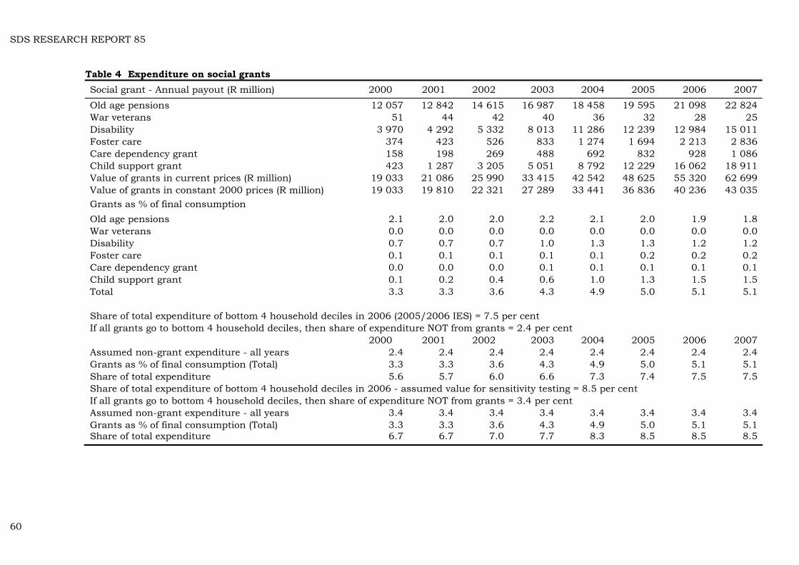
SDS RESEARCH REPORT 85
Table 4 Expenditure on social grants Social grant - Annual payout (R million) 2000 2001 2002 2003 2004 2005 2006 2007
Old age pensions 12 057 12 842 14 615 16 987 18 458 19 595 21 098 22 824 War veterans 51 44 42 40 36 32 28 25 Disability 3 970 4 292 5 332 8 013 11 286 12 239 12 984 15 011 Foster care 374 423 526 833 1 274 1 694 2 213 2 836 Care dependency grant 158 198 269 488 692 832 928 1 086 Child support grant 423 1 287 3 205 5 051 8 792 12 229 16 062 18 911 Value of grants in current prices (R million) 19 033 21 086 25 990 33 415 42 542 48 625 55 320 62 699 Value of grants in constant 2000 prices (R million) 19 033 19 810 22 321 27 289 33 441 36 836 40 236 43 035 Grants as % of final consumption Old age pensions 2.1 2.0 2.0 2.2 2.1 2.0 1.9 1.8 War veterans 0.0 0.0 0.0 0.0 0.0 0.0 0.0 0.0 Disability 0.7 0.7 0.7 1.0 1.3 1.3 1.2 1.2 Foster care 0.1 0.1 0.1 0.1 0.1 0.2 0.2 0.2 Care dependency grant 0.0 0.0 0.0 0.1 0.1 0.1 0.1 0.1 Child support grant 0.1 0.2 0.4 0.6 1.0 1.3 1.5 1.5 Total 3.3 3.3 3.6 4.3 4.9 5.0 5.1 5.1 Share of total expenditure of bottom 4 household deciles in 2006 (2005/2006 IES) = 7.5 per cent If all grants go to bottom 4 household deciles, then share of expenditure NOT from grants = 2.4 per cent 2000 2001 2002 2003 2004 2005 2006 2007 Assumed non-grant expenditure - all years 2.4 2.4 2.4 2.4 2.4 2.4 2.4 2.4 Grants as % of final consumption (Total) 3.3 3.3 3.6 4.3 4.9 5.0 5.1 5.1 Share of total expenditure 5.6 5.7 6.0 6.6 7.3 7.4 7.5 7.5 Share of total expenditure of bottom 4 household deciles in 2006 - assumed value for sensitivity testing = 8.5 per cent If all grants go to bottom 4 household deciles, then share of expenditure NOT from grants = 3.4 per cent Assumed non-grant expenditure - all years 3.4 3.4 3.4 3.4 3.4 3.4 3.4 3.4 Grants as % of final consumption (Total) 3.3 3.3 3.6 4.3 4.9 5.0 5.1 5.1 Share of total expenditure 6.7 6.7 7.0 7.7 8.3 8.5 8.5 8.5
60
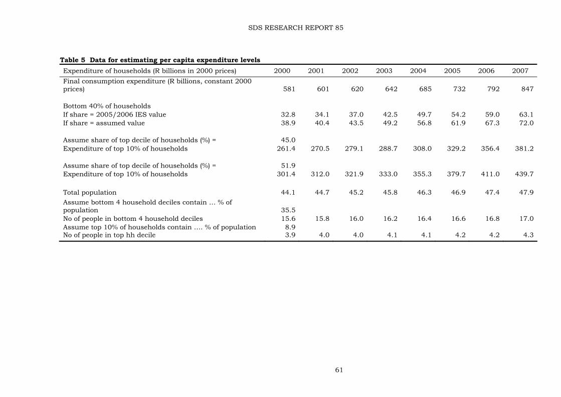
SDS RESEARCH REPORT 85
61
Table 5 Data for estimating per capita expenditure levels Expenditure of households (R billions in 2000 prices) 2000 2001 2002 2003 2004 2005 2006 2007 Final consumption expenditure (R billions, constant 2000 prices) 581 601 620 642 685 732 792 847 Bottom 40% of households If share = 2005/2006 IES value 32.8 34.1 37.0 42.5 49.7 54.2 59.0 63.1 If share = assumed value 38.9 40.4 43.5 49.2 56.8 61.9 67.3 72.0 Assume share of top decile of households (%) = 45.0 Expenditure of top 10% of households 261.4 270.5 279.1 288.7 308.0 329.2 356.4 381.2 Assume share of top decile of households (%) = 51.9 Expenditure of top 10% of households 301.4 312.0 321.9 333.0 355.3 379.7 411.0 439.7 Total population 44.1 44.7 45.2 45.8 46.3 46.9 47.4 47.9 Assume bottom 4 household deciles contain … % of population 35.5 No of people in bottom 4 household deciles 15.6 15.8 16.0 16.2 16.4 16.6 16.8 17.0 Assume top 10% of households contain …. % of population 8.9 No of people in top hh decile 3.9 4.0 4.0 4.1 4.1 4.2 4.2 4.3
SDS RESEARCH REPORT 85
For the bottom 40 per cent of households, these are derived from the shares of final consumption expenditure estimated in Table 4. For the top decile it is assumed first of all that the share of total consumption in each year is 51.9 per cent, the figure obtained from the IES. To test the sensitivity of relative growth in the expenditure of the well-off and not-so-well-off, a share of 45 per cent for the well-off is also assumed for each year. As one would expect, this makes quite a difference to per capita income estimates (Table 3). The difference is obviously never going to be large enough to make the margin between the increases in consumption of the two groups diminish to a point where it is no longer huge. Consideration was given to checking relative shares in the 2000 IES, but given the well-publicised problems with the results of that survey, the effort involved was thought not to be justified. Finally, we have the population estimates. In former times, Statistics South Africa used to publish mid-year population estimate series in their big annual, South African Statistics.67 For some reason, they appear to have stopped doing so in 2008 – there is a set of estimates in South African Statistics 2007, but it is incomplete (it had estimates, on p.2.1 for 1996, 2001, 2004-2007). Unless I have missed it, there is no other place where one can find a series of estimates going back some time. The annual mid-year population estimates published each year in Statistical release P0302 seldom go back more than one year. What they do give for several past years is estimated population growth rates. One can then backcast these from the population figure for the year in which the release is published. For the estimates in Table 6, I used the Mid-year population estimates 2007 (P0302 of 3 July 2007) for a fix on the 2007 population and growth rates for previous years. These run out at 2001, so the 2000 figure was obtained by some judicious guesswork, then compared with the census-anchored figure for 2001. The other figures were compared with the estimates in South African Statistics 2007. There are small differences, which have been ignored. Statistics South Africa is experiencing great difficulty in estimating the size and growth rate of the population because of the AIDS pandemic. This has resulted in a number of changes in estimated growth rates and population sizes. Irritatingly, the 2008 mid-year estimates change growth rates once more (see P0302, 31 July 2008, p.7), as do the 2009 mid-year estimates (see P0302, 27 July 2009, p.8) something I discovered when checking the estimates for the present paper. The change is not large enough to warrant re-estimating everything – backcasting the population on the 2008 estimates of population growth rates produces an error of only 0.6 per cent in 2001. This causes a small over-estimation of per capita incomes in Table 3, hardly something about which to get excited in view of the truly heroic assumptions that have had to be made elsewhere.
67 Bizarrely, the Vital Statistics section of the publication contains data on recorded births; marriages; divorces; recorded deaths, and cremations, but no population estimates.
62


![Efficient and biologically relevant consensus strategy for ......berg’s method to control the false discovery rate (“fdr” adjusted p-values) [30]. Machine learning analysis The](https://img.pdfslide.net/doc/110x75/60cebb463bedb135d25dd085/efficient-and-biologically-relevant-consensus-strategy-for-bergas-method.jpg)