Embed Size (px)
Citation preview
Where the Cloud Rests: The Economic Geography of Data Centers Shane Greenstein Tommy Pan Fang
Working Paper 21-042
Working Paper 21-042
Copyright © 2020 by Shane Greenstein and Tommy Pan Fang.
Working papers are in draft form. This working paper is distributed for purposes of comment and discussion only. It may not be reproduced without permission of the copyright holder. Copies of working papers are available from the author.
Funding for this research was provided in part by Harvard Business School.
Where the Cloud Rests: The Economic Geography of Data Centers
Shane Greenstein Harvard Business School
Tommy Pan Fang Harvard Business School

1
Where the Cloud Rests: The Economic Geography of Data Centers.
Shane Greenstein and Tommy Pan Fang1
September 2020
This study provides an analysis of the entry strategies of third-party data centers in the United States,
an industry with assets worth hundreds of billions of dollars. We examine the market in 2018 and 2019, and
compare with the physical entry of private data centers for services on demand, including those known as
cloud services. We find evidence that providers of third-party data centers trade off the tensions between
buyer distaste for distance, which creates localized demand, and costs of supply, which vary with density. We
find considerable evidence that localized demand and economies of scale shape entry decisions. We conclude
that data centers display tendencies towards urban-biased technical change, and cloud services mildly work to
ameliorate such biases. We see little evidence to suggest data centers will spread to any but a small number of
low density locations.
1 Harvard Business School, Soldier Field, Boston, MA. 02163. Emails: [email protected], and [email protected]. Thanks to Patrick Clapp, Christine Snively, and Maggie Kelleher for assistance. Thanks to seminar audiences, Michael Rechtin, Aaron Kulick, Victor Bennett, Jonathan Timmins, Tim DeStefano, and Alphonso Gambardella for comments. All errors are our responsibility.
2
I. Introduction
Did digitization change the strategic role of proximity? Proximity confers competitive advantage
through a range of different mechanisms (Alcácer and Chung 2014): Proximity lowers the costs of
transportation; enables easier access to skilled labor and innovative complementors; and assists firms in
enjoying the shared benefits with others. The increasing digitization of goods and services potentially alters
these mechanisms. Digitization lowers the frictions associated with moving information (Goldfarb and
Tucker 2019). It enables the creation of services with high “shippability” and such services become
deliverable to, and consumable from any connected location (Gervais and Jensen 2019), and it lowers barriers
to trading with distant customers with similar tastes (e.g., Blum and Goldfarb 2006, Sinai and Waldfogel
2004). It also enables new strategies for omnichannel retailing (e.g., Brynjolfsson et al. 2009), and fosters the
translation of relationships embedded with social trust into online relationships (e.g., Forman et al. 2008).
Data centers are an ideal setting for studying how digitization shapes proximity. The services
provided by a data center play an important role in the digital services used and managed by virtually every
firm with a large-scale digital presence. On the supply side, data centers display economies of scale, but only
after expenditure of extraordinarily large fixed costs for structures that occupy outsized plots of land. If data
centers are cost-focused, we would expect them to enter in locations where there is less competition and
where the fixed and operational costs associated with the data center facility are low. While they benefit from
locating adjacent to pools of network engineers, operating these facilities do not require large numbers of
employees, which provides considerable flexibility over their location. This would discourage entry in dense
urban areas. On the demand side, the services of data centers travel at the speed of light, which makes them
highly shippable and accessible without being geographically proximate. However, buyers for data center
services may exhibit a distaste from distance, and have a preference for services from nearby suppliers instead
of those who are further away. Such distaste could arise from a mix of factors, which we discuss within the
text. If it does matter, it should result in data centers locating in expensive locations near customers and all
across the US, with supply and demand determining where and how much. In light of these factors, in this

3
study we ask a counter-intuitive question: Does proximity to local demand shape the entry strategies
determining US data centers?
Entry Decisions for Data Centers
At the outset of the commercial internet, virtually every firm housed their servers on company
premises. Eventually businesses learned to gain scale economies by consolidating computing resources in
another location in a structure known as a data center, communicating with it via the internet. Today virtually
every organization in the modern economy employs data centers for essential parts of their electronic
commerce and internal digital services. These structures contains many rows of servers on racks, matched to
routine operations for support and maintenance. Designers configure these structures to house massive
numbers of servers, using architectural features that encourage low-energy use and ensure reliable operations
in the event of emergencies, among many features. Today the smallest (largest) data centers house tens
(hundreds) of thousands of servers and can cost more than a hundred million (several billion) dollars to
construct. The collective value of the assets for this activity exceeds a couple hundred billion dollars in the
United States. Regulatory attention, such as those affiliated with the General Data Protection Regulation
(GDPR), devotes considerable text to regulating the location of these facilities.
Despite their importance and long history, no research has investigated the entry of data centers.
This study is the first to address this gap. We analyze the location of every third-party data center provider in
the United States, and supplement that with information about private facilities supporting the cloud market.
The analysis tests among different theories of the strategies determining the entry for data center services.
Given the novelty of the undertaking, and the lack of knowledge about this core piece of modern information
technology, our analysis pursues wide goals. We provide a statistical description of an industry that is not
well-understood, and we derive econometric inferences about behavior that had not been scrutinized.
Our analysis treats the location of a facility as an endogenous choice, one that reflects variance in the
determinants of demand for a facility at different locations. The inability to directly measure the intensity of
distaste for distance frames the principal challenge for this research. Our approach looks for evidence

4
consistent with a model of “distaste for distance.” If this factor plays an important role, as hypothesized, then
we expect to see its consequences in a variety of choices by suppliers who respond to buyer preferences, and
balance those against operational expenses and setup costs, which varies across the US.
The study finds patterns consistent with localization of demand created by distaste for distance. We
show that entry follows the features forecast by a threshold model, where all large metropolitan area (with
over three quarters of a million people) have at least one local third-party supplier of data services, and only a
fraction of small and medium sized urban areas have local suppliers of third-party data services, and no city
below a certain size has any data centers (approximately a little more than one hundred and sixty thousand
population). In between these two sizes, some areas have entrants and most do not. A high fraction of buyers
in small and medium-sized locations must get their services from a non-local supplier (likely located at the
closest major city) because little supply locates in their areas.
We also find evidence of heterogeneity in entry strategies from the differences in the behavior of
footloose data centers and urban and suburban data centers, where we find different responsiveness to
features of local supply and demand. Footloose data centers are more responsive to cost, and that is in spite
of evidence about the size of the largest entrants that suggest footloose and urban data centers face the same
limiting factors. We also find some similarities between footloose and private cloud providers, though this
evidence is imprecisely estimated due to limited number of observations. We also find evidence of the
importance of thresholds in the estimates of total demand, where selection based on entry explains much of
what we observe.
We estimate a number of threshold models of entry in local markets, and use it to make inferences.
We find urban and suburban firms are more prevalent in locations with the type of users who demand these
services, and we find evidence that entrants select areas with lower setup costs. For example, local entry rises
with the presence of information intensive industries, consistent with the presence of localized demand. We
also find evidence that differentiation in the market becomes more prevalent in larger markets, and the
findings about the size of the smallest market entrant are consistent with these. If only to reiterate the point,
5
models with more precise demand are better at estimating the cost of supply. Our estimates suggest fixed
costs rise and margins decline as we move from the smallest to largest markets, while variable costs do not
vary much at all. Yet, entry rises, suggesting a benefit from that location in a major metropolitan area near
users.
Contribution
Our research contributes to literature that analyzes the factors that shape the “supply chain” of
services that make up the internet, with emphasis on the less visible services that complement internet access,
such as storage, distribution, infrastructure security, and names services (Greenstein, 2020). This study
answers a call to better understand the impact of ICTs on economic growth (Cardona et al. 2013). While
internet access has received considerable attention, only recently have studies begun to examine the uneven
supply of the other components that also determine performance. For example, Böttger et al (2016) examines
the location of Netflix’s CDN network. As one of the largest sources of streaming content in the world, this
CDN network is comprised of 4600+ servers in 233 locations in 2016. This is one of many examples of
CDNs owned and operated by application firms. Google, Facebook, Apple, Amazon, and Microsoft are all
known to support large CDN networks. Nobody has performed a comparable exercise on data centers.
Our research is the first to illustrate the demand for data center services, and, as such, adds to recent
research has begun to analyze the impact of cloud providers (Byrne and Corrado 2017, Coyle and Nguyen
2018, DeStefano et al. 2019). Like cloud services, data centers enable flexible and inexpensive uses of storage
and computation, remove frictions in access to big data applications, and reduce frictions to supporting
applications for a mobile labor force (DeStefano et al. 2019, Jin and McElheran 2019). We differ in focusing
on the reasons why providers of services made the decision to enter a local market, wherease prior research
takes that entry for granted, and has focused on the consequences of cloud for users.
Because cloud services use data centers so intensively to deliver their service, we relate directly to
recent evidence that users of cloud services place high value on physical facilities in closer locations (Wang et
al. 2019). Similar to the approach of our study, Wang et al cannot directly view the intensity of demand for

6
local services, but they can infer its presence indirectly from other observable behaviors. Also like this study,
estimating a model provides insight into the tradeoffs faced by providers when allocating physical capital to
support such services.
Our contribution broadly also contributes to research about the ecosystems supporting usage of
advanced IT. As with prior studies, we document a pervasive urban-bias in information technology (Forman
et al, 2018). Urban bias arises due to existing concentration of information-intensive activities within urban
centers, and due to the private incentive to spread fixed costs by locating near users. Marshallian
agglomeration reinforces those incentives, as more data centers enter businesses to locate nearby and vice-
versa. Until this point, most of the evidence for the urban-bias of IT comes from studies of broadband
(DeStefano, Kneller, and Timmis, 2018, Pew 2019, FCC 2020), business applications (Ceccagnoli et al. 2012,
Forman et al. 2009), and markets for technical talent (Tambe 2014). Prior research also focuses on the ability
of firms to substitute third-party vendors in a region for internal providers of internet technology (Forman et
al, 2008), on the capacity of a region to innovate in a variety of areas, including advanced IT (Delgado, 2012).
We are the first to extend that theme to other parts of internet infrastructure, such as data centers. The study
also adds an interesting wrinkle to the literature on general purpose technologies, where the entry of data
centers is broadly interpreted as a specialty supplier of upstream services in the sense discussed in Bresnahan
and Gambardella (1997). They offer analysis of the factors that should encourage entry, such as aggregation
from many smaller potential buyers.
While policy-focused research on internet supply chains and local ecosystems describes the many
symptoms of the internet’s growth and spread around the globe (OECD 2107), statistical studies of
infrastructure have neglected data centers and their role in the modern internet. Despite the size of the
market and value of the assets, data centers receive little attention in policy reports. This is surprising since
these facilities play a key role in virtually all modern internet architectures, and regulatory pressures, such as
those affiliated with the General Data Protection Regulation (GDPR), for example, devotes considerable text
to regulating the location for storage of data and performance of computation (Zhuo et al. 2020). At a broad

7
level, we contribute to understanding the trade-offs affiliated with unregulated supply and demand, and begin
to offer methods for quantifying the trade-offs entrants face without encountering regulatory constraints.
II. Determinants for the location of data centers
Here we describe standard industry practices that affect the supply and demand for data centers. It
also informs the statistical analysis.
Costs of Supplying Data Centers
There is substantial sharing of information inside professional associations in North America, and
many builders of data centers have national footprints. Hence, we expect a similar set of factors to shape the
costs of supplying data centers all across the US.
A new data center takes approximately a year to build, with long time horizons for enormous
projects and specialized design elements. The set-up costs include: construction labor and management; the
land on which the facility sits; the first generation of equipment and the wiring/racks to support it; building
out connectivity to fast backbone internet lines and to (multiple) electrical lines; and tax subsidies and
abatements on these initial costs. Special features may be required by users with specific needs, and raise the
costs of building. These can include features such as: additional reinforcements to flooring to silence
vibrations; raised floors to prevent flooding during hurricanes; extra back-up generators to guarantee
reliability in the event of a power outages or weather-related disaster; special cooling to achieve user
specifications; and/or multiple lines to support connectivity to multiple networks in the event that one goes
down. Construction costs vary widely across locations, and depend on the price of land, labor, permits,
property taxes, sales taxes, rebates, and highly specific features of particular plots of land.
At the time of this study, 2018, in many locations the construction costs of a comparatively small
data center – some might say minimal, such as 5MW – exceed a hundred million dollars (CBRE, 2015).2
2 Industry convention designated a data center’s size by its use of electricity. That leaves the capacity measure flexible enough to handle different uses for the servers, such as storage, computation, and so on.

8
These costs reach their lowest levels in rural or suburban settings with inexpensive land in warehousing
districts, low property taxes, and propitious locations near electrical and data lines. These costs reach their
highest levels in dense urban locations, such as Manhattan and San Francisco, and exceed three hundred
million dollars. The largest data centers far exceed these sizes, and costs several billion to build from scratch,
even in the least expensive locations.
The costs of operating a data center include the costs of electricity for computing equipment and air
conditioning equipment3; variable cooling and heating requirements, which depend on local weather; local
and state economic development incentives, such as tax abatements for sales tax and property taxes; and the
costs of gaining additional supply of computing equipment. All these costs rise with capacity, and, thus,
qualify as variable costs, distinct from the fixed costs to build from scratch. Operational costs are highest in
extremely hot and humid regions, and lowest in moderately cool (northern and not too mountainous) regions
with ready access to large volumes of inexpensive electricity (typically hydro-electric). The operational costs of
a comparatively small data center can exceed tens of millions of dollars a year, and vary by at least several
million year between locations. The operational costs of a large data center can exceed hundreds of millions
of dollars per year.
There is an open question about the practical limits on the scale of production. Space to house
equipment and the availability of (costly) land in a dense urban area are potential limiting factors on
expansion of the size of existing facilities, as are the capacity of electrical supply and data lines to support the
operations of the center. Sometimes the requirement for multiple sources of electricity (from different parts
of the grid) and multiple lines for data (from different carriers) also places limits on the size and location of a
data center. We expect the desire to increase capacity in such a situation, if necessary, will be met with
another facility in the same or different location.
Orig ins of Distaste for Distance
3 A rule of thumb in the industry estimates the costs of electricity equally split for air conditioning in a moderate climate, and servers in an eight megawatt data center, which would typically house just under fifty thousand servers.

9
One buyer motivation to use a nearby supplier comes from demand for lower latency, which the user
experiences as faster response time. There is intense demand for lower latency among financial users, for
example. A related component comes from users seeking to avoid congestion on lines that connect users to
data centers, which, again, users experience as faster response in the absence of congestion. This latter
motivation arises among “big data” data applications that move terabytes or more of data between storage
and computation facilities and user work-places.
Another source of distaste for distance comes from a phenomenon industry participants label as
“server hugging” – i.e., executives want to be near the physical facility to manage the physical assets dedicated
to supplying their needs. Some of this behavior reflects a desire to monitor shared facilities so a firm receives
promised efficiencies (e.g., to adopt cooling or wiring or server design). Some of it reflects the desire to have
the option to visit the facility in the event of an urgent situation, even when that might be a low probability
(e.g., a hurricane). Some of it may arise from a desire to visit a facility and ensure physical separation of
equipment (e.g., keep it safe from theft). Some of it may merely reflect quirky human behavior, and remain
hard to rationalize as calculating.
A set of users have demands have the opposite effect. Some users may have little or no desire to ever
step foot on the facility. This is typical of generic computing needs, such as backup storage, for example,
where best practices counsel buyers to proactively pursue physical separation that lowers risks. Users let
others manage the facility and rent space within a data center, and may or may not own the servers that
occupy the space. We label such demand as demand for “footloose supply,” i.e., demand for supply that
comes from anywhere within North America, because it supports users who do not anticipate setting foot on
the physical premises of the facility.
Full ownership represents another extreme. For example, some large firms today own and manage
their own centers for their company’s purposes. Most visibly, firms with large and technically challenging
computing needs, such as Facebook, Apple, Microsoft, Amazon, and Google/Alphabet, own all facets of their
data centers, and configure the hardware and software to their purposes. Some of these same firms – Microsoft,

10
Amazon, and Alphabet – use their facilities to offer cloud services to users on a rental basis, and gives users the
ability to turn the service off and on at will.
III. Data about Data Centers
Our data, collected in February 2018 and February 2019, provides a cross-sectional overview of the
market-based supply of facilitiies. First, we collect information on facilities that rent space or equipment for
third-party companies to host their data needs. We collect this dataset by scraping data from Baxtel.com and
Datacenters.com, two of the largest information resource sites for data centers.4 We supplement it with
information about the facilities of the four largest cloud providers, which are among the worst kept secrets on
the internet. Finally, we supplement our rich data on data centers with census data about U.S. counties. This
provides information on 1386 data centers in the third-party market. Adding the private centers, we get 1,433
datacenters that are active in February 2019.
Using the physical address of each facility, we identify the county and the Core-based statistical area
(CBSA) in which a colocation center locates. We choose to focus on county-level data, rather than more fine-
grain data on ICT entry (e.g., Skiti 2020) because we are interested in identifying heterogeneity across markets
throughout the country. We show a map of all data centers in the US. As Figure 1 illustrates, data centers are
present in every major US region. The map also illustrates that data centers do not concentrate their locations
exclusively in locations with the lowest costs.
-------------------------------------
INSERT FIGURE 1
--------------------------------------
Data Centers Location
4 Our data sources (Baxtel.com and Datacenters.com) are two known sources of information on third-party data centers. Datacenters.com is the largest marketplace for colocation data center services (in transaction volume and revenue).

11
We locate data centers in counties. Tables 1a and 1b shows that almost all data centers reside in counties
that are part of a Metropolitan Statistical Areas (MSAs), namely, large urban and suburban areas with medium
to large populations. Over 96.4% of counties with at least one third-party data center are MSAs (Table 1a).5 The
census classifies 37.2% of US counties as MSAs, so Table 1 shows that a small number of data centers locate
in low density counties. More than 2000 US rural and micropolitan6 counties have no provider. We next find a
smaller percentage of private data centers locate in urban area – i.e., 73% of counties with at least one private data
center are MSAs (Table 1b).
Table 2a introduces variables to operationalize the types of data center entry that we observe in a
county. A county can have Urban, Suburban, Footloose, or Private supply of data centers. The first three are defined
by their distance from the nearest downtown area containing concentrations of business, who are the principal
buyers of services from data centers. Within each MSA, we identify the downtown hubs in order to estimate
the largest clusters of economic activity within the nearby area. Each MSA contains at least one downtown hub,
although some MSAs that have up to three. For example, the San Jose-Sunnyvale-Santa Clara MSA was assigned
three downtown hubs; one for each city named in the MSA. We geocode the longitude and latitude of each
downtown and data center, and calculate the distance between each data center and its nearest downtown area.
In experiments not shown here we implemented numerous slights variations on this definition, and found it
made no qualitative difference.7 Table 2a shows that 1171 data centers are either urban or suburban, again,
hinting that, even by the simplest measure, most data centers locate near a set of users within cities.
In Table 2b, we provide basic descriptive statistics about capacity. While the industry measures the
capacity of a data center by its electrical usage, we do not have access to such information. Instead, our main
measure of capacity, termed Gross SQFT, is a continuous variable that measures the total data center capacity
(in square ft.) that is operating in the county. About a quarter of our sample reports this directly, so, instead,
5 The first calculation is the # of counties in MSAs over the total # of counties (1,173/3,150). The second is to calculate the # of counties in MSAs with at least one data center against all counties with at least one data center (218/26). 6 Micropolitan areas have less than 50k population. 7 In the analysis in the text, we define urban as data centers within 5 km of a downtown, footloose as those outside of 30km, and suburban and those between 5 and 30km.
12
we construct a measure we can use on the entire sample. We estimate the total square footage of the facility
based on images of each data center facility from Google Maps. The vast majority of data centers are one story
buildings, so square footage corresponds with total capacity.8 The table shows an interesting trend in the
capacity of data centers of each type. Footloose and private data centers are 25% to 30% larger in square footage
on average than urban and suburban data centers, consistent with the importance of land costs as a determinant
of location.
Table 2b provides clues about the replacement value of these assets covered by third-party providers
and private suppliers.9 It takes a simple calculation to show that it must be on the order of magnitude in the
hundreds of billions of dollars. Here is a brief review of the reasoning: A data center of minimal (5MGW) size
is typically less than 100k square feet. As Table 2b shows, most of these data centers are larger than the minimal
size. Such small data center costs over $100 million to build in a low cost suburban location and over $300
million to build in the expensive urban locations. The most common estimate is $250 million for many cities
over a million population (CBRE, 2015). Using those to benchmark an approximation, the value of the assets
easily reaches a couple hundred billion.10 Reiterating, we do not offer that as a precise estimate of asset value,
but, rather, as an estimate of the order of magnitude, which – with any estimate – must add up to a sum in the
hundreds of billions.
Our main measure of entry, termed Data Center County, is a dummy variable for whether there was at
least one data center operating in the county. For the ordered logit specification, we construct a categorical
variable, Data Center Count, categorized by whether there are 0, 1, 2, 3, or more than 3 data centers. Table 2c
8 The rare exception are retrofitted buildings, such as the converted RRDonnelly building 350 E. Cermak in Chicago, which contains 1.1 million square feet, and is the largest third-party data center in North America. Other exceptions are data centers fit into a dense urban settings with extremely expensive land, such as Manhattan or San Francisco, and in these cases we can obtain total square footage. About 25% of the data centers in our sample provide details about the total square footage. We validated that our square footage estimates are consistent with these available statistics. 9 Replacement value is standard concept for asset valuation. It values an asset at the cost of reconstruction from scratch. 10 For a conservative estimate, value the footloose and private data centers (average size: 450k sq ft and $465 sq ft) at $500m, value the suburban data centers at (average size: 375k sq ft) at $400m, and value the urban data centers (average size: 345k sq ft) at $800m. There are 103 urban, 149 suburban, 47 footloose, and 26 private data centers. Hence, a conservative estimate is 103*800 + 149*400 + 47*500 + 26*500 = $183.5 billion. The order of magnitude is “a couple hundred billion,” as stated in the text.

13
provides the distribution of these situations, showing entry for the 218 counties with any entry (i.e., less than
18.6% of MSAs). Only 76 counties have only one, 34 have two, 23 have three, 17 have four, and 68 have five
or more. In other words, most counties that have a data center contain few entrants, while the vast majority of
data centers locate in MSAs with 5 or more entrants.11
-------------------------------------
INSERT TABLES 1 AND 2
--------------------------------------
Given the prevalence of data centers in MSAs, we choose to focus our statistical analysis on counties
that are located within an MSA, where we will be able to estimate the thresholds of entry. It is not possible to
make statistical inferences about areas other than MSAs. As a practical matter, this restriction to MSAs has no
consequences for the estimation because adding addition low density counties would not alter that estimate of
the threshold for determining entry.
Descriptive Patterns of Data Centers and Population
Before performing econometric estimation, we show the correlational patterns between population
and data center entry/capacity. These correlations give an indication about what the statistical estimates will
show about the role of thresholds determined by market size. Figure 2 shows a scatter plot between the number
of data center entrants and the logged population of each county. There is a positive correlation between
population and the number of data centers in a county, consistent with the hypothesis that entry grows with
larger local demand. The correlation is not high, only 0.42. That is because entry behavior is discontinuous.
There is also no entry of third-party data centers below a population level corresponding to approximately
160,000 people. All locations with areas above approximately 700,000 people have at least one entrant. If an
area between those two population levels experiences entry, it tends to be the more populous county.
11 Santa Clara County (aka Silicon Valley) has the largest number, with 71. Followed by Los Angeles County, CA, Dallas County, TX, Cook County, IL, New York County, NY, Maricopa County, AZ, Fulton County, GA, Harris County, TX, Middlesex County, MA, Miami-Dade County, FL, and Loudoun County, VA (with 21).
14
Interestingly, however, population alone does not predict entry for the cities with the largest population. The
variance is quite large, with some experiencing many entrants and some not.
Evidence about capacity partly helps to resolve the puzzle. Figure 3 shows the relationship between
logged population and logged capacity of data centers, which is the sum of the square footage of all data center
facilities in each county. The figure includes only counties with at least one data center, and drops all counties
with none. We categorize each county by the type of data center that has the largest share of capacity. For
example, if a county has 200,000 SQFT of urban data centers and 50,000 SQFT of footloose data centers, we
categorize that county as an urban county.
-------------------------------------
INSERT FIGURES 2 AND 3
--------------------------------------
Consistent with localized demand, capacity and population are positive correlated –i.e., 0.596 without
private data centers. We also find, interestingly, that capacity is not synonymous with number of entrants,
especially for the largest areas. We speculate that suppliers adjust their capacity to demand, either with new
additions to existing building or new buildings altogether. Relatedly, we also speculate that growth over time
by suppliers -- either adjusting entry or expanding capacity – has some consequences for what we observe, and
that will generate challenges for inference.
The county with the largest capacity, Loudon, VA, ranks as the county with the tenth largest number
of entrants. That location was home to MAE-East, one of the earliest data-exchange points on the commercial
internet, and today contains a number of Amazon’s data centers. As it turns out, the firms who locate in Loudon
operate some of the very largest data centers in the US.12 While it contains features consistent with self-
reinforcing agglomeration economies, we do not observe those features at any other location, and so, we
hesitate to draw a conclusion that agglomeration effects operate widely. Just as likely, the capacity in Loudan
may reflect demand among users in Washington, D.C. and Baltimore and the surrounding MSA, which is one
12 Footloose firms largely inhabit Loudoun, VA. It is followed by Dallas, TX, Santa Clara, CA, Cook, IL, Los Angeles, CA, Maricopa, AZ, Middlesex, NJ, Harris, TX, King, WA, NY, NY, and Fulton, GA.

15
of the largest concentrations of data-intensive work in the US, along with other potential demand for footloose
supply (e.g., from Amazon Web Services) from the users in the mid-Atlantic region more broadly.
We next examine the smallest entrant in each location. If localization of demand shapes entry, then a
subtle test involves a comparison of the size of the smallest entrant in each location. An entrant must cover
their fixed costs. If prices rise in high cost areas, then it is possible for the minimal viable entrant to be smaller.
This would arise, for example, with differentiated specialist services in urban areas. A related question is whether
differentiated entrants are prevalent in only larger markets.
Figure 4 shows the relationship between the logged population and the logged value of the smallest
data center in each market. When we exclude the private data centers, smaller entrants are more viable in
counties with higher populations. The correlation is -0.533 without the private data centers. Notice that the
pattern is discontinuous. Below half a million population, there is no visible relationship. The small entrants
increase only after the populations exceed at least half a million. The distribution also shifts downward in
locations over one million in population. The smallest data centers in locations exceeding a million exceeds the
smallest entrant in locations under half a million.
-------------------------------------
INSERT FIGURE 4
--------------------------------------
This pattern suggests that entrants in urban areas may benefit from the local demand for specialized
services and receive higher margins compared to private data centers that rely on economies of scale. As a
measure of the prevalence of specialist entry, we also computed the frequency of qualification to handle
specialized needs from buyers within financial or medical services. For medical services, we look for adoption
of HIPAA (Health Insurance Portability and Accountability Act of 1996) and HITECH (Health Information
Technology for Economic and Clinical Health Act of 2009) standards. For financial data, we look for adoption
of the SOC 1 and SOC 2 standards.13 In Table 3, we find that third-party vendors that offer specialized services
13 Source: https://www.ssae-16.com/soc-1/

16
are more prevalent on average in major markets compared to minor markets. There are 3.776 specialists on
average in major markets, while there are only 1.048 specialists on average in minor markets.14 In addition,
while more than 75% of major markets provide at least one data center that has adopted a specialized standard,
only 43% of minor counties have at least one specialist data center. From these results, we infer that models of
undifferentiated entry are plausible for markets with small population levels.
-------------------------------------
INSERT TABLE 3
--------------------------------------
Another interesting statistic compares the capacity of the largest suppliers. The size of the largest
viable entrant reflects factors that constrain the size of a data center, and provide a test of the limits of
economies of scale. The size of local demand may limit the size of a data center, as could the cost of land. We
compare the largest data centers in rural locations, and infer whether many factors limit the size of urban data
centers. If urban data centers are larger than any data centers in rural locations, then no limitation shapes urban
data center size. If rural data centers are larger, then data centers escaping the limitations of urban locations
achieve new levels of economies of scale.
Figure 5 shows the relationship between logged population and the logged largest data center in a
location. Excluding the private data centers, the figure shows a pattern of rising maximum capacity with
population levels, as expected, though there is considerable variance around that correlation. The correlation is
0.574 without the private data centers. Also notable, there also are similar maximum capacities between private
(in rural counties) and large third-party data centers (in urban and suburban settings), which suggests that there
are limits to the economies of scale, and available land is largely not the limiting factor for private data centers.
However, the size of the largest private data center exceeds the size of about half the largest third-party data
centers in a number of areas with population over a million population, suggesting that some of the private data
centers could be constrained.
14 A major market has population above 750,000. We find similar results across different threshold definitions.

17
-------------------------------------
INSERT FIGURE 5
--------------------------------------
IV. Statistical Testing for Localization
Did distaste for distance create the patterns observed in figures 2-5? If it plays a significant role, it
will create localized demand for services in distinct geographic markets, where each firm supplies services to
local business customers. A simple model can guide statistical analysis, and can provide inference about the
importance of different types of cost in firm entry decisions (e.g., Xiao and Orazem 2011).
Model
We use a variant of Bresnahan and Reiss’ (1991) to identify determinants of entry. The main
endogenous variable depends on whether a data center enters a region or not. There are three categories of
determinants, respectively, F, M, and N, for fixed costs of serving the market, variable profits per customer
served, and total number of customers. Profits for a data center are M*N – F. A firm decides to be present
when it is profitable, i.e., when M*N > F. Regional factors determine the level of M, N and F. Further index
different each region by i, where i represents a county. Each location contains a population of potential
customers, Popi, and two types of shifters, one for mark-ups, which are a function of the type of demand,
XDi, and one for variable costs, XCi. In other words, the function M describes the relationship between
average revenue per customer (e.g., presence of big data users) and variable cost per customer (e.g., local
electrical prices).
First consider entry into an area, and the profits of a firm who has a monopoly on the market.
Designate the variable profit per customer as M1(XDi , XCi), and the number of customers for the firm as
N1(Popi ). The function N1 describes the relationship between Popi, and the number customers served.
Profits for a single entrant are: M1(XDi , XCi ) * N1( Popi ) – Fi. 15
15 A few standard normalizations ease exposition. We assume N1(0) = 0, and that, within the relevant range, more of XDi raises demand, and, therefore, variable profits per customer, i.e., dM1/dXDi > 0, and M1(0, dXCi) = 0. When the cost shifter, dXCi, rise, then variable profits per customer decline, i.e., dM1/dXCi < 0.Though less essential, we also assume

18
The key property of this model is its threshold, which determines the number of entrants. For
any given XDi, there is an Pop*i, such that M1( XDi )*N1(Popi ) > F for any Popi > Pop*i. There is no entry for
Popi < Pop*i. For any level of profit per customer, entry is not profitable without enough customers.
Similarly, for a level of customers, entry is not profitable without customers that demand services with high
margins.16 The related intuition also holds: If customers and margins grow as we compare locations, then,
ceteris paribus, at some point demand must be sufficiently large to support at least one entrant. A related
threshold property holds for variable costs.17 If costs are sufficiently low, there must be at least one entrant,
but above some level it will not be in any firm’s interest to enter.18
How about a second entrant in this model? Following the approach in Bresnahan and Reiss, we can
posit a second set of functions with two symmetric entrants as M2(XDi , XCi), and the number of customers
for each firm as N2(Popi ). Profits for each firm is M2(XDi, XCi)*N2(Popi ) – Fi, where profits are split
between them. The results follow the same logic as above. For any level of variable profit per user, it takes a
sufficient population to make it profitable to enter, and that exceeds the level necessary to support the first
entrant. For any population level, it takes more demand and lower costs under duopoly to make it profitable
to enter, again, exceeding what it took to induce the first entrant.19 This simple logic easily extends to the
third and fourth entrant.
Entry responds to variation in fixed costs. Yet, it is also too simple to say that lower fixed costs leads
to more entrants. Rather, as fixed costs decline, threshold population levels decrease, threshold demand
there exists a sufficiently large X’Ci, such that M1(XDi, X’Ci) = 0, i.e., a sufficiently high cost reduces average profits per customer to zero or less. 16 There is an X*Di, such that M1( XDi )*N1( Popi) > F for all XDi > X*Di,, and no entry for XDi > X*Di. 17 There must be an X*Ci, such that for all XCi, < X*Ci. 18 Formally, the model yields an implication about how the threshold changes as fixed costs change, dPop*i/dF > 0 and dX*Di/dF > 0. The threshold population and demand required to support an entrant rises when fixed costs are larger. Similarly, dX*Ci/dF < 0. The threshold level of cost to support an entrant declines when fixed costs are higher. 19 Note that this too yields a set of thresholds for Pop**i, X**Di, and X**Ci under similar conditions as those that governed M1 and N1. How do the two sets of thresholds stand in relation to each other? First, we assume M1(XDi , XCi ) > M2(XDi , XCi) for any level of XDi and XCi in the relevant range of these variables. That is, for a given level of demand two competitors leads to lowers markups from the level reached with one. Second, like above, N2(0) = 0 and M2(0, dXCi) = 0. Third, dM1/dXDi > dM2/dXDi and dM1/dXCi < dM2 /dXCi. It also follows that X**Di > X*Di, and X**Ci < X*Ci.

19
shifters decrease, and threshold variable costs increase. Eventually a reduction in fixed costs can lead to more
entry, but the entry occurs as a non-convex and discontinuous event.
Estimation
The model leads to an approach for estimation. We observe an entrant when M*N > F, which can
be expressed as ln(M) + ln(N) > ln(F). Adding an error term, we can estimate a logit or probit, where
features of local markets are designated as X. If M = C(XCi)U(XDi), ln(M) =KCD + XCiBC + XDiBD, where the
first term estimates the level of marginal costs, and the second one estimates the percentage markup over
costs per unit of marginal cost. Further let Ln(N) = KPop + BPopXPop, and ln(F) = KF + BFXF, where these
are potential customers and fixed costs. Altogether, it becomes a threshold model in which Y = KCD + XCiBC
+ XDiBD + KPop + BPopXPop + KF + BFXF, where BF, BPop, BD, and BC act as weights to be estimated in a logit
or probit model. All the constants – i.e., KCD KPop KF – add up to one constant in estimation, so average
differences in in fixed or variable costs and average margins are not identified.
Measuring Determinants of Entry
We seek to test whether localized demand generates behavior consistent with threshold models. The
Bresnahan and Reiss model identifies shapers of demand from presuming that more entry occurs when local
areas have features consistent with high demand, and low variable and fixed cost. With only industry beliefs
and no prior analysis, we opt to err on the side of including many variables (without introducing
multicollinearity). Table 4 summarizes the definitions of variables.
Some variables track local demand for data centers. First, we use the 2012 economic census to observe
the level of employment, by county, for two-digit NAICS codes. We focus our analysis on a set of industries
that are most IT-intensive: Information, Healthcare, Manufacturing, Education and Finance & Real Estate. We
operationalize each sector’s economic activity by calculating the percentage of employees in a county employed
in that industry. We use data from the Esri 2016 demographics dataset to obtain zip code-level and county-
level measures. We examine the mean level of education within a county by examining the percentage of the
population with at least a bachelor’s degree.
20
It is unclear whether population or population density best inform us about potential customers
because these are highly correlated, and both are correlated with the prevalence of unobservable types of
demanders. Multicollinearity precludes including both. After experimentation, we concluded it was better to
include population density, measured by the population per square mile. That aligns well with measuring
heterogeneity in population density within a county by creating measures for the lowest and highest population
density areas by zip code.20
A set of variables tests among different determinants of the operating costs of running a data center in
a location. First, we collect data from the EIA to obtain 2016 state-level average electricity prices to industrial
customers to create a measure of Industrial Electric Price.21 Second, we collect data on Daily Air Temperatures
from 2016 and 2016, by county, from the CDC Wonder North America Land Data Assimilation System. We
examine how weather shapes operating costs by creating a measure of the average temperature during Hot
months and Cold months in each county.
We next examine labor costs for maintaining each facility. We collect data from the BLS about the
median hourly wage of network engineers in each county in 2016. For other digital technologies, such as
software, the availability of IT talent is associated with entry patterns (Bennett and Hall 2020). Finally, we obtain
data about MSA-level real estate tax (RET) rate in 2010 from the Tax Foundation.22 We operationalize this
measure by creating indicators for whether a county is located in an MSA in the top quartile of sales tax, High
Sales Tax, or located in a MSA in the bottom quartile of sales tax, Low Sales Tax.
A set of variables tests among different determinants of set-ups costs. First, we approximate land costs
by collecting county-level data on the median home value by square foot from Zillow.23 To account for
heterogeneity in land costs within a county, we create measures for the lowest and highest median home value
20 Population and density are highly correlated in this data. 21 We also used the prices to commercial customers that is also provided by the EIA. Our results do not change when we use alternative measures. 22 https://taxfoundation.org/major-metropolitan-area-sales-tax-rates/
23 https://www.zillow.com/research/data/
21
areas by zip code. Second, we obtain data about state-level real estate tax (RET) rates by collecting data from
the National Association of Home Builders.24 We operationalize this measure by creating indicators for whether
a county is located in a state in the top quartile of RET, High Real Estate Tax, or located in a state in the bottom
quartile of RET, Low Real Estate Tax.
We next examine how labor costs vary for facilities in different locations. To operationalize this, we
collect data from the BLS about the median hourly wage of construction laborers in each county in 2016.25
Finally, we examine how local government incentives in the form of tax abatements can relieve the costs
associated with building a data center. Using data from the CBRE on tax incentives for the 30 largest enterprise
markets, we construct an indicator, Tax Break MSA, to measure whether a county is based in a MSA that
provided tax breaks to data centers in 2015.26
-------------------------------------
INSERT TABLE 4
--------------------------------------
Table 5 shows summary statistics. As noted earlier, only 18.6% of counties have at least one data center.
When we examine the types of data centers, we observe several interesting patterns. On average, there is more
suburban capacity than any other type of capacity, followed by urban and then footloose capacity. The amount
of suburban capacity in a county is almost three times higher than the footloose capacity (47,622 SQFT vs.
17,869 SQFT). We also observe that our capacity measurements appear to have a skewed distribution. Similarly,
we observe that our density variables appear to have a skewed distribution. We apply a log-transformation for
both exogenous and endogenous variables in our analysis.
-------------------------------------
INSERT TABLE 5
24 http://www.nahbclassic.org/generic.aspx?genericContentID=250239&fromGSA=1 25 For counties that did not provide an estimate of the hourly wage of network engineers or construction laborers, we used averages from each MSA or each state. 26 Compiled from CBRE Research, “Site Selection Strategies for Enterprise Data Centers,” https://www.cbre.com/research-and-reports/Site-Selection-Strategies-for-Enterprise-Data-Centers, December 2015, accessed January 2020.

22
--------------------------------------
V. Estimation
Table 6 present the estimates on the entry of any data centers. All estimates focus on the threshold
between zero and one. In column 1, we use an OLS model to predict entry. In column 2, we use a logit model
as an alternative specification, the endogenous variable is an indictor variable.
First, for our demand variables, we find that some demand factors lead to more entry. The proportion
of Information and FIRE (Finance, Insurance, and Real Estate) employees statistically predicts entry. A one
standard deviation increase in the supply of Information workers is associated with a 2.7% increase in the
likelihood of data center entry into a county; similarly, a standard deviation increase in the proportion of FIRE
workers is associated with a 4.2% increase in the likelihood of entry into a county. None of the other types of
users matter, including manufacturing or health workers.
Having a population density one standard deviation above the mean level is associated with a 13.3%
increase in the likelihood of entry into a county. There is a negative association between the size of the minimum
population density in a county and the likelihood of entry. The latter result is consistent with the interpretation
that data centers locate in the places within a county with the lowest density (e.g., parcel of large available land).
These results are consistent with localized demand.
Second, for our cost variables, we find that an increase in median home values is associated with an
increase in the likelihood of entry. This goes in the opposite direction of predictions, and likely reflects
unobserved demand correlated with high value homes. However, consistent with the finding about minimum
density, we find that for land value, entry decreases as the minimum land value increases. Most of the other
estimates for variable and fixed costs are not statistically significant.
Overall, this model of the margin between none and one entrant generates weak results. We conclude
that more refinements are required to make robust inferences.
23
---------------------------------------------
INSERT TABLE 6
--------------------------------------------
Heterogeneity of Effects across Data Centers
Local demand should not shape the decision of footloose suppliers, who, by assumption, satisfy
national demand, and, hence, locate in response to localized costs but not local demand. If that case, XDi
should determine the decisions of local suppliers, but those same factors should not determine entry of
footloose suppliers. A similar statement holds for private data centers for the provision of cloud service.
Once again, if we reject this pattern in the data, then the strong assumptions or misclassification may be held
responsible. If we cannot reject, then it is one piece of evidence consistent with expectations about
localization of competition.
In Table 7, we examine entry thresholds for different types of data centers. First, we find that while
urban and suburban data center entry is sensitive to L. population density and percentage FIRE, footloose data
center entry is not impacted by these demand measures. A one standard deviation increase in L. population density
above the mean is associated with a 9.28% increase in the likelihood of urban data center entry into a county
and 16.7% increase in the likelihood of suburban data center entry into a county. Increasing the proportion of
FIRE labor by one standard deviation above the mean is associated with a 1.7% increase in the likelihood of
urban data center entry and a 2.6% increase in the likelihood of suburban data center entry. These estimates go
in the predicted direction, and their differences with footloose also are consistent with the role of localized
demand.
When we look at our costs variables, we find that footloose data centers are more sensitive to the cost
of land and cold weather. A one standard deviation increase in the average temperature during cold months
above the mean is associated with a 2.8% change in the likelihood of footloose data center entry. Land values
matter for footloose entry. Increasing the Median Home Value per SQFT by one standard deviation above the
mean is associated with a 1.6% change in the likelihood of footloose data center entry. Perhaps the most

24
surprising finding is for electricity, which has no effect on the marginal entrant. Finally, we find that the private
and footloose firms are similar, but since the sets of estimates for private data centers is comparatively weak,
these are not surprising findings.
We test between models using the log ratio test. We do not find evidence to reject the hypothesis of
equality between the urban and suburban models. We perform a similar test for footloose and private, and do
not find enough to distinguish between the models. However, we do find that there are differences between
the footloose and urban models. Thus, while the entry behavior of urban and suburban data centers are similar,
they differ from footloose. This is consistent with localized demand varying in importance for different types
of providers.
---------------------------------------------
INSERT TABLE 7
--------------------------------------------
More Precise Cost Estimates
Our ability to measure distaste for distance and competitive pressures are indirect. To gain more precise
estimates, we adopt a flexible functional form for demand, and use it to generate precision in the estimates for
cost estimates. This approach simultaneously estimates of a threshold for the marginal entrant at zero/one,
one/two, two/three, three/four, four/five or more. For this exercise we do not distinguish between urban,
suburban, or footloose data centers. In other words, this model assume the same function for demand and
costs in every location, but different demand functions across the margins between no entry, monopoly,
duopoly, triopoly, quadopoly and more.
More formally, we adopt a flexible function for margins within the function ln(M). That translates into
a different margin function for monopoly, duopoly, triopoly, and quadopoly. Thus, ln1(M) = K1CD + XCiBC +
XDi B1D, ln2(M) = K2CD + XCiBC + XDi B2D, ln3(M) = K3CD + XCiBC + XDi B3D, and so on. Relatedly, and given
our concerns about unobservable features of demand correlated with population, we also do not place

25
restrictions on the estimates for KPop + BPopXPop, and include a different estimate for each threshold. Once
again, the constants will not be identified. Finally, we estimate these together in maximum likelihood, which
assumes a shared error distribution. That makes B1D and B2D and B3D comparable up to a scalar.
Table 8a contains the estimates. The estimates for variable and fixed costs are in one column, while
the estimates for margins are in four columns. The first column provides the estimate for the threshold between
none and one entrant, referred to here as the function for monopoly margins. The next columns provide the
estimate of the difference between the monopoly margin and duopoly, triopoly and quadopoly margin function.
We perform log ratio tests to jointly test each margin. We do not find enough evidence to distinguish between
monopoly and duopoly, and we find enough to distinguish between the thresholds for monopoly and triopoly,
and thresholds between monopoly and quadopoly. Overall, we do not reject the model, but the model is not
precise at every threshold.27
The coefficient estimates for markups for any entry are comparable in sign to previous findings for the
threshold that determines the difference between zero and a monopoly entrant. As with prior estimates, larger
information industries and FIRE encourages the margins that encourage entry, as do population density, as
well as a smaller minimum population density. A percentage point increase in the share of Information workers
is associated with a 11.8% increase in the margins for a potential entrant and a percentage point increase in the
share of FIRE workers is associated with a 10.8% increase in the margins for a potential entrant. A one percent
change in population density is associated with a .393% increase in the margins for the first entrant, while a one
percentage increase in the minimum population density is associated with a .124% decrease in the margins of
the first entrant. A new finding are the importance of health – more discourages margins for the first entrant,
and maximum density – more encourages margins. A percentage point increase in the supply of Healthcare
workers is associated with a 3.9% decrease in the margins for the first entrant, while a one percent increase in
the maximum density is associated with a .282% increase in the margins of the first entrant.
27 We only show results for the most flexible model, and do not show the models with incremental differences. Log ratio tests clearly accepted different constants for the threshold between monopoly, duopoly, triopoly and quadopoly, while the tests for adding more nuanced flexibility, as shown, were weaker, as discussed in the text.
26
Compare those estimates across different thresholds. The monopoly and duopoly margins have no
statistical significance (consistent with the log ratio test comparing these two). The results differ between
monopoly and triopoly, with the presence of health no longer playing a role,28 and the role of density also no
longer playing a role29 (though min and max continue to do so). For quadopoly, the percent of population with
a bachelor’s degree plays a positive role, unlike in monopoly. Health and density no longer plays a role,
however.30 Most puzzling, information technology plays a discouraging role in going from the third to the entry
with four or more entrants.31
The benefit of this specification appears in the estimates for costs. The estimates for variable cost align
with prior findings, though with more statistical precision than we have seen in any previous table. The estimates
for network engineer wage are negative, the estimates for cold are positive, and the estimates for hot are
negative. A one dollar increase in the hourly network engineer wage leads is associated with a 3.5 percent
decrease in margins. A one degree change in cold temperatures is associated with 2.6 percent increase in margins
for entrants. A one degree increase in temperature during the peak hot season is associated with a 4 percent
decrease in the margins of entrants. Once again, to our surprise, real estate taxes and electrical prices do not
obtain statistical significance.
The estimates for fixed costs find a positive significant estimate on areas that have tax abatement
programs (i.e., tax break), and high sales taxes. Being located in a MSA that support data center tax breaks is
associated with a 48.5% increase in margins. Being located in a county in the top quartile of sales tax is associated
with a 26.5% increase in margins. More expensive home values discourages entry by raising costs, while a high
minimum home value discourages entry. A dollar increase in the median home value per SQFT is associated
with a 0.2% increase in margins, while a dollar decrease in the minimum ZIP-level home value per SQFT is
28 The key estimates add up to an estimate than is not different from zero. That is, the estimates for health add up to statistical zero, or -0.039 + 0.065 = 0.026. 29 The estimates for density add up to statistical zero, or 0.393 - 0.210 = 0.183. 30 In the case of the health, health adds up to statistical zero, or -0.039 + 0.093 = 0.054, and density adds up to statistical zero, or 0.393 – 0.216 = 0.177. 31 In this case, 0.118 – 0.471 = -0.353.

27
associated with a 1% increase in margins. Once again, construction wages seem to play no role, nor do low
sales taxes.
Table 8b shows the implications for margins, variable costs and fixed costs. We take all firms in
monopoly, and compute the estimated variable and fixed costs and margins without a constant. Next, we
compute the mean and median for this group of firms. We do the same for firms in duopoly, triopoly, and
quadopoly. We perform a similar simulation of cost for the data centers in the top ten most popular locations.
Since everything is in logs, the difference between numbers is informative about the percentage difference
attributable to observable factors, or how much a firm’s margins and costs would change if it moved to another
areas.
The table shows the implied variable costs are generally the same for firms in each market, but the
fixed costs rise as we move from smaller to bigger markets. The margins move around among monopoly,
duopoly, triopoly and quadopoly, and the large markets having the lowest margins. The top areas with the
most entry have the highest fixed costs and the lowest margins. Taken a face value, the estimates say the
margins are 48% lower32 and the fixed costs are 24% higher.33 Since there are little or no perceptible change
in variable cost, and a measurable increase in the estimated constant, these estimates can only be reconciled in
a few ways. There must be (a) an effiency gain that lower costs that raises returns for all entrants in the big
market but cannot be measured (and end up in the unidentified constant)34, and/or (b) the variable profits in
the top markets are not nearly as high as they are in the uncompetitive markets. We do not have enough
information to choose among these possibilities, but we do see entry reaching high levels in the top market,
suggesting (a) is more likely, i.e., locating in a major metropolitan area, and near users, makes up for these
more challenging cost conditions and more competitive margins.
---------------------------------------------
32 In this case, 4.834 – 4.349 = 0.485.
33 In this case, 0.151 + 0.093 = 0.244.
34 Any general benefit gained by all entrants in top markets will end up in the unidentified constant. That goes for either from less volutal demand or higher reliability in infrastructure or any other unmeasurable effect.

28
INSERT TABLES 8a and 8b
--------------------------------------------
Capacity
Estimating demand requires a two equation approach, where the first equation accounts for selection
by threshold into a situation in which positive entry occurs. The second equation predicts total demand,
conditional on entry. Entry and demand for capacity are sensitive to different margins. According to the
above model, for example, XDi and XCi should play a role in determining total quantity demanded, while XFi
should not affect demand for capacity on the margin.
In Table 9, we show the estimates for demand, as measured by capacity. Total capacity in an areas
measures quantity demanded under the assumption that mismeasurement in demand – i.e., the difference
between measured capacity and the actual quantity demanded -- arises randomly across locations. We perform
a Heckman correction to predict capacity after conditioning on entry.
The demand-side effects for the information and FIRE industries do not predict demand, once we
control for selection of any entry. We do find that population density is associated with a positive and significant
increase for Urban and Suburban capacity. A 1% increase in population density is associated with a 1.059%
increase in urban capacity, and a 1.416% increase in suburban capacity.
We find little evidence that footloose capacity responds to lower variable costs except in one area. As
expected, lower industrial electric prices are associated with higher footloose capacity. A one dollar unit increase
in industrial electric prices is associated with a 31.3% decrease in footloose capacity. No other localized capacity
is responsive to electricity prices. We also find that colder locations have high capacity for footloose suppliers,
again, as expected. A one degree difference in temperature during the peak winter season is associated with a
10.4% change in footloose capacity.
Overall, only a few coefficients predict capacity, once we control for entry, so only weak conclusions
emerge. Though we see some differences across the coefficients for local and footloose equations, the

29
differences are not dramatic except for electricity. We conclude that entry behavior is more informative about
local demand and supply than quantity demanded as measured by capacity.
---------------------------------------------
INSERT TABLE 9
--------------------------------------------
Alternative Definitions of Data Center Geography
We perform several additional tests to test our definition of footloose, suburban, and urban data
centers. We find that our results are robust even when we designate that urban data centers are all data centers
within 10 Kilometers of an MSA downtown area and when we designate that suburban data centers include all
data centers between 10 KM and 40 KM of an MSA downtown area. In addition, we proxy the density of the
zip code of each data center to test whether it is located in a central (e.g. urban) area in the county. Again, our
results are robust to this definition of data center type. Finally, we test whether aggregating our data to the
MSA-level changes our results. Given that our definition of data center type is based at the MSA-level, it seems
fair to test our demand and cost shifters at this level of analysis. We find even sharper support for our results
when we test at this level.
VI. Managerial Implications
Our findings are consistent with a role for localized demand as an explanation for variance in entry
strategy. We find that a threshold model provides a useful lens for understanding entry. All large metropolitan
area (with over three quarters of a million people) have at least one local third-party supplier of data services,
and only a fraction of small and medium sized urban areas have local suppliers of third-party data services,
and no city below a certain size has any data centers (approximately a little more than one hundred and sixty
thousand population). In between these two sizes, some areas have entrants and most do not. A high fraction

30
of small and medium-sized locations must get their services from a non-local supplier (likely located at the
closest major city).
Our approach overcomes the inability to measure the intensity of distaste for distance. We measure
the influence of localized demand indirectly, by measuring the determinants of the entry of data centers
throughout the country. We find patterns consistent with tension between economies of scale and localized
demand across US cities.
We analyze a range of statistical evidence. We find urban and suburban firms are more prevalent in
locations with the type of users who demand their services, and we find evidence that entrants select areas
with lower costs. For example, local entry rises with the presence of information intensive industries,
consistent with the presence of localized demand. We also find evidence that differentiation in the market
becomes more prevalent in larger markets, and the findings about the size of the smallest entrant are
consistent with these.
We also find differences in the behavior of footloose and urban and suburban data centers, where we
see distinctly different responsiveness to features of local demand. Footloose data centers are also more
responsive to cost, and that is in spite of evidence about the size of the largest entrants that suggest footloose
and urban data centers face the same limiting factors. We also find some similarities between footloose and
private cloud providers.
We estimate a Bresnahan and Reiss model with flexible demand structure, which yields better
estimates of the cost of supply. Taken a face value, the estimates say the margins are 48% lower in a top
market in comparison to a monopoly market due to observable factors, and that the fixed costs are 24%
higher due to observable factors. We infer it is likely that all urban providers get a benefit that makes up for
the higher setup costs and lower margins. The local demand considerations has a more central role than
supply considerations in the entry decisions of data center firms.
Overall, the evidence suggests data centers and cloud services have an urban bias, favoring bigger and
denser cities. There is scant evidence that data centers will spread to non-urban locations. At most, our

31
finding suggest such activities will come from few private data centers, and perhaps a few footloose data
centers searching for low electricity prices. Even as demand spreads to the cloud, more likely, the
infrastructure to support it will locate in suburban areas with low costs, and sufficiently close to potential
customers in order to relieve concerns about network congestion.
This research speaks to two distinct views that animate open questions about digital infrastructure
supply. An outlook that could be labeled as “optimistic” anticipates experimentation in a few places, followed
by more diffusion to more users, more regions, and a larger set of applications. It interprets the state of digital
infrastructure at a point in time as temporary and transient, and in the midst of wider diffusion. In contrast,
an outlook that might be labeled as “pessimistic” stresses that digital infrastructure has achieved higher
productivity in dense locations. That arises due to economies of scale in equipment, due to increased
productivity from the colocation of many related activities, and due to the availability of skilled labor in urban
areas in developed economies. Overall, the experience with data centers supports the less optimistic view, due
to the concentration of supply around urban cities, and the persistent demand for local supply.
This study offers three main managerial implications. First, this study quantifies how data center
managers trade-off between the setup and operational costs of running a facility and capturing local demand.
While supplier proximity to users who demand data center services alleviate a buyer’s “distaste for distance”,
these markets are also associated with higher setup costs and lower margins.
This study also offers evidence that data center managers who provide specialized services display an
urban bias. When there is enough local demand from potential buyers, this provides more opportunity to
provide differentiated services within a data center.
Finally, we expect that managers who operate businesss in small and medium cities will be most
affected by the geographic choices of vendors. They either must build for their own use, and not gains the
benefits of scale economies from sharing infrastructure with others unless they get supply from distant
locations, and give up the benefits of close proximity. Deeper research can address some of the tension. For
example, though managers prefer a local supply of infrastructure when it is available, it may be possible to use

32
remote data centers or cloud storage to manage the potential latency issues associated with congestion on
data lines and to cater to specialized needs.
33
References
Alcácer J, Chung W (2014) Location Strategies for Agglomeration Economies. Strateg. Manag. J. 35(12):1749–1761.
Bennett VM, Hall TA (2020) Software Availability and Entry. Strateg. Manag. J. 41(5):950–962. Blum BS, Goldfarb A (2006) Does the Internet Defy the Law of Gravity? J. Int. Econ. 70(2):384–405. Böttger T, Cuadrado F, Tyson G, Castro I, Uhlig S (2016) Open Connect Everywhere: A Glimpse at the
Internet Ecosystem through the Lens of the Netflix CDN. CoRR. Bresnahan TF, Gambardella A (1997) The Division of Labor and the Extent of the Market. Work. Pap.:1–34. Bresnahan TF, Reiss PC (1991) Entry and Competition in Concentrated Markets. J. Polit. Econ. 99(5):977–
1009. Brynjolfsson E, Hu Y, Rahman MS (2009) Battle of the Retail Channels: How Product Selection and
Geography Drive Cross-Channel Competition. Manage. Sci. 55(11):1755–65. Byrne D, Corrado C (2017) ICT Services and their Prices: What do they tell us about Productivity and
Technology? Financ. Econ. Discuss. Ser.:1–43. Cardona M, Kretschmer T, Strobel T (2013) ICT and Productivity: Conclusions from the Empirical
Literature. Inf. Econ. Policy2 25(3):109–125. Ceccagnoli M, Forman C, Huang P, Wu DJ (2012) Co-creation of Value in a Platform Ecosystem: The Case
of Enterprise Software. MIS Q. 36(1):263–290. Coyle D, Nguyen D (2018) Cloud Computing and National Accounting. ESCoE Discuss. Pap. 2018-19
(December):1–59. DeStefano T, Kneller R, Timmis J (2018) Broadband infrastructure, ICT Use and Firm Performance:
Evidence for UK firms. J. Econ. Behav. Organ. 155:110–139. DeStefano T, Kneller R, Timmis J (2019) Cloud Computing and Firm Growth. Nottingham Cent. Res. GEP
20/02. Forman C, Ghose A, Goldfarb A (2009) Competition between Local and Electronic Markets: How the
Benefit of Buying Online Depends on Where You Live. Manage. Sci. 55(1):47–57. Forman C, Ghose A, Wiesenfeld B (2008) Examining the Relationship between Reviews and Sales: the Role
of Reviewer Identity Disclosure in Electronic Markets. Inf. Syst. Res. 19(3):291–313. Gervais A, Jensen JB (2019) The Tradability of Services: Geographic Concentration and Trade Costs. J. Int.
Econ. 118:331–350. Goldfarb A, Tucker C (2019) Digital Economics. J. Econ. Lit. 57(1):3–43. Jin W, McElheran K (2019) Economies Before Scale: Survival and Performance of Young Plants in the Age
of Cloud Computing. SSRN Work. Pap.:1–77. Sinai T, Waldfogel J (2004) Geography and the Internet: Is the Internet a Substitute or a Complement for
Cities? J. Urban Econ. 56(1):1–24. Skiti T (2020) Strategic Technology Adoption and Entry Deterrence in Broadband. Ind. Corp. Chang.
29(3):713–729. Tambe P (2014) Big Data Investment, Skills, and Firm Value. Manage. Sci. 60(6):1452–1469. Wang S, LaRiviere J, Kannan A (2019) Spatial Competition and Missing Data: An Application to Cloud
Computing. Work. Pap.:1–23. Xiao M, Orazem PF (2011) Does the Fourth Entrant Make any Difference?: Entry and Competition in the
Early U.S. Broadband Market. Int. J. Ind. Organ. 29(5):547–561. Zhuo R, Huffaker B, kc claffy, Greenstein S (2020) The Impact of the General Data Protection Regulation
on Internet Interconnection. NBER Work. Pap. No. 26481.
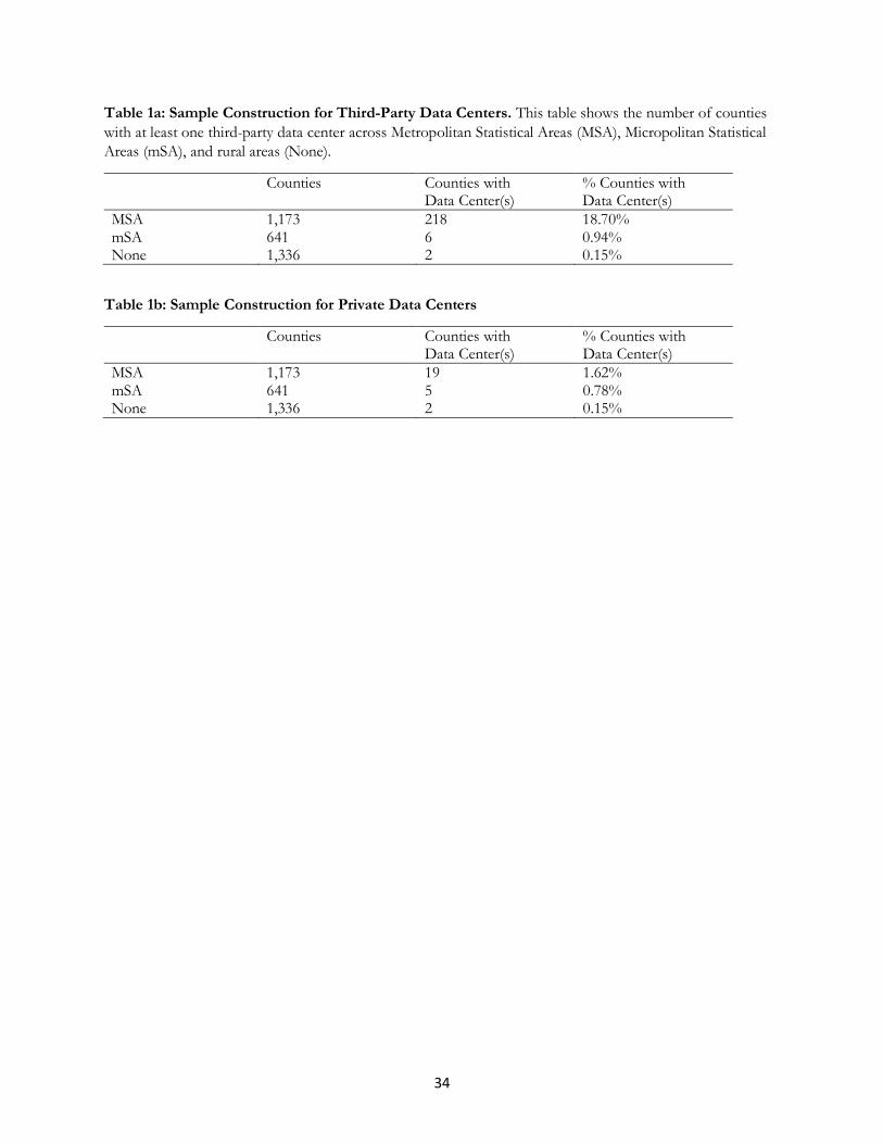
34
Table 1a: Sample Construction for Third-Party Data Centers. This table shows the number of counties with at least one third-party data center across Metropolitan Statistical Areas (MSA), Micropolitan Statistical Areas (mSA), and rural areas (None).
Counties Counties with Data Center(s)
% Counties with Data Center(s)
MSA 1,173 218 18.70% mSA 641 6 0.94% None 1,336 2 0.15%
Table 1b: Sample Construction for Private Data Centers
Counties Counties with Data Center(s)
% Counties with Data Center(s)
MSA 1,173 19 1.62% mSA 641 5 0.78% None 1,336 2 0.15%
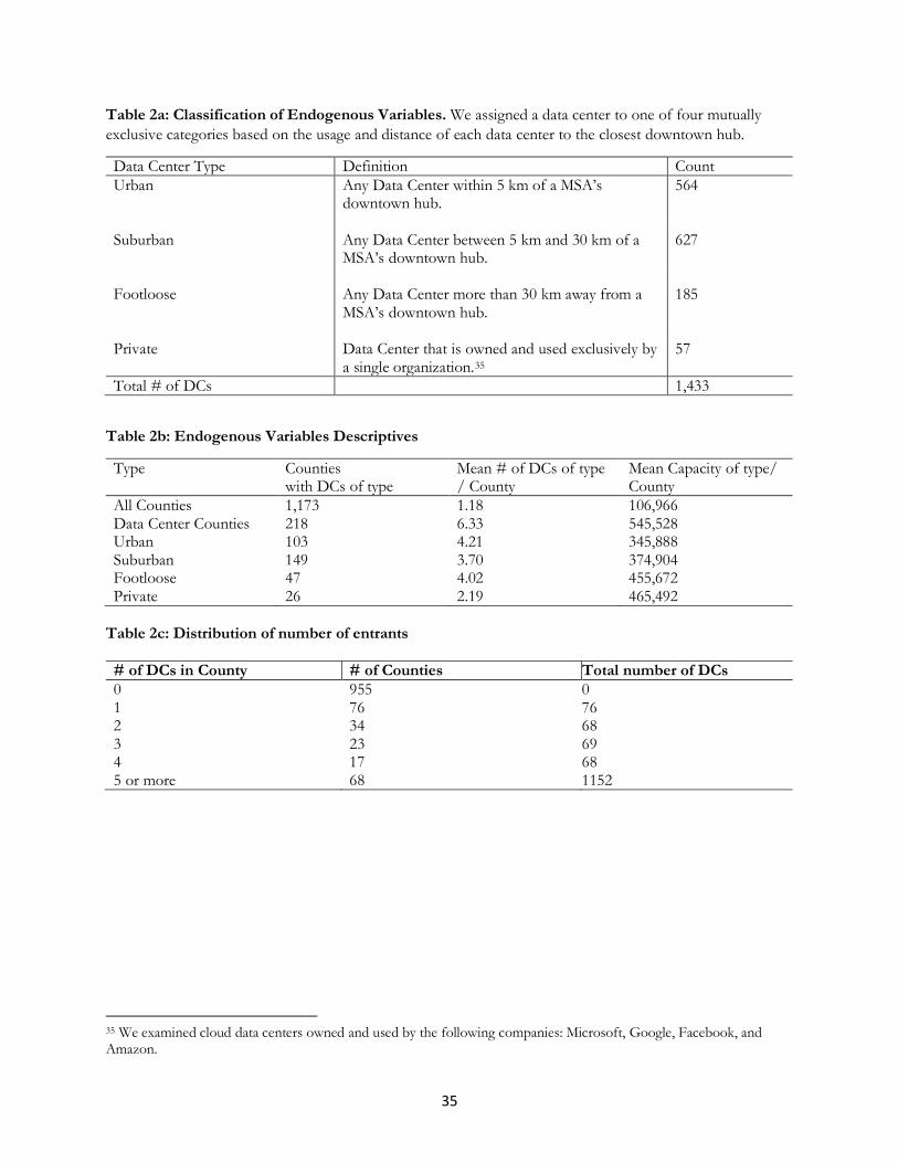
35
Table 2a: Classification of Endogenous Variables. We assigned a data center to one of four mutually exclusive categories based on the usage and distance of each data center to the closest downtown hub.
Data Center Type Definition Count Urban Any Data Center within 5 km of a MSA’s
downtown hub. 564
Suburban Any Data Center between 5 km and 30 km of a
MSA’s downtown hub. 627
Footloose Any Data Center more than 30 km away from a
MSA’s downtown hub. 185
Private Data Center that is owned and used exclusively by
a single organization.35 57
Total # of DCs 1,433
Table 2b: Endogenous Variables Descriptives
Type Counties with DCs of type
Mean # of DCs of type / County
Mean Capacity of type/ County
All Counties 1,173 1.18 106,966 Data Center Counties 218 6.33 545,528 Urban 103 4.21 345,888 Suburban 149 3.70 374,904 Footloose 47 4.02 455,672 Private 26 2.19 465,492
Table 2c: Distribution of number of entrants # of DCs in County # of Counties Total number of DCs 0 955 0 1 76 76 2 34 68 3 23 69 4 17 68 5 or more 68 1152
35 We examined cloud data centers owned and used by the following companies: Microsoft, Google, Facebook, and Amazon.
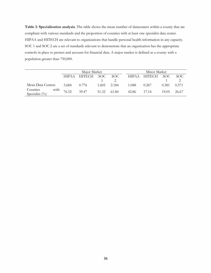
36
Table 3: Specialization analysis. The table shows the mean number of datacenters within a county that are
compliant with various standards and the proportion of counties with at least one specialist data center.
HIPAA and HITECH are relevant to organizations that handle personal health information in any capacity.
SOC 1 and SOC 2 are a set of standards relevant to demonstrate that an organization has the appropriate
controls in place to protect and account for financial data. A major market is defined as a county with a
population greater than 750,000.
Major Market Minor Market HIPAA HITECH SOC
1 SOC
2 HIPAA HITECH SOC
1 SOC
2 Mean Data Centers 3.684 0.776 1.605 2.184 1.048 0.267 0.381 0.571 Counties with Specialist (%) 76.32 39.47 51.32 61.84 42.86 17.14 19.05 26.67

37
Table 4: Definition of Demand & Supply Variables.

38
Table 5: Summary Statistics of Demand & Supply Variables.
mean s.d. min max
Dependent Variables
Data Center County 0.186 0.389 0 1 Urban DC County 0.088 0.283 0 1
Suburban DC County 0.127 0.333 0 1 Footloose DC County 0.039 0.194 0 1 Private DC County 0.022 0.147 0 1 Gross Capacity 106966.300 561541.200 0 9782365
Urban Capacity 30372.060 233390.900 0 3534329 Suburban Capacity 47622.020 279482.200 0 5583060 Footloose Capacity 17869.480 226941.400 0 6149277
Demand Shifters
% Bachelor's Degree 17.371 7.108 4.854 55.464 % Information 1.085 1.193 0 15.066
% Health 10.126 4.373 0 44.326 % Education 0.210 0.253 0 3.008 % FIRE 3.180 2.198 0 29.758 % Manufacturing 8.241 6.489 0 40.011
Population Density 644.237 2912.159 0.8 72158 Min. Density 23.057 163.762 0 2793.67 Max. Density 4342.058 10916.470 0.814 172373.4
Variable Cost Shifters Industrial Electric Price 6.978 2.011 4.66 22.92 Low Real Estate Tax 0.251 0.434 0 1 High Real Estate Tax 0.225 0.418 0 1 Median Network Engineer Wage 30.440 4.466 18.25 46.87 Cold 29.247 8.120 7.163 55.975 Hot 65.710 7.322 38.188 79.25 Fixed Cost Shifters Median Construction Wage 14.519 3.982 8.21 29.38 Tax break MSA 0.163 0.369 0 1 Low Sales Tax 0.255 0.436 0 1 High Sales Tax 0.211 0.408 0 1 Median Home Val (per SQFT.) 117.638 74.574 36 590 Min. Median Home Val 84.444 43.580 18 437 Max. Median Home Val 139.142 113.642 24 1142 Counties 1173
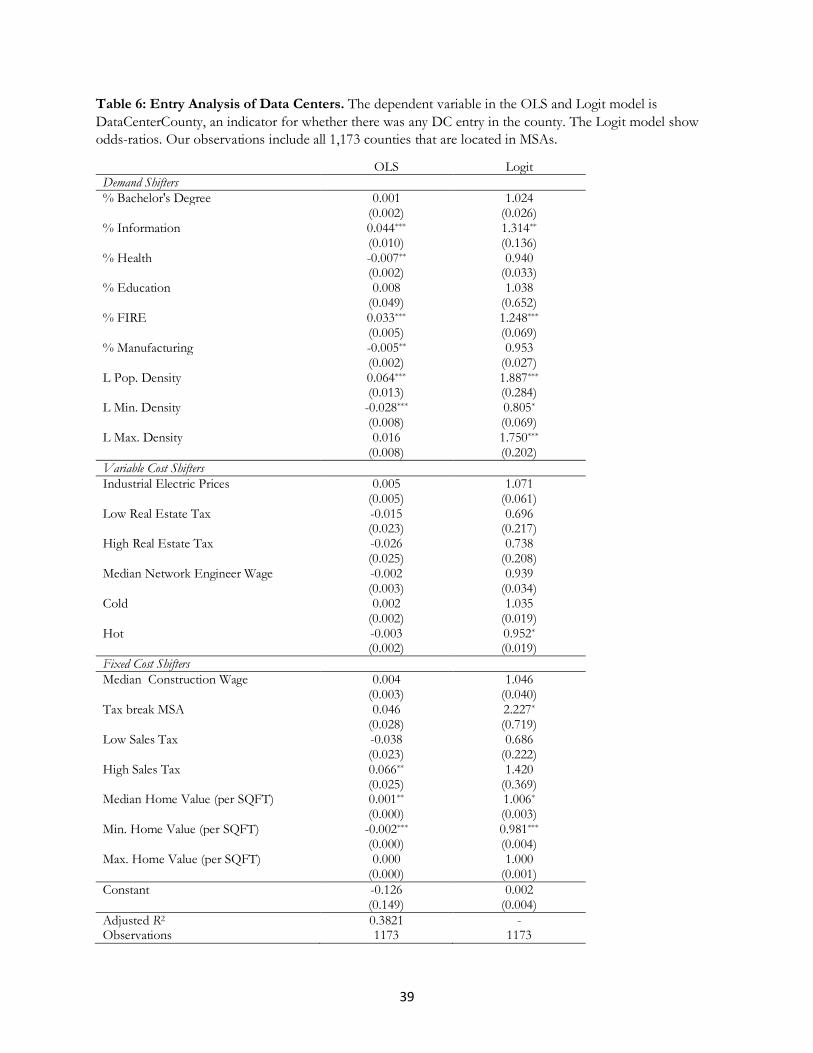
39
Table 6: Entry Analysis of Data Centers. The dependent variable in the OLS and Logit model is DataCenterCounty, an indicator for whether there was any DC entry in the county. The Logit model show odds-ratios. Our observations include all 1,173 counties that are located in MSAs.
OLS Logit Demand Shifters % Bachelor's Degree 0.001 1.024 (0.002) (0.026) % Information 0.044*** 1.314** (0.010) (0.136) % Health -0.007** 0.940 (0.002) (0.033) % Education 0.008 1.038 (0.049) (0.652) % FIRE 0.033*** 1.248*** (0.005) (0.069) % Manufacturing -0.005** 0.953 (0.002) (0.027) L Pop. Density 0.064*** 1.887*** (0.013) (0.284) L Min. Density -0.028*** 0.805* (0.008) (0.069) L Max. Density 0.016 1.750*** (0.008) (0.202) Variable Cost Shifters Industrial Electric Prices 0.005 1.071 (0.005) (0.061) Low Real Estate Tax -0.015 0.696 (0.023) (0.217) High Real Estate Tax -0.026 0.738 (0.025) (0.208) Median Network Engineer Wage -0.002 0.939 (0.003) (0.034) Cold 0.002 1.035 (0.002) (0.019) Hot -0.003 0.952* (0.002) (0.019) Fixed Cost Shifters Median Construction Wage 0.004 1.046 (0.003) (0.040) Tax break MSA 0.046 2.227* (0.028) (0.719) Low Sales Tax -0.038 0.686 (0.023) (0.222) High Sales Tax 0.066** 1.420 (0.025) (0.369) Median Home Value (per SQFT) 0.001** 1.006* (0.000) (0.003) Min. Home Value (per SQFT) -0.002*** 0.981*** (0.000) (0.004) Max. Home Value (per SQFT) 0.000 1.000 (0.000) (0.001) Constant -0.126 0.002 (0.149) (0.004) Adjusted R2 0.3821 - Observations 1173 1173
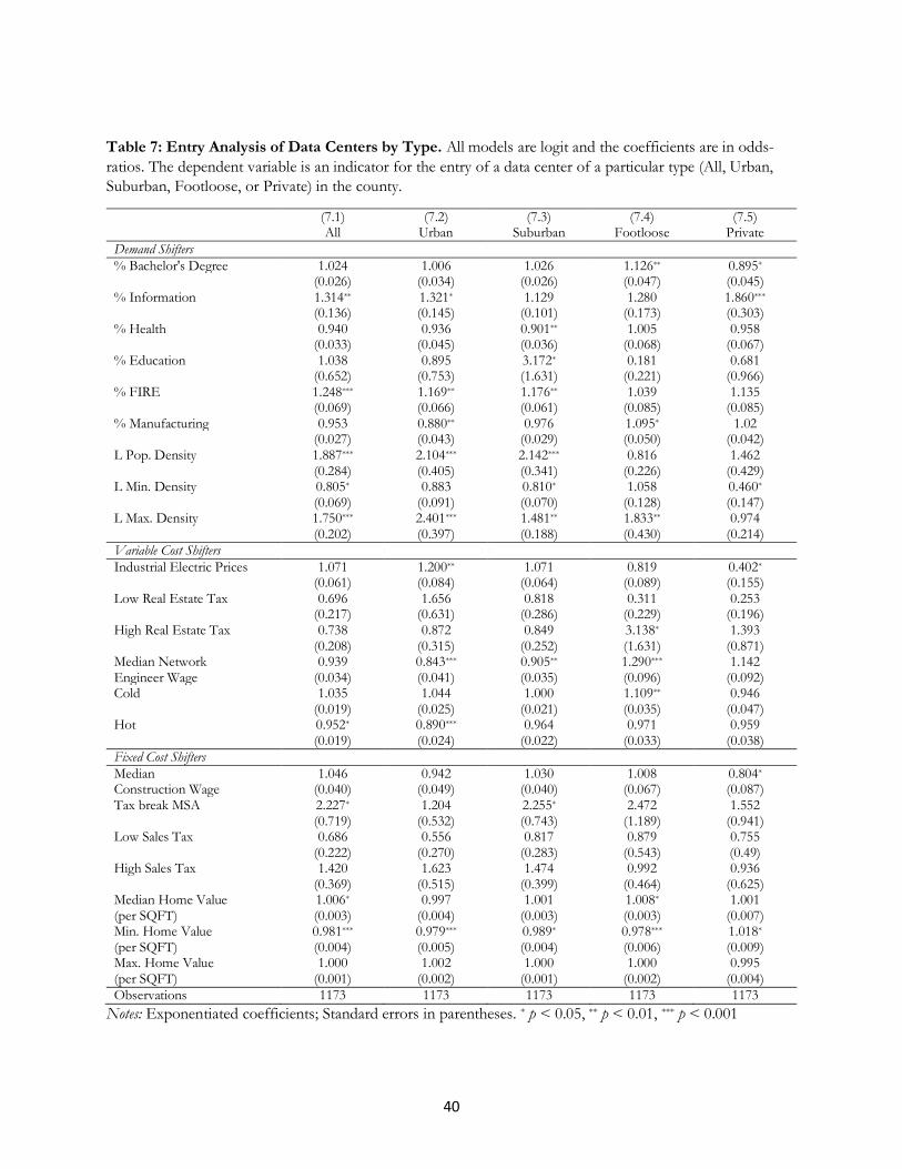
40
Table 7: Entry Analysis of Data Centers by Type. All models are logit and the coefficients are in odds-ratios. The dependent variable is an indicator for the entry of a data center of a particular type (All, Urban, Suburban, Footloose, or Private) in the county.
(7.1) (7.2) (7.3) (7.4) (7.5) All Urban Suburban Footloose Private Demand Shifters % Bachelor's Degree 1.024 1.006 1.026 1.126** 0.895* (0.026) (0.034) (0.026) (0.047) (0.045) % Information 1.314** 1.321* 1.129 1.280 1.860*** (0.136) (0.145) (0.101) (0.173) (0.303) % Health 0.940 0.936 0.901** 1.005 0.958 (0.033) (0.045) (0.036) (0.068) (0.067) % Education 1.038 0.895 3.172* 0.181 0.681 (0.652) (0.753) (1.631) (0.221) (0.966) % FIRE 1.248*** 1.169** 1.176** 1.039 1.135 (0.069) (0.066) (0.061) (0.085) (0.085) % Manufacturing 0.953 0.880** 0.976 1.095* 1.02 (0.027) (0.043) (0.029) (0.050) (0.042) L Pop. Density 1.887*** 2.104*** 2.142*** 0.816 1.462 (0.284) (0.405) (0.341) (0.226) (0.429) L Min. Density 0.805* 0.883 0.810* 1.058 0.460* (0.069) (0.091) (0.070) (0.128) (0.147) L Max. Density 1.750*** 2.401*** 1.481** 1.833** 0.974 (0.202) (0.397) (0.188) (0.430) (0.214) Variable Cost Shifters Industrial Electric Prices 1.071 1.200** 1.071 0.819 0.402* (0.061) (0.084) (0.064) (0.089) (0.155) Low Real Estate Tax 0.696 1.656 0.818 0.311 0.253 (0.217) (0.631) (0.286) (0.229) (0.196) High Real Estate Tax 0.738 0.872 0.849 3.138* 1.393 (0.208) (0.315) (0.252) (1.631) (0.871) Median Network 0.939 0.843*** 0.905** 1.290*** 1.142 Engineer Wage (0.034) (0.041) (0.035) (0.096) (0.092) Cold 1.035 1.044 1.000 1.109** 0.946 (0.019) (0.025) (0.021) (0.035) (0.047) Hot 0.952* 0.890*** 0.964 0.971 0.959 (0.019) (0.024) (0.022) (0.033) (0.038) Fixed Cost Shifters Median 1.046 0.942 1.030 1.008 0.804* Construction Wage (0.040) (0.049) (0.040) (0.067) (0.087) Tax break MSA 2.227* 1.204 2.255* 2.472 1.552 (0.719) (0.532) (0.743) (1.189) (0.941) Low Sales Tax 0.686 0.556 0.817 0.879 0.755 (0.222) (0.270) (0.283) (0.543) (0.49) High Sales Tax 1.420 1.623 1.474 0.992 0.936 (0.369) (0.515) (0.399) (0.464) (0.625) Median Home Value 1.006* 0.997 1.001 1.008* 1.001 (per SQFT) (0.003) (0.004) (0.003) (0.003) (0.007) Min. Home Value 0.981*** 0.979*** 0.989* 0.978*** 1.018* (per SQFT) (0.004) (0.005) (0.004) (0.006) (0.009) Max. Home Value 1.000 1.002 1.000 1.000 0.995 (per SQFT) (0.001) (0.002) (0.001) (0.002) (0.004) Observations 1173 1173 1173 1173 1173
Notes: Exponentiated coefficients; Standard errors in parentheses. * p < 0.05, ** p < 0.01, *** p < 0.001
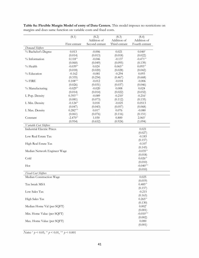
41
Table 8a: Flexible Margin Model of entry of Data Centers. This model imposes no restrictions on margins and does same function on variable costs and fixed costs.
(8.1) (8.2) Addition of
(8.3) Addition of
(8.4) Addition of
First entrant Second entrant Third entrant Fourth entrant Demand Shifters % Bachelor's Degree 0.013 -0.006 0.021 0.040* (0.014) (0.013) (0.018) (0.022) % Information 0.118** -0.046 -0.137 -0.471** (0.060) (0.049) (0.095) (0.139) % Health -0.039** 0.024 0.065** 0.093** (0.018) (0.020) (0.028) (0.042) % Education -0.162 -0.081 -0.294 0.093 (0.335) (0.254) (0.467) (0.668) % FIRE 0.108*** -0.012 -0.018 -0.006 (0.026) (0.031) (0.037) (0.046) % Manufacturing -0.029** -0.020 0.008 0.024 (0.014) (0.014) (0.022) (0.032) L Pop. Density 0.393*** -0.089 -0.210* -0.216* (0.081) (0.073) (0.112) (0.135) L Min. Density -0.124** 0.018 -0.025 0.0513 (0.047) (0.043) (0.057) (0.068) L Max. Density 0.282*** 0.017 0.076 -0.080 (0.061) (0.076) (0.116) (0.151) Constant -2.470** 1.030 0.800 2.065* (0.954) (0.652) (0.924) (1.094) Variable Cost Shifters Industrial Electric Prices 0.021 (0.027) Low Real Estate Tax -0.183 (0.157) High Real Estate Tax -0.107 (0.143) Median Network Engineer Wage -0.035** (0.018) Cold 0.026** (0.010) Hot -0.040*** (0.010) Fixed Cost Shifters Median Construction Wage 0.025 (0.019) Tax break MSA 0.485** (0.157) Low Sales Tax -0.215 (0.163) High Sales Tax 0.265** (0.130) Median Home Val (per SQFT) 0.002* (0.001) Min. Home Value (per SQFT) -0.010*** (0.002) Max. Home Value (per SQFT) 0.000 (0.001)
Notes: * p < 0.05, ** p < 0.01, *** p < 0.001
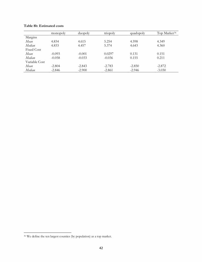
42
Table 8b: Estimated costs
monopoly duopoly triopoly quadopoly Top Market36 Margins Mean 4.834 4.615 5.254 4.598 4.349 Median 4.833 4.457 5.374 4.643 4.360 Fixed Cost Mean -0.093 -0.001 0.0297 0.131 0.151 Median -0.058 -0.033 -0.036 0.155 0.211 Variable Cost Mean -2.804 -2.843 -2.783 -2.850 -2.872 Median -2.846 -2.900 -2.861 -2.946 -3.030
36 We define the ten largest counties (by population) as a top market.
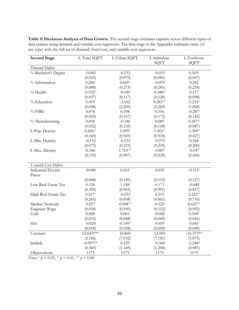
43
Table 9: Heckman Analysis of Data Centers. The second stage estimates capacity across different types of data centers using demand and variable cost regressors. The first stage in the Appendix estimates entry (of any type) with the full set of demand, fixed cost, and variable cost regressors.
Second Stage L Total SQFT L Urban SQFT L Suburban SQFT
L Footloose SQFT
Demand Shifters % Bachelor's Degree -0.045 -0.133 -0.015 0.165* (0.025) (0.079) (0.081) (0.067) % Information 0.206* 0.669* -0.079 0.242 (0.088) (0.273) (0.281) (0.234) % Health -0.102** -0.185 -0.388** 0.117 (0.037) (0.117) (0.120) (0.098) % Education 0.419 -3.162 8.283*** -5.234** (0.698) (2.209) (2.269) (1.868) % FIRE 0.078 0.198 0.156 -0.287* (0.053) (0.167) (0.172) (0.142) % Manufacturing 0.018 -0.146 0.089 0.247** (0.032) (0.105) (0.108) (0.087) L Pop. Density 0.426** 1.059* 1.416** -1.309** (0.160) (0.505) (0.518) (0.427) L Min. Density -0.132 -0.233 -0.375 0.344 (0.075) (0.233) (0.239) (0.200) L Max. Density -0.346* 1.763*** -0.807 -0.047 (0.159) (0.507) (0.520) (0.426) Variable Cost Shifters Industrial Electric Prices
-0.040 0.163 0.039 -0.313*
(0.048) (0.149) (0.153) (0.127) Low Real Estate Tax 0.126 1.148 0.173 -0.689 (0.305) (0.965) (0.991) (0.817) High Real Estate Tax 0.527* -0.533 0.515 2.222** (0.265) (0.838) (0.861) (0.710) Median Network 0.057 -0.508*** -0.225* 0.625*** Engineer Wage (0.034) (0.109) (0.112) (0.092) Cold 0.008 0.061 -0.082 0.104* (0.015) (0.048) (0.049) (0.041) Hot -0.024 -0.149** 0.019 0.043 (0.018) (0.058) (0.059) (0.049) Constant 12.643*** 10.869 12.004 -16.373** (2.166) (7.032) (7.181) (5.875) lambda -0.997** 0.129 -0.364 -2.246* (0.369) (1.169) (1.200) (0.987) Observations 1173 1173 1173 1173
Notes: * p < 0.05, ** p < 0.01, *** p < 0.00
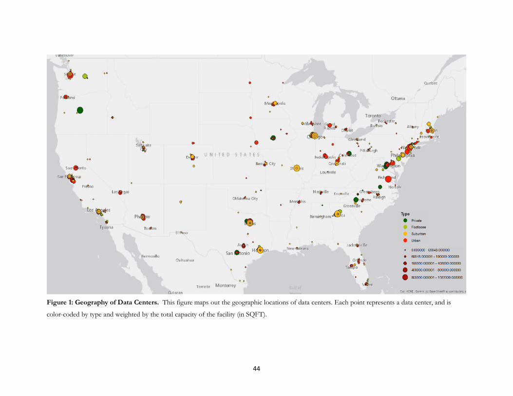
44
Figure 1: Geography of Data Centers. This figure maps out the geographic locations of data centers. Each point represents a data center, and is
color-coded by type and weighted by the total capacity of the facility (in SQFT).
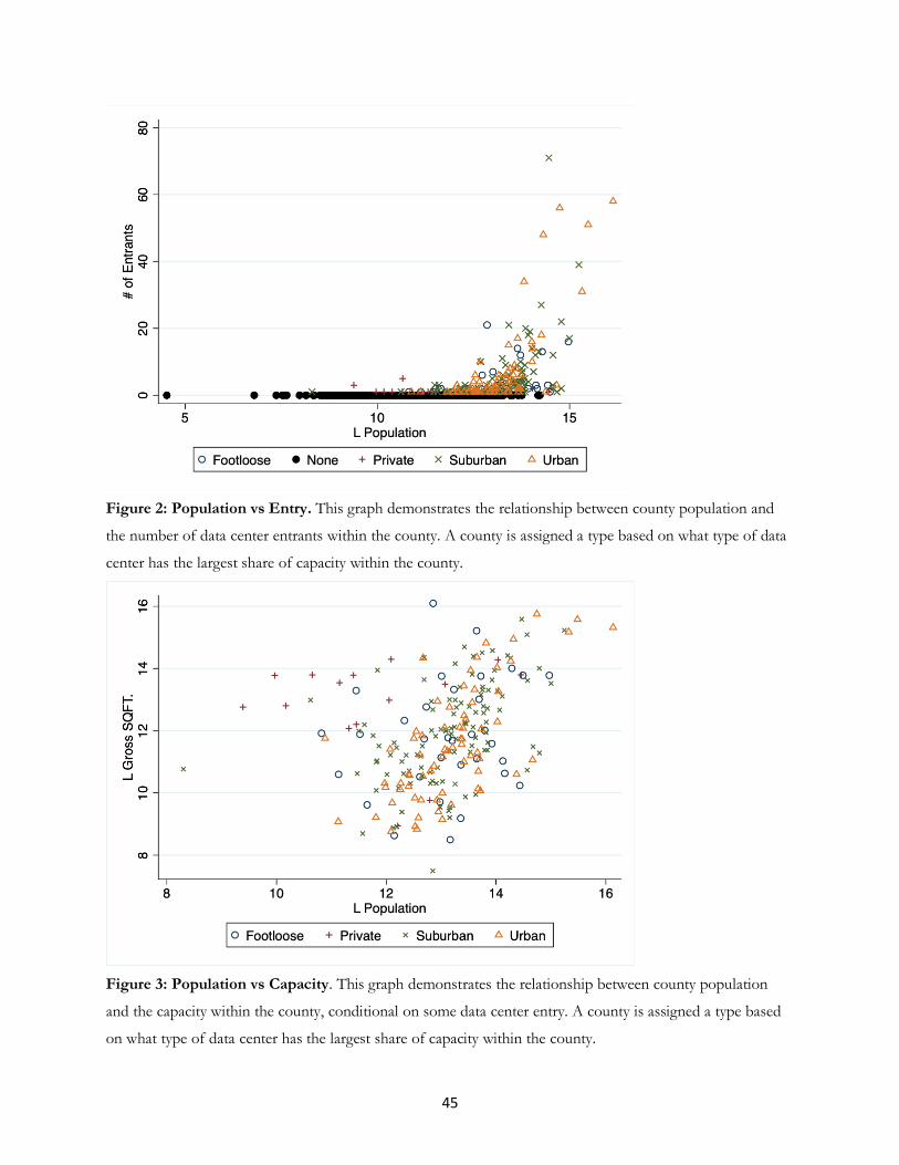
45
Figure 2: Population vs Entry. This graph demonstrates the relationship between county population and
the number of data center entrants within the county. A county is assigned a type based on what type of data
center has the largest share of capacity within the county.
Figure 3: Population vs Capacity. This graph demonstrates the relationship between county population
and the capacity within the county, conditional on some data center entry. A county is assigned a type based
on what type of data center has the largest share of capacity within the county.
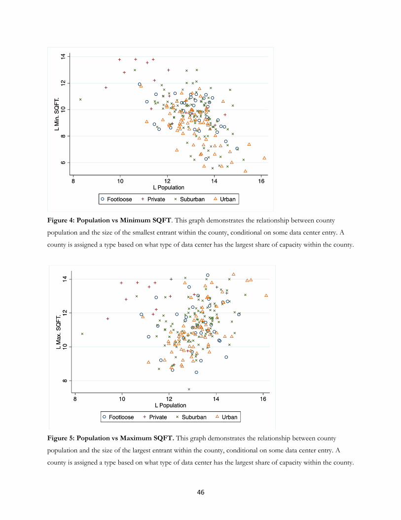
46
Figure 4: Population vs Minimum SQFT. This graph demonstrates the relationship between county
population and the size of the smallest entrant within the county, conditional on some data center entry. A
county is assigned a type based on what type of data center has the largest share of capacity within the county.
Figure 5: Population vs Maximum SQFT. This graph demonstrates the relationship between county
population and the size of the largest entrant within the county, conditional on some data center entry. A
county is assigned a type based on what type of data center has the largest share of capacity within the county.