Embed Size (px)
DESCRIPTION
Research and Development
Citation preview
Jumanah Aliyah Nessa
YCN Brief: Gap
The Gap Message:“American Optimism is our attitude. Casual style is our aesthetic. Clean and confident, comfortable and accessible, classic and modern... Gap embraces a youthful, infectious spirit and the freedom to express individual style.” - Gap website.
The Outcome:Create a series of fashion photography pieces, representing the most important aspects of Gap 1969 Denim which are; Fabric and technology evolution, on trend fits and washes, rich denim heritage and commitment to social responsibility.
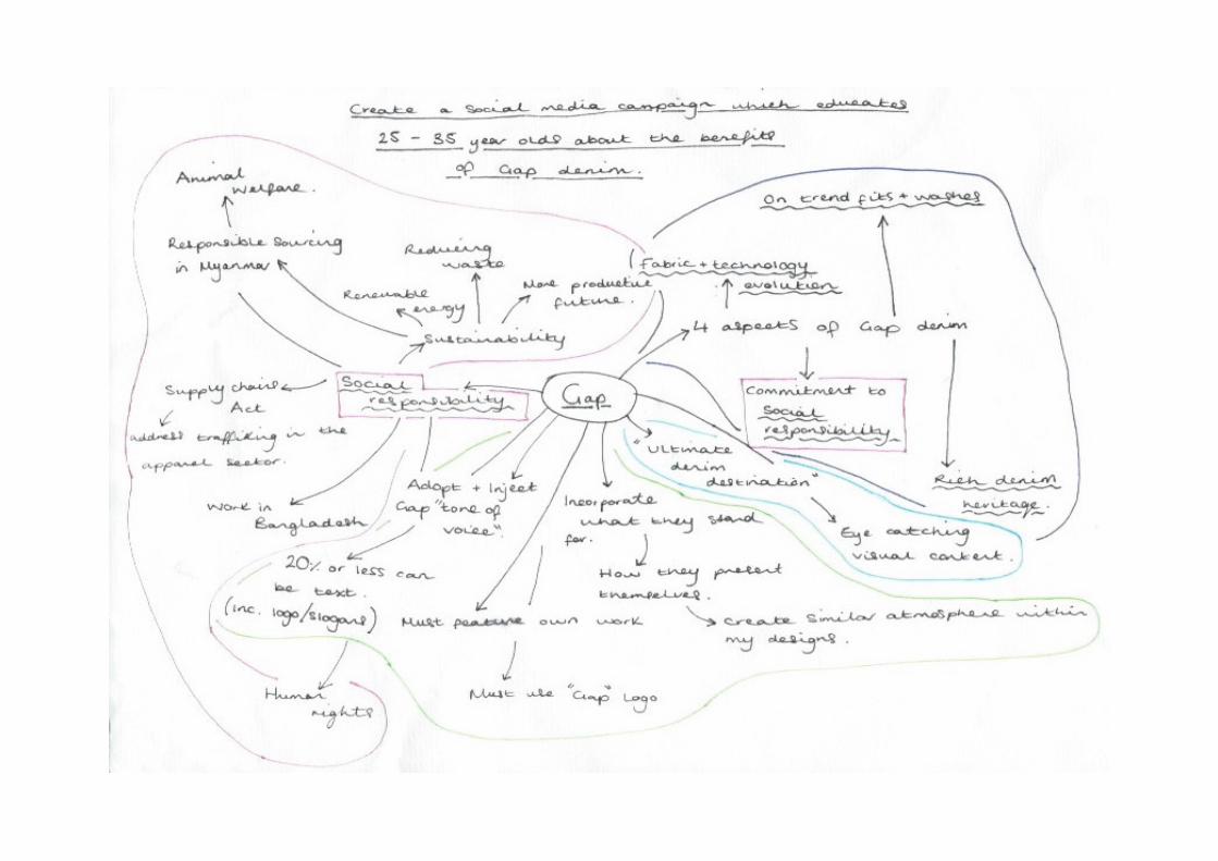
Aim:Create a social media campaign which educates 25-35 year olds about the benefits of Gap denim.
Image source: https://uk.pinterest.com/gap/1969-denim/
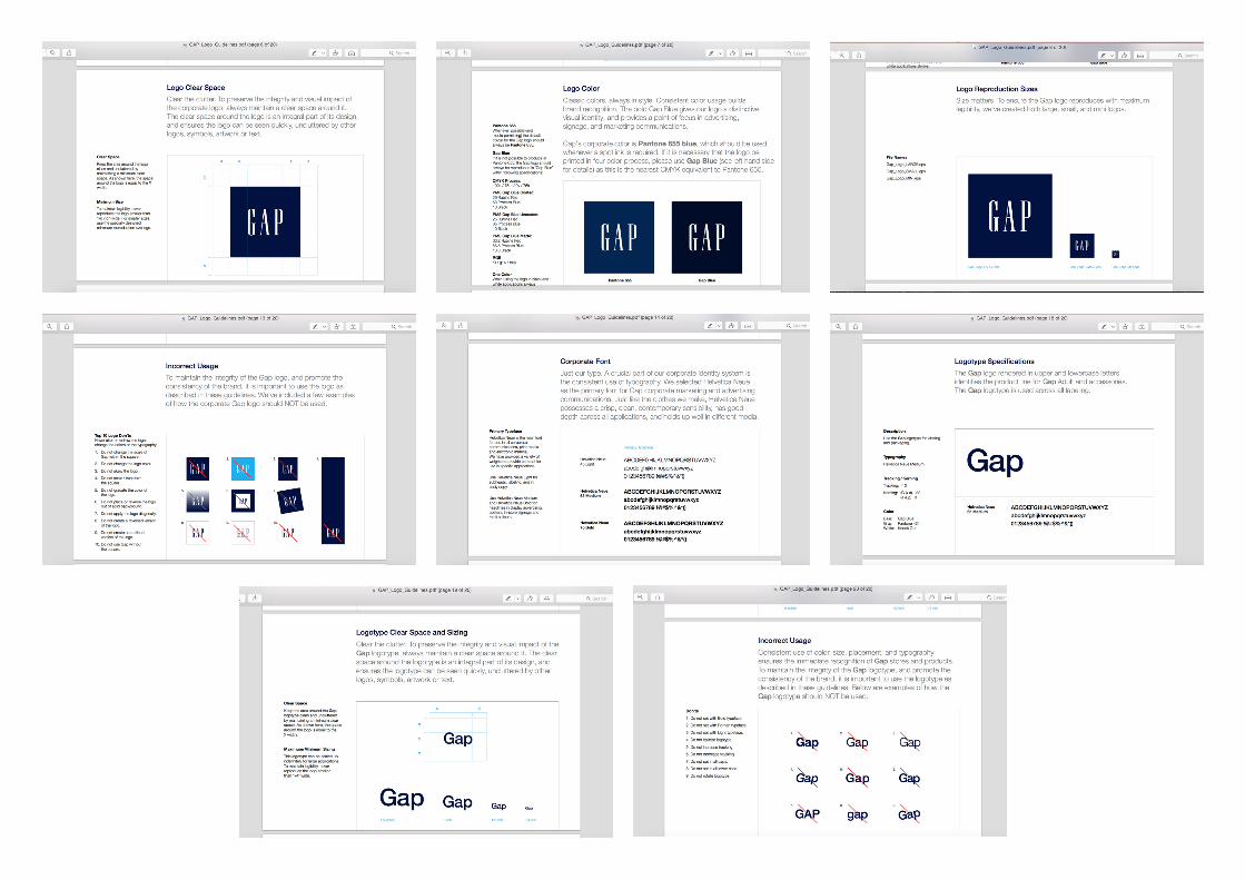
The brief: technical parameters, elements, assets and components.After reviewing the brief and guidelines provided by Gap I have decided to note down all the restrictions and limitations set down by Gap as well as the social media restrictions.
These include:1. Logo clear space: this is the limitations regarding setting the logo. Gap requires the logo to always maintain an equal clear space around it, this allows the logo to be seen quickly without any distractions.
2. Logo colour: it is stated here the exact colours including the pantone colours as well as CMYK alternatives. Pantone 655 is the preffered option however, CMYK 100c/ 75m/ 0y/ 75k is also acceptable.
3. Logo reproduction size/usage: for this Gap has provided 3 versions in a variety of sizes for use depending on the scale of the design. Gap has also provided guidelines regarding the use of the logo. For example not changing the colour of the logo, skewing or transforming the logo in any way.
4. Logotype and Corporate font: here are the guidelines for the fonts and sizes to use for all aspects of research and design including body copy and labeling. This also includes information regarding tracking/ kerning, spacing around the text, as well as colour. Similar to logo usage, there are also certain limitations on logotype such as; do not italicize, do not increase/decrease tracking, do not rotate etc.
Initial thoughts/ideas.After noting all of the limitations, specifications and key points. I created a mindmap that explored each concept in further detail. I have included possible topics to research or incorporate, as well as pointers on how to create successful and effective designs. For example combining my ideas/work with Gap’s atmosphere and ‘tone of voice’.
The main things I noticed were Gap’s consistent enforcement on the idea of ‘social responsibility’, this includes, sustainability, responsible sourcing and human rights. I have researched this further and noted my findings as you can see opposite. I believe this will be the main concept I will focus on, as it is clearly one of the most important issues to Gap.
In conclusion, I will keep these in mind when creating my developmental pieces. I believe this research has enabled me to further understand Gap’s ethos and will therefore allow me to create more suitable and purposeful outcomes.
Existing social media campaigns.Current campaign: The concept of Gap’s current campaign is ‘#gaplove’, this is specifically created for the Christmas holiday season. The use of a hashtag allows the campaign to be spread further online as it is a tool that can be used on a variety of social media platforms, enabling the message and campaign to be seen by a larger audience and therefore increasing possible customers. The strategy of linking the work love with Christmas is one in which Gap has continuously used, for example, in 2013 Gap went with the hashtag #makelove. This creates a sort of storyline and creates an association of love with the Gap brand.
One thing I admire about Gap’s advertising strategy is the way in which they do not try to over sell a product. For example on both Facebook and Instagram pages, they only post images of outfits, without prices or big slogans and taglines trying to entice customers, in other words they allow the clothing/products to speak for themselves. This is something I will keep in mind for my own designs.
Communication design: Branding.Communication design is the combination of design and information development. It involves creating visual messages for broadcast to the public, global or local. This strategic thinking also incorporates a business plan as the ultimate aim is to reach a large audience using tactics such as market research.
Gap’s company branding and high end status has been achieved through a variety of smart business strategies. As mentioned briefly previously Gap’s marketing are extremely simple, classic, consistent and effective, in all aspects from the designs, products, logo/branding as well as how the brand is advertised. It is a clean campaign with no unnecessary distractions.
The target audience for this Gap denim campaign is 25 to 35 year olds. This fits well with the image and atmosphere Gap portray which is modern, classic and sophisticated with a fresh and new vibe.
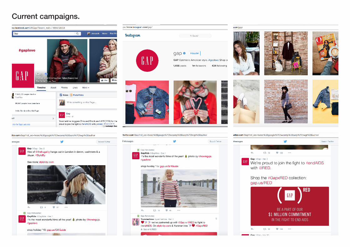
Current campaigns.
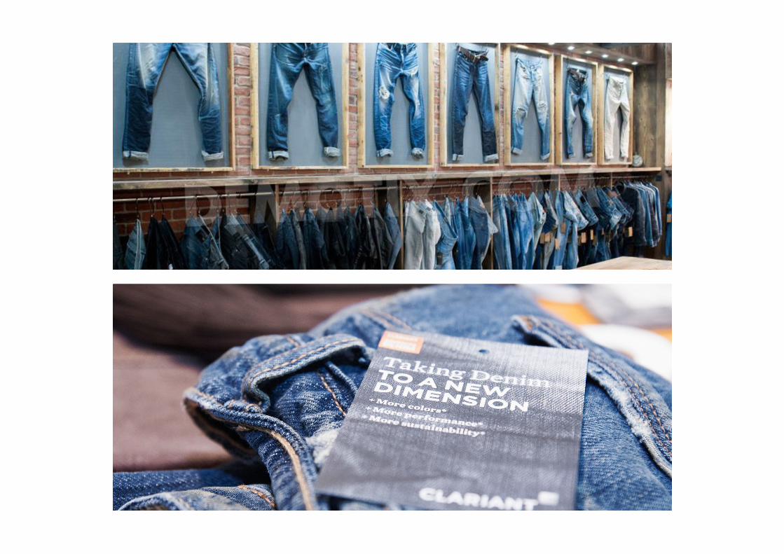
Concept 1: Fabric & technology evolution - Denim trends.Denim premiere vision is a global event that allows the most innovative mills of the world to present the newest trends to the world’s leading fashion brands. This allows brands such as Gap to generate up to date product ideas. Some current trends for 2015 revealed at the event included high stretch capability, unisex fabric and chunky yarns. Greys and green tones are also big colour trends. This year the idea of sustainability also played a key role with one mill sharing a denim made out of vegetables.
Technological advances such as the previously mentioned denim made from vegetables, just show how much we have progressed from, wearing hand woven cotton clothing to the present day factory made denim materials, and how we will continue to progress, exploring and researching new methods/materials.
These innovations allow brands to use the newest and often most efficient techniques and materials when creating new products, therefore creating better quality, sustainable and more fashionable products.
Image source: Google Images
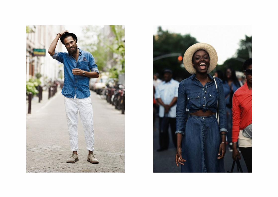
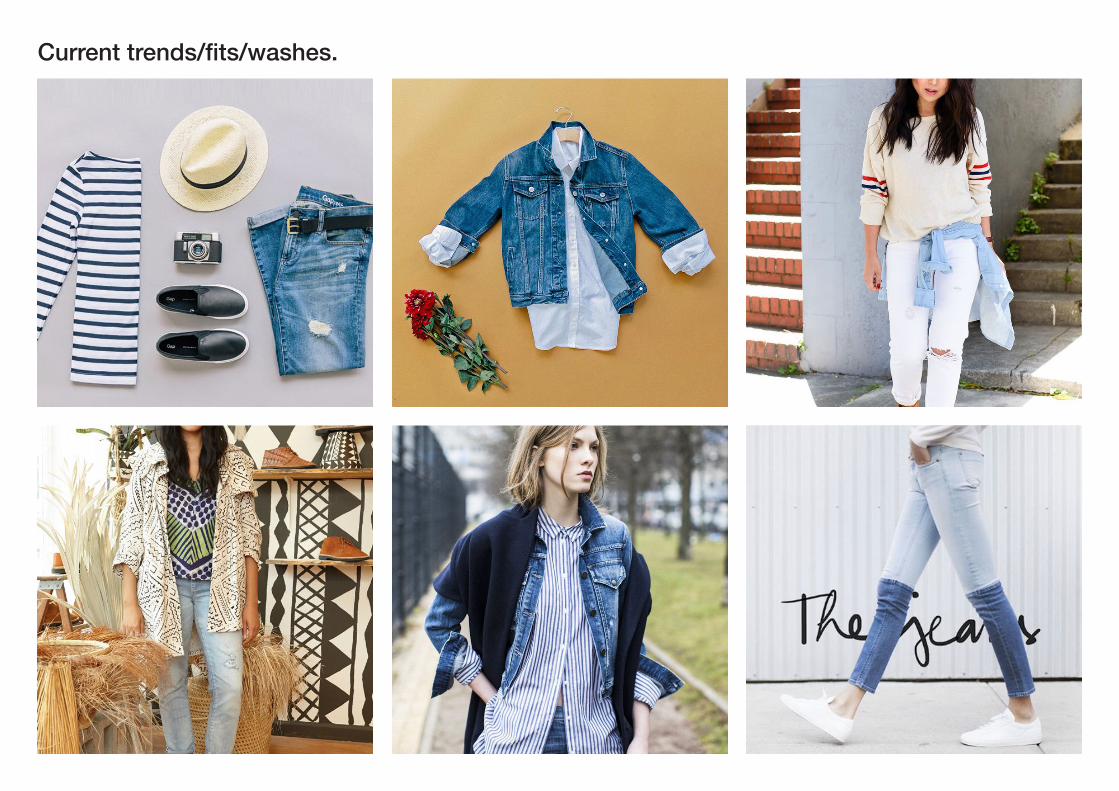
Concept 2: On trend fits and washes.Inspired much by the Denim premiere vision event, Gap’s current denim trends include ripped jeans, chambray style top and bottom pieces, double denim and layered outfits, perfect for the current winter/fall season.
As it is currently the winter season, the distressed, cool-toned wash styles are most popular. Cold colours such as shades of black and white are also currently trending as well as pure blue denim. Fit trends for fall/winter 2015/16 also include, flare, wide leg, boyfriend/girlfriend cuts as well as the always popular skinny jean fit, the skinny jean has always been a consistent style and is perfect for any season. Recently in the winter collections I have also noticed the increase of ripped, distressed and frayed jeans in all cuts.
This research has enabled me to see what inspires Gap and how they interpret their inspirations. I will continue to keep these in mind when creating my pieces as the colours and shapes could influence my own work. This would add a deeper connection between my work and Gap’s ethos.
Image source: https://uk.pinterest.com/gap/
Current trends/fits/washes.
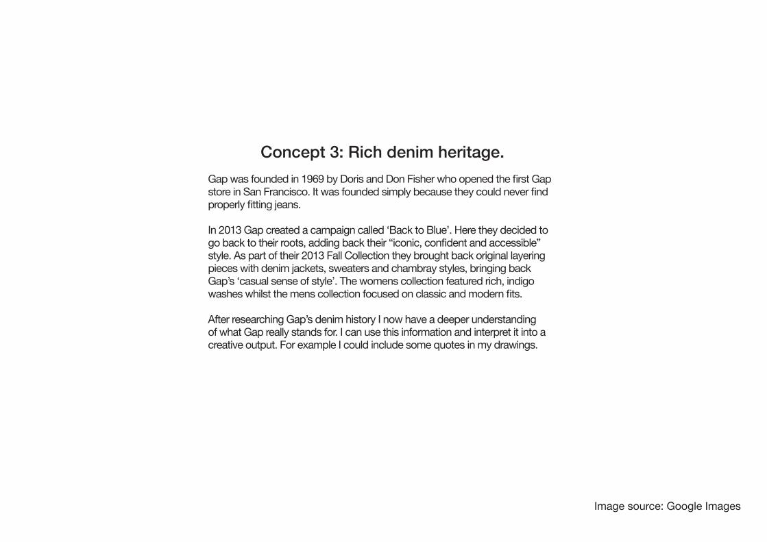
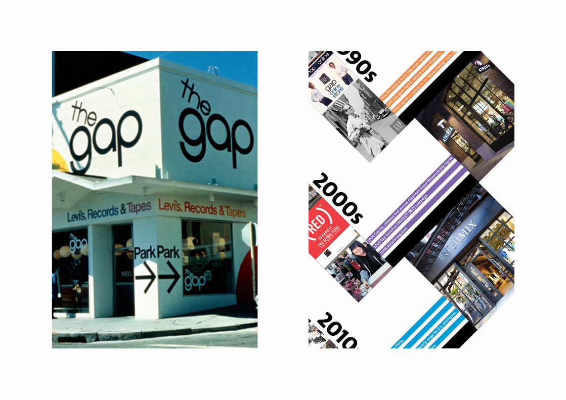
Concept 3: Rich denim heritage.Gap was founded in 1969 by Doris and Don Fisher who opened the first Gap store in San Francisco. It was founded simply because they could never find properly fitting jeans.
In 2013 Gap created a campaign called ‘Back to Blue’. Here they decided to go back to their roots, adding back their “iconic, confident and accessible” style. As part of their 2013 Fall Collection they brought back original layering pieces with denim jackets, sweaters and chambray styles, bringing back Gap’s ‘casual sense of style’. The womens collection featured rich, indigo washes whilst the mens collection focused on classic and modern fits.
After researching Gap’s denim history I now have a deeper understanding of what Gap really stands for. I can use this information and interpret it into a creative output. For example I could include some quotes in my drawings.
Image source: Google Images
Concept 4: Commitment to social responsibility.Social responsibility has been one of the most important issues to Gap since the very start. The main issues include; sustainability, responsible sourcing, and human rights.
In order for Gap to create a sustainable future they have to think about using renewable energy during manufacture and reducing waste from materials and products used, this will alllow for a more productive future as it will ensure that Gap can keep making quality clothing for the future.
Sustainablilty also relies on responsible resourcing. For example in Myanmar child labor, working hours and wages, freedom of association and collective bargaining are all issues which have been dealth with by Gap to ensure fair trade for both manufacturers and consumers. One issue that has been dealth with was wages, until March 2013 there was no national minimiun wage in Myanmar, this changed, with the average garment worker earning between $75 to $150 per month based on their skill levels.
The Supply Chains Act was another issue related to social responsibility, this Act addressed the issue human trafficking in the apparel sector. Gap has ben accused for using child, forced or trafficked labour in the production of their products. New Californian law now requires companies to publicly disclose the steps they are taking to eradicate forced labour in their supply chains. Gap supports this legislation.
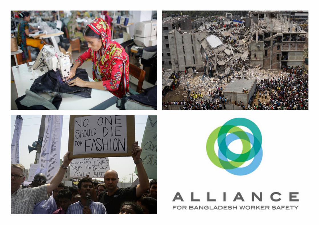
The issue of workers welfare however has been an ongoing issue. In 2013 the collapse of Rana Plaza, a factory in Bangladesh, which produced apparel for big companies such as H&M as well as Gap, caused major global issues regarding the safety of workers in the manufacturing process. As a solution to the catastrophe, the Rana Plaza Donors Trust Fund was set up to compensate the victims and their families. Gap along with many other global brands have since donated a total of $21.5m to this fund.
In conclusion, Gap has always tried to focus on improving their social responsibility in the communities in which they operate. By improving working conditions and manufacturing, this in return improves quality of the products as well as protects the welfare of the workers, creating a more fair trade.
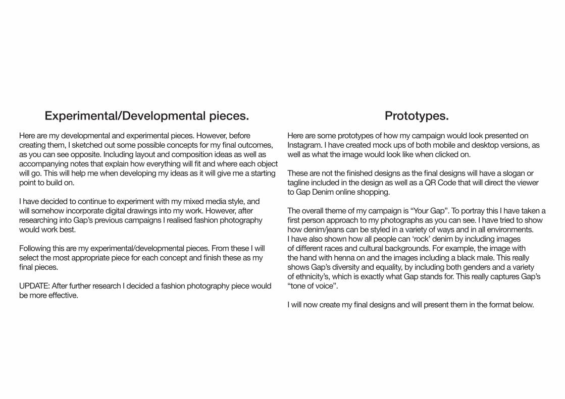
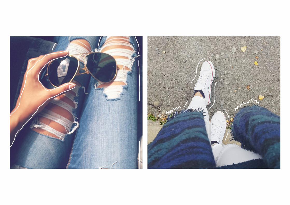
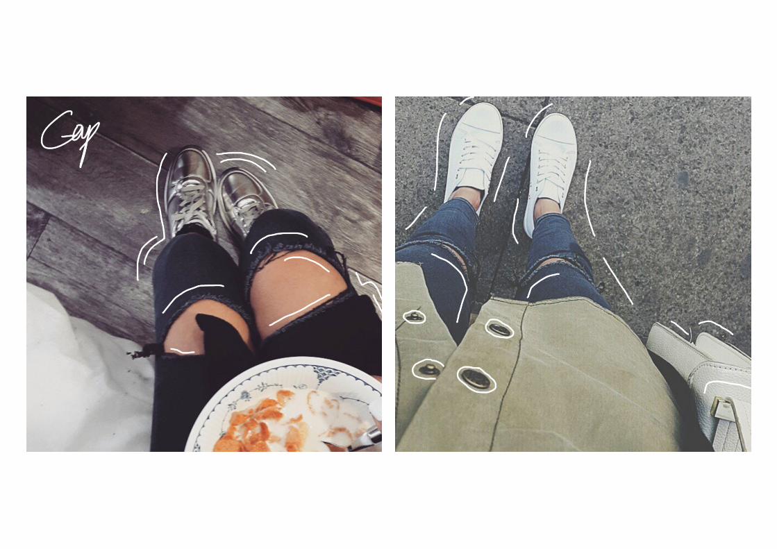
Experimental/Developmental pieces.Here are my developmental and experimental pieces. However, before creating them, I sketched out some possible concepts for my final outcomes, as you can see opposite. Including layout and composition ideas as well as accompanying notes that explain how everything will fit and where each object will go. This will help me when developing my ideas as it will give me a starting point to build on.
I have decided to continue to experiment with my mixed media style, and will somehow incorporate digital drawings into my work. However, after researching into Gap’s previous campaigns I realised fashion photography would work best.
Following this are my experimental/developmental pieces. From these I will select the most appropriate piece for each concept and finish these as my final pieces.
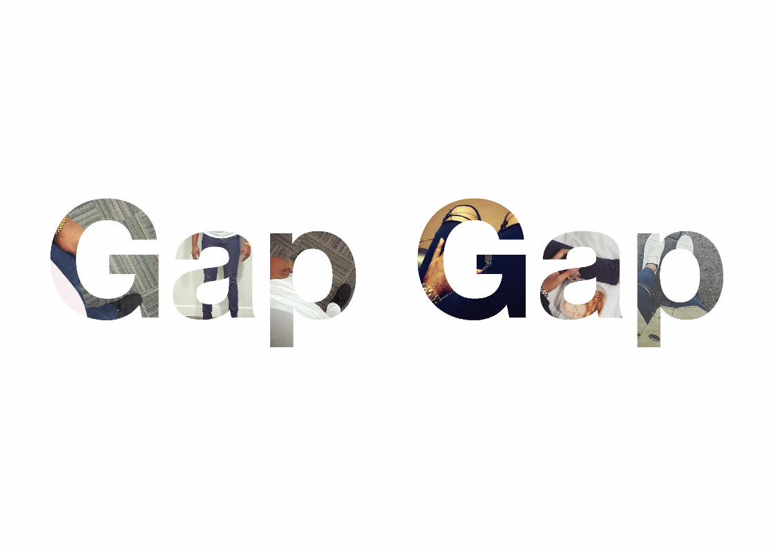
UPDATE: After further research I decided a fashion photography piece would be more effective.
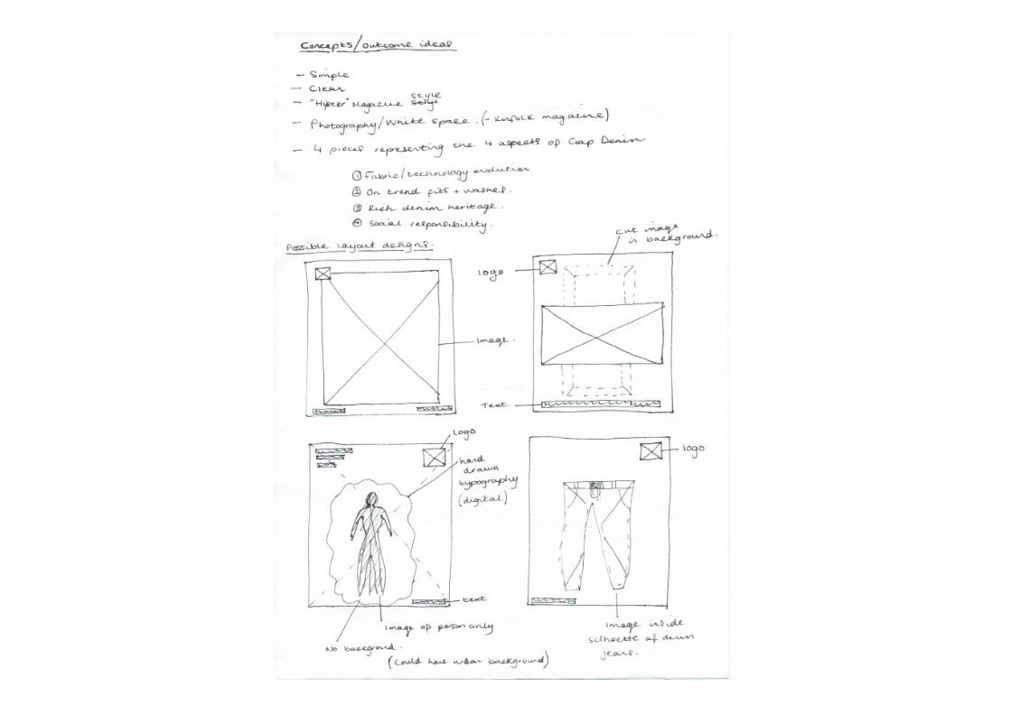
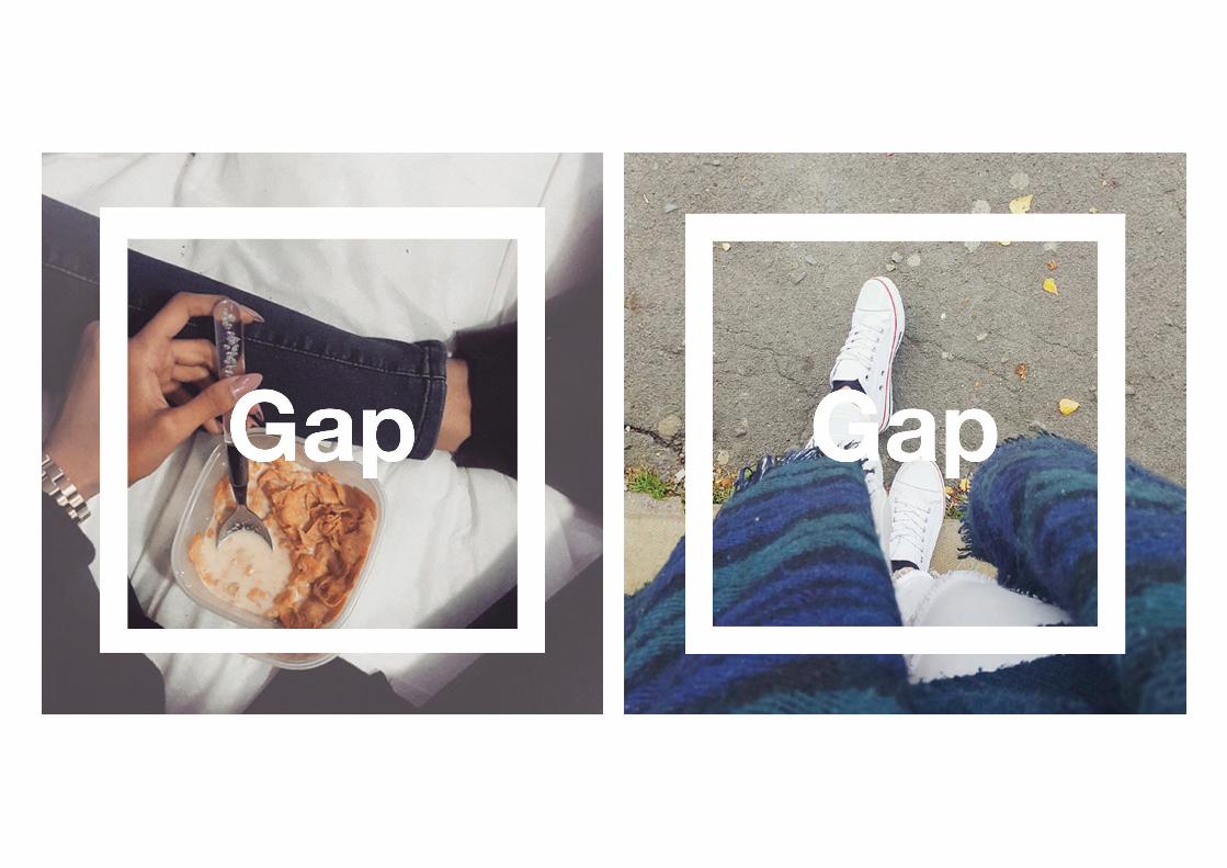
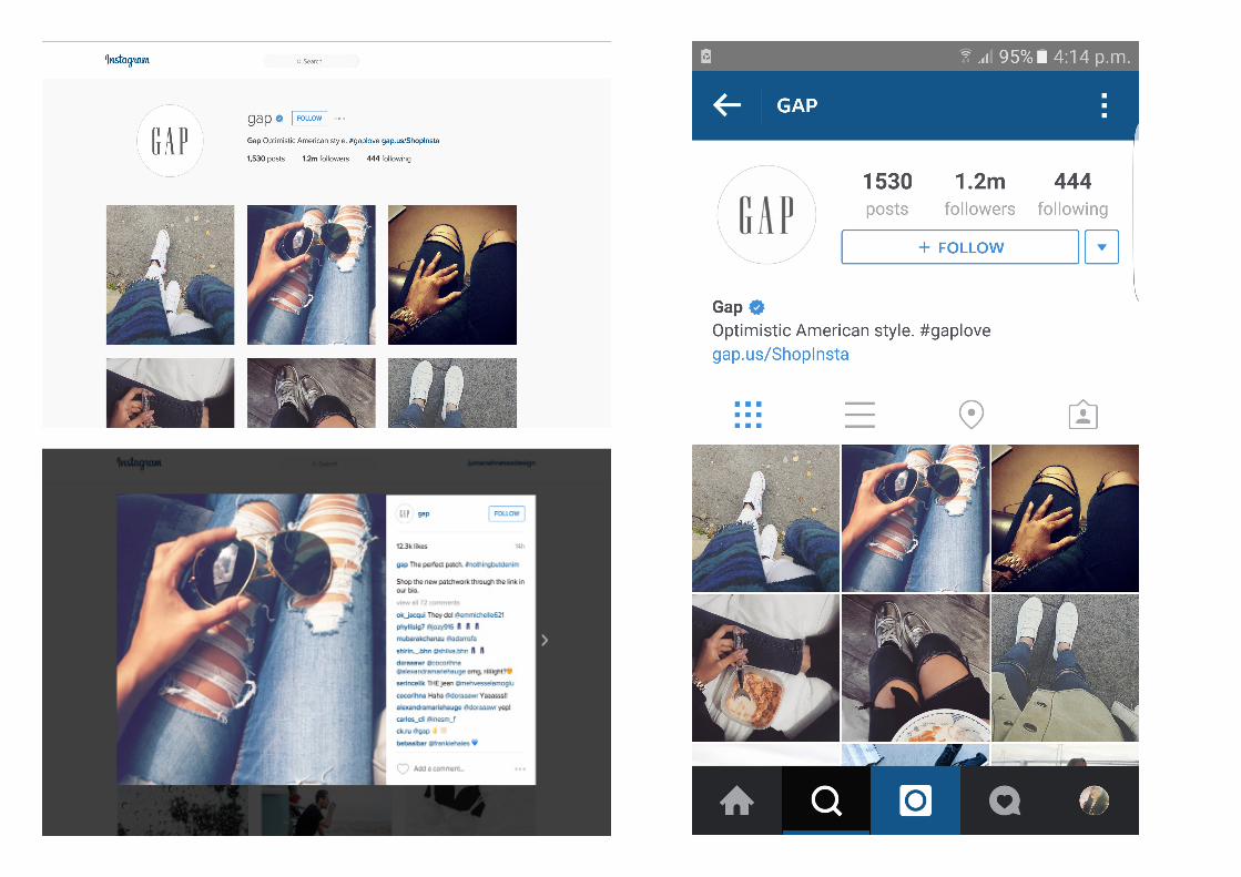
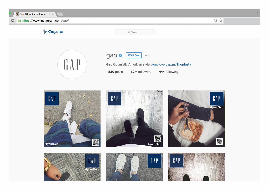
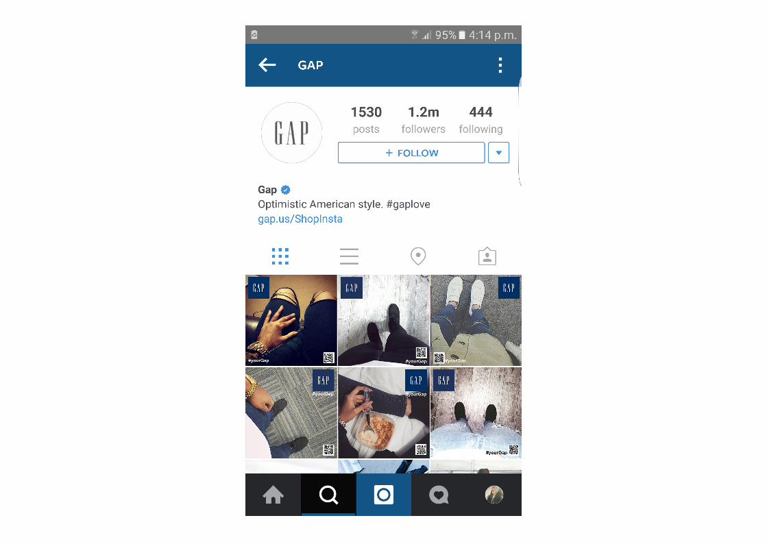
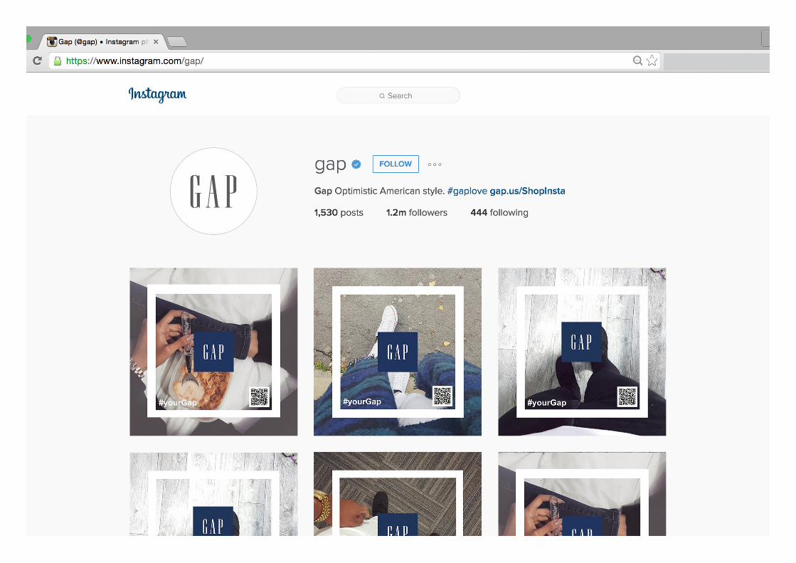
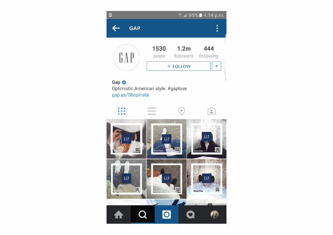
Here are some prototypes of how my campaign would look presented on Instagram. I have created mock ups of both mobile and desktop versions, as well as what the image would look like when clicked on.
These are not the finished designs as the final designs will have a slogan or tagline included in the design as well as a QR Code that will direct the viewer to Gap Denim online shopping.
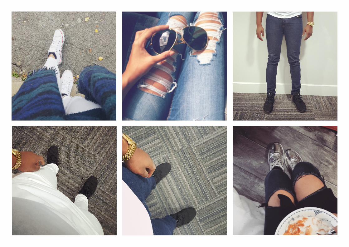
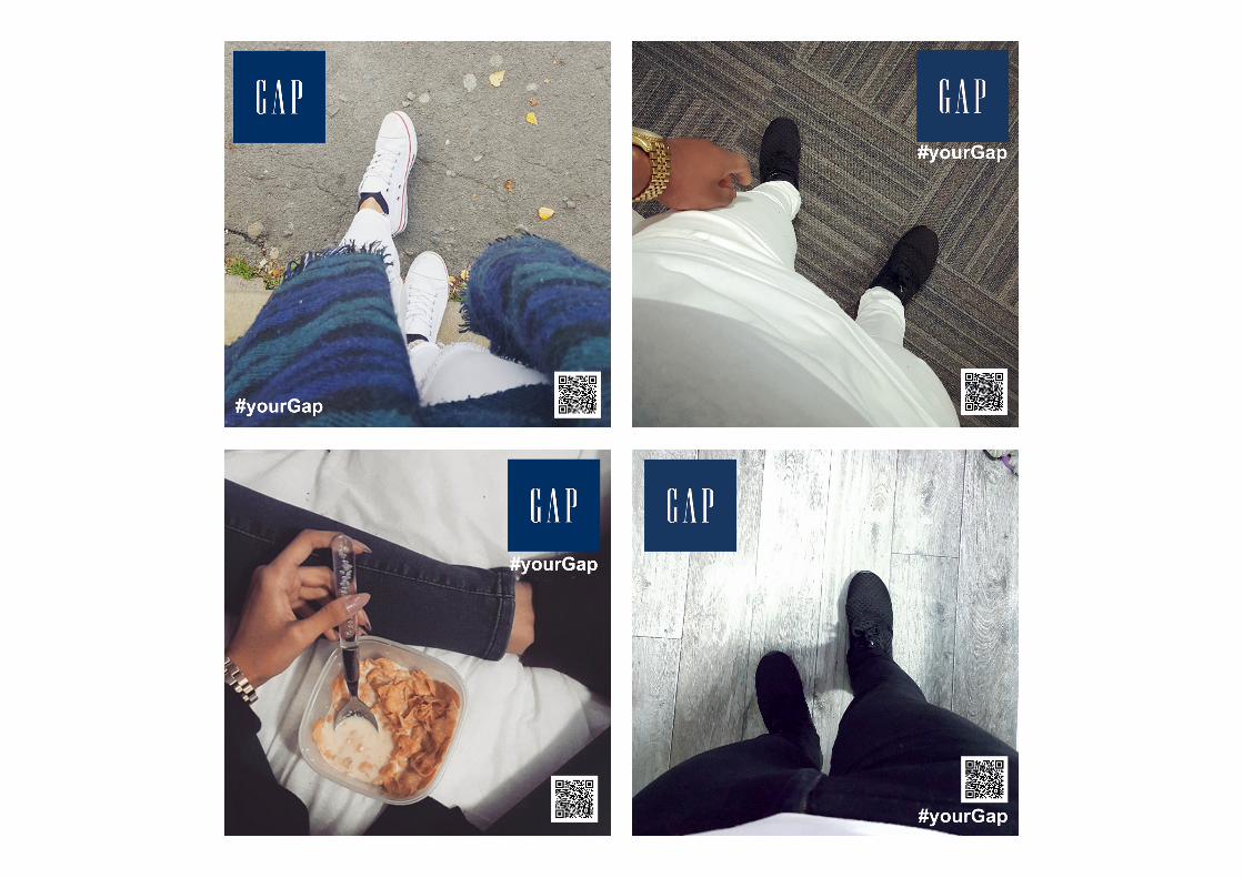
The overall theme of my campaign is “Your Gap”. To portray this I have taken a first person approach to my photographs as you can see. I have tried to show how denim/jeans can be styled in a variety of ways and in all environments. I have also shown how all people can ‘rock’ denim by including images of different races and cultural backgrounds. For example, the image with the hand with henna on and the images including a black male. This really shows Gap’s diversity and equality, by including both genders and a variety of ethnicity’s, which is exactly what Gap stands for. This really captures Gap’s “tone of voice”.
I will now create my final designs and will present them in the format below.
Prototypes.
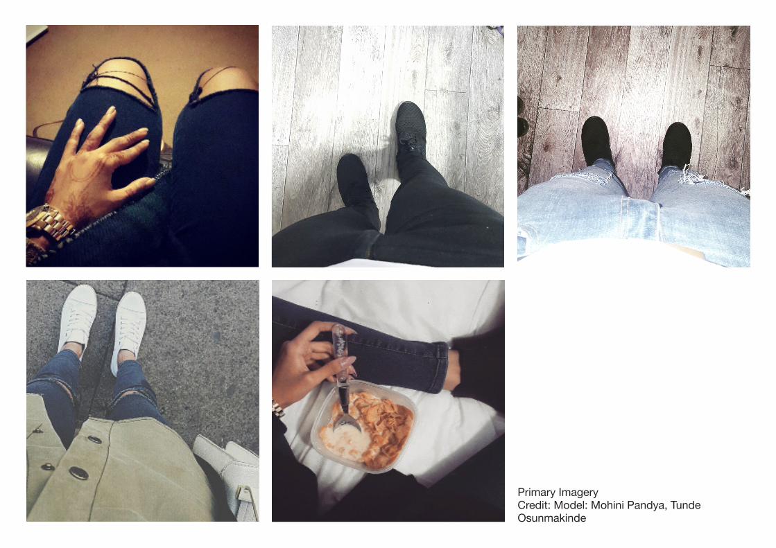
Primary ImageryCredit: Model: Mohini Pandya, Tunde Osunmakinde
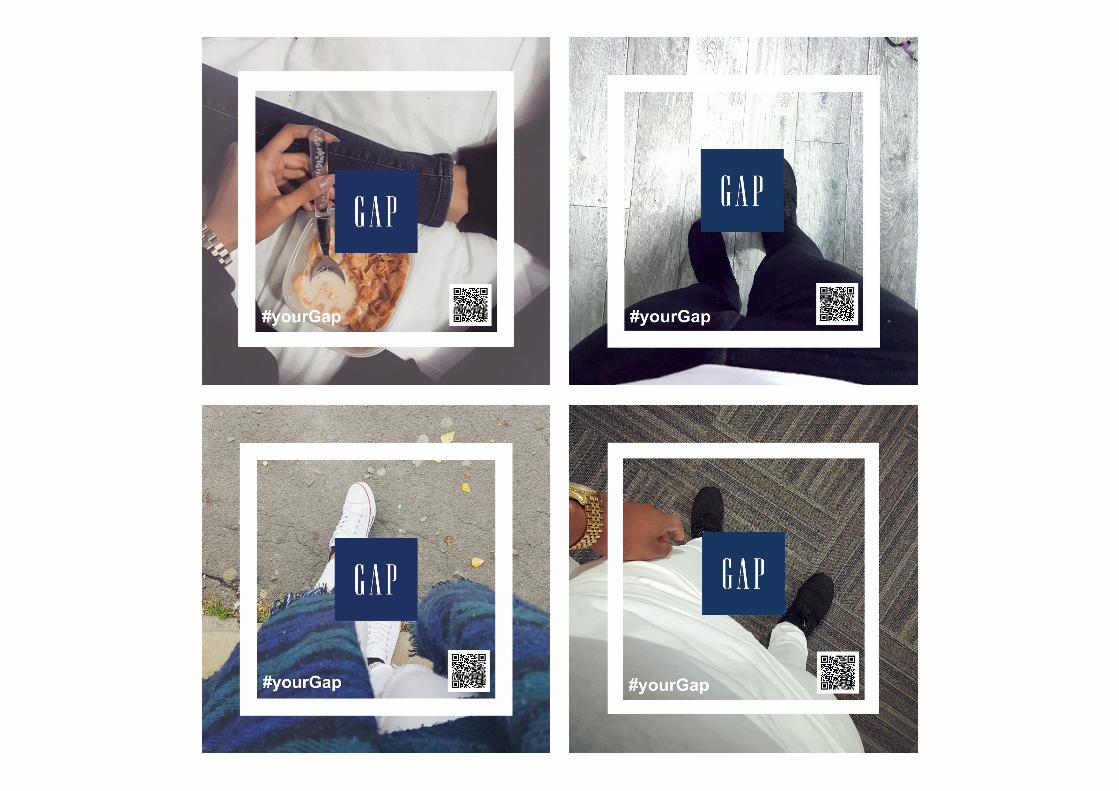
Final pieces.Here are my final pieces. I created these by first carrying out primary resarch which you can see above. As my concept was “your Gap” I decided to take a first person approach to my images to make the campaign more personal. This was quite difficult at first as I had to direct the models as to what angles and positions to take, however after a bit of experimenting I believe I created quite effective images.
To develop these, I began by editing them, adjusting the exposure, curve levels and saturation to create some pleasing photographs that I could use as a starting point. As one of the requirements of the brief was to include the Gap logo and a tagline, I have done exactly that. I also added a QR code which I generated myself that re-directs viewers who scan it to the Gap website. I believe this is what makes my outcomes more than just a design piece but also a working advertising piece.
I also thought about how I would attract potential customers to the Instagram page. This was quite simple as Instagram now has a sponsered post feature as well as the explore page, in which people do not have to be following the account to be directed to their page, these posts appear within a persons timeline. Another was is through Facebook. As Facebook now owns Instagram there is a lot of promotion of Instagram on Facebook’s site. I believe this promotion would easily attract viewers and combined with the QR code, would most definately attract more customers.
Overall I am extremely happy with my outcomes and how they work as a social media campaign. I believe they represent the company well, in an effective and useful way.
Evaluation.Overall, I found this project quite challenging at first, I found the set guidelines to be too restrictive, however, after understanding the limitations more I realised there really wasn’t that much restriction in regards to the actual design.
I have tried to capture Gap’s “American optimism” attitude within my pieces so they fit well with Gap’s already established modern, laid-back image. I did this as I wanted my campaign to work harmoniously with the apparel, for example it is obvious Gap does not use bright, child-like colours and so if I were to create a campaign using these colours it would not be visually appealing and would most likely negatively affect Gap’s reputation. Therefore, as you can see in my final outcomes, I have stuck to their minimalist and urban style.
I believe the extensive research I undertook allowed me to understand what Gap is truly about, their ethos and also enabled me to create more fitting pieces that worked well with their ‘tone of voice’, as well as the Gap products. Furthermore by researching into the history, social responsibility goals etc. I was able to portray these messages to the viewers.
In conclusion I have thoroughly enjoyed working on this brief, regardless of the limitations and struggles I had, I believe I have overall created an effective and purposeful campaign, which meets the aims of the brief, which was to create a social media campaign that educates 25-35 year olds about the benefits of Gap Denim.