Designing & Using Designing & Using Charts & GraphsCharts & Graphs Compiled by: Jim LucasModified by: Luke Reese

Overview
After this presentation, you should better understand:– Using the right chart or graph to
present your information– Design principles for charts and
graphs– How to lie and cheat with graphs,
numbers and statistics

Use the right tool
Percentage and Percentage and ProportionProportion
Pie, divided bar chart
RankingsRankings Visual table, bar or line graph
Cumulative Cumulative totalstotals
Layer or stacked graph
Value, time, Value, time, space space relationshipsrelationships
Diagram, chart, or map
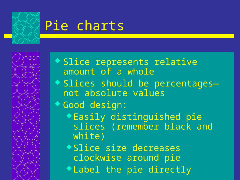
Pie charts
Slice represents relative amount of a whole
Slices should be percentages—not absolute values
Good design:Easily distinguished pie slices
(remember black and white)Slice size decreases clockwise
around pieLabel the pie directly
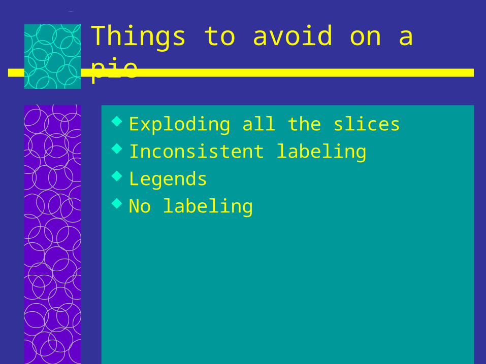
Things to avoid on a pie
Exploding all the slices Inconsistent labeling Legends No labeling
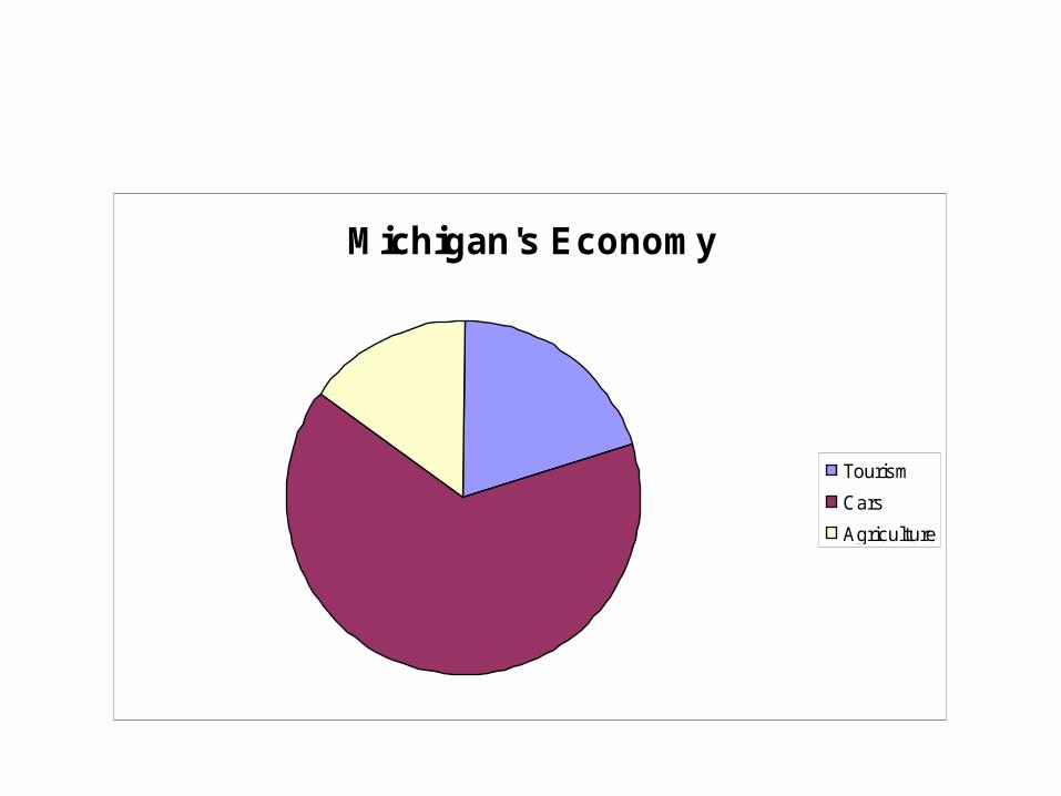
Michigan's Economy
Tourism
Cars
Agriculture
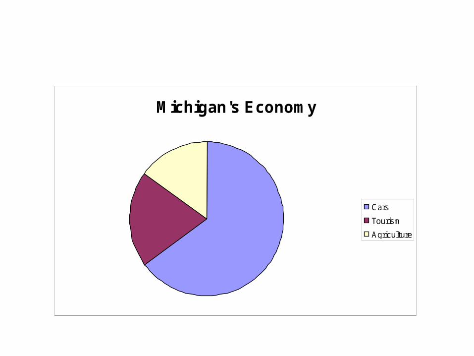
Michigan's Economy
Cars
Tourism
Agriculture

Industry Contribution to Michigan's 2002 Economy
Cars65%
Tourism20%
Agriculture15%

Proportional bar chart
Used to show proportional amounts as a pie chart
Use side scale for more precise measures
Make it wide enough to read If you have multiple bars, put the
least varying factors first

Cattle Loss in Michigan
Disease
Predation
Other
0
20
40
60
80
100
120
% L
os
s

Bar charts
Use to show change in ordinal or nominal data
Usually vertical, but use horizontal if it makes sense
Color code consistently Avoid over emphasizing one line If you use a legend, have it follow
the order of your bars

Cattle Loss
7060
80
2030
510 1015
0
20
40
60
80
100
Michigan Montana Hawaii
State
% L
os
s Disease
Predation
Other
Cattle Loss
70
2010
60
30
10
80
515
0
20
40
60
80
100
Disease Predation Other
Cause
% L
oss Michigan
Montana
Hawaii

Line graphs
Used to show change in trends and continuous data
Vary color or line weight to call attention to specific points
Points on the line are important for precise values
Be consistent with labeling

Line graphs continued
Put warm, bright colored lines on top
Use a scale that accurately reflects the change in information

Currency Exchange Rate (US to NZ) for first day of Month, 2002
1.8
1.9
2
2.1
2.2
2.3
2.4
2.5
2002
US
to
NZ
Exc
han
ge
Rat
e
Picture chart or graph
You can use pictures in the place of a bar chart or graph
Follow color and theme conventions
Have the pictures align in the same direction
Vary size not color or shading

Palm Tree Growth
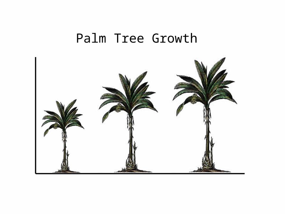
Palm Tree Growth

Tips for diagrams and maps
Follow the culture of the information
Identify relationships on a chart Use color, line weight, shading to
organize information Show only relevant information Avoid gridlines unless needed

A N R E C S S tru c tu re
A d m in is tra tiveA ss is tan t
S ta ff
F acu lty
A ss is tan tC h a ir
S p ec ia lis ts
Tech n o log yM an ag er
In fo rm ation O ffice rs
C om m u n ica tion sM an ag er
D ep artm en tC h a irp erson

Lying with graphsLying with graphs
Altering the y-axis Distorted shapes Uneven start point Using color, lines or other
technique to distort differences Using 3-D effects or distortions

Michigan’s Economy
Tourism
CarsAgriculture

Cattle Loss in Michigan
Disease
Predation
Other
0
20
40
60
80
100
120
% L
os
s

Lying charts and statisticsLying charts and statistics
Percentages and absolute values Numbers are relative Squishy numbers and figures Value labels Error
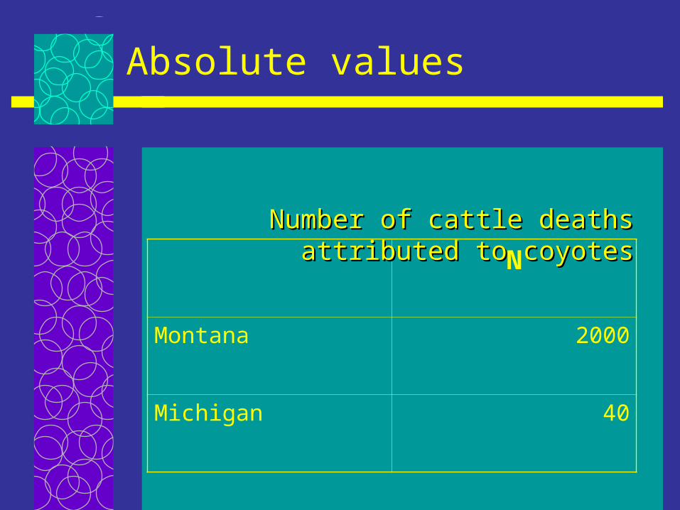
Absolute values
N
Montana 2000
Michigan 40
Number of cattle deaths Number of cattle deaths attributed to coyotesattributed to coyotes
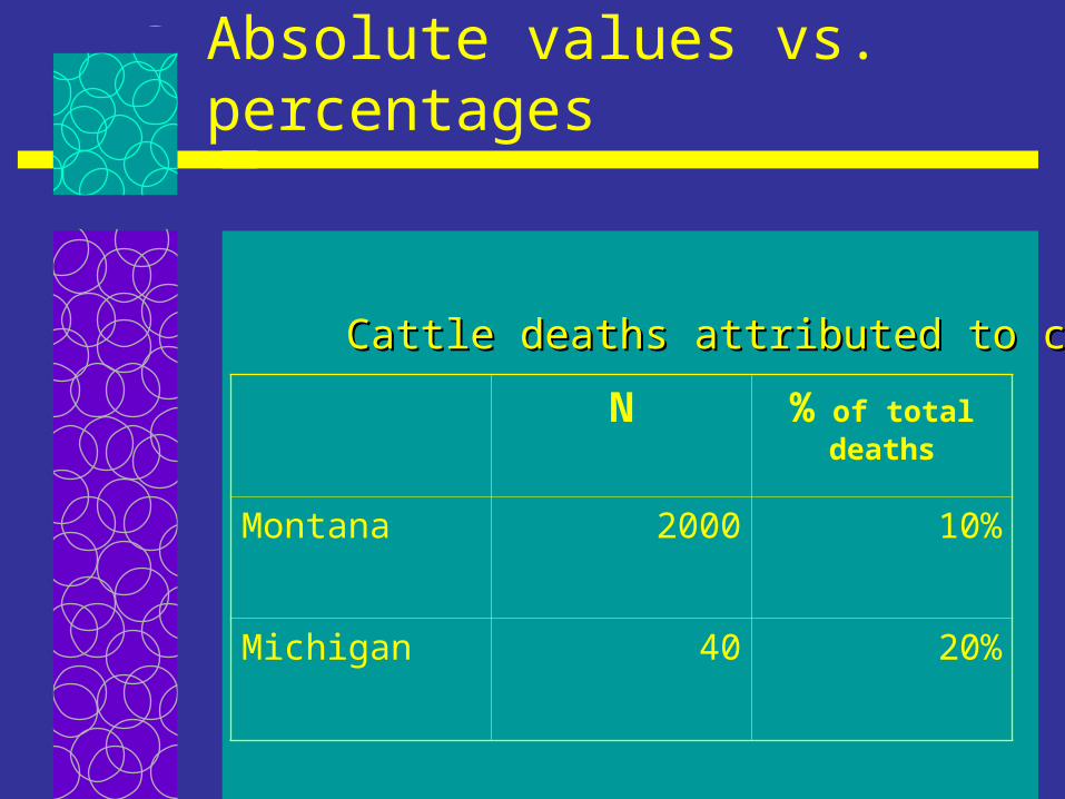
Absolute values vs. percentages
N % of total deaths
Montana 2000 10%
Michigan 40 20%
Cattle deaths attributed to coyotesCattle deaths attributed to coyotes

Relativity
N % of total deaths
Montana 2000 10%
Michigan 40 20%
Cattle deaths attributed to coyotes over 5 yearsCattle deaths attributed to coyotes over 5 years

Relativity II
N Monetary Loss
% loss of total sales
Montana 2000 500 9%
Michigan 40 100 20%
Cattle deaths attributed to coyotes over 5 yearsCattle deaths attributed to coyotes over 5 years
Recommended