DIGIPAKFINAL DESIGNS
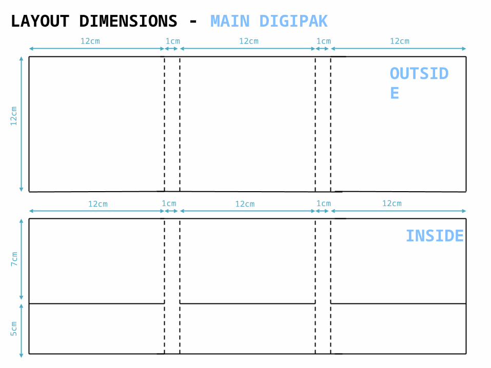
12cm 12cm 12cm1cm
12cm 12cm 12cm
7cm
5cm
1cm
12
cmLAYOUT DIMENSIONS - MAIN DIGIPAK
1cm 1cm
OUTSIDE
INSIDE
12cm
4cm
5cm
10cm
10cm
8cm
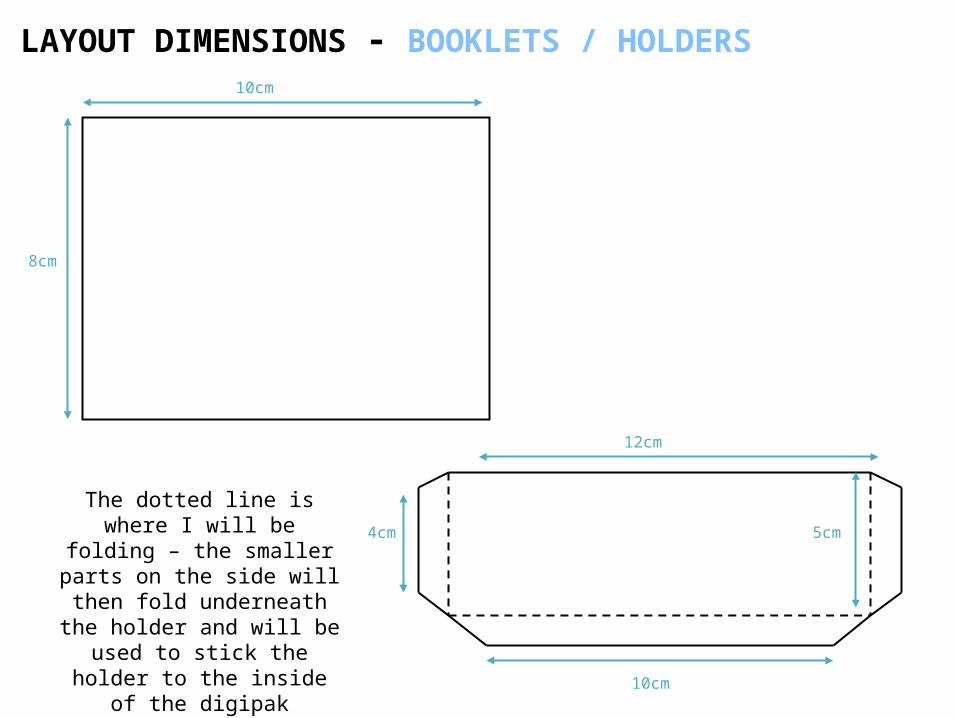
LAYOUT DIMENSIONS - BOOKLETS / HOLDERS
The dotted line is where I will be folding – the
smaller parts on the side will then fold underneath
the holder and will be used to stick the holder to the inside of the digipak
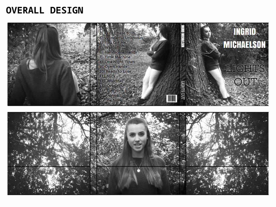
OVERALL DESIGN
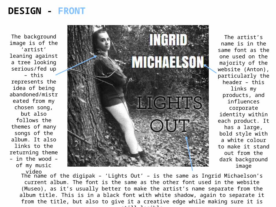
DESIGN - FRONT
The background image is of the ‘artist’ leaning against a tree
looking serious/fed up – this
represents the idea of being
abandoned/mistreated from my
chosen song, but also follows the themes of many
songs of the album. It also links
to the returning theme – in the wood – of my music video
The artist’s name is in the same font as the one used on the majority of the website (Anton), particularly the
header – this links my products, and
influences corporate identity
within each product. It has a large, bold style
with a white colour to make it stand out from the dark background image
The name of the digipak – ‘Lights Out’ – is the same as Ingrid Michaelson’s current album. The font is the same as the other font used in the website (Museo), as it’s usually better to
make the artist’s name separate from the album title. This is in a black font with white shadow, again to separate it from the title, but also to give it a creative edge while making
sure it is still legible
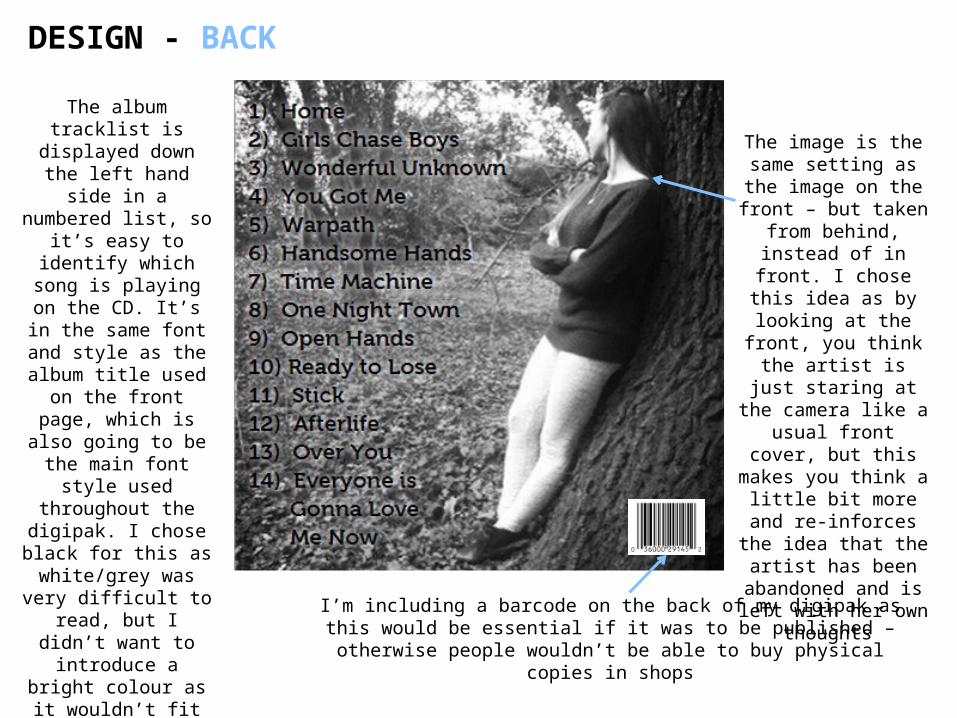
DESIGN - BACK
The album tracklist is displayed down
the left hand side in a numbered list, so it’s easy to identify
which song is playing on the CD.
It’s in the same font and style as the
album title used on the front page,
which is also going to be the main font
style used throughout the digipak. I chose black for this as
white/grey was very difficult to read, but
I didn’t want to introduce a bright
colour as it wouldn’t fit the digipak’s
theme
The image is the same setting as the image on the front –
but taken from behind, instead of in
front. I chose this idea as by looking at the front, you think the artist is just staring at the
camera like a usual front cover, but this makes you think a little bit more and
re-inforces the idea that the artist has been abandoned
and is left with her own thoughts
I’m including a barcode on the back of my digipak as this would be essential if it was to be published – otherwise people
wouldn’t be able to buy physical copies in shops
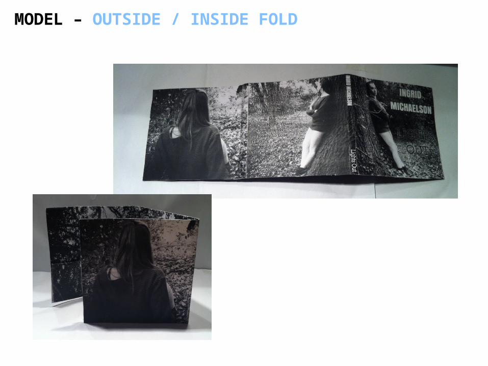
DESIGN - INSIDE FOLD
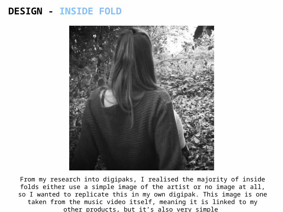
From my research into digipaks, I realised the majority of inside folds either use a simple image of the artist or no image at all, so I wanted to replicate this in my own digipak. This image is one taken from the music video itself, meaning
it is linked to my other products, but it’s also very simple
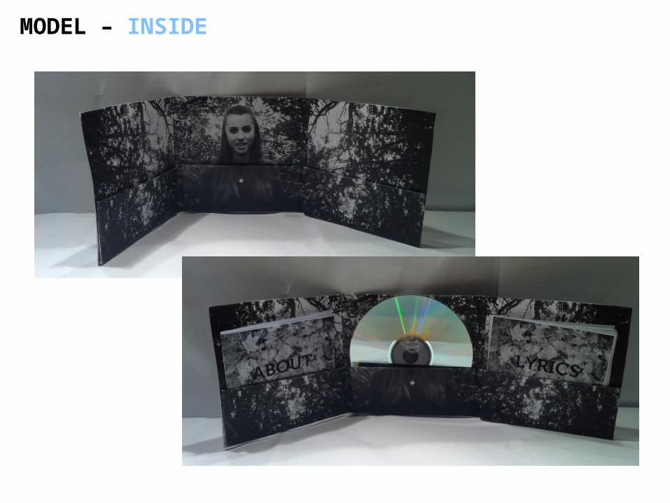
DESIGN - INSIDE LEFT/RIGHT
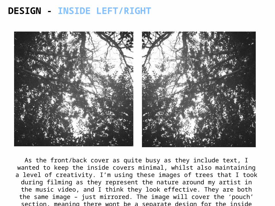
As the front/back cover as quite busy as they include text, I wanted to keep the inside covers minimal, whilst also maintaining a level of creativity. I’m using these images of trees that I took during filming as they represent the nature around my artist in the music video, and I think they look effective. They are
both the same image – just mirrored. The image will cover the ‘pouch’ section, meaning there wont be a separate design for the inside cover / pouch.
DESIGN - INSIDE CENTRE
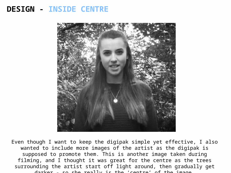
Even though I want to keep the digipak simple yet effective, I also wanted to include more images of the artist as the digipak is supposed to promote them. This is another image taken during filming, and I thought it was great for the
centre as the trees surrounding the artist start off light around, then gradually get darker - so she really is the ‘centre’ of the image.
DESIGN – FOLDING POINTS
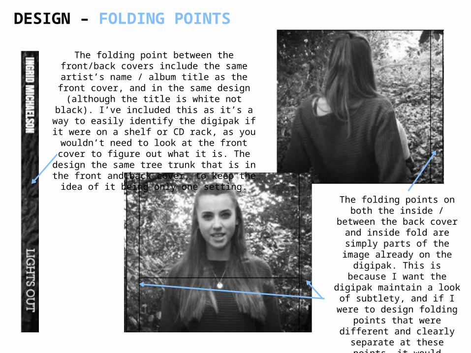
The folding points on both the inside / between the
back cover and inside fold are simply parts of the image already on the
digipak. This is because I want the digipak maintain a look of subtlety, and if I
were to design folding points that were different and clearly separate at these points, it would
detract from the theme / flow of the design
The folding point between the front/back covers include the same artist’s name / album title as the front cover, and in the
same design (although the title is white not black). I’ve included this as it’s a way to
easily identify the digipak if it were on a shelf or CD rack, as you wouldn’t need to look at the front cover to figure out what it is. The
design the same tree trunk that is in the front and back cover, to keep the idea of it being
only one setting.
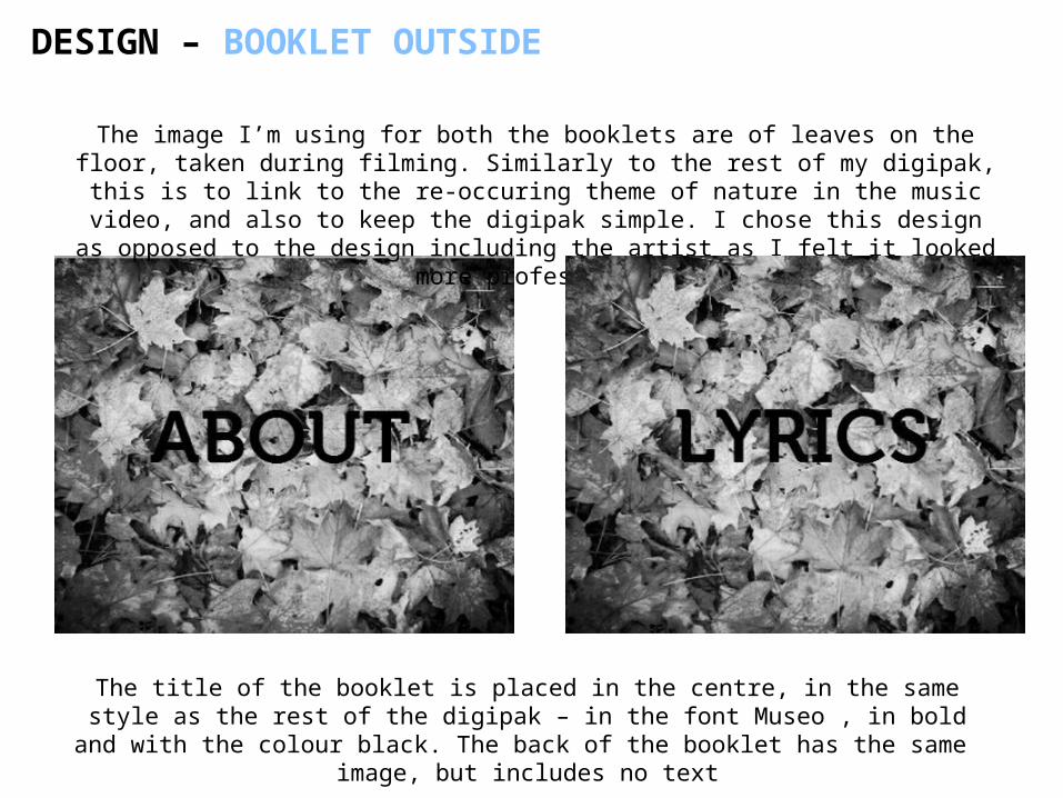
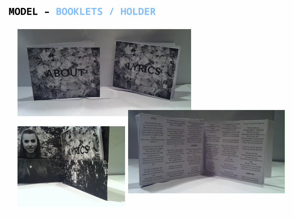
DESIGN – BOOKLET OUTSIDE
The image I’m using for both the booklets are of leaves on the floor, taken during filming. Similarly to the rest of my digipak, this is to link to the re-occuring theme of nature in the music video, and also to keep the digipak
simple. I chose this design as opposed to the design including the artist as I felt it looked more professional
The title of the booklet is placed in the centre, in the same style as the rest of the digipak – in the font Museo , in bold and with the colour black. The back of
the booklet has the same image, but includes no text
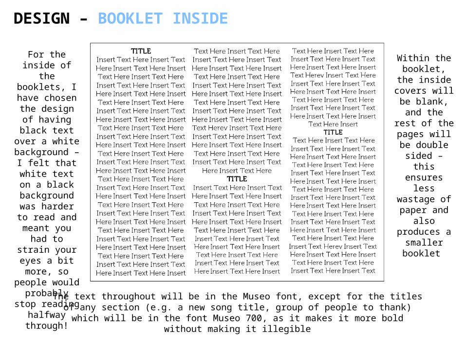
DESIGN – BOOKLET INSIDE
For the inside of the
booklets, I have chosen the design of having black text over a
white background – I felt that white text on a black
background was harder to
read and meant you had to strain your
eyes a bit more, so
people would probably stop
reading halfway through!The text throughout will be in the Museo font, except for the titles of any section
(e.g. a new song title, group of people to thank) which will be in the font Museo 700, as it makes it more bold without making it illegible
Within the booklet, the inside covers will be blank, and the rest of the pages
will be double sided – this ensures less wastage of paper and
also produces a smaller booklet
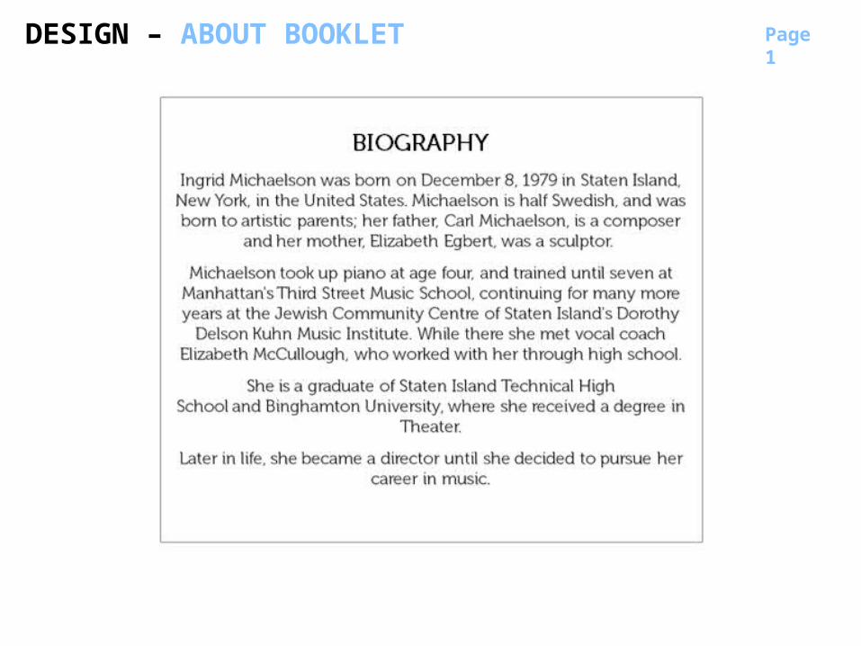
BIOGRAPHY
DESIGN – ABOUT BOOKLET Page 1
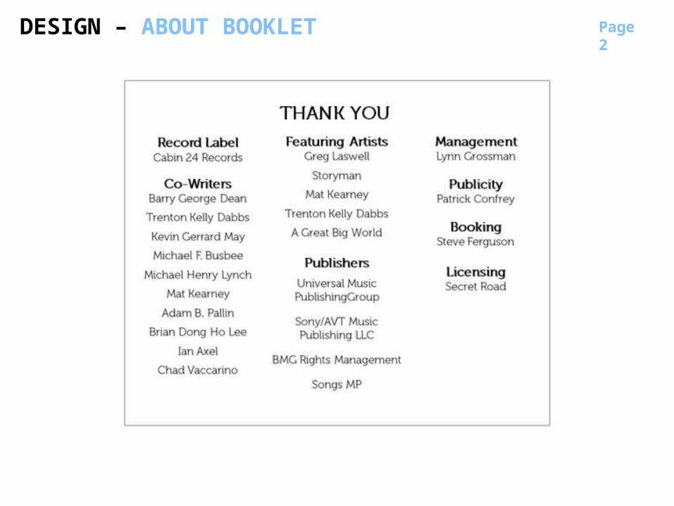
THANK YOU
Page 2
DESIGN – ABOUT BOOKLET

DESIGN - LYRIC BOOKLET Page 1
Page 2
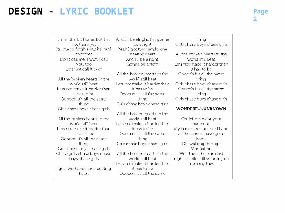
DESIGN - LYRIC BOOKLET
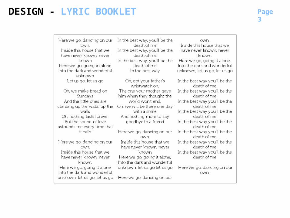
Page 3
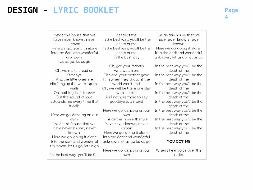
DESIGN - LYRIC BOOKLET
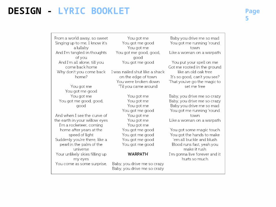
Page 4
DESIGN - LYRIC BOOKLET
Page 5
DESIGN - LYRIC BOOKLET
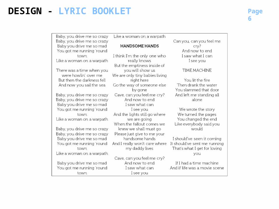
Page 6
DESIGN - LYRIC BOOKLET
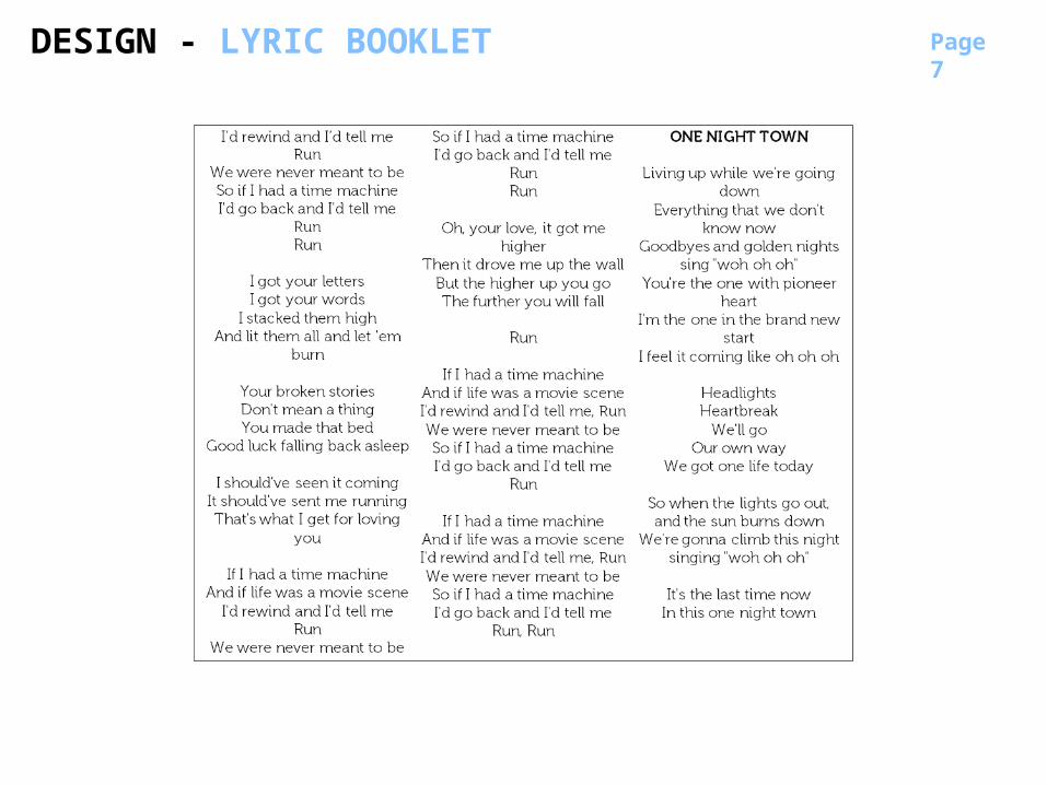
Page 7
DESIGN - LYRIC BOOKLET
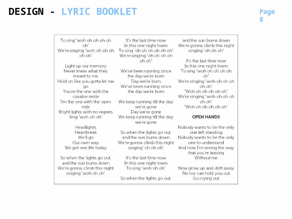
Page 8
DESIGN - LYRIC BOOKLET
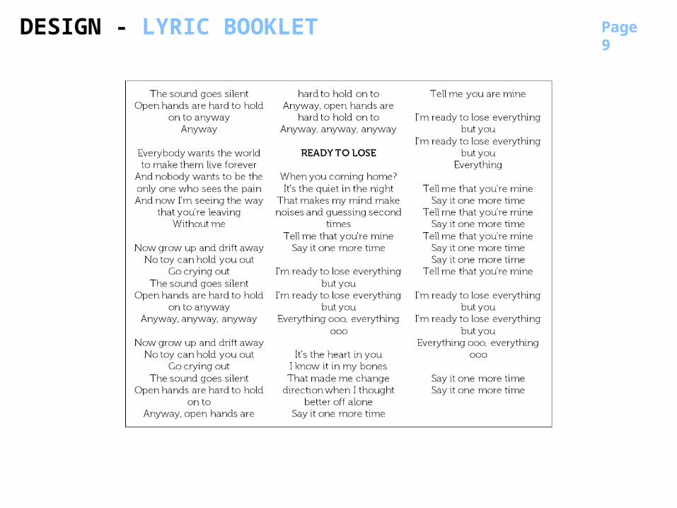
Page 9
DESIGN - LYRIC BOOKLET
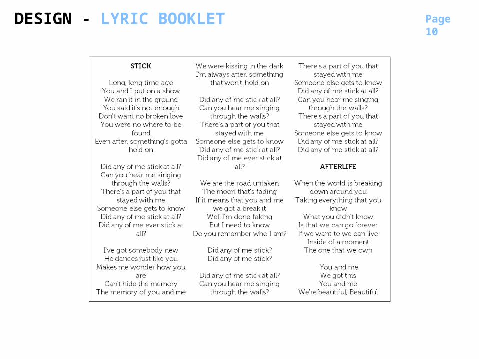
Page 10
DESIGN - LYRIC BOOKLET
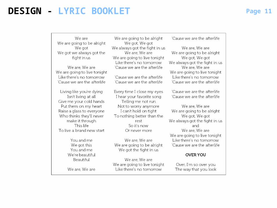
Page 11DESIGN - LYRIC BOOKLET
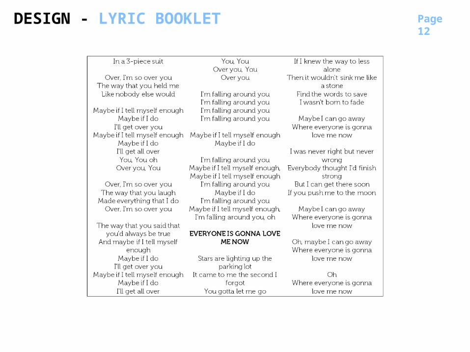
Page 12
DESIGN - LYRIC BOOKLET
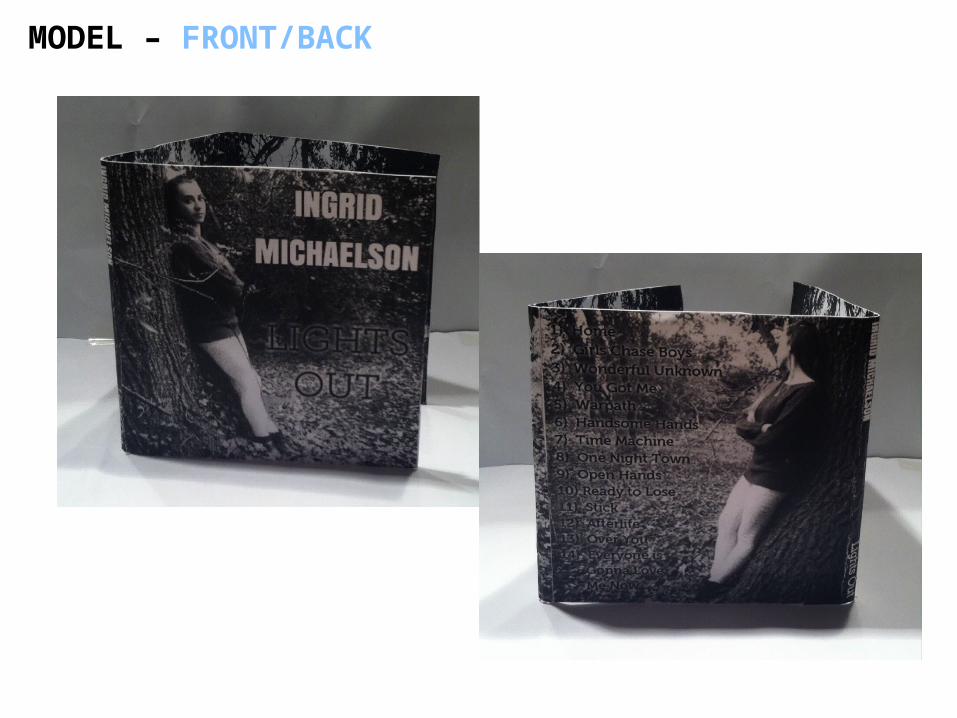
MODEL – FRONT/BACK
MODEL – OUTSIDE / INSIDE FOLD
MODEL – INSIDE
MODEL – BOOKLETS / HOLDER
Recommended