LTLittle Tikes
Corporate Design Manual
Table of Contents1. Introduction 3.2. Coporate Identity 5. Logo 6.
Colors 8.

Introduction
1. Introduction
The design manual was created to formulate the guidlines for the Little Tikes design brand. It has been proven that the brand for the company is its most valued component, as this gives the backbone for the corporation. Customers value a brand that is both true to its ori-gins and consistent with the time as this creates the trust between con-sumer and company.
Corporations must also differentiate itself from other companies and brands, as we must stand out above the rest. The dynamic, unique, and current design of a companys logo is its best chance to be distin-guished among the rest.
Introduction
Corporate Identity
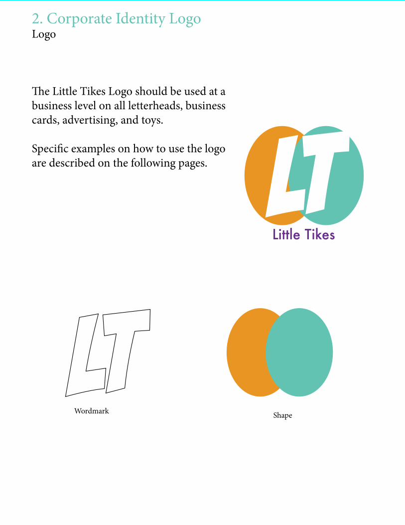
2. Corporate Identity LogoLogo
The Little Tikes Logo should be used at a business level on all letterheads, business cards, advertising, and toys.
Specific examples on how to use the logo are described on the following pages.
Corporate Identity Logo
LTLittle Tikes
Shape
LTWordmark
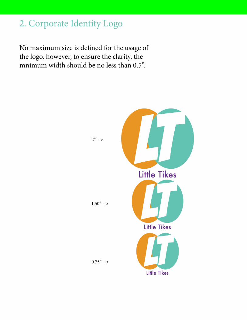
2. Corporate Identity Logo
No maximum size is defined for the usage of the logo. however, to ensure the clarity, the mnimum width should be no less than 0.5”.
LTLittle Tikes
LTLittle Tikes
LTLittle Tikes
2” -->
1.50” -->
0.75” -->

2. Coporate IndentityColors
The Little Tikes coporate colors are teal, orange, purple and white. Make a combination with a multiple transparency between them.
LTLittle Tikes
Logo ReversedThe logo or symbol may be reversed on any background color provided.
LTLittle Tikes LT
Little Tikes
LTLittle Tikes

designs
Recommended