MAGAZINE COVER OVERVIEW
By Rebecca Dahl
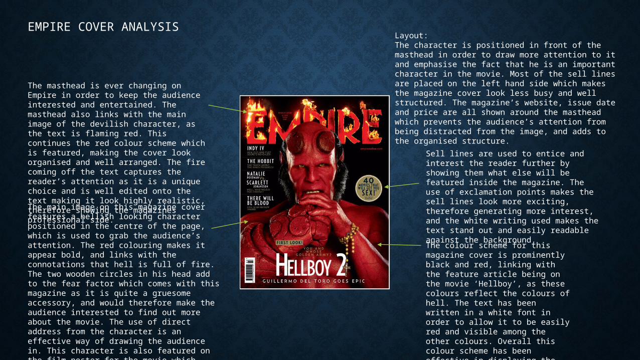
The main image on this magazine cover features a hellish looking character positioned in the centre of the page, which is used to grab the audience’s attention. The red colouring makes it appear bold, and links with the connotations that hell is full of fire. The two wooden circles in his head add to the fear factor which comes with this magazine as it is quite a gruesome accessory, and would therefore make the audience interested to find out more about the movie. The use of direct address from the character is an effective way of drawing the audience in. This character is also featured on the film poster for the movie which creates a symbiotic link between the two texts.
The masthead is ever changing on Empire in order to keep the audience interested and entertained. The masthead also links with the main image of the devilish character, as the text is flaming red. This continues the red colour scheme which is featured, making the cover look organised and well arranged. The fire coming off the text captures the reader’s attention as it is a unique choice and is well edited onto the text making it look highly realistic, therefore showing the magazines professional side.
Sell lines are used to entice and interest the reader further by showing them what else will be featured inside the magazine. The use of exclamation points makes the sell lines look more exciting, therefore generating more interest, and the white writing used makes the text stand out and easily readable against the background.
The colour scheme for this magazine cover is prominently black and red, linking with the feature article being on the movie ‘Hellboy’, as these colours reflect the colours of hell. The text has been written in a white font in order to allow it to be easily red and visible among the other colours. Overall this colour scheme has been effective in displaying the information and looking well presented.
Layout:The character is positioned in front of the masthead in order to draw more attention to it and emphasise the fact that he is an important character in the movie. Most of the sell lines are placed on the left hand side which makes the magazine cover look less busy and well structured. The magazine’s website, issue date and price are all shown around the masthead which prevents the audience’s attention from being distracted from the image, and adds to the organised structure.
EMPIRE COVER ANALYSIS
FANGORIA COVER ANALYSIS
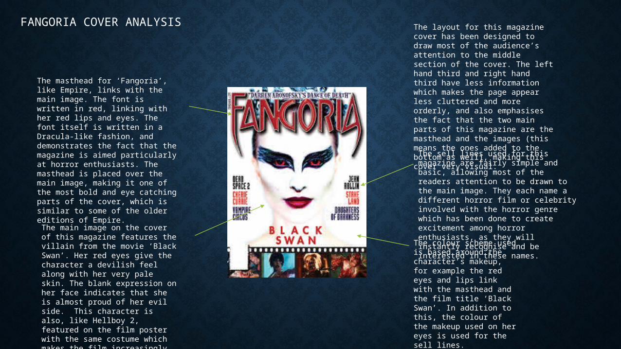
The masthead for ‘Fangoria’, like Empire, links with the main image. The font is written in red, linking with her red lips and eyes. The font itself is written in a Dracula-like fashion, and demonstrates the fact that the magazine is aimed particularly at horror enthusiasts. The masthead is placed over the main image, making it one of the most bold and eye catching parts of the cover, which is similar to some of the older editions of Empire.
The main image on the cover of this magazine features the villain from the movie ‘Black Swan’. Her red eyes give the character a devilish feel along with her very pale skin. The blank expression on her face indicates that she is almost proud of her evil side. This character is also, like Hellboy 2, featured on the film poster with the same costume which makes the film increasingly recognisable for the audience.
The layout for this magazine cover has been designed to draw most of the audience’s attention to the middle section of the cover. The left hand third and right hand third have less information which makes the page appear less cluttered and more orderly, and also emphasises the fact that the two main parts of this magazine are the masthead and the images (this means the ones added to the bottom as well), making this cover very visual. The sell lines used for this magazine are fairly simple and basic, allowing most of the readers attention to be drawn to the main image. They each name a different horror film or celebrity involved with the horror genre which has been done to create excitement among horror enthusiasts, as they will instantly recognise and be interested in these names. The colour scheme used is
based around the character’s makeup, for example the red eyes and lips link with the masthead and the film title ‘Black Swan’. In addition to this, the colour of the makeup used on her eyes is used for the sell lines.
TOTAL FILM ANALYSIS
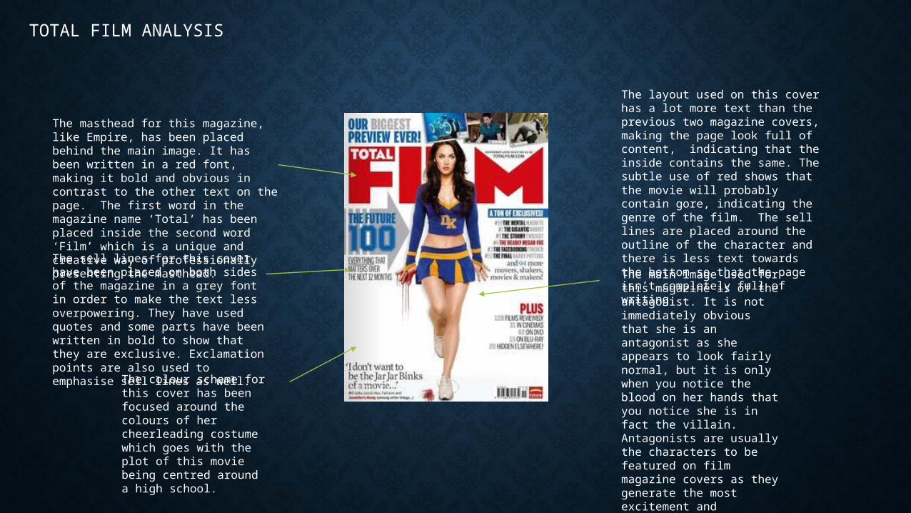
The masthead for this magazine, like Empire, has been placed behind the main image. It has been written in a red font, making it bold and obvious in contrast to the other text on the page. The first word in the magazine name ‘Total’ has been placed inside the second word ‘Film’ which is a unique and creative way of professionally presenting the masthead.
The main image used for this magazine is of the antagonist. It is not immediately obvious that she is an antagonist as she appears to look fairly normal, but it is only when you notice the blood on her hands that you notice she is in fact the villain. Antagonists are usually the characters to be featured on film magazine covers as they generate the most excitement and speculation among viewers.
The sell lines for this cover have been placed on both sides of the magazine in a grey font in order to make the text less overpowering. They have used quotes and some parts have been written in bold to show that they are exclusive. Exclamation points are also used to emphasise sell lines as well.
The colour scheme for this cover has been focused around the colours of her cheerleading costume which goes with the plot of this movie being centred around a high school.
The layout used on this cover has a lot more text than the previous two magazine covers, making the page look full of content, indicating that the inside contains the same. The subtle use of red shows that the movie will probably contain gore, indicating the genre of the film. The sell lines are placed around the outline of the character and there is less text towards the bottom so that the page isn’t completely full of writing.
FANGORIA ANALYSIS
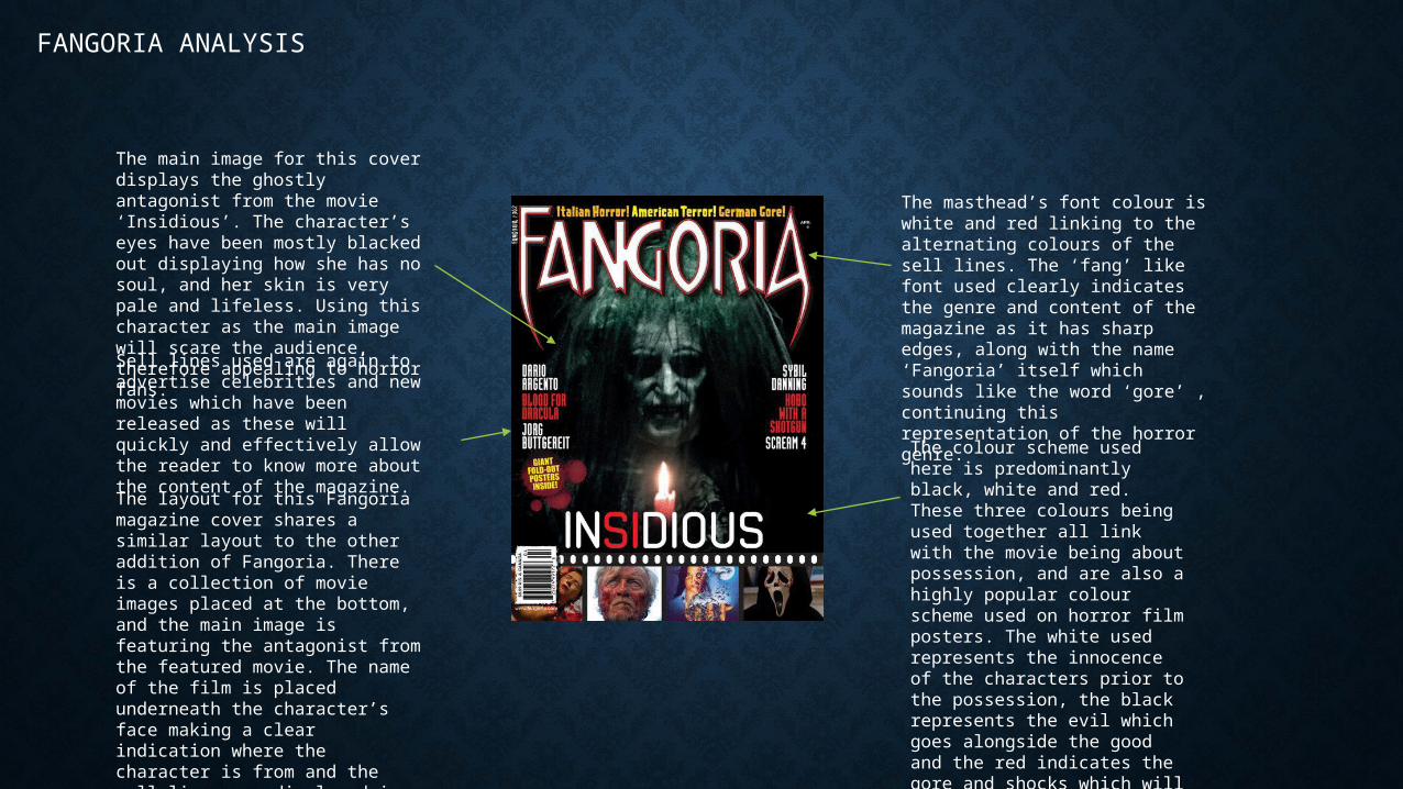
The main image for this cover displays the ghostly antagonist from the movie ‘Insidious’. The character’s eyes have been mostly blacked out displaying how she has no soul, and her skin is very pale and lifeless. Using this character as the main image will scare the audience, therefore appealing to horror fans.
The masthead’s font colour is white and red linking to the alternating colours of the sell lines. The ‘fang’ like font used clearly indicates the genre and content of the magazine as it has sharp edges, along with the name ‘Fangoria’ itself which sounds like the word ‘gore’ , continuing this representation of the horror genre.
Sell lines used are again to advertise celebrities and new movies which have been released as these will quickly and effectively allow the reader to know more about the content of the magazine. The layout for this Fangoria magazine cover shares a similar layout to the other addition of Fangoria. There is a collection of movie images placed at the bottom, and the main image is featuring the antagonist from the featured movie. The name of the film is placed underneath the character’s face making a clear indication where the character is from and the sell lines are displayed in alternating font colours.
The colour scheme used here is predominantly black, white and red. These three colours being used together all link with the movie being about possession, and are also a highly popular colour scheme used on horror film posters. The white used represents the innocence of the characters prior to the possession, the black represents the evil which goes alongside the good and the red indicates the gore and shocks which will be within the movie.
EMPIRE ANALYSIS
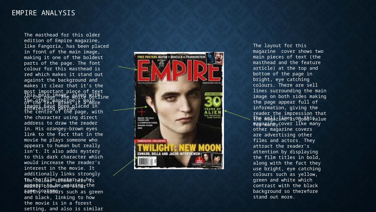
The masthead for this older edition of Empire magazine, like Fangoria, has been placed in front of the main image, making it one of the boldest parts of the page. The font colour for this masthead is red which makes it stand out against the background and makes it clear that it’s the most important piece of text on the page. The white outline of the text gives it a more interesting design. This main image, along with the other magazine’s main images have been placed in the centre of the page, with the character using direct address to draw the reader in. His orangey-brown eyes link to the fact that in the movie he plays someone who appears to human but really isn’t. It also adds mystery to this dark character which would increase the reader’s interest in the movie. It additionally links strongly to the film poster as he appears to be wearing the same costume.
The sell lines on this magazine cover like many other magazine covers are advertising other films and actors. They attract the reader’s attention by displaying the film titles in bold, along with the fact they use bright, eye catching colours such as yellow, green and white which contrast with the black background so therefore stand out more.
The layout for this magazine cover shows two main pieces of text (the masthead and the feature article) at the top and bottom of the page in bright, eye catching colours. There are sell lines surrounding the main image on both sides making the page appear full of information, giving the reader the impression that the magazine is good value for money.
The colour scheme here is mainly brown and other earthy colours such as green and black, linking to how the movie is in a forest setting, and also is similar to the film poster.
TOTAL FILM ANALYSIS
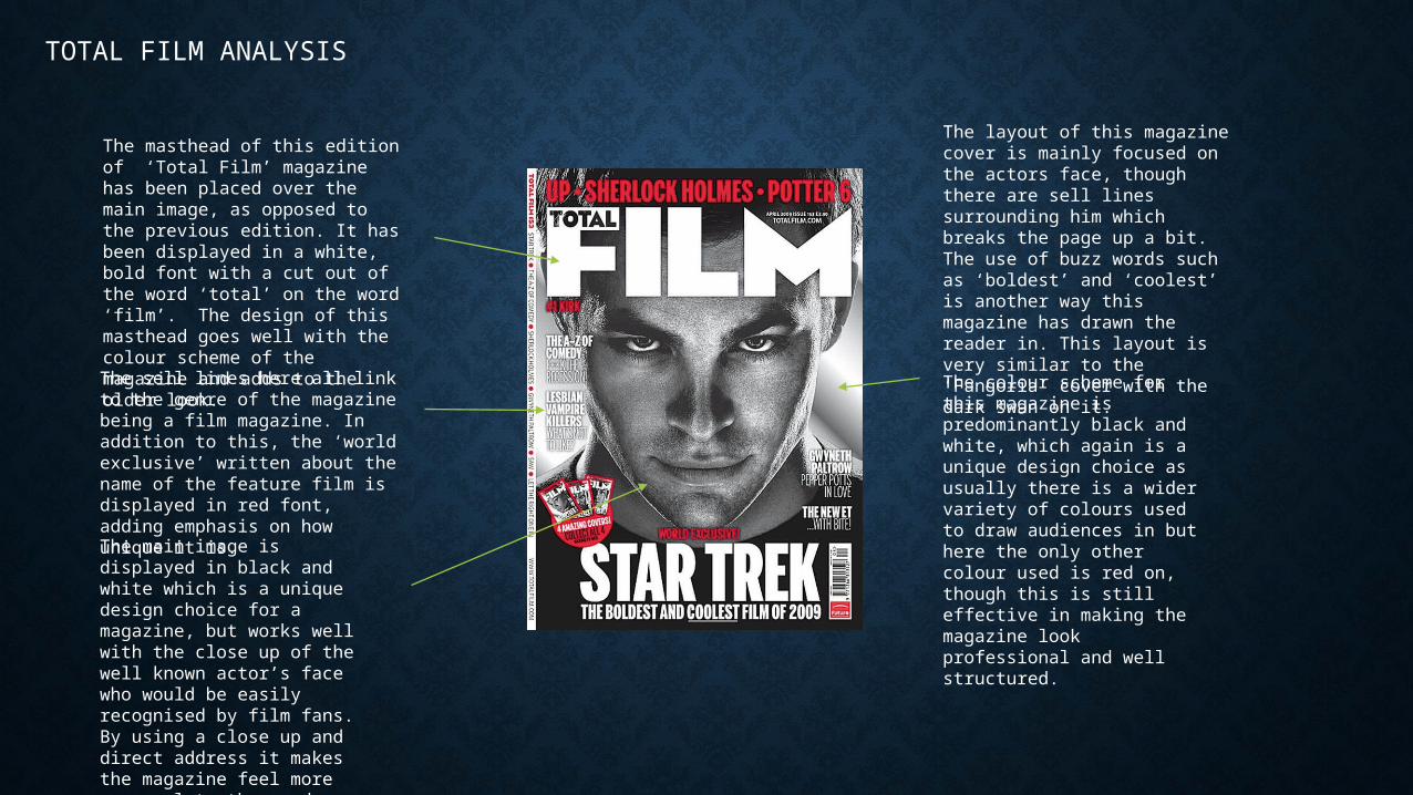
The masthead of this edition of ‘Total Film’ magazine has been placed over the main image, as opposed to the previous edition. It has been displayed in a white, bold font with a cut out of the word ‘total’ on the word ‘film’. The design of this masthead goes well with the colour scheme of the magazine and adds to the older look.The sell lines here all link to the genre of the magazine being a film magazine. In addition to this, the ‘world exclusive’ written about the name of the feature film is displayed in red font, adding emphasis on how unique it is.
The colour scheme for this magazine is predominantly black and white, which again is a unique design choice as usually there is a wider variety of colours used to draw audiences in but here the only other colour used is red on, though this is still effective in making the magazine look professional and well structured.
The main image is displayed in black and white which is a unique design choice for a magazine, but works well with the close up of the well known actor’s face who would be easily recognised by film fans. By using a close up and direct address it makes the magazine feel more personal to the reader.
The layout of this magazine cover is mainly focused on the actors face, though there are sell lines surrounding him which breaks the page up a bit. The use of buzz words such as ‘boldest’ and ‘coolest’ is another way this magazine has drawn the reader in. This layout is very similar to the ‘Fangoria’ cover with the dark swan on it.
EMPIRE ANALYSIS
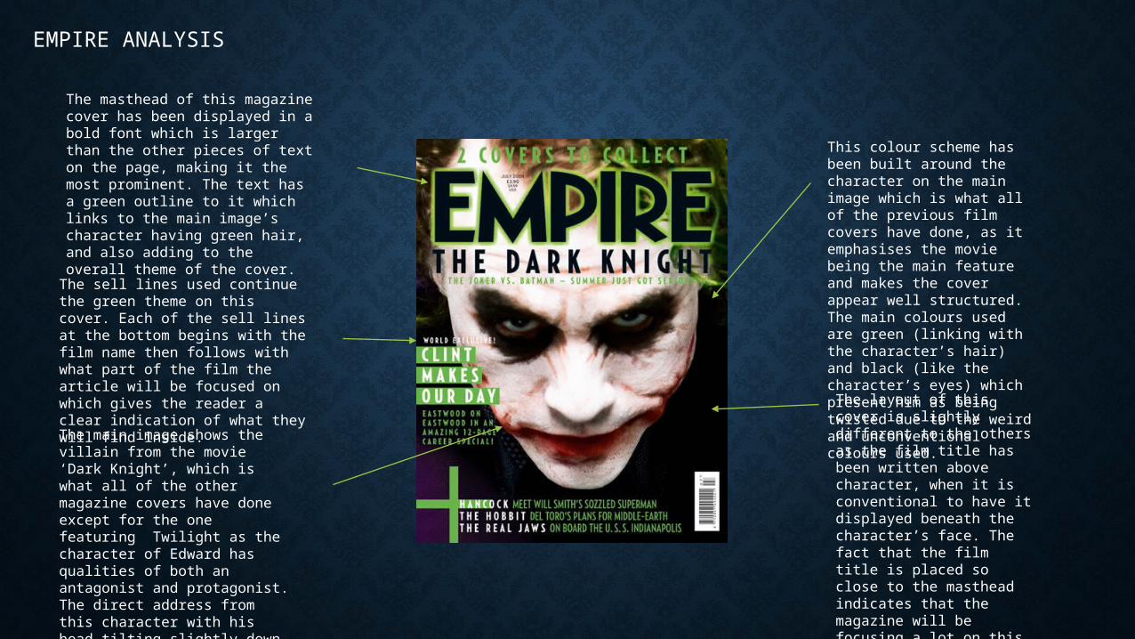
The masthead of this magazine cover has been displayed in a bold font which is larger than the other pieces of text on the page, making it the most prominent. The text has a green outline to it which links to the main image’s character having green hair, and also adding to the overall theme of the cover.
The sell lines used continue the green theme on this cover. Each of the sell lines at the bottom begins with the film name then follows with what part of the film the article will be focused on which gives the reader a clear indication of what they will find inside.
The main image shows the villain from the movie ‘Dark Knight’, which is what all of the other magazine covers have done except for the one featuring Twilight as the character of Edward has qualities of both an antagonist and protagonist. The direct address from this character with his head tilting slightly down and a low angle shot shows how he has an evil and villainous side to him.
This colour scheme has been built around the character on the main image which is what all of the previous film covers have done, as it emphasises the movie being the main feature and makes the cover appear well structured. The main colours used are green (linking with the character’s hair) and black (like the character’s eyes) which present him as being twisted due to the weird and unconventional colours used. The layout of this cover is slightly different to the others as the film title has been written above character, when it is conventional to have it displayed beneath the character’s face. The fact that the film title is placed so close to the masthead indicates that the magazine will be focusing a lot on this movie in particular.
CONCLUSION
• From looking at and comparing these varying magazine covers it is clear to see the various qualities which they share, for example using similar main images to that on the film’s poster, using the protagonist as the character in the main image, using the colour red and black for horror film posters and using brighter colours for the sell lines. From this I aim to use these conventions of magazine covers in my own to make it the most appealing to audiences and successful in attracting their attention.
Recommended