Embed Size (px)
Citation preview
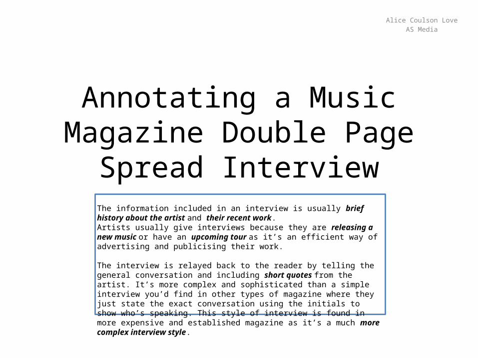
Annotating a Music Magazine Double Page Spread Interview
Alice Coulson LoveAS Media
The information included in an interview is usually brief history about the artist and their recent work.Artists usually give interviews because they are releasing a new music or have an upcoming tour as it’s an efficient way of advertising and publicising their work.
The interview is relayed back to the reader by telling the general conversation and including short quotes from the artist. It’s more complex and sophisticated than a simple interview you’d find in other types of magazine where they just state the exact conversation using the initials to show who’s speaking. This style of interview is found in more expensive and established magazine as it’s a much more complex interview style.

This is a typical spread from Q magazine as one side has a large image of the artist, Lady Gaga, covering the entirety of the page. This creates the mise-en-scene and shows the attitude and genre of the artist.Maintaining a house style is important so that readers can easily recognise future issues of that magazine.
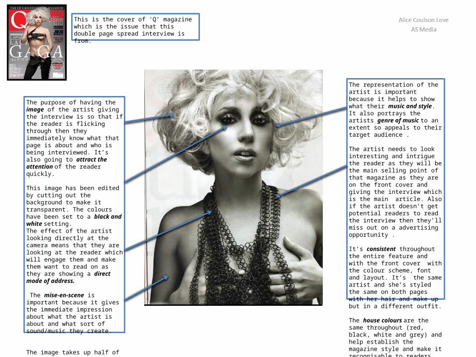
The representation of the artist is important because it helps to show what their music and style. It also portrays the artists genre of music to an extent so appeals to their target audience .
The artist needs to look interesting and intrigue the reader as they will be the main selling point of that magazine as they are on the front cover and giving the interview which is the main article. Also if the artist doesn’t get potential readers to read the interview then they’ll miss out on a advertising opportunity .
It’s consistent throughout the entire feature and with the front cover with the colour scheme, font and layout. It’s the same artist and she’s styled the same on both pages with her hair and make up but in a different outfit.
The house colours are the same throughout (red, black, white and grey) and help establish the magazine style and make it recognisable to readers.
The purpose of having the image of the artist giving the interview is so that if the reader is flicking through then they immediately know what that page is about and who is being interviewed. It’s also going to attract the attention of the reader quickly.
This image has been edited by cutting out the background to make it transparent. The colours have been set to a black and white setting.The effect of the artist looking directly at the camera means that they are looking at the reader which will engage them and make them want to read on as they are showing a direct mode of address.
The mise-en-scene is important because it gives the immediate impression about what the artist is about and what sort of sound/music they create.
The image takes up half of the double page spread as it’s equally important as the text and without a large image or collection of images the reader would lose interest and may not buy the magazine
This is the cover of ‘Q’ magazine which is the issue that this double page spread interview is from.
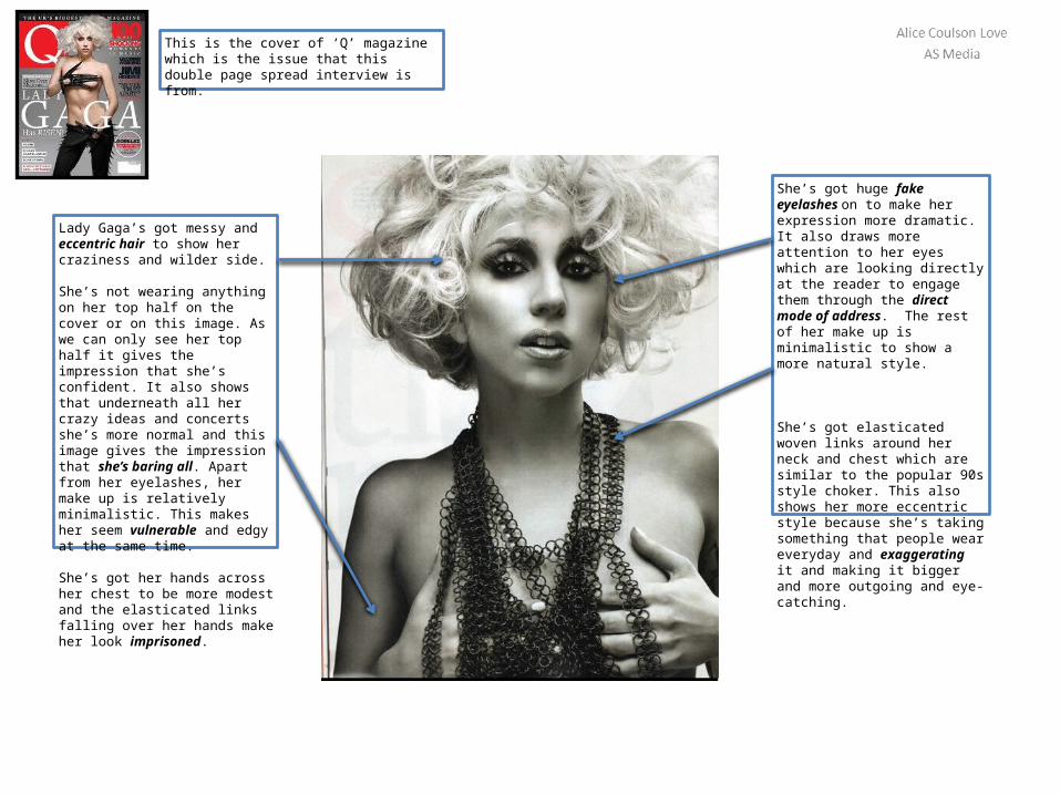
She’s got huge fake eyelashes on to make her expression more dramatic. It also draws more attention to her eyes which are looking directly at the reader to engage them through the direct mode of address. The rest of her make up is minimalistic to show a more natural style.
She’s got elasticated woven links around her neck and chest which are similar to the popular 90s style choker. This also shows her more eccentric style because she’s taking something that people wear everyday and exaggerating it and making it bigger and more outgoing and eye-catching.
Lady Gaga’s got messy and eccentric hair to show her craziness and wilder side.
She’s not wearing anything on her top half on the cover or on this image. As we can only see her top half it gives the impression that she’s confident. It also shows that underneath all her crazy ideas and concerts she’s more normal and this image gives the impression that she’s baring all. Apart from her eyelashes, her make up is relatively minimalistic. This makes her seem vulnerable and edgy at the same time.
She’s got her hands across her chest to be more modest and the elasticated links falling over her hands make her look imprisoned.
This is the cover of ‘Q’ magazine which is the issue that this double page spread interview is from.
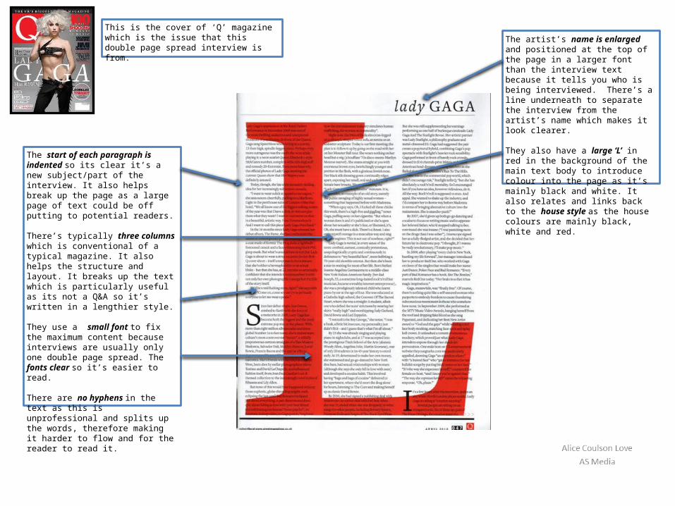
The artist’s name is enlarged and positioned at the top of the page in a larger font than the interview text because it tells you who is being interviewed. There’s a line underneath to separate the interview from the artist’s name which makes it look clearer.
They also have a large ‘L’ in red in the background of the main text body to introduce colour into the page as it’s mainly black and white. It also relates and links back to the house style as the house colours are mainly black, white and red.
The start of each paragraph is indented so its clear it’s a new subject/part of the interview. It also helps break up the page as a large page of text could be off putting to potential readers.
There’s typically three columns which is conventional of a typical magazine. It also helps the structure and layout. It breaks up the text which is particularly useful as its not a Q&A so it’s written in a lengthier style.
They use a small font to fix the maximum content because interviews are usually only one double page spread. The fonts clear so it’s easier to read.
There are no hyphens in the text as this is unprofessional and splits up the words, therefore making it harder to flow and for the reader to read it.
This is the cover of ‘Q’ magazine which is the issue that this double page spread interview is from.

Page numbers are important so the reader can find specific articles in the magazine that they’re interested in by finding the page number on the contents page. Readers may not read the whole magazine—only read articles and pages of interest
The masthead/magazine logo is in the corner to reiterate the branding of the magazine and so it’s recognisable to the reader.
It also means if one page is photographed or seen then you can recognise which magazine it is for example at a dentists/hairdressers or on social media.
The date and page number is conventionally in the corner of the page, so that if readers are looking back through then they can see the date and see if they’ve read this issue. It also means that if the covers are different between shops or if it’s swapping from one issue to the other then they can find which one that they are looking for.
The interview starts with an enlarged letter in a Serif font. This is typical of a magazine and helps break up the large quantities of text and make it easier for the reader to read through large amounts of text so appeals more to the reader so is a popular feature in magazines. It also helps the layout of the page.
This is the cover of ‘Q’ magazine which is the issue that this double page spread interview is from.