Embed Size (px)
Citation preview

Visualcy

Satire (from Saturday Night Live)
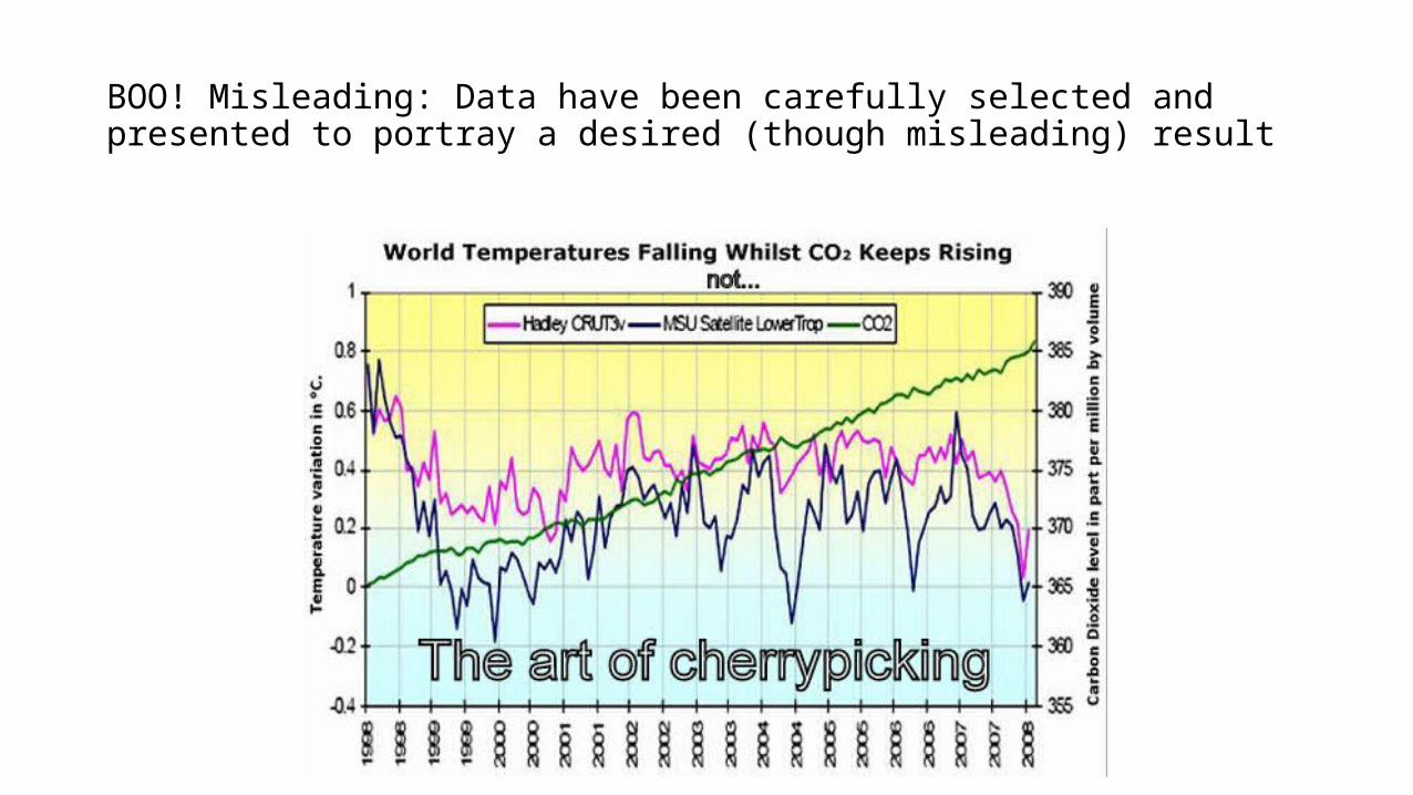
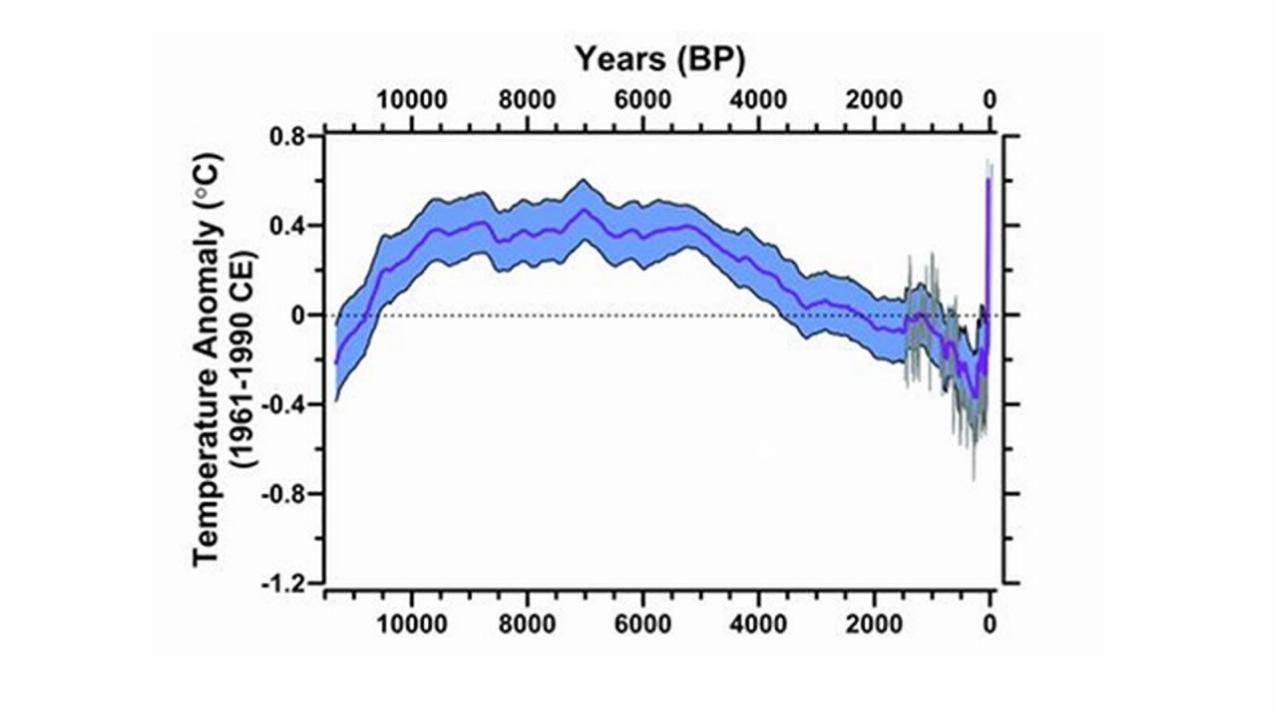
BOO! Misleading: Data have been carefully selected and presented to portray a desired (though misleading) result
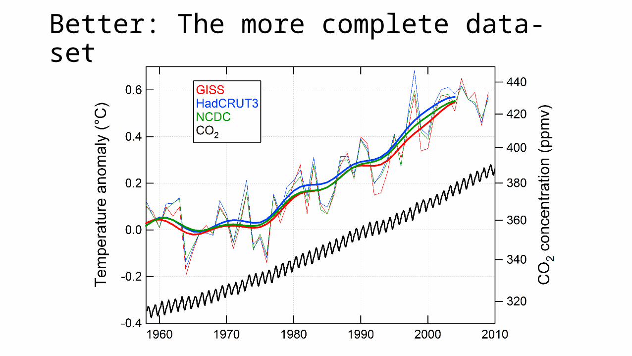
Better: The more complete data-set
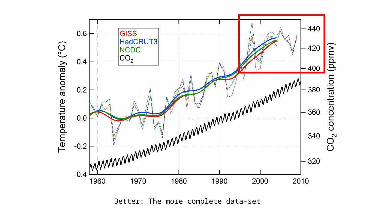
Better: The more complete data-set
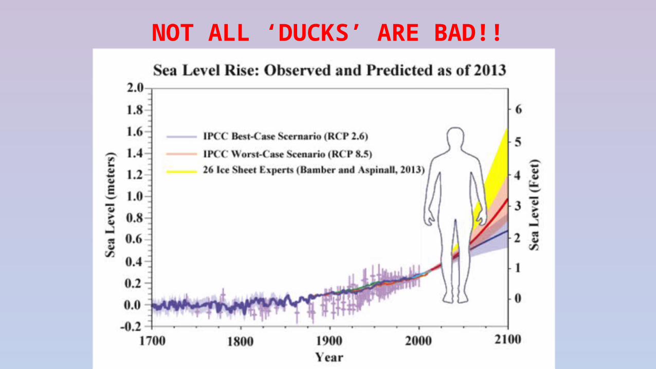
NOT ALL ‘DUCKS’ ARE BAD!!
8
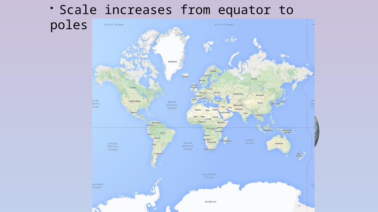
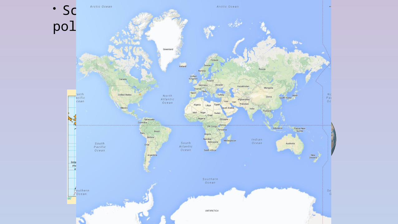
• Scale increases from equator to poles
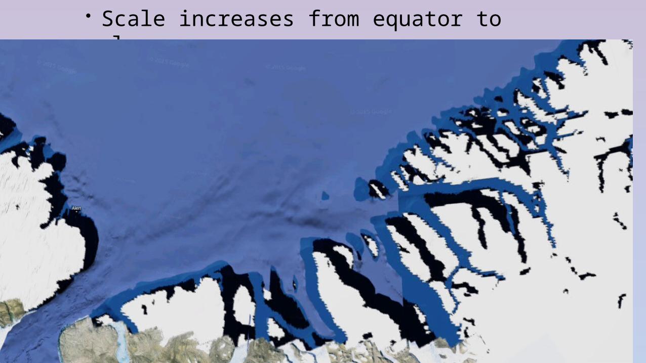
• Scale increases from equator to poles
• Scale increases from equator to poles
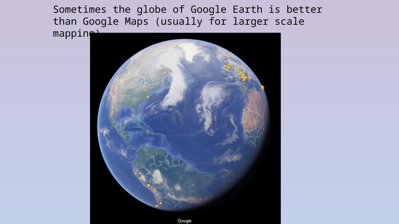
Sometimes the globe of Google Earth is better than Google Maps (usually for larger scale mapping)
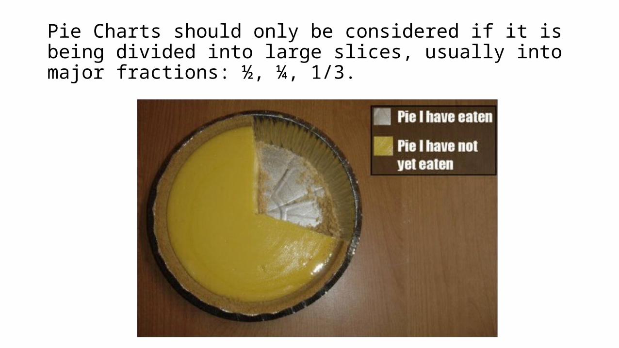
Pie Charts should only be considered if it is being divided into large slices, usually into major fractions: ½, ¼, 1/3.
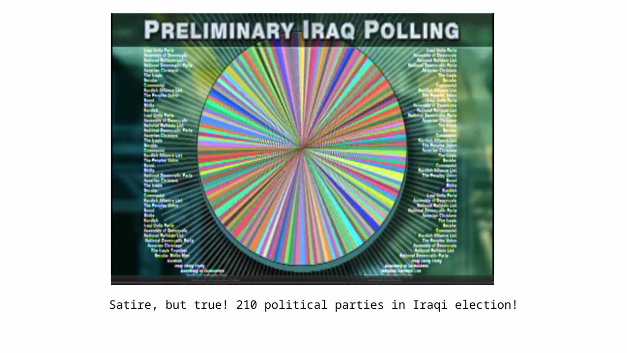
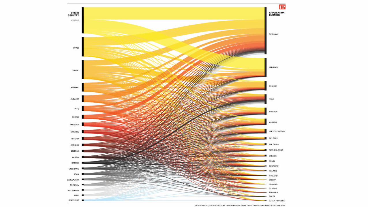
Satire, but true! 210 political parties in Iraqi election!
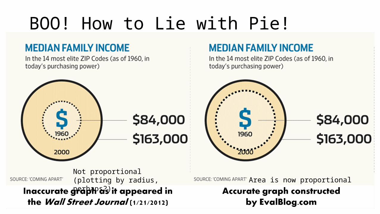
BOO! How to Lie with Pie!
Area is now proportionalNot proportional (plotting by radius, perhaps?)
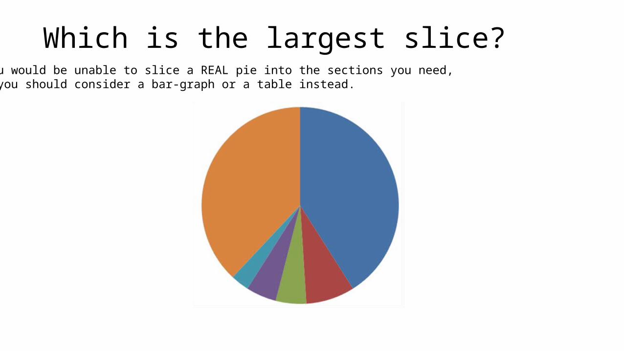
Which is the largest slice?If you would be unable to slice a REAL pie into the sections you need, then you should consider a bar-graph or a table instead.
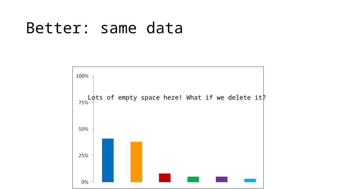
Better: same data
Lots of empty space here! What if we delete it?
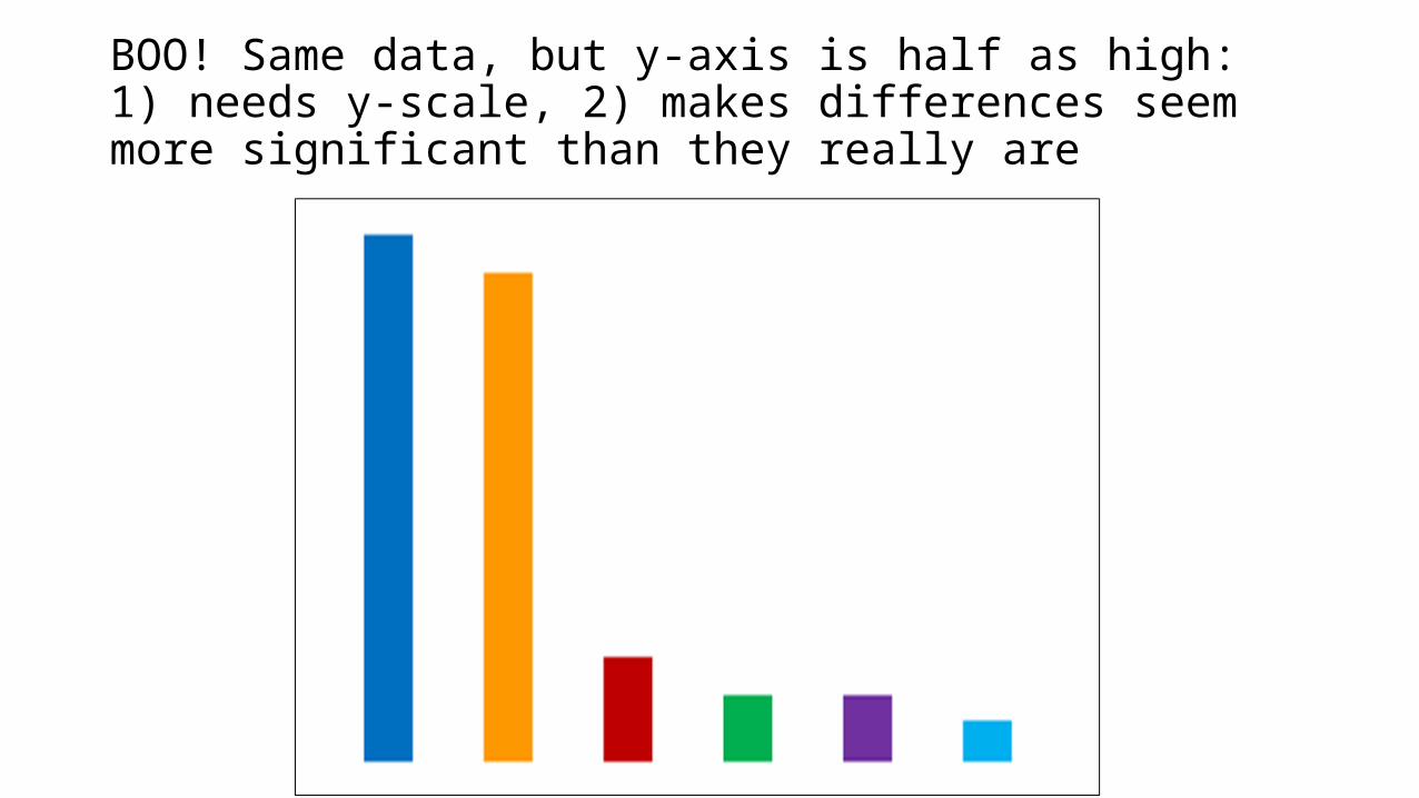
BOO! Same data, but y-axis is half as high: 1) needs y-scale, 2) makes differences seem more significant than they really are
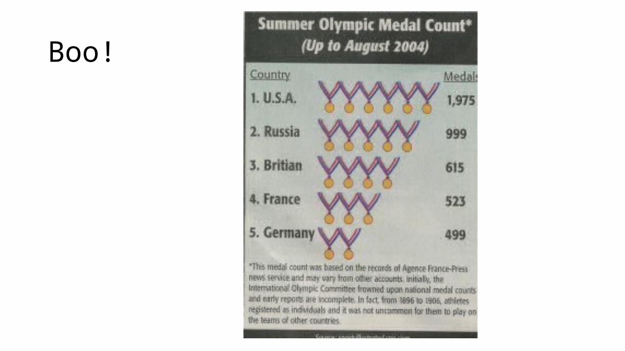
Boo!
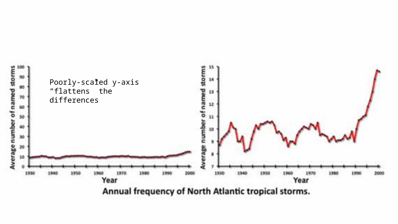
Poorly-scaled y-axis “flattens” the differences