Embed Size (px)
Citation preview
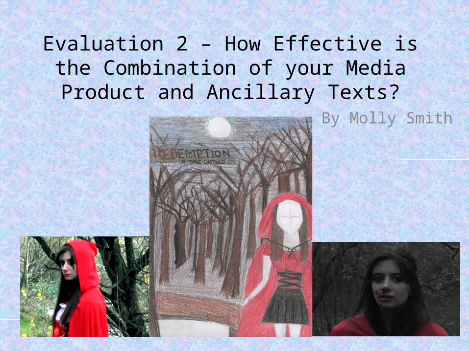
Evaluation 2 – How Effective is the Combination of your Media Product and
Ancillary Texts?By Molly Smith
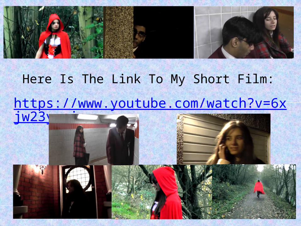
Here Is The Link To My Short Film:
https://www.youtube.com/watch?v=6xjw23y-sic
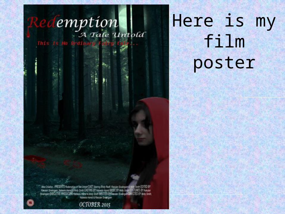
Here is my film poster
IntroductionIn this evaluation I will be comparing the effectiveness of my short film and the two ancillary texts I completed (the film poster and the film review). I believe that my ancillary texts relate well to my short film and that they go well together in terms of the marketing of my short film.For my film poster, my group and I had to choose a genre each that relates most to our short film in order to create a poster based on that genre. The genre I chose to base my poster on was horror as there are horrible, scary elements to the film.
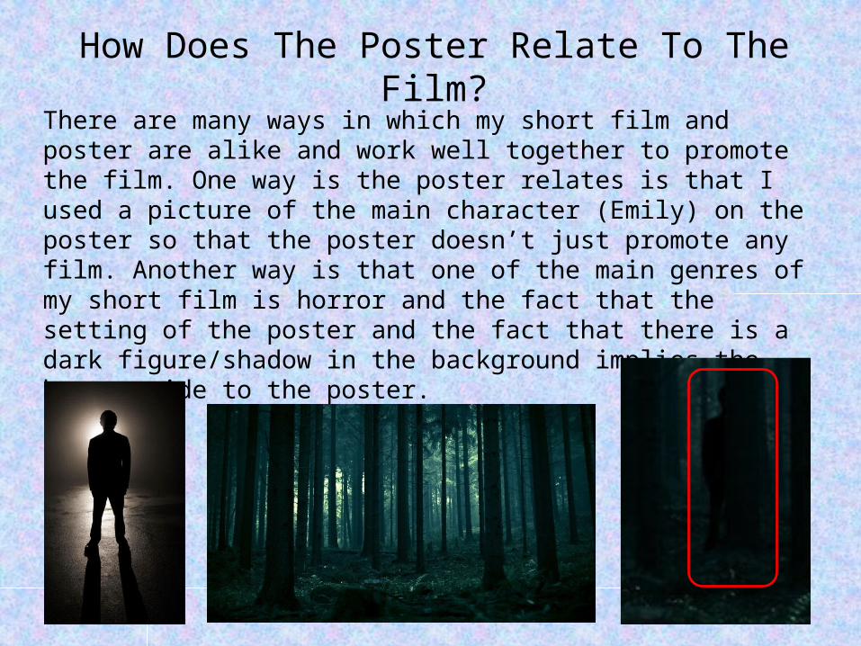
How Does The Poster Relate To The Film?There are many ways in which my short film and poster are alike and work well together to promote the film. One way is the poster relates is that I used a picture of the main character (Emily) on the poster so that the poster doesn’t just promote any film. Another way is that one of the main genres of my short film is horror and the fact that the setting of the poster and the fact that there is a dark figure/shadow in the background implies the horror side to the poster.
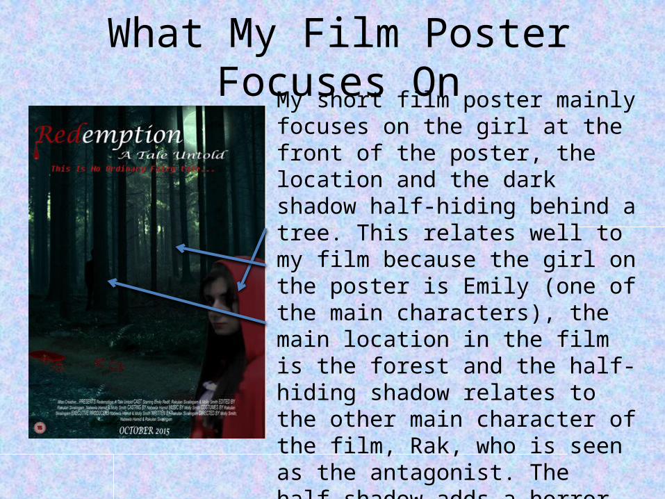
What My Film Poster Focuses OnMy short film poster mainly focuses on
the girl at the front of the poster, the location and the dark shadow half-hiding behind a tree. This relates well to my film because the girl on the poster is Emily (one of the main characters), the main location in the film is the forest and the half-hiding shadow relates to the other main character of the film, Rak, who is seen as the antagonist. The half-shadow adds a horror side to the poster because you cannot verify their identity just by looking at the poster and it seems really creepy as the girl is being watched.
Codes And Conventions
There are many codes and conventions of film posters, especially with the genre the poster is trying to portray. The genre I was trying to portray was horror so the following posters are posters that either gave me inspiration for my own poster or represent horror film poster conventions well.
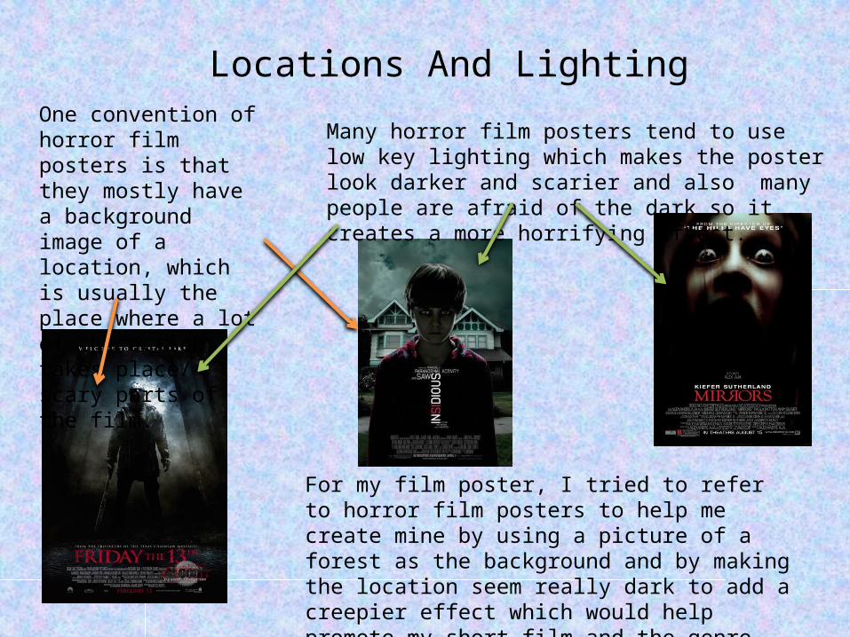
Locations And LightingMany horror film posters tend to use low key lighting which makes the poster look darker and scarier and also many people are afraid of the dark so it creates a more horrifying effect.
One convention of horror film posters is that they mostly have a background image of a location, which is usually the place where a lot of the action takes place/ scary parts of the film.
For my film poster, I tried to refer to horror film posters to help me create mine by using a picture of a forest as the background and by making the location seem really dark to add a creepier effect which would help promote my short film and the genre.
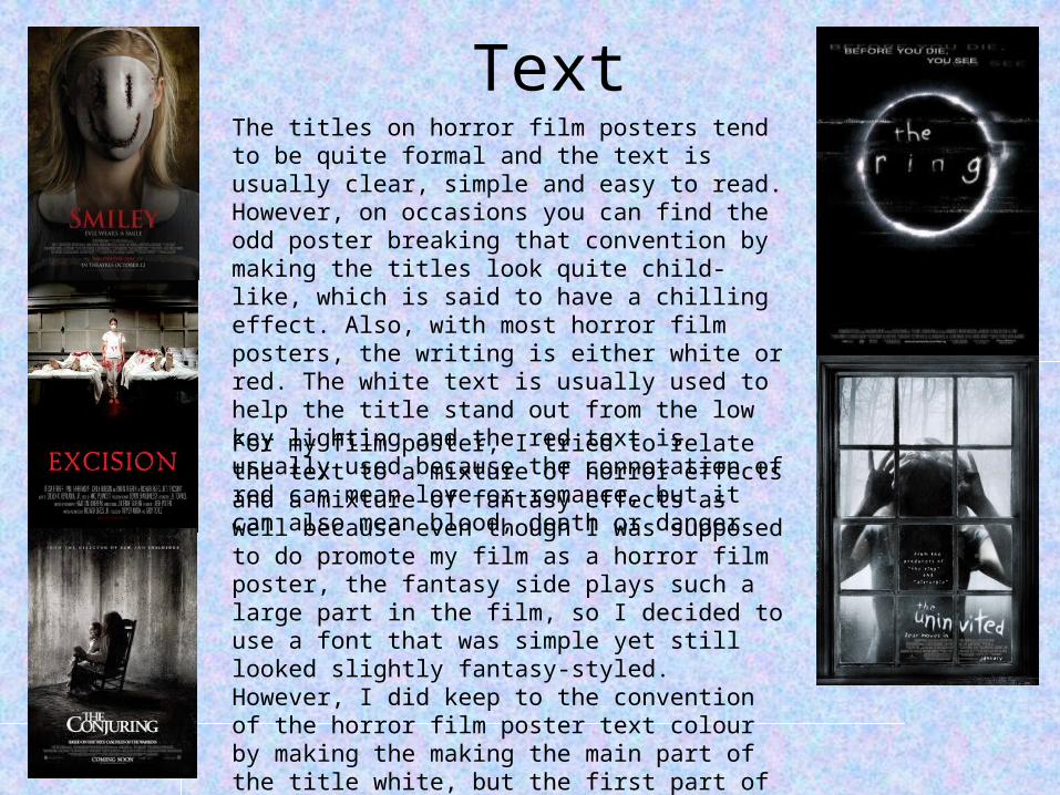
TextThe titles on horror film posters tend to be quite formal and the text is usually clear, simple and easy to read. However, on occasions you can find the odd poster breaking that convention by making the titles look quite child-like, which is said to have a chilling effect. Also, with most horror film posters, the writing is either white or red. The white text is usually used to help the title stand out from the low key lighting and the red text is usually used because the connotation of red can mean love or romance, but it can also mean blood, death or danger.
For my film poster, I tried to relate the text to a mixture of horror effects and a mixture of fantasy effects as well because even though I was supposed to do promote my film as a horror film poster, the fantasy side plays such a large part in the film, so I decided to use a font that was simple yet still looked slightly fantasy-styled. However, I did keep to the convention of the horror film poster text colour by making the making the main part of the title white, but the first part of the title (Redemption) red so it stood out and looked more creepy, thus fitting in with the horror film poster conventions.
Style Of Poster
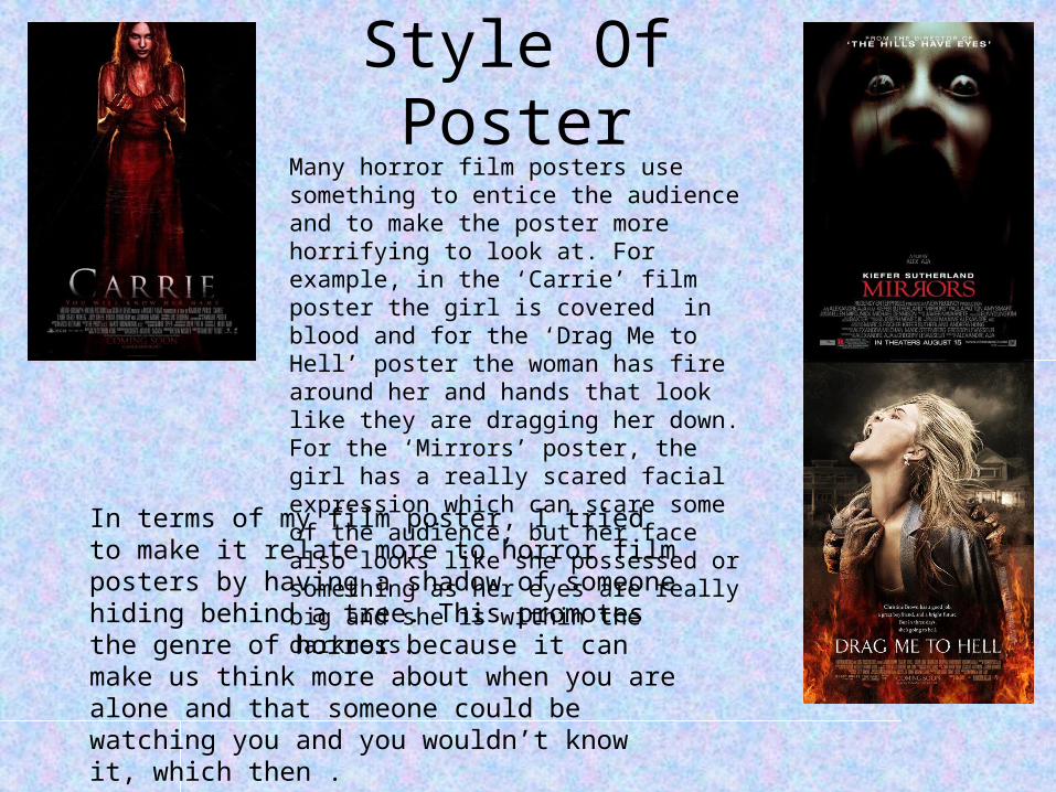
Many horror film posters use something to entice the audience and to make the poster more horrifying to look at. For example, in the ‘Carrie’ film poster the girl is covered in blood and for the ‘Drag Me to Hell’ poster the woman has fire around her and hands that look like they are dragging her down. For the ‘Mirrors’ poster, the girl has a really scared facial expression which can scare some of the audience, but her face also looks like she possessed or something as her eyes are really big and she is within the darkness.
In terms of my film poster, I tried to make it relate more to horror film posters by having a shadow of someone hiding behind a tree. This promotes the genre of horror because it can make us think more about when you are alone and that someone could be watching you and you wouldn’t know it, which then .
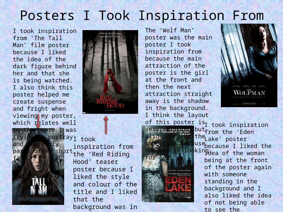
Posters I Took Inspiration FromI took inspiration from ‘The Tall Man’ film poster because I liked the idea of the dark figure behind her and that she is being watched. I also think this poster helped me create suspense and fright when viewing my poster, which relates well to the genre I was trying to portray and the scary parts of my short film.
I took inspiration from the ‘Red Riding Hood’ teaser poster because I liked the style and colour of the title and I liked that the background was in the forest, just like one of the main locations of my short film.
The ‘Wolf Man’ poster was the main poster I took inspiration from because the main attraction of the poster is the girl at the front and then the next attraction straight away is the shadow in the background. I think the layout of this poster is very enticing but also scary at the same time because someone is looking for her.
I took inspiration from the ‘Eden Lake’ poster because I liked the idea of the woman being at the front of the poster again with someone standing in the background and I also liked the idea of not being able to see the character’s (in the background) identity, as I think this add extra dread and terror to the poster.
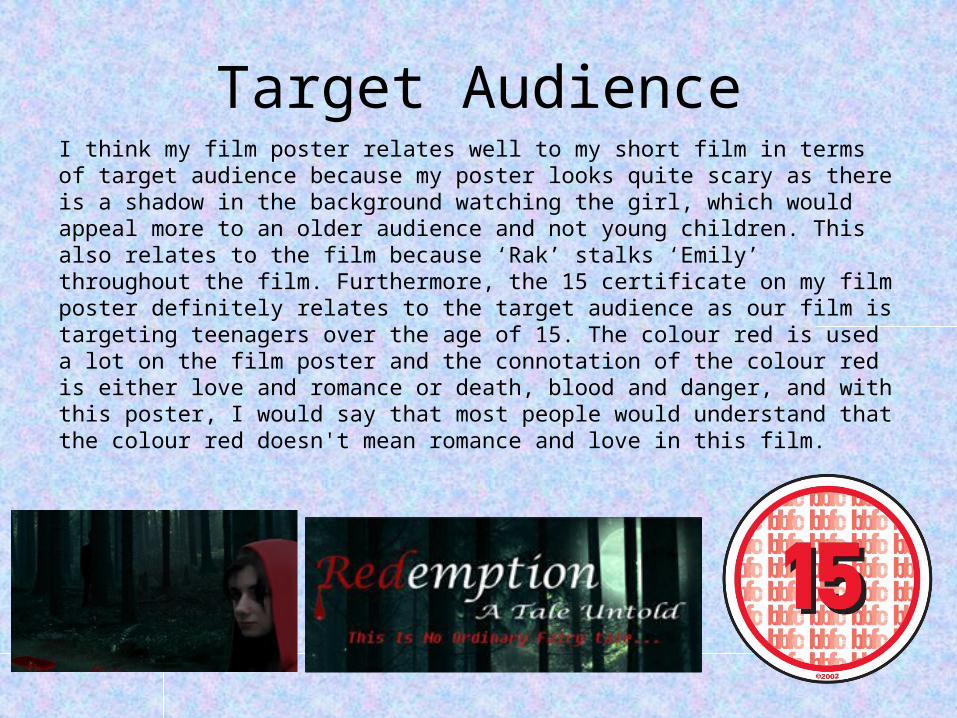
Target AudienceI think my film poster relates well to my short film in terms of target audience because my poster looks quite scary as there is a shadow in the background watching the girl, which would appeal more to an older audience and not young children. This also relates to the film because ‘Rak’ stalks ‘Emily’ throughout the film. Furthermore, the 15 certificate on my film poster definitely relates to the target audience as our film is targeting teenagers over the age of 15. The colour red is used a lot on the film poster and the connotation of the colour red is either love and romance or death, blood and danger, and with this poster, I would say that most people would understand that the colour red doesn't mean romance and love in this film.
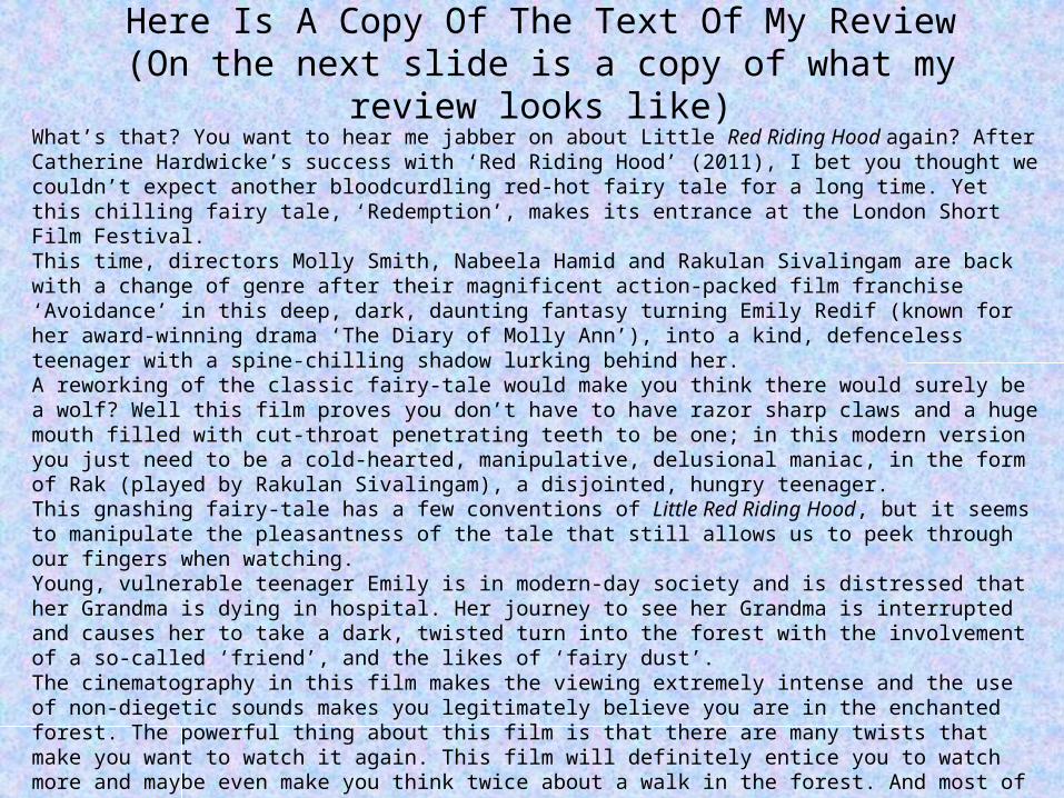
Here Is A Copy Of The Text Of My Review(On the next slide is a copy of what my review looks
like)What’s that? You want to hear me jabber on about Little Red Riding Hood again? After Catherine Hardwicke’s success with ‘Red Riding Hood’ (2011), I bet you thought we couldn’t expect another bloodcurdling red-hot fairy tale for a long time. Yet this chilling fairy tale, ‘Redemption’, makes its entrance at the London Short Film Festival.This time, directors Molly Smith, Nabeela Hamid and Rakulan Sivalingam are back with a change of genre after their magnificent action-packed film franchise ‘Avoidance’ in this deep, dark, daunting fantasy turning Emily Redif (known for her award-winning drama ‘The Diary of Molly Ann’), into a kind, defenceless teenager with a spine-chilling shadow lurking behind her. A reworking of the classic fairy-tale would make you think there would surely be a wolf? Well this film proves you don’t have to have razor sharp claws and a huge mouth filled with cut-throat penetrating teeth to be one; in this modern version you just need to be a cold-hearted, manipulative, delusional maniac, in the form of Rak (played by Rakulan Sivalingam), a disjointed, hungry teenager.This gnashing fairy-tale has a few conventions of Little Red Riding Hood, but it seems to manipulate the pleasantness of the tale that still allows us to peek through our fingers when watching.Young, vulnerable teenager Emily is in modern-day society and is distressed that her Grandma is dying in hospital. Her journey to see her Grandma is interrupted and causes her to take a dark, twisted turn into the forest with the involvement of a so-called ‘friend’, and the likes of ‘fairy dust’.The cinematography in this film makes the viewing extremely intense and the use of non-diegetic sounds makes you legitimately believe you are in the enchanted forest. The powerful thing about this film is that there are many twists that make you want to watch it again. This film will definitely entice you to watch more and maybe even make you think twice about a walk in the forest. And most of all this film will make you feel the need to look behind you when walking down the streets at night… - Anticipation; Smith, Hamid and Sivalingam deliver an unexpected turn in this fairy-tale. (4)- Enjoyment: Rak’s creepy, dead-eyed coldness will surely make you re-think your friends. (3) - In retrospect: Who let the dogs out? (3)
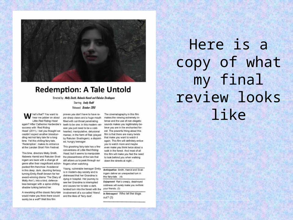
Here is a copy of what my final review looks like
Was The Magazine Appropriate For The Film?
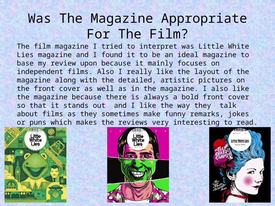
The film magazine I tried to interpret was Little White Lies magazine and I found it to be an ideal magazine to base my review upon because it mainly focuses on independent films. Also I really like the layout of the magazine along with the detailed, artistic pictures on the front cover as well as in the magazine. I also like the magazine because there is always a bold front cover so that it stands out and I like the way they talk about films as they sometimes make funny remarks, jokes or puns which makes the reviews very interesting to read.
How Does The Review Promote
The Film?
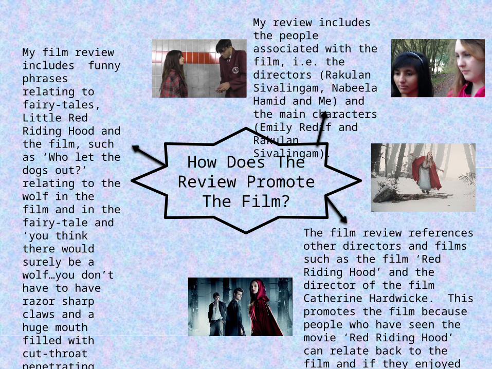
My review includes the people associated with the film, i.e. the directors (Rakulan Sivalingam, Nabeela Hamid and Me) and the main characters (Emily Redif and Rakulan Sivalingam).
The film review references other directors and films such as the film ‘Red Riding Hood’ and the director of the film Catherine Hardwicke. This promotes the film because people who have seen the movie ‘Red Riding Hood’ can relate back to the film and if they enjoyed ‘Red Riding Hood’ then they may want to see Redemption.
My film review includes funny phrases relating to fairy-tales, Little Red Riding Hood and the film, such as ‘Who let the dogs out?’ relating to the wolf in the film and in the fairy-tale and ‘you think there would surely be a wolf…you don’t have to have razor sharp claws and a huge mouth filled with cut-throat penetrating teeth to be one’ relating to the character of Rak.
What Aspects Of The Film Does The Review Focus On?
My review mainly focuses on the characters of the film and how it relates to the fairy-tale ‘Little Red Riding Hood’. The review also focuses on the people involved in the film. The one area I tried not to focus on is the storyline because I didn’t want to give too much away in terms of details about the film and I didn’t want to give out any spoilers as this would make the reader feel that they don’t need to watch the film as they have just read it in the review.
Conclusion
In conclusion, I think that my review and poster portray the film well as I have captured some of the main aspects of the film such as the characters and the setting of the film. My poster represented parts of the film such as the Emily (one of the main characters), the setting of the film (the forest) and the idea showing that Emily is being stalked. For my film review, I mainly related it to the characters and directors of the film, so in conclusion I find that my short film and ancillary texts work effectively together and promote the film well.