Embed Size (px)
Citation preview
In what ways does your media product use, develop or
challenge forms and conventions of real media
products?

Following the conventions…
Although I wanted to ensure my magazine was unlike any already on sale, it was also extremely important to follow a few of the conventions typically seen in magazines on sale. These conventions are often used because they are both effective in terms of design aesthetics, as well as suitability to the subject matter and legibility. Using some conventions which are seen in magazines on the market, as well as those which I analysed in my research process will ensure that my magazine will feel instantly familiar to my target audience.
My media product both uses, develops and challenges the forms and conventions of magazines in the real world. My magazine, most heavily in the contents page and double page spread, follows the typical conventions of magazine form.

My double page spread in particular, features many of the conventions typically used in magazines. These include the use of a large central image which fills both pages, pull quotes and a drop cap. These conventions seem to have been successful when appealing to my target audience, as stated in comments from my audience feedback.
Following the conventions…
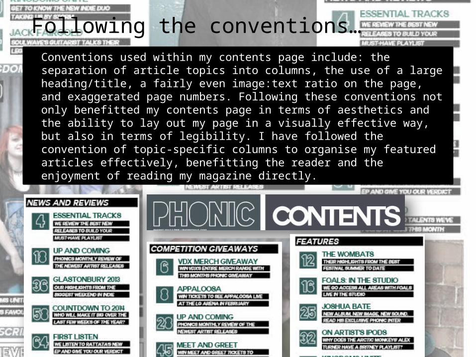
Conventions used within my contents page include: the separation of article topics into columns, the use of a large heading/title, a fairly even image:text ratio on the page, and exaggerated page numbers. Following these conventions not only benefitted my contents page in terms of aesthetics and the ability to lay out my page in a visually effective way, but also in terms of legibility. I have followed the convention of topic-specific columns to organise my featured articles effectively, benefitting the reader and the enjoyment of reading my magazine directly.
Following the conventions…

Following the conventions…
Conventions used within my front cover include: a large, bold masthead design and a striking central image (more specifically, a medium close-up shot). Following these conventions not only benefitted my front cover in terms of aesthetics and the ability to lay out my page in a visually effective way, but also in terms of legibility.

Developing and the conventions…
As well as sticking to some of the typical magazine design conventions, I also developed them to ensure my magazine connotes the genre of music which it is based around. The magazines NME and Q Magazine which I analysed for inspiration, are magazines based somewhat/primarily on Indie music – the genre I have chosen. Although these magazines follow many conventions, each are more “unique” in appearance than mainstream music magazines due to their music genres.

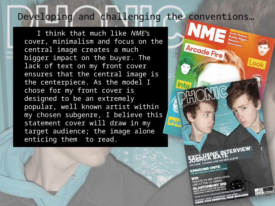
Developing and challenging the conventions…My front cover develops and challenges conventions, as well as following some of them. Many magazine covers typically feature a heavy content of coverlines, headlines, puffs and splashes. To challenge this, by taking inspiration from the striking cover of NME, I went against these conventions. Instead of compacting my front cover with wording, I designed it to be extremely minimalistic. I included a couple of coverlines and puffs, but where I could, I left the page minimal. I found that on the cover of NME, a striking central image with minimal wording stands out and challenges the conventions in a successful and alluring way.
Developing and challenging the conventions…
I think that much like NME’s cover, minimalism and focus on the central image creates a much bigger impact on the buyer. The lack of text on my front cover ensures that the central image is the centerpiece. As the model I chose for my front cover is designed to be an extremely popular, well known artist within my chosen subgenre, I believe this statement cover will draw in my target audience; the image alone enticing them to read.
Developing and challenging the conventions…
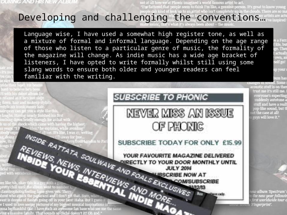
Language wise, I have used a somewhat high register tone, as well as a mixture of formal and informal language. Depending on the age range of those who listen to a particular genre of music, the formality of the magazine will change. As indie music has a wide age bracket of listeners, I have opted to write formally whilst still using some slang words to ensure both older and younger readers can feel familiar with the writing.

Developing and challenging the conventions…
In terms of colour use, I chose a simple colour palette of similar tones which complimented eachother. This choice challenges the typical convention of using bright, striking colours within a magazine to attract attention. I intended to select colours which compliment rather than clash, to create a brand identity and house style that is more stylish and modern. I think this colour scheme worked very effectively – as the colours are neither aimed at a specifically male or female audience.
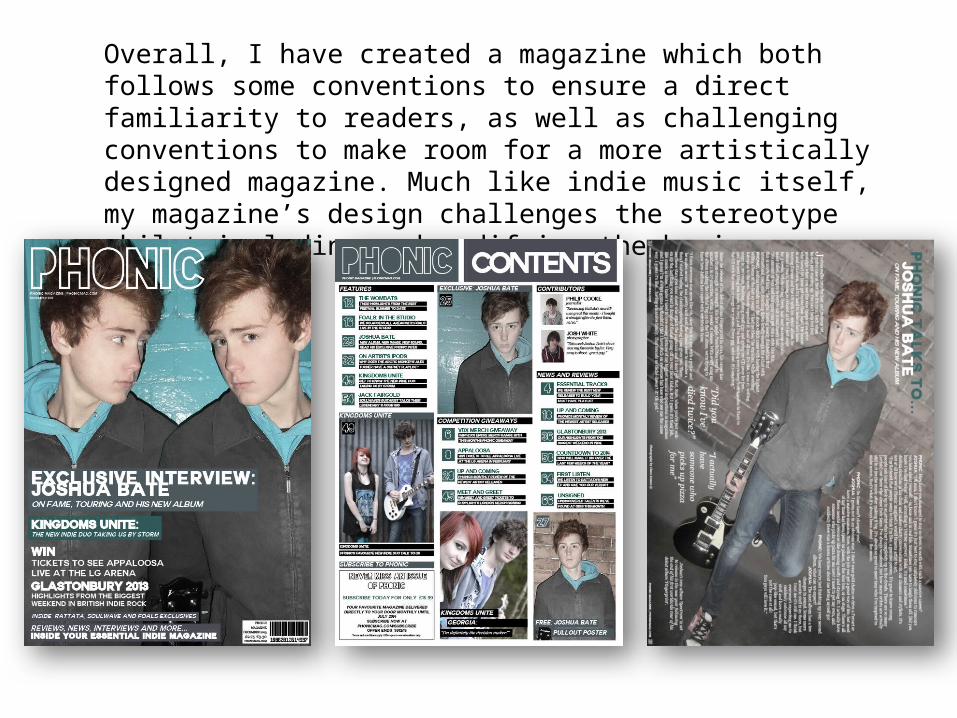
Overall, I have created a magazine which both follows some conventions to ensure a direct familiarity to readers, as well as challenging conventions to make room for a more artistically designed magazine. Much like indie music itself, my magazine’s design challenges the stereotype whilst including and modifying the basic ingredients.