Embed Size (px)
Citation preview
Q1. In what ways does
your media product use,
develop or challenge forms
and conventions of real
media products?
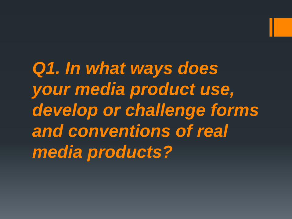
Magazine cover
Use
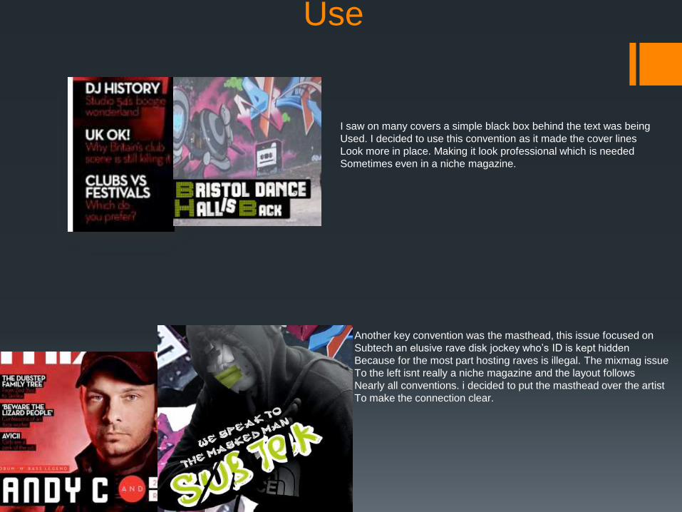
I saw on many covers a simple black box behind the text was being
Used. I decided to use this convention as it made the cover lines
Look more in place. Making it look professional which is needed
Sometimes even in a niche magazine.
Another key convention was the masthead, this issue focused on
Subtech an elusive rave disk jockey who’s ID is kept hidden
Because for the most part hosting raves is illegal. The mixmag issue
To the left isnt really a niche magazine and the layout follows
Nearly all conventions. i decided to put the masthead over the artist
To make the connection clear.
develop
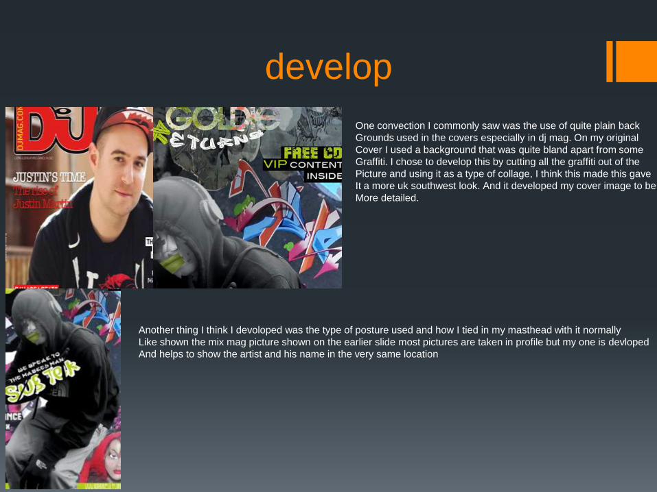
One convection I commonly saw was the use of quite plain back
Grounds used in the covers especially in dj mag. On my original
Cover I used a background that was quite bland apart from some
Graffiti. I chose to develop this by cutting all the graffiti out of the
Picture and using it as a type of collage, I think this made this gave
It a more uk southwest look. And it developed my cover image to be
More detailed.
Another thing I think I devoloped was the type of posture used and how I tied in my masthead with it normally
Like shown the mix mag picture shown on the earlier slide most pictures are taken in profile but my one is devloped
And helps to show the artist and his name in the very same location
challenge
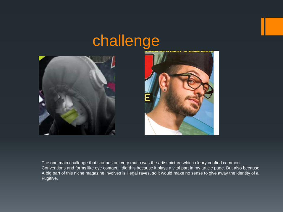
The one main challenge that stounds out very much was the artist picture which cleary confied common
Conventions and forms like eye contact. I did this because it plays a vital part in my article page. But also because
A big part of this niche magazine involves is illegal raves, so it would make no sense to give away the identity of a
Fugitive.
Contents page
use
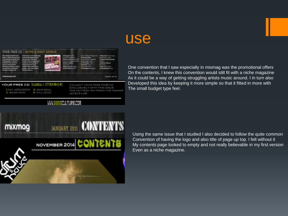
One convention that I saw especially in mixmag was the promotional offers
On the contents, I knew this convention would still fit with a niche magazine
As it could be a way of getting struggling artists music around. I in turn also
Developed this idea by keeping it more simple so that it fitted in more with
The small budget type feel.
Using the same issue that I studied I also decided to follow the quite common
Convention of having the logo and also title of page up top. I felt without it
My contents page looked to empty and not really believable in my first version
Even as a niche magazine.
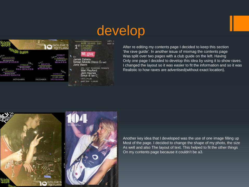
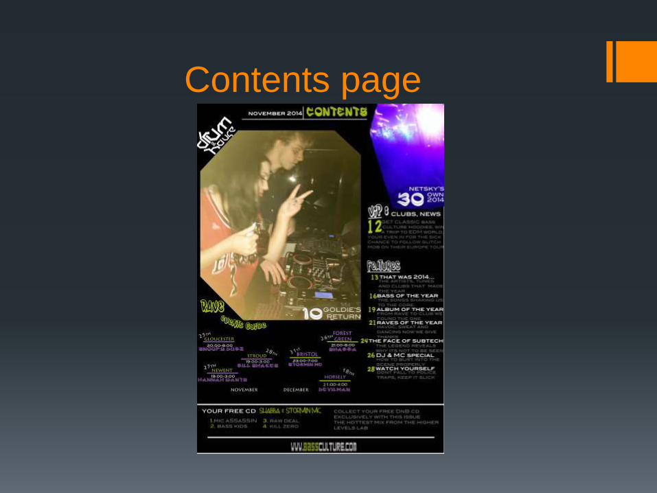
developAfter re editing my contents page I decided to keep this section
‘the rave guide’. In another issue of mixmag the contents page
Was split over two pages with a club guide on the left. Having
Only one page I decided to develop this idea by using it to show raves.
I changed the layout so it was easier to fit the information and so it was
Realistic to how raves are advertised(without exact location).
Another key idea that I developed was the use of one image filling up
Most of the page. I decided to change the shape of my photo, the size
As well and also The layout of text. This helped to fit the other things
On my contents page because it couldn’t be a3.
Article page
forms and conventions
Quotes
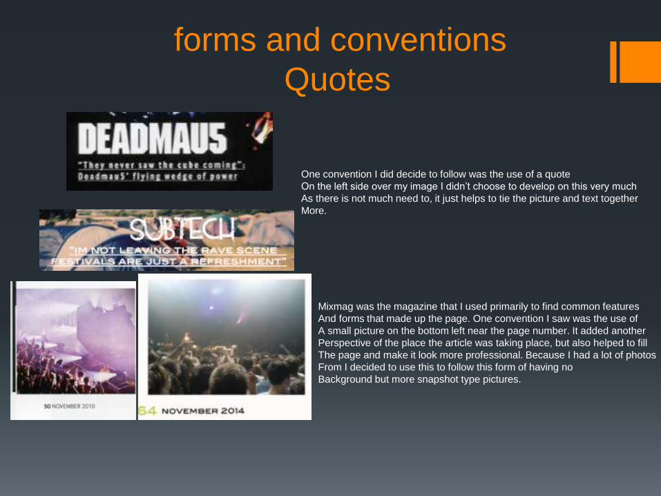
One convention I did decide to follow was the use of a quote
On the left side over my image I didn’t choose to develop on this very much
As there is not much need to, it just helps to tie the picture and text together
More.
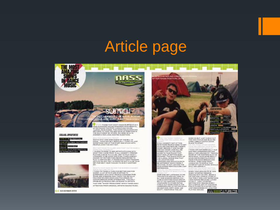
Mixmag was the magazine that I used primarily to find common features
And forms that made up the page. One convention I saw was the use of
A small picture on the bottom left near the page number. It added another
Perspective of the place the article was taking place, but also helped to fill
The page and make it look more professional. Because I had a lot of photos
From I decided to use this to follow this form of having no
Background but more snapshot type pictures.
Develop
layout
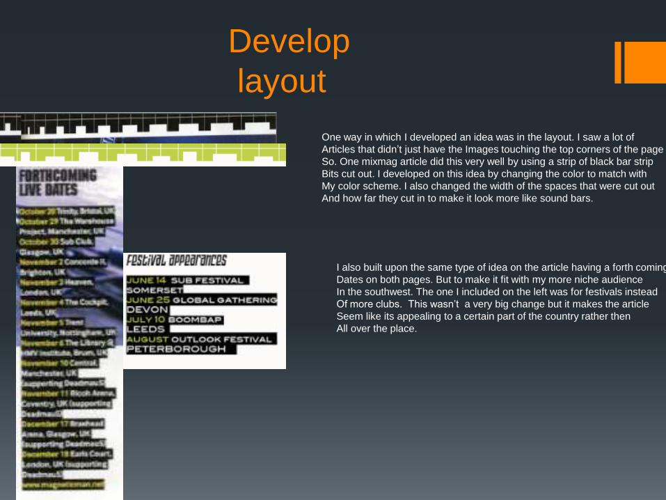
One way in which I developed an idea was in the layout. I saw a lot of
Articles that didn’t just have the Images touching the top corners of the page
So. One mixmag article did this very well by using a strip of black bar strip
Bits cut out. I developed on this idea by changing the color to match with
My color scheme. I also changed the width of the spaces that were cut out
And how far they cut in to make it look more like sound bars.
I also built upon the same type of idea on the article having a forth coming
Dates on both pages. But to make it fit with my more niche audience
In the southwest. The one I included on the left was for festivals instead
Of more clubs. This wasn’t a very big change but it makes the article
Seem like its appealing to a certain part of the country rather then
All over the place.
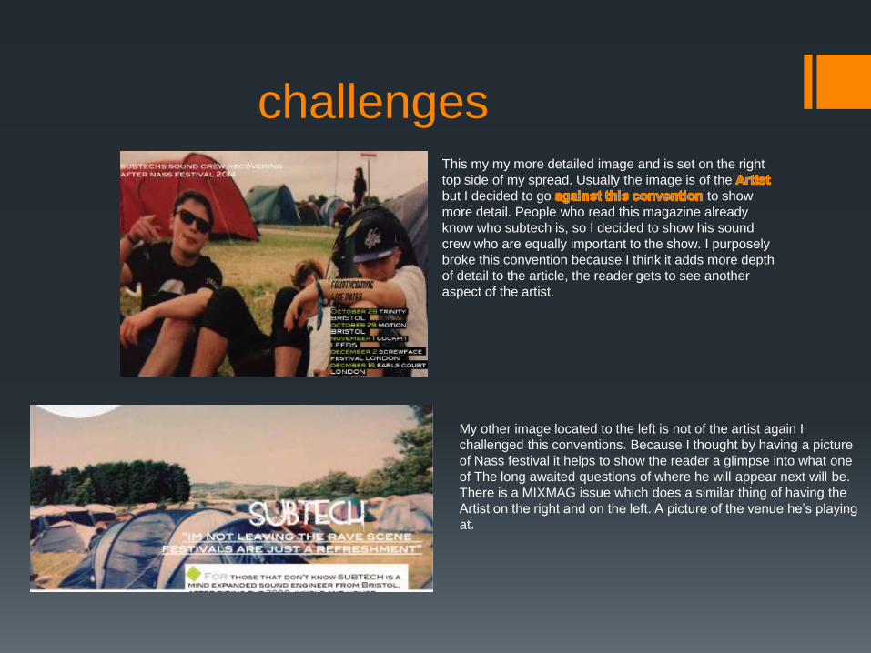
challengesThis my my more detailed image and is set on the right
top side of my spread. Usually the image is of the
but I decided to go to show
more detail. People who read this magazine already
know who subtech is, so I decided to show his sound
crew who are equally important to the show. I purposely
broke this convention because I think it adds more depth
of detail to the article, the reader gets to see another
aspect of the artist.
My other image located to the left is not of the artist again I
challenged this conventions. Because I thought by having a picture
of Nass festival it helps to show the reader a glimpse into what one
of The long awaited questions of where he will appear next will be.
There is a MIXMAG issue which does a similar thing of having the
Artist on the right and on the left. A picture of the venue he’s playing
at.


![Question 1 George [Updated]](https://img.pdfslide.net/doc/110x75/55c69fcfbb61eb8a258b46d2/question-1-george-updated.jpg)