Embed Size (px)
Citation preview


Vibe is a music magazine that focuses on the R&B and hip-hop music genre. It was founded by producer, Quincy Jones. Production for the magazine however shut down in 2009 before it was purchased by InterMedia Partners. The magazine’s target demographic are followers of the hip-hop and urban culture, between the ages of 18-34 because of its more explicit content.
Vibe magazine uses rule of thirds. The use of this allows for the front cover to look professional and helps to keep the coverlines and the images well presented on the page.
The colour scheme of the magazine is orange, black, and white. Orange is a enthusiastic colour that is associated with creativity and stimulation. Like red, it is a highly visible colour. White is a contrasting colour and has connotations for light, goodness. It suggests simplicity. It contrasts against black as white has positive connotations. Black is a mysterious colour that is associated with the unknown and generally has negative connotations. But it also has associations with strength, authority, elegance and power.
The anchorage text is placed to the left of the central image. ‘Notorious King’ is also part of the anchorage text, it is referring to another R&B and hip-hop artists, Lil Kim, whom has notably argued with Nicki Minaj. Those who have insight about this will be interested in what the article has to say and therefore will purchase the magazine and find out because it’s gossip.The typography to this text is different to the others on the front cover. This text’s typography looks handwritten and gives an almost graffiti effect which would relate to the magazine’s R&B and hip-hop genre of music. Because the typography of this text is completely different to the rest, it attracts the attention of the consumer.The barcode is placed in the bottom left hand corner and includes the price of the magazine ($4.99/£3.15). Similar to Kerrang and Q, the magazine’s website is also included (www.vibe.com/). Though the website is presented differently. It uses graphics that represent the magazine website and this is a common feature on Vibe’s magazine. The use of this graphic encourages the reader to go to the website more than it would if it was written in black and printed in lettering. It appears to be more fun and entertaining.
The coverlines are presented clearly and boldly around the central image of Nicki Minaj. The size of the coverlines varies to make a contrast between the articles within the magazine that are being advertised. Some articles will therefore stand out more than other articles will. The typography is sans serif and makes the front cover look more modern and stylish. The different coverlines also vary the use of bold lettering, which makes them stand out more. All of the magazine’s texts are also capitalised so that it is easier to read and much more clearer.
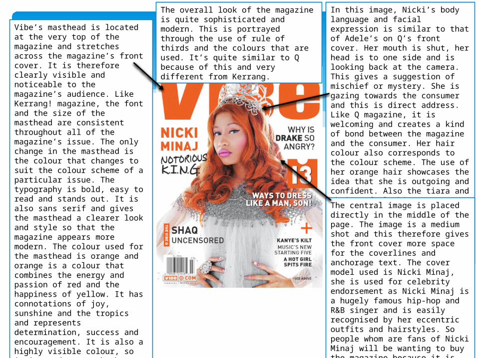
In this image, Nicki’s body language and facial expression is similar to that of Adele’s on Q’s front cover. Her mouth is shut, her head is to one side and is looking back at the camera. This gives a suggestion of mischief or mystery. She is gazing towards the consumer and this is direct address. Like Q magazine, it is welcoming and creates a kind of bond between the magazine and the consumer. Her hair colour also corresponds to the colour scheme. The use of her orange hair showcases the idea that she is outgoing and confident. Also the tiara and choice of clothing represents Nicki Minaj’s power within the R&B and hip-hop genre of music. The use of Nicki Minaj as the cover model is the magazine’s biggest selling point.
The overall look of the magazine is quite sophisticated and modern. This is portrayed through the use of rule of thirds and the colours that are used. It’s quite similar to Q because of this and very different from Kerrang.
Vibe’s masthead is located at the very top of the magazine and stretches across the magazine’s front cover. It is therefore clearly visible and noticeable to the magazine’s audience. Like Kerrang! magazine, the font and the size of the masthead are consistent throughout all of the magazine’s issue. The only change in the masthead is the colour that changes to suit the colour scheme of a particular issue. The typography is bold, easy to read and stands out. It is also sans serif and gives the masthead a clearer look and style so that the magazine appears more modern. The colour used for the masthead is orange and orange is a colour that combines the energy and passion of red and the happiness of yellow. It has connotations of joy, sunshine and the tropics and represents determination, success and encouragement. It is also a highly visible colour, so it is used to catch the consumers attention and highlight and important parts to the front cover. It is also the colour of the cover model’s (Nicki Minaj) hair. It could also represent how Nicki Minaj is a very powerful women in the world of hip-hop and R&B.
The central image is placed directly in the middle of the page. The image is a medium shot and this therefore gives the front cover more space for the coverlines and anchorage text. The cover model used is Nicki Minaj, she is used for celebrity endorsement as Nicki Minaj is a hugely famous hip-hop and R&B singer and is easily recognised by her eccentric outfits and hairstyles. So people whom are fans of Nicki Minaj will be wanting to buy the magazine because it is implied that she will be included within the issue (this is also supported by the anchorage text).
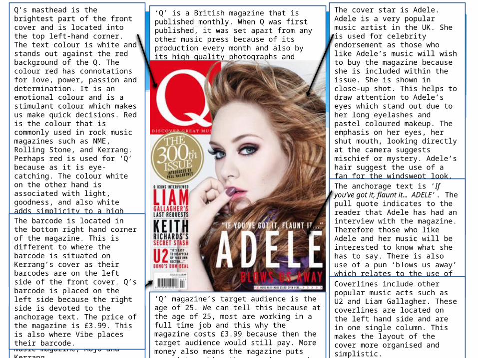
‘Q’ is a British magazine that is published monthly. When Q was first published, it was set apart from any other music press because of its production every month and also by its high quality photographs and printing.
Q’s masthead is the brightest part of the front cover and is located into the top left-hand corner. The text colour is white and stands out against the red background of the Q. The colour red has connotations for love, power, passion and determination. It is an emotional colour and is a stimulant colour which makes us make quick decisions. Red is the colour that is commonly used in rock music magazines such as NME, Rolling Stone, and Kerrang. Perhaps red is used for ‘Q’ because as it is eye-catching. The colour white on the other hand is associated with light, goodness, and also white adds simplicity to a high quality magazine and the colour also adds a balance to the other colours used on the magazine. The typography of the ‘Q’ is serif and looks sophisticated and adds quality to the magazine.
The cover star is Adele. Adele is a very popular music artist in the UK. She is used for celebrity endorsement as those who like Adele’s music will wish to buy the magazine because she is included within the issue. She is shown in close-up shot. This helps to draw attention to Adele’s eyes which stand out due to her long eyelashes and pastel coloured makeup. The emphasis on her eyes, her shut mouth, looking directly at the camera suggests mischief or mystery. Adele’s hair suggest the use of a fan for the windswept look. The image is not central but is placed slightly to the right and is the main focus of the front page, special attention is drawn to Adele’s eyes.
‘Q’ magazine is published by Bauer Media Group which is a European media company that also publishes the British music magazine, Mojo and Kerrang.
The anchorage text is ‘If you’ve got it, flaunt it… ADELE’. The pull quote indicates to the reader that Adele has had an interview with the magazine. Therefore those who like Adele and her music will be interested to know what she has to say. There is also use of a pun ‘blows us away’ which relates to the use of the windswept look of Adele’s hair.Coverlines include other popular music acts such as U2 and Liam Gallagher. These coverlines are located on the left hand side and are in one single column. This makes the layout of the cover more organised and simplistic.
‘Q’ magazine’s target audience is the age of 25. We can tell this because at the age of 25, most are working in a full time job and this why the magazine costs £3.99 because then the target audience would still pay. More money also means the magazine puts more into making the magazine a much higher quality.
The barcode is located in the bottom right hand corner of the magazine. This is different to where the barcode is situated on Kerrang’s cover as their barcodes are on the left side of the front cover. Q’s barcode is placed on the left side because the right side is devoted to the anchorage text. The price of the magazine is £3.99. This is also where Vibe places their barcode.
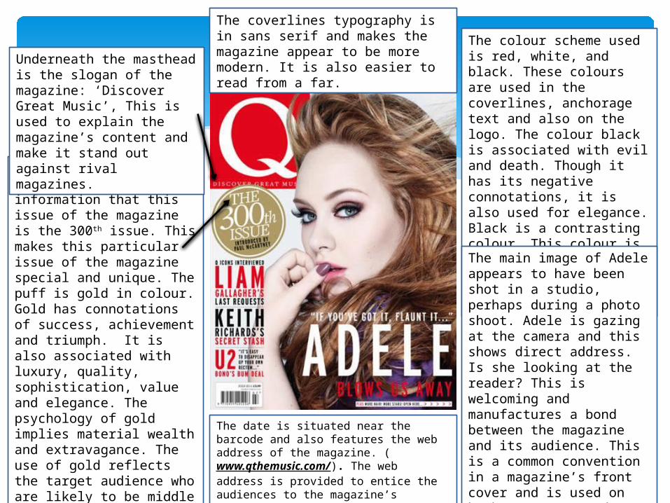
The colour scheme used is red, white, and black. These colours are used in the coverlines, anchorage text and also on the logo. The colour black is associated with evil and death. Though it has its negative connotations, it is also used for elegance. Black is a contrasting colour. This colour is used a lot in Rock music magazines and especially on Kerrang’s front covers.
A puff is used to highlight the information that this issue of the magazine is the 300th issue. This makes this particular issue of the magazine special and unique. The puff is gold in colour. Gold has connotations of success, achievement and triumph. It is also associated with luxury, quality, sophistication, value and elegance. The psychology of gold implies material wealth and extravagance. The use of gold reflects the target audience who are likely to be middle class due to the high pricing and high quality of the magazine.
Underneath the masthead is the slogan of the magazine: ‘Discover Great Music’, This is used to explain the magazine’s content and make it stand out against rival magazines.
The coverlines typography is in sans serif and makes the magazine appear to be more modern. It is also easier to read from a far.
The main image of Adele appears to have been shot in a studio, perhaps during a photo shoot. Adele is gazing at the camera and this shows direct address. Is she looking at the reader? This is welcoming and manufactures a bond between the magazine and its audience. This is a common convention in a magazine’s front cover and is used on both Kerrang’s and Vibe’s front covers.
The date is situated near the barcode and also features the web address of the magazine. (www.qthemusic.com/). The web address is provided to entice the audiences to the magazine’s website.

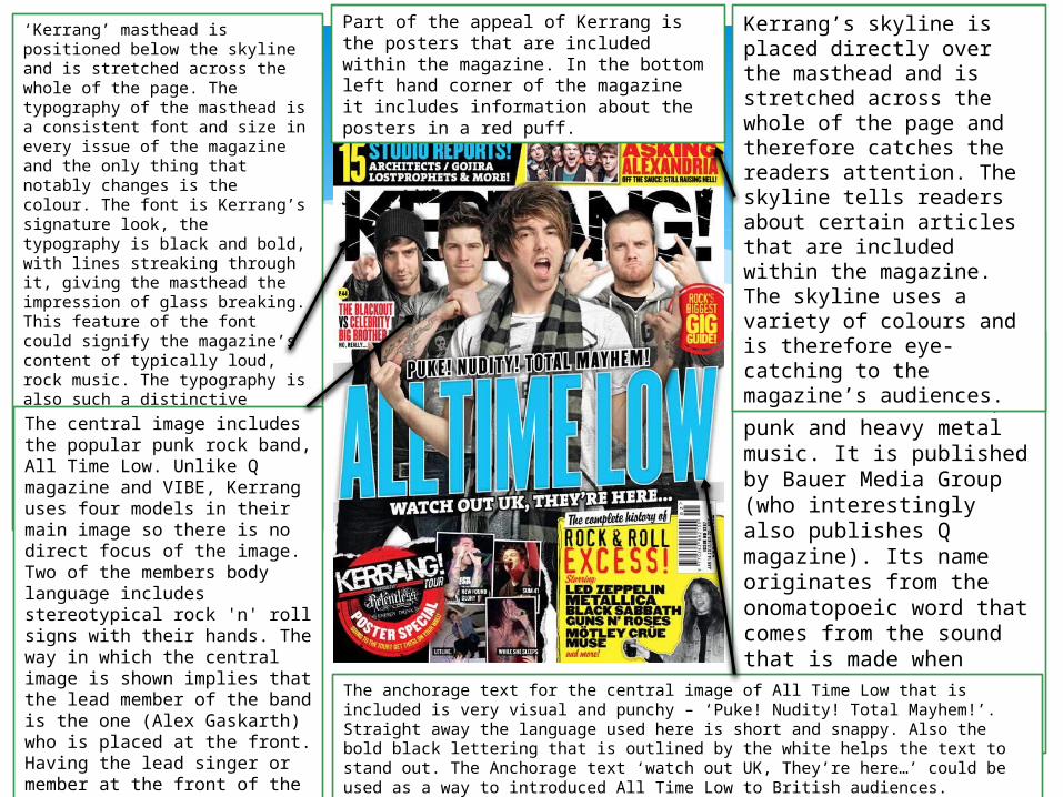
‘Kerrang’ masthead is positioned below the skyline and is stretched across the whole of the page. The typography of the masthead is a consistent font and size in every issue of the magazine and the only thing that notably changes is the colour. The font is Kerrang’s signature look, the typography is black and bold, with lines streaking through it, giving the masthead the impression of glass breaking. This feature of the font could signify the magazine’s content of typically loud, rock music. The typography is also such a distinctive feature of the magazine that it allows an instant recognition by its audience and this is also why the masthead can be placed behind the central image.
Kerrang! magazine is a music magazine that is devoted to the rock, punk and heavy metal music. It is published by Bauer Media Group (who interestingly also publishes Q magazine). Its name originates from the onomatopoeic word that comes from the sound that is made when playing a power crowd on a distorted electric guitar.
Kerrang’s skyline is placed directly over the masthead and is stretched across the whole of the page and therefore catches the readers attention. The skyline tells readers about certain articles that are included within the magazine. The skyline uses a variety of colours and is therefore eye-catching to the magazine’s audiences.
The anchorage text for the central image of All Time Low that is included is very visual and punchy – ‘Puke! Nudity! Total Mayhem!’. Straight away the language used here is short and snappy. Also the bold black lettering that is outlined by the white helps the text to stand out. The Anchorage text ‘watch out UK, They’re here…’ could be used as a way to introduced All Time Low to British audiences.
The central image includes the popular punk rock band, All Time Low. Unlike Q magazine and VIBE, Kerrang uses four models in their main image so there is no direct focus of the image. Two of the members body language includes stereotypical rock 'n' roll signs with their hands. The way in which the central image is shown implies that the lead member of the band is the one (Alex Gaskarth) who is placed at the front. Having the lead singer or member at the front of the central image helps to make the band more recognisable for Kerrang’s audiences.
Part of the appeal of Kerrang is the posters that are included within the magazine. In the bottom left hand corner of the magazine it includes information about the posters in a red puff.
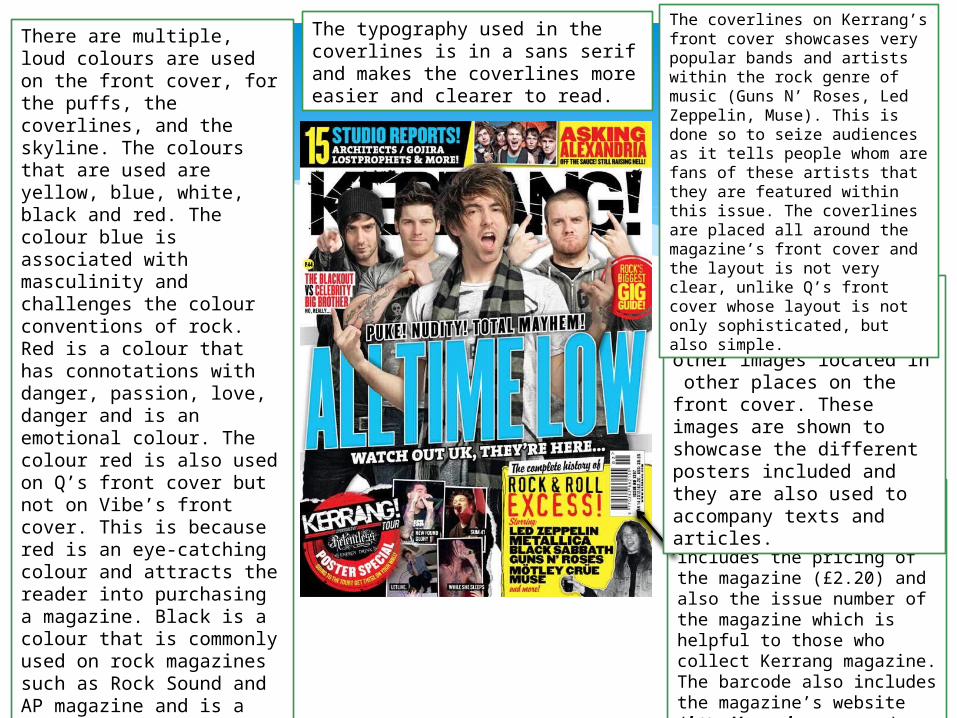
The barcode is placed on the right hand side of the front cover and includes the pricing of the magazine (£2.20) and also the issue number of the magazine which is helpful to those who collect Kerrang magazine. The barcode also includes the magazine’s website (http://www.kerrang.com).
There are multiple, loud colours are used on the front cover, for the puffs, the coverlines, and the skyline. The colours that are used are yellow, blue, white, black and red. The colour blue is associated with masculinity and challenges the colour conventions of rock. Red is a colour that has connotations with danger, passion, love, danger and is an emotional colour. The colour red is also used on Q’s front cover but not on Vibe’s front cover. This is because red is an eye-catching colour and attracts the reader into purchasing a magazine. Black is a colour that is commonly used on rock magazines such as Rock Sound and AP magazine and is a colour that contrasts well against the white because white is a colour that is a complete opposite to black as it has connotations of light as opposed to the dark connotations that black has.
The typography used in the coverlines is in a sans serif and makes the coverlines more easier and clearer to read.
The magazine does not only have a central image but has several other images located in other places on the front cover. These images are shown to showcase the different posters included and they are also used to accompany texts and articles.
The coverlines on Kerrang’s front cover showcases very popular bands and artists within the rock genre of music (Guns N’ Roses, Led Zeppelin, Muse). This is done so to seize audiences as it tells people whom are fans of these artists that they are featured within this issue. The coverlines are placed all around the magazine’s front cover and the layout is not very clear, unlike Q’s front cover whose layout is not only sophisticated, but also simple.