Embed Size (px)
Citation preview
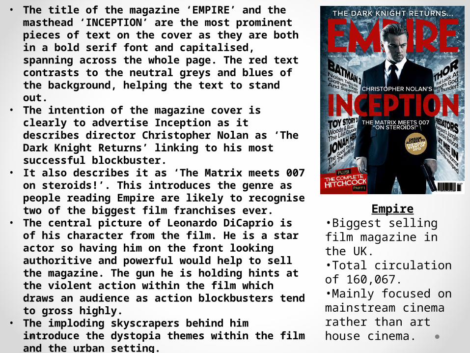
• The title of the magazine ‘EMPIRE’ and the masthead ‘INCEPTION’ are the most prominent pieces of text on the cover as they are both in a bold serif font and capitalised, spanning across the whole page. The red text contrasts to the neutral greys and blues of the background, helping the text to stand out.
• The intention of the magazine cover is clearly to advertise Inception as it describes director Christopher Nolan as ‘The Dark Knight Returns’ linking to his most successful blockbuster.
• It also describes it as ‘The Matrix meets 007 on steroids!’. This introduces the genre as people reading Empire are likely to recognise two of the biggest film franchises ever.
• The central picture of Leonardo DiCaprio is of his character from the film. He is a star actor so having him on the front looking authoritive and powerful would help to sell the magazine. The gun he is holding hints at the violent action within the film which draws an audience as action blockbusters tend to gross highly.
• The imploding skyscrapers behind him introduce the dystopia themes within the film and the urban setting.
• The magazine cover also has other film teasers which encourage the reader to turn the page and start reading to find out more.
Empire•Biggest selling film magazine in the UK.•Total circulation of 160,067.•Mainly focused on mainstream cinema rather than art house cinema.
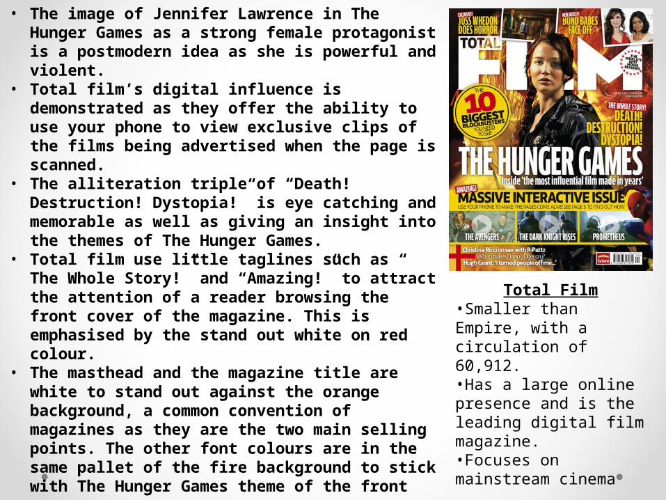
Total Film•Smaller than Empire, with a circulation of 60,912. •Has a large online presence and is the leading digital film magazine. •Focuses on mainstream cinema
• The image of Jennifer Lawrence in The Hunger Games as a strong female protagonist is a postmodern idea as she is powerful and violent.
• Total film’s digital influence is demonstrated as they offer the ability to use your phone to view exclusive clips of the films being advertised when the page is scanned.
• The alliteration triple of “Death! Destruction! Dystopia!” is eye catching and memorable as well as giving an insight into the themes of The Hunger Games.
• Total film use little taglines such as “ The Whole Story!” and “Amazing!” to attract the attention of a reader browsing the front cover of the magazine. This is emphasised by the stand out white on red colour.
• The masthead and the magazine title are white to stand out against the orange background, a common convention of magazines as they are the two main selling points. The other font colours are in the same pallet of the fire background to stick with The Hunger Games theme of the front cover.
• It boasts that the magazine has “The worlds best movie reviews” which helps to convince people to choose Total Film over its competitors.
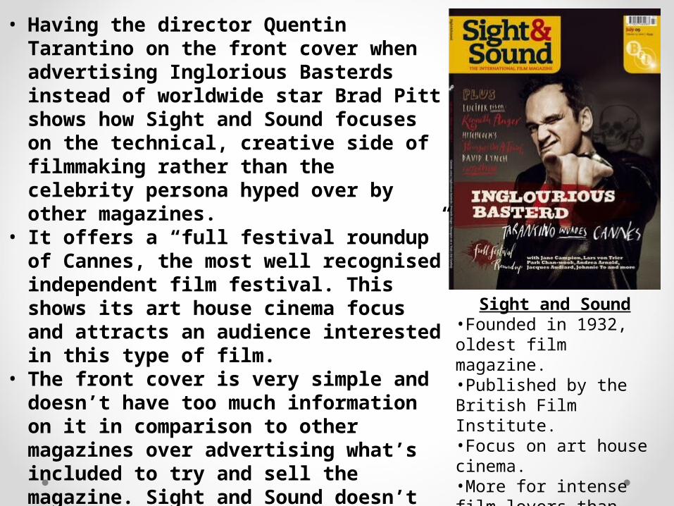
Sight and Sound•Founded in 1932, oldest film magazine.•Published by the British Film Institute. •Focus on art house cinema.•More for intense film lovers than other magazines.
• Having the director Quentin Tarantino on the front cover when advertising Inglorious Basterds instead of worldwide star Brad Pitt shows how Sight and Sound focuses on the technical, creative side of filmmaking rather than the celebrity persona hyped over by other magazines.
• It offers a “full festival roundup” of Cannes, the most well recognised independent film festival. This shows its art house cinema focus and attracts an audience interested in this type of film.
• The front cover is very simple and doesn’t have too much information on it in comparison to other magazines over advertising what’s included to try and sell the magazine. Sight and Sound doesn’t need to do this as its small niche audience is mostly made up of subscribing film fanatics.
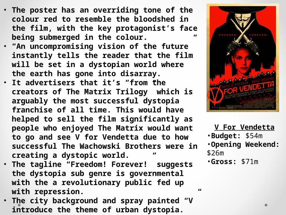
V For Vendetta•Budget: $54m•Opening Weekend: $26m•Gross: $71m
• The poster has an overriding tone of the colour red to resemble the bloodshed in the film, with the key protagonist’s face being submerged in the colour.
• “An uncompromising vision of the future” instantly tells the reader that the film will be set in a dystopian world where the earth has gone into disarray.
• It advertisers that it’s “from the creators of The Matrix Trilogy” which is arguably the most successful dystopia franchise of all time. This would have helped to sell the film significantly as people who enjoyed The Matrix would want to go and see V for Vendetta due to how successful The Wachowski Brothers were in creating a dystopic world.
• The tagline “Freedom! Forever!” suggests the dystopia sub genre is governmental with the a revolutionary public fed up with repression.
• The city background and spray painted “V” introduce the theme of urban dystopia.
• The main antagonist wears a Guy Fawkes mask, also commonly worn by revolutionist group members Anonymous. This reinforces the idea of revolution.
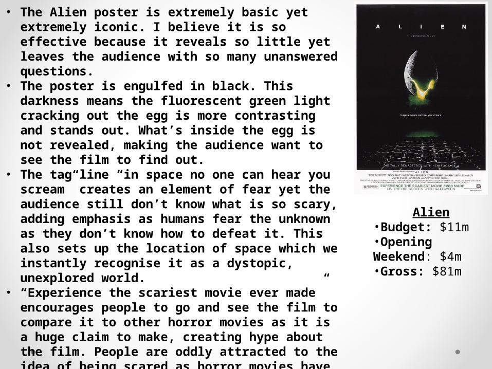
Alien•Budget: $11m•Opening Weekend: $4m•Gross: $81m
• The Alien poster is extremely basic yet extremely iconic. I believe it is so effective because it reveals so little yet leaves the audience with so many unanswered questions.
• The poster is engulfed in black. This darkness means the fluorescent green light cracking out the egg is more contrasting and stands out. What’s inside the egg is not revealed, making the audience want to see the film to find out.
• The tag line “in space no one can hear you scream” creates an element of fear yet the audience still don’t know what is so scary, adding emphasis as humans fear the unknown as they don’t know how to defeat it. This also sets up the location of space which we instantly recognise it as a dystopic, unexplored world.
• “Experience the scariest movie ever made” encourages people to go and see the film to compare it to other horror movies as it is a huge claim to make, creating hype about the film. People are oddly attracted to the idea of being scared as horror movies have a huge loyal audience.
• The layers of dead bodies create more enigmas as we don’t know if they’re dead, alive, human, alien?
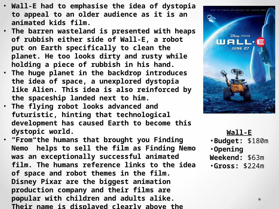
Wall-E•Budget: $180m•Opening Weekend: $63m•Gross: $224m
• Wall-E had to emphasise the idea of dystopia to appeal to an older audience as it is an animated kids film.
• The barren wasteland is presented with heaps of rubbish either side of Wall-E, a robot put on Earth specifically to clean the planet. He too looks dirty and rusty while holding a piece of rubbish in his hand.
• The huge planet in the backdrop introduces the idea of space, a unexplored dystopia like Alien. This idea is also reinforced by the spaceship landed next to him.
• The flying robot looks advanced and futuristic, hinting that technological development has caused Earth to become this dystopic world.
• “From the humans that brought you Finding Nemo” helps to sell the film as Finding Nemo was an exceptionally successful animated film. The humans reference links to the idea of space and robot themes in the film. Disney Pixar are the biggest animation production company and their films are popular with children and adults alike. Their name is displayed clearly above the title to help convince people to see the film.
• The overriding blue/white tone appears cold and has the connotations of dystopia and the future.