Embed Size (px)
Citation preview
AS media studies music
magazine evaluation
Question 1 - Who would be the
audience for your media product?
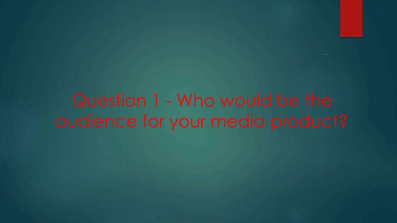
Target audience
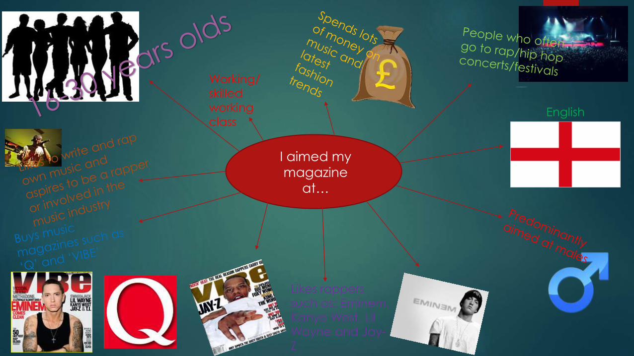
My magazine is following the hip hop/ rap theme used in VIBE magazine so my reader would be:
Age Range: 16 – 30
Gender: my magazine will be aimed at boys and girls
Lower middle/ skilled working class
Interests of my reader:
Rap/ hip hop music
Going to festivals and gigs
Interested in reading about current events in the music industry
Reading about the lives of rappers and how they became famous
I chose this audience as I believe the stories in my magazine
can inspire these young people to do well for themselves and
even get involved in music. I believe that my mostly boys will
read my magazine but it may also attract girls as well.
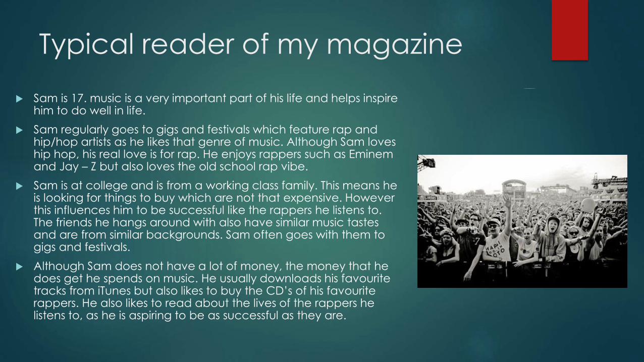
Typical reader of my magazine
Sam is 17. music is a very important part of his life and helps inspire him to do well in life.
Sam regularly goes to gigs and festivals which feature rap and hip/hop artists as he likes that genre of music. Although Sam loves hip hop, his real love is for rap. He enjoys rappers such as Eminem and Jay – Z but also loves the old school rap vibe.
Sam is at college and is from a working class family. This means he is looking for things to buy which are not that expensive. However this influences him to be successful like the rappers he listens to. The friends he hangs around with also have similar music tastes and are from similar backgrounds. Sam often goes with them to gigs and festivals.
Although Sam does not have a lot of money, the money that he does get he spends on music. He usually downloads his favourite tracks from iTunes but also likes to buy the CD’s of his favourite rappers. He also likes to read about the lives of the rappers he listens to, as he is aspiring to be as successful as they are.
I aimed my magazine
at…
Likes rappers
such as: Eminem,
Kanye West, Lil
Wayne and Jay-
Z
English
Working/
skilled
working
class
2- How did you attract/ address your
audience?
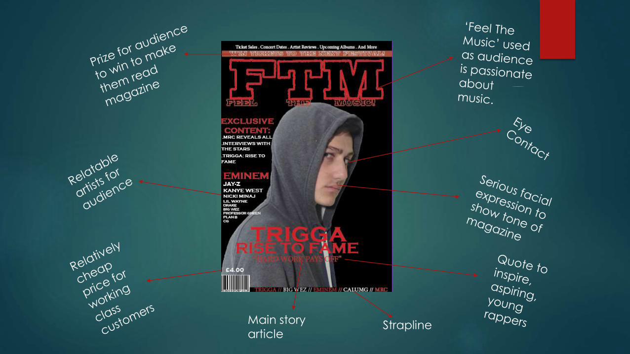
StraplineMain story
article
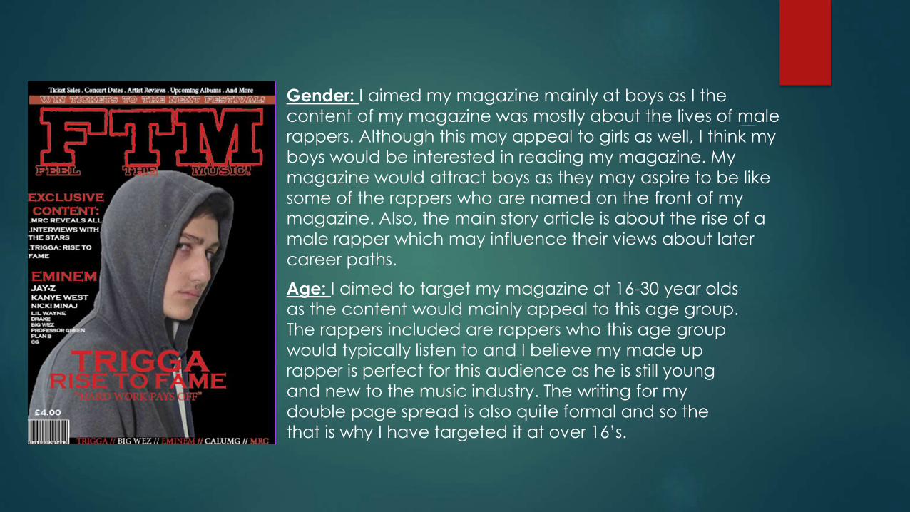
Gender: I aimed my magazine mainly at boys as I the
content of my magazine was mostly about the lives of male
rappers. Although this may appeal to girls as well, I think my
boys would be interested in reading my magazine. My
magazine would attract boys as they may aspire to be like
some of the rappers who are named on the front of my
magazine. Also, the main story article is about the rise of a
male rapper which may influence their views about later
career paths.
Age: I aimed to target my magazine at 16-30 year olds
as the content would mainly appeal to this age group.
The rappers included are rappers who this age group
would typically listen to and I believe my made up
rapper is perfect for this audience as he is still young
and new to the music industry. The writing for my
double page spread is also quite formal and so the
that is why I have targeted it at over 16’s.

This strapline attracts the reader as it is giving
away a prize which the customer could win and
so this encourages them to buy it
The red writing stands out on the black
background which will draw the
customers eyes to it. The friendly slogan
‘feel the music’ may also encourage the
reader to read the rest of the magazine
after seeing the front cover.
Inspiring, yet relatable
quote to draw the
reader in more.

I used a red and white colour scheme as I felt that it would stand out well on
a black background. I used this colour scheme for my front cover, contents
page and my double page spread. However these colours are quite serious
as I wanted to connote the seriousness of my magazine. I also used this colour
scheme to as red connotes danger and I wanted to show that this new
rapper may be a danger to the already existing rappers in the industry.
3- How does your media product
represent particular social groups?
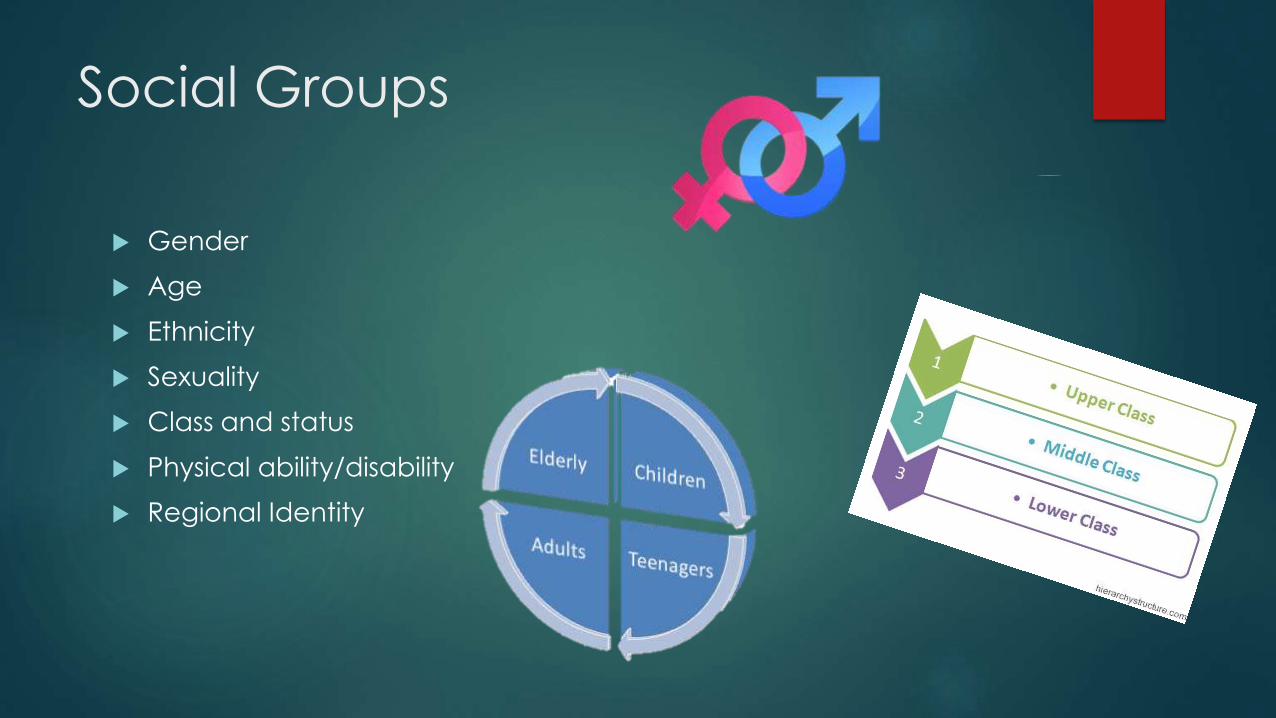
Social Groups
Gender
Age
Ethnicity
Sexuality
Class and status
Physical ability/disability
Regional Identity

Age – the model for my magazine would be a
similar age as the audience who would read my
magazine. This would help them to relate to the
magazine as they may be aspiring to be a rapper.
As he is the same age, his taste in music would be
similar to the audience of my magazine which
may encourage them to buy it.
Gender - My magazine is targeted primarily at
males and so this is why I have chosen to have
a male figure on the front of my magazine. The
story in my double page spread about a young
boy who has become a famous rapper may
influence them to buy the magazine If they
aspire to be like him.
Social class and status – the story in my
double page spread shows that my rapper
is of a working class background. The
clothes he is wearing also connote a
stereotypical view of someone who is
working class.
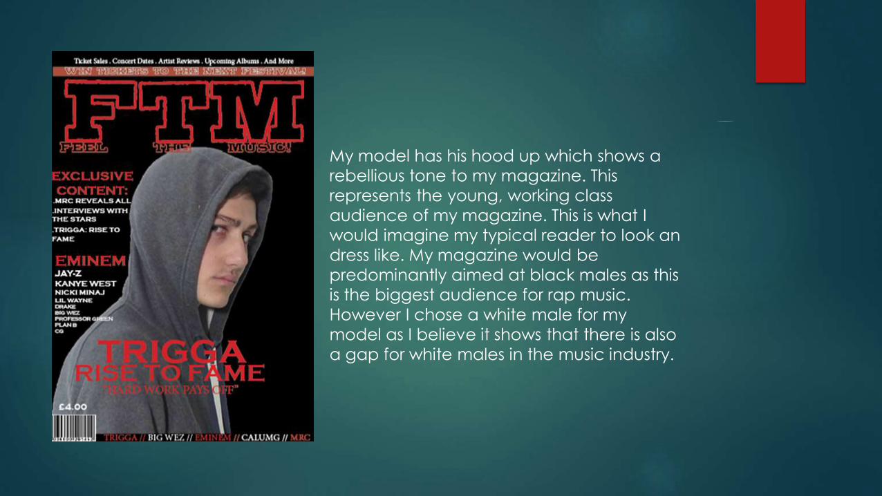
My model has his hood up which shows a
rebellious tone to my magazine. This
represents the young, working class
audience of my magazine. This is what I
would imagine my typical reader to look an
dress like. My magazine would be
predominantly aimed at black males as this
is the biggest audience for rap music.
However I chose a white male for my
model as I believe it shows that there is also
a gap for white males in the music industry.

4 - In what ways does your media
product use, develop or challenge
forms and conventions of real
media products?
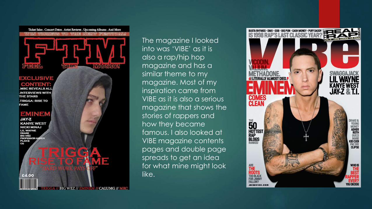
The magazine I looked
into was ‘VIBE’ as it is
also a rap/hip hop
magazine and has a
similar theme to my
magazine. Most of my
inspiration came from
VIBE as it is also a serious
magazine that shows the
stories of rappers and
how they became
famous. I also looked at
VIBE magazine contents
pages and double page
spreads to get an idea
for what mine might look
like.
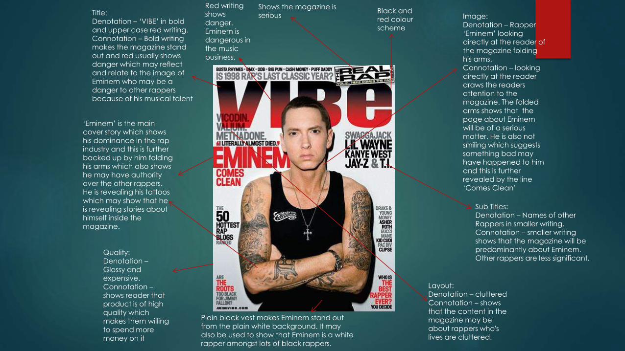
Title:Denotation – ‘VIBE’ in bold and upper case red writing.Connotation – Bold writing makes the magazine stand out and red usually shows danger which may reflect and relate to the image of Eminem who may be a danger to other rappers because of his musical talent
Image:Denotation – Rapper ‘Eminem’ looking directly at the reader of the magazine folding his arms.Connotation – looking directly at the reader draws the readers attention to the magazine. The folded arms shows that the page about Eminem will be of a serious matter. He is also not smiling which suggests something bad may have happened to him and this is further revealed by the line ‘Comes Clean’
Shows the magazine is serious
‘Eminem’ is the main cover story which shows his dominance in the rap industry and this is further backed up by him folding his arms which also shows he may have authority over the other rappers. He is revealing his tattoos which may show that he is revealing stories about himself inside the magazine.
Black and red colour scheme
Sub Titles:Denotation – Names of other Rappers in smaller writing.Connotation – smaller writing shows that the magazine will be predominantly about Eminem. Other rappers are less significant.
Quality:Denotation –Glossy and expensive.Connotation –shows reader that product is of high quality which makes them willing to spend more money on it
Layout: Denotation – clutteredConnotation – shows that the content in the magazine may be about rappers who's lives are cluttered.
Plain black vest makes Eminem stand out from the plain white background. It may also be used to show that Eminem is a white rapper amongst lots of black rappers.
Red writing shows danger. Eminem is dangerous in the music business.
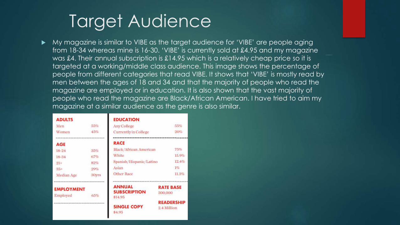
Target Audience My magazine is similar to VIBE as the target audience for ‘VIBE’ are people aging
from 18-34 whereas mine is 16-30. ‘VIBE’ is currently sold at £4.95 and my magazine
was £4. Their annual subscription is £14.95 which is a relatively cheap price so it is
targeted at a working/middle class audience. This image shows the percentage of
people from different categories that read VIBE. It shows that ‘VIBE’ is mostly read by
men between the ages of 18 and 34 and that the majority of people who read the
magazine are employed or in education. It is also shown that the vast majority of
people who read the magazine are Black/African American. I have tried to aim my
magazine at a similar audience as the genre is also similar.
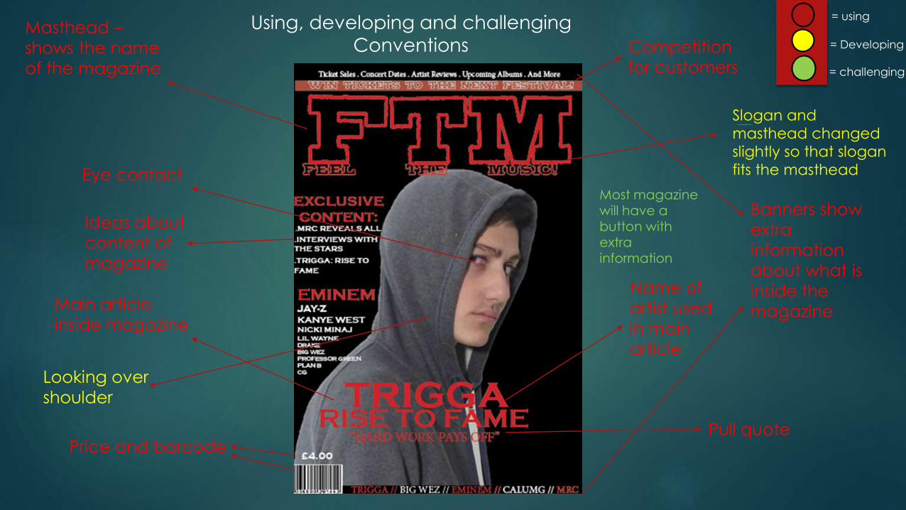
Using, developing and challenging
ConventionsMasthead –
shows the name
of the magazine
Banners show
extra
information
about what is
inside the
magazineMain article
inside magazine
Eye contact
Name of
artist used
in main
article
Price and barcode
Ideas about
content of
magazine
Competition
for customers
Slogan and
masthead changed
slightly so that slogan
fits the masthead
Pull quote
Looking over
shoulder
= using
= Developing
= challenging
Most magazine will have a button with extra information

= using
= challenging
= DevelopingTitle of ‘contents’
Magazine logo
and date in
corner
‘Features’
section
‘Regulars’ section
Model looking
directly into
camera
‘T’ in
background
‘Artist interviews’
section
Some music magazines
have additional photos
to show the content of
the magazine

Title of
article
Pull quotes
Page number and title
at bottomMain article on
right hand side
Model
looking into
camera
Date
magazine
was issued
Two pictures
Model facing
away from reader
Some
magazines
have headings
for different
sections of their
articles.
= using
= challenging
= Developing
5 - What kind of media institution
might distribute your product and
why?
Distribution
To distribute my magazine I would go for a rival company and try and steal my competitors audience. This is because my magazine is similar to VIBE magazine and so I believe it would sell well.
My magazine would be published monthly at £4. this is because my target audience is of working class and so may not have as much enough disposable income to buy a magazine weekly or fortnightly.
I would sell my magazine in supermarkets and local shops such as Sainsbury and Tesco but I would also make my magazine available and purchasable for customers online.
I would also make an app for smart phones which would give customers updates on content and release dates of my magazine.
I would also set up a Facebook and twitter page so that updates can be given to my consumers.
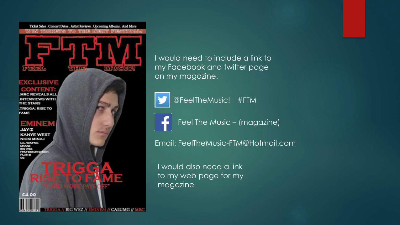
I would need to include a link to
my Facebook and twitter page
on my magazine.
@FeelTheMusic!
Feel The Music – (magazine)
Email: [email protected]
I would also need a link
to my web page for my
magazine
#FTM
Phone App
page
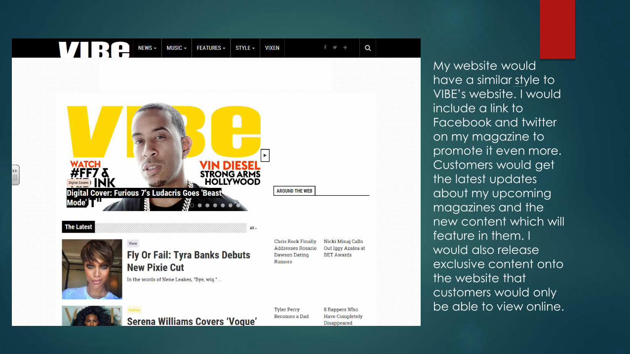
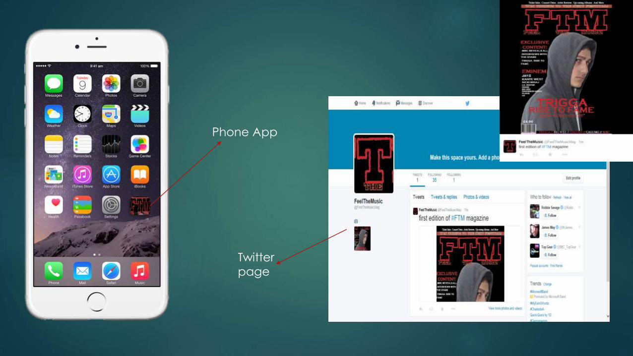
My website would
have a similar style to
VIBE’s website. I would
include a link to
Facebook and twitter
on my magazine to
promote it even more.
Customers would get
the latest updates
about my upcoming
magazines and the
new content which will
feature in them. I
would also release
exclusive content onto
the website that
customers would only
be able to view online.
6- What have you learnt about
technologies from the process of
constructing this product?
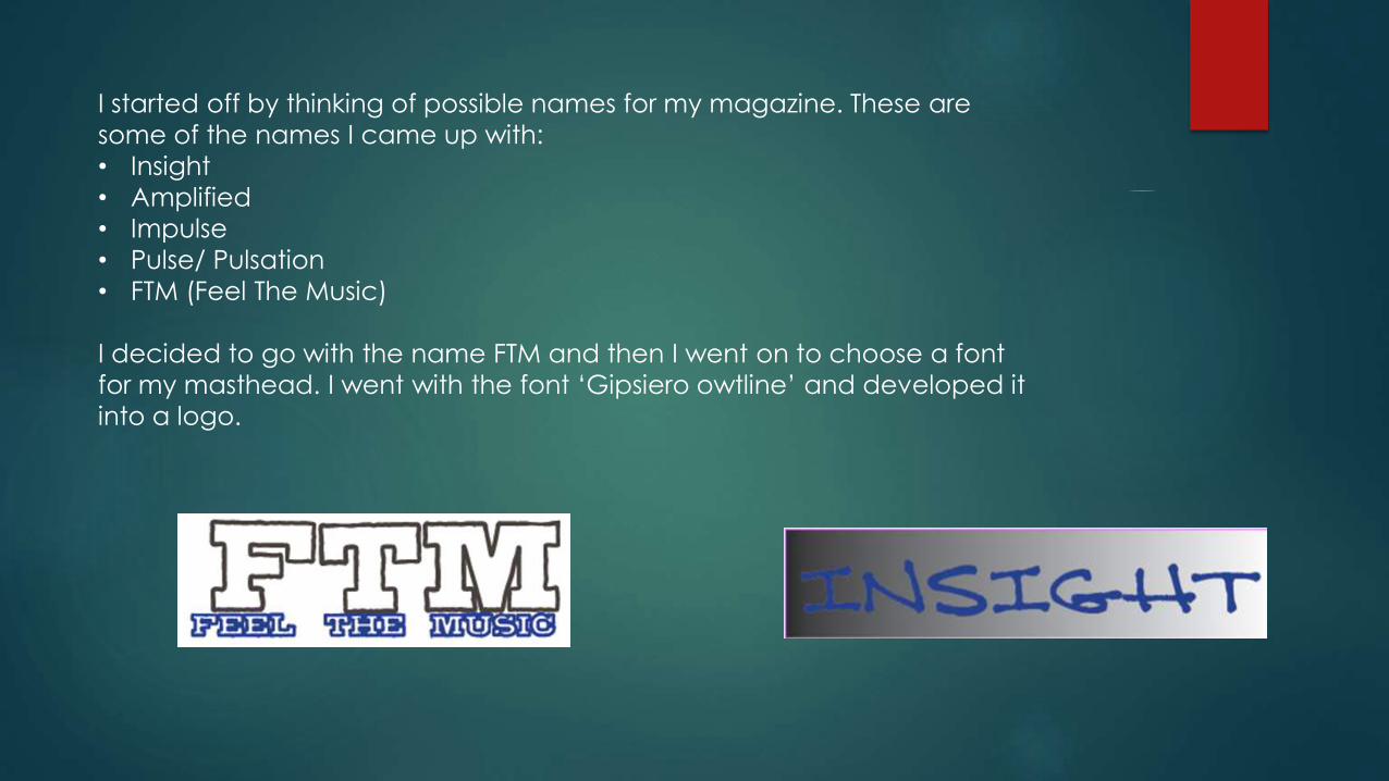
I started off by thinking of possible names for my magazine. These are
some of the names I came up with:
• Insight
• Amplified
• Impulse
• Pulse/ Pulsation
• FTM (Feel The Music)
I decided to go with the name FTM and then I went on to choose a font
for my masthead. I went with the font ‘Gipsiero owtline’ and developed it
into a logo.
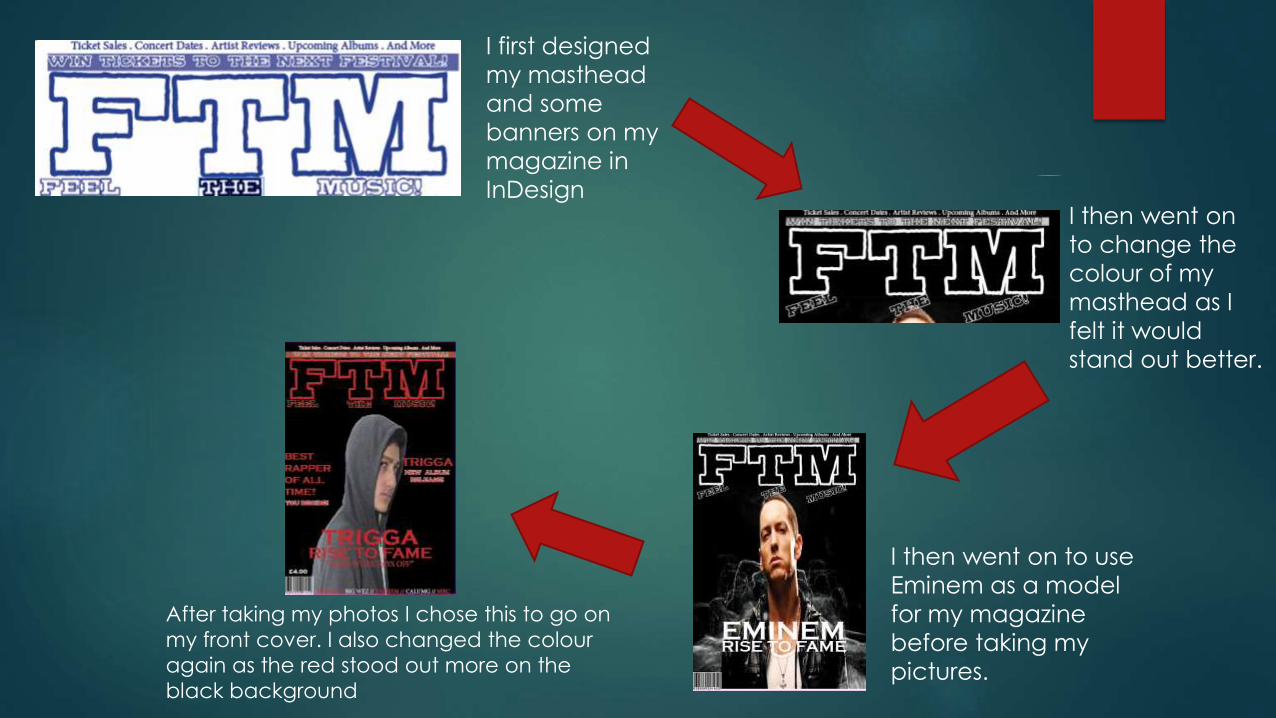
I first designed
my masthead
and some
banners on my
magazine in
InDesignI then went on
to change the
colour of my
masthead as I
felt it would
stand out better.
I then went on to use
Eminem as a model
for my magazine
before taking my
pictures.
After taking my photos I chose this to go on
my front cover. I also changed the colour
again as the red stood out more on the
black background
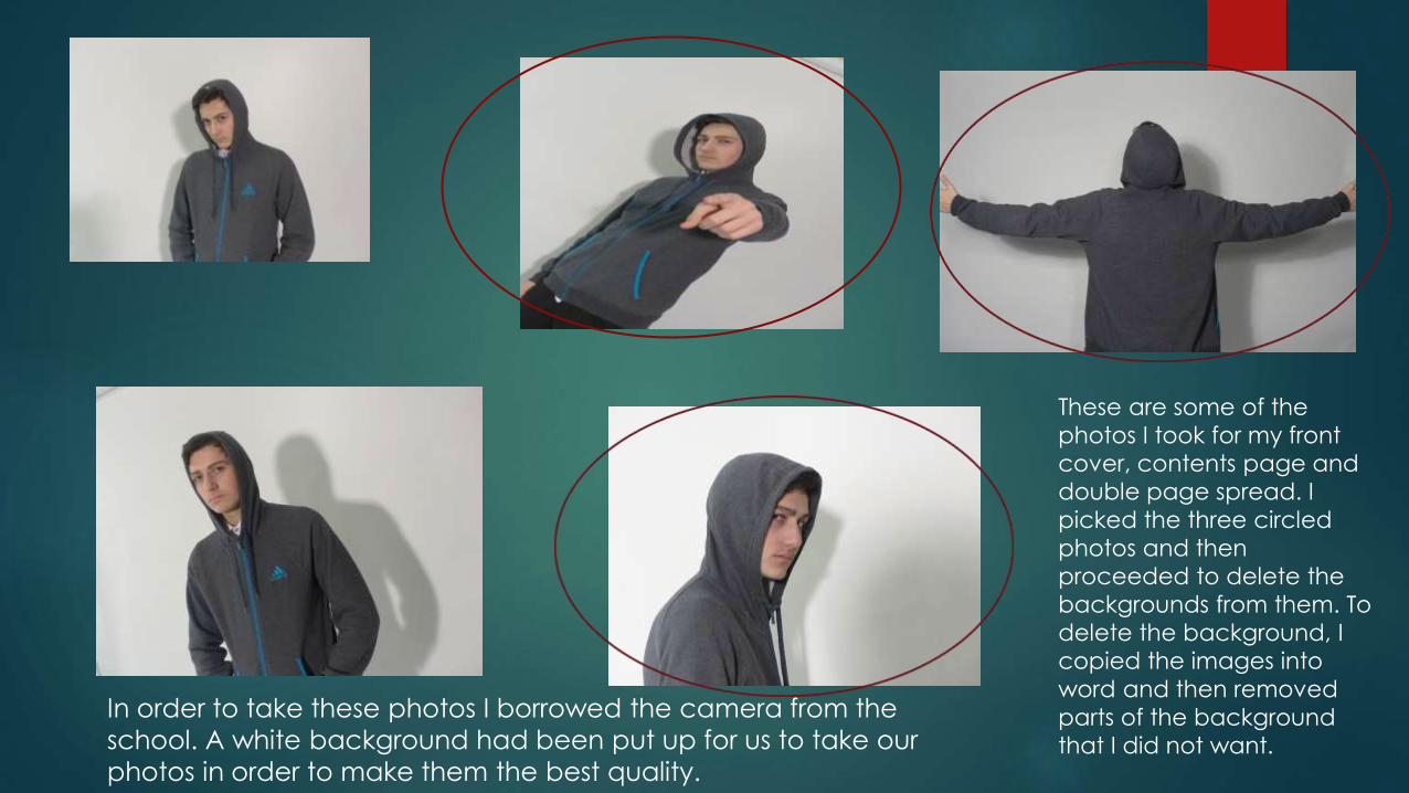
These are some of the
photos I took for my front
cover, contents page and
double page spread. I
picked the three circled
photos and then
proceeded to delete the
backgrounds from them. To
delete the background, I
copied the images into
word and then removed
parts of the background
that I did not want.
In order to take these photos I borrowed the camera from the
school. A white background had been put up for us to take our
photos in order to make them the best quality.
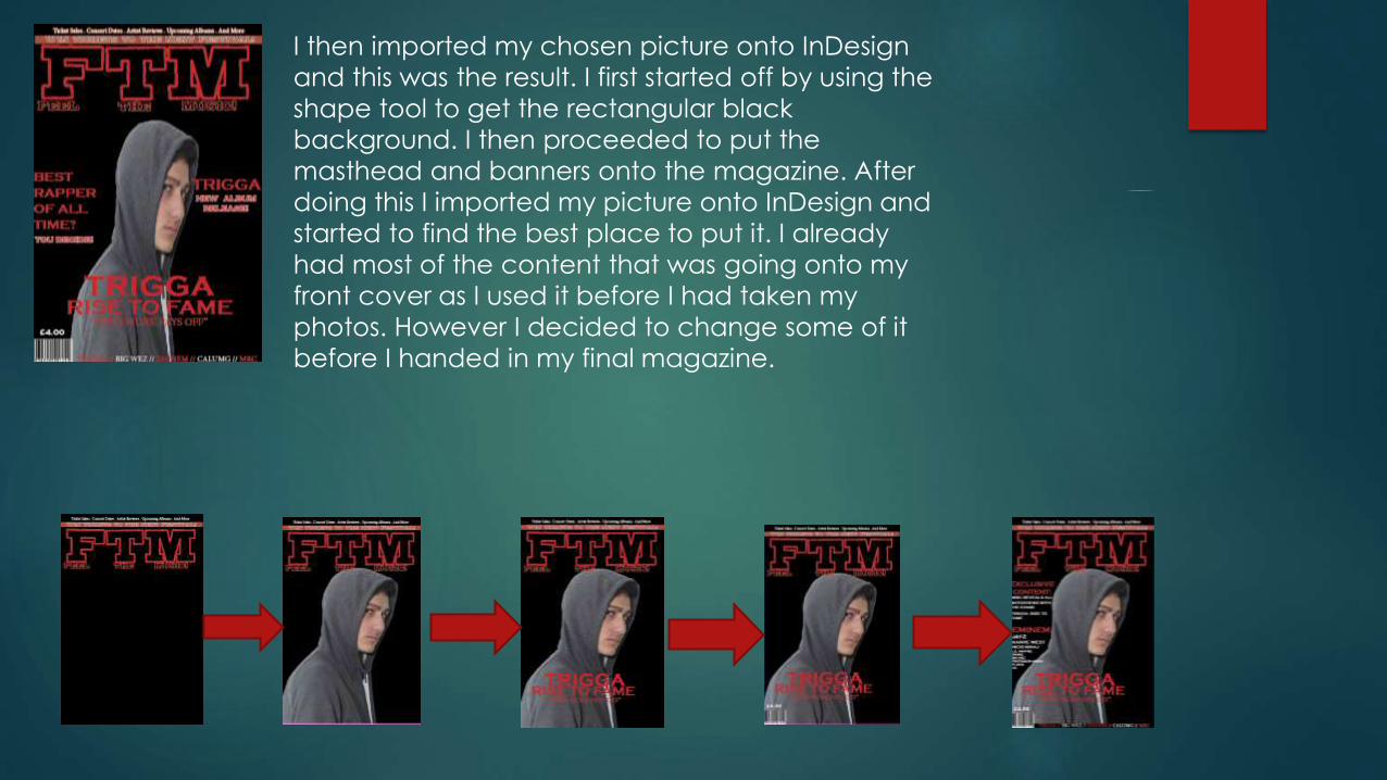
I then imported my chosen picture onto InDesign
and this was the result. I first started off by using the
shape tool to get the rectangular black
background. I then proceeded to put the
masthead and banners onto the magazine. After
doing this I imported my picture onto InDesign and
started to find the best place to put it. I already
had most of the content that was going onto my
front cover as I used it before I had taken my
photos. However I decided to change some of it
before I handed in my final magazine.
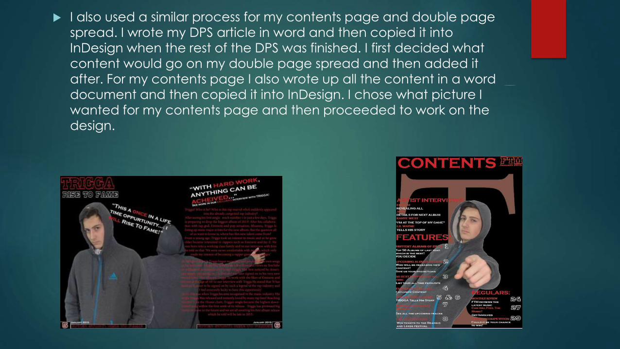
I also used a similar process for my contents page and double page
spread. I wrote my DPS article in word and then copied it into
InDesign when the rest of the DPS was finished. I first decided what
content would go on my double page spread and then added it
after. For my contents page I also wrote up all the content in a word
document and then copied it into InDesign. I chose what picture I
wanted for my contents page and then proceeded to work on the
design.

7- Looking back at your preliminary
task, what do you feel you have
learnt in the progression from this to
the final product?
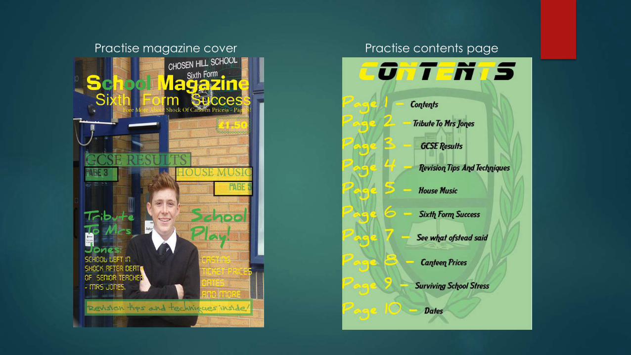
Practise magazine cover Practise contents page
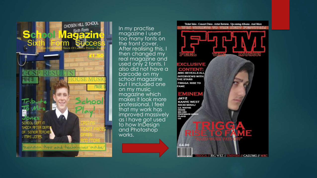
In my practise magazine I used too many fonts on the front cover. After realising this, I then changed my real magazine and used only 2 fonts. I also did not have a barcode on my school magazine but I included one on my music magazine which makes it look more professional. I feel that my work has improved massively as I have got used to how InDesign and Photoshop works.
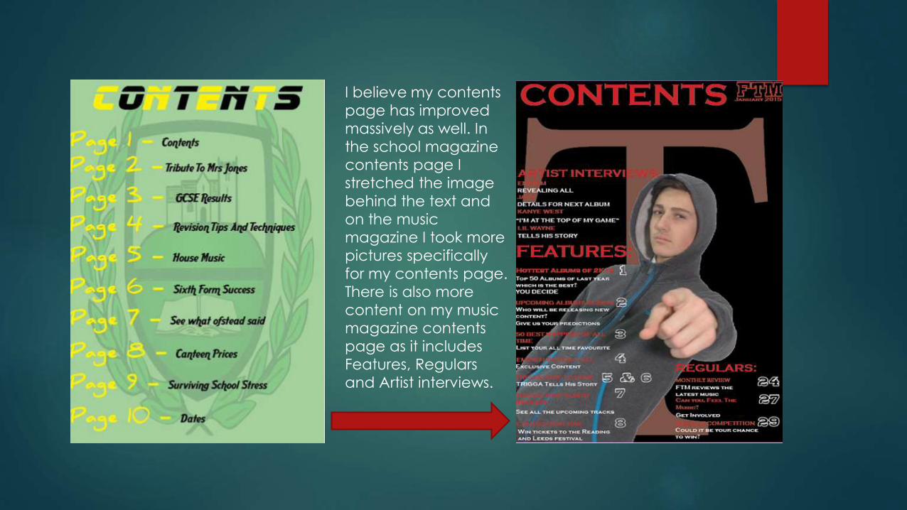
I believe my contents
page has improved
massively as well. In
the school magazine
contents page I
stretched the image
behind the text and
on the music
magazine I took more
pictures specifically
for my contents page.
There is also more
content on my music
magazine contents
page as it includes
Features, Regulars
and Artist interviews.
Overall I believe my work has progressed since the preliminary task. I have learnt about magazine conventions and I have incorporated them into my music magazine. I have also improved my skills on Photoshop and InDesign and have been able to create a more professional looking magazine. For my school magazine I only took one picture and after doing this realised that more pictures would be needed for a real magazine. For the music magazine I then proceeded to take several pictures and choose the best ones. This allowed me to use photos which would be more significant to the style of my magazine.