Embed Size (px)
Citation preview

Module 3
Bootstrap Framework
The most popular responsive,
mobile-first HTML5 and CSS3
framework

What is Bootstrap?
• Free front-end framework for faster and easier web development
• Bootstrap includes HTML and CSS for typography, forms, buttons,
tables, navigation, image carousels…
• Optional JavaScript plugins
• Ability to easily create responsive designs

What is responsive web design?
Responsive web design is about creating web sites
which automatically adjust themselves to look good on all devices,
from small phones to large desktops.

What is a framework?
A framework provides code for common activities
performed in web development — so you don’t need to
reinvent the wheel every time you start a project

History of Bootstrap
• Developed by Mark Otto and Jacob
Thornton at Twitter
• Released as an open source product in
August 2011
• Currently on version 3
• Popularity and usage is rising

Goals for Module 3
What we’ll cover in Module 3 (Feb 10 and Feb 17)
This week (Feb 10):
1. Overview of what Bootstrap is and how it can be used
2. Experiment with the grid system
3. Experiment with other elements: tables and buttons
Next week (Feb 17):
1. Create a simple-one page site

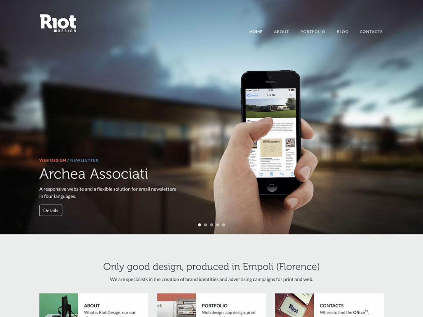
Examples


Pros and Cons of Bootstrap
• Save time: use the predefined
design templates and classes
• Responsive features
• Consistent design across
elements
• Easy to to use
• Compatible with all modern
browsers
• Open Source: free to download
and use
• Div-heavy code
• Relies on classes extensively
• Source code can be rather
complex
• Larger CSS and JS files can
cause some loading lag time
• Popularity means lots of sites
are using it… may want to
customize to stand out
Pros: Cons:

Big pros of Bootstrap? (IMHO)
Start simple, get more complex as needed

Big pros of Bootstrap? (IMHO)
Built-in styles look clean, modern but can easily be customized

Big pros of Bootstrap? (IMHO)
Simple, easy to understand 12-column grid system

Class demos
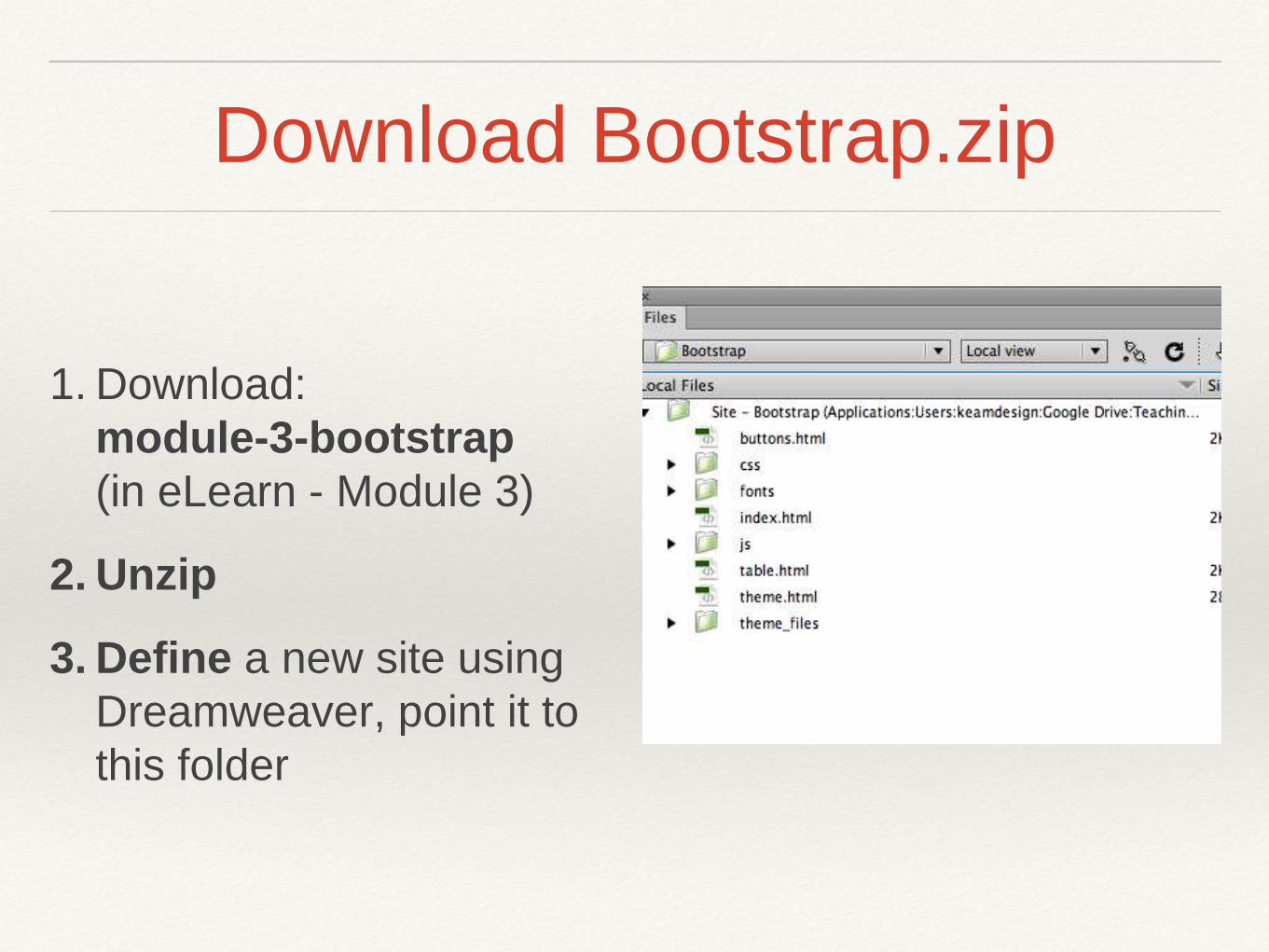
Download Bootstrap.zip
1. Download:
module-3-bootstrap
(in eLearn - Module 3)
2. Unzip
3. Define a new site using
Dreamweaver, point it to
this folder

Download Bootstrap.zip
4. Open the index.html file
5. Note the links to the css files:
• bootstrap.css - this contains all the styles to create the
layouts (DON’T EDIT THIS FILE)
• bootstrap-theme.css - additional css for a visually
enhanced experience (DON’T EDIT THIS FILE)
• custom-styles.css - this is where you create custom
styles to modify the design

The grid and containers
Container element wraps contents and houses the grid system, options:
.container - responsive fixed-width container
.container-fluid - full-width, spans the entire width of the screen

Step 1: create a container
1. In the index.html file create a <div>
2. Apply the container class:
<div class="container">
</div>

The Grid
The grid creates page layouts with a series of rows and
columns that house the content
Blocks of content are created by specifying the number of
columns you wish to span


Media Queries
Key breakpoints in the grid system:
/* Extra small devices (phones, less than 768px) */
/* No media query since this is the default in Bootstrap */
/* Small devices (tablets, 768px and up) */
@media (min-width: @screen-sm-min) { ... }
/* Medium devices (desktops, 992px and up) */
@media (min-width: @screen-md-min) { ... }
/* Large devices (large desktops, 1200px and up) */
@media (min-width: @screen-lg-min) { ... }

Step 2: add a row
1. Inside <div class=“container”>, create a <div>
2. Apply the row class:
<div class=“row">
</div>

Rows and columns
• Rows must be placed within a container for proper
alignment and padding
• Use rows to create horizontal groups of columns

Grid options
• Including the class prefix options allows you to have
more control over how the columns stack/don’t stack on
smaller devices

Step 3: add a column
1. Within the row, create a <div></div>
2. Apply the class for a 12 column-wide column
using extra small:
<div class="col-xs-12">12 columns (x small)</div>

Looks like:
Note: I’ve added some custom styles in <link href="css/custom-styles.css"
rel=“stylesheet"> to show the difference between xs, sm, md and lg

Step 4: add columns at xs
1. Create another row:
<div class=“row">
</div>
2. Create a div and apply the class for 3 column width
using xs (extra-small): col-xs-3
<div class=“col-xs-3”>3 columns (x small)</div>
3. Copy and paste so there are 4 of these <div>s

Looks like:

Step 6: columns at sm
1. Create another row
<div class=“row">
</div>
2. Create a div and apply the class for 3 column width
using sm (small): col-sm-3
<div class=“col-sm-3”>3 columns (small)</div>
3. Copy and paste so there are 4 of these divs

Looks like:

Step 7: columns at md
1. Create another row
<div class=“row">
</div>
2. Create a div and apply the class for 3 column width
using md (medium): col-md-3
<div class=“col-md-3”>3 columns (medium)</div>
3. Copy and paste so there are 4 of these divs

Looks like:

Step 7: columns at lg
1. Create another row
<div class=“row">
</div>
2. Create a div and apply the class for 3 column width
using lg (large): col-lg-3
<div class=“col-lg-3”>3 columns (large)</div>
3. Copy and paste so there are 4 of these divs

Looks like:

Looks like this on a small device:
Notice how the teal and red rows (medium
and large) have stacked at a smaller size…
but the yellow and orange (xsmall and small)
continue to sit side-by-side
Using the class-prefixes allows you to define
how content will look on a smaller device…

Combine for more control…
• Want more control?
• Combine the sizes:
<div class="row">
<div class="col-xs-12 col-md-8”>xs at 12, md at 8</div>
<div class="col-xs-6 col-md-4”>xs at 6, md at 4</div>
</div>

Looks like:
Combining class-prefixes
allows for different layouts on
smaller devices

More great features…

Headings
Styles for headings 1 through 6

Paragraphs
• Bootstrap's global default font-size is 14px, with a line-height of 1.428
• Applied to the <body> and all paragraphs
• <p> tags receive a bottom margin of half their computed line-height
(10px by default)

Making a paragraph stand out
• Make a paragraph stand out by adding the class .lead

Formatting options
Many other classes exist for:
• Inline text elements
• Alignment classes
• Transformation classes
• Abbreviations
• Addresses
• Blockquotes

One of my favourites…
Horizontal definitions:
• Make terms and descriptions in <dl> line up side-by-side
• Starts off stacked like default <dl>s, but when the navbar
expands, so do these

Tables
Open the table.html file
• Add the class “table" to the <table> tag
• Style creates an attractive, easy to read table
Try adding these classes: (e.g. class=“table table-bordered”)
• table-bordered
• table-hover
• table-striped

Responsive table option
Try adding a <div> around the table with the
class"table-responsive"
• Note how the table behaves when viewed on a
small screen

Links and buttons
• Bootstrap has custom button and link styles
<button type="button" class="btn btn-default”>Default</button>
<button type="button" class="btn btn-primary”>Primary</button>
…etc…

Links and buttons
Open the button.html file
• Note the buttons have the class “btn” applied
Try adding these classes:
• btn-default to the button in the left column
• btn-lg to the button in the middle column
• btn-block to the button in the right column
What is the effect of each class?

Putting it all together…
• Open theme.html
• Check out how some elements work
• E.g. the Carousel at the very bottom
• Shrink your window and see how the
layout changes and adapts
Next week we’ll take some elements
from this theme and build a simple,
one-page website

Interested in learning more?
• Check out the Bootstrap
website at getbootstrap.com