Embed Size (px)
Citation preview

My Magazine Page

My Front CoverFor resubmission

My Contents Page For resubmission
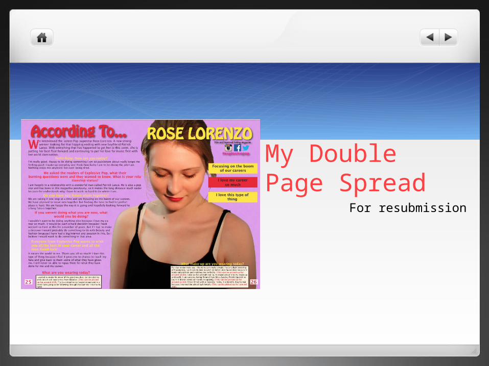
My Double Page Spread
For resubmission
IntroductionTo complete this coursework successfully, I had to create a music magazine specific to one genre. I had to make 3 pages (front cover, contents page and double pages spread) that would fit conventions of the genre. It must include all original images taken by myself and constructed by myself. To have fulfilled the brief, I will use programs to give each and every page the professional and conventional music magazine look, I am aiming to go for.
Research into Quark and PhotoshopBefore starting the construction of the final product, I took some research into Quark and Photoshop. This would to enable me to learn what it they could do and what I needed to go in order to do what I wanted. Reseach into Photoshop and Quark.

GenreDuring the brief, I had to make sure I made the magazine specific to one type of music genre. I decided to select the genre of Pop. I decided to select this because I had the most knowledge on this and I understood the codes and conventions much more than any other. I believe I have completed the brief because I have included many of the codes and conventions of this genre. I did a lot of research into this genre to make sure I included a majority of what is normally there on a magazine. They codes and conventions are included to make sure the audience know what music genre it is. I have included a lot of the codes and conventions in my magazine to make sure my audience know that the magazine is for them.
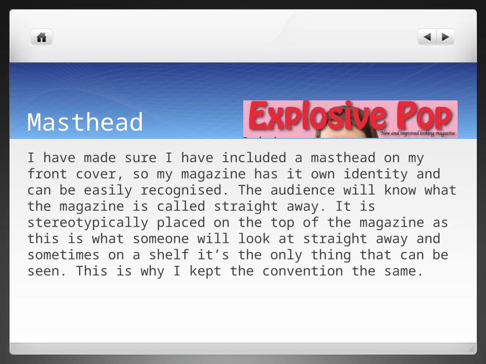
MastheadI have made sure I have included a masthead on my front cover, so my magazine has it own identity and can be easily recognised. The audience will know what the magazine is called straight away. It is stereotypically placed on the top of the magazine as this is what someone will look at straight away and sometimes on a shelf it’s the only thing that can be seen. This is why I kept the convention the same.

ConclusionIn conclusion, I much prefer my new front cover to my old front cover as it looks more real and includes all my own photos which I edited. I massively changed my magazine to make sure it was a lot busier but organised in its appearance. I made the magazine busier but not too busy that it distracted the audience away from the overall look. I This was my aim last times, so I wanted to continue it in some form.
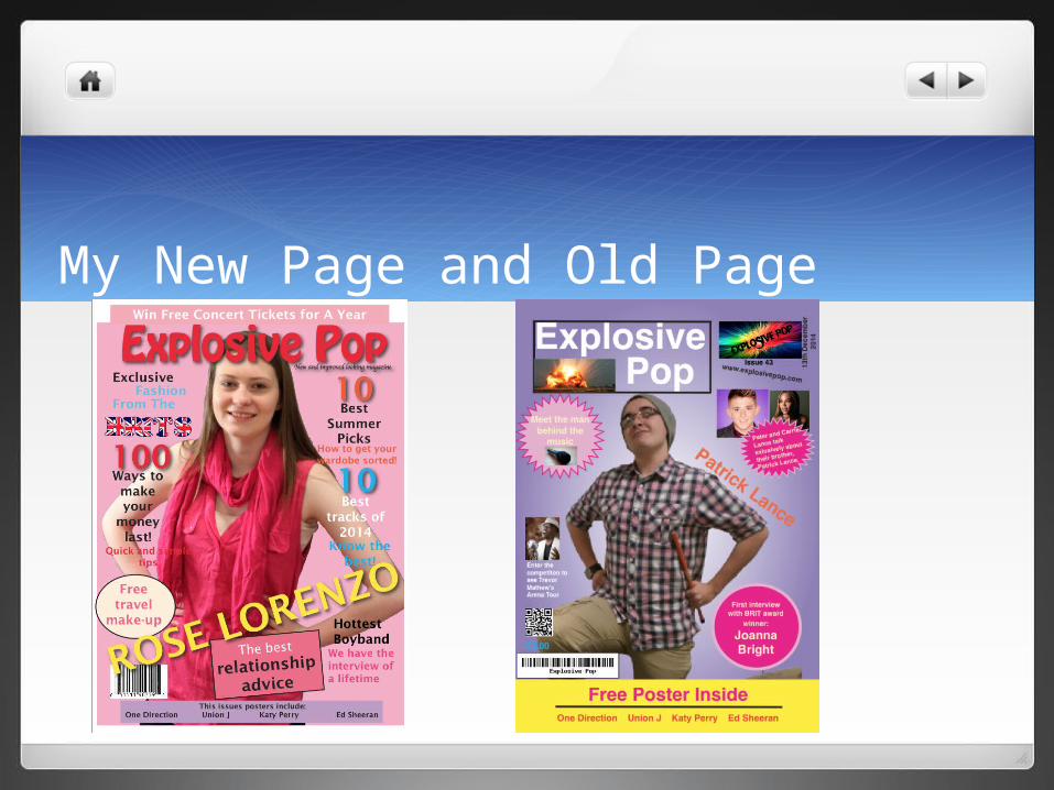
My New Page and Old Page

My New Page and Old Page

My New Page and Old Page