Embed Size (px)
Citation preview

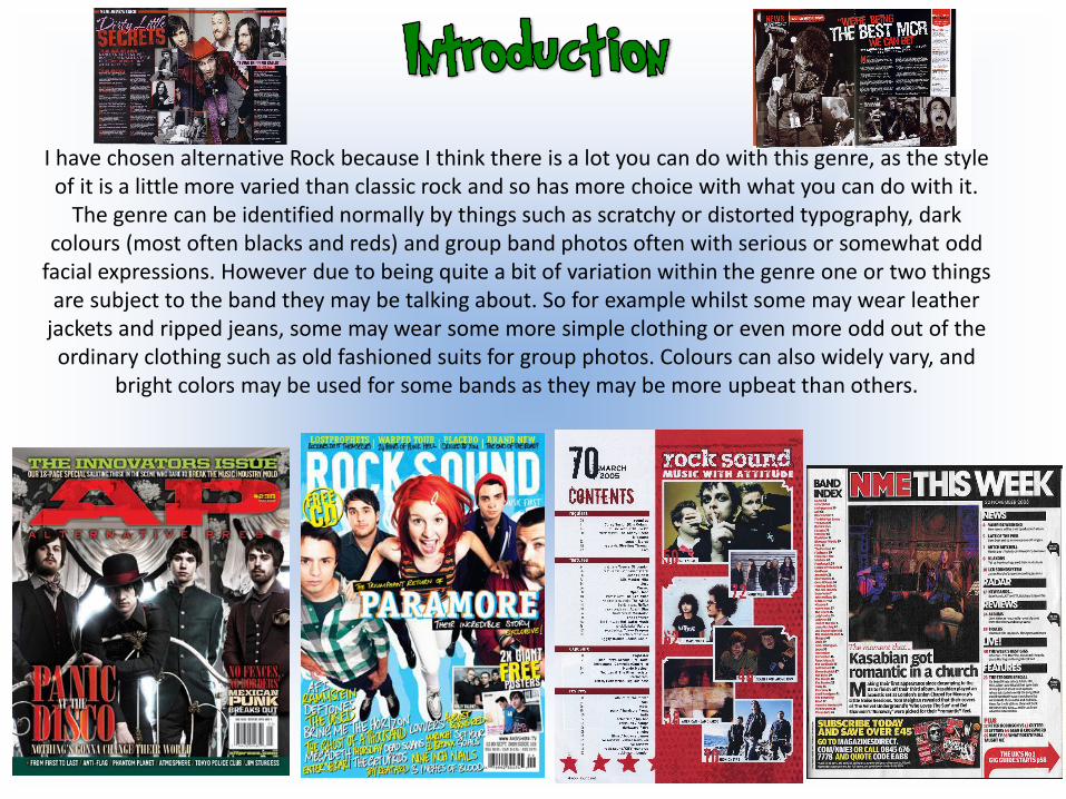
I have chosen alternative Rock because I think there is a lot you can do with this genre, as the style of it is a little more varied than classic rock and so has more choice with what you can do with it.
The genre can be identified normally by things such as scratchy or distorted typography, dark colours (most often blacks and reds) and group band photos often with serious or somewhat odd
facial expressions. However due to being quite a bit of variation within the genre one or two things are subject to the band they may be talking about. So for example whilst some may wear leather
jackets and ripped jeans, some may wear some more simple clothing or even more odd out of the ordinary clothing such as old fashioned suits for group photos. Colours can also widely vary, and
bright colors may be used for some bands as they may be more upbeat than others.
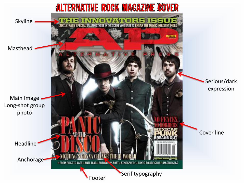
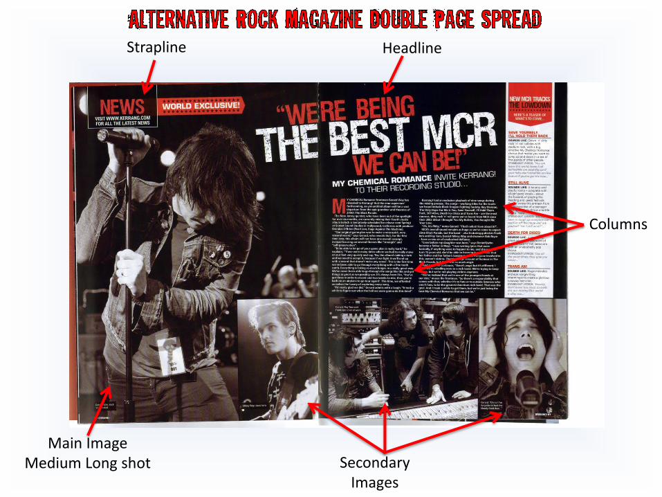
Skyline
Masthead
Main ImageLong-shot group
photo
Headline
Anchorage
Footer
Cover line
Serious/dark expression
Serif typography
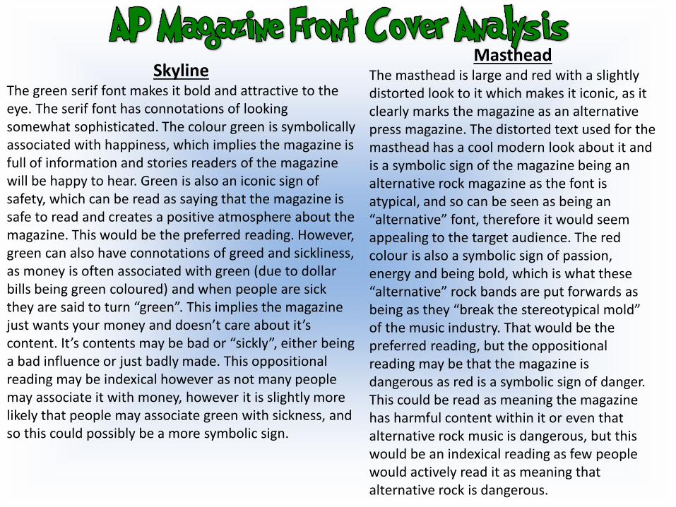
SkylineThe green serif font makes it bold and attractive to the eye. The serif font has connotations of looking somewhat sophisticated. The colour green is symbolically associated with happiness, which implies the magazine is full of information and stories readers of the magazine will be happy to hear. Green is also an iconic sign of safety, which can be read as saying that the magazine is safe to read and creates a positive atmosphere about the magazine. This would be the preferred reading. However, green can also have connotations of greed and sickliness, as money is often associated with green (due to dollar bills being green coloured) and when people are sick they are said to turn “green”. This implies the magazine just wants your money and doesn’t care about it’s content. It’s contents may be bad or “sickly”, either being a bad influence or just badly made. This oppositional reading may be indexical however as not many people may associate it with money, however it is slightly more likely that people may associate green with sickness, and so this could possibly be a more symbolic sign.
MastheadThe masthead is large and red with a slightly distorted look to it which makes it iconic, as it clearly marks the magazine as an alternative press magazine. The distorted text used for the masthead has a cool modern look about it and is a symbolic sign of the magazine being an alternative rock magazine as the font is atypical, and so can be seen as being an “alternative” font, therefore it would seem appealing to the target audience. The red colour is also a symbolic sign of passion, energy and being bold, which is what these “alternative” rock bands are put forwards as being as they “break the stereotypical mold” of the music industry. That would be the preferred reading, but the oppositional reading may be that the magazine is dangerous as red is a symbolic sign of danger. This could be read as meaning the magazine has harmful content within it or even that alternative rock music is dangerous, but this would be an indexical reading as few people would actively read it as meaning that alternative rock is dangerous.
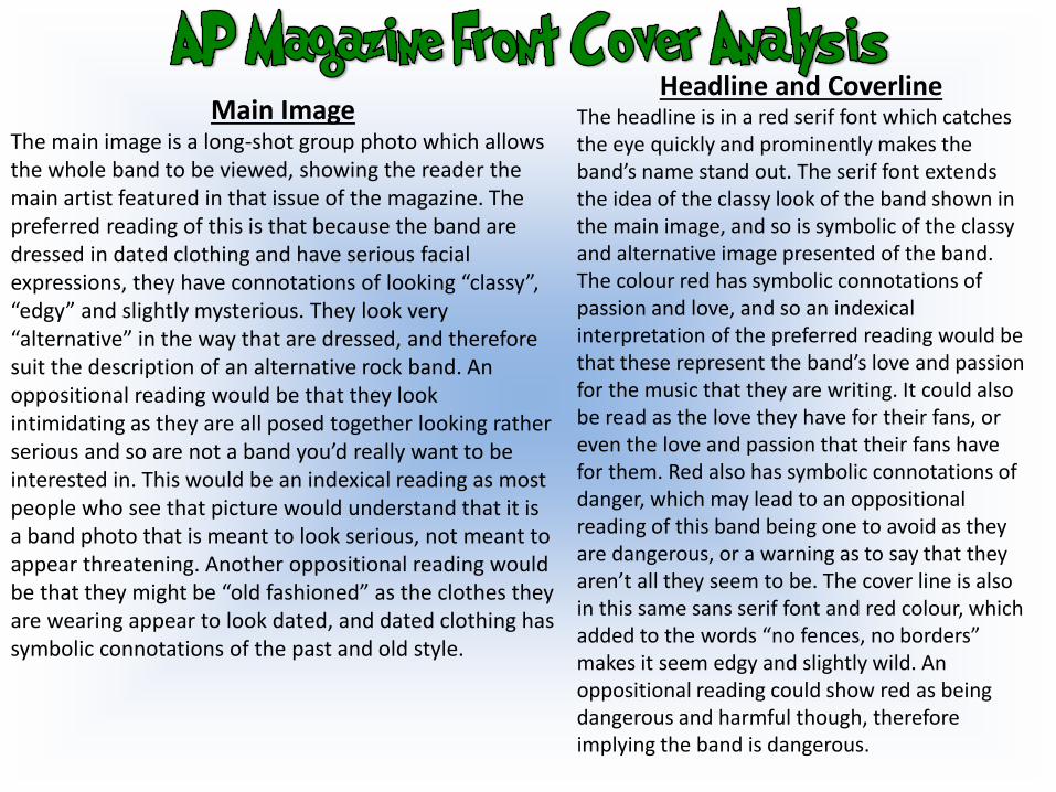
Main ImageThe main image is a long-shot group photo which allows the whole band to be viewed, showing the reader the main artist featured in that issue of the magazine. The preferred reading of this is that because the band are dressed in dated clothing and have serious facial expressions, they have connotations of looking “classy”, “edgy” and slightly mysterious. They look very “alternative” in the way that are dressed, and therefore suit the description of an alternative rock band. An oppositional reading would be that they look intimidating as they are all posed together looking rather serious and so are not a band you’d really want to be interested in. This would be an indexical reading as most people who see that picture would understand that it is a band photo that is meant to look serious, not meant to appear threatening. Another oppositional reading would be that they might be “old fashioned” as the clothes they are wearing appear to look dated, and dated clothing has symbolic connotations of the past and old style.
Headline and CoverlineThe headline is in a red serif font which catches the eye quickly and prominently makes the band’s name stand out. The serif font extends the idea of the classy look of the band shown in the main image, and so is symbolic of the classy and alternative image presented of the band. The colour red has symbolic connotations of passion and love, and so an indexical interpretation of the preferred reading would be that these represent the band’s love and passion for the music that they are writing. It could also be read as the love they have for their fans, or even the love and passion that their fans have for them. Red also has symbolic connotations of danger, which may lead to an oppositional reading of this band being one to avoid as they are dangerous, or a warning as to say that they aren’t all they seem to be. The cover line is also in this same sans serif font and red colour, which added to the words “no fences, no borders” makes it seem edgy and slightly wild. An oppositional reading could show red as being dangerous and harmful though, therefore implying the band is dangerous.
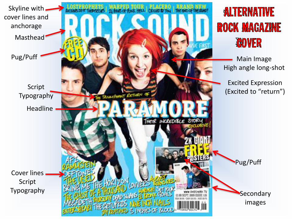
Skyline with cover lines and
anchorage
Masthead
Pug/Puff
Pug/Puff
Secondaryimages
Headline
Main ImageHigh angle long-shot
Script Typography
Cover linesScript
Typography
Excited Expression(Excited to “return”)
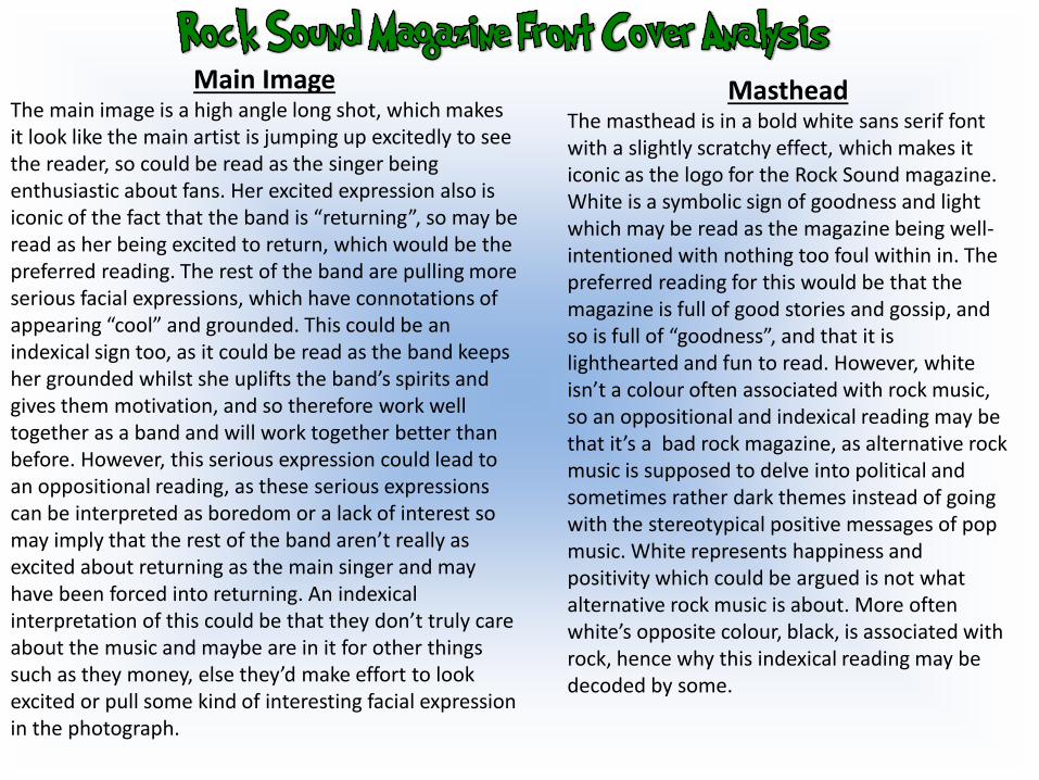
MastheadThe masthead is in a bold white sans serif font with a slightly scratchy effect, which makes it iconic as the logo for the Rock Sound magazine. White is a symbolic sign of goodness and light which may be read as the magazine being well-intentioned with nothing too foul within in. The preferred reading for this would be that the magazine is full of good stories and gossip, and so is full of “goodness”, and that it is lighthearted and fun to read. However, white isn’t a colour often associated with rock music, so an oppositional and indexical reading may be that it’s a bad rock magazine, as alternative rock music is supposed to delve into political and sometimes rather dark themes instead of going with the stereotypical positive messages of pop music. White represents happiness and positivity which could be argued is not what alternative rock music is about. More often white’s opposite colour, black, is associated with rock, hence why this indexical reading may be decoded by some.
Main ImageThe main image is a high angle long shot, which makes it look like the main artist is jumping up excitedly to see the reader, so could be read as the singer being enthusiastic about fans. Her excited expression also is iconic of the fact that the band is “returning”, so may be read as her being excited to return, which would be the preferred reading. The rest of the band are pulling more serious facial expressions, which have connotations of appearing “cool” and grounded. This could be an indexical sign too, as it could be read as the band keeps her grounded whilst she uplifts the band’s spirits and gives them motivation, and so therefore work well together as a band and will work together better than before. However, this serious expression could lead to an oppositional reading, as these serious expressions can be interpreted as boredom or a lack of interest so may imply that the rest of the band aren’t really as excited about returning as the main singer and may have been forced into returning. An indexical interpretation of this could be that they don’t truly care about the music and maybe are in it for other things such as they money, else they’d make effort to look excited or pull some kind of interesting facial expression in the photograph.
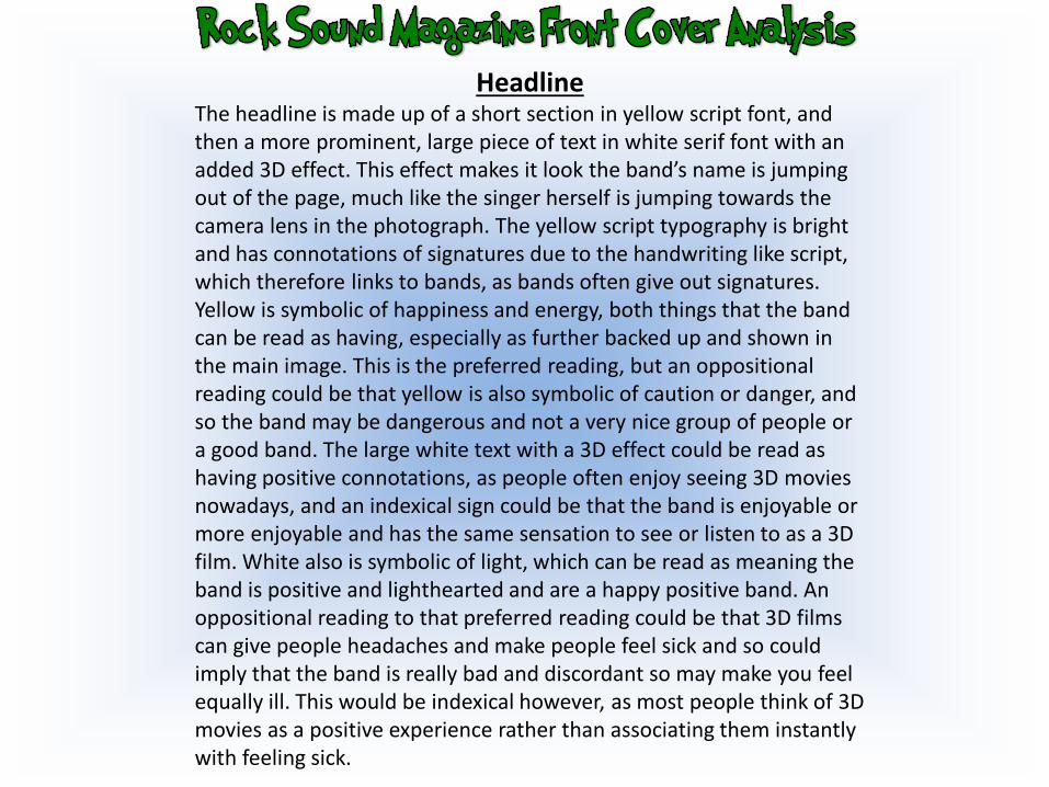
HeadlineThe headline is made up of a short section in yellow script font, and then a more prominent, large piece of text in white serif font with an added 3D effect. This effect makes it look the band’s name is jumping out of the page, much like the singer herself is jumping towards the camera lens in the photograph. The yellow script typography is bright and has connotations of signatures due to the handwriting like script, which therefore links to bands, as bands often give out signatures. Yellow is symbolic of happiness and energy, both things that the band can be read as having, especially as further backed up and shown in the main image. This is the preferred reading, but an oppositional reading could be that yellow is also symbolic of caution or danger, and so the band may be dangerous and not a very nice group of people or a good band. The large white text with a 3D effect could be read as having positive connotations, as people often enjoy seeing 3D movies nowadays, and an indexical sign could be that the band is enjoyable or more enjoyable and has the same sensation to see or listen to as a 3D film. White also is symbolic of light, which can be read as meaning the band is positive and lighthearted and are a happy positive band. An oppositional reading to that preferred reading could be that 3D films can give people headaches and make people feel sick and so could imply that the band is really bad and discordant so may make you feel equally ill. This would be indexical however, as most people think of 3D movies as a positive experience rather than associating them instantly with feeling sick.
Masthead
Main imageClose Up
Secondary Images
Sections
Headline
Scratchy typography
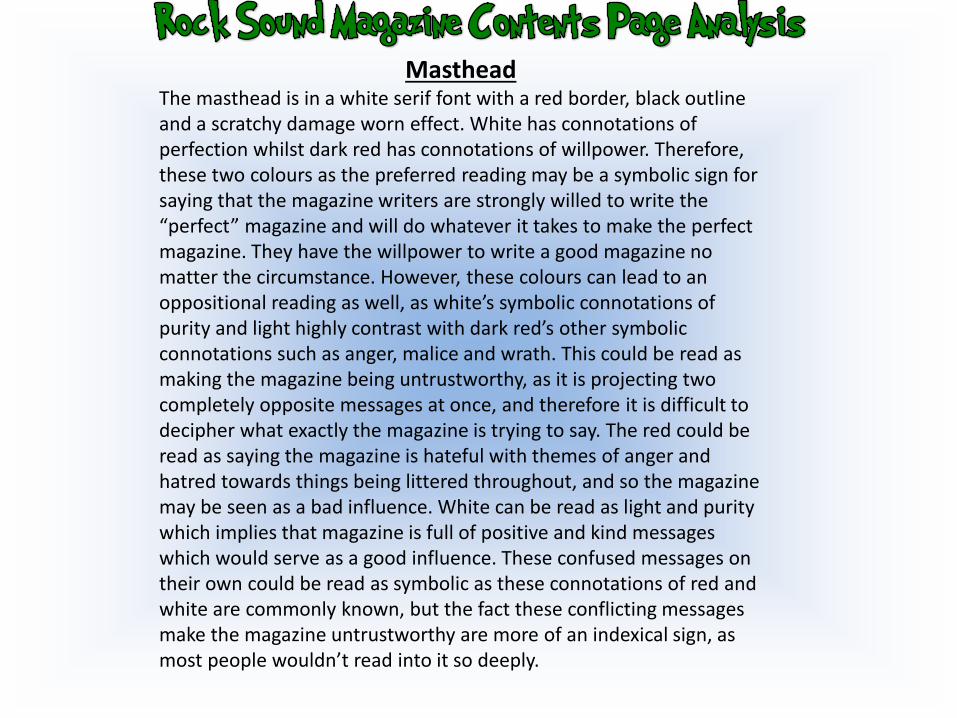
MastheadThe masthead is in a white serif font with a red border, black outline and a scratchy damage worn effect. White has connotations of perfection whilst dark red has connotations of willpower. Therefore, these two colours as the preferred reading may be a symbolic sign for saying that the magazine writers are strongly willed to write the “perfect” magazine and will do whatever it takes to make the perfect magazine. They have the willpower to write a good magazine no matter the circumstance. However, these colours can lead to an oppositional reading as well, as white’s symbolic connotations of purity and light highly contrast with dark red’s other symbolic connotations such as anger, malice and wrath. This could be read as making the magazine being untrustworthy, as it is projecting two completely opposite messages at once, and therefore it is difficult to decipher what exactly the magazine is trying to say. The red could be read as saying the magazine is hateful with themes of anger and hatred towards things being littered throughout, and so the magazine may be seen as a bad influence. White can be read as light and purity which implies that magazine is full of positive and kind messages which would serve as a good influence. These confused messages on their own could be read as symbolic as these connotations of red and white are commonly known, but the fact these conflicting messages make the magazine untrustworthy are more of an indexical sign, as most people wouldn’t read into it so deeply.
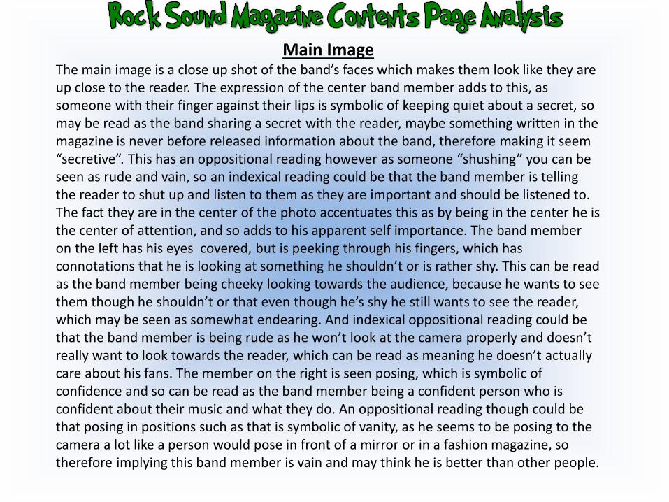
Main ImageThe main image is a close up shot of the band’s faces which makes them look like they are up close to the reader. The expression of the center band member adds to this, as someone with their finger against their lips is symbolic of keeping quiet about a secret, so may be read as the band sharing a secret with the reader, maybe something written in the magazine is never before released information about the band, therefore making it seem “secretive”. This has an oppositional reading however as someone “shushing” you can be seen as rude and vain, so an indexical reading could be that the band member is telling the reader to shut up and listen to them as they are important and should be listened to. The fact they are in the center of the photo accentuates this as by being in the center he is the center of attention, and so adds to his apparent self importance. The band member on the left has his eyes covered, but is peeking through his fingers, which has connotations that he is looking at something he shouldn’t or is rather shy. This can be read as the band member being cheeky looking towards the audience, because he wants to see them though he shouldn’t or that even though he’s shy he still wants to see the reader, which may be seen as somewhat endearing. And indexical oppositional reading could be that the band member is being rude as he won’t look at the camera properly and doesn’t really want to look towards the reader, which can be read as meaning he doesn’t actually care about his fans. The member on the right is seen posing, which is symbolic of confidence and so can be read as the band member being a confident person who is confident about their music and what they do. An oppositional reading though could be that posing in positions such as that is symbolic of vanity, as he seems to be posing to the camera a lot like a person would pose in front of a mirror or in a fashion magazine, so therefore implying this band member is vain and may think he is better than other people.
Pug/Puff
Headline
Anchorage
SectionsMasthead
Sans Serif Font
Main ImageLongshot
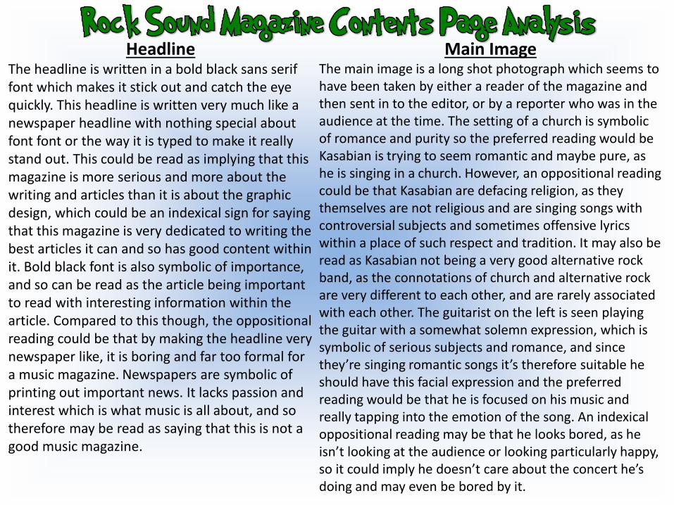
HeadlineThe headline is written in a bold black sans serif font which makes it stick out and catch the eye quickly. This headline is written very much like a newspaper headline with nothing special about font font or the way it is typed to make it really stand out. This could be read as implying that this magazine is more serious and more about the writing and articles than it is about the graphic design, which could be an indexical sign for saying that this magazine is very dedicated to writing the best articles it can and so has good content within it. Bold black font is also symbolic of importance, and so can be read as the article being important to read with interesting information within the article. Compared to this though, the oppositional reading could be that by making the headline very newspaper like, it is boring and far too formal for a music magazine. Newspapers are symbolic of printing out important news. It lacks passion and interest which is what music is all about, and so therefore may be read as saying that this is not a good music magazine.
Main ImageThe main image is a long shot photograph which seems to have been taken by either a reader of the magazine and then sent in to the editor, or by a reporter who was in the audience at the time. The setting of a church is symbolic of romance and purity so the preferred reading would be Kasabian is trying to seem romantic and maybe pure, as he is singing in a church. However, an oppositional reading could be that Kasabian are defacing religion, as they themselves are not religious and are singing songs with controversial subjects and sometimes offensive lyrics within a place of such respect and tradition. It may also be read as Kasabian not being a very good alternative rock band, as the connotations of church and alternative rock are very different to each other, and are rarely associated with each other. The guitarist on the left is seen playing the guitar with a somewhat solemn expression, which is symbolic of serious subjects and romance, and since they’re singing romantic songs it’s therefore suitable he should have this facial expression and the preferred reading would be that he is focused on his music and really tapping into the emotion of the song. An indexical oppositional reading may be that he looks bored, as he isn’t looking at the audience or looking particularly happy, so it could imply he doesn’t care about the concert he’s doing and may even be bored by it.
MastheadThe masthead is in a bold red sans serif font with a white outline around it, which makes it stand out brightly and catch the eye. This masthead is iconic, as it tells the reader exactly what magazine it is and so also tells the reader what the contents of the magazine would be. Red is a symbolic sign of strength and passion, leading the reader to possibly assume that this magazine has a team of writers that are passionate about their product and have great strength to achieve the things that they want to within each magazine. This preferred reading may also be read as alternative rock being a strong genre of music with passionate artists within it that truly care about the music they write. An oppositional reading to this may be to do with the fact that red is also symbolic of danger and fire, so this masthead could be read as saying that alternative rock or the magazine are a danger. An indexical interpretation could be that the things they promote within the magazine or a band’s songs could lead to a bad lifestyle that is dangerous not only to the reader, but others around them too.
HeadlineStrapline
Main ImageMedium Long shot Secondary
Images
Columns
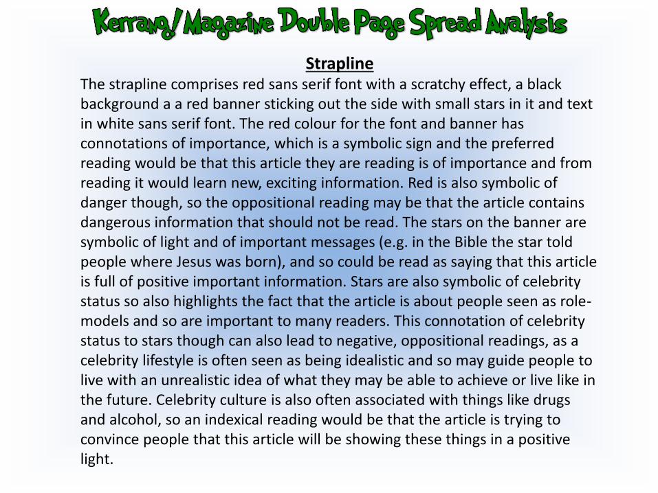
StraplineThe strapline comprises red sans serif font with a scratchy effect, a black background a a red banner sticking out the side with small stars in it and text in white sans serif font. The red colour for the font and banner has connotations of importance, which is a symbolic sign and the preferred reading would be that this article they are reading is of importance and from reading it would learn new, exciting information. Red is also symbolic of danger though, so the oppositional reading may be that the article contains dangerous information that should not be read. The stars on the banner are symbolic of light and of important messages (e.g. in the Bible the star told people where Jesus was born), and so could be read as saying that this article is full of positive important information. Stars are also symbolic of celebrity status so also highlights the fact that the article is about people seen as role-models and so are important to many readers. This connotation of celebrity status to stars though can also lead to negative, oppositional readings, as a celebrity lifestyle is often seen as being idealistic and so may guide people to live with an unrealistic idea of what they may be able to achieve or live like in the future. Celebrity culture is also often associated with things like drugs and alcohol, so an indexical reading would be that the article is trying to convince people that this article will be showing these things in a positive light.
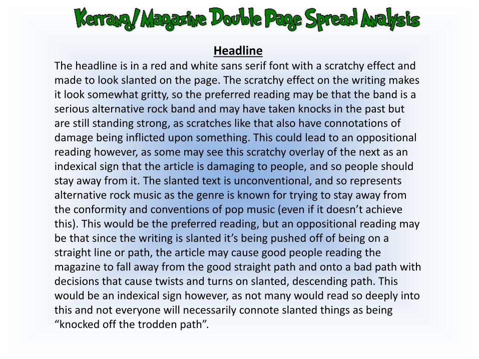
HeadlineThe headline is in a red and white sans serif font with a scratchy effect and made to look slanted on the page. The scratchy effect on the writing makes it look somewhat gritty, so the preferred reading may be that the band is a serious alternative rock band and may have taken knocks in the past but are still standing strong, as scratches like that also have connotations of damage being inflicted upon something. This could lead to an oppositional reading however, as some may see this scratchy overlay of the next as an indexical sign that the article is damaging to people, and so people should stay away from it. The slanted text is unconventional, and so represents alternative rock music as the genre is known for trying to stay away from the conformity and conventions of pop music (even if it doesn’t achieve this). This would be the preferred reading, but an oppositional reading may be that since the writing is slanted it’s being pushed off of being on a straight line or path, the article may cause good people reading the magazine to fall away from the good straight path and onto a bad path with decisions that cause twists and turns on slanted, descending path. This would be an indexical sign however, as not many would read so deeply into this and not everyone will necessarily connote slanted things as being “knocked off the trodden path”.
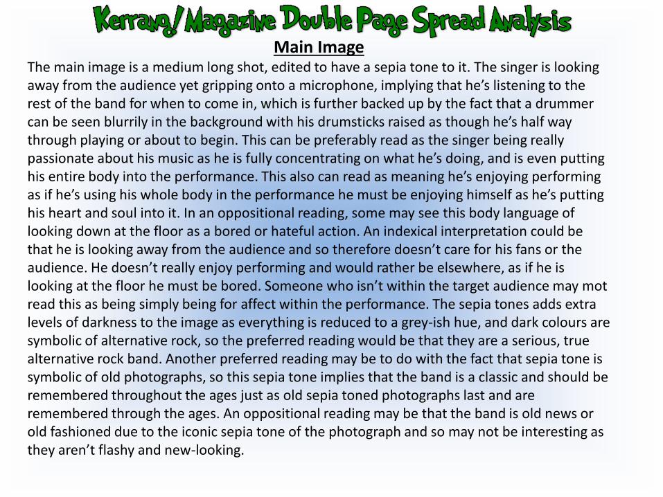
Main ImageThe main image is a medium long shot, edited to have a sepia tone to it. The singer is looking away from the audience yet gripping onto a microphone, implying that he’s listening to the rest of the band for when to come in, which is further backed up by the fact that a drummer can be seen blurrily in the background with his drumsticks raised as though he’s half way through playing or about to begin. This can be preferably read as the singer being really passionate about his music as he is fully concentrating on what he’s doing, and is even putting his entire body into the performance. This also can read as meaning he’s enjoying performing as if he’s using his whole body in the performance he must be enjoying himself as he’s putting his heart and soul into it. In an oppositional reading, some may see this body language of looking down at the floor as a bored or hateful action. An indexical interpretation could be that he is looking away from the audience and so therefore doesn’t care for his fans or the audience. He doesn’t really enjoy performing and would rather be elsewhere, as if he is looking at the floor he must be bored. Someone who isn’t within the target audience may mot read this as being simply being for affect within the performance. The sepia tones adds extra levels of darkness to the image as everything is reduced to a grey-ish hue, and dark colours are symbolic of alternative rock, so the preferred reading would be that they are a serious, true alternative rock band. Another preferred reading may be to do with the fact that sepia tone is symbolic of old photographs, so this sepia tone implies that the band is a classic and should be remembered throughout the ages just as old sepia toned photographs last and are remembered through the ages. An oppositional reading may be that the band is old news or old fashioned due to the iconic sepia tone of the photograph and so may not be interesting as they aren’t flashy and new-looking.
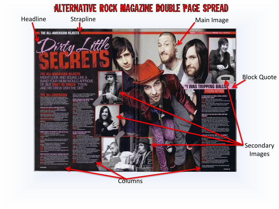
Main ImageHeadline
Columns
Block Quote
Secondary Images
Strapline
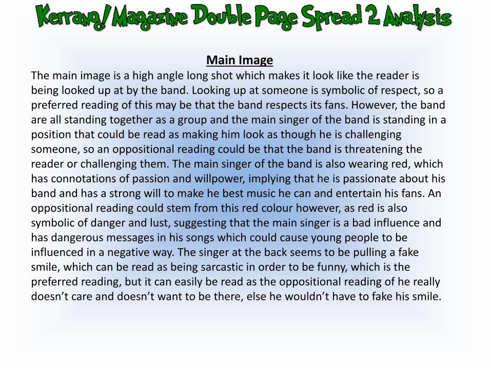
Main ImageThe main image is a high angle long shot which makes it look like the reader is being looked up at by the band. Looking up at someone is symbolic of respect, so a preferred reading of this may be that the band respects its fans. However, the band are all standing together as a group and the main singer of the band is standing in a position that could be read as making him look as though he is challenging someone, so an oppositional reading could be that the band is threatening the reader or challenging them. The main singer of the band is also wearing red, which has connotations of passion and willpower, implying that he is passionate about his band and has a strong will to make he best music he can and entertain his fans. An oppositional reading could stem from this red colour however, as red is also symbolic of danger and lust, suggesting that the main singer is a bad influence and has dangerous messages in his songs which could cause young people to be influenced in a negative way. The singer at the back seems to be pulling a fake smile, which can be read as being sarcastic in order to be funny, which is the preferred reading, but it can easily be read as the oppositional reading of he really doesn’t care and doesn’t want to be there, else he wouldn’t have to fake his smile.
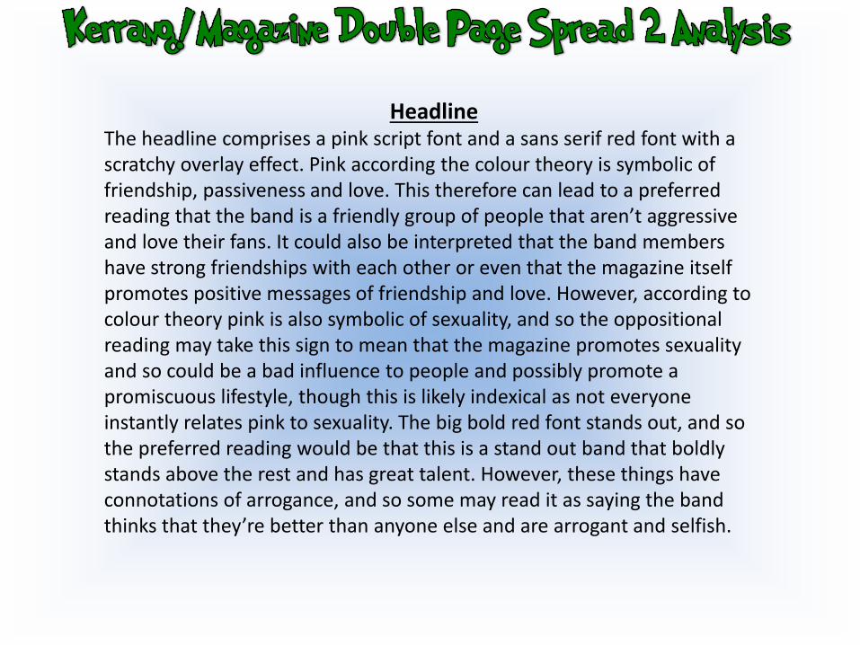
HeadlineThe headline comprises a pink script font and a sans serif red font with a scratchy overlay effect. Pink according the colour theory is symbolic of friendship, passiveness and love. This therefore can lead to a preferred reading that the band is a friendly group of people that aren’t aggressive and love their fans. It could also be interpreted that the band members have strong friendships with each other or even that the magazine itself promotes positive messages of friendship and love. However, according to colour theory pink is also symbolic of sexuality, and so the oppositional reading may take this sign to mean that the magazine promotes sexuality and so could be a bad influence to people and possibly promote a promiscuous lifestyle, though this is likely indexical as not everyone instantly relates pink to sexuality. The big bold red font stands out, and so the preferred reading would be that this is a stand out band that boldly stands above the rest and has great talent. However, these things have connotations of arrogance, and so some may read it as saying the band thinks that they’re better than anyone else and are arrogant and selfish.