Embed Size (px)
Citation preview
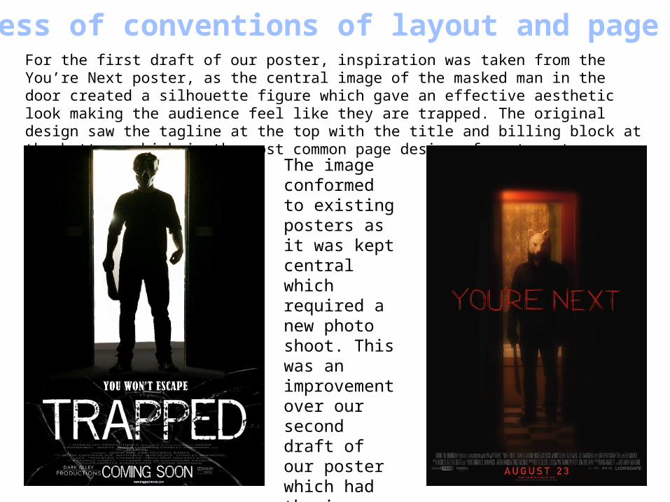
Awareness of conventions of layout and page designFor the first draft of our poster, inspiration was taken from the You’re Next poster, as the central image of the masked man in the door created a silhouette figure which gave an effective aesthetic look making the audience feel like they are trapped. The original design saw the tagline at the top with the title and billing block at the bottom, which is the most common page design of most posters.
The image conformed to existing posters as it was kept central which required a new photo shoot. This was an improvement over our second draft of our poster which had the image placed more to the right and did not look as professional.
Awareness of the need for a variety of fonts and text sizes
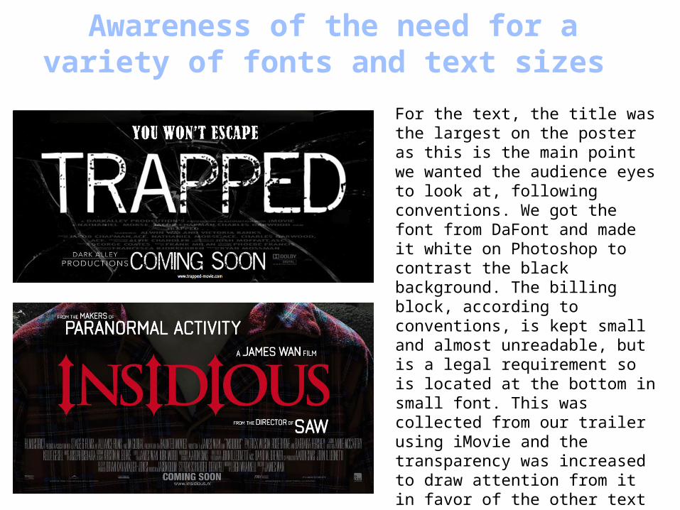
For the text, the title was the largest on the poster as this is the main point we wanted the audience eyes to look at, following conventions. We got the font from DaFont and made it white on Photoshop to contrast the black background. The billing block, according to conventions, is kept small and almost unreadable, but is a legal requirement so is located at the bottom in small font. This was collected from our trailer using iMovie and the transparency was increased to draw attention from it in favor of the other text such as Coming Soon, which was in the same font as the title. The tagline was the second biggest, in terms of size but was in a different font from the title, to follow conventions. This can be located either at the top or bottom.
Accurate use of language and register
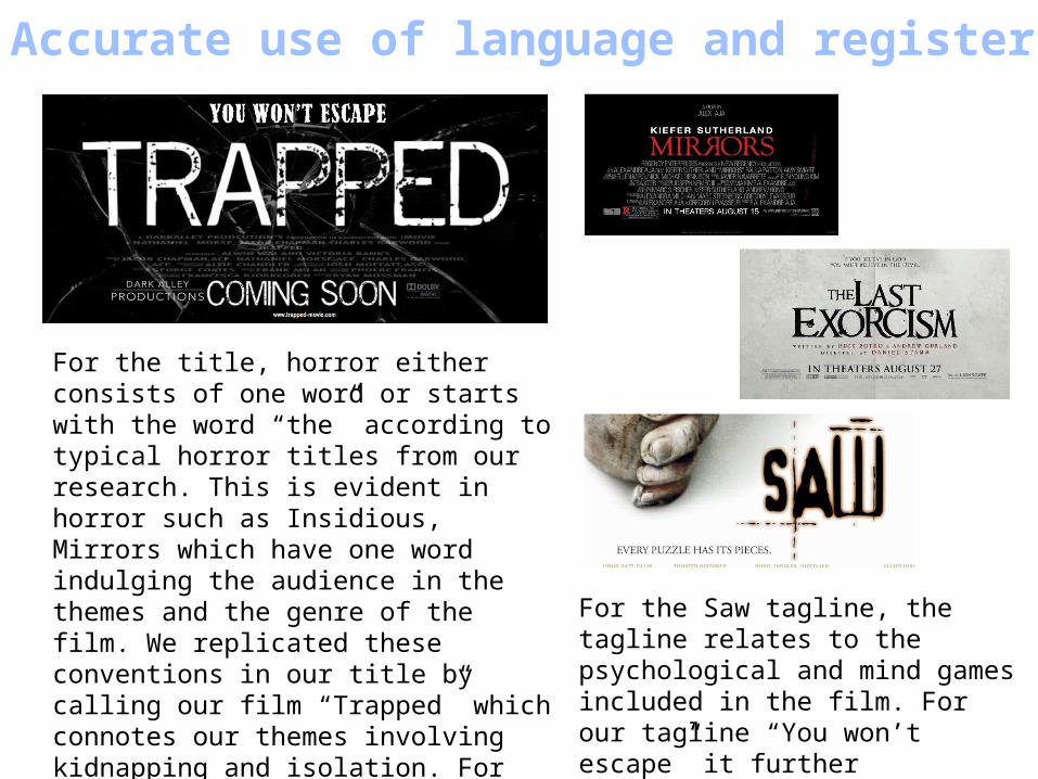
For the title, horror either consists of one word or starts with the word “the” according to typical horror titles from our research. This is evident in horror such as Insidious, Mirrors which have one word indulging the audience in the themes and the genre of the film. We replicated these conventions in our title by calling our film “Trapped” which connotes our themes involving kidnapping and isolation. For the tagline, it is usually kept simple and like the title, relates and gives more on what the narrative will entail.
For the Saw tagline, the tagline relates to the psychological and mind games included in the film. For our tagline “You won’t escape” it further emphasises the themes and narrative given by the title.
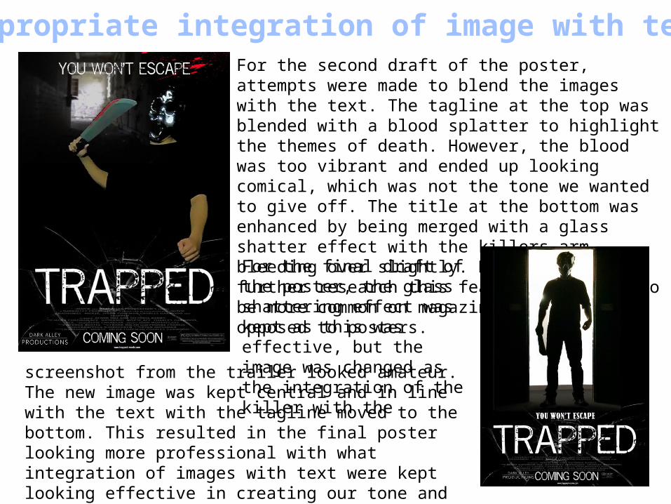
Appropriate integration of image with textFor the second draft of the poster, attempts were made to blend the images with the text. The tagline at the top was blended with a blood splatter to highlight the themes of death. However, the blood was too vibrant and ended up looking comical, which was not the tone we wanted to give off. The title at the bottom was enhanced by being merged with a glass shatter effect with the killers arm bleeding over slightly. However, upon further research this feature was found to be more common on magazine covers as opposed to posters.
For the final draft of the poster, the glass shattering effect was kept as this was effective, but the image was changed as the integration of the killer with the
screenshot from the trailer looked amateur. The new image was kept central and in line with the text with the tagline moved to the bottom. This resulted in the final poster looking more professional with what integration of images with text were kept looking effective in creating our tone and sense of danger.
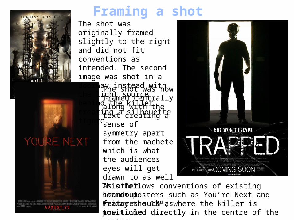
Framing a shotThe shot was originally framed slightly to the right and did not fit conventions as intended. The second image was shot in a doorway instead with the light source behind the killer creating a silhouette figure.
The shot was now framed centrally along with the text creating a sense of symmetry apart from the machete which is what the audiences eyes will get drawn to as well as other standout features such as the title.
This follows conventions of existing horror posters such as You’re Next and Friday the 13th, where the killer is positioned directly in the centre of the poster.
Shooting a material appropriate to task (use of mise-En-scene, use of colour, lighting, setting…)
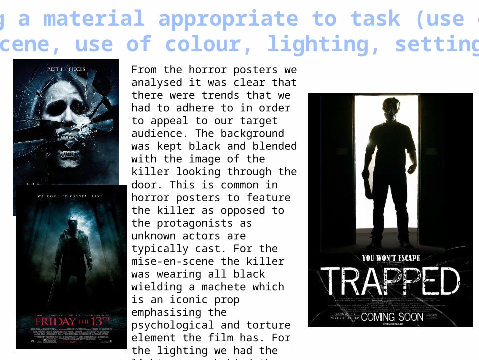
From the horror posters we analysed it was clear that there were trends that we had to adhere to in order to appeal to our target audience. The background was kept black and blended with the image of the killer looking through the door. This is common in horror posters to feature the killer as opposed to the protagonists as unknown actors are typically cast. For the mise-en-scene the killer was wearing all black wielding a machete which is an iconic prop emphasising the psychological and torture element the film has. For the lighting we had the light source behind the killer to create a silhouette figure, similar to the effect used in the You’re Next poster. This created our desired effect and we deliberately shot the main image in a doorway to make the audience feel trapped and hint to the setting being isolated and dark.
The manipulation of photographs (e.g. cropping, resizing…)
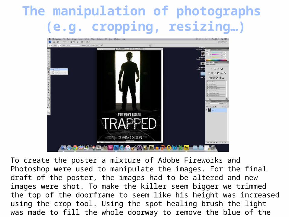
To create the poster a mixture of Adobe Fireworks and Photoshop were used to manipulate the images. For the final draft of the poster, the images had to be altered and new images were shot. To make the killer seem bigger we trimmed the top of the doorframe to seem like his height was increased using the crop tool. Using the spot healing brush the light was made to fill the whole doorway to remove the blue of the background making the location seem more remote.
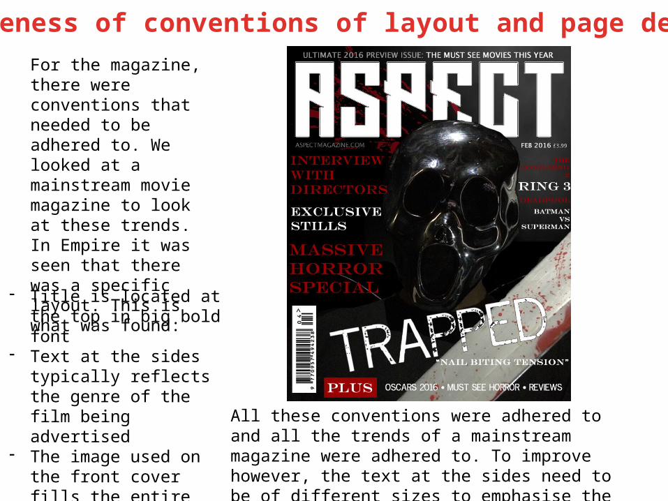
Awareness of conventions of layout and page designFor the magazine, there were conventions that needed to be adhered to. We looked at a mainstream movie magazine to look at these trends. In Empire it was seen that there was a specific layout. This is what was found:
- Title is located at the top in big bold font
- Text at the sides typically reflects the genre of the film being advertised
- The image used on the front cover fills the entire cover and typically bleeds onto the title of the magazine
All these conventions were adhered to and all the trends of a mainstream magazine were adhered to. To improve however, the text at the sides need to be of different sizes to emphasise the importance of stories over others.
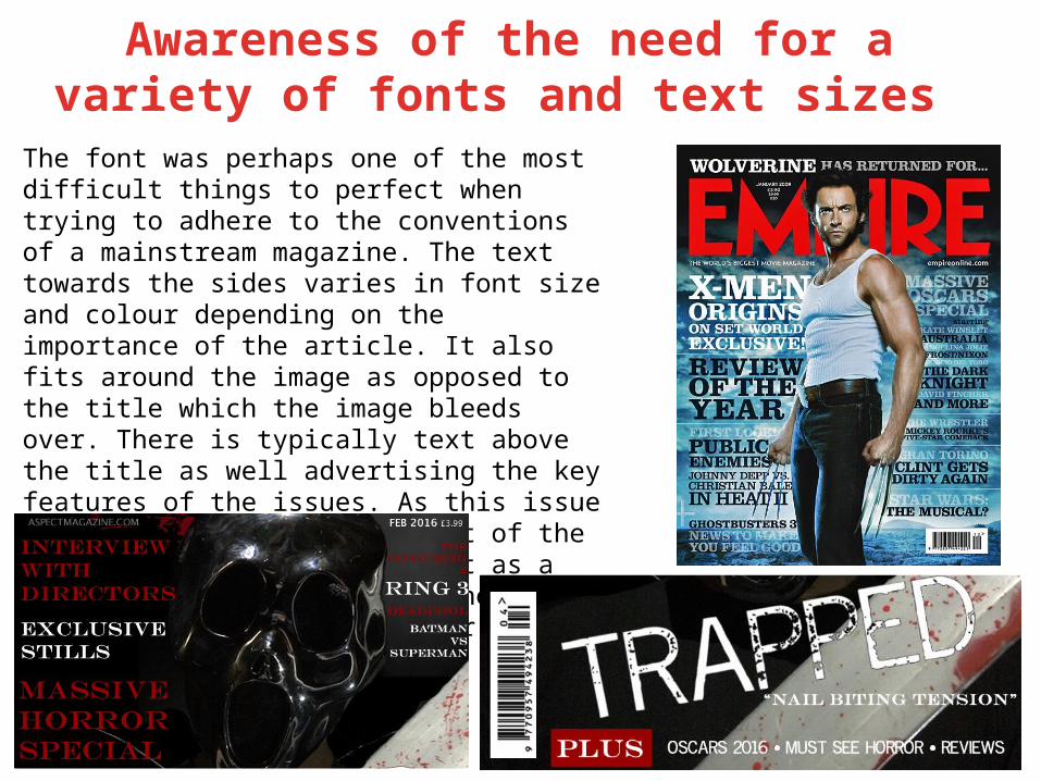
Awareness of the need for a variety of fonts and text sizes
The font was perhaps one of the most difficult things to perfect when trying to adhere to the conventions of a mainstream magazine. The text towards the sides varies in font size and colour depending on the importance of the article. It also fits around the image as opposed to the title which the image bleeds over. There is typically text above the title as well advertising the key features of the issues. As this issue is released towards the start of the year we chose to advertise it as a 2016 preview including all the major releases planned for the year.

Accurate use of language and registerFor the the title we intended to use a film term to appeal to the target audience. From research Aspect was the liked the most by audience. Typically, disregarding the minimalistic covers, writing covers the majority of the page. As well as the text at the sides there sometimes is a banner running along the bottom. To fit the overall theme of horror on the cover, there were mainly horror movies advertised.
For the text at the sides it adhered to conventions by giving little away and talking about the features in the articles such as interviews and film award ceremonies such as the Oscars.
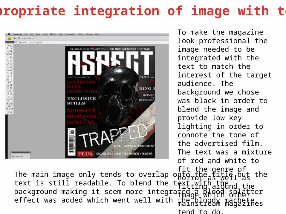
Appropriate integration of image with textTo make the magazine look professional the image needed to be integrated with the text to match the interest of the target audience. The background we chose was black in order to blend the image and provide low key lighting in order to connote the tone of the advertised film. The text was a mixture of red and white to fit the genre of horror as well as fitting around the image which other mainstream magazines tend to do.
The main image only tends to overlap onto the title but the text is still readable. To blend the text with the background making it seem more integrated a blood splatter effect was added which went well with the bloody machete.
Framing a shot
Shooting a material appropriate to task (use of mise-
En-scene, use of colour, lighting, setting…)
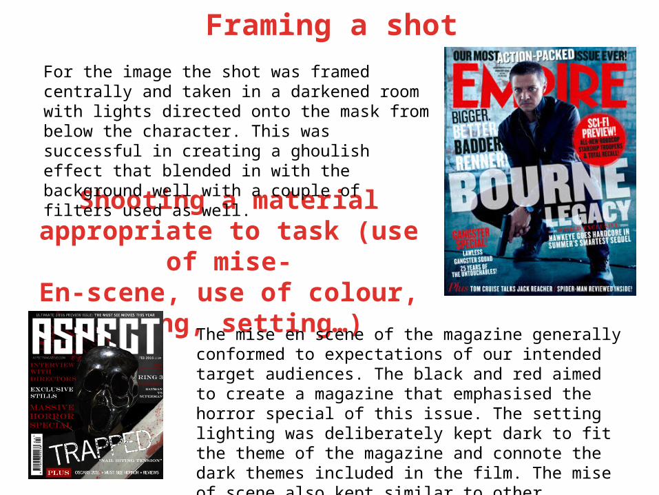
For the image the shot was framed centrally and taken in a darkened room with lights directed onto the mask from below the character. This was successful in creating a ghoulish effect that blended in with the background well with a couple of filters used as well.
The mise en scene of the magazine generally conformed to expectations of our intended target audiences. The black and red aimed to create a magazine that emphasised the horror special of this issue. The setting lighting was deliberately kept dark to fit the theme of the magazine and connote the dark themes included in the film. The mise of scene also kept similar to other psychological horror with a mask similar to the ghoul mask in Scream to create an iconic image for our film.
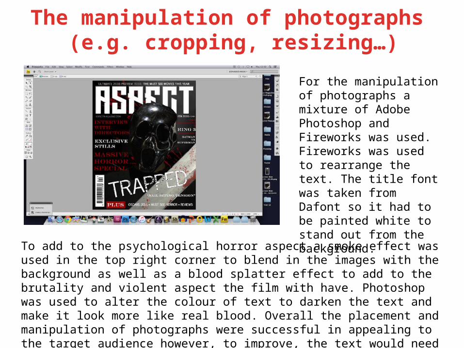
The manipulation of photographs (e.g. cropping, resizing…)
For the manipulation of photographs a mixture of Adobe Photoshop and Fireworks was used. Fireworks was used to rearrange the text. The title font was taken from Dafont so it had to be painted white to stand out from the background.
To add to the psychological horror aspect a smoke effect was used in the top right corner to blend in the images with the background as well as a blood splatter effect to add to the brutality and violent aspect the film with have. Photoshop was used to alter the colour of text to darken the text and make it look more like real blood. Overall the placement and manipulation of photographs were successful in appealing to the target audience however, to improve, the text would need to be different sizes varying on the importance of the article.