Embed Size (px)
Citation preview
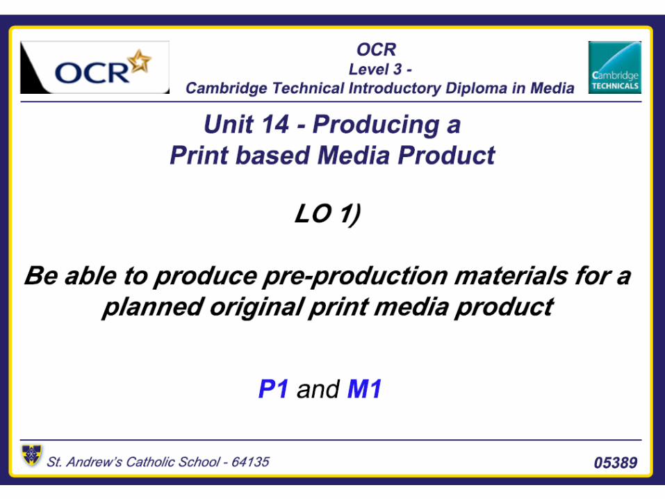
Content Slide• Front page sketches – Slide 3• Double page spread – Slide 4• Font – Slide 5• House Styles – Slide 6• Mind Map 1 – Slide 7• Mood board 1 – Slide 8• Mind Map 2– Slide 9• Mood board 2 – Slide 10• Final Mind Map – Slide 11• Draft Article – Slide 12• Photoshop drafts – Slide 13-14• Graphic Layout – Slide 15
• Layout Comparison – Slide 16• Double Page Spread Graphic
layout – Slide 17• Flat Plan – Slide 18-19• Photoshoot Plan – Slide 20• Photography Plan – Slide 21• Test Photography – Slide 22• Prop List – Slide 23• Resources and Equipment – Slide
24 – 30• Production Process – Slide 31• Production Plan 32• Personnel and Resources – Slide
33• LO1 Conclusion – Slide 34
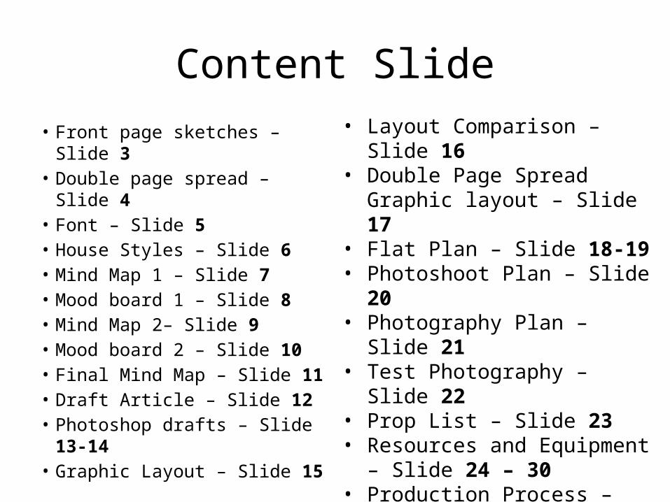
Front Page sketches Example 1 Example 2
Strapline
MastheadCover Stories
Artist ArtistStraplineCover Stories
The masthead is going to be bold as it represents the readers.
The colour scheme of the sketch is to connote lasers at clubs and parties.
Masthead
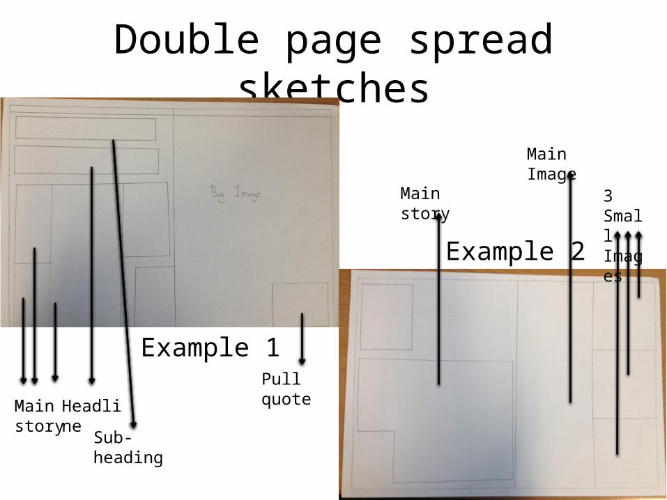
Double page spread sketches
Example 1
Example 2
3 Small Images
Main Image
Main story
Pull quote
Main story
Headline
Sub-heading
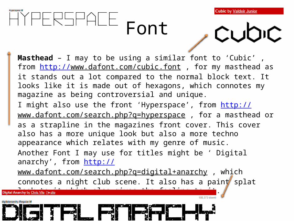
FontMasthead – I may to be using a similar font to ‘Cubic’ , from http://www.dafont.com/cubic.font , for my masthead as it stands out a lot compared to the normal block text. It looks like it is made out of hexagons, which connotes my magazine as being controversial and unique.I might also use the front ‘Hyperspace’, from http://www.dafont.com/search.php?q=hyperspace , for a masthead or as a strapline in the magazines front cover. This cover also has a more unique look but also a more techno appearance which relates with my genre of music. Another Font I may use for titles might be ‘ Digital anarchy’, from http://www.dafont.com/search.php?q=digital+anarchy , which connotes a night club scene. It also has a paint splat look to it which also gives the feeling to it.
House styles• The colour scheme is going to be a blue, pink and white. The
magazine front cover is supposed to connote summer and relaxation. The colour blue is supposed to connote the summers sky or a swimming pool like from the inspiration on the mood board.
• I have decided to include pink more in my magazine than any other colour as it should attract more females into reading it as the majority of the readership is male.
• Magazines in this genre won’t use a lot of pink but very dark colour which I think puts off female viewers and my magazine can gain the female readership as other magazines have not adjusted to their values.
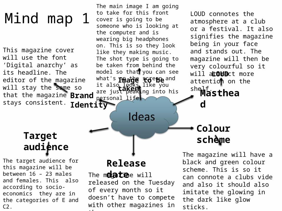
Mind map 1
Masthead
LOUD
Colour scheme
Release date
Target audience
Brand Identity
LOUD connotes the atmosphere at a club or a festival. It also signifies the magazine being in your face and stands out. The magazine will then be very colourful so it will attract more attention on the shelf.
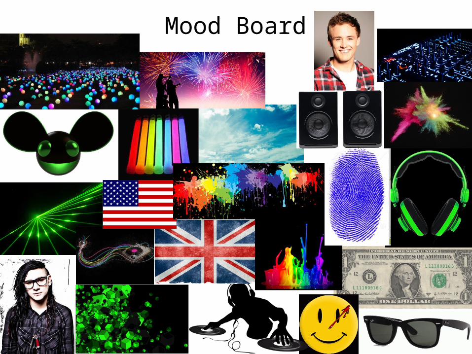
The magazine will have a black and green colour scheme. This is so it can connote a clubs vide and also it should also imitate the glowing in the dark like glow sticks.
The magazine will released on the Tuesday of every month so it doesn’t have to compete with other magazines in the same genre.
The target audience for this magazine will be between 16 – 23 males and females. This also according to socio-economics they are in the categories of E and C2.
Image to be taken
The main image I am going to take for this front cover is going to be someone who is looking at the computer and is wearing big headphones on. This is so they look like they making music. The shot type is going to be taken from behind the model so that you can see what's on the screen and it also looks like you are just peaking into his personal life.
This magazine cover will use the font ‘Digital anarchy’ as its headline. The editor of the magazine will stay the same so that the magazine stays consistent.
The front I am going to use is called ‘Hyperspace’ this is going to be used for the front cover and it will also be next to the page number on every page. Also in the corners of the page this is where the logo will go onto its own.
The social media links will only be on the front cover near to the barcode and only there so it doesn’t get in the way.
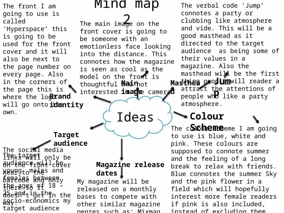
Mind map 2
Ideas
Jump
The verbal code ‘Jump’ connotes a party or clubbing like atmosphere and vide. This will be a good masthead as it directed to the target audience as being some of their values in a magazine. Also the masthead will be the first thing people will reader a attract the attentions of people who like a party atmosphere.
The colour scheme I am going to use is blue, white and pink. These colours are supposed to connote summer and the feeling of a long break to relax with friends. Blue connotes the summer Sky and the pink flower in a field which will hopefully interest more female readers if pink is also included, instead of excluding them. Flowers are at festivals during the summer so show also connote that vide and feeling.
Colour Scheme
Masthead
Brand identity
Magazine release dates
Target audience
My magazine will be released on a monthly bases to compete with other similar magazine genres such as; Mixmag, tillate and street cred
The target audience will be young males and females between the ages of 18 – 25 and in the socio-economics my target audience will be in the category of; E,D and C2.
Main image
The main image on the front cover is going to be someone with an emotionless face looking into the distance. This connotes how the magazine is seen as cool as the model on the front is thoughtful and not interested in the camera
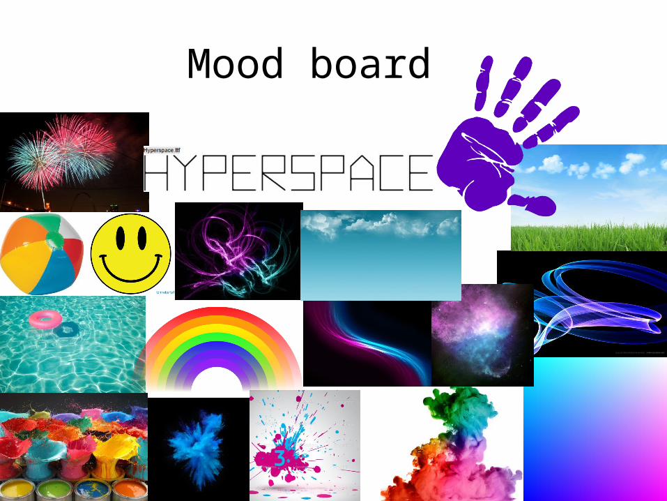
Mood board
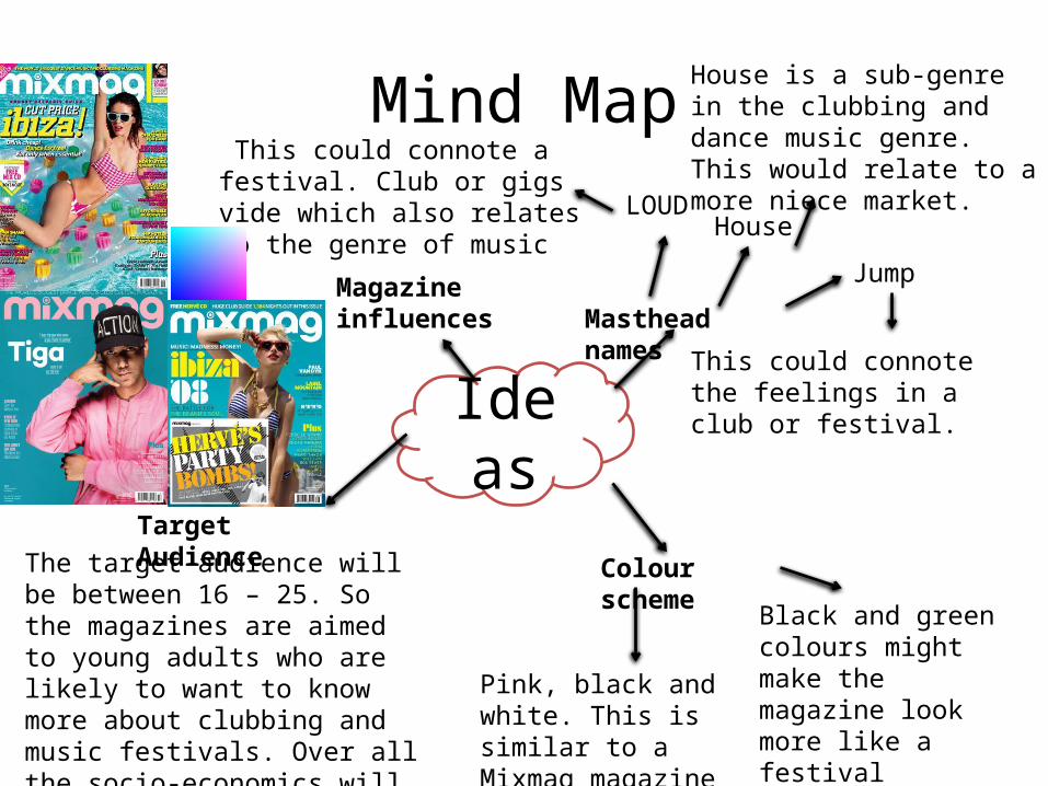
Mind Map
Ideas
Masthead names
LOUDHouse
Jump
This could connote a festival. Club or gigs vide which also relates to the genre of music
House is a sub-genre in the clubbing and dance music genre. This would relate to a more niece market.
This could connote the feelings in a club or festival.
Colour scheme
Black and green colours might make the magazine look more like a festival experience.
Pink, black and white. This is similar to a Mixmag magazine style.
Target AudienceThe target audience will be between 16 – 25. So the magazines are aimed to young adults who are likely to want to know more about clubbing and music festivals. Over all the socio-economics will be in the range of; E, C2 and C1.
Magazine influences
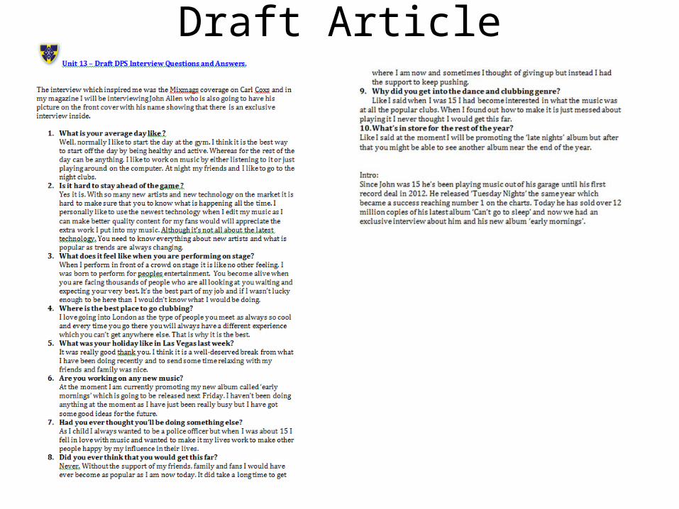
Draft Article
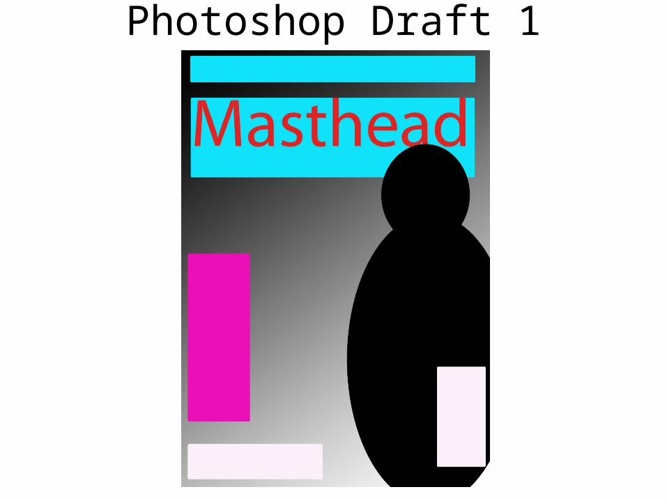
Photoshop Draft 1
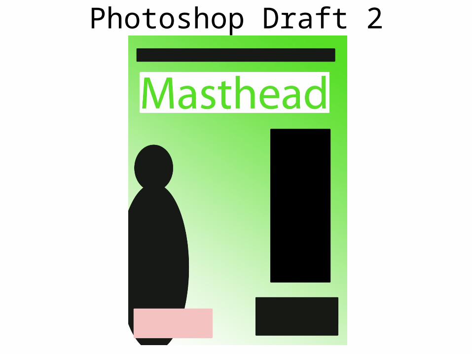
Photoshop Draft 2
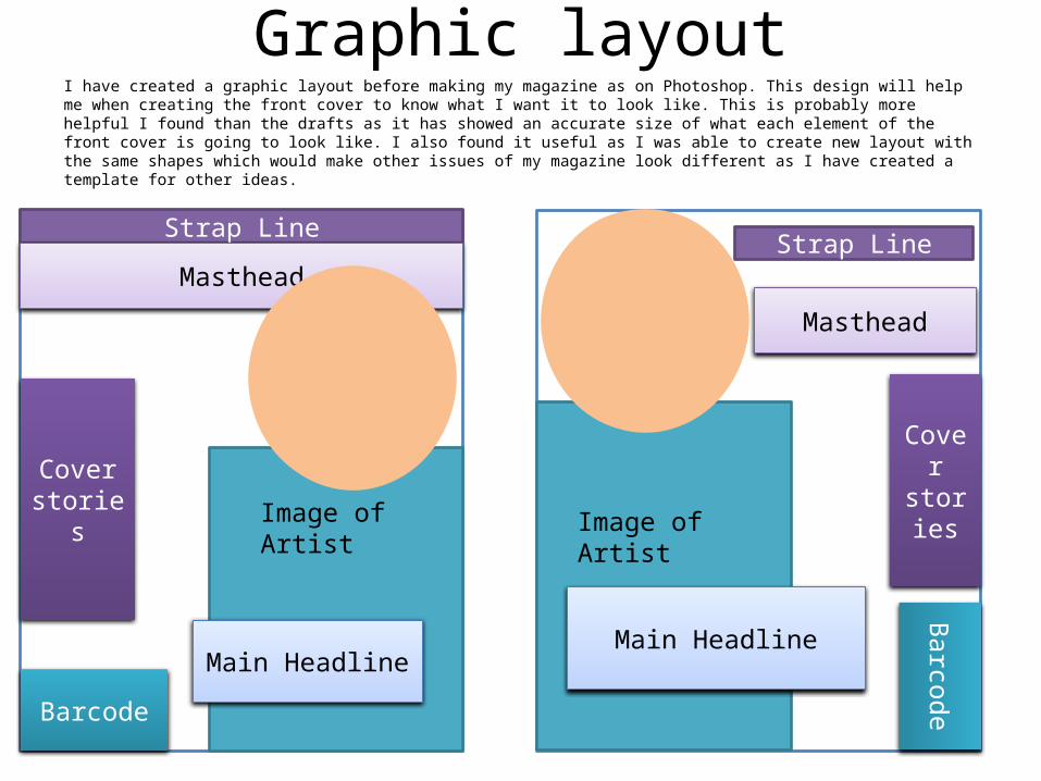
Graphic layoutI have created a graphic layout before making my magazine as on Photoshop. This design will help me when creating the front cover to know what I want it to look like. This is probably more helpful I found than the drafts as it has showed an accurate size of what each element of the front cover is going to look like. I also found it useful as I was able to create new layout with the same shapes which would make other issues of my magazine look different as I have created a template for other ideas.
Image of Artist
Strap Line
Masthead
Main Headline
Cover stories
Barcode
Image of Artist
Strap Line
Masthead
Main Headline
Cover stories
Barcode
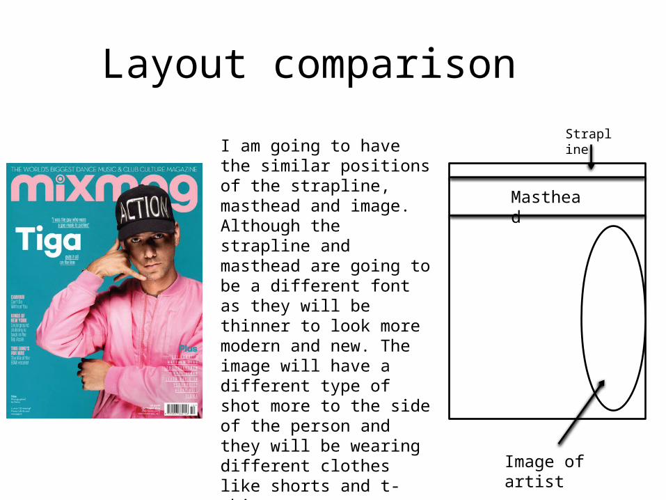
Layout comparison Strapline
Masthead
Image of artist
I am going to have the similar positions of the strapline, masthead and image. Although the strapline and masthead are going to be a different font as they will be thinner to look more modern and new. The image will have a different type of shot more to the side of the person and they will be wearing different clothes like shorts and t-shirt. The colour scheme is also going to be similar as it is to convey a more light hearted and happy side.
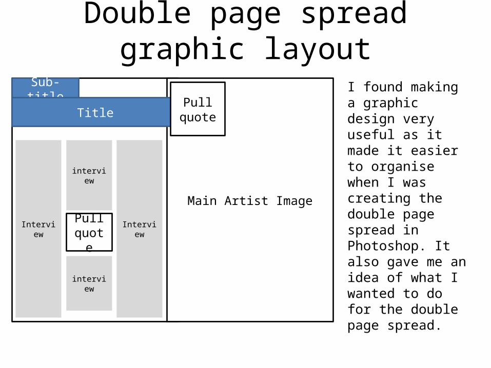
Double page spread graphic layout
I found making a graphic design very useful as it made it easier to organise when I was creating the double page spread in Photoshop. It also gave me an idea of what I wanted to do for the double page spread.
Main Artist Image
Sub-title
Title
Interview
interview
Interview
interview
Pull quote
Pull quote
Magazine Flat plan
Masthead
imagesImage
Advert for mac book
Headline
Main text
= small image
Cont
ent
Cont
ent
Image
Image
Headline
Main text
Main text
Top of the
charts graph
Image of Artist being interviewed
Main
Headline
Small description
Main Image
InterviewImage
Quote
Interview
Image
Main text Image
Main text
Interview
ImageAdvert
to artist’s
new album
Image
Interview
ImageAdvert for Superdry
JUMP
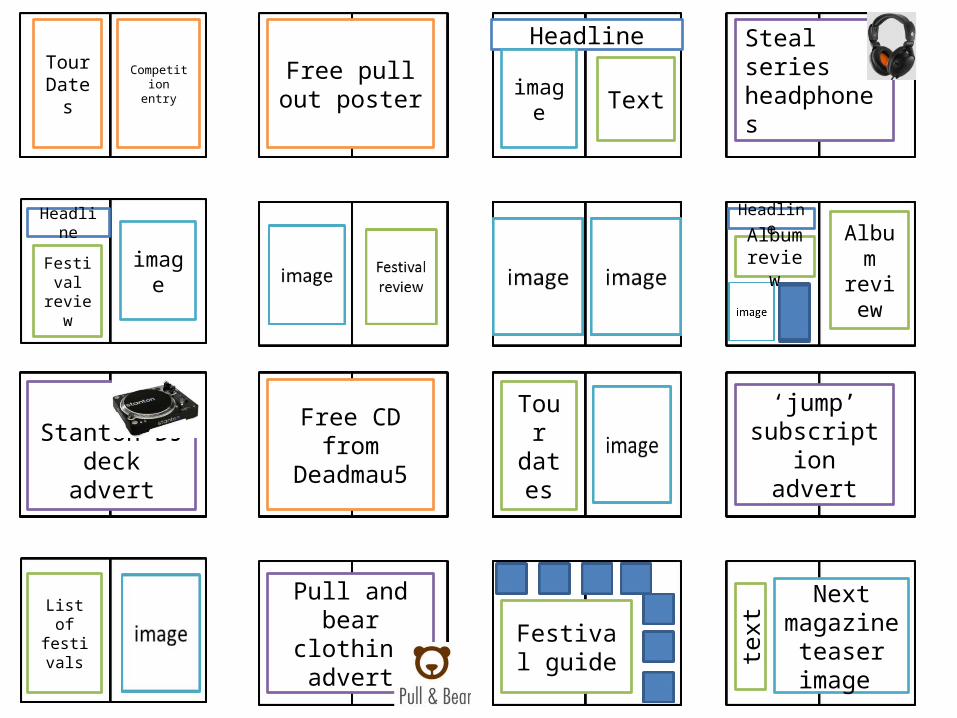
Tour Dates
Competition entry
Free pull out poster
Headline
image TextSteal series headphones
Festival review
image
Headline Headline
Album review Album
review
Stanton DJ deck advert
Free CD from Deadmau5
Tour dates
‘jump’ subscription
advert
List of festivals
Pull and bear clothing advert
Festival guide
Next magazine
teaser image
text

Photo-shoot plan• I am going to use the masthead ‘Jump’ as it connotes a party or clubbing like vide and
atmosphere. This relates to the sub-genre of music which is included in my magazine and what my target audience is interested in and values.
• This is going to be a photo shoot for the first issue for ‘Jump’ magazine which is in the genre of clubbing and dance music. These pictures will be used specifically for the front cover and interview over a double page spread inside the magazine.
• The Technical codes I am going to put this person in is going to be them facing directly at the camera so that there full attention is on the camera but their head is going to be facing the ground and they will be looking up at the camera like they have only just noticed it. At post production, I intend to remove the background and replace it with light reflecting off water to give a summer and relaxing feel to it. The lighting for the photos will be in high key so there is more color on the persons face.
• The clothes that john will be wearing is going to be a t-shirt as that is the type of clothing people wear in the summer. He will also have a pair of aviator glasses which are very reflective which should connote the type of attitude which he has. John will also have a new yellow ice watch on his wrist to show a DJ’s expensive taste and style.
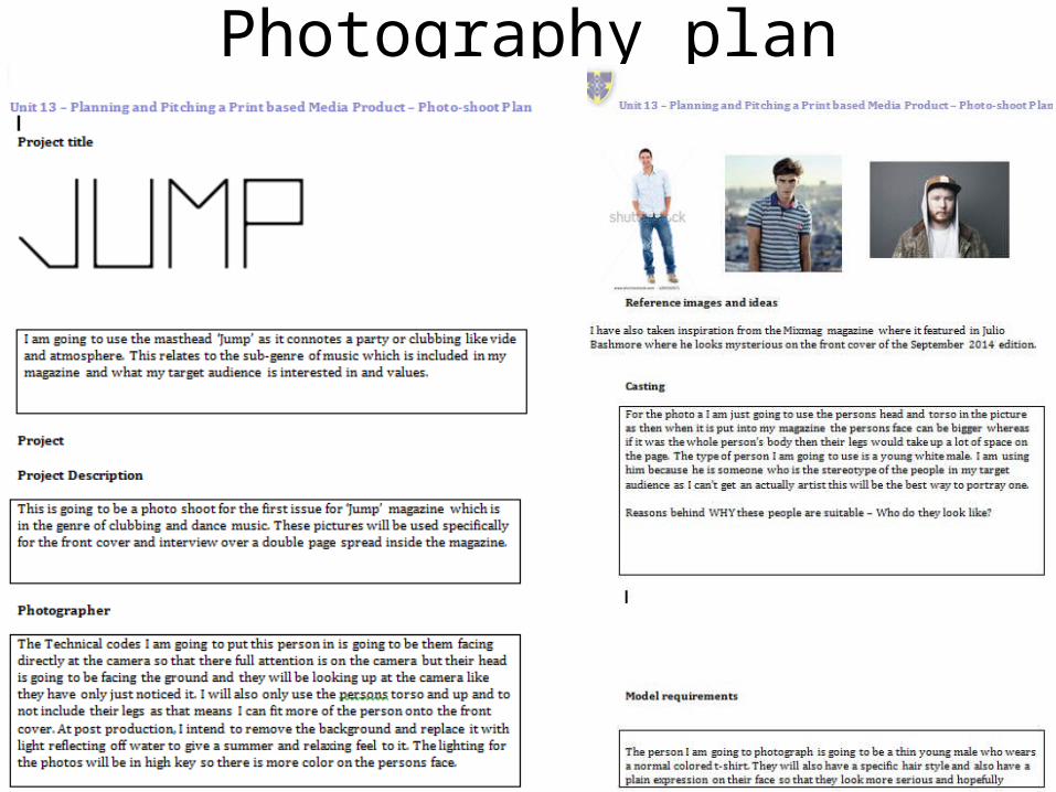
Photography plan
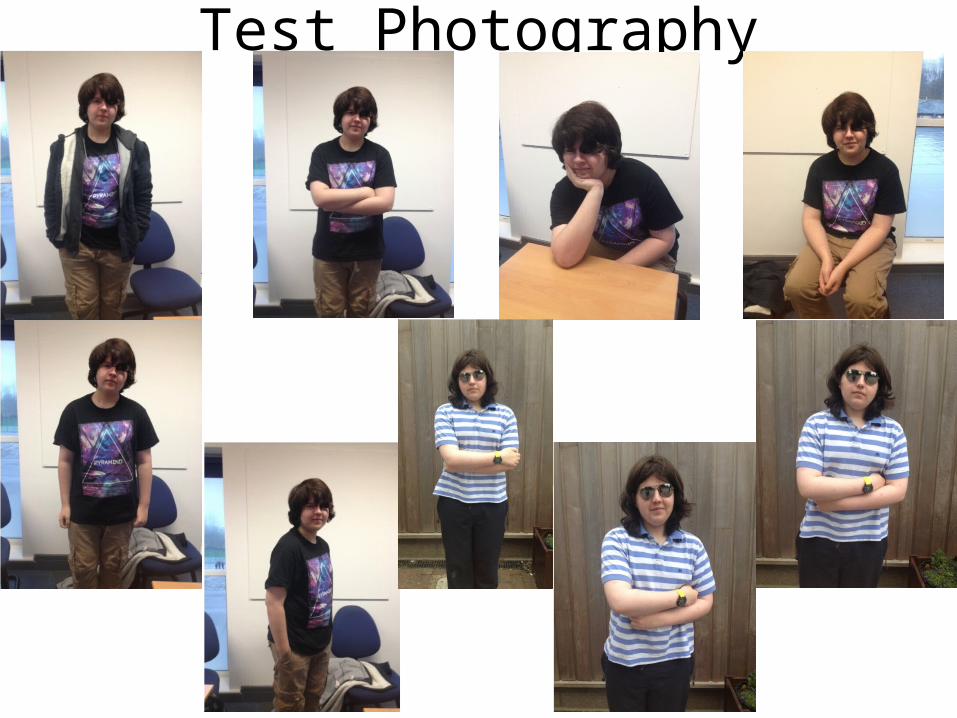
Test Photography
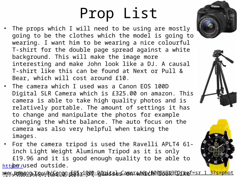
Prop List• The props which I will need to be using are mostly going to be the clothes
which the model is going to wearing. I want him to be wearing a nice colourful T-shirt for the double page spread against a white background. This will make the image more interesting and make John look like a DJ. A causal T-shirt like this can be found at Next or Pull & Bear, which will cost around £10.
• The camera which I used was a Canon EOS 100D Digital SLR Camera which is £325.00 on amazon. This camera is able to take high quality photos and is relatively portable. The amount of settings it has to change and manipulate the photos for example changing the white balance. The auto focus on the camera was also very helpful when taking the images.
• For the camera tripod is used the Ravelli APLT4 61-inch Light Weight Aluminum Tripod as it is only £19.96 and it is good enough quality to be able to be used outside.
• John also has a pair of glasses on which look like ray bans although they are a cheaper alternative from Primark which cost around £2.99.
• The watch John is wearing in the double page spread is an ice watch which costs £83.68 on amazon.
http://www.amazon.co.uk/Canon-EOS-100D-Digital-Camera/dp/B00BYOY9EO/ref=sr_1_3?s=photo&ie=UTF8&qid=1436777642&sr=1-3
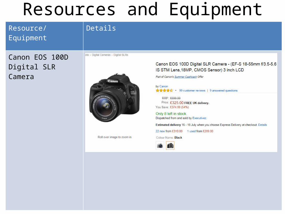
Resources and Equipment Resource/Equipment Details
Canon EOS 100D Digital SLR Camera
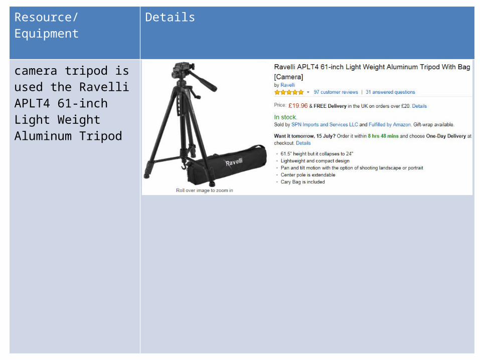
Resource/Equipment Details
camera tripod is used the Ravelli APLT4 61-inch Light Weight Aluminum Tripod
Resource/Equipment Details
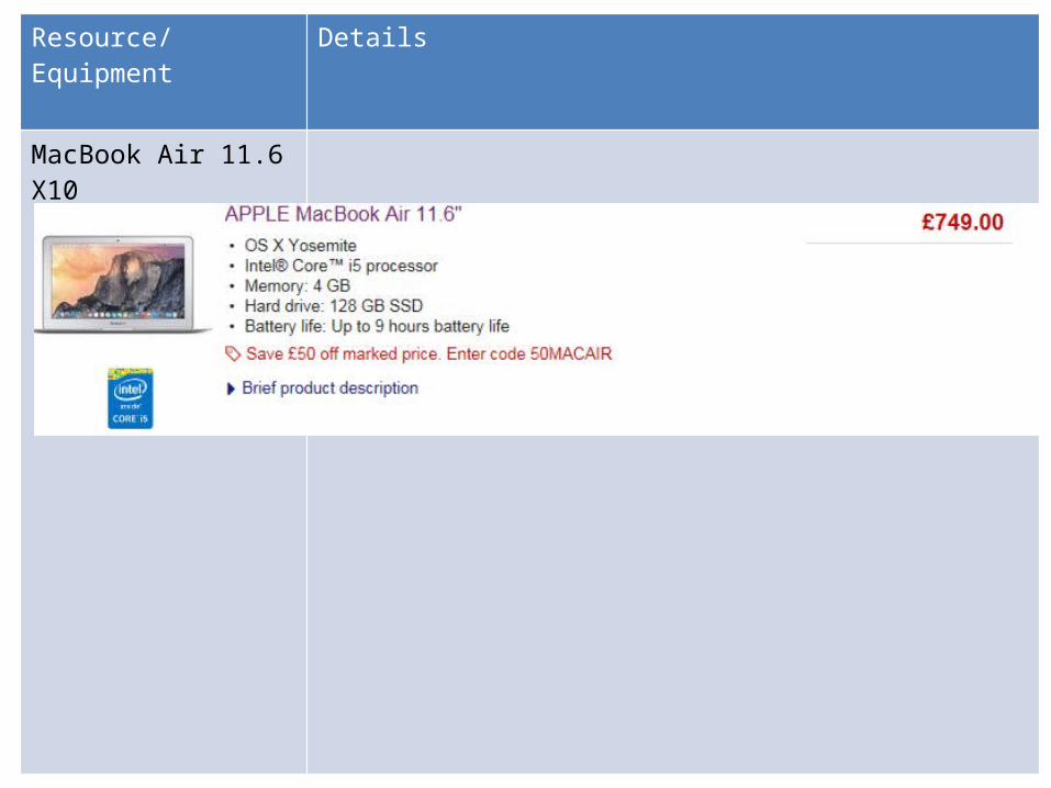
MacBook Air 11.6 X10
Resource/Equipment Details
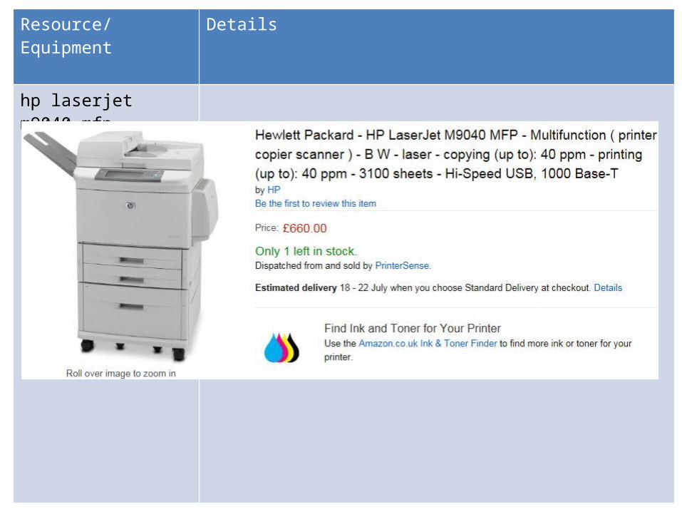
hp laserjet m9040 mfp
Resource/Equipment Details
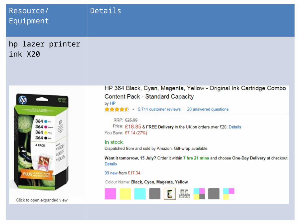
hp lazer printer ink X20
Resource/Equipment Details
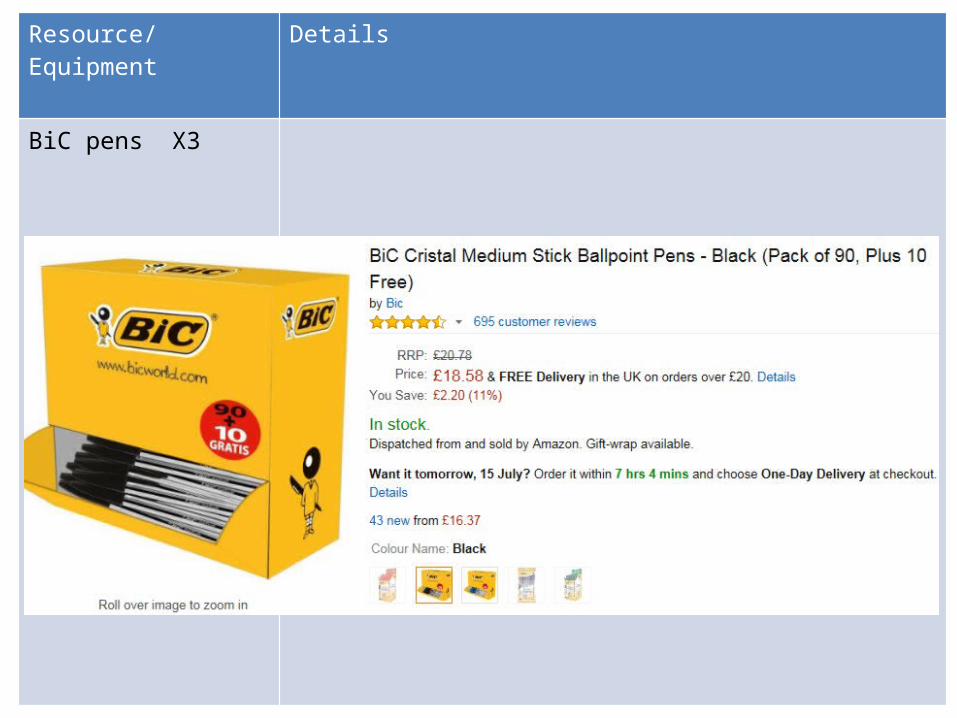
BiC pens X3
Resource/Equipment Details
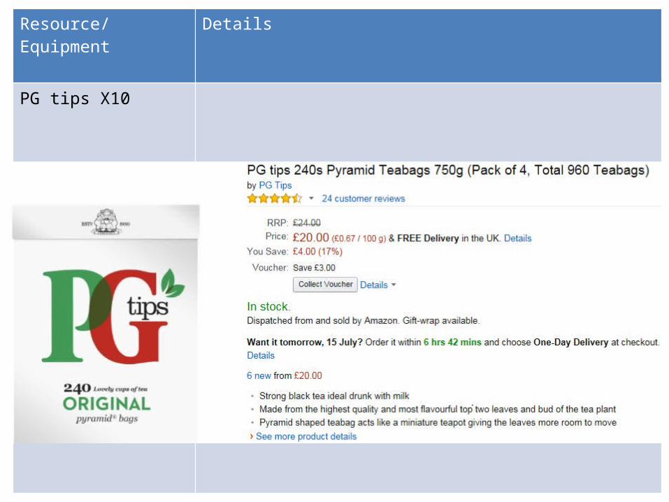
PG tips X10
Production Process• Editorial and budgetary decision – At the start of production the main managers will decide what is going
to be included in the magazine. This will also include planning their budget for the issue and what articles will be included.
• Managing the schedule – All the manager in all the departments will organise when deadline’s are going to be met and what the content of the magazine is going to be. They will also include reserve articles if they decide not to use some. The structure of the future issue of the magazine will also be planned.
• Content Acquisition – After all the articles are written they will be placed in the magazine. Then they will be made presentable and organised so that they look professional.
• Sub-editing – This is when the magazine is read through and is made sure everything is correct with no errors inside it. For my own magazine I had already written up what I was going to put into my double page spread article. I had written it in Microsoft Word documents where it showed me incorrect spelling mistakes. Although, I did read through it to make sure that the punctuation was good and the article made sense.
• Page Layout – The content is then laid out including pictures• Proof reading – This is the final check that everything is prefect and there are no mistakes and the
directors are happy with the whole magazine. • File emailed – The chief editor will have a final look at the magazine and make sure it is ready to be mass
produced. • Distribution – the magazine will then be sent to distributors to sell on the shelves.
http://contentmarketinginstitute.com/2011/08/6-steps-for-producing-a-custom-magazine/
Production Plan • The first week will be focused on organising what material I am going to create
and include to put into my magazine, such as; articles, design, photos and the over all layout of the magazine. Then deadlines will need to made in each department with time too proof read, time to print and distribute. A overall final deadline will be met for the date of publication which will be the first Monday of each month as it will compete with other magazines such as Mixmag and Tilllate which are two established magazines in the clubbing and dance genre. This content will then be gathered throughout the rest of the week and the next.
• The next two weeks will still be collecting the content for the magazine. This will take up the majority of the two weeks. The information which is needed to be collected is interviews, photos, and other information. I will also release some information to certain groups to get specific feedback to improve the current magazine plan.
• The final week will be putting the information which had been gathered throughout the month into the final version of the magazine. The layout of the magazine will change as the graphic designers will improve its appearance and make it more suited towards its aims and target audience. The magazine will be released on the first Monday on the 4th week of the month as it is easy to organise and it will be the same amount of time for every issue. It will also be able to review everything which happened over the previous month and everything for the next month.
Personnel and Resources I needed lots of resources to set up the magazine. Most importantly I needed employees to work to help create the magazine, in different sections of the magazine production. I employed: 1 editor, which will be responsible for overseeing the layout, appearance and content inside the magazine as well as: creating ideas for articles, editing articles, attending photoshoots and generally running the magazine.1 assistant editor which will support the editor in most activities leading up to a as a personal assistant, they will also organise meetings and deadlines, summaries material and correct manuscripts.2 junior graphic designers whom will estimate the time projects require with a the costs included, creating concept designs and multiple final designs for a product.3 journalists, they will research stories, write the articles, do interviews. Together they would make the magazine. I also need the resources which is Abode Photoshop CS5.1, 7 mac book airs, a office in Soho central London as well as other office equipment like printers, paper, pens and post-it notes.
http://www.prospects.ac.uk/index.htm http://creativepool.com/articles/jobdescriptions/graphic-designer-job-description
LO1 - Conclusion
After completing this learning outcome I have finished planning what my final magazine idea is going to be. This includes all the pre production material and planning. I was able to create: drafts, ideas, proposals, mood boards, drafts articles and graphic layouts. This is the beginning process for creating my magazine. In the next learning outcome I will need to assess the legal side of creating a magazine.