Embed Size (px)
Citation preview

OCR –
Level 3 Cambridge Introductory Diploma in Media
Unit 30: LO1UK Media Publishing
Candidate Name: Thomas HibbertCandidate Number: 2063Centre Number: 64135

Contents
1. Kerrang Magazine – Slide 52. Kerrang Strapline – Slide 63. Genre – Slide 74. DPS Conventions – Slide 85. Frequency – Slide 96. Publisher – Slide 107. Marketing and Promotion within the magazine – Slide 118. Advertising – Slide 129. Social Media – Slide 1310. Slogan – Slide 1411. Kerrang Sponsorship – Slide 1512. Ownership Structure – Slide 1613. Ownership Model – Slide 1714. Associated Products – Slide 1815. Spending Power – Slide 1916. Target Audience Theories – Slides 20 and 2117. Distribution – Slide 2218. Retail Outlets – Slide 23Start of Newspaper Tasks19. Broadsheets – Slide 2520. Tabloid – Slide 2621. Free Sheets – Slide 27Start of Metro Tasks22. Metro’s Ownership – Slide 2923. Readership – Slide 30 and 3124. Advertising – Slide 3225. Content – Slide 33 and 3426. News Values – Slide 35 and 37
22. Advertising and Marketing – Slide 3823. Advertising of Metro – Slide 3924. Advertising within the newspaper – Slide 4025. Online vs Hard Copy – Slide 4126. Technological Convergence – Slide 4227. Front Cover Deconstruction – Slide 4328. DPS Deconstruction – Slide 4429. Conclusion – Slide 45


Section One: Magazines

Kerrang Magazine
History of KerrangKerrang magazine is the UK’s number 1 rock music magazine and has been around since 1981. The magazine is based in London but is a worldwide magazine.
What is in Kerrang?Kerrang is a rock music based magazine which contains stories and the latest news and music from that music genre. The following are some artists feature in Kerrang:• Tonight Alive• Green Day• My Chemical Romance• Blink 182• Bring me the Horizon
People of KerrangThe founder Alan Lewis did not only create Kerrang but he has also written for NME, The face, Q, The telegraph and the Times.
Source:

Kerrang Strapline
The Kerrang strapline is “ Where life is loud”. The connotations of this are that the audience instantly know that it is a rock music magazine. The slogan describes life as loud and since rock music is loud the slogan suggests that life is rock music. This will attract people that are hardcore fans of rock music and also persuade more fans to grow in interest of the genre.

Genre - Rock
Verbal CodesKerrang’s verbal codes are the text that the magazine displays on the magazine.
The verbal code “ROCK STARS WHO CHANGED YOUR WORLD” is a perfect example of how they use verbal codes
connotes their genre of rock music. “Rock “ is literally written on the front
cover and makes the reader very aware that they are in fact a rock magazine.
Kerrang is a rock music magazine and their front
covers clearly display this.On this particular front cover of Kerrang they
have used non-verbal and verbal codes to show this.
Non-Verbal CodesThe magazine’s front cover has a picture of many rock music artists
and does this as a constant feature for the magazine each week. This specific front cover has multiple rock artists such as: Billie Joe
Armstrong, Gerard Way and Kurt Cobain. These are not only rock artists but very well known artists that
symbolise rock music.
BarcodeThe barcode for this magazine has the logo
inside of it as well as the price and issue number.
The connotations of the logo in the barcode are the consistency to advertise the
magazine’s title. By having the logo in the barcode
HeadlineThe headline of Kerrang’s front cover is ‘ICONS’.
The text is presented in a bold, bright and coloured format which draws in the readers’ attention as it is the biggest title on the page.
MastheadThe masthead has sharp, broken and destructive
connotations. This matches the consistent
style of Kerrang magazine because they
are a punk rock magazine.
Anchorage textThe Anchorage text on the front cover makes
the reader more interested in reading the article because it tells us that more rock artists are
featured in the magazine, this makes the
reader become more interested as more of the artists they like are in the
magazine.
Adverts/FreebiesThe advert on the front cover of this issue of Kerrang is the free download option for a festival. This encourages readers to buy the magazine in order to get the freebies
advertised.

Drop CapitalA drop capital draws attention to the interview and article instead of having readers just ‘flick through’ the DPS they will be drawn to read it because of the drop capital’s size.
Consistent colour scheme throughoutThis double page spread of Kerrang magazine has a consistent
colour scheme of black, red and white. The colour red connotes anger and fire which fits the stereotype that rock stars are angry
and perform angry music as artists.
Credit to interviewerThe significance of giving credit to the writer and photographer is that it tells the reader who put the page together which adds a more personal touch to the whole DPS.
Differential questionsBy having different colours for the different person speaking in the interview it allows the reader to be able to see who is the interviewee and interviewer.
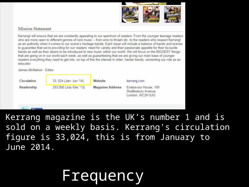
Frequency
Kerrang magazine is the UK’s number 1 and is sold on a weekly basis. Kerrang's circulation figure is 33,024, this is from January to June 2014.

Publisher
Bauer Media GroupCEO: Andreas SchooHeadquarters: Hamburg
1. Europe’s largest privately owned publishing Group2. The seeds of the company’s radio business were planted in 1990 3. In 1994, the company bought a small magazine called For Him Magazine which is now
the core of the best-selling international multi-platform brand FHM.4. Bauer Media spans over 80 influential brand names covering a diverse range of interests
including heat – the must have weekly celebrity title, Parkers, MATCH!, CAR and Yours.5. In 1996, Bauer Media acquired digital music TV channel The Box, as a route into the
small screen business, which has grown into Box Television, a seven channel joint venture TV business with Channel 4.
6. The Bauer Media Group has set the course for sales growth in its domestic market.7. Bauer media group holds a 56 per cent retail market share of the popular magazine
segment, and is also the leading private radio provider.
Source: http://www.bauermedia.co.uk/about

Marketing and Promotion within the Magazine
If you wish to advertise within Kerrang then you can log onto the web address to the right and there are a list of prices and criteria for advertising in Kerrang.
The marketing objective is an “opportunity to build awareness of your brand with a young audience with a median age of 22”. On the website there are several explanations of who has used advertising with Kerrang and the features and benefits of advertising with Kerrang.
http://www.getmemedia.com/ideas/advertising-opportunities-in-kerrang-magazine/bauer-
media.html

Advertising: How does Bauer advertise Kerrang! magazine? Social Media
Facebook is extremely popular in the modern age and Kerrang have taken advantage of this by creating their own Facebook page. The page has got 717,901 likes. This means that almost 720,000 people can see information and promotion for Kerrang issues without even having to click onto the page itself. This is reaching a wide range of people and this is only the people who are on Facebook let alone the people who like it outside of social media sites. Kerrang’s audience is huge.

Social Media
Joined twitter in 2009Kerrang magazine has ‘535K’ followers on twitter. This not only publicises the magazine but advertises its popularity. By doing this they are showing their audience or people debating to read the magazine that they are a good magazine of high quality which is why they have so many people following them.With Kerrang on twitter it connects them to a young audience that is constantly using social media. With so many young people on twitter currently and reading magazines Kerrang have taken advantage of social media and created the perfect way to gain the most readership and popularity possible.

Slogan
Slogan: “We think Popular”The logo with the slogan contains bright feelings with a range of colours. This range of colours in the image connotes the ethos of the magazine which is to have a wide rang of brands and products. The bright colours reflect how their purpose is to entertain and the wide range of colours show the rang of brands and ideas they have. The slogan also connotes that they ‘think’ that they are popular and are therefore considered popular. This could also suggest that if you read the magazine you will be popular.

Kerrang Sponsorship
Sponsor: A sponsor is a person or business that pays towards the costs of a project or activity.
Bauer Media signed a six figure deal with Pot Noodle in July 2013. The deal started on the 1st of July and was made to promote the new noodle flavour ‘Piri Piri Chicken’. The promotional campaign ran nationally and their strapline “Peel the top off a hottie” was used across Bauer’s stations including Kerrang!.
The strapline suits use in Kerrang! Because it is an innuendo and is relating preparing their product to an adult activity, this works with Kerrang! because Kerrang! associates their product (Rock music) with sex, alcohol and misbehavior.
http://www.mediaweek.co.uk/article/1188342/pot-noodle-bauer-media-sign-six-figure-piri-piri-
deal

Ownership Structure
Bauer media was first found in 1875.Bauer Media is a global publisher because it has its headquarters in Hamburg. By being a global publisher it is open to a lot of brands which can help them reach their insight which is “to be able to deliver ground-breaking consumer insight to media professionals, having more market leading brands across a wider breadth of markets than any other media owner”.
On each page of Bauer’s website they have the social networking icons on the left hand side. This shows continuously that they are on social networking sites. This attracts younger audiences that are in fact with these networking sites that they can interact with a magazine that they like within their own environment and reach out to Bauer about their magazine.

Ownership Model
Research Sourceshttps://www.bauermedia.co.uk/about/our-company
PAUL KEENANCEO
DEE FORDGroup Managing Director Radio
ROB MUNRO-HALLGroup MD, Magazine Media
ABBY CARVOSSOGroup MD, Advertising
ANNE-MARIE LAVANGroup Marketing Director
SAM JONESGroup MD, Digital
SARAH VICKERYGroup Finance & Strategy Director.
SARAH BARNESHR Director
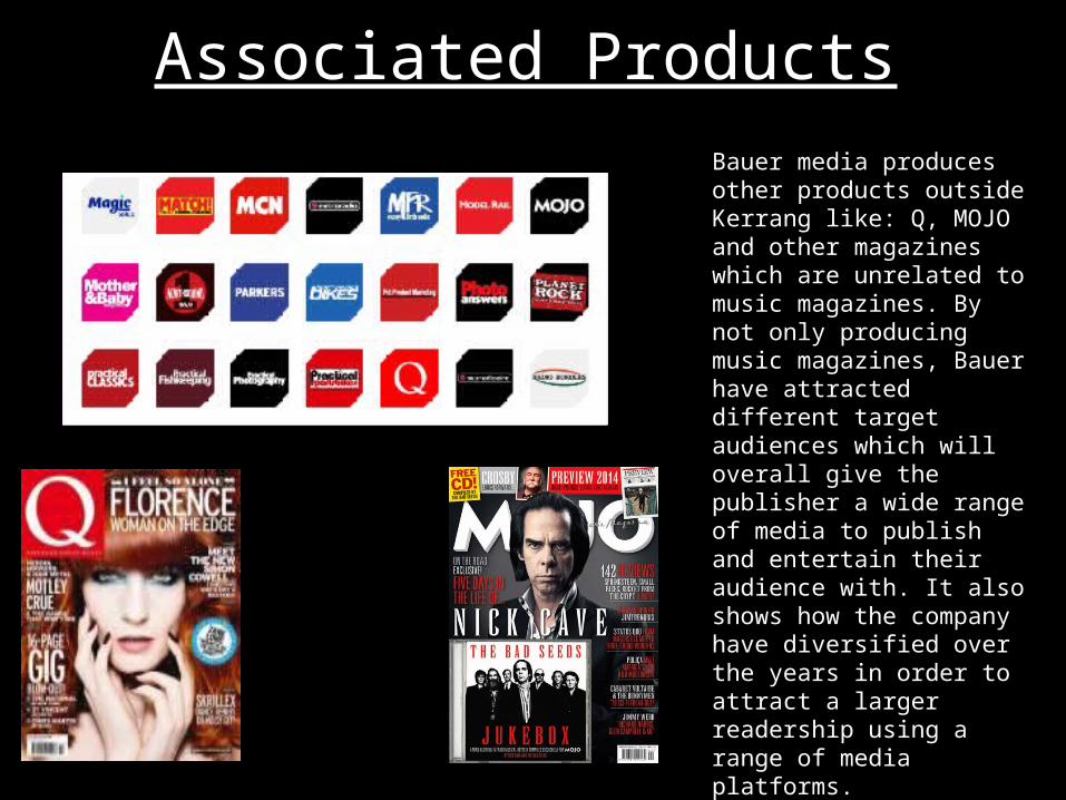
Associated ProductsBauer media produces other products outside Kerrang like: Q, MOJO and other magazines which are unrelated to music magazines. By not only producing music magazines, Bauer have attracted different target audiences which will overall give the publisher a wide range of media to publish and entertain their audience with. It also shows how the company have diversified over the years in order to attract a larger readership using a range of media platforms.

Spending Power
Kerrang’s target audience’s spending power is low. This is because the demographic is E/D, this has most likely influenced Kerrang to price their magazine at £2.20 in the UK as everyone in this demographic can afford this.

KatzThe uses and gratifications theory was made by theorist Katz. The theory depicts how we understand communication and how the media affects us. The theory suggests that people interpret the media they are consuming into their lives with ‘objectives’.Kerrang’s reader’s objectives would be to gain insight into themselves. This is based on the theme and mood of the magazine which is quite dark, this connotes how they may be a dark person.The typical reader of Kerrang! will be ‘informed & educated’ about the lives of rock artists in and outside of music performing. This allows the audience to indulge themselves in the lives of these artists and escape from their own.
PsychographicsPsychographics are parts of a specific media group which have been split up in the market to define a form of media’s reading group or target audience. The psychographics group that I think Kerrang’s readers fall into would be the strugglers. This is because they stereotypically buy alcohol and our disorganised. This matches with some of the types of artists in the magazine and the general look of the magazine may appeal to this psychographic group.


Distribution
Network is Australia’s largest magazine distribution and subscriptions management company and has a market share of 53% of copies sold at retail and 52% of the consumer subscriptions market.Network represents 270+ publishers and sells over 170 million copies of magazines, worth over $500 million in retail sales. With over one million subscribers, Network’s subscriptions team manage Australia’s largest consumer subs business.Network’s distribution reach also covers New Zealand for both retail and subscriptions through its sister company Netlink Distribution.
http://www.bauer-media.com.au/services/distribution

Retail Outlets
Kerrang is available in the following shops• WHSmith• Newsagents• Online-Their website www.Kerrang.co.uk • Sainsbury's• Tescos
Buying Kerrang! onlineTo buy Kerrang online you need to log onto their website and select the tab at the top of the page which reads “Get K!”. Once on the page you can select the issue you wish to purchase and then you will be redirected to a page dedicated to that issue and describe the issue’s content.

Section Two: Newspaper

Broadsheets
Broadsheets are the type of newspaper that are more serious and cover issues that are more crucial to the world as a pose to celebrity gossip and small stories.
Examples of broadsheets:• The Observer• The Daily Telegraph• The Times
The names of broadsheet newspapers are usually more professional and informative than tabloids as you can see in the comparison with aesthetics and other features.

Tabloid
Tabloid newspapers focus more on interesting stories and stories that will attract the reader, they are usually half the size of a broadsheet.
Examples of tabloid• The Sun• The Mirror• Daily Star
The front cover of tabloids will be more gripping and grab the attention and interest of readers easier than broadsheets as tabloids not only inform as broadsheets do but they entertain.
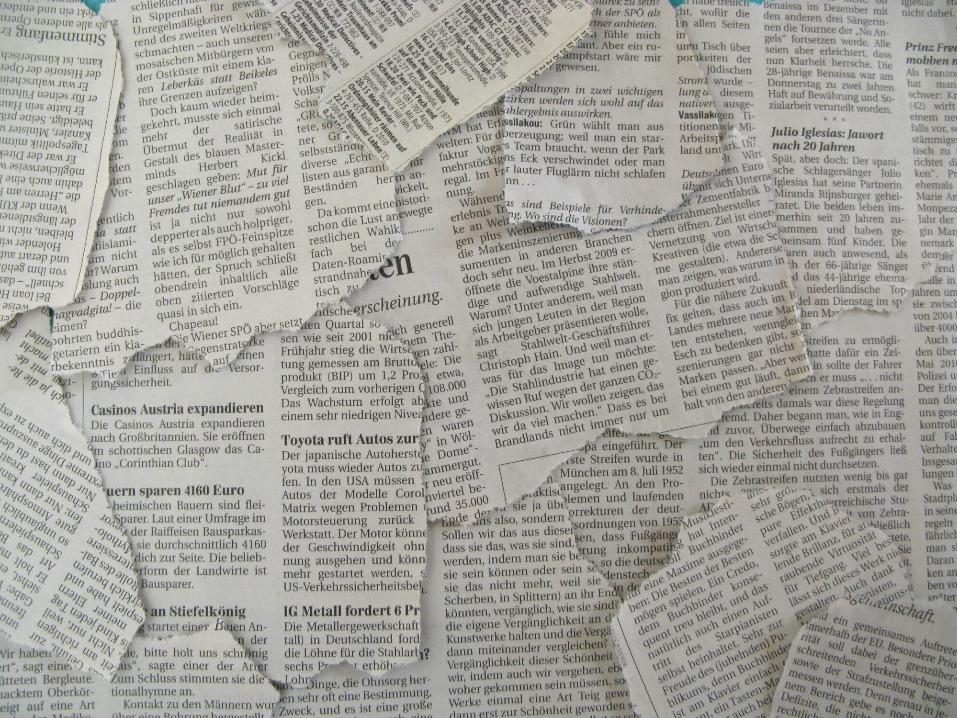
Free Sheet
A freesheet newspaper is a newspaper that has no price and does not cost anything to purchase, because of this the magazines make money from advertising content.
Examples of free sheets:• The Metro • The London Paper• Evening Standard

Metro

Metro’s Ownership
Who owns the Metro?The owner of the Metro is DMG Media. DMG Media are a leading UK media company. They have multiple brands such as Mail Online, Wowcher and including the Metro.
The chairman of DMG Media is Lord Rothermere. DMG Media was founded in 1905 and is still standing today.
http://www.dmgmedia.co.uk/about-us
http://www.metroclassified.co.uk/corporateinformation
Editor of MetroThe editor of the Metro is Kenny Campbell. Campbell has been the editor for 12 years but now works for a PR agency.
http://www.prweek.com/article/1293430/former-metro-editor-kenny-campbell-joins-wifes-pr-agency-campbell-
brown

Readership
http://www.metroclassified.co.uk/productsandaudiences/readdistribution
The readership of The Metro is in the 2 million range, this is impressive as it is mainly “picked up from Metro bins and racks”. The most well known freesheet in the UK is The Metro, this newspaper can be found on trains and is popular with commuters.
According to Maslow’s hierarchy of needs the typical reader of this newspaper would be looking for self actualization because of the morality and facts in the stories found in the newspaper.In terms of Katz’ the reader of Metro would be the need for personal relationships and to fulfill companionship in keeping in contact with the media and latest news.

Source Usedhttp://moremetro.co.uk/trade/audience/audience-numbers-new/
Socio-Economic NeedsSocio-economic needs are economics based on the social behavior and economics at the time.
This relates to the Metro because it appeals to both genders of working class commuting to work.
Circulation FiguresThe total circulation for the Metro is 1,335,000.
PsychographicsThe Psychographics for the Metro’s audience are mainstreamer. This is because of the Metro’s domestic appearance and values.

Genre
Metro is a free sheet newspaper in the format of a tabloid newspaper. The Metro is considered to be in tabloid format because of the size of the newspaper. Metro has 68 pages holding it together which is stereotypically the size of a tabloid paper such as The Sun.
Most of the money made from Metro is advertising such as the double page adverts and single page to small cutouts. To advertise in the Metro there are a range of numbers and contact information provided on their website.
http://www.metroclassified.co.uk/how-to-advertise

Content
The content in the Metro is built up of advertisements, up to date news articles on the biggest stories and a small amount of celebrity news.The personality news in the free sheet is not ‘gossip’ that may be seen in Heat or The Sun but actual news that is interesting and factual. For example in the Friday September 4th 2015 issue of the Metro there is a page dedicated to the star of the new film ‘Legend’ and the premiere event.
The advertisements can vary from film posters to perfume promotions and supermarket price cuts. The adverts in the paper are something that the reader can relate to whether they are a parent on the train to work and they see that they can buy cheaper food for home or they are a teen on the tube into London and cant decide what film to see, the Metro has something for everyone.

Content
The news selection in Metro consists of quick, easy read and important stories that can inform (Katz) people on the train of major events within the time that they are commuting.
The main stories appear to be in the first 10 pages of opening the newspaper, this means that a commuter can easily pick up a copy of the Metro on the train without having to flick through to find the news as it can easily be found within the first dozen pages.

News Values (Galtung and Ruge)
News values are factors subjected to news in the media, media researchers Galtung and Ruge wrote the list of news values.
Using the table and news values inside, the Metro’s news values are size. This is because the stories in the newspaper Metro are large and have a big impact. A working example would be the child that was washed up on the beach, every newspaper covered the story including the Metro which had an image of the beach on the front cover.
http://mediaknowall.com/gcse/news/news.php?pageID=
values

News Values (Galtung and Ruge)
‘Negativity’ –
The verbal code “we’ve lost” immediately ‘signifies’ (De Saussure) to the reader that people have suffered from this news story and what has happened has resulted in emotion for the people who have said “We’ve lost a loving son and father”.
‘Visual Imperative’ –
The non-verbal code of the image of a British soldier adds power to the story. This is also anchored by an emotive caption of how Lee Rigby wanted to “live life to the full”.The image would also appeal to the reader because it denotes the person that was killed which lets the reader get to know the story more and what has happened in more personal detail. It furthers the sad emotions to the reader because you can actually see someone that lost their life and see the “son and father” that a family lost.
‘Recency’ –
The size of the headline connotes how important and large this story is. As soon as the reader sees the large heading they straight away know the ‘magnitude’ of the situation they are reading about.
Metro – May 24th 2013

News Values (Galtung and Ruge)
How certain stories have certain news valuesSome news stories are made to portray or to do certain things for the reader. If there was an article on a missing pet then the news value it has would be simplicity because the story is obvious but truthful for the reader to read.
The Metro’s news values are ‘size’ but different stories in the newspaper can have different values. For example in the Metro there was a story about millions of people being affected by PS3 consoles not working, the news values for this article in Metro are recency because this was new and relevant to a large number of people.

Advertising and Marketing
Metro uses twitter and Facebook as well as their own website to advertise and market the newspaper with other stories. The colour scheme is different online to the hard copy of the newspaper, this may be to attract a more modern and younger audience. The story on the Metro newspaper is less likely to attract a young reader than something they might display on their twitter page about the star wars actor being injured on set, this is clever marketing and serves as almost two versions of the newspaper, one for adults and one for teens.
http://metro.co.uk

Advertising of Metro
PostersThe Metro’s posters promote their celebrity involved news and the fact that there is not a lot of reading or attention to pay when reading the newspaper. This means that commuters will willing pick up a copy of the Metro if they see it because they think that they can read it and be entertained and pass time whilst doing so. The Metro adverts appear to be mostly around train stations and bus stops, this is to focus mainly on commuters when trying to pick up readers because this is where most readers are as well as their target audience.

Advertising within newspaper
To advertise within the Metro you must call the Metro’s phone number. This phone number is 020 3615 1754. However there is a quicker way to advertise by choosing from the following numbers that is allocated to the product you wish to advertise.
http://www.metroclassified.co.uk/how-to-advertise
Lower down on the page there are specifications and different spaces and sizes for the adverts in the Metro.

Online vs Hard Copy
Colour SchemeThere is an obvious difference with these two versions of the Metro, the colour scheme. The colour scheme for the online version is orange, yellow and black. These are modern and young colours which attract and appeal to a younger audience than the daily readers commuting to work in the morning. The hard copy on the other hand has a blue, white and black colour scheme, this appears more formal and appeals to an older audience, the kind that would pick it up on the train.
StoriesThere is a difference in story type with the online and hard copy of the Metro. The stories on the Metro website are made for younger audiences and are aimed towards topics that teens can relate to, this is perfect for a teenage audience as it will attract them and get them latched to the Metro but the website only, however they will be more likely to pick up a copy of the Metro if they see it. The hard copy of the magazine’s stories are more current news as a pose to what readers want to read about.
News ValuesThe news values (Galtung and Ruge) of the online Metro are associated with are simplicity because of the simple and preferred stories. The news values associated with the hard copy are size because of the breaking news stories they include and promote for a big impact. http://mediaknowall.com/
gcse/news/news.php?pageID=
values
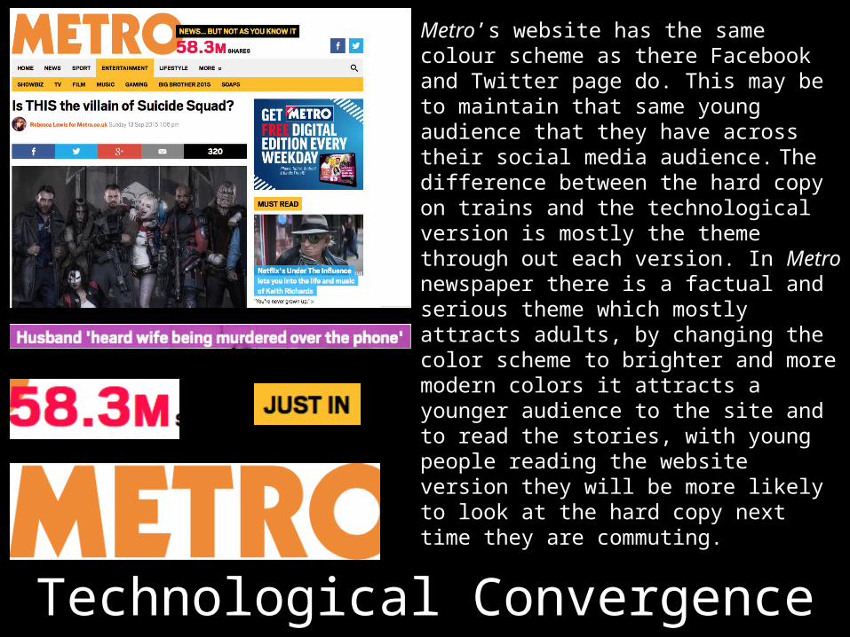
Technological Convergence
Metro’s website has the same colour scheme as there Facebook and Twitter page do. This may be to maintain that same young audience that they have across their social media audience. The difference between the hard copy on trains and the technological version is mostly the theme through out each version. In Metro newspaper there is a factual and serious theme which mostly attracts adults, by changing the color scheme to brighter and more modern colors it attracts a younger audience to the site and to read the stories, with young people reading the website version they will be more likely to look at the hard copy next time they are commuting.

Front CoverMastheadThe denotation of the masthead shows the logo that reads ‘Metro’. The writing is white and background is blue with a red tag indicating that it is free. The red tag suggests that it of high importance.
Bold and Big textThe big and bold text suggests importance, the story on the front cover is the latest and most high profile news article in the media at this point in time and this big and bold text conveys this.
Smaller stories under mastheadThe smaller stories are under the masthead, this placement suggests that they are not as important as the tragic story which is the focus of the issue.
News ValuesThe front cover of the Metro suggests that the news values are simplicity because of the current event that is on the front cove r of this issue. The story is factual and not complicated.

Double Page Spread
ColumnsThe columns on the DPS are divided and split around the main image, this is to keep the articles important but to still draw relevance and importance to the main image.
LOGOThe logo is in the top
corner of the DPS. This establishes a brand
identity and keeps the magazine name and logo
a consistency throughout the
newspaper.
Main ImageThe main image takes up
most of the DPS. The main image in a DPS usually take
up to at least a page. This main image is positioned
across the page in the middle as a pose to the
stereotypical positioning.

ConclusionIn this LO I investigated my chosen newspaper Metro. I looked into the advertising they do, the content in a typical issue and looked into if they were just a printed newspaper or if they had a website.
There are three types of newspapers: Tabloid, Free sheets and Broadsheets.
In LO1 I have also investigated similar aspects of Kerrang magazine and its publisher Bauer Media.