Embed Size (px)
Citation preview

band name : is very exotically written and seems incomplete which maybe symbolises that the band will produce more albums
main image: two hands (male + female) holding one another hints that maybe the album consists of romantic songs and maybe tell a story about two peoples love life
colour scheme: nude colours very simple, this highlights the nature of the album as being very simplistic and modest
album title: very small in comparison to the rest of the page, causing an interest level for the audiences to get once viewing the album for the first time.. The closer they look the more intrigued they become.
name itself: science and faith hints that the album maybe brings together two worlds that are very different which links in with the main image of two people holding each others hands and coming together as one.
back image: contrasts the front image as the front one seems more strong and based whilst the back one is more gentle and tender > the hands are just touching maybe symbolising the meeting of the two worlds that later become strong like the front image.
bottom left corner: contains barcode (identity), Sony music (record label), which all in all gives the album authentication and copyright
top left corner: has a website url for all album buyers to go to for more information on the band itself such as tour dates and venue >> thus promoting the band further.
track listing: in the top right corner and just like the album name are in small font to intrigue the audiences further into the music more than how the album cover looks… rear iterating the point of being modest.
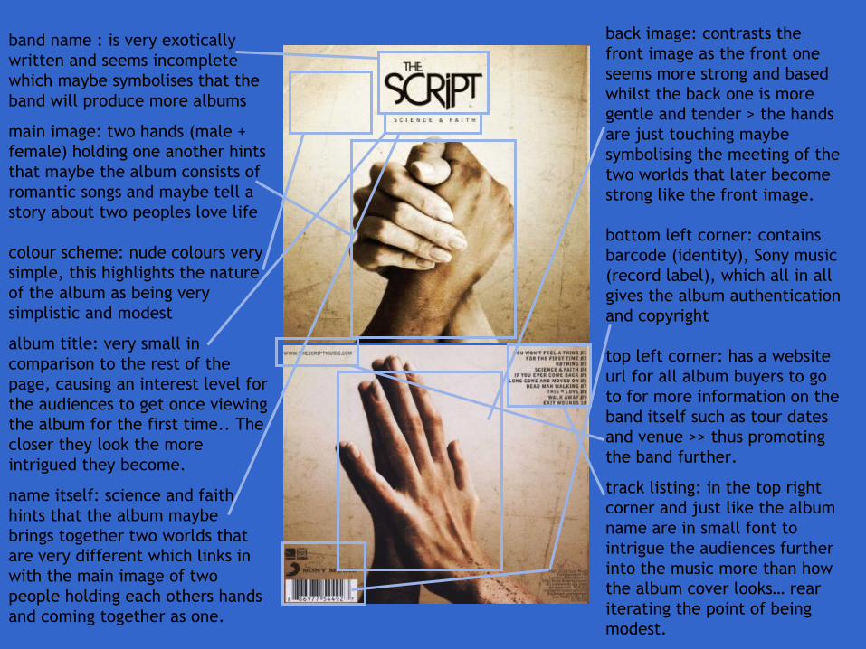
artist name : his name is a globally recognised logo for clothing lines etc. so to use the same font and style for the album cover connects trey songz the artist to trey songz the entrepreneur and creates a familiar buzz on the album that is surrounded by the celebrity of trey songz.
main image: the almost dominant frame in gold may represent richness of the artists thus showing the best of him and the sheer size may also hint that this album accounts for the best of the artist. a baby picture of the artist maybe symbolises that this album is the true representative of his inner self and the purest of mind frame that is embedded within the albums songs come form the childish innocence. However this contrasts with the parental advisory sign on the image because the you wouldn’t link the child with something of adult competence and knowing.
colour scheme: very rich natural colours giving the Victorian vibe when viewed almost say that within the album there is a story to be told and this story will be the truest.
name itself: linking in with the colour scheme the title genesis says a god like truth that cannot be denied is also something important with in the album and artists core beliefs. Genesis is also essentially a story within the bible which connects with a story being told within the album. Maybe his true self past all the buzz and celebrity is surfacing in this album?
album title: the name sits right below the photo> just like in a museum an important piece of detail is placed directly below the art… this highlights the sheer importance that the name holds in relation to the novel. The font is completely different to the artist name but that adds more character to the cover showing a different side to the album and artist.
2 images; 1st image is again of the child trey premature of all the success and the 2nd picture is of trey with his record label boss after his deep found success. This shows the transition of a work in progress to a growing intelligence and shows that the album is him being at his peak
right hand side: house style of a biblical theme is carried on as the spine of a bible is shown as a block image> the artists name, album name and record label/copyright details are written on this platform to complete the absolute crucial convention of any album cover.
bottom left hand side: he shows his respectful and thankful side as trey pays due credit to his produces and artwork members
track listing: in an original spot and showing a tremendous amount of records, which again rear-iterates the hard work that was put into this album and how this album represents his best work and most valuable work.
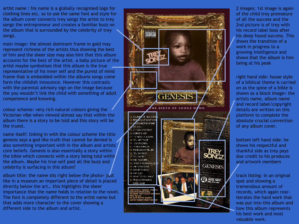
artist name : the font of the name is very chic and elegant yet in a very simplistic manner.. The colour and size of the name make the title very dominant on the page to show the importance of the artists presence in this album.
main image: a mid shot of the artist in near nude symbolising that she has nothing to hide and is showing her true honesty in this album which further hints that this album may have an important sentimental value for herself. The image is centred and covers the name of the artist> this alternates the attention from her name to herself and highlights her presence to the target audience.
colour scheme: nudes and blacks set up the scene for a pure and happy vibe that will reflect of the records in the album. Whilst the baby green and skin nude show a sense of calmness and vulnerability, the black on the other hand mixed with the make up on the artist creates a feel of strength and independence in the album.
name itself: the number 4 is apparently of great importance to beyonce as that is her lucky number and all the important dates in her life link in with the number, so for her to name the album 4 shows that this album is created as a reminiscing tool to her greatest years and shows she is now at her happiest.
album title: in the bottom corner and is isolated from the rest of the scene> on its own level of importance and standing alone shows it has a separate valuing to the image and name of artist.
back image: shows artist looking over a beautiful scenery maybe symbolising reminiscing over the happy events of her life and now as she is at the top of a balcony above all the landscape she has finally reached her prime and fulfilled what she set out to do. The long shot of beyonce shows her unseen beauty and model like features which hints she is willing to share what meets more than the eye within the records of this album creating an anticipation vibe to the overall album.
track listing: the track listing is set out like a minimal paragraph maybe there to seem like a novels blurb and shows the songs as a songstress’ tales of her life up until now. Written in solid black and in medium font the tracks stand out due to their placement and use of typography.
bottom right corner: the barcode, record label/production company alongside credits to the appropriate institutions and individuals are placed to add a copyright stamp that will be individual to other albums.
bottom left corner: paying respect and credit to parkwood entertainment for their work in helping beyonce create her album and videos.
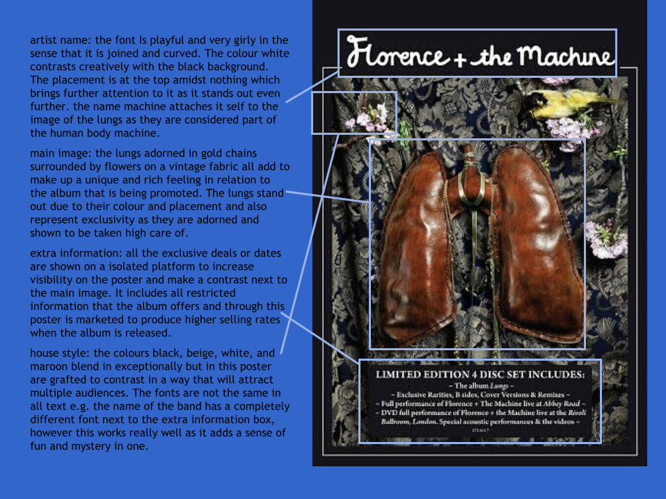
artist name: the font Is playful and very girly in the sense that it is joined and curved. The colour white contrasts creatively with the black background. The placement is at the top amidst nothing which brings further attention to it as it stands out even further. the name machine attaches it self to the image of the lungs as they are considered part of the human body machine.
main image: the lungs adorned in gold chains surrounded by flowers on a vintage fabric all add to make up a unique and rich feeling in relation to the album that is being promoted. The lungs stand out due to their colour and placement and also represent exclusivity as they are adorned and shown to be taken high care of.
extra information: all the exclusive deals or dates are shown on a isolated platform to increase visibility on the poster and make a contrast next to the main image. It includes all restricted information that the album offers and through this poster is marketed to produce higher selling rates when the album is released.
house style: the colours black, beige, white, and maroon blend in exceptionally but in this poster are grafted to contrast in a way that will attract multiple audiences. The fonts are not the same in all text e.g. the name of the band has a completely different font next to the extra information box, however this works really well as it adds a sense of fun and mystery in one.
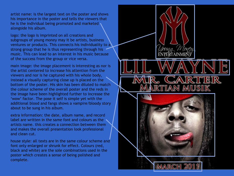
artist name: is the largest text on the poster and shows his importance in the poster and tells the viewers that he is the individual being promoted and marketed alongside his album.
logo: the logo is imprinted on all creations and subgroups of young money may it be artists, business ventures or products. This connects his individuality to a strong group that he is thus representing through his music. This can lead to an interest in his music because of the success from the group or vice versa.
main image: the image placement is interesting as nor is the artist centered to increase his attention from the viewers and nor is he captured with his whole body, instead a visually capturing close up is placed on the bottom of the poster. His skin has been diluted to match the colour scheme of the overall poster and the reds in the image have been highlighted further to increase the ‘wow’ factor. The pose it self is simple yet with the additional blood and fangs shows a vampire/bloody story about to be sung in his album.
extra information: the date, album name, and record label are written in the same font and colours as the artists name. this creates a connection between them and makes the overall presentation look professional and clean cut.
house style: all texts are in the same colour scheme and font only enlarged or shrunk for effect. Colours (red, black and white) are the sole combinations used in the poster which creates a sense of being polished and complete.
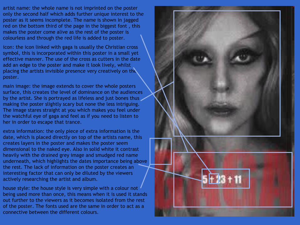
artist name: the whole name is not imprinted on the poster only the second half which adds further unique interest to the poster as it seems incomplete. The name is shown in jagged red on the bottom third of the page in the biggest font , this makes the poster come alive as the rest of the poster is colourless and through the red life is added to poster.
icon: the icon linked with gaga is usually the Christian cross symbol, this is incorporated within this poster in a small yet effective manner. The use of the cross as cutters in the date add an edge to the poster and make it look lively, whilst placing the artists invisible presence very creatively on the poster.
main image: the image extends to cover the whole posters surface, this creates the level of dominance on the audiences by the artist. She is portrayed as lifeless and just bones thus making the poster slightly scary but none the less intriguing. The image stares straight at you which makes you feel under the watchful eye of gaga and feel as if you need to listen to her in order to escape that trance.
extra information: the only piece of extra information is the date, which is placed directly on top of the artists name, this creates layers in the poster and makes the poster seem dimensional to the naked eye. Also in solid white it contrast heavily with the drained grey image and smudged red name underneath, which highlights the dates importance being above the rest. The lack of information on the poster creates an interesting factor that can only be diluted by the viewers actively researching the artist and album.
house style: the house style is very simple with a colour not being used more than once, this means when it is used it stands out further to the viewers as it becomes isolated from the rest of the poster. The fonts used are the same in order to act as a connective between the different colours.