Embed Size (px)
Citation preview

QUESTION 2:How effective is the combination of
your main product and ancillary texts?

Our Products
Magazine Cover
Film Poster Teaser Trailer

Iconography
Throughout our products we use various icons, some don’t appear in
every product but remain important in creating the
brand image.

Iconography:LOCATION
Forests play an important part in our product as it’s the film is set. It
represents the isolation and unknown the characters are feeling
A still from our trailer the background the background
on our poster on our magazine

Iconography:BLOOD
Blood is obviously an icon for horror films, there are very few that don’t
contain any at all, but like all slasher horror films blood is pretty much
everywhere
A still from our trailerthe blood splat on our poster

Iconography:DANIELLE
I think it’s important for the lead character to be on every product,
because it creates a brand image and links all three products together
Danielle in our trailer Danielle on the MagazineOn the Poster
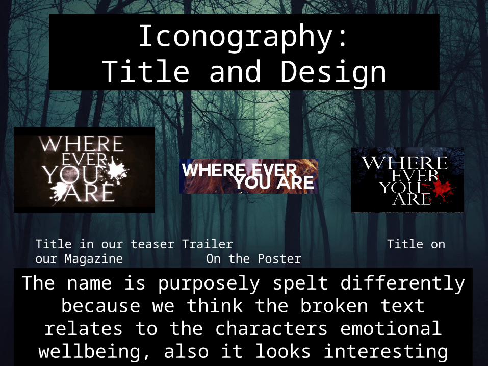
Iconography:Title and Design
The name is purposely spelt differently because we think the broken text relates to the characters emotional wellbeing, also it
looks interesting across four lines. It’s different on the magazine cover because ‘Its made by a
different company’
Title in our teaser Trailer Title on our MagazineOn the Poster

Do they appeal to the same audience?
I think they do! Because
EMPIRE Magazine is targeted at Males aged
17-25Slasher films target
audiences are extremely similar to EMPIRE as
they are 15-25 Males
All of our products include a
female lead which is a
contributing reason men will watch the film, often slasher include some kind of sexual
activity between
characters. Which will
appeal more to the male audience

Characterization
Present across all of our products Danielle is seen as “a lost soul” fitting with the conventions of a typical slasher, we don’t feature a particularly strong female protagonist.
For example she doesn’t have a very stern face in any of the products, she is either confused or scared.