Embed Size (px)
Citation preview
Construction: Double Spread Page
(Making)
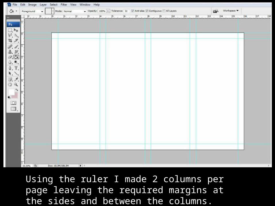
Using the ruler I made 2 columns per page leaving the required margins at the sides and between the columns.
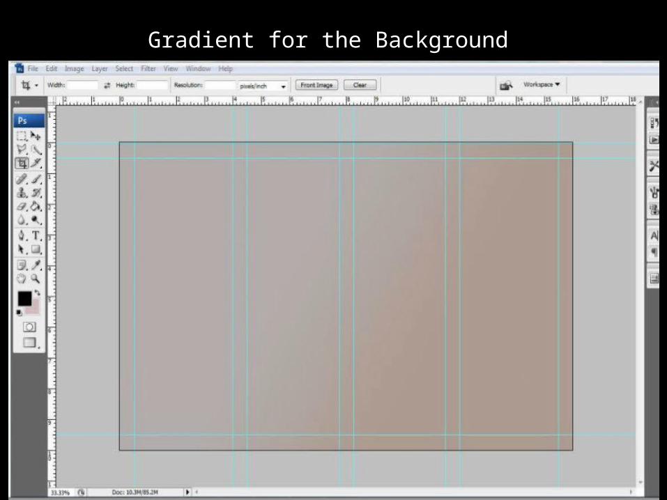
Gradient for the Background
I did not want to go with a plain white background as it makes the spread page look dull. When I was going through my research on double spread pages I noticed that often a gradient is used in the background. That is why I decided to use a gradient. I used two colors orange and grey because the pictures I selected have these tones and if I had selected colors the opposite of the tones in my selected pictures, the pictures would have contradicted the background. I used the color grey more as compared to orange because orange is a bright color and it would have stolen the attention from the content and images on the double spread
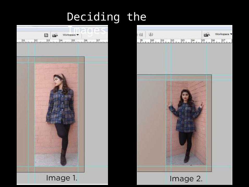
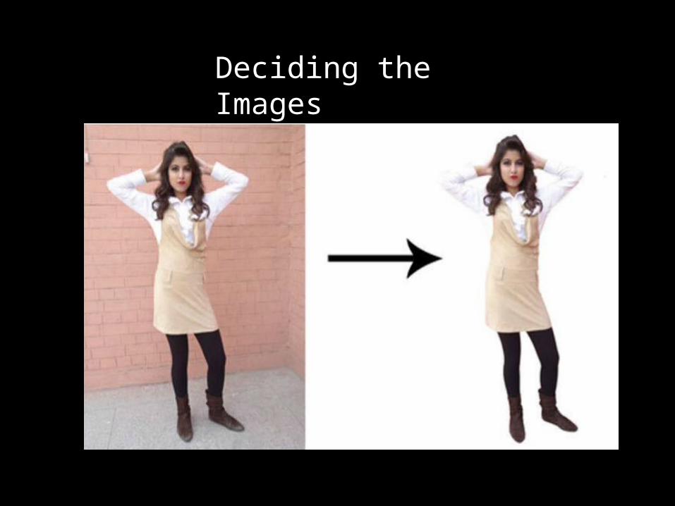
Deciding the Images
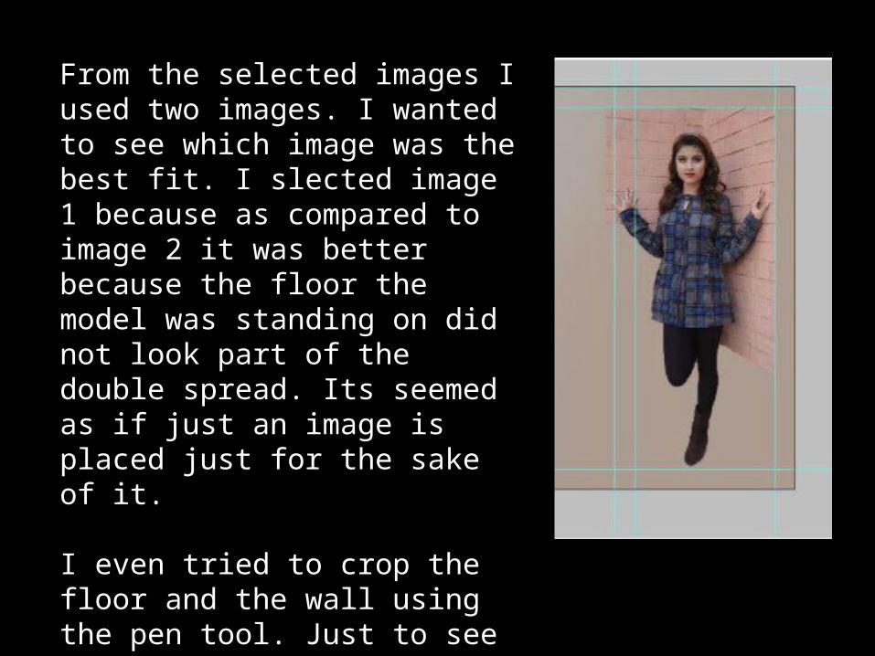
From the selected images I used two images. I wanted to see which image was the best fit. I slected image 1 because as compared to image 2 it was better because the floor the model was standing on did not look part of the double spread. Its seemed as if just an image is placed just for the sake of it.
I even tried to crop the floor and the wall using the pen tool. Just to see how it looked. But according to me it actually looked really odd with half of the wall and flooe cropped out so I decided not to use this image.
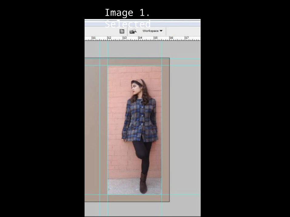
Image 1. Selected
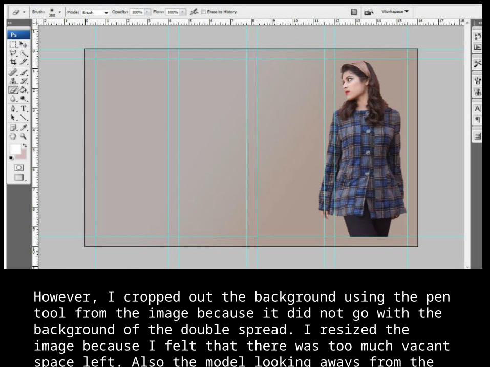
However, I cropped out the background using the pen tool from the image because it did not go with the background of the double spread. I resized the image because I felt that there was too much vacant space left. Also the model looking aways from the camera creates and aura of mystery.
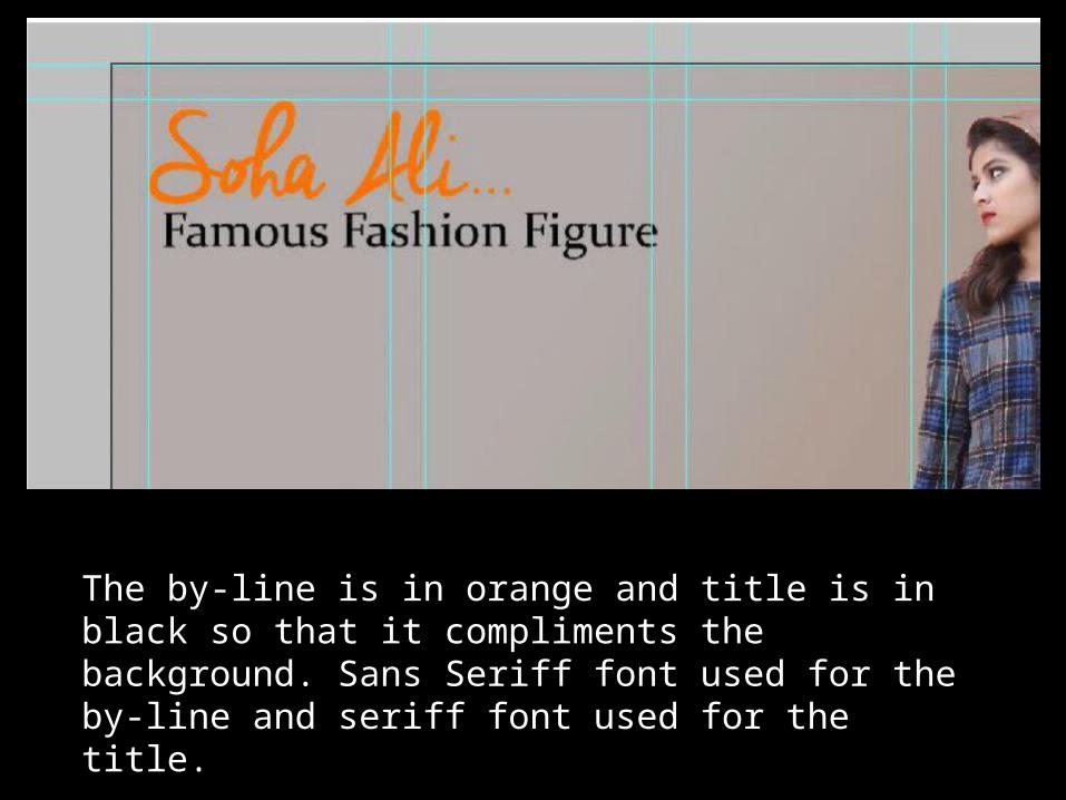
The by-line is in orange and title is in black so that it compliments the background. Sans Seriff font used for the by-line and seriff font used for the title.
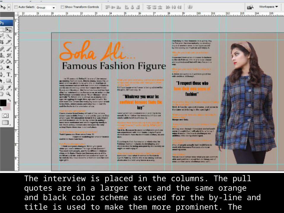
The interview is placed in the columns. The pull quotes are in a larger text and the same orange and black color scheme as used for the by-line and title is used to make them more prominent. The questions are in orange and the answers are in black
Deciding the Images
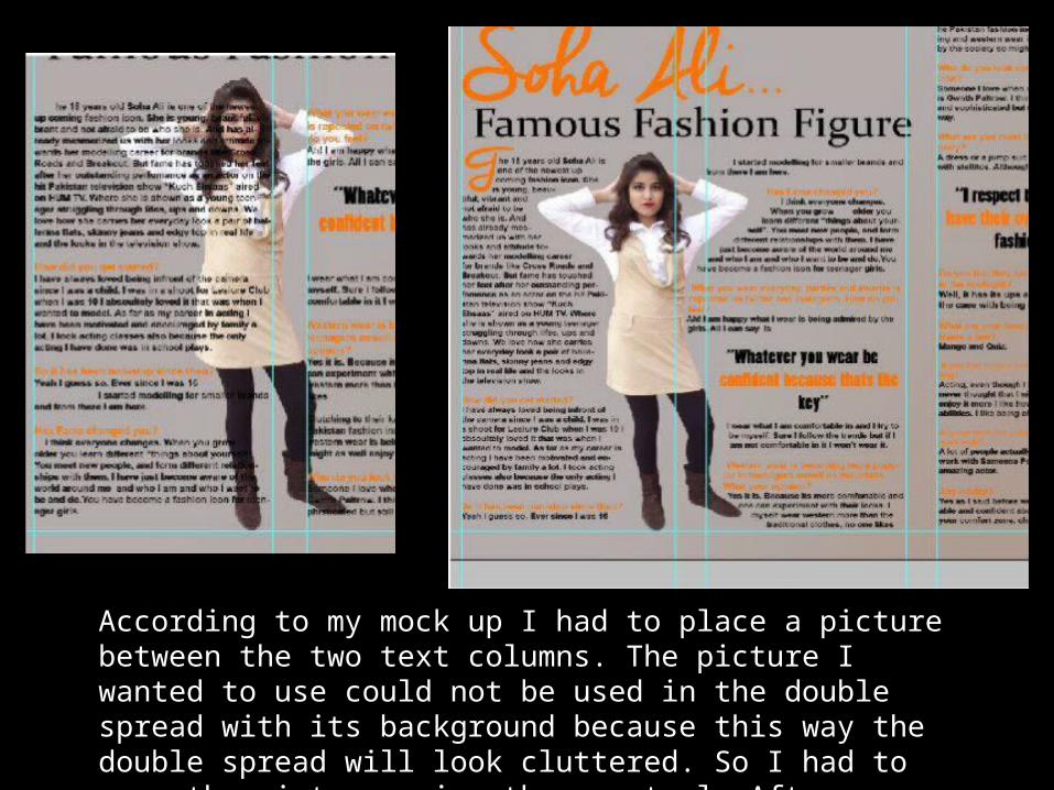
According to my mock up I had to place a picture between the two text columns. The picture I wanted to use could not be used in the double spread with its background because this way the double spread will look cluttered. So I had to crop the picture using the pen tool. After cropping the model I wrapped the text around model
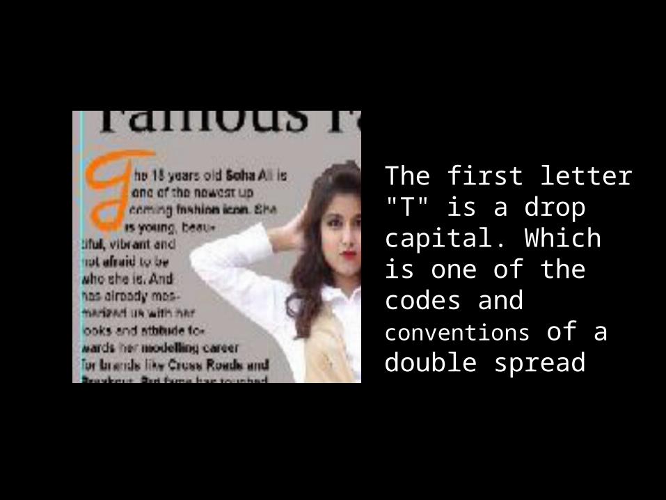
The first letter "T" is a drop capital. Which is one of the codes and conventions of a double spread
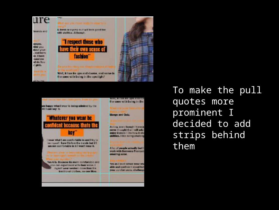
To make the pull quotes more prominent I decided to add strips behind them
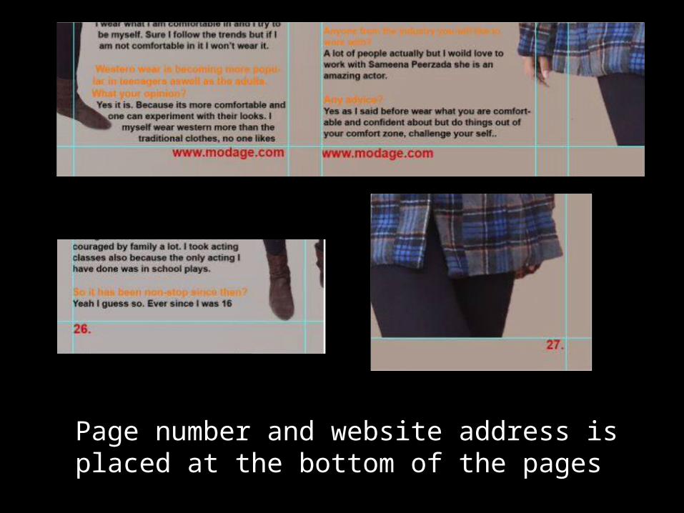
Page number and website address is placed at the bottom of the pages
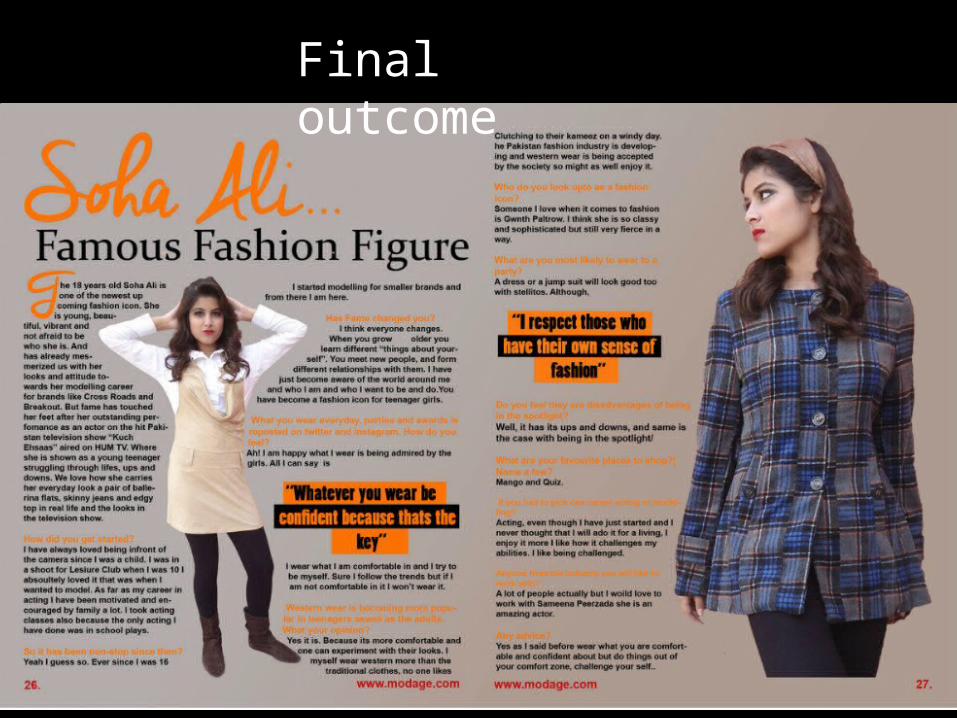
Final outcome