Embed Size (px)
Citation preview
Double Page Spread

Tips
*Main Image on one side of the page*Big Title
*Use your correct colour scheme*Around 400 word limit to cover one page*Manipulate Image*Use little details such as photographers name

I am using publisher for my double page spread. I am using landscape, and I had to change the size from A4 to A3.

Using the shape tool, I filled it in black as my backgrounds on both my contents page and front page are black.

Using Photo shop, I used the quick selection tool, I cropped out the curtain background of bronwen.

Using photoshop, I used the clone stamp tool to edit the hair, arm and hand so it doesn’t look as pixelated.

I saved the photoshop image of Bronwen to a Jpeg. I then went onto publisher, clicked insert, picture. This added my edited picture of bronwen
onto the double page spread on publisher.

I adjusted the scale of the image so her image is bigger.

Using the text box on publisher, I used Birch STD font at size 90 and changed the font colour to red.
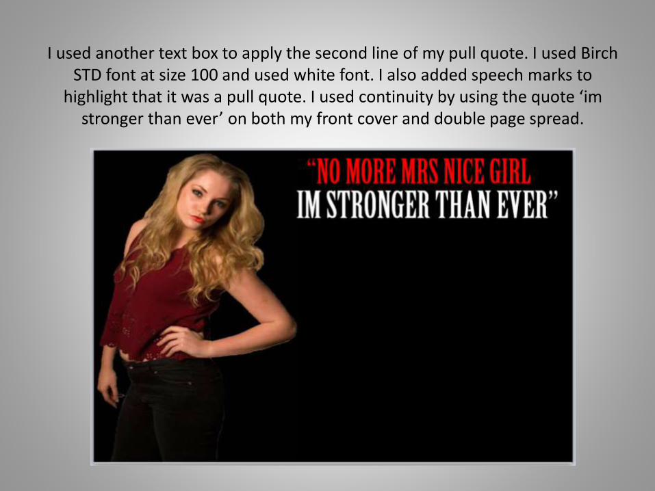
I used another text box to apply the second line of my pull quote. I used Birch STD font at size 100 and used white font. I also added speech marks to
highlight that it was a pull quote. I used continuity by using the quote ‘imstronger than ever’ on both my front cover and double page spread.

I used a text box on publisher to create photography credits.I used Calibri text at size 10 in white font.I included the location and photographer.

Using Bold Arial text at size 11, and dark grey font. I created my conventional standfirst

I Created a drop cap from the first letter of the article, this is conventional of Magazines.I used a new text box and used Ariel bold font at size 72 in grey.
I put it in bold so it would stand out.

Using white Birch STD font at size 18 I put the Magazines name, Echo in the top left corner.
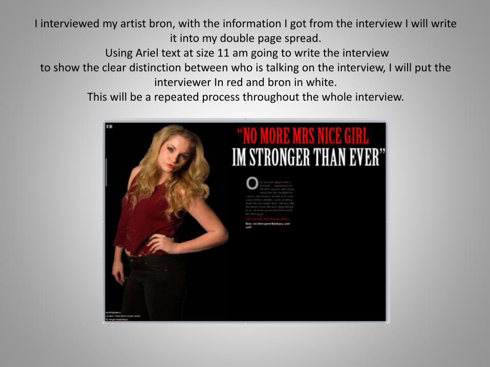
I interviewed my artist bron, with the information I got from the interview I will write it into my double page spread.
Using Ariel text at size 11 am going to write the interviewto show the clear distinction between who is talking on the interview, I will put the
interviewer In red and bron in white.This will be a repeated process throughout the whole interview.

I made the textbox wider so I could fit more of the interview in it.

I have made a new text box the same size as the other column by copying and pasting the text box.I then deleted the words out of it and continued with the interview. Keeping the clear distinction between who
is talking by using the colour scheme red and white.
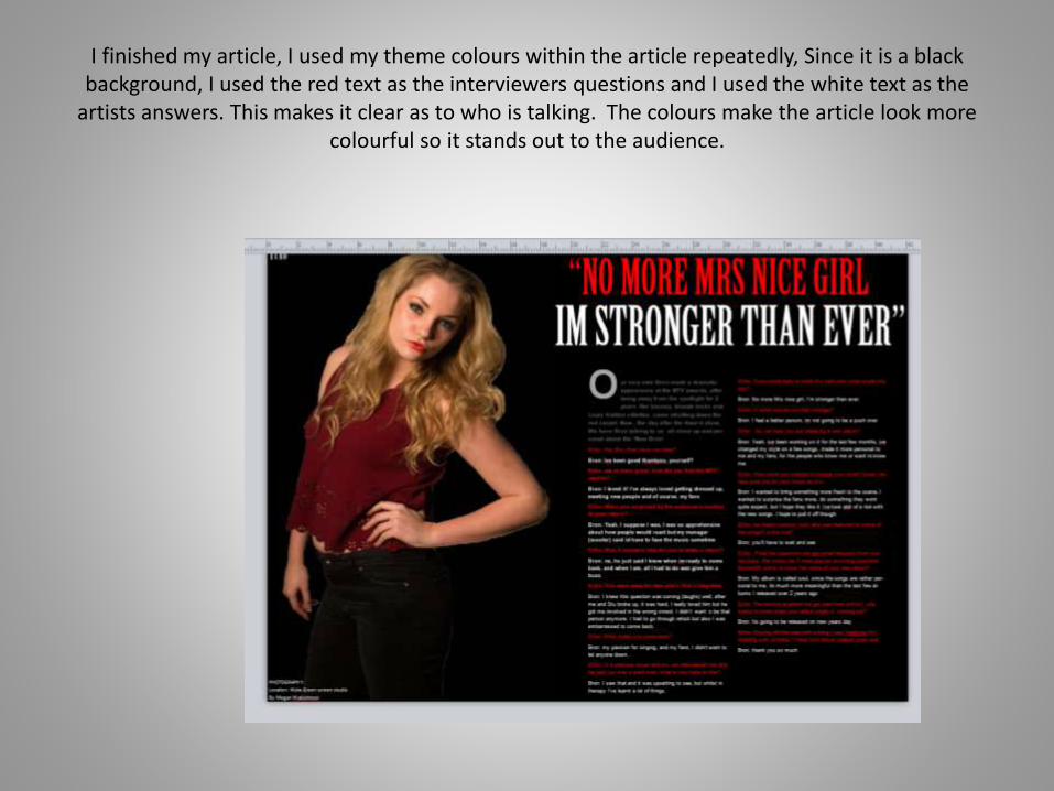
I finished my article, I used my theme colours within the article repeatedly, Since it is a black background, I used the red text as the interviewers questions and I used the white text as the
artists answers. This makes it clear as to who is talking. The colours make the article look more colourful so it stands out to the audience.

Using ariel text at size 12 in grey, I added a text box which gives the readers choice to go online and see the magazine and get more information
For more information, videos or images on Brons Interview or album release go to [email protected]
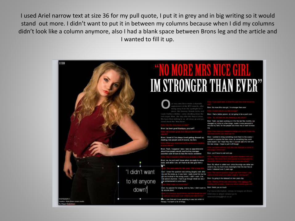
I used Ariel narrow text at size 36 for my pull quote, I put it in grey and in big writing so it would stand out more. I didn’t want to put it in between my columns because when I did my columns
didn’t look like a column anymore, also I had a blank space between Brons leg and the article and I wanted to fill it up.

Using shape tool, I selected the line tool and I created two lines for my pull quotes, so it would stand out

Using text box and ariel text, at size 14, I created a page number for my double page spread, This is conventional of double page spreads.