Embed Size (px)
Citation preview
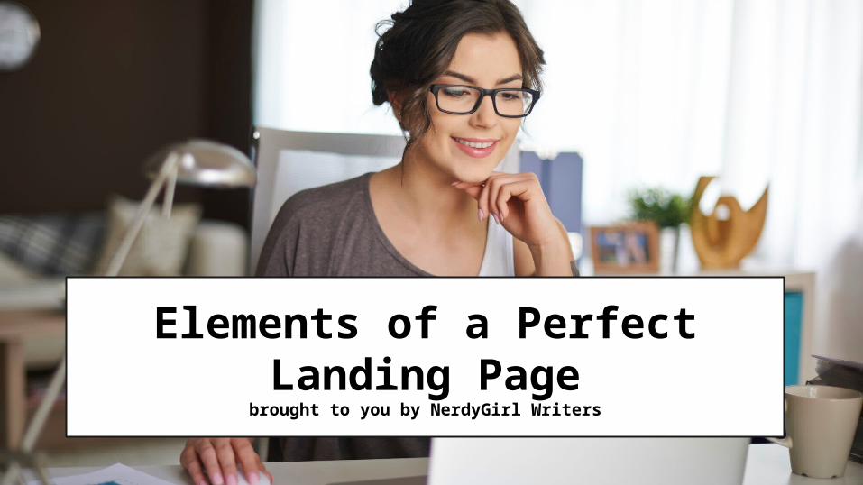
Elements of a Perfect Landing Page
brought to you by NerdyGirl Writers
Landing Page - a page with a singular focus
Optimized to grab viewer’s attention and achieve the
desired result
There are 6 parts to a PERFECT
landing page

A Single CTA
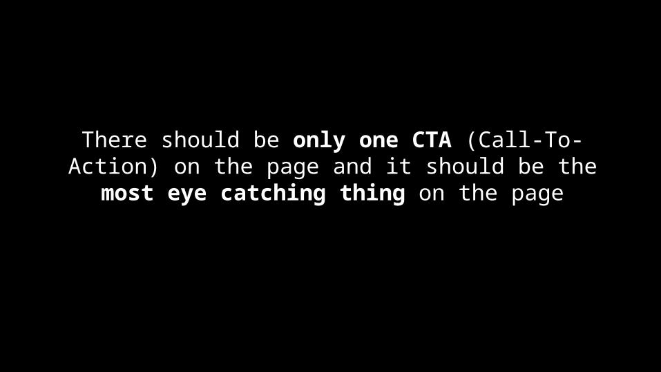
There should be only one CTA (Call-To-Action) on the page and it should be the most eye catching
thing on the page
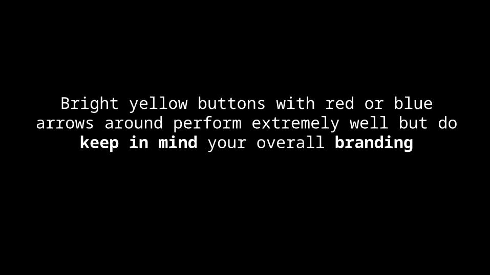
Bright yellow buttons with red or blue arrows around perform extremely well but do keep in
mind your overall branding

Unique Value Proposition

Make sure your offer has something UNIQUELY valuable
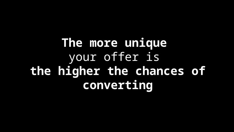
The more unique your offer is
the higher the chances of converting
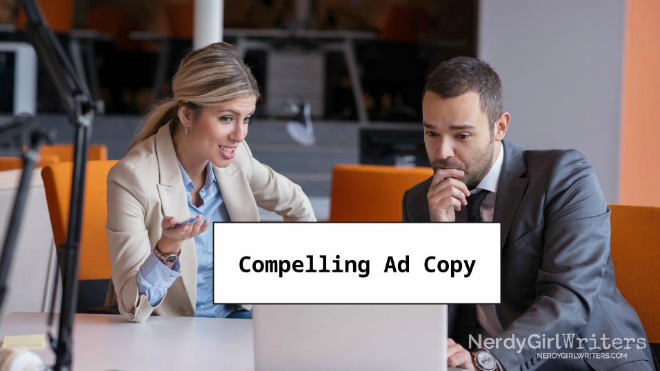
Compelling Ad Copy
Present your offer in a way that captures user’s attention: learn from magazine
headlines that play to reader’s emotions

Keep the text’s length proportional
to the value of your offer

Create Urgency
Creating a sense of urgency can significantly increase
the conversion rate
For a less aggressive approach, try a progress bar above your opt in - psychologically we are more inclined to finish something when we feel
it’s incomplete

Minimal Navigation Options
The BEST landing pages have no sidebar, no navigation menus, no
footer
The only optionbesides the CTA
should be the back button

Language That Matches The Source
The more closely the page language matches the source of traffic the better
your chances at converting
Adding “Coming from Twitter? Check out our complete Twitter For Newbies Guide”
maximizes converting potential

Conclusion
Creating a great landing page is only the BEGINNING
of a great marketing strategy
At NerdyGirl Writerscreating great marketing strategy
is OUR SPECIALTY
Sound interesting?

Freelancers you can trust.
Click Here to Learn More


![[Webinar] How to Create the Perfect Landing Page for Your Offer](https://img.pdfslide.net/doc/110x75/589e870a1a28ab443e8b5565/webinar-how-to-create-the-perfect-landing-page-for-your-offer.jpg)