Embed Size (px)
Citation preview

In what way does your media product use, develop or
challenge forms and conventions of real media
products?By Sarah Dick

Notion magazine
• Contains information on Music, Fashion and Culture.
• Minimalist and monochrome style
• First published in 2004
• Published by Attic London
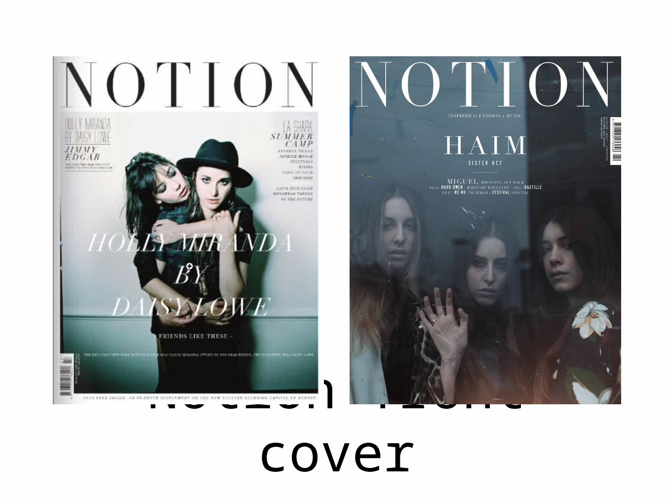
Notion front cover
Notion front cover features
• Usually uses the house brand of black and white.
• The title of the magazine alternates from black and white depending on the colour of the image.
• Subtitles are sparse across the front cover so the main focus is on the image
• The subtitles are kept within a range of two or sometimes the same so it doesn't cause the front to look overly popular.
• The main image uses the whole size of the page or creates a white border to emphasise the image.

My front cover

Features of my front cover
• As notion creates a border around the main image I created this on my front cover.
• I also followed the idea of having the main image of the main article in the middle of the page.
• The overall house style is monochrome or kept within the range of colours found in the image. I used a black title so it stands out upon the white background.
• The subtitles are often found upon the main image in the left or right hand corner but only small so they don’t take away from the main image.
• Notion would usually have the title of the article, in which the main image is based upon, put across the image but due to the image that I have used, I added the title of the main article on the bottom.
• The issue number, barcode, date and price are also positioned at the bottom of the page.
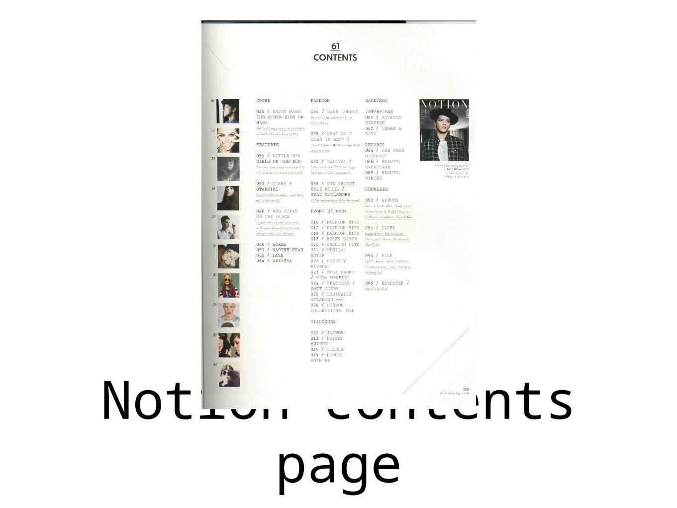
Notion contents page
Notion contents page features
• Issue number is written at the top of the image
• The main headline is written at the top of the page followed by the smaller sub headlines.
• Smaller image of the front cove positioned in the top right side.
• Smaller images of the articles included in the magazine are positioned at the left side of the contents page
• There is a bolder font for the headlines and smaller font for the information about each article.
• The page number is under a 45 degree horizontal line with the website URL.
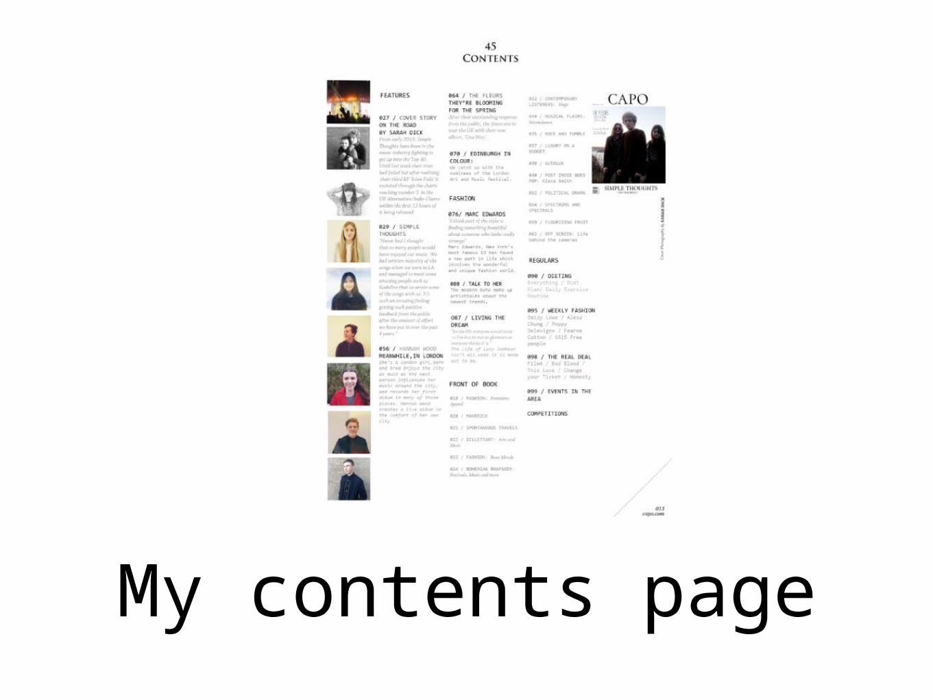
My contents page
Features of my contents page
• I created smaller images that are found on the left hand side of the page which show the reader who is going to be in the magazine.
• I was influenced by the use of three column which are written in order of importance.
• A mini version of the magazine is also placed in the right hand corner followed by information on it.
• The headings for each sections were also influenced by Notion.
• I also used a horizontal line to lie over the page number and website URL.
• The title of the page and issue number is also at the top and middle of the magazine.

Notion double page
Features of Notion Double page
• Usually has a page before the article which gives an summary of the article.
• Columns usually alternative between 2 and 5 depending on whether the article has more images or not.
• The continuous theme throughout the magazine of having the page number under a horizontal line.
• Contains a range of images of the artist/ band which are collaged across the page.
• Sticks with the font throughout the magazine and the monochrome feel of using white in the background and black for the font.
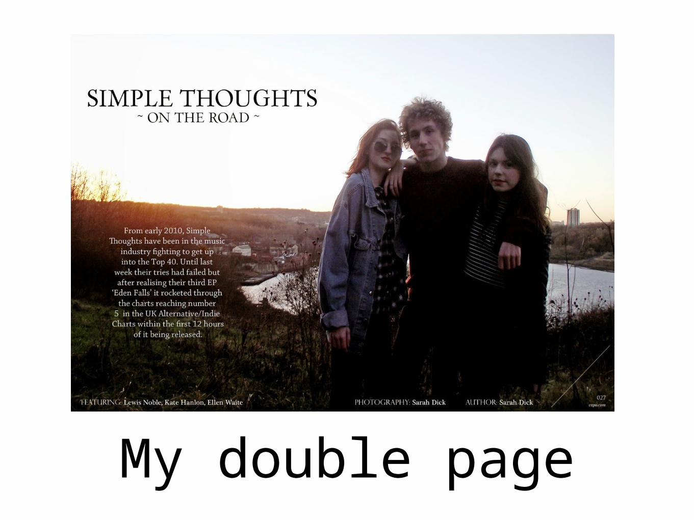
My double page
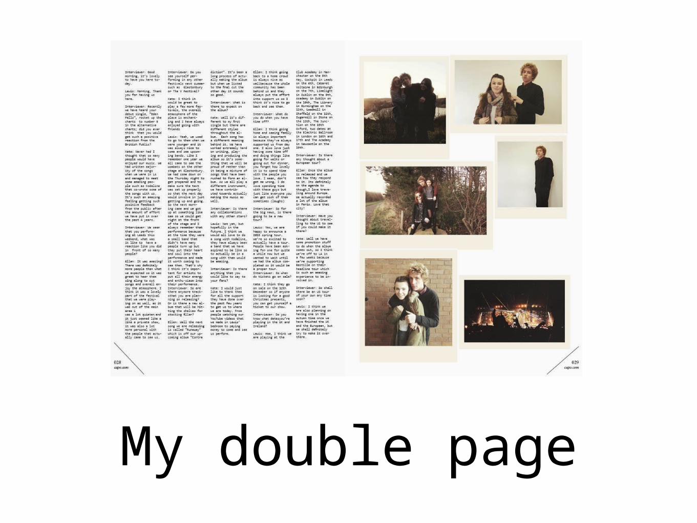
My double page
Features of my Double page
• I have a introduction page which gives a summary of what the article is about and who is in it.
• I have continued with the same title font as on the front cover and used a similar image as to which is on the front cover.
• I have used five columns which is a theme throughout the magazine.
• The images are influenced by the organised scattered effect that continues throughout.
• I have continued using the page number at the bottom left and right hand side of the page.